#3d perspective tricks
Text
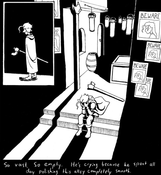
Shadow of the Erdtree - Exiting the Mouths of Caves


Something about framing
#elden ring#analysis of art design#3d perspective tricks#I am here for photography#shadow of the erdtree
10 notes
·
View notes
Text

inspector cabanela my beloved
#ghost trick#ghost trick: phantom detective#inspector cabanela#nintendo#amelias art#cant wait for the switch release so cabanela can finally have his 15 minutes of fame as a tumblr sexyman#futzing around with the new clip studio shading assist on top of my regular shading#(and in place of it on the junk in the background)#and using the 3d models for once for the Perspective#his legs are so long LMAO
314 notes
·
View notes
Text
Current favorite thing: drawing my oc Oliver in battle wearing baggy, disheveled clothes


he's just a smol little guy with a space dragon in his head and the power of a god burning him up
bonus snapshot from a bigger picture I'm working on from the final battle:

I love drawing this little dude
#the sos chronicles#oliver starchaser#my oc#my drawings#my art#fantasy#sci fi#first book isn't even finished and I'm over here trying to draw illustrations for the last one algjkhjfaklgsf#art#drawings#writers#doodles#sketches#I loooooooove drawing clothes like this#I know like 3 perspective tricks and making clothes look 3D is one of them xD#I think it looks so neat#I love in the second one that I got his hair to stand up I can't usually make that look good but it does there!
8 notes
·
View notes
Text
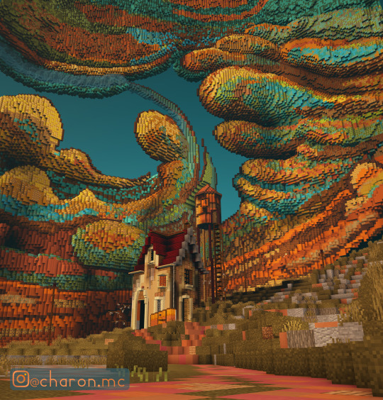
A minecraft build I did a while ago, a Lonely House. Based on an illustration by FrancisCo.
This uses some perspective tricks that started to be used more at the time:
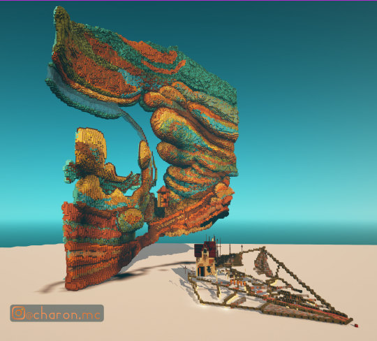
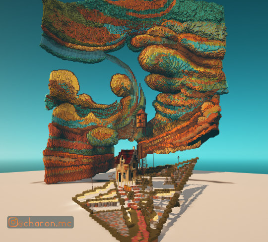
Built in an older version, I made use of a glitch with shulker shadows to help darken some areas. In 1.16, when you place shulker boxes and move away, the boxes disappear as they are entities, but the shadows remain. That’s why there are so many pink blocks all over :)
I got this idea from a build by Mine674, who made a huge, detailed build with customized shadows all over. You can find it here.
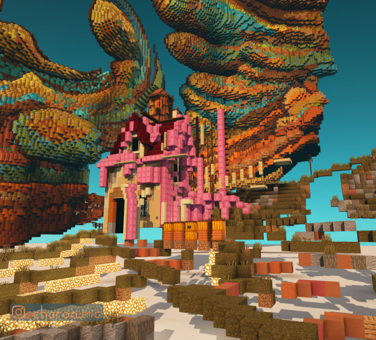
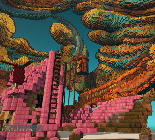
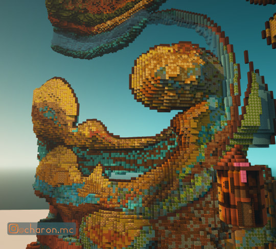
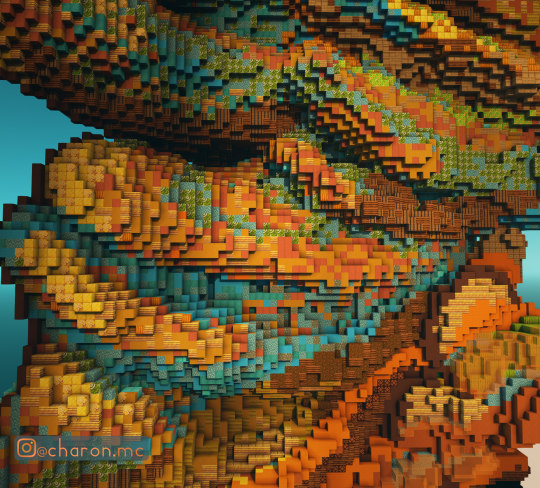
It was pretty fun coloring the clouds and mixing a lot of different blocks to achieve the colors and transitions that match the original image as close as possible.
In the end I was happy with the build as it was my first organic, though some coloring and shaping can definitely be smoother.
If I had to re-do it, I’d also make it more 3D and lean in on using the shadows between the clouds that the sun casts for a better sense of “3D-idness” and a more cartoony, hand drawn look, where the shadows would make for ink or pencil like outlines and accents.
697 notes
·
View notes
Text
Collection of Free Art Tutorials
I don't usually make text post on this blog, but a nice artist I know was asking for tutorials a while back and I forgot to send some to them while in school. So here's a post on it since it's easiest to grab and go this way. :)
This list focuses on the basics. I'm focusing on the foundations of art, so medium is generally irrelevant and you can use physical or digital with these. You'll have to google more specific tutorials on things like character design and such.
One of the biggest pieces of advice I can give to you is strangely, introduce things to yourself one at a time. In art class, we took whole topics week by week. For high school, we did a few exercises then spent a week drawing/painting and doing your piece(s). For basic art 1 & 2 in college, we did 1-2 exercises and then did 1-2 drawings, followed by HW (which we turned in next week) and sketchbook practice (which she'd check at midpoints). For basic art lessons with a tutor, we did practice then our own art. You can see the pattern here - the point is don't be distressed if you don't get everything at once, or the lesson in 2 weeks, or the lesson in 3 years - we practice and do a lot over time, and you'll pick up on things you need to improve naturally and through help with others. Take time to be proud of your art in mini steps too, even if it's not the best! You tried and attempting to climb an obstacle over and over again before finally leapfrogging it is still progress to it.
Overall tutorials:
DrawABox.com is a site that's dedicated to art exercises and practicing when you can. They talk about the basics of art as well as how practice is important. It can get tough at times and it's ok to stop and do a balance of say those practices and doodles if you choose to try and do all of it's stuff - but you don't have to either. It's just a nice basic education done by some art nerds who like going hard.
Ethering Brothers - these guys are famous for their 40billion tutorials. If you need help on a specific idea, search their gallery and you'll likely find something.
Thundercluck's Art Fundamentals - She did a good huge ass tutorials on how things work, and it's the least overwhelming of the 3 I got in this section, so I suggest it as one of the first to look at for digital stuff.
Art Instructions Blog - Another good & simpler website that goes great into fundamentals. They focus more on traditional art but if you're digital, you can replicate most of the techniques - art fundamentals and subjects cover all mediums. Very important
Drawsh - Particularly notes on Construction: construction is the basics of building an illusion of a 3D image on a page. Figuring out how to build shape gives depth to your work, and learning how to see in 3D lets you be able to draw an item then move it around in your head (sometimes, when you're good enough, don't be afraid to pull out a reference or use live subjects). Construction is how to figure out the foundation of your drawing, and good planning = better picture!
This link starts at the back, hit newer post to go forward.
There's a lot on anatomy and other nitty gritty details for when you want to practice those as well.
Griz and Norm's Assorted tips - Long time artist talk about various tips and tricks they use in art and how to avoid certain pitfalls. It's eclectic but great to look through.
James Gurney's Blog - He's got a lot of thoughts, a lot of tips, and a lot of adventures he catalogues. It's the least organized out of these but fortunately he has plenty of tags and most post have something neat going on. He's fantastic!🥰
BEFORE ALL OTHER BASICS….
How to Make Your Art Look Nice: Mindset
There's a lot of artist with different perspectives on how to approach art and your mindset while doing it, but the general consensus is that it's a process and sometimes you have to remind yourself to enjoy art!
Line
How to draw straight lines without a ruler. …but for the love of all that's good do NOT feel bad about using one! This talks about how to hold your pencil and how to do some good freehand stuff, some good practice.
5 grips for holding a Pencil for Drawing - This goes for pencil, pen, tablet, etc.. Get comfortable and figure out what's right for you and your pictures. I'd like to note that paintbrush holding will overlap, but some will differ.
A few line drawing exercises that help with line confidence.
Types of line drawings & what they are.
Contour Line & exercises with Mrs. Cook - Contour lines are one of the first art exercises I do in all the drawing classes I've taken. The good news is that they're surprisingly fun & look neat, even the blind contours!
Good deep thoughts on lines and how to use them.
Line Weight Tutorial
Lineart Weight Tips!
How to show variation in your line art: part 1 & part 2.
Some teacher's Drawing 1 & 2 lessons put online.
Light, Shadow, & Value
An introduction to tonal values.
Why values are important. The main reasons are that they give depth to a piece, and values literally shape our world.
Tonal Values: Everything you need to know
How does light work & the basics on Light
Light & Shadow in Art - much more in depth of the above! Highly recommended if you have time to spare.
Understanding grayscale/monochrome art. Great for shading & planning.
A guide to Cross Hatching (and hatching in general) - As a side note, crosshatching is one of the early things taught as it marries Line + Value into a nice neat package and helps add form with just a pen.
Crosshatching for Comics
Learn more about coloring by working in grayscale
How to Make Your Art Look Nice - Contrast!
Using lighting to make your art look nice.
Some light & shadow classifications.
Edges - notes on how they work in shading.
Color
A side note - color theory doesn't differ much, but color MIXING will change between mediums. If you're doing traditional colored pencil, you're overlapping 2 or more pigments on top of each other. If you're doing traditional paint, you're mixing & creating a solution/emulsion (depends on the pigment and binding) of pigments with the particles reflecting light in different ways. In digital, overlapping colors & blending colors depend on how the program you use calculates it if you're not just putting 2 color side by side. This just means you have to adjust your mixing when you switch between them. :)
Slawek Fedorczuk's Light & Color Tips - also shows how to guide through a scene.
The Color Tutorial Part 1 & 2 by Sashas - A personal favorite.
Color Studies 1-6 by Sheri Doty
Amazingly nice breakdown on how color works in simple terms.
Sarah Culture's Tips on Color
The value of underpainting
A few notes on reflective light.
Experimental color techniques with Alai Ganuza: first post, second, & third.
Color zones of the face charts
Composition
Good Tips on Composition
Here's an example of how you can search the Etherington Brothers' stuff and get like 10 tutorials and tips on one subject. Composition & Cover Design, Shadow Composition, Two Line Composition - plus more.
How to make your art look nice: Thumbnailing!
And don't be afraid to make silly thumbnails or sketches.
Composition Examples - charts like these are great when you can't think of something yourself. There's no shame in using them.
Flow and Rhythm
Formulas for landscape composition.
Perspective
Perspective Drawing Tutorial by Julie Duell
Linear & Atmospheric Perspective Guide
One Point Perspective City Tut by Swingerzetta
Niso Explains Perspective - these are great for drawing figures in perspective!
Putting characters into scenes and drawing backgrounds
Backgrounds that make your character stand out!
Using background detail to guide the eye.
Odds and Ends
I shit you not, probably 1/3rd of my color, value, & structure knowledge comes from pixel art since I've done so much of it and it is all about challenging yourself to do the most you can with limitations. Check out lospec's tutorial database for fun and see how it compares to art techniques you're doing - even if you never try a medium, it's always interesting to see how it works. :D
How to Make Your Art Look Nice: Reference Images & Style, Pushing Proportions, and developing style.
Foervraengd talks about how he expanded his comfort zone with concept art & landscape drawing.
Luna Art talks about what they're thinking when doing concept art.
Repeating visual motifs in character design looks cool.
Eric's Thoughts on Drawing Backgrounds and Props.
Show vs. Tell: Why Visual is Not Optional in comics.
The Lost Vocabulary of Visual Story Telling Day 1, Day 2, Day 3, & Day 4.
Traditional Animation's 2 Digital Library books, The Know-How of Cartooning by Ken Hultgren & Advanced Animation by Preston Blair are two books from the golden age of animation they have up on their site for free viewing!
Animation resources dot org has a lot of cool stuff. Here's Nat Falk's How to Make Animated Cartoons (part 1). Their pages on Instruction & Theory are a good start.
Books
Good news: the internet archive has a TON of resources. Make sure to check around and toggle filters, it's a bit weird with organization. For example, a book can be under art or drawing - techniques, depending on who catalogues it.
Andrew Loomis is someone artist tend to die-hard reccomend. His work is collected here & here on the internet archive (one is Andrew Loomis, the other is Loomis, Andrew - thanks). I own Figure Drawing for All It's Worth and I recommend checking all of his stuff out, especially if you're having trouble with bodies and hands.
The Animator's Survival Guide by Richard Williams is mandatory in animation classes for good reason - it's fantastic!
Perspective for Comic Book Artist by David Chelsea is great for any type of artist. So is Extreme Perspective & Perspective in Action.
Scott McCloud's Understanding Comics, Reinventing Comics, & Making Comics. The first one is on the internet archive, the second two are likely avaliable at your library or at a bookstore as they're pretty popular.
Speaking of comics, Drawing Comics the Marvel Way has been a favorite of comic artist for years no matter what comic book companies and artist you like, it's a good introduction.
Anything by or endorsed by James Gurney, Color and Light: A Guide for the Realistic Painter is one of my favorites (this is his official page but you can get them elsewhere for cheaper too).
Art resource blogs with good tagging systems: @artist-refs , @help-me-draw , @helpfulharrie , @art-res , @drawingden , & @how-to-art
Lastly, I suggest if you find something you like online for free, SAVE IT! Whether it is through the Wayback Machine, screenshotting a whole webpage, reblogging/retweeting something, or putting it on pinterest, digital media is fickle and tends to go up in smoke when you least expect it. I have a partially organized Pinterest board that helped me find most of the stuff I wanted to keep. Figure out what works for you and save what you can.
1K notes
·
View notes
Text
📝 Tiny tutorial: How I work with Clip Studio's 3d models to make them ALWAYS fit my art style! 🩷


I do the same with patterns and decorations of this sort 🥰 I recommend rasterizing your 3d file layer once it's set up the way you like it! Easier to play around with the opacity!
Now that I think about it, the only thing I don't do it for is handwriting brushes… 🤔

📝There is nothing wrong with using 3D files as references or guides.
Personally, direct tracing doesn't sit right with me, so to make sure it's just a shape guide when I need to get the perspective right, I do the blur trick! I keep opacity around 15% to just suggest the shape.
#almakrowantip#tutorial#art tutorial#digital art#art resources#artists on tumblr#clip studio paint#CSPwithAlma
216 notes
·
View notes
Note
if you don't mind me asking, what are your artstyle inspirations?
Not at all!!
Shigenori Soejima and his team (the artists behind persona 3-5) are a huge inspiration. The instinctive look of the black shading, facial structure, and use of gesture really stand out to me.
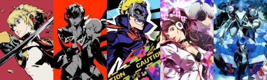
Hungry Clicker's deceptively candid-looking poses, quick but gorgeous painting style and incredible use of reflected light live in my head rent free! I have all his books! His reflected light inspired me to incorporate that into the black shading to artificially create more depth in a 2D style, and spaces for colour

Kuvshinov Ilya's spectacular understanding of anatomy, colour, and how to make a face look cute as hell really helped me nail making a character look appealing. I also often use their idea to add a soft glow to the black lineart. Recommend studying him a lot
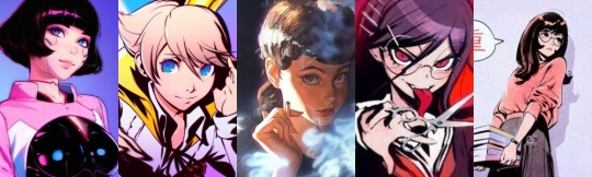
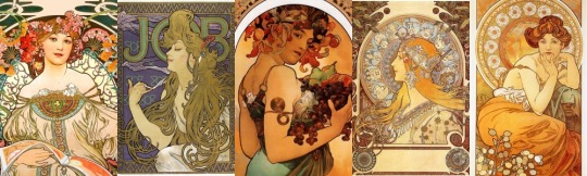
Alphonse Mucha was a master of composition and pioneered the Art Nouveau movement. A legend. His beautiful use of composition, pattern, bold lines combined with photorealistic elements, carefully chosen areas to supply immense detail, is fascinating and I'm trying hard to learn from that. I think combining elements from this with solid black shading could be gorgeous. You also see very little use of perspective in his work.
Helloclonion, to me, is a genius. Their use of black is beyond anything I've ever seen. Just a pure master. The black shading does not look invasive, and there is an element to it that makes it a little more 3D-looking than others, perhaps the use of IRL models. The way they translate real shadows to blackness is something I can't yet comprehend but man, I study their work all the time!! I also got very inspired to use vastly different hues as rim light from them.

Media that's inspired my art a lot are 90s anime (Interstella 5555 is my fave), Steven Universe, Sonic, Crash Bandicoot 2, Ghost Trick, Persona (ofc).
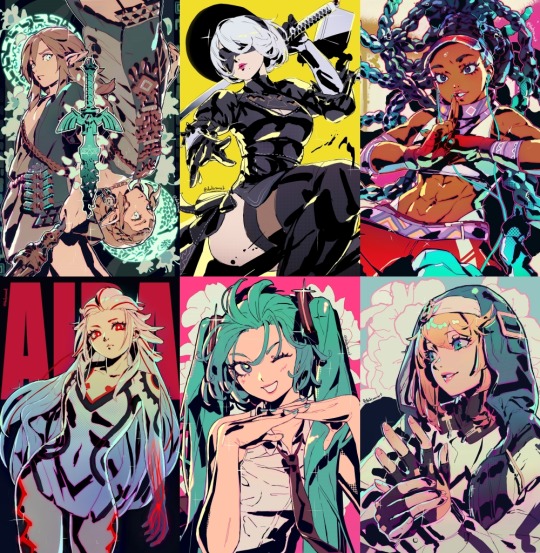
My art looks like this right now:
Hope this is the kind of depth you were looking for, haha. There have been and will be far more than just these inspirations of course, but right now it's very strongly these five!!
199 notes
·
View notes
Text
DRAWING BACKGROUNDS: TIPS AND TRICKS
So many people are afraid of drawing backgrounds and I think it's a shame, so here's some tips and tricks, because I'm not perfect at it myself but I think the hardest part is really just knowing where to start.
First off: Perspective
Yeah, yeah, that's the scary word. But I promise you, once you're familiar with the basics, backgrounds are a LOT less intimidating. Don't get discouraged if WHEN you have trouble with it. Even professional artists struggle with it. I promise you, screwing it up is good and normal. That's how you learn after all!
Now I'm not going to go into detail on how to do it here, because honestly there are a thousand and one free resources online and in libraries that can explain it far better than I ever could in a singular broad-strokes tumblr post. But I AM at least telling you you should familiarize yourself with these basics:
Important Terms:
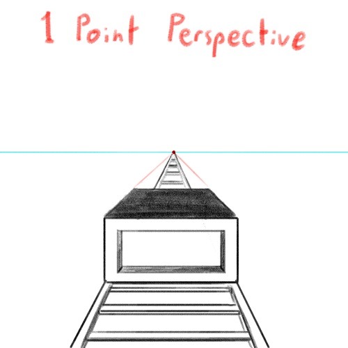
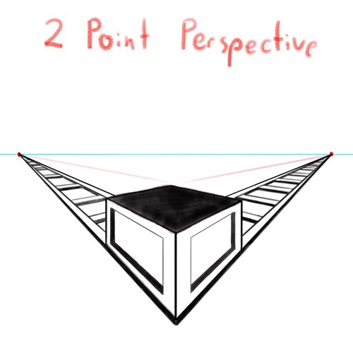
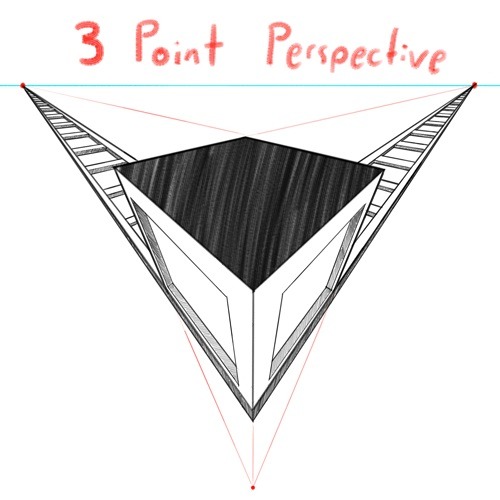
Horizon Line: A horizontal line across your canvas, showing your viewer's eye level and providing a location for most of your vanishing points.
Vanishing Point: Integral to drawing in perspective. The sides of a 3D object get smaller as they become farther away from the viewer in space. This point is where the parallel lines of a side eventually meet.
The Basic Types of Perspective:
One Point Perspective: Good for drawing things that you're looking at straight on.
Two Point Perspective: Good for drawing things at an angle.
Three Point Perspective: Good for drawing things the viewer is looking up or down at, especially at an extreme angle.
[Click images for ALT descriptions]
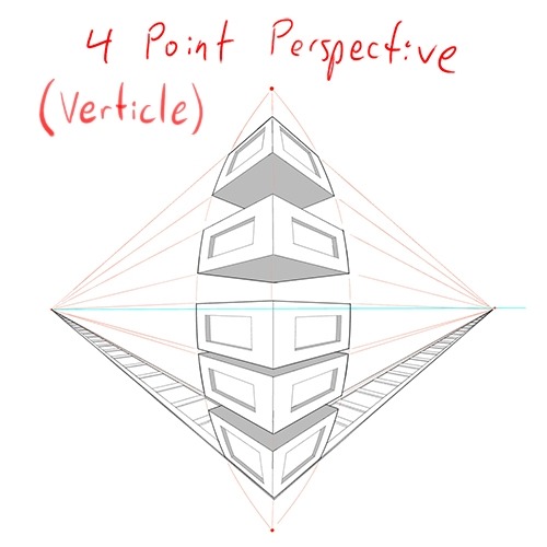
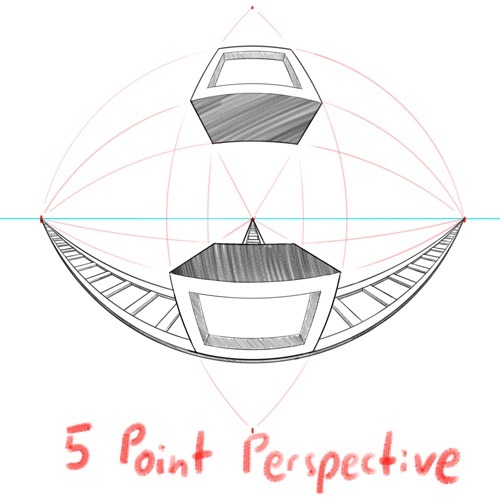
And if you're comfortable with these and serious about improving your skills for use in storytelling, I also might suggest looking up:
4 Point Perspective: Great for extra wide or tall shots and for camera tilts if you're doing an animation or animatic. I think some other names for this in animation include "banana pan" and "warp pan."
5 Point Perspective: Fish-eye lens. Good for all your angsty anime boy slipping into madness needs!
Some perspective tips I wish someone had told me earlier:
Objects' relation to the horizon line is constant.
A super helpful tip to remember when placing a character or object in space is that they will always (assuming they aren't changing in size or moving up or down) have the same relation to the horizon line no matter how far or close they are. If your horizon line is at shoulder height for your focus character in the foreground, any character of the same height in the background will still line up with the horizon line at the shoulders.
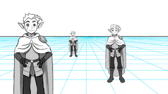
How to pick the distance between your vanishing points:
2 pt perspective uses 2 vanishing points, 3 pt uses 3, etc, etc, but how close should they be? Well, first of all, for anything that isn't one point perspective, one or more points will usually be off the canvas. Super annoying, I know, but the closer your vanishing points are, the more warped your drawing will become.
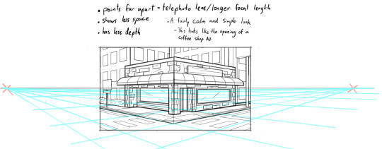
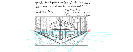
Second, a helpful thing to know is that choosing the distance between your points is basically the illustration equivalent of picking your camera lens! Photography buffs will know that wider (shorter focal length) lenses show more space and make the distance between foreground and background more dramatic, while longer focal length/telephoto lenses are flatter, and more focused and intimate. The same is true of vanishing points that are closer (shorter focal length) or farther apart (longer focal length).
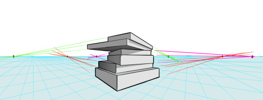
2 point/3 point/etc doesn't actually mean you're limited to that many points total on your page.
this one confused me a lot when I was getting started, lol. A lot of examples will show you drawings of nice, neat cities or something, in which all the buildings are facing the same way in order to demonstrate perspective drawing. But in real life, buildings don't all face the same direction. They're at all sorts of different angles. So how do I do that??? Answer: Just because you're drawing in 2 point perspective or whatever doesn't mean you... have to actually keep your 2 points in the same spot. You can move them around, just keep them the same distance apart, so you're not screwing up your camera lens.
Other Tips:
Use reference!
The instant you try to draw a house, you're going to forget every house you've ever seen. That's just how it goes. Buildings are complicated. Do yourself a favor and collect a few reference images first, buddy!
Consider details (like architectural style, amenities, and materials)
Your building will look more like a building when you keep in mind that buildings have gutters and door knobs and light switches and paneling and stuff, and aren't just boxes with roofs on them. Again: reference! You will forget electrical sockets and baseboards exist immediately. Art brains are dumb.
Use details and texture to fill in negative space
Giant stretches of blank space tend to be boring and distracting. Put a few suggestions of wood grain or something on that wall back there, bud, just don't overdo it.

Line weight
Darker, thicker lines draw more attention, look heavier, and look closer to the viewer than lighter, thinner lines do. Take advantage of this to draw the viewer's attention to your focal points, de-emphasize less important details, and imply depth. It's up to you to decide how you want to use this and what your style is, especially once you start getting into combining or replacing it with shading, values, and color, but a helpful rule of thumb is to try reserving your thickest lines for focal foreground characters and use thinner lines on backgrounds, especially details in the far distance.
Perspective guides
If you're drawing digitally, take full advantage of any perspective tools you have access to! A lot of art programs lately have begun adding perspective guide features that let you set up vanishing points and then literally guide your hand as you draw so you stay in perspective. Some of these include Procreate, Clip Studio Paint, and Adobe Fresco. (still sadly none in Photoshop as far as I'm aware, what the heck, Adobe!). Check through the settings of yours to see if it gives you any perspective guides or other similarly useful tools. They're 100% worth it! And for god's sake, if you've got any skew or perspective warp tools, draw your complicated shapes flat and then warp them instead of spending an hour on it! Don't make my mistakes!
#backgrounds#art tips#tutorial#art reference#drawing tips#perspective drawing#the owl house#hunter toh#doodle art#doodletext#rambling topic#yes i'm using my blorbo to demonstrate art tips what about it#this took longer than i meant it to lol. i got really into the examples#thank you for your patience guys#this turned out to be a GREAT exercise for me as an artist too actually. Trying to explain things is rlly good practice#I didn't even get into values and such. I can only ramble so much I'm afraid
972 notes
·
View notes
Text
Testing a new method for tall grass :)
(don't worry, there won't be a random square patch of grass on the beach, this is just The Test Grass)
Before, I was using the Game Boy Zelda game trick: grass is a tile, and then I just throw a grass sprite on top of the player to make it look like they're inside it. Clever, and it's surprisingly convincing!
But now, this uses the sprite tilting method, which I've been using heavily throughout, to create "3D" grass, and it works so much better than I expected. Also more consistent with the perspective I'm going with!
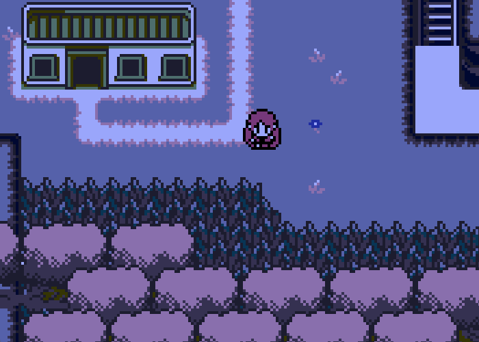
Wheeeeeeeee
#gamedev#indiedev#pixelart#pixel graphics#protodungeon#the waking cloak#gamemaker#indiegamedev#game development#zelda#pixel art#indiegames#devblog#devlog
110 notes
·
View notes
Text
How to Write a Quality First Draft

Every year, we’re lucky to have great sponsors for our nonprofit events. ProWritingAid, a 2023 NaNo sponsor, helps you turn your rough first draft into a clean, clear, publish-ready manuscript. Today, author Krystal N. Craiker shares some tips on how to make sure your first draft has some good bones to start with:
One question I often hear about National Novel Writing Month is, “Won’t my novel be of terrible quality?”
It’s true that writing 50,000 words in 30 days won’t give you a polished manuscript. And it’s always great to embrace the creative mess of the first draft.
However, there are some tricks to ensure that your first draft has plenty of usable content. These tips are also a great way to move your story along when you get stuck.
1. Have a Plan
Pantsers, this might be hard to hear. But having even a basic outline of your story can ensure you stay on track. You don’t have to sacrifice creativity when you outline. After all, you’re still the author creating a story.
A detailed outline can even act like your messy first draft. The more work you put into planning, the better your first draft will be. When I spend more time plotting, I spend far less time cutting things from my later drafts.
2. Make Every Scene 3D
Okay, I get it. Not everyone is a plotter. Luckily, there are other things you can do to ensure your first draft is good quality. One is adding enough sensory detail to bring your story to life.
I like to use a 3D method: have at least three of the five senses in every scene. It’s a great trick to improve the flow of your scene. Take a few minutes to immerse yourself in your story and write what your characters are experiencing.
You might change it or move it around in your final draft, but you’ll save yourself time during revisions if you add sensory detail from the beginning.
3. Reword Your Writing
Sometimes we get stuck after one bad sentence. The imposter syndrome kicks in, and the scene just falls flat.
Ideally, we completely turn off our inner editor during NaNoWriMo. But when you encounter that one pesky sentence, it’s okay to rewrite it.
You can use a tool like ProWritingAid’s Rephrase. Just highlight your sentence, click Rephrase, and select a new sentence. Rephrase uses your own words and enhances them. And don’t worry about security and privacy—ProWritingAid never uses your writing to train AI.
4. Embrace the Chaos
Of course, the most important thing about National Novel Writing Month is to embrace the messy creative process. It’s okay not to have a perfect manuscript at the end of the month—no one will.
Everyone will need to revise, edit, and rewrite after November ends. That’s why NaNoWriMo includes "I Wrote a Novel... Now What?" resources. And when you’re ready to turn your mess into a masterpiece, ProWritingAid will be there to help.

Krystal N. Craiker is the Writing Pirate, an indie romance author and content writer who sails the seven internet seas, breaking tropes and bending genres. She has a background in anthropology and education, which bring fresh perspectives to her romance novels. When she’s not daydreaming about her next book or article, you can find her cooking gourmet gluten-free cuisine, laughing at memes, and playing board games. Krystal lives in Dallas, Texas with her husband, child, and basset hound.
Top photo by No Revisions on Unsplash
#nanowrimo#writing#first draft#writing advice#writing tips#by nano sponsor#firstdraftpro#krystal n. craiker
136 notes
·
View notes
Note
Do you have any tip (or like a book rec) for composition and/or perspective? I'd like to improve that skills but I dont even know where to start 😭
Oh boy, I'm not sure if the way I do it is the best way 🥲. I avoid studying art like the plague in the traditional sense. I don't look up tutorials, read art books, or use grids for perspectives because I straight up don't understand them. That way of working, where you break down the steps in such a methodical way, doesn't work for me. The few times I've tried to use a grid, it ended up looking so wrong to me, and I couldn't make it work, hah! Whenever I've tried to take a 'study' approach to my art, it has stunted my progress and taken the joy out of it.
I wing it a lot. Sometimes I take photos of various items like cups and books and use them as perspective lines because I like a very tactile and hands-on approach to feeling out the composition in real life. The same goes for reference photos for anatomy —I try to understand it in a physical way by moving around myself and sometimes filming or taking photos of myself, but most of the time, I just wing it!
For this piece, I just closed my eyes and prayed. One of the easiest ways for me to build up a composition, is by stacking things and avoiding the floor (it's basically cheating, hah). It makes it look like you know what you're doing when really, you don't. I stacked the front of the boat in front of the mast, which is in front of the tentacle, and so on. Then I just gradually made things smaller as they moved further away until it felt right, rather than being accurate. And if you tilt the composition a bit (this one tilts a bit to the left) and make the characters overlap, then BAM, it looks like it's all intentional.

For this one, I took a picture of the bottom corner of my shelf with a wide-angle, to get the floor right because my brain couldn't comprehend it 🤔

I do study art somewhat by actively observing and breaking down pieces I love that are made by other artists. For example, when I started drawing my comic, I read all of One Piece and Fullmetal Alchemist and took my time to understand their panelling and the tricks they used. I'd stop and look at a page, really taking my time to understand how they were telling the story. I was surprised to find that sometimes they barely drew anything at all for several panels, yet I was never in doubt about who was talking and where they were.
I think, by looking at my art, you can tell that I grew up with Oda's illustrations. I still love how vibrant and well-composed they are, especially how he plays with perspective until it feels right and looks amazing, even if it doesn’t always make anatomical or logical sense. That's the vibe I'm going for as well—just mashing things around until I feel good about it.
One thing that really helped me was letting go of the idea that it has to be perfect or always make sense. For example, this Halloween piece is one of my personal favorites, but if you look at Dakon's foot for too long, you can tell that it's way too small and doesn't match the perspective at all. However, I was satisfied with the overall feeling of the piece, so I just left it.

The only time I've ever "studied" anything art-related was when I went to film school for animation and learned how to animate in 3D, and let me tell you, what a fucking scam. You can learn all of that, and more, just by watching YouTube videos (which I did, lol).
I feel like that wasn't very helpful at all 😭 Is there a particular piece you're curious about, maybe? I'm always ready to break down my pieces and explain how I go about composing them!
39 notes
·
View notes
Text
Shadow of the Erdtree Gravesite Plain


Elden Ring is the best photography game I've played tbh
#Elden ring#3d perspective tricks#environmental storytelling#shadow of the Erdtree#both of these were taken standing directly on top of rada fruits btw#I've been playing the DLC for like 12 hours and haven't fought a single boss lol
7 notes
·
View notes
Text
When was the first 3D video game published? Trick question, this is a post about how "3D video game" is a meaningless phrase.
In 1984, King's Quest: Quest for the Crown was published. King's Quest was marketed as a "3-D Animated Adventure," even though it looked like this:

At first glance, it looks like any other low-resolution 16-color adventure game of the pre-EGA era. But it has one revolutionary feature that sets it a step above its peers: You can walk behind things.
To be clear, that's basically it. There's not even sprite scaling or anything; King Graham is the same size whether he's close to the "camera" or not. Modern gamers would probably find it a bit ridiculous to say this game has a "camera" at all. But you can walk around in that green field, and you can go behind the tree or the castle tower, and those things would hide the part of Graham's sprite behind them—and you could also walk in front of them!
Well, if you didn't fall off the bridge. Why did Roberta Williams never put handrails on those things?
Anyways, the next game I'm going to mention is Wolfenstein 3D (1992), another game which marketed itself on cutting-edge 3-D technology.
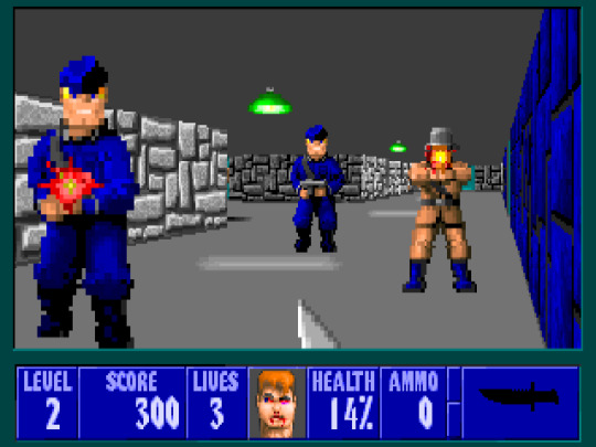
You can see a lot of graphical improvement between these two games set in castles, and not just because Wolfenstein has thrice the resolution and 16 times the colors. The sprites can be scaled with their distance from the camera, for instance, and the backgrounds aren't static flat planes. They're dynamic flat planes, capable of warping as your angle to the wall changes.
In some ways, this is as great a leap over King's Quest as King's Quest is over Zork, or at least Mystery House. But is it really 3D? It's still just a bunch of distorted 2D sprites being drawn to the screen. There's nothing really 3D going on in the computer. It's no Super Mario 64 (1996).
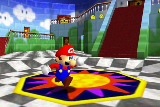
SM64 is among the first popular "real 3D" games, with models and polygons and stuff. And it is, again, a great leap above Wolfenstein 3D. It doesn't distort 2D sprites to mimic 3D shapes; it shapes 2D textures around 3D models. Totally different! It has polygons and stuff!
Now, I'm not 100% sarcastic about that. There are some technical differences between how SM64 handles its textures and how Wolfenstein and other Id shooters handle their sprites. But those differences aren't so much "doing something completely different" as they are "doing the same thing with fewer limitations".
And it would be absurd to claim that Wolfenstein graphics have more in common with KQ1 than with SM64. It would be even more absurd to say that SM64 has less in common with W3D than it does with older and newer titles using what people commonly consider 3D technology.


On the left we have Battlezone (1980), an arcade title which predates KQ1 as much as W3D predates SM64. It has little in common with Wolfenstein's graphics, not needing to distort any kind of 2D image file to mimic 3D, because it's just wireframes.
From a graphical perspective, it has more in common with KQ1 than W3D; both use vector graphics. (Bitmap images would take too much storage space for KQ1.) In fact, you could probably make a compelling argument that KQ1 and Battlezone's vector graphics have more in common with each other on a technical level than they do with Wolfenstein's 3D sprites or SM64's 3D models.
And on the right...it's either leaked security cam footage from Area 52, or The Callisto Protocol (2022). I can't explain what separates it graphically from the other games in this post, because there are so many new systems—systems which require specialist graphical engineers to understand, let alone create or use. I could rattle off some technical terms like subsurface scattering and cloth simulations and soft-body deformation, but I don't understand these techniques on anything but the shallowest level, and TCP has elevated them to another level.
I know it sometimes seems like graphical technology stopped having Big Improvements some time around the seventh or eighth console generation, but it kept going. The difference, I'd argue, is that the improvements have been more spread-out, enabled less by advances in hardware technology and more by learning how to use those advances, distributed throughout a hardware generation rather than concentrated at the start.
Anyways. The point I'm trying to make is that modern games make every prior game in this post look ridiculously primitive. SM64 was impressive in its day, but Mario is rendered with less than a thousand triangles, separated into several rigid components. And his face is just a couple dozen flat polygons with a texture printed on them. Even modern indie games often animate eyeballs with more polygons than Mario's entire body, with the eyeball and eyelid and so forth all being separate models with textures and shaders bringing them to life. Giving them more depth.
Making them even more 3D.
There is not a firm line between 2D and 3D. Wolfenstein 3D is more 3D than King's Quest I, and Super Mario 64 is more 3D than either of them, and Skyrim more 3D than that, and The Callisto Protocol more 3D still. If someone dismissed Doom as not being "real 3D," they're drawing an arbitrary distinction around one of many graphical innovations that made gaming graphics incrementally more verisimilitudinous. That's all.
#video games#graphics#3d graphics#cgi#meta#rambles#king's quest#wolfenstein#super mario bros#battlezone#the callisto protocol
401 notes
·
View notes
Note
hi hi!!!
I'm a CFX artist (I do hair and cloth for 3D animated movies) and I wanted to clarify something!!
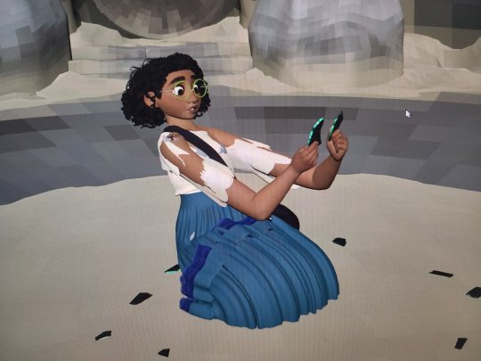
the encanto post? we talked about that one at length at work when it was first made, and it is incredibly evident that the guy who posted it is just bad at his job. the exact same effect can be archieved by changing the camera focal length- but animators never reach for technically competent solutions. (this is a roast.)
and even if thats not possible, there is NO reason for why her shoulder area or chest are completely crushed or why her feet are inside of her hip bone.
and also, since I am in the department that comes right after animation- if I had gotten that shot, I would have either sent it straight back to the animator to fix it, OR cleaned it up myself, by which I mean it absolutely did not look like this off-camera by the time we send it for final light render.
essentially if animation looks that messed up off-camera, it is not "animation magic", it is actually someone doing a bad job.
I'm going to have to respectfully disagree.
For one thing, the behind the scenes image was not close to a final render so I don't think you can fairly judge what was probably just the animator lining up and blocking the shot. I don't think at that state they were concerned with the shoulders, chest, and feet. I'm betting the final polished version looked much better.
And I also disagree the exact effect could be achieved by changing the focal length.
As a photographer, focal length is not just about cramming everything into the field of view. I don't only use a wide angle because I want more stuff in the photo.
It is also an artistic decision.
Wide angle lenses exaggerate distance and can make foreground objects seem massive and background objects seem tiny.
Look at this super wide angle shot of Otis lusting after a tennis ball.
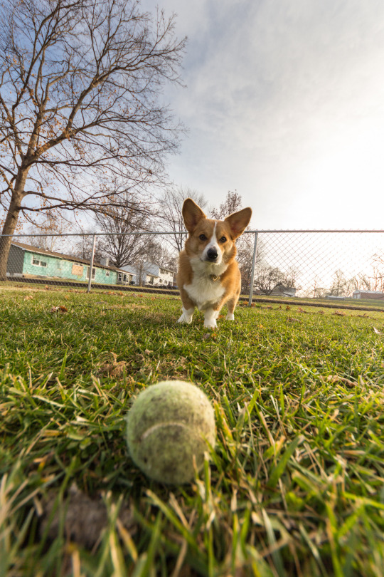
The ball has a huge presence in the photo. It is only two feet away, but the distance between them seems immense. The ball takes up as much space in the photo as Otis.
Compare that to the ball in this telephoto image.
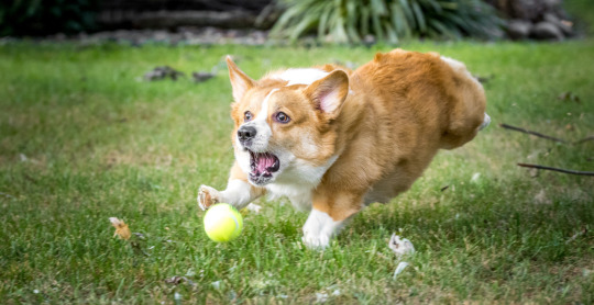
The picture now becomes less about the ball and more about the act of chasing it. The ball is literally only a foot closer to Otis, but it has no commanding presence like in the super wide shot.
So what artistic intention comes from using a telephoto lens like in Encanto?
Telephoto focal lengths compress distance. Background objects appear much larger in the frame. They also flatten the face and give a more flattering perspective of said face. Human faces can look a bit alien at wider focal lengths.

So what if you want the background to look large and encompassing and you want the flattering facial proportions from a telephoto lens, but you also want a foreground object to have a commanding presence like the ball?
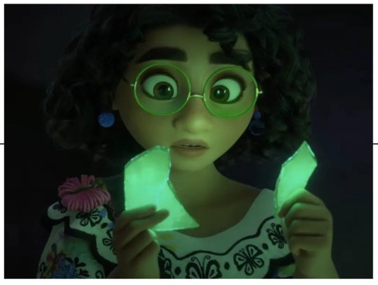
You cheat!
This is not a technique confined to the world of 3D animation though. It is actually an old live-action trick. They will actually use another person's hands to do effectively the same thing as above.
In Hellboy II, Guillermo had two problems. He wanted a telephoto feel and depth of field and he also wanted a very intricate practical egg prop that could open mechanically.
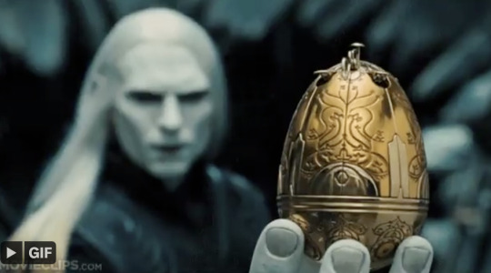

To get the proportions and the framing and the feel of the shot as intended, he double cheated!
He made a big freaking egg with a big freaking fake hand.
(I know there is a picture of the giant hand somewhere but my googling failed me.)
In any case, I think this is just a case of good problem solving over incompetence. I think the director or the animation lead wanted this scene to fit within a specific focal length and it was easier and more efficient to just give her crazy long arms.
I'm not trying to dispute your expertise or animation-splain. Perhaps there was a better way to achieve the same look. But if the final result looked good, I don't think we need to bash someone who was probably under tight deadlines and had a lot of other work to complete. At least not without a lot more information.
55 notes
·
View notes
Text
Art learning resources 2024
It's been so long since I've posted anything at all. I've been straying away from pixel art since I'm learning digital illustration so I haven't really had anything worth sharing. One of the most challenging parts of being mostly self-taught is to find proper resources so I'll share some fo the ones that have been helpful for me
Courses ---------
Drawabox (Free w/ paid options): Art foundations, perspective, construction etc.
Ctrl Paint (Free w/ paid options): Basics of digital painting.
Proko (Free w/ paid options): Different courses for everything art
Marc Brunet's art school (Paid): Digital art complete course
Youtube Channels ---------
MarcLeone's Drawing DB: Art fundamentals, traditional art
Alan Becker: Animation basics and tutorials
AngryMikko: Digital painting, procreate, tips and tricks
Art by Anabelle: Vlogs, procreate tutorials, artist lifestyle
Art by Caro Oliveira: Speedpaints
Art with Flo: Procreate tutorials
E F F I: (Spanish) Art talk, speedpaints, art theory and basics
Erikathegoober: Digital art, tutorials, speedpaints, tips and tricks
Flasho-D: (Spanish) Tips and tricks, speedpaints
FZDSCHOOL: Concept design for videogames and film industry
Gretlusky: Speedpaints
HABOOK: HowTo's for digital art, procreate, character design
Likelihood Art: Speedpaints
Love life drawing: Traditional art, tips & tricks, HowTo's
Marc Brunet: Art tips & tricks, do's and dont's, fundamentals
Marco Bucci: Art fundamentals, tips & tricks
Procreate: Official Procreate yt channel, procreate tutorials
SamDoesArts: Tips & tricks, do's & dont's
The Art of Aaron Blaise: Animation, HowTo's, tips & tricks
Other resources
Save Loomis: All Loomis' books free
Artbooks drive: Drive with different art books (reference, perspective, lettering, etc.)
References ---------
Bodies in motion: Body poses
Anatomy.app: Anatomy 3D models
Character design references: Huge database with character designs, artwork, challenges, etc.
Line of action: Random reference for daily practices
#artist#digital art#art#artists on tumblr#art tips#art tutorial#art reference#reference#art resource
58 notes
·
View notes
Text
How i draw hands
under the cut, sorry for the wait, love you all
OKAY so it has been a while i did one of these. I have a vague memory of @ghost-raven-7 you asking for hands.
I also have a foggy memory of @takemetoasgard you mentioning mouths, so if you want, i could do one for that as well? I'm kinda enjoying doing these. In all fairness, these also help me to figure out how i do stuff actually.
So HANDS
Mind you, i am still neither a proper artist not particularly good at what i'm doing. It is just what i'm using or looking out for currently.
Also there is a lot of text, sorry about that.
As always references references references. With hands it is nice, because you have ready made reference package a ttached to your body. But you still gotta find what helps you understand how it works in 3D.
As always i have to preface, that if you know anatomically how your hand works and looks will help. I mean if you know where are the larger muscle groups or the tendons, etc. We all love cool lines on a back of a hand drawing, but it is more satisfying to look at if the line indicating the tendon is actually at the correct place. So i can only recommend to look at at least some anatomy illustrations.
But beyond that, what helped me a lot, was to simplify the hand to 2D shapes and figure it out from there. But how i do that?
Take pictures. It makes it so much easier, than just simply holding my hand in a certain position. I can do that as well, but if i take a picture it usully helps more with the "understand it in 2D" thing.
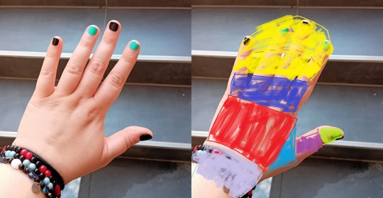
I segment it roughly like this, but others do it differently. It doesn't really matter as long as you are consistent with it, and you understand why you put a segment where you did.
Usually the segment edges are at joint lines of your hand. For one, because the natural lines of the hand can guide it. Secondly, joints are the movement points. It is where the parts of the hand will bend.
And simplifying a pose and trying to make it work on paper, at least for me, is much easier when i moving 2D panes around the space, instead of a complex 3D object. At least this is how i understand it. But how that works in practicality?
Let's have an other picture of my hand. Excuse the quality. Also the lack of ST bracelets, but i need you to kinda see the lines of my otherwise amorph upper appendage.
So using the same blocking, this is roughly how the segments go. This is a tricky one, because of the the bending pinky and the general angle of the hand. But most prominently, the yellow pane folds in on itself, as if you are curling one corner of a piece of paper in front of itself.


You may notice that the blocking's edges are not as straight anymore, more curved. It is because of the perspective. If you want, you can think of your hand as a series of cylinders or tubes attached to each other. If you are not looking at it dead on, but from an angle, it is going to look curved.
Imagine a roll of toilet paper with a straight line running across it horizontally. From a very specific angle, it looks like a rectangle with a line. From any other perspective, you see that it is actually curved, amd the line won't be straight anymore. Also the top or bottom of it going to have a circe and all that. No more 90° angles. Same goes for the hand.
But with your hand, it is helped by the fact that your hand comes with build in lines, to guide you, and help you sell the 3D feel.
So have the above photo as a reference and do a step by step. Excuse me for not scanning or making a video, i am not on top of my game right now, but i'm trying.


Also watch me throw on my cord bracelet on there, to sell the illusion of curviture even further. I am not above cheap tricks to make it more believeable.

Of course if you throw some shading at it, it is going to further the illusion of the curves and 3D nature of a hand. It helps if you pick a proper lightsource not like me, but still. In general, if you shade the recesses and creases darker, then you can't miss too hard.
These are just the basics, you can refine or stylize it from here as much as you feel like it really.
Also, nails. I don't really like them, for me it messes up my anatomy more than i'd like to admit it, because i am way too lazy with them, but i know people who actually find adding them super helpful. So experiment!
And i think that's it for hands? If there is anything i should add, or needs more clrification on, please let me know and i'll either edit this, or add it in a reblog. And again, i apologize for taking this long.
27 notes
·
View notes
Last Seen Blogs

nasajevuke
Untitled

mellowpiedreammaker-blog
Untitled

airanretro
Ari (아리)

dedesenija
хижина деда Есения

multisoft
Untitled