#AND the light box needs to rotate and scale with the object
Explore tagged Tumblr posts
Visit Tumblr Blog
Explore Tumblr blogs with no restrictions, modern design and the best experience.
Last Seen Tumblr Blogs


Fun Fact
Tumblr has 411 employees.
Text
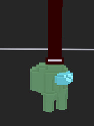
Those glass shard thingies that you have to pull out the right way! Or "stuck draggables" as I call them. The implementation is messy, but it works. Fun fact: Because of how the half-hidden aspect of them works, I can't place them too close together or else one can reveal the hidden half of the other. Well, I CAN put them close, I just have to mess with the settings. Anyway, it works! Barely!
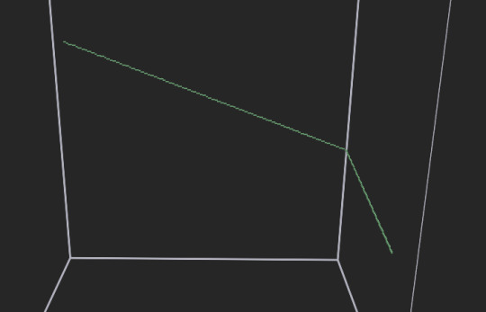
#original#trauma center recreation#definitely the messiest implementation so far#partially because of the half-hidden functionality and partially because i tried to reuse the code from gaping wounds#anyway the way the hidden-ness works is that they're set to only be visible if light is shining on them#and each one comes with a light over the top half#and when you pull it out it gets dragged into the light box#then once it's fully out it gets set to be always visible#and when dropped it turns the hidden setting back on#AND because the light box has to stay still while the object needs to move that made it messy#AND the light box needs to rotate and scale with the object#the way i did that is that they share a parent that determines initial placement and rotation and scale#and then the object can move independently#definitely the most complicated wound so far#i think i have all the wound types now. everything is just minor variations on the stuff i've already made#is there anything i've missed?
2 notes
·
View notes
Text
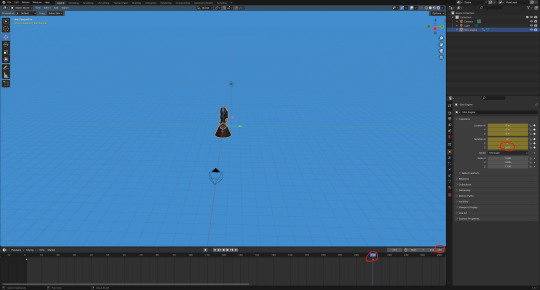
Making a rocket engine Pt3:
Next, I deleted the default cube mesh and imported the 'fbx' model.
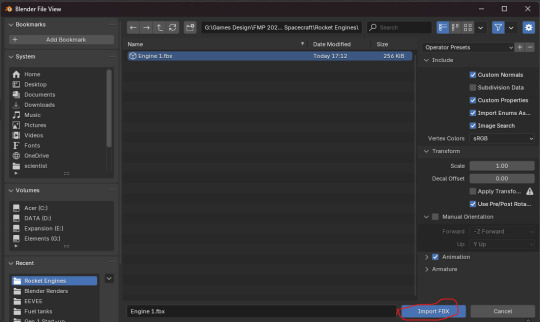
The problem here was that it didn't work. Worse still, is that it has imported the camera and light too. I then closed this file down and didn't save it. As a result I reopened the previous file.
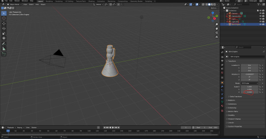
After that, I decided that I would have to squish the model for now. If I wanted to render it in Unreal Engine 5 at a later date, I could increase its height.
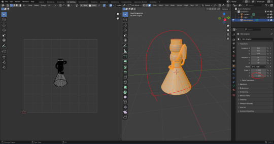
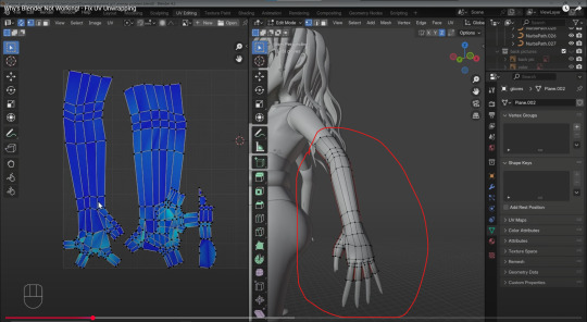
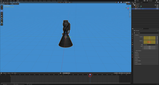
Here, I tried to unwrap the model again.
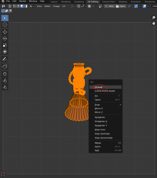
It then looked like this. I couldn't help but feel like it's not going to work.
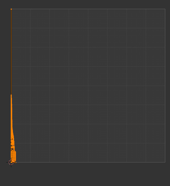
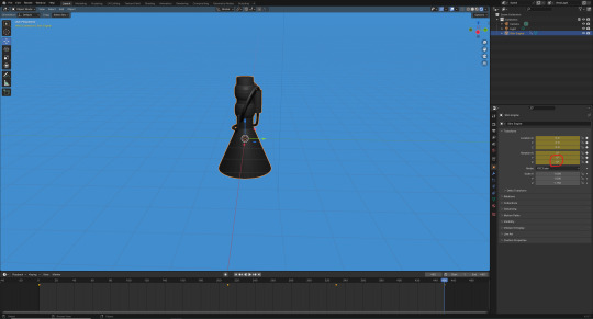
Here, I wanted to paint the model with a picture to see how good or bad the UV map is.
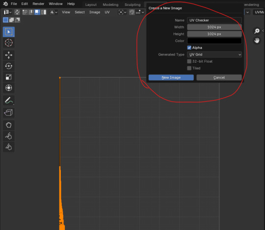
Next, I made a new material for the model and selected 'Image Texture' and then 'UV Checker'. I felt that the UV map looked terrible.

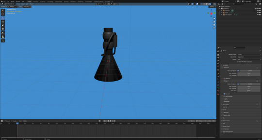
Meanwhile, I realized that I forgot to thicken up the walls of the engine nozzle. It was too late to fix it now. I would have to do that if I was to make a better version later into the project.

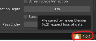
As I've opened the file up in blender on the college computers, I've found a warning notification. This is because I was using blender 4.2 at home whereas the college computer uses version 4.0.
On YouTube, I found another video that should help me.
youtube
I realized that in most of these videos, they create a UV map for individual objects and meshes instead of one big one.
I decided search on 'Microsoft Edge' if you have to UV map a model in separate meshes or as one mesh. I have circled a video that I could use for a future model.

One of the problems I gathered from the video is that I am probably missing seams in the model. I am now of the opinion that the current model has too many mistakes to be fixed. The complexity and the time it would take is getting out of hand. I feel it would be better to move onto a newer model and use a different method. As a result, I decided to close the file down and open up the older file which made the model as tall as I wanted it to be. From there, I added a material for the model and coloured it a dark colour that you would expect from a rocket engine. I had dragged the white dot down to make the mesh darker and increased the 'Metallic' box from 0 to 0.25.
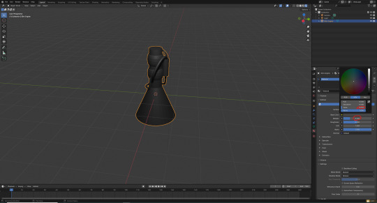
Here, I made a new folder and called it 'Blender Renders'. I then saved the file as a new one and called it 'Engine 1 -Render-'.

Next, I looked at an older blog post I made on tumblr. The post I looked at was one I was working on while developing the fuel tank model. I looked at the post to find a video that I linked that would prove helpful for changing the world colour without effecting the colour of my model.
youtube
First things first, I clicked onto the 'Shading' workspace tab.
Next, I selected 'World' and then added a new background shader. I clicked on 'Add', 'Shader' and then onto 'Background' to do it.
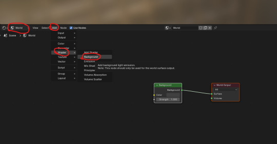
Here, I added a 'Light Path' and 'Mix Shader' box. After that, I attached them together.
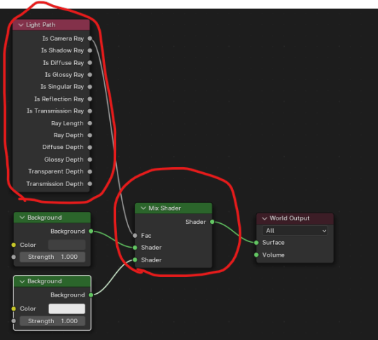
Next, I had set the background colour to a light blue colour.

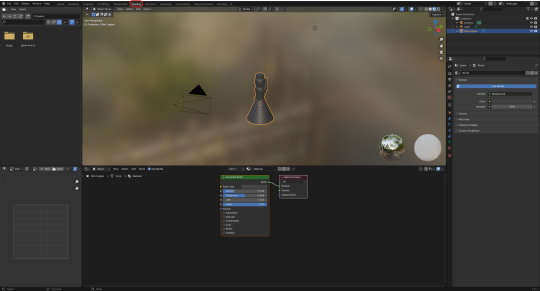
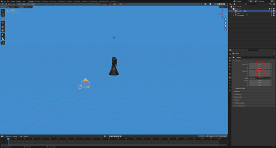
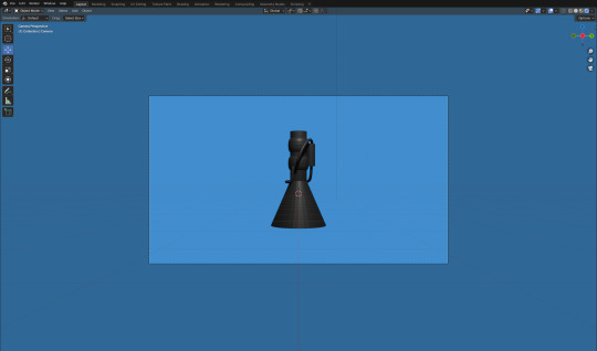
Here, I moved and rotated the camera until the engine fitted perfectly into view.
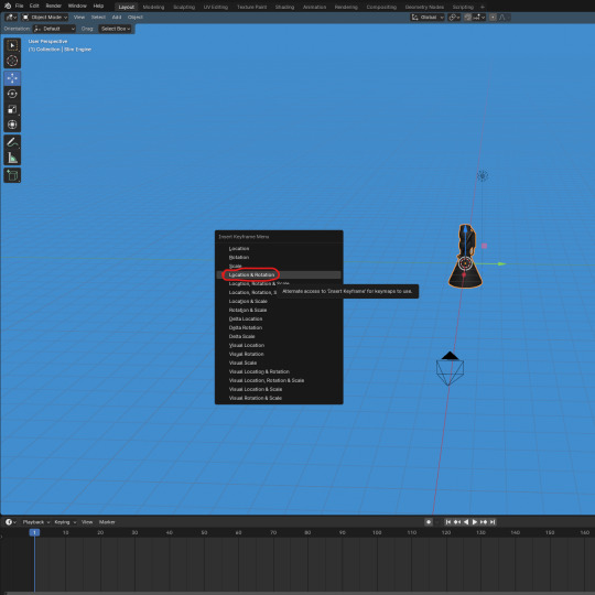
After that, I started to animate the model. Firstly, I needed to add the first key frame. The animation needs a first key frame to let blender know where to star the animation. I did this by pressing 'I' while hovering my mouse over the viewpoint. I then clicked onto 'Location and Rotation'. I wasn't going to change the scale of the model so I didn't click on the option that included scale.
Next, I increased the animation length from 250 to 450 frames. I also made it so that the model rotates 360' degrees on the 'Z' axis by the 210th frame. I then added a key frame.
Here, I set the model to rotate by 360' degrees on the 'Y' axis by the 330th frame.
Lastly, I set a key frame on the 450th frame that should rotate the model back to 0' degrees on both the 'Y' and 'Z' axis.
Once I had animated the model's movement, I wanted to experiment with how the model looks with blender's 'Cycles' render engine. I personally thought it looked no different. As a result, I set it back to the render engine, 'EEVEE'.
I was now ready to set up the render settings and render out the animation.
0 notes
Text
So, you want to build AI models that can detect enemy equipment, but you don’t exactly have a military budget lying around? What’s the game plan? Here’s a guide to building highly accurate AI detection models for enemy hardware - without breaking the bank.
By using synthetic data from 3D models, you can train powerful object detection models like YOLOv5 to recognize even the most elusive assets on the cheap.
When gathering real-world images is tough or expensive, synthetic data from 3D models becomes a game-changer for training object detection models like YOLOv5. Known for its speed and accuracy, YOLOv5 processes images in a single pass, making it ideal for real-time applications like video analysis and autonomous systems.
Using 3D models, synthetic images of objects - such as Russian, Chinese, and North Korean T-90 tanks (for example) - can be generated from every angle, under different conditions, and in varied environments. This flexibility lets YOLOv5 learn robust features and generalize well, even for highly specific detection needs.
Ultimately, synthetic data from 3D models offers an efficient, cost-effective way to build accurate, custom detection models where real-world data collection is limited or impractical.
Steps to Building Detection Models Using Synthetic 3D Images
1. Generating Synthetic Images from 3D Models
● Use a 3D graphics tools like Blender or Unity, to render images of the tank model from every conceivable angle. These tools allow control over orientation, distance, lighting, and environment.
● Render the tank against various backgrounds to simulate different settings, or start with plain backgrounds for initial training, adding realistic ones later to improve robustness.
● Add variety by changing:
■ Lighting conditions (daylight, overcast, night)
■ Viewing angles (front, back, top-down, low angle)
■ Distances and zoom levels to simulate visibility and scale variations.
2. Applying Realistic Textures and Weather Effects
● Apply textures (like camouflage) and surface details (scratches, wear) to enhance realism.
● Simulate weather effects—rain, snow, or fog—to make the images resemble real-world conditions, helping the model generalize better.
3. Generating Annotation Labels for Synthetic Images
● Use the 3D rendering software to generate bounding box annotations along with the images. Many tools can output annotation data directly in YOLO format or in formats that are easily converted.
4. Using Domain Randomization for Improved Generalization
● Domain randomization involves varying elements like background, lighting, and texture randomly in each image to force the model to generalize.
● Change the background or adjusting color schemes helps the model perform better when exposed to real-world images, focusing on the shape and structure rather than specific synthetic features.
5. Fine-Tuning with Real Images (recommended)
● While synthetic images provide a strong foundation, adding even a small number of real images during training can boost accuracy and robustness. Real images add natural variations in lighting, texture, and environment that are hard to replicate fully.
● For optimal fine-tuning, aim for 50–100 real images per tank type if available.
YOLOv5 URL: https://github.com/ultralytics/yolov5
Oh, by the way... the video is just one of 365 different rotations for this background and lighting.
0 notes
Text
Development Project 01: Nostalgia and Memory. (Update 2.0: Modelling)

Figure 1: Models for Rifle and MG munition crates, Landmine and Empty Bren light machine gun model.
I started modelling the smaller objects such as the munition crates, the landmines, and the empty magazines. Majority of the object uses the same work flow. Hence, I will use one of the assets to describe the modelling workflow. Depending on the object, if its based shape appears to be a rectangular shape, a box object was utilised or its based shape appears to be a cylinder then it a cylinder object was utilised.


Figure 2-3: Rifle munition crate model (Left) and real life replica of said model (Right) comparison.
When modelling any of the object, research were done to gather real life reference to make the object as historically accurate as possible. After these references were obtained, it was constantly referred during the modelling process to create believable objects. The mirror modifier was utilised to make all corners look the same, so I only needed to edit the model's vertices or edges on one side instead of repeating the same changes on each corner. This also helps prevent the risk of forgetting to edit a specific corner or making a mistake that goes unnoticed and unfixed. Parts like the handles and the side handle-like locking mechanism are modelled as separate objects and will later be combined with the main object, which is the crate. Parts that appears to be extruding out the real life object were extruded on the model.
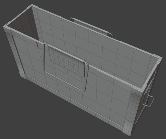
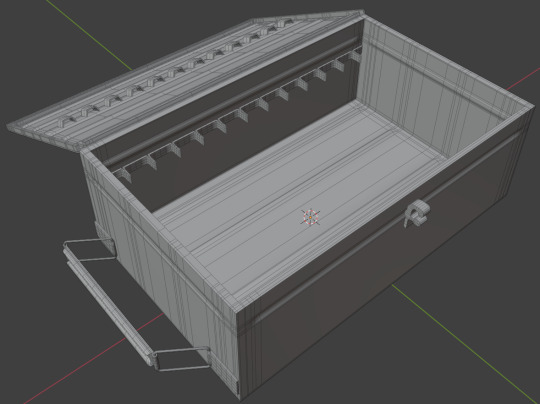
Figure 4-5: Open-lid design of rifle and machine gun ammunition crates.
The crates were designed to appear as though the lid is open, either because all the munitions have been removed or to make it easier for soldiers to quickly grab the ammunition they need.

Figure 6: UV mapping in Blender.
The model was UV unwrapped in Blender by marking edges as seams to guide the software during the unwrapping process. Seams were placed to ensure that textures align logically and believably, with certain faces grouped to maintain proper orientation, such as forward-facing surfaces. Smaller, less detail-intensive parts of the model were scaled down in the UV map to prioritise higher resolution textures for larger, more prominent surfaces.

Figure 7: Using UV checker textures to check UVs
Lastly, UV checker textures were applied to check if the UV appear accurately and not stretch. As all these smaller objects are far from the camera, they were not given too much attention to save time to model other objects in the scene.
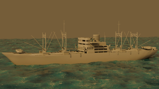
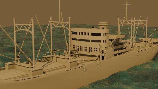
Figure 8: Awazisan Maru (淡路山丸), Japanese troops transport ship.
After receiving advice from Mr. Wayne to focus on creating larger assets before moving on to smaller ones, I shifted my attention to modeling the destroyed battleship. A modular modeling technique was employed, as the ship features many repeated elements. A total of 14 distinct parts were created and duplicated multiple times to assemble the final structure of the ship. The model was designed with less emphasis on fine details since it will be placed far from the camera and depicted in a destroyed state.
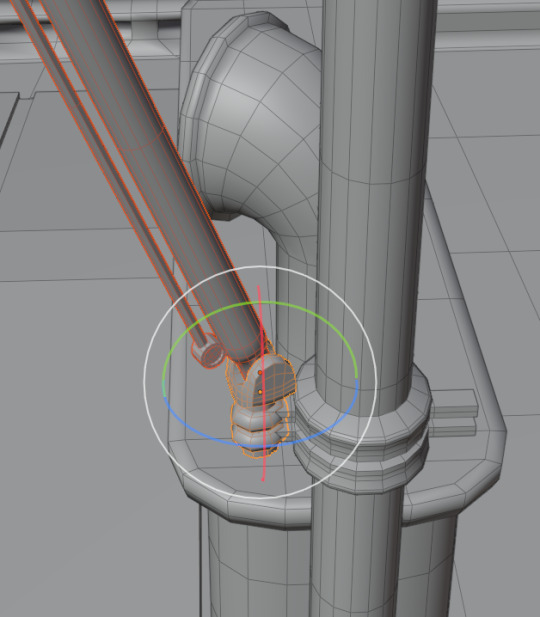
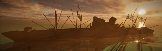
Figure 9: Ship Crane design. (Top) Figure 10: Imported ship into Unreal Engine. (Bottom)
The crane and the joint connecting it to the main support are modeled as two separate pieces to ensure the rotation looks believable. This design also allows the crane to rotate more freely, enabling unique rotated appearances, as shown in Figure 10.

Figure 11: Low and high poly version of the bunker wall.
Following Mr. Neil's advice to soften the sharp edges of the bunker walls, I applied a multiresolution modifier to the bunker and subdivided it multiple times to increase the polygon count. This allowed me to sculpt realistic concrete details, smooth out overly sharp edges, and add logical signs of wear and human impact, such as damage around the bunker’s firing holes where soldiers would rest their rifles or machine guns. Both low-poly and high-poly versions of the bunker wall were created to enable normal map baking. This process transfers the high-poly details onto the low-poly model, creating the illusion of a highly detailed surface while maintaining optimal performance.
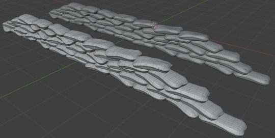
Figure 12: Low and high poly version of the linear sandbag emplacement.
Mr. Neil also advised sealing the gaps between the sandbags to prevent sunlight from passing through. To address this, a flat plane was placed within the linear sandbag emplacement to cover any potential openings. During this process, I noticed that the sandbags appeared unrealistic and overly flat. To enhance their believability, I used the proportional editing tool to adjust the shape of individual sandbags, pushing and pulling specific areas to create a more natural and logical appearance.
1 note
·
View note
Text
Voxels
A voxel is a volumetric pixel, meaning it is 3D rather than 2D.
MagicaVoxel is a program used to create models using voxels. These are the tools we are provided with.
Geometry mode creates lines across the box. These lines, while they look like they're straight across at first, are not as they have to attach to each wall.

You can also make shapes as well as deciding on if they should have a filled centre or if they're fully even.
Voxel mode works similarly to a paintbrush, allowing us to paint voxels where we need them.
You can also change the amount of voxels the brush uses and if its a circular brush or square.
The face mode works as a way to extrude. By clicking on a face, the face will increase by one voxel. It can also be held and dragged to create a bigger extrusion.
You can make it so the extrusion is the same colour as the palette or the voxels behind it as well as making it abide by one colour or just the geometry.
The box mode is pretty self explanatory, with a box being created where the mouse is dragged to and from.
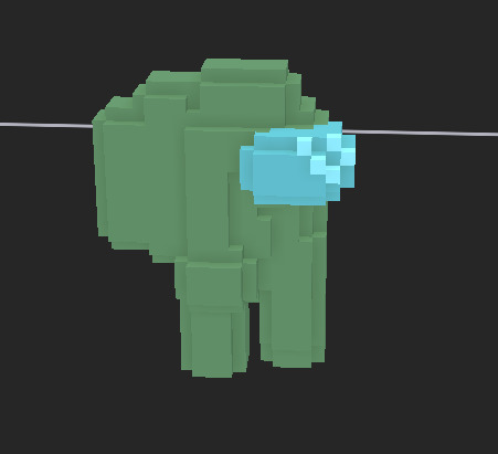
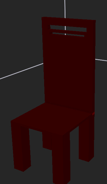
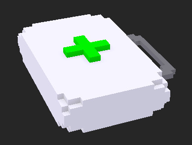
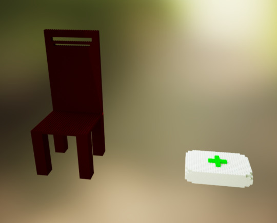
To practice with these tools, I'm going to make a chair and medkit just like in Maya.
Chair:
I started with four squares to act as legs.

I then used the attach tool to extrude them upwards.

I then created an outline of the seat by using the geometry lines and extruded the middle so it was full. I also added a different colour where the back rest is going.
The reason its a different colour is so that I can extrude it easily.
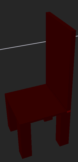
I then added a cutout in the back just like the Maya chair had.
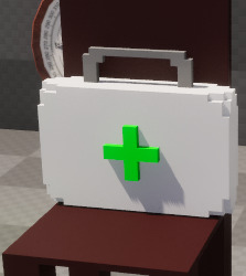
Medkit:
I began my medkit by using the box tool and the extrude tool to make a box suitable for a medkit.
I then added a handle using the paint tool and the extrude tool.

Next, I painted the plus sign on that is normally used on medkits.

To give the medkit a bit of depth, I used the face mode to extrude the plus sign out by 1 and i carved out the corners of the medkit using the paintbrush tool.
Render mode:
We can also render them in an environment to see how the assets would look using proper lighting.
To import these, we need to first export them as an OBJ file.

When exported, we will be given 3 files: the OBJ, the palette and an MTL file. We have to group these in a separate folder for the export to work correctly.

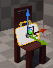
We can then drag the OBJ file into Unreal and scale it up (25x).
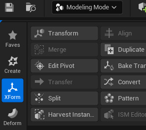
Because the pivot is not in the right place for my objects, rotating and moving them is hard. This can be fixed by entering modeling mode and using XForm.
We can then use edit pivot while having the correct object selected to change the location of the pivot.
Maya vs MagicaVoxel:
Overall, I think that MagicaVoxel is a very useful and intuitive software and I would love to use it in a future project. However, the limitations that come with the software (unable to create the level of desired detail) combined with the more elaborate exportation method that didn't work the first couple of tries, I will be using Maya over MagicaVoxel for this project.
0 notes
Text
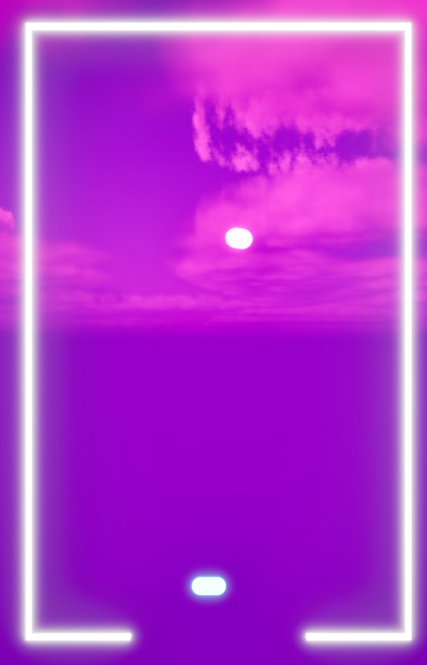
Creating a Brick Breaker Game (1)
Setting up the Project

This is just a new blank project that I've created a new level in and changed the colour of the level and its lighting.

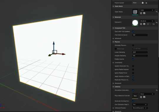
This is the material I'll be using for the object in the brick breaker, for example the ball.

The material instances come off the original material I previously made and are the colours of each object that'll be in the game; the bricks have remained white as they'll eventually have a colour change to show when how many times they've been hit before they break.
Creating The Bat
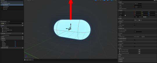

Added a capsule collision to act as the bat, along with the material I made for it and set the rotation on the Y-axis to 90 degrees. That was the arrow is pointing up which is the the right way we want our ball to travel.
Adding Movement

I used a timeline node and added a float track and used it to put in the starting position of the Bat in order to control the the Bat's location along the spline component.

finished product^^
Input Setup

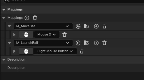
I created an input mapping along with two input actions in order to be able to add controls for the bat to move along with launching the ball.


The reason we are using Custom Events for this rather than connecting them directly is because we are also going to set up some logic to adjust the sensitivity of the mouse and this will make that process easier.


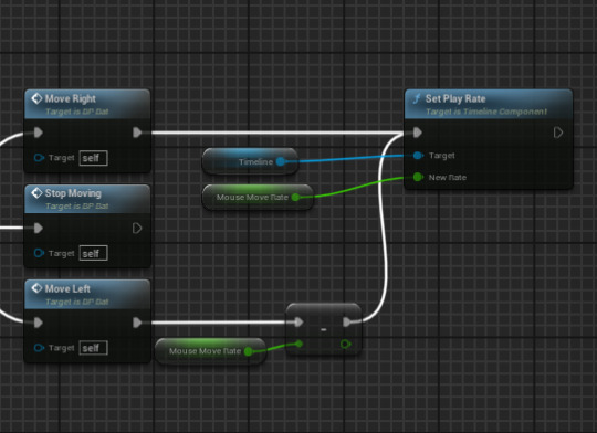
This will work but only for MoveRight, for MoveLeft to work I had to add a negate node and connect that to the set play rate. Now the bat should move left to right.

When I tried testing the movement, the bat didn't move at all so I went back to see what had gone wrong.

I then realized that I hadn't set my Mapping context to the right one, so after I did that it ended up working and moving.
The Ball

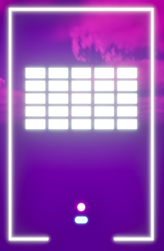
Before making the ball I first added the arena^^

To give the player a clear view of where the ball would launch from I added a sphere onto the Bat actor (shown in image above). I then set it's scale and the material to match the ball actor along with setting the collision to no collision so that it wouldn't effect anything, like the ball moving.
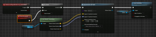
Once that's done I got another reference to the sphere component and placed it after the spawn actor node, dragged of sphere reference and search for set visibility and unchecked it. That way once the ball is launched the sphere set to the Bat actor would disappear.

This code allows the ball to reset and the sphere to become visible upon resetting.
Death Box

The top code sequence allows the game to reset without needing to also resetting the entire map with it and the bottom one makes the ball reset once its entered into the death box below the gap, making the game reset.

Death box place under the gap where the ball can potentially fall through, I've placed it very close to the opening so that the player doesn't have a problem with delay of resetting and it instead instantly resets; meaning the player can carry on with the game straight away.
The Bricks
Making the bricks, along with adding the material for them.

This code means that the blocks are destroyed once they're hit by the ball.
0 notes
Text
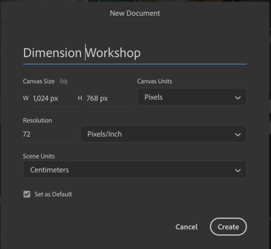
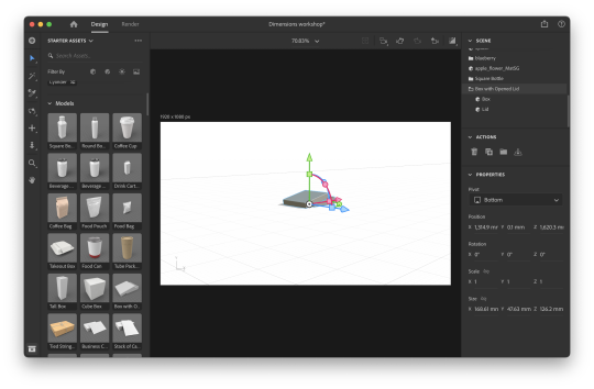
Dimensions workshop
Step 1 - Set up the document
This is similar to most other adobe files however I did find it strange than the scene units can be different from the canvas units. Therefore, I will need to double check these units if I use dimensions in the future.
Step 2 - Insert object - scale, rotate and move
Using the arrows I found it easy to manipulate the box into the place and size I wanted.
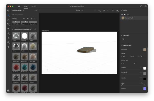
Step 3 - add materials
To make the box more realistic, I found adding materials easy and useful. I like how I was easily able to switch materials, making it easy to test different materials if I was to use this in a future project.
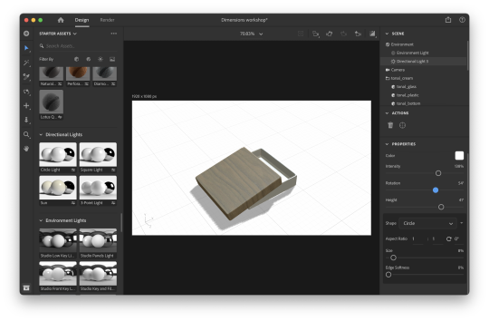
Step 4 - add lighting - scene and directional
I found this quite hard because the lights layered. This made it easy to make the scene too light when trying to test different settings. However, I did find it useful to add realism to the scene. Therefore this programme may be useful for creating quick mock ups of photographs for websites, print and assets.
Step 5 - add decals
I found this quite useful because I found that I could quickly add logos, details and patterns. I also liked how I could easily experiment with scale and location.

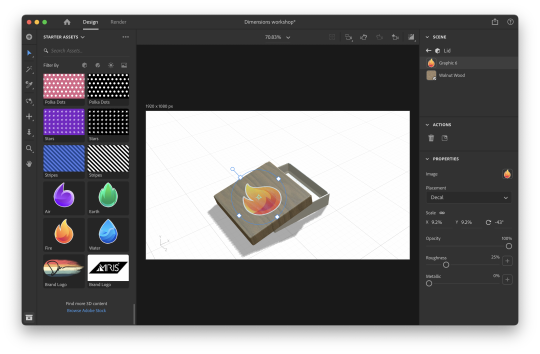
In conclusion, I found dimensions was useful for visualising a photograph or 'scene. Based on my experience, I think I could use this software to create packaging mock up or quickly add logos, and branding guidelines to different merchandise and locations to show how it could work in the real world.
0 notes
Text
Get Started with Maya Animation
Maya is one of the leading 3D animation and modeling software packages in the industry, widely used by professionals and enthusiasts alike to create stunning visual effects, character animations, and more. If you're eager to dive into the world of Maya animation, this guide will help you get started on your journey to creating impressive 3D animations.

What is Maya?
Autodesk Maya, commonly referred to as Maya, is a powerful 3D computer graphics application that provides a comprehensive suite of tools for 3D modeling, animation, rendering, and visual effects. It's an industry-standard software used in film, television, gaming, and various other industries to bring digital creations to life.
Installing Maya
To get started with Maya, you'll first need to obtain a copy of the software. Autodesk, the company behind Maya, offers a free trial version on their website, which allows you to explore the software's features and capabilities before committing to a purchase.
Visit the Autodesk website (www.autodesk.com) and navigate to the Maya product page.
Download the free trial version.
Follow the installation instructions provided on the Autodesk website.
Keep in mind that Maya is a complex software with a steep learning curve, so don't get discouraged if it feels overwhelming at first. Learning to navigate the interface and understanding the basic terminology is the first step.
Exploring the Maya Interface
Once you've installed Maya, launch the program, and you'll be greeted with its user-friendly interface. Familiarizing yourself with the interface is essential before diving into animation.
Key Interface Elements:
Viewport: This is where you'll see your 3D scene. You can navigate and manipulate objects in this space.
Shelf: The shelf contains various tools and shortcuts for modeling, animation, rendering, and more.
Time Slider: Located at the bottom, the time slider allows you to scrub through your animation timeline.
Attribute Editor and Channel Box: These panels display information and properties of selected objects, allowing you to make adjustments.
Menus: Maya offers a comprehensive menu system with various options and settings.
Starting Your First Animation
Now that you're familiar with the interface, it's time to start creating your first animation. Here's a basic step-by-step guide:
Create or Import a 3D Object: You can either create a new 3D object within Maya or import existing models from other software.
Set Up Your Scene: Adjust the camera view and lighting to frame your scene as desired.
Keyframing: The heart of animation in Maya involves setting keyframes to define the position, rotation, and scale of objects over time. Select an object, move the timeline to the desired frame, and use the keyframe commands to record its position.
Timeline and Playblast: Use the timeline to navigate through your animation. You can also use the playblast feature to preview your animation as it will appear in the final render.
Refining Your Animation: Maya offers various animation tools and techniques to refine your animation, such as curves, constraints, and more.
Rendering: Once you're satisfied with your animation, you can render it to create a final video or image sequence.
Learning Resources
Learning Maya can be a challenging but rewarding experience. Fortunately, there are numerous online resources available to help you along the way:
Official Autodesk Maya Learning Hub: Autodesk provides extensive tutorials and documentation for Maya on their website.
Online Courses: Websites like Udemy, Coursera, and LinkedIn Learning offer comprehensive courses on Maya animation.
Community Forums: Websites like Autodesk's Maya forum and CGSociety are excellent places to ask questions, share your work, and learn from experienced artists.
Books: There are also many books dedicated to Maya animation and modeling, both for beginners and advanced users.
Remember that becoming proficient in Maya takes time and practice. Don't be discouraged by initial challenges, and keep experimenting and learning to develop your skills.
In conclusion, Autodesk Maya is a powerful tool for 3D animation and modeling with a wide range of applications. With dedication, practice, and the right resources, you can unleash your creativity and bring your 3D animations to life. Enjoy your journey into the exciting world of Maya animation!
0 notes
Text
PART 2 OF THAT ASK
this is going to be long sorry. some blender things i want to share for absolute beginners from my perspective of someone who is still a beginner. under cut!
NAVIGATING THE VIEWPORT is done by holding down middle mouse button (to rotate your view), and [shift] + middle mouse button (to move around). if you dont have a 3-button mouse, go to edit (in the top left-ish) -> preferences -> input -> tick the box that says ‘emulate 3-button mouse.’
THE TABS AT THE TOP (layout, modeling, sculpting, animation, etc) are not all 100% necessary! esp at first! one of them is for writing in python scripts! you dont need that probably! dont worry if some of them are scary at first, just dip your toe out when you feel comfortable. i use the ‘layout’ and ‘shading’ tabs the most, and usually dont do much else unless i want to add post-processing effects in the compositing/compositor tab.
YOUR HIERARCHY is the list of things in the top right, itll usually start out with a camera, a light, and a cube. they have little symbols by them. you can rename things in the hierarchy by double-clicking them, or pressing [f2]. the [f2] to rename thing is helpful in programs besides blender, btw. you can make ‘collections’ in the hierarchy by right-clicking and adding a new collection. you can rename that as well. things can be dragged into collections, and this all just helps keep it nice and organized. it wont kill you to not do hierarchy upkeep, but its a good habit for future more complicated things.
BELOW THE HIERARCHY is a thing with LOTS of tabs on the side, each tab having a little symbol on it. you can ignore most of them and branch out when you feel more comfortable. the most immediately useful one is the blue wrench, or modifiers. there are many types of modifiers! dont be scared. you can learn them as you go. i dont know what all of them do. i like array, though, and boolean, and mirror. there are many more that you can play around with to see what happens!
MODIFIERS are applied to objects, in object mode. switch between ‘object’ and ‘edit’ mode by pressing [tab]. if you add a modifier to an object and switch to edit mode, you wont be able to edit the modifers ‘results’ (ex: an ‘array’ modifiers adds a line of copies of the modified object, so you wouldnt be able to change any of the copies), but, if you edit the modified object, the results will reflect that. you can ‘lock in’ the modifier by [tab]’ing to object mode, clicking a little drop-down on the modifier, and hitting apply. this ‘solidifies’ the results, and they can now be edited like your initial object, which now has no links to the results.
OBJECT MODE is the mode you want to be in when repositioning your objects, and adding new objects to the hierarchy. operative word there is hierarchy. you can add new objects ( [shift] + [A] ) while in edit mode, but they wont show up in the hierarchy as a new, capital O Object. if you select a cube, go into edit mode, and make another cube, those two cubes are counted as the same ‘object’ by the hierarchy, and will be connected as such when youre in object mode. you can separate geometries like this by selecting the secondary cube (all of it!) (usually [A] works for selecting all of it but since you want only one of the cubes you should shift-click all the faces or go into x-ray mode and drag-select everything) -- and pressing [P]. this brings up a menu, where you can click ‘separate by selection’ - and whapow, that errant cube is now its own Object. this is important, for, say, instances where you make an entire room while in edit mode (accidentally), and so everything is mashed together as a single Object in object mode. unhelpful if you want to reposition the couch ‘object’ easily!
HOTKEYS are the best. press [G] to move, and while moving, you can press [X], [Y], or [Z] to lock that movement to a certain axis (x, y, or z). same with scaling with [S] and rotating with [R] -- using the x y and z keys is very helpful. also, while rotating with [R], before you lock-in your rotation by left clicking, you can type in a specific number to set the degrees to. like. click to select -> [R] -> “90″ -> click to set. now it is turned 90 degrees. easier than eyeballing. [crtrl] + [R] (in edit mode) will add EDGE LOOPS to your object. theyre helpful for adding extra segments and stuff. play around with it. use the scroll wheel while placing said edge loops to add more of them, and you can [S] or [G] while doing this as well. play with it! extrude with [E] is one of my favorites. it creates a new face and pulls it out of the existing geometry. be careful to not hit [E] and forget you did that. it can clutter the geometry by leaving unseen extrusions. hit [E], then either [G] or [S]. or [G] and then [S]. so on and so on. or [R]. the world is your oyster. press [alt] + [E] for a little extrude menu, which can be helpful if youre trying to extude, say, different faces on the same cube at the same time. regular [E] will kind of mangle it, so [alt] + [E] -> extrude along normals, or extrude individual faces. play with that to see the difference between them
SWITCH BETWEEN MODES -- as in, vertex, edge, and face mode -- by pressing [1], [2], or [3] at the TOP of your keyboard. not the numpad the numpad is for other things. i like face mode the most, but using all of them is most helpful. you can scale and rotate edges and faces, but can only move vertices. [shift] lets you select multiple at once, and so does [ctrl], but [ctrl] selection will select anything between point A and point B. sometimes you want this, sometimes you dont, and sometimes it does it wrong. while im thinking about it, you can also select edge loops (remember?) with [alt] + [shift].
ORTHOGRAPHIC VIEW is the last thing ill mention. if you have a numpad (unsure what you do if you dont. um. look it up), press [5] to change to orthographic view. this is helpful for aligning stuff without locking to x y or z. play with it.... and switch back with [5]
theres more but im getting tired so i hope this helps!
7 notes
·
View notes
Text
Dance of the Spheres Chapter 5: Martian March
Chapters: 5/?
Fandom: Marvel Cinematic Universe
Rating: PG 13
Warnings: drugging, kidnapping, forced marriage
Characters: Loki(Marvel),
Additional Tags: Loki Goes Overboard, But When Doesn’t Loki go Overboard, Mature Reader, Disabled Reader, Political Intrigue
Summary:
I'm going back to Saturn where the rings all glow
Rainbow, moonbeams, and orange snow
On Saturn, people live to be two hundred and five
Going back to Saturn where the people smile.
Saturn-Stevie Wonder
our rooms glittered. They were faced in massive scale pietra dura stone patterns from floor to ceiling. Gray, black, and white dominated, with a surprising amount of green mixed in, as well as startling pops of orange-red, blue, yellow, purple, and bright pink.
The designs were large and geometric, almost a sister style to the classic Art Deco that you saw on the older buildings downtown, mixed in among the flavorless glass towers and Brutalist boxes that defined the 'modern' era.
This main room housed a delicately carved stone couch and chairs, around a low stone table, and several stone shelves and storage boxes. These were all made of a black stone that held numerous yellowish-green crystals in their matrix, all polished so that the crystals shimmered.
This same stone appeared in the patterns on the walls and floor, as very thin panes on a pale backing, highlighting the colors of their crystals. This, along with a similar black stone with reddish-orange crystals, and a dark gray, large-grained stone that sparkled at any angle, was contrasted against the now familiar creamy white and pale orange. Here and there, inlays of silvery wire brought organic shapes to the mix.
The cloudy crystal made a reappearance in a round, well-lit, domed room Loki described as a 'Solar', even though no sun could reach this place. Instead, the clearest of the crystal had been set into the dome, all of it covering the mysterious lights, creating a bright light source that illuminated the room to something close to midday. The walls were covered in the cloudy crystal, which, in the bright light, shone with veils and flashes of iridescent blue.
On one wall there was a subtle inlay of translucent gray stone, in the shape of clouds, that shone in splashes of blue and purple. Cleverly inlaid within them were specific pieces of the same type of stone, in the shape of lightning bolts that sparked yellow when viewed at the right angle, but were invisible from others.
He showed you the antechamber that connected your rooms and his, all in black and green. Even the lights were covered in thin panes of green crystals thickly packed in black matrix, casting a dim, viridian light over the whole chamber.
You decided that room was extremely creepy, and you never wanted to be in it.
The bath room was much better, ridiculously large, with a shower just out in the open, a wide counter with a mirror of polished metal, a huge tub carved right into a semi-finished block of stone, and a strange toilet tucked away in a stall in the corner. It was all big enough for you to move around in easily, though you mentioned that you would need a chair for the shower. Loki vowed to have one brought immediately.
But your bedroom was the obvious jewel. Loki puffed up with pride as he showed it off, as if he were the one who designed it. There were jewels in here, bright, bubblegum pink, golden yellow, and apple green in elaborate platinum settings, affixed to the walls. There was more cloudy gray and white crystal in here, with their blue and purple, pink and yellow flashes. The lights were clustered around the ceiling like stars, and the bed was another of the precious rare wooden objects, a four poster canopy bed, draped with a gauzy veil.
Most surprising of all, the bedroom had a window-or rather, a doorway out to a semi-circular balcony that overlooked what must be the main palace courtyard and entrance. When you stepped out onto it, you could see lines of guards-more people than you'd seen in one place since you'd been here. They framed the long, rectangular space every ten feet or so, in bright, brassy armor and sunny yellow capes.
This was clearly a cape kind of place.
It was very strange. You could have sworn you hadn't climbed any ramps, and you certainly hadn't gone up any stairs, but here you were, at least six stories up, and there were more stories above you.
“You must be clever builders.” you said without thinking about it.
“Our engineering capabilities are the envy of the galaxy, it's true.” Loki boasted. You believed him. All around the courtyard more balconies jutted out. Several dozen feet to the side of yours, the balcony you assumed must belong to Loki was connected to another large balcony on the opposite side by an elegant walkway, supported by slender pillars. There was a round platform in the center, and red curtains obscured the balcony on the other side.
“We can address large crowds from there, or call emergency meetings of the guards, or the other high nobles.” Loki said, following your gaze. “That's who lives on this floor. Myself, my brother, all of the most important Asgardians, and now you.”
But not for long, if you had any opportunity. “Uh, I'm honored.”
“How do you like them, though?” he pressed, “Is the décor to your liking? The size? We've been working on it for months, but we can still change things if you need.”
“Months?” you gasped, shocked. “You guys did all this in just months?”
Asgard had come to Earth a little under two years ago, decimated and begging for assistance. Thor led them, but no one knew Loki had come along. Thor himself served as his own liaison to the United Nations, bringing his case before the leaders of Earth, to secure a place for his people.
Obviously, it had worked. Thor's reputation and high-profile friends, as well as his surprisingly diplomatic and optimistic outlook had both charmed and discombobulated most people who spoke to him. People liked and respected him, but no one expected him to be savvy.
It had worked out very well for him and his people. They had secured some secret land that the entire U.N. had remained tight-lipped about. Then, a few months in, Thor had stopped making appearances, leaving Earth-Asgard relations to his advisors; an abrasive, undiplomatic woman whom you loved to watch, and a stoic and imposing man with unsettling eyes. Rumors flew for a while, but you hadn't paid much attention. There had been so much to fight for at home.
Did anyone even know you were gone? You were supposed to attend a march tonight. Or last night? You didn't know how long you had been asleep. Surely someone noticed you were missing.
But if they did, how would you even know?
“-harness the sun's energy over the long rotation period so that we can build even more efficiently.” Loki was saying. “We've done an admirable job for such a reduced population, but there is so much more to do.”
“And you took them away from that to build this for me?”
“I took them away from this to build special chambers for the princess of Asgard.” Loki corrected, “It was not a waste, nor was it superfluous. It was for someone important.”
“I'm not.” you insisted, “I'm just some rando they snatched up and tossed at you. I'm not princess material.”
“I will find out what is behind this.” he said, “But until I can, I want you to feel comfortable here. This is all yours now, and more.”
You couldn't, you couldn't allow yourself. You weren't supposed to be here. It was only a matter of time before this mix up was discovered, and a swap was arranged. You'd go home, and some other woman would take your place.
How horrible.
“But is everything to your liking? Do you need more light? More space? Is the bed all right for your leg? A good height?”
You were more than a little wary about getting into bed with him here, but as you hobbled over to it, he remained at a distance. You sank onto the plush mattress, with it's silky green sheets and thick comforter. It was very nice, soft and smooth, and warm, despite being placed on solid stone. Hopefully the blanket would ward off the slight chill that followed everywhere you had been so far.
“It's a good height,” you said, “especially if I get a new cane.”
“Excellent. Would you like to see my quarters?' he asked, “You may come and go between them as you please.”
Which meant that he could too. You didn't find that reassuring.
“Uh...isn't that, um, inappropriate?” you asked, casting about for any reason to refuse. “We haven't even, um, there hasn't even been a wedding!”
He paused, then his face broke into a beautiful, glowing smile. “Of course. I understand. You want that big celebration, naturally. Well, it is only fair, isn't it?” He sat down on the floor next to your bed, as if forgetting that he was a prince and a god, a powerful figure, abandoning his dignity to sit on the floor like a child.
“Do you want to plan it, or leave it to the advisors? Asgard is very good at grand weddings, but if you've had some specific plan for it, I'm sure we can accommodate it.”
“Uh...” This would be the perfect opportunity to stall. You could buy so much time with this! “I would like to plan it. There's things I've been wanting to do since I was a little girl. It would be a dream come true, to plan my own wedding.”
Not strictly true. Certainly, as a little girl you had contemplated flowers and a dress. There being a groom was far less important.
“Then begin any time you like.” Loki said warmly. “I'll have notebooks brought to you, and you can plan out whatever you want. Whatever it is, we can do it for you.”
You almost felt bad for what you were going to do, but on the other hand, you didn't trust him and his terrifying adoration, and horrible power over your life and safety. You'd make as many impossible demands and take up as much time as you possibly could. If it kept you safe. If it kept you from the nightmare scenario.
“I will have your bathing chair brought. You seem tired; shall I have dinner brought to you? We can dine in your audience room. We can have you measured for a new prosthetic, and for a new cane as well. The artificers will set to work on them immediately.”
“Um, sure. That sounds fine.” Dinner would be welcome, after only one apple and one cup of water. And a new, higher tech leg and cane might help you escape faster. You should take every opportunity available to you.
Loki helped you out to the largest room, with it's bookshelves and seating, and saw that you were comfortable. Then he bid you stay put and wait for a bit, while he got everything set up. You were in no shape to try for an escape right now; you would just bide your time.
You waited patiently, taking in the details of the beautifully precise stonework that made up your new-temporary-living quarters. What incredible workmanship. Shame it had been wasted on you.
Maybe someone else would have been thrilled. To have wealth and power, security and luxury, a handsome prince just handed to them with no effort on their part at all. That wasn't what you wanted though; you didn't want to join the lucky ones. You didn't want to be lifted out of your hardships and set above your peers, you wanted those hardships to be eliminated for everybody. You didn't want to be a social climber, you wanted a more equitable society. This fantasy was worthless to you. It had all been done without your consent.
A quiet knock on the door grabbed your attention. You didn't answer immediately, and the knock was hesitantly repeated.
“Um, come in?” you called.
The two adolescents you had run off before cracked the door open and peeked their heads in.
“Your highness?” the girl asked.
“May we enter?” the boy finished.
“Yeah, come in. I'm in a better mood now.” you said calmly. No need to be rude to them now that she knew what was going on. If Loki hadn't even known about the kidnapping, there was no way these kids were in on it.
“We were sent here to get measurements?” the boy-Andvarri wasn't it-asked shyly. “For a prosthetic leg, and a cane?”
“Yes, I was told you might be coming. I'm sorry about earlier: I was very disoriented and confused.”
“No harm done, your highness. This won't take long.”
The girl-Bjarkehilde-helped you stand as Andvarri took several measurements and asked about your preferences in weight and materials, flexibility and points of articulation, even colors and decorations.
They were going to put in a lot of effort to help you escape. A fine efficient leg, a sturdy lightweight cane, and Bjarkehilde even asked about what kinds of medication you needed, and for what.
Bjarkehild was surprisingly close to your height and build as well. That stayed in the back of your mind for a while after the two of them left.
As the minutes passed, you began to realize that you were going to need some kind of clock. You had no idea what time it was. There was no visible sunlight, the lights in your rooms hadn't changed at all, and no one had mentioned it at all. How did the Asgardians know? Was some kind of internal timekeeping part of their natural abilities?
Maybe it was the nebulous grasp of time, maybe it was the fading adrenaline and setting in of weariness, maybe it was residual drugs working their way out of your systems, but you began to feel strange as you waited for Loki to return. Either you felt hot, or the slight chill that was prevalent in this place was getting worse. Perhaps you had been staring at the artistic walls for too long, because the colors seemed to be vacillating between painfully saturated, and fuzzy at the edges.
It seemed to take forever for Loki to return, carrying a tray of food and drink. This he set on the lovely stone table before you, and then took a seat in a nearby chair.
“You must be ravenous by now.” he said, and you were. You leaned forward to inspect the offerings. The metal tray was filled with small stone bowls and plates, and two small cups of liquid. Was this how meals were traditionally served in Asgard? A great variety of small portions?
One of the cups turned out to be orange drink, from powder. You recognized that taste from your childhood. The dry air had made your tongue rough, and the acidic flavor was a blast on your tastebuds, as bright as the colors on the walls. The second cup was some kind of brown broth, possibly also from powder, as it got thicker at the bottom of the cup. There were dried apricots, soaked in honey, and dates, a barley porridge with a swirl of honey and a dash of cinnamon. There were common Saltine-type crackers that went with a very strange stew that looked like it was made, not just with re-hydrated vegetables, but re-hydrated meat as well. It tasted fine, but the texture left something to be desired.
You barely noticed. You wolfed it all down as Loki just sat and watched, having brought nothing for himself.
“I see you needed the fuel.” he commented, after every bite was gone. “Yes, I think you will need it. Beloved, I must tell you something about that apple you ate earlier. I can see it's effects are starting to take hold. Like I said earlier, I had thought to feed it to you slowly.”
“The apple? What...what's it doing to me?” Beloved? He was taking things a bit far, wasn't he? But you definitely were feeling weird. Uncomfortable. “I had just woken up and I didn't know where I was, or what was going to happen. I didn't know where my next meal was coming from.”
“And I understand that now, as I did not then, or I would have refrained from putting it out at all. But it's too late now. For several things. We will simply have to adapt and endure.”
“Endure?”
“I will not leave your side, you may count on that.” He promised. “But that was a special apple. Its tree came from a cutting, taken from a remnant grove in Vanir territory, as part of their peace treaty with us. A sacred tree whose fruits provided the Vanir with ageless warriors. For us, they heal terrible wounds and sickness. But for you, they are known as the Apples of Immortality, and they confer a great gift indeed. But it is not without price.”
You doubled over in pain.
10 notes
·
View notes
Text
How to render in blender for cc previews..etc..

Hello everyone! So @sikoi asked me to do a tutorial on how I got one of my recent “WIP” pictures, so here it is !! So this might be a little long ! First this is something you can use to display your cc, or if you just want to build fun sets (that's more advanced but you get what I mean). P.S: You need some understanding of blender to be able to do this successfully.
What I am using:
Blender 2.82 or any of the 2.8’s (2.80, 2.81..)
Now, I am using the more recent version of blender because it renders images more smoothly and it helps me get a mannequin “skin” look. I tried using the later versions of blender and I came out with this:
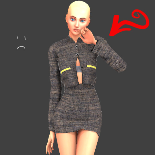
Not what I want but doesn’t mean the picture isn’t nice.
Ok enough rambling here’s what to do.
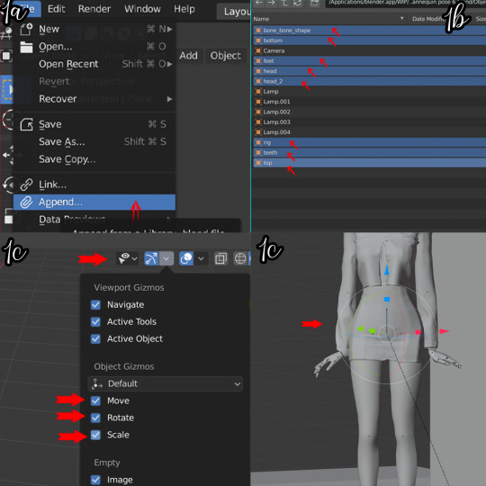
STEP 1: Adding your mannequins
First you make your poses, I have attached 3 different poses so you can experiment in blender : ℌ𝔢𝔯𝔢
* Go to the left side of the window and click on append and locate the mannequin pose you want.(If you make poses already this shouldn’t be too hard)
* Append the following from the file: bone_bone_shape, bottom, feet, head, head_2, rig,teeth, top.
You can append more than two files, so just follow the same process. I appended 3 files.- If you make cc all you need to do is append your clothing mesh and rig it to each mannequin.
* To scale and move your object, and rotate you need to go to the scroll bar ..the place where it shows pose mode, view, select pose..etc. Click the button next to the object that looks like a bow and arrow and select the move, rotate and scale botton
* Make sure the eyes of the rigs are turned on as you need to be able to move them, then click on the root bind button. It should be below the waist area. Use that to move your mannequins to whatever area you want to.
STEP 2: Set up your scene.
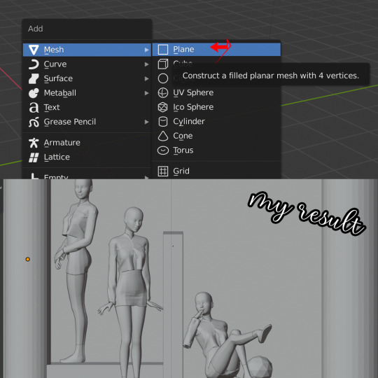
This is more or less the fun part of the rendering and you don’t have to follow what I did..be creative and make different sets!
*To get the shapes all you need to do is click shift+A and it should bring up an option menu that says add, click on mesh and you should see different shapes. I selected a plane first as my floor.
*Select your plane mesh again (or whatever object you choose) and move or scale depending on what you want. The move button looks like an arrow, the scale button looks like a box, and the rotate button looks like a sphere.
* Now do the same thing for any shape you would like to add. You can flatten the cubes and layer them on top of each other to make stairs, you can use the cylinders as chairs etc.
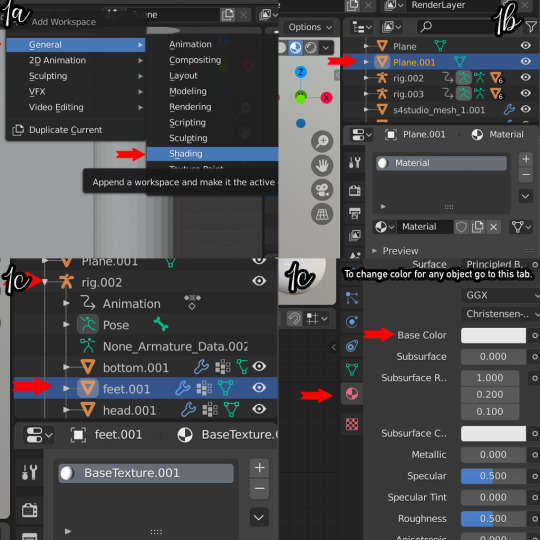
STEP 3- A splash of color
* Here comes the really fun part..adding color to everything!!. For this you need to go to the shading tab up on the menu..if you don’t see it scroll further right and click on the add button, click general and you should find shading.
* Now you can see your workspace more clearly and you can see the colors...this is the hardest part for me cause it is so hard choosing colors ..my suggestion? Have a theme, look up references.
* For this make sure you are in object mode. For the shapes all you need to do is select them, click on the little ball that looks like a soccer ball(that is the materials tab). Add new.
* You should have a list of things like “base color”, “metallic color”..etc. click on the base color and change it to what you like. Other settings I suggest playing with is specular..and metallic...they give it more shine in my opinion.
* For the mannequin click the little arrow next to the rig, then select any of the body parts(It could be the feet, the bottom..etc). Then do the exact same thing you did for the shapes.
STEP 4- Lighting, colors and so on
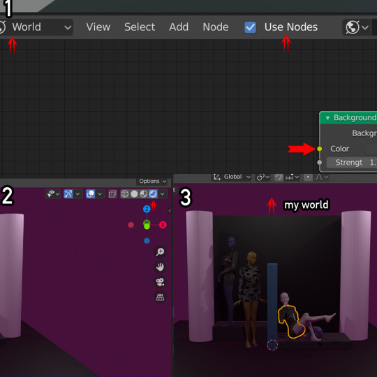
* Now to change the color of the “world”...you need to go to the bottom bar and then where it says object mode? Change it to world, on the same tab you will also see an option that says use nodes..click on that as well.
* It shows two things that have background and world output(pictures below).
* Click the area where it says color and change it to what you like.
* At this point you are probably wondering..why isn’t it showing up in my scene? ..well there’s an easy fix. At the top right you’ll see different “balls” ..click the last one. And there you have your cool looking scene.
Now for lights. Click shift+A again and scroll down to where it says light and click point (you can change it to area, sun..etc if you like the effect it gives)
Use the g key to move it around and position it where you want it to be…
To change the color of the light simply click on the light bulb to the right and where it says color change it. Then add light to wherever you want.

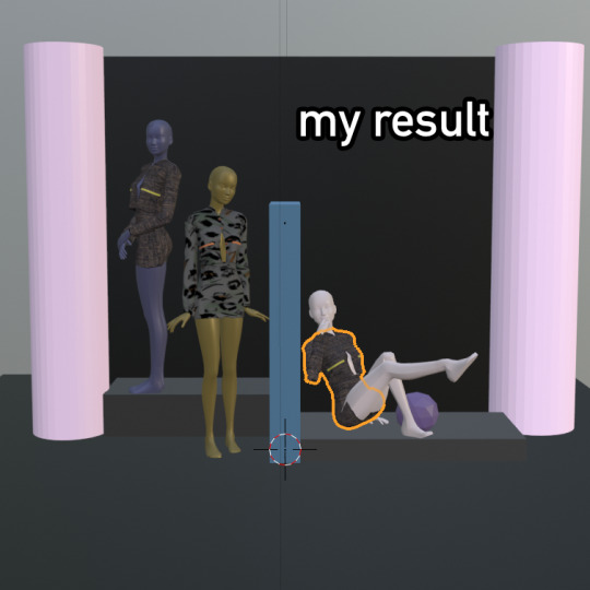
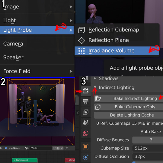
*This part is optional but if you want your picture to look more bright. Click shift+a again and click on light probe and click irradiance volume.
*Scale the box so that your objects are in the middle, and your box surrounds the scene. Then go to the left side click on the camera icon, click iridescent lighting and then select bake iridescent lighting.
STEP 5: The end..YAY!!
Now that you have gone through all that work...it is time to take pictures!!
* All you need to do is locate the camera icon and bring it to your scene
* Scale, move, rotate to set up your different angles. You can go back to the default tab to get a better view of the camera angles.
* Then once you have positioned your camera, go to the menu up top and click on render image. And there you have it! Your result.
* Just save your png. File your done!!

-This was super super long, but I didn’t know how to explain it without going into a lot of details. And also I included the blender files for this use only. Feel free to use it in your cc previews.
But DO NOT copy or use them to make a pose pack and claim it as your own.
Feel free to ask me any questions!!
#cctutorials#ts4 tutorial#thesims 4#thesims4#the sims#sims#ts4 custom content#sims cc#blender render#blender tutorial#sims4#ts4 wips#mannequin
106 notes
·
View notes
Text
Cinema moderne: The Punch and Judy Theatre, Chicago, 1930

“The graceful functionalism of the Punch and Judy;” drawing by Nicolas Remisoff. The Western Architect, November 1930, p. 175.
The cinema unique
The Punch and Judy Theatre was a cinematic remodeling in the modern style of an older theater space. Originally the second-third floor Recital Hall of the 1896 Steinway Hall [see Steinway Hall article here], the new cinema space was a complete reimagining, on an intimate scale, of the experience of moviegoing. The Punch and Judy’s design was the work of Eugene Fuhrer, architect, Nicolas Remisoff, theatre designer and consultant, and Edgar Miller, designer of the lobby's relief decorations.

Edgar Miller “Punch” relief
The Punch and Judy was “an extension of the ventures of Louis Machat,”[1] who had built on the “little theatre” movement in America with his version of “little cinema,” first in the eastern U.S. and then in Chicago’s Towertown [the area off N. Michigan Ave. near the Water Tower].
The “little theatre” movement has courageously invaded the Loop and the result, architecturally, is a most interesting transformation of the one Chicago’s oldest “legitimate” theatres into a motion picture house not only modern but vigorously modernistic, and as such, it is probably one of the most successful examples of this manner that we have in America.[2]

The Western Architect, November 1930, p. 182.
The existing theater was square-shaped, of late-Victorian design, and with “objectionable features throughout” including two balconies, view-obstructing columns, bad acoustics, improper ventilation, and badly-arranged seats. It was judged “utterly impossible for the present-day theatre, while the general design was of such poor taste that a complete remodelling had to be considered.”[3]
Interior views from “The unconventional PUNCH and JUDY,” Exhibitors Herald-World, October 25, 1930, pp. 35-40:


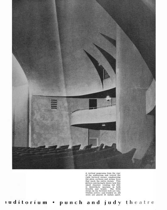
The designers’ task was to turn an “antiquated playhouse,” by then “the product of another architectural period,” [4] into the cinema unique, with every modern design feature and convenience. Modern and modernistic were how the designers’ work was described, in terms both of technology and of style. Eschewing the historical trappings of grand movie palaces, the new style was stripped down, almost devoid of ornament, and based on smooth, curving surfaces. Streamline moderne[5] or Depression Modern[6] would later define this style; in France, it would be called at the time Style paquebot, or "Ocean liner style," referring to the classic ocean liner Normandie.[7] Indeed, one description noted “The columns rising like pylons or the stacks of a great ship” (which actually covered the four columns of the earlier theater), as well as “the plain surfaces and strong lines that mark the entire design.[8]
This is modernism in the mood commonly referred to when this style of design is mentioned. For those who like the severer note…it is probably one of the most honest creations in the motif that we have in this country… [one would] be reminded of several of the finest examples of the manner erected in Germany.[9]
Interior views from Remisoff, Nicolas, “The Punch and Judy Theatre,” The Western Architect, November 1930, pp. 182-191:


The cinema’s broadly-curved walls and domical ceiling, as well as the color scheme – touches of red and blue in reference to Punch and Judy, “faun” or “honey-brown” walls, and bold accents of black – characterized its modern style. A hallmark of this new mode, in addition, was its use of lighting. In the Punch and Judy, illumination was almost all from reflected light. Its principal source was from a light cove set into an elongated proscenium arch, from which the indirect lighting would be reflected off the curtain, softly illuminating the whole room. The lighting allegedly had the same faun tint as the walls.[10]
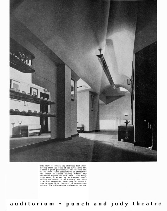
The new theater was illustrated in The Western Architect of November 1930, one article penned by Nicolas Remisoff, design consultant. The theater had been transformed from a squarish space into one “circular in feeling.” Its design, the specialized sound-absorbing seats made by the American Seating Company, the color scheme, the acoustics, and even the free demitasse coffee and cigarettes offered in the lobby, reflected the idea that “the whole theme of the theatre is comfort - comfort to all the senses.”[11] A sense intimacy was achieved by reducing the previous space’s 890 seats to just 354.[12]

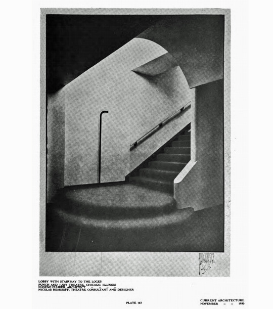
Main floor and loge plans
The new Punch and Judy offered seating on the main floor and in a second-level loge; the loge featured metal trays where patrons could comfortably rest their demitasses or ashtrays. Its small lobby, with plaques of Punch and Judy by Edgar Miller, was reached by a stairway from the ground floor; the entry was through the space originally occupied by the Lyon & Potter Steinway showroom, to the right of the building’s central entrance.
“Thus by a harmony of forms, colors, sounds, service, that restful result which we have long sought in theatre design has at last been achieved.”[13]

1934 handbill
The “Little Cinema” Movement:
The Little Cinema or art house movement sought an alternative to commercial films, the huge public that supported them, and the huge movie palaces in which they were displayed. Discernment, or the need for something different, was the key. It had similar aims to the Little Theatre movement, which had started in the late 19th century, whose goal was to create experimental centers for the dramatic arts.
Starting in 1925, a chain of small theaters was proposed, designed to provide an "intimate" alternative to the large commercial movie houses of the day, and dedicated to showing "art films that appeal to the intelligent and sophisticated.”[14]
Design features encouraged patrons, in the words of one early promotional brochure, to “Sip delightful Java and smoke cigarettes of your own choosing." Created for comfort and quiet, interiors offered sumptuous lounges appointed with deep carpets, velvet, drapes and soft lighting to encourage rest, relaxation, and "intimate chat."[15]
“Sure seaters” was a nickname given to these art house cinemas, since patrons were always assured of finding a seat, due to the films’ lack of broad appeal.
The sure-seater has a subtle snob appeal that helps at the box office. You go into a theater that has a few tasteful paintings in the lobby and a maid serves you a demitasse of coffee. You’ve just paid top admission prices, but the coffee creates a pleasant aura. Then you’re shown to a comfortable seat in a well mannered audience…. You see a picture that assumes you have average intelligence and it’s such a refreshing switch that you are flattered to be among such perceptive folks who are sharing the experience.[16]
Chicago’s first “art house,” the Playhouse, formerly a legitimate theater, opened on September 11, 1927. Managed by Michael Mindlin, the 602-seat theater had a top ticket price of $1.10, and successfully premiered with Battleship Potemkin.[17]
The Cinema Art Theatre, 151 East Chicago Avenue, Armstrong, Furst and Tilton, architects, opened on December 26, 1929 with the film Shiraz.[18] This cinema, with 299 seats, was presumably one of “the ventures of Louis Machat” in Chicago’s “Tower town” referred to earlier. Like the Punch and Judy, the cinema was decorated in soft and contrasting color schemes that downplayed its small size, and both featured works of art in the lobby or lounge, “objects embodying distinctive cultural values,”[19] sometimes exhibited on a rotating basis.

Foyer and auditorium, Cinema Art Theatre, 151 E. Chicago Ave., from The Western Architect, April 1930.
The Punch and Judy opened September 18, 1930, with D.W. Griffith’s Abraham Lincoln, with a policy of presenting American-made pictures “of the type regarded as appealing to the socalled ‘discriminating’ portion of the citizenry.” The opening-night ticket price was $11 a seat [about $170 at today’s prices]. The Griffith film was then shown three times a day at a top evening price 0f $2.[20]

Punch and Judy marquee, announcing D.W. Griffith’s Abraham Lincoln, 1930. Photo: Cinema Treasures
An item in the December 20, 1930 Exhibitors World-Herald announced that “We understand that Max Ascher has taken over the defunct, as it were, Punch and Judy theatre on Van Buren street.”[21] Whether the cinema had fallen on hard times in its first three months or simply changed management is not known; the Playhouse had felt the effects of dwindling ticket sales soon after its opening, and perhaps this was also the case with the Punch and Judy. The stock market crash of 1929, as well as a scarcity of quality foreign silent films and the advent of talking pictures, played their role as well.[22]
The Punch and Judy would change its name to the Sonotone in 1935; it would be known as the Studio 1940-1952, the Ziegfeld 1952-1958, and finally the Capri 1958-1968. The Capri would exhibit adult films until it closed in 1968;[23] the Steinway Hall building, which housed this succession of cinemas, was demolished in 1970.
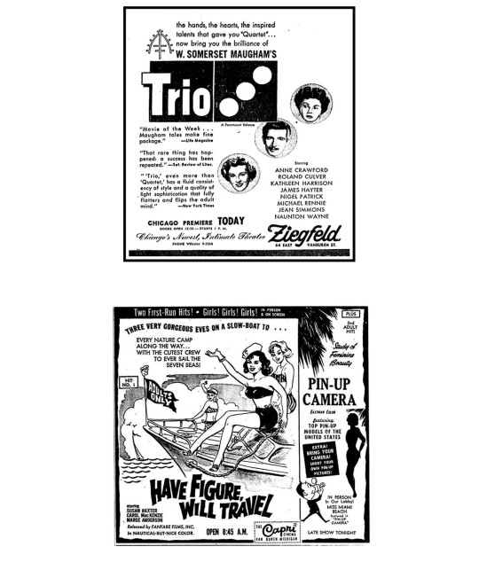
Movie ads for (top) the Ziegfeld 1950 and (bottom) the Capri March 15 1963. Source: Cinema Treasures
In retrospect, The Little Cinema Movement seems to have been destined to engage in a rearguard action against the incursion of what must have seemed the vulgar aesthetic tastes represented by the mass-appeal talkies. Early literature…alludes to the physical layout, atmosphere, and programs as exuding elegance, refinement, intelligence, and repose as an antidote to the helter-skelter pace of the Roaring Twenties.[24]
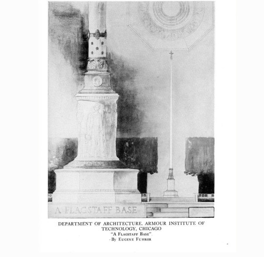
The Designers
Information about Eugene Fuhrer, architect, is scarce. From a 1956 American Architects Directory (American Institute of Architects) he was born February 2, 1902, in Wallendorf, Austria-Hungary. He earned a B.S. in Architecture in 1923 from the Armour Institute of Technology, where he earned a Huntchinson Medal and AIA Student Medal. He received a Traveling Scholarship from the Chicago School of Architecture in 1923, and traveled to Canada, Mexico, Belgium, Holland, German, Czechoslovakia, Hungary, Austria, Switzerland, and Italy.
Fuhrer was employed as a draftsman and designer for A.S. Alschuler, Inc., Chicago, 1923-26; as a designer for Walter Ahlslager 1926-27, and by Rissman & Hirschfield in 1927. He and his brother Max (b. January 31, 1901, studied at Cane College and Armour Institute) organized the firm Eugene & Max Fuhrer in 1927. The firm received commissions in Illinois, Michigan, Ohio, and Wisconsin. Among these were the Women’s Dormitory and additions to a power plant at Northern Illinois State Teachers College, DeKalb, as well as large construction projects in the Chicago area. Eugene co-authored the book Chicago Building Costs in 1936. The firm’s address was 120 S. LaSalle St. [now the CIBC Building], No. 3, and Eugene’s home was at 5228 S. University Ave., Chicago.[25]

Women’s Dormitory, Northern Illinois State Teachers’ College, DeKalb IL; postcard
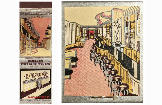
Helsing’s Restaurant and Bar, 166 N. State St., matchbook cover
More details are gleaned from a 1946 Architects’ Questionnaire to gain qualification for federal public works. To his prior practice, Eugene added H. Clyde Miller 1920-21, draftsman and tracer, and Root and Hollister 1922-23, draftsman and designer, as well as brother Max’s prior qualifications. A third brother, Martin (b. December 12, 1912) is listed, who commenced practice in 1933. The firm’s large commissions included the Teachers College dormitory referred to ($1,200,000) and Stickney Hospital, Stickney, Illinois ($1,000,000). Smaller commissions included Helsing’s Washington Street Restaurant, Chicago; the Goodman Company, Cleveland; and the McNeill Building, Chicago. Further representative works from 1936 to 1947 are also listed in the questionnaire.[26]
A couple of drawings by Eugene Fuhrer in the Ryerson and Burnham Archive, Art Institute of Chicago, represent his sketching and presentation drawing skills.
Nicolai (or Nicolas) Remisoff (1887-1975) was born in St. Petersburg, Russia; in 1910 he began studying at the Imperial Academy of Fine Arts, graduating in 1918. He and his family fled Russia, and eventually arrived in Paris in 1921. In Paris, he became the artist director of the famed theatre company Chauve-Souris (the Bat), which traveled the world and brought Remisoff to the United States. In New York, Remisoff began designing covers and doing illustrations for Conde Nast publications; he was then asked by Elizabeth Arden to design her famed “Red Door” salon and spa. In 1924, Remisoff opened a Russian-themed night club in New York called Club Petrushka, but the club burned in 1925.
Remisoff headed to Chicago, where he taught stage design at the Art Institute 1925-1926. While in Chicago, where he stayed until 1935, he designed sets and costumes for the Adolph Bolm and Ruth Page ballet companies. He created murals for the Casino Club, the Chicago Club, the Graceland Cemetery Chapel, and the Lake Forest Public Library, among other buildings. He had one-man shows at The Arts Club of Chicago in 1925 and the Art Institute of Chicago in 1938. He also exhibited at the Century of Progress Exhibition in 1933.
Remisoff left Chicago in 1938 for Hollywood, where he would serve as art or production designer for 31 movies.[27]

Portrait of Nicolas Remisoff painted by Ilia Repine in 1917
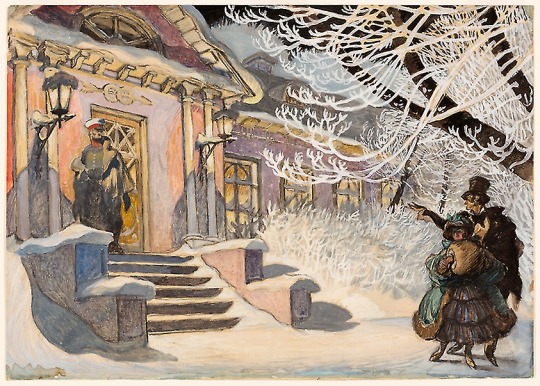
Nicolas Remisoff, Winter Scene Design for a Ballet; Art Institute of Chicago
Edgar Miller (1899-1993) was an American self-taught artist and master craftsman, “a creative virtuoso of the modern era—who applied his skills to a multitude of projects in art, design and architecture.”[28] He was a designer, painter, craftsman, master woodcarver, and stained-glass designer.
Edgar Miller’s genius reached its apex in four fully realized artistic studios that he built on Chicago’s North Side in the 1920s and ‘30s. Miller marked almost every inch of the studios with daring and surprise. He took rustic brick, crude stone, salvaged tile, found glass and recycled steel and wood and “Edgarized” the homes, packing them with stained-glass windows, frescoes, murals, mosaics and woodcarvings.[29]
These studios include the Carl Street Studio (1927) and the Rudolph Glasner Studio (1928), both in Chicago’s Old Town area.
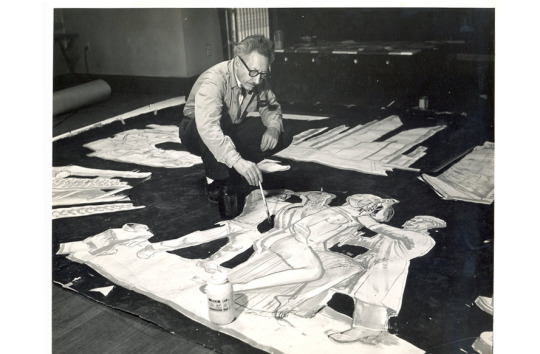
Edgar Miller painting a mural, 1957

(Left) Edgar Miller interior and stained glass, Architecture, August 1932, p. 66; (right) Carl Street Studio, www.edgarmiller.org
In his younger years Miller was called everything from “the blond boy Michelangelo” to “a new luminary.” In 1919 he had been was hired as an apprentice in the studio of Alfonso Ianelli, spending five years working on advertising, design, packaging, ink drawings, mural posters, stained glass, and cut stone. Through Ianelli, Miller met important studio clients like Marshall Field & Company and Holabird & Root, developing a network of future employers.[30]
Of Miller’s plaques for the lobby of the Punch and Judy, Nicolas Remisoff wrote:
In some respects I consider these among the most clever things done by Miller. They are beautifully composed in diagonal compositions, perfectly done. Edgar Miller has, with his usual fine sense of fitness, captured something characteristically theatrical of the old time theatre. This is the one spot where tradition enters boldly, but up the stairway and toward the lounge one sees another plaque that expresses its fitness for its setting and carries out the circular form and motifs of this new theatre.[31]

The Punch and Judy, which has “…introduced a new form for moving picture theatres, free from any kind of style and scenery,”[32] had offered an innovative and more intimate experience for the discerning movie patron of the 1930s. Its concept was realized by some of the most renowned designers and decorators of their day. Its forms evoked an age of speed, machines, and sleek new “modern” design that in retrospect would come to be called streamline moderne.

The Punch and Judy would end its existence as the Capri Cinema, which closed in 1968. Photo: Cinema Treasures
Links to PDF documents of works cited:
Edgar Miller Designer-Craftsman, Architecture, August 1932
Finding Aid for the Nicolas Remisoff Papers
Fuhrer & Fuhrer Questionnaire for Federal Public Works
“The Cinema Unique,” The Western Architect Nov. 1930
Matsoukas, Nick John, “The unconventional PUNCH and JUDY,” Exhibitors Herald-World Oct. 25, 1939
Remisoff, Nicolas, “The Punch and Judy Theater,” The Western Architect Nov. 1930
Notes:
[1] Matsoukas, Nick John, “The unconventional PUNCH and JUDY,” Exhibitors Herald-World, October 25, 1930, p. 35
Louis Machat started in 1910 with an early talking apparatus, such as it was…. Louis Machat was then connected with the old Sixth Avenue Playhouse in New York…. It failed and with the failure of the cylinder film followed the importation of foreign productions from Sweden, France and Italy. This importing business let him into the “Little Theatre” movement and resulted in the opening of the Wardman Park hotel theatre in Washington, D.C. in 1926. Similar theatres followed in New York, Baltimore, Philadelphia, Rochester and Chicago, with still others projected.
Shortly after the Punch and Judy was opened, Machat said to me, “It is high time for the motion picture industry to take cognizance of the fact that the whole population of the United States does not care for gilded walls…. There is a lot of room in America for some native theatrical architecture….”
Ibid. p. 129
Louis Machat would later be listed as the Producer for the 1943 short film Wasted Lives. IMDB https://www.imdb.com/name/nm7956280/?ref_=fn_al_nm_1
The article’s author, Nick John Matsoukas, was a theater manager, film press agent, and journalist. Limited information about him is available at:https://www.myheritage.com/names/nick_matsoukas#col_a_10220http://cinematreasures.org/photos/229126
[2] Ibid.
[3] “The Cinema Unique,” The Western Architect, vol. 29 no. 11, November 1930, p. 175.
[4] Matsoukas, Nick John, “The unconventional PUNCH and JUDY,” Exhibitors Herald-World, October 25, 1930, p. 35.
[5] “Streamline Moderne,” Archetypical. https://www.archetypical.us/streamline-moderne/
[6] Greif, Martin, Depression Modern, The Thirties Style in America. New York: Universe Books, 1975.
[7] “Streamline Moderne,” Wikipedia. https://en.wikipedia.org/wiki/Streamline_Moderne
[8] Matsoukas, Nick John, “The unconventional PUNCH and JUDY,” Exhibitors Herald-World, October 25, 1930, pp. 37 and 39.
[9] “Notes on Writers and Subjects in this Issue,” Exhibitors Herald-World, October 25, 1930, p. 19.
[10] Matsoukas, Nick John, “The unconventional PUNCH and JUDY,” Exhibitors Herald-World, October 25, 1930, p. 38.
[11] “The Cinema Unique,” The Western Architect, vol. 39 n. 11 Nov. 1930, pp. 175-76.
[12] Matsoukas, Nick John, “The unconventional PUNCH and JUDY,” Exhibitors Herald-World, October 25, 1930, p.36.
[13] “The Cinema Unique,” The Western Architect, vol. 39 n. 11 Nov. 1930, p. 177
[14] “The Little Cinema Movement,” The Little; https://thelittle.org/history
[15] Ibid.
[16] Wilinsky, Barbara, Sure Seaters: The Emergence of Art House Cinema. Minneapolis: University of Minnesota Press, 2001, p. 1. Accessed at https://books.google.com/books?hl=en&lr=&id=uJp_B8lN0iIC&oi=fnd&pg=PP11&dq=little+cinema+movement&ots=a5AX92LnoG&sig=kzefPGtf9xbHDWuhPlMhja8CCyg#v=onepage&q=little%20cinema%20movement&f=false
[17] Guzman, Tony, “The Little Theatre Movement: The Institutionalization of the European Art Film in America,” Film History. Vol. 17, No. 2/3, 2005, p. 274.
[18] “Cinema Theater, 151 E. Chicago Avenue, Chicago, IL 60611,” Cinema Treasures. http://cinematreasures.org/theaters/980
Once a popular art house located off N. Michigan Avenue on E. Chicago Avenue on Chicago’s Near North Side, the Cinema Theater opened on December 26, 1929 with “Shiraz”.
The Cinema Theater closed September 13, 1981, and was demolished and replaced a few years later by the Olympia Centre tower. A Neiman Marcus store is also situated on the former theater site.
The theater was illustrated in The Western Architect, April 1930, p. 60 ff.
[19] “The Cinema Unique,” The Western Architect, vol. 39 n. 11 Nov. 1930, p. 177.
[20] Matsoukas, Nick John, “The unconventional PUNCH and JUDY,” Exhibitors Herald-World, October 25, 1930, p. 35
[21] Little, Jim, “Chicago Personalities,” Exhibitors World-Herald, December 20, 1930, p. 62.
See also: Schiecke, Konrad, Downtown Chicago's Historic Movie Theatres. Jefferson NC: McFarland & Co., Inc., 2011, p. 178; “Ascher Brothers, Wikitia. https://wikitia.com/wiki/Ascher_Brothers
[22] “History of the Reel World,” https://thelittle.org/history
[23] Schiecke, Konrad, Downtown Chicago's Historic Movie Theatres. Jefferson NC: McFarland & Co., Inc., 2011, pp. 75-76.
“On July 3, 1940, the theatre emerged as the Studio, with new management dedicated to public service and single, first-run features, newsreels and comedy shorts. French without Tears started off Studio’s program. In 1952 the theatre was renamed the Ziegfeld, operated with Tom Down as manager until 1958 when M. Down became owner.
The newly redecorated “art” theatre, now renamed the Capri, opened on July 3, 1958, with a controversial adult French film, Nana, based on an Emile Zola novel…Adult films were shown until the theatre closed in 1968.”
[24] “History of the Reel World,” https://thelittle.org/history
[25] American Institute of Architects, 1956 American Architects Directory. Accessed at https://aiahistoricaldirectory.atlassian.net/wiki/spaces/AHDAA/pages/20644319/1956+American+Architects+Directory
[26] “Questionnaire for Architects’ Roster and / or Register of Architects Qualified for Federal Public Works,” May 10,1946. Eugene and Max Fuhrer, 160 N. LaSalle St.
[27] Richard Norton Gallery, Nicolas Remisoff biography, no date. http://richardnortongallery.com/artists/nicolai-remisoff
Remisoff’s decor for the New York home of Elizabeth Arden is illustrated here: https://thepeakofchic.blogspot.com/2016/04/an-early-thirties-set-piece.html
[28] “Edgar Miller, the Artist,” https://www.edgarmiller.org/terra-3
[29] “Edgar Miller Legacy,” https://www.edgarmiller.org/history/
[30] Cahan, Richard and Williams, Michael, Edgar Miller and the Handmade Home. Chicago: City Files Pres, 2009, pp. 18–93.
[31] Remisoff, Nicolas, “The Punch and Judy Theatre,” The Western Architect, November 1930, p. 183.
[32] Schiecke, Konrad, Downtown Chicago's Historic Movie Theatres. Jefferson NC: McFarland & Co., Inc., 2011, p. 75.
#punch and judy#theatre#cinema#art deco#moderne#streamline moderne#steinway hall#Nicolas Remisofff#edgar miller#Eugene Fuhrer#capri cinema#chicago#van buren st.#1930s#little cinema#little theatre
3 notes
·
View notes
Text
Anatomy of a Falcon
youtube
We recently announced Falcon Age, a game about nurturing a falcon from a baby, bonding with them, and together resisting the forces that colonise your planet. Falcon Age will be out in 2019 for PS4 and PS VR.
We showed off the game at PAX last week, got a great response, especially on the falcon. Let’s do a deep dive of the design of the falcon, animation and rig setup, AI and navigation, feather tech, and raptor sounds.
Falcon Design
Chandana Ekanayake and Darran Hurlbut

Our falcon design combines multiple raptor types. She is big as a golden eagle, fights like a hawk, has some eagle-hawk resemblance, some owl-like tufts, and falcon tendancies. She’s one of the last of her kind left in our world and we wanted to make her unique visually for the story and also visually stand out during gameplay against the sky and desert like environments.

One of the early inspirations for Falcon Age came from videos of golden eagles hunting large mountain goats. That led to some research on falconry and the idea of having a falcon as a pet and designing mechanics and gameplay around that core idea. We made a rough prototype early on to test out the ideas. The first time we successfully whistled for the bird in VR and saw the scale change from it approaching from a distance to landing on our hand, we knew we were on to something that could serve as the core of a unique game.
Animation and Rig
Aung Zaw Oo
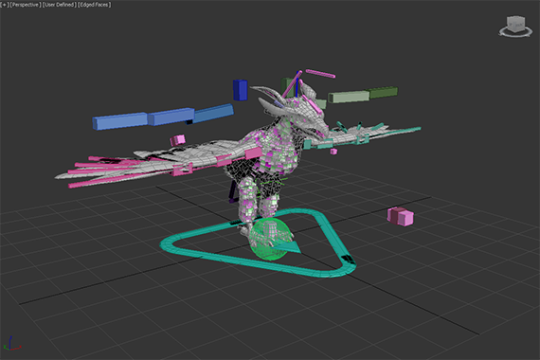
FALCON FEET TRACKING
There are lots of animation options out there, but none of them would easily solve our specific falcon feet tracking needs. Inverse kinematic setups, root motion and other complex plugins could do the job if we had a bigger team and more time to dedicate to it. We wanted a more predictable outcome so we went with a multiple pose based solution made in 3dsmax.
However, the biggest reason for not using IK, is that this is the best way I could come up within a couple of days. We were building the prototype so fast back at the beginning of the project that we didn’t have time to look at what other solutions are available. This is the most reliable and least ugly way I found and we’ve stuck with it since. If it's not broken, don’t fix it.
Here is how I imagined the bird claws blending IRL. The ball is the fist that is attached to the VR motion controls.There are limits to this method. The claws needs to be able to wrap around a fair chunk of the fist and the fist pose needs to be as spherical as possible.

Note that head and legs are siblings of the pelvis. This makes the bone masking and making separate blend trees easier. Ignore the word ‘eagle’ in the naming. That was just a temp asset name before we figured out the bird design.

Short version of how its done; the fist is a ball and the bird’s feet rotate around the ball using 30 blend poses and shuffle animation to get the feet back to center when the ball(motion hand) has rotated too far.
30 Blend Poses on a ball
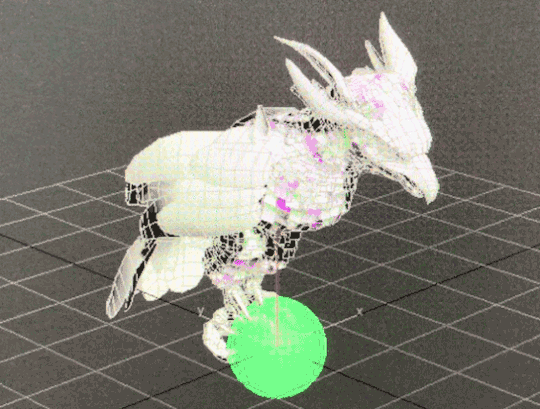
A shuffle animation let feet recenter
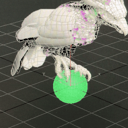
And the the blends start again after that quick shuffle animation from the new rotation of the hand. According to our programmer Justin, he is doing some regular old quaternion and linear algebra math. And I’m using 3 float values that he’s giving me and feeding them into those anim blend states.
For baby bird, the 2nd knuckle on the index finger is treated like a ball.

The one edge case where the ball concept doesn’t work is when the glove is pointed directly down. Pictured below.

We had several ways we could’ve dealt with that case. One solution was to have a collider on the forearm part of the glove and have the bird fly away if bird’s collision intersects with it. Ultimately we decided to let it be as is. It’s more player friendly that way since it lets you scratch your left hip while in VR without having the bird leave you. Also most people would never have their hands positioned that way in normal play.
Unless they’re playing in a headstand for some reason. All kinds of animation features would look wrong or broken in a headstand.
FALCON HEAD TRACKING
Short version of how its done; the head (bone_Head) is a direct child of the highest object in the bird skeletal hierarchy ( bone_Root ).
Bone_Root’s position(not rotation) follows the position of the motion controller and bone_Head counters that motion. Basically a 2-object hierarchy where a positional blend is used to counter motion of the parent object to keep the child object in same global position. The rest of the bird body uses a blend of 27 poses to try its best to keep the bird looking natural.

With the size of the adult bird we have, a 12 cm translation in all axis(24x24x24 cube) seemed ideal for getting the stabilizer effect without stretching the neck too much. The head will also move at the edge of that range and when the motion hand stops moving, that new position is now the new center and another 24cm cube is formed there. Math wise, headlock is mostly just a vector transform with a lot of extra 'fluff' for limiting speed, transitioning in and out, and moving the lock point when it gets too far from the body but the bird is still in the area.
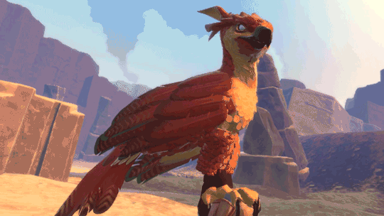
Bird Navigation and AI
Justin LaLone
BIRD BOREDOM
For the most part, the falcon obeys Ara’s commands and follows her around. If you stand around long enough in one area while the bird is just circling or if you launch her with no orders, she will start looking for something else in the area to do - usually hunting or landing on a point of interest. She will also take some initiative when perched on Ara if anything else tries to grab her (she’s possessive like that), and likes to help lead Ara to the next hole in lightning golf.
SUN BLINDING PREY
Some of the prey, such as the rabbits, are very skittish and as soon as they notice a falcon diving towards them they will take off for the nearest bolthole. They have a more difficult time seeing Ara’s bird if she approaches with the sun behind her, so paying attention to where the light is coming from and sending the bird from that direction can make catching prey easier and more reliable. On the other hand, simply diving from higher up can be good too, as the bird can pick up more speed before being noticed, giving her prey less time to dodge out of the way.
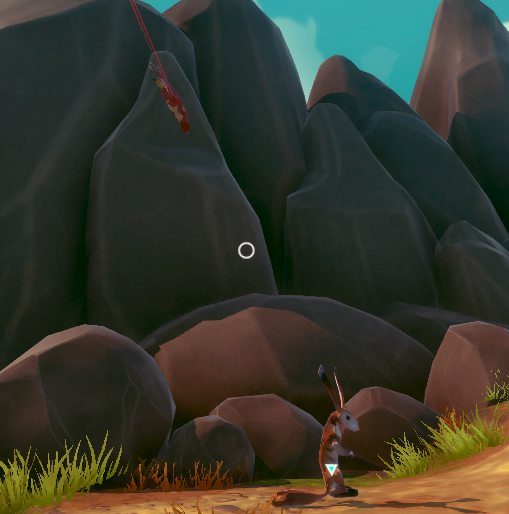
Coming in fast and and from the sun, for a guaranteed hit.
FALCON 3D NAVIGATION
Getting a flying animal to reliably traverse a 3D space in a somewhat natural looking way isn’t something you typically find out of the box in a game engine. We have roughly three levels of bird-navigation logic going on to get the bird from point A to point B without running into too many things or getting stuck in a corner.

For high-level navigation to find its way through the world, we build a 3D navigation graph and use A* to find a path. What’s probably somewhat unique in our implementation is that we are using the fairly new Unity job system to do all our A* pathfinding, giving us fast searches that stay off the main thread, allowing more time for other AI, physics, and more stuff in general. Most of the graph is generated automatically, with manually placed connections for flying through narrow gaps like windows that are small or require an approach from a good angle.
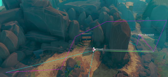
The purple line is a rough path for it to follow to get around the big rocks in between where the falcon started and where Ara is standing. The bird doesn’t try to follow this line very closely; it would be trying to make some pretty strange and sharp turns if it tried, so as soon as it has a clear shot to the next part of the path it heads there instead.

Sometimes smaller objects or moving objects can get in the way. The falcon looks ahead and goes over or around these objects. This rock is actually just big enough that it would normally navigate around it with A*, but I forced it to “forget” about that for now. Here, it’s turning left to go around the rock - the red lines show where it has been looking for the past few frames. It usually won’t try to go under things in this way, but the A* navigation can direct it to go under arches or walkways.
The last level of bird flight logic is the actual maneuvering logic, or how the bird decides how fast it wants to go, how much to ascend or descend, how quickly to turn, and how it applies physics accelerations, limited by what it is allowed to do, to get there. This feeds into the animation system telling it how hard the bird is working, what sort of pose it should be in, if it should be banking, etc. The object avoidance is tied in somewhat strongly with this, but all the A* navigation is completely separate. It is also a big pile of math and logic.
Feathers and Rendering
Ben Golus
The small body feathers, or contour feathers, on our birds flutter in the wind, and react to the player’s hands brushing against them to give a greater sense of tactile interactivity. The way this was done for the PAX demo is a bit of a hack which I hope to replace before we ship. (This of course means it’s the solution that will ship with the game.) The short description is each small feather on the bird is a treated like many grass or vegetation shaders. Several overlapping sine waves are used to calculate some simple noise used to flutter the feathers and give them some life. Their timing is offset by a random value per feather stored in the vertex color, and the flutter movement is scaled also using the vertex color. This means the base of the feathers don’t move, but the tips do. It also means longer feathers move more than shorter ones.
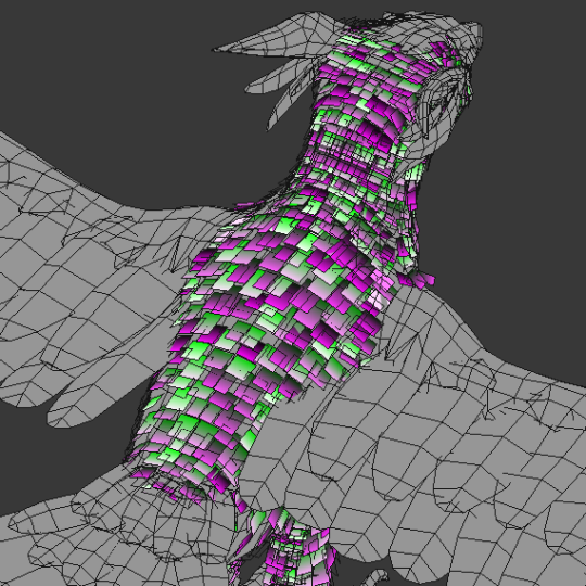
Unlike most grass shaders, we need the feathers to not move in random directions, so we can’t use world or local space directions. Plus this is on a skinned mesh which makes the direction even more dynamic. Instead I use a combination of the feather’s vertex normal and tangent so the feathers flutter in and out and side to side relative to their orientation. This isn’t strictly accurate, but for small movements like this it won’t be obviously wrong.
To handle hand interactions, the player’s hand has a script which tracks the bones and creates a list of capsules that follow the shape of each finger, and a sphere for the palm. If the hand is in range, the vertex shader iterates over the list of capsules to find closest distance to one and softly scales down the flutter if a capsule one is overlapping it. The feathers are also squished down towards the body. The capsules are oversized as the overlapping tests are soft, so this isn’t an instant on-off, but a gradual change. It’s roughly tuned so that once the visible finger is touching the feather it has stopped moving entirely and will push down.

Here’s an early test of this system in action. You can see how the feathers react to the sphere before it actually touches it, but the interaction is still convincing.


For the final release of the game I’d like to move to a geometry shader or compute shader approach which would solve some of the issues the effect currently has when only one vertex of a feather is being overlapped, and the fact the feathers light normals don’t change when being touched.
FALCON DAMAGE FEEDBACK
We needed some way to show when the bird is hurt, and we wanted to avoid using a health bar or similar mechanic as much as possible. Animation is used to make the bird look tired, and in pain, but we still didn’t find that it was clear enough to users that she had taken damage. We decided we wanted her to look physically damaged with blood and frayed feathers to really strongly communicate her state. The obvious answer was to do a material swap. However we also wanted to show a gradual increase in damage rather than a hard on / off, and did not want to have to have a lot of different maps. There was also the issue that most feathers shared the same UVs, which meant blood spots would be repeated all over the bird.
The solution we ended up with was done in two parts. First was feather damage and fraying. The alpha channel of each feather is setup in a special way so that both an undamaged and damaged version exist in the alpha at different opacities. The feathers are using alpha test cutout (actually alpha to coverage) at 50% opacity when at normal health, and 25% opacity when damaged to switch between the two states.
For blood splatter the bird has a second UV for the blood texture so we don’t have to reuse the original feather texture UVs, and then we blend in the blood on top of the base texture. The result is we only need one base texture set, and one blood splatter texture set for the bird and we can get variable damage effects on the bird.

Raptor Sounds
Rob Pearsall

The bird wasn’t designed to be different - futuristic or magical - from any bird in our world, just an amalgam of several flying raptors (except for wearing hats); so, it didn’t make any sense to create a voice for it that might sound ‘cinematically awesome’ - it just had to work and be believable.
That said, I did have the choice of “borrowing” the calls of any raptor I thought would communicate to the player the various moods, feelings, and responses of the bird. So, I listened to the sounds that raptors make; and to my surprise, the biggest, most impressive bird - the eagle - was absolutely the worst sounding predator of them all. First place for “don’t use this”.
The hawk is always a great choice. Everybody loves the screech of a hawk. I used to think that there was only one good recording of a hawk screech and every sound designer owned it and that’s why all hawks in all shows and movies sound the same. Not true. It turns out, all hawks sound the same. Not much variation at all. Now, don’t get me wrong, it sounds awesome, so yea… we’ve got that sound on our bird too. But that’s not all.
The best thing I had going for me was that I didn’t have to limit our falcon voice to one specific kind of falcon; and there are many kinds. Because of this, I could liberally choose any sound any falcon produces that makes sense as a kind of emotional statement from the bird.
Conveniently, the emotions were limited; I name them as statements from the bird:
All is calm, all is well
I hear you call me
I’m attacking
I’m hurt, but I’m still flying
That hurts
Getting a recording of a raptor that’s annoyed is really easy; show up with a bunch of recording gear, get into it’s space, and it’s already annoyed. So, there’s a lot of material of raptors sounding negative and mad. This works for ‘pain’. The hawk’s sounds work for flying responses and attack calls. The “all is calm” sounds were the difficult ones. There were several chirps that worked, but then I had to edit a lot of different kind of calls to get partial, short squawks that fit with the chirps, and it worked.
Keeping track of the bird sonically while in game… well, that’s another story for later.
Thank you!
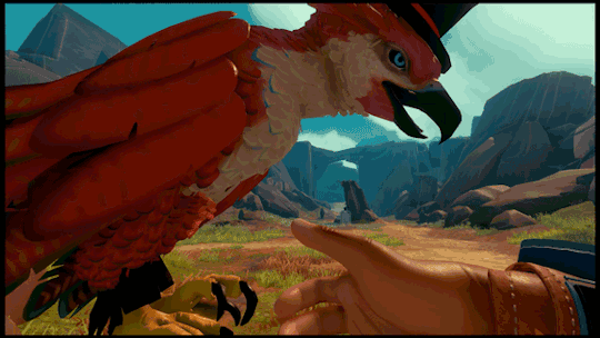
Thanks for reading. For more info and latest updates follow @outerloopgames
15K notes
·
View notes
Photo

No, I just used my basic knowledge of objects and clothes, etc. in Milkshape and simPE.
BIG TUTORIAL under the cut. With pictures:
Prep work: Go into Bodyshop extract skin, hair, clothes, make-up, eyebrows, facial hair, etc. Anything you might need in there. You can also extract them in simPE if they are CC.
Step 1: Extracting clothes and hair in simPE.

Click the “create new package” icon.
Go to Tools -> PJSE -> Body Mesh Tool -> Extracting Stage. Select the mesh you want your doll to wear. This means if you use a base game mesh, like I am, you’ll have to extract it from Bodyshop first (or go through the game files to find it) or if you just want to use a custom mesh, select it.
Click the “Geometric Data Container (GMDC), right click on the file and select extract. Name this something you’ll remember in a location somewhere you can easily find it.

For custom meshes you can open them in simPE and export the textures or extract them in Bodyshop. Either way will work.
Step 2: Extract the sim face:
If you have a sim in mind whose face you want to use, you can open them in simPE. If you already have them extracted through bodyshop you can skip this simPE part and just open the Saved Sim file. If not:

We always start the same by creating a new package.

Go to Tools -> Neighborhood -> Neighborhood Browser, select the neighborhood in which your sim resides and load it.

After it loads go to Tools -> Neighborhood -> Sims Surgery.
Find your sim, click “Use” in the Patient Sim, then Export (thanks to Pinhead). Save somewhere you can easily find it. I believe it is default set to Saved Sims folder in the game.

Open your exported sim and select the Geometric Data Container (GMDC). Look for “age3″ in the files’ names. Usually it is the one without the OLOD.
That’s your sim’s face. Extract it and save it wherever you’ve been saving all these files.
Step 3: Bring everything into Milkshape.

Import -> Sims2 UniMesh Import.
Import the clothes, hair, and face.


(Yes, if you want fat or preg dolls and just delete the body styles you don’t want)

You will have to click these for every mesh you import.
Step 4: After bringing everything into Milkshape, you should have three groups. Three groups won’t work for object meshes. You’ll need two so that means combining meshes, which also means combining textures.
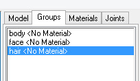
If you want alpha hair meshes...it is going to be difficult and honestly, too much work so I am not going to do that. One of the reasons is because the size of the texture files if you go that route. I combine the hair and face, or head, which means these two groups will be apart of the same texture group.
I leave the body to itself as it is usually already a bigger texture size.
Editing this requires some knowledge on milkshape texture editor and photoshop (or whatever photo editing program you use).

So here is a combined texture file of the face (top) and hair (bottom) that I made in photoshop. This is a 512X1024 pixel picture that I saved as a BMP. Add facial hair and eyebrows, make-up, etc. as you want.

So in Milkshape, select groups that will be apart of this texture:

In Materials, click New.

Then the first <none> and select the texture.

Hit assign.
Your model will look crazy. Ignore that.

Go to Window -> Texture Coordinate Editor.
So something like this will show up. You will need to adjust the hair down to the hair and the face to the face. This can take some time of fiddling with the “Scale” and “Move” buttons.

Since we only need to shrink it vertically, check mark the “Lock X.” That will make sure the horizontal stays the same. Scale .5 in both options and hit S. That will reduce it half the size, which is what we need since a single group is taking up 1024 pixels instead of 512. Sometimes it will not snap it in place so you’ll have to “move” it into place. Make sure Lock X is still check marked for this too.
Wala! Repeat for face.

Wala X2! For the body, you will not have to do this.
Go back to the Groups TAB and select face and hair again (if not already still selected). Hit Regroup. We always do this after because now the textures will share the same group.

WALA X3!
Step 5: the body. We don’t have to move any of the texture files here, but you can go ahead and combine your outfit texture and skintone just to see the complete look. You must do this with your photo editing software.


Just repeat the top of Step 4 to add the materials so you can view it on your model.
So now Step 6: Let’s make sure our neck and body stay together.

So in the Groups TAB if we reselect our Regroup we can see where the neck and body go together. If you have some shoe-swapping or clothes mesh edit skills, this will come in handy. All we are going to do is make sure this stays secure for when we pose our model.
So in the Model TAB we click Select and make sure it is set to Vertex. We select the individual dots, or vertices.

When a vertice is select, go to Vertex -> Sims2 UniMesh Vertex Data Merge then Vertex -> Sims2 UniMesh Normal Data Merge. Repeat this for each vertice.
Step 7: We are ready to pose.

Go to the Joints TAB and check Show Skeleton.
At the bottom right, click Anim.

Go to Model TAB click Select then Joint. Now click on the model where the dots for joints are, it should highlight like so.

Use Rotate set on these options and just rotate your models appendages around. Check out other posing tutorials if you want more info on this. I am not a pose box maker, so I am not the best source.
Step 8:

Once you are set on the pose, go to Animate -> RotateAll.
Leave it set to 0 and hit OK.

Go Click Anim on the bottom right again and the blue skeleton should fall back into T-position, but the model should stay posed. If you did not do this step right, the model will too fall back into T-position.

Export your completed posed model/doll as Wavefront OBJ.
Step 9: Now for some people they can just go through simPE and make their object, but I have never been able to get an item to show up in the game this way. I have to turn it into a .simpe item first. So perhaps this is the long way. If you want to know that way, look it up. If not, here we go.
Open simPE:
Go to the Object Workshop tab.
Selecting Start means to use an object from the game. Selecting Open means using CC. Either way works. I use CC since it has an edited material definition to make the object not shiny, but for giggles, I will select Start.
Wait for it to load completely.

Select an item. For this, I am selecting a decorative item that I know that has two textures.
Select Clone then hit Next. Anytime you feel like you are messing up, you can always select Startover.
Important, name it something and give a description. Please call it something simple and with your name in there somewhere. Easiest way for people to find something of yours, especially for WCIFs. You can always change or add to this any time afterwards.

Name part 2. I always use the same thing I will use as the package’s actual name. Hit update then OK.

Save.

So go to the Geometric Date Container (GMDC) and extract the file and save it in our easy to find area.
Step 10: Back to Milkshape.
Let’s export our OBJ file we made at the end of Step 8. The reason why we exported it as an OBJ is to get rid of the skeleton.

Import -> Sims2 UniMesh Import the deco item we just extracted from simPE.
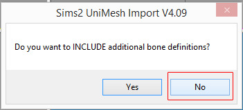

So in the Groups TAB we have this. Delete the groundshadow as we will not use it. Again if you want one, look up a tutorial for it. I will not cover that in this.
We just imported in the deco vase and flowers for their names and comments. Rename body to vase and Regroup to flowers.

So, before we delete the deco vase and flower groups let’s steal their comments.
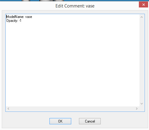
Select this and copy it, paste it into the respected “vase” and “flowers” of our model/doll.
Delete the deco vase and flowers. We don’t need them anymore.

Export as Sims2 Unimesh Export.
Step 11: Back to simPE
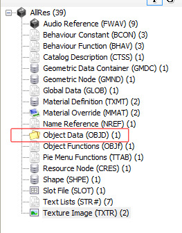
The file we exported from just a minute ago, should still be open in simPE. Select the Object Data (OBJD)

Check update all MMATs then select “get GUID.”
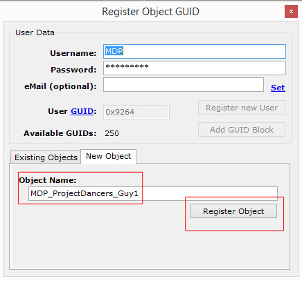
Name and Register Object.
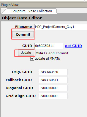

Update then Commit and Save.
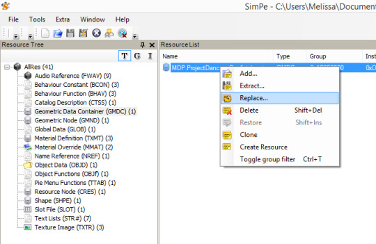
Go to Geometric Date Container (GMDC), right click, hit Replace. Select the model we exported at the end of Step 10.

Let’s update our textures.

I have already deleted the groundshadow. So these are our two textures. Blue is the vase. Lily is the flowers.

Click on blue. Right click on the picture. Build DXT.
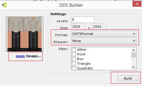
Open Image. Select the texture. Set format and such as shown then hit Build.

Click commit and then OK.
Repeat for Lily/flowers.
Save.
Step 12: Fixing the shine.
Throwing this in here because the item we cloned from does make our model appear shiny or just weird with lighting.

Go to the Material Definition. These two choices are our vase and flowers. (If there is the option of the groundshadow, just right click and delete it)
This is what the list should look like so it does not appear shiny.
Commit both times when changing then save.
Step 13: Load the game and test:


53 notes
·
View notes
Text
Day 3 - Unity - Game Objects & Unity Editor continued

A brief one today, sort of. Well, not really but I’m not talking about anything in depth. So let’s just go through the overview.
Editing Game Objects
Game objects are pretty much all the assets within your game scene, so it’s pretty standard that we would want to affect them in some way. The hotkeys for these are pretty much standard across 3D engines and 3D software. Let’s take a look.
W for Move
E for Rotate
R for Scale
To hide and un-hide game objects, the shortcut is H. Whereas isolation view is Shift + H.
When it comes to transforming, we have RectTransform and Regular transform. Rect-Transform is intended for 2D and GUI elements to be placed inside, and only works in two Axis of a rectangular shape. It has all the manipulation of moving, scaling and rotating in a single gizmo.
Sometimes you might want to deactivate a game object to temporarily remove it from the scene. You can do this by unchecking it in the inspector window or with script by using activeSelf.
When you deactivate a parent object, you also deactivate all of it’s child objects. If you want to deactivate just the child, you could use a code like this:
void DeactivateChildren(GameObject g, bool a) { g.activeSelf = a;
foreach (Transform child in g.transform) { DeactivateChildren(child.gameObject, a); } }
This will affect the activeSelf settings of the child object, but not the parent. If you make changes during play mode, they don’t save.
This is just the beginning of affecting elements inside your game. To continue to do so, you’ll want to understand other aspects of the windows within Unity.
Apologies for the quick summary, but I’m hoping to speed through this.

Pivot toggle lets you adjust from the object’s pivot, or center of rendered bounds.
The Scene View
The Scene View let’s you choose options for viewing the scene, but also control whether lighting and audio are enabled.

To the right of the Render Mode menu are three buttons that switch certain Scene view options on or off:
2D: switches between 2D and 3D view for the Scene. In 2D mode the camera is oriented looking towards positive z, with the x axis pointing right and the y axis pointing up.
Lighting: turns Scene view lighting (lights, object shading, etc) on or off.
Audio: turns Scene view audio effects on or off
The next icon is to toggle off skybox/fog effect, and the eye is to toggle scene visibility and counts the number of hidden objects.
Under the camera menu, a lot of the options seem rather self explanatory, but one option I wanted to take note of was occlusion culling.
Occlusion Culling You’ll want to this box to enable occlusion culling in the Scene view. This prevents Unity from rendering GameObjects that the Camera cannot see because they are hidden behind other GameObjects.
Camera Speed
The current speed of the Camera in the Scene view. The minimum speed of the Camera in the Scene view has valid values between 0.01 and 98.The maximum values are valid between 0.02 and 99.Gizmos
The Game view The game view is what the game will actually look like. At least one camera will control what the player sees.
Aspect Select different values to test how your game will look on monitors with different aspect ratios. By default, this is set to Free Aspect.
When you enter ‘play mode’ to simulate your game, you switch to the game mode by default. But remember, any changes you make to your game during play mode are not saved once you exit. This allows you to experiment without damaging the game.
Low Resolution Aspect Ratios
Check this box if you want to emulate the pixel density of older displays: This reduces the resolution of the Game view when an aspect ratio is selected. It is always enabled when the Game view is on a non-Retina display.
Stats
Click this to toggle the Statistics overlay, which contains Rendering Statistics about your game’s audio and graphics. This is very useful for monitoring the performance of your game while in Play Mode.
Stats are looking pretty good considering it’s an empty scene!
The Inspector Window One thing about the inspector window is that it shows the components of your selected GameObject. With component scripts, the order you need to use when queuing components in your user scripts is the order that should be seen in the inspector.
Scenes Scenes! Scenes are environments and menus of the game. They work like levels. A must for building games in pieces. In terms of their position in the editor, I don’t have much to say about them yet.
Thus, we’ve reached the end of this post! We won’t be going over custom editor tools. This post was a little boring, but hey, sometimes things are.
1 note
·
View note
Text
It's a little while since that Smash Direct, right? So while the fire is tepid, time for me to gush about it and share some creative thoughts. First, wanna say that Belmont in Smash is one of the most 'I didn't know how much I wanted it until I saw it' things I've ever experienced. It's such a perfect and direct fit, yet I never really thought about until then. Everything so far has been a complete home run.
People are always talking about what they want for new characters, but I'm more interested right now in stages. There's six empty spots still, yeah? So here's my thoughts for stages. It's at a mix between what's likely and what I'd like to see.
Although, some of these thoughts are mixed with characters or heavily influenced by them. Thoughts on some of those combined within, but in short, my character guesses are Erdrick, Bandana Dee, Ken, and Black Shadow. Ken is the original slightly deviated clone character, and Bandana Dee, well, really underwhelming compared to all other newcomers, but he could be nifty if he used some of Kirby's traditional copy abilities (Cutter, Parasol, Beam, etc.). At any rate:
Ancestral Steppe - (Monster Hunter)
It's pretty plain that this exists, though I imagine the stage version is based on room 4 (the one with the arching bridge that gets knocked down), and not room 3, where the Rathalos boss was shown. Either way, stage'll have some radical music choices. Personally, I'd rather see a stage based on Misty Peaks, with the rope bridge and the watery area below it, but it seems pretty decisive that it'll be Ancestral Steppe. Anyway, yeah. Room with the arch, some Jaggi nip at you sometimes, and Kecha Wacha and Tigrex show up to make everyone miserable.
Monster Hunter isn't a playable character, but rather the Mii variants all have MH outfits; Rathalos for Swordfighter (just like Smash 4), Gore Magala for Brawler (with Gore's Dual Blade claws), and either Zinogre or Lagiacrus for Gunner. And especially for Rathalos, the colour of the Mii shifts more than usual to better match an existing Rath colour; a Yellow Mii would wear a set that looks like Gold Rathian scales and so on.
Mute City Grand Prix - (F-Zero/Star Fox)
This one is based on a small mountain of assumptions, that the rumoured Star Fox Grand Prix is a thing, and that it merges Star Fox and F-Zero more than they already were. And that it gets shown off at the same time at the Tokyo Game Show. Don't actually have anything to say about design of stage, just that it'll end up being another Mute City, because of course it'll be. Why else would the OTHER Mute City stage feel the need to label itself Mute City (SNES)?
Related, Black Shadow'll be around as echo fighter of Captain Falcon, and essentially Melee Ganondorf. If I'm right on the Star Fox thing, I wouldn't be surprised if he's now literally a bull, instead of a bumble-king in bull-shaped spandex. Either way, it'd be weird as hell if after EVERYONE IS HERE there wasn't a time-frozen version of Melee Ganondorf, like how Dr. Mario and Young Link are for pre-Fludd Mario and pre-lots-of-things Link.
Poke Floats 2 - (Pokemon)
They've made updated versions of other stages before, so why not this? The same concept as before, but with new Pokemon.
Dragon Quest III's Pyramid - (Dragon Quest)
Erdrick is just too overwhelmingly popular in Japan to NOT get in. Dragon Quest III still dominates game popularity contests there, 30 years later. It doubly makes sense to expect it, considering every other character added for Ultimate has been from games more popular in America; time for the pendulum to swing back. Dragon Quest is not a series I care about, but I do know about one dungeon and the item within; the Pyramid and the cursed Golden Claw.
So the stage is fairly large, run-of-the-mill egyptian pyramid, with extremely lazy mummies or whatever other DQ enemies were found there walking around, doing so-so damage when they decide to slowly attack.
But the main gimmick is the Golden Claw lying at the base of the Pyramid. It's basically a stronger version of a Beam Saber or Killing Edge, with a few major drawbacks. One, it continually hurts its wearer, like the flowers from Lip's Stick. Second, it can't be dropped, and if destroyed, it'll respawn at the base in 15-20 seconds. Last and most significant, the roaming monsters become hugely aggressive towards the owner of the Golden Claw.
Most of that in reference to how the Golden Claw worked in-game, being strong at that point in game, but cursed so you can't remove it (because that's how curse worked in most old games, which I assume originates from D&D) and causes EVERY step you take with it to cause a random encounter.
Puyo Puyo Tetris - (Tetris)
Asspull of the highest magnitude, but ever since the falling blocks at the end of stage 2-1 from the original Yoshi's Island, I've wanted to see a more extreme version of that.
Stage starts as a flat, final-destination sized platform, but tetris pieces fall continually, becoming permanent objects. The pieces fall pretty slowly, don't rotate, won't poke outside the standard 10 columns, and give a shadow of where they're going to land. If you're stuck under one, you're crushed as an instant KO.
The stage's AI on playing Tetris is pretty awful at it, leaving regular holes, letting blocks stack high, and has no interest in attempting chains. Standard Tetris rules apply; if a row is filled up, it'll explode in a horizontal line of light, likely KO'ing anyone who might connect with it. If the pieces stack too high, all the pieces dissolve, bringing the stage back to its starting position.
If a player is boxed in (not on the two sides though, as you could jump out and climb back up to the fight), a Puyo slime will jump from the background through the hole the player is stuck in and smash them into the sceen, instantly KO'ing them (counting as a self-destruct).
And I guess Arle Nadja is an assist trophy or something. I mean, she beat Bayonetta in the Japanese poll, so, like, yeah.
Yggdrasil Labyrinth - (Etrian Odyssey)
Really though, if there was Atlus content in Smash Ultimate, it'd almost certainly be Jack Frost and some blasted, post-apocalyptic Tokyo, but hey, let me do me for this one.
Based mostly on EO2's Yggdrasil, with some nods to EO4. It'd be a mix of 'touring stages' like Isle Delfino and vertical stages like the nixed Ice Climbers level. It would scroll vertically, but only at sudden increments, with four 'main' screens representing the first four strata. So most of the time would be spent on one of four static areas, but you have to climb yourself to reach the next area (or die if you can't keep up) instead of being picked up by a platform. It isn't infinite scrolling, and they could hide some platforms upon a stage swap, which presumably is what killed the other vertical levels.
After some time in the 4th stratum, Petal Tree Bridge, Yggdrasil will wither and die, plummeting everyone back down (like the transitions in Castle Siege) to the 1st Stratum, Ancient Forest. Worth noting, most of the platforms in the Ancient Forest region are made of stone and not part of Yggdrasil, and thus remain there when you land. After a little bit, a new Yggdrasil sprouts, and the process repeats.
Protector shows up as an assist trophy. She followers her summoner around like an Ice Climber would, and soaks up damage for them until she times out or takes too much and dies. She'd create a visible sphere of protection, but if a player moves too fast or she decides to shield bash a dude, there's room for openings to whack her summoner. I'd love it if Gunner, Landsknecht (EO4's version), and Monk showed up as Mii costumes, but that's probably pushing what's already a pipe dream to beyond the breaking point.
5 notes
·
View notes