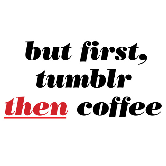
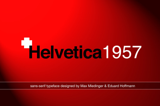
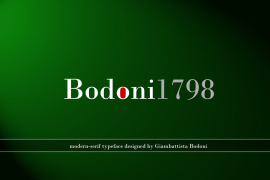
#Bodoni
Photo

Lil’Louis - French Kiss
Tribute Poster
Design by Attico36
#graphic#design#designer#layout#editorial#visual#grafik#poster#minimal#graphics#graphicdesign#artwork#print#posters#type#typo#typography#typeface#helvetica#bodoni#sans#serif#art#fineart#font#fonts#web#webdesign#music#dj
304 notes
·
View notes
Photo

Open Houses are back this week!
Theme: TypographyWed 2/22/2023-Thu 2/23/2023 10am-4pm each day. Free and open to all!
On February 22, 1991, “A Few Basic Typefaces” exhibition opened at the School of Visual Arts (SVA) in NYC. Massimo Vignelli was awarded their annual Master Series award which included an exhibition. He chose to highlight work in only a few typefaces: Bodoni, Century, Garamond and Helvetica. This week marks the 32nd anniversary of this exhibition.
SVA’s Masters Series began in 1988 as “an annual award exhibition to honor great visual communicators—designers, illustrators, art directors and photographers—of our time.” Massimo Vignelli was the 3rd person to receive this honor.
“It was a polemical exhibition to protest the inflation of meaningless typefaces polluting our world.“ Vignelli: From A to Z, p. 187
For our Open Houses this week, we will be revisiting this exhibition and invite you to think about designing type and designing with type. You will be able to view many of the artifacts from this 1991 exhibition plus some designs done after 1991 that includes these 5 typefaces.
From the exhibition records, we found that the exhibition plan originally included designs using Times New Roman as well. You will be able to see these works too. Along with images of the original exhibition, the original exhibition checklist, and other documentation. Plus numerous OTHER typefaces, many custom, that appear in the Vignellis’ work. Futura. Optima. Didi. Bloomingtype. Our Bodoni. Our Futura.
Plus numerous custom alphabets for architectural graphics, logotypes, etc. And we’ll have examples of designs using type that might seem very “un-Vignelli.”
More details about Open Houses can be found on our website: https://www.rit.edu/vignellicenter/events
#vignelli#design archives#design history#Typography#1990s#bodoni#century#garamond#helvetica#times new roman#graphic design#corporate identity#Packaging#exhibition design#architectural graphics#open houses#archives for all
21 notes
·
View notes
Note
also what font do you use for your blog title :)
It's "Bodoni," according to my settings page.
3 notes
·
View notes

Text
this anyone else's morning? 😂
4 notes
·
View notes
Photo
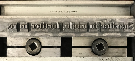

& so said claudio acquaviva
caludio aquaviva’s well known dictum from his Industriae ad curandos animae morbos [ioannem mersium, antuerpiæ, 1635]; cast, as frequently encountered—transposed. my favorite [non-literal] translation: iron fist in a velvet glove. set in bodoni bold [lanston monotype 275].
letterpress on johannot.
3 notes
·
View notes
Text
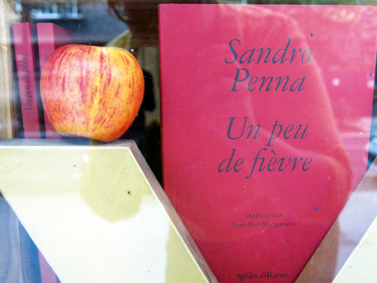
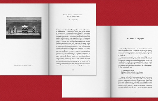
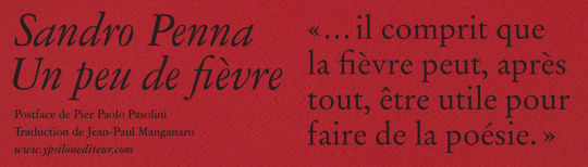
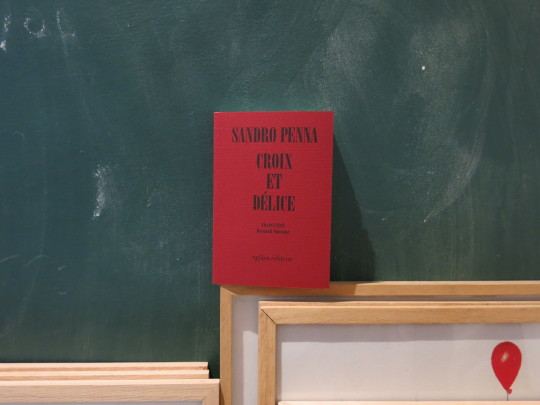
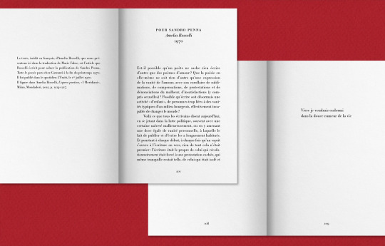
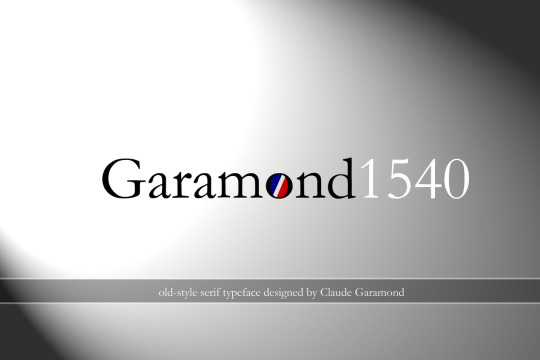
Sandro Penna :
Un peu de fièvre, trad. Jean-Paul Manganaro, postface de Pier Paolo Pasolini, Paris, Ypsilon éditeur, 2022 »
Croix et délice, trad. Bernard Simeone, éd. bilingue, textes de Natalia Ginzburg, Amelia Rosselli & Pier Paolo Pasolini, Paris, Ypsilon éditeur, 2023 »
#Ypsilon#book design#book cover#typography#black#fedrigoni#arena naturale smooth#Sandro Penna#Pier Paolo Pasolini#Natalia Ginzburg#Amelia Rosselli#Jean-Paul Manganaro#Bernard Simeone#Marie Fabre#Garamond#Merida#Scarlet Merida#giuseppe capogrossi#Un po’ di febbre#Un peu de fièvre#Croix et délice#Croce e Delizia#Bodoni Poster#Bodoni#Chauncey H. Griffith#Bodoni Berthold#American Garamond#Stempel Garamond
0 notes
Text
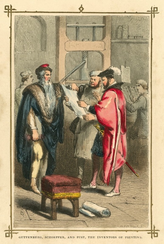
A Printer’s Nod to the Germans
This post is part of my preparation for a first-time ever Norlu Press event that will take place later this year. More posts to follow as the big days get closer.
The form of letterpress printing that the west has known since the middle of the 15th Century began in Germany, when Johannes Gutenberg and his associates Peter Schoffer and Johann Fust combined movable types with an adaptation of wine…
View On WordPress
0 notes
Text

Typeface history posters.
0 notes
Text

HARRY LESTER IN DA HOUSE
0 notes
Text
Tribbing pussies in hot lesbian fucking
Girls using dildo and masturbate
Ass Feet Pussy ♡¿♡ Tease
me manda esta video mi prima
Suck my huge dick
Foot tease
Sexy BBW Brutal Deepthroat Throatpie
Handsome bottom playing with two Indian dicks
Friends wife blowing
Mrs Claus disaplines me for being a bad Santa's helper / Nina Rivera
#accusingly#Bodoni#delirant#orthotoluidine#untrochaic#pseudogastrula#pawing#Ramey#thick-stemmed#Xanthian#Botryllidae#apod#Samas#apophyges#danhowell#recidivated#flanning#Liebfraumilch#luxive#cacophonical
0 notes
Text
Adriele novinha se masturbando
amateur asian girl riding dick - MyanmarHD
CARDI B INSTAGRAM
Sexy tease with Nikita
shemale big ass Chanel Santini A XXX
Double fisting Marias Brazilian butt
Dava's Hot POV Blowjob
Big natural tits babe showing sexy downblouse at her place
Seth Gamble and Jake Adams take turns in fucking teen Abigail Mac who wants to be an actress
Colpo Grosso Besame mucho, Sirenetta , Energica , Cavoletta Supersonica
#iridocyte#glut-#spreads#vermicle#microaerophile#nonruling#Corella#cook-out#bahoo#denotes#Aktyubinsk#hilaro-tragedy#accusingly#Bodoni#delirant#orthotoluidine#untrochaic#pseudogastrula#pawing#Ramey
0 notes
Video
FMR da Renato Morselli
Tramite Flickr:
Il mensile di Franco Maria Ricci
1 note
·
View note
Text
@staff
the bodoni font is all fucked up!
(>:c)
0 notes
Photo
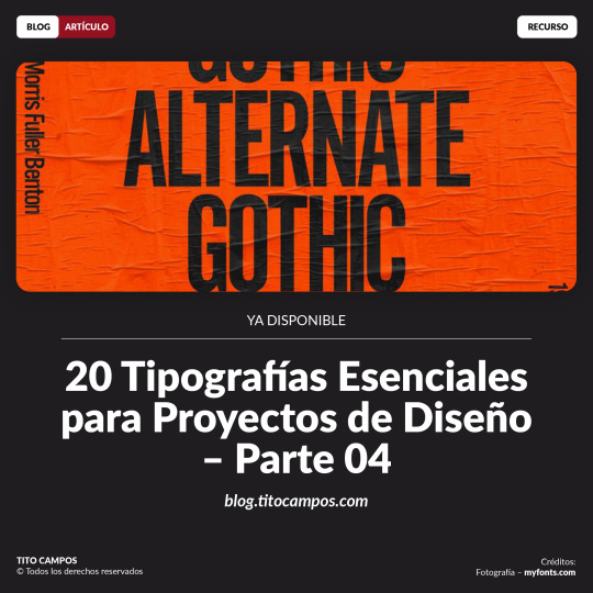
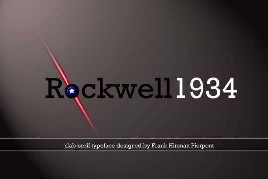
BLOG | ARTÍCULO | 20 Tipografías esenciales para desarrollo de proyectos de diseño – Parte 4 Para finalizar esta entrega de 20 tipografías esenciales para el desarrollo de proyectos de diseño, ahora llegamos a la cuarta y última parte de la recopilación. Así que en este artículo veremos las siguientes 5 tipografías para que podamos añadirlas a nuestro catálogo de fuentes. En la primera, segunda y tercera parte conocimos las tipografías de la 1 a la 15: 1. Avenir 2. Bodoni 3. Univers 4. Futura 5.Montserrat 6. Work Sans 7. Gotham 8. Rockwell 9. Sabon 10. Roboto 11. Adobe Caslon Pro 12. Letter Gothic 13. Avant Garde 14. Helvética 15. Open Sans En esta cuarta parte, les comparto otras 5 tipografías esenciales para el desarrollo de proyectos (16 a la 20). Espero las disfruten: social.titocampos.com/20-tipos-esenciales-diseno-parte4 Click en el enlace para leer artículo ahora ⬆️ Para ver tutoriales paso a paso…no olvide visitar ✅ youtube.com/titocampos Más contenido en los enlaces de la biografía ➡️ links.titocampos.com
#blog#articulo#recurso#tipografia#listado#recomendacion#lectura#mejoresTipografias#topTipografias#TopTypes#typeList#gotham#workSans#sabon#rockwell#roboto#avenir#bodoni#univers#futura#montserrat#adobeCaslon#caslon#letterGothic#avantGarde#helvetica#openSans#alternateGothic#courier#garamond
0 notes
Photo
sleepy baby hour
7 notes
·
View notes
Last Seen Blogs

viking-eriksson
Untitled

jackjones-cpr
Jack Jones - CPR

wwwblhzsfcom
Shenzhen Mark

a-break-in-time
Too bored to see

amorejennie
Amorejennie