#CSS Text Property
Explore tagged Tumblr posts
Visit Tumblr Blog
Explore Tumblr blogs with no restrictions, modern design and the best experience.
Last Seen Tumblr Blogs


Fun Fact
Women make up for the other 50% of Tumblr’s audience.
Text
Theres a way to do this with workskins! If you go to make a workskin on ao3, and then paste in this:
* { user-select: none; }
and then add that workskin to your fic, the text won't be able to be copied, and still works for screenreaders (at least the one I tested it with).
This can be turned off easily by disabling the creators style, but if the plagarists can't figure it out it would probably deter them well enough.
As annoying as it probably would be, I wonder if AO3 would allow special HTML to prevent copy-paste of my works. There are ways around it but it might just deter lazy content thieves
#honestly Id bet that these people are going to be lazy so should be pretty helpful haha#how it works is the asterisk basically means “any element” in css#the code ao3 uses for workskins#and then the properties you want it to have is in the curly brackets#and user-select: none stops your cursor from selecting it#but because its still available text screenreaders can still use it#tell me if you want to try this and need help setting it up 👌#im honestly surprised it worked ao3 workskins are so damn limiting#vio text
352 notes
·
View notes
Text
yesterday i randomly remembered that a WHILE back i was messing with making gen 4 styled text boxes in HTML/CSS and i ended up totally forgetting about it until now. idk why i started this but now that i've remembered it i want to add all the different window types in gen 4 lmao. i also cleaned up the CSS a bit. fun little side project ig. i'm gonna work on the other window types after i eat bc it requires image editing for the border-image property jiosdfj
79 notes
·
View notes
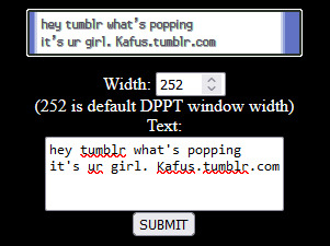
Note
Hi, I was just curious how you did your text bubbles in the demo?
hello!! some screenshots and an explanation under the cut!
it's not too complicated, you will just need to make sure what you want in the text bubbles is wrapped in a div.
here are some messages in the rendered passage:

here they are in the text editor:
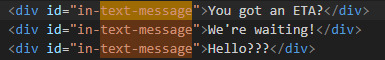
and here is the css:
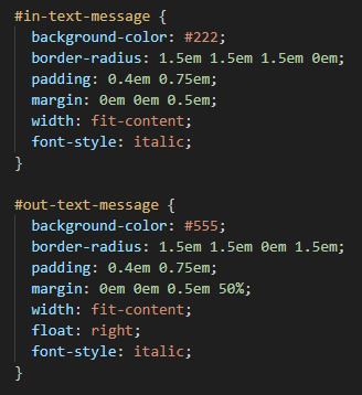
the in-text-message is for messages received and out-text-message is for messages being sent! the most important part of this is the border-radius properties -- the values are rounding each corner but one (the 0 value) to give it that text bubble look. play around with the padding, margins. colours etc to get the style that you want :-)
24 notes
·
View notes
Text
JavaScript Fundamentals
I have recently completed a course that extensively covered the foundational principles of JavaScript, and I'm here to provide you with a concise overview. This post will enable you to grasp the fundamental concepts without the need to enroll in the course.
Prerequisites: Fundamental HTML Comprehension
Before delving into JavaScript, it is imperative to possess a basic understanding of HTML. Knowledge of CSS, while beneficial, is not mandatory, as it primarily pertains to the visual aspects of web pages.
Manipulating HTML Text with JavaScript
When it comes to modifying text using JavaScript, the innerHTML function is the go-to tool. Let's break down the process step by step:
Initiate the process by selecting the HTML element whose text you intend to modify. This selection can be accomplished by employing various DOM (Document Object Model) element selection methods offered by JavaScript ( I'll talk about them in a second )
Optionally, you can store the selected element in a variable (we'll get into variables shortly).
Employ the innerHTML function to substitute the existing text with your desired content.
Element Selection: IDs or Classes
You have the opportunity to enhance your element selection by assigning either an ID or a class:
Assigning an ID:
To uniquely identify an element, the .getElementById() function is your go-to choice. Here's an example in HTML and JavaScript:
HTML:
<button id="btnSearch">Search</button>
JavaScript:
document.getElementById("btnSearch").innerHTML = "Not working";
This code snippet will alter the text within the button from "Search" to "Not working."
Assigning a Class:
For broader selections of elements, you can assign a class and use the .querySelector() function. Keep in mind that this method can select multiple elements, in contrast to .getElementById(), which typically focuses on a single element and is more commonly used.
Variables
Let's keep it simple: What's a variable? Well, think of it as a container where you can put different things—these things could be numbers, words, characters, or even true/false values. These various types of stuff that you can store in a variable are called DATA TYPES.
Now, some programming languages are pretty strict about mentioning these data types. Take C and C++, for instance; they're what we call "Typed" languages, and they really care about knowing the data type.
But here's where JavaScript stands out: When you create a variable in JavaScript, you don't have to specify its data type or anything like that. JavaScript is pretty laid-back when it comes to data types.
So, how do you make a variable in JavaScript?
There are three main keywords you need to know: var, let, and const.
But if you're just starting out, here's what you need to know :
const: Use this when you want your variable to stay the same, not change. It's like a constant, as the name suggests.
var and let: These are the ones you use when you're planning to change the value stored in the variable as your program runs.
Note that var is rarely used nowadays
Check this out:
let Variable1 = 3; var Variable2 = "This is a string"; const Variable3 = true;
Notice how we can store all sorts of stuff without worrying about declaring their types in JavaScript. It's one of the reasons JavaScript is a popular choice for beginners.
Arrays
Arrays are a basically just a group of variables stored in one container ( A container is what ? a variable , So an array is also just a variable ) , now again since JavaScript is easy with datatypes it is not considered an error to store variables of different datatypeslet
for example :
myArray = [1 , 2, 4 , "Name"];
Objects in JavaScript
Objects play a significant role, especially in the world of OOP : object-oriented programming (which we'll talk about in another post). For now, let's focus on understanding what objects are and how they mirror real-world objects.
In our everyday world, objects possess characteristics or properties. Take a car, for instance; it boasts attributes like its color, speed rate, and make.
So, how do we represent a car in JavaScript? A regular variable won't quite cut it, and neither will an array. The answer lies in using an object.
const Car = { color: "red", speedRate: "200km", make: "Range Rover" };
In this example, we've encapsulated the car's properties within an object called Car. This structure is not only intuitive but also aligns with how real-world objects are conceptualized and represented in JavaScript.
Variable Scope
There are three variable scopes : global scope, local scope, and function scope. Let's break it down in plain terms.
Global Scope: Think of global scope as the wild west of variables. When you declare a variable here, it's like planting a flag that says, "I'm available everywhere in the code!" No need for any special enclosures or curly braces.
Local Scope: Picture local scope as a cozy room with its own rules. When you create a variable inside a pair of curly braces, like this:
//Not here { const Variable1 = true; //Variable1 can only be used here } //Neither here
Variable1 becomes a room-bound secret. You can't use it anywhere else in the code
Function Scope: When you declare a variable inside a function (don't worry, we'll cover functions soon), it's a member of an exclusive group. This means you can only name-drop it within that function. .
So, variable scope is all about where you place your variables and where they're allowed to be used.
Adding in user input
To capture user input in JavaScript, you can use various methods and techniques depending on the context, such as web forms, text fields, or command-line interfaces.We’ll only talk for now about HTML forms
HTML Forms:
You can create HTML forms using the <;form> element and capture user input using various input elements like text fields, radio buttons, checkboxes, and more.
JavaScript can then be used to access and process the user's input.
Functions in JavaScript
Think of a function as a helpful individual with a specific task. Whenever you need that task performed in your code, you simply call upon this capable "person" to get the job done.
Declaring a Function: Declaring a function is straightforward. You define it like this:
function functionName() { // The code that defines what the function does goes here }
Then, when you need the function to carry out its task, you call it by name:
functionName();
Using Functions in HTML: Functions are often used in HTML to handle events. But what exactly is an event? It's when a user interacts with something on a web page, like clicking a button, following a link, or interacting with an image.
Event Handling: JavaScript helps us determine what should happen when a user interacts with elements on a webpage. Here's how you might use it:
HTML:
<button onclick="FunctionName()" id="btnEvent">Click me</button>
JavaScript:
function FunctionName() { var toHandle = document.getElementById("btnEvent"); // Once I've identified my button, I can specify how to handle the click event here }
In this example, when the user clicks the "Click me" button, the JavaScript function FunctionName() is called, and you can specify how to handle that event within the function.
Arrow functions : is a type of functions that was introduced in ES6, you can read more about it in the link below
If Statements
These simple constructs come into play in your code, no matter how advanced your projects become.
If Statements Demystified: Let's break it down. "If" is precisely what it sounds like: if something holds true, then do something. You define a condition within parentheses, and if that condition evaluates to true, the code enclosed in curly braces executes.
If statements are your go-to tool for handling various scenarios, including error management, addressing specific cases, and more.
Writing an If Statement:
if (Variable === "help") { console.log("Send help"); // The console.log() function outputs information to the console }
In this example, if the condition inside the parentheses (in this case, checking if the Variable is equal to "help") is true, the code within the curly braces gets executed.
Else and Else If Statements
Else: When the "if" condition is not met, the "else" part kicks in. It serves as a safety net, ensuring your program doesn't break and allowing you to specify what should happen in such cases.
Else If: Now, what if you need to check for a particular condition within a series of possibilities? That's where "else if" steps in. It allows you to examine and handle specific cases that require unique treatment.
Styling Elements with JavaScript
This is the beginner-friendly approach to changing the style of elements in JavaScript. It involves selecting an element using its ID or class, then making use of the .style.property method to set the desired styling property.
Example:
Let's say you have an HTML button with the ID "myButton," and you want to change its background color to red using JavaScript. Here's how you can do it:
HTML: <button id="myButton">Click me</button>
JavaScript:
// Select the button element by its ID const buttonElement = document.getElementById("myButton"); // Change the background color property buttonElement.style.backgroundColor = "red";
In this example, we first select the button element by its ID using document.getElementById("myButton"). Then, we use .style.backgroundColor to set the background color property of the button to "red." This straightforward approach allows you to dynamically change the style of HTML elements using JavaScript.
#studyblr#code#codeblr#css#html#javascript#java development company#python#study#progblr#programming#studying#comp sci#web design#web developers#web development#website design#ui ux design#reactjs#webdev#website#tech
400 notes
·
View notes
Text
Progress report on the Sky shrine: The structural parts of the site are done ~ ! Now I just need to make some assets and make this a proper shrine with like, writing and stuff.

What the above screenshot doesn't show is that the background behind the text boxes also gets blurred, which should hopefully aid in that frutiger aero look I wanted. Should also help with readability.

Side note: Those scroll bars are gonna make me so mad every time I look at this shrine. They're ugly, but they can't be helped... but I wish they could be!!! Firefox does have some CSS properties to customize how scrollbars look, but the fact that I'm also a Mac user means these changes don't seem to hold. I've gotten the scroll-bar property to work only once or twice, and never reliably the way I want it to.
#sky children of the light#sky cotl#that sky game#thatskygame#skyblr#not a photo from the album#mufo draws#still not really a drawing but making webpages is still an art regardless
24 notes
·
View notes
Text
Coding Tutorial - Permalinks, Tags and Notes
I found this helpful so I wanted to share
Source: https://themesbyeris.tumblr.com/tutorial07
I couldn't reblog so I'm reposting.
Permalink
We are going to start this part of the tutorial by adding in the permalink. If you don’t know what that is already, it is the thing you click to go to view a post on an individual page. Tumblr makes this really easy. All you need is the following piece of code:<a href="{Permalink}">Text</a>
You can replace the word “Text” from the example above with an image, a note count, the date, or anything else text-based. For example, if we wanted the permalink to be displayed in dd/mm/yyyy format, we would write:{block:Date}DayOfMonthWithZero}/{MonthNumberWithZero}/{Year}{/block:Date}
Tip: Always wrap the date in the “block:Date” tags otherwise the date will show up on ask/submit pages too.
Here are a few other formats:{MonthNumberWithZero}-{DayOfMonthWithZero}-{Year} = 04-10-2012 {DayOfWeek}, {DayOfMonth} {Month} {Year} = Tuesday, 10 April 2012 {ShortMonth} {DayOfMonth}{DayOfMonthSuffix}, '{ShortYear} = Apr 10th, '12 {12Hour}:{Minutes}{AmPm} = 3:00pm {12HourWithZero}.{Minutes}.{Seconds}{CapitalAmPm} = 03.00.00PM {24HourwithZero}{Minutes} = 1500 {TimeAgo} = 1 hour ago
[Click here for all the ways you can format the date]
I will be using the {TimeAgo} tag for this example. But I also want to include in the permalink the notecount. This one is easier because there’s only two options for it.{NoteCount} = 1,938 {NoteCountWithLabel} = 1,983 notes
Naturally, this is also wrapped in those pesky block tags. This time it’s “block:NoteCount”. So if we put both the date and notecount together with the word “with” between them, it will look like this:<a href="{Permalink}"> {block:Date}{lang:Posted TimeAgo}{/block:Date} {block:NoteCount} with {NoteCountWithLabel}{/block:NoteCount} </a>
What we’re going to do with this piece of code is wrap it in a div and call it “permalink”, then put that div right after our main content, inside the “block:Post” tags (this is important).{block:Posts} ... [All your post types here] ... <div id="permalink"> <a href="{Permalink}"> {block:Date}{lang:Posted TimeAgo}{/block:Date} {block:NoteCount} with {NoteCountWithLabel}{/block:NoteCount} </a> </div>
Now that it is wrapped up in a div, we can style it. We don’t need to do much for this theme, since we did a lot of the styling in the content tag. The only things we need to specify here is the size of the font, and use the margin property to make a space between the permalink and the post above it.#content #posts #permalink { font-size:9px; margin-top:10px; }
Tags
The basic code for tags is this:{block:Tags}<a href="{TagURL}">#{Tag}</a> {/block:Tags}
Tumblr also gives us an extra block tag called “block:HasTags” since not all posts have tags. If you add in a pretty box or image for tags, it is not a good idea to have it still display when there are no tags at all. In this case I will be adding a div with the label “tags”, and putting this inside the secondary block tags.{block:HasTags}<div id="tags"> {block:Tags} <a href="{TagURL}">#{Tag} </a> {/block:Tags} </div> {/block:HasTags}#content #posts #tags { font-size:9px; }
Now I am going to show you a little trick. At the moment we have formatted the tags so that they will show up like this:
#tag one #tag two #tag three
But what if I want them to show up like this?
tag one, tag two, tag three.
Do you see the problem there? The last tag ends with a fullstop instead of a comma. The following would not work:{block:Tags} <a href="{TagURL}">{Tag}</a>, {/block:Tags}.
(Take note of the full stop outside of the “block:Tags” tag.)
tag one, tag two, tag three,.
Here’s a little trick to get around that. Just copy this code:{block:Tags} <a href="{TagURL}">{Tag}</a><span class="comma">, </span> {/block:Tags}.#content #posts #tags .comma:last-child { display: none; }
It’s the “last-child” bit in the CSS that tells the browser not to display the comma if it’s the last one in the line. We also used “span” instead of “div” because if we’d used div, it would have made a line break, which we don’t want in this case.
tag one, tag two, tag three.
Note Container
The note container is the bit where it lists everyone that has liked or reblogged a post, along with their comments if they made any. Naturally it only shows up on the permalink pages.
This one is going to be done a little differently to the previous two, and be placed outside the “posts” div we created (but it still has to be inside the “block:Posts” tags).{block:Posts} <div id="posts"> ... [A lot of stuff in here.] ... [Permalink] [tags] </div> [<--closes the "posts" div] Note Container {/block:Posts}
Note that you don’t HAVE to put the note container outside the “posts” div, it can be inside if you want. This is just how we’re doing it for this theme. All this means is that it won’t be inside those white boxes we made for each post.
The HTML part for this is simple. Just some block tags, and {PostNotes}. I have wrapped this in a div so we can style it using CSS.{block:PostNotes} <div id="notecontainer">{PostNotes}</div> {/block:PostNotes}
Now since we took the note container outside of the “posts” div, we need to re-establish the width and margins. A font size also needs to be specified here since that isn’t specified in any parent tags.#content #notecontainer { margin: 20px auto; width: 500px; font-size: 11px; }
Now if you look at the theme, you will be able to click through to the permalink pages and see the notes as a list. If there are a lot of notes, they will be labelled 1-50, and number 51 will contain a “Show More Notes” link. Having it numbered is the tumblr default, but it doesn’t actually look nice. We are going to go ahead and access the list using a built in tag called “ol.notes” (ol = ordered list, numbered list), and apply a property called “list-style-type” to remove the number system. I am also going to get rid of the default margins and padding that comes with the list, but padding can be added if you prefer to have the lines more spaced out.#content #notecontainer ol.notes { list-style-type: none; margin: 0; padding: 0; }
Lastly I am going to edit the little avatar next to each note. At the moment there is no space between the avatar and the name of the blogger, so I’ll be adding in a 10px margin. Plus just to be on the safe size I will include the size of the images.#content #notecontainer img.avatar { margin-right: 10px; width: 16px; height: 16px; }
Click here to see the code so far, and here for the live-preview.
In the next tutorial we will be finishing up this basic theme with adding in pagination and infinite-scroll. Then I will move on to tricks to make things look pretty like transition-effects.
#themes#tutorial#theme code tutuorial#coding tutorial#tumblr theme tutorial#theme tutorial#tutorials#code tutorial
5 notes
·
View notes
Text
oh my god this hurts to look at
i assume it's because tumblr has to account for anything a user would want to put in their post
i'm no expert but could you not just put something like
<div class="sonic3"> <strong>SONIC THE HEDGEHOG 3 (2024)</strong></div>
in your html and
.sonic3 {
background: -webkit-linear-gradient(rgb(255, 0,0), rgb(0,0,0));
-webkit-background-clip: text;
-webkit-text-fill-color: transparent;
}
in your css if you were doing this yourself?
(Note: Firefox and its forks automatically alias these "-webkit" properties with something that works in FF environments.)
5 notes
·
View notes
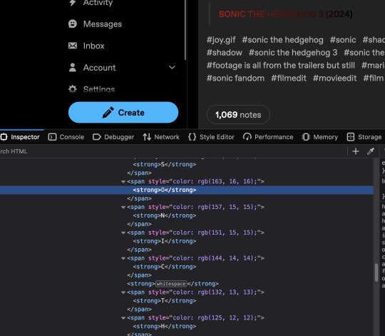
Text
how shinigami eyes works
first - the short version:
shinigami eyes is a browser extension that uses a fancy list called a bloom filter to identify people who can be considered transphobic or trans-supportive. a bloom filter is a kind of list that lets you check if someone is in the list, without being able to actually know the contents of the list. i go below into how it works, but the short version is Math™️, with a side effect of having false positives - thinking an item is in the list when it really isn't. whenever a social media username is detected (the exact method how depends on the website), it checks the username against that list, and applies some CSS to change the color of the text depending on what list the username is in.
the long version
shinigami eyes can be split into a few parts:
bloom filters
submissions
name highlighting
bloom filters
i'll start with the most complex part - bloom filters. the most common misconception about Shinigami Eyes is this: the filters are not updated in real-time. they are shipped with the extension which had last been updated since november 2022, according to the FF extension site. in other words: nothing marked since then can be seen by anyone other than who marked it. you can see that in the code here, where it loads the bloom filters from a data/[something].dat file included in the extension (but not in the github repo).
the following information about bloom filters is my summarized version of this page.
bloom filters are, in a slightly longer explanation than before, a way to know if an item is *not* in a list with 100% certainty, but there's a false positive rate that grows as more names are added to the list. a bloom filter of a single size is able to handle any number of items in the list, though. there's also the issue that you can't *delete* stuff from a bloom filter - you would need to regenerate it from scratch to do that.
now that the medum-sized explanation of what they are is done, let's go into how they work. a bloom filter is a set of n bits, initially all set to zero. to add items into the filter, you need a few hash functions, in this example i'll use h1, h2, and h3, with n=10. if I wanted to add the text asyncmeow to the list, i would do this: h1("asyncmeow") % n // n = 10, h1(...) % 10 = 9 h2("asyncmeow") % n // n = 10, h2(...) % 10 = 5 h3("asyncmeow") % n // n = 10, h3(...) % 10 = 8
after that, i have a list that looks like this (keep in mind that the list is zero-indexed):
[0, 0, 0, 0, 0, 1, 0, 0, 1, 1]
you can then check if something is in the filter by running the same hashing functions and checking if the result bits are set in the filter. you can access the bloom filters used for shinigami eyes by going to about:debugging#/runtime/this-firefox in Firefox and clicking "Inspect" on Shinigami Eyes, then running bloomFilters in the console. as this could possibly change in an update, i don't want to go into how they are set up, and i haven't dug enough into how their bloom filter code works well enough to say anyways.
submissions
submissions on shinigami eyes are encrypted (as in - encryption separate from HTTPS), then posted to https://shini-api.xyz/submit-vote. you can see the code for this here. when you right click someone to mark them, their name is stored in the local data of your browser in an overrides property.
name highlighting
name highlighting is done by checking them against the bloom filters and your local overrides. if a user is present in either bloom filter, or present in your local overrides, they are marked accordingly. not much to it from there.
that's really it, i think? feel free to ask if you have any questions! nya :3
77 notes
·
View notes
Note
hi there!! there isn’t a need to publish this ask I literally just am so curious if you had any resource or tutorial regarding your neocities! I’m sorry if this is so out of the blue but I saw your site and really adored the layout!! I’m specifically just wondering about the method you used for your blog posts - I’ve found some recommended ways to do it but i feel like yours is integrated really well imo :) also if you’re not comfortable answering or anything that’s totally fine lol pls don’t feel obligated. lastly your art is so gorg!!!
i'm finally going to answer this ask...!! it's going to be a very long read so i'll keep it all under this cut
i know you are specifically curious about the blog posts page but i figured this was a great time to thoroughly explain my website layout too since i had another person asking about it (i'll put that at the bottom though) :D
please bear with me btw because i... i have never made a tutorial like this before LOL
--
blog posts guide

1. scrollbox
i made a super low effort format for my blog entries. i honestly just wanted it to be a super simple scrollable box with all of my entries being in one general place. CSS to do this, i created an all encompassing <div class> that had the styling property of overflow.
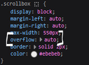
fyi, i also added a <div class> within the scrollbox class that would handle the padding but TBH i'm not sure... i needed to make an entire class for that LOL REFERENCES - scroll box
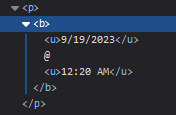
2. date & time
HTML ok honestly i just used a <p> element and made it bold....
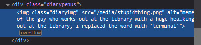
3. images (optional)
HTML i don't always attach an image to my entries but when i want to, i use this <div class> that sits below my date & time. i style it with an <img class> that i created and add an <alt text> too to make it more accessible!
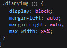
CSS this is what the <img class> looks like. i like my images centered and on their own "line."
4. status
HTML again, another <div class> specifically made for the status. i just made the font size smaller to visually differentiate it from the actual entry itself.
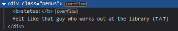
5. blog entry text
HTML my blog entries are simply typed up between <p> tags and i use <br> to start a new line... it literally just looks like this LOL....

THAT'S ALL...>!!!!!! :)
--
website guide

1. general page layout
HTML in order to establish where i want all of my blog's content to lie, i created a <div class> specifically to store it all.
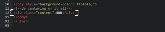
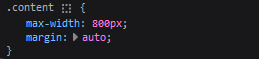
CSS the styling for it is pretty simple! just setting a max-width to limit the size of everything that will be in it and also centering the page with the margin.
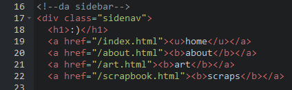
2. sidebar
HTML my sidebar just comprises of a heading tag and navigation links.
CSS this is all personal taste aside from the fixed position
REFERENCES - fixed sidebar - responsive sidebar
3. main content
HTML because everything is stored in the <div class="content">, the sidebar and the page contents are limited to the constraints of the it.
that is all pt. 2...... bless <3
#THANK U FOR ASKING BTW!!!!#it brings me so much joy when people ask me . things and i then get to answer these things#i am so sory if this is somewhat incomprehensible or a pain to read through IF YOU HAVE ANY NEEDS FOR CLARIFICATION... JUST ASK ME..!!!!#textoffun#inbox
34 notes
·
View notes
Text
my neocities site used to have a bunch of javascript.
for example, i had a page that existed to load up chapters of various stories so that you could read all of the chapters in one page, sort of like ao3's view full work feature. because it was scripted dynamically, i didn't have to maintain a separate copy of the text, and it was actually more flexible than what ao3 offers, because you could read specific arcs, heck, you could read a specific sequence of chapters (e.g., 2-13 specifically)
another thing i didn't want to maintain by hand was header at the top of the page with navigational links, so i had a script that updates them on page load.
problem is, it kind of just feels bad to load a page, then see a visible delay before the header pops in.
i spent almost a year living like that, but i eventually stopped maintaining my html by hand, and learned the joys of the static site generator.
i didn't need the chapter loader anymore, either - i could code my site generator to concatenate chapters into a full-text page, and since it's static, it'd load much faster than make the user's browser stitch together the html every time they want to open that page.
slowly but surely, everything i might've used js for was getting replaced by simpler, faster, and easier means.
i don't make much use of it, but my site actually has discord-style spoiler text. blocks of text you can click to reveal (and the css is uses currentColor, so it works even on different themes)


i don't even need javascript for this; the way i accomplish it is a bit clever:

it's a checkbox! even if you hide the actual box, you can still click the label to toggle its state
this was something i implemented early, based on this blog post where a similar trick was used for a no-js dark/light mode toggle.
but i took this to a new height this year: i added fancy footnotes

but under the hood, it's the same principle

check box to toggle the state, then some fancy css it position it to float above the text.
but of course, if i'm doing all of this without javascript, what do i need javascript for?
and there was only one feature that stuck around. it's something that i think no one really used, but i'm attached to it.
you see, i'm notorious for writing long chapters. i could split them up, but i have particular stopping points in mind. still, i am merciful, so in my stories with consistently long chapters, i'm gone out of my way to insert break points, "subchapters" seamless into the main text.

those little roman numerals would trigger a script that reformatted the page to hide all the other subchapters, and reconfiguring the next/prev buttons so that clicking them takes you to the next section rather than the next chapter
in theory, you could read Hostile Takeover as if it were a fic with 72 chapters instead of 16.
now, this is a very complex feature. you cant use checkbox tricks to emulate this, unless you want to go crazy writing a dozen css rules for every permutation of checkboxes, or force the user to figure out an arcane system where you need to uncheck one section before loading the next
but it turns out, while i wasn't paying attention, the css committee added a crazy new feature. there are :has selectors, enabling you to style elements based on the properties of elements that come below it in the document.
the whole game has changed now.
couple this with learning about :target selectors courtesy of wonder how a couple of really ambitious ao3 fics do their magic, i had everything i need
all it took to make subchapters happen now a few simple rules

really, you only need that first line. it says "if main has a target element, hide all subchapters that aren't the target"
the other lines are convenience; they had the next/prev chapter buttons if you're in the middle of the chapter. there's a couple other rules (beside the subchap nav i added a button that takes you to the top of the page, which resets the anchor target), but overall, it was quick and painless. really, the actual struggle was teaching my site generator spit out the right html. (i spent five minutes tearing out my hair and rebuilding to no effect because i forgot i had two layers of caching. whoops)
this new approach does sacrifice the ability to make the arrow buttons do double duty, but i don't think it's a big loss when the subchapter buttons are right there, and arguably retaining the single function of each button is a win for usability.
the biggest loss is that there's no real way to style the buttons differently if they've been clicked, so you don't actually know which subchapter you're actually browsing.
(maybe if anyone i actually uses this feature, they can complain to me and i'll whip up a quick bit of js to patch it :v)
but until then, i'll take some satisfaction in delete my site's scripts entirely. in a way, that's the biggest loss, but it's one of i'm proud of
2 notes
·
View notes
Text
day 2 - css
finally. (usual disclaimer: i don't know what i'm doing)
shadows
i'm completely skipping the basics because css basics are so hard BUT you know what's harder? SHADOWS. i somewhat learned the basics but not well enough to make a post about it SO logically my only option is properly learning the basics later and figuring out shadows right now. so, without further ado:
there's two properties for shadows: box-shadow (which makes box shaped shadows) and text-shadow (which makes shadows specifically for text, so text shaped).
box-shadow needs five values: horizontal offset, vertical offset, blur radius, spread distance, and color.
text-shadow needs four values: horizontal offset, vertical offset, blur radius, and color.
horizontal offset is how much the shadow is going to be dislocated to the right. if the value is negative, the shadow dislocates to the left.
vertical offset is how much the shadow is going to be dislocated downwards. if the value is negative, the shadow dislocates upwards.
blur radius is how defined/sharp the shadow is, with 0 being the sharpest possible (so higher = more blurry/less sharp). this value is optional; if you don't specify it, it's considered as zero.
spread distance is basically how big the shadow is. the higher the number, the bigger the shadow. this value is optional; if you don't specify it, it's considered as zero.
these first four values can be given in pixels (px), and the next one, the color, can be a hex code or similar
color is the color of the shadow (golly gee who would have thunk). it is also optional.
the values for box-shadow should be written in that order 1) horizontal offset, 2) vertical offset, 3) blur radius, 4) spread distance, 5) color
the values for text-shadow are basically the same, but there's no spread distance, so 1) horizontal offset, 2) vertical offset, 3) blur radius, 4) color
example for box-shadow:
box-shadow: 5px -5px 16px 8px #fff;
(text-shadow would look the same except for the spread distance, which is 8px in the example, since text-shadow doesn't have the spread distance value)
ok that's it, sorry the whole post looks like a clown who can't do their make up properly, i just had to color code everything because yes.
28 notes
·
View notes
Text
The Essentials of Flat Icons: Characteristics and Usage in Modern Design
Icon Design: Common Questions Answered
1. What is a UI icon?
A UI icon is a small graphical symbol used in user interfaces to represent a function, action, or concept. Icons help users quickly identify features or tools, enhancing usability and navigation within software applications or websites. They can be simple images or complex illustrations, often designed to communicate meaning intuitively without relying on text.
2. How do I make my icons smaller than 100%?
To make your icons smaller than 100%, you can adjust their size using CSS. Set the `width` and `height` properties to a percentage less than 100% (e.g., `width: 80%; height: auto;`). If you're using a graphic design tool, look for sizing options and input a smaller percentage or specific pixel dimensions.
3. What is a flat icon?
A flat icon is a graphic design element characterized by a minimalist style, using simple shapes, bold colors, and a lack of three-dimensional effects like shadows or gradients. This design approach emphasizes clarity and ease of recognition, making flat icons popular in user interfaces, applications, and branding, as they convey information quickly and effectively without unnecessary detail.
4. What are program icons?
Program icons are small graphic symbols that represent software applications on a computer or device. They provide a visual way to identify and access programs quickly. Icons often reflect the program's function or branding, making it easier for users to navigate their systems and launch applications with a single click.
5. What is the link rel shortcut icon?
The link rel shortcut icon, often referred to as the favicon, is a small image associated with a website. It appears in the browser tab, bookmarks, and address bar, helping users identify the site quickly. It's defined in HTML using the `<link rel="shortcut icon" href="path/to/icon.ico">` tag, typically in the site's header.

Visit: VS Website See: VS Portfolio
2 notes
·
View notes
Text
Learn HTML and CSS: A Comprehensive Guide for Beginners
Introduction to HTML and CSS
HTML (HyperText Markup Language) and CSS (Cascading Style Sheets) are the core technologies for creating web pages. HTML provides the structure of the page, while CSS defines its style and layout. This guide aims to equip beginners with the essential knowledge to start building and designing web pages.
Why Learn HTML and CSS?
HTML and CSS are fundamental skills for web development. Whether you're looking to create personal websites, start a career in web development, or enhance your current skill set, understanding these technologies is crucial. They form the basis for more advanced languages and frameworks like JavaScript, React, and Angular.
Getting Started with HTML and CSS
To get started, you need a text editor and a web browser. Popular text editors include Visual Studio Code, Sublime Text, and Atom. Browsers like Google Chrome, Firefox, and Safari are excellent for viewing and testing your web pages.
Basic HTML Structure
HTML documents have a basic structure composed of various elements and tags. Here’s a simple example:
html
Copy code
<!DOCTYPE html>
<html>
<head>
<title>My First Web Page</title>
<link rel="stylesheet" type="text/css" href="styles.css">
</head>
<body>
<h1>Welcome to My Web Page</h1>
<p>This is a paragraph of text on my web page.</p>
</body>
</html>
: Declares the document type and HTML version.
: The root element of an HTML page.
: Contains meta-information about the document.
: Connects the HTML to an external CSS file.
: Contains the content of the web page.
Essential HTML Tags
HTML uses various tags to define different parts of a web page:
to : Headings of different levels.
: Paragraph of text.
: Anchor tag for hyperlinks.
: Embeds images.
: Defines divisions or sections.
: Inline container for text.
Creating Your First HTML Page
Follow these steps to create a simple HTML page:
Open your text editor.
Write the basic HTML structure as shown above.
Add a heading with the tag.
Add a paragraph with the tag.
Save the file with a .html extension (e.g., index.html).
Open the file in your web browser to view your web page.
Introduction to CSS
CSS is used to style and layout HTML elements. It can be included within the HTML file using the <style> tag or in a separate .css file linked with the <link> tag.
Basic CSS Syntax
CSS consists of selectors and declarations. Here’s an example:
css
Copy code
h1 {
color: blue;
font-size: 24px;
}
Selector (h1): Specifies the HTML element to be styled.
Declaration Block: Contains one or more declarations, each consisting of a property and a value.
Styling HTML with CSS
To style your HTML elements, you can use different selectors:
Element Selector: Styles all instances of an element.
Class Selector: Styles elements with a specific class.
ID Selector: Styles a single element with a specific ID.
Example:
html
Copy code
<!DOCTYPE html>
<html>
<head>
<title>Styled Page</title>
<link rel="stylesheet" type="text/css" href="styles.css">
</head>
<body>
<h1 class="main-heading">Hello, World!</h1>
<p id="intro">This is an introduction paragraph.</p>
</body>
</html>
In the styles.css file:
css
Copy code
.main-heading {
color: green;
text-align: center;
}
#intro {
font-size: 18px;
color: grey;
}
CSS Layout Techniques
CSS provides several layout techniques to design complex web pages:
Box Model: Defines the structure of an element’s content, padding, border, and margin.
Flexbox: A layout model for arranging items within a container, making it easier to design flexible responsive layouts.
Grid Layout: A two-dimensional layout system for more complex layouts.
Example of Flexbox:
css
Copy code
.container {
display: flex;
justify-content: space-around;
}
.item {
width: 100px;
height: 100px;
background-color: lightblue;
}
Best Practices for Writing HTML and CSS
Semantic HTML: Use HTML tags that describe their meaning clearly (e.g., , , ).
Clean Code: Indent nested elements and use comments for better readability.
Validation: Use tools like the W3C Markup Validation Service to ensure your HTML and CSS are error-free and standards-compliant.
Accessibility: Make sure your website is accessible to all users, including those with disabilities, by using proper HTML tags and attributes.
Free Resources to Learn HTML and CSS
W3Schools: Comprehensive tutorials and references.
MDN Web Docs: Detailed documentation and guides for HTML, CSS, and JavaScript.
Codecademy: Interactive courses on web development.
FreeCodeCamp: Extensive curriculum covering HTML, CSS, and more.
Khan Academy: Lessons on computer programming and web development.
FAQs about Learning HTML and CSS
Q: What is HTML and CSS? A: HTML (HyperText Markup Language) structures web pages, while CSS (Cascading Style Sheets) styles and layouts the web pages.
Q: Why should I learn HTML and CSS? A: Learning HTML and CSS is essential for creating websites, understanding web development frameworks, and progressing to more advanced programming languages.
Q: Do I need prior experience to learn HTML and CSS? A: No prior experience is required. HTML and CSS are beginner-friendly and easy to learn.
Q: How long does it take to learn HTML and CSS? A: The time varies depending on your learning pace. With consistent practice, you can grasp the basics in a few weeks.
Q: Can I create a website using only HTML and CSS? A: Yes, you can create a basic website. For more complex functionality, you'll need to learn JavaScript.
Q: What tools do I need to start learning HTML and CSS? A: You need a text editor (e.g., Visual Studio Code, Sublime Text) and a web browser (e.g., Google Chrome, Firefox).
Q: Are there free resources available to learn HTML and CSS? A: Yes, there are many free resources available online, including W3Schools, MDN Web Docs, Codecademy, FreeCodeCamp, and Khan Academy.
#how to learn html and css#html & css course#html & css tutorial#html and css#html course#html css tutorial#html learn#html learn website#learn html#learn html and css#html and css course#html and css full course#html and css online course#how to learn html and css for beginners
4 notes
·
View notes
Text

Dive into the latest web dev trends with CSS Landscape #30! Discover Firefox 130 updates, vertical centering in CSS & innovative text truncation techniques. ✨Optimize fonts, master CSS display properties & create a 2D solar system with CSS.
➡️ https://freefrontend.com/css-landscape-2024-09-24/
2 notes
·
View notes
Text
more seriously though I have been making progress on my website again. I stopped for a while because I could not for the life of me get the rich text editor library I used to play nice with all the other libraries I'm using in my front end, so I decided to just look for another rich text editor library and got it working very quickly, so for the past few days I've focused on making the front end look presentable, but I swear bootstrap doesn't actually make anything easier. I'm still fumbling around with css but I think after I finish up this one thing I'm gonna start working on the back end again. I need to implement more robust error handling, but also I think I'm gonna add a comment system
I've been thinking that once this is all done, I'll use my website to post my more serious thoughts since I can't be randomly terminated on there and I'll have more control over it. but yknow I would still like there to be able to be some discussion so that it's not just me speaking into the void. I'll have to add a comment moderation system that immediately filters out obvious trolls and harassment and puts the rest into a queue where I have to approve them. it's not ideal but that's what I have to do as a trans woman with opinions. that being said I think it'll be fun to work on that stuff, I'm already envisioning what data structures I'll use, how I'll store them, what properties I'll add to the already existing post and user classes, and so on. back end development is so much more fun because it actually feels like programming
#although I have to leave canada next week so preparing for that is gonna slow me down for a bit. ugh#txt#programming
5 notes
·
View notes
Text
CSS One-Liners to Improve (Almost) Every Project
CSS One-Liners to Improve (Almost) Every Project
#css#webdev#listicle
Most of these one-liners will be one declaration inside the CSS rule. In some cases, the selector will be more than just a simple element; in others, I will add extra declarations as recommendations for a better experience, thus making them more than a one-liner —my apologies in advance for those cases.
Some of these one-liners are more of a personal choice and won't apply to all websites (not everyone uses tables or forms). I will briefly describe each of them, what they do (with sample images), and why I like using them. Notice that the sample images may build on top of previous examples.
Here's a summary of what the one-liners do:
Limit the content width within the viewport
Increase the body text size
Increase the line between rows of text
Limit the width of images
Limit the width of text within the content
Wrap headings in a more balanced way
Form control colors to match page styles
Easy-to-follow table rows
Spacing in table cells and headings
Reduce animations and movement
Limit the content width in the viewport
body { max-width: clamp(320px, 90%, 1000px); /* additional recommendation */ margin: auto; }
Adding this one-liner will reduce the content size to occupy 90% of the viewport, limiting its width between 320 and 1000 pixels (feel free to update the minimum and maximum values).
This change will automatically make your content look much nicer. It will no longer be a vast text block but something that looks more structured and organized. And if you also add margin: auto; to the body, the content will be centered on the page. Two lines of code make the content look so much better.
Aligned and contained text looks better than a giant wall of text
Increase the text size
body { font-size: 1.25rem; }
Let's face reality: browsers' default 16px font size is small. Although that may be a personal opinion based on me getting old 😅
One quick solution is to increase the font size in the body. Thanks to the cascade and em units browsers use, all the text on a web page will automatically increase.
Larger text size makes things easier to read.
Increase the space among lines
body { line-height: 1.5; }
Another preference for improving readability and breaking the dreaded wall of text is increasing the space between lines in paragraphs and content. We can easily do it with the line-height property.
Spaces between lines break the wall of text and the rivers of white.
This choice (with the previous two) will considerably increase our page's vertical size, but I assure you the text will be more readable and friendlier for all users.
Limit the size of images
img { max-width: 100%; }
Images should be approximately the size of the space they will occupy, but sometimes, we end up with really long pictures that cause the content to shift and create horizontal scrolling.
One way to avoid this is by setting a maximum width of 100%. While this is not a fool-proof solution (margins and paddings may impact the width), it will work in most cases.
Prevent horizontal scrolling and make images flow better with the text
Limit the width of text within the content
p { max-width: 65ch; }
Another tactic to avoid the dreaded wall of text and rivers of space is to apply this style even in conjunction with the max width in the body. It may look unnecessary and sometimes weird, as paragraphs will be narrower than other elements. But I like the contrast and the shorter lines.
A value of 60ch or 65ch has worked for me in the past, but you can use a different value and adjust the max width to match your needs. Play and explore how it looks on your web page.
Break the bigger chunks of text into smaller blocks for readability
Wrap headings in a more balanced way
h1, h2, h3, h4, h5, h6 { text-wrap: balance; }
Headings are an essential part of the web structure, but due to their larger size and short(-er) content, they may look weird. Especially when they occupy more than one line. A solution that will help is balancing the headings with text-wrap.
Although balance seems to be the most popular value for text-wrap, it is not the only one. We could also use pretty, which moves an extra word to the last row if needed instead of balancing all the content. Unfortunately, pretty has yet to count on broad support.
Balanced wrapping can improve visibility and readability
Form control colors to match page styles
body { accent-color: #080; /* use your favorite color */ }
Another small change that does not have a significant impact but that makes things look better. Until recently, we could not style native form controls with CSS and were stuck with the browser display. But things have changed.
Developing a whole component can be a pain, but setting a color that is more similar to the rest of the site and the design system is possible and straightforward with this one-liner.
It's the small details (and colors) that bring the page together
Easy-to-follow table rows
:is(tbody, table) > tr:nth-child(odd) { background: #0001; /* or #fff1 for dark themes */ }
We must use tables to display data, not for layout. But tables are ugly by default, and we don't want data to look ugly. In particular, one thing that helps organize the data and make it more readable is having a zebra table with alternating dark/light rows.
The one-liner displayed above makes achieving that style easy. It can be simplified to be only tr without considering the tbody or table parent, but it would also apply to the table header, which we may not want. It's a matter of taste.
Easier to follow the data horizontally (by row)
Spacing in table cells and headings
td, th { padding: 0.5em; /* or 0.5em 1em... or any value different from 0 */ }
One last change to make tables more accessible and easier to read is to space the content slightly by adding padding to the table cells and headers. By default, most browsers don't have any padding, and the text of different cells touches, making it confusing to differentiate where one begins and the other ends.
We can change the padding value to adjust it to our favorite size. However, avoid overdoing it to avoid unnecessary scrolling or too much blank space.
Easier to follow data horizontally and vertically
Reduce animations and movement
@media (prefers-reduced-motion) { *, *::before, *::after { animation-duration: 0s !important; /* additional recommendation */ transition: none !important; scroll-behavior: auto !important; } }
Okay, okay. This code is way more than a one-liner. It has a one-liner version (removing animations by setting their duration to zero seconds), but other things on a web page make elements move.
By setting these declarations inside the prefers-reduced-motion media query, we will respect the person's choice to have less movement. This approach is somewhat radical because it removes all movement, which may not necessarily be the user's intent -it is "reduced motion" and not "no motion." We can still preserve movement on a case-by-case basis if appropriate.
No animations? No problem!
2 notes
·
View notes