#Color Harmony
Explore tagged Tumblr posts
Visit Tumblr Blog
Explore Tumblr blogs with no restrictions, modern design and the best experience.
Last Seen Tumblr Blogs


Fun Fact
Tumblr has 411 employees.
Text

Tried out pointlism in 60x40 format on paper. Got inspired by Seurats scientific approach to art, only used the 3 primary colors for the artwork. I made it in acrylic and took the photo with my phone but hopefully it still captures the artworks vibrancy and colors.
#pointalism#painting#colorful art#impressionism#color harmony#artlovers#acrylic painting#art#artworks#fine art#original art#vivid colors
473 notes
·
View notes
Note
Hi Queen! What did you mean by a triadic colour scheme in the post on The Rebound? And why would you scream about polyamory if Ryu was purple?
Hi, Anon.
The triadic color scheme is one way to create color harmony. You can do this in a couple of ways (which I might expand on in a separate post), but let's focus on the triadic color scheme in this one.
First, though, I need to bring in this visual aid and explain it a bit:

(This is a photo I took of a color-wheel illustration in Betty Edwards' book "Color".)
This is a traditional color wheel with 3 primary colors, 3 secondary colors, and 6 tertiary colors.
Since your question relates to Zen, Ryu, and Atom's colors in The Rebound, we'll focus on the primary and secondary colors in this post.
The primaries and secondaries are:
12: Yellow (primary)
2: Orange (secondary)
4: Red (primary)
6: Purple (secondary)
8: Blue (primary)
10: Green (secondary)
(Not that this will matter to the post, but if you're interested: The primary colors can't be created by mixing other colors/pigments. These are the basic colors you need to create the other colors on the color wheel. The secondary colors are those you get by mixing two of the primaries together.)
The triadic color scheme, which I briefly mentioned in that post on The Rebound (which you referred to), is created by using three colors with an equal distance between them on the color wheel. Since the traditional color wheel has 12 colors, there needs to be 3 colors between each chosen one. This is illustrated by a triangle (you can see two options in the image above). No matter how you turn the triangle, the points always point to the three colors that harmonize with each other.
The 4 triadic combinations you can get are:
The 3 primary colors together (yellow, red, and blue)
The 3 secondary colors together (orange, purple, and green)
And two different combinations with tertiary colors (1, 5, and 9, and 3, 7, and 11, but these don't matter in this post)
With that said, what we've seen in The Rebound so far is that Zen is connected to orange (even though he seems to be verging towards yellow at times)...

Ryu is connected to blue...


And even though we haven't seen much of Atom yet, he seems to be connected to green (because we've seen it in the trailer as well).


Orange and green align perfectly for a triadic color scheme, but blue doesn't. The color that would've made a perfect triangle with orange and green is purple (as shown by the downwards-pointing triangle in the image above).
In other words, had Ryu been purple instead of blue, I would've screamed about poly because that would've been as close to perfection as perfection could come when it comes to the colors (at least for me).
Also, one of the symbols for polyamory is a downwards-pointing purple möbius triangle, which is basically a never-ending ribbon that's shaped into a triangle (other symbols are the blue, red, and black flag with a pi symbol on it, and a red heart with a blue infinity symbol, to mention a few). This is just another reason I would scream about poly if I got a triadic color scheme.
But I didn't get that, so this is pointless. But I can't help it. I'm a "more is more" kind of person, lol.
To be serious, though... I don't think we will get poly here (even though I want it). Not only because I didn't get a triadic color scheme or other color harmonies between all three of them, but also because I don't think that's the story they want to tell. They might not even do the love triangle trope (but they probably will, lol).
Does this mean I'll stop suggesting poly, though? No. Because I'm delulu. Even when the colors are telling me to stop, I won't.
Because all I want to see are the three of them together.

(This image is living rent-free in my brain right now. And I don't mind. I don't mind at all.)
I will shut up about poly now. (Just give it to me!)
Thank you for your ask!
#iq color post#triadic colors#color harmony#color theory#the colors mean things#orange#blue#green#the rebound#the rebound the series#thai ql#thai bl#thai series#my shit
20 notes
·
View notes
Text


Frieren Art thumbnail exploration
#Frieren#art thumbnails#color harmony#I’m practicing#illustration#I hv no idea what I’m doing#sousou no frieren#procreate
5 notes
·
View notes
Text

Nicholaas Chiao, In Full Bloom, 2024, mixed media
#art#contemporary art#nicholaas chiao#fine art#neo expressionism#neoexpressionism#expressionism#flowers#still life#color harmony#painting
18 notes
·
View notes
Text
Fly me to the moon
22 notes
·
View notes
Text
New project is in progress. I have so much fabric, it’s time to stop buying new ones and start using the old ones!

#sewing#sewingtoys#my sewing#handcrafted#crafts#fabric#recycling#old fabric#kids toys#soft toy#new ideas#color harmony#hungary#quilting#small business#kids room#green
2 notes
·
View notes
Text
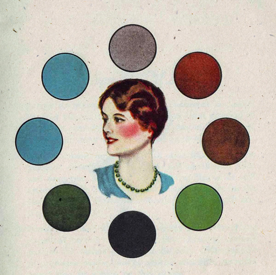
1930s era color harmony chart - Chart C.
#vintage illustration#color#color harmony#the 30s#color palettes#color schemes#infographics#interaction of color#color charts
26 notes
·
View notes
Text

Today's gonna be an old art work post. While I was home for the holidays I cam across more old art work from my time at Mississippi State. I'm still really happy with how this turned out.
Don't forget to like and follow for more art! ✨
3 notes
·
View notes
Text
An attempt at a color script
I was kind of dreading this at first, but after gathering references it didn't feel so bad. It's interesting how different the results feel than what I had imagined. I'll have to think about if I want to change the lighting to make this a bit... lighter? Anyway, I tried to capture important moments in the short where the lighting and color might be unique. I should be able to use this as a map/guide to lighting my scenes. Onto modeling!
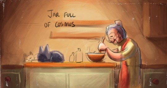
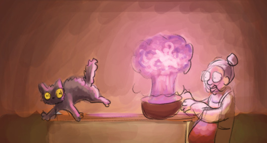


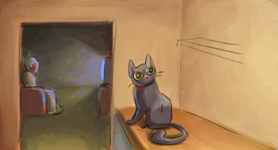
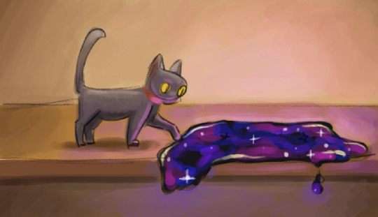
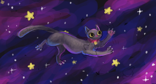
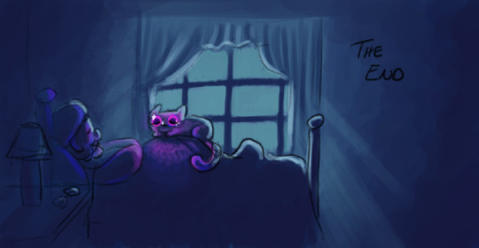
And of course, here are my reference images. I think they look pretty :]
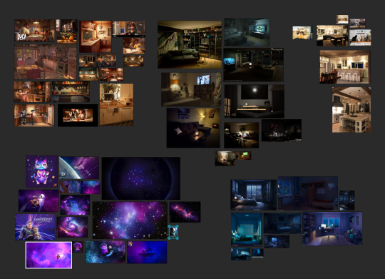
#Color Script#Jar Full Of Cosmos#Digital Art#Color Palette#Visual Storytelling#Color Design#Fantasy Colors#Witchy Vibes#Cosmic Hues#Artistic Process#Tumblr Art#Creative Journey#Color Scheme#Magical Tones#Concept Art#Colorful Narrative#Character Design#Fantasy World#Color Harmony#Storyboard Art#Blender Art#Artistic Vision#Creative Direction#Tumblr Creativity#Color Exploration#Illustration Process#Cosmic Palette#Color Composition#Visual Development#digital art
4 notes
·
View notes
Text
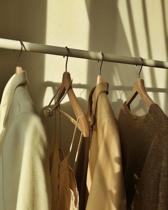
thebeiges: Instagram: @solncevgolove More posts like this here ♥ https://trashicorn.tumblr.com/post/641095803475247104/thebeiges-instagram-solncevgolove-more Sent from Pixm! A Photo Viewer and Universal Tool for Discovering Beautiful Pictures. https://appsto.re/us/pWte2.i
#brown moodboard#brown sugar#brown aesthetic#brown color#color palette#color harmony#brown street style#brown outfit#brown#color coordinated#color scheme#earthy tones#brown dress#brown sweater#brown coat#brown jacket#corduroyjacket#brown leather#jacket#beige#leather jacket#beige tones#knitted sweater#hand knitted#sweater#silk blouse#silk shirt#satin and lace#closet#coat hangers
2 notes
·
View notes
Text
Some color theory examples.
🎨color study note
#art#color theory#color harmony#art tips#color study#colour theory#colour harmony#colour study#color contrast#colour contrast#warm colors#cool colors#tones#monochomatic#complimentary
18K notes
·
View notes
Text
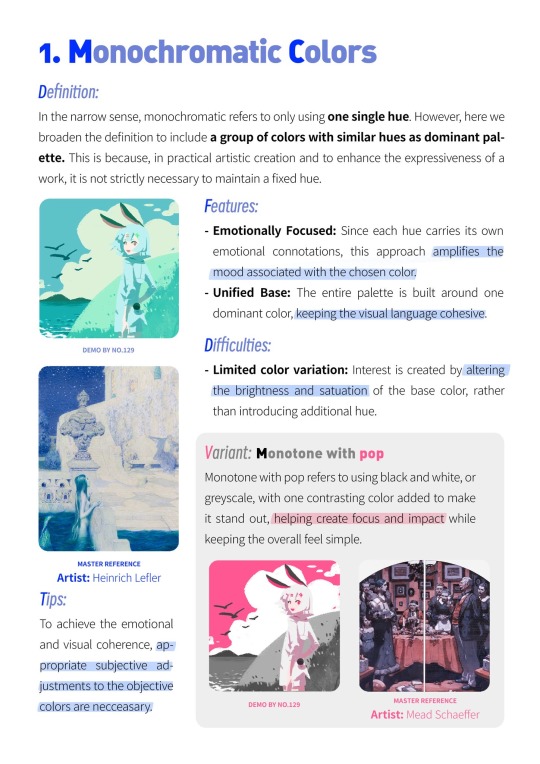
Color Harmony
This is inspired by a post I wrote answering an ask about the triadic color scheme. So, let's dive into color harmonies.
There are a couple of ways to create color harmony, and some of the most common are:
Analogous color scheme (which I usually refer to as "related colors")
Monochromatic color scheme
Complementary/contrasting color scheme
Split complementary color scheme
Triadic color scheme
There are also other color harmonies like the tetradic color scheme (which forms a rectangle across the color wheel and includes 4 colors) and the square color scheme (which forms a square across the color wheel and also includes 4 colors) to name a few. But I'm keeping it (somewhat) basic in this post.
Value (dark/light) and intensity (saturated/muted) also play a role in color harmonies, but I'm keeping it simple in this post by just focusing on color combinations.
As always when explaining these things, I need this visual aid to help me:
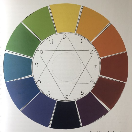
(This is a photo I took of a color-wheel illustration in Betty Edwards' book "Color".)
This is a traditional color wheel with 3 primary colors, 3 secondary colors, and 6 tertiary colors.
(I'm putting their numbers in the list below so you'll know which color I'm referring to on the color wheel.)
The colors are:
12: Yellow (primary)
1: Yellow-Orange (tertiary)
2: Orange (secondary)
3: Red-Orange (tertiary)
4: Red (primary)
5: Red-Purple (tertiary)
6: Purple (secondary)
7: Blue-Purple (tertiary)
8: Blue (primary)
9: Blue-Green (tertiary)
10: Green (secondary)
11: Yellow-Green (tertiary)
(Not that this will matter to the post, but if you're interested: The primary colors can't be created by mixing other colors/pigments. These are the basic colors you need to create the other colors on the color wheel. The secondary colors are those you get by mixing two of the primaries together. The tertiary colors are those you get by mixing the primary color with the secondary color that's on either side of it.)
(Also, the tertiary colors usually have different names in everyday language (like magenta, indigo, or turquoise). But I'm coming from a painter's perspective when naming the tertiary colors because this was how I learned how to identify hues and mix them properly.)
With that sorted, let's dive into the different color harmonies.
Analogous Color Scheme
These colors are inherently harmonious because they share the same space on the color wheel and reflect similar light waves.
Usually, they include 3 colors, but a 4th and 5th could potentially work as well.
If you think of the color wheel as a cake, the analogous colors are all included in a small/mid slice of it. They are all next to each other.
An example could be purple, blue-purple, and blue since these 3 colors are right next to each other on the color wheel.
The analogous color scheme is often used with characters that are color-coded with a secondary (or tertiary) color. Secondary (and tertiary) colors are more difficult to distinguish than primary colors since they're produced by mixing at least two other colors. So, there is always more than one color at play in the secondary (and tertiary) ones.
This is why we often see, for example, orange color-coded characters in QLs use a spectrum of orange where they sometimes verge towards yellow and/or red.
But, this color scheme can be used in the set design as well, as it was in the background in this scene from House of Stars:
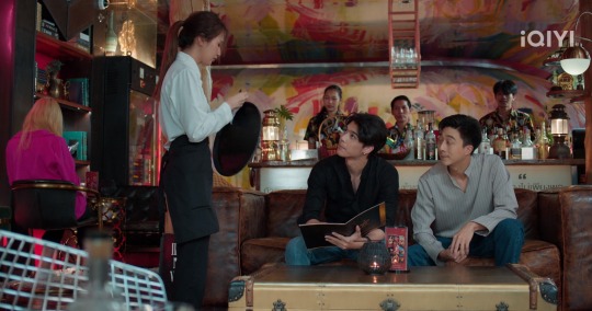
There's yellow, orange, and red (which incorporates a spectrum of 5 colors on the color wheel), and makes an analogous color scheme. There's some pink in there as well, which, if we want to be basic, is pretty much just a light red (red mixed with white). (There's also some green, which is a complementary color to red, but I'll get to that below.)
Monochromatic Color Scheme
This color scheme is basically several values (dark/light) of the same color.
A simple way to think about it is to think about a black-and-white photo. There's everything in there from black to the gray midtones to white.
Or this frame from Bed Friend:
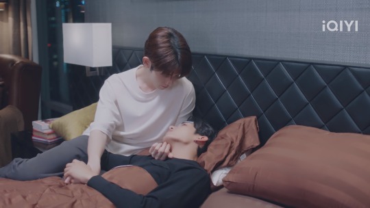
If we just focus on the white-to-black color spectrum, there's the white of the lampshade and Uea's shirt, the gray on the wall, the gray of Uea's pants, the darker gray/black on the headboard and King's shirt, and the black of the nightstand.
If another color was used, the black would still be black and the white would be white, but the midtones in between would be different values of the color of choice (for example purple, blue, or green).
Obviously, it doesn't have to go all the way to the ends of the spectrum (to the black and the white) to create color harmony. Using the midtones also works well, like these harmonious blues in Ji's bedroom in To Be Continued:

(I know this might look gray to a lot of people. But, trust me, there's blue in there.)
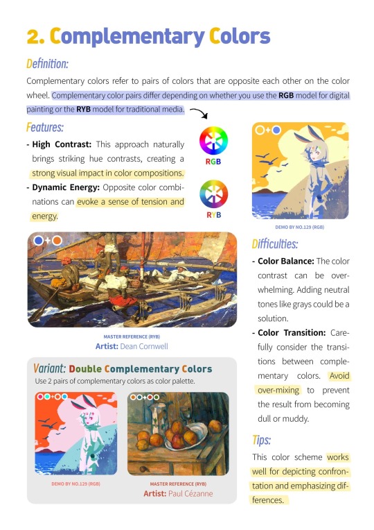
Complementary/Contrasting Color Scheme
I've already written about complementary/contrasting colors before, so I won't explain it in detail in this post. However, the core principle is that the complementary colors sit on the opposite sides of the color wheel.
The basic (primary + secondary) examples are:
Yellow + purple
Red + green
Blue + orange
And we also have black/white (or dark/light).
I would say that this is the most commonly used color harmony in the QLs I've watched. It's an easy way to make the colors stand out, it's a great way to show contrasts in characters, but it's also very easily and universally used with the black and white, dark and light contrasts in particular.
There are a lot of options to choose from when it comes to the black and white contrasts, but I'm choosing Lee Hyun and Kim An in Love Class Season 2 because their lives and personalities contrast just as much as their black and white colors.

I also want to add Chen Yi and Ai Di from Kiseki: Dear to Me who are matching each other:

It's a bonus that they're matching on all three colors (black, white, and red).
If I were to choose two of the colors from the color wheel and a QL that used them well, I would choose red and green and I Told Sunset About You:

They used these contrasting/complementary colors everywhere and it was so well done that everything from the set design to the characters was unforgettable. It was divine.
Split Complementary Color Scheme
This is also a way to use color on the opposite side of the color wheel. But, instead of the complete opposite, you select the two colors adjacent to the complement.
Instead of yellow being used with purple, yellow is used with red-purple and blue-purple, or purple is used with yellow-green and yellow-orange.
This is where we get into complicated territory, especially when trying to find examples of this in QLs. I don't think this is used very much (I can't remember having seen a representation of this) because sticking to the primary and secondary colors is easier.
Tertiary colors are used (I would say they're used more as a hue of a secondary or primary color, like I mentioned with orange in the part about the analogous color scheme above, rather than a color on its own) but are difficult to distinguish from the primary and secondary colors that produce them.
Every split complementary combination includes at least one tertiary color, so this might be why this color harmony isn't used as often in QLs.
If you have any examples, feel free to share them.
Triadic Color Scheme
I've already written about the triadic color scheme before, so I won't explain it in detail here. However, the core principle is that this color scheme is depicted with a triangle (there are two examples in the image of the color wheel above). Each point of the triangle points to a color that harmonizes with the other two.
The basic examples are:
The 3 primary colors together (yellow, red, and blue)
The 3 secondary colors together (orange, purple, and green)
An example of this can be Ji's bedroom in To Be Continued (the image I showed above), where there are yellow candles on the nightstands, a red balloon dog to the left (I can't really see if this is a Jeff Koons' figurine, but I doubt it), and the blue surrounding them (as well as their clothes).
There's also the living room in Knock Knock, Boys!, which includes the yellow, red, and blue (I love how all three of those colors pop):

But there are also the secondary colors in combination:

The orange pillow and posters, the purple light in the background to the right, and the green beer bottles. This is just another reason for me to absolutely love this series.
And then there's Secret Crush on You who wants to have all the primary and secondary colors in one frame at the same time (considering this is a colorful show, I'm not surprised):

The yellow, red-ish, and blue straws, the red backpack, the blue on Toh's shirt and the pillow behind Nuea, the orange on Nuea's clothes, the purple on Toh's shirt, and the green on Toh's shirt as well as the plants behind them.
And in this frame:

Where all three primary and all three secondary colors exist on those condom packages. Iconic!
And what a way to finish off this post, lol.
So, there you have it. 5 different ways to create color harmony with some examples from a couple of QLs.
#iq color post#color harmony#analogous colors#monochromatic colors#complementary colors#contrasting colors#split complementary colors#triadic colors#color theory#the colors mean things#house of stars#bed friend#bed friend the series#to be continued#to be continued the series#love class 2#kiseki: dear to me#i told sunset about you#itsay#knock knock boys the series#secret crush on you#my shit
18 notes
·
View notes
Text


Two-Tone Bistro
0 notes
Text
🎨 3 Amazing Websites to Find the Perfect Color Palettes 🌈
Struggling to find the perfect color palette for your design projects? 🤔 In this video, we’ll introduce you to 3 awesome websites that make color selection easy and fun! Whether you're designing a website, creating digital art, or refreshing your branding, these tools will help you nail your color choices every time. 🔥
✨ What you'll learn:
Discover online tools to create unique color schemes Get inspiration for your next design project 💡
Master color harmony and trends 🎯
Say goodbye to clashing colors and hello to stunning palettes! 💖
0 notes
Text
A Symphony of Color and Light - Posters with Wooden Frame

Bring your artwork to life on these posters made from high-quality photo paper (250gsm). These posters come with a pine wood frame for a natural look and come with a protective acrylic glass cover for long-lasting home decor. Their natural wood frame is available in black and white and you can choose between a satin or matte finish for your paper. Available in three sizes, and vertical orientations to best suit your art. Sawtooth hanging hardware included (except for the 11.7" x 8.3" size which has a small metal hole on the back instead).
- High-quality 250gsm photo paper in a satin or matte finish
- Pine wood frame with a protective acrylic glass cover
- Natural wood, black and white frame color options
- Three sizes
8.3" x 11.7"
11.7" x16.5"
20" x 28"
#symphony of color#color and light#wooden frame#vibrant posters#framed art#artistic decor#colorful artwork#light-themed art#wall decor#modern art#abstract posters#decorative frames#framed prints#unique wall art#home decor ideas#stylish posters#artistic expression#colorful wall art#aesthetic design#framed modern art#vibrant wall decor#abstract design#color harmony#framed abstract posters#contemporary decor.
0 notes
Text

Sewing in nature is the best, especially when the kids are asleep!
I hope a bag will be made from these leftover fabrics.
#crafts#handcrafted#hungary#my sewing#sewing#fabric#recycling#leftovers#sewblr#sewist#bag#backpack#colors#colorful#color harmony#textildesign#textiles#next project
1 note
·
View note