#Digital Art Tutorial
Explore tagged Tumblr posts
Visit Tumblr Blog
Explore Tumblr blogs with no restrictions, modern design and the best experience.
Last Seen Tumblr Blogs


Fun Fact
Hackers stole 65M passwords from Tumblr in 2013.
Text

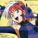
Dragon beetle! its a mix between my faves : dragonfly and hercules beetle if you want to support me on bsky!
#artists on tumblr#digital art#fantasy#dragon#creature design#insects#beetle#dragonfly#brartist#illustration#digital illustration#lilsiriusart#digital art tutorial#drawing
41 notes
·
View notes
Text


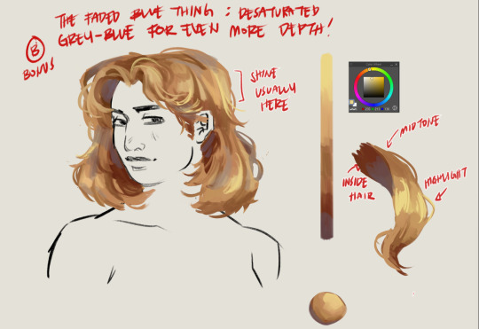
a short/mini digital painting tutorial by yours truly 🫡
a lot of people really like how i painted kaveh in that short hkvh comic so i thought i'd share a quick painting tutorial! I hope this can be helpful to yall ^_^
#also if you'd like a more in-depth understanding of light & shadow i highly suggest Angel Ganev on youtube#dude explains so well and i like how he respect people's art styles as he improves their art#art tutorial#drawing tutorial#digital painting tutorial#digital art tutorial#artists on tumblr#my art
552 notes
·
View notes
Note
Hii! I love your art so much! I have a question if you do not mind; how do you shade? Or well, it kinda looks like you added a "noise effect" layer over it but then again it also doesn't look like that. I just want to know how you make your art look so,,- texture-y??? I hope you understand what I mean ^-^" have a nice day! (And keep up the nice artwork 🫶🏻)
Thank you so much, I'm really glad you like my texture sm!! It's one of my favorite features for sure so I hope that helps <333
I know this isn't exactly tumblr's thing but I figured it'd be easier for me to show you how I do it rather than tell!!
I basically use this method on the video to add the realistic texture on top of the finished art, and in general I use a LOT of textured brushes!! For lineart, for base colors, textured brushes are your best friends! My favorites are chalk brushes and pencil brushes but there're tons of other types of textures you can try, like gouache, watercolor, oil painting, and all of them look wonderful with the paper texture above!!
As for the brush I used in the video for the light texture layer, it's this type of brush:
You'll find the link in my "brushes" highlight on instagram!
If you don't use procreate, just look for similar brushes and I'm sure you'll be able to achieve the same effect!!
#mew responds#apologies for the wait !! i was pretty busy until recently but I've finally been able to put this together for you <33#i had the recording for a while now but was only able to edit it these days geez#art tutorials#art tutorial#art resources#digital art#paper texture#digital art tutorial#artist on tumblr#digital artist#procreate#digital drawing
43 notes
·
View notes
Text
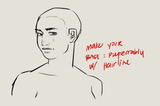
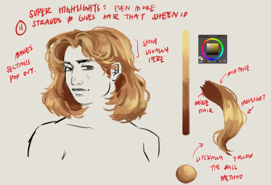
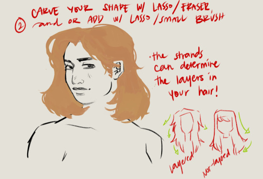

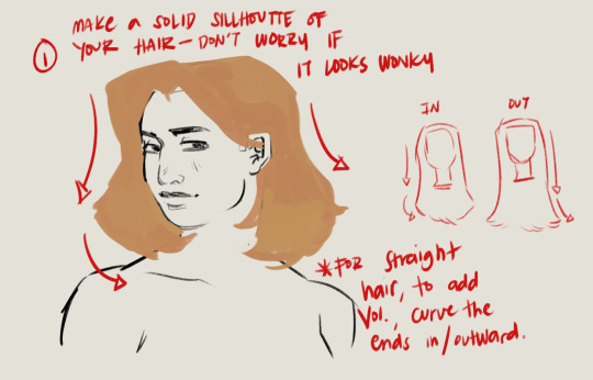
Hairt art step by step
#artists on tumblr#baliwart#art tutorial#hair art#hair art tutorial#digital art tutorial#digital art tips
774 notes
·
View notes
Text
Here, take my industry secrets.
I don't want people to spend their money on art school when I can make resources for free for them.
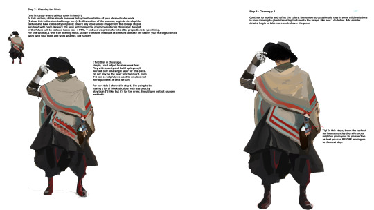
Hey here's a step-by-step guide to making concept art pieces using the industry "Collage > Painting" pipeline. It's how artists pump out a shit ton of concept work for their bosses at record speeds. Intended for newer artists!

For more stuff join my discord! I'm a transfem streamer who makes art stuff!
#art#artist#digital art#illustration#digital painting#digital artist#tutorial#art tutorial#digital art tutorial#digital painting tutorial#painting tutorial#concept art#concept artist#concept art tutorial#transfem#transfem artist#trans artist#transgender artist#transgender
192 notes
·
View notes
Text
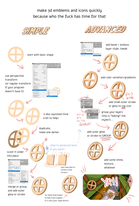
DISCLAIMERS:
1. This is done in Photoshop but most art programs can approximate, especially just the transform > duplicate > move around steps, which is 90% of the technique.
2. There are ways to do this that are:
quicker
more precise
more accurate in 3d space
less clonky
but this is the laziest way that I have yet found, so I thought I'd make a tutorial.
3. Sorry the UI text got so shrunk, I didn't notice. You can tell what I'm doing anyway hopefully, the only confusing part should be the grouping in the advanced method.
TLDR you can apply layer styles to an entire GROUP, so you can have layer styles on an individual image, and THEN put that in a group and put a layer style on that and it applies to that image and everything else in there with it. This is extraordinarily useful once you start using it a lot.
#art tutorial#tutorial#photoshop tutorial#digital art#digital art tutorial#digital art resource#art resources
136 notes
·
View notes
Text
youtube
Line Art Tutorial by Artsytsaa
“Hey Artlings! 🧋here’s my beginners lineart tutorial in which I teach you how to draw Perfect line art in procreate and any other program with streamline. I show you the secrets to do smooth clean lines and get rid of that chicken scratch and how to actually make your line art look like your sketch! While it can be as simple as using the classic line technique, there are a lot of things that can help you have the best lineart experience ever! These are all the things that I wish I knew when I was making manga style commissions and trying to get clean lines as a not so clean artist. As this is a #beginnersarttutorial I will be going into some depth of some settings that might be, and while my lineart is technically not perfect, this information in the right hands (aka someone dedicated to line art) will definitely be able to make their lines perfect.” - Artsytsaa
#art#lineart tutorial#digital art#digital art tutorial#line weight#line weight tutorial#line art tutorial#artsytsaa#digital line art#digital line art tutorial#Youtube
80 notes
·
View notes
Text


#Digital Art#Digital Painting#How To Paint Skin#Skin Tones#Art Tutorial#Digital Art Tutorial#Iridescent Skin#Holographic Skin
236 notes
·
View notes
Text

Lazy Tutorials for Lazy Artists, pt. 3: simplify your use of screentones in Clip Studio Paint! Let me know if you found this helpful and easy to understand :)
Ko-Fi?
#csp#clip studio paint#clip studio art#clip studio ex#clip studio#drawing tutorial#art tutorial#digital art tutorial#digital art tutorials#screentone#screen tones#manga tutorial#manga art#art tips#arttips#art tip
7 notes
·
View notes
Note
Hello! I was wondering if you would think about posting tutorials or stuff like that! I really admire your art style, and there are a lot of things that you were capable of drawing that I and many others are not.
You don't have to respond to this if you don't want to, bye honestly I just need to know how you're able to draw a kiss and make it look natural or, certain poses with characters
You're just really talented and I admire your work! I would love to learn from you if you were inclined to teach💕
i typed this almost all out once and tumblr deleted it so here we go again 🥀🥀
OFCC!! this is so sweet 😭😭 I broke my process down into steps so hopefully it’s easier to understand. This is just a general tutorial, but if you’d like a more in depth one on something specific do let me know and I can try!! I am not a professional (yet) and only a student but I hope my tips can be useful!!
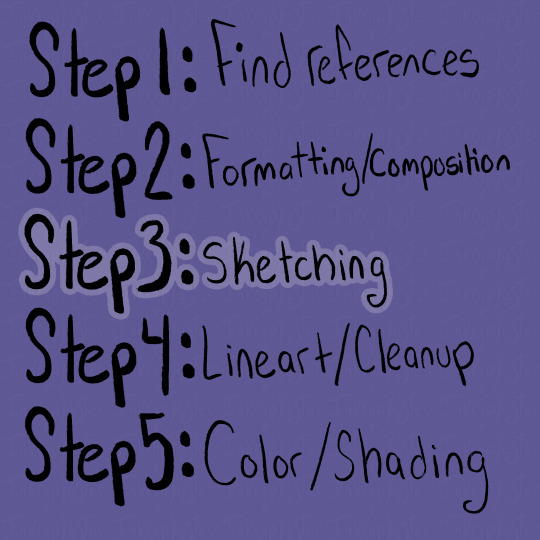
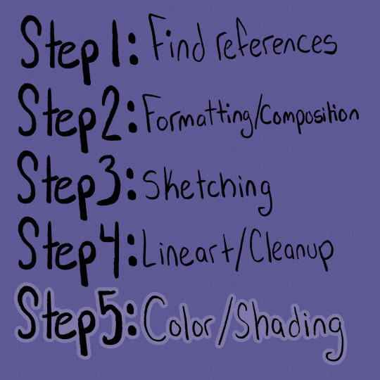
Step by Step tutorial + full speed-paint of my Cassius drawing below cut 💜

Using references has been something I’ve more recently gotten into the habit of, and by god I’ve improved so much because of it. Studio classes really forced me to get used to drawing from reference, and I’m glad I got that push.
For finding references, I usually use Pinterest, or I take my own photos (like for this cover image!! i couldn’t figure out the pose LMAO) For this tutorial, I’m going to be using my recent drawing of Lord Cassius from KotLC as examples of my steps. When I’m searching for references, I like to type phrases and emotions I associate with the character and see what it gives me. For Cassius, I literally searched “Judgmental facial expression man” as my beginning search LOL.
From there, if I’m not immediately finding pictures I want to use, I try finding one that’s within the realm of what I’m looking for, and then continue deep diving under the recommended pictures below the one I clicked on. I find this is a good way to more quickly get the specifics you want, and it’s something I love about Pinterest.
You can also combine images together to create a new pose if you’re not finding exactly what you want! I love hodge-podging pictures together to create my scenes.
Along with pose references, I also like to gather emotion/body language references. Sometimes it’s just looking at different aesthetics I’m going for, and sometimes, like when I’m drawing sokeefe, it’s looking at pictures of couples. I study their facial expressions, and how their bodies interact in a space together, compared to more platonic relationships. I also just think it’s fun to study human behavior lol.
An extra thing I do when find references is also look for clothing inspiration! Especially with fantasy works like KotLC, it’s sometimes hard for me to come up with fashion for them. I often really like taking random elements from a couple different pictures, putting them together to create an outfit, and unifying them through color!
Once I have gathered a bunch of references that I like, I sift through them and pick out the ones I think will go well together, both stylistically and composition-wise. I think it’s important to note that your drawings don’t have to be a 1:1 replica of the reference!! The pictures are there to guide your drawing, but not dictate it. Some parts of the picture I will reference a lot more heavily, often things I struggle with like hands, while things I’m more comfortable with like expressions I will stray from the reference a bit and give it my own flare.
Whether your making a drawing like the ones I will show below (of the multiple smaller drawings of Cassius all laid out on one spread) or more of a scene drawing, I find using the reference photos to roughly “sketch” out how I want the composition to look to be extremely helpful. Especially with digital art, using the images as a rough guide is easy to create multiple compositions to choose from.
As you can see in this picture, I’ve cut out the backgrounds/parts of the reference photos that I don’t need, so I can better see what my composition will actually look like. I’ll have the full speed-paint of my Cassius drawing at the bottom of this post, and in that you can see briefly at the beginning me cutting apart and piecing together a bunch of images, until I landed on this layout.
When actually laying out the images, I always have in mind the viewer’s eye. I want to guide the viewer through the drawing, giving them lots of entertainment while not being an overwhelming amount of information.
When it comes to sketching, I have a lot of different approaches that I use, depending on the time I have and what I need to draw. Most of the time, I lightly trace over the reference image, blocking out any large and important shapes. This makes it a lot easier for my brain to understand and replicate. When I’m tracing, I also like to mark where certain features are, like the nose and eyes, along with the curves of the shapes. That is especially important on the face.
I like to turn the reference off, or put it in another window, bring my traced shapes to the left side, then begin my own drawing on the right. At first, I focus on making sure the proportions are correct and the shapes match. After that, I go back over and adjust the sketch to my style, and the characteristics of whoever I’m drawing. Often the reference image’s face/body will look different from the character, so it’s important to understand the fundamental shapes of the body, and how they are interacting, rather than just copying the image straight up. Here are some examples below from the speed-paint 👇


If I’m feeling stuck and like something doesn’t look right, I’ll hover my drawing over the tracing, and sometimes over the reference to see what is not lining up. Then putting it back off to the side and working on that section. I also flip the canvas a lot, to help my eyes not get too used to my drawing.
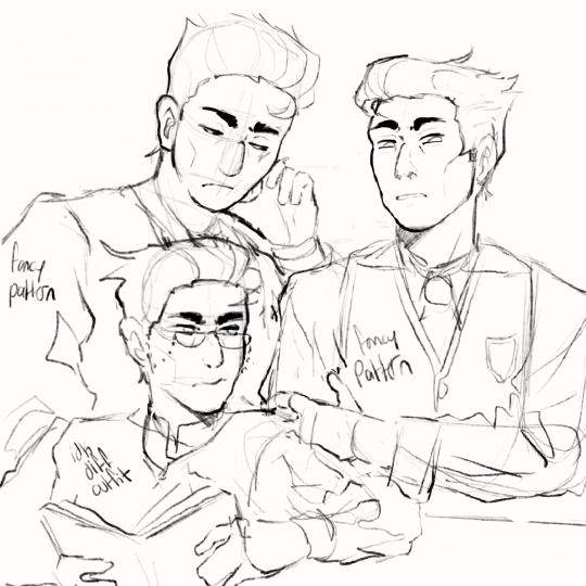
I keep repeating that process until all of my images are sketched out in my style and look like the character I want. I’ll also leave notes for myself to remember details I need to add when I’m closer to being done, and don’t want to draw LOL
Also note that some people’s sketches are incredibly neat and thought out, while others’ (like me) opt for figuring out the details in the later stages. Either way works, it’s kinda just what works for you. What sketches need to have are solid fundamentals, and if that’s looking good, then you’re set.
I looooovvveee line art /gen and i know a lot of people don’t which makes me sad 🥀
I get it, it can be tedious, but I really do enjoy bringing my drawing to life and finding all the details I want to add. I used to really struggle with my lineart feeling very stiff compared to my sketch, and it took me a long while to learn how to keep the vibe of the sketch in my final drawing. I’m not always as successful as I want to be, but that’s okay, my goal is to keep learning not to be perfect.
I’ve found that utilizing line weight helps that problem a lottt. Also just having fun with your lines, like in the sketching stage. When I was younger I remember doing line art and needing every.single.pixel to be perfect, and it really sucked all the fun out of it. There are tons of different ways to do line art, and something that helped me get out of that perfectionist mindset was just looking at artists I admired. I studied their speed-paints, what kinda of brushes they used, and how they used line in their line art.
A lot of them had more expressive strokes than I realized, often using the weight of lines to exaggerate the drawing.
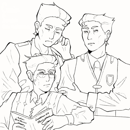
The line art doesn’t need to be out-of-this-world to be good. I like using a textured brush, with lines that connect for the most part. I try to put heavier lines on places of emphasis, like the outlines, folds, points, and where lines connect. Usually, the smaller or softer the details, the lighter and thinner the lines.
It took me a long time to find a style of line art that I really enjoyed, and even now sometimes I switch between brushes. Something that art school taught was how important play is. Even just messing around with brushes helped me find how I liked to draw. All of the brushes I use I've found for completely free on Gumroad. If you're ever curious what I use I'd be happy to make a post about it!
Color!!! This is one of my favorite steps, and also the one I find most frustrating. I absolutely love color theory and tweaking colors to look completely different than reality, and it sometimes bites me in the butt lol. Recently I've gotten a lot better with base colors, and I always try to set the background to a mid-tone grey instead of blaring white. I tend to favor saturated yet darkish colors if that makes sense.

The grey background allows the colors to not have to fight so much to be seen against a white background, and also helps me keep my values in check. I'm always thinking about readability in terms of value as well as saturation when I'm coloring.

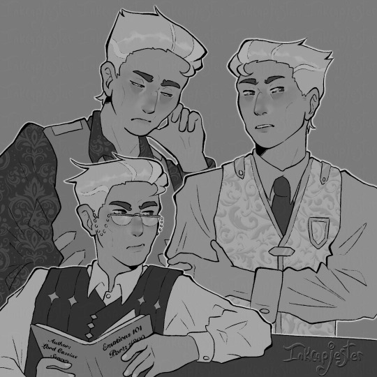

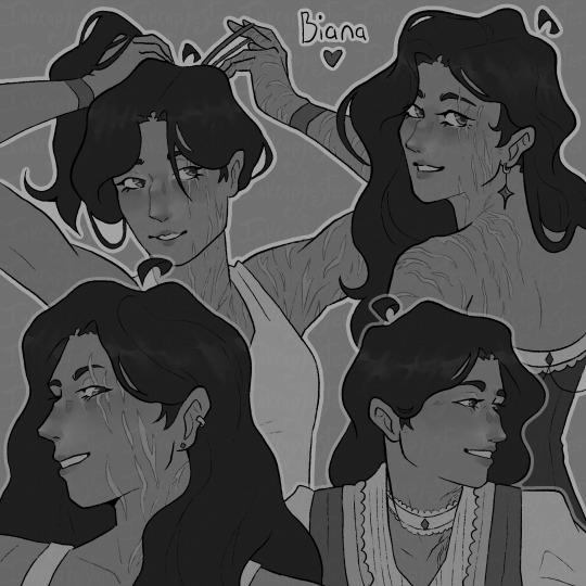
I always check my values by having a layer above all others filled with white and set to the blending mode saturation. I want the main points of the character to be distinguishable and easy to read, especially from a distance or if you squint. This is why I kinda hate drawing blond characters because it is a lot more difficult to find values of a light skin tone and light hair that are different enough without it looking insane. Some areas I succeed more in terms of "value readability" and some are weaker. Not every single color needs to have extremely different values, but the composition needs to include large areas of varying value. I also use value in my colors to frame things I want to emphasize, like Biana's face in front of her dark hair.
You can also frame pieces of a drawing with the actual colors, like in my Cassius drawing, I wanted the drawing in the foreground to stand out, so I used tints and shades of blue for the outfit behind him. Blues and yellows often go well together, and it gave me a nice opportunity to bring him even more forward.
When it comes to actually choosing colors, I like to chose a color palette for that character ahead of time. I also limit my use of different colors and tones both as a challenge and to make my pieces more cohesive. I love reusing colors, like the whites of a character's eyes being the same as their clothes.
For Cassius, I knew I wanted his palette to be primary golds, whites and blues. White can be a particularly difficult color to make, because it depends so heavily on its environment to exist. This is why I usually chose the brightest white and the skin color first. I absolutely need the white to pop and I need the skin to look alive and well, so those two colors take the highest importance for me. For each character's white, I take a look at the color palette I assigned them, and try a few different kinds of white alongside the skin tone. I try giving them cool and warm undertones that correspond with their color palettes, then chose the combinations I like the best. I always try to master a few colors together at a time. Trying to get all of the colors to work together all at once is overwhelming to me, and often leaves my drawings looking messy.
I know a lot of artists that fill the inside of their character with a base color that they want to tie all the other colors back to, and I've heard that works great too! Color is really something that you learn through play and experimentation. It took me a very long time to get a good grip on it, and even now I stumble sometimes trying to wrangle my colors. Sometimes just going back to the basic color wheel is what helps me get back on track.
The most important thing about color is just that they always exist in context. Take them out of that context, and they can look completely different, like in my example below ^.^ This is a very extreme version of what I would use for a white, but I thought it was a good way to show just how different something reads when its against a different color/value.
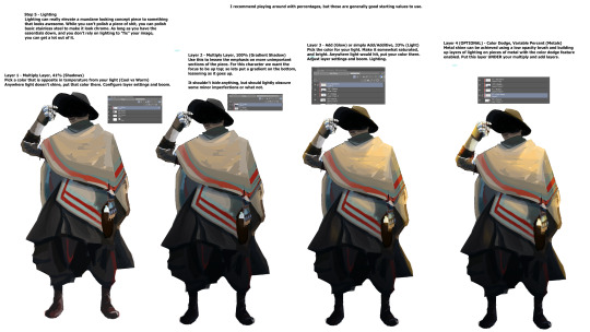
As for shading, I've been trying a lot of different techniques lately. I'm in-between shading styles right now, so I'm still trying to figure myself out too!! I do love using masks for shading though. I use them in my more simple/cel-shading, and for when I'm rendering.

The masks have been deleted by this point and I can't pull them from the speed paint :< but these layers I have highlighted came from the same mask. Basically, I make a clipping layer clipped onto the base colors, and fill the entire layer with whatever I want to shade with. Usually I use the layer mode multiply, and set the opacity down to whatever I want. After that, I make a mask of that clipped layer, and use the mask to carve out where I want the light. I like using masks because it lets me mess with opacity without messing with the layer's over all opacity.
After I'm satisfied with what I've carved out, I merge the mask and shading layer. Then, I select the contents of the shading layer, invert that selection, make a new layer, and fill the inverted selection with my lighting color. Then I mess around with blending modes and opacities till I get it how I want it!
If that was confusing I can always go more in-depth about it :] That and anything else that I maybe didn't explain well enough!! I love talking about this stuff and art in general (it's my major for a reason LOL) so please don't hesitate to ask!!!
Here is the Cassius speed-paint as well!!
#digital art#digital artist#artists on tumblr#digital illustration#art tutorial#tutorial#digital art tutorial#small artist#inkcapjester tutorial#inkcapjester
41 notes
·
View notes
Text
youtube
29 notes
·
View notes
Text
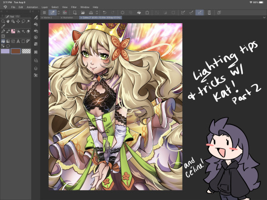
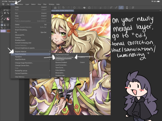
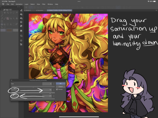
I’ve got 2 more lighting tips today: first one is something I call “soft rendering.” It gives that fuzzy, 90’s anime feel! I hope you all enjoy it! I’ll post the second lighting tip tonight!


#smkittykat#smkittykat art tips and tricks#digital art#art ref#art reference#art tips#artists on instagram#artists on tumblr#artists on twitter#digital art tutorial#art tutorial
521 notes
·
View notes
Text
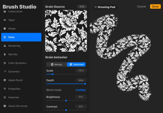
I just figured out how to make texture and pattern brushes on procreate. i am unstoppable now.
in case youre wondering btw, if you download or draw an image (png works best for patterns, but if you want a texture it will use the color values for the opacity which you can invert as needed)…
1. make a new pen
2. go to grain
3. grain source > edit > import > photo > choose the img you want to use
4. OPTIONAL: adjust the other grain settings if needed
5. OPTIONAL: shape > shape source > edit > import (if you need to change the brush shape)
Example with a brush i made with a jacquard pattern stock image i found on google images then edited to remove background & watermark
126 notes
·
View notes
Note
How do you sketch & render your clothing folds, if i may ask? They look very pretty!
I am the least qualified person to give a tutorial but sure let's do this.
No I'm a self taught artist so a lot of this is just me using the good ol' "Fuck around and Find out" technique. So the example I'll might not be the best but it will give a general idea.
First you get your sketch/lineart + flat color. As you can see I've already drawn the fold lines. It's best to know where the shirt is getting pulled more from because that's the general direction that the folds start from and where fore folds are.
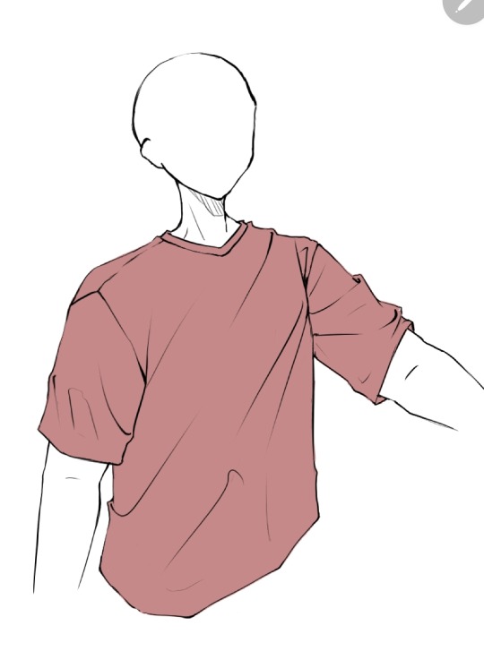
Next, on a clipping layer, I just draw with a darker color the places that will be shaded with a watercolor brush or pencil brush, just a brush that kind of fades works. This doesn't have to be accurate coloring it can be just messy blobs. But always keep in mind were the light is hitting the shirt so you'll know which direction to draw the shadows bigger and darker at
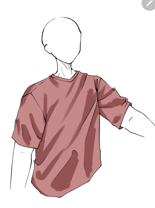
Than with a soft eraser I start erasing the shading and fixing it by going back with the brush. This is a lot of back and forth between the eraser and brush until you get to a point where it looks good in your eyes (i lowered the opacity a bit here because I thought the shade color was too dark)
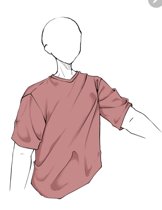
(Note: during more detailed drawings I like to go in with a darker shade color at the deepest corners for more depth and detail)
On a new clipping layer, by using an airbrush or the gradient tool, with the same colour I used for the shading, I darken the top and bottom. Why? Because it looks cool idk.

And usually that's where I leave it but sometimes I might add a lighter color for some lighting on the cloth by using the same steps as for the shading, this may depend on the fabric you imagine the clothes have. Or I've seen some people airbrush the parts of the outfit near the skin and that gives off a cool effect too
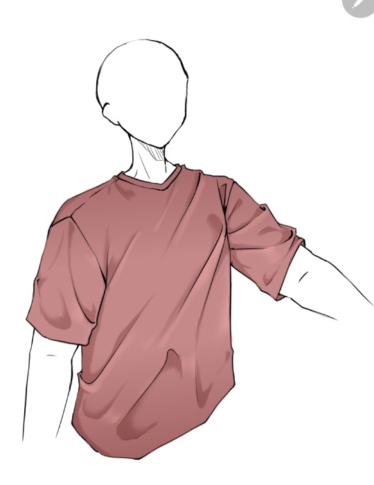
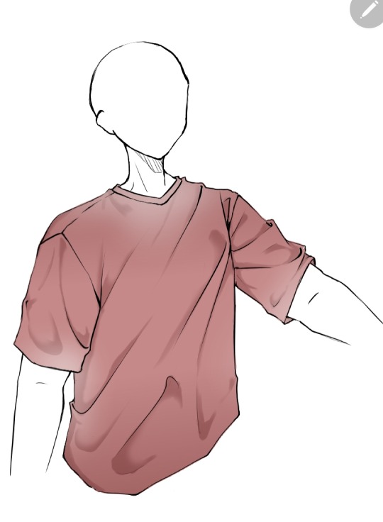
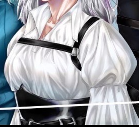
Now as you might have noticed this is the ugliest shirt ever. And that's because I did this in 10 minutes from my ✨️imagination✨️. Usually I have reference pics when drawing which give me a general idea of how the folds should look like and that is a life saver. This was just to give a general idea of how it works. Here are some examples of actual good shading I've done
Hope this helps👋✨️
#mura answers asks#shading#shading tutorial#art tutorial#digital art tutorial#digital art tips#digital artist#digital drawing#digital art#artist#artist on tumblr
60 notes
·
View notes
Text
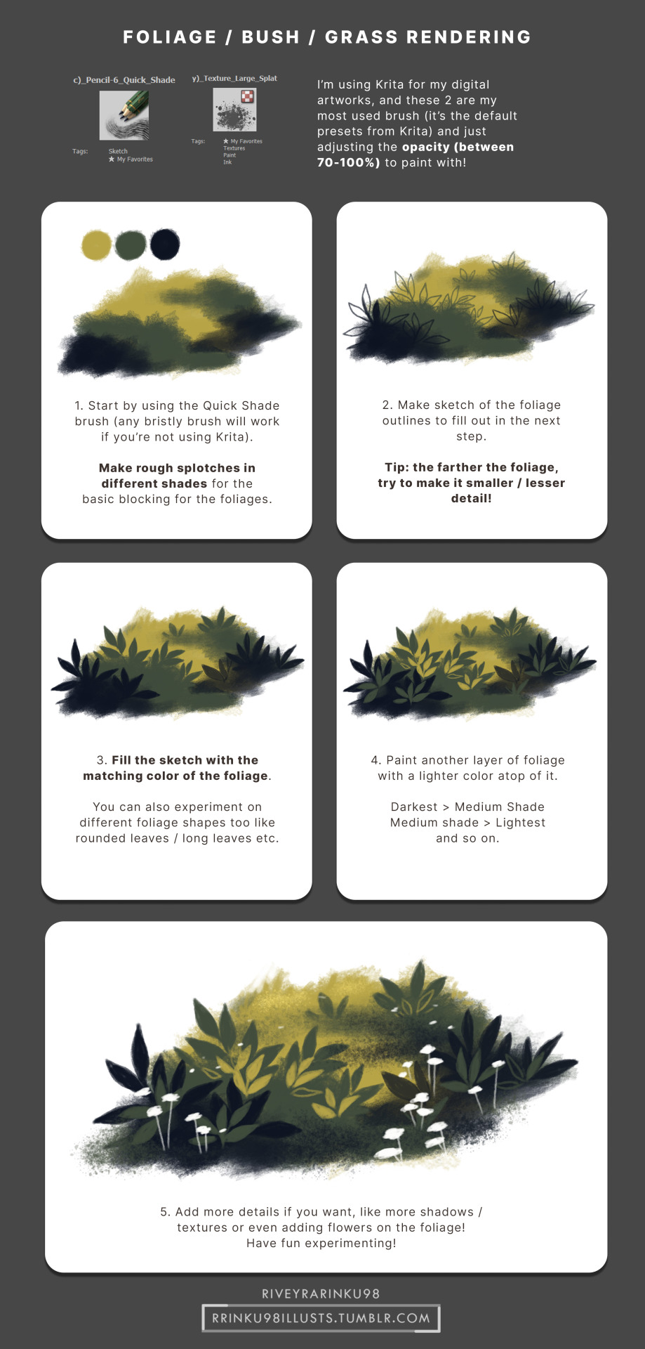
Bush / Foliage Rendering
Since I'm planning to do more original artwork this year (that isn't fanart or LoZ), making some tutorials would be nice! Just want to share on how I paint digitally here.
Oh and for the colors, I usually adjust the Hue slider or Color Balance slider until I got the colors I wanted. Hope this helps!
52 notes
·
View notes
Text
Hi, skykids and artists alike!
WARNING: THIS IS LONG. I can't stop yappin'.
I was taking a series of screenshots of my art process for my own reference (to review later, see how my process has changed, etc. I’m not much of a timelapser) and figured I’d share my process and show off how much the game Sky: COTL has DRAMATICALLY improved my art (and also have a post to show people in the very, hopefully, unlikely chance anyone ever doubts that I draw my own art). I also have seen a lack of written out with screenshots explanations of art, as video format becomes more popular across not only Youtube, but Instagram and Tiktok as well. This is not a learning style I jive with, so this is something for all the artists out there looking for this kinda thing.
For reference, here is my FIRST EVER Sky digital painting compared to my most recent (before the one used for this lil infodump). <3 This is CSP specific as far as brushes go, but I’ve seen people make amazing art in freaking PowerPoint, so if I can do it, you can do it.
F’real. This is the process of a VERY LAZY artist with hand tremors and hecked up wrist ligaments as a result of an autoimmune disease.. I’m talking, drawing in bed in a blanket nest watching vodcasts and cuddling cats.
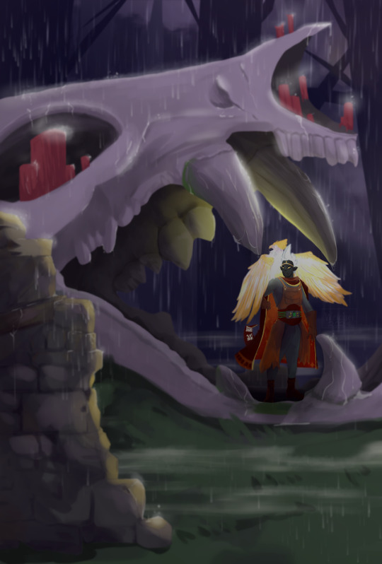

(May 2024) -----> (January 2025)
Added info - the pic on the left is exactly why I wanted to do this. I'm even a little embarrassed by it, now, but when I had originally posted it on another platform, I was questioned and disbelieved that I was able to draw a background at all. This was the start of me taking digital painting seriously (versus general character/creature design) with lineart and a cell shading style. That disbelief from someone who knew me IRL hurt a lot, and I often have the concern of that happening again. This is me alleviating that anxiety once and for all, so I can finally move past it. YAH, FRIENDO, THIS IS MY THERAPY SESSION.
Anyway; I’m nowhere near new to art, but it’s always been a hobby for me so I never sought to actively improve with proper studies -- but wanting to create lore for my silly lil skydude forced my hand. With a semi-open world game that’s genuinely gorgeous made collecting references easy, and the Sky community here on Tumblr has not only inspired but encouraged me to keep going despite 2024 being a very rough year. This game has brought me joy, and I hope you find this lil doodad helpful. 🕯️
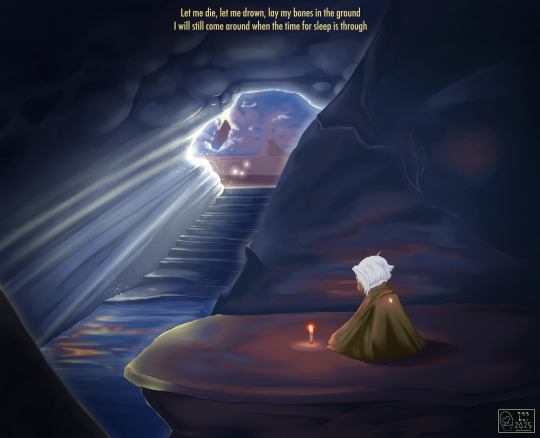
Now on with the show! This piece will be a part of a little series I’m working on that will include lyrics to a song that gives me the biggest Sky vibes (To Thus Onto Tyrants by The Oh Hellos).
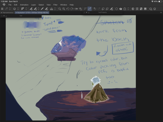
The brush that did the heavy lifting (“spread pencil”) seems to be either very elusive or no longer available. Everything else is listed here :)
What I could find:
Turnip Pen - Default brush in CSP
“Crunchy” - Specifically the second to last one in this brushpack
“Hard Round V1”
“Hard Round V2”
“YN Soft Round” (Not free, sorry ): )
“Pecas” - for sparkleys
“Toothbrush” - For more sparkleys
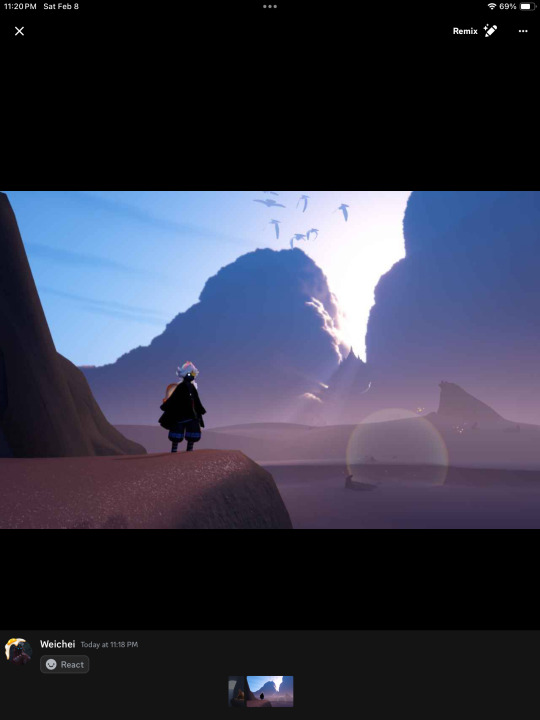
So the first step is to gather references. They’re a MUST HAVE and DON’T LET ANYONE ELSE TELL YOU OTHERWISE. Use references, redline, and yes - EVEN TRACE. I may make a lil thingy about how to do these things ethically, but for now, just art process. Let’s see what references I used: self harvested!
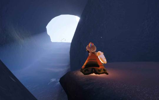
Shout out to the Skykid screaming in the background.
I also used this for a reference for the moth that I grabbed off the interwebs-
For this, I wanted to try and recreate what it felt like as a moth (but after getting at least one starboi lol). Isle of Dawn will always hold a very special place in my heart. The first impression was impactful, even though I was incredibly confused on what I was doing. I knew I wanted the temple, but there’s something so calming and melancholy about that first cave. Putting these references together, I got the most hot garbage sketch I’ve ever done - but it’s okay! We’re not doing any lineart, so we WANT messy. The more you work on a sketch at this stage, the harder and more intimidating it will be to get to the next step. You’ll become too attached to those details and things you sketched, that if you have to go over them later it will be devastating. Just using this to work out composition :)
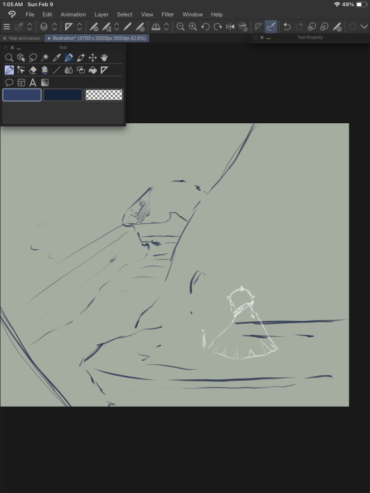
Currently, I have two main layers (CSP makes an automatic background and I just leave that one alone and do not count this as a layer)
Top - moth sketch
Bottom - everything else
Moving forward, we’re working in three main sections. Background, midground, and foreground. I show a screenshot of how I organized these layers later.
The next step is to block in colors. Layer styles are VALID and AMAZING, I do not use them much. They have their time and place, and I prefer to keep those for finishing touches. For now, I’m just doing my best to eyeball colors I like from the reference photos. Color picking is amazing and helpful too, but I’ll add a little note* at the end about why I try to avoid doing that too often from my reference.
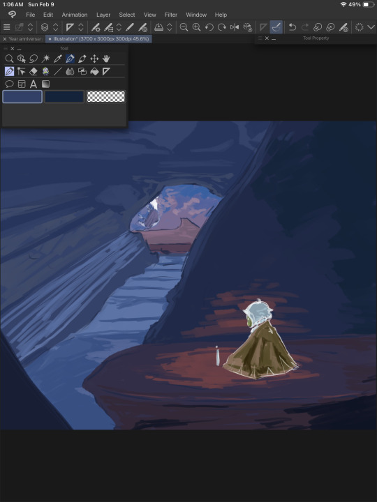
I put the colors on their respective layers (Four to start with. One for each mentioned above, and another for the moth). I try to block out shading and lighting but I keep it sloppy because it’s likely to change a LOT. This is just planning and fiddling, seeing what colors look good together.
(Spread Pencil is the one brush I couldn’t find >: at this point, this is the ONLY brush I’ve used. Don’t be tempted by blending things yet. Be sloppy.)
Once I get the general idea of what I want, I WORK FROM THE BACK. I hid any layer that would be ‘blocking’ that section and allow myself to go ‘outside the lines’ a bit. The overlap is helpful when making changes to the ‘front’ elements later. Remember, we’re still being SUPER MESSY.
I kept the moth/foreground visible so I can still check that the general color theme was working.
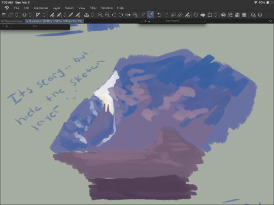
Hide the sketch layer. Do it. We’re painting, not doing lineart. You gotta. I believe in you. Look at this slop. Beautiful.

Alright, now we’re cooking! The layers are in the following order going from top (front) to bottom (back):
-Moth sketch (will be hidden later)
-Moth colors
-Background sketch (will be hidden later)
-The rock the moth is sitting on and that little rock section on the bottom left
-The rock behind the moth (hidden in this screenshot)
-The rest of the cave
-The temple
At some point around here I used “Crunchy” on the clouds to blend em a bit.
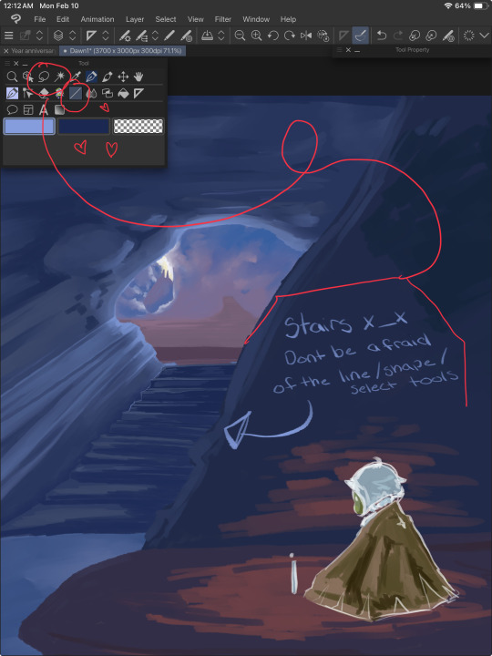
NOW IS THE FUN PART. RENDERIIINNNGGGGGG. I started with the stairs because they looked annoying. USE YOUR LINE/SHAPE AND SELECTION TOOLS. These will help you keep your lines straight and achieve crispiness if you desire. More on the stairs in a moment, but while you’re doing this, remember to
ZOOM THE HECKIE OUT. Make it thumbnail sized and squint. Can you still tell what you’re painting? Evaluate. Are the colors working well together? Is there enough contrast? How’s that composition doing? Zooming out rocks.
After taking a moment to zoom out and squint, I came up with the following notes:
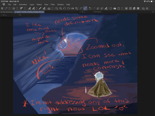
Do this regularly throughout your process, even if you’re in the middle of something mundane like drawing stairs. A LOT more contrast is needed, and taking a moment to notate this will help prevent you from doing TOO much that you’ll regret later when you end up covering it up to fix these issues you missed earlier.
Back to the stairs.
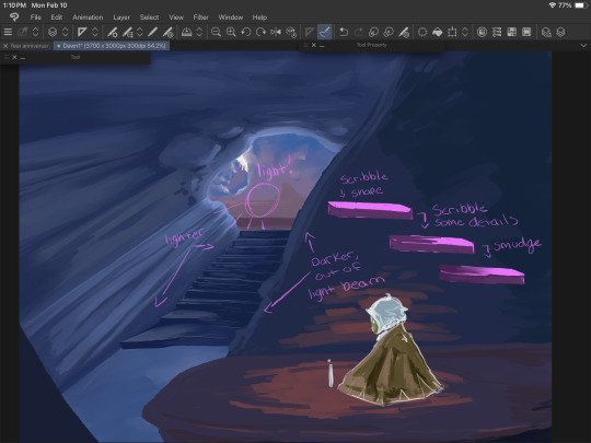
I blocked things in with the line tool and the turnip pen, then scribbled it around using ‘Hard Round V2”. When I say scribble, I mean literally. Scribble. It’s fun and freeing. We’re not trying to be precise or make anything hyper realistic. We just gotta get those colors down yknow.
Good luck.
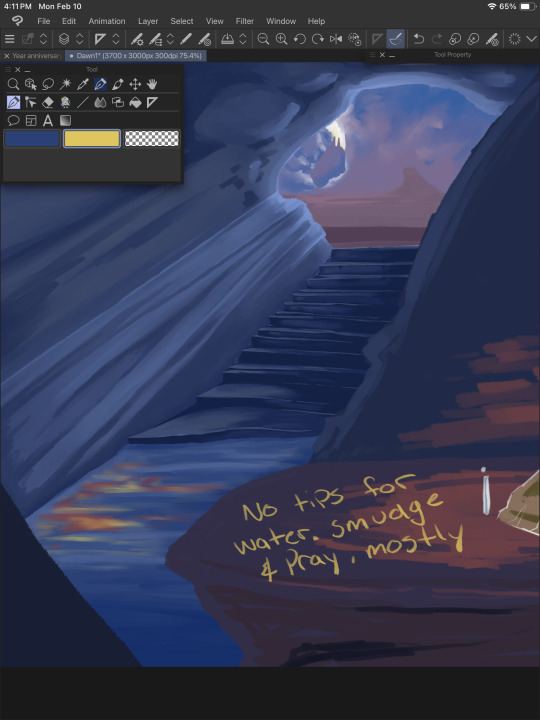
Water is weird, and I don’t understand it. We guess and hope for the best. Remember that water is clear, and for the most part you’ll be able to see through it, so unless you have a blue toned drawing (like this one), the water itself may not be blue. I generally color pick the areas around it and lighten/darken it based on those. I also knew there’d be a light beam in this area, and the reflection from the moth’s candle so some bright oranges and yellows were nice to add, as well. Don’t forget reflections/highlights if the scene calls for it!

Time for the part that actually requires a shred of skill. Thankfully, this pose is very simple and the moth’s design is, well, a moth. Don’t be afraid to toggle that sketch layer on and off for this. The moth is the main focus, and should be clear and easy to read as such - requiring a bit more work for colors and shape language.

Don’t work on one single thing for long. The moment your brain goes “im getting annoyed/frustrated/bored”, move to another piece of the painting. If you notice your character has a horrible tangent with a background piece and it’s just really bothering you - stop working on the character and fix that background area. Give it a bit more bulge (or less), shift things around. Paint over stuff.
“But I drew this really well, and it would be a shame to cover it up if I won’t be able to do it that well again!” You may ponder, anxiety filling your chest at the very thought of redrawing a hand or that one rock that just looks really, really good somehow.
And to that I ask - why won’t you be able to do it again? You did it once before, CLEARLY you have the skill and ability. If you’re worried, draw over it on a new layer so if you have to fall back on the old thing, you can. ART IS FUN. Don’t let it stress you out too much. The moment you look at that canvas and go “you know what, I CAN do it again”, you will be able to do it again.
Trust me.

With some more scribbling done, we can start detailing things that aren’t stairs. Yay! Let’s work from the back again.

LITERALLY. SCRIBBLE.
You can start blending around now, too, though. We’re getting there, and look at all we have to show for it! I tried to mimic the clouds as best I could from the screenshot because like water - they are weird and wonky and yah, hard. Cloud brushes can be helpful, but give you significantly less control IMO, but to each their own and whatever works for you, works.

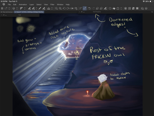
BG looking good, but remember ZOOM OUT. I can see the contrast of the temple/background elements looks a bit better now, and now that I’m bored with that, I wanna bounce to that midground area, and fix up the moth a bit more. I also used an ADD (GLOW) layer to messily test some different ways to paint light beams and to find a nice color. I settled on the same yellow I used on the candle flame. I didn’t work too hard on this just yet, since there’s a lot of elements that will hit that light that I haven’t even thought about yet.
I fiddle with the main cave texture a LOT. Painting over it entirely MULTIPLE TIMES to find something that sticks. What you see here is not it. I also added some details to the ‘moth rocks’ but this also changes a little as we go.
Painting/art is a lot of push and pull. You add some darkness, take away some. Add some light, take away some. Add an element, remove one. Go with the flow and trust yourself. Turn on an audiobook or a movie and turn off your brain while you plop colors here and there. An artist I VERY MUCH look up to (Julia Lepetit of Drawfee and Secret Sleepover Society) said, “Zoom in and zone out”. It’s time to turn off that brain and paint.
I zoned out too hard and stopped taking screenshots because oops. On the top left shows the YN Soft Round, Pecas, and Toothbrush, in that order going from the top and counter clockwise.
I darkened up the cave quite a bit and finally settled on a look for those upper rock formations. I used a MULTIPLY layer to darken up the moth’s shadow a bit, then merged the layers and used those same colors to blend it with the rest of the rock. I also deleted and added a new ADD (GLOW) layer and fixed up that lighting. This is where we get to darken shadows and add highlights and bounce light to things. Anything in bright, direct light has its original color showing through (from the original layer it’s colored on, that wonky light blue area by the stairs). Rim lighting is a great way to separate elements like this (the different rock edges) without having to use a gajillion different shades/values of the same boring blue to make it stand out.
Details on the moth are also done now - mostly in the hair. A few hair strands, ESPECIALLY in Sky with the white hair we all have - looks incredible in a painty style IMO. I also SHOULD HAVE added the star on the moth’s cape at this point, but BOIIS, GORLS, AND CRYPTIDS, i forgot until I saved/exported it and had to go back and fix it. But anyway, so you don’t have to scroll up, here’s the finished piece again:
Thank you for reading, if you did! I hope it was helpful, or at the very least served me in the future like this post is intended to do!
And I will leave you off with the promised note* about color picking -
Color picking from a reference can be really cool and easy and tempting, but you know what makes that NOT work? Color theory. When you blend your colors (this goes for real life, too), there's a LOT more grey and diluted tones than you'd expect. A lot of these bright colors aren't ACTUALLY bright, save for the details on the candle light and the ADD (GLOW) layers. The orange reflections on the rocks and water are actually quite dark and diluted, but because it contrasts so well with the darker blues - it looks a lot brighter. Blending these colors together allows for a more natural soft light. This is also why I try to work on so few layers for pieces like this that are relatively simple. I can easily take a bright color and use a softy kind of brush - the hard round v1 brush is GREAT for this, a little bit of pressure over the colors you already painted down will blend them together with some minor elbow grease and mindfulness. It gets a more natural transition between your lights and darks.
Where as if you zoom in on your reference and color pick - look at it. Look at it all zoomed up, I BEG you. Make it super pixely, and you will see how much that 'one' color varies in that entire area. Unless you're color picking pixel by pixel, which at that point you're not really drawing/painting at all, it's just not going to work out and help you recreate that reference.
My personal preference is to color pick for base colors to get me started with a vibe, and then once I have a few colors down, I'm eyeballing it all the way baybee.
#doodle#digital painting tutorial#digital art tutorial#tute#art tute#painting process#digital art#digital painting#sky children of the light#sky cotl#scotl#sky children fanart#a rambling mess that's mostly for me but maybe it will help someone idk#it's 3am#im throwing this in my queue and going to bed good night ilu tumblr <3
13 notes
·
View notes