#Effective Website Design tips
Explore tagged Tumblr posts
Visit Tumblr Blog
Explore Tumblr blogs with no restrictions, modern design and the best experience.
Last Seen Tumblr Blogs


Fun Fact
Tumblr was named as a finalist in Lead411’s New York City Hot 125 in Aug 2010.
Text

how to create a wonderful logo for your moving company | moving logo |
I will provide high-quality new custom design logos without any copy-paste work, you will get a new design only for you. I have 5 years of experience in graphics designing and I can make a new concept logo any time.
logo #movinglogo #fundraising #houston #movie #script #filmmaker #fundraiser #scriptwriting #family #familystory #mexicanamerican #mexicano #singleparent #culture #filmmaking #houstonfilmmakers #texasfilmmakers #tejano #classicrock #shortfilm #film #storyboarding #storyboard #vip #vipparty #casting #auditions #sides #hmsfilmproject
#best motion logos#50 best motion logos#cool logos#animated logos#animated logo gif#cool logo animation#how to animate logo#animated logos 2020#animated logo design#motion graphics#best logo intro#branding design#logo intro#animated logo designs#branding visuals#animated logos example#logo design#brand recognition#branding tutorial#animated logos examples#logo effects#logo creation#logo movement#branding tips#animated logos on websites
1 note
·
View note
Text
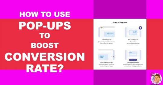
Pop-Up Strategies for More Conversion
How can you use website pop-ups to drive more leads, sales, and customer loyalty? This comprehensive guide covers the basics, types, best practices, and real-world case studies to help you create effective pop-ups. What Are Website Pop-ups?Are Website Pop-ups Effective?Real-World Pop-up ExamplesExpert Tip: Integrate Pop-ups with Your SiteSuggestion: Test and Optimize Your Pop-upsPop-up…
View On WordPress
#call to action#convertion rate#personalization#sales#pop-up strategies#conversion optimization#website pop-ups#lead generation#digital marketing#marketing strategies#pop-up design#user engagement#conversion rates#website conversion#pop-up marketing#online marketing#conversion tips#email sign-ups#pop-up techniques#lead magnets#marketing tactics#pop-up effectiveness#CRO#sales funnel#conversion strategies#marketing trends#website optimization#pop-up success#pop-up best practices#pop-up tools
0 notes
Text
📚 A List Of Useful Websites When Making An RPG 📚
My timeloop RPG In Stars and Time is done! Which means I can clear all my ISAT gamedev related bookmarks. But I figured I would show them here, in case they can be useful to someone. These range from "useful to write a story/characters/world" to "these are SUPER rpgmaker focused and will help with the terrible math that comes with making a game".
This is what I used to make my RPG game, but it could be useful for writers, game devs of all genres, DMs, artists, what have you. YIPPEE
Writing (Names)
Behind The Name - Why don't you have this bookmarked already. Search for names and their meanings from all over the world!
Medieval Names Archive - Medieval names. Useful. For ME
City and Town Name Generator - Create "fake" names for cities, generated from datasets from any country you desire! I used those for the couple city names in ISAT. I say "fake" in quotes because some of them do end up being actual city names, especially for french generated ones. Don't forget to double check you're not 1. just taking a real city name or 2. using a word that's like, Very Bad, especially if you don't know the country you're taking inspiration from! Don't want to end up with Poopaville, USA
Writing (Words)
Onym - A website full of websites that are full of words. And by that I mean dictionaries, thesauruses, translators, glossaries, ways to mix up words, and way more. HIGHLY recommend checking this website out!!!
Moby Thesaurus - My thesaurus of choice!
Rhyme Zone - Find words that rhyme with others. Perfect for poets, lyricists, punmasters.
In Different Languages - Search for a word, have it translated in MANY different languages in one page.
ASSETS
In general, I will say: just look up what you want on itch.io. There are SO MANY assets for you to buy on itch.io. You want a font? You want a background? You want a sound effect? You want a plugin? A pixel base? An attack animation? A cool UI?!?!?! JUST GO ON ITCH.IO!!!!!!
Visual Assets (General)
Creative Market - Shop for all kinds of assets, from fonts to mockups to templates to brushes to WHATEVER YOU WANT
Velvetyne - Cool and weird fonts
Chevy Ray's Pixel Fonts - They're good fonts.
Contrast Checker - Stop making your text white when your background is lime green no one can read that shit babe!!!!!!
Visual Assets (Game Focused)
Interface In Game - Screenshots of UI (User Interfaces) from SO MANY GAMES. Shows you everything and you can just look at what every single menu in a game looks like. You can also sort them by game genre! GREAT reference!
Game UI Database - Same as above!
Sound Assets
Zapsplat, Freesound - There are many sound effect websites out there but those are the ones I saved. Royalty free!
Shapeforms - Paid packs for music and sounds and stuff.
Other
CloudConvert - Convert files into other files. MAKE THAT .AVI A .MOV
EZGifs - Make those gifs bigger. Smaller. Optimize them. Take a video and make it a gif. The Sky Is The Limit
Marketing
Press Kitty - Did not end up needing this- this will help with creating a press kit! Useful for ANY indie dev. Yes, even if you're making a tiny game, you should have a press kit. You never know!!!
presskit() - Same as above, but a different one.
Itch.io Page Image Guide and Templates - Make your project pages on itch.io look nice.
MOOMANiBE's IGF post - If you're making indie games, you might wanna try and submit your game to the Independent Game Festival at some point. Here are some tips on how, and why you should.
Game Design (General)
An insightful thread where game developers discuss hidden mechanics designed to make games feel more interesting - Title says it all. Check those comments too.
Game Design (RPGs)
Yanfly "Let's Make a Game" Comics - INCREDIBLY useful tips on how to make RPGs, going from dungeons to towns to enemy stats!!!!
Attack Patterns - A nice post on enemy attack patterns, and what attacks you should give your enemies to make them challenging (but not TOO challenging!) A very good starting point.
How To Balance An RPG - Twitter thread on how to balance player stats VS enemy stats.
Nobody Cares About It But It’s The Only Thing That Matters: Pacing And Level Design In JRPGs - a Good Post.
Game Design (Visual Novels)
Feniks Renpy Tutorials - They're good tutorials.
I played over 100 visual novels in one month and here’s my advice to devs. - General VN advice. Also highly recommend this whole blog for help on marketing your games.
I hope that was useful! If it was. Maybe. You'd like to buy me a coffee. Or maybe you could check out my comics and games. Or just my new critically acclaimed game In Stars and Time. If you want. Ok bye
#reference#tutorial#writing#rpgmaker#renpy#video games#game design#i had this in my drafts for a while so you get it now. sorry its so long#long post
8K notes
·
View notes
Text
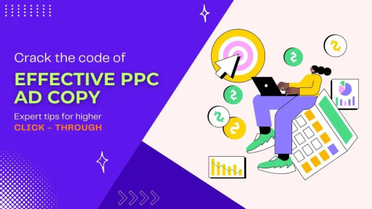
Crack the Code of Effective PPC Ad Copy : Expert tips for higher Click - Through
Are your PPC ads falling flat, failing to entice potential customers and leaving you scratching your head in frustration? Well, it’s time to crack the code of effective ad copy and skyrocket your click-through rates! In this blog post, we’ve gathered expert tips from industry pros who know exactly how to craft compelling PPC ad copy that grabs attention, hooks readers, and compels them to take action. Get ready for a crash course in writing captivating ads that will have users clicking like never before!
Introduction: What Is PPC Ad Copy?
PPC ad copy is the text used in your pay-per-click (PPC) advertising campaigns. The quality of your ad copy can make or break your PPC campaign, so it’s important to get it right.
To write effective PPC ad copy, you need to understand what makes a good ad, what your audience is looking for, and how to craft an appealing message that will encourage them to click through to your website. In this article, we’ll share some expert tips on how to write PPC ad copy that converts. Visit More - https://www.gmatechnology.com/crack-the-code-of-effective-ppc-ad-copy-expert-tips-for-higher-click-throughs/
#Crack the Code of Effective PPC Ad Copy : Expert tips for higher Click - Through#web development#web design#magento development#best web development company in united states#logo design company#digital marketing company in usa#web designing company#website landing page design#web development company#asp.net web and application development
1 note
·
View note
Text
[WIP] TS3 UI "Krystal"
I figured it would be cool to finally publicly share what I've been working on behind the scenes, as well as some mockups!
A few of you on Patreon or Discord may have already seen sneak peeks/given feedback. I kept things quiet because I wasn’t sure I’d even do it in the first place as a next modding project, and I didn’t want to let anyone down.
Luckily, @lazyduchess’s Monopatcher made the job ten times easier. The biggest hurdle was that I would've had to make a core mod to override UI code (I’m normally anti–core mod), but the patcher solved that and let me push ahead.
(Psst, if you're looking at seeing the mockups bigger, I also posted this post on my site: Simblr.cc 😉)
Creating the Mockups

Fun fact: I actually have a degree in UI/UX design! (for websites) While principles like “How wide should this padding be?” or “Which colors send the right signal to the user?”—game UI is a whole different beast.😬
Main Menu


I started with the main menu:
Cut the SimPoints clutter and the “Buy TS4!” banner—after a decade, we get it exists 😉.
Grouped items into clean blocks
Added a text-free “Create New Family” icon
Swapped lot thumbnails for family shots (still baffled by EA’s original choice).
Dropped an options gear in the bottom-left; might label it if it’s too subtle.
Different backgrounds: one solid blue, one closer to the classic gradient.
A lil' sneek peek of where I'm at:

She's not finished, but it's definitely getting there! 😉
Load Screen


Not much has changed here! It's just less... busy I suppose, lol!
2 Different backgrounds to choose from
Moved the Game Tips to the bottom, so the main focus stays on that loading bar 😉

I also have a third option but I'm strongly leaning towards just having the loading bar as it's the most clear!
Live Mode

The hardest of them all lol. Kudos to EA for figuring that one all out! I really struggled with this one in regards to shape and what to even move around/remove!

I figured, it should be nice to pull really into that glassmorphism I've been using over the Mockups! Now I do realise that it can hamper user experience in the sense of not being able to read anything. But these are pictures! So that should be all fine and dandy.
The active item in the queue will now be more "visible". The queued item however, you'll see look a bit more "unactive" compared to what the current version has.

I also completely overhauled the thumbnails for your sims, showing their moods a bit better, and giving the active sim a tiny plumbob! :D

And now the real deal: The control panel! You might notice it's not the whole thing, but I'm still working on that part.
I removed the camera controls from the panel. However, upon feedback, I did hear that it's better to have them as some people are limited in their hand movements on their keyboard and that those controls are really useful. So I will make sure to share 2 versions :)
I also realised I completely forgot the Build/buy mode buttons 😬 So, err, stay tuned for that? lol.

Notifications I really just tidied up :p
I am aware that the space where the text is and the thumbnail is huge, and normally I'd wrap the surrounding text, but apparently in TS3's UI stuff that's practically impossible. Hence that they got this "2 column" effect to them 😉
About releasing the UI:
I'm hoping to release them all in bits and pieces! So first up is the Main Menu (and possibly the Loading screen given it's simplicity).
After that, I hope in my second "update" to release a big portion of Live mode, but that's a bigger task on it's own of course 😉
Any feedback at this point is also completely welcome by the way!
386 notes
·
View notes
Text
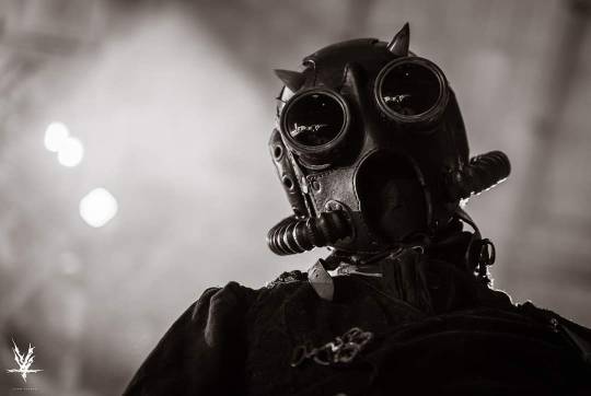
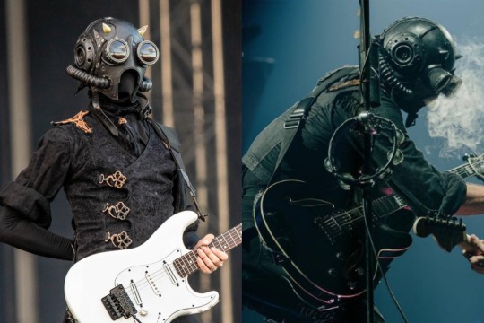
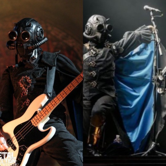
I've been wanting to do this post for a while now so here is EVERYTHING I CAN TELL YOU ABOUT THE GHOULS' IMPERA COSTUMES.
Buckle up because I have a LOT to say about those, this is gonna be a very long one.
The costumes were designed by B Åkerlund, a Swedish costume designer who's worked with Ghost since at least Meliora (that's as far back as I was willing to scroll on her Instagram page lol). B Åkerlund has also worked for many other musical artists such as Lady Gaga, Beyoncé, Madonna, the Rolling Stones, Ozzy Osborne, Blink 182 and Hollywood Undead (information from her own website)
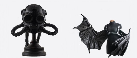
The masks were made by Bob Basset, a visual artists who works a lot with leather. I find his work fascinating, you can look him up on Instagram (nsfw warning, there's a few naked ladies).
Fun fact! The horns are real cow horns. That's the reason some of them have gold tips, to hide the imperfections that come with working with actual horns.
He does have a shop where he sells his items, there's a mask there very similar to the Impera ones. You can also buy Papa's batwings if you happen to have 2500$ lying around!
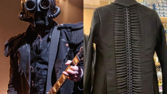
The jackets are made on the same model as one of Papa's. The back is decorated with a spine-like design made from leather and cording. It's adorned with a few of our classic Impera buttons. Some of the hems were left raw and some deliberate weathering was done to make it look old and worn.
Fun fact! The shoulder pieces are not sewn into the garment, I would assume for easier cleaning. I don't know if they're held by strong magnets or snap buttons.
The vest (my beloved 😩) is made from flocked velvet in a paisley pattern, the front hems embellished with satin piping. It closes in the front with custom metal clasps that are riveted into the garment. The D parts are attached with what seems to me like wide elastic, which would lessen the pression on the clasps when moving around a lot. The back is made from two different types of fabric, I'd have to touch it to be able to tell you what they are. I assume the panels closer to the sides have some mild stretch to them. The top of the shoulders are decorated with Impera grucifix patches.
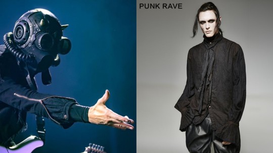
The shirts were not custom made for the ghouls, altho they were altered. The original shirt in the vintage painter linen shirt from Punk Rave and it is still being sold. Some of the cuffs were altered, removing the ruffles for some of the ghouls, but not all. They were removed for Dew, Mountain and Phantom, Aether's didn't have them either. As far as I can tell, all the ghoulettes still have them.
An unfinished piece of linen serves as an ascot, that piece is decorated with a metal devil skull. The colour of the skull doesn't appear to be consistent between each ghoul, Dew's looks gold almost bronze while Phantom's is a silver-like colour.
Another modification is the buttons, a small portion of them were removed in favor of our Impera buttons. Some of the ghouls have more buttons replaced than others, which is still a mystery to me.
The pants are called Jodhpurs, they were invented in the 1800s as horse riding pants. The wide part at the hips and thighs allowing for better movement. The ones the ghouls wear don't reach all the way to their ankles, they stop a bit past the calf muscle, hidden by the boots. (Yes, the ghouls are effectively wearing capri pants)
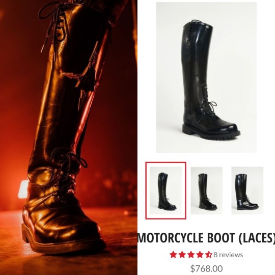
The boots are motorcycle riding boots, decorated by a grucifix. Like the shirt, they can still be bought online through the All American Boots website, altho the price tag is... Headache inducing to say the least.
The cape is a piece of costume that was only briefly worn on stage by the ghouls, Aurora being the only one who still wears one. I would assume it gets in the way of playing very easily. The cape itself is made of two fabrics, a light blue satin and a dark grey suede. The two pieces are not sewn together at the bottom, they move freely from each other. The cape is attached on the left shoulder with a harness piece that has one strap across the chest, decorated with a metal buckle, and one under the armpit.
Aight that's it for me, have a nice day byyyyye!!
#the band ghost#ghost bc#nameless ghoul#nameless ghouls#swiss ghoul#phantom ghoul#swiss ghost#dewdrop ghost#rain ghost#mountain ghoul#mountain ghost#rain ghoul#phantom ghost#dewdrop ghoul#cirrus ghoulette#aurora ghoulette#cumulus ghost#aether ghost#aeon ghoul#impera ghoul#impera#meerkat talks about ghost costumes#IMPERA FIT MASTER POST LET'S GOOOO
2K notes
·
View notes
Text
CONNECTİONS WORDS - PRO+

Welcome to the world of Connections Words, your ultimate destination for word enthusiasts seeking an exhilarating challenge! Our platform offers a unique blend of excitement and mental stimulation, perfect for puzzlers of all ages. Dive into engaging games like the Connections game, designed to test your wit and vocabulary while providing endless entertainment. With features like daily hints and strategies, you can sharpen your skills and stay ahead in the game.
By Times Connections
The By Times Connections brings a fresh and engaging spin to traditional word puzzles. Designed to challenge and entertain, it’s more than just a game; it’s an opportunity to enhance your vocabulary while having fun. With a plethora of themed levels, each puzzle offers unique challenges that stimulate your mental prowess.
What sets the By times connections apart is its seamless integration with various platforms. Whether you prefer playing on your desktop or mobile, the game ensures a smooth and enjoyable experience. Every session is not just a puzzle but an adventure that seeks to connect various words, testing your skills with every turn.
Additionally, the Connections game provides hints that guide you through tricky parts, ensuring you never feel stuck for too long. The availability of “Connections hint today” further enriches your gameplay, allowing players to strategize effectively and maintain the momentum of their progress. With every hint, you gain valuable insights that make each challenge more manageable.
For those who enjoy competing with friends or challenging their own limits, “Nyt connections” offers timely updates and new puzzles that keep the excitement alive. It’s an evolving game experience that adapts to your growing skill level and keeps your mind active.
Dive into the world of By Times Connections and uncover the joy of wordplay! Join fellow enthusiasts today and experience the thrill of connecting words like never before.
Connections Game
The Connections game is an engaging and innovative word puzzle that challenges players to think critically and creatively. Whether you’re a casual gamer or a serious word enthusiast, this game offers the perfect blend of fun and mental exercise. The objective is straightforward: to connect words in meaningful ways and solve the puzzle, all while racing against the clock.
One of the key features of the Connections game is its versatility. With varying levels of difficulty and unique themes, players of all skill levels can enjoy this dynamic experience. From educational usage to family game nights, the Connections game has become a favorite across different demographics.
Additionally, players can enhance their skills and strategies using Connections hint tools available on our website. These hints provide valuable insights and tips, ensuring you’re never stuck for too long and can continue your quest for mastery.
Don't miss out on experiencing the excitement of the Connections game! Join the community of word lovers and start honing your skills today. Check out the latest challenges and try to achieve high scores on our site, making it a fun and rewarding endeavor for everyone involved.
Connections Hint
If you're looking to enhance your gameplay and discover effective strategies for the Connections game, you've come to the right place! Understanding the hints can make a significant difference in your ability to solve puzzles efficiently. Here are some insights on how to leverage connections hints to your advantage:
Practice Makes Perfect: Regularly playing the game will familiarize you with common word patterns and connections, helping you recognize hints more easily.
Focus on Word Associations: Pay attention to any words that seem to share a common theme or category. Identifying these connections can unlock solutions and speed up your game.
Use Process of Elimination: If you're stuck, consider what doesn't fit. Eliminating irrelevant words can provide a clearer path to finding the right connections.
Join Online Communities: Engage with other players who enjoy the Connections game. Sharing hints and strategies can provide you with new perspectives and improve your skills.
Check Daily Hints: For those playing Nyt connections, make it a habit to check the hints provided daily. They can often lead you to new tactics that can be applied in future games.
Utilize these strategies for the best experience and maximum enjoyment in the Connections hint. The more you engage with the hints, the more adept you'll become at unraveling the puzzles and achieving high scores!
Connections
The Connections game has rapidly become a favorite among puzzle enthusiasts. It challenges players to think critically and creatively as they navigate through a unique grid of words, aiming to identify groups or themes that connect them. Not only is it an engaging way to spend your time, but it also offers a rich platform for developing cognitive skills and enhancing vocabulary.
At ConnectionsWords.com, we provide a wealth of resources to improve your gaming experience. You will find a variety of tips and strategies that make deciphering those tricky hints more manageable. Our platform is designed to help you conquer each level with confidence, whether you're a seasoned player or just starting with Nyt connections.
By taking advantage of our expert Connections hint today, you can elevate your gameplay and unlock even greater enjoyment. This not only fuels your passion for the game but also fosters a strong community of players who share insights and experiences. Don't let complex puzzles get the best of you—visit our website to access essential hints and tips that will guarantee your success in the Connections game!
Join the ranks of successful players and stand out in the puzzle community. Start exploring the unlimited potential that awaits you at every level and turn those Connections into victories!
Nyt Connections
The Nyt Connections game has taken the world by storm, captivating players with its unique and engaging format. As part of the By Times Connections series, this puzzle challenges both your intelligence and your wit, encouraging players to think outside the box.
With a variety of categories and connections to unravel, the game offers endless opportunities for fun and learning. Each round is designed to stimulate your brain and enhance your vocabulary, making it an ideal choice for puzzle enthusiasts and casual gamers alike.
If you're seeking Connections hints, look no further than our comprehensive resources available at connectionswords.com. Our expertly crafted tips ensure that you’re equipped to tackle even the toughest Challenges. Whether you consult the site for daily updates or rely on Connections hint today, you’re always one step ahead.
Join the community of players eager to improve their skills and share strategies. Dive into the fascinating world of Nyt Connections and experience the thrill of connecting words like never before!
Connections Hint Today
Stay ahead in your gaming experience with today's insights into the Connections hint today. This feature from the By Times connections is designed to enhance your performance in the Connections game, ensuring you never miss a beat. Each day brings new challenges, and with our hints, you can sharpen your strategies and become a pro in no time!
Here are some key benefits of using Connections hints:
Improve your skills: Our hints are crafted to help you understand the game's nuances and boost your skill set.
Save time: Instead of fumbling through guesses, rely on strategic hints to guide your choices.
Stay competitive: The Nyt connections can be fierce. Using hints can give you an edge over your competitors, elevating your game.
Have fun: Enjoy the game more by alleviating frustration with timely and effective hints.
Don’t let challenges deter your gaming journey. Embrace the Connections hint today for a more rewarding experience. Dive into the game with confidence, and who knows, you might just discover your new favorite strategy!
263 notes
·
View notes
Note
hii! i absolutely love your work. i've been getting into trying to make borders myself, and i was wondering if you had any tips on where to find good pngs or do you create everything yourself? i feel like my luck so far hasn't been great but maybe i just don't know how to search for it correctly!
Hello, nonnie! I'm so glad you enjoy my work; thank you for your kind words. ( ˶ˆᗜˆ˵ ) And oh my gosh, it's so nice to see a new GFX creator in the making! One of us, one of us, one us. ~ Welcome to the wonderful world of editing, hehe!
I've compiled a list of websites that I use for my graphics, but please do let me know if you need anything else and I'll be happy to assist!
For general assets, as well as inspiration, I generally use these websites: behance (which is pretty much the industry standard when it comes to graphic design in general, they have cool studios or experienced designers that post their works and/or assets), booth (an independent japanese resources hub with many free and paid assets), huanban (an independent chinese resources hub, same proposal as booth), abdz (mostly focused on typography and branding), dribble (more focused on web applications and design) and envato (templates).
Since I'm colourblind, I'm not always confident about how to compose colours together. So whenever I'm in doubt, I use coolors (to get palettes from images and browse through palette ideas) and colorhunt (which gives ideas for palette themes and motifs).
I love typography a whole bunch, but sometimes it's hard to find that one right font for your project. Whenever I need to look for something else, I always run to these websites: google fonts (when I'm on a budget and want to use 100% free fonts, including for commercial use), 1001fonts (to quickly find fonts based on themes, it has a great tag system), dafont (a big classic huge dabatase of custom fonts), befonts (for more industry standard-leaning fonts) and kerismaker (for those magazine looks). When I want to identify a font used on an image and where I can download/purchase it, I use myfonts and font squirrel. They even give you similar options for free, too!
Suppose I'm specifically searching for illustrations/PNGs I can use on my upcoming project. In that case, I'll either go to flat icons (for websites, applications or presentations), vertex (for 3d icons and/or general vectors), graphic burger (for logo making), cleanpng (for I want a tree PNG and do not want to clean it myself, for example), pngtree (same idea as the previous one, you just search for a word and will see all PNGs related to it) and pngall (self explanatory).
Regarding backgrounds, textures, and photography in general, I rely on websites like pixabay, vecteezy, 3d ocean, morguefile, freepik and isorepublic. They have high-quality photos and videos that you can use on your projects. However, if I specifically need mockups or patterns, I turn to unblast, pacage and ava.
Besides those, you can always search for things on Deviantart and Twitter! Though I do not use those much, I think Instagram and Threads also have pages dedicated to sharing resources. Discord can be a nice place to search for graphic design servers, too.
However, if I cannot find specific resources for a commission/project for whatever reason, then I will make them myself. Be it through photography, drawing or anything else I can get my little hands on.
For the more technical/applications side, the programs I use for my graphics and edits are Adobe PhotoShop 2020, Adobe After Effects 2020, Adobe Illustrator 2020, Clip Studio Paint (for when I need to draw or polish something for specific projects/commissions), and HandBrake (for when I need to make screencaps). My drawing tablet is an oldie, Wacom One.
Hopefully, this can be a nice starting point for you! Please feel free to reblog and/or like this post if you'd like to save it for whatever purpose. ~ I hope you enjoy this journey ahead, and if you need anything else, let me know! You got this! ദ്ദി ˉ͈̀꒳ˉ͈́ )✧
#♡: answered! *#graphic resources#gfx resources#roleplay resources#rph#rp resources#editing resources#carrd resources#editing
107 notes
·
View notes
Note
Do you have any tips on learning arabic as a super beginner? Its been a few months and I still cant get the alphabet down and i find even kids youtube content hard to keep up with :(. Granted it’s been a long time since i tried learning a new language and tbh i dont think it was ever a strong suit of mine but i’d like to change that! Was/is there anything that was effective in making things ‘click’ for you? Someone recommended watching tv shows or listening to music helps to simulate an immersive experience, do you have any recommendations on this front?
For me I listen to a lot of music! Mostly rappers on the BLTNM (pronounced "blatinum") label based in Ramallah, but I also just root around looking for other artists. I personally like Shabjdeed, Daboor, R3D, and Fawzi. I also like Saint Levant, an Algerian-Palestinian-Usamerican artist and Zeyne, who is also Palestinian-Usamerican I believe. Saint Levant's poems in particular tend to be simple and easy to understand.
Other than that I would really recommend memorizing some of Mahmoud Darwish's short poems, like مساء صغير and على هذه الأرض ما يستحق الحياة
For me I found that this really made the conjugations of verbs, both in fuS7a and in 3amiyyah to feel natural. And then I'd really recommend using NovelArabic I think it's a really wonderful and incredibly well-designed language-learning website (also completely free, for all features!)
أتمنى لك حظ موفق يا حبيبي~
47 notes
·
View notes
Note
Hi Von! First off, I love tetro and you've done a great job! This fangan has actually inspired me to create the fangan ideas that have been rattling around in my head for the past year. I'm currently trying to do the character building and thought asking you a few questions could be helpful! First, how did you go about things like plot and character building/character design? Second, how did you go about assembling a team for tetro?
im glad youre enjoying it! thank you for the high praise! this got long, so ill put my answer beneath the cut!
one tip ill give before i say ANYTHING ELSE because this is my strongest gripe in the fangan universe: if youre planning on making something like tetro, or any fangan at all, DO NOT CAST UNTIL YOU ARE READY TO GIVE OUT CONSISTENT WORK. one of the biggest pitfalls in fangans is that fangan directors cast WAY before they actually need voice actors. if you arent yet in a place where you are going to be able to CONTINUE REGULARLY GIVING OUT SCRIPTS, you dont need to cast yet. focus on the other tasks!
in terms of plot/character building, you should consider what roles need to be filled in the story and what types of characters will be needed to keep the story interesting/moving forward. a lot of fangans struggle with having characters that dont really do a lot - not every character needs to be bombastically doing things all the time, but every character needs to have some sort of point in being there. it can be really tricky when youre working with the usual danganronpa numbers of 16 characters per cast, but take your time and really consider how you want your story to play out.
another thing i advise strongly is to make sure you're writing your characters in a way that lets the audience connect with them. the whole drive of danganronpa is that characters will die, so your audience needs to care when that happens. one of the biggest pieces of feedback i get with tetro is people saying that they like the whole cast and dont want to see anyone die - when you can cultivate that kind of cast, death matters. give each character something the audience can relate to in some way. you can still get interesting and specific with backstories and lore, but make sure the core of the character is something that someone can connect with. for example: harada. a lot of people probably cant relate to the idea of bullying people in their youth. however, many people can relate to the idea of doing something you regret down the line because you wanted to fit in or avoid trouble. the core should be something people can connect with. focus on that core!
in terms of assembling a team, i put up a casting call page! there are a couple different websites you can use, but this is the one i find to be the most effective. i only cast voice actors for tetro - other roles ended up getting taken on by people who were eager to do more work in the project or help out. i always say that if there's a job that needs doing in your fangan, you should be prepared to do that job entirely on your own, because the odds of getting help for free are slim. other people who know nothing about you or your project arent going to want to give you free art, video, music, animation etc., and from my experience, a lot of VAs will see a casting call full of calls for animators and artists and view that as a red flag. fangans are chronically unfinished, so make sure you can do every job by yourself if need be. learn whatever skills you need! there are tutorials everywhere!
hope this was helpful in some way!
33 notes
·
View notes
Text

🧡 Tuesday Tips #3 🧡
Your website is more than just a collection of pages—it’s your digital home. It should reflect you, your interests, and your personality. But with so many sites out there, how do you make yours stand out?
Here are 25 ways to make your website feel more personal, unique, and personalized to you!
........................................................................................................
🎨 Design & Aesthetics
1. Custom Color Palette – Pick colors that resonate with your personality and aesthetic.
2. Unique Typography Choices – Use a mix of fonts that match your vibe.
3. Handwritten or Doodle Elements – Add personal sketches or notes.
4. Custom Cursor – Let visitors use a fun, themed cursor on your site.
5. Personalized Favicon – A tiny but powerful detail that makes your site feel complete.
6. Themed Layouts for Different Pages – Make each page visually distinct but cohesive.
7. Custom Backgrounds – Textures, gradients, or even a personal photograph.
8. Retro or Experimental CSS Styles – Go wild with unique styles that make your site stand out.
9. Create a Custom Hand-Drawn Logo – Instead of a standard logo, try sketching one yourself for a unique touch.
10. Add Subtle Animations – Small hover effects, background animations, or cursor trails can bring your site to life.
11. Play With Layering Elements – Overlap images, text, and shapes for a more dynamic look.
12. Design a Personalized Loading Screen – A custom loading animation or message adds a fun detail visitors will remember.
13. Add Your Own Handwriting as a Font – Convert your handwriting into a web font for a truly personal touch.
14. Design a Seasonal Theme Switcher – Let visitors toggle between different seasonal or mood-based color palettes.
........................................................................................................
📜 Content & Personality
15. Create a Behind-the-Scenes Page – Show how your website was built, share your thought process, or include fun bloopers.
16. Add a "The Making Of" Section – Share drafts, sketches, or early concepts behind your creative works.
17. Include a Personal Dictionary of Words You Love – A list of favorite words, phrases, or slang you frequently use.
18. Design a "Things That Make Me Happy" Page – A simple, uplifting page filled with personal joys.
19. Show Your Progress on a Learning Goal – Track and share your journey in learning a new skill, language, or hobby.
........................................................................................................
💾 Interactivity & Engagement
20. Add a Clickable Mood Indicator – Let visitors see your current mood with an emoji or phrase that changes over time.
21. Create a Dynamic Banner That Updates Automatically – Display different messages depending on the time of day or special occasions.
22. Add a "What I'm Listening To" Widget – A live-updating display of your current favorite song or playlist.
23. Embed a Poll or Voting Feature – Let visitors vote on fun topics or help you make creative decisions.
24. Introduce a Mini Personality Quiz – Something quirky like “Which of my favorite books/movies are you?”
25. Make an "Ask Me Anything" Page – An interactive page where visitors can submit questions for you to answer.
Closing: Make It Yours!
Your website should be you in digital form—fun, unique, and engaging. Whether you add just one or all 25 ideas, the most important thing is to have fun and make it your own.
If you try any of these ideas, let me know—I’d love to see what you create!
-----------------------------------------------------------------
Want to help the Small Web movement grow?
Join us on other platforms. ♥
FB Page & Group:
facebook.com/thesmallweb
facebook.com/groups/thesmallweb
Twitter/X:
x.com/smallweblove
Tumblr Community:
tumblr.com/communities/thesmallweb
Mastodon:
indieweb.social/@thesmallweb
#small web#indie web#web revival#old web#blog#neocities#2000s web#decentralized social media#decentralizedfuture#old internet#decentralization
17 notes
·
View notes
Text
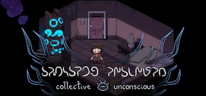
ive been playing a lot of collective unconscious lately
at first i was gonna make a post talking about multiple ynoproject games before i realized that i just had too much to say about this one. also, this was written before the update dropped
header made by callisto on steamgriddb
if you dont already know what yume nikki is, i consider it a must-play if you enjoy analyzing games. its effectively a rorschach test with just enough fuel to point you in an interesting direction that nobodys pieced together in quite the same way yet. the best way to play it is either for free on steam, or on ynoproject.net, which also hosts a handful of the fuckton of games that act as entries into the yumenikki-like genre. perhaps the most notable among these games, along with the classics like yume 2kki and .flow, is collective unconscious, a yume nikki fangame designed with the website's massively-multiplayer functionality in mind.
initially, i was worried that the collective nature of the game would encourage way more obtuse design. like, if youve heard of namco's tower of druaga, you might know that while english arcade-goers hated the eclectic and bizarre progression requirements, japanese arcades were abuzz with collaboration, people starting cabinet journals that list their discoveries and offer tips. i minored in sociology and therefore have the confidence to declare that this is a perfect example of collectivism vs individualism. anywho, i was worried that the post-fnaf world would encourage this kind of design on a more widespread level again, which would just mean tabbing out into a guide every few minutes. well, youve gotta for a handful of the journal covers and menu styles (the game does a great job at pacing out the rewards while still maintaining reasonable expectations), but those are optional cosmetics, and their obscurity is par for the course. the effects (scuse me, the eidola) are pretty clear-cut too, i feel like yume nikki just kinda handed em out for random stuff (which is great for what its going for!) but i really like the spectacle and circumstance around em here. like, you find the rat one in a random dumpster somewhere, but the weather one is from communing with the gods
ill note now, there isn't the stock speed vehicle like in most fangames, you can just sprint whenever. this isnt a trivial change, and the game knows it. theres one puzzle that is built around needing to sprint with another effect active. personally, i like this change, but i understand why oldheads wouldnt. dont worry, i still take my time, its just nice to speed up a bit without having to sacrifice my cool eidola
unfortunately, the multiplayer aspect wasnt too lively. there were only a handful of other dreamers, and the ones that werent just afk in the nexus were off doing their own thing god-knows-where on the map. i think i ran into one other person organically, ever, and they just ran past me. i suppose this is an inevitability when you put strangers in a sandbox together... especially since most people (hundreds compared to our twenty-odd) were in yume 2kki, the MUCH larger sandbox. anyway, im gonna stop talking about meta stuff and get into what youre all here for: dream analysis. finally, a use for that stupid psyche degree.
oh real quick, the exception to the loneliness thing is expeditions, something built-in to YNO at large. you get exp if you go to a specific location in one of the games, so you can expect a lot of people there. once you get there, youre gonna see a bunch of people standing around the entrance facing the camera afk.
anyway, when i got the soulfire eidola, the obligatory weapon effect, i got some "donut steel" vibes. its kinda funny to jump from a kitchen knife to casting Demonic Flare: Pillar of Hellfire with a floating eye face vigil and arms made of flames. but then i simply got over myself and took this as a surface-level aspect of minnatsuki's personality. you can tell a lot from a protag by how they kill npcs. for example, sabitsuki has a gun, but only uses it for intimidation, leaving the act of killing to some old pipe she found; implying that she is pragmatic, and still sees the act of murder as something dirty and ill-fitting. meanwhile, urotsuki uses a chainsaw, a weapon infamous for being impractical against humans irl but pervasive in fiction due to the sheer cool factor; this tells us she glorifies killing, seeing it as something fun and badass. minnatsuki is similar to the latter, having a fantasy spell as their method, meaning that we can see a hint of escapist desire, to be empowered beyond mundane humanity in a way that equates to the ability to harm others.
other eidola, like her animal forms being a mouse (stereotypically skittish and shy) and a jellyfish (weak and passive, confined to water), and her instument of choice being the meek and obscure kalimba, paints the picture of a girl who feels desperately powerless. she doesnt want to lash out and kill others per se, her weapon is a bit too fantastical for that. she just wants to feel strong, and whats stronger than some arbitrary mythical abstraction of an element of destruction? and dont get me started on the umbra and spectral eidola, letting her fade into nothing or just be untethered to the world. theres something she wants to escape
another thing? very rarely are you given an eidola. with soulfire and umbra you have to actively avoid people trying to stop you from leaving with it. the ones that seem more permissive have caveats: you get rodentia in a back alley from someone hidden in a dumpster, you loot lumen off a corpse, spectral comes from a literal cult ritual, and climate makes you earn the blessings of three separate... gods? before youve earned the right to it. the only real exception is kaliba, because theyre like $20 on amazon. nah but seriously, maybe it represents being a heartfelt gift from a friend? or maybe its granted more readily because its recreational, and doesnt empower minnatsuki in the way weve talked about them desiring?
by the way, i dont think minnatsuki has a gender. not like in a kris deltarune "actively canonically nonbinary" way, but as an unimportant detail left up to interpretation. maybe theyre just a cis person who doesnt care and puts no stake in it as an aspect of their identity, or maybe they just feel alienated from the social concept of gender altogether? i prefer the last one, personally, for reasons ill get to later
that brings us to the eyes. there is so much eye imagery in minnatsuki's dreams. eyes on stalks that watch you, where trying to talk to them is useless. giant murals with a six-armed diety that has an eye on its palm. women in melancholy, whos faces lack eyes. a giant flower hidden in the dark that hides a single large eye. only being able to enter the house in rainstorm city that has the eye symbol next to it. perception plays a toll on minnatsuki, and i think it goes both ways. they feel observed in a burdensome way, and they feel incapable of 'seeing' on the same level as others. or maybe they see too much? is there an event she shouldnt have seen, or does she experience sight at a level above others, recognizing things others cant? the child and spectral eidola may be a wish fulfillment of the former, letting her see the unseen in a literal way, while also letting her overcome limitations that she has seen for herself with the latter
another thing about the design i wanna mention real quick is that so much is diagonal. this is something that the rpgmaker engine isn't built to really allow. like yeah, you can, and this game goes out of its way to make it non-obtrusive by having minnatsuki slide along walls sometimes, but it's not something the foundation was set in mind for. this also brings to mind the idea that minnatsuki doesn't fit in with others. it's not a disease like in .flow, it's not something that's detrimental to her in a literal way. it just causes friction with the world around her, because she doesn't feel as if it's built for how she is. she just doesnt quite fit with the world around her sometimes, the way she moves is just a bit off, like a direction-locked movement system trying to go diagonally
theres also a lot of thematic relevance to the idea of connection and ingroup membership. the game is named from the jungian ideal, a level of understanding inherent to the human mind where process instinct and achetype (the latter basically being our classification of others into pre-conscieved schema like "the wily trickster" and "the tyrant leader"). in addition, the game has a lot of togetherness imagery, with npcs sometimes travelling in packs or existing as hordes (the only exception i can think of are npcs that give you something like an eidola or menu theme, perhaps meaning isolation holds a deep importance), and things acting as notable points of interaction when they are isolated (note that the dungeon-relevant houses in gbc world are furthest from the village, for example). there's also a lot of totem poles, acting as the dream trigger and the centre of the nexus, signalling great importance. in first nation tradition, totem poles are created to honour the lineage of a clan (using designs that are unique to that clan), and send messages such as welcoming visitors and shaming wrong-doers (both of these uses involve establishing in-group membership).
i believe these themes combined, minnatsuki's dreams letting her feel powerful and connected, paint the picture of a person that is alone and powerless. minnatsuki doesnt have friends, and im not sure if she even has bullies. i have yet to meet a chaser in this game, so maybe that means that nobody even singles her out in a negative way? stares and weird looks, maybe, but only as a collective and not as a personal connection. this is corroborated by the school location, which minnatsuki's dream constructs as a tainted and evil place, half-formed from broken blueprints. she understands it as a flawed idea done poorly; implying that her disillusion is so severe she sees her isolation as an inseparable corruption of the entire system. so, she feels powerless to stop it, as well as alone and friendless
unfortunately, the game doesnt seem to have a proper ending yet. which is a shame, because most solid ynfg theories start with you working backwards from the ending. well, i supposed "social outcast that struggles with confidence and/or self-esteem" isnt a groundbreaking theory, but im still interested to see if this supported or jossed as the game gets more updates. also, i noticed while brushing this up that at some point i switched from they to she for minnatsuki, so i guess the audience has interpreted.
look i could ramble about this wonderful game all day. dont get me started about my thoughts on the event in uncanny world, the lonely girl in snowy shoal, and the random blond girl that can just show up in random places out of nowhere and that takes you one a scooter ride once you get to know her?
im gonna be playing this for a long, long time, and im gonna love every second of it
#collective unconscious#yume nikki#ynfg#ynoproject#in progress#i hope this inspired you to give the game a try! lemme know if you run into me my username is queenzigzag#this was cathartic to write because its been a while since ive really sunk my teeth into some story analysis#mechanical analysis? sure. but as a skill of mine that pales in comparison to english lit-style breaking down themes and subtextual meaning#wait thats not true. ive been going off on literary analysis i have a 7k dan*anron*a retrospective in my drafts#i think that plus fl*thead might be why i feel like ive been so negative in my reviews lately?#maybe im still rattled from reviewing g*d str*ke and t*los princ*pal back to back#which was like. last year lol#i promise ive written up reviews for my all-time favorites and im currently playing some that are sucking my dick clean off#ill uh. finish em someday. if i dont get distracted
18 notes
·
View notes
Text
CNN:
In early February, John Schwarz, a self-described “mindfulness and meditation facilitator,” proposed a 24-hour nationwide “economic blackout” of major chains on the last day of the month. Schwarz urged people to forgo spending at Amazon, Walmart, and all other major retailers and fast-food companies for a day. He called on them to spend money only at small businesses and on essential needs. “The system has been designed to exploit us,” said Schwarz, who goes by “TheOneCalledJai” on social media, in a video to his roughly 250,000 followers on Instagram and TikTok. “On February 28, we are going to remind them who really holds the power. For one day, we turn it off.”
Schwarz, 57, has no background in social or political organizing. Until early this year, he almost exclusively posted videos of himself offering inspirational messages and motivational tips sitting in his home, backyard and shopping mall parking lots. He had low expectations for his boycott message gaining traction. “I thought maybe a handful of my followers would do it,” he told CNN in a phone interview this week. Instead, Schwarz’s call rapidly spread online. His video has been shared more than 700,000 times on Instagram and viewed 8.5 million times. Celebrities such as Stephen King, Bette Midler and Mark Ruffalo have encouraged people to participate. Reporters wrote and aired TV pieces about the boycott, propelling it further. The “economic blackout” effort is relatively uncoordinated and nebulous. Experts on consumer boycotts and corporate strategy are dubious that it will make a dent in the bottom lines of the massive companies it targets, let alone the vast US economy. Effective boycotts are typically well organized, make clear and specific demands and are focused on one company or issue. But this boycott has gained strength online because it has captured visceral public anger with the American economy, corporations and politics. “There’s the sense that a lot of people want to do something. Doing something in the American context has often meant using pocketbook politics,” said Lawrence Glickman, a historian at Cornell University and author of “Buying Power: A History of Consumer Activism in America.” “This a way of engaging in a form of collective action outside of the electoral arena that makes people feel some connection and sense of potential power.”
People online say they want to join the boycott for many different reasons. Some are commenting about high prices and the cost of living. Others are angry about the power of large corporations and billionaires such as Elon Musk. Some are pushing back against the Trump administration’s efforts to gut federal programs and fears about an autocracy in America. Yet others want to boycott companies rolling back their diversity, equity and inclusion (DEI) policies. Schwarz scrambled as a result of the response to create a group. He called it The People’s Union and describes it on its new website (that is frequently down) as a “movement created by the people, for the people to “(take) action against corporate control, political corruption, and the economic system.” He has raised around $70,000 in donations on a GoFundMe page that solicits funds for social campaigns, legal advocacy and other efforts. He has also called for more targeted boycotts in the coming weeks against specific companies, including Amazon and Walmart. (Walmart declined to comment to CNN. Amazon did not respond to comment.) Although the response online appears to be strongest from the political left, Schwarz has no ideology that could be considered consistently progressive or conservative, at least along the traditional US political spectrum. He does not belong to either political party, but he supports Bernie Sanders. In recent posts, has advocated for the end of federal income tax, term limits in Congress, universal health care and price caps.
John Schwarz proposed a 24-hour nationwide “economic blackout” of major chains on the last day of the month of February, and he initially thought it would get minimal traction. Alas, it has spread to a mass of people, especially those fed up with businesses rolling over for the anti-American autocrat occupying 1600 by ending DEIA programs, the Trump/Musk co-Presidency’s attacks on federal workers, and frustrations about the high cost of living.
15 notes
·
View notes
Text
Crack The Code of Effective PPC AD Copy : Expert tips for higher CLICK - THROUGH
Write headlines that are clear and direct
Use strong calls to action
Appeal to emotion
Focus on benefits, not features
Keep it short and sweet
Test, test, test! By following these tips, you’ll be able to craft PPC ad copy that resonates with your audience and drives conversions.
Tip #1: Focus On Benefits, Not Features

When it comes to PPC ad copy, one of the most important things to keep in mind is that you should focus on benefits, not features. This may seem like a small distinction, but it can make a big difference in terms of how effective your ads are.
Benefits are what your product or service can do for the customer. For example, if you’re selling a new type of toothbrush, the benefit might be that it’s much more effective at cleaning teeth than a traditional toothbrush. Features, on the other hand, are simply the characteristics of your product or service. In the case of the toothbrush, some of its features might include that it’s battery-powered and has a built-in timer.
Focusing on benefits rather than features is important because people generally make purchasing decisions based on how a product or service can meet their needs or solve their problems. So, if your ad copy focuses on the benefits of your offering, you’re more likely to get people to click through to your website or landing page.
Tip #2: Have A Compelling Call To Action
Your ad copy should always include a call to action (CTA) that encourages users to click through to your website or landing page. Without a CTA, your ad is likely to be ignored.
Your CTA should be specific and compel users to take action. For example, “Click here to learn more about our new product” is much more effective than “Check out our website for more information.”
Make sure your CTA is relevant to the user’s needs and interests. If you’re selling a new type of toothbrush that prevents cavities, your CTA might be “Click here to learn more about how this toothbrush can help you prevent cavities.”
Your CTA should be placed prominently in your ad so that users will see it and be compelled to act on it.
Tip #3: Include Keywords
When it comes to PPC ad copy, keywords are essential. Not only do they help your ad get found by potential customers, but they also play a role in determining your ad’s quality score.
To make sure your ad is relevant to what people are searching for, include keywords that are related to your product or service. For example, if you’re selling running shoes, you might include keywords like “running shoes,” “runners,” and “jogging.”
Including keywords in your ad copy can help you improve your quality score, which can lead to lower costs per click and higher click-through rates.
Tip #4: Use Power Words That Resonate With Your Audience
A lot of businesses make the mistake of using industry jargon in their PPC ad copy. This can be a major turn-off for potential customers, as it comes across as arrogant and exclusive. Instead, focus on using power words that resonate with your target audience. Words like “amazing,” “valuable,” and “unbeatable” are universally appealing, so make sure to work them into your ad copy. You can also use more specific words that relate to your product or service, such as “reliable,” “long-lasting,” or “first-rate.” By using language that your audience can related to, you’ll be more likely to grab their attention and get them to click through to your website.
Tip #5: Tell A Story
When creating your ad copy, try to tell a story that will resonate with your target audience. What are the pain points that your product or service can solve? Share a relatable anecdote that will grab attention and illustrate how your brand can help. In addition to being relatable, make sure your story is also unique – this will help you stand out from the competition.
Tip #6: Keep The Copy Simple And Concise
It’s important to keep your ad copy simple and concise so that potential customers can understand what you’re offering quickly and easily. Try to use clear, straightforward language and avoid jargon or technical terms. Instead of using long, complicated sentences, break down your thoughts into shorter, easier to digest chunks. Also, be sure to proofread your copy for any spelling or grammar errors before posting it. By following these tips, you’ll be able to craft effective ad copy that will help increase your click-through rate.
Tip #7: Utilize Humor
When it comes to PPC ad copy, don’t be afraid to have a little fun with your message. Adding a touch of humor can help you stand out from the competition and make your ad more memorable. Just be careful not to go overboard – you don’t want your ad to come across as cheesy or unprofessional. A little bit of wit can go a long way!
Tip #8: A/B Test Your Ads
A/B testing is one of the most powerful tools available to PPC advertisers. It allows you to compare two versions of an ad side-by-side to see which performs better in terms of clickthrough rate, cost per click, and other metrics. This can be a great way to hone your PPC technique and ensure that you’re getting the most out of your campaigns.
Conclusion
Crafting effective PPC ad copy is no easy task, but with the right strategies and tips in mind, it can be a powerful tool for improving your click-throughs. From understanding keywords to creating compelling calls to action, following these expert tips will help you create an effective message that resonates with customers and drives them to click. So what are you waiting for? Take the time to craft some creative ad copy today and start driving more clicks!
#Crack The Code of Effective PPC AD Copy : Expert tips for higher CLICK - THROUGH#web development#web design#best web development company in united states#website landing page design#logo design company#digital marketing company in usa#web designing company#magento development#asp.net web and application development#web development company
0 notes
Text
FAVE CREATORS ART CHALLENGE! for @anya-chalotra
And here is a list for one of my fave creators ever, my darling Ava! You are truly such a gifted gifmaker and artist, the way you can manage to color and blend always makes my jaw drop. You have created so many trends here on this website and don't get enough credit for it (no seriously you would do something for the 1st time ever on this site and then people would start doing that effect too), you are one of the people that have changed the giffing world of Tumblr. And not only that, you are such a kind person, offering tips and tricks and indulging my whims of ot3 humor.
Seeing your sets have always inspired me and made my days so much better, even if I was sad, I would just look at one of your sets and marvel at the beauty this world has to offer and it made me feel better.
You are a gem to this world, Ava and I love you.
Witcher Character Meme - This captivating set completely changed the game for me. It is truly one of the most amazing sets I've ever seen in my life and just looking at it makes me want to do better. I worship this set, Ava. It has inspired so much of my own work and is so bloody excellent! Every single pixel of this set is heavenly, from the lovely violet coloring to the badass blending (literally Ava your blending is borderline magical!) to the awesome fontwork and to your hilarious captions! You are so witty and talented, I can't believe I get to witness your works of art that you grace us with.
BW Yennefer - Okay I cannot tell you how many times I've opened this set and just stared at its beauty. It is so magnificent, I adore it so much, I feel like I can't even properly express my adoration for this set. I am a huge huge fan of BW colorings that still have skin tones and this set is so phenomenal. It looks so wonderful and incredible! It just looks so marvelous, I type while weeping at how warm it makes my heart feel.
Witcher Episodes - Words cannot describe how mind-blowing I think this set is. You, Ava are just so fantastic at PS editing, this set is so extraordinary, I adore red and BW combos and before you made this set I thought nothing could beat the 1st part of the episode sets and you completely proved me wrong. Like, how? How? How did you come up with this? How did you make this? How are you so talented? You should be a graphic designer, honestly. This set is so absolutely mindbogglingly breathtaking. As in, it takes my breath away every. single. time.
Witcher + Disney Movies - What I would give to see inside your mind and find out how you come up with these ideas and then to also watch you create these absolute masterpieces that should be framed somewhere! This set is on a whole other level, I simply love everything about it! I wish I could scream at you through the screen and tell you how beautiful this set is! Not only is it so brilliant but it looks so enchanting. Ava, picture me screaming as I type this and you will understand at how freakin much I love love love this set.
Orange & BW Yennefer - Wow wow wow! I adore layouts and tiny gifs and also blending inside tiny gifs! The orange coloring is so dreamy and gorgeous, it makes me want to weep and the blending looks super great and your fontwork is so good!
Orange Witcher Women - I love simply everything about this. From the bombass blending to the magnificent coloring to the fontwork! Your hands create magic! I honestly am in awe at how well the blends work here, it's so masterfully done!
Lilac & Yellow Witcher Characters - The talent jumped out in this set, wtf Ava! You must have put so much effort into this, with so many characters and such different scenes. And you made them all have this one color combo, how on earth did you manage to color them so well?! You are a Photoshop goddess! I love love love this set!
Yennefer + Fashion - I'm amazed at your uncanny ability to blend scenes that you wouldn't think to put together and make them look like absolute masterpieces! It is so top notch, just insane how good your blending is!
Witcher + Tarot Cards - This was one of the first sets I saw from you and even then your PS skills were so on point. I love this set so much, you have no idea. Even looking at it now makes me so happy! I adore the yellow frame overlay, it's so delicious and stunning! And the blending in this set is just wowza, such a marvel to look at! I can't even decide which card is my favorite, they all look so amazing!
Red Enola Holmes - Can I just say that I was so thrilled when you started giffing Enola Holmes and this set is still one of my fave of yours, it has honestly inspired me so much. I love the reds here so much, they look so masterfully done, you must have worked so hard on this!
Purple Witcher - Your coloring work on this set is extraordinary! Not only is the purple so vibrant and gorgeous, but seeing all these lights/shadows makes it look even better! You probably used gradient fills, right? I love using them too and this set is just proof of how good they can make sets look! Such a stunning set, honestly!
Witcher + Winter - This is so so so so beautiful! It truly is one of the best sets I've seen and it is so soothing to look at! The colors are so pretty and your choice of shots are brilliant!
Battle of Sodden Hill - I'm blown away at the sheer beauty oh my gosh! This is so remarkable, I adore the gorgeous oranges, the fontwork and the subtle yet wonderful blending!
Yennefer + Spitfire - I gasped the first time I saw this set. It is so freakin amazing! The orange is incredible, the blending is awesome, and the fontwork is cool! And I am so impressed at how well the skin tone looks here given that orange is so hard to work with for that precise reason.
Witcher + Greatness - This is so spectacular, the blending is off the charts amazing, just the scenery in the background looks so magical and the lovely beige coloring, mwah!
Green Geralt - This is so pretty, the green looks so great. You're so talented, I can't comprehend it.
Yennefer + Damsel - This is an absolute banger of a set, imagine being this talented! The orange is sooo sexy and the blending is freakin astounding!
Orange Geraskefer - You already know I'm a hoe for your orange sets so is it any surprise that I adore this set? The orange is so fabulous!
Yellow Witcher - This looks so sublime, the yellow is so delicious, it feels like sunshine is leaping off the page!
7 notes
·
View notes
Text
webdev websites list
Web Design Free and Premium Resources - Webgyaani
Internet History Sourcebooks Project
Webpage archive
Your Website Needs to Work on Phones - Kalechips
Mobile Friendly via CSS - Dannarchy
Clagnut by Richard Rutter
CSS { In Real Life }
CSS-Tricks - Tips, Tricks, and Techniques on using Cascading Style Sheets.
90's Cursor Effects
Web Design Museum
Milestones Archive - The History of the Web
All Paths | The Odin Project
Developer Roadmaps - roadmap.sh
XP.css - A design system for building faithful recreations of old UIs
GTmetrix | Website Performance Testing and Monitoring
sadgrl.online
Peregyr Art & Design
R.V.Klein 🐇 HOME
lunospace
goblin-heart.net
Reliquarian
Dark theme - Material Design
32-Bit Cafe
Cappuccicons Font
BASIC HTML COMPETENCY IS THE NEW PUNK FOLK EXPLOSION!
17 notes
·
View notes