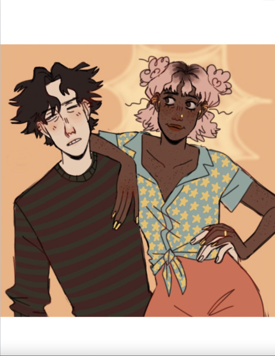
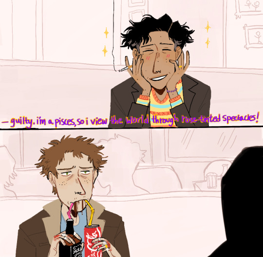
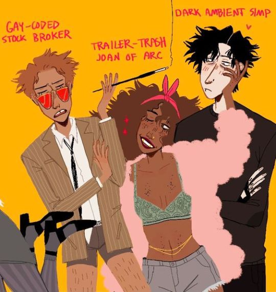
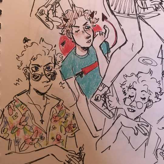
#Honestly it was so much fun drawing and doing the lineart of this
Text

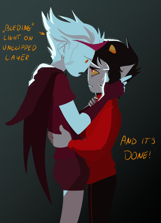
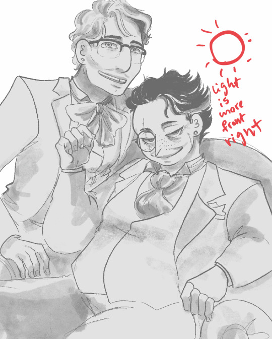
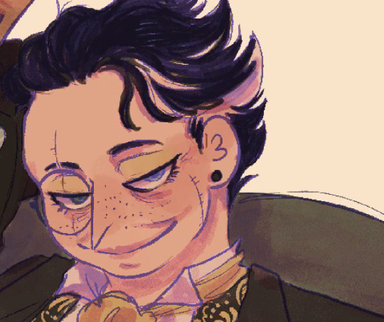
#full on stole this pose from#death and the maiden by Henry Lévy#Honestly it was so much fun drawing and doing the lineart of this#I might do a whole series of destiel versions of classic art#the coloring part went awful though#I will still post the colored version but it looks overworked and I think this one is just superior#oh also tiktok made me keep the topsurgery scars#illustration#art#supernatural#spn#procreate#supernatural family#supernatural art#supernatural fanart#fanart#deancas#destiel#castiel#dean winchester
462 notes
·
View notes
Text
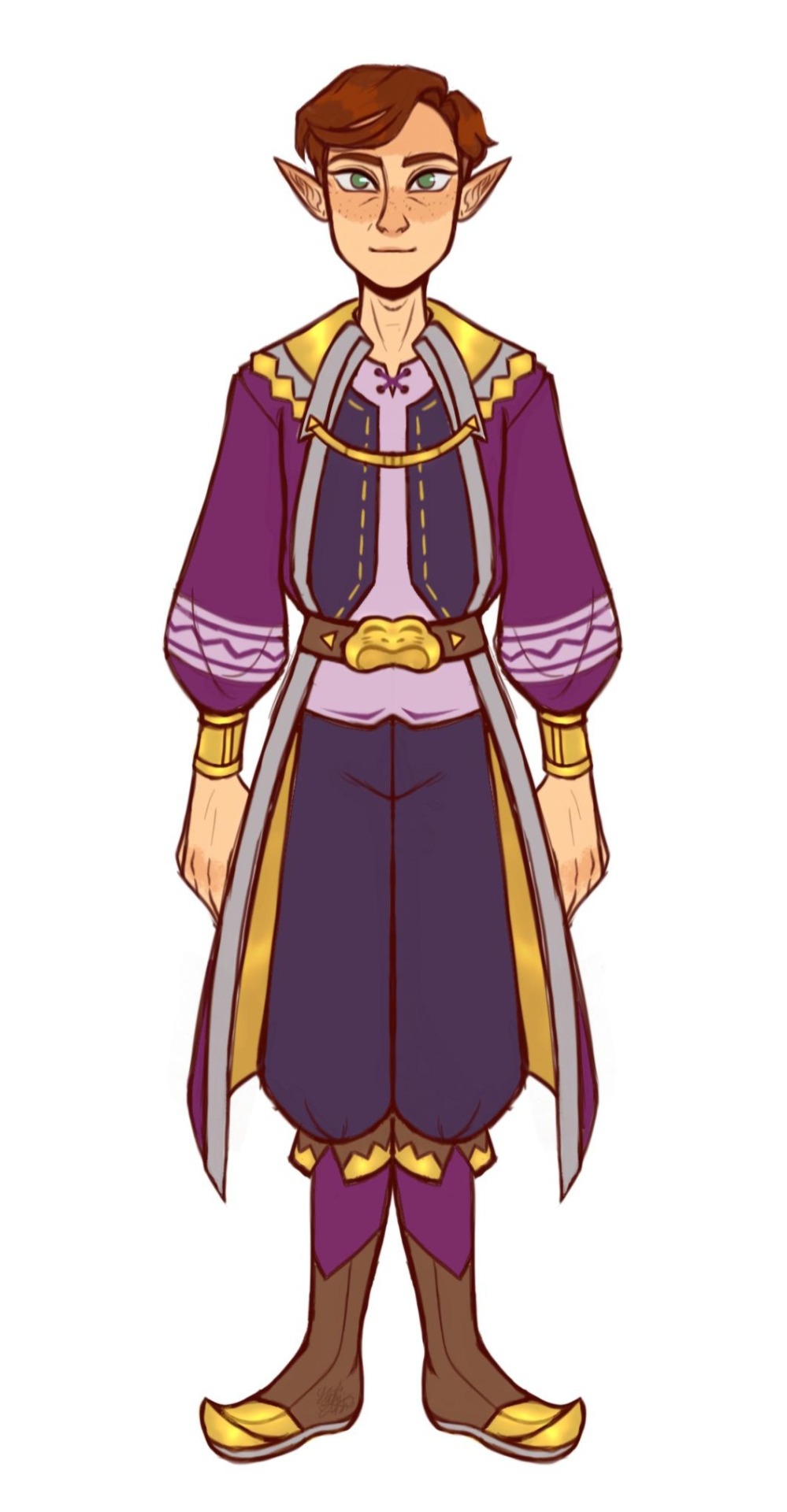
Fionna and Cake
Finn and Jake!
A F&C Swap Au! :))
Pt 1? Re-Drawings!
presenting the idea!(? 🥹
("pt 2" out! some "posters")

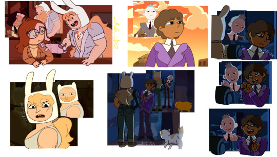


Hello!! I bring u smthing super special to me today!! <3 is a— project? that I have waaaaay time ago!! And finally after being so lazy I finished it!! <33
I bring u— Finn&Jake! A Swap!Au of F&C of course :)) A thing I was SOOO EXCITED to show!! <3 Is something I plan to carry more than just some drawings! ;)) I have a lot planned!!
But for now...
This is just a post to Present to you the idea! And if this Post gets support, I hope it is like that- I'll bring more information about the Au! And characters! Bc they change, duh— hehE-
Extra sketchsss!!!
Hehee <3 pretty simple but I thought they were necessary—?
Ok, Now, clarifications:
1— I KNOW I'm not the first one in swap Fionna w Finn, I KNOW I am NOT the first one in swap Betty and Simon, and I KNOW I am not the first one in swap Scarab and Prismo either, Im pretty conscious about that
💛- But! I think Im the first one in actually do Fionna as Finn :bb Bc— Honestly I think I just saw ppl drawing Finn w Fionna's normal life, but not Fionna w Finn's magical life 🤔 u know— all buff and w Cake's... tattoo 🙃🤧
And! I think, or feel, like I am the first one in combining all this Swaps in just one SwapAu!! :DD So- yuh—
2!!— Guys! I know some re-drawings might look kinda weird and kinda not like AT Style, But the thing is this:
💛I have the Sketchs of all this since NOVEMBER of last year, Then in December I just was doing the linearts, And just now I finished all this... So, dont worry, that for future drawings of all this Au, will be better!! Will look better, and be more close to AT/F&C actual style since I improved w it!! <3👍
And 3!!— Dont worry if some designs doesn't convince ya! (cofcofSwapPrismocofcof) Some will definitely change in the future! :)) (cofcofWinterQueenCOFCOF—) but they have this "issue" cause of Clarification 2 I could say.. (In the moment I did the sketchs, all this wasn't planned too well... so I didn't put much effort into the designs...?)
And I think that's all I could say by now :))
Remember this is something just made for fun!
Hope u like this Au! bc- Honestly it means a lot to me for some reason..
And hope to bring u more information! Not soon though— I need to rest a little hehE— All this post was a "stress" in my head for all this time.... BUT IT WORTH IT‼️💛💛 WOOO SUPER PROUD OF THE RESULTS!! BUT FUTURE ONES WILL BE EVEN BETTER!! WOOOO—
well— ehem—
See ya!!! 💛
#fionna and cake#prismo#prismo the wishmaster#fanart#adventure time#fionna campbell#cake the cat#jake the dog#finn the human#betty grof#scarab the god auditor#the scarab#digital art#prohibitedwish#we could say—?#marceline#💛'sart#FAJ!SwapAu
256 notes
·
View notes
Text
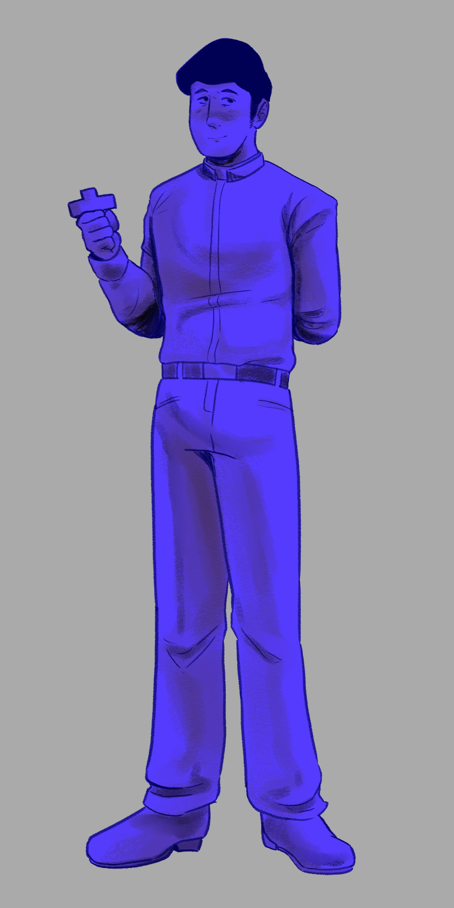
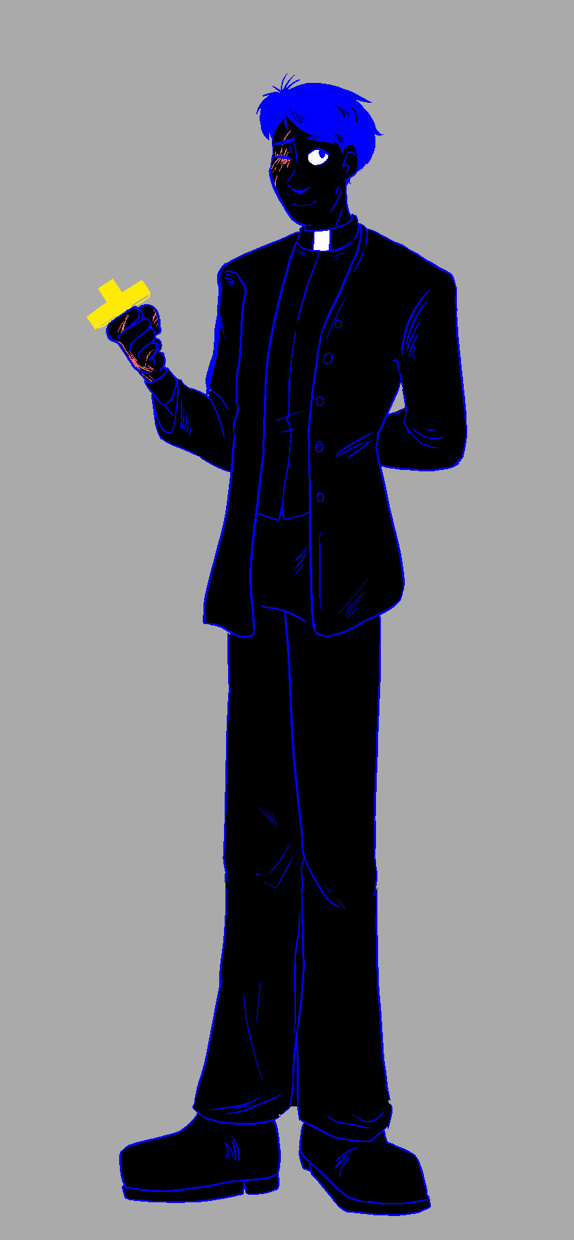
An open love letter to the entire Faith the unholy trinity fandom off sorts. I present to you.....
John in the style of 9 different artist!

(Keep in mind this is a style study. And although the whole thing was drawn by me, please please PLEASE check out the artists whose style I tried out. Thank you!)
This was SUCH a fun experience! I honestly love our fandom, and I adore how unique everyone's style and perception of John is. Says a lot about society or smth.
And even though I probably didn't do justice to all the art styles, I really hope they are recognizable.
Also, you might've noticed an empty spot in the end. Well, it's for you! Naturally, I wasn't able to include every artist, but I hope you will be interested in taking a spin at this yourself. Thank you and good luck!!!
A closer look, links and notes under the cut

@trashprinceward
I adore how soft this version of John looks, he seems so trustworthy and kind, gah. The shading style is surprisingly difficult, but I hope I managed to pull it off:) I also adore Prince's AUs hehehe
@rokiro99
A very unique colouring style!! I've seen a few versions of how this artist draws John, but decided to stop on this one. His face is so adorableeeee. I also LOVE the use of liturgical clothing and themes!!

@karamielo
Eeeeep I love how they use colours in their works and how well they use composition??? Like omg. Such such pretty works, I hope they create even more art
@justcommander
I lovvve how game-adjacent this artist's style is. I also love the way they (I'm so sorry, I'm not sure about the pronouns) draw hands and use body language. Also, the father and children AU??? Muah.

@shu-bullshit
I'm not even pretending I managed to pull this one off, I bit so much more than I could chew. But I couldn't not try, I almost every time I see their use of coloured pencils and watercolours, I just can't. Love love love

@zzoupz
So. As far as I can tell, Zoup doesn't use this style TOO often, but it wasn't leaving my head, I had to try. The artist did so much for the fandom, the Gary ask blog is such a treat. Yum
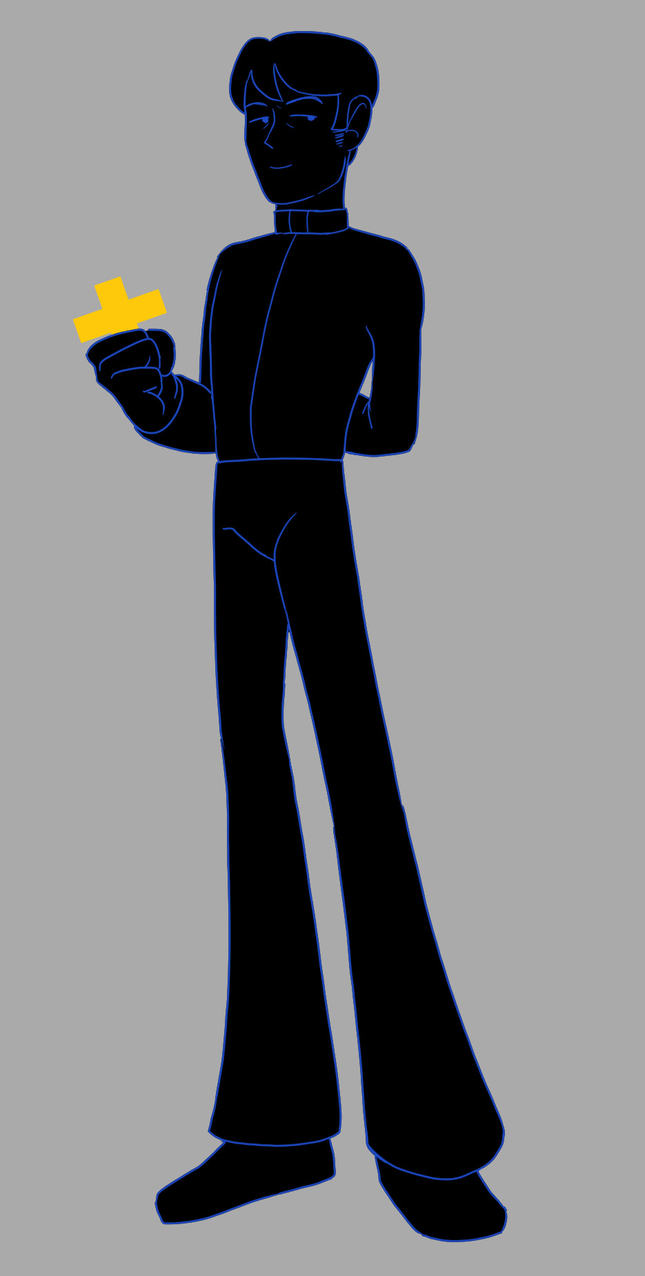
@genesissaturna
Hee hee he's so shapes. The legs. Beautiful. I wasn't sure about the colouring style since I only saw lineart done by this artist, so I decided to use the in-game ones. I hope they do more art, it's so unique and makes me happy!:)

@hammy-art
Wet cat John. Silly. A little pathetic, but in a nice way. I feel like I didn't make the lineart the way he does, it is usually more gentle, but I still hope it will suffice. Also my God he does amazing backgrounds, which I sadly can't portray here. (A personal thank you for giving me the courage for doing self-inserts)
Annnd that's it! I thank you for everything and I hope this whole thing will somehow inspire you. Keep doing art, let the world see your vision! Also go draw a pathetic blue priest /j
#i really should've asked for permission#but i really wanted it to be a surprise#i love you alllllll#faith the unholy trinity#john ward#clerk art#faith the game#ftut#faith#trashprinceward#rokiro99#karamielo#justcommander#shu-bullshit#zzoupz#genesissaturna#hammy-art
154 notes
·
View notes
Text
Got myself involved in making some art for a Dungeons and Dragons campaign set in Breath of The Wild!
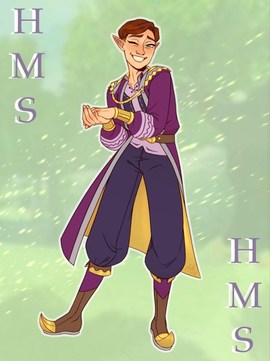
I initially was just reached out to by the GM for advice and assistance on designing and characterizing a Happy Mask Salesman NPC (which was a huge honor 🥹), but it's starting to look like I might be able to go furthermore insane about this and start helping out with other NPCs, too! Particularly original characters, now, because HMS only needed a new look due to the fact that his original outfit is from a different, older era of TLOZ.
We sat down in a Discord call for a while to talk, and I streamed my art program and helped to sketch out the GM's vision for what HMS would look like in his campaign. It was mostly inspired by the clothing of both the BOTW merchants and the royal family/people affiliated with the royal family, along with the DM's own personal flair and of course keeping as much of the original vibe of HMS's character as possible (though the style of this era has a lot more detail than we're used to seeing on him)!
(Excuse the quality of the proportions/lineart etc. looking more rushed than usual, the first drawing up there on this post is the finished character graphic and took 14 hours to make while this one is only an outfit concept and took around 6 hours.)
His gorget was honestly the hardest part to try to incorporate with the time period and other desired details, so we settled for a general homage of shapes. BOTW fashion has a lot more triangles and zig-zags, so we switched that up, too.

Thanks to everyone in the Whispers of The Wild server who was so kind and welcoming and excited to see my art while I spectated during this week's session! You're all doing so amazing, and this was incredibly fun. I've been very sick and struggling for a while, so this was a breath of fresh air and gives me things to look forward to. I'm glad to be a part of this. 😊
#happy mask salesman#loz happy mask salesman#the happy mask salesman#legend of zelda#loz#legend of zelda majoras mask#majora's mask#majoras mask#zelda majora's mask#loz majoras mask#dungeons and dragons#zelda dungeons and dragons#whispers of the wild#breath of the wild#loz breath of the wild#loz tears of the kingdom#legend of zelda tears of the kingdom#the legend of zelda majora's mask#legend of zelda breath of the wild#legend of zelda majora's mask#the legend of zelda#tloz#botw#legend of zelda botw#botw happy mask salesman#botw fashion
115 notes
·
View notes
Text
Rayday's Swap AU ~ Vox
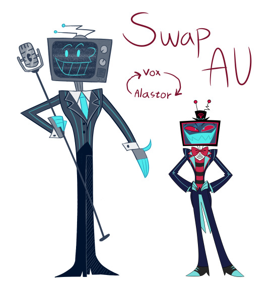
This is probably my most out-there design for my swap AU so far, but I have my reasons! Please just hear me out, guys--
More information about the design + "sprites" under the cut

Why his face looks like it does - I tried my best to emulate the UPA style. I actually had to research for this shit, and I accidentally made him have a Butch Hartman face at first, but I figured it out eventually I think.
I felt like I had to add the nose though, cuz it's honestly pretty common in illustrations from the 1940s/1950s where this style originates from ( from what I read. ) Either way, I felt it was important to have a style from around the era he died for his face, and Vox's character in my swap AU is the old-timey type.
Why no shoes - This decision is also due to the UPA style, where a lot of male characters would have their legs me entirely black. I decided to add the hatching and lighter lineart though to make it obvious where his legs separate and all.
Tie instead of bowtie - This is simply due to the fact ties being more common in the 1940s/1950s from the quick Google searches about that era's fashion I did.
More simplistic/shape-y style - This is also due to the UPA style. It was actually rather fun to emulate, if I'm honest, and I think I mixed the UPA- and Helluva styles relatively well imo idk.
Microphone cane/staff - This is pretty much inspired by the older types of mics, and while the eye's style isn't from the UPA style, it was the easiest way to convey it's an eye in an older artstyle while also making it look good to me.
Color scheme - For his color scheme I first colored everything in grayscale ( with some blue accents ) and then put a blue, transparent layer over it to pull it all together.
Not only does this give a nod to the fact older TVs used grayscale, but it also ties into how regular Alastor's color scheme is mainly entirely red.
Still not too sure if I made the color scheme too light, but eh I'm too lazy to change it now considering I've been drawing for a while.
Swiped-to-the-side antennae - This was a design choice based on how hairstyles from Vox's era used to be slicked-back, and I thought it'd be a neat idea to have his antennae emulate that.
TV head model - It's simply loosely based on TVs from the 1950s. Do note most of the TVs back then ( from what I saw ) had a more wooden look, but I just wanted to stick to the grayscale/blue color scheme more.
Neck stripe wires - giving him a regular neck felt a little off, so he got metal pipes/wires for a neck now. Why? Because I say so and it makes the design a little more interesting.
Aaaand here's the "sprite"!
#rayday's swap au#hazbin hotel swap au#hazbin hotel#hazbin hotel fanart#hazbin hotel vox#hazbin hotel swap au vox
104 notes
·
View notes
Text
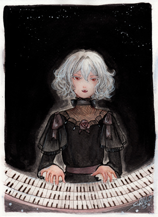
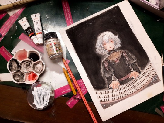
"Noble d'Apchier"
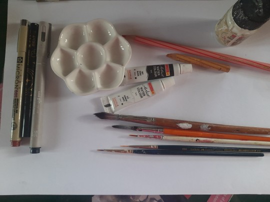
A little watercolor painting of Chloe,with the Zorn palette! I found out about this palette a while ago and I really wanted to try it out! (More on that below )
Chloe's hair is something I adore, it's gotta be one of my absolute favourite character designs ever,I love how swirly and fluffy it is,very fun to draw. I've drawn her normally before,I wanted to do one with her vampire eyes and fangs too. I decided to try to draw a white fuzzy rim around the foreground against the plain background,for a change,like in some of the VnC panels.
The Zorn palette,or Apelles Palette was a colour scheme used by Anders Zorn in the late Victorian/Early Edwardian era. It ,or something similar,might have been used by artists of old civilizations too, because it avoids the use of blue and green entirely: which would eliminate the need for rare pigments . It's essentially a colour mixing challenge,to draw the entire paintings with 4 pigments,2 basic colours: Ochre yellow, Vermillion,and Black and white,which can be mixed into different shades. It can be an excellent exercise and means for portrait painting
Modern artists use red instead of vermillion,but the essence is the same. So that's what I did too. I considered using vermillion,but I realised that it would introduce a lot of yellow tint, making the picture very warm. Which is usually something I prefer honestly,but not what I was going for here. Also,I need to consider the fact that I'm a watercolour artist,which is very different from the original intended palette. Zorn used oil paints,but other artists use it fine for gouache and acrylic too, however,that too is different from watercolor, because instead of mixing with white, I'll be diluting with water,which changes the composition of the palette considerably. So I went with these supplies: ochre yellow and red watercolor pencils (for me, basically watercolor pigments,I don't use them to draw,I grind and dissolve them in water),white and black watercolor tubes,and white ink. In addition: lineart with sepia,grey and black brush pens,which are well within the bounds of the palette
To be honest,I ended up not using the white paint tube at all,water makes more sense to me. I didn't use anything else though,and stuck with the original materials.And the results:
Does it work? Hell yeah. It's not perfect,but I'm happy with how she turned out
Was it restricting? That's kind of the point,to paint with some limitations
Was it hard? Honestly? No. Not at all. It's definitely very different from what I'm used to,I use a lot of colours both as is and mixed,but this was surprisingly easy. Perhaps because of my subject,which didn't have much colour to begin with
Do I recommend it? If you want a small challenge,or to experiment or practice colour mixing,definitely
Will I do it again ? Absolutely. I feel like I haven't utilised much of the potential of this palette. I ended up using mainly red and black, hardly any yellow at all. So I'd like to do something more colourful with this palette, perhaps a sunny painting of a gingerhead girl with flowers,and for this I'll probably use vermillion,not red
Anyways, that's all! If you read all this,thank you for your time!!
#chloe d'apchier#the case study of vanitas#vanitas no carte#VnC#my art#traditional art#zorn palette#vnc fanart#vanitas no shuki#jun mochizuki#case study of vanitas
277 notes
·
View notes
Note
Hi hi just wanted to stop by and say that you're a MASSIVE source of inspiration for me. I have a difficult relationship with art but when I saw your artworks a few months ago it actually motivated me to get back to drawing again! There's just something about your style, I think it's thanks to the lineart, that makes your drawings "easy to grasp" if that makes sense?? Like there isn't an overwhelming amount of detail, all the shapes and colors are Just Right and it makes me go holy shit this is it this is how I'd like my drawings to look like. So whenever your works pop up on my dash I'm always like !!! this is epic, beautiful, amazing. Honestly you've helped me figure out how to draw a dragon's head in a 3/4 view better. So THANK YOU for drawing the monster dudes, even if we're not really in the same fandoms I still love your stuff! ^^
Wishing you a speedy recovery too ✨

AWWW THANK YOU SO MUCH! It makes me OVERjoyed to know I've helped inspired people to try drawing! (´∀`)♡
I'm a self taught artist, so I don't have any official training, lol, but I certainly don't let that stop me! Every year I always get excited to see how much more I've improved, even If I do a Full body cringe every time I see my old art! ahah! ╭( ๐_๐)╮
In short, don't be discouraged by your art, KEEP AT IT and HAVE FUN! ( ゚▽゚)/
((And THANK YOU FOR THE WELL WISHES! I am better! Stil a bit snotty BUT better!))
68 notes
·
View notes
Text

ngl im not like, lineless art specialist, honestly i went lineless fairly recently (like lets say may 2023 when i started drawing art for homestuck), before that i was making art with lineart only, so take my process with a grain of salt lmfao but i hope it clears out some things!
lets dissect the recent dirkkri art ive made:
i start out with sketch, as you usually do. depending on how im feeling or how complex the pose/background is, i make it more or less detailed. for more basic poses i might even stick to a simple gesture drawing and go straight into laying out the colors, it really varies a lot. it might even change in the further process, like how i moved dirks shades from his head to be sticking out slightly from behind his arm, clipped to his shirt, because i didnt like how busy the area around the faces looked
one advice i can give is to not spend too much time on the sketch. its job is to guide the laying out of flat colors and thats it! dont make it too fancy, dont get lost in the details - you can add those later on when youre doing the flats. its fine if the sketch is messy, youll fix it in later stages of the process!
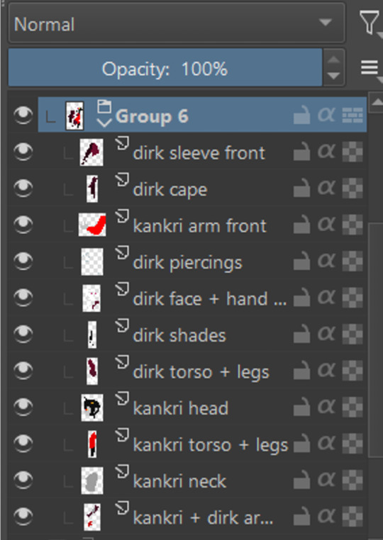
next i do the flat colors! i tackle it one thing at a time - for example with dirks head i started on separate layers with the general shape of his face, then added his facial features, then i drew the hair, then added his neck, the crown, and lastly his piercings. i then merged them all together - you dont need to leave it all separate, best way is to group things together and merge so you dont get lost with all the layers (like how kankris arm on the front is one layer including his sweater sleeve and his hand).
i highly recommend naming your layers - im a little on and off with it myself, but seriously it makes your life easier later on when you spot a mistake and have to shuffle through bazilion layers to find it lmfao, especially when your drawing includes multiple things that overlay on top of each other like in this example. dont be like me and take a second to name them asksks
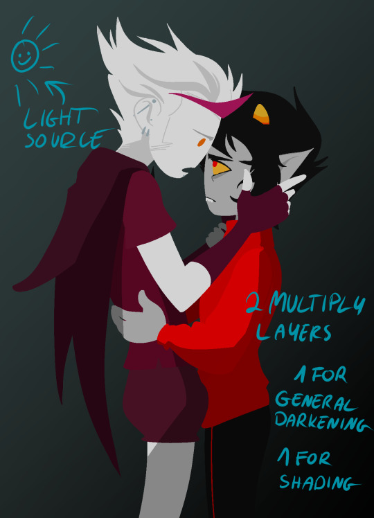
next to the rendering! i sometimes completely ditch this one, just leaving the flats as they are, but when i want a drawing to have more oomph i have some more steps to the process. its pretty simple - shadow, gradient map and highlight layer on clipping masks connected to the flats. in this one i used light gray for shadows (first layer to generally darken the drawing, second for defining shadows). same with highlights - one color.
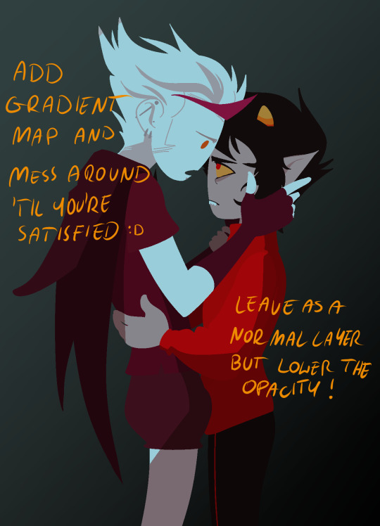
the real star of the show is the gradient map, seriously, its a goddamn miracle worker. in krita you can add one by clicking on the plus sign to add a new layer and choose "add filter layer", then in the menu open the "map" category and here should be the option of adding gradient map. you can do it on your flats, but its destructive, and on a separate layer you can always change it if you dont like it later on. mess with the colors and tadah! it now looks fancy as shit and makes people think you know color theory!

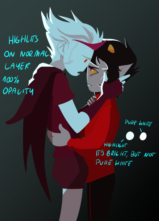
last but not least you can add some bleeding light on a separate layer that isnt clipped to the flats to give it more dreamy appearence! i also added an example of how my layers looked in a group at the end of the drawing process.
and thats it! hope it helps, and have fun drawing!
#ask#drawing process#lineless art#art tips#art process#digital art#hope its at least somehow understandable im really sleepy rn#god i hope i didnt make any spelling mistakes LMFAO#artists on tumblr
62 notes
·
View notes
Text
Or how I fudge and find out my way through making digital paintings.
art program used here : Procreate ( but the method can be applied to other programs )
original painting time ≈ 3 hrs
*note : English isn’t my native language in case something is confusing or wrong. Don’t hesitate to ask for more details regarding anything
**more important note : take breaks, drink water, don’t push your hands too hard.
Base
I start off by sketching where the bodies and objects are. Nothing too detailed. I’m just arranging stuff around and figuring out sizes. You shouldn’t spend too much time in drawing this and they shouldn’t be detailed so you can easily move the elements around without exhausting yourself beforehand ( also to avoid getting bored when you’re just starting.

composition is a little complex to figure out but for this one I made the characters around the middle point to create some sort of guide for the observer’s eye movement.
2. Initial sketch (optional)
I usually make one sketch for a drawing unless it has little details or elements I’m not used to drawing. For this one it was figuring out the clothes and the details on them. Again, don’t pressure yourself to make this look perfect or right. You’re just figuring out where things are.

As you can see, the sketch is pretty rough, not all the details on the hands are drawn. The eyeliner are still there and the chair is just a shape. Lots of lines are overlapping and.. you basically get the idea.
3. Second (final) sketch.
I wouldn’t call this a lineart. Linearts are more careful, less rough, cleaner. I like using sketches more than linearts because I like the rough sketchy texture they provide, and also it’s less restricting boring for me personally . Although we keep in mind this is the drawing we’ll color. So we’re more careful about it. I draw the details and clean the sketch.
also don’t be like me, I forgot to draw the cane here and was upset about it :(( didn’t notice till days later. But also sometimes I do change things here. This one wasn’t on purpose though.

it’s important here to avoid chicken scratch by using less strokes. For example. Instead of drawing a curve with say a hundred strokes, draw it with one and then clean up anything wrong. You make have to redo one stroke a hundred times to get it right, but it’s cleaner and softer. ( it helps with drawing hair )
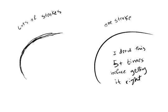
Nothing is wrong in art but it depends what kinds of effect you want. You can use both methods to give different vibes, draw different things. But it’s important to know how to do them.
oh and, it is one stroke but it’s fast. If you linger on it the line will come out woobly and shakey. If you do it fast it’ll come out clean.
4. Blocking.
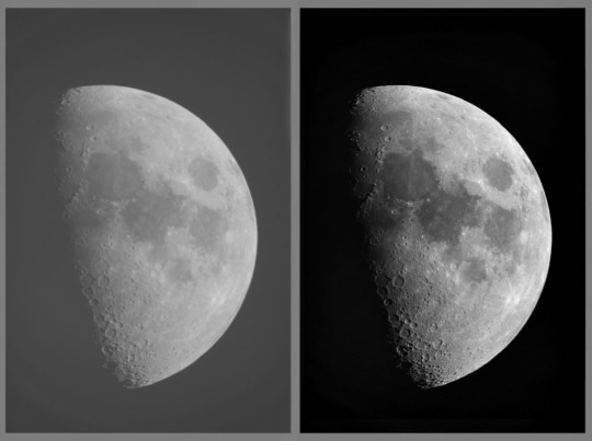
You go back over the drawing here to fill in black spaces. Maybe if someone has black hair or for shading, you can also add texture on things like walls and etc*. I like leaving some white spaces when doing this because black is very reflective irl, so it gives some shine to it. It honestly depends on what the black element is, something’s are shiny some things are not. But it’s pretty fun
**when it comes to texture this is an example from another drawing

5. Grey scale coloring.
I have already a plate on hand of colors from white to black to use in my drawings. You can use three or more. This is the one I use
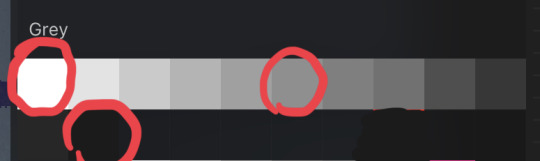
Circles to indicate that if you have white, grey, and black, that’s enough.
why grey scale? The thing about grey scale coloring is that it helps figuring out contrast. You don’t want all your drawing to be of similar tone, when you have contrast, it helps make elements pop and differentiate things.
"Joseph Nelson." Roboflow Blog, May 15, 2020. https://blog.roboflow.com/when-to-use-contrast-as-a-preprocessing-step/
I’m honestly still figuring out how greyscale works but, looking at real life pictures is one way you can know how to do it. See how light is distributed where whites and blacks are used. One key element is to figure out where light comes from, and shading according to that . The light source isn’t very strong with this drawing so it was more of a simplified shading.
If something is over the other, shade underneath. That’s the simplest way to figure out shading
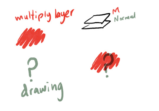
before coloring, I did change the sketch to a more grey color and set the layer to multiply. What multiply does is that it darkens the color underneath it with a hue of the color in the multiply layer. I know, confusing, so here is a picture.
Sorry, got a little detailed there.
back to our drawing.
As I said, the light source wasn’t very complex here to give more of a photo shoot vibe, but I can show another drawing with a more natural strong light
Places directly getting the light get very light colors like white, the ones opposite use very dark grey or even black.
of course the coloring here isn’t very realistic, I have, after all, colored the character, kristen, in lighter colors than everything else. This is because I wanted to create a sense of contrast to make her pop out against the background. So don’t limit yourself, play around.
6. gradient map
gradient maps replace the grey scale colors into other colors on a specific range, you can use a gradient map offered by the program or one you make yourself. How to chose them? Depending on the vibe you want to translate. I have synesthesia so I sort of follow my gut when it comes to this, but you can also look at movies and pictures and see what colors they use and what feelings they give. Or just go warm colors give warm feelings and cold colors give cold feelings. Or just whatever you like. Just have fun with it

See? It looks pretty fun. Heck you can even stop here even. Note that I merged the sketch layer and the grey scale one into one layer so it can change the color of the sketch layer too. Also sometimes id use the blur tool to blend some things but I didn’t use that here.
another thing to note is that if you leave things empty in the greyscale drawing they won’t change color in the gradient map, that’s why I use white in the empty spaces. Or sometimes I don’t if I’m unsure if I want to keep something white/black or not.
7. Coloring.
here, I add another layer and set it to multiply and basically color it in over the drawing. I have the colors for the characters on hand to use, and they change according to the gradient map.
note that it will look weird and wrong at first but just keep going, trust the process. The colors will fit in together.
Also notice the difference between the colors in the drawing and the colors on the color palette. Cool no?

And this is how the whole thing looks. You can also add details in here. Like the drawings on the vets and Ed’s bow tie. Makeup, blush, lipstick, nail paint… etc etc.
8. Details
I add another normal setting layer here and basically go back over the drawing to add details, fix mistakes, draw over things to make them pop off or look more hard than soft.


I mostly like going over the hair and facial features in this step, and also adding highlights and shine.
I also felt that the background was a little too empty, but I didn’t want something too detailed so it wouldn’t take the attention from the characters. so I added a pattern.
9. Finale touches. (Optional)
sometimes the drawing is done here, sometimes it’s not.
I’d maybe add overlay and/or add layers and to highlight light sources, or add a multiply layer to emphasize shadows like in this example.
for this drawing I didn’t do that as I was satisfied with the lights and shadow, but it still felt too… rigid.
so I added a textile texture as a multiply layer so it would look more…Touchable?

And…that’s it!

If you like this, you can check out the original drawing’s post ( or support me on ko-fi? ) 👀👀👀
100 notes
·
View notes
Note
i know you get asked this probably 16 times a day but as a fellow artist who usually paints based off of references of real pics and trying to be somewhat realistic. how did you develop your style? did it take awhile, or was it pretty immediate? did you start out doing mediums like painting and drawing and transition to digital or was it always digital? final question: do you have any “tips” or “words of wisdom” for silly people like me who wanna try digital art but never have and because i never have im too scared to try…? sorry for the elephant stampede of questions i just really love your art and would love to know YOUR THOUGHTS AND FEELINGS!!! (please)
hi ♡♡!! this is so kind & honestly i'm incredibly touched... I forget that people even like my silly art so this had me making 🥺 eyes at my phone. i will answer your questions to the best of my abilities!!!
i'm putting it under the cut so i can attach examples lol
DON'T BE SCARED OF THE SWITCH TO DIGITAL!! it's so fun and the undo button will change your life... come take my hand...
my biggest tip is to watch speedpaints! that was really huge for me when making the switch. find artists with styles close to yours & pay attention to their steps (how many layers they have, how they do lineart, do they use overlays, etc). if you do this a lot, you can get a clearer sense for how the digital workflow/process can look for you
i feel like kind of a pompous asshole discussing my own "style" or whatever 😭😭 my silly yaoi fanart 😭😭 but i do want to answer your questions!!! i started out drawing traditionally but i transitioned to digital when i was 16. and for a very long time i was one of the people who drew with my finger on my iphone .......i def get the most questions about my style & the unsatisfying answer is that it's pretty much always been there. it's evolved over time in a way i can't really describe so i'll show it visually
(my examples are all my ocs in an attempt to get you guys to be curious about them)
^ i did a redraw pretty recently so i can put that here!! these are the same characters from Jan 2020 -> March 2024... the first one was drawn on my literal phone lmfao. to me it's almost as though my "style" has always been there, but it's become like... yassified?
^ my art looked like this in 2020-2021
^ and like this in 2018-2019 when i was still doing trad
sorry for responding to your questions with an elephant stampede of images lmfao!!! I APPRECIATE YOU!! i guess my only words of wisdom are that even if it's intimating, you will never look back & regret trying something artistically. looking at my own stuff like this, im the cringiest yaoi artist EVERRR but im still doing it because it's the most fun when you're being self-indulgent.
i really really wish you the best on your art journey! thank you so much for writing & i hope my answers weren't too long-winded ♡♡
#a#i need to learn to Say Less#EITHER WAY I APPRECIATE THIS SM I HOPE YOU ENJOY !!!#saintsocs#<- look i’m making a tag. i feel like i posted them enough here#foursaints art tag
34 notes
·
View notes
Note
Have u ever posted your comic or animation workflow anywhere? Im super curious on how you tackle the process, especially not using a drawing tablet. I know you have a very simple (and adorable) style so that probably helps in terms of workflow -- Im just curious about the steps you take.
Thank you! With both comics and animation my key thing is to not spend too much time on any particular thing, just draw loose and fast. Honestly the only downside to drawing with a mouse is that I can tell my arm has extremely specific muscle memory regarding it- if my mouse breaks and I get a new one I have to spend a good month or so just letting my hand get used to it again lol. Same with if my setup gets readjusted too much- right now my setup is my mouse on one of those padded mousepads, on top of 2 books, with my elbow resting on my 3DS case (I'll get an actual pillow or something for it eventually lol). But luckily thanks to this I suffer very minimal wrist pain 👍
(...Okay I started to go really in depth in my process here, so sorry if this is way more than what you were asking. Putting it under a readmore just to save space lol)
With MFM in particular, I start by writing out the entire script for the next story arc, which really is just all of the dialogue and vague notes about any important actions. Then I do the paneling with very loose stick-figure like sketches of where the characters are and what they're doing. I prefer having very little planning when it comes to character poses and panel shapes, coming up with those on the fly makes things much more exciting and faster to make. But it's the opposite with dialogue... it needs to be 100% FINAL before I draw a single line lol.


That's part of my script for my most recent chapter, as well as what my extremely loose goofy thumbnail sketching is like. I write the script as one big thing and don't separate it into pages until I actually start drawing- then I go and color change it just to keep track of what dialogue goes on each page
After that, I go back and do the ACTUAL sketch, as well as the lettering (I don't believe this is how it's done professionally. I used to do lettering as the very last step in the process... but then found it hard to cram speech bubbles in the right places lmao.) After that is lineart, coloring, background flat colors, then shading/rendering for all of it. I do each step in batches, as in I sketch out ALL pages of a chapter before moving to lineart, I line ALL pages before starting coloring, etc. I find it way easier to be productive when it's broken up like that, though when I first started the comic I used to draw each page to completion before starting the next (but also, the comic's style was DRASTICALLY simpler back then haha)
(Unfortunately I merged some of the shading to the background flat colors so it's not entirely accurate... oops) FireAlpaca has a sand texture feature that I only found out about last year- adding that to the backgrounds makes them look 10x better with WAY less effort.
With animation, it depends on the project. For simple 5-10 second animation I make for fun, there's very little planning lol. I skip some steps in the process- I'll sketch out the keyframes (and maybe any difficult inbetweens if necessary), line those, then go straight into making linework inbetweens. I'm not a cleanup artist and have no experience in that, so I always find trying to line my rough animation makes everything jittery and wobbly. If I do it with a clean line from the start then I can avoid that and save a lot of time 👍
For my bigger projects (such as the Parvey cartoon and the MFM Kickstarter trailer), I do the whole animatic with final audio first and foremost, with the animatic being almost like the keyframes. I split them up into individual shots, .mp4 files anywhere between 1-30 seconds usually, and animate those one at a time. I'm a huge fan of free to use programs and try to use them as much as I possibly can, here's a list of the ones I use:
FireAlpaca- for the actual drawing part itself (storyboarding/animating/etc). FireAlpaca has a feature that lets you export every frame as it's own drawing, as well as an onion skin mode
Windows Movie Maker- for compiling all of those frames into video format, creating individual shots. If you upload all of your frames and set them to around 0.08 seconds, it equals about 12fps (I usually animate at 0.10 seconds/10fps, its a bit slower but looks nice)
Onlinesequencer.net- for making music. It's the place I've made all of my songs on, like the timeloop song, hyperworkaholic, and the background music for the MFM Kickstarter trailer.
Audacity- for editing audio/music. Also great for recording things directly from your desktop
DaVinci Resolve- for editing and putting together all of the shots into one big video. Can get kind of intensive on the computer during rendering, so watch out.
YouCut (app)- also for editing and compiling shots, I used this one a lot a couple years back but I'm not sure how well it holds up. Doesn't need much phone storage to download but needs a lot to render videos.
MS Paint (yes really)- for typing up text. FireAlpaca has a text option but I don't like it as much as Paint's.
...The only thing I genuinely can't do alone is voice acting. Luckily there's a big voice acting community on Twitter and they're all amazing to work with!
This got... way more in depth than I planned for it to be, so sorry if this is way more than what you were asking lol. But that's my general process when it comes to my art 👍
32 notes
·
View notes
Note
Hi :) just wanted to drop in to say I really love your art, the way you use lineart and colour are like, insanely beautiful. I'm curious what brushes you use for lineart? Hope you have a nice day!
Hello!
Thank you very much, I'm super happy to have such a positive response to my art ^^💜💜💜
Talking brushes: I mostly use a default pen with a fuzzy texture, the exact type is not that important, it cam be noise or a spray tex. of sort)
Now what I feel has a more profound effect is the exact proportions of pressure, sharpness and density. Here the preferred setting I use in SAI2:

I'll try to break it down a little so it's not just useful for SAI2 users, for I do not know the ins and outs of how other programs approach this.
I set to to have round tip with no sharpness, and both minimal density and density amp set to 0, which results in it corresponding directly to pen pressure. The additional size and density scrollers set quite low too. That, together with high stabilization and low tablet sensitivity (smt you can do in your tablet settings, you can play with them too!) makes the brush rly easy to control for both opacity and thickness. Which is what I personally prefer (it gives a soft pencil feel I think) You'd need to set your density settings higher if you prefer a more opaque lineart brush.
I do advice playing with them yourself to get the feel for it, it's honestly very useful to understand and develop intuition for.
Now another "tool" I absolutely cannot live without is this pesky lil boi:
The "switch to transparent" tool is like, A Beast, and I don't see a lot of talk about it's versatility. I set it to my hot keys and use it more that undo tool :D
To elaborale: I find it helpful to use the negative space (or erase) the lines I draw in a particular way to give them a more unique value that it would have by itself. I'll try to demonstrate:
So, the gist of the technique comes down to subtractive shaping of form, in combination to usual additive approach. Now, this is a specific trick I find rly satisfying to my style of drawing that works well with my brush preferences, which is by no mean universal, but what I would encourage to take away from this if you're not doing it already is to think of erasing as not just a corrective tool, but also an artistic one!
(Note: switching to eraser does similar thing- the only downside is your brush settings and texture would have to match with it, which can be a hustle)
I hope this isn't too elaborate of a response, and hope it is at least somewhat helpful X3!!
Good drawing you Ya'll and first of all: have fun!
Have a nice day~
38 notes
·
View notes
Note
Kinda a random one, but how much time per day and/or week would you say you spend working on your webcomics? I want to eventually make my own webcomic, but the idea of having to draw 24/7 to make a good comic is honestly pretty intimidating.
Not random at all! I love chatting webcomics! :D
Hmm, it really depends on so many factors here. Webcomics can take as much or as little of the day as you'd need- but if we're thinking project longevity and the hopes of finishing such a huge feat, we need to consider some pre-production and project timelines- as well as how to handle scope.
Let's break it down:
-Figure out the length of your work (even in a general sense) This can help you keep an eye on the size of your project, where to trim and where to add, as well as get a general sense of a timeline for completion. Say you do a comic for 200 pages- once you figure out your general output page wise, you can get a sense of how long it will take to get from point A to point B (with some breaks added of course!)
-Understanding Your Process . You need to dive in head first with this one! Start making some pages, don't get hung up on too much at first, and get a general idea of where you spend the most amount/least amount of effort and time. This can help narrow down where you need to focus your time with. (this includes writing/scripting, thumbnails, pencils- etc etc)
-Don't compare your output to others! Some people are just really REALLY fast with output, others (like me) are quite slow on that. This is why understanding your own limits and strengths is important (and why it's a good idea to do some practice rounds with making comic pages to see how you feel about it first)
-Working in a way that makes YOU happy. if you dont like inking/lineart, get that OUT of your process! you are allowed to have a comic that has pencils, painting, just colours- its all about YOU! One of the biggest 'slayers' of webcomic production is adding a part that the creator hates. Make it fun!
Figuring out all of these steps took me a while to do. I am also lucky in that I work as one solid half of a team with @spacerocketbunny. We both write, draw, ink, promote, etc etc in equal amounts- But that also means that I can spend more time on details with the aspects that I enjoy- like inking.
As far as the time it takes- I try to keep it a set amount of time a day. When at the day job, Webcomics can get 3-4 hours a day. On days where i am without obligations, i work a 'full work day' on them with 8 hours! I also give myself a 'weekend' off from comics too.
Limiting yourself with hours to work on a project is necessary to last throughout the entirety of the project, and to prevent burnout. I've done webcomics for over 15+ years, and Ghost Junk Sickness turns 10 this year (and is on the way to being completed).
Understanding your process, output, and scope of the project will create a better roadmap for the time needed to create your comic- and remember- it has to be for YOU the most, in the end.
I hope this helps, always willing to chat more!
Happy creating!
15 notes
·
View notes
Text

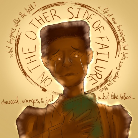
Ok so I was able to do like 3 of the prompts—I’m probably not going to finish the rest until tomorrow so that’s rough.
BUT ANYWAYS
Top Left is Monday prompt (Saints or Ghosts) and I said lmao why not both but make it angsty—specifically ran Where Can I Run (reprise) in my head over and over again too think of this one. I always thought the eye imagery thought the musical was sick so like why not make it the ghosts and saints. It was super fun messing with brushes for the Quincy’s wing tho—Vincent calling Quincy angel lives in my head rent free :’)
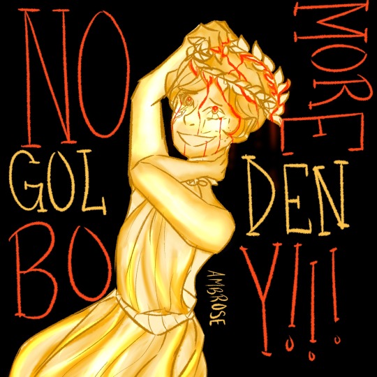
Top Right is Thursday prompt (Self-made or socially constructed) and I chose Ambrose bc it was between him and Beatrix and I already had Beatrix for another piece and besides I wanted to draw the golden boy mwahahaha. Anyway, the scene where Vincent describes how Ambrose makes art with perfect precision and how Vincent makes art in a more messy way also lives in my head rent free and I thought it would be cool if I didn’t make something super concise with my lineart, with a painted vibe for color, and only gold (bc golden boy)—oh and then the blood showed up and honestly it all just checks out.
Bottom is Sunday prompt (pre-freshman year or post graduation) and how could I not do post grad when the Other Side of failure lives in my head rent free :’) I’m not really happy with it that much—I’ll probably finish it later but I do like the textures/colors that I pulled and am super happy with the overall design.
Hopefully I’ll get the Tuesday, Friday, and Saturday prompts up before the end of fan week but idk if I have the time to do the Wednesday one lmao—but even if its late Imma still post it bc I already have drafts of them all done and I need to draw more Beatrix bc they’re just so neat teehee
23 notes
·
View notes
Note
i am enchanted by the texture work you put into your art! can i ask if you have any specific methods for how you design backgrounds for your illustrations? any sort of inspiration or somesuch you draw from? :D
OH BOY so ive told this story before but it's a mix of inspiration from other artists and....laziness.
Lazy in the sense that I specifically started doing clothing and background shapes in a more graphic style because I just don't have as much fun doing lineart for either. I think an underrated trick for artists is to find the part of art you dislike the most and then come up with a way to make it less bad. I LOVE doing clothes and backgrounds now because I get to dick around a lot more with abstract shapes and textures!
As for specific inspirations...I have a lot and honestly I'd spend too long talking about them. Leo and Diane Dillon though have always been one of my favorite duos and I think their illustrations are unmatched. I've been meaning to do some studies of their work for ages just because it's so beautiful
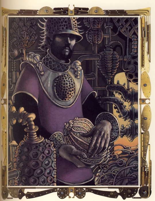


This book cover was my first exposure to their work and I've never been the same since tbh
47 notes
·
View notes
Note
hi! this is the bunch-a-questions anon. this wont be an ask ask. thank you for answering! it really gives me so much insight about tools and processes, i really enjoy seeing/reading how different artists have different ways in approaching creation of art. it’s all so interesting to me
and oooh i know what you mean about looking at a lot of different artists! it’s inspiration!! i find those things to be amazing too, it’s so cool. it’s like “this spot is inspired by an artist” “this artist draws this like this, so i wanted to try” “i think the way an artist drew this was neat and i wanted to try an implement it” it reminds me of that one post how we, as people, are a mosiac of other people and i believe it to be the same for how artists are too with their art
i feel inspired by the way you draw….. everything!!! it gets me pumped to try and replicate the way you do some things. like the shapes you create, the colors you choose, the way your lineart seems to be so flowy, how dynamic everything feels and how different each drawing you create is from one another (i saw you reblog that meme of like “why shouldnt i draw characters from the waist up and that is SO me, but it’s shoulders up” because drawing full bodies makes mh drawings feel so stiff, i need to practice more!!), the poses of the characters. just.. every aspect of your art is so, so, so nice!!
the way you draw, in all your styles, it’s definitely one of the ones that is such a good scratch to my brain. it gets me all giddy and happy! i’m not sure if i’ll get into jwri, mostly because my attention span will not let me be able sit and focus on listening before i get distracted and miss context on parts, BUT i still go to your blog almost every day just so i can see your art, no matter what it is, no matter who the characters are because it’s always so so good and i love taking it in. (will eat your art if i could, i am so serious)
this was a long one but yeah! i just wanted to let you know how awesome i see your art is! and how i also think youre a cool person, you seem like such a good peep to hang out it! might be weird to say but if you were a blorbo, you would be one of the most blorbiest blorbos to blorbo ever
hope youre having a good day!!
OH THANK YOU SO MUCH FOR ALL THE KIND WORDS THIS IS SOOOOO

your explanation of taking inspiration from other artists was so poetic and beautiful! truly inspiring in itself
its okay if you can't get into jrwi, i get it! i didn't think i would get into it as well and after binging all the episodes i honestly forgot why i even started listening in the first place. remembered recently tho! it was because i was going a little crazy while making the picrew and needed some actual talking in the background instead of just music. so, if you ever decide to give it a try, or listen to something else equally as lengthy, try to busy your hands with something that doesn't require a lot of thinking! it helps me at least! worked both with jrwi and tma. it's like, doing something monotonous (knitting, sorting files, cleaning the house, etc) can be incredibly boring if i sit in silence and let my mind wonder. alternatively, listening to something long or watching a long movie can be incredibly boring as well because i struggle to pay attention to the same thing for two hours. but combining these is really good, because it keeps both my mind and hands busy, but not overwhelmingly so!
and ough ough ough thank you again for such heartwarming message! im so happy to hear that you feel inspired by my art, and i wish you good luck in your own art journey!!!!!!! remember to have fun and listen to yourself and do things that you find interesting and that you enjoy! don't force yourself to draw stuff you don't like! all art is personal and individual, so don't be afraid to make things "you"! you don't have to do clean line, you don't have to do lines at all, you don't have to do coloring or shading, if you don't like it! and if you do like it or are excited to try, you should go for it! don't be afraid to change and grow but don't force yourself into it!
also don't foget to stretch before drawing its very important!!!!!!!!!!!!
28 notes
·
View notes
Last Seen Blogs

sunsunies
▪︎훈선▪︎

klang21
KLANG ))) 21
peaceful-roadkill
Your Trusty Goblin Friend
ahmeddmabrouk
Ahmed Mabrouk
pikachuwhore
Anastacia'Ariana louiisee