#How To Make Colors Pop in Photoshop
Explore tagged Tumblr posts
Visit Tumblr Blog
Explore Tumblr blogs with no restrictions, modern design and the best experience.
Last Seen Tumblr Blogs


Fun Fact
Tumblr is used by 21% of adults online aged 18-29 years.
Text
I KNOW every person says this about every medium, art form, hobby, etc. ever, and always specifically about whatever time they get really really really into said hobby BUT i do genuinely think, at least from a software perspective, that we're probably on the cusp of some kind of vocal synth renaissance. the scene never died or even wavered, but with the sheer amount of new software coming out both paid and free, voicevox getting a singing update,stuff like OpenUtau making compatibility easier... i don't care for subscriptions so im only interested in their perpetual licenses but i will admit voisona's subscription model for voicebanks has a lot of benefits for those who just wanna use a voice maybe once or twice.... there are so many robots to make sing you guys. there are so many.
#im learning about diffsinger in openutau rn. the kohaku merry bank sounds SO so good like i already loved her utau#but her ds has like. this extra huskiness thats so nice. excited to see how i can play with these things!!#i feel like another new group of voices to mess around with was just plopped in my lap hkfsjhekrfas#but yeah. all we need is like a new utau-making boom and i think we'll be fully in it#make a cv utau. do it now. do it NOW#i love cv banks. people dont like em but i like their efficiency. plus there so easy to record that you can like#do all kinds of weird unique voices. i think its fun!! ive been getting really into the windows 100 utau recently#those i believe come in both cv and vcv most of the time but in general i just love how unique some of them were#kachanloid rules. and the grandma. and the wrestler. and the middle aged man#so so so awesome. make a weird utau NOW#i do wish openutau had more layout options tho. i get why its a bunch of separate windows and all#but i do hate juggling them all around like this orz i wish it was like photoshop or gimp or something#where you can pop out everything as separate windows if you want but can also have them in one window with tabs if you prefer#but even then i'd accept just having play controls on the part-editing windows. it does suck flipping between them to listen#to the thing you just pitchbended orz but i still love you openutau. especially the vocal color functionalities#its so versatile and editable i love it. now you can finally use all the appends at once easily!!!!!#so so cool i think its a bit of a game changer for open source vocal synths like this
3 notes
·
View notes
Note
Why reblog machine-generated art?
When I was ten years old I took a photography class where we developed black and white photos by projecting light on papers bathed in chemicals. If we wanted to change something in the image, we had to go through a gradual, arduous process called dodging and burning.
When I was fifteen years old I used photoshop for the first time, and I remember clicking on the clone tool or the blur tool and feeling like I was cheating.
When I was twenty eight I got my first smartphone. The phone could edit photos. A few taps with my thumb were enough to apply filters and change contrast and even spot correct. I was holding in my hand something more powerful than the huge light machines I'd first used to edit images.
When I was thirty six, just a few weeks ago, I took a photo class that used Lightroom Classic and again, it felt like cheating. It made me really understand how much the color profiles of popular web images I'd been seeing for years had been pumped and tweaked and layered with local edits to make something that, to my eyes, didn't much resemble photography. To me, photography is light on paper. It's what you capture in the lens. It's not automatic skin smoothing and a local filter to boost the sky. This reminded me a lot more of the photomanipulations my friend used to make on deviantart; layered things with unnatural colors that put wings on buildings or turned an eye into a swimming pool. It didn't remake the images to that extent, obviously, but it tipped into the uncanny valley. More real than real, more saturated more sharp and more present than the actual world my lens saw. And that was before I found the AI assisted filters and the tool that would identify the whole sky for you, picking pieces of it out from between leaves.
You know, it's funny, when people talk about artists who might lose their jobs to AI they don't talk about the people who have already had to move on from their photo editing work because of technology. You used to be able to get paid for basic photo manipulation, you know? If you were quick with a lasso or skilled with masks you could get a pretty decent chunk of change by pulling subjects out of backgrounds for family holiday cards or isolating the pies on the menu for a mom and pop. Not a lot, but enough to help. But, of course, you can just do that on your phone now. There's no need to pay a human for it, even if they might do a better job or be more considerate toward the aesthetic of an image.
And they certainly don't talk about all the development labs that went away, or the way that you could have trained to be a studio photographer if you wanted to take good photos of your family to hang on the walls and that digital photography allowed in a parade of amateurs who can make dozens of iterations of the same bad photo until they hit on a good one by sheer volume and luck; if you want to be a good photographer everyone can do that why didn't you train for it and spend a long time taking photos on film and being okay with bad photography don't you know that digital photography drove thousands of people out of their jobs.
My dad told me that he plays with AI the other day. He hosts a movie podcast and he puts up thumbnails for the downloads. In the past, he'd just take a screengrab from the film. Now he tells the Bing AI to make him little vignettes. A cowboy running away from a rhino, a dragon arm-wrestling a teddy bear. That kind of thing. Usually based on a joke that was made on the show, or about the subject of the film and an interest of the guest.
People talk about "well AI art doesn't allow people to create things, people were already able to create things, if they wanted to create things they should learn to create things." Not everyone wants to make good art that's creative. Even fewer people want to put the effort into making bad art for something that they aren't passionate about. Some people want filler to go on the cover of their youtube video. My dad isn't going to learn to draw, and as the person who he used to ask to photoshop him as Ant-Man because he certainly couldn't pay anyone for that kind of thing, I think this is a great use case for AI art. This senior citizen isn't going to start cartooning and at two recordings a week with a one-day editing turnaround he doesn't even really have the time for something like a Fiverr commission. This is a great use of AI art, actually.
I also know an artist who is going Hog Fucking Wild creating AI art of their blorbos. They're genuinely an incredibly talented artist who happens to want to see their niche interest represented visually without having to draw it all themself. They're posting the funny and good results to a small circle of mutuals on socials with clear information about the source of the images; they aren't trying to sell any of the images, they're basically using them as inserts for custom memes. Who is harmed by this person saying "i would like to see my blorbo lasciviously eating an ice cream cone in the is this a pigeon meme"?
The way I use machine-generated art, as an artist, is to proof things. Can I get an explosion to look like this. What would a wall of dead computer monitors look like. Would a ballerina leaping over the grand canyon look cool? Sometimes I use AI art to generate copyright free objects that I can snip for a collage. A lot of the time I use it to generate ideas. I start naming random things and seeing what it shows me and I start getting inspired. I can ask CrAIon for pose reference, I can ask it to show me the interior of spaces from a specific angle.
I profoundly dislike the antipathy that tumblr has for AI art. I understand if people don't want their art used in training pools. I understand if people don't want AI trained on their art to mimic their style. You should absolutely use those tools that poison datasets if you don't want your art included in AI training. I think that's an incredibly appropriate action to take as an artist who doesn't want AI learning from your work.
However I'm pretty fucking aggressively opposed to copyright and most of the "solid" arguments against AI art come down to "the AIs viewed and learned from people's copyrighted artwork and therefore AI is theft rather than fair use" and that's a losing argument for me. In. Like. A lot of ways. Primarily because it is saying that not only is copying someone's art theft, it is saying that looking at and learning from someone's art can be defined as theft rather than fair use.
Also because it's just patently untrue.
But that doesn't really answer your question. Why reblog machine-generated art? Because I liked that piece of art.
It was made by a machine that had looked at billions of images - some copyrighted, some not, some new, some old, some interesting, many boring - and guided by a human and I liked it. It was pretty. It communicated something to me. I looked at an image a machine made - an artificial picture, a total construct, something with no intrinsic meaning - and I felt a sense of quiet and loss and nostalgia. I looked at a collection of automatically arranged pixels and tasted salt and smelled the humidity in the air.
I liked it.
I don't think that all AI art is ugly. I don't think that AI art is all soulless (i actually think that 'having soul' is a bizarre descriptor for art and that lacking soul is an equally bizarre criticism). I don't think that AI art is bad for artists. I think the problem that people have with AI art is capitalism and I don't think that's a problem that can really be laid at the feet of people curating an aesthetic AI art blog on tumblr.
Machine learning isn't the fucking problem the problem is massive corporations have been trying hard not to pay artists for as long as massive corporations have existed (isn't that a b-plot in the shape of water? the neighbor who draws ads gets pushed out of his job by product photography? did you know that as recently as ten years ago NewEgg had in-house photographers who would take pictures of the products so users wouldn't have to rely on the manufacturer photos? I want you to guess what killed that job and I'll give you a hint: it wasn't AI)
Am I putting a human out of a job because I reblogged an AI-generated "photo" of curtains waving in the pale green waters of an imaginary beach? Who would have taken this photo of a place that doesn't exist? Who would have painted this hypersurrealistic image? What meaning would it have had if they had painted it or would it have just been for the aesthetic? Would someone have paid for it or would it be like so many of the things that artists on this site have spent dozens of hours on only to get no attention or value for their work?
My worst ratio of hours to notes is an 8-page hand-drawn detailed ink comic about getting assaulted at a concert and the complicated feelings that evoked that took me weeks of daily drawing after work with something like 54 notes after 8 years; should I be offended if something generated from a prompt has more notes than me? What does that actually get the blogger? Clout? I believe someone said that popularity on tumblr gets you one thing and that is yelled at.
What do you get out of this? Are you helping artists right now? You're helping me, and I'm an artist. I've wanted to unload this opinion for a while because I'm sick of the argument that all Real Artists think AI is bullshit. I'm a Real Artist. I've been paid for Real Art. I've been commissioned as an artist.
And I find a hell of a lot of AI art a lot more interesting than I find human-generated corporate art or Thomas Kincaid (but then, I repeat myself).
There are plenty of people who don't like AI art and don't want to interact with it. I am not one of those people. I thought the gay sex cats were funny and looked good and that shitposting is the ideal use of a machine image generation: to make uncopyrightable images to laugh at.
I think that tumblr has decided to take a principled stand against something that most people making the argument don't understand. I think tumblr's loathing for AI has, generally speaking, thrown weight behind a bunch of ideas that I think are going to be incredibly harmful *to artists specifically* in the long run.
Anyway. If you hate AI art and you don't want to interact with people who interact with it, block me.
5K notes
·
View notes
Text
Quick GIF tutorial (Photoshop)


#holy shit this is perfection!!#i am so jealous of this set!#the coloring op THE COLORING!!! (original post)
alright @dontyouknowemma-itsyou and anyone interested, this was really easy to colour so I'm gonna give you a quick breakdown. (i didn't save the psd file?? so i'm redoing this i guess, but i did it on autopilot in the first place. i've been making gifs for over 15 years.)
GONNA INCLUDE A VIDEO AT THE END SHOWING OFF THE SETTINGS!!
General GIF stuff
This is in Photoshop CC. I extract a clip from a video as an MP4 file, which photoshop can open. (I use AviDemux for this, which is free, because it lets you save clips using 'copy' encoding for video output and still change from MKV to MP4 format - without losing any video quality, cause you're not re-encoding.)
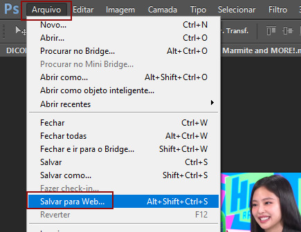
Open that shit directly in photoshop as a video layer (just drag and drop), that lets you scan through it to check the colouring works overall. Convert the video layer to Smart Object, that lets you resize and edit it. (Do NOT open a full movie in Photoshop, it'll probably die and it has a max length anyway.)
Also all the colour adjustments are gonna be adjustment layers you can tweak and turn on/off whenever. There's a lil button at the bottom of the Layers window to add them quickly.
When we're done we're choosing a section of the video in the Timeline window and we're doing File->Export->Save For Web. 'Adaptive' (or selective) palette selection, 'pattern' style dithering.
Colouring
Curves layer to lighten. Just pull the curve up. Curves seem to give a much smoother lightening, since it mostly affects the middle, leaving the brights and the darks where they are.
Levels to make the darkest darks pure black, and the lightest lights pure white. Good for limiting GIF size. Don't overdo it though.
Colour balance!! My beloved, most important. So for the Shadows and Highlights, you're gonna move the sliders towards Cyan and Blue, but for the Midtones you're gonna do the opposite - towards Red and Yellow. This means you don't shift the overall colour of the picture, but trust me it does SO MUCH for the contrast and colour. I swear I do this for almost any edit, and also my art tbh. Also if the original clip is like very green or whatever, you can correct that here.
Selective colour. For this I did one thing. For 'Black' dropdown, I upped 'black' and 'yellow' sliders (the latter to counteract the blue in the darks). This in combination with:
Levels again. Bring in those darks, turn them pure black. Basically this does a couple things. It preserves GIF file size, by making sure the dark areas are static (file sizes mostly depends on pixels that are CHANGING). It ALSO makes the palette much more optimized, meaning you don't waste palette on the darks no one sees anyway, and instead uses them in the mid range colour variation, giving much smoother gradients. That's it!! That's all the colouring!!
EDIT: Uh I probably also had a Vibrance layer?? Idk. This just ups the saturation, but it's softer than upping Saturation. Makes the colours pop without overdoing it.
Other tips and tricks
Often I'll put a Smart Sharpen (50% amount, 0,5px radius) filter on the video layer, just to make it a bit crisper. Subtle but effective.
You can manually edit the palette when you save as a GIF, either to reduce file size, or because some colour areas look pixelly. See the video for how.
If your file size is huge but you don't want to shorten or resize, you can reduce the frame rate manually. To do this, FIRST save the GIF, then open the GIF you just saved. Go through in the Timeline window (which is now a Frame Animation rather than a Video Timeline), select every other frame, and delete them. When you do this, remember to select the rest of the frames and double their Frame Delay so you don't end up with a super speedy GIF. (You can also make a GIF slow-mo like this.)
Since the video is a smart object, I literally just resized it in between saving the different GIFs, to change composition between the different shots.
Selective Colour layer can be used for a lot of image tweaking. For example, if something is overly yellow or green, I may go to the Yellow and Green in dropdown and just reduce the yellow slider. (I usually then go to Red in dropdown and ADD some yellow to that, to balance out the reds to be less pink.) Or maybe the overall colours are nice but the blues are dull, so I'll just go to Blue/Cyan and tweak those specifically.
If you have a colouring you like that you want to use on lots of things, remember you can drag-and-drop layers between different images. You can also save a photoshop file with nothing but those layers, to use on later gifs and just tweak as needed. (You can also make Actions to automate stuff, but I won't go into that.)
How easy or hard something is to colour HUGELY depends on the original video, both lighting/colouring and video quality.
Finally the video showing settings!
This is like 5 minutes long and has no commentary or anything. This is mostly to show off where you find each individual thing, and what difference it makes in the colouring.
ANYWAY hope someone found this useful!!! ♥
#next to normal#gif making#photoshop#gif tutorial#photoshop tutorial#my posts#my gifs#art things#tutorials#PS if you can't afford Photoshop then just you know.... yo ho ho and all that
121 notes
·
View notes
Note
hi sole! your sharpening is always so soft and pretty, i was wondering if you would be open to share it? hope you are having a wonderful november so far <3
Hi, Anon! Thank you so much <3 Yeah, sure, tutorial under the cut:
What you'll need:
Photoshop (I use Photoshop 2023)
Basic knowledge on how to make gifs
Camera Raw filter installed
Okay so, first of all, I use two different methods depending on the size of the gif. Let's start with the one I use for most of my gifsets which are big gifs (examples: x x x x.)
METHOD #1: Smart Sharpen + Camera Raw
I started using the Camera Raw filter last year and let me tell you, I'm obsessed! It completely changes the game of sharpening. I use this method for all gifs with a 540px width.
We're going to work on timeline so get your gif ready and convert it for smart filters. I'm using this scene from my last set as a base:

Here's the gif after I color it (I usually sharpen my gifs before I color them but for the sake of the tutorial I'm showing you this so you guys can see the difference):

(1) Smart Sharpen Layer: Let's start by adding a Smart Sharpen layer (Filter > Sharpen > Smart Sharpen) with these settings:
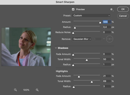
Disclaimer: I didn't come up with these settings myself I got them from these sharpening actions forever ago so I don't know which one it is :/. I also wasn't able to find that person's new blog (if they even have one since they've been inactive since 2021) so if anyone knows please let me know and I'll give them proper credit!
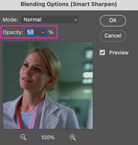
Now we're going to go to the 'Layers' panel and click on this little thingy:

This window will pop up and we are going to change the Opacity to 50%.
(2) Camera Raw Filter: Here's where the fun begins. Go to Filter and click on Camera Raw Filter (you'll need to have the plugin installed for it to show up.) I don't know how the Camera Raw window will look like the first time you open it but good thing you only need to change a couple of things!
If it isn't opened yet click on 'Effects' and we're going to change the Texture and Clarity:
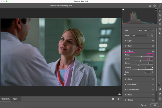
Depending on the scene/show/film I'm giffing, or if I want a stronger or softer sharpening, I'll use two different settings, but 99% of the time they are these:
First setting: Texture (+20) Clarity (+10)
Second setting: Texture (+40) Clarity (+20)


As you can see the difference isn't huge but the first setting gives a "softer" look. As I said I'll use one or the other depending on how I see the scene (it's almost always about the vibes yk.)
Feel free to experiment with these two and see what works best for you (although I wouldn't go higher than 40 on texture because the sharpening will look too fake imo.)
Also this filter is soooo good at making low quality videos look 1080p! Every time I've had to use 720p videos the Camera Raw filter has saved me 🫡
METHOD #2: Smart Sharpen
I use this method for smaller gifs. For example, 8 gifs of 268px x 180px sets (like these) or small-ish gifs in complex sets (like the second gifs in this set.)
This process is much simpler since it's the one I explained before but without adding the Camera Raw filter. That's it that's the method. Just a Smart Sharpen layer with the Opacity turned down to 50%.
As I said this method looks best on smaller gifs but to be honest it looks good on big gifs too? Depends on what you like most!
Anyway I hope this was easy to follow and if anyone has any questions please feel free to dm me or send an ask! ♡
#ask#Anon#ps tag#useraljoscha#usermelone#userchibi#usermagic#uservivaldi#userlorna#tuserhol#usercats#userlix#usersavana
241 notes
·
View notes
Text
crazy how whats seen as like a conventionally attractive ideal toned muscular male body you see in media and as like body building inspo and so on is straight up like disgusting dehydrated fucked up lumpy baroque sculpture situation like you cannot get me to believe that outside of people with an outright muscle fetish (which i respect for the record. you keep photoshoping those shiny hunks to be headless, weird gay guy on tumblr) actually find that desirable. like id be scared. if i were attracted to men id be scared. 6packs or 8packs or whatever packs are scary and functionally useless. if i were attracted to men and was into one like gazing at him from across the room and then he took off his shirt and revealed he has a scary 8pack id feel so crazy like ohhh oh geeze this guys a centipede or some other creature with segments i gotta get outta here. like its stress-inducing. dried up husks. what do you need all this muscle mass for. its not even usable muscle mass. making actors dehydrate themselves before shoots is crazy. nobody looks like that unless theyre dying. hypernatremia? diuretics. huge jackman sorry before your strong hunky beefy self can act in this movey as a strong hunky beefy guy you have to get to a point where your piss is the color and consistency of boiling caramel and youre shaking and mummified and every vein and tendon threatens to pop out of your body and youre on the verge of shitting yourself and passing away. this is crazy. and why are your organs exposed? and i bet those guys are cold all the time. hello?
123 notes
·
View notes
Note
if you ever have time/feel so inclined, i would love to see a tutorial or some tips from you about how to do color isolation sets!! they are absolutely incredible and I love them so much! <3
absolutely! thank you so much 💙
here are a few examples of my color isolation sets:
the substance (yellow) || beetlejuice (red) || us (red) || conclave (blue) || sleeping beauty (cyan/blue) || crimson peak (yellow) || smosh (purple) || conclave (red)
beneath the cut, i'll walk you through my coloring process!
notes: tutorial assumes basic gifmaking knowledge & i'm using adobe photoshop 2023 (though afaik, your version shouldn't matter much)
i don't color my gifs until they're sharpened and i'll give you a quick overview of my process: file -> import -> video frames to layers -> trim any extra frames -> crop to desired dimensions -> run sharpening action (i used this tutorial and just made it into an action) which also converts to timeline
once i'm in timeline, i go through my normal coloring process. unless i'm giffing similarly colored scenes that i've already colored and saved a psd for, i usually color from scratch every time. obviously, some adjustment layers vary depending on the source material, but these are almost always my main adjustments, just with differing values
a brightness/contrast layer set to screen - this is a gamechanger for especially dark scenes. note: i do not adjust the values, i leave them both at 0 and just change the blending mode
a curves layer utilizing the black & white eyedropper tools. first, i select the black eyedropper and then click on the blackest area of the gif. i do the same with the white one, using it to select the brightest/whitest spot. this can help a lot if you're dealing with heavily tinted scenes!
a selective color layer (set to absolute, not relative) where i adjust the blacks usually anywhere from 1-5 notches higher and the neutrals either up or down the same amount depending on the scene. be careful with the neutrals when giffing poc as lightening them can result in whitewashing. if need be, i will also adjust the whites, making them slightly whiter with the black slider. selective color is by far my fave adjustment layer and i use it in every single coloring.
after this, i sometimes add a black & white gradient map adjustment layer set to soft light. i'll play around with the opacity, leaving it anywhere between 5-100% depending on the scene. i think this adds depth to your colors and adds some contrast, but i don't use it in every psd.
occasionally, i'll mess around with vibrance/saturation, and that'll be my final layer, but oftentimes i won't actually add this layer until i've finished the rest of the coloring. this is just where the layer will go.
these are the main 5 layers i almost always start every single coloring with and they act mostly as a base and to color-correct any weirdly tinted or exceptionally dark scenes.
now, let's talk about scene selection. i try to set myself up for success by choosing scenes that either already have a very noticeable pop of color or have a color i know can easily be manipulated. you'll want to pick scenes that aren't drenched with the color you want to isolate though, or you won't have the contrast of the black & white.
here are a few examples of good scenes:

the only red here is the covered bridge and it will be easy to adjust only that and not the blue, green, or yellow.

same as above, apart from ralph fiennes's face, which obviously contains red undertones. i'll go more in-depth on this in a bit, but because this scene doesn't have a lot of movement, this will be able to be fixed with layer masks.

again, here we have one bright occurrence of yellow surrounded by blue that we'll easily be able to neutralize.
and a few of bad/less than ideal scenes:

while this scene is an absolute dream for making super vibrant sets or color palettes, it's no good for color isolation. this yellow covers basically everything, leaving no other colors to cancel out.

while i definitely did try this one out, the scene is ultimately too dark and too cyan-tinted to properly isolate the red of the blood or the cyan in her eyes and on the walls.

just like the first one, this scene is fully just. color drenched. would make a great base for a vibrant or color palette set but not useful for color isolation.

bad and wrong!! coloring this movie, however beloved, was a test of my sanity. you have this yellow/green filter over everything and so much of it that isolating or changing one or the other is pretty much impossible.
with all that being said, play around! the best way to learn what does what is to try it out yourself. selective color, though there are other ways of getting the same or similar effects, will be your best friend. it's how i'm able to make sets like this & this!
let's look at this adjustment layer using a scene from conclave:

truthfully, you could either isolate the orange of the wall or the blue of her outfit. i'm going for the latter at the moment.
add a selective color layer by clicking this button:

i like to really emphasize the color i'm going to isolate, make sure it's as consistent with the other scenes i'm using and that it pops. from the dropdown in the layer properties, i select blue.

each color from the dropdown will look like this. you have adjustable sliders for cyan, magenta, yellow, and black. the more to the right, the more you're emphasizing that color in any blues in your image. the further to the left, the more of that color's opposite you'll adjust. each opposite pairing is as follows:
cyan + red magenta + green yellow + blue black + white
if you're struggling with this (i did at first), visualize it. pull up one of those "bad" examples. say we take the yellow scene from the gorge. add a selective color layer to it and select yellow from the dropdown. play with the sliders to see how AND how much each adjustment changes the coloring. decreasing the yellow slider all the way to -100% is adding blue to anything ps identifies as yellow. because yellow and blue are opposites, it pretty much neutralizes the scene. instead, if you use the magenta slider and push it all the way to the left, you make any yellows become green. if you move the magenta slider all the way to the right, you'll add magenta to any yellows, making the scene orange. it's all about knowing the color wheel and experimenting!
back to the conclave gif! i want to bring out the blue as much as possible, under the blue dropdown, i crank the cyan slider all the way up and bring the yellow all the way down.

is it a massive difference? no, but you can definitely see the difference between the left (with the adjustment) and the right (without).
depending on the scene and color i'm working with, i'll play around with other layers from the dropdown. but i prefer to do each color in a different layer and i right-click on the box with the eye in the layers panel and change it to the applicable color. that way, it's easier to adjust something later on. you can also rename your layers, but this is quicker and easier imo.

with this particular scene, this is the only adjustment i want to make to the blue for the time being. now, it's all about getting rid of any other colors. to do this, add a hue/saturation layer and select every color, one at a time, EXCEPT the color(s) you're isolating and bring the saturation all the way down to -100. in this case, it's everything but the cyans & blues.

and this is what i'm left with:

from here, you can leave it, but a lot of the time, i'll add a vibrance layer or even another blue/cyan selective color layer and crank that shit up.

this is after adding a vibrance layer (increasing both vibrance & saturation to 100) AND a selective color layer (decreasing the yellows to -100 in the blues).
i would consider this finished, but this can also be super fun to mess around with, again, using selective color:


and if the way her hair changed colors is bugging you, toggle your layers on and off until you find which one(s) changed it and add a layer mask, coloring over her hair with a soft black brush:

once you're happy with everything, save your gif in your preferred way. these are my save settings just for shiggles:


et voilà!
overall, the best advice i can give is to try. experiment! if you're not sure a scene will work, give it a shot. even if it doesn't, you've still learned something. i know it can seem confusing at first, especially if you're not super familiar with these layers or the color wheel, but please feel free to ask any questions. also, let me know if anyone wants another tutorial(s) where i go more in-depth on other colors. i'm happy to do it!
#answered#daynascullys#my tutorials#gif tutorial#gifmakerresource#completeresources#dailyresources#emilyblr#usercats#userholloway#tuseruta#usertina#userrobin#uservivaldi#userchibi#userbunneis#userbambie#useraljoscha#tusermira#userelio#userscourt#userishh#angelblr#heymaur#elwintersoldado#tuserhol#usermaguire#useraashna
109 notes
·
View notes
Text
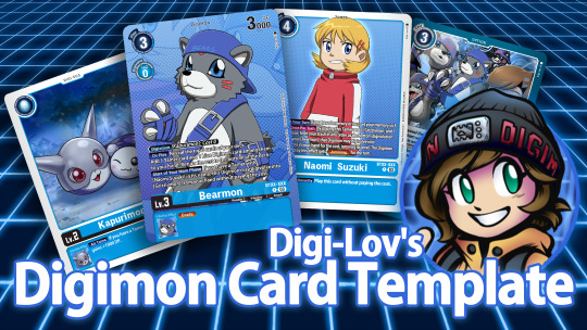
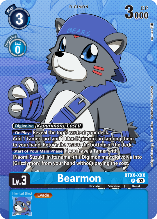
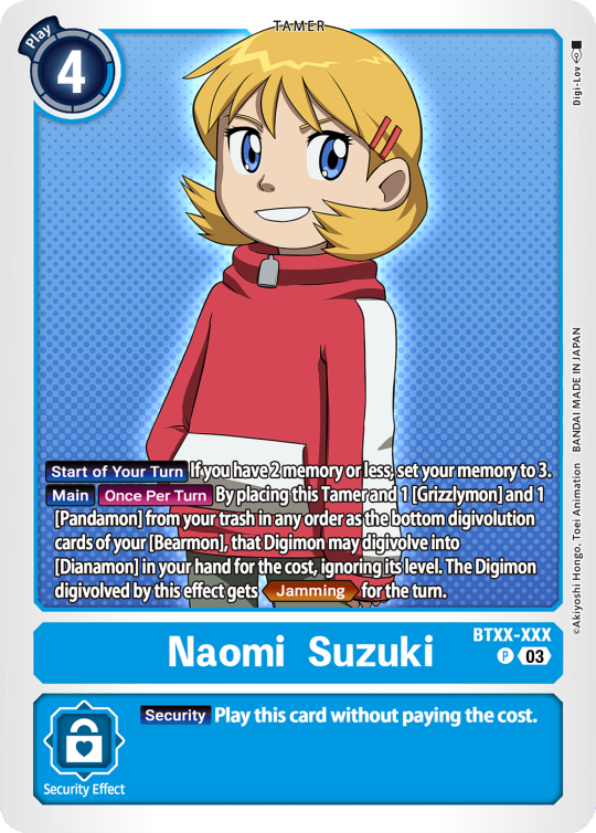
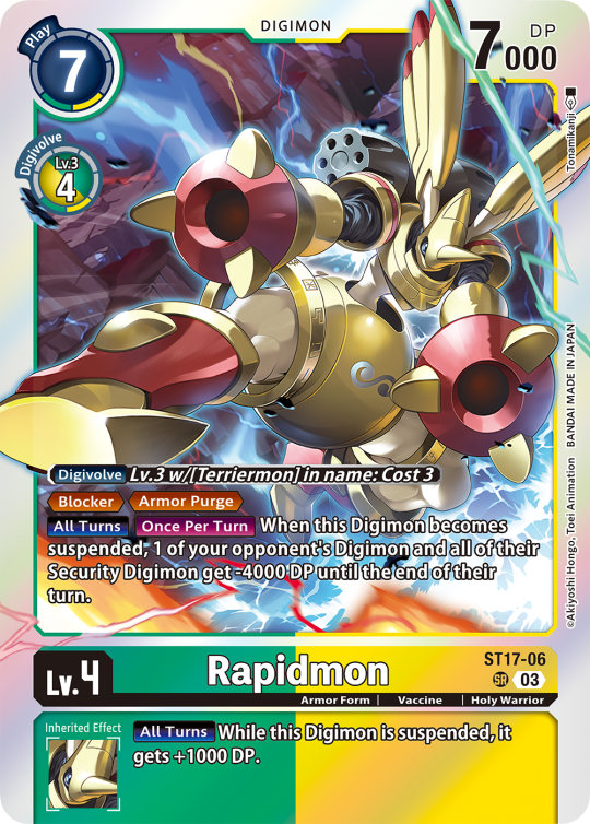
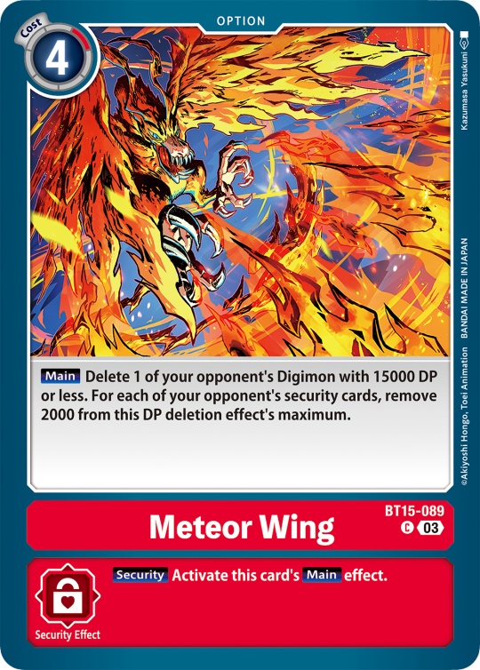
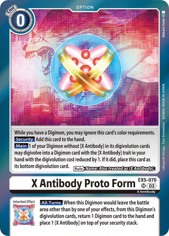
Digimon Card Template->
Hey guys, I finally finished the templates! A few words to read before using, and more words under the cut if you will. I'd love to see any and all cards you create, so feel free to leave me an ask or DM! Also if you feel like supporting me a little, feel free to stop by my ko-fi->
First off, all fonts you need for the template are in the "Card Template Fonts" rar file. Remember to install them first before opening the files. Second, I recommend working with the PSD file in Photoshop, if you can. It has more and easier customization. If you use CSP, do use the CSP files. The PSD Text layers don't work in CSP, as well as certain other settings. I did my best to adapt the file to CSP, and it should work fine!
The Files have "HELP" layers in certain folders, I recommend reading them! Some of the Information I will repeat under the cut.
HAVE FUN! I wanna see lotta cards!
Okay, below the cut I'll leave some notes on how the Digimon cards are designed, as of the num <03> era at least.
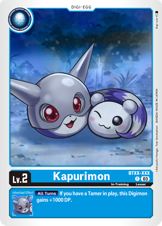
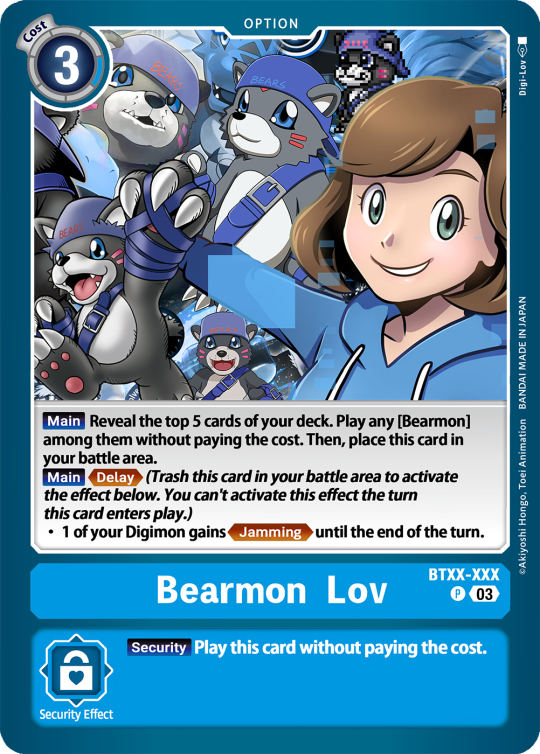
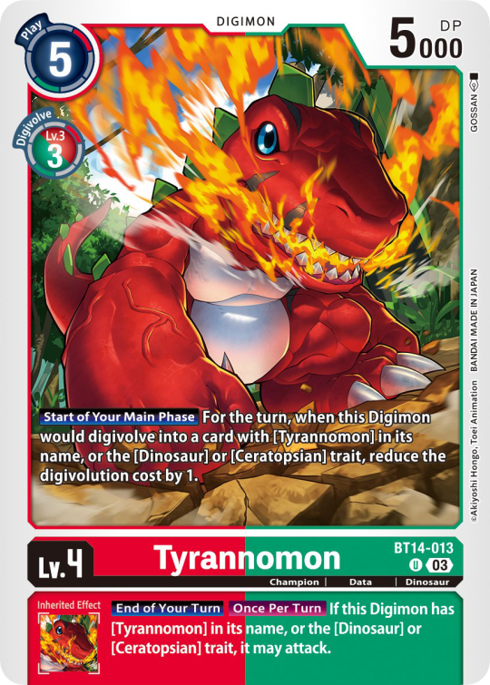
Digimon cards have seven different colors. Red, Blue, Green, Yellow, Black, Purple, and White. White cards are rare and reserved for special Digimon/Tamers, and usually don't interact with other colors. For easier reading, Yellow and White cards have black text in their colors, instead of the usual white text. On multicolored cards, card including Yellow (or white) have white text with a black outline. (before <03> if Yellow was the first color, the text was black with white outline instead, but they unified it with the update) The color on the left is considered the first color. Since the design update, the Card color is displayed in a color wheel around the Play cost. The digivolution cost bubble also recieved a color wheel, as well as the buble being split into the differen colors. Imagining it like a clock, the top color is the first, and then circling clockwise. Digi-Egg, or Lv.2 Digimon are always single color.
[tricolored cards have been introduced just recently and super rare. use sparingly]
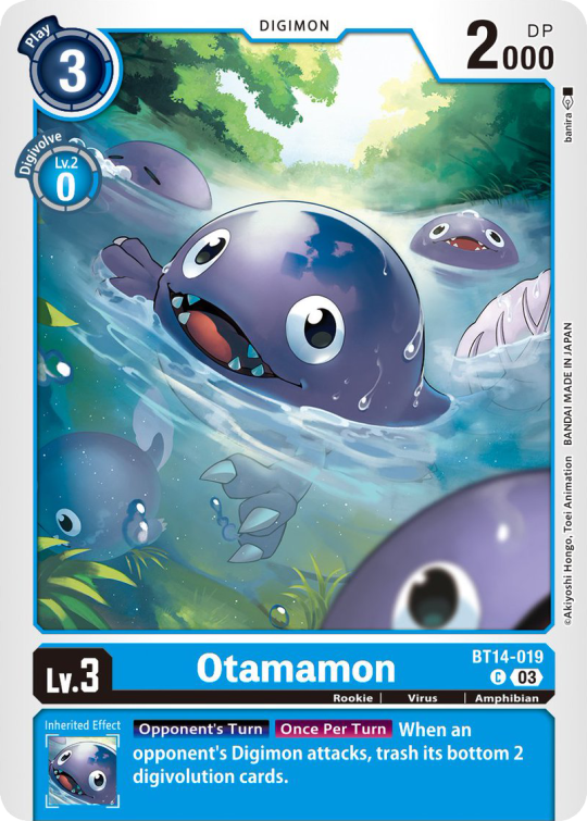

Now to the Effects. The main effect is in white color with a black outline (also outlines on the keywords), while the Inherited Effect doesn't have outlines (unless it's a Yellow double color). If the Digimon has no Inherited Effect, there will be a small dash in the box.
Only white cards have black text in their main effect.
The effect text will start in the lower bottom of the image, not all the way at the bottom, and go down from there. If the Effect is too long it will move up.
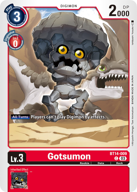
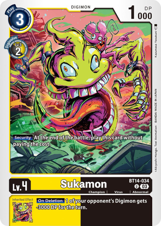
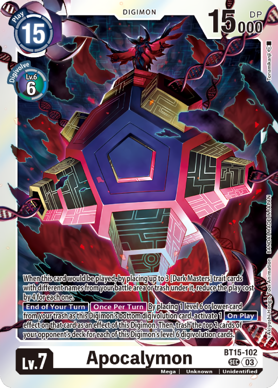
Besides the regular evolution requirements, Digimon may have special "Digivolve" rules in their effect. This can make an evolution from a specific digimon cheaper, allow X Antibody Digimon to evolve from their normal counterparts, serve to overlook color requirements, or to allow evolution from certain traits, etc.
Some Digimon may also have an extra "Rule" in the bottom corner.
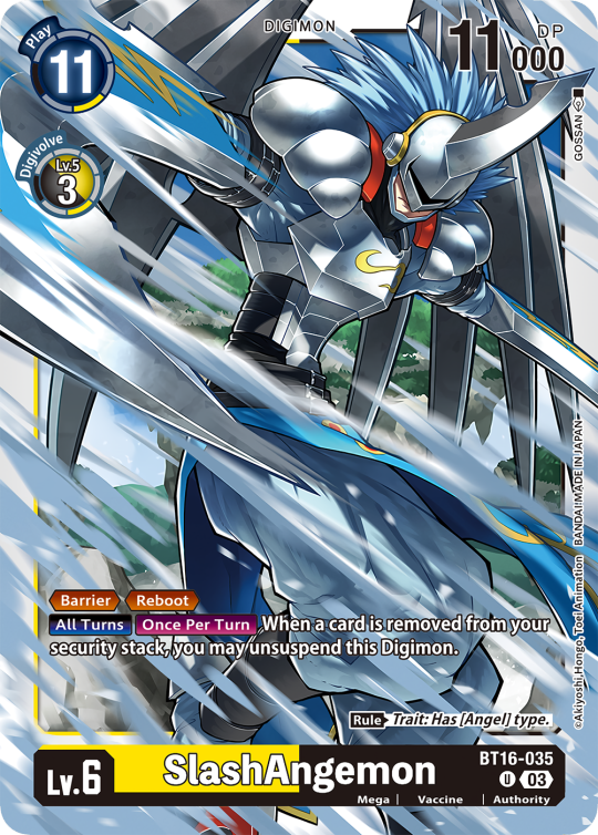
Ace Digimon will always have [Hand][Counter]<Blast Digivolve> effects. Most of them have no inherited effects. They also have a significantly cheaper play cost than comparable Digimon, but in turn have the Overflow mechanic. EX6 introduced Blast DNA Digivolution, which specifies the required Digimon by name, and not just Level and color.
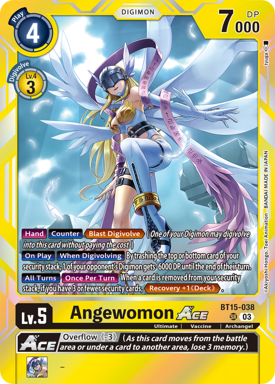
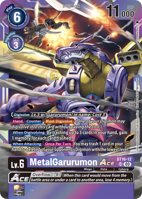
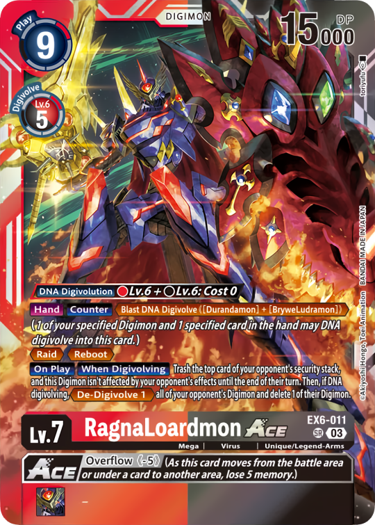
Lv.6 Digimon usually don't have inherited Effects, some might though, if they were made with Lv.7 evolution in mind. Furthermore Lv.6 Digimon pop out of their frame, even on the normal arts.

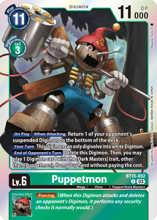

Now Tamers originally had neither traits, nor inheritence effects. But certain Tamers now do! Tamers with Mind Link effects, or the kids from Frontier for example, will have Inherited Effects.
Option cards have a grey backdrop for their effects, and the effect text is black. This black effect text carries over to full/alt arts, regardless of color. The have a (use) cost instead of a play cost. They can also have traits or rules, but it is rare.

#digimon#digimon tcg#digimon card game#digica#digisafe#デジカ#digimon card#digimon template#template#digi community#digi lov edits
414 notes
·
View notes
Text
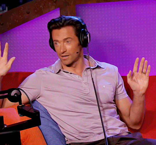
💋 Sexiest Man Alive 💋
November 19th, 2008
New York City, New York
✨ Author's Note: In this one shot, for story purposes, Hugh is not married. We'll say he divorced from Deb recently to keep the flow of the story.
I double checked my appearance in the mirror before heading out. Today is the day I will be interviewing Hugh Jackman for his People magazine's Sexiest Man Alive crowning. The interview will be filmed and broadcasted live on national television. I decided to go business casual, wearing black capri slacks, a white and pink flowered cami tank top with black 6-inch heels. My dark brown hair was shoulder length and wavy. My makeup was flawless. To say nervous would be an understatement whenever you're interviewing someone that's been named the sexiest man alive.
Everything seemed perfect, so I rushed out to my 2008 Ford Mustang and sped off to our studio in downtown NYC. Traffic was hectic, but I managed to get there with 25 minutes to spare to go over the interview questions before our guest of honor arrives. One question in particular stood out to me, it was a question pertaining to his sexuality due to circulating rumors that he's gay. I'm normally shameless, but this would be an awkward thing to ask him.
"You ready?" My co-worker/camera man Justin asked, stepping in front of me.
I nodded, "As I'll ever be! Just going over some of the questions. 'How do you feel about the circulating rumors of you being gay?', 'What turns the sexiest man alive on?', Justin, what the hell are these questions?" I asked with a humorous horrified look spreading across my face.
He failed to contain his laughter, "I didn't write 'em, I just control the cameras."
I shuffled the cards, "This is going to be the weirdest interview. This dude is probably going to leave the set mid interview." I laughed.
Justin shook his head, "Hugh is a pretty good sport. He should take it in a humorous way. You should be good. He'll be here any minute, so get ready."
I nodded, "Alright."
I stood to double check the set and make sure the props were in their correct location, making sure the set was clean and presentable before sitting back down in my chair. I stood back up, hearing an Australian accent coming from the hallway, that must be Mr. Jackman.
"Glad to be here, mate. Thanks for havin' me." He said, shaking hands with our producer Mack, while walking into my view.
Mack smiled and pointed in my direction while walking Hugh up to me, "Mr. Jackman, this is Kaitlyn. She'll be doing your interview."
I smiled, extending my hand out to Hugh, "Hi, nice to meet you. I'm a huge fan and honored to be doing your interview today, Mr. Jackman."
He gave me a smile, shaking my hand, "Call me Hugh. Nice to meet ya, Sweetheart."
I can see why he was voted sexiest man alive now. No photoshop or CGI needed. This man was cut. He had the most beautiful smile I'd ever seen and did not look a day over 28 despite just turning 40 last month. He was wearing dark colored blue jeans with a white t-shirt adorned with a black blazer that made his biceps pop. I could swear the temperature in the room went up at least 20 degrees since he'd walked in.
As we sat down, I noticed him smiling at me and looking me up and down as if he were checking me out. I smiled back while grabbing the cue cards with the questions for the interview and looked towards Justin, who gave me a slight nod to let me know we were rolling,
I smiled from ear to ear as the camera zoomed in on only me, "Good afternoon, New York! Today's guest was just crowned People magazine's Sexiest Man Alive of the year. You can purchase his edition today in stores. Please allow me to welcome Mr. Hugh Jackman!"
The camera zoomed out showing Hugh and I both sitting in the chairs at the small table separating us. I looked over smiling in his direction, allowing him to speak.
He gave a huge smile towards the camera and then towards me, "Thank you for having me! How're you doing today?" He asked.
I smiled, "I'm great. How are you? How have things been since being named People's Sexiest Man Alive?"
"They've been quite interesting. I was told Brad Pitt wasn't available this year." He said with a cheeky laugh.
I failed to contain my laughter, "I believe a lot of people feel that you've earned the title, especially given your portrayal of Wolverine in Marvel's X-Men."
I could see him blushing, "Honestly, things have been great. I just finished up a movie with Nicole Kidman called Australia, which comes out next week. We're pretty pumped for that."
I shifted in my seat, "How was filming that with Nicole?"
He got serious for a moment, "It was great. She's a good friend of my ex wife's, so it was a bit awkward at first, but overall a great experience. Shooting the film back home in Australia was exciting."
I nodded, "We'll be sure to check that out next week once it premiers." I felt a slight smirk appear on my lips, "Okay, now for the good stuff you all have been waiting for. Juicy questions for the sexiest man alive. Are you ready for this, Hugh?" I asked with as much confidence as I could possibly muster.
He giggled, "Baby, I'm always ready. Let's go."
I took a dramatic deep breath for dramatic effect, "Alright, so given you're now the sexiest man alive, what are some of your turn-ons? What's something you find sexy in a woman?"
He chuckled, giving me a smirk, "Oh, getting a bit cheeky, are we? You waste no time." He noticed me trying to keep a straight face and continued, "What turns me on? I'd have to say confidence, a strong woman that can sometimes put me in my place. I also love a woman in summer clothing. I'm from Australia, I love the outdoors, I love the water. I feel like a woman comfortable in her own skin, enjoying herself on the beach is very attractive to me."
I smiled with a nod, shuffling the cards in my hands, "Good answer."
He smirked at me, shifting in his seat, "I have a question for you. When are we heading to the beach?"
I looked a bit flustered, "I didn't know we were! But I'm happy to go with you any time!" I said with a small laugh.
He chuckled, "Dually noted." He tapped his forehead as if he were retaining the information.
This man was gorgeous. I'm sure he's just being funny for the camera, but I'm still enjoying this.
Attempting to stop chuckling, I went with the next question, "So Hugh, what do you make of the circulating rumors of your sexuality?"
He shrugged, "I think they're funny. They don't really bother me."
I nodded, "What did your friends and family say after you broke the news of being the sexiest man of 2008?"
He laughed, "My mates found it funny. My kids think it's funny but also gross their father is being called sexy. My family also, but they were proud of the accomplishment."
"Given your recent divorce, the ladies would like to know, is Hugh Jackman on the market?" I asked curiously, with a slight giggle.
He looked at the camera, "Hugh Jackman is on the market, ladies." He turned to me, "Is my interviewer also on the market?"
I failed to hide the red blush appearing on my cheeks, "Is Hugh Jackman hitting on me?" I said to the camera acting as if I were in shock with a tilt of my head.
He laughed, "You didn't answer my question."
I smirked, "I'm the interviewer. I ask the questions."
He shook his head, "Feisty, are we?"
I chuckled, "Mr. Jackman, do you have a secret talent?"
He smiled, "I'm very well trained. Not toilet trained, but I'm trained in other things. Barbara Walters told me I give phenomenal lap dances."
I laughed, "Did she? Barb is a great judge, so I trust her judgment."
He immediately stepped up from his chair, looking towards Justin, "Do we have music? I'm going to demonstrate." Looking back towards me he continued, "I have to showcase my talent for you."
This has definitely been the most interesting interview of my two year career.
I looked at Justin as music began playing, "Oh? I'm getting a lap dance too?" I asked playfully throwing the cue cards across the room. "Forget the script."
Justin failing miserably to contain his laughter watched on as Hugh began swaying his hips, removing his blazer and stepping to me. I sat not knowing how to react or if this was some odd dream I was having. He was in front of me with both of my legs between his, while still swaying his hips in a seductive motion.
His voice now seductive shook me from the thought, "How're you feeling, love? Isn't this your best interview yet? C'mon, look at me, baby." His finger grasping my chin pulling it upwards to look at him with the cheekiest, sexiest smile on his face.
I nervously laughed, blushing, "Oh my god." Was all I could manage to say. His other hand gripping my shoulder as he moved closer, almost putting his crotch 2 feet from my face.
He immediately began dying laughing as he sank to the floor, placing both hands on my knees. "How was that?" He asked.
I shook my head with a smile, "That was... I mean, I've never had an interview leave me speechless."
I could hear the film crew failing to contain their laughter as Hugh reached up and hugged me, straddling my lap. This must be every woman's wet dream. His laughter piercing my ears as he hugged me.
"Job well done then." He said cockily. "Turn off those cameras. We're headed backstage." He managed to say through his laughter.
I squealed, dying of laughter, "And that concludes our interview with Mr. Hugh Jackman, ladies and gentlemen! Go pick up your issue of People's magazine's Sexiest Man Alive-" I struggled to grab the magazine but finally reaching it, holding it up towards the camera, "Today!"
The cameras immediately cut and Hugh hopped off of me, laughing at the crew's reaction as their laughter grew louder now that they didn't have to worry about the rolling cameras.
"Best interview of your life?" Hugh asked me with a knowing smile.
I laughed, shaking my head, "Definitely. I was not expecting my day at work to end with a lap dance from Wolverine."
He pulled me in for another hug, "Next interview I'll be giving you another lap dance."
I playfully rolled my eyes, hugging him back, "I'll be sure to remind you."
He got serious for a moment, "Would you like to grab lunch with me? I've got a bit before my next press."
I nodded, "Sure. I'd love to."
He gave me a smile, "Seriously though, are you on the market and when are we gonna go to the beach?"
I looked at him nervously, "I am on the market, and I'm available anytime after 3."
He grabbed my hand, leading me towards the hallway. "Great. All I needed to know. I'm looking forward to that next lap dance, beautiful." He said with a smirk.
222 notes
·
View notes
Text

Hi! I got asked if I have an icon tutorial so I thought I'd do my best to go through my (probably way too long) process :) I'm going to show how I made that icon up there 👆
When I first started making icons I used this great tutorial by @/strwrs and then slowly added my own preferences to make this chaotic process 💕
First for getting screencaps of things i normally just google "[name of show/movie] screencaps" but one of the ones I use a lot is this site.
1. Open the pic in photoshop and crop it
Here's the full image:

Here's where I'm cropping it:

I like to make the size of my icons 250x250 but it can be more of a preference thing, a lot of people use 200x200 or I've seen 100x100 too.
I also like to crop a little above the image sometimes to give more space above the head
2. Removing the background
Removing the background is way easier on animation than on real people sometimes so I can show 2 examples even though I do it the same way...
First I go to select > select and mask:

Then I use the quick selection tool to select as much of the head as i can and the brush tool to remove/re-add parts that got missed so it should look like this:


(is the quick selection tool great? not all the time but when it works well it's great 🤡)
For something like this where her hair has a lot of texture in it and it's difficult to get a good outline, I'll zoom in really far and use the brush tool to get as many of the big pieces as I can so it looks a little more natural when the background color is added

Sometimes there can be a white/black line around the icon that got missed from erasing the background and you can use the brush tool to erase that as well.
3. resizing and sharpening
Now everything should look like this:

I'm going to go to the right where my layers are at and create a new group by clicking on the folder at the bottom
Then I drag the layer mask up to link it to the group instead of just the image and drag the image into the folder:

Next I like to sharpen before I resize the image so I open the group and highlight the image layer and then go filter > convert for smart filters and then for sharpening: filter > sharpen > smart sharpen with these settings:

Now with the image layer still highlighted i go to image > image size and set it to 250x250

4. the fun part ✨
Now we can add the background color and everything else ✌️
I have a lot of previous templates saved to save me time so what I normally do is open a psd template I have then highlight the group layer i just made then right click > duplicate group and have the destination be the psd and then I can just change the colors of gradients i've already made (For this tutorial though I'll show you how I make the gradients/paint layers)
For coloring this is pretty much what my process usually looks like (im probably going way overboard with it but oh well lol) it really depends on the pic being used, some don't need to be colored as much.
I have found that over brightening/upping the vibrance isn't necessarily a bad thing sometimes (not all the time though) because of how small the icons are it kind of helps the image stand out more when they're used but it's up to you!
(I also put all the adjustment layers into one group because it gets a little chaotic if I don't)

Next we're going to make a gradient ✨ first i go to the adjustment fill button (?) and pick gradient

Then I just pick one of the generic photoshop options that kind of has the look I want ( it doesn't matter too much since it will be edited so it can be any color)

Now to change the color of the gradient click on the color part in the gradient section and you'll see this

I deleted the bottom middle square because I didn't want it, but to change the colors double click on the bottom left or right squares and a color wheel will pop up.
When I pick the lighter color i normally just go up to a lighter section above the darker color
This is the change i made, you can move the middle diamond slider to have the darker or lighter color be more prominent

Next is playing with the angle/scale until it's how you want it, these are what mine ended up being

I also normally adjust the angle so that the lightest part of the gradient is in the top corner where the light source is coming from in the icon pic to make it look more natural
Next I add a solid color layer over the coloring layers with a color that's similar to the background gradient color im using and switch to the brush tool with black paint and with the layer mask selected on the solid color layer paint over everything i don't want colored with black
Then I do a second solid color layer set to a lightish brown, normally on just the hair, to add a bit more contrast

then i set the color fill layer that matches the background to either overlay, soft light, or color (depending on which one looks best for the image) and adjust the opacity/fill to where I want it.
I always set the brown layer to soft light with the opacity at around 80%
And NOW just when you think I might be done...I'm not...because I have to make this process as long as possible 😂
Now I do another color fill layer but this time over the entire image group layer. I normally make the color a slightly lighter color than the darkest part of the background color, set it to soft light, lower the opacity/fill to about 50% or lower, (depending on how much it changes the pic) and then right click > create clipping mask so it only effects the image and not the background
This kind of just tints the image a little with the color to bring it together a little more

Now the icon looks like this:

You can add more fun stuff like doodles/background textures i've used these and these but there's a lot of resource blogs like @/completeresources and @/allresources that have long lists of different textures
If i wanted to add a texture though i would put it over the gradient layer and set it to overlay or soft light


And to add a doodle you just put it at the very top of everything and resize it/turn it using the move tool :)


Then you're done! you can go file > export > quick export as png and thats it 👏
Hopefully this makes sense! I've uploaded the template i made in the tutorial here if that's easier to follow but feel free to ask if you have any questions!
#icon tutorial#dailyresources#completeresources#icons#tutorial#tutorial*#photoshop tutorial#usertana#userzo#tusertha#ps*
71 notes
·
View notes
Text
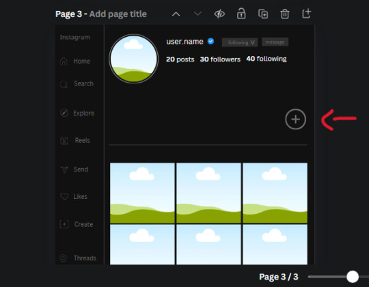
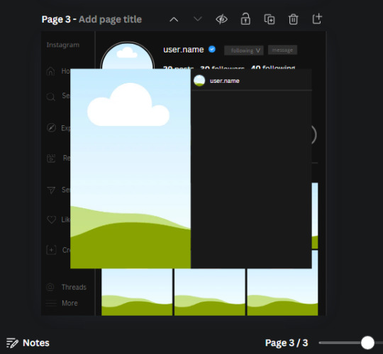
𓈒༷♪˚.✧ How to make a mockup like this for smaus, ocs, etc. (step-by-step tutorial ☆ no Photoshop, easy, free) (requested by @lovebittenbyevans) ✿
guys this took me two hours to make and you could probably get this done in like, 30 minutes :) I hope this is coherent <3 Please look back this image for comparisons, if my explanation is not well explained, etc.
first of all, if you dont already have one, make a free canva acount. once you're signed in, hit the purple "create design" button on the sidebar. A pop-up will appear with different design template options. For this design, we want the dimentions to be 1080 x 1080, so you can either make a custom size or choose the instagram post (square) template by either searching or scrolling through the list.

2. Now you have a blank page. Zoom in with the slider at the bottom of the page if you need to (Mine is currently zoomed in 41%). Click on the page and change the color to an off black (hex code #111111).
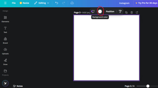
3. Now that the color is changed, click the "elements" tab and search "line". Click the shape and it will add it to the page automatically. These line are particularly hard to navigate and hard to get it at the right angle and length so this part might take a little longer than the rest.
4. stretch it from top to button and turn in a 90 angle so its straight on the left side of the page. Change the color of this as well to a grey tone (hex code #2F2F2F).
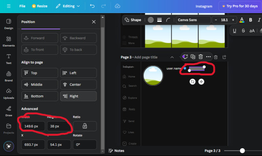
5. Now we'll add the Instagram logo. Click the "text" tab then click the purple "add text box" button. Write "Instagram" in the box and change the font to "apricots". This is the closest font I could find that resembled the logo font but if you find a better one, feel free to use that instead. Make the font size 19.3 (you can do this manually or do it in the text options). Change the color to grey color (hex code #707070). Add it to the upper left corner of the page like this:
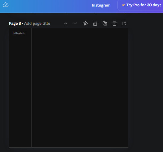
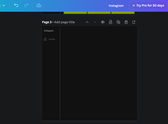
6. now we're adding icons and a menu inside the border we just made. Click the "elements" tab again and search for "instagram home icon" and add the element by sketchify to the page. Click the home icon, an options icon with pop-up above the page. Look for the "Position" button and click it. Scroll to find the advanced options and you can manually type in the width and height at 26.6 and 28.7.
Move it inside the border, under the logo (photo below). Change the color again (the hex code is #707070).
7. Open the text tab and add a text box. Change the font to Canva Sans and write "Home" in the box. Change the font size to 18.1 and align with with the house icon. It will look something like this,
8. Go into the elements tab again and search "instagram search icon". Scroll until you find the one by sketchify and add it to the page.
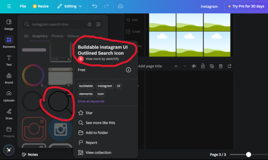
9. Shrink it so the W and H is at 36.6 and 31.3. Move it below the home icon until a purple "67" pop ups and aligns under it. Change it to the same color as the Home text and icon (#707070). Go ahead and Duplicate the the "Home" text box and clicking it and a pop-up will show up then edit the text so it says "Search" and align with the searcch icon we just added.
10. You know the drill. We are continuing to search up more icons in the "elements" tab. Search "instagram compass icon" and choose the one by sketchify (are u seeing the pattern?). Add it to the page and change the width and heigth to 33.1. align it under the search icon just like how we did before and change it to the say colors as the other icons.
11. Do the same as before and write "Explore" in a text box and align it with the icon. We're doing the same thing for all of these.
We'll be using the same search prompt for all of these icons so just change the type of icon you're looking for like we've done before hand. Next look for the Instagram reel icon and add the outlined one by sketchify and change the W and H to 31.2 x 30.9. Change the color to the ones we've used before, align it underneath the icons above and add your text ("Reels").
12. The next icon is an outlined, "sent" one. W and H is 31.1 x 27. The text will say "Send". Then an heart outline by sketchify; W and H is 34.2 x 29.1 and the text is "Likes". Next is the "create" outline icon by sketchify, W and H is 36.8.
(p.s if you are struggling to align the icons and text correctly, shoot me a message and I'll send you the X and Y positions ;D)
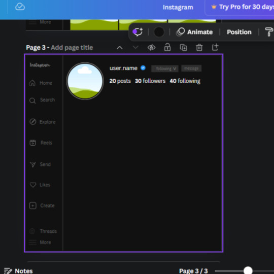
If you followed it through, it should look like this,
13. Now onto step 13, we'll be adding the Threads logo. You don't have to add this but to make it look more like the actual website, I will be adding it. Open the "text" tab and add a text box. Write an "@" symbol in the box and change the font to Nanum Sqaure and the size to 24.9. Add in the bottom corner below all the icons we just added to our page. We need another text box now (Color is still #707070), write "Threads" and align it to the "@" symbol.
14. We're adding another icon now. Search "Instagram menu icon" and find a wireframe menu icon by sketchify. the W and H are 42.5 x 24.6. Add a text box that says "More". It will look like this:
We are a quarter way done now :D
15. Search in the elements tab "circle frame" and look for the one with a little border around it.
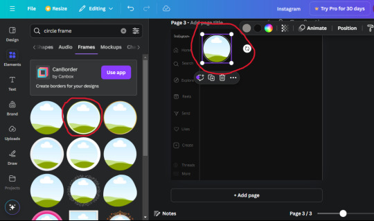
At first, the circle will be green and inside the circle will be white. Change the white to color of the background of the page (hex code #111111) then change the green to a grey color (#8D8986).
16. Add a new text box, change the font to Canva Sans and the size to 22.8 and the color is white. I just wrote "user.name" in the box. the W and H will be 153.3 x 35.7.
Enter the "elements" tab and search for a blue checkmark and find the icon by Victor Aguiar. The W and H is 28.1 by 28.
17. Search in the search box for a rectangular shape and add it to the page. Place it next to your username and checkmark icon and make the W and H to 149.6 x 38. Add another and place it next to the other rectangle shape. the W x H is 111.4 x 36.7.
Change the color of both boxes to #2F2F2F. Add a text box and write "following" then change the W and H to 82.6 x 21.8 and fit it inside the first box. Add a second text box and write "message" in it then change the W and H to 77.8 x 21.8. Change both text colors to #7A7A7A

18. Add another text box. Write "<" and turn it upside down and place it beside the "following" text inside the rectangle. Adjust the size as you need to. I also like the round the corners to around 8 so its not so pointy and square.
19. Add 3 new text boxes. Write the amount of posts, the amount of accounts you're following and the amount of followers your have. Write "20 posts", "30 following" "40 followers". Bold the numbers and change the text W and H to 116.4 x 32.7. These are just place holders that I use.
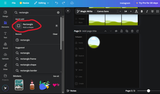
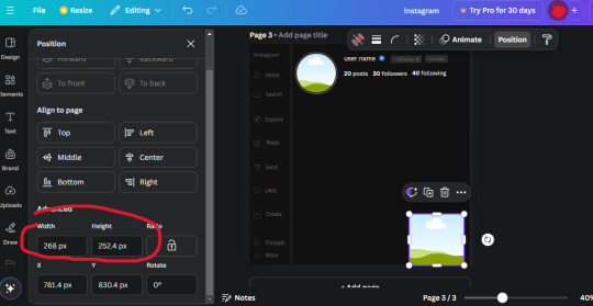
20. Open the "elements" tab again and search "frame". Choose the first one.
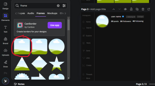
We want the height and width to be 268 x 252.4. Place it at the bottom of the page but we want some space between the frame and the page.
Now we'll duplicate the frame we just placed (the icon between the comment and trash can on the pop up above the frame). Place it next to the previous frame but we want to leave a bit of space between them like this:
If its a little wonky, don't worry. You can always adjust it so it looks right.
Duplicate the frame again and place it next the second frame you just placed, same distance between. Make sure they're even. Now we have a row.
Select all three frames and duplicate them. Move them above our original frames but leave a little space between them.
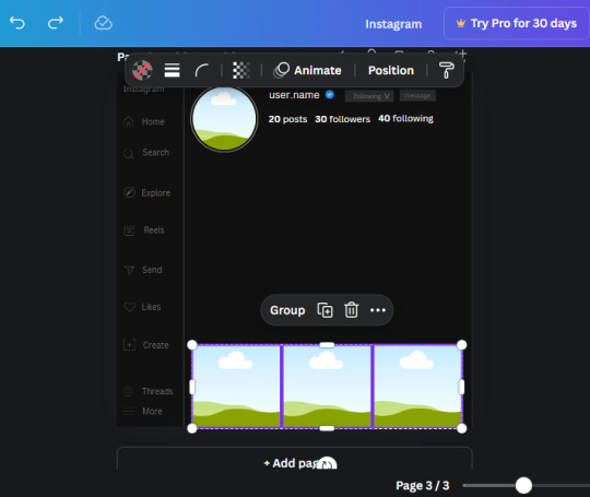
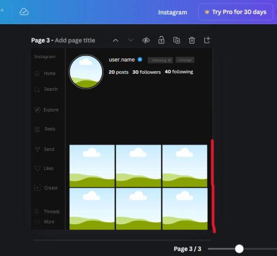
Again, if they're uneven, adjust them as you need to.
21. Select the line again from the elements tab. Stretch starting from the top frame to the last frame and make the color grey (#2F2F2F).
Because the line is stupid hard to navigate, use something like a text box to mark where you want it to end like this:


Delete the text box and the line with be where we want it.
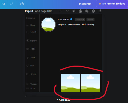
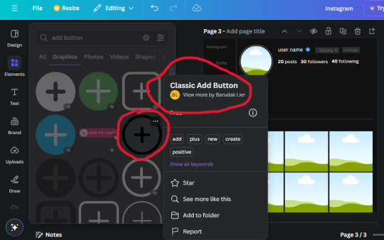
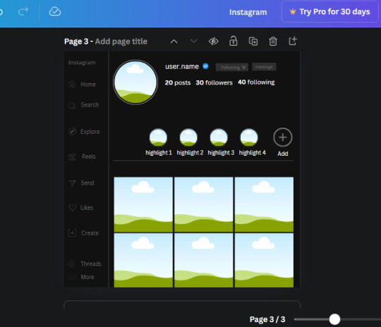
22. On to the highlight reels. Seach for "add button" and find the one by Barudak Lier.
Change the heigh and width to 81.1 and move it above the border.
Search for circle frames now and add this one to the page (The same one we used for the pfp), change the width and height to 85.4 and move it next to the add button. Since this is a generic, blank template, I add about 4 of these highlight frames but you can do however many you want. You can change the border color to a gradient or leave it grey.
Add a text box now. The font will be Canva Sans, the size will be 18.1 and the color will be white. Change the text to "Add" and place it under our add button. Make more of these text boxes to place under the circle frames. Depending on which frame its under, write "Highlight 1", "Highlight 2", etc. etc. or you can give them different names and such.
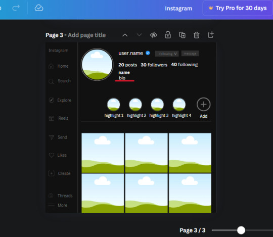
23. Add another text box, write "name" and bold it, change the size to 19.1 and the W and H to 69.2 x 28.8. The font will be Canva Sans and the color will be white. It will go under the amount of posts, followings and followers.
Add another box. The font is Canva Sans, font size to 20.1, the W and H is 40.8 x 31.3 and the color is white as well. This is our "bio". Place it under "name".
Yay!🎉🎉🎉 You're halfway done!
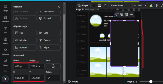
24. Search for a shape in the elements. Look for the rectangle again and add it. Change the width and height to 460 x 760.4 and the color to an off black/grey color (#191919), placing it like this:
Get the same kind of square frame we used before to make the profile grid and make it the same size as the rectangle we just added. Place right up against the rectangle like it's its other half. Add another line like before and span across the upper half of the black rectangle as a border then add a circle frame inside the border.
Add a text box, "user.name" and align it with the frame. The text is white and the W and H is 111.5 x 25.9
25. Add more circle frame along the inside of the rectangle to resemble the comment section. Make sure the W and H of the frames are 46.1.
Add more text boxes that align with the frames you just made and write "username" again and bold them. Add even more text boxes that align with the usernames and write "comment". These are place holders for when you decide to use this template.
Add another rectangle on the lower part of the rectangle and make the color black. and search for "instagram heart icon", "instagram comment icon" and "instagram send icon". Make sure the lines are thick. Find the heart icon by sketchify, and the the comment and send icon are by Mirazz Creations. Make the lines white and make sure the W and H are the following:
Heart icon: 38.7 x 32.9
Comment icon: 35.2 x 35. 8
Send icon: 35 x 32
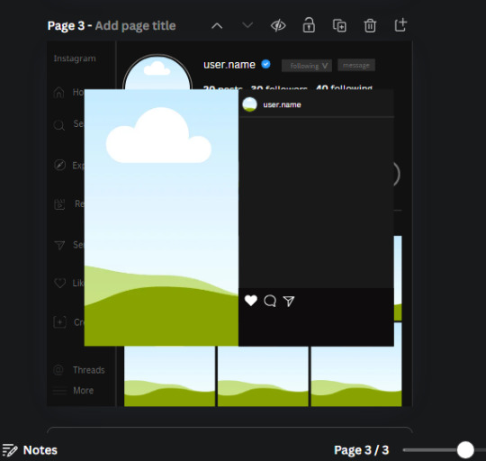
Next, look for "instagram bookmark icon" and find the one by Adricreative. Change the color to white and the W and H to 29.7 x 40.2. Move it to the other end of the rectangle.
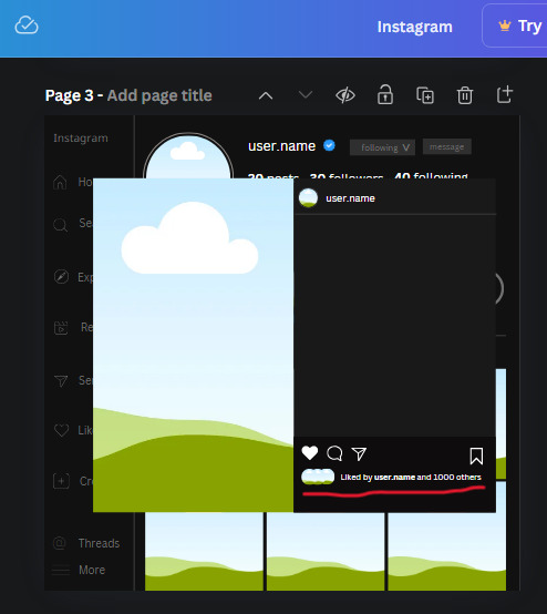
26. Now add three circles frames and change the W and H to 37.2. Move them below the heart icon and have them overlap each other some. Then, add a text box and write "liked by username and 1000 others". Change the font size to 13.6 and change the font to Canva sans. the color will be white. Align this with the three overlapped frames.
27. Look in the elements tab for an emoji icon and choose the one by Soni Soukell from Noun Project. The W and H will be 32.8 and the color is white.
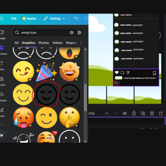
Now add a another text box and write "Write a comment". The color will be white, the font size will be 14.2 and align with the emoji icon you just placed.
Search for "next arrow button" by Pixeden and make the W and H 42.8 then add it to both sides of the post.
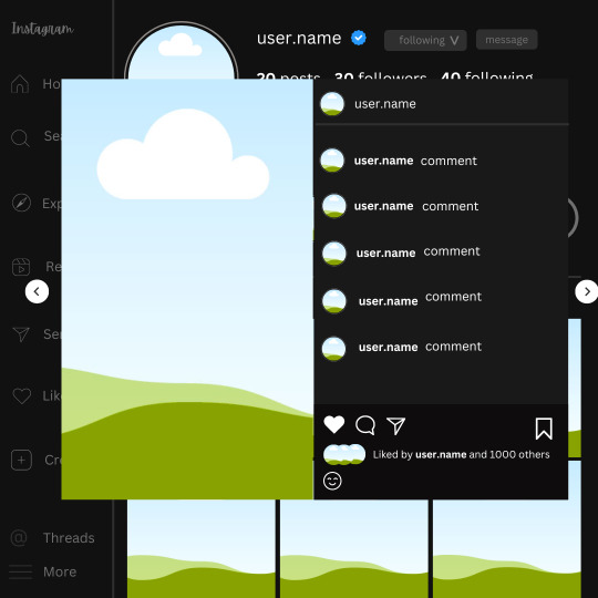
And you're all done with your template! All that is left to do is fill it but before doing that, duplicate the page so you always have an extra blank mockup if you want to use it again.
To fill the frames, upload an image (or use a Canva stock photo), drag and hover it over the frame and it will fill the frame.
Hope this was helpful and you you successfully made one :D <3
#requests#text#smau#template#mockup#moodboard#instagram#instagram moodboard#instagram mockup#graphic design#canva#psd#free tutorial#tutorial#instagram au#social media au#free psd#photoshop#resources#fanfiction resources#graphic design resources#graphic design tutorial#psd tutorial#photoshop tutorial#au#au ideas#mockups#digital design#digital design tutorial
172 notes
·
View notes
Text
𝐠𝐢𝐟 𝐦𝐚𝐤𝐢𝐧𝐠 𝐭𝐮𝐭𝐨𝐫𝐢𝐚𝐥 by nami ♡
i know that there is a loooot of gif making tutorials on this website but i want to share my way of doing my packs! for this tutorial you'll need basic photoshop cs6 knowledge and a lot of patience lol. this tutorial is very simple and fast, but my inbox and messages are open to any questions. if this post helped you, please please reblog!!
what you will need:
y2meta: youtube download site.
mkvdrama: for dramas.
obs studio: if you need to screenrecord.
potplayer: video player.
gif making action by me: it will help you save a lot of time.
ㅤㅤㅤㅤㅤㅤ
ㅤㅤㅤㅤㅤㅤ𝗦𝗧𝗘𝗣 𝟭.𝟬: configuration stuff (the boring step)
after downloading potplayer, you will open your video of choice and hold ctrl+g, it will open something like this.
make sure the format is jpeg (you can choose png too, but it will take more time to capture the frames)
for the frames, you can choose how many frames you want to capture. i let it capture until i manually stop, so it's 99.999. but you can put 60, 80, etc.
for the image size, let it be the original size.
ㅤㅤㅤㅤㅤㅤ
ㅤㅤㅤㅤㅤㅤ𝗦𝗧𝗘𝗣 𝟭.𝟭: the capture folder.
for this next step, you click the configure folder option:
create a new folder and select it. the images you capture will apear on that folder.

ㅤㅤㅤㅤㅤㅤ
ㅤㅤㅤㅤㅤㅤ𝗦𝗧𝗘𝗣 𝟭.𝟮: photoshop !
after dowloading my gif making action, open your photoshop and open the action. it will look like this:
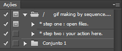
you can download any free sharpening action and put it on the step two option!
ㅤㅤㅤㅤㅤㅤ
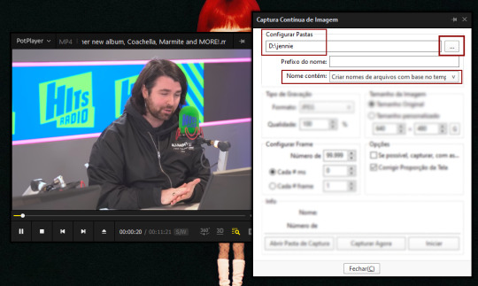
ㅤㅤㅤㅤㅤㅤ𝗦𝗧𝗘𝗣 𝟮.𝟬: capturing the frames!
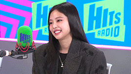
after doing all of that, let's get to work! first, open your video of choice. mine is an interview of jennie, as you can see. after that, select the part of the video you want to capture and hold ctrl+g. once you're ready to capture the frames, click start.

i clicked start, let the video play and clicked stop when i wanted to stop. usually i do this basing on whos on the screen: for this example, i click start when jennie is talking and stopping once the interviewer appear.
after that, open you capture folder, it will look like this:
as you can see, it starts with the interviewer and ends with the interviewer so i don't miss any frames! jennie's frames are inside the red rectangle!
now you just delete the interviewer frames, select all of jennie's frames and move to another folder inside our capture folder, like this:
ㅤㅤㅤㅤㅤㅤ
ㅤㅤㅤㅤㅤㅤ𝗦𝗧𝗘𝗣 𝟯.𝟬: photoshop timeeeee.
open your photoshop and click the step one of my action,
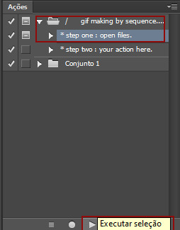
this will pop on your screen:
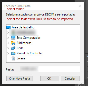
now you will open your capture folder, mine looks like this:

now you click OK and let photoshop do his work. once it's done, this is what you're going to work with:

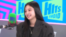
now, for the fun part! adjust your gif to your liking and press play to check if everything's ok. make sure you click that chain thingy up there so your image doesn't get weird angles.
this is how my gif is looking like until now:
pretty, right? NO! lets sharpen and edit!!!!!!!
ㅤㅤㅤㅤㅤㅤ
ㅤㅤㅤㅤㅤㅤ𝗦𝗧𝗘𝗣 𝟰.𝟬: THE OTHER FUN PART!!! COLORING!!!
first, choose your gif action of liking and apply it to the gif. i'll be using mine! this is what it looks like with sharpening only:
it's getting better... BUT LET'S COLOR IT!
usually i do curves > vibrancy > color balance if needed. it looks like this:

i normally like more natural and vibrant colors to my gifs, so this is perfect for me! all done :]
ㅤㅤㅤㅤㅤㅤ
ㅤㅤㅤㅤㅤㅤ𝗦𝗧𝗘𝗣 𝟱.𝟬: saving for web.
after that sharpening and editing, follow these steps:
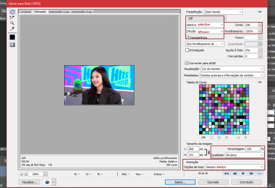
set your configs like mine (if you want to, this is up to you!) and set the loop to always. after that, just save to your gif folder and its done!
this is how my gif looks:

ㅤㅤㅤㅤㅤㅤthat's it! a tutorial that nobody asked but i wanted to make! feel free to ask me any questions you have!
ㅤㅤㅤㅤㅤㅤmeus brs, as fotos estão todas em português e o google tradutor pode ajudar vocês, mas se mesmo assim vocês tiverem alguma dúvida, me chamem!
love y'all. ♡
#rp help#rp h#rph#rp br#gif making tutorial#gif tutorial#mine by taylor swift#ive been wanting to do this for so long lol
58 notes
·
View notes
Text
Thinking about….
Various! Boyfriend x fem-coded reader
Cw: not really anything. Chubby reader friendly- in fact I sort of imagined it that way. Was thinking about shinsou while I wrote it (and it’s probably obvious). Fluff, modern, 2nd person pov.
x
Thinking about laying in bed with him one particularly lazy evening, cuddling and watching reels together on your phone. You’re both cozy and tucked against each other’s bodies, his chest to your back, arm hooked lazily over your waist, a few pillows supporting your head while he rests his chin on your shoulder.
As you scroll mindlessly, he watches from his perch next to your head and laughs at some of the funny videos, fingers fidgeting with the fabric of your shirt softly. And then, you come across one of those “pick an outfit videos”.
There’s a few dresses photoshopped onto the screen, below them are corresponding accessories, shoes, bags, each with a symbol/letter/number to mark each one.
You stare at it for a second, in your mind skimming over each of the options to see which you like best. You aren’t really sure though…
The low rumble of a hum comes from your boyfriend’s throat next to you, grabbing your attention.
“D.”
You pause, glancing over at him.
“Huh?”
“D.” He repeats himself, nodding towards the screen. You blush a little as you connect the dots, looking back at the dress he chose.
“Really?”
“Yeah. ‘S pretty, good color.”
You give a small hum of acknowledgment as you process his words- cheeks a little warm at the sentiment. You weren’t expecting him to give his own answer- but since he did, you can’t say you didn’t find it endearing, the little moment attractive.
Before you can scroll again, he speaks once more.
“Do another one.”
Your lips curl upwards a little, almost a bit flushed. You didn’t think this would be something he would care about- but nonetheless, you swipe onto the creator’s profile, met with several more videos in the exact same format. Clicking on a random one, you tilt your screen so he can see better.
He leans in, eyes scanning the screen as he puts an odd amount of thought into it, a certain something soft glimmering in his eyes. As he thinks, you feel his hand slowly caressing your stomach, a warm palm smoothing over your skin gently, affectionately. As if he’s mapping out exactly how the dresses would fit on you, envisioning it in his mind. It’s not an unusual touch, but it could still give you butterflies any day, any where.
“Mmmm. B. With those shoes.” He uses his chin to gesture to the ones he means, the pair with the “&” symbol right above them.
“Y’think?” You ask, glancing at the dress and continuing to flush a little at the image of wearing it- at the thought of him imagining it on your figure.
He nods. “Mhm. I like that color on you,” he tucks his head further into the bend of your shoulder, “…and the fit of it looks nice.”
You start to smile a little bit, stomach all fuzzy as he speaks. The simple act of being known- of him having a favorite color on you (one of your favorite colors, to say the least), his hands gently running down your stomach and hip, warm cheek pressed close to your neck, makes you feel all warm inside. Beneath the blanket, your free hand rests on top of his forearm that’s slung over your waist.
“Thanks” you mumble softly, smiling at your phone screen as he simply nuzzles his face into the crook of your neck.
“Mhmmm…” he mumbles again- and you can feel his small smile against your skin.
.
.
P.s:
Whenever you’re watching reels together after that, and those kinds of videos pop up, he again gives his own opinion- thinking over each option and answering with a small quirk of his lips. And you love it almost every time.
.
.
Characters: Eijirou Kirishima / HITOSHI SHINSOU / Shoto Todoroki / Denki Kaminari / THEODORE NOTT / Mattheo Riddle / Steve Randle / Dean Portman / Adam Banks / CHARLIE CONWAY / Daichi Sawamura / Keji Akaashi / more?
[up for interpretation, aka some characters also vaguely match the scenario, but would have their own little behaviors added/emphasized in this type of scene that were not included, but can be imagined.]
#whyareyouhere66#Hitoshi shinsou#hitoshi shinsou x reader#eijiro kirishima#eijiro kirishima x reader#shoto todoroki#shoto Todoroki x reader#Denki kaminari#denki kaminari x reader#Theodore nott#theodore nott x reader#Mattheo riddle#Mattheo riddle x reader#Steve Randle#steve randle x reader#Dean Portman#Dean Portman x reader#adam banks#Adam banks x reader#daichi sawamura#daichi sawamura x reader#keji akaashi#Keji Akaashi x reader#X reader#x fem reader#x chubby reader#MHA#Haikyuu#mighty ducks#harry potter fandom x reader
301 notes
·
View notes
Text
what i use: potplayer for capturing frames photoshop cs6 (can find it for free here or in other links on the tag) qbittorrent torrenting sites (this, this, eventually this) sharpening action arial rounded mt bold for subtitles
assuming you know how to torrent, if possible download what you want to gif in 1080p or the highest possible resolution etc etc
frames
open video in potplayer, go to the moment you want to gif and go back a couple frames (10-20) from when you want your gif to start (i usually just spam press D a bunch) (to see which key you have to press to go back on frames, right click > jump (to) > previous frame
now press CTRL+G or open frame capturing through right click > video > video capture > capture consecutive images...
my settings for capturing frames
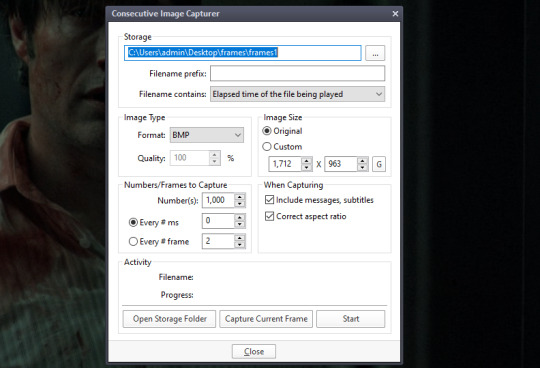
(important to turn off subtitles before doing this or they'll be captured on the image too)
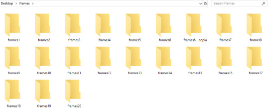
the folders i save it to -> i created a bunch of frame folders that i fill up since the way frames load in my photoshop require me to load an entire folder into it. so i capture an entire gifset's frames into one folder and then load up the entire thing
press 'start' on the consecutive image capturer, then start playing the video (best to mute it since the video might start playing slower), wait until the part you want to gif is over and stop the video, press CTRL+G again to stop the capturing
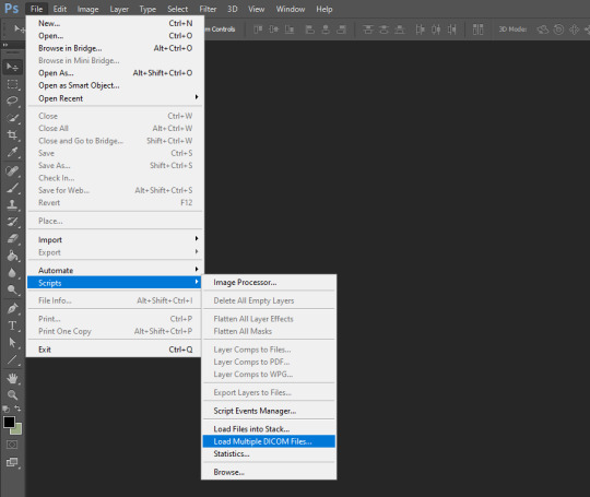
2. photoshop
depending on your photoshop you can either 'load files into stack...', which opens up a folder and you can manually choose which frames you want to load, or 'load multiple dicom files..." (what i have to do), where you select an entire folder to load its contents into photoshop
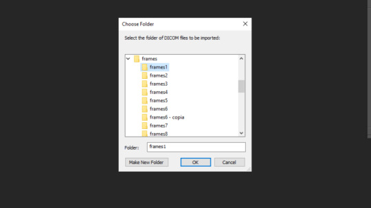
once you do either of those things, you got this
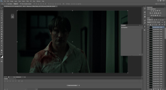
now click 'create frame animation' on the bottom
now we click on the three bars and 'make frames from layers'
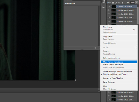
!! if you loaded up frames with 'load frames into stack...' at this point you also have to click 'reverse frames' since they load in reverse order with this method for some reason
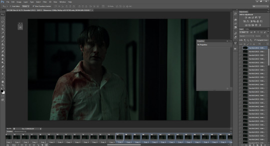
now we got our frames on a timeline and delete anything you dont want in your gif. if you have frames for multiple gifs on the timeline, go to image > duplicate and duplicate for however many gifs you got and delete the unnecessary frames from each one
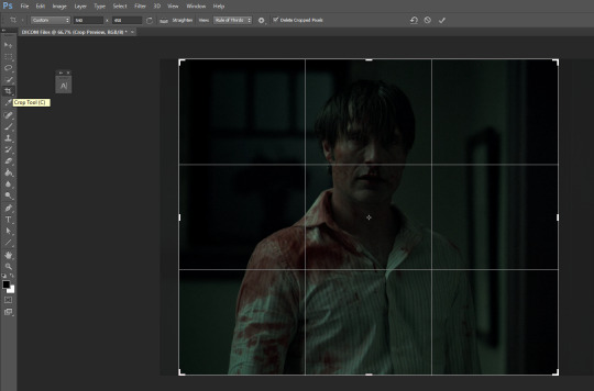
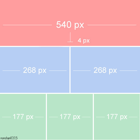
crop tool, type in dimensions up top (in accordance with tumblr's dimension graph, so if you want a wide gif like the one on the top of this post keep it 540px). i usually crop my gifs to between 540x400 and 540x500. once centered on how you want to crop, press enter or double click on the image to crop
press ALT+CTRL+I or go to image > image size... to resize
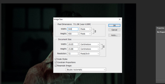
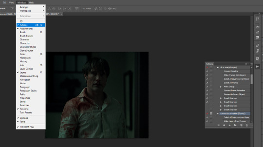
open the actions tab if you don't have it already open, go to 'load actions...' and find where you saved the sharpening action you downloaded from the top of this post
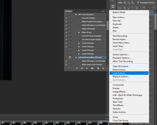
i only use "all in one (sharper)" and "convert to animation (frames)", but unchecked the "canvas size" option on the latter one since we resized the gif ourselves
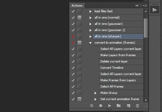
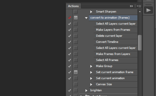
select 'select all layers current layer' on the action (the other steps we already did) and press play
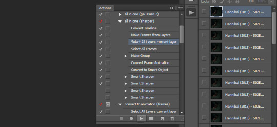
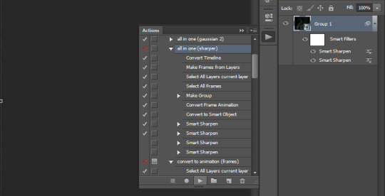
our gif frames will turn into a group so now go to "convert to animation (frames)" and press play again
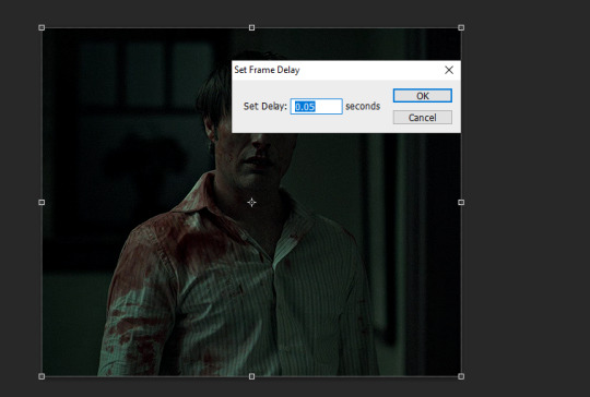
this will pop up at the end, leave it at 0.05 (maybe 0.06 if the gif is going too fast)
if we were to export the gif now it would look like this
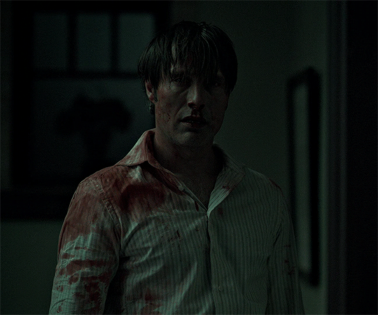
now comes the coloring, which is personal preference. the reason i chose hannibal for this gifset is to show the white balance tool that works great in tinted scenes
open a 'levels' layer and selected the bottom eyedropper. then click it on a place on the gif that should be white but isn't (i clicked on hannibal's shirt collar). the gif coloring will change accordingly
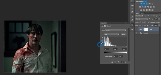
then pick the top eyedropper and click on anything that should be black but isn't (you can click on multiple places and see how the color changes, keep trying until you find one that looks good)
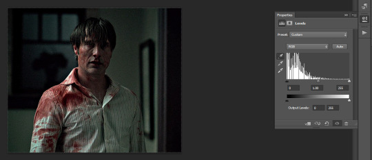
the coloring difference with just those two clicks
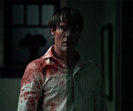
and then the coloring is up to you, i usually just add more levels layers and color balance
here's all of the layers i applied to color this
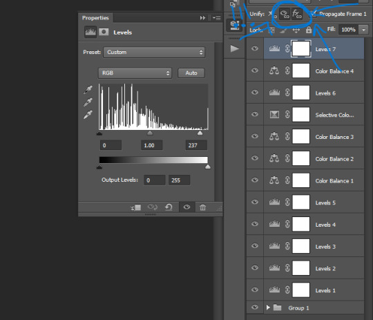
VERY IMPORTANT to get into the habit of selecting those two thingies on each layer you apply (on the subtitle text layer select all three) so that the coloring stays the same on all frames
difference
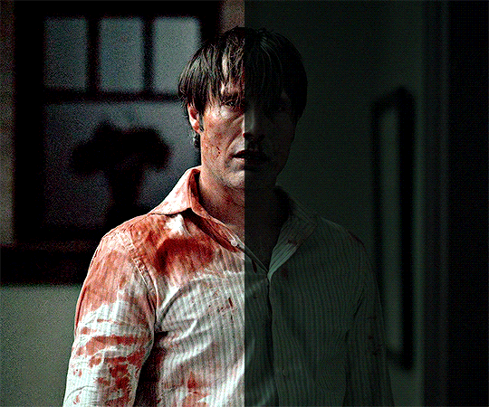
+ subtitles settings using the text tool
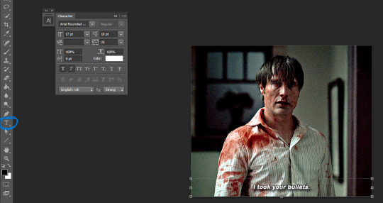
shadow and stroke to make your subtitles readable
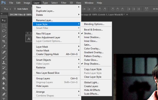
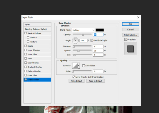
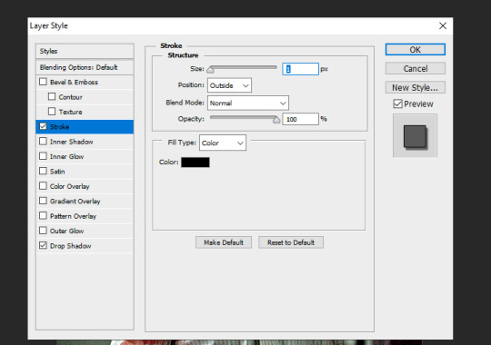
saving the gif. click ALT+SHIFT+CTRL+S or go to file > save for web... here are my settings
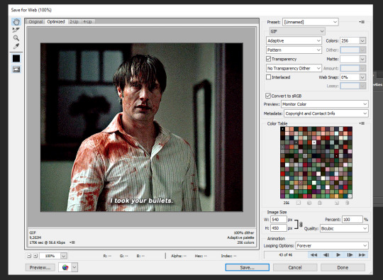
that's it
358 notes
·
View notes
Text
TF2 MERCS IN THE ANIMAL CARE INDUSTRY BECAUSE WORK HAS BEEN MAKING ME SAD
scout: scout is new to the industry. a year at most. the fastest bather you could find in town. doesn’t want to start his own business, so works for a mom and pop shop. personality hire, but he’s getting better and better every day. has no interest in learning how to groom, though. he doesn’t have the right eye to make an animal look good.
soldier: soldier is more likely to be an owner of a very blank salon that he rents out booths for individual groomers. only takes enough from the money pool to maintain the building. doesn’t really care what goes on otherwise. his tenants LOVE him, because any issue is solved within 48 hours and they can do whatever they want as long as they take care of the place. handles sharpening because he knows the sharpener.
pyro: runs a luxury doggy daycare; and is VERY serious about the job. is up almost 24 hours a day during holiday seasons taking care of up to 30 dogs a day. has a handful of full time, live in employees, but they get so nervous when they’re not there they just stay at the daycare all day, watching. loves their employees. pays like, double the average wage as a start, because pyro expects nonstop work. consistent raises and bonuses, AND pizza parties.
engineer: a man of many hats. is actually a farrier. but if you got a sheep that needs shearing or something that needs to be tinkered with or a blade that needs sharpening or a dog that just needs a bath and nail trim he’s also your man. is the ONLY LICENSED AND CERTIFIED SHARPENER IN THREE FUCKING STATES. busy, busy man. soldier sends wealthy business and hearty workers his way in exchange for a monthly sharpening for his little shop. they’re friends, and soldier has always been a man of his word, so of course he agreed.
heavy: specializes in extra large dogs. 70 pound minimum to book with him. he runs a one on one fear free grooming experience called “Giant Spaw For Giant Dogs”. his website to book an appointment is full of pictures of him holding these massive dogs like they’re puppies. he’s smiling so wide in each picture. heavy loves dogs. has numerous certifications. is dog cpr certified. regularly attends dog shows. his salon is BEAUTIFUL. sleek, modern, lavender and navy theme. you enter and the reception area smells… so good. charges an arm and a leg though. but he sends you like… pictures of your dog on photoshopped backgrounds. it’s so worth it, his clientele is DEVOTED to him. one time he got sick and had to cancel his appointments and one of his clients broke down on him, praying for his health over the phone.
demo: demo is the best worker in the state, and he cycles through salons and clinics often based on where he’s needed. every business wants him so bad when they don’t have him. is getting paid VERY well to do what he does best. enjoys the process of bathing a dog without the stress of the haircut. fast, efficient, able to juggle multiple groomers as ONE bather. he’s a vital asset to any team he’s with, and he doesn’t even need the money. also likes working kennel. will help pyro during the holiday season for a break.
spy: i have two ideas. spy either has like, celebrity clientele, or spy exclusively grooms cats. requires his clients on a monthly schedule either way. his salon is also one on one quiet luxury pet care. brown and cream colored salon. never remembers to take pictures of his work. to book with him requires prepayment. website is sleek, and his portfolio is sorted by breed. doesn’t ask what anyone wants done on their pet, just does what he thinks is best. they always come out stellar. even his worst grooms are westminster worthy. has a wall of pet colognes and finishing sprays.
sniper: sniper is a mobile groomer and his business is called “Come Wash My Dog”. fast, efficient. doesn’t do anything fancy on any dog, and charges accordingly. does keep bows and bandanas to put on his favorite clients. likes terriers. occasionally gets caught up talking to his clients. it’s like his human interaction for the day. don’t come up to him making any requests, he is very frank that he is not one of them fancy groomers. he gives the dogs a trim if he can. that’s why his prices are so low.
medic: see, medic might make a really bad and unethical human doctor. but i think he’d make a phenomenal avian veterinarian. i think if medic became a veterinarian he would be a much different, much more ethically fulfilled man. known for his passion and dedication to the job. practically sleeps in his office so he is on call, at all times. probably wouldn’t have interest in tending to anything past the birds, but because he is known as one of three exotic vets in the state he’ll occasionally see reptiles and rodents. only has passing thoughts of joining an illegal pet trade, but he loves his job so much. he couldn’t forgive himself if he squandered it. keeps every feather that falls off his clients, and keeps them in organized files. when a client dies, he’ll give them the feathers and keep one for his clinic’s gallery wall. has a clinic cat because he thinks the irony’s funny. much more at peace with himself. at his worst he’s like house but with birds and without the drug addiction.
#team fortress 2#team fortress two#tf2 demo#tf2 demoman#tf2 engineer#tf2 heavy#tf2 medic#tf2 pyro#tf2 scout#tf2 sniper#tf2 soldier#tf2 spy#tf2#no bc why where i live is there only ONE SHARPENER who tends to like THREE DIFFERENT STATES#WHERE ARE ALL THE SHARPENERS#WHERE DO I TAKE THE CLASSES TO BECOME ONE#thanks for appreciating my hcs if you got this far!
85 notes
·
View notes
Photo
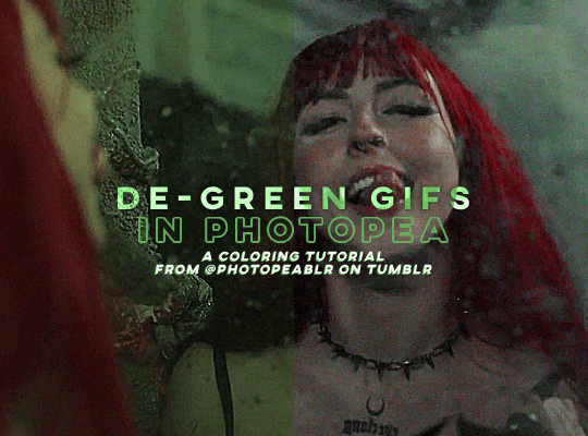
DE-GREEN GIFS in photopea — a coloring tutorial by kai at @photopeablr
howdy everyone! i come bearing another gift of a tutorial, as i’ve seen people run into this problem many times of giffing subjects being... incredibly difficult to de-green.
this tutorial requires:
photopea (free online photoshop)
basic giffing knowledge (check out our gif tutorials tag if you need to!)
with all that out of the way, let’s begin!
so first thing’s first, we need to get our gif loaded into photopea for us to start with. here’s a screenshot of my gif after i loaded in all the frames and cropped it to the size i wanted (540x400):
from here, we can start coloring! for those of you who haven’t read my coloring tutorial from a couple years ago, my method is more or less very similar to how it was back then. i still do the layer > adjustment layer > brightening/contrast step (though for this gif, i changed the opacity of the layer to 30%) and the layer > adjustment layer > levels, which i have set to these numbers in the pop up:
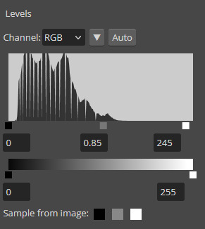
and doing all of that leaves us with our gif looking like this:
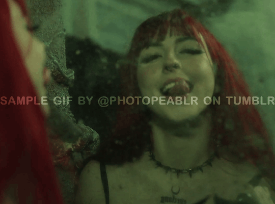
(i know the difference is very minimal but this tutorial is an entire process, give it a minute lol)
but now we get to the fun part: getting rid of that damn green filter.
in my original coloring tutorial, i used a channel mixer layer because i was following a method similar to this tutorial. while that tutorial is great for yellow-tinted scenes (i still use that method to this day), over the years, i realized that it wasn’t as great for green-tinted gifs. this is how i started to play around with another adjustment layer known as color balance.
color balance does exactly what it sounds like it does: it balances the colors of your gif. since we’re trying to balance out all the green that’s happening in this gif, it makes sense to use this adjustment layer. go to layer > adjustment layer > color balance (visual below):
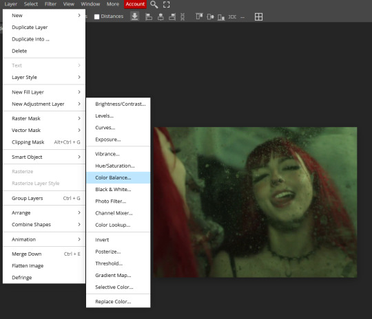
and you’ll get a pop up similar to the channel mixer adjustment layer, but just a bit different. this part of the tutorial requires for you to play around with this adjustment layer—the settings that you are going to use for any gif you make are gonna be different no matter what you’re giffing, so play around with the different settings to see how they mess with the colors of your gif until you get something that neutralizes the green for the gif you’re working with. for my gif here, these are the settings i used for the shadows, midtones, and highlights:

and in doing so, now my gif looks like this (with a before/after):

we’re only three adjustment layers in and it’s already MUCH better than what we had. color balance tends to do most of the work for us in getting the green filter out, so now we can do the rest of our coloring process (whatever that looks like for you) to finish the gif. here is the fully colored + sharpened gif:

and that’s it! a simple tutorial, but it’s immensely useful when giffing with weird green-toned scenes.
a couple things before i stop this tutorial: in some cases, sometimes you’ll need to combine a color balance layer with a channel mixer layer, but (at least in my gif experience) that’s few and far between. color balance is more or less the only layer i really need to use when trying to get rid of green tones, but sometimes scenes need a little extra touches with the channel mixer layer to help neutralize the gif a bit more so it’s easier to color later on in your coloring process. but, again, those are few and far between.
no matter what you’re giffing, color balance is a great base layer that you can build off of with other adjustment layers and should really help out in making that gross green filter go away!
#photopea#photopea tutorial#photopea gif tutorial#photopea tutorials#coloring tutorial#coloring tutorials#gif tutorials#gif tutorial#*#*kai#*tutorials#resources#usergoose#userheartbreak
46 notes
·
View notes
Text

HOW TO: Make an iPhone Layout + Downloadable Template
Hi! I've gotten a few messages asking for a tutorial on my iPhone gifsets — but instead of only doing a tutorial (that would probably be triple the length this one already is), I decided to turn my layout into a template with all the bits and bobs! In the "tutorial" under the cut, I'll share everything you'll need, a free template download, and quickly go over how to use this template. :)
Disclaimer: This template uses Video Timeline and this tutorial assumes you have a basic to intermediate understanding of Photoshop.

PHASE 1: THE ASSETS
1.1 – Download fonts. These are the fonts used for all assets I've included in my template: – SF Pro or SF Pro Display (Regular, Medium, Bold): Either version works, they look nearly identical. You can download directly from https://developer.apple.com/fonts/ or easily find it via Google – Bebas Neue: Free on Google Fonts, Adobe Fonts, and dafont – Times New Roman (Bold): Should be a default font in Photoshop

Make sure to download and install any of the fonts you don't already have before opening my template. That way, once you open the template file, all the settings (font size, weight, spacing, color, opacity, etc.) are as intended.
1.2 – Download my template. Before you use my template, all I ask is that you don't claim or redistribute it as your own and that you give me proper credit in the caption of your post. Making these iPhone gifsets takes me a longgg time and turning this layout into a template took several hours too.
DOWNLOAD TEMPLATE VIA KO-FI ← This template is completely free to download (just enter $0), but if you feel inclined to tip me, I appreciate you! 💖
BTW this template also includes some of my frequently used icons!
NOTE: If, for some reason, you open the template and see the pop-up shown below, click "NO" — otherwise, the fonts will be all messed up:
And if you see this triangle with an exclamation point by a text layer, don't double-click it — it'll mess up the font as well:

PHASE 2: THE GIFS
I'm just going to briefly go over gif sizes and my recommendations. Also, keep in mind when grabbing your scenes, you'll want all of these gifs to be the same amount of frames.
2.1 – Background Gif: 540 x 540 px. I recommend this size so you have a good amount of visibility for the gif behind the iPhone wallpaper. I also recommend making this black and white (or in my case, black and white with a slight blue tint — idk I just like the way it looks) so the wallpaper coloring can stand out.
2.2 – Wallpaper Gif: 230 (w) x 500 (h) px. Keep in mind the very narrow dimensions of the wallpaper! And also keep in mind that you'll have a bunch of apps and widgets covering the image. I try to use wide shots (or layer my clips into looking like wide shots). Also, keep in mind your color scheme for your set and your character's aesthetic! I tend to focus on one or two colors for the wallpaper.
I usually position the wallpaper to the side with 20px bumpers, so there's lots of space to see the background:
2.3 – Large Photo Widget Gif: 201 (w) x 96 (h) px.
2.4 – Small Photo Widget Gif: 94 x 94 px.
PHASE 3: THE TEMPLATE – "IPHONE" FOLDER
In this section, I'll try to quickly walk you through how to use this template and some bits that may require extra instructions. I'll be going through each folder from top to bottom.
3.1 – Status Bar. Time, Service, and WiFi are pretty self-explanatory. In the Battery folder, you can use the shape tool to adjust the shape layers labeled "Fill (Adjustable Shape!)" to customize the battery level.
3.2 – Message Notification. Again, these are pretty self-explanatory. I've already masked the circle for the contact photo, so you can simply import any photo and use the transform tool to shrink it down. The circle is 24x24 px. If you don't want to use a photo, there's another folder called Default Initials.
If your message text can't fit the text box, the message should end with ellipses which is how iOS caps off long texts.
3.3 – Blurred Banner (IMPORTANT) This folder is easy to miss because there's only one placeholder layer in there. On iPhones, the area behind a banner notification and the dock get blurred (including the wallpaper and any apps).
What to do: Make a duplicate of the apps in Row 1 and/or widgets that intersect the message banner, convert them all into one smart object, apply a Gaussian Blur filter (Radius: 3.0 pixels) on the smart object, and move the smart object into this masked folder!
(There's another masked folder in the Wallpaper folder for the dock which I'll go over in that section.)
3.4 – Apps Turn off the yellow guide if you don't need it to keep things aligned and turn off layers you don't need by clicking the eye icon. Replace the "App" placeholder text with your app name, change the color or gradient of the square to compliment your color scheme, and add your custom app icon overlay!
If you can't find an app icon you need from the ones I provided, flaticon.com is a great resource. Also, if you can only find the filled version of an icon, check out this tutorial for how to make any text or shape into an outline.
Also, each app folder has 4 notification bubble options (1-4 digits). Again, you can toggle these on and off as you need!
3.5 – Big Widgets I like using these when my wallpaper has A LOT of negative space to fill. I included the Photos and Books widgets in my template, but there are lots of widgets available on iPhones. You can check some of the other ones I've done here, or if you have an iPhone, simply try adding some widgets to your phone!
There are also widgets bigger than these, but they would take up half of the phone screen which is why I don't use them for these edits.
3.6 – Small Widgets The only thing I'll say about these — because they're pretty straight forward — is there are a lot more weather themes than I included in my template. Also, if you set your character's phone to evening, the weather widget will show a dark background (sometimes with stars), so keep that in mind.
Speaking of, I've included Light Modes and Dark Modes for, I think, every applicable widget.
3.7 – Page Dots These barely perceptible dots indicate that your character has more pages of apps than shown in your gifset (so if an anon tries to come at you, you can just say "it's on the next page of apps" /j /lh)
3.8 – Dock Again, the dock has notification bubble options and I've included the default app designs, custom filled designs, and custom outlined designs for iMessage, Phone, Email, and Safari (there's also a FaceTime alternative if that's how your character rolls). These are usually the apps people keep in their Dock, but this is fully customizable too. So, if your character is, like, super obsessed with Candy Crush or something and needs it in thumb's reach — you can put it in the dock.
3.9 – Wallpaper This whole folder is masked already to a 230x500 px rounded rectangle.
Inside, you'll find another "Blurred Portion" folder for the area behind the message banner notification and the dock.
What to do: Duplicate your gif layer and place it in this folder, remove any sharpening filters, and apply a Gaussian Blur filter (Radius: 3.0 px). Be sure to add any coloring/adjustment layers ABOVE this folder and your original sharpened gif layer.
PHASE 4: EXPORT
We made it!
I hope this template makes it super easy for you to recreate this layout! If you decide to try it out, feel free to tag me with #usernik.
If you notice anything wonky about the template, kindly let me know so I can fix it! And if you have any questions about how to use this template, please don't hesitate to send me a message! I just ask that you try to be specific in your question so I'm able to answer you the best I can!
#gif tutorial#completeresources#userpickles#usersmia#userabs#usertreena#alielook#userkosmos#usershreyu#userzaynab#tuserabbie#useryoshi#usersalty#tuserlucie#usernanda#userelio#userhella#usercats#gfx*#resource*
967 notes
·
View notes