#I DID keep a lot of the techniques from the tutorials in mind
Text
Most of my photos were from 2012 to 2016. I have learned a lot since then. My photo restoration hobby has improved my image editing skills in general. And I was curious if I tried editing one of my photos from scratch if I could improve upon my original edit from years ago.
This is my friend Nicole.

( @nicolebelongs I hope you don't mind being my guinea pig for this.)
This is just a direct output of the original RAW file. RAW files are typically flat by nature so you have more latitude when processing and editing.
This is my original finished edit from 2016.

I actually made a pretty big lighting mistake when shooting this photo. A beauty dish can cause harsh reflections on makeup and so Nicole's forehead bounced all that light directly into my camera. I was still learning back then and didn't know anything about makeup. All that was required was angling the dish a few degrees up or down, which feels like a pretty silly mistake all these years later.
And here is my 2023 edit. I did not reference the 2016 image until after I finished.

The main priority was the glare on the forehead, but I think this is much more balanced overall as well. I also tried to fix the weird neck shadow and the lack of light in the eyes. I probably should have used a reflector originally, but thankfully Photoshop has a solution to almost any photography blunder. I removed some vellus hairs on the edge of the face, as that is not something you would notice in real life, but the camera and lights can exaggerate them. I'd also like to say I love the new remove tool. Getting rid of flyaway hairs was such a monotonous pain in the ass before and that thing just zaps them with a click.
I am also trying to learn new editing techniques I was never good at. There is a retouching technique called "dodging & burning" that I had trouble with back in the day. Mostly because finding advanced tutorials can be difficult. Much of the content on YouTube focuses on beginner techniques.
Dodging & burning was originally innovated by Ansel Adams back in the days of film. He would block portions of his negatives for a second or two so those areas would develop darker. Or he would let sections expose longer so they would be brighter. It was basically analog Photoshop. You can see a neat video of his darkroom here.
While Ansel mostly did landscapes, portrait photographers of the digital age utilize dodging & burning to help bring out dimension in the face. It's quite similar to makeup contouring, actually. It is very hard to perfectly light every nook and cranny on a face and many portrait lenses are slightly telephoto. Longer lenses compress faces to remove distortion, but you end up losing three-dimensionality as a tradeoff.
My first attempt dodging and burning did not go well but I played with this photo for a few hours trying many different approaches and I think I landed on something I like. But I have been staring at it for way too long, so it is hard for me to look at it objectively.

I do wish we could all look at this on the same display. Green is notoriously difficult to keep consistent from screen to screen.
In any case, there are a dozen subtle things I did with my upgraded knowledge that may not be noticeable individually, but I'm hoping it all adds up to a better finished result.
And I guess we'll see if there is a consensus regarding the dodging & burning. Either good, bad, or just... different.
89 notes
·
View notes
Note
How do you sketch & render your clothing folds, if i may ask? They look very pretty!
I am the least qualified person to give a tutorial but sure let's do this.
No I'm a self taught artist so a lot of this is just me using the good ol' "Fuck around and Find out" technique. So the example I'll might not be the best but it will give a general idea.
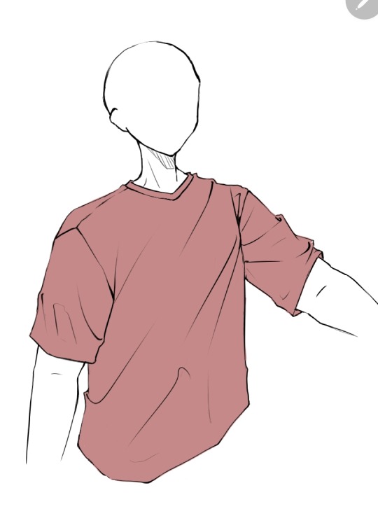
First you get your sketch/lineart + flat color. As you can see I've already drawn the fold lines. It's best to know where the shirt is getting pulled more from because that's the general direction that the folds start from and where fore folds are.
Next, on a clipping layer, I just draw with a darker color the places that will be shaded with a watercolor brush or pencil brush, just a brush that kind of fades works. This doesn't have to be accurate coloring it can be just messy blobs. But always keep in mind were the light is hitting the shirt so you'll know which direction to draw the shadows bigger and darker at
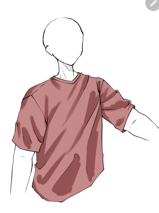
Than with a soft eraser I start erasing the shading and fixing it by going back with the brush. This is a lot of back and forth between the eraser and brush until you get to a point where it looks good in your eyes (i lowered the opacity a bit here because I thought the shade color was too dark)
(Note: during more detailed drawings I like to go in with a darker shade color at the deepest corners for more depth and detail)
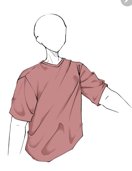
On a new clipping layer, by using an airbrush or the gradient tool, with the same colour I used for the shading, I darken the top and bottom. Why? Because it looks cool idk.

And usually that's where I leave it but sometimes I might add a lighter color for some lighting on the cloth by using the same steps as for the shading, this may depend on the fabric you imagine the clothes have. Or I've seen some people airbrush the parts of the outfit near the skin and that gives off a cool effect too
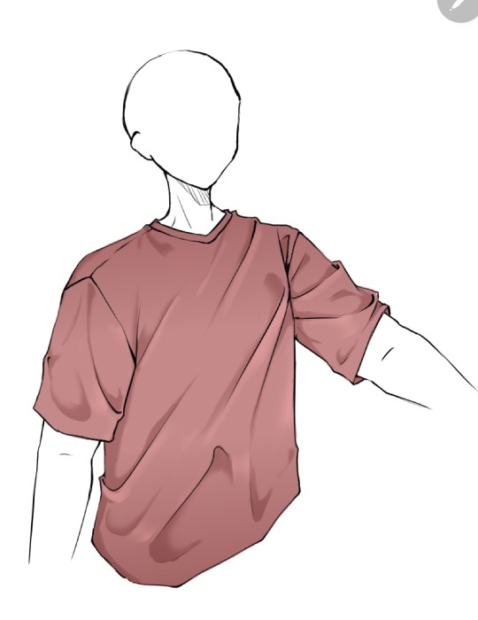
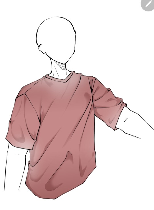
Now as you might have noticed this is the ugliest shirt ever. And that's because I did this in 10 minutes from my ✨️imagination✨️. Usually I have reference pics when drawing which give me a general idea of how the folds should look like and that is a life saver. This was just to give a general idea of how it works. Here are some examples of actual good shading I've done
Hope this helps👋✨️
#mura answers asks#shading#shading tutorial#art tutorial#digital art tutorial#digital art tips#digital artist#digital drawing#digital art#artist#artist on tumblr
30 notes
·
View notes
Note
Do you have any tips on how to draw different poses? Any kind of movement just fucks me up so bad 😭😭
hoo boy poses! an eternally difficult frustrating teeth clenching jaw aching part of drawing 🤩 JK but i def get where you are coming from. i was trying to think of the best way to reply to this and just ended up making a whole step by step of my process LOL
BEFORE WE BEGIN THOUGH i should mention that i am NOT a professional, nor have i learned these techniques anywhere other than the internet and so there's obviously room for improvement and this is not the end-all-be-all, just how i personally draw poses ATM.
now with that out of the way! keep reading for my tutorial on posing :D
i figured the best way to show this would be to take one of my old drawings and repurpose it. so:
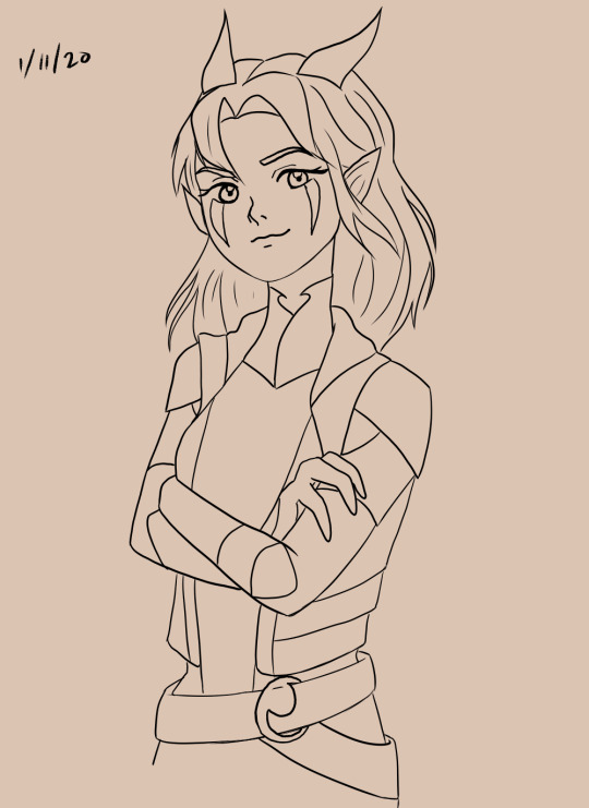
rayla. january 11 2020 rayla. she looks a lil smug maybe? a lil confident? her arms are crossed and her head is kinda tilted and her expression seems that way, but all in all it's kinda grey. this is the first thing you should do when making a pose for your character:
what is your character feeling?
define it clearly. are they angry? close their pose up, cross their arms. happy? open it up, give them big gestures. lazy or tired? slouching, etc. posing is pretty much just body language so figure out what you want your character to say when they aren't speaking.
now i'll just show what the base sketch for this drawing looks like:
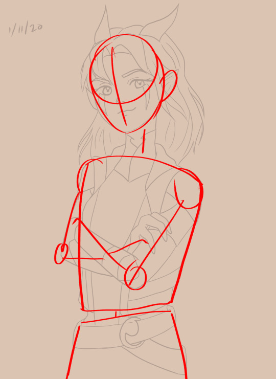
that's fine and all, the building blocks are there, but now i'm gonna redraw it and show what i would do differently now:
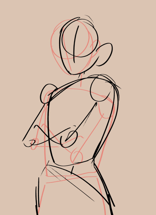
what's different about this sketch from the first one? three main things which i will break down!
The Lines
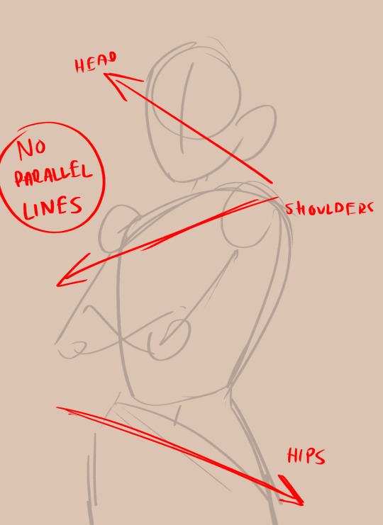
when i say "the lines", i mean the horizontal lines of the body if that makes sense? i'm sure there's an actual term or something, but basically, the parts of your body that can tilt. don't make these parallel! that can end up making the character look unbalanced and unnatural, or stiff if the lines are just flat. in the 2020 sketch, they aren't parallel, but they aren't exaggerated either. the more you exaggerate the differences in your posing, the more dynamic it will look. so in this sketch, i've exaggerated them more. gotta make rayla look real cocky yk
The Blobs

when i used to sketch bases for my characters, it would be a bunch of boxes and rectangles connected by sticks. i stopped doing that and it helped. human bodies are soft and squishy and curvy, we aren't robots with metal edges. drawing the base shapes as blobs personally helps me with getting rid of stiffness in the pose. lots of ppl make the boxy method work though, so if that's what you wanna do, by all means.
another thing i noted is "forget about the limbs". limbs are basically just branches, so if you get caught up in drawing them before their foundation (torso + lower half) is down, it could look wonky. get the basis down first, and then go on with the joints and limbs.
The Line (Singular)
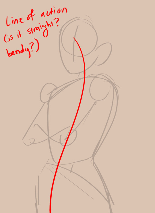
AKA the line of action, which is a very popular term + method for posing. this is basically a line that runs down the spine, and the more bendy/curvy it is, the more dynamic your pose will look. tbh in the sketch i did right now it's not very action-y, but rayla is also just standing there, so if you want to do a fighting pose or something similar make sure the line of action is hella curved. even for stationary poses though, a little curve is helpful.
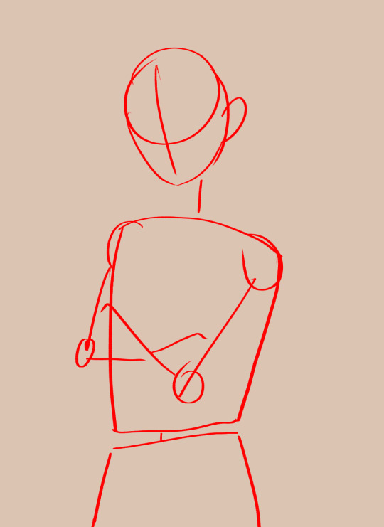
so! with these things in mind, i redid (extremely very roughly lol) the drawing. let's see the difference:
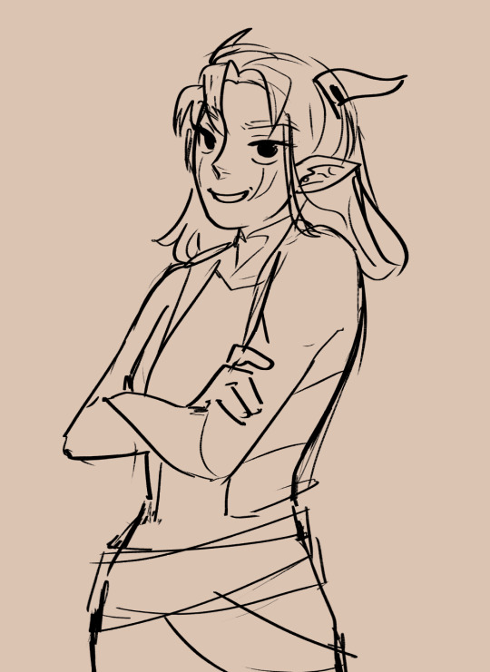
eyy hows that? she looks a helluva lot more arrogant! lol jk. but we can definitely get a better grasp of her character from the first image than the second. ofc there are other factors at play here like line weight and expression, but nevertheless, a few small tweaks go a long way.
anyways this got kinda long but i hope i could be of help!
134 notes
·
View notes
Text
Finished playing 358/2 Days! Needless to say, I now understand Xion's deal. The only thing that I raise an eyebrow at in terms of confusion was what Xion was to Sora and the nature of her design. I'll touch on the latter first, as the former is moreso story analysis from me and becomes more rambling.
How was it exactly that Xion was able to slowly sap memories of Sora's? In my understanding of Replica Riku's functioning, he was injected with Sora's (Edit: Riku's memories, I recall, albeit still tampered by Naminé) memories as per Naminé's influence. However, it seems Naminé had no power over Xion, leading me to wonder how the memories were given to her in the first place. Was it purely because of her being around Roxas, who has Sora's memories, that she was unknowingly able to do so? I could believe that she was created with an inclination towards such a function that then kicked into gear upon exposure.
As for "what Xion was to Sora," Riku says to Mickey that she has Sora's memories of Kairi (which, I'd like to mention, Riku believes were those "most precious" to him. I found that telling, especially considering how avoidant he was of Sora in the following game chronologically, KH2. I don't believe he considered himself important to Sora following his actions in the previous games, poor guy. Roxas' dream/memory of Sora being left behind by Riku and co. in Hollow Bastion where he cried upon waking says otherwise, regarding how much Riku's opinion means to Sora. I digress.) Naminé adds onto that by telling Xion that he views her (through Roxas, I assume) as he remembered Kairi. This is further demonstrated by Xion, in her imaginary sequence with Roxas, her, and Axel in Destiny Islands' Paopu tree sitting in the places of Sora, Kairi, and Riku accordingly. However, there's much more to Xion than JUST Kairi. If she just had Sora's memories of Kairi, there would be no reason for Roxas having his entirety sapped by her, first of all. Xion was taking much more than things regarding Kairi, from anything like Sora/Roxas' battle techniques, to memories of happenings in other worlds, things like keyholes and whatnot. That's not even to mention that SOMEHOW, Xion, and I would then assume also Sora by proxy, had memories of Riku's confrontation with Zexion in his portion of CoM! Double that with the fact that although her hairstyle was similar to Kairi's, she has Sora's eyes, and a grayscale (since it's black) hair coloring like Riku, and she's more like a combination of the trio of Islanders. Which would make more sense and be less reductive than just: "Xion is everything Kairi to Sora," because just that would write out a lot of other stuff Xion took, too.
Anyway...
That fever dream sequence was so interesting?? The fact that that scene from CoM was re-highlighted by the 358/2 Days story as important has me boggling my mind. Why is it that Xion widened her eyes in surprise and shapeshifted to Sora at the part where Zexion said: "You were the one that destroyed your home!" Even though it was established in that original scene that Riku was the one who did that by opening the Door to Darkness? The intrigue? Aaaa? What could this mean?? Going insane! CoM continues to be the most important game, with the Replicas now being revisited in Days, it being the birthplace of repressed memories of Sora's and sort of kick-starting the whole thing with how memories continue to exist within the heart as feelings regardless of conscious awareness of them, the memory of Sora's that Naminé messed with regarding the meteor shower (the event and imagery that keeps getting brought up across games- it feels important) (As of writing this I have now started Birth By Sleep and once again have raised an eyebrow at the meteor shower in the opening movie and tutorial sequence), man, CoM!
So, that's pretty much everything cohesive from the top of my head. Now comes the part of this post where I generally scream about things that I can recall from the story and general sentiments:
Xigbar is establishing a theme that for every game he's in, he says something extremely intriguing at the end and then nopes out. KH2 he hinted at other Keyblade wielders and then died. This game he sees in Xion who I now know as Ventus (I yelled: "That can't be Roxas, he's wearing different clothes" upon seeing that part and surprisingly I was right, lol) and then doesn't elaborate. So curious about this eye-patched man and all the things he knows.
I WAS RIGHT ABOUT AXEL'S NAME BEING LEA! 🎊 I have no idea what Saïx was like before he became a Nobody, but this guy is a complete jackass as of now, so I don't know why he'd think he's hot enough shit to pull the "you're prioritizing your new, fake friendships over the *real* ones from before, Lea," card, because dude. Axel deserves better than your blue-haired ass. I called him so many names this game, sorry to any Saïx enjoyers. Actually, not sorry. He's mean.
When Roxas flaked out in his and Axel's expedition to Castle Oblivion, and then emerged to consciousness with a yell of "RIKU!" I laughed so much. Like... of course Sora's subconscious gut response of even slightly engaging with a Riku-based stimuli would hit so hard that even his Nobody would then emulate a teaspoon of Sora's oncoming KH2 behavior. Roxas was just like *screwed up expression* 'Where the hell did that come from.' Hah.
Speaking of sad boy Wiku who I now hold in my hands so gently, his entire interaction with Xion post fever dream was one of my favorite parts of the game. He was so immediately kind towards the Nobodies/Replicas, once again, in a way that no one else has been, not least themselves. Of course, as it's implied that Riku likely saw Sora's face in Xion's, I imagine it would be harder to be especially cruel to her, but considering his sympathy towards Roxas in KH2, I think it's just in his nature. Just...
"Do you hate me for taking your friend away from you?"
"No. I'm just... sad."
IT WAS SO SIMPLE, YET SO EFFECTIVE. GUT PUNCH. OWIE.
Added Riku note: I only now noticed in the final duel between Roxas and Riku that Oblivion, the Riku Keyblade, has the same silver crown on Sora's necklace on the end of it. 🤔 Storing this interesting information away for later...
Xion! I love Xion so much! The fact that she was ready to go down a-blazing at the end because of how she knew she was hurting Roxas? AGH. Killed me. And yet, she got so wrapped up in her sense of purposelessness without Sora that she still was ready to take Roxas down with her at the same time? It feels so contradictory, and yet it doesn't! She didn't want Roxas to suffer, and she especially didn't want Roxas to suffer and feel, as she perceived it, incomplete. And just... ah.... she wanted to give him the greatest gift she felt like someone else could give her: a feeling of belonging in identity. Except she never truly realized that Roxas had found a different answer to that question than she had, even if it turned out to be a shaky one: he found his sense of home in the loved ones around him. He never cared to learn about himself or his origins when he was with her and Axel. His diary entries repeatedly showed him forgetting to ask Xion about his Sora dreams, and repeatedly forgetting to show Axel the Winner stick, because all he could care about when being with his friends was... being with them. Never answers. He only wanted answers when he had nothing else. Whereas with Xion, she was the one who would say she wanted everything to stay the same between them, and yet she, in a conflicting manner, was the one disastifsifed without having answers, therefore driving the three of them further apart.
And MAN the Winner stick with Axel! When he pulled it out of the envelope at the end of the game... ouch. I personally wonder if Xion was the one who gave it to him, considering between grilling Axel for answers and then escaping the castle, I didn't see any off screen time for Roxas to have given Axel the stick. However, in the in-between time of Xion being apprehended by Xemnas and fighting Roxas, there's definitely a window of time where Xion could've given the slipped the Winner stick to Axel, perhaps as a final attempt to reconcile him and Roxas. I personally found that thought so affective that unless there's a canon alternative, I've accepted that as my headcanon. It's definitely something I could see Xion doing and man, I love her. I have hope about Roxas being able to reemerge from Sora somehow down the line, but Xion? What with no one even remembering her and being a blank canvas of an individual to begin with, I don't have as much hope for her. I want to, but... :(
Lastly, poor Axel being stuck in the middle the whole time. That scene where he told Xion that 'he was the one who would always bring her back' rendered my soul vulnerable as all hell. That was the closest I got to crying, honestly. His voice actor perfectly exuded that angry, torn up feeling of trying so hard to help someone who doesn't want to be saved, despite everything. That line perfectly encapsulated Axel's struggle of being stuck in the middle this entire game series. Being a double-double agent in the Castle Oblivion mission. Knowing his previous life, and trying to appease the connections he has in this one. Trying to make it good in the Organization. Trying to find his own freedom. Trying to be a good friend to Roxas and Xion, even when he knows they're destroying each other. He just felt so helpless by the end of this game, seeing how despite trying so hard, despite saying the things he was meant to and keeping quiet about the things he wasn't supposed to, he ended up losing everything it was all for, in the end. By being too careful, he was left scorned and abandoned by the only things that mattered. I bet he wished he would have said "I would miss you," more than he did.
All in all, really interesting experience playing a game I knew was gonna end badly since finishing KH2, all while still becoming invested regardless. It was like reading some sort of old tragedy. I think the KH strategy is to confuse you just enough that you get invested by your attempts to understand the plot, therefore trapping you into becoming emotionally invested, as well. Good plan, writers. I'm taking notes. Another compliment to the writers, I've not found KH's dialogue bad, but it's not stood out to me a bunch for the most part. This game had some really good dialogue writing though, in my opinion. Liked it a lot.
Like I said, I've now booted up Birth By Sleep, and already have my head abound with theories and questions and- Xehanort's old now? I thought this was a prequel! Luke Skywalker is a Keyblade Master mentor? Why does Terra enunciate in lowercase? Why does Roxas look like Ventus? Okay, I do have a theory for that one, given the intro...
I restarted my playthrough after starting as Aqua, because I quickly realized doing so was going to make the story seem very disorderly. Stay tuned for my continued documentation of my KH journey! I'm healing post-358/2 Days by playing KH monopoly in Birth By Sleep's Command Board minigame, lol.
28 notes
·
View notes
Note
Hi, first off your art is absolutely stunning, it’s quickly taking over the “Bobs Burgers” folder on my phone. I love your art and your improvement is absolutely phenomenal, do you have any practices or exercises you did to improve your art skills? Thank you!!! 🍔
hi and thank you!! that genuinely means a lot! i’m honored to have my art taking over your bob’s burgers folder lol.
also yeah! i actually do have some methods that i used that really helped me improve my art! idk how much it shows but lately i’ve been trying to add more dynamic and perspective into my art! the help i got from getting that skill was through using the “box method” -
i don’t know if that’s what it’s actually called but it helps me build the body into placement when working with different angles. it’s also helpful to break down poses or whatever you want to draw into simple shapes- i learned this from watching a LOT of ethan becker’s tutorials since he’s worked in the animation industry and understands how to work with poses.
a more personal and not *widely* talked about practice that i’m actually kinda surprised about is that, i never draw in one style. and what i mean by this is, i’m not talking about artists who have like two or three artstyles based on mood or whatever; i draw in LOTS of styles that are not my own.
it doesn’t matter if it’s not perfectly accurate or by any means good at first, but it’s a great way to identify shapes in different molds of drawing. and it also helps you build on your ACTUAL style in the process and imput all the things you like seeing in others art into your own! however this is probably only a helpful trick if you’re more confident in your skills regarding basic anatomy and such. you don’t need to be a realism artist but if you struggle a lot with certain body proportions or identifying shapes in art in general then it’s better to practice that before you start experimenting with styles.
also, and this is more from an emotional well-being standpoint but, i think it’s important to put yourself in a good mood before drawing too. i think lots of artists get frustrated when drawing because they feel a big lack in confidence with their skills and in my eyes this may cause some of the stagnation that occurs when trying to improve. if you focus only your love and appreciation towards your art and forgive yourself for not always getting certain things right, you’ll feel a whole lot better and your mind will be much more clear and focused when trying to work forward instead of backward. and you’ll feel a lot happier drawing in general.
so yea, those are the main things that helped me in my art progress! i hope these help you, and if not then don’t feel bad. some techniques work better on others and the best you can do is keep experimenting and to just have fun!
35 notes
·
View notes
Text
So my New Year's Revolution this year is to finish at least a big chunk of my current WIP and limit starting any new ones. My mom is aware and has been very enthusiastic about making me keep to it.
I would also like to actually document some of this so...
Here is a newly finished project
This is my first biscornu.
https://feltmagnet.com/textiles-sewing/How-To-Make-A-Biscornu
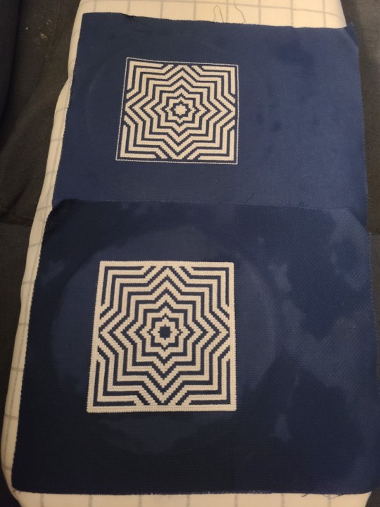
I got the pattern from this website. I didn't want to fight with designing my own pattern on top of learning the technique, so I just used the one shown in the tutorial. Though I inversed the colors, stitching white on navy instead of navy on white.
It took a lot longer than I expected (normal for cross stitch), and because it exists in two distinct pieces, second sock syndrome is a problem.
Stitching them was pretty straightforward, though my decision to use 3 strands of floss instead of 2 became annoying quickly.
The new technique of stitching them together was interesting. In the future, I would want to use a longer length to make sure the back stitch is all done in a single length. At one point, while whip-stitching, the backstitch came undone, and I had to stop and redo and make sure the ends were secure in order to keep going.
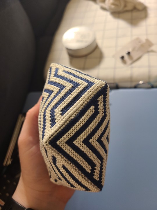
The whip stitch is pretty cool here. You can see how it creates almost a third row of stitches. I did it with 2 strands. I wonder how it would have looked with 3. (Gods I hate working with odds numbers though)
Stuffing it was pretty straightforward too, but sewing the button on and pulling it tight was an exercise in wishing I had 3 hands. Or a longer needle.
I probably wouldn't mind doing another of these some day, but... maybe a smaller one.
#cross-stitch#biscornu#sewing#pincushion#3d cross-stitch#cross stitch#x stitch#xstitch#Finish things 2023
22 notes
·
View notes
Note
your art is so amazing honestly i'm in love 😍😍😍😍
i wanna be able to draw like that too (if school doesn't unalive me istg) so may i ask how you developed as an artist? like how did you work on your technique, blending, shading and just drawing in general??
ofc if you don't have to answer! i still think your art is amazing and worth all the appreciation in the world ✨✨✨ keep up the great work, dear!!
Oh!! I'll try to keep this short - mostly an advice post on how I worked on improving
Here's one of my first cracks taken at digital art versus my most recent painting!(2018/2022)


You asked about how I developed, and my sole answer is to reference!!!
- Referencing yourself: as much as possible, when drawing humanoid things, take a photo of yourself to use as reference/find one online! The biggest mistake i made was not referring to images when I was drawing, it's also the most noticeable when you make anatomy errors compared to anything else
- Referencing other's: always have a goal in mind! Have one or two ULTIMATE artists that you want to become, no matter how impossible it will seem. (It's not! How do you think they got there?🙏) COPY AND TRACE* their art to better understand how they use guidelines and anatomy....how they draw eyes etc. You'll learn a lot!
In the same vein, include elements that you like from artworks you see online. Use every chance you get to improve and learn from another artist. Each artwork I draw has some element from another artist, whether it was the pose, how they drew hair, even the background color!
* if you reference them really closely/traced, avoid posting it or simply credit them. The above pink haired girl was referenced from Shal. E, one of my biggest inspos.
Take some time daily to get inspired and learn from others - speedpaints, tutorials and even mindsets (super important), but Don't forget to rest in your comfort zone lest you burn out..! Take time to draw something easy and happy. For me, it's drawing albedo 3/4 profile 👍
I omitted a lot - if you'd like, I'd be more than willing to share everything I know. Anyone is free to send more asks Abt this!
28 notes
·
View notes
Note
can i ask how did you make the bo wyatt doll it's so pretty 😢😢 blessed my eyes
THANK YOU SO MUCH!!!!!!! makes me happy that he makes you happy <:D i don't know how much detail you want me to go into so I wrote an entire novel srry
Actually first I will direct u to the agosia arts YouTube channel because i love her and I used her tutorials on how to make limbs with clay parts and attach button joints >
Clay doll playlist
Basic doll technique playlist
Video on sewing the cloth body
Video on attaching clay components
Video on button joints
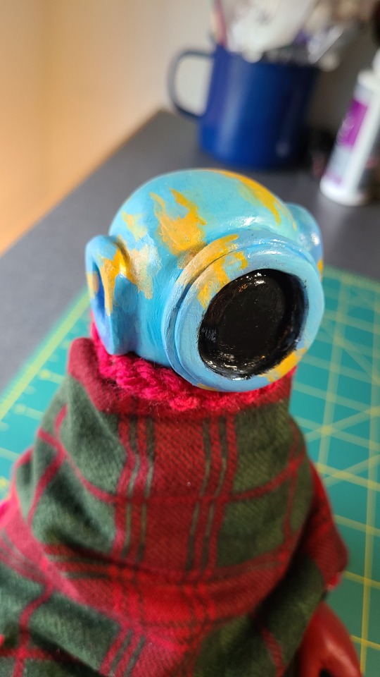
I made some adjustments to her techniques just to suit my own needs better. Also, the fabric and buttons I used are a lot cheaper than what she uses and I used oven bake polymer clay to sculpt the helmet, hands, and boots. More on agosia later
I started out by sculpting all the clay components - gloves, boots, and the diving helmet. this is a very "draw the rest of the fucking owl" moment but I cannot tell u my process w sculpting just please don't buy sculpey III that shit SUCKS to work with

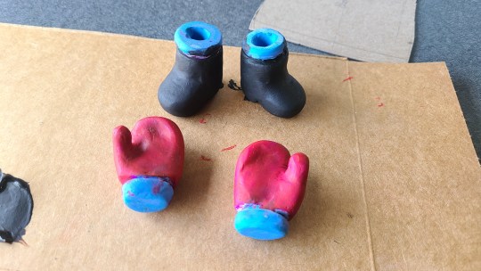
After sculpting and baking the clay parts, I sanded them down and painted them. I also gave the boots and helmet a couple or layers of folkart gloss varnish bc Shiny (i am not sponsored by folkart)
I then made a fabric pattern around the clay parts i just sculpted. I went through a lot of drafts changing the proportions of the body, length of the arms and legs etc. i laid all of my pieces out together and moved stuff around until it felt proportional.
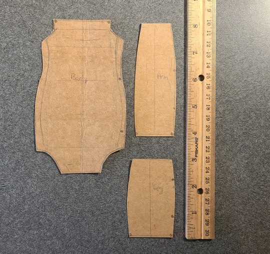
I traced the patterns onto two pieces of fabric, right sides together. the fabric for the body comes from an old t-shirt of mine. the fabric was very stretchy and it was a pain to try and draw a pattern onto it 8|
AS FOR CUTTING OUT THE FABRIC...I did what agosia did and sewed directly onto the lines, leaving open spaces at one end and one side of the pattern so the clay hand/boot/helmet what have you can be slipped in between the fabric. Keep in mind the size of these spaces so u can actually get stuff in there
anyway agosias demonstrations are great so I won't say much else about how to attach limbs, I will stress that when sculpting the clay parts, they should have a groove around them that is deep enough for the wire to sit snugly. ur basically sandwiching the fabric inbetween the wire and the clay. I also hollowed out the boots and helmet so the end of the wire has a place to hide so it doesn't poke out of the fabric. As a side note, if you don't have armature wire or something similar u could probably use pipe cleaners, yarn or a strong thread to do this. or maybe a really strong glue
Mr. bo wyatt doll does have an armature wire skeleton so he's kind of posable. You don't really need to do that, but you can use pipe cleaners/chenille stems if you want the doll to have a little bit of structure.
Here's a little diagram of how I made the wire skeleton (bc I did not take pictures at this step) the wire in each of the limbs and body are pretty much free floating which affects the integrity a lil bit

(this diagram is. Bad. so let me know if something needs to be explained a bit more)
(incoming jumpscare of bo without the shawl) After the clay parts were attached to the fabric limbs I stuffed them by wrapping scrap yarn around the armature wire skeleton and then sewed them closed. This Is Where The Fun of This Project Starts.
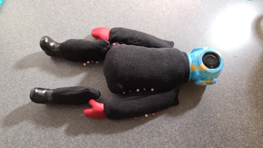
Playing a game of where I want to sew the limbs onto the body (and then realizing I made one of the legs way too short. How in the fuck)
i ended up redoing the legs entirely and just added another 1/2 inch to the length of the leg pattern.
Bo has weird proportions I don't want to think too hard about but here's what he looks w/ all his limbs pinned in place
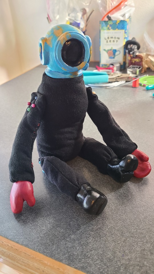
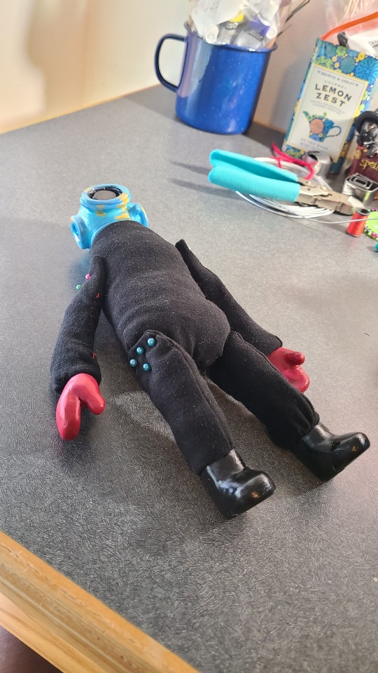
he is so top heavy help him.
I attached the arms and legs to the body with button joints (insert agosia arts tutorial on that). It was a pain in the ass bc I dont have a needle that's both thin enough to go through the button holes and long enough to go through both ends of the dolls body. But at least the picture for this step is kind of funny.

the state of my goddamn desk
Also u don't really need to do button joints its just another thing that gives the doll more flexibility. Just sew those thangs (arms and legs) on there (the body)
Ok now onto making the shawl yaaay. Yaaaaay. I looked up some tutorials on how to sew a poncho from fleece, this one was helpful to me. I did not measure the circumference of the helmet bc that would have ended up with a neck hole that is way too big, but I did measure the circumference of the base of the neck and used that. And also sewed a button to the back of the shawl so it would be easier to put the shawl on the body.
I also did not feel the need to add a hood, but I did line the shawl with a blanket stitch w red yarn. I may add tassels onto it eventually bc it is the cutest thing in bo's design. To Me. Also I will mention that bo's shawl is still a work in progress, it came out waaay too wide so I have it pinned back until I have the time to make adjustments 8|
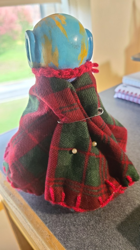
Going off of the video I linked before, for the wingspan measurement, I just measured where I wanted the shawl to rest on the body and multiplied that by 2. Looking at bo's official art, his shawl reaches down to about his wrists ish??? Measuring this on the doll, I got 6in, multiplied by x 2 = 12in. But again it ends up w a shawl that is way too wide for the body. So u may want to go shorter than what you think you'll need
also I crocheted a little collar for the shawl... that I have yet to sew onto the shawl. this is an ~~artistic choice~~ bc i just like to draw bo with a knit collar. I like that you draw his shawl with a button up collar I think it would be very cute on a doll.
Ok that took me 50000000 years thank u if you read this far I hope to God this is coherent, helpful or somewhat interesting to read. Now look at him
#basofy#ThANK YOU AGAIN...I saw that you made a lisa doll and I love her sm the flower trim on the dress is an inspired choice#if you have any specific questions lmk this is a very disorganized post#main tag does not get spared from my shenanigans >#lisa rpg#irvart#sidenote i hate the tumblr post editor why is this so broken
3 notes
·
View notes
Note
For the requests, Elizabeth Lavenza?? :0
(Also if you’re looking for constructive criticism, try finding some different pose/facial references and then try to grid and sketch them as closely as you can – even if you’re looking to achieve a more cartoony style, dimension and a basic understanding of realism are important. Try drawing different objects and rotating them (heads, hats, shirts, etc) for a better understanding of how those things look on a person. Also try keep in mind that hair flows, and it’s kind of a mass, it isn’t really drawn as a load of individual lines or scribbles. Pay attention to the way that hair naturally falls around a person’s head and try to sketch it in parts rather than individual strands OR as one whole mass, if that makes sense? Also, you might want to practice shading a bit – even with basic cell shading, try to shade where the light falls and not just around the outlines, if that makes sense? There’s plenty of great tutorials out there on Pinterest and stuff that I’d definitely recommend checking out. Also, since I’m just a rando on the interwebs I can’t really judge your actual technique that much, but I’d recommend loosening up your arm a bit and trying to sketch bigger shapes and then focusing on the detail and fixing the proportions more exactly – if you stay zoomed in the whole time, literally or metaphorically, it’ll be a lot harder to get a better overall idea of the final drawing. Also, if you’re drawing digitally and you’ve messed up some proportions, liquify is your best friend! You’ve got potential, good luck!)
Thank you so much for the advice, we seriously appreciate it, we'll definitely start working on that soon, as all of those are some really good tips! Again, thank you so much for the detailed advice, and have a wonderful day!
Anyways, did a super quick diddly doodle of Elizabeth Lavenza, and kinda traced ourselves from a paper sketch 💀
Hope you like her, since we actually hadn't drawn her prior to this and kinda just whipped up a design on a whim during science today /hj
(featuring a WIP Dracula design)


#frankenstein#doodles#classic literature#gothic lit#the modern prometheus#classic lit#gothic literature#mary shelley#elizabeth frankenstein#elizabeth lavenza#Weekly Frankenstein diddle doodles#Weekly Frankenstein#Weekly Frankenstein doodles#dracula#count dracula
6 notes
·
View notes
Text
10.Forefront Research-Complex Garments
Garments are the essential to create appealing and captivating characters. The clothes of a character can tell their story and much more information such as time period, location, style, and history.
With this project I have improved my garment modeling, and I managed to create much more realistic and complex characters than I ever did before. However, I still have much more to improve in order to get at an AAA game standard. As a result, I decided to do a deeper research on how does to get to that industry level.
While searching, I found this article on 80.lv from Alsu Rakhimova, and I immediately recognized the character, as it is the character who was shown in the opening screen of Marvelous Designer. I found her article a gold mine, as she talks about each step she took to create the garment of the character.
She also provides additional external sources and tips for beginners, which I found very useful. Not only she explains how she modeled the garment, she also goes into explaining how she textured the assets and what to keep in mind to achieve good quality. In my next project, I will make sure to follow this article and focus on creating an exceptional garment piece for my portfolio.
Fig.1: 80.Lv Article by Alsu Rakhimova
Looking at cloth artists on ArtStation, I found this article posted by Passion Republic, in which they show all the garments they have made for Elden Ring. I found all the cosmetics very interesting, but what attracted me the most was the quality and details of the garments, from sculpting and modeling, up to all the texturing details.
As I mentioned in previous blogs, having those modeles from multiple perspectives and showed as 3D models, it really helps me to make some targets for how my characters to should look.
Fig.2: Elden Ring Garments by Passion Republic
From my pre-production research, I found Marianna Yakimova and her YouTube tutorial regarding complex, realisitc garments. Her video helped me a lot during my production, but I still believe I have much to learn from it. In the future, I will also try to make characters who would fit this style for clothing, so I can diverse my skills and learn some of her techniques.
youtube
Fig.3: Realistic Garments Tutorial by Marianna Yakimova
To make sure I am looking at the forefront, I also researched how the top games from 2024 such as Baldur's Gate 3, made the garments for their characters. On ArtStation, I found Archy Gansior who is the 3D character artist who made one of the female garments for the game. Looking at his models was really inspiring, and I will use some of the techniques I've learned to create patterns and models like the ones he put on the garments.

Fig.4: Female Garment from Baldur's Gate 3 by Archy Gansior
In my research, I also stumbled upon an article about the importance of fashion in gaming and how the fashion industry actually influences some aspects of how we see the garments of the characters.
Fig.5: Fashion In Gaming Article from ANZU.IO
The article also talks about the advertising of brands and the marketing around it in games such as SIMs, Fortnight, GTA and many more. Because of our society, brands have adapted to new ways of promoting their name and fining new innovative collaborations. Another example is how Louis Vuitton collaborated with Riot to create a new skin for Quianna in League of Legends. Another subject they touch upon in the article is the rise of Metaverse, which is also a new factor that is influencing the digital universe and creates new opportunities to mix games with big brands.
In my future project, I will use all this gathered information to improve my skills and create advanced garments for my characters. Now I also have a better understanding of the importance and significance of clothing on characters and how it can be used as more of a prop, but a way to enhance the story of characters.
Bibliography:
Fig.1: Rakhimova, A. (2023) Designing clothes for a 3D character in Marvelous Designer, .80.Lv. 80lv. Available at: https://80.lv/articles/designing-clothes-for-a-3d-character-in-marvelous-designer/ (Accessed: August 20, 2024).
Fig.2: (No date t) Artstation.com. Available at: https://passionrepublic.artstation.com/projects/8wE4NQ (Accessed: August 20, 2024).
Fig.3: Yakimova, M. (no date) Creating realistic garment in for games & realtime render. YouTube. Available at: https://www.youtube.com/watch?v=N1c4EC0isNs&embeds_referring_euri=https%3A%2F%2Fsafe.txmblr.com%2F&embeds_referring_origin=https%3A%2F%2Fsafe.txmblr.com&source_ve_path=OTY3MTQ (Accessed: August 20, 2024).
Fig.4: (No date s) Artstation.com. Available at: https://www.artstation.com/artwork/d8ezbw (Accessed: August 20, 2024).
Fig.5: Anzu (no date) From runway to gameplay: The rise of fashion in gaming, Anzu.io. Available at: https://www.anzu.io/blog/fashion-brands-in-game-advertising (Accessed: August 20, 2024).
0 notes
Text
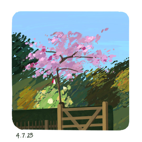
Project Agreement Tutorials (20/4/23)
By the time of this class, I'd completed a third of the paintings in my Project A PleinAirpril challenge which is what I brought in to show. I decided at the beginning that all 30 paintings would be the same size and shape, to emulate the experience of drawing in a real sketchbook and so if I ever wanted to print the paintings as part of a book, I'd be able to format them relatively easily.
I chose to bevel the corners of the paintings because I liked the softer effect it gave, rather than the sharp 90 degree turns. I set the paintings slightly inside the square of the canvas rather than directly on the edges because I wanted there to be a bit of a frame to each painting, and also because I wanted room to date each piece underneath. It also had an added benefit of creating more continuity to my Instagram feed, where I was posting the pieces.
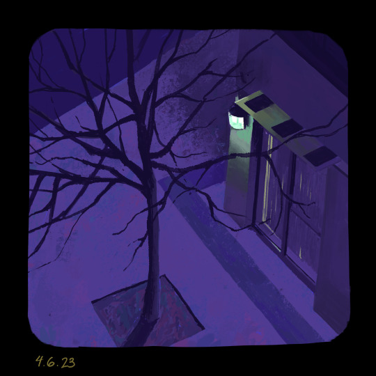
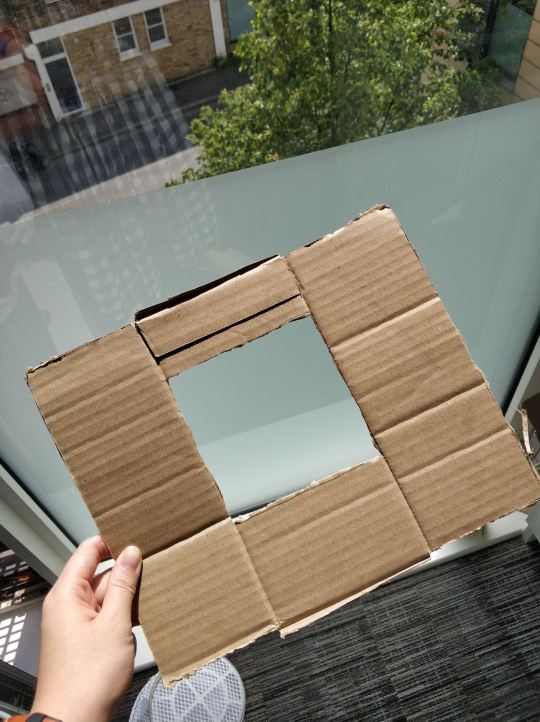
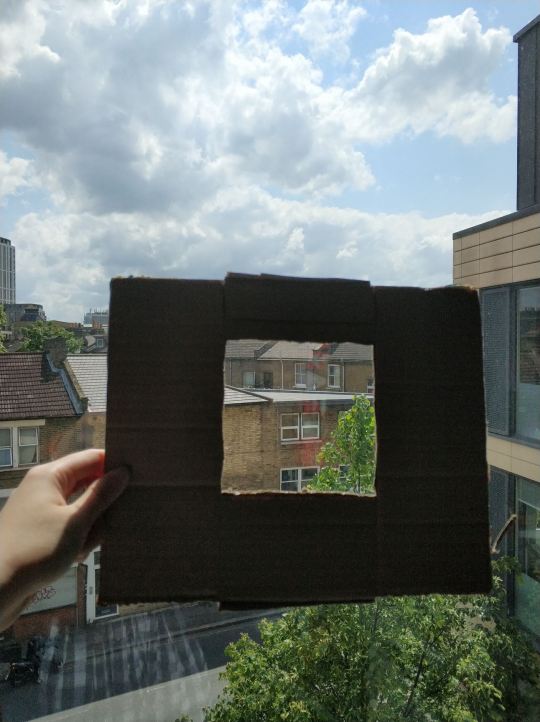
The first two paintings I did for PleinAirpril were plein airs done from real life observation. I constructed a little window out of cardboard for my first painting, which I did at night time from my room.
I used a lot of brushes with color mixing for these two because I'd seen other digital artists create really gorgeous effects with the color variation. I focused a lot on trying to capture the colors and lighting I saw relatively accurately at this stage.
For the third painting, I followed along to the first Warrior Painter's demo with Angela Sung, one of the hosts of the Warrior Painter community! For this demo, I was trying to follow the same painting techniques as Angela. She uses the lasso tool a lot to select certain parts of the painting, and then fills that area with a solid color. I think it was a valuable experience to try and work that way, but I found that it definitely doesn't work for me very well. I didn't really feel like I had a lot of control over what I wanted to do, and it really slowed my process down a lot as well.
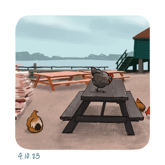
For the next two paintings, I tried to push my colors a bit beyond just what I saw, but in hindsight they were pretty close to the original. I experimented a bit with linework in the chicken painting, which I liked but ultimately gave up on in favor of lineless painting instead.
Also at this point, I started using reference photos instead of drawing from real life, since it cost a lot of time to scout out and visit specific locations, which I discovered for Day #2 since I did that at Holland Park near Kennington Palace. Almost all the rest of the paintings I did were of photos I took from spring break, which I wanted to do since it was like a way of documenting the places I traveled to :)
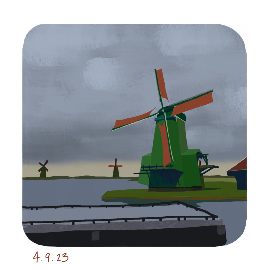
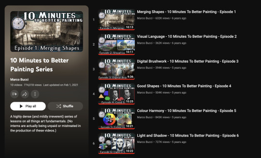
For Day 6, I painted while watching Marco Bucci's YouTube video series on tips for better painting. It was really helpful to take in his tips and I found myself actively incorporating his tips into my painting as I worked on it.
I merged my shapes into defined sections and was conscious of making sure colors from certain dominant areas were also present in less prominent areas, to a lesser degree.
For the next four paintings, I tried to keep those lessons in mind and experiment with my painting techniques to see what worked the best for me.

0 notes
Text
Days 217 and 218 of the Great Artscapade of 2022! Because apparently I forgot to update you guys yesterday? Which I could have sworn I did. Hmm. My brain must be playing tricks on me again.
ANYWAY!!!
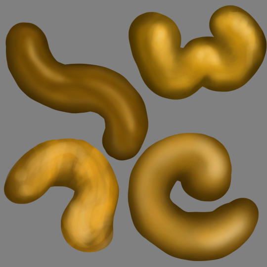
Day 217 sees the end result of not one, not two, not three, but four golden turds! See, I was practicing gold shading techniques to see which one I liked best, and the answer was no. I liked none of them. Why was I practicing making golden poop, you ask? Well, hypothetical question-asker, I'm glad you hypothetically asked! You see, I have a Christmas present for a friend that is over a dozen years late, and this Christmas present requires I do art-related things, and like a dumbass I decided part of the art-related things must look like gold. So here we are.
Day 218 sees a much better result that I actually like and will be replicating on the Dozen Years Late Christmas Present! Some things will be tweaked in the final piece. For example, I probably won't do quite as many strong highlights. Or I'll do more, who knows! Not me, that's for sure. I can't predict the future. Wish I could, it'd make my life so much easier. Oh, well. Such is life.
#the great artscapade of 2022#bobbi's being weird again#art#my art#shading practice#art practice#technique testing#y'all I did SO MUCH RESEARCH trying to find a good gold painting tutorial that would work with my style#I found a kajillion that would work if I was going for something more painterly and less anime#but alas#so I had to make it up as I went#I DID keep a lot of the techniques from the tutorials in mind#and like#I KNOW how to shade things to look metallic#like the physics and science of it#I know how the light reflects and scatters and diffuses and all that#I know that there's actually a stronger shadow near the highlight than you'd think there should be#and that there's a lot of bounced and reflected light that contributes to the highlights to make it look shiny#and the weird thing is that this is exactly zero issue for me with colored pencil?#or it was back in high school#I'd probably struggle with it now#but basically yesterday I'd tried to recreate the colored pencil techniques I knew as well as a few painterly techniques I'd learned#but it turns out I was going about things ALL WRONG for how I do my shading with digital art#anyway there is now a kitty on my tiddies so I need to stop typing lol
1 note
·
View note
Note
hi!! i am absolutely obsessed with your mulan edit (and the rest of them like. holy shit they're all fucking incredible. but that one in particular) and i was wondering if you'd mind sharing how you made the fifth gif? if you're not feeling it or don't do that sort of thing, no worries, it's just so unique and i think i can parse it but i really would love to hear about your process! regardless, thank you for sharing it and i hope you have a lovely day/night!
Hi there!! Thank you!!! 🥺 I'm always happy to talk about gif-making! 💙 (I also just made a new tag for tumblr/photoshop help and some of my other mini tutorials)
I used a few techniques in this gif. So, I'll quickly talk about the typography + shapes and multiple blended gifs. But I'll go more in-depth on the delayed fade-in transition since, I think, that's the most unique aspect of this gif (I haven't seen anyone do it before, but I'm sure I didn't break ground here either lol). I didn’t expect to get so detailed but hopefully that’s a good thing. 😅 More under the cut!
If you’re not here for the typography and if you already know how to blend, skip to the end for the delayed fade-in transition effect. But since I’m not sure what you already know (and because I hope this can be helpful for others too), I’ll try to explain in as much detail as I can.
PART 1: TYPOGRAPHY + SHAPES
Here are all the specs for the typography and shapes!
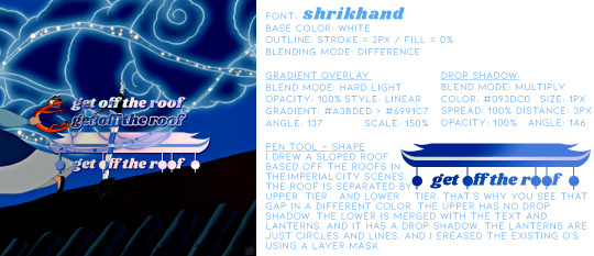
The pen tool is my best friend for interesting typography. Just click to create a point and continue clicking to connect the dots with straight lines! To create a curve, you just long-press and drag your cursor until you get the curve you want. You can also use this tool to create paths, like wavy lines, and write text on them (I did this in the second gif of the same set).
PART 2: MULTIPLE BLENDED GIFS
There are lots of tutorials about how to blend gifs so I’m mostly just going to talk about the details for my gifs.
For context: I use the Timeline method — so I make my screencaps, load into stack, convert frames into smart object, sharpen, etc. [For any blending beginners: When you use Timeline to blend, it’s important to have the same amount of caps for each scene, otherwise, your gif will create duplicate frames for one scene while the other scene continues to move. This makes the animation look choppy/not smooth.]
Start with your base gifs as sharpened smart objects, then put them all into one canvas. If you don’t have a clear idea for your composition, my advice would be to make sure you have “Delete Cropped Pixels” unchecked when you use the crop tool. This will preserve the cropped out parts of your gif, so you can still use them if you decide to move things around. Do this all with the upper gif layers set to Screen, so you can see how the gifs will intersect and blend. Now, let’s talk about the coloring and blending modes I used.
THE BG: Let’s start with the background gif. I’m going to call it the BG (the one with Mulan grabbing Mushu from the sword and running away). I colored the BG as I normally would on its own. Since this was a rainbow set, I also made the blue pretty saturated. Whenever I blend, I always put all the layers per scene into groups. So I put the adjustment layers and the gif into a grouped folder. Keep this group below everything else and leave the group’s blending mode set to Pass Through.
THE FIREWORKS OVERLAY: This is the wide shot gif at the bottom. I colored this so the lighter portions (the reds and yellows of the explosion) were as vibrant as possible and the darker portion (the sky) was as black as possible. When you set the blending mode to Screen for blending, it’s important to have this contrast to make the blending as seamless as possible. The light portions are most visible when it’s overlaid above the BG. And because I made the sky super black, I didn’t have to erase the edges with a layer mask to blend it into the BG.
THE BW OVERLAY: Next is the black and white overlay gif (the one that fades in but I’ll go over that later). Color this however you like to do black and white coloring. I like gradient maps and levels. But remember, like before, creating contrast is crucial. Set this group to Screen as well and you can always go back to your adjustment layers and tinker with them until you like how the gifs blend! Here’s what it looks like broken down with the frames on their own and then blended on top of each other:
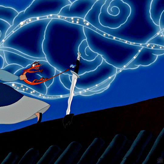
PART 3: DELAYED FADE-IN TRANSITION
So, this idea came about because I didn’t like how all the light areas of the smoke blocked Mulan’s face in the BG as she was running off screen. So, I thought, if the overlay explosion happened later, just as Mulan’s face goes off screen, it wouldn’t overlap!
Now, before I get into how I did it... remember how I said you need to have the exact same amount of caps per scene when blending, otherwise things get choppy? Well, that all kind of goes out the window here for two reasons:
Problem 1: We’re moving one smart object gif. Once you move a smart object gif layer away from the beginning of the timeline, the frame synchronization can go wonky if you’re not paying attention.
Problem 2: We’re using Timeline’s fade tool. It’s such a handy tool, but when you convert back to Frame Animation (which you absolutely MUST do if you do the bulk of your work in Timeline), you’ll see it: revenge of the duplicate layers.
I’ll go over how to mitigate these issues as I continue explaining. I’m going to reference the different colored lines and boxes in the screenshot below as we walk through the steps I took.

1. First, I moved my BW Overlay gif so it started a little later than the other gifs. You can see I moved it almost to the halfway point of the BG, where I placed the playhead (the vertical red line).
2. Problem 1 — If you were to export your gif right now and if you were lucky enough to move your gif to the perfect spot on the first try, your gif would look smooth. But if you didn’t move it to the perfect spot, you’d notice some choppy animation. Timeline does a weird thing with frame delays. You see this when you convert back to frames: some frames are at 0.07 sec and others are at 0 sec or something (that’s why we always have to reset the frame delay before exporting). I don’t know how to explain why this happens, I just know it does. But because of this, making gifs start at different points in Timeline creates gaps. The way I fixed this was by zooming in on the Timeline as much as possible. Then I kept clicking the next frame button while moving my BW Overlay over one frame at a time until all the gifs were all moving at the same time and stopped at the same time. It’s really just trial and error, and you keep nudging things til it’s in sync and the animation looks smooth.
3. Now, if I had only done these two steps, my BG and Firework Overlay would have just stopped and you would have seen the BW Overlay blended over nothing. See the vertical pink line? That’s where the gifs all stopped before I did Step 1. They wouldn’t be moving behind my BW Overlay. They wouldn’t even be visible. That’s where the green boxes come in. I labeled those green boxes “Freeze Frames” because they’re the very last frame of each gif, frozen. So, it’s as if the original gifs simply stopped on the last frame for an extended amount of time. You can have your BG continue to loop instead, but to minimize the distraction as my BW Overlay faded in, I decided to make them still frames. (You can make a freeze frame by duplicating your layer, moving the playhead/red line to the last frame of the scene, right-clicking, the layer and selecting “Rasterize Layer.” Move the freeze frame so it’s after your gif.)
4. Problem 2 — The easy part here is adding the Fade transition. The annoying part is the magically appearing duplicate layers. To do this simple Fade transition, just click that square in Timeline with the diagonal split. Then, I dragged the Fade effect (yellow box) over the beginning of my BW Overlay (other yellow box). The Fade effect is indicated by the right-angle triangle. All looks fine and dandy until you finish the rest of your gif, convert back to frames, adjust your frame delay, and see choppiness due to some duplicates. Luckily, the duplicates only pop up where the fade transition is. Again, idk how to explain why this happens, it just does. And to fix it, I simply go to the spot where the fade starts and delete all the duplicate frames until I get to the end of the fade. Once the duplicates are gone, it’s all good and the animation should be a lot smoother!
And ta-da! That’s pretty much how I made this gif:
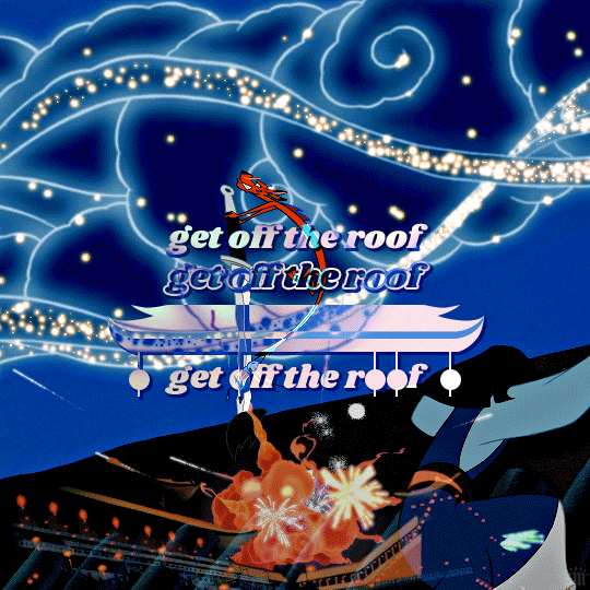
I’m sorry this was so long a;slkdfjs 😅 Please feel free to ask any specific questions if I made something unclear!! I hope this helps!
#cosmiccas#ask#gif tutorial#photoshop tutorial#completeresources#allresources#resourcemarket#onlyresources#resource#photoshop help#tutorial#nik.help#resource*#gfx*
427 notes
·
View notes
Note
Hey nim quick possibly loaded question:
What did you study to get better at anatomy? I know a lot of different artists out there say to study bodies and poses as well as art that you enjoy…but I feel like it’s not adequate. I’ve always enjoyed your human pose drawings and the bobadin drawings of yours to a ridiculous extent, so I thought you would be the person to ask.
Thank you for your help! I hope you enjoy the rest of your day/evening, and please say hi to the shrimp for everyone (*´∀`*)
To preface, you are witnessing the current iteration of a language I’ve been building for years.
The other folks aren't wrong. Perhaps your dissatisfaction is in the perceived enormity of the task. There is no secret shortcut, but perhaps there are different ways to think about the journey.
Now, everyone approaches art in a different way, for different reasons. To keep the language analogy going, some people learn enough to google translate their way through a trip to another country, some think it’s fun to roll their R’s, some just happened to move here & are figuring it out as they go, still others need to be fluent for work purposes—the potential diversity is limitless. What makes each individual voice interesting however, are the little details about themselves & that which they hold dear that naturally appear in the process of translating the world into the words, tone, and sentence structure people have.
Anatomy is one part of it. Like all “rules” around art and language, you learn enough to know what you’re doing, so you can then play and expand and mess things up with intention.
If I were to give general advice on shit to do:
Find a thing to care about. It’s much more enjoyable if you’re able to be interested in something, ANYTHING, that’s tangentially related to the thing you have to learn
Draw real people who happen to be physically in front of you, because all those books and techniques are cool and everything, but real bodies are all different, and generally tend to deviate from the tutorials.
More resources [post re: timed gestures online] [post 2 re: sketchfab]
[Quick note on how I study (esp from tutorials): copy the diagrams in the books, maybe write down 3 things that you noticed from them that you didn’t know before, translate those ideas into application. Most often when I use ref, I have An Idea already in mind of some fictional character situation, and I double-check reference to make sure I’m not far off the mark.]
Morpho book on fat and skin folds
The other morpho books are also very good
Andrew Loomis books (Figure drawing for all it’s worth is a good starting point), you can find PDFs online free
Foreshortening with coil technique video
Going on a dive on youtube for various ways people construct bodies; you may find a way that works for you, or a piece of a thing that you’ll integrate into your own working knowledge
Fixate real hard on some characters who happen to be human, because ho boi fun fucking shit to follow it down the rabbithole. Even now, I am finding new details on Boba Fett that I never noticed before.
--
At the end of the day, forcing yourself to learn a thing will only make it less enjoyable, so if the goal is “Get better at [Skill]”, the way to get there is to trick yourself into finding things you like on the way to figuring it out. People are just more complicated plants, sometimes we gotta run circles around our brains to sneak something in there.
Also, to manage expectations, it’s not about “Getting Good™ Immediately”, but “to observe and be able to describe one thing better, one piece at a time.” Every single thing in your life, including all the times you aren’t doing art, will bring added depth to your work. Take a moment, look at the sky, flex your hands, shove your face into a cat....
Thank you for your kind words, the shrimp are doing well.
A one-person circlejerk under the cut
Hrmmmm how I got here myself :V
A) a shit ton of fixating
B) a childhood of “ehehe cartoon drawings”, 2013-2018 of concentrated effort to study and Get Better, and 2018-current day of mulling things over and adding a few pinches of spices
Also I went to art school, that’s a giant factor. BFA in Communications Design from Pratt Institute.
If it helps you quantify anything, know that I am currently on my 23rd sketchbook? Sketchbook 1 was started ~2013
I was the sort of bastard who found diagrams FASCINATING.
Very few of my sketchbook pages were assigned schoolwork; I just did that shit on my own because I had an unhealthy existential dread of being unemployed after school, and I also fucking LOVED learning.

Nothing in here is printed out; I copied things out and studied them, goddamn. I no longer have the patience for this but I’m glad younger!me did.

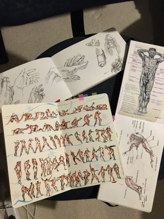
You can tell I got into Yuri on Ice (above). Those studies are from looking up a youtube video on skating, and pausing the video every few frames to sketch the pose. Also the muscle diagram on the above right is fun because I drew the top black lines part on see-through acetate, which you can flip up. There’s more. There’s so much more. Whatever people see now is the culmination of everything I picked up along the way.
Honestly I definitely forced my own nose to the grindstone wayyyyy too much in college. Think of the person who skips most social events because they’re too busy working, who's perpetually anxious when out on social gatherings because they could be doing work—that was in no way healthy for me, and I never plan on repeating it. I had “motivational” quotes on post-it notes all around my workspace that said toxicly positive things like “think of all the time you spend consuming other peoples’ work, vs. how much time you spend making your own. Only one of those will make you remembered.”
However, I can’t be upset at past-me because I absolutely did the best I could with the coping mechanisms I had, and I’m really proud of him for trying this hard and still being ALIVE at the end of the day.

That’s a page from one of my 2017 sketchbooks; drawing was a stim for me + helped me stay awake in classes, so I’d draw the whole way through.
All sketchbook images above are from my “concentrated learning” phase of 2014-18. Since then I've lowered my own standards and now it’s about the vibes and not the 100% accuracy. Fuck the accuracy, shapes that real humans are can look “fake” or drawn incorrectly if you translate it into 2D. And sometimes it’s some visual prejudice you didn’t realize you had, due to the media you grew up seeing. Maybe some pieces have fucked up anatomy, but I’m not hung up about it (just add a lump when unsure). But yes, this is definitely “keep in mind I have thousands of studies under my belt and thus even if I’m not actively thinking about it, I’ve osmosis-ed enough from the stuff I’ve done previously to make something look like it’s got convincing shapes”. It also doesn’t come out great All The Time! That’s life. You can get here also; just take it in bite-sized chunks, and give yourself plenty of time to rest and go back into your own comfort zone.
I am not trying to make anyone demoralized; this is simply the path I took myself. Sometimes, even if you’ve barely taken three steps, it’s nice to encourage yourself and be proud of making it this far.
If you’'re still here for some fucking reason, here’s a shrimp reward.
--
The art I am often most drawn to are the ones that tell me something new, often about something familiar. “That’s a line I never thought of using to describe the ears”, “That’s an application of color and texture that I would have never thought of myself but makes SO MUCH SENSE” etc.
I too, have a long ways to go. The rest of my life actually! And what a wild journey that shall be.
Well wishes on your own.
--
Reference Tag | Tip Jar
#reference#art reference#long post#anatomy#nim rambles#asks#my tag is 'reference' if anyone is looking for things#I'd make a strange teacher I think#I shall no longer apologize for my rambling longform because this is how I say things :V#asks about art either get answered by me reblogging things I've answered in the past that are similar enough#or in a whole essay length situation#where my ADHD brain just starts glossing over things I previously wrote and I'm like 'well the point is in there SOMEWHERE' xDD
340 notes
·
View notes
Note
Thank you for the detailed reply! While we're on the topic, I also wanted to ask if you had some tips for painting galaxies, both generally (e.g. how to pick colours and structure) and in terms of watercolour technique. With watercolour, I struggle with getting the colours dark enough to actually look like a night sky and the gradients often become messy and look kind of like the pigments are cancelling each other out at the interface.
(cont) I might just have to invest in some intesely pigmented properly dark paints, but there's probably ways to get better results with my current set as well. I tend to not really do proper washes and mostly work in one or a handful of layers, so that's probably contributing to the less intense colours. I never really got any formal training and just trial and error'd my way through, so I'm probably missing knowledge on some really basic techniques
You're welcome! The follow up question makes me wish I'd made that galaxy tutorial I have been wanting to do for years but alas, no time. So I'll try to explain it.
There are two things that factor to this. One is that watercolour is a transparent medium so you typically don't get super intense colours or dark tones with them. Two, cheaper watercolours don't often have enough pigment to achieve what you have in mind.
What you described with the "gradients becoming messy" is what happens to me often, too. When you layer too much watercolour they become muddy and that is what you generally want to avoid. Because watercolour is a transparent medium it relies on having some of the paper white shine through to make the colour look vibrant/intense. So when you block all of that you lose the colour.
To paint a night sky or a galaxy in watercolours you can rely on relative colour a lot. For example, in this whale piece the darker areas look dark because what's around them is light.
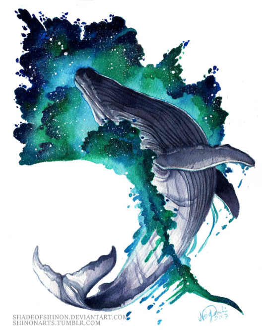
The way I did this was by doing a very wet and light wash for the wave, mixing teals greens and blues randomly and just let the paint take the shape. The lighter areas around the whale are the first wash. The more detailed and darker bits were added on top and if you look closerly at the mid greens they're not really that dark but the lighter wash that lets some of the paper white show through makes it look more opaque and dark. The dark blues are just full pigment so they appear the darkest in value.
It's also good to keep in mind that what you see on the screen is not what it looks like in real life because your computer/phone screen is not a paper or a canvas. So don't let that fool you. This scan was enhanced so that it would look good on a computer screen.
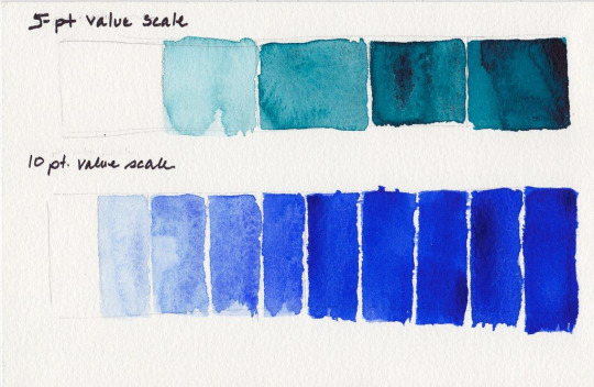
One good way of avoiding overworking your piece and preventing the colours from turning muddy would be to build some kind of value scale you can reference as you work on your painting, just to remind yourself what does the darkest colour look like and what are the mid and light colours you can use.
It's really easy to overwork a watercolour piece and I do so constantly. I have started entire pieces over because of this but the internet never sees it.
Hope this helps!
#art tips#glueblade#art#watercolour#watercolor#watercolor tips#traditional art#traditional painting#ask#reply#artists on tumblr
54 notes
·
View notes
Note
Hi! I'm a very petite person, and my cabinet is full of wonderful t-shirts that are unfortunately too big for me. (Men's size S on my 5'0 thin frame D:) Also a friend gave me a wonderful button-down Hawaiian shirt that's way too big, but I would love to wear it. Any advice? I think I might bring it to a tailor, but what could I ask them to do?
Downsizing shirts:
Introduction:
If you've got a collection of shirts on your hands that are too large for you that you'd still like to wear, you've got a few different options.
First of all: the way you style them can change how they look. Shirts that are too large can look a little more fitted by wearing them with a belt, or by tucking them into pants or skirts. Long shirts can also make for cute dresses.
If you plan on taking them to a tailor, ask them to take in your shirts. Taking in clothes means taking a garment that's too large and downsizing it to your own personal size and body type. A good tailor will know what to do.
(The opposite of taking in clothes is called letting out clothes.)
The DIY approach:
There are a few ways to make shirts and t-shirts smaller.
If you only need to take in the side seams of your garment, try on your garment inside-out. Take a piece of chalk or soap and draw new seams on your shirt: these will be your sewing guides. Try to follow your natural body shape. An easier approach is to ask someone to pin new seams on your shirt for you while you're wearing it. Take your shirt off again (be careful if there's pins in there - or use safety pins). Double-check if the new seams you've pinned/drawn sit where you want them to sit, then sew up your new seams. Cut away the excess fabric, and finish off your raw edges.
Check out Lady Ruth Design's tutorial on how to take in the side seams of a shirt for more information.

(Image source) [ID: a small blue shirt lying on top of a larger green shirt.]
If you need to take in the entire shirt, the easiest way to do this is to turn your shirt inside-out on the floor and get a different shirt that fits you the way you want your other shirt to fit, too. Lay your smaller shirt down onto your bigger shirt, making sure to align the necklines properly, then draw the smaller shirt's outline on the bigger one. These lines will now be your sewing guide, similar to what we did with the side seams.
Check out Amelia's List tutorial or Melly Sews' tutorial on this technique for t-shirts. It's Always Autumn uses the same technique to take in a flannel shirt.

(Image source) [ID: a before and after picture of a tailored flannel black shirt with white and red stripes.]
If your shirt fits okay but is too long, try cutting off the bottom and re-hemming it. If that's not your thing, you can also add ruches at the sides.

(Image source) [ID: a before and after picture of a tailored blue t-shirt with ruches at the side seams.]
If your shirt's really big, you can also use the fabric as a base to make your own t-shirt from scratch instead of altering it.
Another option is to add darts, which are pleats sewn down at strategical points to make a garment fit closer to your body. Take a look at these tutorials by Stylish D for a masculine example and Coolirpa for a feminine example to see how it's done.

(Image source) [ID: a before and after picture of a tailored light blue button-up shirt.]
If there are specific undergarments you tend to wear a lot underneath your shirts that can alter your body shape, like for example a push-up bra or a binder, wear these while you figure out how to resize your clothes. Otherwise, your shirt might fit you well without them but still look awkward when combined with these garments.
Also keep in mind temporary body changes when tailoring your clothes (if you experience these).
Conclusion:
Taking in shirts isn't as hard as it looks. Try it out on a shirt you don't really care for. If you're happy with the result, you can tackle the rest of your collection. If doing it yourself still feels too daunting, have your shirts taken in by a tailor.
If you ever need to go up a size instead of down, check out my post on upsizing clothes. It's completely normal for our bodies to change over time, and resizing your clothes to change with you used to be common practice before the advent of fast fashion. Therefore, knowing how to up- or downsize clothing is a useful skill to have.
#wasteless crafts#ask#tutorial#info#sewing#sewing 101#sewing for beginners#tailoring#shirts#t-shirts#mending#downsizing#fibre arts#fibre crafts#global warming#climate change#fashion#fast fashion#slow fashion#as others have pointed out in the past: if larger sizes are hard to find in your local thrift stores and they're not your size#don't buy them for craft projects#leave them for others who need them more than you do#of course if they're a super common size that's a different thing#basically if you find things like uncommon clothing sizes or disability aids at second-hand shops and you don't need them yourself#it might be better to leave them be#anything else is fair game: second-hand shops often get more donations than they can deal with due to fast fashion#so it's better to salvage things for craft projects than to have them thrown away if they don't sell
324 notes
·
View notes
Last Seen Blogs

medslv
MedFet

drugaddictlostall-blog
Kolejny szary dzień koloruje wódką

app-development-solutions
Mobile App Development

m4rgiela
DANA