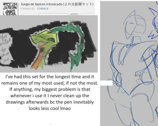
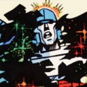
#I don't tend to render over my drawings enough??
Note
Odd question, but when you're shading your pictures, where do you put the "true" color of whatever it is you're drawing? The parts that are in light are brighter than the original color and a bit of a different color, too, based on the source. The shadows are darker than the original color and more based on the undertones of the object/hair/skin or whatever, so also not the original color. I've noticed you have a kind of gradient between the colors to make them harsh but still blend together, too. Where does the shade you're basing these off of come in?
Sorry if this doesn't make sense 🙏 I'm trying to study art styles I like to figure out how to improve my own drawings, and your page is a huge inspiration for me.
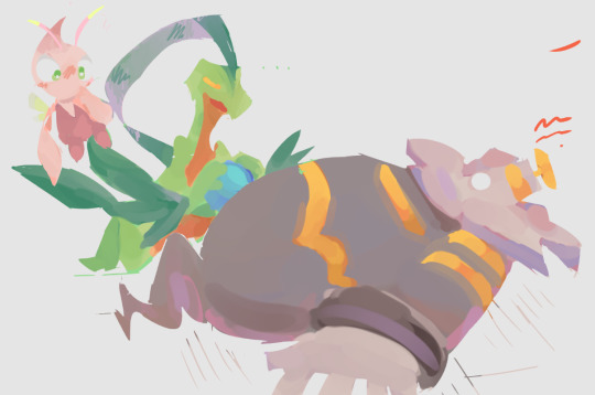
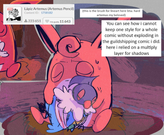
Hmmm If I understand correctly, you're asking me why you can't color pick the base tones as shown below from anywhere in the picture, right?

That's because A) I know these colors, roughly, by heart. So, Instead of picking them from the original drawing, I did what I always do and selected them manually. But also - and what I think is actually relevant for your question: B) A lot of processing takes place OVER these base colors! Let me get the spherical piece of Bhaal's sacred flesh to explain.

Here we have just the base color by Itself. Next, I add a light wash of the undertone to places like the face, ears, hands - basically anywhere the body has a tendency to become flushed. The intensity of this depends on the person and skintone, and in DU drow's case I tend to make it pretty prominent.
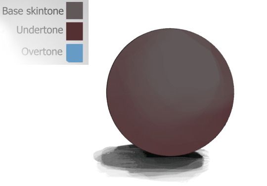
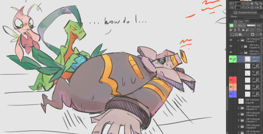
Next, I add the "overtone". I don't even know if that's the right term for it, but it's something that happens with very dark skintones because they tend to reflect more light. With my character, this color is almost always blue for stylistic reasons.

The base tone is still there, even though you probably couldn't easily color pick it anymore. It's doing it's quiet, thankless job: being a base!
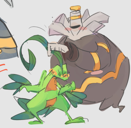
As if that wasn't enough, out comes all the fancy stuff:

And I can get even sillier than this with more layers of shadows, multiple light sources, highlights, and so on. These colors here are just examples too - they can be pretty much anything in a similar level of brightness/contrast. All elements of the art that I want to render get this treatment or similar depending on their texture, not just the skin, so you can probably guess how they would get "lost" despite being used as a base.
Hopefully this clears things up!
670 notes
·
View notes
Note
Whats your art process and what would you reccomend for someone who would like to achieve a style similar to yours? i love this mix of cartoonism and realism. your work is such an inspiration >.<
oh gosh! thank you?! 💞 i'll do my best to explain it, but even I have a difficult time trying to understand my own art process/style because of how inconsistent it is;; (i still have a lot to learn!) this is gonna be a long reply so i'll place it under the cut
process:

I start loose with a more gesture type rough sketch. I mainly just do lineart in the same layer as my sketch and erase away parts I don't like. Sometimes I'll lower the sketch's opacity and on a new layer do my lineart (which is what i did for the drawing above). But regardless doing that loose gesture sketch helps keep my drawing dynamic even as I refine over top of it!
- I duplicate layers A LOT for safekeeping my previous progress, especially if I'm thinking of making a big change (ex. changing limb position)
If I wanna put colors down underneath it I set my lineart to Multiply. For coloring I'm very inconsistent with the process, but recently I've been using a more subjective coloring style, where I pick my own shadows and highlights to try relying less on blending modes (which is gonna be too long to get into here;;) Finally if I feel like it, I make a layer on top of my lineart layer where I render everything
Oh this is something that helps me a lot for colors! I have 2 layers that are a mid-gray tone placed above all my other layers. One I set to the Color mode (to make the drawing black and white), and the other I set to the Luminosity blending mode (to make the drawing's brightness the same..?not sure)
The Color layer helps me check if I have enough contrast in values, and the Luminosity layer helps me check if I have enough contrast in color hue and saturation!
style:
This is really difficult to answer because style encompasses so many different aspects of art, but I'll try to focus my answer on the mix of cartoonism and realism that you mentioned!
I struggled trying to explain what my style is like so I just broke down one of my drawings that exemplifies a lot of my stylizations! Hopefully these can give you some pointers about what I tend to think about when I draw (click for higher quality)
(+to add to this i use a brush with no size pressure, only opacity pressure)
What I recommend for stylizing a realistic character: The way I learned to stylize a more realistic character like this one was to import a reference of his face, then trace over it very deliberately, making sure to stick to big shapes and characterizing details I thought were important to achieve his likeness! Then I'd turn the reference layer off and freehand it over and over, comparing and redrawing until I managed to get the mix of accuracy and stylization I liked!
What I recommend to find a style: I basically ended up with my style subconsciously as an intersection between the things I like to see in art + the things I like to draw! Most of my inspiration comes from anime (😔) and artists online. I'll see a very specific stylization I like in others' art, and try replicating it to see if I like how it fits with my style + if I enjoy drawing it in that way. I did this a lot over the years, accumulating into a big mosaic of inspiration from all the artists whose work I personally enjoy and learn from! I know this isn't exactly answering how to get a style like mine, but I think knowing this general process may help you out in the long run!
ahh i think that's it! i tried to be as comprehensive as i could without being too verbose (my bane). i hope this is the answer you were looking for and that it can help you! 💞 and thank u for the ask! it was a good exercise for myself to analyze my own art
#my asks#anonymous#tutorial#...? art info? not sure what to tag this#i spent a very intense day mulling over this ask#hopefully i answered this correctly...!#art resources
44 notes
·
View notes
Note
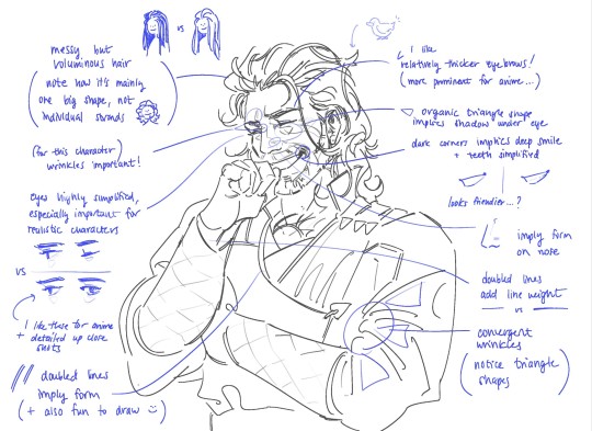
I love how you draw wrinkles and construct the faces of older characters like Gunter! Do you have any tips on how to convey the dimension that older faces tend to have? - sincerely, a fellow old man fan
Why, thank you for the kind words! :)
You've probably already seen my post on drawing old folks in general, but just in case if you haven't, it's over here. I link it mostly because there's a book mentioned there (Morpho: Skin & Fat) that is a far better resource than anything I could mention; it talks about how gravity affects sags over time and wrinkle placement---all that good stuff.
I will say, what has been useful to learn recently is that it's very possible to over-render age lines, and that "more lines" doesn't always mean better.
Sure, we're probably sick and tired of the standard gacha-style "two lines by the eyes and mouth" stylization and how it doesn't cut it when you want a believable 60+yr old. But there’s also the other extreme of drawing too many lines/creases where the clarity (emotional clarity, visual clarity, character design clarity) of the art piece gets lost. Sometimes one well placed crease/shadow can believably (and handsomely) age a person more than five of them.
That’s when you get into the interesting game of ‘knowing how to draw all the creases/wrinkles so you don’t over- or under-shoot the number of lines’ for clarity. It’s a fun tug-of-war between placing the lines for the specific expression, placing them for Teh Sexy (if you are drawing them for fanservice) vs placing them for that specific character.
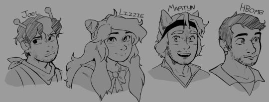
Lastly, it's fun to collect stylized versions of old folks and see what shortcuts do work for other illustrators. I don't have the tumblr post on me right as of the moment, but there's one floating around that mentions Urasawa's various manga/anime series is a great example of the sheer variety, and there's other creators too. For example --
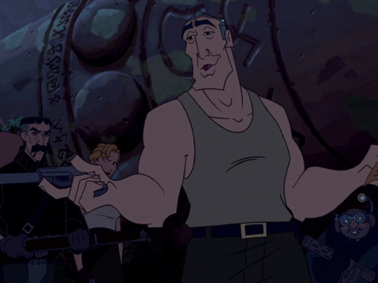
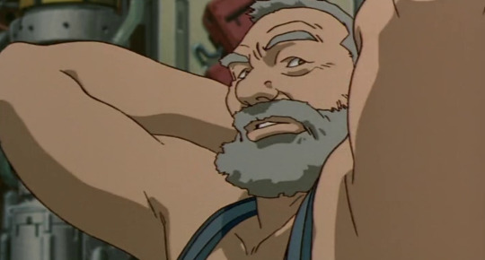
Same medium, four different dudes (still could be more variety!), but four vastly different line placements that are still flexible enough to show believable but consistent acting.
Hope that helps ~
41 notes
·
View notes
Note
hi hi! i love your art so much & specifically how you use shapes, especially when you’re drawing heads and faces. i was wondering if you have any tips about how to incorporate shapes this way! pls feel free to ignore if course!
Thank you! I was mulling over this trying to figure out an answer that makes sense. I usually go for what "feels right" which is not a great answer lol so come deconstruct my choices with me in real time--
When i'm drawing figures i'm never aiming particularly for realism when it comes to movement. I go for flashy, poster perfect-esque compositions, so if having Vash's coat-tails flit around him unnaturally don't make sense but it looks cool, then i'll go for it! I think i'm always looking for a solid silhouette so whatever pose the character is striking, you can tell what's going on. Finding the right balance between making a silhouette with too much vs not enough is not something I know how to explain, but something I believe is important! :']
I also tend to extend a characters "energy" outward:

you can see in all these corners and edges everything points outward and even curves a slight bit away. I think this is one of the reasons people tend to call my art sharp/spikey!
I don't tend to shade/render my work a terrible amount, preferring a flat graphic look most of the time or just playing with blacks (which is a whole shape language in itself) but when I do, all the shadows and highlights shapes tend to take on a spikey/lightning bolt shape even tho it wouldn't look like that in real life!

It's just really pleasing to me and I like how it looks! The spikier something is for me, the better! If you couldn't guess at this point, starts/lightning bolts are my favorite shapes haha
Another thing I tend to do is avoid is curved lines. They're definitely still there! But my flow is more jerky straight lines so that if I drew a circle in my style it'd look like a messed up pentagon with soft points, that basic rule in my art brings forth funky shapes that otherwise wouldn't be there if I was trying to stick to realistic shapes
This probably didn't answer a lot ToT but I hope my rambles brought something to light, whatever that may be!
93 notes
·
View notes
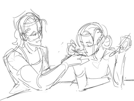
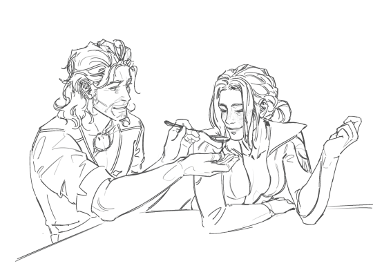
Text
Continuing onward, page 2 of 6, the rest of which you can see here.


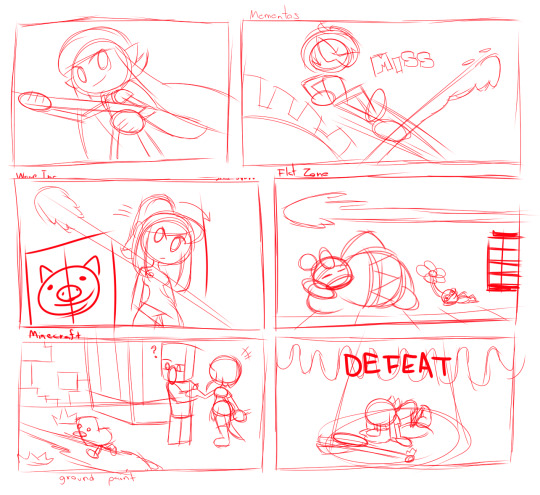
Honestly this page was a lot of fun, I love recreating areas in gaming a lot, so this was a lot of fun with the whole playing around with multiple universes in smash to give the idea that the Inkling girl just can't hit a shot.
Of note:
I like to think that Inkling Girl's first mistake was skipping Sheldon's explanation. Like, I get it, but his bios do give you a hint of how the thing is supposed to work. Just because you're familiar with a thing it doesn't mean you should skip the manual.
I could have straight up taken a picture of Mementos, but I instead re-drew the whole bit (if anything I just reused a re-draw of the main mementos map which I have done in a previous drawing project).
I honestly do not skip steps, if I can recreate a thing for the shot, I'll go out of my way to do it. It makes things look more seamless and in-line with the drawings as a whole if I do everything from scratch, though I'm not above re-using previous drawing assets if I can get away with it (since the mementos map never really changes, I can just reuse that isolated re-draw I have).
If you want it for whatever reason, here it is.

Oh, by the by, I kinda based Joker's render off his appearence in Tactica since that had been recently released by the time I was doing the drawing. I do like the tactica renders so I may base the persona characters off that to simplify them a bit style-wise.
I know WarioWare being used for Samus is a bit of an odd choice, but I figured I could just do a simpler area rather than going with either Norfair (all that lava would get in the way of the ORANGE paint), Brinstar (same, but Yellow) or Frigate Orpheon (I didn't really need the parasite queen in the background). Adding Pikachu in was a later idea just to highlight how much she's missing the shot.
Dedede and a Pikmin laying down was funny enough already, but here's a bit of hilarity I thought about (and I know that explaining the joke ruins it, but you know, this is supposed to be a commentary): this is flat zone, it's entirely 2D, the inkling girl somehow missed the shot even when you only needed to aim left or right.
I like Minecraft a lot, but when DRAWING the universe its a bit dull if everything is just cubes. So while I totally can do that I just choose to make a stylized version that is semi-cubey for most everything. Though Alex I prefer to go full proportions.
Alex being more human proportioned does bring some challenges since I do want her to look like a country bumpkin of sorts, so this comic helped me finalize how I would do it. Honestly its kind of based on how artist Peargor does it. Though I'm gonna go with a longer braid and some freckles.
I do largely prefer Alex over Steve though, so you'll likely see her whenever I involve minecraft on my drawings. If I were to draw steve though? I'd likely make him buff. I tend to think of Alex as the builder/farmer (which is my playstyle) whereas Steve is the adventurer (how my friends play the game).
I didn't actually borrow any textures from Minecraft, they were self made. Which is kind of why they're kind of shit.
Honestly drawing the regular Charger was a bit of a thing. The Splatoon weaponry can be very complex in its detailing so for the first few panels it was kind of traced. Over time I just did it on my own for later panels.
Tracing isn't a bad practice, just as long as you don't pass an entirely traced work as your own. Trace responsibly kids, it helps learn how to do a thing.
#splatoon#nintendo#smash bros#SSBU#Super Mario Bros#King Dedede#Kirby#Pikmin#Metroid#Samus aran#Minecraft#Persona 5#Joker#Wario#independent artist#commission
22 notes
·
View notes
Note
Hi! Saw your post about commissioners using AI as a skeevy way to get cheap fully-rendered art from artists (thank you for spreading the info btw! Deeply concerning the ways these AI programs are being used to make an already difficult field of work even harder 🥲).
But it also got me thinking a bit about TOS's and pricing your work, particularly commercial work... I'm in the process of preparing to open up for commissions for the first time in years myself, and was wondering if you had any advice/resources for putting together a professional looking TOS and figuring out how to handle commercial licensing? I know this stuff tends to be super regional, but it's so hard to find consistent information online on the topics 😞
I can only tell you how I handle it. :) For normal commissions, do feel free to copy whichever part of my TOS you think will work for you from my private commission info. If you're not Swiss, the last line on the page won't be usable.
A lot of doing art and illustration commissions is trial and error. I know it was for me. Tons of mistakes and hopefully not repeating them.
For pricing, a friend told me two things that stuck with me and helped deciding on prices since then.
First thing she told me is that exclusive rights for a simple caricature for a newspaper go for USD 800.- and up. Mind ya, she said that YEARS ago. And prices change. But if a simple black and white doodle goes for USD 800.-, don't sell exclusive rights to your full colour A4+ artwork for less.
If in doubt, don't sell your exclusive rights at all. Most clients don't need them and if someone tells you they will give you USD 25.- and a voucher for -10% off their own product for it, tell them to fuck off.
People will try. And you will learn to say no.
The second important pricing tip I got from said friend: decide on a price that makes it easy for you to let go. If you regret having sold it, the price was not high enough.
Most companies have their own contracts and their own price lists. It helps if you are able to adjust your work to their budget and deadline.
Read the contracts carefully, don't skim anything, only sign them when you understand them. Especially US-contracts have a lot of complicated looking clauses in them, like the Indemnification clause. If they tell you that a clause is just there and you don't need to understand it, you can sign the contract as it is: run.
Most clients won't actually need or even want exclusive rights, simple print licenses will be enough for them. A rough over-the-thumb minimum pay would be around CHF 200.- to 250.- per work day.
I will add a third point here:
If you really want something to exist and be a part of it, then do it. Have fun. We mostly regret the things we never tried and never did. And if you only do things for the money and don't get paid, it leaves you with nothing (my thanks to Neil Gaiman and his commencement speech "Make Good Art").
Some of my most amazing commissions were orders from people who couldn't pay a lot, but were awesome individuals with fantastic ideas. And I don't regret a second of the work I put into those commissions. But THAT is your decision. And purely yours. Don't let people tell you what to be exited about.
Maybe the thing you will be exited about is a kid that wants to pay you three shiny rocks for a drawing of their super hero princess cat wizard.
And you will make it the fucking best super hero princess cat wizard for one of the rocks, because you don't want the kid to have no shiny rocks anymore~. <3
131 notes
·
View notes
Note
Do it have tips on how you draw? Preferable your comic strips? Speaking of, are you a self taught artist?
I am indeed mostly self taught, been drawing since probably before I could talk. Save for the things I learned through a few videos online and some art classes in school, I haven't really had anyone to teach me how to draw. With that being said, sometimes, I wish I was taught by someone else simply because they'd be able to point out that I was doing things the hard way.
Maybe one day I'll do some online classes or something.
As for your other questions, I don't actually have that much experience in comics save for a few pages here and there. I know you're looking for something technical, but I can't give you that right now (maybe ask me in a year, lol).
However, I do have something else I think is important to learn that it to me a while to really understand (even longer to put to practice). So with that in mind and putting myself at risk of sounding a little preachy:
Try not to be a perfectionist!
I often find myself stuck in a loop of never finding a piece good enough, of rendering and rendering until it becomes overworked and loses the spark that made it interesting in the first place. It's why I tend to lose sight of why I create: to have fun and spread my joy and passion for art with others.
Having the skill to correct poses, expressions, page layout, and everything that goes between comes with time and practice. Being able to see mistakes is a good thing, but it's always beneficial to remember that your human. Flaws are part of being a person and often times makes your art more interesting simply because of its imperfection.
Next: Take your time and be patient with yourself!
So much of today's social media is surrounded by comparisons and I am no saint in this; I fall right into rabbit holes of comparing my art with that of someone I admire. All that really does is make me hate my own stuff and the skills I've worked years to improve. It makes me see all the skills they have but I don't. It makes me think that I should be at the same advanced level as they are, but I forget, and I think a lot of other people do too, that we are all on our own art journey. Maybe you started drawing later than someone. Maybe you just don't pick up certain skills as fast as someone else. Maybe you're simply younger than someone else. Maybe you've been on a hiatus and you haven't drawn in a while.
No matter where you are in your journey, it's important to remember that you are your own person, you work at your own pace. Remember to take a look back on where you were a few years ago, remember that improvement is not always instant, that there are things you can't learn overnight. There are goals you have that are bound to be difficult to reach. You're going to get frustrated and impatient and it might make you want to give up altogether, but for every struggle, there is always the satisfaction of success in the end as long as you don't give up and give yourself the compassion and patience you deserve.
Geez, this turned out a lot longer than you probably wanted to ready and I'm sure it's not exactly what you were looking for, but it's what I had to offer.
But as proof of my overly dramatic rant, I give you a drawing I did in March of 2021 to a current Wip that I've been working on, over three years of progress:


13 notes
·
View notes
Text
Molluck's Emotions 'n' Faces

I barely felt like drawing a few days ago but I just kept seeing a certain image of Molluck inside my head, so I started doodling him, yet again... This doesn't look like what I had inside my head since it made no sense to me when I tried to draw it... So yeah, here's just some random Molluck sketches I did to practice his face anatomy. I didn't mean to render these sketches, but like I have said, I'm bad at drawing simple stuff...
It seems like I do like to mix realism and cartoony elements together, I just haven't noticed it this clearly before... I had no idea what effect to draw that angry Molluck to have, so I ended up 'setting his head on fire'... You surely don't wanna make him angry! Though I gotta say that I love drawing angry faces, so this is yet one more reason why I love drawing Molluck this much.
I don't know how odd it's to see me drawing him mainly without his scars but it's just about that I tend to picture him before 'that disaster'. I also think that that his black suit fits better this new Molluck and that purple suit fits the best those previous Mollucks, so that's why I also keep this same suit. He is a very stylish Gluk!
I also have been thinking his face recently, in a certain way (of course I think about his face, like every day). He seems to look the most like 'a traditional Glukkon', or how I should say... He looks surprisingly a lot like he did in Abe's Oddysee. Yes, I could make this comparison between that New 'n' Tasty one too, but I prefer doing it this way, especially when I prefer this AO Molluck over NnT one (though, when it comes to anatomy, NnT is probably better... Yes, his body has a bit different anatomy in these games, especially arms, but when it comes to his hands, well, that concept art wins... Yeah, I'm basically mixing my fave Molluck stuff from different 'versions'. But enough about his body, for now.).
Here's an image to illustrate what I see:

Yeah, not the best quality but hopefully you see the main stuff here. First, he got similar cheeks; I'm not sure how to describe them but they have like two parts. The shape of his forehead, like the area around his eyes, is similar but also the shape of his eyes. (A little note: I have noticed that his eyes are a bit different in the actual cutscenes, and it's probably due to that this is a concept art piece, made on the 3D model, like his suit ain't actually a 3D thing but a drawing.) The basic shape of his head is the same in general, like his ears have the similar shape too. His chin has that 'separate part' in the middle of it. And yeah, his mouth looks pretty similar too. When I took that one screenshot for the ask, I also thought while looking at this Glukkon sign in it that man, this looks like Molluck's shape:

So yeah, Molluck is indeed 'the Glukkon'. But I also tend to think that he has very delicate features, or I at least tend to think this, that he looks very elegant and therefore he is such a beautiful Glukkon. Yes, I prefer to call him beautiful than handsome since like I said, I find him just elegant, adorable, endearing, even dainty, and so on, those kinda soft/feminine adjectives, so he is indeed beautiful for me. Though yes, he do is also handsome but I just prefer those adjectives about him. Frankly, I feel kinda alone with this but I guess that one reason for it is the orientation but also my personality, my own preference, and so on...
Yeah, it also has came to my mind to think that probably some people (would) find my Molluck sculpt creepy... Like there are people who do find him scary/intimidating but well, also ugly. But for me, he is just so adorable, beautiful, and well, my ideal man... They say that some people have unrealistic beauty standards, well, look at mine then, they totally are unrealistic! But I still managed to find 'my man', so no problem. (Y) I just have like zero interest in dating and other stuff like that IRL, so this is just my way to be, having a fictional partner. I know how some people see it, would see me as a weirdo, but I'm not gonna change myself for them. I'm so used to be seen as odd, so I kinda have no way to be 'normal' anyway, why I even should be like that. It used to depress me back then but then I started to embrace my 'oddness', especially after finding Oddworld, so yeah, I just tend to describe myself as 'an odd man' these days.
Also yeah, Molluck's species is also sapient and he do can express himself, so I just see there shouldn't be any problem in this way. Though, sometimes I wonder if he would really be into a relationship like this since he is so into his business, getting his moolah, and so on, but also probably has this attitude that Glukkons are 'higher/better species' than many others, making me wonder how he would see humans since yeah, I do am a human in my self-insert world with him, look like I do IRL. But I still see him having a certain kind and soft side inside him that he must hide, like I genuinely find him friendly, so I feel like my own species wouldn't be a problem for him, even if humans look similar to Mudokons. Also, I bet that he enjoys having someone to pamper him, that he can be himself with someone and having someone that understands him. Just no matter what has been said about him, I still find him a lovely Gluk!
Um yeah, I'm not sure of what else to say here but that yesterday, I saw some unseen Molluck and Glukkon stuff for me from that rare Oddworld artbook, the First 10 Years of Oddworld. (I gotta own it one day.) Man, it made me laugh a lot when I saw that storyboard for the ending of AO. Like, Molluck seems to swear and then, when Abe tries to chant, he just blows smoke into his face; just loved that stuff! I just can totally see Molluck doing that stuff, and man, I would love to create something related to this! Also yeah, it also made me laugh a lot when the book called that young Glukkons flushing their pet Fleeches down the toilet as 'the rite of passage'. In our world, people abandon their pets in the streets, but in Oddworld, they are flushed down the toilet; which one is worse? Well, probably depends on the species of the pet. I still need to draw a Glukkon with a Fleech... I just cannot really figure out how to draw young Glukkons... Like, I really wish to draw Molluck as a child with his Fleech pet... Well, just gotta try it one day. I have wanted to draw a Glukkon with a Fleech since I heard about the whole thing in the game but drawing young Glukkons has felt impossible...
But yeah, just so much stuff to create! Maybe I should just draw like a child, you know, just not really care about the result, just do it! There somewhere I still just prefer to see my stuff as amateur stuff, like I'm only a hobbyist anyway, not a professional; my stuff doesn't look like professional to me anyway, I know what it lacks of. I just personally think that my stuff doesn't have a high quality, barely good; it's just 'okay' for me. Sometimes, I just tend to think that every person I see here draws better than me and therefore I should stop posting my trash... Though, I don't even wanna really think about who draws the best, just focus on what the drawing is about.
~ Gotta just keep creating!
9 notes
·
View notes
Note
Do you have a set process for coloring and rendering / adding texture to your art? If so, would it be alright for me to ask what goes into that process? I'd love to learn how an artist I admire goes about their work!
Omg I'm so flattered, I'll try my best to explain it!! ^^
Tho, okayyy, I apologize beforehand for how incoherent this might be, since I don't really have a set process at all and mostly I fake it 'til i make it haha. I'm the first to admit that I don't have a ver consistent method and that shows in how irregular in quality my art can look, even inside the general sketchy look.
(Btw sorry if some of the fanart i use for example doesn't make you comfortable but I've tried to find the best examples for each type of coloring haha)
I'll start with the brushes I rely on the most, tho I admit i made the mistake of downloading too many brushes and textures so I might use others on rare occassions xddd
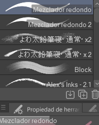
These are basically the brushes I use the most. The "mezclador redondo" is just CSP's default paintbrush and I only tweaked it to find sth I liked and felt comfortable with for both lining and painting
As you can see here I only used one layer for lines and other three for each of the guys' colors. I colored it all with the default brush (tho unfortunately I lost the settings I used for this drawing in particular and haven't found them again rip). In drawings like this I just do a sketch, clean the lines (no lineart) and then paint it. After the base color I start laying out different hues to make the coloring more interesting.
This one was the same. One layer for coloring, manually adding lighter hues (see the more light and yellowish color on grovyle's left leg compared to the shadow) or darker tones. I try to add color to the shadows as well to make them feel less flat, and an airbrush in overlay tends to help with that (tho here I just used a brush).
Here you can see that I often paint over the lines on another layer to correct mistakes in the "lineart" lol. I also applied an airbrush (layer mode overlay) over celebi to make her more bright. I wanted to put this one to show that coloring doesn't have to be detailed to look nice enough. Here Celebi basically has no shadows at all but the tone of the drawing makes her look cute anyways imo ^^
In these two you can see adjustements over the full image again (yellow layer), but I also wanted to show that I don't have a set number of layers either, it depends on how many I feel like using. Again, sorry for the lack of consistency but im too lazy to have a proper method lmao
I will also use harder brushes and tone changes sometimes, instead of blending them with less dense brushes. I am also fond of adding hard lighting in some drawings. You can experiments with it on a top layer and delete it if it doesn't fit, so it's always worth a try.
Another thing I recommend is studying and copying artists you admire or like. Add things from their styles into yours, see how they work with proportions and try to use that in your own art. It has helped me a lot and, without looking to fully copy anyone's style, it does give you some ideas of how you wish your drawing would look, which motivates me (when it doesn't depress me lol)
Finally, the texturing isn't consistent either. I use one of CSP's/Downloaded texture packs, put a grainy texture on the canvas, set it to overlay and adjust the opacity until I'm satisfied. In these two images you can see I am not consistent in coloring even in the same comic lmao. But we are doing this for fun, so I think experimentation is always sth worth exploring ^^
And I think that's all I have to say. I don't control color theory at all, so I can't really explain how I choose colors. I look up some tutorials on youtube and pretend I understand lol. Ig the one thing I tend to do a lot is changing hues in a base color to make it look less flat, the same as with shadows.
Anyways I hope this was helpful or that it at least waas what you asked for haha. Thank you for the interest!! :DD
#ask#art process#i guess???#anyways thank you for the ask sofie i hope this was helpful <333#I am KIND OF A BIG MESS IN ORGANIZATION#but hey we have fun hahaha
10 notes
·
View notes
Note
For funsies. 1 and 4! ^^
(about the game few posts beloww)
1)When did you get into art?
i was born with the artistic talent! which is pretty cool actually fun fact i was born from a generation of artists and its been passed down from me, my sister and my cousins. also because i kinda just,,find it really interesting i guess? i don't remember much except when i drew a leaf for the first time and all my classmates were fascinated about it. i started art at a very young age (3 specifically) and after that i couldn't stop drawing!
4)What defines your artistic style?
my art style is pretty recognizable! atleast to others who have been following me for a long time. it's definitely the 'sketchy' look of the style and how i tend to avoid doing very clean or smooth line art. and how i tend to render my art. i enjoy freely scribbling all over as well as mixing different colors and my usual 'dull color palettes' heres some examples!

if you stare close enough you'll notice how i tend to blend colors together and how 'messy' they looked but in a balanced way


hoping i got the 4th question right. i sometimes still have doubts because my understanding in english still sucks </3
#asks#imagine i got it wrong OSDJKHKAHSH#FALLS AND DIES#rain world#rain world art#ask game#cw body horror
19 notes
·
View notes
Note
did you know that it’s hard to get anons when you have anon turned off lol
but. when did you start drawing? writing? what’s your creative journey? 👀
I do, I turned them off when desceros did and for the same reason. I tend to see "anons" and "asks" as interchangeable. I can turn them back on if you'd like
Oo that's so funny actually. I was writing before I was drawing, funny enough. I mean, I've drawn traditionally forever. But digitally it was very sparse and usually tracing, and I'd never post it
I got into call of duty in the fall of 2022, and started writing fic for it soon after. I orphaned everything. A few headcanons, some fics I immediately deleted but the ideas are still very tempting....and a long fic called If I Could Be Vulnerable. I had forced myself to write every day for it, and lost steam pretty quickly. I got really embarrassed of how bad I think it is and orphaned all my works. The fact it was ever popular astounds me and I'm proud of my numbers, even if I still absolutely hate the fic
I drew nsfw of CoD here and there, but deleted it all soon after out of embarrassment. But then an incredible artist and friend convinced me to put my OCs on artfight last July, and I drew almost daily during artfight. This was massive for me, I only drew like once a month at most before this. I didn't really color my AF works then, despite coloring past works, because I didn't really know how to render and was afraid. But after art fight, I watched tutorials. I learned things about ibis paint. I found the brush I use for rendering to this day. I started coloring, then rendering. I slowly stopped using references(nothing against them, but I was very dependent on them for a while).


These are pieces from a year ago, and surprisingly I hadn't used references for these, I didn't use them for a lot of my old AF attacks, which confuses me why I grew dependent on them after this.
I started drawing backgrounds sparingly a few months ago. I only learned what clipping was maybe two months ago maximum. I found lens blur, which I use for rendering also and allows me to be lazier
I tried to force myself to write fic since I moved into a hotel a year ago, and it's just not happening. I don't think it'll happen for another two months at least. My comics are also on hiatus until that point, despite how tempting it is to get the arc over with, I just can't do it. I love to write, so so much, even if it's really hard for me and I don't think it's good. So no hiatus will be permanent unless things are truly at their lowest
I think my art has grown a lot 😭 that is my journey, and I'm proud of it
#gornack ask tag#gornack art tag#rendering with those lines was the most draining thing ever#i barely get asks anyway so i should open up anon again lmao#a lot of my friends only feel comfortable on anon anyway
5 notes
·
View notes
Note
Hey do you have a process for your colored pencil work? Your stuff is phenomenal.
Hi, thanks for reaching out ! I think i've already answered bits of this question before (you can check my blog for the tag "answers" !) but maybe not so linearly ? It's strange thinking of my drawing as a "process" when for me it's just... How it has to go ahah !
But I do have a routine I follow ! I start off by building a fairly detailed sketch on basic printer paper, which I then tape to the paper I use for colouring (Clairefontaine Exacompta Bristol paper - very smooth, very thick paper, almost no grain at all !).
I copy that rough sketch with the help of a lightbox, then scan the clean sketch so I can digitally plan my colours ahead.
Once I've figured out what I'd like to do colourwise, I move on to lineart, which means erasing the lines of the clean sketch and going over them with a coloured pencil (so I technically do the same drawing three times !)
And once lines are coloured, *then* I can start putting down colours ! I tend to put rough flats first just to make sure I don't accidentally forget which areas are supposed to be white and then move from top left to bottom right, generally starting with the background. Rendering is very instinctive and I wouldn't be able to explain much of it apart from "I uhhhh, colour for a while, and then it looks ok ?" so I'm afraid I won't be able to be of much use to you there x)
But in terms of steps, that's really all there is to it ! Colouring definitely takes the longest but all the steps beforehand are kind of a handful, I'll admit. I kinda wish I was good/confident enough to go mostly lineless, I wouldn't mind skipping that coloured lineart part at least ! But I don't think I'm there yet.
Thanks for asking, let me know if there's anything I can help you with !
27 notes
·
View notes
Note
Can i ask how u do lineart so well,, it looks so smooth,,
I've always been very big on keeping my lineart clean and smooth! :) I'm very inspired by comic and graphic novel illustration, so naturally, I try to take notes from that sort of aesthetic in a lot of my art.
The short answer is that I just have a lot of practice, and am very picky about how my lineart looks. So, I'll often spend a long time making sure it looks just how I'd like it, before moving on, even if the lines aren't necessarily going to be the focus of the final drawing.
The longer answer kinda depends on what lineart you're asking about! The style of my lineart tends to change to fit whatever mood I'm going for, so I have a lot of different line styles with varying levels of smooth-ness.

On the super-smooth end of the spectrum, we have these bubbly, cartoony lines! These are a pain to draw, to be honest. But they really contribute to giving that cute look :) For these, I used the Clip Studio Paint G-Pen, with some minor adjustments to the settings, mainly so that there's not too much line width variation. The uniform, thick lines are important for this look! :) Drawing in this style really just a lot of trial and error. Usually when doing lineart, I'll erase away at lines to get them to the right thickness, or even just clean up a sketch and call that lineart, rather than doing lines on a new layer. But, that's a lot harder to do when the line thickness has to stay consistent. So, I end up just drawing the same line 7 times over, un-doing my work and re-doing it until i'm satisfied. Again, it's a pain! I used to draw like this a lot more frequently, but I stopped because I found that other approaches are often a lot more satisfying and rewarding. This is still great, for that cutesy look, though.

Next, we have what I would affectionately call my ref sheet lines. As much as it's probably a bad idea, I have a habit of just kinda skipping the lining stage of art. I'll just take my sketch, and tidy it up until it's clean enough. But for a drawing where there's only going to be flat colors, that sort of roughness can look sloppy, In my opinion. So, particularly when doing ref sheets, or other art which I don't intend to render, I will actually go through the effort of fully sketching out my idea and lining on a separate layer. The result is a lot cleaner and more deliberate, and looks a lot nicer when colored! Especially if I take the time to color the lineart :) I also really like doing small details with thin lines, particularly body/facial hair, elastic cuffs on clothing, and the seams of clothes, too. I like drawing those little details a lot, and I think they shine the most in my cleaner line style :D
For this, and for most of my lineart, I use these brushes which you can find on the Clip Studio Asset Store:

I'll bounce back and fourth between these, and Kozmo's Scratchy Scribbler brush, which you can find on Ko-fi!
Additionally, I have a modified G-Pen with a pencil texture that I think I made myself? I don't remember making it, but I also don't know where it came from! So i guess I did, lol.
A little more messy than my ref-sheet lines, we have the line style which you probably see most often on my page. As mentioned before, I usually kinda skip the sketch step for these? I don't encourage that, it's a bad habit of mine. But I make it work! I feel like the best way to explain my process with this is to just offer you a timelapse of my lineart process:
I just kinda... go. and it works out! most of the time. lots of cleanup and tweaking, and as you can see with Bdubs and Etho here, sometimes I do actually just. do a sketch and then line over it. So maybe I have no idea what my own process even is, LOL.


Now, to completely abandon your original question here's how i don't do smooth lineart! :D In this style, for the most part, I ignore the cleanliness of my lines, only really erasing with the lasso fill tool, when lines get too cluttered to actually read. Usually I'll only go for this when I'm already planning on painting over the lines. Because sometimes an idea doesn't need or want clean lines, and sometimes I just want to paint some values or slap some colors together and call it a day. Love my clean lines, but scratchy, messy lines are fun too! :)
Not sure if any of this really explained how i do smooth lineart, but I sure did talk about lineart for a while. I hope you could find something interesting or insightful in here! :) thanks for the ask, and I hope you have a great day <3
#inbox#digital art#art process#timelapse#lineart#another ~1k words on my art process?#yippee!!!#askeliyips#ask
17 notes
·
View notes
Note
Your art is very shapey and it's really cool!! I was wondering if maybe you could share a bit of your process??
hey, thank you for the kind words. i appreciate it greatly.
i'll be honest; in terms of a "process" i dont really have one? i'm not as traditional as other artists go, but, if i really think about it, that's the magic of creating, as sappy/cheesy as that sounds lol. i'll talk about what i can tho. i'm not great with words so, bear with me.
i free draw, i don't really draw the traditional guidelines or anything, like the circle with the cross over it? even tho sometimes that bites me in the ass, but thats just how i've taught myself to draw and there's no point in changing that for the sake of being like everyone else.
i start by drawing the jawline first. obviously changes with every face shape i draw but ive drawn this specific look so many times. tbh if anything is my "guideline" its this

i'm drawing franziska since she's all i've been wanting to draw lately.
another method that pops up in my art a lot is utilizing layers like crazy, it helps me so much. i usually draw the hair on a separate layer, and the torso, and sometimes an arm. it helps when i want to change it's size or move it freely, without having to erase so much of what's underneath.

i also keep the opacity lowered because it helps me focus on which part i'm working on.
sometimes im not as sketchy and messy as this as sometimes i draw really quickly.

i tried not erasing as much to show how messy i really am even tho it's usually cleaner at this point when im actually drawing.
here it is semi-cleaned and opacity all put back to normal.
most of my stuff i make is simple doodles, i dont worry about cleaning so much all the time.

that's all i can think of. in terms of color tho, i never really color or render, not often at least.
but tricks i use are usually changing the color of the lineart (oh yeah i hardly ever line my work, i clean and color the sketch) another thing is, instead of making the color darker, i just use a different color entirely. for example, of im shading white, instead of using grey, i'll use blue or something. just makes it pop. i tend to color differently every time i do it, tho those two things are the two that stick in my head the most.
i tend to draw the same elements over and over, like short hair and sideburns. masculine traits. i am transmasc after all, and i put a lot of myself in the content i make. i'm sure that was obvious enough lol. i don't wish to be a professional when it comes to art, i do it purely for fun. i'll be blunt, i usually draw what i want, how i want. it's for my sanity.
thank you for indulging me.
3 notes
·
View notes
Note
1, 2 & 26, 27 :-)
hehe ty !!! <3
do you prefer traditional drawing, or digital?
hmmm probably id say digital as of late, considering it's what i primarily use for my finished work. but when it comes to sketching i 100% prefer traditional, i sketch in graphite almost entirely and only sometimes use pen
2. how long have you been drawing?
since i was little, pretty much! it's always been something i liked, and i'd spend a lot of time drawing on my own as a kid -- i was a little bit of a loner in that regard lmao -- because i wanted to be able to draw in the styles of artists i found inspiring, or at least render things i found interesting well enough that they'd actually look like those objects/animals/etc (which i think is common, except for when you're little you don't really think about how you'll eventually figure out your own style, since that takes a good while and lots of practice, lol)
26. for digital artists: what program(s) do you use?
procreate's my main workhorse, i do nearly everything in it. for zines i'll arrange them in indesign + use photoshop for photo editing
27. for digital artists: how many layers does a typical piece require?
anywhere between like 5-10 sounds right i think ... there are very few pieces where ive gone over 15 cause i'm allergic to using tons of layers in my work (it overwhelms me) ... sometimes ill work on just one layer because i tend to use the eraser or brushstrokes to cover mistakes/refine my work (which drives my friend crazy cause he can't comprehend working like that lmao)
8 notes
·
View notes
Note
Art tips I beg of you share your wisdom
Oh god oh fuck I'll try, a lot of my art process is vibes only, i kind of just zone out and Draw and a picture appears
I have to stress that practice is the most important part of art, even if said art looks shit and you feel like the world is ending because you're not doing well/making tangible process/it's not turning out how you want. Gotta push through that by accepting that hey, sometimes your art turns out looking Janky, so what? You still took the time and effort to make art, and you're more of an artist than you were before starting the piece. You can sit back and figure out how to constructively criticise yourself without destroying your own self confidence for the sake of a viewer who isn't there. Practice being neutral about noting the parts you dislike - 'this anatomy is awful and I'm shit at it, why do i bother' isn't going to help as much as sitting back, going 'damn that looks weird, lol' and then looking up reference photos similar to what you'd been hoping to draw and figuring out where things went wrong.
When starting with a drawing, person or animal, I find myself focusing on the silhouette initially. Sometimes i might play around with a solid colour, or focus on the outline with a thin-ish pen. It helps to be aware of certain curves on a form and how it relates to other features of the body proportionally. Look at the empty spaces on the piece and look back to those in the reference, or your own intuition, flip the canvas etc, and see if it looks 'right'. Get funky with it when in the draft stage
Tracing for practice and reference also helps - but don't trace blindly, instead use it as a chance to figure out how the lines of a person/animal/construct move, and how can you replicate that in art. Make guidelines and notes on how things are proportionate to each other, isolate singular lines and practice them over and over to build up the muscle memory.
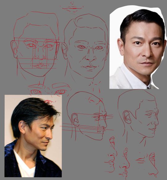
kind of like the above, where I used photos of an oc's faceclaim (Andy Lau) and traced over them, isolated certain features, made guidelines, and so on
When figuring out how to draw faces, I use a couple little anatomy tricks to keep things in line before tweaking some of the features to make things more unique:
Corners of the mouth tend to align with the top of the jaw. The corners of the mouth also align with the pupils if a front-facing figure is looking straight on. The inner corners of both eyes align with the outer nostrils. Top of the ears align with the top of the eyelid and earlobes align with the bottom of the nose.
This can change depending on feature size etc, some people have bigger or smaller eye or theyre close together or further apart, or they have large earlobes or none at all, or their nose is small or big. I just use it as a guideline to make sure features are in order because. Uh. I keep forgetting to draw in the guides during the draft stage.
Variability of the human face lends well to avoiding same face syndrome as you can stretch the features quite a bit. It may feel weird or wrong drawing a face with different features to how you're used to, but that's the point of practice and progress.
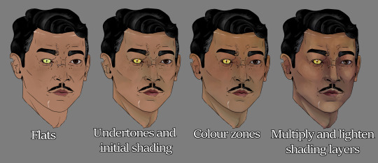
For rendering I found using the colour zones of the face (shown below) adds a lot of oomph and depth after finding my own rendering attempts falling a bit flat.
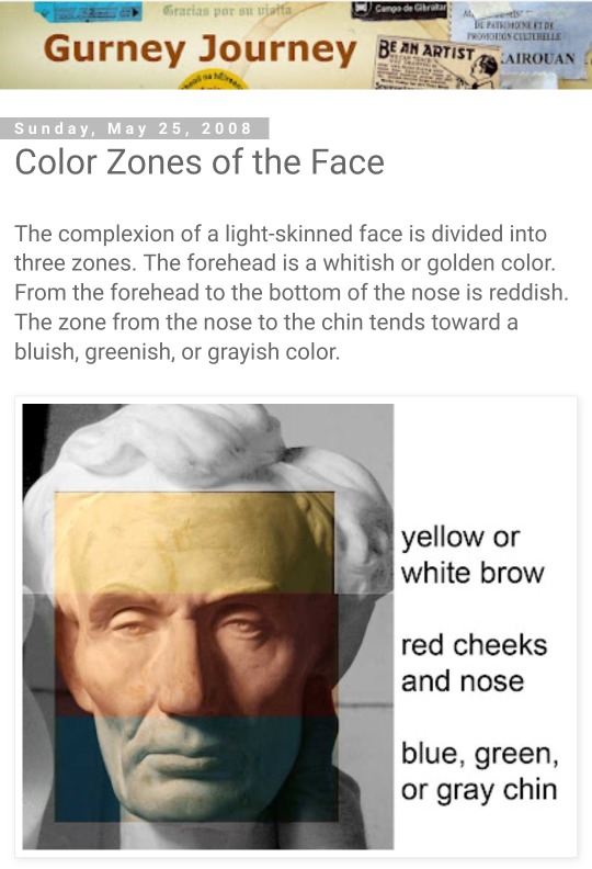
(above, from Gurney Journey describing the colour zones of the face)
(below, by ArtofYorugami on twitter)
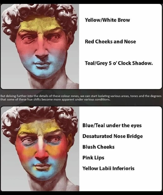
I make the three colour bands, blend them to the contours of the face, then set the layer to multiply and lower the opacity to around 10-20%, and make further tweaks there to where it best suits the face being drawn.
Other little things
Eyes aren't totally white, make them a touch grayer and also add a little bit of blue to give it some depth. Same with teeth but I've yet to figure those freaks out
Hands are the devil but draw them enough times and you can flub your way through them until they feel normal. Would recommend having at least one finger in a different position to the rest, as our hands naturally rest with the index finger away from the rest. Again, use a reference, trace for research and building muscle memory, be cognizant of the muscles and bones at play in the hand and wrist. There are reference compilations on pinterest I've found in the past that have been helpful, and taking a photo of your own hand is an option as well.
A hand's palm width across is also the height of your lower face. That sentence doesn't make a lot of sense - but if you put your hand over your mouth, the top will be touching the bottom of your nose, and the bottom of your hand will align with your chin, more or less. Again, this can change from person to person but is helpful when eyeballing proportions.
Reference sites like x6ud is very helpful for angles of people and animals. Apps like Handy are helpful with figuring out how certain angles of light interact with the face. Videos like this one and this one are also good lighting references. Just looking up 'face under different light angles' on a search engine or pinterest will also be fruitful. Books like Michel Lauricella 's Morpho - Fat and Skin Folds is also very useful and you can find free pdfs online with enough safe digging. And there are a number of tutorials by tumblr artists on a number of desired topics
For expressions, it can be difficult to word the search right to find the specific look and angle you want as a reference. If you're willing, I'd recommend taking a photo of yourself making the expression at the intended angle. No one but you has to see the photo lmao
Uhhh. Multiply, overlay, add (glow) are your friends if you use CSP, play around with pens and layer effects until you get ones you like. I'm partial to the CSP textured pen for lineart and the watercolour pen for rendering
I think that's all i have ahjfjdks 😭 sorry, hope this helped a little bit!
14 notes
·
View notes
Last Seen Blogs

r20626zd
蛇奴隷
dorkicon
aha what if we kissed and we're both giant robots?

thestalwartheart
constantly chasing a thought

rabbbitnotes
Holla, Its Me Rabita

fashioncassetete-blog-blog
Fashion Casse-tête