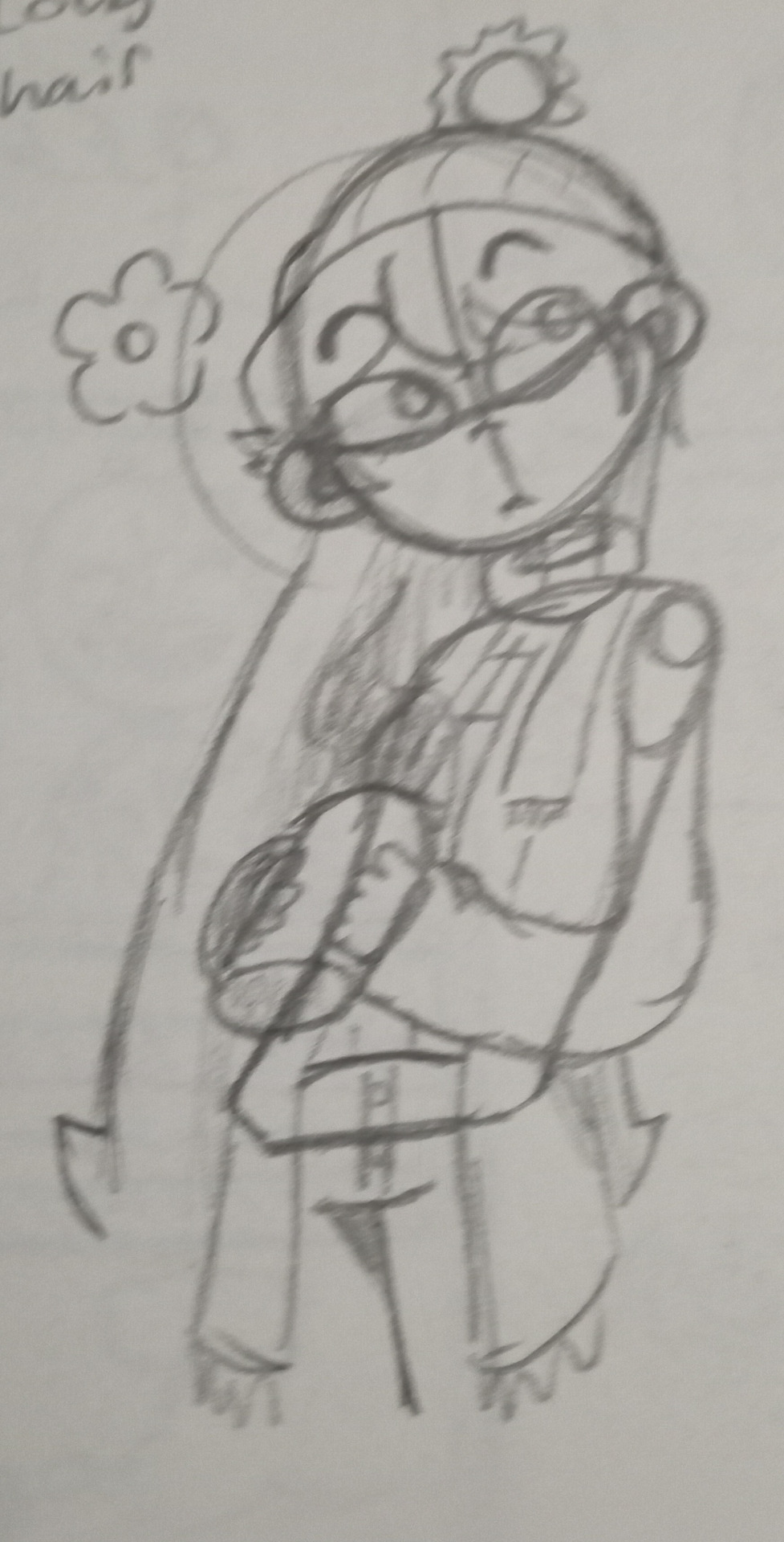
#Image File Formats Comparison
Explore tagged Tumblr posts
Visit Tumblr Blog
Explore Tumblr blogs with no restrictions, modern design and the best experience.
Last Seen Tumblr Blogs


Fun Fact
Mobile Tumblr US users spend an average of 4.04 minutes per session on the app.
Text
#PNG vs JPEG#Image File Formats Comparison#Image Compression#Lossless Compression#Lossy Compression#Graphic Design#Image Quality#Digital Images#Image Format Selection#Visual Content#Image Optimization#Web Graphics#File Size Reduction#Digital Photography#Multimedia Formats#Transparency in Images#Visual Effects#Image Loading Speed#Image Compatibility#Format Choice
0 notes
Text
A few people have asked me about kitbashing art from retrograde minis so I decided to make a tutorial on it!
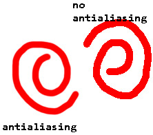
First off I recommend installing paint.net, I find it has everything I need for what I make but as long as you have some sort of art program that has layers it will work. But I'll be showing stuff in paint.net since its what I know. Here's the link to paint.net, its free! https://www.getpaint.net/ First step you need to do is to make sure antialiasing is off, just select the paintbrush or eraser and select the following two options:
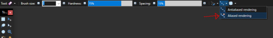

This will give the paintbrush and eraser a hard edge, which are vital to working with pixel art. Heres a comparison:
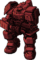
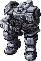
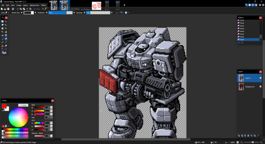
Now we can get to the actual kitbashing. There are two methods I know of, the first is the one I primarily use and the other my lovely girlfriend @gay-dollish-catgirl uses. Both are useful for different circumstances so I encourage mixing them up! The first method is what I called layer and erase and I find it is the easiest. First get the two colours you want for your mech, usually the base colour and then the accent colour. You can get these by downloading from retrograde minis, taking a screenshot of the web page, or using the All++ option if you have patreon membership, which I personally recommend to support the creator! For this example I'll be using this tortuga in platinum and scarlet:
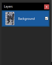
I recommend fiddling around in paint.net to get used to the tools, especially the magic wand tool, I could do a tutorial on that alone, and if anyone wants that I can! For now we will focus on the kitbash. Next you want to put these in the same image and layer them on top of each other. First add a new layer, which you can do in the layer window here:
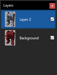
This will create a new layer above the selected layer, which you can then drag around above or below the existing layers. Next, take your other coloured mech and place it above or below the current one, with the base colour you want being above the accent layer. In this case I want the platinum to be the base colour and the scarlet to be the accent so Ive organized them like this:
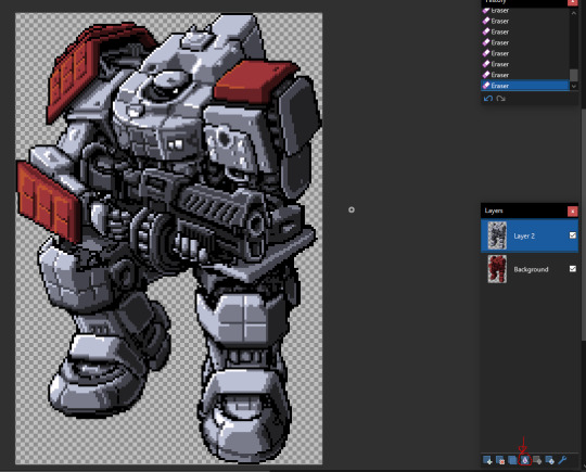
Now we can actually get to doing the kitbash, and from here its simple. All you do is erase from the base colour layer to reveal the accent layer underneath, make sure you have the base colour layer selected too, other wise it will seem like nothings happened... that happens to me a lot. But if you did it right erasing the top layer should reveal the bottom layer and cause it to show through like so:
From there just continue to do so for any other parts you want to be the accent colour
Once you have all the parts you want coloured done, merge the layers together with the following button:
Once its merged you can just start over with a new colour, doing the same technique to continue adding to the mech until you are happy with the end result! I recommend experimenting with the tools and shortcuts in paint.net! Now for the other method which admittedly I'm not as good at but I wanted to show off anyway! This method involves creating a colour palette and manually replacing the colours. First find the part you want to replace, which in my case is the top of the mechs head

If you look at the colours on the head you can see there are actually only really 4 different colours, which if I colour them differently you can see:
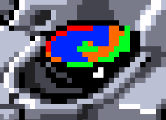
It looks a bit weird but can help visualizing that there are only 4 different colours. What you then need to do is make a palette of 4 different colours to replace the existing one. This can be done several ways, by taking the existing colours and tweaking them, taking them from another image, or just playing with colours and eyeballing it. I find the first option to be the best for me
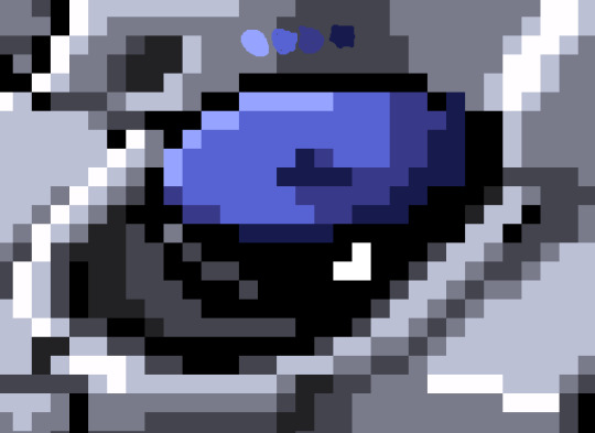
Eventually youll get something like this! It will take some time fiddling with colours to get it exactly right but once you do you can make some pretty funky looking colours with this technique! As an end note be sure to save the files in PNG and not the PDN format, the PNG format is more widely supported, and PDN should only be used when you want to keep the layers, which can be useful if you want to reuse stuff from a mech for later! once again Im not an artist, so Im not sure how helpful this will be, but if it gets a few more people making mechs then that is my goal! If anyone has any questions please feel free to send me and I'll answer them as best I can! If anyone makes any mechs using my techniques please lemme know so I can check them out and reblog them too!
60 notes
·
View notes
Note
What is your creation process? :3c
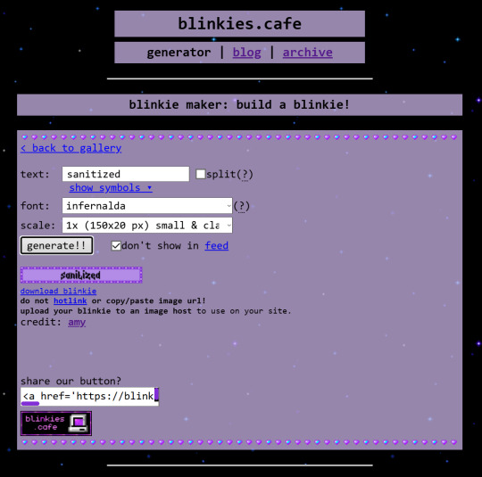
hey, thanks for the inquiry! i've been meaning to make a post like this for some time now. NOTE: this will only cover how i make my blinkies. if you want me to go in depth about how i make stamps, please send another ask! i just think they're kind of self explanatory in comparison >_>
MY BLINKIE MAKING PROCESS
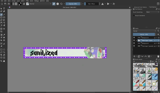
for this demonstration, i will make this graphic of Acht Mizuta from Splatoon 3. it's free to use btw:

i make my graphics in Krita, which is great for editing pixel art, but does not have an option to disable font antialiasing. this leads me to generate my pixel text through external online services, but i usually generate it on blinkies.cafe and get an editable template to go along with it. my go-to is the simple purple template, since it has a simple palette and the text has its own color so i can put it in a separate layer easier.
i import it as a single frame that i will animate later. usually what i do first is cut+paste the inner content of the blinkie into a separate layer:
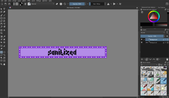
then i remove the background with a fill erase on the third mode, and move it around as i see fit. i put it in a separate layer before this so it's easier to color and add things like outlines.

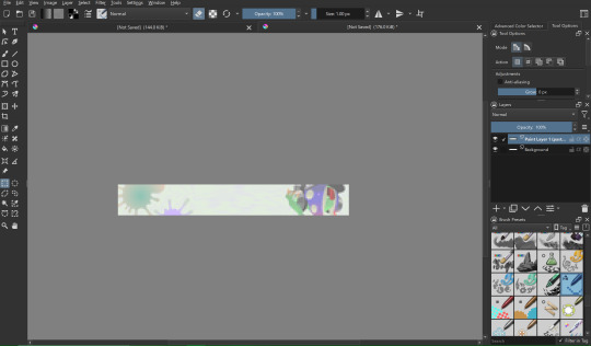
let's import graphics! usually i find a transparent png and overlay it onto the background, but in this case i'm using a full background, so it needs to be prepared:

(source: splatoon 3 side order locker reward banner)
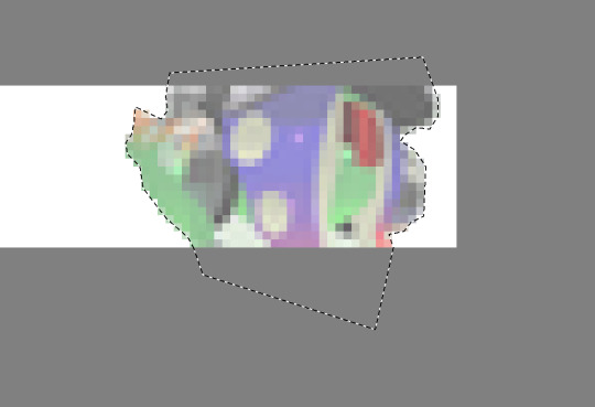
i import the image into a new file with the same resolution as the blinkie. i edit it to have a wider resolution so it fits better:
i use a lasso tool to put acht in a separate layer (so they stick out of the frame)
i import the two layers into the original file with the text. though i feel the images could use a little color grading...
at this point i begin to mess around with the layout a little, trying to match the original "sanitized" theme i had in mind. i also do color grading on the render of acht and change out the background. now we're getting somewhere! i also color the text at this point to be a nice gradient green.
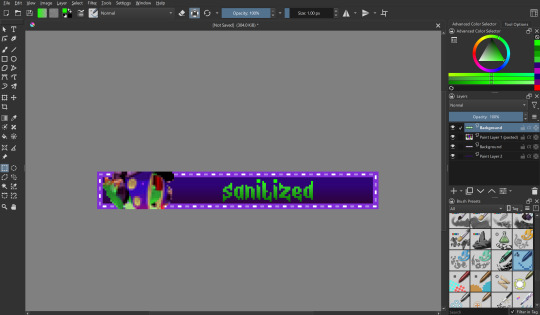
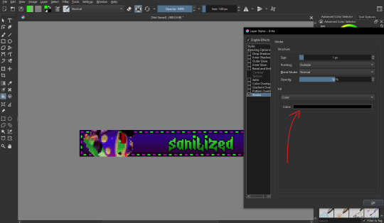
let's color the outer part of the blinkie! i thought i would make the border a transparent black, with the lights being neon green and a dark magenta respectively.
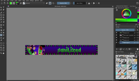
i also want to make the text have a nice little border around it, so i put a stroke filter on the text layer with the following settings. these usually change depending on graphic but the thickness is always 1px (any more and it gets antialiasing)
that's it for designing the blinkie, now it's time to animate it! i do this internally in krita, since it has an animation feature:

i make a new frame for the animation and change the colors and positions around. i also set up my clip settings - ending at frame 1 (2 frames - frame 0 and frame 1) at 6fps.

that's pretty much it! the gif is ready to export, just make sure you export it in the right format and don't accidentally compress it or make it too big.
the gif is ready!! wahoo!! i hope this was somewhat enlightening, i'm not the best at explaining stuff but i tried to go in depth as much as i could
#dj's commentary#pixels garage#web graphics#blinkies#dedf1sh#acht mizuta#acht splatoon#blinkies.cafe#tutorial
53 notes
·
View notes
Text
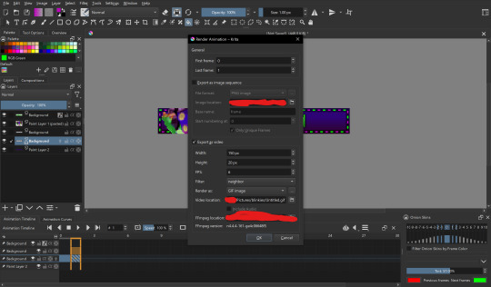
SRWE or AI? Best Ways to Upscale Sims 4 Screenshots
Are you also tired of seeing social media mercilessly crush your The Sims 4 screenshots? We’ve tried every trick in the book to keep our pics crisp – SRWE, AI upscalers, you name it – and now we’re ready to break down how to save your favorite sim’s photos from pixelation, quick and easy. In this article, we’ll explain (no tech jargon, promise!) what actually works, plus share our hands-on experience and top tips.
Your upscaling method depends heavily on the source image and the look you’re going for. We all have different ideas of what makes a sims beautiful – some love natural textures, even slight skin imperfections, while others prefer flawlessly smooth, hyper-sharp results.
We’ve tested different upscaling tools to help boost your screenshot quality. But to find your perfect match – the one that makes your shots look just right (by your standards!) – we recommend trying a few yourself.
You can enhance screenshots both before and after saving them! We’ve covered both approaches, so pick whichever suits you best.
Before Saving the Screenshot: SRWE (Simple Runtime Window Editor)
This tool is well-known in The Sims 4 community – there are tons of YouTube tutorials covering it. When it comes to improving image quality before taking a screenshot, SRWE is one of the first solutions that comes to mind.
It works by bypassing Windows' DPI scaling, allowing you to capture screenshots at a higher resolution without blurring.
Pros:
— A fantastic tool: it delivers the exact same image but in much better quality.
— No conflicts with GShade/ReShade: your presets will look exactly as intended.
— Free and easy to install, no hidden costs or complicated setup.
— No post-processing needed, preserves original texture and UI quality.
— No extra plugins or presets required, works right out of the box.
— Great performance even on low-end PCs. If your computer can run GShade, SRWE will work just fine.
Cons:
— Limited functionality.
— Some users find SRWE a bit tricky to set up (though we personally disagree).
Now, let’s break down how to use it and what results to expect.
If you prefer a video guide, check out this link for a detailed walkthrough by Chii.
Step 1
First things first – you'll need to download the program itself. It's available for free on GitHub – you can grab it here.
There's no real benefit to getting the version with pre-configured profiles, so just download the standard version without profiles.
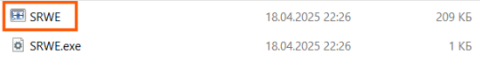
Step 2
Extract the files from the archive.
It doesn’t matter where you store them on your computer – it won’t affect how the program works.
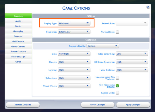
Step 3
Now it’s time to launch the game and switch from fullscreen to windowed mode in the settings. You can also do this with the Alt+Enter shortcut.
Step 4
Set up your shot exactly how you want it. Open the location, pose your sims, apply any presets if needed. At this point, you can take a regular screenshot (for comparison) using your usual method.
Step 5
1. Go back to the SRWE folder.
There are only two files inside – one of them launches the program (no installation needed).
2. In the window that opens, select The Sims 4 from the list.
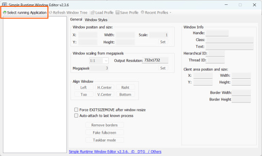
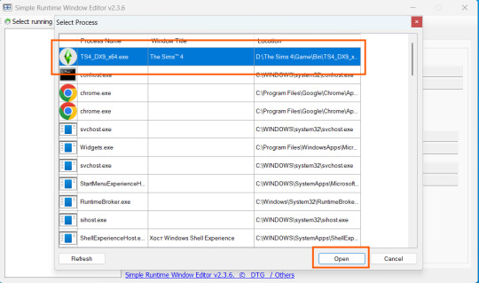
3. Check all the boxes.
4. Image Size
You can set your screenshot size in a few different ways:
— The easiest method: Multiply your current resolution by the desired factor. For example, to upscale 1080p to 4K, multiply by 2. Tap Set.
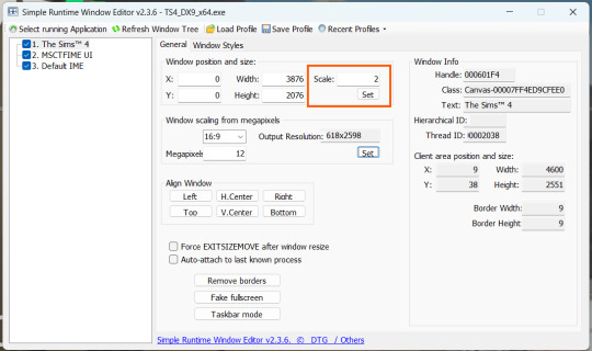
— Manual input: Enter your preferred pixel dimensions. Tap Set.
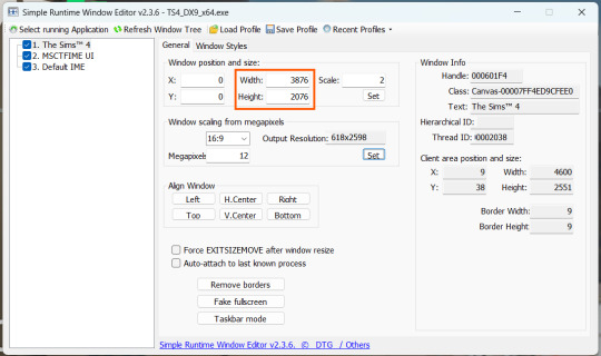
— Aspect ratio mode: Choose a format (1:1, 16:9, 4:3, etc.) and set your target megapixels. The program will automatically calculate the dimensions. Tap Set.
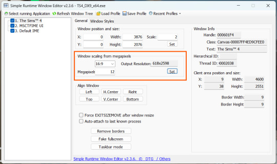
Honestly, you can experiment with any size. During our tests, even a weak PC handled an 8K screenshot without issues – though realistically, 4K is more than enough for most purposes.
Plus, if you're capturing in-game scenes (not just CAS), your screenshots will already be pretty large in file size. You probably won’t want them taking up even more space unnecessarily.
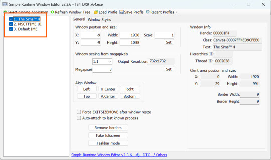
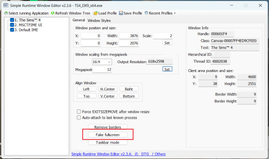
Step 6
Now when you return to the game, you'll notice the image has become significantly larger and no longer fits your screen resolution – you're only seeing a part of it.
Don't panic! Just wait for your preset to fully load (if you're using one), then take your screenshot as you normally would.
Step 7
Once you've captured your planned screenshot, head back to SRWE and click "Fake Fullscreen" to return to the original resolution.
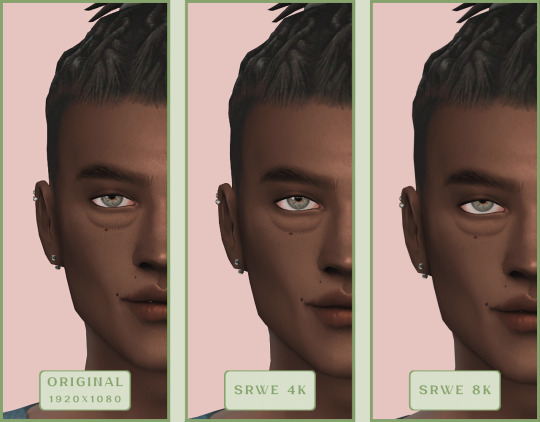
Now let's compare our results.
Gameplay Scenes
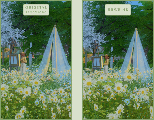
CAS
For in-game screenshots, this method works much better if you have at least a moderately powerful PC. After upscaling, navigation can become tricky due to lag. That said, it's still completely doable since we've prepared our scene in advance.
Post-Processing Screenshots
We've tested several post-processing programs: two paid options and several free ones.
Let's start with the paid options – Topaz Gigapixel AI and Let's Enhance.
Topaz Gigapixel AI
A specialized tool from Topaz Labs designed specifically for AI-powered image upscaling.
It doesn’t include extra features like noise reduction or face correction, but it delivers more precise upscaling, which is especially useful for The Sims 4 screenshots.
Pros:
— Upscale up to 600% (6x) without losing detail.
— Preserves texture clarity (hair, clothing, patterns).
— Automatically restores lost details (e.g., small decor items).
— Supports batch processing (multiple screenshots at once).
Cons:
— $99 price tag.
— Requires a powerful PC for 4K upscaling.
— Limited functionality (just upscaling, no additional edits).
— Trial version doesn’t allow exports.
Example:

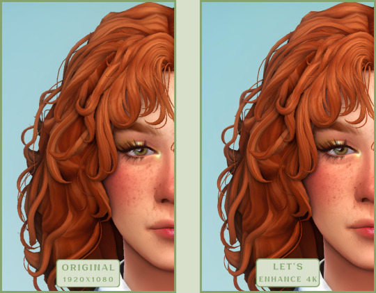
Let's Enhance
A convenient online AI-powered tool for enhancing screenshots. No downloads required – just head to https://letsenhance.io/boost and you're good to go.
Pros:
— Automatic upscaling up to 16K, boosts resolution without losing detail (hair and clothing textures become sharper).
— Dead simple to use: just upload your screenshot, pick a model, and download the result.
— AI doesn't just upscale, it subtly "beautifies" images too (though this is subjective, of course).
Cons:
— Free version limits you to 10 images/month (watermarked downloads; subscription starts at $9/month).
— Internet connection required (no offline mode).
We found these settings work best for Sims screenshots:
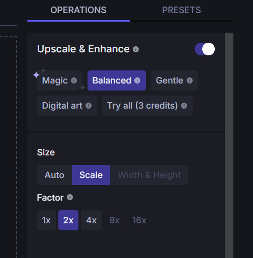
Now, let's see the results:
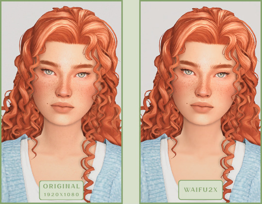
Free Upscaling Tools: Upscayl (with detailed usage guide), Bigjpg, and Waifu2x.
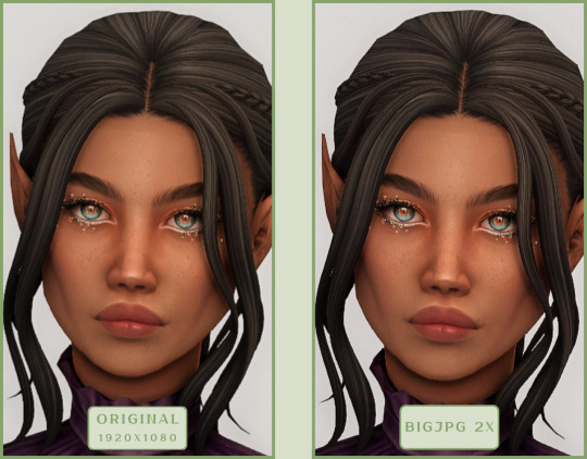
Bigjpg
A handy tool for basic image upscaling tasks, though the free version has limitations on processing speed and number of images.
Pros:
— Solid baseline results: boosts resolution effectively, making images noticeably sharper with genuine quality improvement.
— Free 2x/4x upscaling with watermark-free downloads.
Cons:
— Free version restricts image quantity, size, and processing speed.
— Lacks advanced parameter fine-tuning.
Our recommended settings combo:

The 4x upscale delivers noticeably weaker results.
Sample Bigjpg output:
Waifu2x
A free neural network-based tool. Originally created for upscaling anime images, but works perfectly for The Sims 4 as well.
Pros:
— Upscales images 1.5x–2x without noticeable distortion.
— Preserves art style, doesn't turn pixel art into a "blurry mess" (unlike some other upscalers).
— Available in both online and offline versions.
— Offline version supports batch processing of screenshots.
— Free 2x upscaling with no watermarks.
— No powerful PC required.
Cons:
— Free online version has a 5MB file size limit.
— Maximum 2x scale (no higher options).
— Lacks advanced parameter tuning.
Our recommended settings:
Waifu2x results:
Upscayl
A free, open-source program that uses neural networks to upscale images without quality loss.
Pros:
— Upscales images without distortion.
— Enhances fine details.
— Supports multiple AI models for different screenshot styles.
— Offline version handles batch processing.
— Free 4x upscaling with no watermarks.
— Doesn't require a powerful PC for 2x upscaling.
— Works offline, no internet needed after installation.
Cons:
— Requires a powerful PC for 4x upscaling.
— Minimalist interface – fewer beginner-friendly guides.
— Lacks advanced parameter tuning.
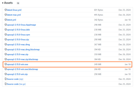
Given Upscayl's minimalist interface and lack of detailed tutorials, we decided to provide a more thorough walkthrough.
Step 1
First, download the program from its GitHub page. It's completely free and open-source.
Multiple versions are available – choose the one matching your system. For standard Windows, download the file highlighted in the screenshot below.
Step 2
Run the installer as administrator.
Install location doesn't matter – it won't affect performance. Select the destination folder. Click "Install".
Step 3
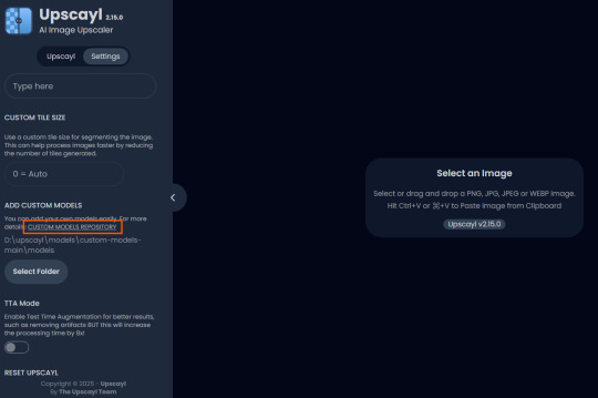
Upscayl includes several built-in AI models (good for testing), but we strongly recommend downloading custom models for better results:
1. Download the custom models pack here (also accessible via Settings → Add Custom Models in-app).
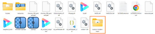
2. Extract the archive.
3. Navigate to custom-models-main → custom-models-main.
Move this folder to your Upscayl installation directory (optional: rename it).
Your Upscayl folder should now look like this:
4. Add Custom Models:
— Launch Upscayl.
— Go to Settings and click Select Folder.
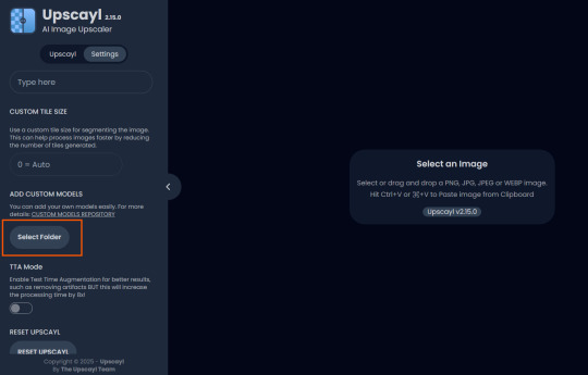
— Navigate to Upscayl → custom-models-main → models
Critical: The folder must be named "models" – don't rename it.
Step 4
Now that you have both the default and custom models loaded, it's time to start enhancing your screenshots.
1. Click Select Image or simply drag and drop your file into the processing area.
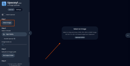
2. Choose Upscale Factor.
While Upscayl supports up to 16x magnification, it warns that anything above 5x may severely strain your system.
For optimal results, stick with 2x to 4x.
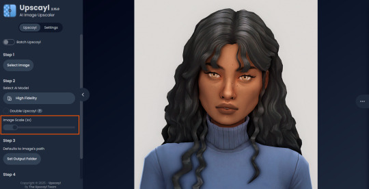
3. Select AI Model.
Click the Select AI Model dropdown: default models show before/after previews, custom models appear as a text list.
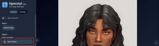
4. Experiment! Try different models on the same screenshot. Test various scales (2x, 3x, 4x) – sometimes better results come from modest scaling, while 4x might degrade quality.
For this demo, we'll use the first default model.
5. Click to begin enhancement.
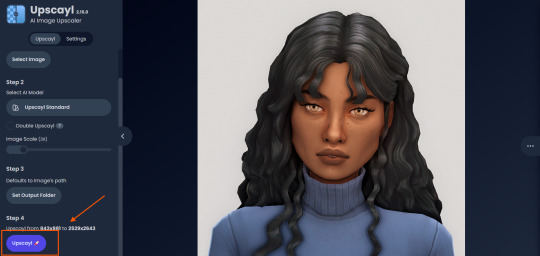
6. Processing time duration depends on original image quality, selected parameters and your PC's power (may complete quickly or take several minutes).
After processing, you'll see a clear side-by-side comparison of the changes.
7. Click the three-dot menu (⋮) for advanced viewing options.
Magnifying lens compares original vs. enhanced versions side-by-side.
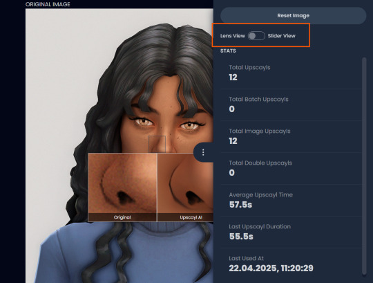
Also you may reset to original and revert all changes instantly.
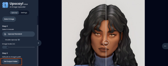
8. Save your image.
By default, Upscayl saves to the source image's folder. To change this click Set Output Folder.
9. After this, use the Ctrl+S keyboard shortcut, and the new image will be saved. The original filename will be appended with the name of the AI model used and the upscaling scale applied.
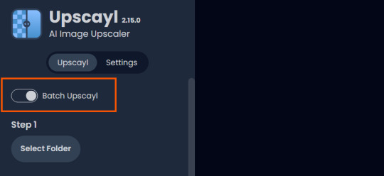
You can also use batch processing. Before loading images, you simply need to enable batch loading.
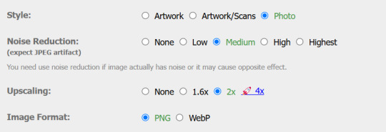
In the settings, there are different format options for saving processed images: PNG, JPG, WEBP. To preserve the best quality, we recommend choosing PNG.
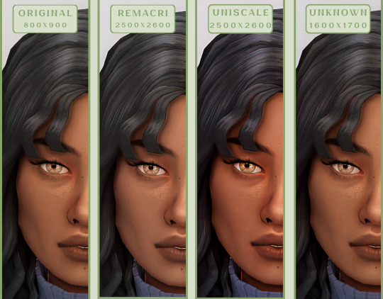
Finally, we're sharing the AI model options we liked best for processing Sims screenshots:
— Remacri (default model)
— Uniscale Restore (custom model)
— Unknown-2.0.1 (custom model)
🌱 Create your family tree with TheSimsTree
❓ Support 🌸 Our Blog
#TheSimsTree#simslegacy#legacychallenge#sims4#sims2#sims3#simsfamily#simstree#sims#sims4legacy#sims4roleplay#sims4stories#sims4couple#thesims4#ts4#ts4cc#plumtreeapp#simsta#simstagram#sims proposal#sims ideas#inzoi
39 notes
·
View notes
Text
On the subject of framerate...
All of the animations created were intended for 60fps, but .gif as a file format is limited solely to 50fps.
As a result, you end up with animations that are slower than in-game with large files that need to be shrunk down to fit within Tumblr's 10MB-per-image limit.
One potential alternative is that instead, I could output a .gif at 30fps and skip every even frame. This would allow for higher resolutions and closer to in-game accuracy, but it would have more jitter compared to its 50fps predecessor.
For comparison —
50 fps, lower resolution (current process):
30 fps w/ even frames skipped, higher resolution (proposed process):


16 notes
·
View notes
Text

Avisynth Basics - Resizing and Sharpening for Gifs
Prerequisites
Avisynth (Wikipedia)
How to Use Avisynth For Gif Making by MichieTuts
Installing Avisynth by brandinator
Tumblr Dashboard Image Display Sizes by Unwrapping Tumblr
This post details my process for using Avisynth to resize a video file. The video file can then be edited and converted to a gif.
I learned how to use Avisynth through the posts linked above. I highly recommend reading through them; they're very detailed and easy to follow. By comparison, this is a basic guide as it only offers one method for using Avisynth.
In this post, I cover the following:
Why use Avisynth?
Using Avisynth to resize a video clip
This post assumes that you've already installed Avisynth.

💡 Why use Avisynth?
Avisynth is a frameserver that takes a video file as input and resizes it for editing. The width of a Tumblr post is 540 pixels (px); with Avisynth, we can resize video files so that they fit that criteria. (For context, a 1080p (HD) YouTube video is 1920 x 1080 px.)
While Photoshop is able to resize images (Image > Image Size), it's not as accurate as Avisynth is.
Here are two gifs that have been resized through different software:


The difference is subtle, but the left gif (Avisynth) appears more detailed to me!
However, please note that I didn't run any Photoshop sharpening on the right gif. When learning how to resize and sharpen gifs in Photoshop, I followed rubyredwisp's Gif Sharpening Tutorial.
🎥 Using Avisynth to resize a video clip
The following steps detail how I use Avisynth to resize videos. The final product, an .avi file, can be imported into your editor (eg. Photoshop) and edited there.
① Choose a video file that you'd like to gif.
For the purpose of this tutorial, I work with a screenrecording that I took of Dragon Age 2.

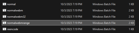
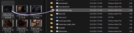
② Navigate to your Avisynth folder and locate the normalwebmrange script.
This may differ depending on how you installed Avisynth, but my Avisynth folder is located at \This PC\Windows (:C)\video.
normalwebmrange is a Windows batch file (.bat). I use this particular script because it allows you to clip out a few seconds of the video by specifying the start and end timestamps. These timestamps specify the video clip that will become your gif(s).
I recommend working with video clips that are 4-8 seconds long.
ⓘ This means that you may need to load your video file back into normalwebmrange to make a gif in a new timestamp range. While inconvenient, I recommend working with smaller video clips so that you're asking Avisynth to process multiple small videos rather than one large video. A larger video is more likely to crash the software.
③ Load the video file into normalwebmrange.
To do so, select and drag your video file into normalwebmrange.
④ Enter the timestamps of the portion of the video you want to clip out.
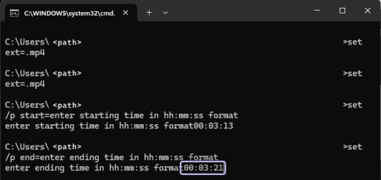
A pop-up window will appear that asks you for the "starting time in hh:mm:ss format."
For this example, I want my gif to start at about 3 minutes and 13 seconds into my video file. My start timestamp is therefore 00:03:13.
Enter this information, then hit the Enter key.
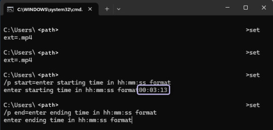
Next, enter the "ending time in hh:mm:ss format." (For this example, my end timestamp is 00:03:21.) Hit the Enter key.
normalwebmrange will then generate a bunch of log lines. After, it will automatically open two things:
A tab in your computer's default web browser.
An Avisynth window.
⑤ Specify the resizing details for your gif.
Navigate to the browser tab that normalwebmrange opened. There are several fields for you to fill out here.

GIF Size - This is the width and height of your gif. For more details on Tumblr post sizes, see Tumblr Dashboard Image Display Sizes. After filling this out, you may have to adjust your video clip in the preview box (below the white textbox).
Opacity - Leave this value at 100.
Preprocessor - I always use qtgmc 30 slow for the framerate and debilinear sharpening. "30" refers to how many frames per second (fps) you want your gif to display; I find that the alternative, 60 fps, is overkill for Tumblr gifs. "Slow" means that Avisynth will take longer to process your video, but this results in better quality.
Extra Sharpening - I don't use this field, but feel free to experiment!
After filling out all of the fields, copy all of the text in the white textbox.
⑥ Enter the resizing information in Avisynth.
Navigate to the Avisynth window that normalwebmrange opened.
Paste the text you just copied on line 17:
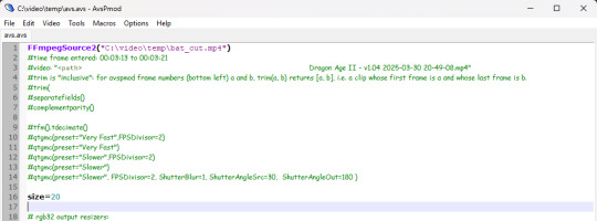
Your Avisynth window should now look something like this:

Select File > Save Script.
Close the Avisynth window.
This automatically launches another Avisynth window called VirtualDub. Here, you can watch Avisynth resize and sharpen your video clip in real time!
Once the VirtualDub window automatically closes, you'll know that your video clip has been fully processed and is now ready for editing.
? Where did my video clip save to? If you go back to your Avisynth folder (\This PC\Windows (:C)\video), open the \temp folder. The .avi file named "video" is your resized and sharpened video clip!
18 notes
·
View notes
Text
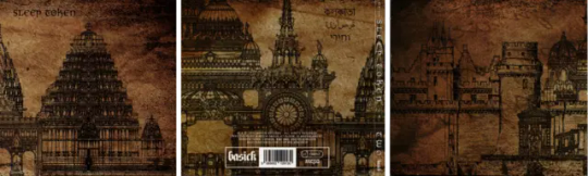
A breakdown of Two's album Artwork By PINQTEETH - ENG TO PTBR
FULL CR TO PINQTEEH, link

A quick summary of this post:
I found every component used across Two's visual elements; I'll point out exactly where they were implemented and give a tiny bit of context to the illustrations as well.
I will be using the single release images (seen above) for comparisons to the source illustrations, as the black and white make them clearer to see. All source images still apply to the outer CD casing, where the same designs are also featured (except for the cover and flap being reversed).
---------------------------------------------------------------------------
Um resumo rápido deste post: Eu encontrei todos os componentes usados nos elementos visuais de Two; vou mostrar exatamente onde eles foram aplicados e também dar um pouco de contexto sobre as ilustrações. Vou usar as imagens dos singles (vistas acima) para fazer comparações com as ilustrações de origem, já que o preto e branco as torna mais fáceis de visualizar. Todas as imagens de origem também se aplicam à parte externa da embalagem do CD, onde os mesmos designs aparecem (com exceção da capa e da aba, que são invertidas).
I hope you find this a little bit interesting (and that its decently readable, formatting is hard), worship :]
---------------------------------------------------------------------------
Espero que você ache isso pelo menos um pouco interessante (e que seja razoavelmente legível, a formatação é difícil), adoração :]
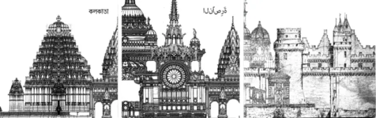
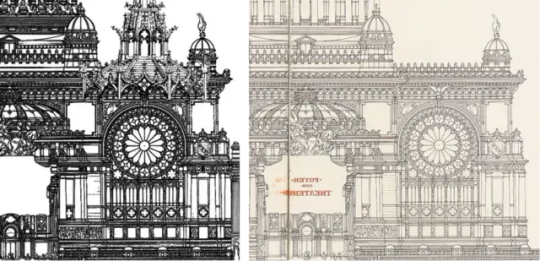
Design for Sri Kalyana Venkateshwara Temple

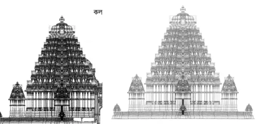
Calcutta / Sri Kalyana Venkateshwara Temple design
The illustration most recognised as being the centrepiece for Two's visuals as well as Calcutta's single artwork comes from a design for a traditionally constructed Hindu temple in the 12th-century style of the Hoysala dynasty, created by Adam Hardy of Cardiff University.
The Sri Kalyana Venkateshwara Hoysala Art Foundation commissioned the temple, which is dedicated to Vishnu in the form of Sri Venkateshwara, with the goal of revitalising regional cultural traditions by serving as a religious centre, a venue for music and dance performances, and a destination for thousands of worshippers and tourists. The design was mainly developed in 2010, with minor adjustments made up until 2013, and began physical construction in 2017.
---------------------------------------------------------------------------
A ilustração mais reconhecida como sendo a peça central dos visuais de Two, assim como da capa do single Calcutta, vem de um projeto de um templo hindu construído de forma tradicional, no estilo do século XII da dinastia Hoysala, criado por Adam Hardy da Cardiff University. A fundação Sri Kalyana Venkateshwara Hoysala Art Foundation encomendou o templo, que é dedicado a Vishnu na forma de Sri Venkateshwara, com o objetivo de revitalizar as tradições culturais regionais, servindo como centro religioso, local para apresentações de música e dança, e como destino para milhares de devotos e turistas. O design foi principalmente desenvolvido em 2010, com ajustes menores feitos até 2013, e a construção física começou em 2017.
Sources: Image source - https://architexturez.net/system/files/pdf/Hardy_A%2520New%2520Hoysala%2520Temple%2520orca%2520rev.pdf https://www.cardiff.ac.uk/news/view/795958-work-gets-underway-on-welsh-designed-indian-temple
Elevation Of A Hindu Temple


Calcutta / Nazareth / Elevation Of A Hindu Temple
This illustration is featured on the edge of both Calcutta and Nazareth's cover art and is an architectural print presenting the elevation of a Hindu temple, originally engraved by by Kasheenath from Calcutta. It was displayed alongside 'Benares Illustrated' by James Prinsep, a work published in 1831 that aimed to capture the architecture, customs, and cultural heritage of the Indian city of Varanasi (then called Benares).
---------------------------------------------------------------------------
Essa ilustração aparece na borda das artes de capa tanto de Calcutta quanto de Nazareth e é uma gravura arquitetônica que apresenta a elevação de um templo hindu, originalmente gravada por Kasheenath, de Calcutá. Ela foi publicada junto com Benares Illustrated, de James Prinsep, uma obra lançada em 1831 que tinha como objetivo retratar a arquitetura, os costumes e o patrimônio cultural da cidade indiana de Varanasi (então chamada Benares).
Sources: Image source - https://commons.wikimedia.org/wiki/Category:Art_works_by_James_Prinsep#/media/File:Elevation_Of_A_Hindoo_Temple_by_James_Prinsep_1831.jpg https://www.christies.com/en/lot/lot-191352
Princely Summer Residence
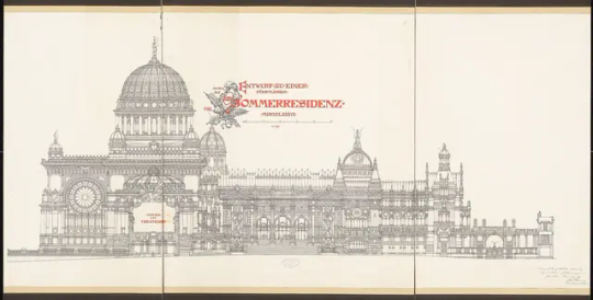
Princely Summer Residence 8

Princely Summer Residence 9

Princely Summer Residence 11

Calcutta / Nazareth / Princely Summer Residence 11
Nazareth / Princely Summer Residence 8 (flipped)
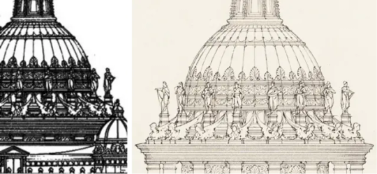
Nazareth / Princely Summer Residence 11 (flipped)

Jericho / Princely Summer Residence 8
Jericho / Princely Summer Residence 8
Most of the different components used across all 3 singles' respective artworks are made up of pieces of Otto Schmalz's Draft For A Princely Summer Residence. The illustrations were created as a submission for the Schinkel competition (an architectural design competition held in Germany, named after the 19th-century architect Karl Friedrich Schinkel) in 1886, rather than having their future construction in mind.
---------------------------------------------------------------------------
A maioria dos diferentes componentes usados nas artes de capa dos três singles vêm de partes do projeto Draft For A Princely Summer Residence, de Otto Schmalz. As ilustrações foram criadas como uma submissão para a Competição Schinkel (um concurso de design arquitetônico realizado na Alemanha, nomeado em homenagem ao arquiteto do século XIX Karl Friedrich Schinkel), em 1886, sem a intenção de que fossem realmente construídas no futuro.
Sources: Image source - https://architekturmuseum.ub.tu-berlin.de/index.php?p=51&SID=17303218893220 https://benedante.blogspot.com/2015/11/otto-schmalz-plan-for-royal-summer.html
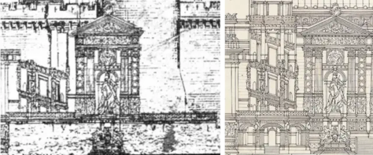
All Saints' Church, Wittenberg pulpit

Nazareth / All Saints' Church pulpit
The design featuring as a roof of sorts to Nazareth's main section of Princely Summer Residence is the top half of the pulpit in All Saints' Church, Wittenberg.
It was designed by Friedrich Adler, who modelled it off of the Gothic choir pews inside St. Anne's Church, Annaberg.
Its physical construction was handled by the sculptor Wilhelm Lober for a remodel of the church in 1883.
---------------------------------------------------------------------------
O design que aparece como uma espécie de “telhado” na seção principal de Nazareth, da Princely Summer Residence, é a metade superior do púlpito da Igreja All Saints, em Wittenberg. Ele foi projetado por Friedrich Adler, que se inspirou nos bancos do coro em estilo gótico da Igreja de Santa Ana, em Annaberg. A construção física foi realizada pelo escultor Wilhelm Lober durante uma reforma da igreja em 1883.
Sources: Image source - https://lavidaatravesdeimagenes.wordpress.com/2017/02/28/arquitectura-ii/ https://www.schlosskirche-wittenberg.de/vr
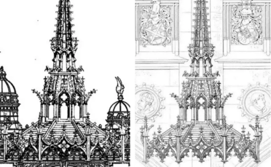
Château de Pierrefonds

Jericho / Château de Pierrefonds (+flipped)
The centrepiece of Jericho's artwork is an elevation of the side of Château de Pierrefonds. This design was created by the architect Viollet-le-Duc when Napoleon III if he could restore a medieval chateau for the Emperor's own use near Compiègne. He eventually settled on creating an entirely new chateau based on the ruins of Château de Pierrefonds in 1857. The redesign aimed to capture the spirit of Gothic architecture, with neo-Gothic inspiration applied to 19th-century comforts.
---------------------------------------------------------------------------
A peça central da arte de Jericho é uma elevação lateral do Château de Pierrefonds. Esse design foi criado pelo arquiteto Viollet-le-Duc, quando Napoleão III pediu que ele restaurasse um castelo medieval para uso pessoal do imperador, próximo a Compiègne. Viollet-le-Duc acabou optando por criar um castelo completamente novo, baseado nas ruínas do Château de Pierrefonds, em 1857. A reformulação tinha como objetivo capturar o espírito da arquitetura gótica, com inspiração neogótica aplicada ao conforto e às necessidades do século XIX.
Sources: Image source - https://fr.wikisource.org/wiki/Page:Viollet-le-Duc_-_Dictionnaire_raisonn%C3%A9_de_l%E2%80%99architecture_fran%C3%A7aise_du_XIe_au_XVIe_si%C3%A8cle,_1854-1868,_tome_5.djvu/93 https://www.gutenberg.org/files/30785/30785-h/30785-h.htm https://en.wikipedia.org/wiki/Eug%C3%A8ne_Viollet-le-Duc
ORIGINAL POST FROM HERE
#band#vessel#iv sleep token#sleep token ii#iii sleep token#vessel sleep token#sleep token iii#sleeptoken#music#sleep token lore#EP TWO#TWO#EP
10 notes
·
View notes
Text
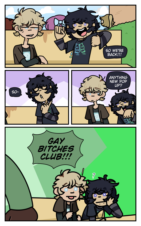
part 1 post right here :3
(I'll also be giving tiny story synopsis's because I want to yap about my stories U_U)
Also sense all of my main stories are connected to each other in some way I'll be putting a ⭐ next to a sentence that's connected to Backyard Thursday (I consider BT the plaza of my stories)
Green: Backyard Thursday Pink: Roseburnt
((And no, there's no huge story where they all meet and face a bigger bad, I don't like that trope and I think they've suffered enough(Especially Mandela's Requiem and Backyard Thursday... woof)))
Also geez- lots of old art (here's some recent comic art in comparison before you see the old comic art U>U)
I'm only sharing a few because stories like Rose Burnt do not have any comcis made(Rose Burn was written but I'm moving it to a comic format as writing it in a book style isn't fun for me), Shadow Killed had a few but I lost all files for that and need to go searching for W.I.Ps, I have some panels from the Webtoon drafts I made a few years back so I can go get them for SK
As for the rest I'll show what I can! (TOAK.... Has too many re-do's so i'll only share a few U_U)
Collideists

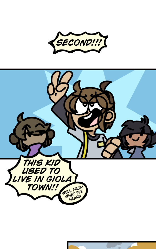
Yeah... Collideists only had 1 panel drawn of it and never again, and this isn't even the comic style I'm doing anymore
But anywho's, in short:
Collideists takes place in a world where humans go extinct after a bright light lands on Tellus(In universe Earth for context)⭐ causing changes to happen. Two immortal races start to appear called Shadow (Not my species) and Light Creatures(My species). Some were too hostile and others not so much, they eventually re-built the half broken Tellus and travers through wherever they take their half broken planet. Years later Aont is a 17-18 year old high school student currently on summer break (he didn't graduate yet) lives in the most protected country of Tellus and has a secret that if revealed could spark a huge revelation. Despite his secret however he's very reckless and get's caught and news spreads about a "human" being alive gaining the attention of many hostile creatures known as CMJ's.
I haven't really completed writing out all of collideists/it's still in development, but I do have an ending planned, basically Fatum fixes the mess her parents caused (I think you can guess who they are) among the creatures and helps planet travel run smoother in stuff, humans are Moreso still extinct but there are still fake humans running amongst the planet safely (humans are still extinct, the only "actual" human would be Fatum but she's half human (heh.... :3))
All of this is to be changed sense I think I wanna add more sci-fy ish stuff and have it so that thousands of years passed causing 4 planets to be colonized, Tellus and 3 others, maybe only 3 planets or just 2. As creatures in this world do not die of old age (they have the mental stability to live forever as they're just figments of light/color/technically walking corpses(tiny spoilers but not really U_U))
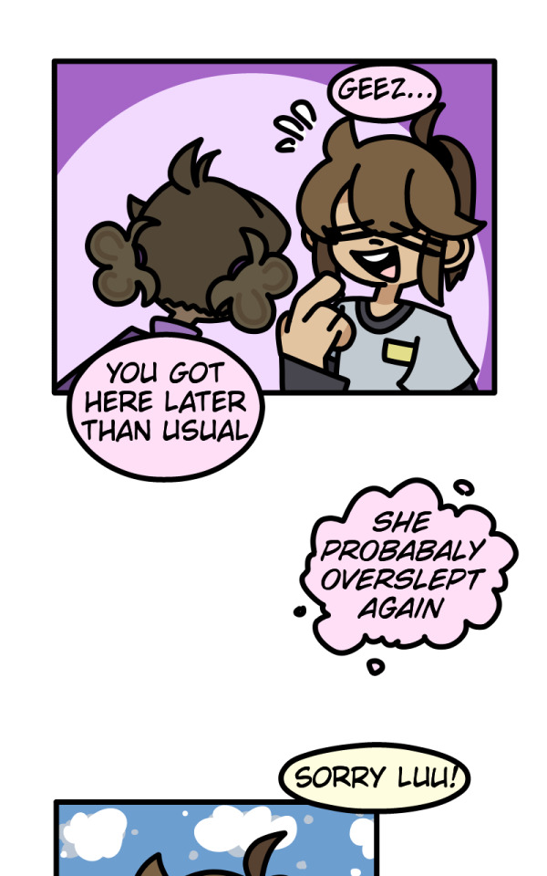
Backyard Thursday
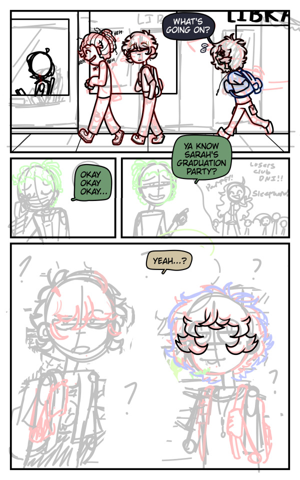
1st image is when I solidified act 1 of BT (2024)
2nd image is when I didn't have a script for BT and just winged it (I knew what I wanted but I made the grave mistake of "fuck it we ball")

Also GEEZ, that art style change is INSANE (Unsure if yo see a different but I do)
Also, Nath's design is TBC because I hate her current design, but she does have other designs like this within BT
I really do prefer her Cold/Saxaisis(country within BT) arc outfit :3 (the paper drawing was made a year after U_U)
Never So Norm
This was at the time where I wasn't used to drawing backgrounds or dynamic-ish poses (I'm still not but they're much more easier for me to draw now!)
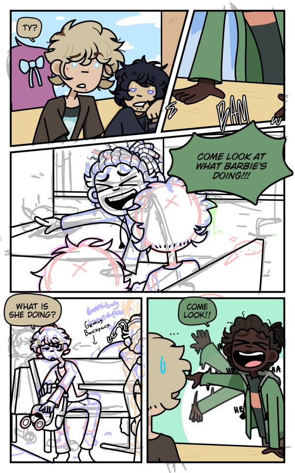
this isn't *all* of the panels btw, just a few that I really like, also Never So Norm is one of the few old comic arts I did where I fully sketched out of the chapter instead of "sketch, draw, sketch draw"
I really prefer the sketch all and then draw all format because it's much more easier to follow through U_U
Also here are some headshots I really liked that don't appear in the panels I showed


Despite this world canonically being connected to my other story Rose Burnt that has a lot fantasy elements in it, this story does not. It's slice of life, drama, and school life genre story and it might be one of the most controversial stories I've created. I've implemented a lot of personal elements into my life on this story so it's very personal to me and I'm the most shy when talking about this to strangers U_U
Never So Norm's story (without huge spoilers):
Samy is a 17-18 year old (I'm debating on which/when the story should take place before or after he's 18) high school senior. His friends meet the new girl Cheryl and get into some drama with someone they all hate after Ivan and Ty catches Darrel cheating on Sarah with her best friend Jane. Meanwhile Cheryl meets a new friend and the two get super close, although this closeness slowly determinates after Cheryl discovers something about Alex that not only concerns her but get's her into major drama with someone which ties both Cheryl and Samy's drama together.
Also despite this story focusing on the main cast it will also focus on the parents part of the story which IMO is way darker and shows more on Rose Burnt's fantasy side. (spoilers ahead) I.E an unknown eye virus⭐ and other stuff (some of the main cast will get dragged into their parents drama which causes them to mature more(*coughs* Sarah *coughs*))
(And I'm still figure out NSN cuz it's a whole shit show but I also wanted it to have a little twist to it and not be like other high school drama's ) (Also Backyard Thursday's act 1 takes place in NSN's Earth but this is when the main characters are in their 30's making Ajax and Nath the same as the main cast (When the autism kicks in)) (((And what connects Never So Norm to Rose Burnt is that canoncially a few of the main characters are cousins of the other main characters(Samy and Erg being cousins for example and Samy being a fanboy of a pop singer AKA one of MC's of RB's mom))))
Shadow Killed (I lost the files to the actual full W.I.Ps so take the webtoon draft version I have of it(I never posted it cuz I'm gonna re-do it all once I get to SK in my preferred format))

And that's it cause the rest of it is lost forever :skull:
I wish I saved it better because Shadow Killed is one of my favorite stories I've created, not only because it's my first original story, but also because I loved it so much it survived my story purge back in middle school.
I'm trying not to go ahead and start drawing it right now because I want to get better at art for Shadow Killed, it's one of my biggest motivators to get better at drawing because not only do I want to handle SK with care, but also the art.
As much as I also love Two Over A Kind it's a huge mess right now and I'm trying to clean up the world building because I went a bit overboard on the world building and I'm cleaning it up right now, but I still love it do death!
Trust guys I don't have a favorite story (I do and it's SK)
Story Baisis:
4 roommates Ian, Damien, Hannah, and Victoria live their causal daily life, do their job for bills, participate in guild activities, report any suspicious behavior to the royal guards, and live quietly in the small village of Loyalette. However things go wrong during a mission, Saul Shiskui takes away Victoria's ability after a run in with a wanted criminal Jay. Despite Victoria not being worried as she has a second ability that cannot be taken away, Hannah's vengefulness and anger strives her to find a cure in a cursed village rumored to bring back abilities. While doing so, they catch the attention of the whole world.
That last part is actually a spoiler to the ending of Act 1 of Shadow Killed, to give background/context, everyone has an ability, and if they don't they're called inabilities. there are special people however that have a second ability, these peoples are within a group called the 4 7's or the four seven's, four groups with seven people having a very special second ability. the 7DS, 7HV, 7OH, and 7OM (it's too long to type out the full thing so I always shorten it) the 7DS are seen as evil and must be removed (which is untrue), the 7HV are seen as good luck and must be protected, but somehow all of them keep dying and a new 7OH appears (mainly because of assassin's trying to harbor their ability/take it for themselves, and each death is huge but a kidnapping is not normal(teehee... spoilerssss))
I'm guessing you know what happens at the end of Act 1 as I kidna gave it away with some hints, but if not then I think i'd fun to try and figure it out!
Also this may be one of the few stories that isn't connected to BT, i'm trying to connect it to BT somehow in someway because I love all of my stories connecting! (Maybe SK would just be a universe created the procreator and left to not be added into BT bc it's too powerful or something(more BT universe world buidling AUGAUHAGHU :3))
I'm trying not to go off on SK because of how much I love it, but I have a lot planned for it and a lot of love for this story <3
Two Over A Kind (each image is from a different re-make, it's not from the same remake U_U) (Also yes I did in fact base my username off of this OC, although I'm gonna re-design her and re-name her because I don't want people thinking she's a persona when she isn't U_U)
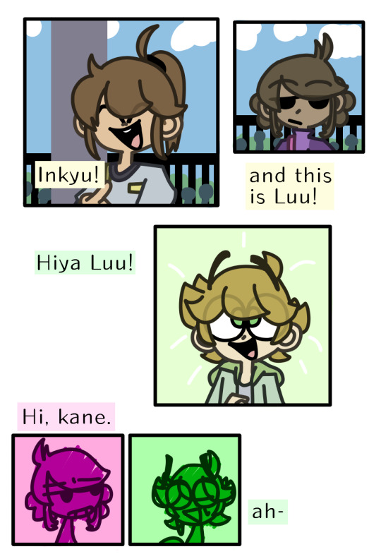

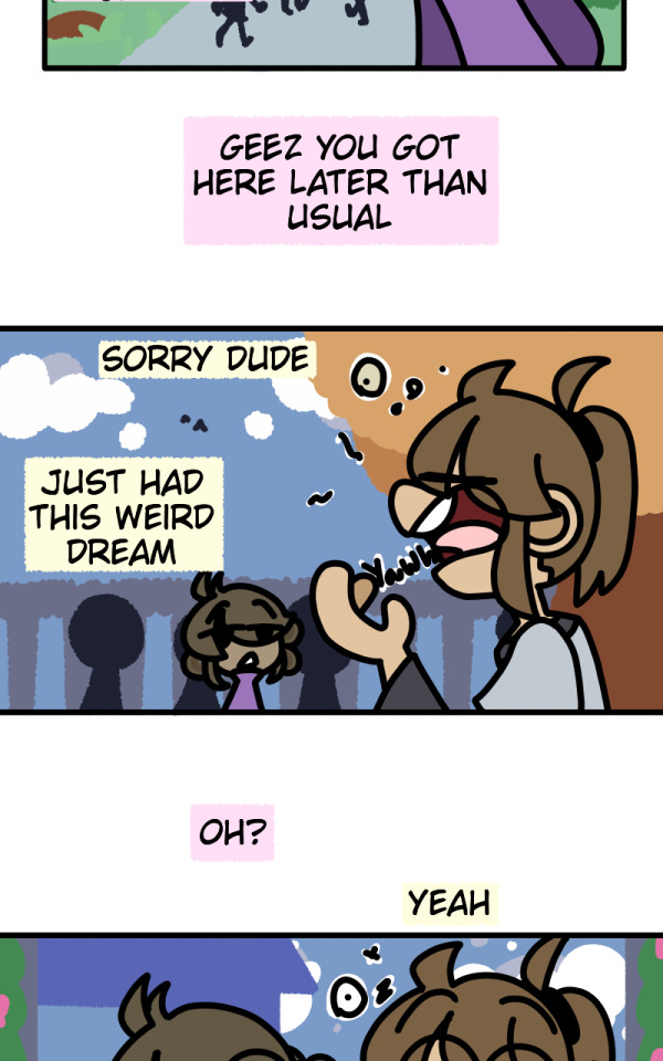
I'm not sure if you can see the art style change but there has been (+ Gaia has been added to the part 1 introduction!)
Also midway through the CONSTANT re-making they went from 12 year olds to 17-18 year olds
In fact a lot has changed about TOAK, from story name, to world building, to genre.... heck even the main VILLAINS changed a lot, I'd have to make a whole post about how much TOAK has changed. But alas I am not U_U
Story Basis:
Inkyu(Name to be changed but I'm using Inkyu for now) and her friends Luu and Gaia meet the new kid in town Kane. They introduce him around town when weird things start to happen. Eventually they're attacked by a crazy homeless looking lady who sends them into a world called the "Mirror Realm". They eventually escape it and they learn about the world outside of their country having magic and different species besides their own. But now their mirrored clones are out to kill them causing Inkyu and many other of her friends to flee to Kane's old town, so that one of Kane's old buddies can help.
Also the mirror realm stuff is a huge clickbait IMO, they're not actually mirrored versions of the others. They're actually just another species within the TOAK universe (before they weren't but the more I thought about it the more it made no sense to even have it in there) But I think I should save my species ramble bambles or else I'll start going off from the main topic.... like I did with the SK one :Skull: :sob:
(Although I will be happy to answer any OC related species or world building because I really love to ramble about them when given the chance... even if it means spoilering the story on accident qWp)
Extra's/No Comic Art/Comic Art already public
Rose Burnt
Rose Burnt is actually a written story I made on wattpad a few years ago my late freshmen/early sophomore year, I was super into Homestuck (I still am but not as obsessed as I was before) and wanted to try and make a horror-genrefied version of it(RB is no longer horror). Needless to say I gave up on it after like 4 chapters and didn't go back to it until I logged back into my wattpad about and went "Oh shit I forgot I wrote this............." and then I started to hyperfixate on Rose Burnt and things went on from there U_U
here are some sentences/writings from RB that I really like because I still have that TwT (I wrote up to 12-13 chapters before I officially decided that "this would be better as a comic instead")


The premise of the story is the same but some stuff has changed. U_U
I think you can tell (if you're into homestuck) that rose burnt is literally just Homestuck, although it's my version of a sburb game as although Rose Burnt has a lot of elements to homestuck, I think it's different because the goal of their own game is to not get a re-ward but to just get creative/make your on goals
Also those screenshots is beta rose burnt, back when the game aspect wasn't a thing and those ghouls(before they were called monsters but I changed it to ghouls as I solidified their species more and they take on a more spooky-ghost like culture)came to August's and the others world for a different reason, that reason has changed now as I solidified Ghoul culture/their backstoris (a bit)
Rose Burnt baisis:
(Also tiny funfact anything similar to tiktok does not exist in any of my stories because of my huge distaste for tiktok(and also because I need to give the Rose Burnt cast a reason to be outside and not doom scroll all the time as honestly that's very sad...))
5 kids enter summer break ending their 8th grade year, August's birthday just so happens to be coming up. But after a few hours into summer break strange things begin to happen after all of her friends enter a grave yard's house and strange people start to message them about how to handle this situation. August after receiving an early birthday gift from a strange user called "majestic_marryier" uses this gift to help save her friends and stop whoever's hurting them. However, something else stalks August which leads her and her friends into something even more dangerous.
I'm gonna be so fr with you when making the newer beginning to Rose Burnt I wanted to do it in a way that was interesting. Personally I find the starting to Homestuck boring (I think a lot of people do to) and sense Rose Burnt is basically my Homestuck I wanted to write it in a way that I liked, don't get me wrong I freaking LOVE Homestuck, and parts of it's beginnigns, but Rose Burnt isn't really Homestuck in it's own weird way. I don't care if people call it a HS clone or whatever, I just want to write it in a way that makes me happy!
(And I might tag it as "sburb" on MSPFA sense well- the game their playing is SORT OF like sburb but not really-, I'll see when I get to Rose Burnt's story U_U)
Mandela's Requiem
I don't really need to show any art from MR as it's already public so all I'm gonna do is talk about the story basis XP (I also might change up the beginning of MR a bit as the story itself writing wise was based off of old creepypasta storis of "oh haha MC get's bullied and stuff happens", I will def keep the bullying aspect the same but have it so that Isabela is less-sad about it as I kinda wanna distant MR from creepypasta writings and base it off of my own U_U) (I wanna make it so that Isabela is moreso numb to the bullying)
Isabela Sola get's bullied often at her school for being the "weird kid", her vocal stims put people off and the way she talks about things she likes makes her seem weird. Chester Sawyer doesn't find Isabela's habits weird and tries to befriend her but his two jackass friends Henry and Rob prevent him doing so leading into a fight causing Rob and Chester to get detention. Eventually when school ends Isabela get's into a fight with the schools queen Jacklynn. (context: MR is also connected planet wise to NSN and RB, not gonna explain now but when I say queen I mean she literally is the school queen(IRL earth and this earth are not the same)) All of this negativity and mistreatment of others leads something⭐ deciding to stand up and take out other bullies as well as give the victim and supporter a new "forever home" that doesn't last long.
And I think that's all for my yap session U_U, I hope that at least one of these stories interests you as all of them interest me ^W^. I'm still working on my writing skills and I'm getting better by the day.
I hope I answered your question, if you (or anyone who comes across this...) has any questions on any of my stories don't be scared to ask, if anything be scared of my response because I will go on a 50 page essay on the world building X.X (half joking... but I will non stop yap because I love all of these stories dearly!!! even my AU's!!! (i don't prioritize my AU's much but I still love them U_U))
#oc#oc story#oc rambles#two over a kind#toak#shadow killed#sk#collideists#rose burnt#rb#never so norm#nsn#backyard thursday#bt#Also fun fact I like to call these OC stories the “main 6”/“mane 6”#MR I consider the sunset shimmer/starlight glimmer of the group#:3#I WANNA DESIGN MY STORIES AS MY LITTLE PONIES NOW AUGAUHAHAG#it'd be so much fun omfg...#Mandela's Requiem#MR#yapping#oc yapping#i kinda do wanna yap about all of them now actually.... BDSGHBFG#TwT#But I don't mind if there are no questions#SJSJSJSSJ
5 notes
·
View notes
Text

Dusting for a young star's magnetic fingerprint illuminates planet formation
For the first time, astronomers have succeeded in observing the magnetic field around a young star where planets are thought to be forming. The team was able to use dust to measure the three-dimensional structure "fingerprint" of the magnetic field. This will help improve our understanding of planet formation.
The study is published in the journal Nature Astronomy.
Planets form in turbulent disks of gas and dust called protoplanetary disks around young stars. It is thought that the first step in planet formation is dust grains colliding and sticking together.
The movement of the dust grains is influenced by many forces, including magnetism. Thus, understanding the magnetic fields is important for understanding planet formation, but so far it has not been possible to measure the magnetic fields in a protoplanetary disk.
In this research, an international team of astronomers led by Satoshi Ohashi at the National Astronomical Observatory of Japan used the Atacama Large Millimeter/submillimeter Array (ALMA) to observe the protoplanetary disk around a young star known as HD 142527. This star is located 512 light-years away in the direction of the constellation Lupus.
The team found that the dust grains aligned with the magnetic field lines. This allowed the team to detect and measure the unseen magnetic field lines, much the same way iron filings can reveal the magnetic field around a magnet. The team thinks that the measured three-dimensional structure might create strong turbulence within the protoplanetary disk.
Now that this method of dusting for a young star's magnetic fingerprint has been proven to work, the team wants to apply it to more stars, and measure the magnetic field closer to the star to better understand the magnetic conditions where planets are forming.
IMAGE: ALMA observations of the protoplanetary disk around HD 142527. The white bars show the directions of the magnetic field revealed by the orientation of the dust grains. The strength of the magnetic field is 0.3 milligauss. For comparison, a typical refrigerator magnet has a magnetic field of about 1,000,000 milligauss. Credit: ALMA (ESO/NAOJ/NRAO), S. Ohashi et al.
3 notes
·
View notes
Text
Migrating Product Data from PrestaShop to Shopify: Best Practices

Moving your eCommerce store from PrestaShop to Shopify can be a game-changer, but the success of the migration depends heavily on how you handle your product data. Ensuring that your products, descriptions, and SEO data are migrated without loss is essential. This blog will walk you through the best practices for migrating product data from PrestaShop to Shopify.
1. Pre-Migration Checklist
Backup your entire PrestaShop store, including product data, customer information, and order history.
Analyze your data to remove outdated or irrelevant information.
Make a list of all product categories, attributes, and variants.
2. Choosing the Right Migration Tool
Use automated migration tools like LitExtension or Cart2Cart for seamless transfers.
Evaluate Shopify's native import tools for small to medium-sized catalogs.
Consider hiring a professional migration service for large or complex stores.
3. Preparing Your Product Data
Organize your data into a structured CSV file that matches Shopify’s import format.
Clean up product titles, descriptions, and SKUs for consistency.
Ensure all images are appropriately named and optimized for SEO.
4. Mapping Product Categories and Attributes
Shopify and PrestaShop may handle product categories and attributes differently.
Map PrestaShop’s product categories to Shopify’s collections to ensure consistency.
Double-check that product attributes (such as size, color, etc.) are transferred correctly.
5. Migrating SEO Data
Migrate SEO metadata like meta titles, descriptions, and URLs to avoid losing organic traffic.
Use a URL redirect app to manage old PrestaShop URLs that no longer work in Shopify.
Install SEO apps on Shopify to monitor and optimize your store’s SEO post-migration.
6. Testing Your Product Data Post-Migration
After migrating, thoroughly test your products on Shopify.
Verify that all product variants, descriptions, and images display correctly.
Ensure pricing, inventory levels, and SKU numbers are accurate.
7. Handling Advanced Product Options
Shopify’s product option system may differ from PrestaShop’s.
For products with complex configurations, use Shopify apps like Infinite Options.
Ensure that any product customization data is correctly migrated.
8. Optimizing Your Product Pages
After migration, take the opportunity to improve your product pages.
Use Shopify’s easy-to-customize product templates to enhance the layout.
Consider adding customer reviews or enhanced images for better conversion.
9. Maintaining Inventory Accuracy
Double-check inventory levels before and after migration to avoid stock issues.
Sync inventory with Shopify’s POS or third-party inventory management systems.
Monitor inventory closely post-migration to address any discrepancies quickly.
Conclusion
Migrating product data from PrestaShop to Shopify requires careful planning and execution. By following these best practices, you can ensure a smooth transition that retains the quality and integrity of your product data, setting your Shopify store up for success.
Click here to know prestashop-vs-shopify-feature-comparison-to-help!!
2 notes
·
View notes
Text
#JPEG#Image Compression#Lossy Compression#Image File Formats#Digital Images#Graphic Design#Photography#Web Graphics#Image Quality#File Size Reduction#Digital Photos#Image Optimization#Online Media#Visual Content#Image Sharing#Website Performance#Image Loading Speed#Image Storage#Image Formats Comparison#Multimedia Files
1 note
·
View note
Note
Hey Do you have any tips on making a logo because ive been looking to make logo for Ask blog and was wondering if you had any tips?
Hey, thanks for asking! :D I can be very wordy about stuff I’m passionate about so my apologies for the length of this answer ^^’ That said though, if you have any further questions feel free to reply or send another ask :) Here’s a few tips, I hope they help!
1. Choose a font (or draw one yourself) that fits what you want the logo to represent Similar to how specific choices are made to convey the intent in character design, font choice in a logo design can affect the overall “feel” of it, so try to pick ones that fit whatever you’re making the logo for. In other words, logos can have their own “character” too! Many character design principles, such as shape language and colour theory, can apply to logo design as well. If this is for a fandom/pre-existing media, try looking up those logos first if you want to match their look for your own. Also try studying logos you like in general to figure out how they're constructed, and use anything you like from them in your own design!
There are a ton of styles and combinations out there, but one of the biggest distinctions between fonts is serif versus sans serif.

Though not the case every time, serif fonts tend to look more old-fashioned/traditional, while sans serif usually appears more modern/digital.
While you can use any font for inspiration if you intend to draw your own, if you just want to type one out, then be sure to look up the usage permissions for it first. Not all are free for personal use and may be stolen even if they're listed as free online. If you’re unsure, search the font name and find the license or usage permissions directly from the creator/font foundry if you can!
2. How “fancy” you want your logo to be is up to you, but make sure it still works as a flat image as well This is less applicable if you’re only using the logo for one thing, but generally speaking you want your logo to be versatile enough to still be readable without all of the fancy gradients and drop shadows added. Those should be extra details, not the main component that's holding up the whole design, so to speak.
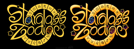
I recommend starting with the flat or black & white version and refine the design enough in that stage first before moving on the final clean/fancy version. Here's a comparison between the flat and full version of the logo for my comic project, Starglass Zodiac (original post here):
Even without all of the shiny stuff on top/underneath, the flat colour version still functions as intended. 3. Make sure the width/length/size of the logo works well for what it will be used for For example, if you want to use the logo on the banner for your ask blog, make sure it'll can be read well in that format. You can do this by either making the logo in a file that's the same dimensions as your banner, or testing the rough design for the logo on the banner first before committing to the final design.
Also make sure that the logo doesn't blend into whatever background you intend to put it on, especially if the logo itself doesn't have a background. Adding a black or white (or both) stroke around the logo can help it appear on more background colours.
4. Make sure the most important words are largest or are the focal point otherwise Similar to the last point, make sure that a viewer will get the gist of your logo even if they look at it quickly. This is most relevant for logos for things that have long titles or have a subtitle attached to a main name. If your logo will have multiple words, having a hierarchy of importance in size and/or colour can help the viewer see the most important part first.

--------
Now for some general additions/effects to consider for your logo!
Gradients - Your best friend, one of the easiest ways to make even the simplest logo look fancier than the flat version, if the overall style you're going for calls for it. These can allow you to have colour shifts over the whole design, or add highlights in parts of it to tie the whole thing together. You can also add edge highlights/shadows on top of these too.
Textures - Similar to gradients, textures can add a lot of flair to a design very quickly. Even gradients themselves can be textures already, like mimicking shiny metal or the like. They can also be used to represent something about what the logo is for, like adding a rocky texture for a logo involving mountain climbing or ancient ruins.
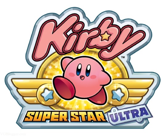
Strokes - These are outlines around your lettering that can help them be seen on multiple background colours, or to make specific letters pop out from the others. You can use multiple strokes on different areas of the same design as needed, but make sure they don't impede the legibility of the lettering itself! Many of the Kirby logos use several strokes at once, like this one below.
Backgrounds - Any colour/shape underneath the text to serve as a base for it. Similar to strokes, they can help the lettering read properly on multiple colours/shades. They can also provide additional information about what the logo is for or represents, like putting a sunset in the background of a logo that has "Sunset" in the name.
Drop Shadows and Outer/Inner Glows - These are often paired together, as they generally serve the same purpose; emphasizing the part of the design they're applied too. Drop shadows can help "lift" some parts of the design off the base, while glows can outline something instead, like a soft version of a stroke. It's very easy to overuse these though, so use them sparingly!
Bevels & Edging - Adding these to the lettering or other parts of the design can make them stand out more, especially if you add shading to it! One of my favourite examples of this is the main Spyro logo, both classic and modern :)
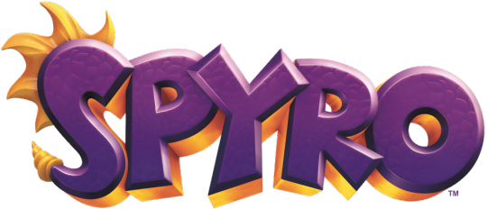
Blocking - Basically a way to make the letters or the whole logo look more 3D by adding "blocks" underneath it, which can also help add another colour to the logo's palette! Spyro's logo above uses shaded blocking.
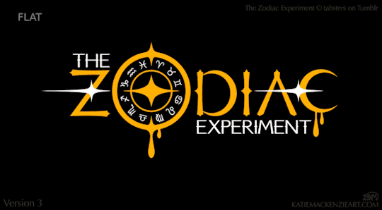
There are a ton of other effects and ways to combine them, so feel free to experiment with a bunch of them! As one final example, here's a breakdown of the logo design I made for The Zodiac Experiment (Original post here) so you can see how these effects can work together on one piece!
Have fun designing! ^_^
8 notes
·
View notes
Text


ERROR: FILE NOT FOUND
Now this was a sight Anika could get used to.
The greenery that stretched on for who even knew how many acres, the stone stairways below that led to the lower gardens. The sunlight that made the white flowers in the garden that she couldn’t even name glisten.
The rock formations in the far-off distance that shielded the estate looked so small from so far away. What she knew to be as tall as some of the tallest buildings in Tokyo looked like tiny pebbles from such a distance.
It was a stark contrast from the busy city streets of Akihabara that she was so used to. It truly put into perspective just how small her bustling town was in comparison to this place.
The uncomfortable, chilling breeze that blew threw the white tulle piece that was attached to her asymmetrical white skirt. She pressed her hands against the window on her white polyester blouse, stopping the wind from exposing more of her midriff. The diamonds and pink tourmaline gemstones that lined the cuffs of her sleeves brushed against her skin.
It all felt so foreign.
Through her peripheral vision, she caught sight of another figure standing beside her, their fingers moving about to form what she recognized to be Japanese sign language.
Though she could distinguish the finger movements clearly, the person’s face was entirely blurred and covered in colorful pixels.
Like a corrupted image…
“Peculiar, is it not?”
“What is?” Anika signed back, watching the pixelated figure step forward until they reached the edge of the balcony.
They leaned against the balustrade, almost sitting on the ledge.
Just one little misstep and they could tumble off this balcony…
“Isn’t it a wonder that everything you see only exists within this estate? You would never imagine what lies beyond those barriers to be such an arid desert.”
Right…
This was all artificial.
Just another lie.
Anika returned her gaze to the seemingly endless land of green. “Just like how the people who sit so high up on their thrones have been shielding us from the truth.”
“So you made the connection after all.”
Anika removed her hands from the tulle of her skirt, which she didn’t even realize she was grasping at so tightly. “The people deserve to know,” she signed.
“Oh, but they mustn’t.” The pixelated figure continued to sign. “The selfishness, the lies, the work we all do in the shadows must be preserved. The people mustn’t know about the truth behind that ideal they cling onto so dearly.”
Anika shook her head and took a step back.
“This isn’t right…” she whispered aloud.
“On a moral standpoint, perhaps you are correct,” said the faceless person. “But it is only the right thing to do.”
It was enough to make Anika’s blood run cold.
Her eyes zeroed in on the pixelated figure’s fingers that drew invisible circles on the balustrade.
“I can’t let you do this… I can’t…”
She paused.
She opened her mouth but no sound came out.
“You ‘can’t’ what?” asked the pixelated figure. However, that statement seemed far from taunting.
Anika lowered her head, her eyes meeting the balcony floor.
‘I can’t…?’
Huh…?
What’re these things I’m saying…?
In the corner of her vision, she noticed her right leg. It was…
This isn’t my prosthetic…
Anika took a few steps back until she was inside the drawing room and the wind and sunlight could no longer reach her. “No… this isn’t…”
She turned her head in all directions, studying the area around her.
The cream-colored walls with gold embellishments, the red and gold furniture, the crystal chandelier that illuminated the room.
The longer she studied her surroundings, the more unfamiliar this all seemed to her.
So what was all that just now…?
Wasn’t I just acting like I knew what this all was…?
What was I just doing in a place like this…?
Anika furrowed her brows and stared straight ahead, her eyes meeting the pixelated figure that was stationed directly across from her and basking in the sunlight. “Where am I? Who the hell are you…?”
The view in front of her began to flicker.
She froze.
What the…
The increasingly rapid flickers between the black and the bright daylight blinded her eyes and she winced. She raised her arms, shielding her eyes from the constant flash and blinking.
With each glitch and flicker, the pixelated figure and the green scenery began to dissipate.
Like a television screen going haywire.
The hell…?
Then it all turned black.
No light.
No shadows.
Just darkness.
Anika spun around, her eyes quickly moving in every direction in search for the faceless figure from before.
She lowered her head, studying her outfit. No longer was she in her almost entirely white and bedazzled attire from before, but back in her usual off-white top, yellow biker jacket, and black dress pants.
I have to be dreaming… it’s just a really lucid dream…
The floor beneath her began to buzz and shake, the vibration all too familiar for her.
Music…?
No… it’s an alarm…
She lifted her head. Appearing before her was a wall of text in neon blue letters, so incredibly pixelated and glitchy that it was near-impossible to make out the letters.
Anika reached for the wall of text, only for her fingers to brush right past the lettering.
A hologram…
“What is this…”
‘THOSE MONSTERS’
‘THE HYPNOSIS MICS’
‘YOU’VE GOT TO SAVE THAT PERSON FROM THEM’
‘PLEASE SAVE THEM!!!’
Anika spun around, now left with more questions than answers.
“Save who?!” she yelled.
‘SHIT THERE'S AN INTERFERENCE’
‘I’M RUNNING OUT OF TIME’
‘BUT THE PERSON YOU MUST SAVE’
‘THEIR NAME IS ███████ ████████ ███████████’
#hypnosis mic#hypnosis mic oc#hypmic#hypmic oc#hypnosis mic arb#hypmic arb#akihabara division#pixel syndicate#birthday 2023#anika birthday 2023
7 notes
·
View notes
Text
Performing Hypnarchaeology
I was looking through old files today and I thought this would be a good chance to show some progress over time. This post is for anyone curious about where I started out.
The first image below is my first OC and the reason I started drawing again in 2016. It's been scaled down slightly to fit this post format.

I still have a lot of images I did of this character. If she wasn't long lost to me and soured then I might try to redraw her at my current stage of growth.
The next example is the first image I have of Hypna, in 2018.
I still had not figured out the stabilizer lmao I was starting to actually get used to working on a tablet and was starting to take the first steps on how to actually shade things.
The next image is a direct comparison of Hypna above, in a similar pose but with different intent and inspiration. I've used it to compare with the image above before. It's from 2021 so that's already a fair amount of progress passed.

In the time between the first image of Hypna above and this finished work, I had started drawing nearly every day, partially because I was starting to hit stronger inspiration but mostly because of quarantine and lock down leaving us in financial binds. I finished the above shortly before I was diagnosed with Tendinitis.
The next image is the latest finished work of Hypna, this summer of 2023.
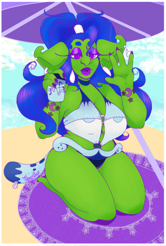
Feat. a recoloured Garf-kini and Garfaccino to match. I did actually purposefully pose her hand like that coffee cup based on how she was holding that orb but it was an impulse at the time. That's definitely not an ordinary way to hold a cup.
Still not great with backgrounds but I have definitely come very far and it's good to be able to look back and see my progress and also why I recommend keeping at least some of your old files, even if it's not all of them. When you doubt yourself, you can look back and see how far you've actually come.
8 notes
·
View notes
Note
Hello! Thank you for sharing your PingXie fic recs! Since you post a lot of fics on Weibo, I don't know if you're a Chinese speaker, but if you're not, I was wondering how you read Weibo fics since a lot of them are in image format, and sometimes the Google Translate app doesn't work very well for them. I'd really love to read them, so if you have any tips on apps or translators to use I'd be grateful!
Hi! It's my pleasure to share! ( ◜‿◝ )♡
I'm not a Chinese speaker, I use machine translator. Since I always use my phone to read them, I'm not sure how it works on computer.
I assume that what you mean is the super long images, because normal images work fine on Google Translate. For long images, the Chinese characters are so tiny that they can't be detected properly and thus failed to translate. To solve this problem, I need to either crop the images using a photo/image editor or screenshot them. I usually do the latter, so I don't have to go back and forth editing them. For flipped/mirrored images I still have to use a photo/image editor though. For scribbled images, I have to resign to my fate and hope that the app would recognize them >.<
Other than Google Translate, I'm also using 2 translation apps in which all of them can also translate text from images; Microsoft Translator and DeepL. The former, I use it for comparison and the latter, the quality is pretty good but it has limited usage. If you don't mind spending more money then you can consider it.
I usually don't directly use Google Translate app though, I use Google Lens in my file manager. It's more convenient for me, here is what I usually do:
1. Download the image (it's optional, but I decided to download it just in case that it's suddenly gone) → go to File Manager and find the image → zoom it → screenshot it (one image needs many screenshots, I did it in one go to avoid getting the same image)

It's a gif, Tumblr didn't let me post more than 1 video :(
2. Find the screenshot image → scan it with Google Lens (make sure that every sentence is in white line which means it's detected by the app)
If the result is too tiny, you can choose to open it on Google Translate app.
It's a bit tricky, but I haven't found another way.
Hope this helps!
Thanks for asking! (。・ω・。)ノ♡
4 notes
·
View notes
Text
Pictures or it didn’t happen By Mike Chopra Grant
Week 3
In this text, the idea of digital photo filters on social media is explored.
Nathan Jurgenson states “ Faux vintage photo is an attempt to create a sort of nostalgia for the present” expressing that with a retro filter, digital photos evoke more importance and realism. To investigate this idea, Grant examines the value of a digital photograph in comparison to vintage photographs, which inherently seem to feel more significant.
Viewing vintage photographs like pictures of my grandparents in their 20′s, or images from before photography became accessible, makes me impulsively want to take as many photos on my phone as I can to preserve my present life. However, I had a realisation that the reason why those older photographs felt important, was because of their scarcity. My extensive camera roll and photos taken in an instance, will not become those of value like how my grandparent’s photos had become. Grant expresses this phenomenon of instant digital photography to be ‘Devaluating each individual image’.Furthermore, Grant expresses digital photographs to be ‘immaterial’ as they only exist in ‘digital files’. Digital photographs are not fondly looked back at, as much as physical printed photos. Perhaps that is one of the reasons for the rise in popularity of Polaroid cameras or retro filters in post modern times.
For technological generation, we find retro filters to be appealing as they evoke a “generalised aura of pastness” with the ‘distressed frame’ and ‘light leaks’, as it contrasts to the format of a generic digital photograph, making it feel special. Svetlana Boym describes this idea of making present photographs have the feeling of nostalgia without the existence of a real experience, as “restorative nostalgia”
“Filters that make the present look like artifacts of a somewhat distant past imbue that present with a greater aura of materiality and authenticity”
and that retro filters or the nostalgic impulse create a “textualization of mundane experience“ because of the “existential crisis of the self in postmodernism”, implying that our desire for nostalgia stems from the issue of identity in the post modern era.
3 notes
·
View notes