#Interactive map
Explore tagged Tumblr posts
Visit Tumblr Blog
Explore Tumblr blogs with no restrictions, modern design and the best experience.
Last Seen Tumblr Blogs


Fun Fact
Mobile US users spent an average of 115.8 minutes on Tumblr app monthly.
Text
21 notes
·
View notes
Text
To whom it may concern, I’ve made some updates to my “People of the Viking Age North” digital map! Just minor things. For instance, I added a new location for a burial that crosses both cultural and religious boundaries. Pretty neat, I think. I added that at work while avoiding…well, work. I included a link to an article that’s not paywalled, too.
22 notes
·
View notes
Text
Hi all.
I am a 25 year old student nurse and nature devotee who has an interest in memory benches.
With no valuable IT skills, a limited budget and no overall knowledge of creating and maintaining an active online map, I am seeking advice, tips and potentially assistance from those of you who have insight on how to achieve my goal.
In the UK, memory benches are everywhere - wooden or steel seats of engraved love given by those who were privileged enough to have shared life with those who have passed.
I made this tumblr so that I can start keeping a record of the memory benches I come across in my city, Sheffield, tagged here on this account by location, postcode and the dedicatee’s given name. I will record benches I find outside of Sheffield also, just far less frequently or sporadically.
My goal is to eventually pool the knowledge and resources together to, first, create an online directory of recorded memory benches and then hopefully develop into a map once I gain experienced of how to do so.
A like or reblog would be appreciated if you see this, and any and all insight into the matter would be appreciated.
Cheers for reading! Ask box is open or you can email me at [email protected].
#Project#Project help#IT#Benches#Memory benches#Nature#Advice#Community project#Help#Help needed#Technology#Sheffield#Yorkshire#London#IT help#Maps#Map#Interactive map#Digital map#Preservation#Tumblr staff#Staff
6 notes
·
View notes
Text
Mapping Stories That Matter: Exploring Culture with Interactive Story Maps
Stories aren’t just found in books—they unfold around us every day. In the rhythms of daily life, in the spaces we move through, meaning is constantly created. Interactive story maps help capture that depth—not just showing where things happen, but why they matter.

Beyond Pins and Text: Why Story Maps Make a Difference
Interactive story maps created on platforms like MAPOG blend spatial data with visual storytelling. Whether it’s showcasing monuments, documenting community spaces, or mapping cultural festivals, story maps provide dynamic, multimedia-rich experiences. Each point on the map becomes a micro-story, complete with descriptions, images, and meaningful context.
Instead of a static document or a plain PDF, a story map lets users explore data intuitively—zooming into areas, reading histories, and drawing connections between places and their cultural significance.
The Challenge with Traditional Methods
Spreadsheets, reports, and slide decks may convey facts, but they rarely spark curiosity. They miss the visual relationships between locations, and they’re hard to interact with. By contrast, story maps let you see clusters, patterns, and trends. For example: Where are India’s Buddhist sites concentrated? What colonial buildings align with old trade routes? You can't spot that in a list—but you can on a map.
Who Benefits from Story Mapping?
Creating a story map using MAPOG isn’t just a tech activity—it’s a cultural tool that serves:
Educators & Students: Bringing history and geography to life in classrooms through visual journeys.
Tourism Boards: Highlighting cultural circuits and local heritage trails to inspire travelers.
NGOs & Researchers: Mapping social initiatives or heritage restoration projects spatially and clearly.
Content Creators: Building engaging blogs, portfolios, or exhibits with embedded interactive narratives.

A New Way to Connect with Culture
By turning data into narrative and maps into experiences, story maps do more than display—they communicate. They help us see patterns we hadn’t noticed before. And more importantly, they make heritage, culture, and community stories more approachable, discoverable, and memorable.
In an era where visual storytelling is more impactful than ever, story maps empower us to map what truly matters—from ancient ruins to modern social movements. With tools like MAPOG, it’s never been easier to create and share stories that are grounded in place and rich in meaning.
Your story deserves a map—and the world deserves to see it.
4 notes
·
View notes
Text
My god, that was a long walk... My feet hurt, but whatever... I'm here now, at least.

Lots to do in town, but I don't like it that much... It's so fake. Eugh.
"S" Willsdale is a creation of @imaglitchy, a good friend of Willsdale! Thank you for your Resident, I will take good care of her!
Claude G. Burial is a creation of @spooksiedoodle, a good friend of Willsdale! Thank you for letting him visit, I'll treat him well!
8 notes
·
View notes
Text
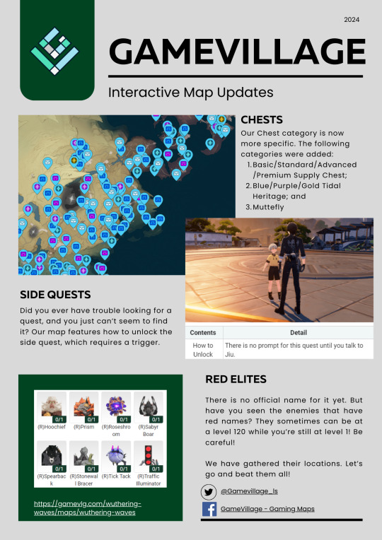
I'm here for our map for Wuthering Waves! Check it out and please let us know what you think. Here is the link: https://gamevlg.com/wuthering-waves/maps/wuthering-waves
2 notes
·
View notes
Text

Do you need to pull data from an interactive map? Here's the basic gist.
0 notes
Text
🗺️ The British Journey to India: From Arrival to Rule
What if you could trace the entire timeline of British colonization in India—not through textbooks, but on an interactive map?

From Surat to Delhi, from trade to total control, the British presence in India wasn’t a single event—it was a slow, strategic expansion across centuries. It began with coastal trading posts and ended in an empire built on military power, treaties, and economic dominance.
💡 Using tools like MAPOG, we can now visualize this transformation. Every port, battlefield, and annexed kingdom can be plotted on a map—offering a spatial story of colonial ambition and its impact on the subcontinent.
📍Want to see how British India took shape? Map it.
Through Geographic Information Systems (GIS), students, educators, and history lovers can now dive into British colonization of India using interactive storytelling. It’s not just about where things happened, but why—and how it all connects.
0 notes
Text


The Swim Guide
The Swim Guide is provided by the team at Swim Drink Fish to provide folks with a helpful guide on swimming spots. Each spot is researched on about the place, what the water and environment is like, and up to date information about the swim spot. Their Beach Finder tool is an interactive map of swim spots you can research and add to your holiday/break plans.
They also have other pages like Beach Basics, a guide to live on the beach. You can find beaches by regions. They also have a blog too.
#swim#swimming#travel#events#summer#warm weather#beach#beaches#traveling#maps#interactive map#ocean#vacation#holiday#outting#sports#sport
0 notes
Text
#podcast#own work#love under fire 🔥#fyp#university#collaboration#youtube#fypツ#tumblr fyp#war love letters#letters#military#interactive story#interactive map#i made this#maps
1 note
·
View note
Text
Who else is on a mission to find all 1000 korok seeds 😬 I accomplished it in BOTW and now trying to on TOTK. Damn koroks! See the link to Zelda dungeon maps, it helps A LOT! (Click on the 3 lines in the top left corner to access the interactive map).

#zelda tears of the kingdom#legend of zelda#totk korok#korok#gaming#gamer#korok seeds#zelda#video games#nintendo switch#interactive map
1 note
·
View note
Text
Explore Canberra Guide Map #attractions #touristattractions #ilovecanberra #touristplace
youtube
From iconic landmarks to cozy cafés and everything in between, our map is your ultimate guide to Canberra’s best spots. 🌟 Whether you’re a visitor or a local, find hidden gems, plan your adventures, and make every moment unforgettable. #canberralife #canberra #canberraeats #canbeelifestyle #canberraproperty #australia #touristattractions #touristdestinations #touristplaces #tourism #tourist #touristplace
Visit Us for more info: https://bushcapitalguide.com.au
For Canberra Guide Map: https://bushcapitalguide.com.au/bush-capital-guide-map/
For Canberra Deals & Offers: https://bushcapitalguide.com.au/canberra-deals-offer/
Follow Us on Social Media: https://www.facebook.com/bushcapitalguidecanberratouristattraction/ https://www.instagram.com/bushcapitalguide/ https://in.pinterest.com/bushcapitalguide/
#canberra#tourist#attractions#australia#travel destinations#guide#travel guide#maps please interact#interactive map#Youtube
0 notes
Text
Mapping Waste Disposal Sites: Visualizing Sanitation Infrastructure for Cleaner Cities
Effective waste management is not simply about collecting garbage—it's critical for public health, environmental sustainability, and urban livability. As Indian cities continue to expand, clearly understanding where waste disposal facilities are and how effectively they're managed is essential. Traditional data formats such as lists and tables provide useful information, but they fail to convey the geographic nuances necessary for targeted improvements. Spatial mapping bridges this gap, offering vital visual insights into waste management infrastructure.

Why Spatial Mapping of Waste Matters
Spatial mapping transforms waste management data into visual, geographic insights. By utilizing Geographic Information Systems (GIS) platforms such as MAPOG, urban planners, policymakers, and communities can precisely visualize locations and conditions of facilities including landfills, recycling units, refuse transfer stations, and public waste bins. This approach reveals patterns, highlights effective practices, and clearly identifies areas that require immediate attention.
Limitations of Traditional Reporting
While conventional reporting methods offer valuable statistics, they often miss critical geographic details. Static reports cannot illustrate the spatial relationships between waste facilities and surrounding neighborhoods, nor can they easily communicate the impact of regional factors on waste management outcomes. Spatial maps effectively communicate these geographic stories, translating data into understandable and actionable visuals.
Key Benefits of Spatial Mapping for Waste Infrastructure
Spatial mapping provides essential benefits for diverse stakeholders:
Urban Planners and Policymakers: Quickly identify gaps in waste infrastructure and optimize resource allocation and collection routes.
Public Health Professionals: Visualize potential health risks associated with waste management, such as proximity to residential or environmentally sensitive areas.
Environmental NGOs: Showcase successful waste management strategies, promoting sustainability and knowledge-sharing.
Local Communities: Engage with their city's sanitation data, advocating effectively for improvements and accountability.
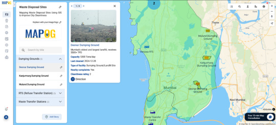
From Visualization to Real-World Improvements
Mapping waste disposal infrastructure isn't merely informative—it's transformative. Clearly visualizing waste management performance helps stakeholders prioritize critical areas, shape informed policies, and foster meaningful community engagement.Whether you’re an urban planner, government official, public health expert, researcher, NGO representative, or engaged citizen, MAPOG empowers you to turn complex waste management data into meaningful, impactful action. Because true progress in urban cleanliness begins with understanding the spatial stories behind the infrastructure.
0 notes
Text
Hey, you guys wanna go fuck some shit up?
What?
Y'know, go cause some mayhem of the variety that we can't talk about in this library.
Pfft, that just makes it sound worse...
What are you talking about???
Y'know. Mayhem. Anarchy. Fun stuff like that.
You're being so vague...
... Yeah. Suppose I am. Sorry. Just a habit of mine.
So there's this giant realistic looking heart thing underneath the town that's got an eye and some teeth and it kinda sucks. Wanna kill it with me?

"S" Willsdale belongs to @imaglitchy, a good friend of Willsdale! Thank you for your Resident, I will take good care of her!
Natily Willsdale belongs to @such-lovely-posts, a good friend of Willsdale! Thank you for your Resident, I will take good care of her!
4 notes
·
View notes
Text
Click on a state and read its specific policies.
1 note
·
View note
Text
You all know me for the Eclipse mania I continued to post about from April of 2023-May 2024.
I have great news.
It’s not done.
Online there is an interactive map covering the path of the eclipse, run by the Gulf of Maine Science Institute. On it are icons that will lead you to videos, articles, poetry, photos, and all sorts of artwork.
It is run by one Terence Finnegan, Eclipse Coordinator for the Gulf of Maine Institute. They hired him for six months to run all their community eclipse programs, and this is what he is leaving behind for the greater online community.
First off, it is just super fun to click through-
https://felt.com/map/GMRI-Total-Solar-Eclipse-April-8-2024-jYYarRjOQKmrnTI8cdGYsD
But more importantly- you can continue to submit works for this map!
If you caught video, or photos, or filled out scientific notes, or made art, or wrote songs, or have ANYTHING to relay what your eclipse experience was like, they want it on their map!
It’s best to submit before July 3rd, 2024, but hopefully they will continue to take submissions throughout the summer. They are more likely to keep working on it if they have a steady stream of submissions.
You can submit work here: https://www.gmri.org/projects/in-the-path-of-totality-eclipse-2024/
I just think this is the coolest thing, and most of the info on this map so far is what ONE guy went out and collected from local communities and postings online.
Imagine what it could be if the science nerds and artists of tumbler got behind it????
This could be a major resource for anyone looking to study eclipse experiences leading up to future eclipse events.
This could be a major resource for anyone looking to write stories with eclipses as a plot point.
If we want to get super fanciful about it, this could be one of those things aliens some day use to understand us. Did you know, they don’t have total eclipses on any other planet we know of? The moon and the sun only line up with the correct size on our planet.
Or it could just be a fun thing for kids to scroll through when they study sun science in school.
In any case, I think we should get on this.
#total solar eclipse#solar eclipse#solar eclipse 2024#interactive map#gulf of Maine science institute#science nerds#tumbler artists#go forth and create!#I sic you all on this man’s science project#let’s make this a thing#let’s go feral#blow this up#make this man’s year
0 notes