#New Business Formation
Text
youtube
You may maximize your company's probability by utilizing the several services that Advantage CPA supplies. From tactical financial design to correct tax composing, our skilled staff offers express solutions to maximize your business's performance and ensure consent. Survey our vast array of services planned to boost your income, ease your growth, and graceful your accounting work. Join us to proceed with your business with acute guidance and unusual experience. See how Advantage CPA can help you prosper right now!
#Accounting#Payroll#Tax Preparation#QuickBooks Pro Advisor#Bookkeeping#New Business Formation#Business Consultation#Bank Financing#Internal Controls#Strategic Business Planning#Succession Planning#Tax Planning#Tax Problems#State Sales Tax#IRS Tax Problems Resolution#Accounting Firm#CPA Firm#Payroll Services#Tax Services#Business Services#Youtube
0 notes
Text
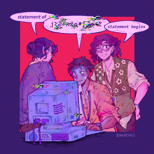
001: first shift
#the magnus protocol#tmagp#samama khalid#gwen bouchard#alice dyer#rusty quill#tmp#magpod#gwendolyn bouchard#wanted to draw something small for each episode but here I am finishing one (1) like. 10 episodes in#my headcanon is that lena is a lot stricter re: dress code but in general#gwen usually dresses in neutrals/grays#sam is New Here so he at least tries for the business casual look of button up#and alice gets away with more loud outfits bc look it's a sweater vest are you saying that's NOT professional *thinking emoji face*#rip statement of [name] statement begins format you will be missed#wait imagine we get a statement in one ep that has that format with no comment#i say this but I love how different all of the statements are with the new format
519 notes
·
View notes
Text
why Aurora's art is genius
It's break for me, and I've been meaning to sit down and read the Aurora webcomic (https://comicaurora.com/, @comicaurora on Tumblr) for quite a bit. So I did that over the last few days.
And… y'know. I can't actually say "I should've read this earlier," because otherwise I would've been up at 2:30-3am when I had responsibilities in the morning and I couldn't have properly enjoyed it, but. Holy shit guys THIS COMIC.
I intended to just do a generalized "hello this is all the things I love about this story," and I wrote a paragraph or two about art style. …and then another. And another. And I realized I needed to actually reference things so I would stop being too vague. I was reading the comic on my tablet or phone, because I wanted to stay curled up in my chair, but I type at a big monitor and so I saw more details… aaaaaand it turned into its own giant-ass post.
SO. Enjoy a few thousand words of me nerding out about this insanely cool art style and how fucking gorgeous this comic is? (There are screenshots, I promise it isn't just a wall of text.) In my defense, I just spent two semesters in graphic design classes focusing on the Adobe Suite, so… I get to be a nerd about pretty things…???
All positive feedback btw! No downers here. <3
---
I cannot emphasize enough how much I love the beautiful, simple stylistic method of drawing characters and figures. It is absolutely stunning and effortless and utterly graceful—it is so hard to capture the sheer beauty and fluidity of the human form in such a fashion. Even a simple outline of a character feels dynamic! It's gorgeous!
Though I do have a love-hate relationship with this, because my artistic side looks at that lovely simplicity, goes "I CAN DO THAT!" and then I sit down and go to the paper and realize that no, in fact, I cannot do that yet, because that simplicity is born of a hell of a lot of practice and understanding of bodies and actually is really hard to do. It's a very developed style that only looks simple because the artist knows what they're doing. The human body is hard to pull off, and this comic does so beautifully and makes it look effortless.
Also: line weight line weight line weight. It's especially important in simplified shapes and figures like this, and hoo boy is it used excellently. It's especially apparent the newer the pages get—I love watching that improvement over time—but with simpler figures and lines, you get nice light lines to emphasize both smaller details, like in the draping of clothing and the curls of hair—which, hello, yes—and thicker lines to emphasize bigger and more important details and silhouettes. It's the sort of thing that's essential to most illustrations, but I wanted to make a note of it because it's so vital to this art style.
THE USE OF LAYER BLENDING MODES OH MY GODS. (...uhhh, apologies to the people who don't know what that means, it's a digital art program thing? This article explains it for beginners.)
Bear with me, I just finished my second Photoshop course, I spent months and months working on projects with this shit so I see the genius use of Screen and/or its siblings (of which there are many—if I say "Screen" here, assume I mean the entire umbrella of Screen blending modes and possibly Overlay) and go nuts, but seriously it's so clever and also fucking gorgeous:
Firstly: the use of screened-on sound effect words over an action? A "CRACK" written over a branch and then put on Screen in glowy green so that it's subtle enough that it doesn't disrupt the visual flow, but still sticks out enough to make itself heard? Little "scritches" that are transparent where they're laid on without outlines to emphasize the sound without disrupting the underlying image? FUCK YES. I haven't seen this done literally anywhere else—granted, I haven't read a massive amount of comics, but I've read enough—and it is so clever and I adore it. Examples:


Secondly: The beautiful lighting effects. The curling leaves, all the magic, the various glowing eyes, the fog, the way it's all so vividly colored but doesn't burn your eyeballs out—a balance that's way harder to achieve than you'd think—and the soft glows around them, eeeee it's so pretty so pretty SO PRETTY. Not sure if some of these are Outer/Inner Glow/Shadow layer effects or if it's entirely hand-drawn, but major kudos either way; I can see the beautiful use of blending modes and I SALUTE YOUR GENIUS.
I keep looking at some of this stuff and go "is that a layer effect or is it done by hand?" Because you can make some similar things with the Satin layer effect in Photoshop (I don't know if other programs have this? I'm gonna have to find out since I won't have access to PS for much longer ;-;) that resembles some of the swirly inner bits on some of the lit effects, but I'm not sure if it is that or not. Or you could mask over textures? There's... many ways to do it.
If done by hand: oh my gods the patience, how. If done with layer effects: really clever work that knows how to stop said effects from looking wonky, because ugh those things get temperamental. If done with a layer of texture that's been masked over: very, very good masking work. No matter the method, pretty shimmers and swirly bits inside the bigger pretty swirls!
Next: The way color contrast is used! I will never be over the glowy green-on-black Primordial Life vibes when Alinua gets dropped into that… unconscious space?? with Life, for example, and the sharp contrast of vines and crack and branches and leaves against pitch black is just visually stunning. The way the roots sink into the ground and the three-dimensional sensation of it is particularly badass here:

Friggin. How does this imply depth like that. HOW. IT'S SO FREAKING COOL.
A huge point here is also color language and use! Everybody has their own particular shade, generally matching their eyes, magic, and personality, and I adore how this is used to make it clear who's talking or who's doing an action. That was especially apparent to me with Dainix and Falst in the caves—their colors are both fairly warm, but quite distinct, and I love how this clarifies who's doing what in panels with a lot of action from both of them. There is a particular bit that stuck out to me, so I dug up the panels (see this page and the following one https://comicaurora.com/aurora/1-20-30/):

(Gods it looks even prettier now that I put it against a plain background. Also, appreciation to Falst for managing a bridal-carry midair, damn.)
The way that their colors MERGE here! And the immense attention to detail in doing so—Dainix is higher up than Falst is in the first panel, so Dainix's orange fades into Falst's orange at the base. The next panel has gold up top and orange on bottom; we can't really tell in that panel where each of them are, but that's carried over to the next panel—

—where we now see that Falst's position is raised above Dainix's due to the way he's carrying him. (Points for continuity!) And, of course, we see the little "huffs" flowing from orange to yellow over their heads (where Dainix's head is higher than Falst's) to merge the sound of their breathing, which is absurdly clever because it emphasizes to the viewer how we hear two sets of huffing overlaying each other, not one. Absolutely brilliant.
(A few other notes of appreciation to that panel: beautiful glows around them, the sparks, the jagged silhouette of the spider legs, the lovely colors that have no right to make the area around a spider corpse that pretty, the excellent texturing on the cave walls plus perspective, the way Falst's movements imply Dainix's hefty weight, the natural posing of the characters, their on-point expressions that convey exactly how fuckin terrifying everything is right now, the slight glows to their eyes, and also they're just handsome boys <3)
Next up: Rain!!!! So well done! It's subtle enough that it never ever disrupts the impact of the focal point, but evident enough you can tell! And more importantly: THE MIST OFF THE CHARACTERS. Rain does this irl, it has that little vapor that comes off you and makes that little misty effect that plays with lighting, it's so cool-looking and here it's used to such pretty effect!
One of the panel captions says something about it blurring out all the injuries on the characters but like THAT AIN'T TOO BIG OF A PROBLEM when it gets across the environmental vibes, and also that'd be how it would look in real life too so like… outside viewer's angle is the same as the characters', mostly? my point is: that's the environment!!! that's the vibes, that's the feel! It gets it across and it does so in the most pretty way possible!
And another thing re: rain, the use of it to establish perspective, particularly in panels like this—

—where we can tell we're looking down at Tynan due to the perspective on the rain and where it's pointing. Excellent. (Also, kudos for looking down and emphasizing how Tynan's losing his advantage—lovely use of visual storytelling.)
Additionally, the misting here:

We see it most heavily in the leftmost panel, where it's quite foggy as you would expect in a rainstorm, especially in an environment with a lot of heat, but it's also lightly powdered on in the following two panels and tends to follow light sources, which makes complete sense given how light bounces off particles in the air.
A major point of strength in these too is a thorough understanding of lighting, like rim lighting, the various hues and shades, and an intricate understanding of how light bounces off surfaces even when they're in shadow (we'll see a faint glow in spots where characters are half in shadow, but that's how it would work in real life, because of how light bounces around).
Bringing some of these points together: the fluidity of the lines in magic, and the way simple glowing lines are used to emphasize motion and the magic itself, is deeply clever. I'm basically pulling at random from panels and there's definitely even better examples, but here's one (see this page https://comicaurora.com/aurora/1-16-33/):

First panel, listed in numbers because these build on each other:
The tension of the lines in Tess's magic here. This works on a couple levels: first, the way she's holding her fists, as if she's pulling a rope taut.
The way there's one primary line, emphasizing the rope feeling, accompanied by smaller ones.
The additional lines starbursting around her hands, to indicate the energy crackling in her hands and how she's doing a good bit more than just holding it. (That combined with the fists suggests some tension to the magic, too.) Also the variations in brightness, a feature you'll find in actual lightning. :D Additional kudos for how the lightning sparks and breaks off the metal of the sword.
A handful of miscellaneous notes on the second panel:
The reflection of the flames in Erin's typically dark blue eyes (which bears a remarkable resemblance to Dainix, incidentally—almost a thematic sort of parallel given Erin's using the same magic Dainix specializes in?)
The flowing of fabric in the wind and associated variation in the lineart
The way Erin's tattoos interact with the fire he's pulling to his hand
The way the rain overlays some of the fainter areas of fire (attention! to! detail! hell yeah!)
I could go on. I won't because this is a lot of writing already.
Third panel gets paragraphs, not bullets:
Erin's giant-ass "FWOOM" of fire there, and the way the outline of the word is puffy-edged and gradated to feel almost three-dimensional, plus once again using Screen or a variation on it so that the stars show up in the background. All this against that stunning plume of fire, which ripples and sparks so gorgeously, and the ending "om" of the onomatopoeia is emphasized incredibly brightly against that, adding to the punch of it and making the plume feel even brighter.
Also, once again, rain helping establish perspective, especially in how it's very angular in the left side of the panel and then slowly becomes more like a point to the right to indicate it's falling directly down on the viewer. Add in the bright, beautiful glow effects, fainter but no less important black lines beneath them to emphasize the sky and smoke and the like, and the stunningly beautiful lighting and gradated glows surrounding Erin plus the lightning jagging up at him from below, and you get one hell of an impactful panel right there. (And there is definitely more in there I could break down, this is just a lot already.)
And in general: The colors in this? Incredible. The blues and purples and oranges and golds compliment so well, and it's all so rich.
Like, seriously, just throughout the whole comic, the use of gradients, blending modes, color balance and hues, all the things, all the things, it makes for the most beautiful effects and glows and such a rich environment. There's a very distinct style to this comic in its simplified backgrounds (which I recognize are done partly because it's way easier and also backgrounds are so time-consuming dear gods but lemme say this) and vivid, smoothly drawn characters; the simplicity lets them come to the front and gives room for those beautiful, richly saturated focal points, letting the stylized designs of the magic and characters shine. The use of distinct silhouettes is insanely good. Honestly, complex backgrounds might run the risk of making everything too visually busy in this case. It's just, augh, so GORGEOUS.
Another bit, take a look at this page (https://comicaurora.com/aurora/1-15-28/):

It's not quite as evident here as it is in the next page, but this one does some other fun things so I'm grabbing it. Points:
Once again, using different colors to represent different character actions. The "WHAM" of Kendal hitting the ground is caused by Dainix's force, so it's orange (and kudos for doubling the word over to add a shake effect). But we see blue layered underneath, which could be an environmental choice, but might also be because it's Kendal, whose color is blue.
And speaking off, take a look at the right-most panel on top, where Kendal grabs the spear: his motion is, again, illustrated in bright blue, versus the atmospheric screened-on orange lines that point toward him around the whole panel (I'm sure these have a name, I think they might be more of a manga thing though and the only experience I have in manga is reading a bit of Fullmetal Alchemist). Those lines emphasize the weight of the spear being shoved at him, and their color tells us Dainix is responsible for it.
One of my all-time favorite effects in this comic is the way cracks manifest across Dainix's body to represent when he starts to lose control; it is utterly gorgeous and wonderfully thematic. These are more evident in the page before and after this one, but you get a decent idea here. I love the way they glow softly, the way the fire juuuust flickers through at the start and then becomes more evident over time, and the cracks feel so realistic, like his skin is made of pottery. Additional points for how fire begins to creep into his hair.
A small detail that's generally consistent across the comic, but which I want to make note of here because you can see it pretty well: Kendal's eyes glow about the same as the jewel in his sword, mirroring his connection to said sword and calling back to how the jewel became Vash's eye temporarily and thus was once Kendal's eye. You can always see this connection (though there might be some spots where this also changes in a symbolic manner; I went through it quickly on the first time around, so I'll pay more attention when I inevitably reread this), where Kendal's always got that little shine of blue in his eyes the same as the jewel. It's a beautiful visual parallel that encourages the reader to subconsciously link them together, especially since the lines used to illustrate character movements typically mirror their eye color. It's an extension of Kendal.
Did I mention how ABSOLUTELY BEAUTIFUL the colors in this are?
Also, the mythological/legend-type scenes are illustrated in familiar style often used for that type of story, a simple and heavily symbolic two-dimensional cave-painting-like look. They are absolutely beautiful on many levels, employing simple, lovely gradients, slightly rougher and thicker lineart that is nonetheless smoothly beautiful, and working with clear silhouettes (a major strength of this art style, but also a strength in the comic overall). But in particular, I wanted to call attention to a particular thing (see this page https://comicaurora.com/aurora/1-12-4/):

The flowing symbolic lineart surrounding each character. This is actually quite consistent across characters—see also Life's typical lines and how they curl:

What's particularly interesting here is how these symbols are often similar, but not the same. Vash's lines are always smooth, clean curls, often playing off each other and echoing one another like ripples in a pond. You'd think they'd look too similar to Life's—but they don't. Life's curl like vines, and they remain connected; where one curve might echo another but exist entirely detached from each other in Vash's, Life's lines still remain wound together, because vines are continuous and don't float around. :P
Tahraim's are less continuous, often breaking up with significantly smaller bits and pieces floating around like—of course—sparks, and come to sharper points. These are also constants: we see the vines repeated over and over in Alinua's dreams of Life, and the echoing ripples of Vash are consistent wherever we encounter him. Kendal's dream of the ghost citizens of the city of Vash in the last few chapters is filled with these rippling, echoing patterns, to beautiful effect (https://comicaurora.com/aurora/1-20-14/):

They ripple and spiral, often in long, sinuous curves, with smooth elegance. It reminds me a great deal of images of space and sine waves and the like. This establishes a definite feel to these different characters and their magic. And the thing is, that's not something that had to be done—the colors are good at emphasizing who's who. But it was done, and it adds a whole other dimension to the story. Whenever you're in a deity's domain, you know whose it is no matter the color.
Regarding that shape language, I wanted to make another note, too—Vash is sometimes described as chaotic and doing what he likes, which is interesting to me, because smooth, elegant curves and the color blue aren't generally associated with chaos. So while Vash might behave like that on the surface, I'm guessing he's got a lot more going on underneath; he's probably much more intentional in his actions than you'd think at a glance, and he is certainly quite caring with his city. The other thing is that this suits Kendal perfectly. He's a paragon character; he is kind, virtuous, and self-sacrificing, and often we see him aiming to calm others and keep them safe. Blue is such a good color for him. There is… probably more to this, but I'm not deep enough in yet to say.
And here's the thing: I'm only scratching the surface. There is so much more here I'm not covering (color palettes! outfits! character design! environment! the deities! so much more!) and a lot more I can't cover, because I don't have the experience; this is me as a hobbyist artist who happened to take a couple design classes because I wanted to. The art style to this comic is so clever and creative and beautiful, though, I just had to go off about it. <3
...brownie points for getting all the way down here? Have a cookie.
#aurora comic#aurora webcomic#comicaurora#art analysis#...I hope those are the right tags???#new fandom new tagging practices to learn ig#much thanks for something to read while I try to rest my wrists. carpal tunnel BAD. (ignore that I wrote this I've got braces ok it's fine)#anyway! I HAVE. MANY MORE THOUGHTS. ON THE STORY ITSELF. THIS LOVELY STORY#also a collection of reactions to a chunk of the comic before I hit the point where I was too busy reading to write anything down#idk how to format those tho#...yeet them into one post...???#eh I usually don't go off this much these days but this seems like a smaller tight-knit fandom so... might as well help build it?#and I have a little more time thanks to break so#oh yes also shoutout to my insanely awesome professor for teaching me all the technical stuff from this he is LOVELY#made an incredibly complex program into something comprehensible <3#synapse talks
761 notes
·
View notes
Text
im sorry to say, that by ignoring the plague of apollo, you have doomed the danaans to further misery. Farewell my bitch
#apollo#agamemnon#book 1#update here cause new post and all! thank you to the anon who informed me about a slur in a prior post#i was not familiar with the term and def shouldve checked it out and changed it before turning the dril tweet around to fit everything here#the fact that it is a dril tweet itself though is….hm#anyways! apologies! the post has been edited#all this is reminding me again is that i should be making more posts and just following the format cause. this is not the first time#that ive encountered very offensive tweets#i havent done it in a hot bit though cause im fairly busy with work now. gonna start phasing the tweet based ones out again soon#also. please inform me if anyone at all finds anything on here that i should tag or edit in the future#i really dont want this to be a place of pain of any kind (other than war crimes)#and ive been running this since i was like…14 so there is likely bound to be smth that should be revisited
58 notes
·
View notes
Text
Illustration of Albedo | "What a view... How about a quick break so I can sketch this beautiful scenery?"
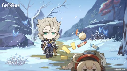
"Albedo, look! A big Crystalfly!"
"Slow down, Klee. Be careful, don't fall now."
#genshin impact#genshin impact updates#official#genshin impact news#genshin impact albedo#that's a noncanonical title format#anyway i have been so ungodly busy lately it's not even funny.
357 notes
·
View notes
Text
ello ello ello return to your usual sad scouse bastard programming coming next week <3
#( ooc. ) OUT OF CIGS.#damn i got busy and tumblr changed format. what else is new#anyway sorry for vanishing on everyone!!!! i had a work project that went insane#also my queue broke Yet Again and i've been too swamped to fix it#so i will simply. start posting replies next week bc fuck it bro#also NEW HELLBLAZER next week so i will have inspiration and energy anew#if i haven't replied to your messages yet i will do so starting monday!!! sorry again!!! life has been uhhhhh hell!!
8 notes
·
View notes
Text
holy shit nanowrimo forums drama??? nanowrimo forums drama??? what the everloving fuck?!
#i grew up on thosw forums basically so like...damn#sad to see them go but hopefully they can get some better mods i guess?#i stopped using them when they changed to the new site bc the new format bugs me (and also im too busy to trawl the forums like I used to)#but...damn
9 notes
·
View notes
Text
okay, so
the battle of yavin was 1,000 years after the ruusan reformation. 22 BBY (before battle of yavin), the start of the clone wars, is 978 ARR (after ruusan reformation). 0 BBY is 7977 CRC (coruscant reckoning calendar)
in 968 ARR (32 BBY, 7945 CRC) the clones are commissioned by jedi master sifo-dyas, who’s later murdered by count dooku.
10 years later at the start of the clone wars (978 ARR, 22 BBY, 7955 CRC) obi-wan kenobi is elected to the jedi high council, anakin skywalker is knighted and assigned ahsoka tano as a padawan (at nineteen!!!!!!! he’s like barely five years older than her, genuinely wtaf). obi-wan is now a high general, putting him in charge of the third systems army, the seventh sky corps, and the 212th attack battalion more specifically. this is also likely when cody gets promoted to marshal commander.
the war ends for years later, 981 ARR 19 BBY 7958 CRC. order 66 is executed, anakin skywalker falls to the dark side and massacres the jedi temple of coruscant, padme amidala gives birth to twins fathered by anakin skywalker, leia is entrusted to bail organa while luke is sent to live with anakin’s step-brother on tatooine, obi-wan kenobi and the rest of the remaining jedi order go into hiding.
19 years later, 1000 ARR 0 BBY 7977 CRC, the original series happens, yippee.
#hi everyone#i’ve been knee deep in star wars prequels hell for the past little bit lol#(also just been busy with things outside of my online spheres)#hope y’all are doing well#star wars#star wars timeline#i tend to use ARR because i like the way the math lines up with BBY#but i also like knowing all three of the calendars that are most commonly used (imo)#i also like the thought of the empire coming up with their own new system for dating things#but idk what i’d call it#maybe EF (empire formation) or something similar#star wars prequels#point me in the direction of anyone that already come up with an empire era calendar
8 notes
·
View notes
Text
i wonder at what point skz started to feel like they couldn't live without each other or that they felt like family. obviously it doesn't happen one day and you notice it but just from a human standpoint, i'd be so curious to know their povs on that
#i've been thinking lately like.. in certain kpop groups the members definitely view the group as business and nothing else. which is fair#it's a system designed to create bright stars that move on afterwards#i get curious about new groups because it's like.. either we are witnessing the formation of friendships and bond that will last a lifetime#or we're watching people who are at the least acquaintances doing what they signed up to#neither are bad.. but it's curious..................
12 notes
·
View notes
Text
spent the entire day trying to figure out how to add cut lines and save my little sticker designs with separate design and cut line vector layers only to realize its not going to work without professional graphic design software and sending the most neurotic little order email to the print shop 😭
#guy who cant do anything without terrjbly precise instructions voice: time to list every reason for why i sent these files in this format#as if im on trial.#outsourcing things always puts me on edge esp when i cant do something myself. its got me thinking shit like.#what if they print one single image per sticker sheet bc i havent specified i need more than that.#what if they resize my designs and then theyre too big or too small#ive unlocked new mental illness w this business endeavour i fear. but it will be worth it. car crash valentines stickers..#srce.txt
2 notes
·
View notes
Text
gotta love how I usually see Impel Down being discussed as Luffy's greyest moment for allowing a bunch of psychos to escape with him, even though he himself freed a total of 2 people. And granted! One of those WAS Crocodile! Most do go back to pirating!
But I rarely see any discussion about the punitive nature of such a prison, and how moral is it to leave people to endless sadistic and fatal tortures, as the bunch of skulls littering the whole place show. Know who else was down there with the pirates? The revolutionaries and TOM, all coming from Ennies Lobby itself, the place with 100% conviction rate
like yeah, they're dangerous. System's broken too, tho
#is it a new format for the trolley problem? I don't think so I just know I'd hesitate to go either way#wasn't there a bounty hunter in dressrosa who thanked luffy for the business? but we're never told if those people were caught AS criminals#or if they had given up that life but oh well#btw there's a person in the staff who's literally called Sadie-chan I mean it's a prison of ants surveyed by the anteater#one piece#personal#seeing one two many tv tropes entries but to be fair that one's not meant to analyze things that deeply
22 notes
·
View notes
Text
resisting the temptation to just post everything in tobai's q rn smhh
#msposts#text#tobaiblog#i have like... 15 posts in that queue rn#the format is very good and much less stressful to work with !!#i hope people dont find it boring though#just know i am so lazy that tobais talk sprites?? i only have the neutral one saved#every single other change in expression i draw new every time#seeing how the audience interacts so far has been interesting also#like seeing what people have been focused on#but i just know ill prolly be sick or busy or some other stupid thing will come up#so i should allow queue to be like 10 or over ig
4 notes
·
View notes
Text
I'm so hyped about this spreadsheet project that I'm writing out formulas in a notepad that reference sheets I haven't even made yet
#gods I haven't felt this inspired in so long#there's truly nothing like innovating a new spreadsheet design#learning new formulas and conditional formatting rules and data organization styles#and colour-coding everything of course#down to exact hex codes just because I can#this is the life#aaaaand I just remembered that I forgot to eat dinner because I was busy researching a really specific formula#gonna go do that now lol#girlblogging
2 notes
·
View notes
Note
aeons anon here! landaus, after current events, i'm interested to hear your opinions on groups that follow the aeons, especially the IPC. of course, the antimatter legion is a threat to belobog, but what about the IPC? the xianzhou alliance?
also, gepard, i think sampo may be part of the masked fools... i saw him hanging out with a few of them.
*Recording begins*
Serval: -So while the IPC might be a bit greedy, I do think that at least Topaz was just trying to help us.
Lynx: Right so I'm going to ignore the fact I wasn't consulted and also managed to miss another major event.
Serval: No comment.
Lynx: Oh shush. For the record, I would've been against the signing the contract, but I suppose that worked out in the end. As for the IPC, yeah I'd call them greedy, I mean how can you justify making people wholey unrelated to the initial contract take full responsibility for it and still see yourself as in the right?
Serval: I'm sure there's more to it than just that Lynxy, they exist everywhere. Aeons, we even use credits in Belebog, yet haven't seen from the IPC until just recently. It's a bit unfair to color them based on just one encounter.
Lynx: Sure, but I still think it was a bit rude. They are probably fine enough in practice. As far as other groups, I mean the Antimatter legions is definitely a problem, but most are so far removed from us it's hard to really have an opinion.
Serval: What Lynxy said, I'm sure they all have there motivations, but the legion definitely seem like a problem.
*Recording ends, the following is submitted seperately*
Gepard: The IPC...
*a sigh is recorded*
Gepard: I agree with Lady Bronya not signing the contract. It is cheap of the IPC to strike when we were still recovering from the stellaron, not only that but claiming territory and halting productions before any agreements were made could have crippled our ability to hold back the fragmentum had things not been resolved quickly. As it stands, the IPC has left a sour taste in my mouth, even if it's been resolved now. Sampo Koski? The wanted con man? I can't imagine him being part of the masked fools changing much, even if it clarifies some of his... eccentricities.
*Recording ends*
#honkai star rail#gepard landau#lynx landau#serval landau#landau family hsr#Trying new formatting for clarity#Aeons Anon#Also to whoever put in the other ask a while ago I'M SO SORRY I'M TRYING -Fox#Tempted to add a Read More but eh#Not Peer-reviewed#Other mod is busy so I'll just post this
6 notes
·
View notes
Text
heads up - greatest hits chapter is probably gonna come a little late today!
#peach rambles#ive got a bit of a busy day and im not sure when i’ll have the time to transfer the chapter onto ao3 + post about it#plus this chapter i want to do some new formatting stuff which i’ll need time to figure out
8 notes
·
View notes
Text


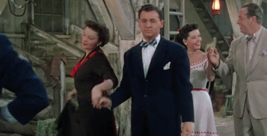


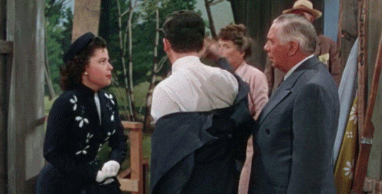
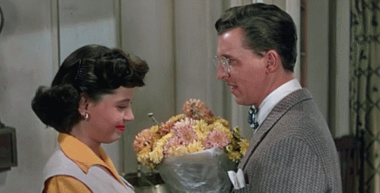
eddie bracken as orville wingait in summer stock (1950)
#don't get it wrong abigail whacking orville upside the head is during their comedy backstage 5 sec to Resolution ending rush#literal last minute conclusion crunch in unsurprising formatting lol; i chose a more peaceful gif to end on. note the prior one's [feet Up]#i hope this illustrates There Is Much Material. more clips than this & truly as good or better a role as any others to choose from here#summer stock#conveniently it's apparently wingait in the movie but via that casting news this (2023) role is wingate#tcm fancam life...we've all been there. akd talking abt meet me in st. louis like maybe i should rewatch lol. have to muddle through someho#anyways there's for sure room to like grab a little thread of plot and enhance it in this story. e.g. orville & abigail could talk Thrice#their B-plot / more idiosyncratic romance there is still >>>>>> the main JUDY & GENE one unsurprisingly even w/o a third convo lol#whoops the main guy is an asshole. judy/jane learns she loves show business so just kinda may as well be in love w/the show guy ig#like girl you don't have to be...but ofc already although her & orville's dynamic is pleasant enough she seems somewhat disinterested#while fascinatingly for our purposes though orville is framed a bit like [this NERD] he can't be too dunked on b/c [romantic B-plot]#meanwhile abigail's Undeserving Of Gene/Joe (she is but she's too good for him) qualities being just that she's been too Indulged so like#in her lack of protestant ethic farm work she's so conceited & sensitive that she wants to rest & not be yelled at???#smash cut to for real judy/jane on Opening Night like asking tentatively like oh romantic interest you're Not gonna yell at me..??#but she's been Hard Working so she will tolerate the physical AND emotional demands. but she's also more Talented than abigail#so joe need not be mean to her Anyways like. okay wild maybe we could rework that but congrats abigail for NOT ending up w/him fr#meanwhile orville's arc (joe has none to speak of save realizing he wants to make out w/this other woman now) is as clear as anyone's#extricate himself from otherwise only getting to be an extension of his father who is generally interfering / directing / demeaning him als#another ''well i don't know about that'' element in that when orville Does tell him to cut that out his dad actually just rolls with that#and becomes more amicable lol like well that does work out & it's unsurprisingly like cmon orv you can't LET him treat you like that...#and if you didn't? he'd just be like ''oh haha okay''...like is abigail supposed to be ''right'' abt uhh romance there but yet she's just#too sensitive to handle Tell Don't Ask / No Apologies? maybe; but they both end up getting to Not Stand For It lol. i think that that would#ofc still be fun to develop. whereas w/joe it's like uh maybe make him Not a huge asshole in the end / judy p much in love w/Showbiz....#abigail & orville out here decidedly Not About Nonsense....but still a bit zany ig such that after the [imagine the foley] hit: it's good#like i'm sure it's ''orville's still enough of a NERD to be chill w/that'' & ''abigail's still DIFFICULT enough to put her foot down''#['50 gender politics] we all know that couple whose flaws & idiosyncrasies allow them to Apologize & Ask & use their inside voices#and be all upset if someone's trying to demean them. unlike True Romance of the man who won't bully his wife if she earns it :')#joe could instead uhh be a harried director who's actually Wrong for being a dick to his gf (if we even include that) w/the various sources#of pressure to make a show Work but there's all this req'd spontaneity / flexibility anyways & he learns that even if he's clenching throug#it he can Not take it out on other people / Make it succeed by Making ppl do anything. & also jane reminds him of Passion for this.
6 notes
·
View notes
Last Seen Blogs

queensvision
Queens Vision

indububnapulmonologist
Untitled

officialsakuratoto2-blog
BANDAR TOGEL ONLINE

nellop13
El abrevadero envenenado

ilovedeadlypremonition
Welcome to Greenvale