#Screen Resolution Changing Method
Explore tagged Tumblr posts
Visit Tumblr Blog
Explore Tumblr blogs with no restrictions, modern design and the best experience.
Last Seen Tumblr Blogs


Fun Fact
There are dozens of funny blogs to kill time on Tumblr.
Text
Display and Modification of LVDS Display Interface on AM62x Development Board

1. LVDS Interface Specification
Forlinx Embedded OK6254-C development board provides 2 x 4-lane LVDS display serial interfaces supporting up to 1.19Gbps per lane; the maximum resolution supported by a single LVDS interface is WUXGA (1920 x 1200@60fps, 162MHz pixel clock).
In addition, the interface supports the following three output modes:
(1) Single-channel LVDS output mode: at this time, only 1 x LVDS interface displays output;
(2) 2x single-channel LVDS (copy) output mode: in this mode, 2 x LVDS display and output the same content;
(3) Dual LVDS output mode: 8-lane data and 2-lane clock form the same display output channel.Forlinx Embedded OK6254-C development board is equipped with dual asynchronous channels (8 data, 2 clocks), supporting 1920x1200@60fps. All signals are by default compatible with Forlinx Embedded's 10.1-inch LVDS screen, with a resolution of 1280x800@60fps.
2. Output Mode Setting
(1) Single LVDS output mode:
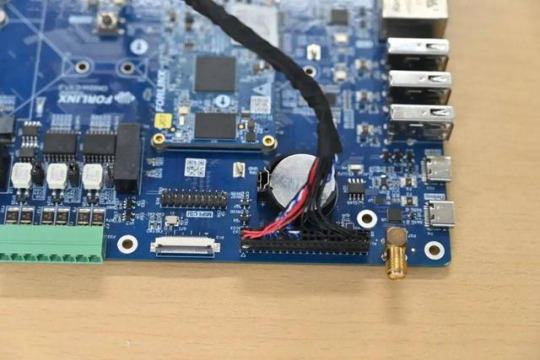
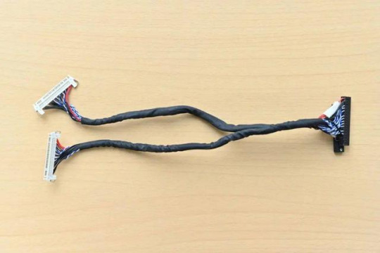
We need a single LVDS screen cable. The black port of the cable is connected to the embedded OK6254-C development board, and the white port is connected to the embedded 10.1-inch LVDS display screen. Connection method as shown in the figure below:
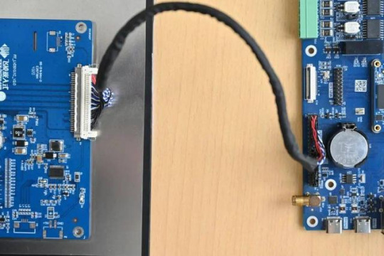
Note that the red line section corresponds to the triangle position, so don't plug it in wrong.
(2) 2x single LVDS (duplicate) output mode:
This mode uses the same connections as the Single LVDS Output Mode. Two white ports link to two 10.1-inch LVDS screens from Forlinx Embedded, and a black port on the right connects to the OK6254-C board's LVDS interface for dual-screen display.
(3) Dual LVDS output mode:
The maximum resolution supported by a single LVDS interface on the OK6254-C development board is WUXGA (1920 x 1200@60fps). To achieve this high-resolution display output, dual LVDS output mode is required.
It is worth noting that the connection between the development board and the screen in this mode is the same as in [Single LVDS Output Mode], but the LVDS cable's and the screen's specifications have been improved.
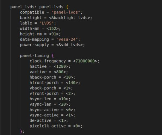
3. Screen Resolution Changing Method
OK6254-C development board device tree is easy to modify, we need to open the OK6254-C-lvds.dts (single 8-way configuration) and OK6254-C-lvds-dual.dts (dual 8-way configuration) files.
Open OK6254-C-lvds.dts
Open OK6254-C-lvds-dual.dts
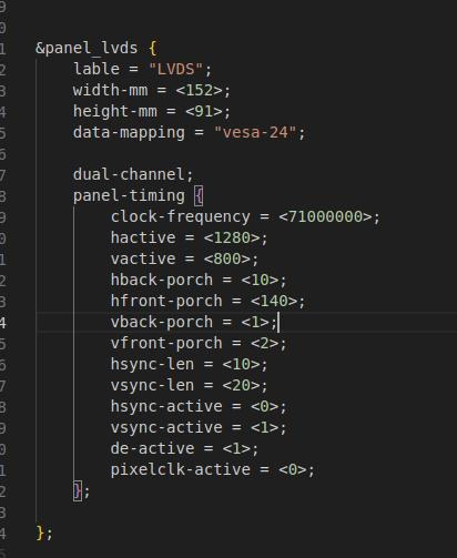
The above figure is the single LVDS and dual LVDS screen resolution information, the default resolution of 1024 * 600, and the maximum resolution support of 1920x1200, you can modify the corresponding parameters according to the Screen User’s Manual.
4. Compilation Configuration
Because we only modified the device tree, we don't need a full compilation. After compiling the kernel, a new Image and multiple device tree files will be generated in the images directory. Here we only need to compile the kernel separately.
(1) Switch directory: cd OK6254-linux-sdk/
(2) Execution environment variables:.. build.sh
(3) Execute the instructions that compile the kernel separately: sudo./build. Sh kernel.
(4) Pack all the device tree files to the development board /boot/ directory and replace them, then sync save and reboot scp images/OK6254-C* [email protected]:/boot/
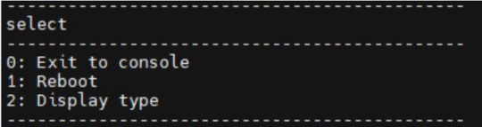
We have modified the corresponding file. How should we select the screen after replacing it? At present, there are three kinds of screen switching control methods: kernel device tree designation, Uboot menu dynamic control, Forlinx Desktop interface and Uboot menu application. Today, I will briefly introduce the dynamic control of Uboot menu.
During Uboot, pressing the space bar will take you to the Uboot menu. There are three options in the menu:
Enter 0 to enter the Uboot command line;
Enter 1 to restart Uboot;
Enter 2 to enter the Display Configuration menu.
There are three options in the menu:
Enter 0 to return to the previous menu;
Enter 1 will toggle what option 1 displays to configure Screen 1 LVDS; Note: Screen 1 supports single LVDS, dual LVDS, and off (i.e., LVDS off)
Enter 2 to toggle the display of option 2 to configure the Screen 2 LCD. Note: Screen 2 supports 1024 * 600 resolution LCD screen, 800 * 480 resolution LCD screen and off (i.e. RGB off)
When selecting the LVDS screen, we enter 1 to select single 8-channel LVDS or dual 8-channel LVDS.
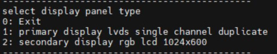
After selecting the desired configuration, enter 0 to return to the previous menu level. Restart Uboot or enter the command line to start the system, which can make the screen settings take effect. For other resolution screens, please modify the kernel device tree screen parameters according to the screen parameter requirements.
Originally published at www.forlinx.net.
#LVDS Interface#Forlinx Embedded#OK6254C#Screen Resolution Changing Method#Compilation Configuration#Uboot menu dynamic control
0 notes
Note
Hi! I saw a post where you had a game made in godot with old school rendering, do you maybe have any tips on how to make godot render a game like that instead of its normal rendering method?
I'd be right happy to!
I'll try to make this concise lol, I always end up overexplaining and then getting lost in the weeds. Buckle up, it's a loooooot of little little things that all add up.
First off, you should decide which look you're going for. N64 and PS1, the two consoles I'm emulating, both had drastically different specs. (plus, there's plenty of other early 3D systems I've not even touched!)
The N64 had texture filtering (textures were interpolated aka "blurry"), it had floating point vertex precision (points moved correctly), it had perspective correction on its textures (no warping)
The PS1 had no texture filtering, no floating point vertex precision (vertices snap and pop around), affine texture mapping (textures warp weird). I also think the color space they operate in is different? Don't quote me
So you can go hard one way or another or pick and choose what you think looks good! We don't have anywhere near the hardware restrictions they did in the 90s so go nuts.
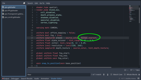
RESOLUTION
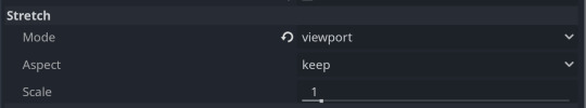
To get a low resolution window, I set the window size of the game and the window override size to different amounts

In green is actually how big the window is on my screen (4k monitor) and in red is the retro resolution I want. If you set the stretch mode correctly (an option a little further down the Window tab) then it'll make the pixels big
COLORS
Now the PS1 had the capability of showing you over 16 million different colors, but it could only display 50,000-150,000 at a time, so in order to get more fidelity out of it, the engineers implemented a dithering effect to better blend the otherwise sharp edges between colors.
I used this shader to achieve the dithering effect. If you don't understand shader languages, that's fine. There are a few different pre-built ones for looking like the PlayStation 1 out there.
TEXTURES
Textures for the PS1 could be as big as 256x256, but they were typically 128x128. And they would squish everything a model needed into there usually, at least with like player models and objects and such.
As mentioned, if you're not good with shader language don't worry. There are countless resources out there that people will either let you use or teach you how it works. But I'm gonna touch on it a little bit here.
PS1 textures had no pixel filtering, so you could see individual pixels.
This is what determines that in the shader code. If you want it to look like the N64 (blurry lol), the proper hint is "filter_linear". Note that it won't be 1:1 with N64, cuz they used bilinear filtering (which kinda sucks and causes weird quirks) whereas now you'll only find linear or trilinear filtering. It's a negligible difference imo.
PS1 textures also were only saved using 15 bit color. I'm told that Photoshop's "Posterize" filter set to 32 can achieve this, but don't use photoshop if you can help it. I use GIMP, and while a newer version might have a posterize filter, or there may be a plugin out there, my version doesn't so I cluge it a little.
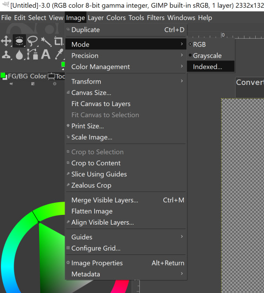

Change your color mode to "indexed", set color dithering to how you like it, and the number of colors in the palette to a number to get a good result. Usually I'll do 16, 8, 32, but occasionally I'll cheat and do a non-multiple-of-8 teehee >:3c
You can change it back to RGB after to make further editing easier.
LIGHTING
N64 and PS1 both implemented vertex lighting, as opposed to the more modern and (now) ubiquitous per-pixel lighting. Godot as it is right now (4.2 i think?) claims it has vertex lighting that you can set as a shader property but they're lying and it doesn't work yet.
The old consoles could only handle like, 2 lights though so it doesn't matter much.
The real star of the show, and in my opinion the one thing that makes a game most look like the 90s is the inclusion of vertex colors.
By multiplying the color of your texture by its stored vertex color, you can do all the shading yourself!
Plus you can reuse textures like crazy just by coloring them differently. The N64 also made heavy use of vertex colors by forgoing a texture on models entirely and just painting them using verticies. The only textures on SM64 Mario are his eyes, stache, hat emblem, buttons, and sideburns. Everything else is done with vertex colors.


Here you can see this level from my Crock Land with no vertex coloring, with some of the vertex colors only, and then with the two combined.
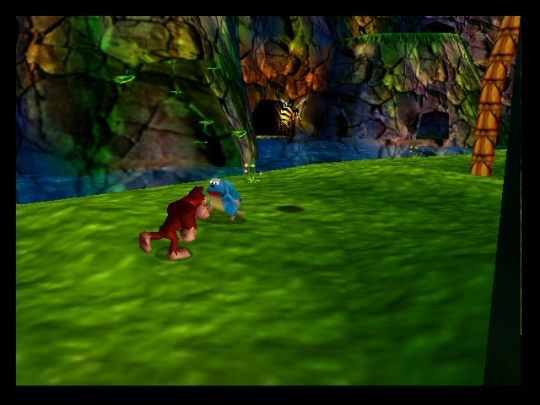
Rare loved this. Look at how colorful that cliffside is in Jungle Japes. It makes it so much more interesting than just a brown cliff face. Plus you can see the vertex coloration instead of textures at work on DK and the Gnawty.
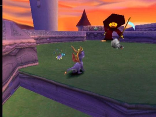
My go-to example for PS1 is always Spyro, what a gorgeous game. All of those colors there are not made by a light or an environment. They're hand painted babey! Also! With spyro! The skyboxes are actually just huge domes made up of vertices that are colored in different ways! That's how they can look so colorful and "hi-res".
There's plenty more you can do, like adding a CRT filter or a little bit of chromatic aberration which I haven't gotten into yet.
The way I've learned all this is just by being curious as to how the old consoles did their thing, and slowly accruing the knowledge over time. There's still infinite stuff I don't know too.
I hope that helped! And wasn't too longwinded or confusing! Like I said, it's all about piling up tons and tons of little things, small details, weird graphical quirks that really bring out the retro 3D feel for me.
And I didn't even get into the modeling side of things! That's an entirely different "color-of-the-sky"-sized post though.
I'd be happy to re-explain or explain more about any of this!
214 notes
·
View notes
Text
Dragon Age: The Veilguard settings details - Display and Graphics
This post is under a cut due to length.
This information comes directly from the game.
DA:TV menu 'pages': Display, Graphics, Audio, Controls, Gameplay, Interface, Accessibility, Other.
For some of the settings, additional detail on a specific one (the one that was selected at that particular point during the video, e.g. "Window Mode" was set to "Full Screen") is given after the general explanation/definition of the setting itself. These are in italics at the end of an entry.
DISPLAY
Display Mode
Active Monitor: Select the monitor for game display. Window Mode: Switches between full screen, windowed, and borderless windowed modes. You can press ALT+ENTER at any time to switch between full screen and windowed modes. In full screen mode, the game will play on the entire screen. Screen Resolution: Changes the game's display resolution. The game's level of on-screen detail is determined by the number of pixels it contains. Higher resolution increases the number of pixels displayed, which will result in a clearer image. This comes with a potential cost to performance. Refresh Rate: Sets how often your display will refresh game visuals. A higher refresh rate means a smoother picture, depending on your computer's hardware. Frame Rate Limit: Sets the maximum framerate for the game. VSync: Synchronizes the game's framerate with the display's refresh rate to prevent screen tearing.
Calibration
Brightness: Adjusts the intensity of the game's visuals. Makes all visuals lighter or darker. Contrast: Adjusting the contrast will change the difference in color and light between the brightest and darkest parts of the screen. Enable HDR: HDR (High Dynamic Range) mode provides enhanced color and contrast ranges. This option can only be enabled on supported displays. HDR must also be enabled in your operating system. Use the HDR Calibration option below to adjust. HDR Calibration: Launches the HDR calibration tool which adjusts the HDR settings to best match your display. The maximum brightness level should generally be adjusted to match what your HDR display will support. Measured in nits. This is only available when Enable HDR is turned on.
Upscaling
Unsample Method: Improve performance and visuals by rendering the game at a smaller resolution, then "upsampling" to a larger resolution for display. The pixels that make up the difference between the two resolutions are generated using advanced algorithms. Unsample Quality: Select the desired quality level for the upsampling method selected. DLSS Frame Generation: DLSS Frame Generation can generate additional frames that boost your overall frame rate. In order to use Frame Generation, you must have an NVIDIA RTX 40-series graphics card. NVIDIA Reflex: NVIDIA Reflex is a technology that helps reduce input latency while playing the game. In order to take advantage of NVIDIA Reflex's feature, you must have a supported NVIDIA graphics card. Anti-Aliasing: Anti-Aliasing smooths out pixels along the edge of objects that can look sharp or jagged in certain situations. Temporal Anti-Aliasing (TAA) uses information from current and past frames to address aliasing issues. The high setting uses a large range of frames and will result in a higher quality anti-aliasing effect, but with a higher performance cost.
Resolution Scaling
Render Scale: Controls the resolution the game is rendered at relative to your display resolution. Settings below 100% may decrease visual fidelity, but can improve performance. Settings above 100% may increase visual fidelity, but can negatively impact performance. Dynamic Resolution Scaling: Automatically lowers the game's resolution in real-time to maintain the target frame rate. Target Frames Per Second: Determines the target frame rate for dynamic resolution scaling. Minimum Resolution Scale: Determines how low the resolution can be scaled when Dynamic Resolution Scaling is active.
GRAPHICS
Graphics Preset
Graphics Preset: Graphics presets are predefined configurations that simultaneously adjust multiple graphics settings to achieve a balance between visuals and performance. Restart required for setting change. Maximizes visual fidelity by setting most graphics options to their highest values. Recommended for the Ultra hardware specification tier.
Textures
Texture Quality: Selects the level of detail and resolution for textures applied to objects in the game. Higher settings will result in more detailed textures, potentially at the cost of performance. Restart required for setting change. CPU - Moderate. GPU - Moderate. VRAM - Major. Texture Filtering: Adjusts the appearance of textures at varied angles and distances. Higher settings will increase texture quality, though potentially at the cost of performance. CPU - Minor. GPU - Moderate. VRAM - Minor.
Light and Shadow
Lighting Quality: Adjusts the appearance of shadows, reflections, and light-scattering. Higher settings increase the visual fidelity of light effects. CPU - Minor. GPU - Moderate. VRAM - Major. Contact Shadow: Contact Shadows improves the appearance of shadows when objects are close to one another. It fills gaps between objects and shadows that can occur with static lighting. CPU - Minor. GPU - Moderate. VRAM - Minor. Ambient Occlusion: Ambient Occlusion is a technique to simulate soft shadows where objects are close together or where surfaces meet. This makes the scene look more realistic. Disabled when Ray-traced Ambient Occlusion is enabled. CPU - Minor. GPU - Major. VRAM - Minor. Disables Ambient Occlusion. This potentially increases performance at the cost of visual fidelity. Screen Space Reflections: Screen Space Reflections simulate reflections of objects and light on visible surfaces. Enabling this will result in high-quality reflections. Disabled when Ray-traced Reflections are enabled. CPU - Minor. GPU - Moderate. VRAM - Moderate. Volumetric Lighting: Adjusts the appearance of volumetric lighting effects. This simulates how light interacts with atmospheric elements like fog, smoke, dust, and clouds. Higher settings increase the quality of these types of elements. CPU - Minor. GPU - Moderate. VRAM - Minor. Sky Quality: Adjusts the appearance of the sky, clouds, and celestial bodies like the sun and moon. CPU - Minor. GPU - Moderate. VRAM - Minor.
Ray Tracing
Ray-traced Reflections: Enables the use of Ray-Tracing to simulate realistic reflections of objects and light on reflective surfaces. This is a more advanced technique and requires specialized Ray Tracing compatible hardware. CPU - Major. GPU - Major. VRAM - Moderate. In selective mode, the game will only enable Ray-traced Reflections in specific areas that can best take advantage of the feature. Ray-traced Ambient Occlusion: Enables the use of Ray Tracing to simulate soft shadows where objects are close together or where surfaces meet. This makes the scene look more realistic. This is a more advanced technique and requires specialized Ray Tracing compatible hardware. CPU - Major. GPU - Major. VRAM - Moderate. Ray-Traced Ambient Occlusion is always on. Ultra Ray Tracing: Enables the highest level of ray tracing effects, which provide better quality visuals at the cost of performance. This setting is available on the Ultra and Custom graphics presets and is only recommended for high-end graphics cards.
Geometry
Level Of Detail: Adjusts the distance at which objects are visible and the level of detail as they get father away from the camera. Higher settings increase the visual quality of objects at distance. Restart required for setting change. CPU - Major. GPU - Major. VRAM - Moderate. Strand Hair: Strand hair simulates the appearance and movement of individual strands of hair. Enabling this will result in more realistic and natural-looking hair. CPU - Major. GPU - Major. VRAM - Moderate. Terrain Quality: Terrain is the natural landscape and ground surfaces. Higher settings will increase the detail and overall quality. CPU - Moderate. GPU - Major. VRAM - Moderate. Terrain Decoration Quality: Adjusts the appearance and detail of terrain elements like rocks, vegetation, and other environmental objects. Higher settings will increase the quality and density of the terrain elements. CPU - Moderate. GPU - Major. VRAM - Moderate. Visual Effects Quality: Adjusts the quality and detail of visual effects throughout the game. This includes particle effects, decals, and screen effects. Higher settings will result in higher quality effects. CPU - Minor. GPU - Moderate. VRAM - Moderate.
Camera Effects
Depth of Field: The Depth of Field effect causes some elements of the scene to be in focus, and others to be out of focus. This effect is generally only used in cutscenes and conversations. CPU - Minor. GPU - Minor. VRAM - Minor. Depth of Field is only enabled in cinematic sequences. Vignette: The vignette creates a subtle darkening of the image towards the edges of the screen during cinematics and gameplay. This is generally used to enhance the atmosphere of scenes. CPU - Minor. GPU - Minor. VRAM - Minor. Motion Blur: Motion Blur slightly blurs fast-moving objects. This helps make motion appear smoother and more natural. CPU - Minor. GPU - Minor. VRAM - Minor. Post Processing Quality: Adjusts the overall quality of the post process effects above like depth of field, bloom and motion blur. Higher settings will result in higher quality effects. CPU - Minor. GPU - Moderate. VRAM - Minor. Field of View: Adjusts the field of view, which changes how much of the game world is visible during gameplay. A higher field of view allows you to see more of the game world. CPU - Major. GPU - Major. VRAM - Moderate.
[source]
#dragon age: the veilguard#dragon age the veilguard spoilers#dragon age: dreadwolf#dragon age 4#the dread wolf rises#da4#dragon age#bioware#video games#long post#longpost#if you're thinking#fel. why did u type this out#sometimes i search my own blog for info or the answers to things and it will only show up if its written as text :D
68 notes
·
View notes
Text
Sylph of Void
The Sylph of Void. One who heals secrecy, darkness, and nothingness while also healing with them.
The cool black abyss. Come in peace and watch your step
Sylph- heal their aspect and heal with it. They bring their aspect to where there is little of it, sowing the seeds for their aspect to grow.
Void- major themes of nothingness, obscurity, and the Void. Minor themes of ignorance, secrecy, darkness and null.
Abilities
Shroud
The Sylph of Void allows shadows, mystery, and secrecy to blossom, bloom, and spread. The Sylph is capable of a sort of sleight of hand and misdirection, allowing little unnoticed changes to become areas of obfuscation and confusion.
Initially this could manifest as a blackout doctrine, specializing in redacting, deleting, and disconnecting key pieces of information. Carefully editing audio and video, blacking out text in sensitive files, and other similar forms of direct information control. The Sylph is something of a counterintelligence agent, either as minor as someone being a troll or as grand as one of the Men In Black, choosing to carefully and meticulously erase key details.
At lower levels these methods of shrouding would begin to take on a more supernatural lean, able to not simply block out the information in the present, but expand beyond the medium to the information itself. When they begin octuring information it subtly alters other records of the same object or event and can even pass into the minds of anyone witnessing the shroud. Carving a face out of a painting could result in all other portraits of the person in the castle being similarly removed with servants unable to easily remember who the portrait was supposed to be of.
As the Sylph of Void progresses this would move beyond tampering and enter into interfering with reality with less interference. The Sylph would be able to cast their shroud over objects and people, akin to a magic placing a blanket over something they wish to disappear. While cloaked, objects and people would be in a field of stasis, unaware of time and unburdened by things like cause and effect. These people or objects sit in a place of superposition where until the shroud is removed, nothing has occurred yet. The coin at the apex of a toss. All while their gap in the world is felt, reverberating out. This can be used to effectively erase periods of a timeline, to hide things away in the hidden depths of the Incipisphere, and to allow the disappearance of any person or object to invoke inquiry about the mysterious void left behind.
At medium levels, the Sylph of Void can allow these shadows to lengthen, controlling a dimmer to the world itself. Their shroud would increase in size, allowing for more subjects of greater size, number, and distance to the Sylph to become hidden. As long as they remain shrouded it is like they never even existed or a magic trick yet to meet a resolution, if it ever will. Prolonged time shrouded could result in things being swallowed by the void, never to be seen again. The Sylph could cause these lost things to be forgotten as well.
At higher levels, the Sylph of Void would be able to cloak entire places within their shroud, erasing and neutralizing all details and senses related to the place. Entire airships, armies, castles, moments themselves could simply cease to be. The looming dread of a mysterious threat passing over an army as monsters disappear behind the curtain of reality. The Sylph of Void controls the curtains of the stage, and with it, what stories get told. People, places, and events can be forced to transpire “off-screen” away from anything of importance or note, if the Sylph allows them to transpire at all.
Safe haven
A Sylph of Void renews with void, healing and restoring with nothingness, obscurity, and lack of focus. The Sylph knows how to take the pressure off, allowing time and rest away from the vibrant sights and sounds of the world around them. They can cause things to lose relevance and immediate impact, creating a gentle environment.
While they are more than capable of reducing harm, they might lack the drive necessary to achieve their ends or fully sympathize with the desires of others, a caretaker focused solely on recovery without the end goal of activity in mind.
At lower levels the Sylph has a cooling, soothing, perhaps even to the point of stifling aura. They are capable of suppressing or even nullifying pain, hunger, and stress, at the cost of all else: initiative, drive, extreme emotions, and clarity of purpose. They could refresh and restore stamina and endurance and in more extreme cases, allow for their allies to simply shrug off harm and keep standing or even alive through the Sylph alone.
As they progress this ability to soothe and nullify would expand into an aura around them, a lack of narrative focus and spotlight allowing them to bring peace and reprieve. Similar to how conflicts in movies tend to slow for a character interaction scene, the Sylph would be able to bide their time. Attacks never seem to make a solid impact, ranged weaponry flying harmlessly past, boss monsters being easily distracted by other threats, etc. The Sylph would particularly excel at evacuations, with those they can maintain focus on simply fading away and disappearing into the background to maneuver and escape.
At medium levels the Sylph of Void can create their own pocket in reality, a literal safe space beyond the borders of the world around them. This pocket dimension would be a space of deep introspection and quiet peace, where little, if anything, could interfere. Without shape and form, this nebulous area of nothingness is a cool dark abyss, where time is slowed. The Sylph and their allies would have a time to rest, a pause button for the world around them. While in this safe haven things may not occur in their immediate surroundings, but other functions far away may still occur. While the area around the Safe Haven may slow and lose tension, the spotlight must always be directed and for better or worse, it will go elsewhere.
At higher levels this Safe Haven would expand in dimension and ability, evolving from a small protective space to a large area completely outside the bounds of space and time, without cause and effect, without narrative pressure and tension. The Safe Haven is a world unto itself, existing between the threads of reality, the space between pages, where all lost and forgotten things dwell. Even should this kingdom of darkness manage to be breached, swirling protective shadows and horrorterror guardians are able to protect the Sylph of Void.
Passives
Something from nothing- you never require tools to fix an object or heal a creature, seemingly making due with nothing at all
Better without- even when you are not present you are helpful
Whisper network- you can share secretive information regardless of distance or method
- - -
This post was commissioned by @smiteblast442 ! Thank you for being patient <3
If you want to commission me you can find me @ https://ko-fi.com/kesscal
#homestuck#classpect#sylph of void#sylph#sylph class#void#void aspect#fwoo ive been going through some shit lately but I think this turned out nice
70 notes
·
View notes
Text
Screen Tones (the actual material!)
If you've seen the little comics-esque dots in media (and in our logo), you've seen screen tones, also known as halftones! The halftone method was created as a way to print values - and they've developed a unique flavour in comics because of how they look. But how do we use them in the digital age? Krispy dives in with her tips:
Digital art can have a LOT of issues with consistency and sizing with halftones that creates odd, eye-straining patterns called moiré. There's technically no way to avoid this in all aspects- it comes with the territory of tones because of their nature, and the fact that folks use many different size screens to read and enjoy your comic. That said- they're are still many methods to help keep it looking fine and non obstructive:
Consistency is key.
There is no 'proper size' for the screen tones, because the art will change regardless of how its compressed and viewed. You can WORK in 600dpi, but if that is displayed on a screen with lower resolution, you will get moiré as a result. Your printer's settings will also dictate how the patterns come out. You can print with one company and get different results with another- it can be a big gamble, so proofs are essential! (Here's a great post going into all the print details) Moiré happens also when your patterns are NOT on the same 'frequency', meaning an overlap of different patterns can give you this janky effect:

This also shows you the many frequency and 'sizes' you can get with halftones. It can be a gamble depending on how it is sized. Sizing matters a lot!
We have set files of halftones that are a set size, and we place the image on top, and delete what we don't need. That way, the image stays the same size, and you're not dealing with it re-sizing.

Traditional halftones were meant for a single size, so they print consistently, but when scanned and shown on bigger displays than they were intended for, you can still run into problems. Avoid working so large with halftones if you don't want to waste time fixing them. But don't work too small either! 300dpi Sizing down is still easier than sizing up. Focus on what frequency would match the three sizes you plan on: working in, printing, and sharing. Again, consistency is key!
A couple of other techniques for screen tones you can also use that will give you the effect you want, but avoid most of the moiré:
Blurring: If you want to work in the halftone thresholds/brushes you have, and don't want to deal with the sizing issues, you can blur the halftone layer by a couple levels, making it a static image that still gives you texture, but isn't fighting your screen with dots and patterns.
Imitating the feel of halftones with other methods: With a few Photoshop filters and effects, you can transform flat grey areas into textured tone!
Go forth and tone!
60 notes
·
View notes
Text
Baldur's Gate 3 Screenshot Tutorial
Hi, I decided to make a more in-depth guide for my twitter followers, as I'm super limited in characters and formatting options over there.
For this tutorial, I'll explain how you can enhance your screenshots. I'll divide it into five parts: ReShade, making your screenshots high resolution, camera mods, photography basics, and post-processing. By the end of following all of these steps, you should have something way better than the start!
I recommend going through this tutorial downloading things step-by-step for the first three parts, as it'll help you to quickly identify where you've gone wrong if you have any issues.
1. ReShade ReShade is a post-processing tool that allows you to change the look of a game with an array of different effects and adjustments to use. It can be a lot to wrap your head around at first, so I recommend starting off by finding a ReShade preset that speaks to you from this page if you're not already familiar with using it. The mod authors should explain how to download it. I find 22:20 of this YouTube video to be helpful to introduce ReShade if you're completely new to it. This video is for the Sims 4, but ReShade typically works the same across different games. Now that ReShade is downloaded, we can get depth of field working within the ReShade. This step is optional. Depth of field refers to what will be in focus in your screenshot, and what will be blurred. It's essentially simulating shooting with a camera, like so:
To get this effect working, you need to follow this tutorial within the ReShade menu.
2. Making Your Screenshots High Resolution Typically, Baldur's Gate 3 is ran in 1920x1080 resolution, or standard HD (unless you have a higher resolution monitor and are running the game in 4k, in which case, you can ignore this step if you'd like). This is definitely an acceptable quality, but if you'd like to capture any detail, you're not going to get much out of this. To get a better quality image, there are two ways to achieve this. The first method is through hotsampling. Hotsampling is briefly running a game in a much higher resolution than your monitor supports, allowing you to capture screenshots with incredible detail, then bringing it back down to a native playable resolution. To hotsample, you'll either need to use the BG3 camera tool, or SRWE. For either of these hotsampling tools, it's important that you've downloaded ReShade, or they will not work.
Once you have either of these downloaded, make sure your game is running in windowed mode. If you have more than one monitor, you need to change your display to show only on one screen. Or again, this will not work.
Next, you're going to want to make sure you have a key set for taking screenshots in ReShade, as well as making sure you like the folder where your screenshots are set to be saved. You can find this in the settings tab. Once you have those set, you're ready to take really HD screenshots!
To do that, you want to set your game's resolution to 2x, or even 3x what it's currently displayed as. Once it's set, your game screen is going to look giant and probably run way off your monitor. This is a sign it's working! Once it looks like this, press the screenshot key you set earlier within ReShade, and there you go, a nice big screenshot should be in the folder you set!
If you don't want to do hotsampling, and if you have a Nvidia graphics card, you can download their their app, which can take resampled screenshots. It won't be as high quality as hotsampling, but still better than standard HD.
3. Camera Mods
There are two camera mods that I know of for BG3. One is paid, the other is not.
The first one is the Native Camera Tweaks mod. This mod allows you to move the camera around more freely as you're traversing the world, but in cutscenes you'll still be stuck.
The second one is the paid one, but it allows for total freedom within the game, even during cutscenes. This tool is also very helpful for hotsampling. Within this tool, it's very useful to configure your own controls for moving the camera around in game, as well as setting a key you'll remember for pausing the game so you can set up a screenshot. I changed the movement keys to be wasd and the keys to change the angle of my camera side to side/up and down to the arrow keys.
4. Photography Basics
Taking screenshots in a game is a lot like doing photography irl tbh lol, same rules mostly apply. You of course want to do the basics like making sure your subject is in focus, it's not too dark or too light. But some other tips for people not very familiar with taking photos to take note of are:
Make sure if you're taking a photo of a person, the top of their head is within frame
Try and either make sure someone is front and center, or in the rule of thirds
Pay attention to the lighting, sometimes it's too bright or too dull. Sometimes it's unflattering in certain angles. Lighting will always make a huge difference
5. Post-Processing
You can now leave your screenshot as is, or edit it further with a photo editing software! I recommend using Photopea, as it offers basically everything Photoshop does without the insane price tag. From here you can do whatever you feel is best to enhance your image.
And that's all! If you have any questions, feel free to ask, and if you get stuck anywhere in this tutorial, don't feel bad. A lot of this stuff is just trial and error, but if you're very persistent with it, I promise you'll get these working. Also I would just like to mention that a lot of this stuff applies to taking screenshots in a lot of games! So you can take this knowledge with you elsewhere <3
If you happened to follow all this, please send in an image of your Tav you took!
124 notes
·
View notes
Text
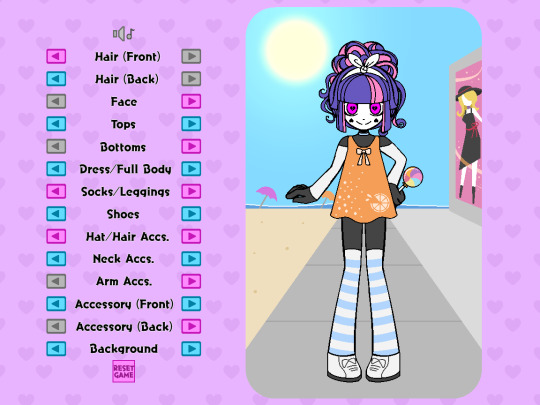
How I created a dress-up game in RPGMaker!
At least one person asked me to make a guide for this and that’s enough for me! Though, bear in mind, I may not be the best at explaining things and I used an example from assets I already had.
I made the dress-up game pictured below using RPGMaker MV, but I’m sure this method is applicable to versions above MV as well. I will be writing this post specifically through the lens of using MV (You’re also going to need some plugins, but not a lot!). At the time of typing this post, all RPGMaker engines are on sale until October 5th (just to let you know!)
(Please note: This method does not account for a game where you can freely change the colors of characters hair/clothes)
(Please note x 2: this is not a tutorial for learning RPGMaker, but a tutorial on how to make this specific type of game within the engine. Prior RPGMaker experience and familiarity is required when following this tutorial!)
I’m not the best at explaining things, but I’m sure going to try my best!
List of things we’re going to need:
-An RPGMaker Engine, preferably MV (or MZ) since they already come with mouse support.
-An art program
-A tileset consisting of words and arrows
-All your dress-up accessories as PNG images
-A blank PNG image
-2 plugins
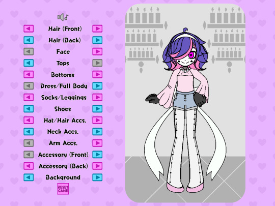
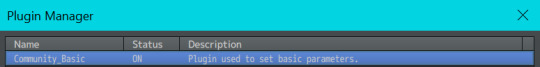
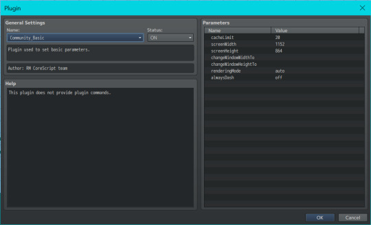
First things first is you’re going to want to decide on the canvas size of your game. Keep in mind with the way RPGMaker works, there’s a high chance you’ll wind up with black bars on the side of your screen. If your game is intended to be played in browser on itch.io, it shouldn’t be much of an issue as you can choose the display size on the game’s page to match the visible game. (I also just personally wasn’t concerned about the black bars for a dress-up based game anyways) The canvas I chose to work with for this game was 1152 x 864, but you can choose whatever size you feel will help you draw most effectively(just keep in mind how it might appear in browsers or if the player will have to zoom out!) If using MV, you change your canvas resolution by going into the plugin list and selecting “Community_Basic”
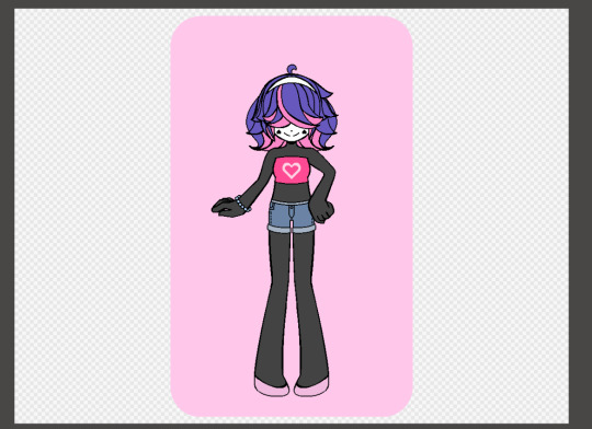
When making the assets in your art program, I find it easiest to have your canvas match the canvas size of the game. We’ll use Nova as our example character for everything. I drew them and all their assets in the center of the screen (for easier mirroring). The position of all the items can be adjusted later in the engine
I would start by doing a few test assets and putting those in the engine to make sure you get the hang of the whole thing, but this is where you’ll be making all your assets for a given character! (So if you wanna make some test assets and then move down to the “Putting it together in the engine” section, that might be a good idea!)
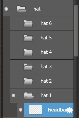
Here I create and separate every asset into their own folders(categories) and subfolders. For example, hats get their own folder labeled “hats”, and the subfolders “hat 1” “hat 2” “hat 3”, etc, each containing their own individual hat asset.
You can make as many or as little categories for clothing as you like. When you have everything you need, make at least one asset from all your categories visible, and make sure all the categories are ordered in the way they are meant to appear in game. This way, you can make sure nothing is overlapping in the incorrect way(at least for what your intentions are). When your categories are properly ordered, keep them in that order, as you’ll use it for a basis later when importing the assets into the engine.

Alright, this next part is a little tedious. Now you’re going to save every asset individually by hiding every other folder/layer except for the one you’re saving. It might help to have a naming convention for your assets, for example all of Nova’s assets follow the scheme of “dressup nova-shoes 4.png” “dressup nova-shoes 5.png” “dressup nova-shoes 6.png” etc etc.
NOTE: In addition to these files, remember to include a BLANK png image with nothing on it! This will help later!

Once this is done, we can start importing them into the program!
Putting it together in the engine:
Open up your RPGMaker project’s file directory. Find the folder named “img”, and in that find the folder named “pictures”. Drop all your clothing/hair/face/etc assets into this folder.
Now we need to set the scene. The scene being…a map! I used multiple characters so my game has a different map for each one.
Since Nova is our example character, let’s focus on Nova’s map.
Make sure the width and height of your map is large enough to cover the whole screen (sans any black bars you might have on the sides). You can fill in the back with tiles, or you can do what I did and add a small parallax backing that loops across the screen. I made a small one with two hearts in the corners for a nice scrolling effect!

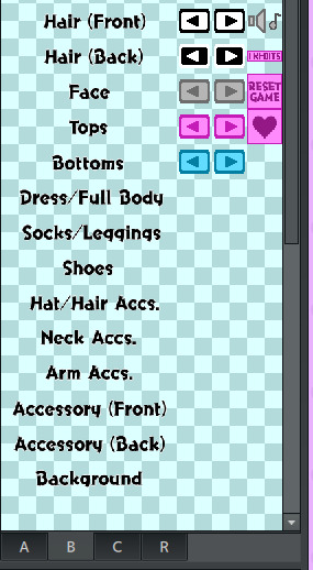
To start this map, let’s put in some of the categories to choose between. I did this by laying out the words on a tileset, and drawing that tileset onto the map. The order of categories I chose does not reflect the layer order of clothing items, but rather was organized by what I felt was a natural start-to-finish order progression in a dress-up game.
Don’t worry about putting the choice arrows next to the categories yet, though! We’ll do that in a little bit.
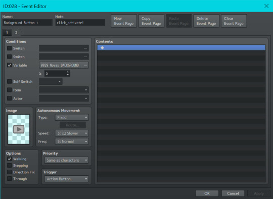
Now we’re going to start with actually putting your character and their clothes/hairs/etc into the map. Double-click anywhere on the map (where you won’t put any other buttons) to create an event.
We are going to set this event to autorun. In this event we are going to set up all your layers, even if nothing needs to be presented on them yet. To start, I added some comments to help me keep track of them. For context, when you choose to show an image in RPGMaker, it asks you for the image number. The image number is essentially the image’s “layer”, with 1 being the bottom-most layer and 100 being the top-most layer. Up to 100 images can be displayed on an RPGMaker screen at any given time. Even though 1 is the bottom-most layer, I chose to start at 10 just in case I wanted to add more layers underneath later. So layer 10 is my bottom-most layer, and layer 24 is my top-most layer.
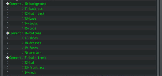
Let’s start with our bottom-most layer, the background asset.
The background is this pink rectangle behind Nova.

Even if you change its appearance, this background itself is always visible. So we are going to show the first background on layer 10 with the Event Command “Show Picture”.
(Note, because I wanted all the dress-up assets to be on the right side of the screen, every picture’s X position is offset by 200. You may want to offset your game in another way, or keep it centered.)

Because this is an asset that is always visible on the screen, we are also going to set up its variable. Select “Control Variables” in your event commands, set it to a constant of "1" and add it underneath the "Show Picture" command,

Don’t worry about the #number of the variable, all that matters is the number of what the variable equals. As you can see we are showing “dressup nova-BG 1”, so our variable should equal 1 to correspond to this.
The next asset up from that is our back accessory on image layer 11. (Nova can have fairy wings or a yoyo accessory, for example.) The back accessory doesn’t always need to be present, so we will simply set this image as being our BLANK png asset.

We will continue going down the column like this! Any asset that doesn’t need to be present will be set as a blank, and any asset that does need to be present (like Nova’s background, Nova’s hair in the front and back, Nova’s face, and Nova’s base) will be set as the corresponding image and have its variable set to “1”.
(Note: The base does not require a variable as it does not change)

And because this is an autorun event, we have to close it off. Add a control self-switch A, and then add a new event page. On the 2nd event page, merely click off self switch A in the conditions box
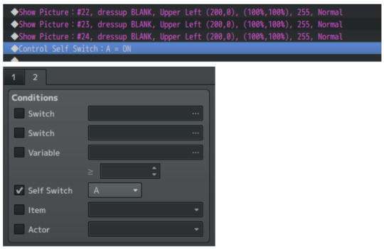
Doing this will ensure that the autorun event won’t keep trying to show the images in an endless loop.
Go into your database tab and under system, check that your starting position is on the correct map (if you have more than one) and start your game. Your autorun event should show all the images you asked it to. (I was gonna have a pic here but I'm limited on pics so)
Now, using our category list that we placed as tiles onto the map, we are going to be adding the arrows next to them to make them function.
Even though it's at the bottom, we’ll start with the category Background as an example since that was the first we implemented.
Create an event on the left side of Background and make its event image a grayed-out, left facing arrow, to communicate that the player cannot click anymore in that direction. Set its condition to be variable activated, with your Background variable being greater than or equal to 1. Leave the event page contents blank.
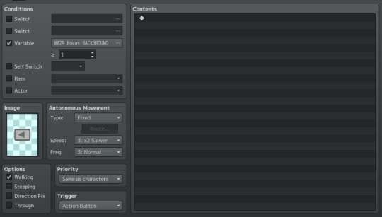
Create a 2nd event page on this event. On this 2nd page, replace the grayed-out arrow with a colored arrow, and set the Background variable to be greater than or equal to 2. This means that as long as the variable is 2 or above, the player can press the back button and go back to see the previous Backgrounds.
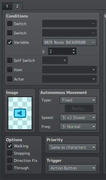
This time, we WILL fill up the contents on the event page.
First we are going to put a control variable command. Set your Background variable to subtract a constant of 1. This means that every time the event is clicked, it will subtract 1 from your Background variable (since this is your “Back” button).

Next, we are going to include a conditional branch command like so!
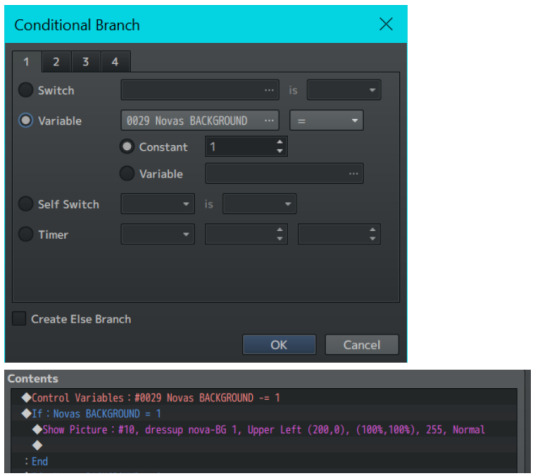
Under this Conditional Branch we put a Show Picture command, where we show an image on layer 10(the same from our autorun event). We can see that if Nova’s Background variable is equal to 1, then layer 10 is going to show the first background–that pink rectangle from before.
Let’s copy-paste this conditional branch and edit it slightly!
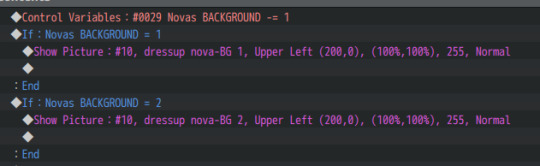
Repeat this for every asset you have for a specific category. (In this case, Nova has 5 different backgrounds, with one background needing to be visible at all times.) So our 2nd event page should look like this:

This button event is now ALMOST complete–but we’re missing something!
We need this event to activate when we click on it! Normally in an RPGMV game, when you click on an event, the player character will walk to the event before it can activate. But for a dress-up game, we want the event to activate as soon as it’s clicked on!
Therefore, we need a plugin! You’ll need a plugin that makes events activate based on a click trigger. For me, I downloaded the “TDDP_MouseSystemEx” plugin for MV found here: https://forums.rpgmakerweb.com/index.php?threads/mouse-system-ex.46511/
(Remember to follow the terms of service for whatever plugins you use!)
After adding it to my in-game plugin list and turning it on, I added the “click_activate!” notetag to the event (as instructed by the plugin) and now it works as soon as it is clicked on.
Next, we have to make the Forward Button! This is easier now that we have the Back Button as a base.
To make your Forward Button, we’re going to copy the 2nd Event Page of the Back Button event, and make it the first page of our Forward Button event. We are then going to change three things:
-Remove the condition variable
-Change the image to a right-facing colored arrow
-Change the control variable from a “subtract constant of 1” to an “add constant of 1”
So your first Forward Button event page should look like this!
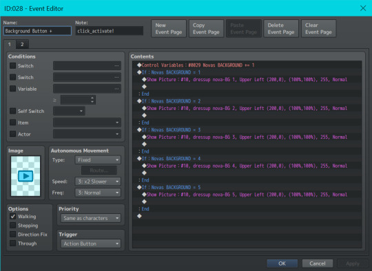
For the 2nd event page of your forward button, remove all the contents in your content box. Change the arrow to gray-right-facing arrow, and add a condition variable equal to your number of assets for the category.
Because Nova has 5 Backgrounds, our number is 5. If Nova had 7 Backgrounds, this number would be 7. If Nova had 3 Backgrounds, this number would be 3, etc.
This ensures that when a player has clicked to the last asset, they can’t continue increasing the variable past what is needed.
You then continue making these types of Back Buttons and Forward Buttons for every asset, until you have everything you need!
But WAIT!!
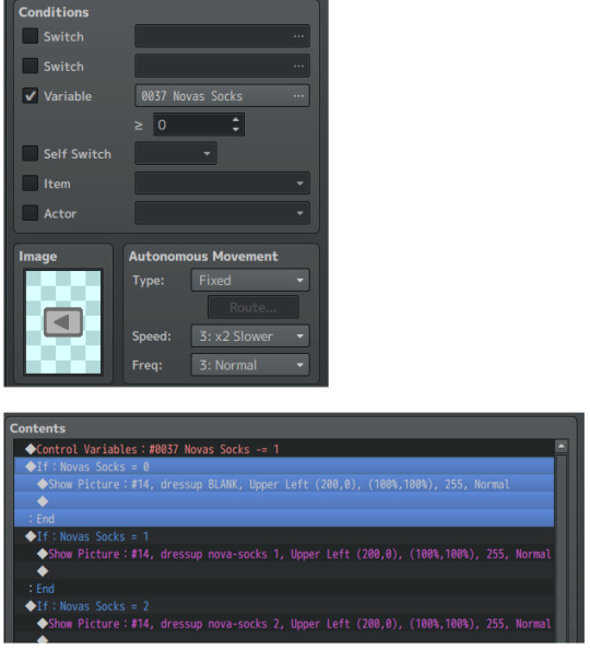
For objects that don’t always need to be present, we add one extra conditional statement!
Let’s use socks, for example. Nova does not need to wear socks to complete an outfit. So for the socks’s back button, we make sure to set the variable condition to 0.
After that, under the event contents of our sock buttons, we make sure to add an extra conditional statement for the sock variable. When the variable is zero, we show the BLANK image–so there are no socks to be seen! (Remember to apply this extra statement to both the back and front buttons!) Do this for every asset that doesn’t always need to be present such as socks, dresses, hats, etc etc.
That’s pretty much the basics of all the mechanics you need to get it to work!! I won’t be going over other things like the reset game button/disabling menu access/hiding the player walksprite, as those are things you probably know how to do already if you’re familiar with the engine.
But I WILL share one last piece of optional advice that I feel makes a big difference.
While testing things out you might notice that there is slight lag between changing images, a blip between pictures. This is because RPGMaker doesn’t preload images, and loads in an image as soon as it’s called.
In a downloadable version of a game this slight lag is negligible. However, if you intend for your game to be browser-based, this lag will be significant and noticeable. In order to fix this problem, I’d recommend downloading Galv’s Image Cache plugin found here: https://galvs-scripts.com/2017/04/26/mv-image-cache/
This plugin will help pre-load images so there’s no lag!
However, you will have to write the name of all your assets manually in its plugin menu. If you have a lot of images (which you will, for a dress-up game) this could take a very long time.
My advice is to go into your game’s picture folder, select all, and select “copy file path” from your folder options. Paste this list into an excel sheet, remove the directory name and file extensions, and then paste it into a google doc.
Edit the names together until there is no spaces between image names and they’re all separated by commas. Then, select all and paste your list into the Image Cache plugin’s settings. If you spelled something wrong or placed a space incorrectly, the game will not start and will tell you what image it was struggling to find. So having this to refer back to is very helpful and also means you don’t have to retype everything in the event of an error!
(Below is just a preview of how my list of image names looks for my dress-up game and what i copy-pasted into the plugin settings for the Image Cache plugin)

And thaaaaat should be everything! I hope this wasn’t too hard to follow, or messily formatted! But I tried my best and will try to answer any questions one may have about it!! Good luck creating your dress-up game!
#im so sorry i feel like this is so hard#but i hope it makes at least a little sense!!#i also apologize for the combo images tumblr doesnt let me have more than 30#guide#rpgmaker#rpgmaker mv#dress up#dress up game#dress up guide#game guide
106 notes
·
View notes
Text
A (brief) Look at Sims 3's Edge Smoothing Technique
TLDR: If you have a good enough GPU, this is going to tickle it just a little. But if you are having FPS problems from lack of GPU power, absolutely disable this. Over my 10+ years of playing Sims 3, going through many different computers with a wide spectrum of specs, one thing never changed: Edge Smoothing ALWAYS caused slow downs for me. Yes. This little slider. I tried looking into it, and i guess i have a bit of answer why.

So, this one in particular has always been an outlier to me. Modern, frequently used anti-aliasing techniques on games usually do not have "sliders". Either you have it on, or you have it off. This immediately set off an alarm in my head: this is not your usual FXAA, which a big majority of games use. This is something else!
The first thing i went after was finding out what tech was behind it. It had to be something with levels (low, medium, high). My first step was looking into the graphics rule file to look for more info, and our mystery almost ends here.

There! FSAA, short for Full-Screen Anti-Aliasing and varying levels (2x, 4x and 8x sample rate). But there is one small detail: no game developer, in sane mind, would actually put FSAA as an anti-aliasing method. Not even Sims 3, with all its spaghetti code. Why? FSAA works by pretty much rendering multiple times the display resolution, then downsizing it to fit your display. Meaning... if you played Sims 3 at 1440p, and used the high setting... You would be virtually playing at something beyond 8K. Yes, you read that right. Needless to say, nothing would run this. By this alone, i would rule out FSAA. But FSAA is a primitive, super performance intensive solution. There are others... Here he is: MSAA (Multisample Anti-Aliasing)! MSAA is like that younger, smaller sibling of FSAA. It uses a technique similar to FSAA, but is less intensive in consideration due to not applying calculations to every single pixel on the screen (it is a bit more in-depth than this, but i'm not going to go that far :P) This is exactly what Sims 3 uses, or, at least, the engine's implementation of MSAA. But it being less resource intensive does not mean it is a good implementation either. MSAA in Sims 3 is still slow, still costs far too much compared to more common techniques, such as FXAA, and WILL cost you some good amount of FPS. Anything rather than Low/2x is pretty much sucking your GPU in exchange for... nothing. In my tests, some scenarios had an increase of 15% to 20% in GPU usage for very little actual edge smoothing, even on low. This might seem minor, but a lot of people play Sims 3 in GPU-bound scenarios and might not notice that a fraction of their lag is coming from this. Sure, you have less jaggies, but at what cost? (anywhere between 2 to 15 FPS, if i had to guess /s) So... what should i do? Well, it is your game and computer, so it depends from case to case! Are you running Sims 3 on a notebook that is not gaming-focused? Disable it and test it yourself. You might have a bottleneck caused by your graphics chip and disabling this will let the steam off a bit, making your game run better. Are you running Sims 3 on a gaming notebook/computer/gadget/device? You are (probably) safe. Again, this is a recommendation for GPU-bound scenarios. You could always test it yourself and see if you have any improvements, but chances are, your GPU might run it just fine. But... my game has too many jaggies now! There are other methods of anti-aliasing that are far easier on the GPU. You can use something like FXAA Tool to inject FXAA into Sims 3 (this one is a bit tricky), or use ReShade and some FXAA/SMAA (or any other anti-aliasing methods, use your plugins to your heart's desire) to have similar effects. A drawback of these solutions is that ReShade generally affects UI too, and anti-aliasing UI and fonts can make them look a tad bit funky. Still, these should be easier on your computer than MSAA. MY PERSONAL TIP: Use something like ReShade and a lightweight FXAA plugin for gameplay, then you might enable Edge Smoothing to take pictures. Or just use ReShade with more aggressive AA plugins to make things smoother. Or smooth everything out in Photoshop ;) (and save before toggling between the two, my game crashed multiple times while enabling/disabling Edge Smoothing for testing. Might be just me, but better safe than sorry.)
THAT'S A WRAP!

But before i go, fun fact: the game disabled edge smoothing automatically in the config files regardless of what GPU it detects you having. Guess they are scared their technique might crash and burn your fresh RTX 4090. /s
14 notes
·
View notes
Note
coming off anon feels like a job interview i’m sweating balls rn but will speak my truth.
LOUDERRRRRR about doting roy and him guiding and being so proud of you when you follow his lead and ohmygobdhxbdbsh im on the floor weeping from both ends what. he’s so rewarding and maybe lets you get a little smug because he likes seeing you be reliant on him, coming to him for advice. likes seeing you take pride in your work and telling him about your achievements. really really really likes that you seek out his praise and want to be good for him and WHO SAID THAT WHAT.
the dynamic shift when you come home. /home/ . except home feels different now that you’re looking at it through olivier’s carefully crafted lenses. looking at roy the way she’s thought you to. all the little lessons roy gently instructed you through have been replaced by something he has to fight with. you’re not seeking his praise anymore, and he realizes he’s going to have to make you work for it now.
olivier and him get into SUCH A CATFIGHT ABOUT IT when she comes down to central. shes soooooooo smug about it because she can SEE you having little fights with him. she knows your bite got colder, more resilient and sharp, because of her. tells him that she would’ve gotten you to behave by now. or better yet you wouldn’t have acted out at all around her because she knows she’s taught you what the consequences are. and she’s rough on him about how he can’t seem to bring his authority down on you and keeps coddling you and it leads to the most intense night with him of your life because BOY DOES HE LOSE IT.
all part of her master plan though because (and walk with me here. hold my hand if you must. hear me out), /she/ gets to put you back together afterwards. not gentle or patient, but she puts you back methodically, purposefully, and sends you right back to him even more resilient to his attempts to tame you then before. she has you eating right out of the palm of her hand and thanking her for it. it drives roy up a wall and everyone can see it LMAOAOAOA. roy is warring with himself between wanting his perfect little cadet back and taking a shameful amount of joy in getting to /make/ you his perfect little cadet all over again.
it’s so hot and cold between the two of them. he’s so unbelievably passionate and demanding and consuming. she’s cold and calculating and unpredictable in a way that always leaves you wondering what her next move will be. and when they clash? with you right there? it’s not even like being pulled in two directions, it’s like you’re being dunked in hot water then dropped in snow repeatedly and you want to interject and demand the respect you’ve been fighting for this whole time with them. but. they’re so consumed in their fight with each other and staking this claim over you like you’re some coveted treasure that you lash out like you never have before. you’re /right/ there and they won’t even pay attention to you.
you don’t want to be treated that way, so you act out in punishment to them both. and well…….. that isn’t gonna fly.
resolution, tonight at ten, in my room.
OKAY OKAY SORRY ANYWAY LONG TANGENT AND ALL thank you for indulging me this has me clawing through the screen.
MANNNNNNN. ive been thinking about this ask nonstop since you sent it. NONSTOP. pls don't feel like this is a job interview and if it is you're hired???
"really really really likes that you seek out his praise and want to be good for him" IM GONNA KEEL OVER IM NOT PLAYING. THIS IS SOOOOOOO...,..ough. when you go to him for advice and then you do just as he told you and he's sooooo god. his chest is so puffed up like he's so proud. when other people praise you and he gets so. smug. just thought of roy saying "atta girl" after you kick someones ass. need to lie down. (alternatively, a very proud "clever girl" im so so so unwell)
GODDD. the idea that you go home but home isn't quite the same anymore bc you're a little more grown up. you're changed. and so now home has changed in your eyes, too. you can never really go back.
THE CATFIGHT THEY HAVEEEEE. diva off fr. oh god olivier just rubs it in his face that he can't quite control you anymore?? she thought that you were this good, trained cadet...what happened to that? (she knows exactly what happened to that.) losing my mind at the thought of like....roy losing control/not knowing where you are and olivier saying something to the tune of "maybe you need to collar her. keep her on a tighter leash." OUGH.
(thinking about roy finally coming down on you when you cross a line. um uhhh cw for impact play but. roy taking you over his knee because your attitude has been sooo bad lately. a proper brat taming. and it just....blows past all these carefully held boundaries but you. break. and afterwards you're so....good again for some time.)
olivier stirring the pot. igniting you a little. sending you back to roy a little too tough so he has to work that much harder to tame you again. to train you. and im just imagining that it all....builds and builds and builds until you just burst.
forgive me i love the thought of reader running away from it all. and now olivier and roy have to hunt her down..,.,,find her..,.bring her home..,..,OUGH.
PLS GOD THIS IS SO GOOD IM SOOOO. im so overcome with this. im so sick.
THANK YOU FOR YOUR THOUGHTS THANK YOU FOR CHATTING.
#truly never gonna be over this#can't tell you how its running circles in my mind GOOD LORD#cielo chats!
5 notes
·
View notes
Text

3D printing method reveals light emission from nanowires for the first time
Dr. Jaeyeon Pyo's team at the Korea Electrotechnology Research Institute (KERI) has become the first in the world to reveal light emission patterns from 3D-printed nanowires, which has been published as a cover article in the journal ACS Nano. The higher resolution in display devices signifies the more pixels in a given screen size. As pixel density increases, movies and images are displayed with greater precision and detail. In this regard, ongoing research aims to fabricate smaller light-emitting devices, from the micrometer scale (one millionth of a meter) to the nanometer scale (one billionth of a meter). As the size of light-emitting devices shrinks to hundreds of nanometers, peculiar changes occur in the light-matter interaction, resulting in significantly different emission patterns compared to macro structures. Therefore, understanding of light emission from nanostructures is an essential prerequisite for the practical application of nanoscale light-emitting devices.
Read more.
13 notes
·
View notes
Text
It starts with the simple question of top-line price. There’s a funny caveat in the method the Bureau of Labor Statistics uses to determine the cost of smartphones for its Consumer Price Index. Smartphones, like a lot of other things, have been getting more expensive. They’re not eggs or gas or Coke — you don’t think about their prices every week — but there’s a good chance you buy one every few years. The cheapest version the iPhone now starts at $800; the cheapest version of the flagship model, $1,200. Let’s venture to say that people have noticed this and do not love it. Since 2018, though, BLS economists have specified that, actually, due to the “rapid rate of technological advancements and improved quality to consumers,” including, as an example, increases in screen resolution, smartphones need a “hedonic quality adjustment” before inclusion in the CPI. As a result, smartphone prices have been recorded, in an official way directly relevant to debates about the economy, as going down. Makes sense, maybe. Feels wrong, definitely.
Is funny to ocnsider this a "hedonic" adjustment, today's smart phones are in many ways superior goods to the smartphones of 10 years ago, it's the fun level that hasn't changed or even decreased.
31 notes
·
View notes
Note
I saw your Minthara drawings and just wanted to say WOW, you're talented! Do you have any tips for digital drawing, and especially getting facial features so accurate?
Hello there, MischievousSeagull.
Thank you for the ask and for the compliment. I really appreciate it. Minthara is just too gorgeous not to draw her (every day, for the rest of my life).
To answer your question, I must say I am very much an amateur and self-taught as well so my advice my not be what professional artists would always agree with. I personally regret not studying art and doing character and object studies when I was younger because I believed 'drawing from references was cheating' so I never did. Now I know that in order to draw a character and make it look like themselves you will need:
1. Start with high quality references:
I aim for a few different ones from different angles, with good light but not flat light as this washes out facial features. I usually find something I like and then wing the rest of it. I recommend checking out and supporting Baldurs Gate 3 community in game photographers, they are amazing! The bigger the resolution, the better, so you can see the the details clearly and avoid ending guessing 'is this a shadow or a dimple or a smudge?'. Also, studying the references will help you recognise the characters features. And Minthara has a few!
It helps me to keep the reference in grey scale for and even with slightly more contrast to better understand the structure of the face, especially if I am just learning to draw a new character.
2. Make the features match:
There are so many different ways of approaching the form here and I ended up trying out a few ones. I personally need to have some kind of guide for the relative position of eyes, mouth and middle of the face as it can save from making massive errors. But I am becoming more and more impatient and mostly just wing it and spend hours correcting it later.
Doesn't matter how you do it: using the Loomis method, Asaro Head/planes of the head model (I love it, it helps a lot, especially if you are planning to have more detailed shading in your art!), Reilly method or the thirds method, colour blocking shapes method that they teach in art schools (I do that chaotically sometimes) or just mark the positions of features from references or just trace it, this is 50% of success. It doesn't matter how you get there, especially if you are a beginner.
What I have been doing with Minthara is trying different faces, sometimes just the reference, with my chosen body position and choosing the one that looks 'least off' and then sketching it. I remember to mark the features of the face as it's crucial at this stage, whether you stylise your art a lot or just stick to the character proportions: thin lips, deep/almost hooded eyes, the way her buccal pads are shaped, the more pronounced nasal dorsum and the adorable angry look of concern with furrowed brows. And obviously the ears. However, I will make the ears longer and the eyes slightly bigger as it looks better for my style.
The structure is very important because and you gave to trust the process. The ugly phase can be torture and if the drawing has no redeemable features, I will never come back to it. However, the next step can lift it all up.
3. Shape it with darknesss and light:
Choosing the way you render can make a big difference in how the drawing turns out. What helps me at this stage, after I have my base colour established and filled my shapes with it, is to have a layer with shadows (copy the base colour and just change layer properties to multiply and time it dial it down to 50%) and a layer with light (the same but use a different mode like Add or Screen) and that's the base for shading on which I build my colours. But to be fair, I am not great at this and I still refuse to aim for a higher contrast in my drawings. This is something I'd like to improve in this srea. I learned to avoid airbrush and work with blending brushes.
I usually play with these light and dark layers until it looks okayish, then proceed with adding extra light and some details. If I keep forgetting where they light is coming from, I draw a little sun to remind me.
4. Ok, now crisis control:
Sometimes, even if I have the most perfect reference the more I render, the less it looks like the person I intended for it to look like. This is why I keep doing these things throughout the process:
A) Mirroring: canvas>flip horizontal every now and then. Our brains lie to us and if you look at your art long enough,you will not be able to see mistakes. Sometimes, when I want to finish something quickly, I end up not checking for errors (wrong eye position, nonsensical anatomy, etc), and seeing the final version after sometime, it can make me feel like a rubbish artist. Having breaks and coming back to unfinished art is a good way to keeping it a little bit more objective as well.
B) Levels in grey scale: Rendering is hard and with little understanding how colours work it can ruin the best lineart more sketch. It helps to have a grey layer set to Colour on top of your art to check if the dark and light balance is there and if shapes look the way you wanted them to look. My brain likes bright colours and sometimes they don't go well with the rest of the composition, this is where grey scale helps with planning it all.
C) Check what went wrong with the reference: If I mess up badly and nothing is improving my drawing, I will go back to the original reference. Mirroring both helps to look at the structure with fresh eyes but if that fails, I will try to redo the base form or marked features in the reference. If it's hopeless, I'll trace the features until the drawing looks right to me.
I used to draw by looking at reference on a (in)famous okeaki platforms and I learned many things from just going back to the form over and over using guidelines on both the drawing and the reference as one couldn't import a picture in that software like we can do in Procreate. I recommend just studying forms and shapes and simplifying complex structures. I'd be a much better artist if I wasn't feeling like it was cheating back them. Going to various exhibitions and learning that my favourite artists traced their own photos and built the composition around them blew my mind and encouraged me to explore more ways of creating art.
I hope this answers your questions and I hope to see your work in the near future and the planned animatics! I'm learning Procreate Dreams and hoping to create a few short animations, once I get the hang of it.
This was a bit long but it was a really good question and one that I often ask myself in the process. Thanks for asking! I almost ended up doing a tutorial on Minthara's features but that'd be overdoing it, haha!
Cheers to creativity!
Izzy
8 notes
·
View notes
Note
do you have different options for how you resize the pages? I usually use the nearest-neighbor interpolation method for resizing images to keep the aliased look of my line art it usually works well going from a small image to a large one but not the other way around. Idk what process you're using for resizing images.
Yeah I use nearest neighbor. It keeps other antialiased midtones from intruding in the colors. It's just visually intolerable when it's sized up by 400%. 200% seemed fine.
My options are limited for the basic sizes I work with. I already tried a larger page size that wouldn't need to be resized as much, but it's just not for me.
Currently the size I'm working at for digital offers me something that's comfortable for me to draw at and, more importantly, it is the exact size it'll be on a piece of paper on my screen. The upscale would be this way regardless of size due to how standard web resolution and standard print resolution relate to one another...
I think the size I've picked after so much experimenting is the best I'm getting and the way I'm resizing it is the best possible outcome for how I want it. My emergency contingency plan is to force the print size to be smaller at a like 200% scale of the digital size, changing the book size itself.
7 notes
·
View notes
Text
Triumphs and frustrations with a complex physical disability and a brain at nearly midlife… Searching for a champion to share and grow with
My Cerebral Palsy made life without diapers very traumatizing for me. From age 4–21, I was in underwear with bladder accidents from spasms at least once a week. Toilet training was a point of pride for my mom, even though most doctors and my preschool and elementary teachers told her not to focus on it. She thought I could outthink my body. Instead, having to plan my relief breaks around other people has given me kidney issues at 42 and that is after choosing to go back into diapers as a junior in college. Based on this experience, wearing diapers is healthier than waiting on people to help me to the bathroom. Also, as a guy who is 6 foot 4 and 170 pounds, toilet transfers several times a day are exhausting and potentially dangerous for me and my support people.
There is no correlation between incontinence and intelligence. Mom said she didn’t want me diapered after the typical age because she thought people would perceive me as being stupid…Well I have been wearing 24/7 for over 20 years including under my gown at my Ph.D graduation… 😘 … My advice to emerging adults with disabilities is that your ability to accomplish great things is a product motivation, not the undergarments you are wearing. In my observation and experience, the responsibility of motivation evolves throughout the developmental process. Initially, this responsibility lies with parents and other supports, to explore and educate themselves about success stories of adults with similar challenges, focusing on understanding the strategies that have led to positive outcomes. As youth with disabilities approach preadolescents (middle school), the responsibility gradually for exploration and experimentation gradually shifts from solely residing with the parental figure to a joint venture that increasingly becomes more driven by curiosity of the individual themselves. Today’s adolescent preteen and teenager is constantly engaged with personal technology and electronic media. The focus of at least some of this screen time can be given to meaningful discovery of not only strengths, interests, and abilities but also the possible strategies that can be used to bring abstract dreams into reality. As the time for high school approaches, a portion of this exploration time should be dedicated to experiential learning, this includes testing strategies that will allow the person with self-care challenges to participate in their community with minimal effects from their limitations. Some examples of considerations include exploring methods for community access through transportation, strategies for accessing nutrition while public and elimination (bladder/bowel) management.
My decision to use diapers full-time again with the occasional addition of male catheters, as I eluded to earlier, was the product of a New Year’s resolution in 2002. Ironically, I felt as if this was a means of asserting control over one aspect of my life. It was around the age of 25 that I began to realize that there were some unintended social consequences of my decision that I am still struggling to overcome. I have learned that midstream people are not very receptive to a guy in a wheelchair who needs fed and his diapers changed, but otherwise is completely cognitively intact, even bright with a sarcastic and very dry wit.
I had to learn to have fun with it along the way, finding companionship from people who will understand my needs and embrace my choices has been difficult. After some research, I discovered that there was a group of people who enjoyed doing the same things I needed and mostly by choice, the ABDL and medfet communities. Happiness for me will be finding a woman who considers the AB and medical needs as normal and has fun doing it. The lifestyle or fetish angle removes the awkwardness for both of us. It would be awesome to be in a crowded public place (i.e. restaurant, sporting event) and know that there is at least one other person there who is experiencing the same sensation I am feeling inside as well as from the diaper against my body and clothing. At last I will not feel alone in the world. There is also some intrigue and humor in the idea that only we know that each other is wearing. For those of you who prefer more crude or masculine visualization, as I used to say in one of my profiles on a certain ABDL dating site, a diaper nor wheelchair should not also be a chastity belt. Just because I must wear for medical reasons does not mean I am stupid or otherwise not worthy of sharing myself with someone. Sexual intimacy alone is rarely the basis for a solid long-term relationship, however human touch is essential for me. Having no inhibitions about giving or receiving a hug or cuddle is a must for me because I have been deprived of it so much because of misconceptions about body and mind. I am looking for a partner who understands my ambitions and is not afraid to explore their own. The ability to have someone who you can share your most intimate thoughts and feelings with even on the worst days would be a blessing for me. I hope to find someone who is willing to learn and grow together.
If you’re still smiling after reading this… DM me or comment below :-)
#incontinent#diaper dependent#adult diaper cerebral palsy#actually disabled#disabilities#ab dl lifestyle#actually incontenent#bed wetter#anxitey#autism#ab dl girl#disabled diaper#diapered girlfriend#ab dl diaper#medfet#incontinent girl#public diaper girl#ab/dl girl#abdlmommy#ab/dl community#ab/dl diaper#ab/dl relationship#cerebral palsy#spina bifida#developmental disabilities#adult diaper lover#disabled student#disabled diapering#ab/dl kink#ab/dl boy
35 notes
·
View notes
Text
"Aaaand, done."
Spectre moved back from the TV of her house, and wiped her brow. She looked over at Tera, who had been watching her plug the device in.
"Are you finally going to tell me what this is?" the drone asked.
"Yeah," Spectre responded. "It's a game console."
Tera cocked her head. "But, we already have a game console."
Spectre didn't answer. Instead, she looked at the new item. It was made from a mixture of wood and plastic, and overall resembled retro consoles like the NES or original Playstation. She pushed the power button on the front, grabbed a controller, and sat back on the couch next to her fiancée.
The TV turned itself on, and the image of a stylized ghost holding a controller faded onto the screen, before the display changed to a grid of boxes, most empty, save for the first 5. Spectre selected the first game, Super Mario World, and watched the screen fade to black before the title screen animation appeared. She looked at Tera with expecting eyes.
"It's... Mario?"
Her shoulders and head dropped. "Yeah, I guess this doesn't really explain what's going on, huh?"
Tera nodded, and Spectre took the controller, opening an overlay. She selected the option labeled "Return to Collection" and then they were back to the grid.
"I got the idea for this from thinking back to when we salvaged parts for Ai's laptop. I'm sure you remember."
Tera smiled. "Obviously."
"I say it's a game console, but it's more like a computer packed full of a ton of emulators. All kinds of systems, ranging from NES to Playstation 5. The grid"—she motioned to the TV—"is the collection of games on the console. See how at the end is Devil May Cry 5?"
Tera nodded. "Yeah."
"Virtually any game should be playable on this console. All you have to do is connect a device and drag the ROM into the console's games folder."
Tera's eyelights widened. "You're saying I can play anything on this?"
"Yep. Just so long as you got the rom. If you have that, you can play it here. Oh! And watch this."
Spectre picked up the controller and moved to the very left of the grid, before moving left one more time and showing a menu with different options. There was the choice of sorting method, a toggle to show only favorited games, and then a display option. She selected it, and a ton of options like aspect ratio, resolution, and borders all appeared. The one she found more exciting, though, was the "screen finish." She selected it, bringing down a list to choose from, and selected "CRT". A symbol appeared in the top right of the screen, and when Spectre opened Super Mario World again, it now had the appearance as if it were being played on an old CRT monitor.
"I dunno why, but I get really excited over having this option." Spectre chuckled. Her hand rubbed the back of her head, and she looked at Tera sheepishly.
"It's really cool," Tera said. "Don't have to worry about finding games or physically having them. And you made it yourself for this house. Gives some more personality to it all."
Spectre smiled and gave Tera a quick peck on the cheek. The drone laughed before responding with a kiss on the lips.
...
"How quickly can you add Doom to this?"
"Give me 3."
(Thank you @dronebiscuitbat for the feedback on Tera.)
4 notes
·
View notes
Text
Guide: How to take huge screenshots without stitching
(This was originaly posted to r/starbound by G0D3P5. I'm reposting it here because I feared the information could be lost with all the shenanigans Reddit has going on right now)
Run Starbound at least once and make sure you leave it in windowed mode, not maximized
navigate to your Starbound's "storage" folder* (by default it should be C:\Program Files (x86)\Steam\steamapps\common\Starbound\storage)
open up the "starbound.config" and find the"fullscreen" : false, "fullscreenResolution" : [1920, 1200], lines and make sure to change false to true, additionally make sure that the resolution matches the one of your screen
navigate down further and find the "windowedResolution" : [1920, 1200]", line. now here's where you'll set the final resolution of your screenshot (note: even with 5k x 5k the game will have problems running**)
save and exit starbound.config. head over to steam and launch starbound. if you did everything correctly starbound should have launched in fullscreen. play the game as normal and head over to the build you want to screenshot, now use your ingame bind*** to exit fullscreen (by default F11((for some reason this bind doesn't work for me so you might want to remap it as well))) AND SPAM YOUR STEAM SCREENSHOT BIND (by default F12) till you hear the sound of a screenshot having been made.
--
My additions having tried this a few times:
* Make sure you make a backup of either the whole folder or the config file just in case.
** I've managed to get the game to run okay-ish at larger sizes but I also have a beefy amount of RAM and GPU. I recommend you start with smaller sizes first and ramp up to see how much your PC can take before going belly-up.
*** You can also just open the menu and use that to exit fullscreen.
Although it sounds a bit complicated, it's really not, and lets you take some very nice screenies of your huge builds, so I do recommend it as a method if you're prone to making huge things like I am.
#starbound#q#starbound reference#screenshotting advice#not my original idea#I rely on the reddit post too much and I would hate for the info to be lost
26 notes
·
View notes