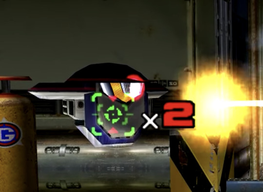
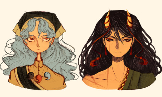
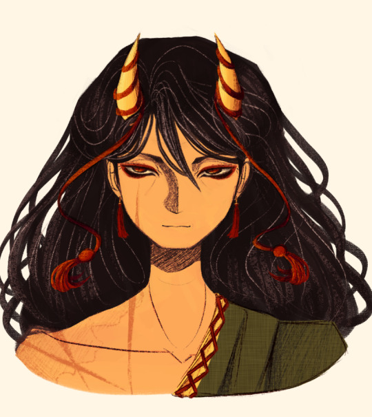
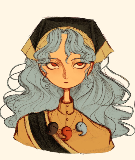
#also the poses are based on renders of them
Text
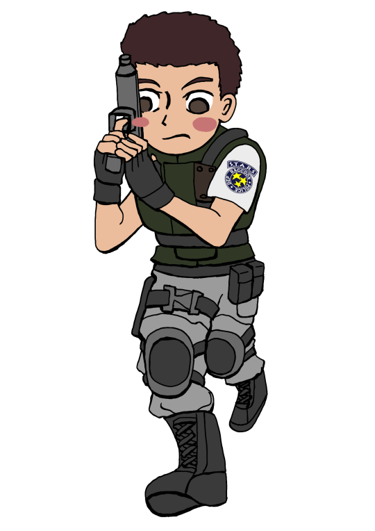

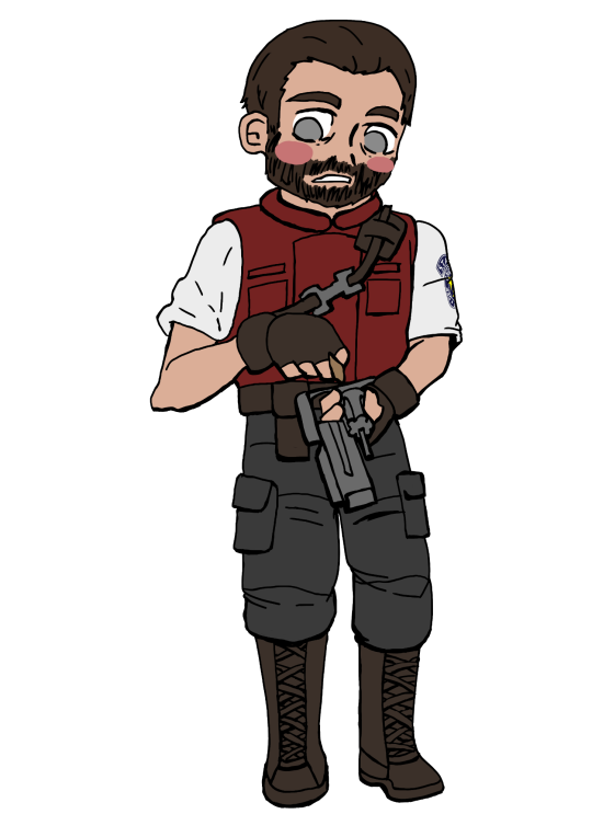
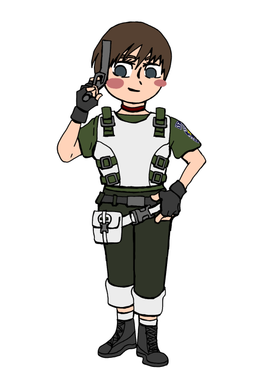
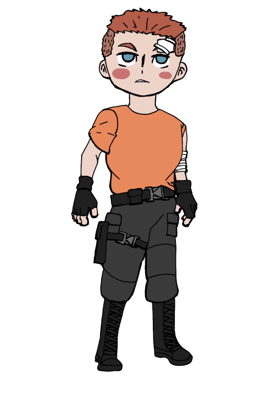

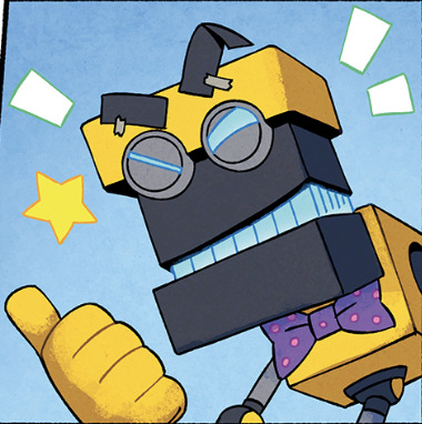
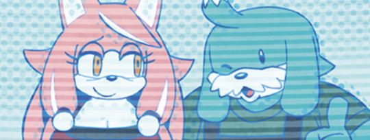
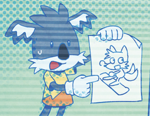
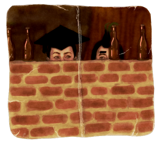
Welcome to my Resident Evil Chibi Series.
Here the surviving S.T.A.R.S members plus Richard. Cause dude was such a bro in the game.
I recently beat the original RE1 Director's Cut on the ps1. It was fun and scary (less scary when I then married my wife the shotgun)
It inspired me to draw about RE and I thought why not something cute ? The games are scary enough for me. So here enjoy my chibi take !
Also btw @bunnystalker enjoy the Chibis. Your hexcode for Wesker made him look more like himself lol. The one I used before was way too off.
#resident evil#albert wesker#chris redfield#jill valentine#rebecca chambers#barry burton#richard aiken#re chibis#re1#s.t.a.r.s.#notice how they are all blushing?#but not Wesker?#I do have a version of him blushin aswell but it looked way too cursed#so I made his shade sparkle#good enough#my art#resident evil fanart#also the poses are based on renders of them#so if the pose is familiar it's cause of that
66 notes
·
View notes
Text
What I see in the only one of my three model viewers that loads Chrom's body model, vs what I see when I export that and open it in blender


Exactly zero of his bones are in the right place......... orz
I dont even really need his animations for anything, but, I'm mad that I can't get them. It's the principle of the thing. >:[
#I might need to start exploring forks of the model viewers and possibly building them myself???#I might need to fuck with ROMs more? maybe mine got corrupted? Or maybe the file decompressor is the problem child?#I dont knowwwwww and everything I look up is so unhelpfullll#i could also just give up too. I dont really NEED these to pose the man manually for silly renders.#But it would be so nice to have the animations to pull base poses from.... hrgh
0 notes
Text
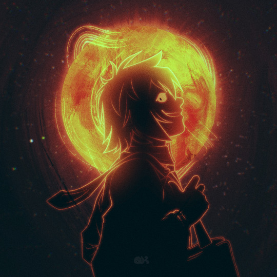
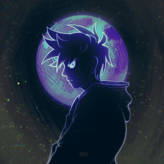

a star, a moon, and a black hole walk into a bar (and order milk)
#qkdraws#id in alt#okay so this was based off of a tiny comic i saw a while back#but i cannot for the life of me find it#the premise was shou gave sun vibes teru was a star ritsu was the moon and then mob was a black hole#if anybody like . knows where the hell that comic is please tell me cuz i wanted to link it but </3#i can't find eet#mob psycho 100#mp100#mp100 teruki#teruki hanazawa#mp100 ritsu#ritsu kageyama#mp100 mob#mp100 shigeo#shigeo kageyama#mob's pose is based off of a still frommmmm s3e2 ?? i think??#anyway i had a blast rendering the uhhhh the Things behind them. the Celestial Bodies if u will#especially the star that was fun#tis also a shame that most of the details of the moon r covered up by ritsu his big fucking head blocks most of the detail
518 notes
·
View notes
Text
Under the Christmas tree [dark!141 x fem!Reader] (Secret Santa fic)
Secret Santa gift for @crash-and-live
141 had a wonderful time taking their combat medic to be their captive barracks bunny instead. Now, the Sergeants have decided you will make a wonderful gift for their COs.
CW and Tags: Dub-con, poly!141, inappropriate celebration of Christmas, power imbalance, bondage, slight BDSM.
Gaz was always an expert on knots.
Fancy little ribbons and bows – not so much. He prides himself on being suspiciously quick to adapt to the changing environment, yes, but learning how to tie bows when your little captive is acting just a tad bit dismissive towards the whole idea is…hard. Not as hard as hanging down the rope on a moving helicopter, but…
— Come, luv. Stop strugglin’
He smiles, all teeth and no lies, when you – his favorite medic, the best thing ever happening to this bloody team – started meowling something about the circulation and cutting off the bloodstream and how you don’t exactly like not only being held in the basement of the base but also being tied up…he looks at you and just knows he can’t resist booping you on the nose, kissing your perfect fuckin cheeks while Soap already has his hands in your hair, gently brushing it to put even more ribbons and bows. Red, just like on a Christmax gift.
You’re a bloody gift.
— I ken ye don’t like sittin’ like this, but Lt needs pick me up, aye?
Soap smiles when you struggle just a bit more, your tied hands brushing against his stomach as you slowly buck your hips back. Trying to get just a tiny bit of stimulation, sneaky little lass – this is why he loves you, so smart and so adorably dumb at the same time. The best thing that ever happened to them is that you still act like you don’t enjoy being their shared chewing toy. They can agree it’s just a bit of a stretch from your previous working environment but hell, at least you’re not being shot at.
Johnny’s hand gently moves from your head to your neck, adjusting the little red bow he made from the ribbons. They tried so hard to find the softest ever ribbons without a sharp edge and material that could cut off the circulation – even though Kyle was still doing his favorite knots that rendered you absolutely defenseless. You lick your lips and try to rock from side to side, making the ribbons a bit more loose – it doesn’t work, of course. Not like your team ever wanted you to have a say in their perverse desires, right?
You fell into the Stockholm syndrome quite easily, especially since they were so stuck on always respecting your wishes(except for letting you out, of course) and never forcing anything too harsh…up until now, apparently. Making sure you’re on your best behavior because it’s Christmas, they have a small table set up – beer, whiskey, some snacks that you naively put on because you’re still not allowed to cook, and they don’t really care for home-cooked meals – and your shaking form, twisted in a somewhat sexy pose all because they needed a little Christmas present for their CO’s.
Gaz brushes his hand on your tummy, gently pushing it down – you were prepared, of course, so much lube was out in your glossy folds, with Soap’s mouth buried deep between your legs, until you felt you’re going to pass out from the sheer amount of orgasm he was edging out of you. There is a reason why Johnny isn’t allowed to eat you out when Ghost isn’t around – his self-control is non-existent when push comes to your cunt and the tongue he can shove in.
You feel like you’re going to burst when you finally hear the door opening. When you finally hear Captain – his tired, gruff voice, the way Ghost’s jacket silently hits the ground as they start to undress. Usually, you’re made to greet them with kisses and your soft lips on their cocks if they feel particularly tired. Usually, you’re made to wait for them in the bedroom, with their sergeants gently playing with you because, of course, you’re the property of all four of them, no matter the power dynamic.
Nothing is usual now – you’re laying under a Christmas tree, naked and aroused, your pussy is all puffy and swollen from Soap’s tongue, your body is tied up with red ribbons Gaz was using. You want to be good for them, and so you lay here, hoping your obedience will be enough for a few more climaxes.
Ghost is the first to put his hands on you.
Kneading your breasts, gently forcing his rough fingers on your exposed nipples, you’re so sweet for him, so perfect, laid out like a beautiful gift – he can only groan in arousal as he slowly pushes the ribbons from your chest, taking in the view of your hardened buds and bite marks – evidence of Kyle taking his mark while he was tying you up. You might have been apprehensive about the whole idea, but you’re playing the role of a gift perfectly – just like you should.
— Bloody hell, love. So pretty for us.
— She was such a good girl for us, Lt. Didnae even resisted much. ~
— Is that right, sweetheart?
You can only nod, your mouth stuffed with a pretty gag – you’re drooling all around it, looking fucking adorable as you try and look as harmless as possible. No reason to provoke them now when they already made it clear just how many orgasms they are going to take from you tonight.
Ghost smiles under his mask, his hands moving to play with your lower tummy, squeezing the soft flesh and teasing your folds – you’re soft and pliable for them, spread out like a perfect toy. The most desirable thing they could ever find under a Christmas tree.
Price caresses your face with a softness you didn’t know a man of his position could have. He kisses you, and his whiskers tickle your soft skin – you aren’t sure if you can even handle him being so damn gentle about everything. He laughs as you try to wiggle out of Ghost’s grasp, their hands laying on your body – bruises and marks are scattered across your skin, making you the perfect canvas. Gosh, you’re beautiful – John doesn’t even know what they did to deserve such a little treat.
— Such a pretty display for us, eh?
— Sergeants outdid themselves this time.
— You bet they did. Are you goin’ to behave for us, love?
Price smiles when you whimper, spreading your legs like a pretty toy. Ghost already pushing you to the ground, forcing his way in between your thighs – you’re so open for them, vulnerable to the tip of his cock pressing in your folds already. Soap did a good job eating you out, even Simon’s cock won’t be too much – not after the way Gaz was spreading you on three of his fingers, smiling with each of your little attempts at moans.
You know the night is going to be long.
#cod#cod x reader#call of duty#captain price x reader#price x reader#john price#captain john price#soap#soap x reader#soap mw2#ghost x reader#simon ghost riley#dark ghost#dark 141#141 x reader#gaz x reader#kyle gaz garrick
1K notes
·
View notes
Text
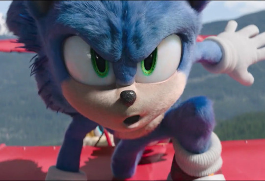
❄️✨❄️REMINDER THAT IDW SONIC WINTER JAM IS OUT!!! ❄️✨❄️
I'd love to talk about some neato things I got to draw in the comic! Spoiler warning for some contents below! If you haven't read anything yet, come back after reading the comic!
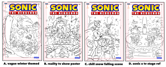
Let's start off with the cover thumbnails! I was more inclined to do A since it wouldn't spoil the big surprise Orbot and Cubot had in store! Otherwise I probably would've gone with B or D! It has that bombastic party sort of feel that I think would've been super fitting!
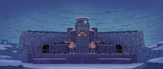

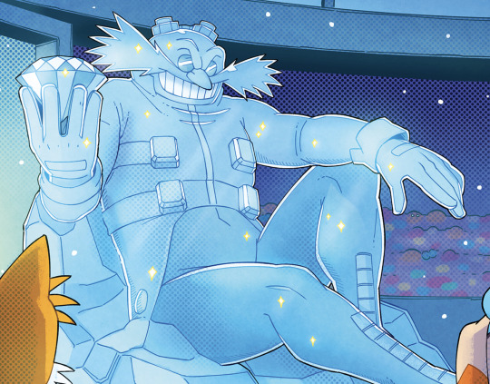
Here, Eggman is temporarily staying at one of his many bases throughout the world after the collapse of his Eggperial city! This base is inspired by Industria from Future Boy Conan and a bit of Eggmanland!
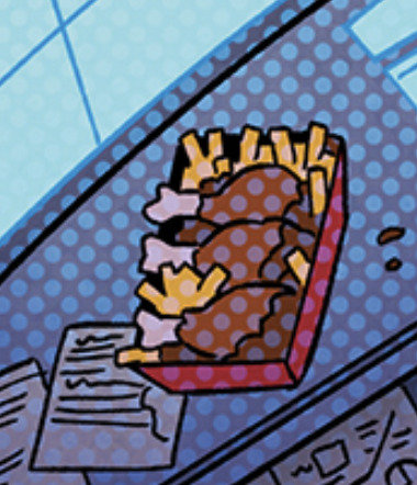
He also sure loves his chicken and fries!
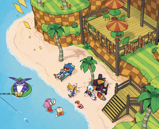
A little beachside balcony in Green hill! I felt like we generally don't get structures there as much so I thought it'd be a nice addition!

The design on the floor is the stage from the JP Sonic X intro! It gets covered up by snow after but still neat to include!
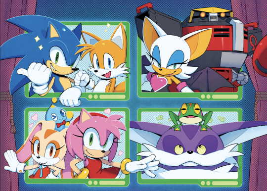


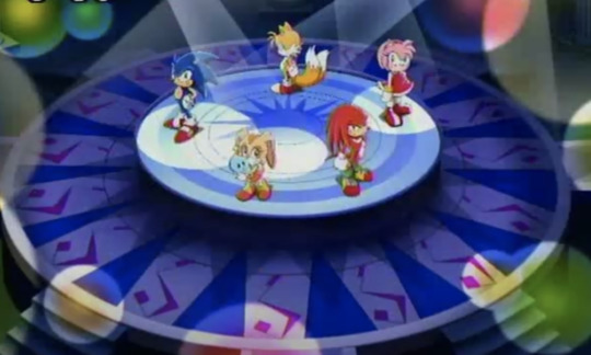
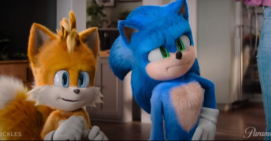
Look at this magnificent cast of characters! I wanted to use the poses that each pair had when they were first seen together! I'd considered giving Big his winning animation pose from SA1 but alas no space haha!
Cubot's taped on eye brow gag was one I suggested and it's a reference to the same gag from FLCL!
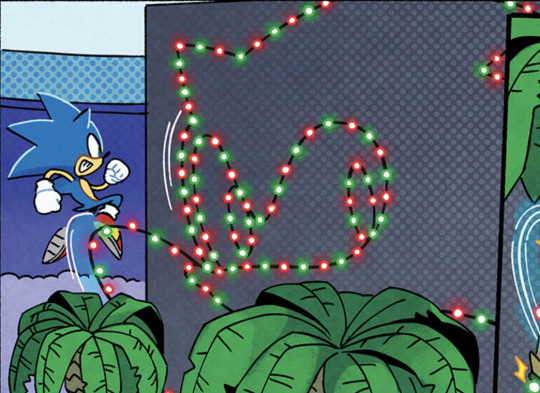

Lil sonic team logo Iasmin asked for! Sonic sure knows to appreciate himself! Good on him.
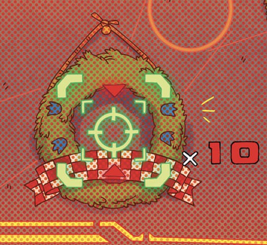

And here's a sonic 3 wreath and the SA2 lock on reticle from the mechs!
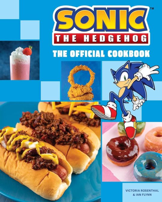
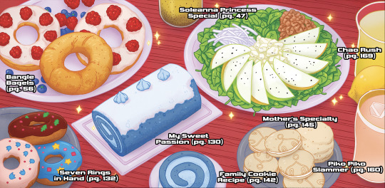
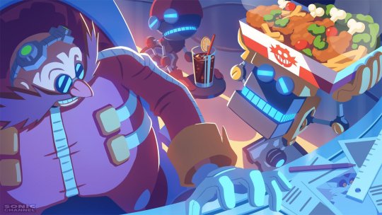
Amy and cream's spread of delicious looking food beautifully rendered by the coloring god Reggie! I wanted to include all their items from the Official Sonic the Hedgehog Cookbook! So if you want to make them yourself, YOU CAN! (except for uhh the experiment on another panel. you guys can figure out what's in that yourselves haha)
Also made sure to list all the pages you can find the recipes!
This is one of my fav gags that Iasmin wrote in!! Can you all guess what this is meant to vaguely resemble?
Quick round of character refs from Eggman's screen going in order from left to right! [Conductor's wife and Conductor, Barry and Gadget, Early Conductor design, Early Barry design (his outside eye markings are white tho), My uh Sonicsona lol]
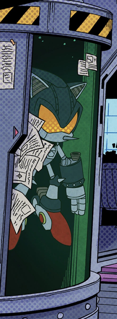
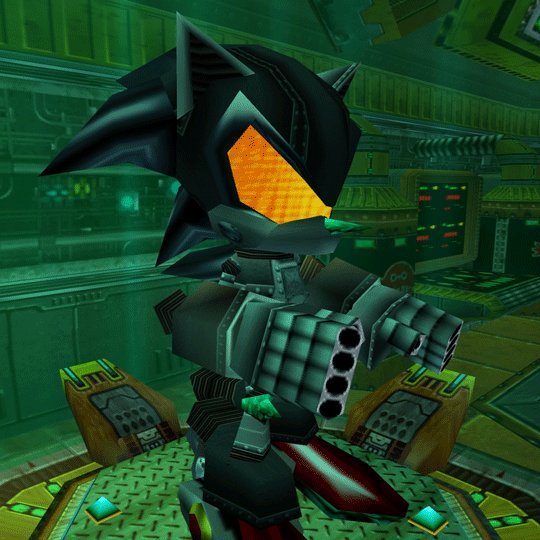
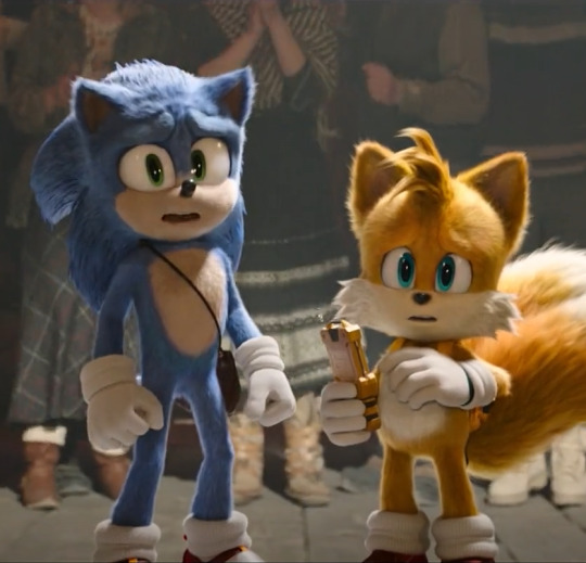
Mecha Sonic mark 3? Yep Iasmin wanted him to be there and so there he shall be!! Hopefully we get to see him again!
I remember seeing the story Iasmin made and it really felt like it could be something you'd see in a sonic anime episode if it were made nowadays. I drew the comic with some influence from Sonic X because of that. I think the most telling detail fans might notice is the constant 3 spines for Sonic.
but YEAH another absolutely wonderful comic I got to work on! See ya'll on another issue!
1K notes
·
View notes
Text
Here's a digital sketch dump of some pose/anatomy practices and some 2hu doodles, I think from now on if I don't have any big final piece to post, I'll just post sketches I liked that I did digitally (might also reblog some drawings of mine that I want more people to see, maybe idk).
Artist's Notes:
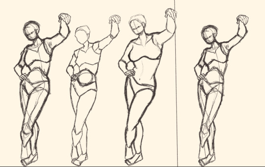
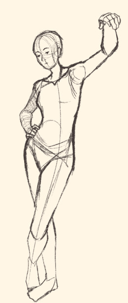
Ok so after the recent Hifuu fanart I did, I've been hoping to experiment more with how I draw faces, how I render, as well as how I stylize things. In some of the earlier sketches I did, I had an idea for a pose that I wanted to try drawing, so I took a ref pic of myself doing said pose (the leaning one btw) and then did a sketch over top of it just to get an idea for the shapes, negative space, and silhouette. After that, I wanted to do some simpler breakdowns of the shapes so I can get better at simplifying the body (these ended up being the bottom right sketches in the post). I also did some experimenting with how to push certain parts of said sketches to create a different body type (via liquify and then a more refined version based on that sketch), as well as figuring out what makes a pose feel natural and not stiff. This was also a bit of a foreshortening practice just so I can get more confident with it, and I ended up using the arms from the liquified version for the coloured Zanmu sketch I did since I liked them so much (dw I'll get to that).
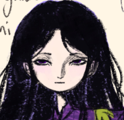
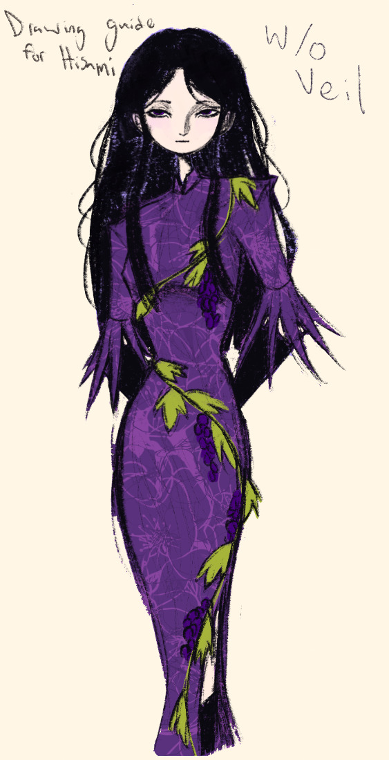
The next thing I wanted to try and draw was Hisami, mainly because.... I am very bad at drawing her in my style. Last time I drew her I made her look really creepy and spindly, and it is my headcanon now that she can switch between a more human, and more creepy look whenever she wants. I'm liking where the face is going a lot, might have to refine a few things about it in the future, but it's cute (I also made the blush purple which I think is what I'm gonna do with her face from now on). I also like how her hair in the sketch turned out a lot, but the outfit..... not as much... Ever since I started changing my style to something less cartoony, I've had a hard time drawing her outfit in my style. Especially the flower veil thing she has on, which, I did try to find a way to draw, but I ended up deleting that sketch because I didn't like it. I'm also not a fan of using the colour purple, like, pure purple, magentas are fine, indigos are fine, but not strict purple. I also have a hard time with drawing all the little pattern details on her dress. I also need to find a way to draw the flower veil in a way that looks good because everytime I try it ends up just looking off (very similar to whenever I try to draw Zanmu's blue spears). I think the only solution to this problem is to do what I normally do and make my own version of the outfit, but with adjustments to suit my style while still trying to keep core elements from the original design intact (like I do with Zanmu and Keiki, and yes I am going to get to that Zanmu drawing just gimme a minute).
Ok next up is Keiki, my favourite Touhou character who I haven't drawn since the beginning of the year. Since my style has changed a lot, I wanted to just do a face sketch of her to get a hang of drawing her again, and I..... really really like how it turned out! When I drew her eyes, I realized that a good way of keeping faces too same facey can be via varying the sizes of their pupils, so that's an idea I'm gonna keep in mind from now on. I had a lot of fun with her hair, I initially was gonna do it like how it is in the official art, but I ended up not liking it, so now I'm gonna draw Keiki with wavy heir like this because it's fun and it looks nice. I also included my base sketch for Keiki's face since I was initially struggling with drawing her bandanna, and in the coloured sketch I added some more detail into her hair.
Now to finally talk about the sketches for Zanmu. Good lord was I having a tough time with her face. I also did this sketch before I figured out how I wanted to draw hair, so that's why the rendering on her hair is different (I did this soon after the Hisami sketch actually). Since I changed my art style a lot, I had to find a way to translate her face from my more cartoony style to my more detailed style, so while the face shape, nose shape and mouth was fine, I was really struggling with the eyes. I did get somewhere eventually though, and I am super happy with how it turned out. I wanted to lean more towards the androgynous side of the gender presentation spectrum, mainly because I think that makes sense for her character. Also made sure to include the silver hairs and some wrinkles just to bring some signs of her aging into her face because those are just staple features of how I draw Zanmu at this point lol. You will also notice that I gave her some scars on the right side of her face, and that's because I am a Zanmu-with-scars truther, I fucking love it whenever I see someone give Zanmu visible scars like that it just adds so much omg (I also tried to put a wolf bite mark on her arm in the full body drawing but idk if it reads well). While you can argue that her not having scars sells the idea of her being this "powerful, untouchable mastermind who is impossible to defeat," I'd say that instead of those scars representing times she got injured, they represent everyone who has failed to defeat her.
As I was drawing Zanmu's face, I referenced my sketch of to help with contrasting their features since I made Keiki's face more traditionally feminine. I also didn't mention this in my commentary on Keiki's face because I wanted to save it for here, but giving Zanmu scars also plays into the fact that she used to be human, wheras Keiki doesn't have any scars because she's a god who doesn't follow the rules of normal human biology. Plus I'm thinking about the two of them interacting again (return of Zan/Keik??? (I'm a multishipper btw) maybe???) so drawing their faces together will definitely help me in the future if I wanna draw them together (again, maybe as a ship? I've kinda been ironing out the kinks in their potential interactions (romantic and non-romantic) for a while now so idk maybe expect that in the future lol).
And now for the full body drawing, when I was doing the face sketch I did this little snippet of an outfit, had a vision, and the made it into a reality. I'll admit, part of me was worried that it would end up looking too much like Yuugi's outfits in the spinoffs and mangas, but I feel like I made enough changes to differentiate them. I tried to keep a few of the major details in Zanmu's design (i.e. the red tassles and yellow lining on her shirt) while putting a new spin on it. I also dialed up the scars to 11 since without them the whole thing kinda looked incomplete. Also, while I could say that the leaves on her kimono are "a nod to the fact that technically she should be a tengu because back then people belived that corrupt monks would turn into tengu but no Zanmu is an oni and they're maple leaves because...tengu...ahahahaha" what really ended up happening was that I looked up clothing patterns from Sengoku era Japan, liked the leaves the most because the red picked up on the red from the rest of her design and just ran with it. I also always had the idea to put Zanmu in men's clothing from Sengoku era Japan and while the accurate thing to do would be to put her in a Buddhist's clothes from that era.... from a character standpoint, I don't think Zanmu is pious enough to strictly wear the proper monk uniform, and also since she's basically the king of Hell, she would probably dress herself like royalty from that era. TBH, I probably could've been a bit more historically accurate, but again, this was mainly for conceptual purposes because I had a vision and I needed to see it through.
If I were to draw her in this sort of outfit again, I should probably try and use more references, although now that I look at it, if she were to wear it properly this would maybe, probably look a bit closer to a Kyūtai sugata (a very huge stretch, but it just kinda reminds me of that) just without the layers under and over the main piece of clothing (In the website that I searched up to try and compare the outfit in my sketch to, they name the outfit pieces but don't label them on the image, so I don't know 100% what everything is called) so I will definitely have to use that style of clothing as a reference going forward.
Also, I was kind of inspired by the ToTK design for Ganondorf since I have finished the game a while ago and I absolutely love what they did with his design (it's just so fucking cool omg) and I thought that sort of look would look good on Zanmu, so yeah got some inspo from that.
And those were all the notes for each of the sketches, I'm motivated to draw rn but kinda art blocked, so doing these little coloured sketches helps a lot.
#touhou project#art#fanart#sketches#sketch dump#zanmu nippaku#keiki haniyasushin#hisami yomotsu#touhou 19#touhou 17#unfinished dream of all living ghost#wily beast and weakest creature
326 notes
·
View notes
Text
-FAQ-
Hello! I've gained a whole bunch of followers lately and I've been getting a lot of questions about commissions, what my setup is, what brushes I use, etc, so I thought I'd make a post about it to answer everyone's questions at once !
Putting them under the cut <3
Commissions:
Commission prices are listed in my pinned post. You can send me a private message about your commission idea and we can get to talking :) It is helpful to have enough references handy (character, outfit, descriptions etc)
I am generally a fast drawer but I also have a job and a physical disability so there might be moments I can't work on your commission. But that is never longer than a few days at most.
Payment is upfront, the full amount and via paypal only. I know this might seem a bit scary but unfortunately there are a lot of people who end up not paying for commissions and I want to avoid that.
During the process I will send you frequent updates and will ask for input, to see if it is going in the direction you want. You can ask for changes during the sketching progress but once I've started on line-art and coloring, no big changes will happen. (You can for example ask for a different color for a shirt etc, but not for a different prop or pose or expression)
When it is completed, I will send the drawing to you via email. The drawing will remain mine and it is not to be sold or profited of by the person who commissioned me. If the commission is for something commercial/for selling, that needs to be discussed. I prefer to do drawings only for personal use!
For more questions, my dms/asks are open :)
How long have I been doing digital art:
I've been drawing digitally for about 5 years now i think? But before that I've been drawing and painting traditionally literally since the moment I could pick up a pencil.
Set-up:
It's just me and my ipad and apple pencil laying on my bed. I wouldn't even know where to begin for those whole multi-monitor/screen setups ;-; I draw only with Procreate
Brushes:
I tend to play with different brushes from time to time to get different textures, but generally i use the same few for most of my drawings/styles. My favorite one is the Peppermint Brush, for sketching. I use it in every drawing i make! I always sketch with it, and often do the line-art with it as well! And it makes for a nice textured brush for rendering as well! (i used it for a lot of rendering of the armor in this drawing)
The (procreate) brushes i use a lot are
for medieval style:
inking - Ink Bleed (for line-art)
artistic - Quoll (for coloring)
for general style:
calligraphy - Chalk (coloring/rendering)
sketching - Peppermint (line-art/sketching)
for realism:
calligraphy - Shale Brush (full rendering) Also using the shale brush for smudging and erasing when drawing realistic
for lineart:
smooth pencil from this pack by Heygiudi
How/why do you choose a base color:
I tend to look at a few different things when deciding on a base color/color palette.
the overall color of the reference pic
the color i associate with who or what i am drawing
the feeling/vibe i want to give off with that drawing
color has a BIG impact on the vibe of a drawing, so it is something i keep in mind when im drawing.
Using a color as a base to start, helps a lot with my drawing process. It helps me pick out other colors so they match better. It helps me get light/dark values right. And the chalk brush i use, has gaps between the strokes, so the base color will always come through a little. Having the same color come through in the entire drawing, helps pull all the colors together if that makes sense? I always start with a solid base color when i am painting traditionally as well!
Advice:
PRACTICE!!! just keep drawing and practice. I know this is such generic advice but truly practice is The Way. Learn from other artists but don't compare yourself to them. Everyone's artistic journey is different and there's no "good" or "bad". And most importantly make sure that you have fun when you're making stuff :3
I also learn a lot by studying art I admire and love. Figuring out what it is I like about it. (for example, the line thickness or the shapes or texture etc), and try to incorporate that in my own style in a way that is not directly copying or stealing.
#my art#FAQ#frequently asked questions#art process#art tips#drawing process#procreate#brushes#commission info
766 notes
·
View notes
Note
What art program do you use? sorry if you already answered something like this but im so mesmerized by the techniques you use in your art.
Thank you. No need to apologise; I don't mind answering this question because it's an excuse to walk through my latest image!
The concept for this piece is based on being perceived online through interpretations of posts and artwork, yet how artificial this can be. The relationship the viewer forms is more with the narrative of the work, and any insight into the artist through this feels highly awkward to me, which is precisely what I want to explore with this piece.
In this example, I wanted an attractive sitter to look like someone out of a new romantics music video or like an Enya video, because this genre and era of media is very aesthetically pleasing and nostalgic for me. I hold it as an unobtainable ideal— a hauntology. So, as wonderful as it is, it equally feels shameful and perverse because it's an aesthetic object of desire that I am contriving.
The sitter is holding one of my cartoon characters, Lauren Ipson, the protagonist of my Ersatz world project. A trope in writing is when a character acts as a self-insert of the author, and I'm conscious to try and avoid that with Lauren. I try to write Lauren as dry and sardonic yet also fun, dramatic, and friendly. I don't think of these as personal qualities of my own, but I imagine personal qualities bleeding into fictional characters is inevitable.
Yet Lauren Ipson feels much more alive a character to me compared to any attempt at self-portraiture or self-expression that I've done, which is very little because I'm not interested in constructing a perceivable identity. (I'm aware this text itself can be interpreted as self-expression; however, to me this is just another construct.)
So Is the sitter meant to be me, controlling Lauren? I'm definitely baiting the viewer to think this, and you can interpret it that way if you want, but really I don't think of the sitter as me at all. My intention is to show how it's all a facarde. The sitter is basically just as much a doll, a puppet, a mannequin as Lauren Ipson is, if anything more so.
There's a deliberate irony between Lauren's cartoon rendering and the sitter, who I wanted to render with more detail and evoke a modernist style. I'm inspired by Hans Bellmer and Dorothea Tanning with their work with dolls. However, despite that implied visual hierarchy, the more detailed sitter shares a similar, stilted vector construct to Lauren. They're both born from vector drawing after all. And it's further undermined with the way Lauren the doll looks directly at the viewer, as if she's alive, while the sitter looks to the side with a blank, almost dead-in-the-eyes expression.
Anyway, with that in mind, almost all of my work starts as a thumbnail sketch. Although I often draft digitally and am fine with doing that, I feel more confident doing it freehand on paper. Digital rendering feels more like a refinement process to me. Funnily enough, although I often prefer to sketch with physical materials, I'm anxious of refining or rendering with them.
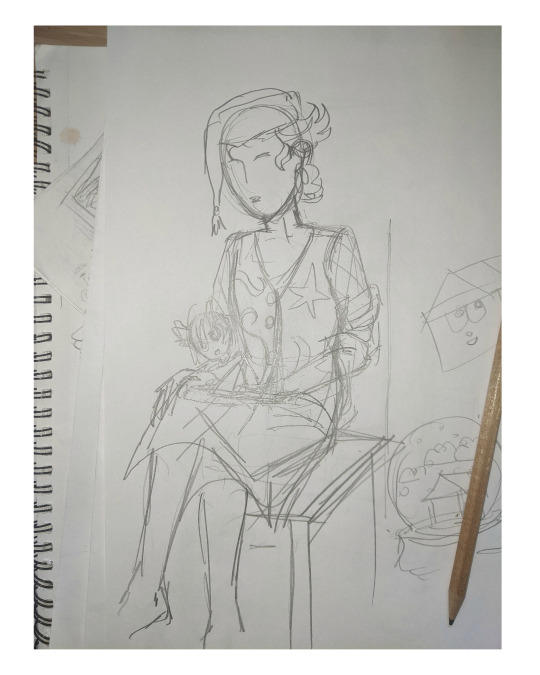
I like my designs to be very direct and conceivable, so a solid silhouette, pose, negative space etc. I often create a quick digital sketch with this in mind, either by tracing or referencing the thumbnail, although sometimes I skip this step and go straight to the rendered drawing. The aim is to establish a visual guide, dividing the drawing into various shapes for digital airbrush rendering later on.

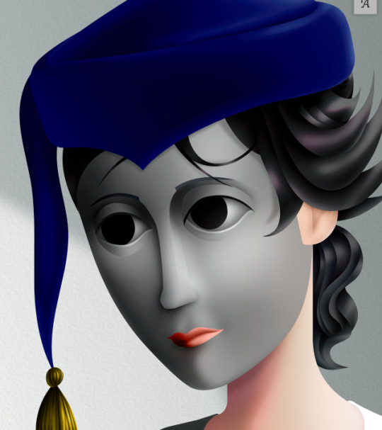
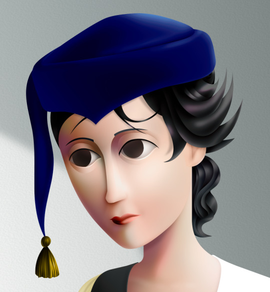
With this composition, I made a second draft with more attention to details such as the face, hands and feet. Sometimes I'll use photo references if I'm struggling with posing or anatomy. These drafts are often blue because it's easier to render the black linework over a transparent blue sketch.

The chair took some time but was relatively simple to render. It uses the line tool set to magnetic anchor point, following two-point perspective vanishing points. I like two-point perspective because it feels sort of digitally native to me to have these impossibly perfect vertical lines. I also know the horizon line should be at eye level or something, but I just like the idea of the top of the chair to be perfectly horizontal.

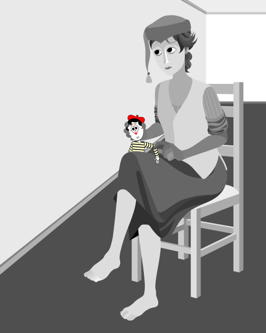
Here I'm drawing the final rendered form. I use the stroke tool with it set as smooth as possible. Often I'll redraw lines over and over if it means getting certain curves to look right. Once the lines are drawn, I'll fill them in and remove the stroke, leaving just the solid vector shape. The shade of grey I use is done to simply denote the shape. It does not represent any kind of shading or anything; in fact, when I bring it into Photoshop, all these shapes are set to the same shade, but if I had that here in Animate as I'm drawing, it would be impossible to see what I'm doing. The red background is just for clarity.
Once it's all drawn, I'll make sure every shape is clean, overlapping nicely, and divided into its own layer. A composition can often be comprised of hundreds of separate shapes.
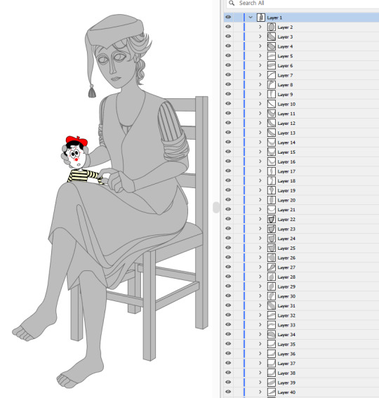
Each shape will be its own layer in Photoshop, which will operate as a clipping mask. The clipping masks act like masking tape or shielded off areas for soft brush opacity rendering, similar to the soft atomised rendering from an airbrush, just done digitally.
I follow very rudimentary painting techniques of simple shading, lighting, and bounce-back highlights. I follow a simplified Grisaille technique, focusing on strong values in greyscale before adding a wash of colour with a color gradient map set to layer style color. Sometimes my values can be a little off, but as long as the values are all consistently acting together, I can correct them with transparent washes or color curves. If the greyscale looks harmonious with all the forms clear, colour will likely work.
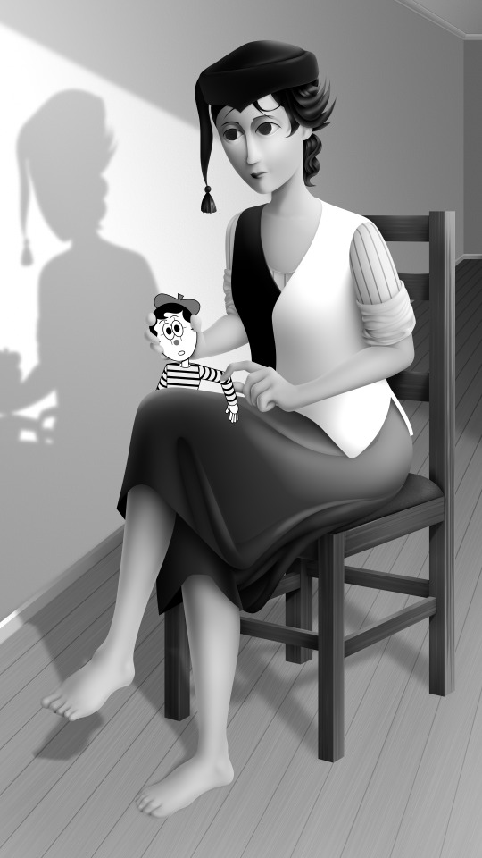
Proper digital painters will say this is an amateur process, with results that look mechanical and stiff, as colours in the real world all bounce together off different surfaces, resulting in colour harmonies. However, I don't mind the inharmonious nature of the colours, as I find the values give the composition enough harmony. I'm working digitally, so why go to all the effort to make it not look digital? It's interesting to me to have the red chair look blindingly red, the green skirt look blindingly green.
Colours can look boring without some form of harmony though, so I will add in blue-greens with the darker areas, more turquoise greens towards the highlights.
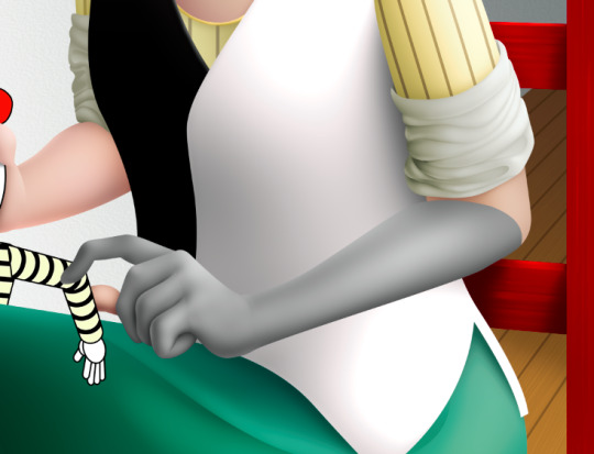
Skin tones are far more complex, however, as it's something that's more informed by realism. This is why kigurumi dolls with their plastic flesh look so artificial to the eye, because we're familiar with how light passes through flesh and skin and all the subtleties of colour that it picks up. This piece is the first time I've explored flesh tones, as typically I avoid all this by rendering skin as grey porcelain.
I needed to really up the contrast, with shaded areas becoming purples and highlights verging on washed out. Areas with more blood, like feet and cheeks, appear more orange and red. Areas closer to bone and cartilage, like the bridge of the nose, can look almost blue and green. Exploring these colour values and tints in the aim of natural tones was fun to do, and ironic given how blank the face is.

Although in the moment I feel very much like I'm rendering a realistic reality, when I step back, I'm reminded how stylised and unrealistic the painting actually is. It looks kind of insane, like everything is so uniform and overtly saturated. It doesn't feel present in a real space, despite the shadow and form implies one. But I'm not consciously thinking of these things, of style, as I'm working. To me, it's a process of world-building and problem-solving.
124 notes
·
View notes
Text
Israel’s legal manipulations draw on a series of ambiguities and exceptions that constitute international law, revealing that the laws of war favour states over non-state actors and the strong over the weak and consequently might not be the best tool to shield civilians in Gaza.
Let us take some concrete examples. The standing orders given to the soldiers entering the Gaza Strip in 2014 were clear: Palestinians who did not heed Israel’s warnings to evacuate their homes and flee south became legitimate military targets. One soldier explained to the Israeli organisation Breaking the Silence that:
“There weren’t really any rules of engagement … They told us: ‘There aren’t supposed to be any civilians there. If you spot someone, shoot’. Whether the person posed a threat or not wasn’t even a question; and that makes sense to me. If you shoot someone in Gaza it’s cool, no big deal. First of all because it’s Gaza, and second because that’s warfare. That, too, was made clear to us – they told us, ‘Don’t be afraid to shoot’, and they made it clear that there are no uninvolved civilians.”
One might think that a military order permitting indiscriminate firing at civilians would be deemed illegal under international law, particularly given the principle of distinction (the bedrock of the laws of war calling on warring parties to distinguish at all times between civilians and combatants, and prohibiting the intentional attacking of civilians) – and given the fact that over half of the 2.3 million Palestinians currently living in the Gaza Strip are children.
The irony is that Israel actually uses the laws of war to portray itself as the moral actor. As it has done earlier this week, in 2014, the Israeli army instructed hundreds of thousands of Palestinians to leave their homes and travel to the south knowing full well that among those living in the area are thousands of elderly and sick people and that the time it gave them to vacate the area was not sufficient.
But Israel also knows that warning the Palestinian civilians and instructing them to leave will allow it to deny the very existence of civilians within northern Gaza. That is precisely the meaning of the phrase “there are no uninvolved civilians”, since it brands all those who have remained in the area – even if civilians are still the majority and are unable to leave, as the United Nations has averred about the current situation – as “participants in hostilities” or as “voluntary human shields”. Such terms render these civilians “killable”, according to some interpretations of the laws of war.
And since the claim to morality is based on compliance with the laws of war, the lethal violence that Israeli soldiers use against civilians who remain in their homes is then constructed as morally justifiable and even ethical.
458 notes
·
View notes
Text

GENERATIONS #1: FAMILY PORTRAITS POSEPACK
Hello again friends! I have always been fairly hard-pressed to find poses for group portraits, and if I do, they're SO specific. So I set out to create some poses for larger families/parents with their adult children/etc! This pack contains 6 pose sets: 4 for larger families, and 2 platonic/sibling poses! These should be fairly versatile for more than family, so go crazy and enjoy! ♥ (Also, my OGs will recognize the fam in this photo...do you remember them??)
DOWNLOAD HERE (PATREON, EARLY ACCESS UNTIL 4/28)
You will need:
Teleporter Mod
Pose Player
Bench (the base game "Balanjar Teak Two-Seater Bench" is also suitable)
Disclaimer: I try to make my poses while taking into consideration Sims' different body shapes/types. However, it is nearly impossible to make poses fit every Sim ever made, so you may experience gapping or clipping based on their body type and/or clothing.
SimmErika TOU:
✨ Do not reupload on ANY website
✨ Do not claim as your own
✨ Do not change the package files
✨ Please give credit when using the poses (@simmerika AND #simmerikaposes on IG: so I can thank you and hype up your posts!)
✨ Use of my poses is allowed for blender renders, but please do not alter the poses.
✨ Violation of these TOU will result in a permanent ban from my Patreon, Instagram, tumblr, etc.
——————————
@ts4-poses
1K notes
·
View notes
Text
Differences between the models from Sonic 2 and the Knuckles Show Masterpost!
I'm sure there are more but these are just what I've noticed so far...
(Also, this is kind of hard for Sonic and Tails because we don't see them much, but I'll do my best)
::Knuckles Show on top Sonic 2 on bottom
Okay, first...
Textures
For the most part, they're less furry.


Comparing these you can see that the fur around his muzzle is shorter or at least not as well defined. This is true for the rest of them as well. Everyone looks "smoothed out," especially around the face.
Another example...
You can see the fur around his ears is actually less fuzzy, and the triangle shape of the inside of his ears is more obvious. (Almost like he got a trim or something haha.) This is true for Sonic as well, especially the ear definition bit. Tails' cheek fluff is also more shapely and long, evoking his game design more. His forehead tufts now face slightly different directions instead of all pointing right.
This goes for Knuckles' chest pattern too...


The shape is SO much fuzzier in the movie.
His body fur is also less voluminous in the show (likely the cause of the aforementioned definition.) I think this goes for everyone else too (Except for Tails maybe, I can't really tell since we can't see his body that well ¯\_(ツ)_/¯.)
Another one...

They got rid of his nosebridge pattern. The delineation between his muzzle and head color is much clearer. (You can also see the muzzle fur and ear change here.) I'm actually kinda sad about this one :( It was one of my favorite parts of his design. It could be due to the fur shortening and just for the show, but I'm not sure... :/
Exceptions
Tails' tails actually appear to be MORE fluffy.
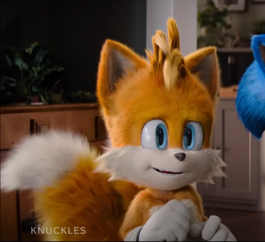

and Sonic's chest fur is WAY fluffier
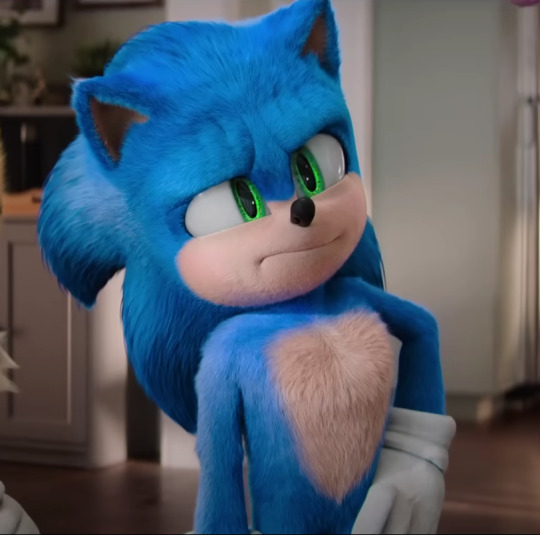

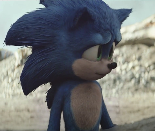
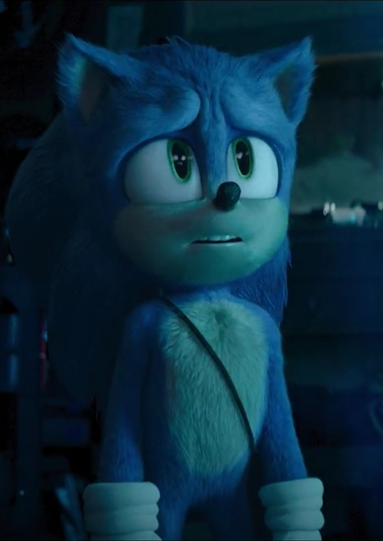
If I had to guess, I'd say most of these changes were made to cut down on rendering time. Switching out the movie's "denser" textures for these "lighter" ones cuts down on the budget without sacrificing the looks. Very smart, very smart. (Obviously, I don't know for sure that they did this, I'm just guessing based off of the differences.)
Structure Changes
Here are some things I noticed about how the bones of the models have changed (meaning not due to textures) (It's mostly Sonic lol.)
From the images above you can see that Sonic's shoulders are broader and his arms are thicker. His upper chest area is now more prominent, giving him a body shape closer to a "V" than the rounder "0" Sonic from Movie 2. It's really obvious in the second picture.
His quills also don't start on his upper forehead anymore, now beginning further back. His quills also appear to be thinner. They blend in with his fur more than before. (See below.)
He also emotes differently. His face rig must have changed with his model, because when he furrows his brow the way pictured above his face wrinkles like 3x more than before, haha (I hope that doesn't stick around, it's kind of weird to look at lol.) Actually, now that I think about it, it might just look that way because the show's less voluminous fur is not hiding it as much.
Yeah, that's definitely why haha. You can actually see the indents of the same crease placements in the movie model.
Also, is Tails taller?!?!? He sure looks taller here! But it could be a case of forced perspective since we can't see their whole bodies.
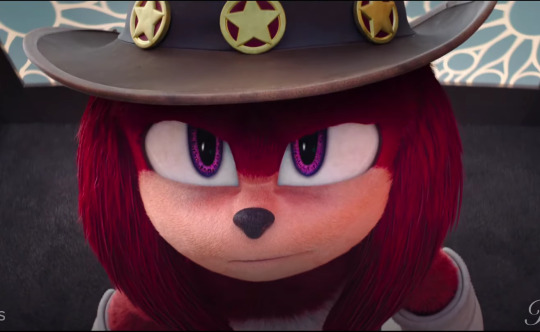
Knuckles' eyes are very different. I don't think the other's eyes are different, but we see them for like two seconds from afar so...¯\_(._.)_/¯
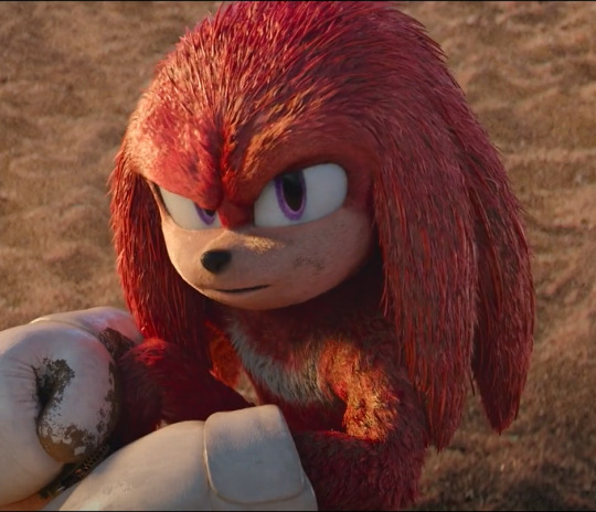
Also, I might just be imagining this, but it looks like everyone has more "neck" than before. Weird sentence, I know. You can kinda see what I mean here...If this is the case, it was likely done so posing is easier for the animators.
And generally, everyone is at least twice as vibrant, especially Sonic! Just look at the comparisons. My boys are G.L.O.W.I.N.G! Beautiful!
I think that's all I've got. If I can think of any more I'll make a part 2. If you noticed something that I didn't, leave a comment and I'll add it. Or add a reblog of your own if you want^^
(This took way too long (¬_¬"") )
#knuckles series#scu#Movie!knuckles#Movie!sonic#Movie!tails#tails wachowski#sonic wachowski#knuckles wachowski#sonic movie#sth
241 notes
·
View notes
Note
have u ever talked anywhere about your coloring or composition processes? u are honestly one of my favorite artists and i would love to hear any insight on how you make pieces 💓
wahh thank you TTT !!! I did sorta give a very simplistic answer here but it was more of my simpler sketchy style so lemme redo that, ill try to be consise and make this understandable ?? its a bit hard cuz it honest to god depends on what Kind of piece im even drawing, cuz for some i go the whole length of doing lineart flats and all that, others i just just fuck around untill it looks right?
i do usually start with a rough sketch or colour draft, especially with more compley pieces this helps with figuring out the feel, honestly i should spend more time drafting properly, figuring out poses and such but im so lazy i just go w the first thing that looks good
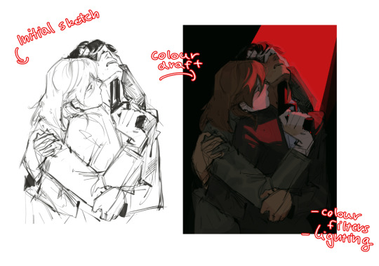
then just lines over the colour draft, fixing lots of anatomy and proportion stuff, and depending on how i wanna do the colours ill either keep the colour layers or merge them together and have the edited colours as the base colour (this might not even make sense help)
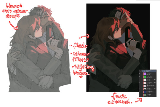
see this piece at the time gave me an insane ammount of trouble with lighting and colours, so after trying to render i ended up merging everything together....which i dont USUALLY do but the rendering is pretty similar except usually i have colours be seperated by layer,
ANYWAYS sadly i dont have a process on how it got from flats to this specific render for this piece...but i still followed my initial drafts/plans with vibe and colours and just painted over it, its why i make it after all!
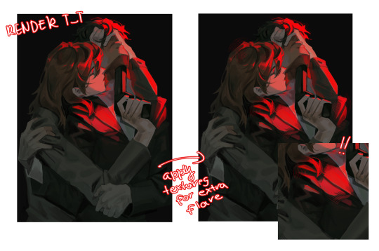
but honestly a lot of times its just very simple colours and just trying to mainting good contrast and values !!!! and THEN fucking around with colours and rextures, for other pieces i kinda just paint as i go? i have this timelapse of my justice piece that may be a bit more help!
it includes the initial colour draft, the cleanup/lining process, flats, rendering, and all that so its probs the most accurate timelapse of my morecomplex work processes, with stuff that doesnt include heavier backgrounds, which is a whole OTHER topic honestly
im sorry if i cant explain it more cohesively, i genuinely barely know what im doing most times and go by muscle memory and stuff i Know but cant. Explain? like i know how light and folds work since i observed and studied them but i cannot put it into words at all )--)0
my brushes also contribute a lot to how i render and colour, depending on what i use, you can find the swatches for them here !
150 notes
·
View notes
Text

Len and Tommy's life told through nine photos ~
A fanart based on the Inside no 9 episode 'Bernie Clifton's Dressing Room' because I loved it so much!
(09/2024)
See below for close ups and unnecessarily detailed explanations of each individual artwork lol
First wanna say that I spent wayy too long on these (like 25+ hours), especially trying to make them look like actual old photos lol... also trying to get their likeness right for the various ages was really bloody hard lol, but hopefully each photo has the essence of each character even if it might not look 100% right pfft...
Second thing is that the dates & locations are very much my own subjective thoughts on their life and not particularly rooted in the canon of the show lol
Also I did go really heavy with the colour symbolism lol...

Ravenhill School, 1965.
The year they met, both are around the age of 10 (give or take). Len is 3 from the left in the top row, Tommy 2 in from the left on the bottom row (also I tried to include references to the other 2 League Of Gentlemen guys... Though I think the only vaguely recognisable one is Jeremy pfft)
Also shout out to @lapis-lazuliie for the idea that they met at school!
(side note, this is the least detailed of all the paintings not just because I was too lazy to render all those children's faces pfft but ALSO because of the significance of them being less recognisable or prominent in each other's lives in this point...)
I was planning on making another childhood/early teen photo but couldn't really think of any good subject matter that could also fit thematically with the episode (also the fact both are coming from poor families who would have had limited access to cameras in this era means we can just pretend that there are just no photos that really exist of them at these ages pfft...)

Photo booth in Leeds, 1974.
Both in their late teens, they'd (well, mainly Tommy) gone to a photo booth in Leeds with the intention of getting some professional looking photos only for Len to immediately make Tommy laugh once they got in there lol
The middle photo is covered in lines as Tommy had planned on throwing it away, only to find he couldn't bring himself to do it in the end... Is it platonic? Romantic? Both? Who knows, you decide lol! I mainly wanted it to be a candid moment between two people that love each other lol
(final one is them play fighting because that's kinda just what 19 year olds are like pfft... also I think photo booths technically gave you 4 photos? so let's pretend there was another photo that they did throw away for whatever reason lol...)
Rehearsals, 1979.
Deep in the midst of practising their routine for some of their first performances!
I'll admit this photo was mainly me wanting to include something more episode specific lol and also to get in some much needed heavy handed symbolism (the crease in the photo separating them, the bottle in front of Len's face, etc)

Polaroids taken at Tommy's flat, 1985.
In-between shows the two often spent a lot of time at Tommy's place (featuring that god awful sofa the previous home owner had left). I did originally plan to have them in the sofa shot together, but was finding it hard to figure out who would have been taking that kind of photo so figured it made more sense to make it shots they took of each other.
Also marks the beginnings of Tommy's weariness (& Len's over drinking...)

Outside the Glasgow Pavilion, 1988.
The morning of that fateful performance...
Ok not much else I wanna say about this other than the reference I used for the pose had Reece sorta awkwardly clasping his hands in front of him which I really liked but unfortunately in my art it just looked like he was trying to cover his crotch so I had to change it pfft...
Tommy standing at Len's grave, 2024.
The sixth anniversary of Len's death, and the sixth time Tommy has travelled across from France to lay flowers at his grave. Photo taken by Leanne from the inside of a taxi (I'd like to have had more references to her in these photos but was unsure of dates/ages where it would have fitted...)
She couldn't get her phone to not focus on the raindrops on the window as she tried to take a picture of Tommy at her father's grave but then realised that she actually liked the pathetic fallacy and had it made into a print anyway lol (look I'll be the first to admit that this is the least 'realistic' in terms of a photo that people would take, but I couldn't resist the symbolism of it lol...)
There were a lot more ideas for photos I wanted to do but for obvious reasons had to keep it to just 9 lol
Also will be posting these on my ao3 with snippets of stories to go with each photo so keep an eye out for when I share that link!
#artists on tumblr#inside no 9#bernie clifton's dressing room#tommy drake#len shelby#reece shearsmith#steve pemberton#in9#inside no 9 fanart#digital art#digital painting#i love these two and this episode so much so maybe i'll do more art? who knows
59 notes
·
View notes
Note
Miquella is a deeply tragic character and saying he's a villain just because he used someone, who was probably way worse than him to create an order lead by kindness, makes you come off as pretty short-sighted imo Miq was as much of a victim as Mohg. He had good intentions, he truly believed he could make the he could make the world a better place.
*exhales deeply* Are you the person, I think you are? nonetheless....
I'm going to shed my opinion on Miquella now because I seriously can not tell if this is bait or not from things we see and know in the base game and DLC and want to clarify my thoughts on him and why I believe rendering him as a victim is extremely problematic, also outside of the entire Mohg situation.
Is it so hard to internalize that the things Miquella did were actually highly morally questionable? I got to admit, he is a way more interesting character to me after the DLC because of the things he did (and I enjoy villains, so yeah.) I guess the »villain« term is as much accurate as some of you folks justify brainwashing to be ethical , when it is done with good intentions and keeps the peace, with which I personally do not agree with at all.
I don't see Miquella as tragic because honestly we have nothing to suggest that this guy suffered in any way before he decided to rip himself off of his personality. And that is the point, he decided to do that himself. No one forced him to this. Miquella had a choice, unlike Mohg. Yeah sure, you could argue that he suffered through his immense »empathy« but honestly, Miquella's empathy for the weak and shunned always came off as superficial.
Why does he not care for the Albinaurics being tortured in Castle Sol, which is clearly allied with him? Where are the Misbegotten and other creatures in Elphael? Where are the Albinaurics? And the Omens? The Nomads?? Miquella claims to want to create a perfect world where everyone is equal but honestly except for words we hear, we do not see any fucking action or effort to truly include them in his world order.
And that's the thing, Miquella reeks for me at best of naivity and at worst of white saviour complex. He grew up as a fucking empyrean, he had a good relationship with at least one of his parents, he was a golden child. From the things we see and hear in the base game, and now the DLC, it feels like Miquella does not seem to grasp the complexity of the situation when it comes to subjugation. If that is due to his child-like thinking, infused by his curse or actually just his personality, is up for debate. Can you truly care for the subjugated as someone more privileged? Absolutely. But only if you truly educate yourself on the matter and actually listen to the needs of the excluded and shunned.
What does Miquella do instead? He rips everyone off of their autonomy to make decisions themselves if they refuse or challenge his beliefs. That is textbook tyranny. You can not save someone, who refuses to be saved by someone like you. Doing so anyway is extremely ignorant. In the end, Miquella actually puts his needs & beliefs before that of those he claims to desire to save. He is so convinced of his own agenda that he loses track of the moral dilemma, his approach to worldpeace poses. That is not tragic. These are the thoughts of a megalomaniac.
If Miquella's selflessness was truly genuine there would be no need of compelling affection. However, he bewitches people. Over and over.
Of course, there are his efforts of curing Malenia still. But even that is, in the big sight of things, not really a selfless act because Malenia is a.) close family and b.) he gets and actual use out of Malenia's talent as a skilled swordswoman. I do not think Miquella bewitched her, I truly believe Malenia followed him by his own will and I also do believe he really did want to help her!
However true kindness lays in how you treat those who can do nothing for you. Bewitching those who can do nothing for you and refuse to follow you, is not exactly a very pretty picture of his character.
And in comes Mohg to this occasion. The game is so fucking obvious about the fact that Mohg was the exploited one and I seriously do not understand why people still insist he isn't and exploited Miquella?? He is the only demigod we know for certain of, who was brainwashed. With Radahn and Malenia we do not know for sure but with Mohg we do. The fact that Mohg was bewitched implies that Miquella could not be sure that Mohg would have agreed to a deal and that would have been a way safer route than to bewitch him and his closest consult. I mean, Miquella almost DIED because he underestimated Ansbach's knowledge on how Mohg behaves. Why the fuck risk that if you could have just openly made a deal with Mohg, if he was as power hungry and crazy as the game implied?
In contrast to Miquella, Mohg is actually one of the most tragic characters in the game. This motherfucker was told his mere existence is a crime, grew up in the sewers locked away for years, he had no one except this one Outer God who seemed to care for him and showed him maternal love, something he was deprived off his entire life. Not getting into the speculation on how the cult operated before Miquella took over but it's very clear that he ruined Mohg's life. Mohg just wanted to get away from the toxicity he grew up with and created his own haven, from which he too thought, was the right thing to do. However he never forced anyone to join him. He never mind controlled people. People followed him by their own accounts.
The cult in itself is probably morally questionable too but we also have no idea how the Mohgwyn Dynasty worked before Miquella essentially took over. But by that standard, everyone is in the Lands Between is a twisted bastard with their different agendas ….
The point is that Ansbach is still right though when he says that »Mohg deserved better«. NO ONE who is genuinely interested in helping the shunned and subjugated, would chose one of the most excluded and tormented souls as their pawn. NOBODY deserves to be treated like this but the fact that Mohg is a product of extreme racism and social exclusion makes it so much worse and makes Miquella look so much more hypocritical. It suits the stuff we see in Castle Sol and the Haligtree … Miquella wants to be seen as the world's saviour so badly but seems to have no understanding on what suffering actually means. Because he never experienced it. His empathy is superficial and short sighted. The fact he is convinced he is doing everyone a favour in bewitching them, and does everything in his power to achieve his dream, makes him a truly terrifying villain.
And that is something I like Miquella for. Is that really so hard to accept for people like you?
Sure, you can still live out the fantasy in your head that the mindcontrolling intermitted in Mohg to "grape" Miquella (even tho the game also never confirmed this????) if that pleases you, but for the love of God stop acting like it is a fact that Miquella was used by Mohg because he wasn't. I guess a lot of personal feelings from my side bubble up regarding this topic and I'm sorry of if I come off as passive aggressive but as a survivor of abuse as a minor by someone "popular", and nobody believed me, and Mohg being one of my comfort characters, that shit hits different. Just not a fan of turning victim-abuser dynamics upside down, sorry.
103 notes
·
View notes
Text
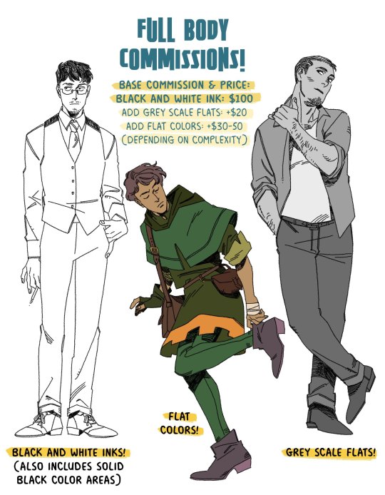
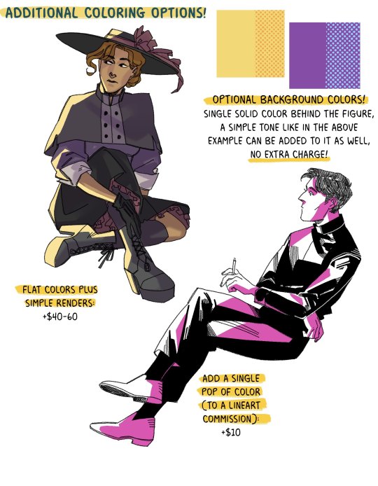
full body commissions, at long last!
the base price is $100 for a single figure, and then you add on the price for colors if you want that! flat color prices vary on complexity. if you have someone in a suit, then it's just +$30, but it's more like a complex period costume, then it's closer to +$40-50 (same for simple renders)
(simple renders are not an additional fee on top of the flat colors! I realize that it might be a little confusing, flat colors + simple renders is it's own thing, which starts at +$40)
anything over $100 can be paid either in it's entirety up front, or $100 up front, and the rest once completed (for this, I'll send a lower resolution jpeg of the finished illustration when it's finished, and the high res png when the payment goes through)
visual references are a big help! either art of the character, or things like a face claim or actor. if you have a character from a specific time period, please also send references of the clothes you'd like them in! if you have a pose in mind, feel free to tell me! It can be anything from standing around, to sitting down, jumping, etc.
these prices are for private commissions only! which means you can go ahead and get 'em printed or whatever for your own personal use but you can't use them commercially
currently, I don't have prices for a commission with a second full body figure! if you really want something like that, we can work out a price.
I'm also using a dead line weight in these examples, but if you want something that looks more like the inking style that I use in Trikaranos, just let me know!
🍊 commissions will be on a 10x15 in canvas at 300dpi :)
🍊 email me at [email protected], and we can talk details! I use paypal for payment, do not send me money ahead of time because this is not my paypal email and I use invoices.
if I don't reply in like, a day, feel free to message me here and I'll give you my other email where we can hash out details because sometimes, the perils of having an email on public display is that people will sign your email up for junk mail and it takes a minute to mark it all as spam
things I'll draw: established characters, ocs, your favorite dead roman or greek hero, I'm cool with it all!
things I won't draw: generally, I'm not too keen on drawing anyone under 18, as you may realize from the fact that many characters on my blog are vaguely in their 30s. like, it's not a hard rule, but I will fully admit right here that I'm better at drawing people over 20.
(also! again. money this month sucks, and the economy is honestly just a huge bummer for literally everyone everywhere. if my prices for full body comms are out of your range, I'm cool to do payments in $50 a month installments!)
#also my finances are a little yikes this month: if you get a full body commission i'll also throw in a little thank you head sketch of your#character. but that's a secret. shhhh.#commissions tag
155 notes
·
View notes
Note
hi! not exactly a request but i do wanna ask, whats your process when you're rendering more paint like art? (if that makes sense, English isnt my first language so apologies hdskhsjdbd) i really love how you use the colors and im curious how you do it :0
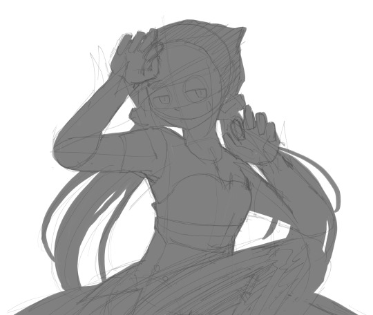
i’ve been meaning to answer this one for a while so here’s how i painted miku in today’s post (put under the read more because yeah prepare for a long post
i’d also like to preface this by saying that i never follow a set way of doing things, so in terms of what my personal process is like, these are only broad strokes of what i do! sometimes i’ll combine or skip parts entirely, depending on how i feel. also, this is not a tutorial, just how i do things, so please don’t treat it like one :’D this will read like the ‘how to draw an owl’ picture if you do
first, like every artist, i sketch. more specifically, i’m getting an idea of what i want to paint later on. this could be how a scene is set up or in this case, how a character is posed. here i’m not concerned about details or getting everything perfectly, i’m only planning how the thing will be composed. maybe a lot of canvas size changing, or adjusting what miku’s doing (note how busted miku’s right hand looks from all the transforming!) however, i still have to be concerned with how clear the sketch will be to future me, because the sketch won’t be any good if i can’t read what miku’s doing

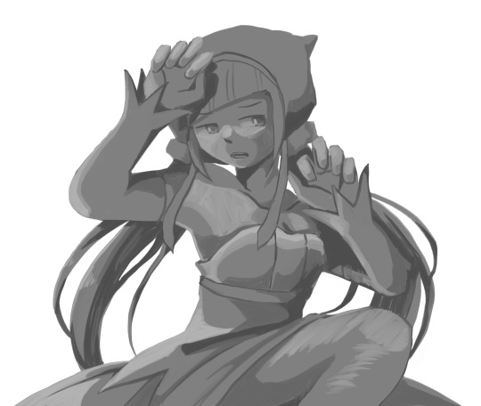
after that, i lay down a flat gray under the sketch, mainly focusing on giving miku a clear silhouette. this is also a good time to make adjustments to the composition on the fly if i suddenly feel like something can be improved upon, like shortening miku’s left arm from the sketch!
after painting a flat silhouette, i start shading in grayscale, focusing only on lighting. i usually do it in two passes, one for the lightest and darkest tones i’ll use (not black and white) and then a second for midtones to blend them better with the base gray but i forgot to screenshot the result of the first pass 🗿 nevertheless, here is where i can start adding some amount of details. i’m not including any extra accessories yet, just focusing on the base design of the outfit and the character herself (for anyone wanting to draw characters from That Gacha Game, this is how i personally make the process more bearable for myself.) i still use the dark gray to separate where certain details (like the facial features and fingers) begin and end, mainly to make colouring more bearable later.
now here’s where i get the Good Colours. it’s a cheat lol. i put a gradient map layer over the grayscale painting so that there’s a little bit of color to start. some gradient maps can be applied as is, some need the layer settings adjusted to make it look good. this one, for example, is a (free) gradient map set from the csp assets store that needs you to set the layer opacity to 20% and to set the blending mode to color to achieve this result. in general, i tend to pick which gradient map i want to use based on vibes, or basically whether i want the work to be warmer or cooler, colour-wise. but this does do quite a bit of lifting for the colors in my stuff.
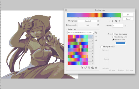
and then, finally, i add the colours. i add flat base colours in an overlay layer. at this stage, i’ve made the character silhouette clear enough that i don’t need to refer to the sketch anymore for what miku looks like. also, the gradient map layer does its magic by making the shading a bit more vibrant than it would’ve been without it. after that i paint over with a new layer to add details like the lace.
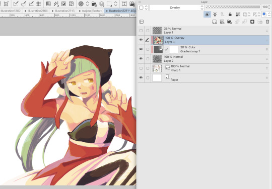
and then i put some extra shading on top. basically this is where the ‘better lighting’ happens. again, this isn’t a tutorial, so i’m not here to say what each part of the lighting is, but i’ve labeled which layers do which job. in other works where the lighting within a scene is more defined (from a window, from a small crack in the walls, etc) the glow dodge layer may be more opaque and sharper, but since this isn’t a work with that, the lighting was applied using an airbrush. the linear burn layer is also there to make the whole thing darker so the glow dodge doesn’t end up oversaturating miku. i also usually match the lights to the vibe i want, and use a complementary color for the shadows. so here you can see i have warm colors on the glow dodge layer, but light purple on both the linear burn and multiply layer.
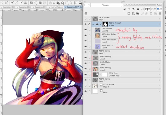
and that’s it for the character—here’s a gif showing how each layer adds to miku! (sorry it’s so toasty)

as for the background, depending on the complexity, it may go through a similar process, or if i can settle with flat image backgrounds, i just go for that. it’s ok to use external image materials. i didn’t have a background in mind for this miku in specific, so i got some default csp materials and threw together something
and that’s about a rough overview of what my process for more finished works looks like! again, art is a fluid process so i never specifically stick to certain steps all the time, and you shouldn’t either. i can probably answer why i’d pick this colour over another in one particular work, but it’s something that kinda has to be learned on a grander scale. i think everyone can already feel what colors work with what atmosphere or what setting, even if they can’t immediately explain why. colors and composition do take some level of experimentation to find what works best!
127 notes
·
View notes
Last Seen Blogs


ljm-125
Short stories for you

nscsojin
One million roses

w3rdink
W3RDink

brinumladiteart
BrīnumLādīte Art