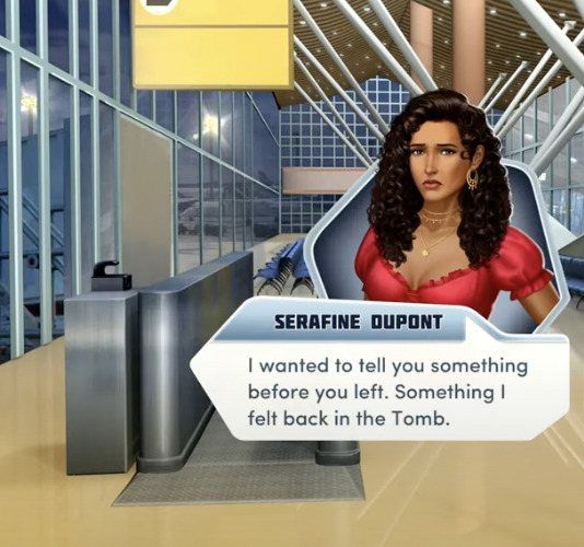
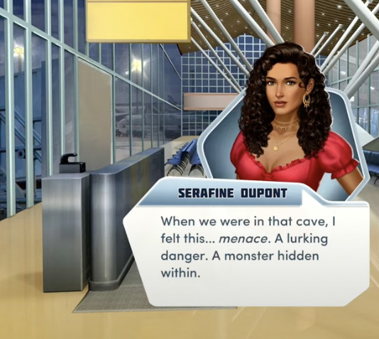
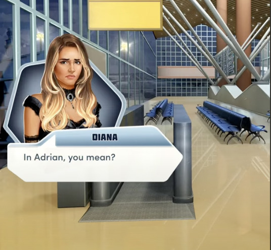
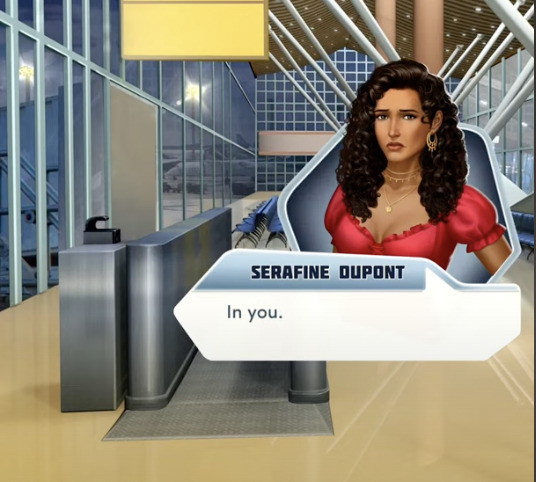
#and am reworking some of my design choices
Text
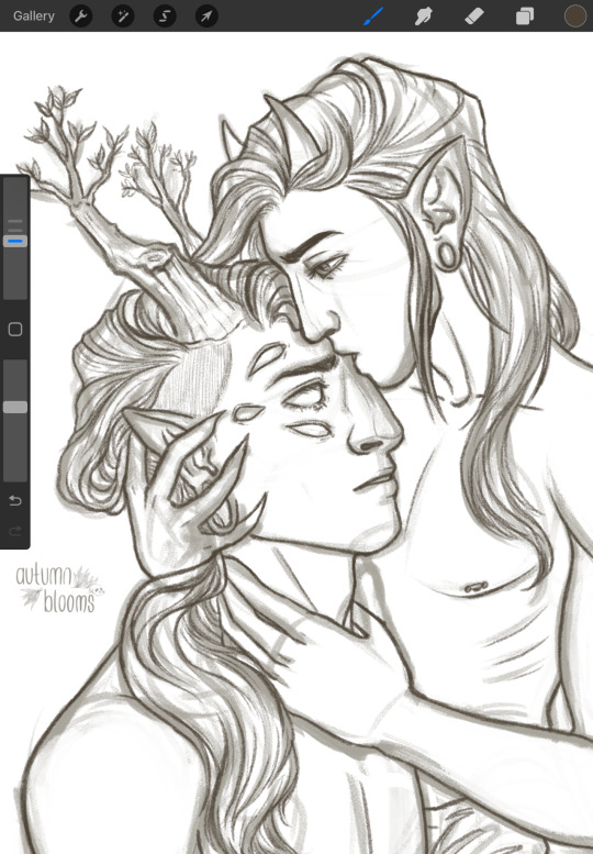
Back on my MountainDew bullshit curtesy of @kroas-adtam ‘s Death of Peace of Mind 👀
#fucking great angsty hurt/comfort fic#binged it in two days#and am reworking some of my design choices#their description of feral Mountain was *chefs kiss*#the band ghost#my art#current wip#dewdrop ghoul#mountain ghoul#ghost band#nameless ghouls#body horrow cw
211 notes
·
View notes
Note
Jumping off the Bell’s Hells vs. Mighty Nein question…what does Bell’s Hells need most right now? What can Sam bring to the table that would make BH as complete as MN? Is it just “a life cleric” for maximum healing, or do you think there’s something better out there?
Hi anon,
You would need a drastic reworking of the entire party. One person swapping out can't fix it.
I'm going to stick to combat and not more general stuff [high INT doesn't matter much in combat unless that's your casting stat but GOD it's not optional in a longform campaign] but in short:
You're fucked by having two (mostly) sorcerers in a party. It's one of the least versatile classes by far; all the glass cannon of a wizard with a fraction of the utility. As my url indicates I am nearly always a caster main but also very much NOT a casters as blasters person and sorcerers are basically designed to be this (except divine soul love u dariax).
melee line is strong so that's pretty good, though Ashton's stuff is unpredictable by design and as a result they're a touch behind Yasha, and the fact that Chetney runs the risk of attacking the party in wolf mode is something of a liability that the Nein did not have.
None of the melee tank line has quite the range the Nein melee line had at the end: Yasha could fly; Beau was a monk; Fjord had a trillion short range teleport options and could also if necessary fly. Ashton, Chetney, and Orym have comparatively limited options and Ashton's can't be relied on. I love Ashton's subclass but whenever you can't control the situation you cede something in combat to someone who does. I do actually own a copy of The Art of War for non-douchebag reasons and I'm pretty sure it says that.
Really, hexadin is literally one of the most bonkers good verging on broken combos and if you don't have one you are probably at a disadvantage over a party that does.
For all I am a Rogue Hater Of Some Renown, they are very good in combat scenarios when on a party with a strong melee tank line. Burst damage is overrated but man it is kind of great when, simply because your melee fighters are doing what they do best, the rogue can eliminate a handful of d6s worth of enemy HP for free.
Fearne would need to be played very differently. This isn't a judgment of how Ashley plays her - I love her choices and feel they're in character. However, to compete with the Mighty Nein she would need to be played rather more like Jester, with a more even split of offensive and healing. She can do this, and sometimes does, but that's not her usual style.
The Nein had two main healers plus a hexadin plus Yasha had a little; Bells Hells has only one person with any healing at the moment.
The Nein had two people who could cast Counterspell. Laudna has no one to counter Caleb when he counterspells her counterspell.
This is very subjective, but also, I think the Mighty Nein really played to a lot of the cast's strengths mechanically, and Bells Hells are an expansion of their comfort zones, which is a good thing but it also means they play the Nein more optimally.
Anyway I think full cleric (most subclasses will do) is probably the wisest bet for Sam and if he can throw in a high INT score (knowledge cleric? wizard dip? Just a smart guy?) that wouldn't hurt, but yeah the Nein are still winning this one unless you replace like half the party.
43 notes
·
View notes
Text
Fallout London First Impressions/Semi-Organized Thoughts
Things I'm not a fan of;
The female player character combat sounds, while not the worst I've ever heard, are bad to the point of distraction at times. I was streaming it for some friends and we broke out in laughter at various points because of how unnatural they sound. Don't know what the male sounds are like yet.
Biggest complaint though, the choice to freeze the player in place during important 'cut scenes.' At two points early in the game, a mysterious agent talks to you and does your basic mysterious exposition talk stuff. I assume it's to prevent you missing these moments, but by the level design I kind of already can't.
In both cases you can't proceed anyways because the agent has to unlock doors for you. It felt less egregious in the hallway because I wasn't sure what was about to happen and it was a small space with nothing to see anyways. The second time in the atrium got on my nerves though. Here's this huge space I could be exploring while the agent talks at me through some big tv screens, but instead I am stuck waiting.
Bugs I've encountered;
Churchill the dog companion. Nice guy. His footsteps are absurdly loud. It's like there's a small horse stomping around near my head. I assume this is not intended hence filing it under bugs, but I was forced to leave him behind because of it.
Beware ye who try to fast travel. Seems prone to causing crashes so always save before you try. I also crashed twice when taking the train out of the starting area into the main world.
There's a sequence on a boat. It seemed like the boat got stuck for a moment and then I fell through it into highly radioactive water and died.
Things I'm enjoying
Honestly, pretty much all of it.
I can't really help but compare it to New Vegas' relationship to Fallout 3. Where 3 and 4 have their drawn out intros, in New Vegas and London you wake up in front of some doctors. Pick your face, states, and traits, and bing bang boom you're on the move soon after trying to figure out who you are and who did this to you. Oh yeah, much like New Vegas, they brought back traits again. The perk system also got reworked/reskinned to be closer to how it was before 4 as well.
The world building especially though. After spending so much time being frustrated at Bethesda for not seeming to think very deeply about the ways the East Coast might be different from the West Coast, it's so nice to see all the thought put into how things would be different in Britain. Using tickets from the Underground as currency. Ion Brew as the local soda of choice. London Ghouls I believe prefer to go by the term Commuter? Viewing the term ghoul much the same way US Ghouls view zombie it seems. Though I've only heard that from one ghoul so far.
The ATTA-Boy is especially cute. A handheld version of the Pip-Boy that was reverse engineered off of scavenged/stolen Roboco Pip-Boys.
I've gotten myself involved in some kind of gang turf war. Can't wait to see where that goes.
Also the array of local creatures they've made is great. The giant leeches are awful, good job guys. Radshrews, giant ladybugs, mangy foxes. The Fish People. Can't wait to see what else is out there.
Last thought, Greenwich Footbridge was a horrifying experience (positive). Nothing like being trapped in a flooded tunnel full of ghouls.
20 notes
·
View notes
Text
thoughts as i watch:
environments are gorgeous but we knew that'd be the case tbh. they were gorgeous in dai too
i dont feel strongly one way or the other about a more action-oriented combat approach, but i can see this being a controversial choice (although i would say even with dai's tactical cam, the series has been headed in this direction since da2)
still not sure how i feel about the style. the venatori are standing out to me especially--they looked eerie and unsettling in dai; i feel like the simpler design has definitely lost some presence here. it's not enough to make me not want to play or anything, but my criticisms of the trailer in this regard are more or less still standing
the demons were another thing i liked in DAI--i know some demons have been reworked across all the games, but the pride demon remained consistent and was iconic. i feel like it didn't need to be changed here
also not sure about the UI--it's very clean and well-designed but as with just about everything else from graphic design elements, it just doesnt evoke dragon age to me. minrathous is obviously very different from other thedosian locations we've seen--maybe the sleeker visuals there will help the UI feel more in place. but i still like a grungier da, personally
the first thing im gonna do when i recruit neve is get that goddamn graduation cap thing off her head lmao
definitely building some tension with varric and solas D:
approval system still in play, guessing that'll factor into romances
solas' teeth are really distracting me lmao did he get veneers
ooooooh what just popped outta the fade i actually dont want to know or speculate too hard dont tell me
didn't really get a sense of the protagonist, but that's not necessarily a bad thing if we're gonna be able to really customize and roleplay our own character. i did notice harding's comment about who he is and his skills--felt a little shoehorned as a way to let the player know "hey, your choices matter" but im not mad about it
it looks fun. it looks like a game i will enjoy. still not sure if it'll be a day one purchase, but all things considered given what has gone down at bioware since inquisition (since even before that really), this does look pretty polished
i'm going to be very restrictive on what else i willingly expose myself to between now and the release. i am interested in seeing the CC and i would like to see a little more about lucanis, maybe a little more combat from the other classes, but i think i've seen what i need to for now
19 notes
·
View notes
Note
PLEASE PLEASE PLEASE SHARE YOUR SOCIOCULTURAL STUFF ABOUT THE NETHER FOLK AND THE END FOLK PLEASE PLEASE PLEASE
I AM ATTEMPTING TO PUT MY MESS OF NOTES TOGETHER INTO A WHOLE PRESENTATION, FOR NOW HAVE SOME OF THE STUFF I CAN EXPLAIN IN TEXT

Piglins that originate from the Nether, due to the vast amount of stone, metal, bones and fungal forests, usually create a handmade accessory in the form of an amulet or pendant to hang on any clothing pieces as charms for each other as a sign of respect or friendship.
Courting is similar however the motif of the piece and if it includes a piece of ruined portals, mob loot and/or fortress may carry deeper sentiments in conjuction to the metalwork detailing as more detailed/personalized items tend to act as claims to someone or dedication/commitment/devotion.
Adornment Details
(still in the works bc this is the ~10th rework bc of updates and I actually have to mix my nether update old ideas w/ the dsmp ones)
Materials
Dedication/Commitment - wither bones & wither roses : due to its near incurable and severely debilitating effects + overall risk to even obtain without dying in the fortress itself, one has to plan everything just for one goal for them
Passion/Devotion - blaze rod/fragments, fire charges & magma cream : due to the heat intensity and practically impossible to stiffle flames, another way to say they are not afraid to be burnt by them or burn together
Uniqueness/Safety/Comfort - netherite/ancient debris : not a material usually sought after but if paired with gold can reflect how one finds them so rare, they are their home (bastion/village) they want to return to as almost every place is hostile and unsafe
Prosperity/Fortune - overworld gemstones : due to the rarity of things like diamonds, emeralds, amethyst and lapis in the nether, these become more of a proposal material to some areas but generally it'e when one feels lucky to have met or sees them as their treasure, or gifted as charms for good fortune to come
Endurance/Survival/Mourning - obsidians : the most obvious ones due to resisting practically everything, usually used to indicate near-death experiences or death defiance but crying obsidian is an indicator of someone loved being lost either by sacrifice, illness or time
Alienation/Loneliness - enderpearl : rarely ever used but used as an indicator that someone is not from the bastion/village, someone who had lost their home or parents and has been left to wander, someone socially exiled due to a crime or some difference
Remorse/Longing/Mourning - ghast tear : crystalline tears that never break and contain the haunting aura of the ghast itself, these are only for mourning unless one is bold to make a statement on their ghast hunting specialty, though some places use it almost like pearls accentuating other materials in amulets, pendants and earrings
Metals, string and leather do not have much symbolism due to being base materials but some villages attribute at least 1 to their patron deity and vary greatly in prominence and exclusivity to that purpose
Patterns & shapes
Connection/Unity - floral/fungal : usually for more familial and platonic items due to the ability to create a continuous design whilst being unique, usually symbolizes family, community and unity due to the vastness and variation within fungal biomes
Power/Ferocity/Vigor/Hardwork - teeth & bone : used to display something personally treasured/won/earned, sometimes worn by rivals or brutes with the personal icon of the other or their mentor, if paired with crying obsidian it becomes a memento
Stability/Durability/Humility/Pragmaticism - geometric : very basic and simple, being the first to be taught to beginner metalworkers, it is also the most practical design and some accessories become secondary weapons when in these designs or it is just a personal choice for practicality
Mob designs are either trophies, strength levels or symbols of their work, varying between bastions and villages; if paired with corresponding drops, these act as charms against the mobs as it's believed that it will strike fear into them
Piglin inspired designs are usually modeled their special person/s or leaders, but in war settings it is seen as someone who is ruthless for slaying many of their own kind or someone who would sacrifice everything for the one it is designed after (zombified designs are mostly used by those who act as doctors or worship death deities)
Designs
Tusk caps & guards - popular for merchants & artisans
Earrings & eartags - common for identification & status
Necklaces, chokers & neck guards - common but can be ceremonial for rank promotions
Rings & nail guards - ceremonial/occassional, usually for nobility
Bracelets, anklets & bracers - common for friends & family
Brooches, buttons, pins & clasps - gifts of gratitude & mementos
Amulets, pendants & charms - most common for gifting but socially distinguishes work and specisltiee
Weapon accessory - popular for combat fanatics, enchanted ones are popular with masters of unique fighting styles and usually replace a part of their weapon (example: sword pommel/guard)

Anyways I'm gonna sketch the clothing, biology and evolution concepts for them, funny how the only idea I added from dsmp to my piglin stuff since the nether update is literally their culture around relationships, gifts and art
I say as I look at the overworld versions that are solely inspired by dsmp and d&d bc I forgot abt the "they got split from half their og populations due to interdimentional war that made the soulsand valleys" for like,,, a few years,,, that sticky note detail on the lore was in my old textbooks and not my personal notebooks 💀
#minecraft au#minecraft#piglin#minecraft nether#worldbuilding#writing ideas#fic ideas#story ideas#headcanon
7 notes
·
View notes
Text
Sonic (Bio/Character design ramble)
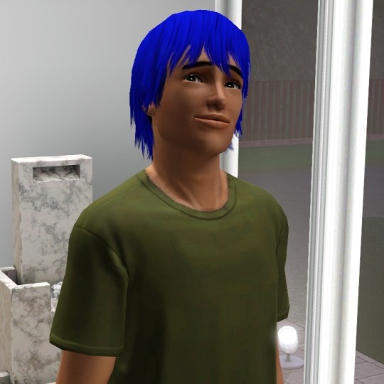

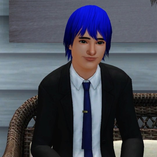
Sonic's bio/ramble is here !!! This is not a drill !!!
Kudos to my sister, who took up writing Sonic's bio and commentary. She majors in Sonic Psychology, it's only right for her to continue writing, expanding on, and doing the titular character justice (because I sure can't ripp </3).
Info under the cut, as usual x
Sonic is a 25 year old influencer. He's lived in Green Hill for the majority of his life but his job and adventurous lifestyle often leads him far from home. Sonic's reason for entering the show was purely childish: a challenge. So Sonic arrives with the intent of messing around and having fun.
Sonic is free-willed and easy-going. This makes him a fun guy to be around and that's why he thrives on the Island. Given the fact he likes to have freedom... he's never tied down and struggles with commitment when it comes to love. He never stays in one spot for too long, therefore he can never stick around one person for too long. Sonic also has no type. Unlike other characters in the series or people on Love Island, Sonic gravitates to whoever he feels is giving a good energy back to him or someone he can bounce off (although he is not above basing things off physical attraction in some situations). Saying that he didn't arrive with the intent of finding love on the Island, doesn't mean he isn't genuine.
Ultimately, Sonic makes it clear that he doesn't quite know what he wants...
External design choices !! (visual appearance - incl. formation of base sim, references taken, makeup choices, fashion style... etc.)
Sonic is one of the characters I'm still not happy with and never will be because of the way the game works and my unreasonable expectations for this man. Sonic has been reworked twice in an attempt to get him perfect. When taking inspiration from the game series, Sonic took heavy inspiration from modern Sonic (Mainly the 2010's Sonic opposed to the early 2000's models.)
Sonic is the most iconic character in the series and so I wanted to do him justice by blending features of his design with the idea of him looking relatively desirable. In the first design his features relied heavily on his defining 'Sonic' features such as his pointy nose, big eyes and blue hair. His nose (in my opinion) was exaggerated when looked at front on and this was purely because of his skin overlay. His skin overlay was custom content and was the same that we used for Amy except there was one issue, it didn't work for males as it changed the way his facial features looked. As it looked fine on Amy, I thought nothing of it for Sonic, until it finally grated on me enough to change it. This is where his second design was made and thought out.
In Sonic's redesign, I gave more thought into how he looked beside other similar characters such as Shadow and Silver. As Sonic was the first to be made in the game, I didn't have the other two boys to compare him to. Now that the other boys were there to refer to, I could make sure they looked slightly similar. I decided to make their noses and mouths appear similar while keeping key things like eyes, hair and face shape unique. Sonic's eyes were kept rounded and big much like his canon design and so I wanted the eye colour to be accurate too. Sonic's eye colour is a slightly darker shade of green than Amy's and that was carried over into Sonic's design. When it came to his skin tone we had to look very closely at his Frontiers model. In a picture we looked at, we could see a slight olive undertone rather than pink. After some debate about it, we incorporated the skin tone into his redesign.
I've come to terms that I'll never be able to get Sonic right in The Sims 3, but I do like Sonic's redesign better (not to mention how proud of his side profile I am. He looks so good from side on <33). He went from looking older than 25, untrustworthy and unattractive, to looking Younger than 25, frankly cute and closer to his 'fakers', Shadow and Silver.
[ Acknowledging both designs is crucial, as a ton of screenshots have Sonic's older design in them as opposed to his newer one. And we'd rather perish than retake screenies because we altered him. I like to think it's a good display of what the design process looks like :) - bee ]
Sonic's fashion is fashion. As an influencer, he would receive a lot of branded clothes from sponsors or for product review. (This headcanon was formed from the SOAP shoes he wears in SA2). While also he'd need to keep up with fashion trends to maintain a good image. On the island, Sonic wears casual things such as sneakers (occasionally his classic red but he switches it up a bit), t-shirts, bomber jackets, jeans, cargo pants or shorts, things tend to be baggy for comfortability. Sonic also has a gold ring that he wears on his left, middle finger. This idea was not only a reference to the games and how many rings he collects, but more specifically a game where he wears a ring, Sonic and the Secret Rings.
Internal design choices !! (personality, characteristics, psychology)
I am a strong believer that Sonic is more complex than most think. He's very good at masking anything negative he's going through with a smile. A good example of this is in Sonic Frontiers. I took a lot of inspiration from Frontiers because in my opinion it is the BEST Sonic characterisation. I also took inspiration from SA2, Sonic X and many other games or media to count (Sonic's a pretty consistent character when it comes to some aspects of his personality.) In this, Sonic is a good blend of childish and mature. He tends to show his childish nature when interacting with Knuckles and Shadow or when things take a negative turn, he tries to lighten the mood with a joke to change the topic. His maturity shows when he gets fed up with people being disingenuous or rude to him and/or his friends. He also doesn't hold grudges and tends to see things that others don't. But Sonic isn't perfect because of his spontaneous actions and changes.
Sonic tends to act strangely if he feels things are getting too deep. He'll surprise everyone with an unexpected action that he can't justify himself. He cares for the people he loves, even if he doesn't know why.
Sonic tries to give people second chances when it comes to friendships and consistently tries to befriend or bring happiness to the most stubborn of people. It may be because he struggles with social cues on occasion, so he doesn't quite know when to stop sometimes.
When hurt, he places up a protective wall to try and shield himself from vulnerability. This is where Sonic shuts himself off from other people by friend-zoning or going cold in some situations. He keeps people who cause him to be vulnerable at arms length and will keep them there. So long as he can help it, anyway.
[ Except we do NOT give him that kindness. Everyone faces their problems eventually. Sonic most of all >:)) - bee ]
Fun facts / trivia :
A lot of Sonic media is included in this AU, so Sonic has 3 siblings. Sonia, Manic (triplets) and "Classic" (younger brother). This is because we thought it would be fun to add Sonia and Manic from Sonic Underground. Sonia ends up playing a big part in his arc. Classic could have been left or represented as a young version of Sonic but in the Twitter Takeovers, Classic is said to be a separate entity from Modern Sonic. And Sonic having many siblings just fitted his personality. [ I think I saw something about Classic/Modern Sonic and the dealio with them and the funky timeline, but I've forgotten what that was now. I love the idea of Brother Sonic so much to care lmao. Give him all the siblings. I trust him not to burn the house down <3 - bee ]
Sonic has ADHD. [ Yeah :) I mean- is this even a hc anymore. It's basically canon in my eyes hehe - bee ]
Sonic loves to talk and brag about his travels around the globe. Especially since he's previously visited Spagonia (home to the Sonic Love Island villa) before arriving on the show. This boy has a story for everything, and we mean EVERYTHING.
#sonic love island au#sonic love island character bios#sonic the hedgehog#sonic#sth#the sims 3#character bio#character design#sonic au#sth au
8 notes
·
View notes
Text
Some QSMPers as Pokémon trainers.
(Pomme, Richarlyson, Ramón y Spreen)


For Pomme, I obviously had to give her Applin as a starter. Her Applin would definitely become an Appletun and not a Flapple, which is why I gave her more Appletun colors. Speaking of her outfit, like a lot of Pokémon characters, her outfit has a lot of bows and things on her that look like things on Applin or Appletun. Her neck bow is Applin’s eyes, the leaves on her head and her hair ties are the leaf things on Appletun, and her socks are the mouth like pattern on the lower half of Applin. Not to mention, the top of her apple beret has the light pink pattern shine like Applin. All of her colors but her dress and skin tone, and the French flag blue were picked from Applin/Appletun. I imagine she would be a grass type trainer because none of the eggs can be dragon type because they are all dragons. I used Iono as a pose reference because I wanted to get the style (obv no tracing just referenced it).
Richarlyson has Scorbunny obviously because he’s a soccer player! That was pretty much my thought process on it, I did find it hard to incorporate Scorbunny’s colors into his design though so I may go back and rework his design at a later date. Richas has a mooshroom hat usually, but I made his hat a miltank now because that is the most cow Pokémon and a mooshroom is a cow. No kidding, that was my thought process. I think he would also be a Sword & Shield trainer or gym leader and if he was a leader he would be a fire type trainer. Why did I decide fire type? Because Scorbunny is fire type, again, I am very straight forward. And that’s why I made the Brazil flag’s globe into a blue fire type symbol. I think certain parts of this design are good, I think I could definitely rework the colors a bit though.
Ramón was the first design I made and I think it’s the best thought out in terms of Pokémon choice, and it goes hand in hand with his father’s, Spreen’s, Pokémon, Pangoro. I gave Ramón Pancham as a starter. Pancham is a flat fighting type, which I think is perfect for Ramón, Ramón is a fighter and a little gung-ho and I think a baby-stage fighting type is perfect for him. None of the eggs will have evolved Pokémon, I think. I think that Fit would be a fighting type trainer and as I will talk about later, Spreen is a dark type trainer, so Pancham is particularly perfect for Ramón. Pancham is pure fighting but it becomes a dark type when it becomes Pangoro because it is corrupted. I think Ramón would refuse to evolve his Pancham and keep it a baby Pokémon forever because of his father, Spreen. Ramón would associate dark types with Spreen and therefore wouldn’t keep them as Pokémon. I also gave him a klefki because I thought it was cute and I would probably also give him a duskull if I had unlimited time to draw this. I used the youngster trainer from either Hoenn or Kalos…? I truly do not remember which game the blue hoodie youngster comes from, I think it’s ORAS.
Spreen is a dark type trainer and I think he would actually be a gym leader. I think that he would serve a similar role to Norman narratively for a Pokémon game while Ramón would be Brendan (Hoenn/ORAS). I think unlike Norman though, Spreen would be a lot more aggressive, but he would still have that “dad’s working he’s an absent father” rizz that Norman has. I also imagine that he gave Ramón a Pancham to be similar to him, but now Ramón resents him and refuses to evolve his Pokémon because of the dark type which Spreen is annoyed with.
#qsmp#quackity smp#qsmp design#qsmp eggs#qsmp fanart#qsmp ramon#qsmp ramón#qsmp rambles#qsmp richarlyson#qsmp pomme#qsmp spreen#q!ramón#q!ramon#q!pomme#q!richarlyson#q!spreen#qsmp pokemon au#kashmir-smoke art
40 notes
·
View notes
Note
Hi, so I'm an artist currently reworking a several years old story of mine, and I'm currently working on some of the characters. My old designs were, very bad, to say the least, so I'm pretty much starting from scratch for most of them.
Currently I'm kinda stuck on a specific character's hair. She has a pretty strong mythological aspect to her so I feel like locs could be a good choice, and she is relatively on-the-go. There is also a magic system involved and this character can shapeshift to some extent (that I haven't quite figured out the limits of).
I've drawn her with a few different styles both locs and otherwise, and I honestly like all of them so that didn't really help much ._. so I'd appreciate a second opinion. (I am willing to share the art if you want. I've seen some people share character descriptions, but idk how you feel about adding images to asks)
Feel free to submit so we can see them! I can't really offer an opinion without seeing the work.
7 notes
·
View notes
Text
After a good conversation with @margintext about game design, I am feeling the urge to go back and do something with some unfinished projects...
But I'm definitely having a bit of choice paralysis about what to approach first, so have a poll about what you'd be most interested in seeing out in the world.
*note: this is an existing published game, but I want to rework it as a ttrpg instead of a larp
13 notes
·
View notes
Note
out of curiosity, what made you decide to make this into a full fledged visual novel instead of just writing a fic? esp since afaik there hasn't been a demand/outcry for more bloodbound
(this ended up being rlly long, so I'm putting it under a cut. if you don't want to read all of that, the tl;dr is I've been working on an spec adaptation of Bloodbound since 2021, I've been making edits with Choices assets for a little over a year now, and I started messing around with ren'py during my stint in the now no longer active @nightboundthesecond project, and this spinoff is the culmination of all of those things bc I wanted to do something w them).
Anyways, here's the long version:
So...I kind of already did. Sort of.
In summer of 2021, I was going through a pretty bad depressive episode and ended up rereading Bloodbound (which got me back into the fandom as a whole, more on that in a sec). When the dust cleared, I began really heavily reconsidering what exactly I was doing with my life.
I'd been toying with the possibility of doing a film MFA of some kind, but I was worried I didn't have the skillset to get into any grad programs. So, I began teaching myself how to write screenplays by adapting Bloodbound into a spec TV series. From August 2021 to April 2022, I wrote twenty-eight episodes, with three rounds of revisions, which really strengthened my abilities as a writer. I'm currently at a T10 film school getting an MFA. I wouldn't be where I am without doing that. Part of my love for Bloodbound stems from the fact that it quite literally changed my life.
The very nature of turning a book into a screenplay/teleplay is that you have to restructure a lot of plot points so they fit in better with the new medium. With a TV adaptation, you also usually have to build onto the source material. For Bloodbound, that meant fleshing things out and creating new characters to move the plot forward. It also meant exploring things that either happened offscreen or were only brief scenes.
And so when it came time to write episodes for the book 2 adaptation, the huge aspect of that was going into New York City and seeing what Gaius was doing during his hostile takeover. And since I had very little to work with from the source material, I had to come up with a lot of stuff off the cuff. And as I put those storylines together, I was like there's actually some pretty interesting stuff here. This visual novel is based off of that stuff.
@clansayeed and his fantastic reimaginings of Bloodbound and Nightbound had been on my radar for a while at this point, but I wasn't aware of the fake caps he made until I actually checked out his tumblr account. I thought they were really fucking cool. As a little private celebration for finishing the third round of edits for season 1 (and to let myself take a break), I decided to teach myself how to make fakecaps and recreate a few scenes from my adaptation in the Choices format:

I found out that I really enjoyed reworking assets into new outfits and character designs--lowkey, putting on a podcast or a video essay, opening up pixlr, and just making stuff became one of my go-to ways to unwind in the midst of mfa apps and life in general--, so I started making more fandom service stuff for fun and posting them on Reddit. I made a variety of stuff: role reversal AU edits, general dress up stuff, and of course... "on the set of [choices book]: the tv show" fake caps.
I feel like you're not really supposed to say this, but it was kind of validating to me that a lot of those posts did like. Decent numbers. And that kind of motivated me to get better at doing it, especially in the beginning.
And then...It Lives Within dropped. And I think that shifted a lot of how people--myself included--considered what they could do within a fandom space like Choices. Like, if we could make our own shit, why not? I was really intrigued by the idea, and so when there were calls for writers and sprite artists for a Nightbound project, I jumped at the opportunity.
(As a side note, I think the fact that now there are people within the fandom making their own sequels/spinoffs/whatever is gonna be rlly interesting for the general ecosystem of the Choices fandom and its future, but that's a convo for another time lol)
While the team I was on is no longer working on a sequel, being part of that group did a lot for me, and I look back on being part of that really fondly. I think we all were kind of picking up whatever we needed to do, regardless of if it was what we signed on for. For me, that meant teaching myself how to use Ren'py. The thing was, this was still in the really early stages of development, which meant I didn't have a lot of story to play with. So...
I was kind of like. Fuck it. Let me try my own thing out.
The original idea was actually a prequel set in the 1910s, as I'd done an MC set and an LI set based on that very premise, but the problem was that there are so few assets from that time period, and asset creation has never been my strong suit. But then, I thought back to the adaptation I'd been working on.
Some of the strongest writing I think I've ever done was in the episodes where the primary storylines were following Gaius's takeover of New York. I think a lot of the themes of the second book came out in those moments. And as cool as it would be, as much as I've fantasized about it, I don't think Bloodbound: The TV Show is ever happening. So it made sense for me to rework that into a visual novel spinoff.
In terms of the actual framing of this story, I spent a lot of time in the Bloodbound tags in the early days of working on my adaptation. I was deep in those tags. And it's really interesting to see what people expected it to be before its release. Part of it was the assumption of a Clan sorting system. Obviously, that wasn't actually the case.
Additionally, I think a lot of people were frustrated by the fact that Bloodbound's MC isn't really given the option to just. Be bad. Which then makes moments like this super jarring:

So, I decided to put everything I'd learned together. I was working on the GUI/character creation features for Nightbound (side note, the GUI in this game isn't an absolutely perfect replication of the Choices GUI yet and won't be for the demo, but we're getting there), I had a ton of edits I'd made that I wasn't using for anything, and I had a story that I knew could be reworked into an arc about a new vampire in New York City during Gaius's coup.
But with this project in general, it's less about a demand for a sequel/midquel/spinoff within the fandom and more like. I noticed that there were some things people wanted out of Bloodbound and didn't get, and trying to give it to them, because I wanted those things too, and I felt like I had the means to create that. When I've talked to IRL friends about this project (non of whom play Choices), I've just been like "yeah it's a visual novel fanfic" because...it's a visual novel fanfic.
So. That's why.
(This was super long (and felt a little self centered, sorry!), but if you read all of that, I hope it all made sense. All of this is to say that this has been a labor of love for a book series I've been living with for a year and a half, and I want to get part of what I've done with it out of my head. I hope you all like it.)
#bloodbound#bloodbound the siege#anon#ask#sorry this was so fucking long but i rarely get to talk about this stuff lol
25 notes
·
View notes
Text
So I have over 1,000 hours in Civ V for... reasons...
(I'm trying to get through victories for all of the leaders ok? And I play on Standard pace, and it takes a couple of hours per leader, and there's like 50 leaders, ok???)
anyway
I usually aim for just having the most points or getting a Science victory because those are easiest for me. And at the end of the Science victory, for years, I've seen the "Go Beyond Earth" button, and knew it linked to a download of Civ: Beyond Earth.
Well, the other day, I finally decided to download it because it was on sale for like $6, so why not?
And... I really like it. It's very similar to Civ V in a lot of ways, which I like. The tech tree is... bad, from a design perspective, but I get why they did it that way. Thankfully, they have ways to filter the monster spiderweb they turned the tech tree into so it's actually pretty easy to work your way towards the different victory types.
For my first playthrough, I was on standard difficulty and found it impossible to keep Health up (this game's equivalent of Happiness) and then Hutama attacked me and that was that. Second playthrough I went on Easy and found it much better, I wasn't struggling to keep Health up and could actually enjoy the game. Hutama was still a dick, but other civs were my friend and I was making a boatload of energy (gold) so I was able to kick Hutama's ass when he inevitably attacked me. He's like the equivalent of Napoleon or Bismark or Alexander: if you start off next to him, he's gonna attack you at some point.
SO: a lot of the game is identical. You construct units and buildings that have familiar purposes. You do research, you develop both science and culture trees. You trade, and try not to get killed by other players.
Where the differences lay I find a lot of interest.
First, setup is a bit slower than for Civ V. After picking difficulty/map size etc, you have to pick a Sponsor - the equivalent of leaders. They of course come with different abilities to take into account. Then you have to pick a Colonist type, Spacecraft type, and Cargo. These can give you some major advantages, and add variety to startup. Finally, you pick Planet Type, which is equivalent to continent type.
Instead of Ideologies, you have Affinities, and they're really interesting. The three Affinities are Supremacy (technologically advance humans), Purity (solve humanity's problems while remaining human), and Harmony (genetically modify humans to synergize with the alien planet). These synthesize with the Victory types: Domination, Contact, Transcendence, Promised Land, Emancipation, and End of Time.
I took the Harmony/Transcendence path in my first successful playthrough, because I'm a big ol' hippy and becoming one with the new planet and its ecosystem just seemed like the right thing to do.
The Contact victory entails making contact with a superior alien race. Promised Land is a Purity victory that involves bringing more humans from Earth to settle. Emancipation involves returning to Earth and helping those humans achieve Supremacy. End of Time is what happens if you get to turn 500 and no one has won, much like getting to 2050 in Civ V. Points are tallied, and the player with the most points wins.
But that's not where the differences end!! The spying is reworked, and you can assign them actual tasks. I am not good at it.
But a BIG difference is that you get quests and throughout the game you have to make choices about what to do, which was really engaging and added even more variety to the game for me.
Oh, and there's the BUG problem, too. The planet you land on isn't lifeless, and there are lots of local life forms that really want to eat you. Whether you kill them or not actually has an affect on gameplay and how the other leaders feel about you.
3 notes
·
View notes
Text
My thoughts on the Fresh Season 2023 update!
Hey all, this is a different kind of post, where I'll be going over every new addition to the game, serving as an update post and my thoughts on the new content!
So lets just jump right into it!
Splatoon Fresh Season 2023: 3.0.0
Inkopolis DLC:
This update introduced the first wave of paid DLC! DLC owners can now travel to Inkopolis, essentially serving as a new hub world skin. (note the wording used, "Travel to this city?" perhaps more hub worlds are coming?)
Inkopolis is functionally identical to Splatsville, which is disappointing but understandable. There's no Squid Jump, the former arcade machine is now a terminal to order items from Hotlantis, and all shop owners share the same stock as the Splatsville shops. Some people hate these choices, but they make sense as parity decisions between the 2 hub worlds. What I am disappointed about is the Grizzco and pvp lobbies being identical to Splatsville's. Even the graffiti is identical!
The new and returning characters and settings have phenomenal designs, as expected for the series, and I appreciate the compact and sleek hub design as opposed to how spread out and chaotic Splatsville is. I will forever cherish Shelly & Donny's designs and mannerisms (Donny calls the lobby the WOBBY!) and Fred Crumbs is a new favourite character of mine.
Overall, Wave 1 of the DLC is great, it's essentially an entrée. You don't pay for reservations at a restaurant to eat breadsticks, but its important to serve them to keep us busy while the real meat and potatoes of the DLC, Side Order, is in production.
The Catalog:
As per usual, a new Catalog is coming. There really aren't critiques to be said. Flipping through it, all the new clothing, decorations, stickers, splashtag title parts, banners and emotes look wonderful.
Thanks to datamining, I've already seen all the new emotes. Every season the emotes get more and more expressive! Rootin' Tootin' is going to be permanently equipped as soon as I hit level 73. Again, there is 1 disappointment for me. The Reppin' Inkopolis emote (which is completely free, you don't need the DLC for, which I appreciate incredibly) doesn't have new Splatoon 1 style animations for the 6 weapon classes introduced since then. (Dualies, Brellas, Stringers and Splatanas; including Brushes and Blasters which were distinguished from Rollers and Shooters respectively in Splatoon 3) The emote is a nostalgia trip for me but having it play the default win animation for new weapon classes is really disappointing.
Related to the catalog, we have a new gear brand, Z+F. It's a collaboration between Zekko and Firefin and the name is a real mouthful. I don't like it at all. There were so many good ideas for mashups of Zekko and Firefin; Zekkofin, Finko, Z-Fire and so on! Z+F isn't a bad name per say, but it is disappointing to be included among all the other amazing brand names.
There are 2 more incredibly welcome changes to the catalog system though! From now on, in mystery boxes and shell-out capsules, you have a small chance of receiving catalog exclusive items. Previously, if you didn't get a catalog exclusive item during the season it introduced, it would never appear in your shops, and the exclusive emotes, banners and title parts were gone forever. Now you still have a chance, which is really great!
Finally, in the last week of every season, you'll get a 1.2x closeout bonus for catalog points, helping you finish out your catalog before the new season starts. These are 2 amazing changes to help players with less time on their hands to get their hands on content without making players who earned it the old way feel cheapened.
New Stages:
Um'ami Ruins and Manta Maria have been added to the game! As of now I can't speak on them, as they aren't playable, but from datamined screenshots they seem to follow the unfortunate Splatoon 3 trend of reworking older maps to be cramped and creating 1 dimensional new maps.
New Special Weapons:
2 new special weapons have been released!
The Kraken Royale is a transformation, turning you into a Kraken for 8 seconds. (up to 10 with special power up) You can squid roll and surge during it, and colliding with an enemy deals 60 damage, while a charged attack deals 100 piercing damage.
This weapon is a complete counter to Crab Tank, it oneshots the Crab Tank user with a single charge attack. Other than that, I'm a bit concerned about the invincibility of the special weapon, despite the start and end vulnerability, invincibility was a problematic part of Splatoon 1 and 2's special design.
It also steps on Ultra Stamp and Reefsliders toes a little too much for my liking. These other 2 specials are simply outclassed by Kraken! In addition to being buggy and under-tuned, Krakens invincibility and mobility outclasses them both on a mechanical level, which is a shame.
A new special weapon, the Super Chump, was introduced. Horrible name aside, this weapon allows you to pick a spot on the map to deploy a barrage of bombs! Once you pick a location, a dozen Super Chumps create fake super jump landings and stick to the ground, exploding 4 seconds later. Enemies won't die to a single Super Chump, as they only deal 30-60 damage on their lonesome, but they are excellent displacement tools.
Similar to Kraken Royale, this weapon steps on a lot of toes. It is essentially another variation of "random bullshit go!" where you pick a spot to throw a bomb(s) to force enemies to move. It didn't need to be this similar to Booyah Bomb, Triple Inkstrike AND Tenta Missiles! In fact it is essentially a replacement for Tenta Missiles, seeing that the 2 weapons that have it also have identical sub weapons to their Splatoon 2 kits, without the Missiles!
There really was an obvious way to make Super Chump unique. The super jump landings are an interesting idea, but they're very useless. They don't function any differently to other special indicators, as no one will believe 12 super jumps at once all in their own ink. Rather, Super Chump could have been a unique engagement special, where you are also shot forwards alongside the Super Chumps, forcing the enemy to either run and and concede the space to you, or try to guess which super jump landing is the real one and try to splat you.
Overall, these specials are cool and well designed, but their similarities to existing specials puts a sour taste in my mouth.
New Main Weapons:
Of course we can't have new specials without new main weapons.
Here they are:
Neo Sploosh-o-matic: Squid Beakon/ Killer Wail 5.1
Neo Splash-o-matic: Suction Bomb/ Triple Inkstrike
N-ZAP '89: Autobomb/ Super Chump
.96 Gal Deco: Splash Wall/ Kraken Royale
Custom Jet Squelcher: Toxic Mist/ Ink Storm
L-3 Nozzlenose D: Burst Bomb/ Ultra Stamp
Rapid Blaster Deco: Torpedo/ Inkjet
Clash Blaster Neo: Curling Bomb/ Super Chump
Krak-On Splat Roller: Squid Beakon/Kraken Royale
Z+F Splat Charger/ Splatterscope: Splash Wall/ Triple Inkstrike
Tri-Slosher Nouveau: Fizzy Bomb/ Tacticooler
Now all of these kits are phenomenal. Ignoring the viability of certain subs and specials, all of these kits work and look fun. In the last season we got a couple of stinkers like Snipewriter 5H with Sprinkler/ Tacticooler. This time every kit makes sense. There's a valid playstyle and a weapon for everyone here which I really respect. In a perfect world where all of these main, sub and special weapons are balanced well, all of these kits would have their time in the spotlight.
My only issue is the obvious preferences the Splatoon Devs have for kits. Only FOUR shooters are yet to get a second kit, while Brellas, Stringers and Splatanas remain completely unrepresented. Every other class has only 1 or 2 secondary kits! This is a shame because Splatoon promotes inclusivity and that needs to be apparent in the game and its updates. The new kits need to give something new to play with for every type of player, and they simply aren't.
Online Functions:
Pools have been added! They're essentially the same as Mario Kart 8 lobbies, or arenas in Super Smash Bros. Ultimate. You can create a pool, choose whether its open or password protected, and people can join and play! This is amazing. It allows for so much versatility in playing with friends, playing with chatters on stream, new people on discord or with people in tournaments and LAN meetups! Really, a phenomenal addition.
Tableturf Battle can now be played online! You can even spectate regular battles, not just in private lobbies. This also comes with 23 new cards! This is a welcome addition, and I understand why it wasn't packaged in the base game, but I'm happy it's here either way.
Salmon Run:
A new King Salmonid has been added! Horrorboros, the flying serpent, charges and shoots Booyah Bombs at workers. A new Big Run event is also happening right away which is really promising for the future of events in Splatoon.
New Scale rewards have been added! Splatoon 2 Grizzco gear has been added in a new tab of the Scale Shop, and Splatoon 2's "Gloopsuits" have been added, as a counterpart to the Slopsuits, if you'd like a different work look. All good additions!
In addition, Eggstra Work has been added, making use of the Salmon Run scenario feature. In this 2 day event, you must assemble a team with your friends and run through 5 preset waves to get as many eggs as possible, getting rewards for what percentile of eggs you collected in 1 shift. This is also a welcome addition, more modes are always great, but it's a bit troublesome.
First of all, it steps on Big Runs toes. The addition of Big Run already lowered how many Splatfests we get, and now theres a 3rd weekend event! They could of course have every event happen 2-3 times a season, but I'm concerned about the Devs tuning down the amount of events every month.
Secondly, it doesn't feel like a weekend event in the same way Big Run and Splatfests are. There are elements of surprise in the former 2 events, but in Eggstra Work, once you've played it once, you've played it a million times. Unlike Big Run there is a maximum amount of eggs you can get. It will get boring over the course of 2 days, and you need friends to play it, it can't be played in freelance.
I really wish they didn't make Eggstra Work a limited event. It would've been great as a permanent game mode that rotates monthly! A sort of counterpart to freelance the same way that League Battles were a counterpart to X Battles. at the turn of every month a new map, weapons and scenarios are selected for the Eggstra Work shift, and teams of 4 compete for top leaderboard spots throughout the month.
People tend to grind out weekend events, and I feel that Eggstra Works repetitiveness will lead to burnout if it gets condensed to a 2 day period.
Balance Changes:
I am disappointed with the Devs fear of making big changes to Splatoon 3's meta. They only changed 1 main weapon, the Big Swig, this patch. They didn't directly nerf Crab Tank, only giving Inkjet, Trizooka and Ultra Stamp damage multipliers against the Crab Tank's armor. They buffed underused weapons by decreasing their special gauge by 10p, which really doesn't fix their problems, as for weapons like Ballpoint Splatling, Aerospray MG and N-ZAP '85, their problems aren't that their specials are too hard to get, its that their specials aren't particularly good when you get them.
Finally, they changed maps, which is promising. I don't mind small changes to maps, despite my feelings about the above small balance changes. I appreciate them understanding that they went wrong with their maps and small changes are a gateway to big changes, but as of now, the small changes they've added feel like bandaid solutions to an underlying problem with the map design.
The Jukebox:
Every song in Splatoon 3 has been given a name! The Jukebox is a great addition to Splatoon, allowing you to pick what songs play in the lobby. Again, I have a small gripe. It is annoying that you have to pay every time you want to use the Jukebox, when in Splatoon 2 you could listen to every song for free.
Badges:
There are a whole slew of new Badges and I really appreciate the direction they're going in.
Of course there are new badges for the special weapons, Horrorboros, Eggstra Work and Z+F. They also added badges for the Inkopolis shop keepers, adding another incentive to swap between hub worlds, which I really like!
Finally, they added Level and X rank badges. There are 12 Level badges, for reaching level 30/50/100/200/300/400/500/600/700/800/900/999, and X rank badges for reaching top 3000/500/10 on the leaderboards. This expands on the direction I like, but also highlights a glaring flaw.
It's impossible to 100% Splatoon 3's badge system, it's meant to a system to let you show off the way you play Splatoon! But I don't really like the design of the badges themselves.
In the case of most badges, the colors have inherent symbolism. Bronze means 3rd place, Silver means 2nd place and Gold means 1st. Once you get a gold badge variant, the rest are inferior. If you use the bronze or silver badges, its implying to other players that you aren't the best at this milestone you're showing off. Even if you dedicate all your time to Salmon Run, if you don't put thousands of hours in, your badges will always look worse than what you could have. This is especially in the Level badges, the level 999 badge is stunning, and other impressive milestone badges, like the level 100 badge, looks horrible. You have players putting in so much time and effort for badges that are a downgrade to others.
Even if you do put in a lot of time into the game, unless you specialise in a specific game mode, your badges won't look good. I have over 1k hours in Splatoon 3, but my playstyle's given me 90+ mediocre badges and 1 or 2 impressive badges. I have the 5 star Hydra Splatling badges, acquired 300 hours in, and fifteen 4 star weapon badges, a couple silver Salmon Run and Special weapon badges and so on. I put a lot of time into this game but I have nothing cool to show off, my current badge layout on my Splashtag doesn't have an identity to it, it looks just like a Splashtag someone with a couple hundred hours in Splatoon 3. It doesn't speak to my achievements, my playstyle, it conveys that my milestones aren't the peak, that my Silver Booyah Bomb badge isn't impressive because there are people with Gold Booyah Bomb badges.
1 thing I'd do to remedy this is make badges for getting badges. This would help players who don't specialise in anything and instead are good at everything. I don't know what this badge would look like, but badges for getting 10, 30 or 100 badges would be cool.
I'd also like Sheldon badges! You get badges for getting stars on your gear, why not badges of Sheldon for getting stars on weapons. I've counted, I have over 200 combined stars on my weapons, and nothing to show for it.
Finally, I'd like every badge to be more unique, and not just be recolored variations of eachother. What if the Gold Maws badge wasn't gold, and instead it was stylised art of Maws lunging at the screen. What if the N-ZAP '85's 5 star badge was pixelated. What if the Hydra Splatling's 5 star badge was on fire. What I'm saying is, instead of making the tiers of badges just recolors of the lower tiers, they should look visually different, to make them stand out more and give lower tiered badges purpose for existing and remove the negative connotations with their coloring.
Minor Changes:
There are quite a few small additions in this update! of course there's new gear. But there's a lot more coming!
Lockers can now be wiped clean with the - (minus) button if you want to start over. The amount of items on display in shops has been increased to 9 from 6. You can preview Scale reward items at Grizzco, similar to Hotlantis! Color Lock was adjusted during Tricolor Battles to accommodate for colorblind players. Winners of 10, 100 and 333x battles will be broadcast to your friends and on the Anarchy Splatcast!
Connection Errors are now dealt with player-side. Instead of the match grinding to a halt, laggy players will be notified and have their controls removed if the lag persists. Terrific!
Closing Thoughts:
Overall, despite my complaints, I really like this update. The team over at Splatoon is doing a good job and I'm excited. With these changes they're heading in the right direction and we can only hope they keep on this trend with bigger and better changes. I'll see you all on the battlefield! Stay fresh!
14 notes
·
View notes
Text
"The Year of the Linux Desktop"
Every time someone from work mentions that to me, I feel like rolling my eyes.
Custom rigs should be custom. As in, the hardware, aesthetics, intended purpose and driving operating system - all of them should be in the user's hands. What a lot of diehards don't want to consider is that Windows is still one of those choices.
And the fact is, it still is. It still will be for decades to come.
I've been distro-hopping between Pop!OS, Linux Mint and Debian on my laptop. They all have their perks, they all have their respective drawbacks - no Wayland compositors for Mint, for instance, which hobbles any NVIDIA build by default. I keep hearing diehards mention that everything can be done on Linux, all the while typically failing to mention that oftentimes, the choice gets made not by the user, but by company policies, personal requirements, or simply aging hardware that's never so much as seen an open-source driver before. There's still plenty of cases where basic user operability requires Windows by default, and no amount of FOSS Bible-thumping will ever change that. By and large, the people I work with require complete office or graphics suites, not the valiant efforts of volunteer teams steadfastly climbing the Sisyphean ramp of Windows software parity.
And, well, like it or not, sometimes, you just wanna play that stupid fucking game of which the Easy Anti-Cheat implementation wasn't designed with Linux compatibility in mind. Because it's your library, your games, your own damn personal time.
"Well, then, play compatible games or games the Proton layer supports!" spout some of the diehards.
Fair enough; but what if I really want is to rejoin my cousin after hours to dick around in a cannabis-infused Destiny 2 raid? Am I really going to die on the hill of Open-Source software if I've got the rig, the game and the potential to play it?
Copilot is being reworked to include security restrictions following last week's immense backlash. So is Windows Recall - which you always could turn off entirely. Moreover, if Copilot's very existence offends you, just use a Debloater tool and excise it from your system. It'll come back after updates, but you'll always have the choice to remove it manually.
Yes, Windows 11 is bloated. Yes, Microsoft overreaches and overextends its grasp. No, these things are not as catastrophic as they seem, because any patient user with five minutes to spare can slim down a brand-new Windows install. If your only lasting argument is that your Linux distro doesn't require you to do so, then it's a question of personal choices, not moral value or definite requirement.
Linux won't ever be mainstream. It's too fiddly, too undefined, too fragmented between extremely specific distros and entire software forks that emerge more as base discontent than as an actual software-based value-added propositions. Cheers if you need NixOS, for instance, but do you really think Joe Average who has an aging rig he uses to file his taxes is going to bother learning the intricacies of one Package Manager over another?
Nerds like myself are a diverse bunch, and there's as many distros as there are types of nerds. That kind of fragmentation does not a market make.
I love Linux as much as any other Sysadmin, but I wouldn't put a distro on my personal rig without at least some form of dual-boot option to Windows. The last thing I want is to cross out games or services, to limit my choices for the sake of ideological purity.
1 note
·
View note
Note
Oh boy, what do you think of the Silent Hill 2 remake trailer? I can’t speak for the other announced stuff cause I’m pretty basic when it comes to my appreciation for the series, but I do not care for the style change. There’s nothing wrong with the original’s graphics, and those FMVs in particular are still phenomenal! Do we really need to see every single strand of James Sunderland’s five-o-clock shadow?
I know the original source code was lost, and I know a game as old as SH2 should be played on modern hardware, but if Bloober are gonna remake it from the ground-up, I just don’t see a reason to make the new graphics so overly-polished, the devs of the original made the choices they did for a reason, it’s just detailed enough where each character has incredibly subtle details like Eddie’s dilated pupil’s and Maria’s slight stomach flab, but it leaves just enough room for your imagination to fill in the blanks.
I worry with these new graphics, it’s gonna be like those instances where some horror movies get so overly-remastered that you can see the imperfections that the film grain could hide. At the very least, why not recreate the FMVs to apply to the entire game? I think that could actually be interesting… so long as more of Team Silent were involved. I don’t know much about Bloober and haven’t played any of their games, but I hear they tend to have some major problems with their writing and horror.
We recently discussed Pathologic 2 as a great example of expanding on the original in a different way, but at least the original was a compromised vision so it makes more sense for a game like Pathologic Classic to be remade from the ground-up.
Am I coming off as too nitpicky with just this single trailer to go off of?
If anything you are being too tactful in describing the situation.
The current popularity of video game remakes is symptomatic of a creative crisis at the heart of the industry, as well of the average consumer's expectations from technology. Players have allowed themselves to be persuaded by the unfinished thought that the best path to revisit the classic games they grew up playing is to have them reworked to look modern and pristine; paying little or no mind to the fact that their perception of the original game experience will irreparably be altered in the process. Certain studios, on the other hand, feel much more at ease with the prospect of developing a new version of a beloved game whose known popularity gives them a risk-reducing safety net, while also bypassing the strenuous work of developing an original concept.
Just a few days ago in another comment exchange here, I repudiated the Bluepoint remake of Shadow of the Colossus, for me the foremost example of the perils this practice entails. To that, I would add that other atrocity that was the also recent Panzer Dragoon remake. I feel downright terrified by how the majority of players considers this to be entirely harmless.
Silent Hill 2 is a game from its time and for its time. I remember that the slight resolution upgrade seen in the XBOX edition already exposed the fragile seams that stitched it together. The aesthetics were designed with a CRT TV equipment in mind. As you say, this specific visual style doesn't lend itself too well to modern displays. Adding sheen to its dull textures compromises its entire visual identity. Increasing the detail of character models poses impossible interpretative challenges, leading to the result we saw in today’s presentation, where there is nothing left of James' original facial features to be recognized in the remake. Paradoxically, we’re expected to summon the memories of something exceptional and familiar, use them to fill the credibility gaps of some high definition ersatz that will, in its turn, consume them and replace them by lesser ones.
There was already enough information available to establish that Bloober was developing a Silent Hill project, namely the fact that a partnership deal was announced last year right about at the same time Tencent became a major shareholder for this studio. Their games are, for the most part, unconvincing. I played Observer and while it was fine as an independent project, it was clearly not a congruent experience. They also face-lifted it but a few years after the first edition, which I found suspicious, even though it’s their IP to do with as they please. The Medium isn't a complete failure, although it shows a poor lack of understanding of what constitutes horror in a video game experience. I never even touched Layers of Fear games because nothing about it seemed to deserve any attention. Although they are an already established studio, this will be their biggest project yet, with a potential target audience much wider than any of their previous titles. Nothing should distract us, however, from the fact that these are mere tradesmen foolishly attempting to recreate a work of art.
I will say that Townfall, by No Code, has the smallest margin by which it may succeed in taking the base themes of Silent Hill and working them from an angle that fits the studio's own artistic direction, freed from the pressure of making the game look identical to its prequels. Their other games, Observation and Untold Stories, are sufficiently unique and inventive for me to preserve moderate expectations that they may actually be in the process of creating the first dignified sequel since the release of 'The Room'.
12 notes
·
View notes
Text
MIYA POSTING
IT WOULDN’T LET ME TYPE ENOUGH TO REALLY SAY ANYTHING I WANTED TO IN THE FUCKIN. COMMENTS?? so i am just gonna make a post and tag mr. @yymiya who asked. So. INFO ON MY OCS!! specifically Miya because she is my baby and i’ve been drawing her for a year now

so these two are Miya (left) and river (right). Their pronouns are she/purr and they/he respectively. i made Miya last year in english because i was bored and remembered a conversation i had with a friend (who wears hijab)(i do not) which was basically just how would a catgirl wear a hijab? they would obviously just wrap their ears because it seems like kind of a hassle to cut out ear holes in every scarf you own and most hijabis cover their ears anyway, but if they had a tail would they wrap it? if catgirls were common enough would there be specially made clothes for them so they could cover their tail in a sleeve or something? we decided that its up to the person (like most things) but it’s probably not that common.. Anyway Miya doesn’t even have a tail in the main universe HAHA but it was an important question to answer i felt
i made River much later, in about april of this year? i thought Miya needed a skater boy friend (not boyfriend, as she is a lesbian🫶) so i made them also during class. to be honest i don’t have much of a story for either of them but they were really fun to draw messing around on my papers, i’m sure my teachers were sick of them lmao
if i were to make them into a comic of some sorts, i’d probably make their stories short and funny, while exploring themes of youth and growing up and finding your place in society as a minority/someone seen as ‘weird’. as an autistic queer poc, i didn’t really get much representation growing up, and i think seeing someone who acts and looks like me, who leads a life similarly to me, could have saved me from a lot of self-hatred when I was younger and didn’t know why I was different. a huge reason i still make art to this day is to help people who feel and look like me feel a bit better in their identities, because i know the representation i have seen, even if its few and far between, has touched me in ways i can’t even begin to explain. it means so much more than you’d think.
Anyway. the fantasy au kinda just came about one day when i was in a mood and felt like making fantasy character designs and stuff. i don’t have much of a storyline for this one either but i have a very vague idea on what it’s gonna be about, and i’m gonna develop the story as it is gonna be a big part of my Inquiry Question for Ap art this year👍👍👍
SO. these are their original fantasy au designs. i was actually pretty happy with miya’s first design, but for overall silhouette and posing issues i had to change her skirt, but i thought it looked stupid so i thought i should just rework her clothes altogether.
i’m gonna keep showing people this sheet because i am ridiculously proud of it. anyway. Even when i first started drawing Miya, way before i even thought of the fantasy Au, I had some specific design choices mind. I always wanted her to have catlike eyes, so i tried to imitate the shape of them while keeping them pretty human looking. the silhouette of her hijab is kinda exaggerated and not very realistic just so i could properly communicate the fact that she is supposed to be a cat.
in her original design, she’s supposed to be much closer to a human, with the only distinguishable traits to set her apart being her ears, her eyes, and maybe her hands. i wanted to put most of the “cat-coding” in things like the hoodie she wears, which has a tail, or the fact she paints paws onto her converse, or gives her self a dan-and-phil-style nose and whiskers (AHAHAKAHDHFKBS NOT A WORD). i also wanted her to be younger, about 15-16 in the modern universe, but that’s a difference I only made relatively recently, which you can see in the two pictures above.
with the fantasy AU, i wanted her to be honestly closer to an anthro than human. I didn’t want her to BE a furry, necessarily (no hate to furries, i am the number one furry enthusiast), but i wanted her to have much more animal-like traits. She’s very inspired by Tabaxies but i didn’t want the fantasy au to be in the 5e universe because i have several problems with racist stereotypes in DND.. anyway, miya is almost completely covered in a light layer of fur, has paw pads on her feet, almost has a muzzle, has a cat shaped nose, ears, a tail, and retractable claws. the only things keeping her from being a furry, at least in my mind, is that she has human hair and isn’t digigrade, and has much more human-like proportions, like the ratio of ear to head, head to body, torso to leg and so on.
i’ve put a lot of work and love into her design! while i can’t say everything has a concrete reason, almost every detail on her is intentional, one way or another. like, how she doesn’t have paw pads on her hands but does on her feet because she’s bipedal, and cats have paw pads to muffle the sound of their footsteps when stalking, for prey or otherwise. she also doesn’t need shoes because of her paw pads, but if it gets a little cold she might wrap something around her feet. shoes are very uncomfortable for her. (can you tell i’ve been dying to tell someone about that in particular i think its so clever)
other little details are, i made her headpiece mostly to bring more gold up by her face. it helps balance out the colors i think. the green in her eyes is inspired by my cat! and i don’t think cats can have brown eyes, but it was mostly bc i didn’t want to just give her green eyes (bc brown ppl with light eyes kinda freak me out cough cougb my sister cougb cough). the circles with smaller dots around them on her sampin songket are suppose to vaugely look like paws. i was gonna actually make them paws but that felt a bit on the nose.
i think thats all i have to say for now… i will talk more abt river when i finish their character page. there’s nothing really wrong with their current design, other than the fact that it’s kinda really boring, so i’m working on adding more character and interest! here’s the sketches i did in my sketchbook, i’m currently working on tracing n coloring them digitally
here they are!! also i said earlier that in the modern au miya is supposed to be younger but i never said how old she’s supposed to be in the fantasy au and i cant find a smooth transition to talk about that so i will say that here. She’s supposed to be like 18-19 in the fantasy au, i just think it would make more sense for what they’re supposed to be doing throughout the story (exploration, fighting, potential mortal danger, i think its a bit much for high schoolers is all). river is slightly younger but still around the same age as miya, so same thing for him too. they look really young in the sketches above bc my art style was doing something funky that day lmao
that is all!! finally!! for now at least. (if u saw me post this way earlier than i meant to No You Didn’t.)
10 notes
·
View notes
Text

This week's reading focused on grids. grids are important and can help a design look more balanced, put together and more eye-catching. This week's reading provided many examples where a grid was used for a design, from posters , books,magazines and websites. Every single web page and cover uses some kind of grid for its design to provide a guideline for the title and text. I never thought there would be many different types of grids.
Right now on our current project I have all my squares done. I want to go back and rework quite a few of them though, like the high contrast, the low contrast , and the texture. At this point of the project I'm just mad at recutting these squares to get them perfect. Most of my squares were off and I have redone some of them already. I also had issues with the texture square, at first I just did a crumpled brown bag and cut my shape from there and that felt like it took forever. It was so flimsy. Now my new plan for the texture square is this shiny leather like paper I found at the hobby lobby. I have now cut into it yet but I hope it goes smoothly for me. Also I am thinking of changing the colors for my low contrast and high contrast. After the walk around in class, I realized other students had meanings to their color choices. I just chose my colors because I thought they were “low contrast”/ “high contrast”. Other students took inspo from their person's outfits , therefore I want to do some more research into Lady Gaga's outfits for my colors. I am really excited to finish this project.
0 notes
Last Seen Blogs

hembrowtammyz
Untitled
shyluminarycat
Untitled

theverum
Verum

stargleekhead
Random Musings of a Geek

seiichirou
f0.7