#and horizontal animation are 3 frames long
Explore tagged Tumblr posts
Visit Tumblr Blog
Explore Tumblr blogs with no restrictions, modern design and the best experience.
Last Seen Tumblr Blogs


Fun Fact
Post activity is at the highest at 4:00 pm EDT; notes peak at 10:00 pm EDT.
Text
Me: oh god this feature is gonna be super wonky to impliment. This code is about to look like shit.
Me 5 minutes later:

#I feel pretty clever for this#basically vertical animations are 2 frames long#and horizontal animation are 3 frames long#and I needed a way to differentiate the two#after this I just need to work out the portion of the animation sheet to draw which wont be hard at all#codeblr#programming#gamedev#indiedev#original post
12 notes
·
View notes
Note
Can you bestow some of your knowledge on me and teach us how to draw in the peppa pig artstyle? I'm planning on animating some fake clips of the show to put my oc in so pleeeaseeee help
(Also I'm absolutely ecstatic that there are other peppa pig fans out there, I thought I was the only one)
Lineart thickness between characters should always be the same regardless of the size difference. Some characters accidentally dont follow the rule, and it looks off, for example babybears head lineart being too thin. On props and backgrounds it kinda depends they dont have strict consistency tbh
Lineart on characters is usually straight and simple but can have some areas slightly thicker than others. When the lineart is on the outfit of a character or a prop or background, the lineart weights/thickness can have a lot of variety. Long/straight lines are usually wobbly also.
Overlapping lines is pretty frequent, cant think of any exceptions except for some outfits and specific props.
Things like plants, grass, paintings, leaves, and paper drawings usually have the coloring offset from the lineart or no lineart at all.
Characters in background photos usually have a more simplified lineless style with dot eyes
The limbs can stretch if necessary, arms extend preeetty often in the show
Shadows always have 50% opacity. Sometimes they overlap with eachother, sometimes they merge, its kinda confusing i dont know. They seem to merge mostly when hey are static objects and overlap when they are both moving and the shadows just so happened to collide, i guess its unintentional.
The colors are pastel, very rarely (or never) strong and saturated.
For lineart: when coloring, for example, a dress, and ur on the lineart, you would want to color pick the original color and change the hue and saturation so it looks darker thanks to color values. It can be just doing the same color but a bit darker, but its often a mix of sliiightly darker plus hue/saturation shifting.
If an object is white, the lineart is a light gray (or sometimes dark)
If an object is pitch black, the lineart is a dark gray (or sometimes light)
If a species has a very small snout, they dont have the weird picasso proportions going on. For example the cats and humans.
peppas boots are golden. this is factually true.
And a fun fact is all pigs have different proportions (minus uncle and the aunts but who cares about them)
This is mostly seen thanks to flashbacks.
Toddler peppa's proportions were different than george's. His ears are bigger and his chin isnt that out.
When peppas parents were her age, they had different proportions. Granny and grandpa have different face proportions than mummy and daddy also.
Evie and alexander also have some differences with the ears, chin, nose, and eyes
While the rigged animation is smooth, the framerate of hand drawn animations isnt too high. Each mouth expression has like 5-6 frames, the eyes have 3, i dont remember for the fingers bending but it was also few. When props are interacted with they also dont have many frames.
the expressions dont change that much (in peppa tales they do every 2 seconds but not in the main show), most of the time the characters will be either :) or :|
the ~~~ mouth and :( and :o and :0 faces are only used when necessary (looking at you peppa tales) and the characters arent constantly moving, when idle they only look around and blink most of the time
when a character turns around, the body squished horizontally for 1 frame before flipping horizontally and then a frame after the flip it unsquishes. The characters also blink when turning their head, which is a good animation tip in general
they use premade animations most of the time, heres the ones i have written down on my phone:
Walk START
Walk
Walk STOP
Skip START
Skip
Skip STOP
Hand1 pointing Family
Hand2 pointing Family
Angry
Seated
Squat
On Back Laughing
Run on Spot
Family Walk (when shes with a crowd)
Hands on Hips (for when shes sassy)
Splodges On ALL (for muddy puddles)
Arms by Side
TURN AROUND
Heads Shoulders (the heads shoulders dance)
Dance (the dance where they just swing their arms while laughing like idiots)
thats what i have on my mind rn feel free to ask more specific questions if u have any
10 notes
·
View notes
Note
Out of all the animes you’ve watch what ones are your favorites
...you know what, you get the serious answer. I used to track my anime watching, so out of the 450+ completed ones on my list, here are some of my top recommendations! (In terms of quality, more so than what I've spent the most time dwelling on.)
. . .
One Piece — I haven't technically watched all of this one, but after falling back into the fandom after an 8-ish year break, I really can't understate the quality. One Piece's story is amazing, and I'm consistently impressed by the author's characters/worldbuilding.
Dominion Tank Police (1988) — I have FEELINGS about the villain in this one... Overall, 80s sci-fi vibes mix with themes of ethical responsibility and societal peacekeeping, and the "don't you just want to go apeshit? :)" protagonist (who's also extremely aromantic-coded) is a hilarious, yet wonderfully earnest little menace!
Kyousougiga — I've been rewatching this one recently, and the sheer detail in every scene is STUNNING. I keep having to pause to mentally scream about the symbolism, and tbh, knowing the plot from my original watch is only improving the experience.
Tekkon Kinkreet — This one's a movie, not a series, but SKLJKHS IT HAUNTS ME. Absolutely chilling, by the time the big plot twists roll around... Beyond that, the overall aesthetic/vibe is impeccable, and the exaggerated, messy art style only adds to that.
Kemonozume — Monster/human forbidden romance with stunning art and a great soundtrack. The plot started out a bit confusing, but all of the scattered story elements came together nicely in the end!
The Tatami Galaxy — The "get your shit together and start enjoying your life" anime. It's plenty good as just a story, but I got some excellent life lessons out of it too. Solid mix of comedy, drama, and charismatic-yet-extremely-bizarre characters interacting.
Monster — Excellent slow-paced, psychological horror packed with ethical dilemmas, traumatic backstories, and so many Extremely Depressed Men. In other words, there's a very good reason why Johan Liebert used to end up on so many "best anime villains" lists.
Paranoia Agent — I have nothing but praise for Satoshi Kon's work, in general, and Paranoia Agent has been my favorite of the ones I've seen so far. Compared to his movies, it really benefits from the extra space for plot development, and the big emotional twist hits hard.
Revolutionary Girl Utena — A true classic. <3 There are enough tumblr essays about this tragic yuri masterpiece that I won't go into detail myself, but yes, it's every bit as good as you've heard.
Black Lagoon: Roberta's Blood Trail — The entire Black Lagoon series is excellent, but Roberta is my special girl. Unfortunately, the OAV adaption compresses the manga's version of her arc pretty heavily (and the altered ending is kind of dumb), but I still have to recommend it. Babygirl's breakdown is a REAL mess kjshghs
Claymore — Excellent pseudo-medieval fantasy with badass female characters, lots of body horror, and top-tier monster design. The manga is MUCH better than the anime after a certain point, however.
Kuuchuu Buranko — An episodic series about an eccentric psychiatrist interacting with his troubled patients. The mixed-media animation style and bizarre characters are what sold it for me, along with the exploration of mental health through storytelling tropes.
Cannon Fodder — An artistic short movie that's twenty minutes of aesthetic experience and fascinating worldbuilding implications. I love the vibe, and the "one, long horizontal frame" style is neat.
Flowers of Evil — The art style. The VIBES. The whole thing is incredibly eerie and off-putting, with a plot that's pretty much: "congrats! two shitty teenagers are tearing each other's lives apart!".
36 notes
·
View notes
Text
Morning Warm Ups for the Last Week (2)


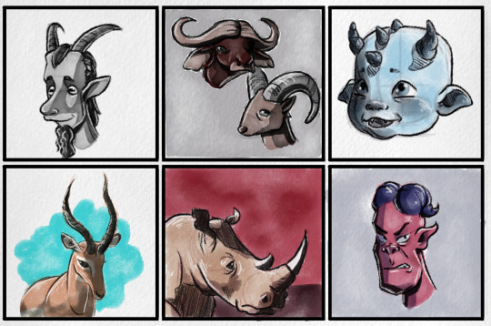
Themes for the week were horns, still water, and masc trad goth styles. Found a new colouring styles part way through the week.
[I.D. - Picture 1 The picture is a series of six illustrations of people or animals, with a focus on their horns. The first image is of a satyr with long, tall horns and goat like features. He is drawn in grey scale and has long ears, horizontal pupils, and a goatee. The second image is of a musk ox and a mountain goat. The third image is a demonic baby with a sweet face and blue skin. They have many tiny horns on the top of their head. The forth image is of an ibex with very long, twisting horns. They are set in front of a simple, blobby blue background. The fifth image is of a rhino set on a red and brown background. They have a sad face. The final image is of a demon with a pig nose and long purple horns coming from his bald head. He is snarling at the camera.
Picture 2 The picture is a series of six illustrations of still water in various positions and places. The first image is of a lake on a windless day. It is painted in greyscale and there is a small island with a single pine tree on it. The second image is of a backalley. The alley is framed by a stone wall on one side and a thick hedge on the other. There are some shallow puddles on the pavement. The next image is a glass of water, it is painted with blue paint. The forth image is a close up shot of water, with special attention paid to the shadows and highlights of the water. The fifth image is of a deep puddle on a dirt road, where the sky and clouds can be seen reflected in it. There is a kitty cat drinking from the puddle. The final image is of a bunch of water drops on a red surface.
Picture 3 The picture is a series of six fashion illustrations of people of various body types and genders. They are all dressed in a masculine trad goth style. The first image is a grey scale image of a person wearing a long black leather coat. They have a partially shaved head with long curly hair on the other side. They have on a button up top tucked into loose black pants that are fastened with a belt with a large buckle. The second image is of a person with a short, heavily teased hair style that covers most of their face. They are wearing a t-shirt with a large red cross on the front, that is layered overtop of a fishnet shirt. They also are wearing red leather pants tucked into knee high lace up boots. The third image is of a large, very muscular man wearing a loose blue t-shirt that falls off one shoulder. He is wearing many silver necklaces and has heavily teased hair held back by a headband. He has tight black pants on and thick chunky boots. The forth image is of a petite person with bright pink, coily hair and a nose ring. They are wearing a large necklace and tank top. They are wearing black tight pants fastened with a bright cyan belt and red boots. The fifth image is of a large man with a simple outfit of a red, loose shirt, and black pants. He is accessorizing with fish net gloves, a nose ring attached to an earring with a thin chain, and pointed dress shoes. His hair is heavily teased and flipped over the face, and he is wearing red eyeshadow. Finally, the sixth image is of an androgynous person with short, purple, coily hair. They have on heavy makeup and have snake bite piercings. They have a long, complex necklace on, and a leather jacket worn over top of a band tee. Their pants are loose and tucked into pointed toed, knee high boots with many buckles on the side.]
2 notes
·
View notes
Text
I've been working on a personal project that I wanted to yap about a little bit. This will be a bit long-winded, but it's my damn blog and I don't really care if anyone reads, to be honest.
Anyway, a few years back I bought a Sailor Moon season 1 DVD set from a Japanese-owned rental shop that was liquidating its stock. I was hoping it'd be a copy of the JP DVD set, but it turned out to be an exact copy of Viz's monstrosity from 2014. For anyone who doesn't know, that set is infamously terrible. The picture is ROUGH. Here's an example frame to show just how bad it is:

Like... what's even going on here? First of all, the aspect ratio is wrong. It's got what you might call "pillar boxing." Basically, they've embedded the 4:3 frame into a 16:9 canvas. In this case, it's an obvious sign that this set is a downscale of their blu-ray version (Which is its own nightmare). On blu-ray, this is correct practice since the BD standard only supports 16:9. On DVD, this results in the picture losing ~30% of the horizontal resolution, as well as rendering it unplayable on a traditional 4:3 display- ya know, the type of display this content was literally created to be played on.
The luma and chroma (lighting and colors) are also terrible. But not terrible in the usual "DVD copy of a broadcast VHS from 1992" way- that would be a significant upgrade from this- but in a, "how did you manage to include several types of degradation from various different types of sources?!" way. Here's an example of what it should look like:

This frame is from Viz's Pokemon DVD box set that was released around the same time. It's literally just a digital copy of a VHS from 1998. It's dull, blurry, and beautiful. There is very slight pillar boxing as an artifact of the telecine process (The tape was made by literally shooting a projector screen with a 90s TV camera). Note the significantly higher resolution compared to the Sailor Moon shot, as well as the more accurate colors. THIS is how you'd expect Sailor Moon to look on DVD. But... it doesn't?
Somehow the SM shot shows significant red shift (Colors are SIGNIFICANTLY redder than they're supposed to be), which you'd expect from film assets that had been stored improperly over long periods of time. Yet we know from Viz's statements at the time that they weren't allowed to use the film assets... Which is why it looks so shit, according to them... But then they'd be giving us a scan of, presumably, a betamax tape from 1992 (Japan was big on beta). But that would look significantly better than what they released? So how does a beta tape end up with film degradation? Unless Viz is saying that Toei literally created a brand new telecine of aged, badly-stored film to give them in 2014?
For comparison, here's my attempt to "fix" the SM footage for my own personal use:

It's not perfect, but it's significantly better. I was able to do this using free software in my spare time. How did Viz fuck up so badly? Is it really Toei's fault like they said? It's truly one of the great mysteries of anime fandom.
2 notes
·
View notes
Text
Styrax Dev Diary #3: Me and U(I)
Back during the first iteration of Button Man-- back when it was strictly a point and click adventure game via Adventure Game Studio-- the UI needs were fairly 'find and replace'. Point and Click Adventure audiences are not averse to change per se, but over the 40 year lifespan of the genre, some standards were expected. A semi-diegetic inventory screen which swipes into and out of shot, a cursor which changes shape or accompanying icon according to context, and a dedicated text description area for showing the names of objects/characters the player's cursor hovers over. But since the beginning, we also knew we wanted combat in Button Man. As a new team, the combat existed in a sort of theoretical space, which we would 'get to when we get to'. Pretty quickly, we got to it. So we started with a semi-turned based system, with icons surrounding the player which you would press via mouse click. Punch/ Block/ Use Item. But our ideas started to flow, and the combat became more interesting and intricate, but also became more... unrelated? It's one thing to marry Point and Click trappings to a modern combat system, but its another to require a whole new control scheme and frame of mind when switching between the two modes. But how to solve this combat conundrum? Coincidentally, for reasons I may get into another time, this moment of head scratching was followed by the first major shift in development: Side Scrolling.

The place where games are (sometimes) made You see, also at the start, the story and thematic elements were pretty set-in-stone. But what we did not have was a standardized art style. Much of the early artwork was strictly practical; a bench was a bench, there was no specific style applied. The breakthrough was the decision to establish an old pulp-comic style, in the image of Smilin' Jack and TinTin. With that style, it began to make sense to change the visual angle a bit, which in turn made a restricted horizontal movement style make more sense.
With that, we realised it also made more sense for the player to explore the world a bit more directly, via keyboard controls. WASD/Arrow key movement would add a sense of tactile immersion (you know, as far as these things go with a keyboard and a named character on screen).
And with THAT revelation... we arrived at the obvious answer for our combat-- Beat 'em up side scrolling. It fit perfectly with our protagonist, Bruce McKenzie, who is a former junior boxer and all around tough guy, and comics have no shortage of "BAM", "POW!", and "SMACK!" images called to mind. With a change to artwork and keyboard controls, the migration to a side scrolling adventure game inspired by point and clicks was complete.

Original Bruce, followed by the first pass at a comic Bruce.
Which brings me to the present moment. The road to the current look and feel was long and winding, as the Lead Designer (me) learned 3 separate engines during this time and spent a good portion of the last year trying to catch up to our Lead Developer's abilities and knowledge of Unity. I'm happy to report that I am competent and comfortable in the Unity environment now, but that means I'm now sweeping up after myself in the wake of all the education. So many factors and components were created as temporary measures; placeholder dialogues, placeholder location teleporters, placeholder animations, and placeholder UI. All of these components have had their own evolutions and iterations, as I learned what we are capable of producing. We now have an elegant character teleportation system, and excellent Dialogue Manager which is overloaded with functionality, and now its time to fully shift the UI away from the Point and Click to one befitting a side-scroller.

what a lovely gait
First and foremost, our artist, Sam Mameli, worked hard to make the locations look great-- lets not hide them with bulky, persistent UI elements! Today I am creating the animations to hide away icons when not in use.
We've also removed the Description bar from the bottom of the screen, which tells the player who or what they are about to interact with.

Instead, the interactable which the player is about to activate will animate or highlight, allowing the player to plainly see that they are going to speak with a character, for instance, without revealing their identity.
Next up, I'll be shifting our dialogue box from the wide format, bottom of the screen style, to one which emerges from the right side of the screen, creating a square on the left side of the screen in which to center the conversation. This means that the camera will have a clean, unobstructed view of the characters and the backdrop.

(The background artwork is outdate in the above image, but you can see the UI components which are about to be updated)
I hope to finish this all up in the next few days, so that our artists can go in and replace the placeholder artwork sooner than later, bringing Button Man one step closer to being Gamescom ready!
2 notes
·
View notes
Text

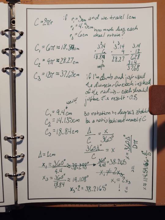
We have wings as of last week! And as of today they seem to work, after I had to reduce the range of the scotch yoke a bit to keep this fairly balanced shape without clipping through the horns. And while I was at it, we let the back legs do less of a high step and got that leggier shape I was wanting for them. I think all the major shapes are final now, just have to punch a few more holes for all the dowels since I decided to make it disassemble-worthy, and reduce the width of that yoke's lower slot now that it's on a smaller wheel.
Also, while the every-tenth-frame animation was rendering I did some real paper math (well, reusable paper at least) to check my assumptions that the wheel that's twice as tall will take twice as long to rotate. And almost said it wouldn't! Remember kids, math is dangerous and little mistakes can make you doubt relationships you intuited until you find the issue. Always let your calculator think for you and everything will be okay. (Or, y'know, your basic multiplication skills will erode until you make tons of mistakes like this. Pros and cons.)
Image descriptions got long again so they're under the cut, along with the gif of how our first proportions moved:
[ID: First image is a sequence of 3D renders of a work in progress mechanical dragon toy in orange, showing it gain a hinged tail, large head, and wings before the sizes of its wheels and the slots in a piece on its side adjust and a low frame rate animation begins, showing the way the wheel rotation will move the limbs. The front and back legs are articulated to "walk" with the wheel movement, the front leg on a small wheel causing it to move about 50% faster than the back. There is another set of wheels between the two, twice as large as the front set. This wheel raises the slotted piece with its rotation using a peg in the wheel through a horizontal slot while it's guided up two dowels through vertical slots. The wing rests on the top of this piece is pushed upward, rotating on its hinge in the middle of the back. Everything is mirrored on the far side of the dragon.
Second image is a page of handwritten algebra in green ink on an unlined six-ring notebook page. It starts with the equation for a circumference, C = 2 (pi) r, and asks the question "if (given three radius measurements) and we travel one centimeter, how much does each wheel rotate?" R sub 1 is 3cm, R sub 2 is 4.5cm, and R sub 3 is 6cm -- so R sub 3 is double R sub 1. Hand-multiplication follows, with the answer for C sub 1 now having a note with "oops" and the digit 4 written over the mistaken second decimal 0. A longer note reads, "if I'm dumb and just used the diameter for each instead of the radius...each should just be the result (times) 0.5." The results cut in half are written down. C sub 1 is missing the second decimal place it would have with the corrected numbers from the first multiplication, now with a note "wait!" pointing to it. "So rotation in degrees should be a ratio between travel & C." This note is expressed as an equation, delta over C is equal to X over 360 degrees. 360 delta degrees over C is equal to X. Given delta is equal to 1cm, there follow three solutions for X using each of the circumferences found, then X sub 3 is multiplied by two. Initially that result had a second decimal place of 1 where X sub 1 had 9. To the side is an non-equation X sub 1 is not equal to 2 X sub 3, with a sad face. Written vertically is the formula X is equal to 360 delta degrees over diameter pi; this is simplified to the approximation X is equal to 114.59156 times delta degrees over diameter. Changes in the diameter should be inversely proportional to changes in X. The first solution for X sub 1 is lined through with an arrow to one with the corrected circumference value, which matches 2 X sub 3. The earlier non-equation is crossed out as well; the equation X sub 1 is equal to X sub 3 is followed by an exclamation point and a smiley face.
End ID]
[ID: Animated gif of the dragon toy in a brown matcap, wings and legs moving with the wheels. The wheels are not spinning at a constant rate because their rotation mode hasn't been set to Axis Angle yet, the back "knee" joint raises to higher than the middle back, and the middle of the front arches of the wings travel into the middle of their respective sides' horn by the top of their rotation. End ID]
3 notes
·
View notes
Text
How to Do Cosplay Makeup for Different Face Shapes: Step-by-Step Guide
Cosplay is about becoming someone else, and makeup plays a major part of that transformation from creature to Kylo Ren. And yet, we still have face shape hiding in the shadows as one of the greatest unsung heroes of cosplay makeup. Makeup looks the same makeup can look totally different on a round face vs. a hearth-shaped one. When you use cosplay makeup to modify your face, it is necessary and important to paint differently from other characters according to the different shapes of faces.
In this guide, we will provide you with a detailed explanation and lists of the best cosplay makeup ideas suited to each specific face shape for looking like the character whom you love while making your already good features better more.
Cosplay Makeup Tutorial: Importance of Face Shape
According To Elajne, Different Face Shapes Absorb Makeup Differently Personally your face shape, helps you to:
More realistic facial structure changes (sharper cheekbones, softer jawlines)
Match anime or game characters proportions better
To Equalize your Makeup and Make it Look perfect in Snaps
To start, identify your face shape: Is it round, oval square heart long?
Read More: 10 Tips for Taking Professional Looking Cosplay Photos at Home
1. Makeup Look For Round Face Manga/style
Objective: To give the face some definition and also unplots its phenomena.
Step-by-Step:
Chisel your forehead, jawline and contour under the cheekbones to add complimentary definition.
Sweep highlighter down the nose and across most of your forehead center front to back, helping elongate?
Opt For Angled Brows | it will lift your look
Not on the apples of your cheeks, but back toward your temples.
When you have a round face with decent proportions, characters such as Nezuko (Demon Slayer) or Hinata(Naruto), employ soft gradient eyes makeup look best.
Pro Tip: To make the eyes appear longer use a lash that flares up.
2. Oval Face Cosplay Makeup Tips
Objective: Proportion and Feature Highlighting
Step-by-Step:
For a subtle definition, use it to contour lightly under the cheekbones.
Groomed full brows Frame the face without overtaking it.
The versatility of the face shape allows you to play with bold lip colors or dramatic eyes.
Toonify Balanced: Examples would be something like Sailor Moon, or Mikasa (Attack on Titan).
Pro Tip: If you have an oval face, then best believe you can get away with the extreme stuff; dont be afraid to do fantasy or sci-fi loots.
3. Cosplay Makeup Tips For Square Face
Aim: We want to give your face a smoother, rounder shape.
Step-by-Step:
Choose a shade that’s just a bit lighter than your foundation and apply it outwards along the sides of your forehead and chin to make it more rounded.
To soften the upper face you can use a soft arch brow
Curl your lashes before applying blush to the areas in small circular motions.
Go for characters with strong and almost rounded features like Jolyne Cujoh (Jojo’s Bizarre Adventure) or Asuka (Evangelion).
Pro Tip: Recessed mommy botox is counterbalanced with rounded contact lens and eye shapes.
4. Cosplay Makeup Tips for a Heart-Shaped Face
Goal: The object is to reduce the width of your forehead and help balance an unusually wide chin.
Step-by-Step:
Balances Upper and Lower Halves & Contour temples and bottom of chin
Add bit of contour to soften that jawline.
Soft, rounded brows and herblended eye makeup.
Great characters for this shape include Zelda, Violet Evergarden or Lucy (Fairy Tail)
Pro Tip: Tighten with muted lips to avoid over-focusing on the chin area.
5. Cosplay Makeup Tips for a Long/Rectangular Face
Objective: Make the face appear shorter and wider visually.
Step-by-Step:
Curve the top of your forehead and bottom chin to cut short face
Frame the face with straight brows
Apply blush and dust it horizontally on your cheekbones.
Characters like Yoruichi (Bleach) Or even Kanao(Demon Slayer) who have a balance vertical shape.
Pro Tip: Opt for broad Liner Wings to expand the eye region horizontally.
Universal Cosplay Makeup Tips
Here are some rules to help you understand: You face shape may differ, but the following will remain constant
Beginner: For extended events to keep the make up in place.
Setting spray or powder – A must for oily skin.
Weatheristic goods: good for photoshooting and conventions.
Talk with Lens: Change eye to personality eyes.
Wig coordination: hair style is particular about face shape fitting, before you choose to be exquisite effect.
Read More: Cosplay Industry Trends: Insights and Analysis for 2025
Final Thoughts
Comprehending Cosplay Makeup — Art Or Science? Knowing how to modify your look according to the face shape will get you closer in resemblance while still looking impressive when it comes into real life and photos. The general idea is to merge key cosplay elements with suitable facial features — all together making a transformation of authenticity, accuracy and empowerment.
Now, take a look at your face shape in the mirror before you head to that next con or photoshoot and get those brushes ready so you can spend more time on creating than finding.
FAQs
Cosplay makeup: How do I know what face shape.
This should help you detect patterns in how your forehead, cheeks, jawline and face length measures. Best Guide is A Chart of Face Shapes
What if the characters I wanted to would have different face shapes from mine?
Yes! Contouring and makeup illusions to get the facial structures right. Accessories and wigs also help.
What are the Best Makeup Styles for All Face Shapes
Neutral contour, bold brows and film accurate eye makeup can be worn on almost every face shape.
Is Professional Makeup Necessary for Cosplay?
Not necessarily. You can cheat and even use some budget brushes, sponges & good inexpensive drugstore makeup to start with.
What would you suggest to make the makeup last longer on my face during events/cosplays?
So plaster on some primer, lay down a setting spray and waterproof the hell out of them. Blotting paper for touchups.
Source: https://urcosplay.com/how-to-do-cosplay-makeup-for-different-face-shapes-step-by-step-guide/
0 notes
Text
The Archaeology of Shamanism Redux: Part 3
in which I respectfully disagree
Chapter 7: Shamanism as localized practice in the Nepal Himalayas, by Damian Walter
I thought there were a lot of gaps in what Walter had to say, such as 'what makes this a house if there's nowhere for anyone to sleep'. For me the most interesting part of what he had to say was not about shamanism, but about language. He had been describing the two kinds of shamans that exist in the area he studies, and was going to describe the distinction as a horizontal vs vertical hierarchy with the spirits they work with, and then he realized that that whole concept is meaningless in Nepal because ground go up and down. People don't think in terms of flat space; they have a different relationship with the idea of verticality. So he got into some other connotations about the language of space, distinctions between simple and non-simple location and continuous vs discrete concepts of space, in order to talk about how near shamans are to their spirits - which was ultimately of less interest to me than the discussion of the language he was gearing up to use.
Chapter 8: Addressing the antiquity of systems of multiple genders, by Sandra E. Hollimon
This one builds on the thesis defended in earlier chapters, that the peoples of the global arctic have a recent common cultural ancestor, so that it is more reasonable to compare Inuit people to Siberians than to Aztecs. It makes some move to further that, talking about the shared importance of bears and ravens, before arguing that given the prevalence of third and fourth gender systems in North American societies, it makes more sense to assume that a civilization in this area has 3+ genders than to assume it has only 2. (Future chapters will argue that 'shaman' is a gender.)
Chapter 9: Shamanism and the iconography of Palaeo-Eskimo art, by Patricia D. Sutherland
The main thing this chapter was getting into is the representation of transformation themes and flight themes in Palaeo-Eskimo art. (Hold your furor about the use of the term Eskimo, this is the academic term [from 2001] for the long-gone people, they use Inuit for modern peoples.) So you have animal/human figures, you have exaggerated teeth like one might wear for Halloween except to be an animal instead of a vampire, you have skeleton representations a la Siberian art, and you have the most interesting piece/recurring theme: a bear represented with all four feet trailing behind it, which is not the natural position of a bear's limbs. Together with the angle of the feet, they suggest that this is a representation of flight and therefore, naturally, the common theme across shamanic cultures of shamanic flight in the trance state.
Note that the traditional ritual depiction of a bear is lying down with its head between its paws, said paws stretched forward to frame the head.
This bear is also notched with skeleton-marking lines, and the interesting point about this, to me, is the discussion of how the lines tend to represent bones such as ribs - as depicted in Siberian rock art also - but that joints tend to be represented by crosses/X's. Which is all well and good until she adds that there was an "Ice-Man" found in glaciers on the Austrian-Italian border which had tattooed plus marks on the knee and ankle.
Same culture? Same idea? We have no way of knowing. But, she says, here is a parallel. Put that in your pipe and smoke it.
#Nimblermortal liveblogs#the archaeology of shamanism#I'm going to stop there because I have brickspace stuff and because the next section is comparatively dull
0 notes
Text
Space-Saving Design Ideas for Small Kids' Rooms

Creating a functional, stylish, and clutter-free kids' room in a small space might feel like a challenge, but with the right design ideas, it’s far from impossible. Parents often struggle to balance the need for storage, play areas, and comfort in limited square footage. The good news? Strategic space-saving solutions can transform even the tiniest kids’ rooms into practical and inviting spaces.
This blog was compiled by our interior designers in Mumbai to help you maximize a small kids' room's potential. From multi-purpose furniture to smart storage hacks, you’ll find plenty of inspiration to bring big ideas into compact spaces.
Use Multi-Functional Furniture
When space is at a premium, every piece of furniture should work harder to earn its place in the room. Multi-functional furniture is a lifesaver for small kids' bedrooms, providing multiple uses while saving precious floor space.
1. Invest in a Loft Bed with Built-In Storage
Loft beds are a game-changer for small rooms. Elevate the sleeping area to free up valuable real estate underneath, which can be used for built-in drawers, desks, or play spaces. For example, a loft bed with built-in shelves and cubbies keeps toys, books, and clothes tucked away neatly while carving out room for other activities.
2. Opt for Ottomans or Benches with Storage
A storage ottoman or window bench doesn’t just provide seating; it can double as a toy box or a place to stash seasonal bedding. Kids won’t even notice they’re tidying up when the space for cleanup is that convenient!
3. Convertible Cribs and Beds
For families with growing children, furniture that adapts over time is a must. Look for cribs that convert into toddler beds or daybeds, and bunk beds that can separate into twin beds when needed. They not only save space but also save you money in the long term.
Maximize Vertical Space
Making the most of vertical space in kids’ rooms is key, especially when horizontal space is restricted. Walls offer excellent opportunities to store and display essentials without creating clutter.
1. Use Floating Shelves
Floating shelves are perfect for holding books, toys, and decor. Place them at kid-friendly heights for accessible storage or higher up for items that need to stay out of reach (hello, craft paint!).
2. Incorporate Pegboards
Pegboards are a versatile way to organize a room without taking up any floor space. Paint one in your child’s favorite color and use hooks, baskets, and shelves to hold everything from small toys to art supplies. Plus, you can easily rearrange the layout as their needs evolve.
3. Wall-Mounted Desks
A traditional desk can monopolize a small floor plan, but a wall-mounted, fold-away desk offers functionality without the footprint. These are an excellent solution for older kids who need a study space but don’t use it all the time.
Get Creative with Storage
The secret to maintaining a neat and organized small bedroom is smart storage solutions. Think beyond traditional furniture and hunt for hidden opportunities to stash clutter.
1. Storage Under the Bed
Beds with built-in storage drawers provide a sneaky place to store extra linens, toys, or out-of-season clothing. For older kids, consider slim storage bins with wheels that slide easily under a standard bed frame.
2. Use the Inside of Closet Doors
The back of a closet door is prime storage real estate. Door organizers can hold shoes, toys, accessories, or school supplies while keeping the floor clear.
3. Add Corner Shelves
Often overlooked, corners can be made functional with corner shelves. These can hold books, stuffed animals, or keepsakes, making them a fantastic addition to any small room.
Create Zones for Functionality
Even in a small space, creating distinct zones can make the room feel larger and more functional. Think about the key activities your child engages in, and tailor the design to these needs.
1. Sleeping Zone
Ensure the bed is cozy while keeping the area around it free of distractions. Add soft lighting and draping curtains for a snug sleeping nook.
2. Play Area
A play zone doesn’t need to be large. A soft throw rug and some stackable storage bins can serve as the perfect space for playtime without overwhelming the room.
3. Study Zone
For school-aged kids, having a dedicated workspace is essential. Keep it simple with a small desk, a comfortable chair, and good lighting.
Tip for Zone Design
If space is super limited, zones can overlap! For example, a loft bed with a desk underneath seamlessly combines the sleeping and study zones.
Use Light Colors and Clever Decor
Light, color, and decor choices can have a significant impact on how spacious a small room feels.
1. Choose Light Paint Colors
Light colors like white, pastels, or soft grays reflect light, making the space feel larger. Consider painting one wall a fun accent color or adding a whimsical, kid-friendly pattern in small doses.
2. Mirrors for Illusion
Hanging a mirror on one or more walls can create the illusion of depth and light in the room. For a playful approach, search for mirrors in interesting shapes like stars or animals.
3. Keep Decor Minimal
Although kids' rooms are often filled with toys and decorations, too much clutter can make the space feel even smaller. Stick to a few statement decor pieces, like a fun wall decal or an over-sized stuffed animal, to keep the room visually tidy.
Encourage Kids to Stay Organized
No matter how well-designed a room is, clutter can undo all your hard work. The key to maintaining a clean and functional kids' room is involving your children in the process.
1. Make Storage Accessible
If the storage solutions in the room are child-friendly, your little ones are more likely to use them. Low shelves, labeled bins, and open baskets can transform tidying up into an easy, manageable task.
2. Turn Organization into a Game
Clean-up time becomes less of a chore when it’s fun. Challenge your kids to pick up toys as fast as they can or sort items into color-coded bins.
3. Rotate Toys
If toys are overwhelming the space, consider implementing a toy rotation system. Keep only a small selection of toys out at a time and store the rest elsewhere. Swap them out every few weeks to keep things fresh and exciting.
Final Thoughts: Small Spaces, Big Possibilities
Designing a small kids' room may have its challenges, but with creativity and thoughtful planning, you can create a space that feels spacious, functional, and fun. Focusing on multi-functional furniture, vertical storage, and distinct zones, combined with clever design choices, can make all the difference. Need additional guidance for your small space? Connect with a team of professional interior designers in India to unlock personalized ideas tailored to your exact dimensions and preferences. With the right approach, even the smallest rooms can become a big hit with your kids!
0 notes
Text
[image id: four images, first in the original post, second through fourth in a single reblog. The second and fourth images are identical.
First image: sheet music formatted for a piano, in that it contains two measure lines for two unseen clefs, showing one full measure with one partially cut off on either side of it. The first measure shows three quarter notes equidistant from each other on the bottom space with lines above and below it on the bottom measure. The quarter notes have “x” in place of their head and the line of the leftmost quarter note is cut off. Inbetween the second and third quarter notes have a squiggly vertical line between them that goes from the bottom space of the lower measure to the second highest space of the higher measure, with each squiggly being the height of the space between each line. The squiggly line is much closer to the third quarter note. Below the first quarter note is a lowercase “d,” likely some part of notation. Below the second and third notes is the notation “Turn around” above the latter half of the first measure and the first half of the second measure is the notation “(Both buttocks)” which is meant for the second measure. The latter half of the second measure is entirely blank while the first half depicts a large black rectangle that stretches to slightly above and below the bounds of the top and bottom measures. Below the rectangle is the notation “Sit on keyboard and jump back to normal position without losing the tempo.” With the o in keyboard and the l in normal slightly damaged or weathered and the word “losing” cut off after the s and continued using a hyphen. The notation is four lines long, with each line starting with “Sit” “jump” “position” and “ing” the third measure is separated from the second measure with two vertical lines instead of one and starts with a four four time signature, as in four quarter notes per measure, on both the upper and lower measures. The top measure depicts an eighth rest and then a quarter note one the top space with a line above it with a symbol resembling the “greater than” symbol above it. The lower measure depicts three whole notes, all sharp, played at the same time. One whole note is on the second space from the bottom, one whole note is on the top space of the lower measure with a line above it, and one whole note is two spaces above the previous one. All corners but the bottom left have partially cut off notation. The top left has part of what seems to be a stylized letter, the stylization adding extra curls. The top right has the word “Do” below a cut off measure that does not show any notes and is barely visible. However, a measure divider is seen. The bottom right has the letters “Cm” with the first letter capitalized. Every part of the image appears to be printed. For those not familiar with sheet music, a measure is depicted as five horizontal lines with four spaces between them, each of the same height. A vertical line is used to separate individual measures from each other. Piano and other keyboard sheet music uses two rows of measures with a space slightly taller than an individual measure between them and the vertical divider line for both measures is connected. For musical notes that occupy spaces or lines outside the measure, short note-length lines are drawn to depict each line between the note and the measure, stopping at the line the note is on or the line closest to the measure that the note would be directly above or below. For the one note depicted here that is outside a measure, there is one line directly below it that it is touching.
Images 2/4 and Image 3 depict two edited frames from a single scene of a cgi animated show or movie, most likely “Barnyard” or “Back at the Barnyard” both frames depict a brown path in front of green hills with some trees. On the right side of both frames is a postman holding a letter next to an open gray mailbox with the flag down. In the second and fourth images he is looking to the right and slightly to the back with a shocked pose and in the third image he is facing the right at a 3/4 angle, so more to the front than the right, with an inquisitorial or confused expression. Both frames are edited to depict the Dragon Ball character Broly, who is absurdly muscular, has solid white eyes, and light green glowing spiky hair and a grand piano layered above him on the left side, sized so that Broly and the Piano are behind the postman. In the second and fourth images, an official render of the Dragon Ball Z design of Broly is used, which depicts him as wearing gold accessories and a red cloth around his waist above large white pants, and the closest leg of the piano, which is furthest from where the player would be, is slightly erased. In the third image, fanart of the Dragon Ball Super design of Broly, which is evident from the gray and white gauntlets he is wearing, is used and the piano is slightly larger. The fanart depicts Broly naked, though not explicitly, with his head turned back to the left and his thighs spread out and his butt, which is exaggerated, facing the viewer. Broly is edited to appear as if he is sitting on the piano’s keyboard. Beneath the piano on the third image, a cow’s legs can be seen which is presumably part of the original unedited frame.
End id]

15K notes
·
View notes
Video
youtube
How to build duck's house bamboo, adorable little yellow ducks
Yellow ducklings are always a lovely sight, and creating a bamboo home for them not only helps to protect but also creates an environmentally friendly living space. Here is a detailed guide so that you can build a bamboo house for your ducklings yourself.
Ingredients:
Bamboo: Choose straight, sturdy, and moderately long bamboo sections. The amount of bamboo needed depends on the size of the house.
Rope or nylon rope: To tie the bamboo segments together.
Leaf or corrugated iron roof: To make a roof for the house, helping to shelter from rain and sun.
Tarpaulin or plastic mesh: To cover the roof or around the house, creating ventilation while still protecting the ducklings.
Saws, knives, hammers: Used to cut and process bamboo slats.
Step 1: Prepare the bamboo
Choose bamboo segments of length and diameter that are appropriate for the intended house size. Usually the bamboo sticks should be 4-6cm in diameter and about 1.5-2m long.
Use a knife or saw to cut the bamboo segments into strips of equal length. It is necessary to prepare shorter sections for framing, and longer sections for walls and roofs.
Step 2: Make the house frame
Use long bamboo sticks as the main frame of the house. You need to create four vertical columns at the four corners and connect them together with horizontal bars.
Use rope or nylon rope to fasten the joints, making sure the frame is firm.
Step 3: Install the wall and roof
Use the remaining bamboo pieces to make walls around the house. You can stack the bamboo pieces together or use a plastic mesh to wrap them around.
With the roof, you can use bamboo sections to make a frame, then roof it with corrugated iron or leaf roofs depending on the weather conditions where you live.
Step 4: Make the floor (optional)
If you want the house to be taller, add a layer of bamboo flooring underneath to keep the ducklings from getting wet when it rains.
Step 5: Inspection and decoration
Once finished, double-check the entire house to make sure there are no sharp edges or loose joints.
You can decorate the house with natural materials such as hay, wildflowers to make the ducklings' dwelling more lively.
Note:
The house needs to be placed in a cool place, not too humid and not directly hit by rain.
Regularly clean the house to keep the habitat for ducklings clean and safe.
Building a bamboo house for ducklings with your own hands is not only fun, but it also helps you understand more about caring for animals and using natural materials creatively. Try it and enjoy the
0 notes
Text
Q: What is a bingo? How many prompts will the cards have? How big will they be?
A: A bingo is a fandom challenge, in which participants are given a card (they can be 3x3, 4x4, 5x5 grids) filled with prompts meant to inspire a person to create more works!
For this particular bingo, our bingo cards will be 5x5, which means you will receive 24 prompts, as well as a free space – which means you can fill it with whatever you wish too, as long as it was not already used for a prompt on your card. These are meant to inspire those to create more works about Obikin (Obi-wan Kenobi x Anakin Skywalker), in either a romantic or platonic nature!
Q: How would I receive my bingo card?
A: Either by Twitter, Tumblr, Email or Discord! You’ll get to pick how you feel most comfortable receiving your bingo card. If by email, it will be emailed to you; If by Twitter, Discord or Tumblr, it will be DM’d to you. A link to the rules and schedule will also be sent a long.
Please be sure that you’ve given the correct full username, so it’s easy for the Mods to send it to you.
Q: What’s the bingo’s schedule going to be?
A: This is the schedule:
Sign-ups will open August 31, 2022.
Cards will start going out September 5, 2022.
Once you receive your card, you may begin creating and posting when you like!
Sign-ups for this bingo will close October 1, 2023.
This round of our Obikin Bingo will end December 1, 2023.
** This is our first bingo round and to give everyone as much time as possible to work on their cards, so this will be an extended round. Which roughly will give people a little less than a year and a half to work on their cards.
**** Please note though this round is a long one, that does not all mean future rounds will be so as well!
Q: How long should I expect to wait to receive my bingo card?
A: A few days at the very least, with a week at most. If you sign up and have not received your bingo card within eight days, then please send a polite message to inquire about it; chances are the Mods are simply a bit busy with offline life or for some reason your signup did not go through.
Q: How do I ensure I'm getting prompts I want/am comfortable creating for?
A: Great question! To ensure that your card is catered to your exact wants/comfort, you will pick the prompts you want on your board! A master list of the potential prompts for the bingo will be going out shortly before sign ups go live (soon!), so you will have plenty of time to decide which prompts you want for your board!
Which leads us into why there will not be any square changes allowed for this round of our bingo, since you'll already be requesting specific prompts you’ve chosen, and approved of for yourself, for your bingo board.
Q: Where can I find the prompt list?
A: You can find the NSFW list here and the SFW prompt list here!
Q: What counts as a bingo? How can I achieve a bingo?
A: To achieve a bingo, you simply need to meet these requirements:
A line (5x5) that is either vertical, horizontal, or diagonal. Also getting the four corners and free space, will count as a bingo!
Q: What requirements are needed to fill a prompt?
A: Ensuring that your square’s prompt is featured within your creation, and meeting these minimum requirements:
Fic/Meta - 100 word minimum.
Podfic - 1 minute and 30 seconds minimum.
Moodboard/Gifset - 3 images minimum.
Graphics/Edits - 1 image minimum.
Art - size 2x2 inch if physical, 200x200 if digital; clean sketch minimum.
Fanvid - 20 seconds minimum.
Animated Short - 20 frame minimum.
Comic/Visual Novel - 3 panel minimum.
Rec List - 6 recommendations minimum.
Playlist - 6 recommendations minimum.
If you have any more questions, or would like a more in depth answer, please ask away! Would be happy to discuss it with you!
Q: There's a lot of amazing prompts, but is there a way we could send in suggestions for the bingo?
A: Yes! Here is a link to a google form where you can send in suggestions for us to add to our ever growing and expanding list of prompts for our bingo!
Q: What counts as a blackout?
A: Filling every square on your card! You do not need to do this, of course, but could be a fun challenge for you to try and do!
Q: Can we use a fill for another event as well (another bingo for example)?
A: As long as the other event is okay with it, then you can absolutely go ahead! Just make sure you hit our minimum requirements for filling a bingo.
Q: What do we need to do to request a new card?
A: You either need to have two completed bingos or blackout your card completely before asking for a brand new card.
Q: What happens when we’ve hit the two bingos/blacked out our bingo card? How do we get a new one?
A: You simply fill out the form once again, picking the prompts you’d like on your new card and give the Mod a week or so to make you a brand new one!
Q: Can we write our fic’s in a non-narrative format? For example, could we write it as if it’s a magazine article, meta, ship manifestos, a text chain, Instagram/Twitter, etc. posts?
A: Absolutely! Let your creativity soar! All you would need to do is ensure the minimum requirements are being met, otherwise, absolutely go wild with how you’d like to do your fills!
Q: Can I repost an old work/art/creation and have it count for a square/prompt fill?
A: No, all works must be newly created to count towards a fill. If it’s already a completed work/art/edit that you’ve already posted, those will not count. If it’s something you’ve been working on but have posted nowhere till now, that counts.
Q: Can I include other characters in my work? Like in a threesome or something else?
A: As long as the relationship of Anakin and Obi-Wan is integral to the work, yes! Anakin and Obi-Wan should interact with one another or be thinking/talking about the other if one of them happens to be separate from the other for the entire timeline of the work.
Q: Is there a collection I can post my work to?
A: Yes! There is a collection on Ao3, which can be found here, that will be opened to posting once cards are being sent out to those who have signed up for this!
*** Edit: We are aware that there is an issue if you try to add a work to the collection. If you type ‘ oeb_round1‘ into your draft on Ao3, where it asks about adding it to a collection -nothing will drop down- and hit post (only once you’re ready!) your work will be added to the collection!
Q: How exactly does posting work for the bingo?
A: As soon as you receive your card, you can begin posting! It’s whenever you feel you’re ready to share your creation.
Q: I know other bingo events require master posts to be made once the round is done, will you be doing that?
A: No, we won’t be requiring a master post to be done up of all the squares you marked off your board. Though if you do make a master post, we will happily reblog it!
Q: Can my stories be a part of a series that's already published?
A: As long as what you’re adding to an already established series, then yes you are allowed to do that! Also if you are adding to a WIP, just be sure it’s a new chapter and that the prompt is mentioned with the chapter.
Q: Can I make art inspired by a story of mine that's already published if it fits a square prompt?
A: As long as it's a new, unpublished piece of art, then yes that would be okay! Our main objective for this is to create new creations, not reuse ones that are already out in the world.
Q: Are we allowed to combine our bingo prompts?
A: Absolutely! You can combine as many of your prompts as you’d like to but please know only one will count as having been filled for our bingo.
Q: Does my work have to be romantic in nature?
A: No! You can absolutely write about platonic Anakin & Obi-wan.
Q: How can I ensure my fill gets reblogged?
A: You can use the tag #obikinbingo23 or @ the blog here or on Twitter, depending where you post your creations. You can also submit a link on the Discord, DM or @ for Twitter, so we can share your creation!
Q: Where can I sign-up for this?
A: You can sign up here!!!!
If you have any questions, please don’t hesitate to send in an ask on Tumblr, a DM on Twitter or even an email to [email protected]. Or if you're already a part of our Discord Server, you can ask us there as well!
May The Obikin Be With You!
#Obi wan Kenobi#Anakin Skywalker#Star Wars#Obikin#obikinbingo23#Obi-Wan Kenobi#Anakin x Obi-Wan#Obi-wan x Anakin#Obikin Events#Obikin Bingo Event#Obikin Bingo Round One
195 notes
·
View notes
Text
(^〃^) * modern!el hopper hcs
as requested by @softgirl-softworld <3 mwah
in the early stages of growing her buzz cut out, she let max dye cute little designs into her hair (hearts, smiley faces, flowers (maybe even with smiley faces!!!), etc)
will was rly into the art hoe aesthetic in 2018 and it rubbed off on el. she still wears a lot of yellow, high-waisted mom jeans, striped shirts (many given by will) & overalls
her mustard yellow kanken backpack from said art hoe phase is one of her most prized possessions
outside of that her wardrobe is very pastel! she’s either wearing like .. a crop top and a patterned midi skirt or a long, loose-fitting dress with a white shirt underneath. loves a good patterned cardigan too
rly likes studio ghibli films and adventure time. she sleeps with a big totoro plush
will drew a studio ghibli - style portrait of himself, jonathan & el where they’re standing in the rain with totoro & it’s framed in her room
thinks pusheen is the cutest thing ever
willingly wears crocs
has a very large hair accessory collection, consisting of everything from scrunchies to ribbons to bandanas
loves doing her hair when its long. she’s heart eyes for any variation of bubble braids
she really likes flavored chapstick especially if it comes in a fun lil package
falls asleep on facetime with max all the time. the only semblance of an argument they’ve had was over whose shitty wifi was to blame for one of the two cutting out
real big lorde fan!! she’s always on the top three of el’s spotify wrapped. she rly likes indie artists in general like sales, big thief, faye webster, clairo, the list goes on
also likes most 2000s top hits. would give her left arm to listen to i really like you by carly rae jepsen and fireflies by owl city for the first time again
texts like a middle aged mom
rly likes using emoticons, her fav is :o)
misuses acronyms like it’s her job. the type of person to say somethin like “sorry your grandma died. LOL” bc she thought it stood for Lots of Love
doesn’t rly have a social media presence outside of big life milestones (graduation, prom, etc)
very sentimental!! keeps all her concert ticket stubs/movie tickets/photobooth strips/polaroids pinned on a corkboard in her room
absolutely CRUSHED at cut the rope and temple run when she was younger. still has a concerning amount of games on her phone
plays a lot of animal crossing!! loves showing the party her island and would always try to get them into it
hates reading but rly likes audiobooks. loves listening to fantasy novels in particular (harry potter, percy jackson, the raven cycle)
for joyce’s bday one year, el, jonathan & will took awkward family portraits at jcpenny in very tacky 80s getup, complete with many awkward poses (jonathan & will holding el up as she lays there horizontally and poses dramatically, all three of them on the ground side-by-side with their chins in the palm of their hands, etc)
#eleven hopper#el hopper#jane hopper#eleven#stranger things#stranger things 4#stranger things headcanons#modern!stranger things#el hopper x reader#eleven hopper x reader#jane hopper x reader#jane hopper x you#jane hopper x y/n#stranger things x reader#stranger things x y/n
134 notes
·
View notes
Photo


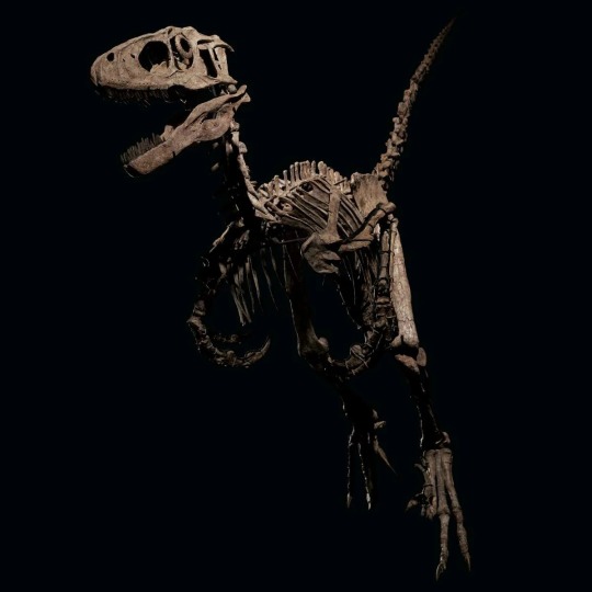


“Hector” (Deinonychus Antirrhopus), Montana, Usa,
From the Cloverly Formation, Wolf Canyon, Carbon County, Montana, the Early Cretaceous (circa 115-108 million years ago).
Excavated at Wolf Canyon, Carbon County, Montana (in the W1/2NE1/4 of Section 23, Township 4 South, Range 24 East, P.M.M.) 2013-4 Pangea Fossils February 2015.
Fifty million years before the reign of the dinosaurs ended in the age of Tyrannosaurus rex, a smaller, more agile, pack-hunting predator was the most feared animal of its time. The sleek, dynamic, and deadly Deinonychus is one of the most popular and well-known dinosaur species, but also one of the rarest fossils. Its popularity would peak following its leading appearance alongside T. rex as the Raptor in Jurassic Park. Taking his name from the greatest of the Trojan warriors, ‘Hector’ is the most complete skeleton of his species ever found.
Known for its long talon-like claws and elegant frame, Deinonychus flourished in western North America during the Early Cretaceous period. Part of the clade of dinosaurs called theropods (carnivorous animals that can walk on two legs), these sickle-clawed predators were armed with a deadly kick. Their fossil remains are typically found in the Cloverly Formation and the Antlers Formation, which are thought to have provided an environment of tropical and sub-tropical forests, lagoons, swamps, and river deltas for Deinonychus to inhabit. The name Deinonychus was coined by palaeontologist, John Ostrom, in 1969 and translates to “terrible claw,” in reference to the killing claw on each foot. Shaped like a sickle and held up off the ground when not in use so as to maintain its lethal sharpness, this claw was used to disembowel its prey. It is believed that in order to use the claw with the highest degree of success, Deinonychus would have stood on one leg, holding the target with its long arms, and impaled its prey with a powerful kick. This attack was aided by the ability to use its arms, unlike many other dinosaurs, and the ability to stretch its hand to nine inches long. Indeed, it is believed that the main use of the arms was for this very purpose, and it is unlikely that the arms were ever used to walk on. Its deft movement and predatory skill were further supported by Deinonychus’ ability to stand on its hind legs when attacking other dinosaurs. This upright, offensive stance was facilitated by its long tail that provided essential balance thanks to rows of internal bundles of bony rods that gave the tail additional strength. The tail would otherwise be stretched horizontally when running, and contributed to the exceptional length of this animal, measuring approximately 3 meters long.
119 2⁄3 x 62 1⁄4 x 26in. (304 x 158 x 66cm.)
Courtesy of Christie’s
#art#sculpture#skeleton#deinonychus#archeology#montana#usa#style#history#monster#animal#christie's#hector#dinosaur#cretaceous period#cretaceous#carbon county#john ostrom#claw
147 notes
·
View notes
Text
2. Light, Vision, and Color
For your biologically accurate monster building information, here is part 2 of my notes on An Immense World by Ed Yong, drawing from chapters 2 and 3. This section has truly a massive amount of information and I did my best. Please note a lot of this is generalizations, so read the book if you want the good stuff.
Vision and Photoreceptors
What is it?
Photoreceptors signal a neuron when exposed to light photons. With enough receptors, complex structures like eyes that (when paired with the right brain) can create a mental representation of the surroundings. There are four levels of complexity:
A single photoreceptor that can sense the presence and absence of light
Photoreceptors with a shaded spot that allows for detecting the angle of light
Clusters of shaded photoreceptors that allow the brain to produce a blurry lo-fi image of its world
High resolution vision with lenses and other structures for perceiving sharp details, wide field of vision, color etc.
There are two common types of complex eyes; camera like eyes with one retina that gathers light, and compound eyes, which have many ommatidia that gather light information.
There are many components of “vision”:
Visual acuity. The amount of resolution and detail perceived.
Higher acuity is achieved by denser photoreceptors, but this also corresponds to weaker night vision.
Compound eyes have weak acuity.
Light Sensitivity. Is vision suited for bright light or nocturnal conditions?
Color. Multiple types of photoreceptors allow the brain to compare wavelengths of light and distinguish those differentiations as color.
Animals with high visual acuity (humans and raptors) and fish that see long distances underwater tend not to perceive UV light.
Animals that evolved from nocturnal ancestors perceive fewer colors
Field of View. Where does the animal have blind spots, if any? And what parts of the eye have the sharpest vision?
Refresh Rate. How quickly the brain can receive and perceive new information from the eyes; frame rate.
Night Vision Adaptations. Special features like “long exposure” vision to see in total darkness, or a tapetum structure to check twice for photons.
How is it used in nature?
Visual Acuity: to notice small details, like raptors hunting from the sky, other distance hunters, or primates hunting insects.
Light Sensitivity: with nocturnal vision animals can avoid competition with diurnal species. Night vision may correlate with a lack of color vision.
Color: Animals and their ecosystem may share a color palette that is tuned to their eyes. For instance, flowers are colored to appeal to the eyes of pollinators; plants that looks camouflaged may actually stand out brightly to the animals that eat it. Or species may look flashy and bright to attract mates, but the coloration appears in a spectrum that is invisible to their predator’s eyes. Many birds only appear sexual dimorphic through their tetrachromat eyes.
Monochromats – No color vision, just light/dark. Useful for identifying motion and recognizing shapes.
Dichromats – Compared to monochromacy, allows for the differentiation of objects in motion, and patterns of light moving through water.
Trichromats – Useful for herbivores that need to identify the ripeness of plants (distinguishing red and green).
Tetrachromats – Widespread; Able to perceive ultraviolet and all of its combinations
Field of View: Animals see in the directions most useful for them.
underwater it is useful to see up and down at the same time
or above and below water’s surface at once
panoramic vision
animals that live in flat landscapes may be able to a panorama of the entire horizontal at once (and have no need to see up)
in the sky it may be useful to see below but not ahead or above
primates only see the direction they face, but their overlapping fields of vision provide excellent depth perception
Refresh Rate: this typically correlates with size with smaller animals having a higher refresh rate, moving and perceiving the world around them more quickly that larger slower refresh rate animals. This is an advantage in reaction times and hunting abilities.
Who has it?
Photoreception is widespread since there is such an array of uses and complexity in nature. Regarding color:
Monochromats – Nocturnal species and those with simpler eyes.
Dichromats – Many formerly nocturnal mammals without the need for detailed color information.
Trichromats – Formerly nocturnal herbivores.
Tetrachromats – Insects, fish, birds, reptiles, dinosaurs, and many mammals.
What would it look like externally?
There is really no limit to the number and variety of eyes or photoreceptors, but animals tend to only have the equipment they need.
Simple light sensitive photoreceptor spots are not necessarily visible.
The eye may appear as an immovable lens, and may have a movable component behind the lens to aim the field of vision.
If the eyes are large relative to the skull (i.e. birds) the eyeballs may not be moveable.
If the eyes have a narrow field of vision (i.e. spiders) the animal may compensate with more eyes.
Though complex eyes may look outwardly similar they may have widely different features (color, field of vision, etc).
Compound eyes are typical in small insects and provide low acuity for their size.
The movability of the eye and field of vision affect the appearance or behavior of the animal. For instance a bird may look askance to see better; a heron may appear to be looking straight ahead, but their field of vision is so wide they can see their feet and scan the whole area without moving their eyes. It’s important to note that many species would not “face” the subject of interest to better see it, unless their eyes are located like a human’s.
What would it feel like?
Visual Acuity: Most animals have “blurrier” vision than humans and use a combination of other senses to populate their world with the kind of dense information we get with vision.
Color: Additional types of photoreceptor exponentially increases the number of colors perceived. With tetrachromacy colors are significantly more differentiated. White may be several colors.
Field of View: Animals can have panoramic vision, so they don’t have to turn their head to stay on the lookout for predators or prey. Some birds on the wing can see ahead and behind at the same time.
Refresh Rate: To a fly with a high refresh rate, humans move in slow motion. If a human moves slowly enough, they will appear completely stationary to the fly. Perception of time may feel very different.
#writeblr#speculative biology#speculative evolution#writing#science#biology#fantasy#umwelt#vision#an immense world
6 notes
·
View notes