#bad character design
Explore tagged Tumblr posts
Visit Tumblr Blog
Explore Tumblr blogs with no restrictions, modern design and the best experience.
Last Seen Tumblr Blogs


Fun Fact
Hackers stole 65M passwords from Tumblr in 2013.
Text
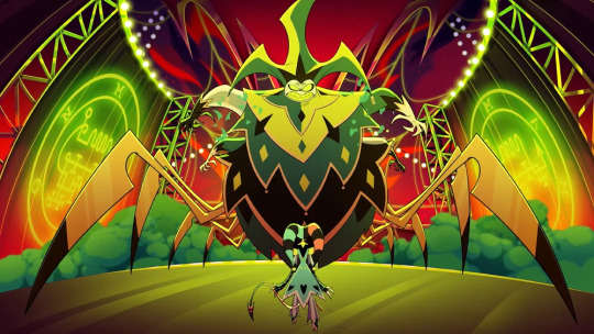
Okay, so I just learned that Mammon's full demon form is based on a centipede... A centipede.... A centipede.
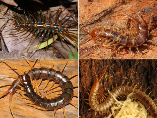
If he was suppose to be a centipede, why doesn't he have a long, multisegmented body? Why the web motive in the theme park? Jesus Christ Vi' is just pulling shit outa her ass again.
#helluva boss critical#vivziepop critical#bad character design#what do centipedes have anything to do with greed btw?#what centipede makes webs?
82 notes
·
View notes
Text
another instance of bad/inconsistent character design i noticed in spop.

so these are supposed to be made out of metal, right? since they're golden and shiny, and i'm pretty sure adora has used them a couple times to block attacks.


but then, why do they bend and fold like that? it doesn't even bend like malleable metal does, this just straight up looks like cloth.
i thought the gold parts of she-ra's outfit was supposed to be armor but apparently not?
it's bad enough that they only gave her actual armor for like one fight, and even that didn't protect her from catra's scratches. but this is just ridiculous.
and they could have fixed this by simply having the gauntlet (?) end at her wrist instead of extending it up to her knuckles.
or they could have given her a plated gauntlet like in actual armors that knights used to wear, so that there is more freedom of movement and flexibility, but i guess that's too much to ask.
i know that this is a nitpick and i'm not denying it. but for a show that is centered around war, it's so funny to me that the main character, the warrior hero, isn't even given proper armor.
#and it's not like her warrior goddess status protects her from injuries either#og she-ra used to be invincible meanwhile reboot she-ra is getting thrown around like a ragdoll#spop critical#spop salt#spop#spop discourse#spop criticism#she ra#anti spop#bad character design
63 notes
·
View notes
Text
more alice art


#my art#alice liddell#american mcgee's alice#alice: madness returns#amr#alice in wonderland#video game#horror#gothic#steampunk#concept art#character design#fashion design#knight#armour#dress#idk#i'm bad at tagging#digital art#fanart#love you bye
706 notes
·
View notes
Text
this character design makes me unreasonably angry bro like just look

like look at her bruh
her mouth is between her eyes and her nose
i could fix this in less than a minute
watch

see?
much better!
168 notes
·
View notes
Text
It needs to be said, most of Genshin Impact’s character designs suck ass, it ignore important character design fundamentals like unique silhouettes and limited details, making the designs a mishmash of pretty things with no real coordination or identity.
They’re ugly af too
35 notes
·
View notes
Text
I had another realization as to why I hate live-action Toothless’ design so much, he literally looks more like the Light Fury than HTTYD1 Toothless


- rounder ✔️
- sleeker and skinnier, less bulky ✔️
- less scaly ✔️
- dopey as fuck, little to no scare factor ✔️

I don’t want anyone telling me ever again that “oh LA Toothless didn’t change much, he looks just like his original design!” where
#sketch text#rant#bad character design#dreamworks#HTTYD 3 critical#httyd 3 criticism#httyd live action criticism#HTTYD live action critical
20 notes
·
View notes
Text
I hate the design of the gods (and especially the goddesses) in DnD. Let me tell you why.

Okay, let me ramble a bit about DnD. And especially about this one thing that I really loathe about the visual design of the game: The designs of the gods, and especially the goddesses.
Now, let me say, that a part of the issue is, that many of the gods still use their designs from early on. So from 1e, 2e or 3e. Some got new artworks, yes, but they still have the same design as those early gods. Which is very much the root cause for the issue I have, but it does not change that this issue exists.
The issue?
I fucking hate that most of the Faerûnian gods are:
human
white
thin
abled
Yes, there are a few gods, who break out of this. Ilmater is disabled (but also, the fact that he is kinda the god of self-sacrificial suffering... does seem really ableistic), and of course there are the pantheons of the different other species. Though it should be noted that they are generally not part of the Faerûnian pantheon.
And... like, the gods really do not have any variety among them, and this is especially true for the goddesses. Which is obviously the typical character design problem.

(No idea, who drew that one, but it kinda is very fitting - especially for the DnD Gods.)
The male gods look actually quite different at least in terms of body build and stuff.
Like, if you look at the gods... I mean, looking through the different gods I have not found a single one, that was really overweight, but at least there is some body diversity - even if there is not going on a lot else in terms of diversity.

But the goddesses? Yeah, no they all look the same.
You could argue that the current design for Shar looks a bit East Asian, but other than that? I mean, they are all super pale and shit.
Now, I already hear people say: "But Faerûn is BASED ON EUROPE! And it is majority human!"
There are only two issues.
Given that since 3e the world outside of Faerûn was not really developed further, WotC decided to turn Faerûn into this super diverse place - but this is not reflected in the gods.
Some of the gods are just mortal who through ascension became gods, while the forms of other gods were formed through their avatars - which then should reflect the diversity of Faerûn, too, and it doesn't.
I mean, while I started reading into the lore of the game, I came across this one artwork of Mystra, which still has her as white - but very much as a fat woman. Which actually is such a nice look for her.

Meanwhile I have decided that in my stories I will depict Tymora not as a white, blonde human woman, but rather have her use an avatar of a Black, halfling woman. And Loviatar in my stuff has a more Arabian, brown skin tone and thick black hair. Because why... would I want all of them be white, normal folks?
It is in general an issue I have, and where especially the (yes, very underfounded) novelization part of WotC is doing shitty work. Because most of the canonical characters that get to play a big role in novels and comics are still white, abled, thin. And man, it sucks.
It is boring. It is bad design.
And yes, Baldur's Gate 3, I am also looking at you. You know I love you, you stupid game. But really, a bit of melanin would have done wonders for you.
#dungeons & dragons#dnd#dnd lore#baldur's gate 3#baldurs gate 3#bg3#rant#dnd gods#mystra#shar#loviatar#tymora#dnd tyr#selûne#character design#bad character design#diversity
24 notes
·
View notes
Text
this is the most upsetting peacock design i've ever seen


(this character is Charming Gold from Running Man: The Animation)
81 notes
·
View notes
Text

i took out the other people sitting at the table in the original comic because i did NOT want to draw glindas gay ass friends
#wicked movie#wicked musical#wicked#galinda upland#elphaba thropp#wicked galinda#wicked elphaba#gelphie#galinda x elphaba#glinda#glinda x elphaba#glinda upland#im sorry guys her two friends annoy me so bad i will not stay silent anymore#BEFORE ANYONE YELLS AT ME this is a scene from the movie but w my stage designs#mainly bc i havent taken the time to come up w movie vers designs yet#but i might soon bc i love character design and drawing fun outfits#anyways i love lesbians
13K notes
·
View notes
Text
I will never forgive them for not giving her the bullet tattoos. She has the smoke tattoos from killing her family, she killed Silco with pink bullets, so it only makes sense for her to have them, but instead they do a complete 180 of League lore and decide not to include that, even though it's literally an adaptation of League. And they decide they have to give her more traumatic events like isha's death or whatever because they were cowards and didn't want to stick to the jinx they had created by the end of s1, and instead had to make her the cliche good guy with cheesy lines.
Her character design isn't just bad because it doesn't fit the story, it's straight up atrocious design in general. Her braids added to her uniqueness and silhouette, plus the way they flow with her movement is pleasing to watch. Then they decide she just cuts them off (which according to the artbook is due to technical difficulties with her braids during the ep 9 fight, so yeah, a complete retcon that has nothing to do with adding to the story or her character) and gives her the ugly and unoriginal pixie cut. I don't even know why they went through the effort of giving her that cut when they already had her with shorter hair at the beginning of ep 9 which is worse than the braids, but still WAY better than her final cut. So for some reason, after cutting her hair nicely once, removing the troublesome braids, she cuts her hair yet again in a messy way?
Her top is a pale grey that doesn't fit with either powder or Jinx's color pallette or aesthetic at all, but just serves to make her look even less unique. She has random bits of paint of all different colors all over her which makes her design messy and all over the place like a middle schooler's 'unique' oc, unlike her s1 designs, which were unified by their blue, pink, purple, and black color scheme and overall simpler appearance.
Jinx's appearance in s2 ep9 is a tragedy for her character. The writing throughout the season already tried its best to destroy absolutely everything meaningful to her and who she is at her core, and now we get the chance to see it visually.
I'll get this out of the way so nobody bothers me about it later: yes, I personally hate the design overall. But despite that if it was truthful to her character and reflected her journey well I wouldn't even squeak. Well, maybe one tiny time, but not make a whole post about it.
Alright, so right now I'm going to lign up all 3 of her designs and compare them in a sense how they represent Jinx as a character. I apologize for using The Wild Rift model because it's actual hell to find her s2 ep9 look in good quality and with a good view of the details.


There's a pretty stark difference between Powder and Jinx. The only element they share is gloves, but on Jinx they are modified and have a different color. There are however also similiar "motifs"(?), like purple stripes on clothes, Jinx's belts are positioned in a way that mirrors Powder's blue...thing on her pants; also Powder has a small braid on the side of her head, as well as golden hairpins, while Jinx has two braids that are waaay longer, but she still has golden elements that support her braids.
Now, the differences. Powder's clothes are layered and are made from different fabrics, covering almost her entire body. This represents that she's a shy, frightly girl with very low self-esteem. Jinx, on the other hand, has waaay more open skin, even to a somewhat inappropriate degree. This shows us that she became confident and doesn't care what others think of her, maybe even to a fault. Her boots in some way resemble jester's shoes, showing us her more light-hearted attitude, especially towards violence.
Also, unlike Powder, who only ever shot from a toy gun and made bombs that didn't work, Jinx is a prodigy bomb maker and a master shooter with (what seems like) a hand-made pistol, and on top of that has an also self-made machine gun. So from all of this we can pick up that this is the same person, but she changed in a huge way, hence why even her name is different.
Now, onto the Jinx we see in s2 ep9. She cut off her braids, colored streaks of her hair, especially on the bang, replaced her pants, top, and belts, made herself a hood, painted over her tattoos with x-es and Ekko's symbols, fused her machine gun with Fishbones, her recently made rocket launcher (ignore the wild rift picture for this part), and completely remade her pistol. The only things that carry over from her previous outfit are gloves, boots (which are now fully laced), her necklace aaaand yeah that's it. Motifs are left the same, except for her hair of course.
Now, I want to talk about a couple of elements in detail. Her hood is made from unknown material, and resembles some kind of monster, rather than a monkey, raven or shark, her previously established symbols. Like someone pointed out, it probably resembles drawings on Isha's helmet.
Also Jinx has pink markings under her eyes, just like Powder from Ekko's vision in season 1 ep7.
The bandages that replace her top are the same ones Vi has.
So, with all of that information, what can we tell about Jinx at the end of her journey? The obvious answer is that she decided to move on, but in what way? Accepting both "Powder" and "Jinx" parts of her? But then why did she paint over her tattoos? Something permanent, that shows how irreversibly she changed over the years, and will never become the same girl again? Moreover, why didn't she make the new tattoos, pink bullets? Yes yes, pink bullets. Both LoL Jinx and even s2 ep9 skin for Jinx in The Wild Rift have pink bullets tattoos, but arcane Jinx doesn't. Why tho? Well, of course, it's our good ol' pal Silco erasure. Because, you see, Jinx killed Silco with her Pow-Pow, and when she shoots with it, the bullets are seen as pink projectiles. So, not only does Jinx figuratively want to "paint over" her past with Silco, she also in no way wants to capture what she did to him and that in the very same night she finally accepted herself as Jinx. Of course we know that s2 writers didn't want to follow up on this decision, but adding a couple of effects onto her model isn't that big of a job. Anyway
Why did she go back to covering her legs entirely? Is she more careful now, orrr perhaps she seeks protection from someone? No. Why does she have paint all over her, and Ekko's symbols in particular? Is she a part of the Firelights now? Even if that's the case, it was never confirmed on screen. Why did she completely change her haircut, only leaving a bang? I guess hair holds the memories or whatever, so to start a new life you shouldn't have any memories of the previous one? Idk. Why did she replace her top with bandages like Vi's, if the last time they saw each other Jinx told Vi to let her go and forget about her? Idk. Why did she fuse Pow-Pow and Fishbones together? Idk.
The only things I more or less don't question are the hood and markings, but then again, I'm not really happy with the fact that we see Jinx in them in her "last" moments either. That's the part of my biggest problem with all of this, actually. It took around 10 years for Jinx to have such a big difference in how she looks, but the latest change happened literally overnight. No matter how you try to explain this, this is objectively terrible writing. In less than one episode the main character of the series drastically changed her appearance in ways that should tell us about a big character development, but we didn't get a chance to see any of it. Not the process, nor the development itself, because Jinx behaves in ep9 the same way she behaves in the rest of s2.
So, what was that all about? I guess they wanted to fill out the quota of a minimum of two outfit changes per season, but it's in no way justified within the show. And that's why this is a tragedy. Jinx went from the most well-written character in the show with incredible design and conflict to the writer's toy which only function is to be sacrificed.
192 notes
·
View notes
Text

This design gives me physical pain because the thought process was clearly "he needs to wear glasses so we need to give him ears" but they didn't factor how that would work with the original design at all.
9 notes
·
View notes
Note
Stans: Spop says Buff Women Rights!!!
Spop: The buff women in question.


Not buff. Not even athletic in any way. NO MUSCLE DEFINITION WHATSOEVER.


Very buff, but they’re built exactly the same. Also, there’s only two of them. I’m not counting the moth lady or the bar tender.
Not all buff women are built the same. (Yes, I know not all the girls pictured are buff, but they are all athletes and have noticeable muscles or are toned in one way or another. You get the idea)


all of this! adora at least has muscles SOMETIMES in her she-ra form, they’re just very inconsistent. but catra??? fans really saw that one frame where her arms were drawn a bit thicker and immediately decided that she had biceps. even though she was stick thin for the ENTIRETY of the series. pros at cherrypicking really.
and yeah, while i do appreciate that spop gave us SOME buff women, i do wish there was more variety, instead of giving them the exact same body type. scorpia and huntara even look like they’re around the same height. (also we don’t really see much of scorpia’s muscles because most of it is covered by her exoskeleton. we know she’s buff but we rarely get shots of her muscles.)
arcane, for example, does muscular bodies really well and gives us a variety of muscular women who all look different from one another.


same goes for tlok.


you can see how korra’s body is stockier and wider while lin is a bit skinnier with lean and athletic biceps. this makes sense considering their powersets and their jobs too since lin was a cop who often used metalbending to restrain people, whereas korra used brute force to fight people head-on. i also appreciate that they made korra a decently big-chested woman who is still masculine and muscular.
at the end of the day, progress is progress and i will praise spop for playing a role in that progress (even if it was very backwards in many areas). but there’s always room for criticism and it’s especially frustrating when fans act like spop is the most diverse show in existence when it doesn’t even come close.
#ask#spop critical#spop salt#spop#spop discourse#spop criticism#she ra#anti spop#bad character design
78 notes
·
View notes
Text
Sooo lets about the bad characters in my story

Name:Mustafa🇹🇷
Age:35
He/Him
Although he seems like a good person, he is actually the greedy man I mentioned before, who kills his victims for money and makes toys from their corpses and sells them. Only Yağmur knows this secret of his, but since that man threatens Yağmur, Yağmur cannot tell it to anyone. When choosing his victims, he generally gains the trust of people who are excluded from society and kills them after ensuring that the society loves that victim and even becomes famous. In short, he is a money-hungry bastard.

Name: Gözde🇹🇷
Age:32
She/Her
She is actually Pelinsu's mother. But Pelinsu's father divorced from his wife after it was revealed that she was cheating on him. But that's not the only reason she's a bad character. She also constantly tries to kidnap Pelinsu and force her to marry someone older than Pelinsu in exchange for money. she also caused to break Pelinsu's legs, and because of Gözde, Pelinsu has been confined to a wheelchair all her life...

Name:Sevim 🇹🇷
Age:36
She/Her
She is the mother of Atakan and Doğa, but she started drinking alcohol constantly after she divorced her husband. He also constantly inflicts violence on his children and puts psychological pressure on them by constantly comparing them with others. So her motherhood is just a matter of words.

Name: Mrs. Gülşen and Mr. Kamil 🇹🇷
Age: (Gülşen) 46
(Kamil) 50
She/Her
He/Him
They are Kader's mother and father. We define them as bad characters because they constantly beat Kader when she was little and tried to force her to marry at a young age. (Don't worry, Kader's current marriage is a marriage of her own will and not a marriage at a young age.) Additionally, Kader realizes that her mother and father did not accept that Lavina was autistic when she was 6 years old and were constantly trying to touch her. When he sees them beating him, he cuts off communication with them. They don't see each other anymore.

Sarah 🇬🇧
Age:14
She/Her
Sarah is generally someone who bullies people, humiliates them, and can even go as far as using violence. In short, she's a spoiled brat. After Yağmur and Öykü die, because Sarah made fun of it, Lavina eventually has a nervous breakdown and loses her mind, and that night she kills Sarah by trapping her in a dead-end street, but then she goes and surrenders in order not to cause trouble for anyone, and is sentenced to death penalty, and Lavina dies because of Sarah.

Name:Mrs.Hilal 🇹🇷
Age:32
She/Her
She was actually Toprak's primary school teacher, but she sexually harassed Toprak when he was still young. After continuing this for a long time, she was released and Hilal harassed Toprak once again. She went to prison again, but while escaping from prison, Toprak was shocked when he saw her while driving and accidentally crushed Hilal to death out of fear. That damn woman is probably in the depths of hell right now.

Amelia 🇬🇧
Age: Died when she was in her 34
She/her
I've told you some things about it before, so now I'll just explain the part I didn't say. In her life before she died, she was actually a teacher for disabled children, but once, someone burned the school while all the children were at school, causing the children to die. Amelia then went crazy and eventually committed suicide. We currently know Lavina as the "Queen of Rules and Goodness" in her dream world, but she is happy in heaven with her students. Actually, she doesn't want to harm Lavina and her friends, but the problem is this: Amelia sees Lavina and the others not as they are, but as people who cause the deaths of the students, so she harms the lives of Lavina and the others. As you can see, she is not actually as bad as I explained before, just life has worn her out a lot.

Christina 🇬🇧
Age: Died when she was 15
She/Her
Christina is not a real girl, but the spirit of her dead self. After years of bullying and violence in her previous life, Mustafa killed her to make a baby. Her spirit generally wanders around the forest areas and does her best to harm the lives of Lavina and the others, but like Amelia, she sees Lavina and the others as they are, not as people who bully her and as the man who killed her for money. After accidentally killing Öykü, she is never seen again, we will never know what happened to her...
That's it for now! Actually, we will have more bad characters, but I will not explain them right now because I need to introduce other characters before getting to know them.
25 notes
·
View notes
Text

LOSER mark and vinnie post everyone go home
#ignore the nub hands I didn't wanna fight with them#oc art#my ocs#mark WAS a homestuck oc from a really corny au#but im making him an original character now:3#just wanted to draw his old design cause i really like ti#it#can you tell i like eye patches and cool robot arms#my art#mark hansen#largos hansen#vinnie hansen#on my grind 👅👅#i have more stuff to post but it's my CRINGE south park au#im gonna wait on that!!#bad character design#artists on tumblr#their hair being white IS a Ghostbusters reference#if you catch my drift#i will redesign mark soon#does anyone read these? hi you're so cool😁😁
9 notes
·
View notes
Text

What the hell kind of design is this? 🤣
8 notes
·
View notes
Text

I found this cringeworthy cover art for "The Count of Monte Cristo," in which Kirk Douglas' Ned Land from Disney's "20,000 Leagues Under the Sea" has dyed his hair black and finally got his hands on that stupid treasure chest.

I don't know what's going on, but it looks like Edmund Dantés has a whale of a tale to tell; a whale of a tale or two.
#that striped shirt is a menace#why#why just why#bad character design#20000 leagues under the sea#jules verne#twenty thousand leagues under the sea#classic literature#tkluts#captain nemo#the count of monte cristo
13 notes
·
View notes