#because i added image descriptions in the alt text
Explore tagged Tumblr posts
Visit Tumblr Blog
Explore Tumblr blogs with no restrictions, modern design and the best experience.
Last Seen Tumblr Blogs


Fun Fact
Tumblr has a low social media market share in South America.
Text

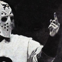
WHICH ONE OF YOU WAS IT
(post for reference)
#byrd chirps#image description in alt#image described#image desc in alt text#image description included#image description added#described#Also worth noting that in the reddit post the op of the Tumblr post (womaninwinter) is not yet deactivated.#but if you go back to the og post‚ the op is in fact deactivated#so did it go directly to reddit? did it go to pinterest or some other social media first? who knows#and the reason i found out about this is because MY POAST GOT READ BY GODDAMN JAMMIDODGER.#WHO. WHO DID THIS.
31 notes
·
View notes
Text
hi guys. amethio outfit board
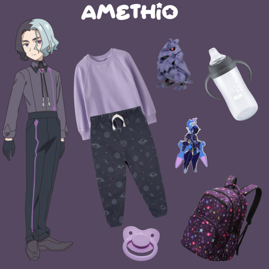
#pokemon agere#sfw agere#agere#image description in alt#<- gonna try adding alt text more often :)#i want this blog to be as accessible as possible#at least image-wise#because i struggle to type when i’m regressed#and that can probably be hard for people with screenreaders to read#but!! i will do my best#sorry for the tag ramble.#please rb if you like this :) not forced but it’d be super appreciated!
6 notes
·
View notes
Text

WELCOME TO HERMIT-A-DAY MAY 2025!
Another year, another Hermit-a-Day May! I'm so thrilled to be able to bring this event to you all for the third year in a row.
THE RULES: 1. Any type of fanwork is welcome so long as it features, or is otherwise inspired by, the Hermit of the day. 2. Tag #hermitaday to have your fanwork reblogged, or submit it directly to the blog (Please note that while we recognize the value of fanworks involving more mature themes, and they can certainly count toward challenge completion if you're keeping track for yourself, content on this blog will be kept "PG-13" so that all may enjoy.). 3. Fanworks for one Hermit posted after the day rolls over to another Hermit's day (per the US Central time zone) will be reblogged in one big queue in June. 4. Traced or stolen work is NOT welcome. If we discover you have posted traced or stolen work, you will be given one chance to delete it and apologize, or you will be blacklisted from the blog. AI-generated/assisted pieces are similarly unwelcome and will not be featured on the blog. 5. We are not interested in seeing captions or tags in which you disparage your art/skills, and will not be reblogging posts where this happens. We're all improving all the time. Be kind to yourselves. 6. Technically not a rule, but we strongly recommend adding alt text or description to all images. Click here to learn more about writing alt text - it's pretty easy!
WHY SHOULD I PARTICIPATE? To show love to every Hermit, from the most to least subscribed, from those who have been on the server from day one to those who only joined this season! And because challenges are fun! And because we are once again out here for a good cause: we're running another fundraiser for Gamers Outreach, featuring art incentives by nine amazing artists. Learn more about our incentives in these posts:
MILESTONE REWARD POST
INDIVIDUAL REWARD POST
RAFFLE POST
WHO’S RUNNING THIS? Hi! My name is Luna! You can use ze/hir, she/her, he/him, or ro/ros/roseself pronouns for me. My main blog is @as-if-unreal. Helping me out this year is the incredible Mod Sky ( @skyspersonalhell ), who uses any pronouns!
BONUS DAY PROMPTS EXPLAINED UNDER THE CUT
FAVORITE "ALT" HERMIT - May 4th HoTGuY and Poultry-Man. Helsknight and Evil Xisuma. Renbob and - look, you get the idea. This server is full of theater kids ready to toss on an alternate skin and play into a brand new character at the drop of a hat. Who's your favorite?
OUTFIT SWAP - May 9th What would Doc look like in Cleo's Life Series leotard? How would Cub fare in Wels's armor? What laundry day mishap could lead Mumbo's suit to lose its sleeves like Skizz's? Only hilarity can come from this...
GROUPS AND COLLABS - May 14th This month is all about one Hermit a day... but what we really love is when they interact with each other. What does your favorite duo or group of Hermits get up to together?
FAVORITE BUILD - May 18th The Hermits have put thousands of hours into their builds, from cozy starter bases to the sprawling halls of Deepfrost Citadel, from idyllic natural landscapes to machines the size of mountains. Which builds have inspired you?
TFC - May 23rd While he may no longer be with us physically, TFC left behind him a legacy of quiet care and good humor, and Hermitcraft would not have been the same without him.
FRIENDS OF HERMITCRAFT - May 28th There are plenty of shows, podcasts, competitions, other servers, and more woven into the internet ecosystem around Hermitcraft, and plenty more people involved in them. Today is for celebrating all of those who, while they may not be Hermits themselves, exist and entertain in proximity to them.
#hermitcraft#hermitaday#reference post#impulsesv#grian#tangotek#falsesymmetry#mumbo jumbo#bdoubleo100#hypnotizd#geminitay#cubfan135#pearlescentmoon#smallishbeans#ijevin#goodtimeswithscar#rendog#zombiecleo#xbcrafted#xisumavoid#keralis#joe hills#vintagebeef#zedaph#welsknight#skizzleman#docm77#ethoslab
3K notes
·
View notes
Text
my lecturer's comment on my assignment proposal cracked me up
#misc: personal#Nia Goes to College#adding alt text on tumblr is not user friendly lmao#the pop up to add the description covers the image you're trying to describe#so i had to copy my alt text from twitter instead because i instantly forgot what the text in the start of the image said
0 notes
Video
Ohhh okay so I actually had a self-reblog of this queued up for the 5 year anniversary in about a week, but I’m gonna do it early instead because I want to promote this addition
4 years since change your mind aired!! here’s an anniversary art
#was gonna ask if I could add it to my alt text before remembering videos don’t have the option 😔#I really appreciate this being added on tho#especially as someone who honestly is never sure what’s a good way to describe their own artwork for image ID’s#and struggles to determine what details are necessary to describe and what details end up being superfluous#like stuff with text is easier bc that gives me a decent starting point#( which reminds me that I forgot to alt text my last few ones with text so. Am gonna go fix that in a sec )#but I might use this description as a reference point because it’s pretty concise and well structured#steven universe
2K notes
·
View notes
Text
DREAMGIRL'S LASH COLLECTION V.1-V.6 FIXED
Hello~ As many of you know, a recent patch update broke pretty much all cc eyelashes. I personally adore @dream-girl's eyelashes and because the creator has been gone since February of last year, I knew there was little chance of them being updated. I'm very very new to cc creating, but I came across a quick fix for cc eyelashes and decided to take on the project of updating these so that everyone can have them working in their game again! I will of course take this down in the event that the creator requests that I do so or if an official update is released by dreamgirl. Alt-text includes image description and the names of the sims who are modeling these gorgeous lashes!
Download + Info under the cut~
You can find all of these in the new eyelash category. They are enabled for occult as well as both genders and opposite frames! I only tested them once on a male sim, so if there are any issues I apologize 🙏🏼
Issues of note: I am currently unable to fix V.7 of the creator's lash collection. There is a preexisting issue (pre-patch) with the mesh where the top eyelashes did not morph with the eye, and this has of course carried over. I am going to continue to attempt to fix these (they're a favorite of mine), but please understand I am very much so a newbie and I've never used Blender. I can't promise when or even an if they will be fixed, but please be patient with me. One other thing I've found is that these lashes may conflict with some custom facial sliders. For example, I use magic-bot's facial sliders and the cheekbone slider causes the bottom lashes to morph with the structure of the cheekbones, so please keep this in mind! As per usual, these lashes conflict with glasses! That's all! Thank you guys SO much for all the love and support and a big big thank you to @dream-girl!
DOWNLOAD (SFS + AD FREE)
#ts4#ts4cc#ts4 eyelashes#cc eyelashes#s4cc#ts4 genetics#ts4 accessories#simblr#thanks again lovelies!!
2K notes
·
View notes
Text
Inspired by this post by @thanergetic-hyperlinks, I present to you
Tessellations of the Nine Houses
(Or "I can't really draw figurative art so my Locked Tomb fanarts are geometrical vector drawings")
"A tessellation or tiling is the covering of a surface, often a plane, using one or more geometric shapes, called tiles, with no overlaps and no gaps." — Wikipedia.
Making tilings themed after each necromantic House seems obvious: for each House you pick a tile with the same number of sides as the number of the House; but this does present some challenges for some of the Houses.
note 1: this might give the impression that I first decided on the symbols and then found patterns to match them in a very organized and motivated manner; in practice it was much more chaotic and multidirectional, the patterns informing the symbols as much as the symbols informed the patterns; this is fine since symbolism is entirely associative and arbitrary anyway
note 2: I added alt-texts for all the images, but I have no idea of how to properly describe abstract geometric art; if you feel you can do a better job than I did, feel free to put your fingers where your mouth is--wait, hang on-- I mean feel free to provide better descriptions if you can
note 3: looking forward to the geometry nerds explaining to me how I got basic geometric details wrong, friggin nerds
The First House
The First House seems obvious, as a shape with one side is an ellipse (of which the circle is a special case). There's just one problem: ellipses do not tile the plane. No matter how much you stretch them and deform them, the very nature of ellipses means you'll always have gaps or overlaps.
So we cheat and we work with overlaps: turns out there is a history of tilings that use circles as a construction pattern, then turn the overlapping sections into the actual tiles. Such patterns have been used extensively in European and Middle Eastern art, and have also been associated with the New Age movement, so it fits Jod's style perfectly. And so we get this:

The different cells correspond to different House colors, with the resulting gothic stained-glass appearance quite in line with the Roman Catholic Empire vibe Jod is going for. The overlapping circles convey the intricacy of the relation between the First House and the eight other, both autonomous from it yet intrinsically part of it.
The Second House
There's a variety of geometrical shapes that have two sides, but most of them don't tile the plane, altho there is one that does — if we take a crescent shape and slightly thicken it so that the inner and outer curves are identical, we can do this:

The waving pattern is of course evocative of the flag of conquest which the Cohorts of the Second House have planted on many worlds.
The Third House
With the Third House things get a lot easier, because equilateral triangles are one of the three regular polygons (where all sides are the same length and all angles are identical) that tile the plane all by themselves without needing any other shape! Which however doesn't mean we have to be boring; we can have a little bit of fun:

Flowers for the beauty and ionizing radiation warning signs for the rancid vibes.
The Fourth House
Squares are the second regular polygons that tile the plane by themselves, so again our job is easy here, altho we still want to not go for the easiest option in order to be able to work in some symbolism:

The four big navy squares with a small white square at the center of course evoke the number five and the shadow of the Fifth House's regency over the Fourth.
The Fifth House
Regular pentagons do not tile the plane, so we have to use a more unusual shape — there are many options, but obviously we want to again pick one that offers some interesting numerical symbolism:

The cross-like patterns of course bring up the number four and the hold of the Fifth House over the Fourth. As for the crosses themselves and the fact that they appear to be made of wooden stakes, well uh… Abigail Pent, Vampire Hunter??? She does have Van Helsing vibes.
The Sixth House
Hexagons are the third and last regular polygons that tile the plane on their own. But this is the Sixth House we're talking about, things need to look orderly but in a convoluted way. So how about multiple levels of recursion:

The apparent complexity of the pattern is created by different orientations of a small number of elements, either 3 irregular hexagons, or 1 patterned regular hexagonal tile, depending on how you look at it, in line with the kind of hermetic scientism one imagines the Sixth House indulges in. The result is those apparent three-dimensional elements and emerging higher-order patterns, including that of ꙮ, the Multiocular O found in exactly one word of one 15th century Old Church Slavonic translation of the Book of Psalms ("серафими многоꙮчитїй" many-eyed seraphim).
The Seventh House
Regular heptagons do not tile the plane, but they don't need much tweaking to work, which is fine since for the Seventh House we want something deceptive yet simple (deceptively simple? deceptive in its simplicity?):

Hearts for the beauty, snake scales for the poison [the Seventh House is on Venus, the planet named after the Roman Goddess of love, but etymologically "Venus" is actually the same root as "venom", and of course "Septimus" resembles "septic" — tho in that case there's no etymological connection, it's just a happy coincidence].
The Eighth House
Octagons do not tile the plane, but they come pretty close, so we can give the Eighth House a simple, stern, but slightly threatening pattern:

Boring sterile bleached temple mosaic, with just a little bit of passive-agression, a perfect fit for Evangelical Christians Tumblr puritans the Eighth House.
The Ninth House
And so we reach the Ninth House. Now the thing about the Ninth House is that, even by imperial standards, they're huge freaks, like they're completely unhinged heretical weirdoes. So, when it comes to their tiling, we need to get weird, like, a lot weirder than we've been so far, and this will require some context, so get ready because now we're officially going on a wild tangent.
So far all the tilings we've seen were periodic. That is, they were drawing a pattern that repeats itself indefinitely in all directions.
But starting in the 1960s, mathematicians began to study aperiodic tilings, tilings that don't repeat; you can keep expanding them forever and never exactly find back the original pattern you started with. The first mathematical proof of such a pattern was made in 1964 and theoretically required 20,426 distinct tile prototypes… This was soon refined to just 104 tile prototypes, then a mere 40. By 1971, it was mathematically demonstrated that you could make such a pattern with just 6 tile prototypes.
Except that was a lie.
Note that I said mathematically demonstrated. As it turns out there was an aperiodic pattern with just 5 tile prototypes, known as Girih, that had been used in Islamic art… since at least the 13th century — but it had historically been treated merely as an element of architectural design, and its mathematical properties weren't studied until 2007.
Then in 1973 this guy Penrose came along and demonstrated you could make an aperiodic tiling with just 2 tile prototypes. So now the goal was to find the ultimate aperiodic tiling, the one that would use only one tile prototype. Given how fast the field had progressed so far, it seemed that this discovery was imminent.
It took 50 years.
Not only that, but it was the work of amateur mathematician David Smith who accidentally discovered a 13-sided polygon that could make an aperiodic tiling all by itself (he then had his discovery checked by and co-authored a paper with a number of professional mathematicians).
EXCEPT THAT WAS A LIE AGAIN.
In turns out an aperiodic tiling using only one tile prototype had already been found… in 1936. But since the study of aperiodic tilings only started in the 60s, its significance in that domain wasn't understood at the time. It was seen as significant, but for an entirely unrelated reason: it was the first demonstration of a polygonal shape that needed only two copies of itself to completely enclose the original one — many mathematicians before that point thought the minimum possible was 3 (think of the Triforce from Zelda, with one equilateral triangle completely enclosed between three other identical triangles).
And coincidently, that shape happens to be a highly-irregular nonagon [yes "enneagon" is """technically""" more correct but "nonagon" has been used since the 17th century and is more common and it has Nona in it and Nona loves you]. So here it is, the Voderberg tiling, the freakish freakish tessellation of the Ninth House:

Like you see this and you're like "what is this, what is that thing, that's not a tiling, what the fuck is that" — but it is, it is a tiling, you can keep adding the freaky polygon and it keeps expanding outward forever, with no gap, no overlap, and with an ever-changing pattern. A double-spiral radiating outward, for Anastasia and Samael, Anastasia and Alecto, Alecto and Harrowhark, Harrowhark and Gideon.
And if you were thinking that this last one must have been significantly harder to draw than the other ones, you would be correct.
450 notes
·
View notes
Text

(Image description in ALT text)
Did this as a quick painting experiment - Also because I haven't drawn Virgil in a skirt in a while lol
Taglist: @roseianxiety @vash-the-trans-catboy @angstysunshine @treeni @jervis-tetch-my-beloved @plaguethewaters @anxious-chaos-art @ghostbunnii @sapphicfrogae444 @cutebisexualmess @thedeadandthedecaying @swampthing07 @oliversdumbshit
Tell me if you want to be added or removed!
330 notes
·
View notes
Text

@inspectorpoe
Torn between trying for the, like, sixth time now to explain to one of you folks that my objection to this particular kiss being called a "farewell kiss" is a semantic issue with the order of operations in the scene, and just being... completely exasperated that this is the hill we have all apparently chosen to die on, when it's almost the least of the problems with the original translation of this Regret Message.
As I have said now, twice, if the original translation had just included the word "When" in the sentence, that tiny fragment of their translation would've been fine. Inaccurate, in my opinion, to the scene, but not blatantly inaccurate to the Japanese, because yes, AS I HAVE REPEATEDLY SAID, 別れのキス by itself could be translated as parting/farewell/goodbye kiss. Or as "breakup kiss", because 別れる also means that sort of separation.
But:
ねえ、ルルーシュ。あの別れのキスの時、 Lelouch, about that parting kiss...
continues to be inaccurate, because it omits multiple words from the Japanese, changing both Kallen's tone and how this part connects to the rest of her sentence.
If for whatever reason you really need the sentence to contain "parting kiss", instead of how I translated it, which was "That last moment we had together, with that kiss...", then I would suggest: Hey, Lelouch, when we shared that parting kiss...
Or something like that.
Now, the original Regret Message translation would still have had half a dozen other problems, like translating イラついている as "plastered with thorns" instead of "being irritated"; like the strange editorializing about 嘘でもいいから and the stranger footnotes about 愛してる and わかってたでしょう?...
...but at least if they'd put a "when" in the right spot, their version wouldn't have confused people into thinking Kallen was talking about two separate instances, when she is clearly, in this Regret Message, talking about a hypothetical version of events where, after she asked him what she was to him and kissed him, Lelouch had said 愛してる — how if he'd done that, Kallen would have done anything for him, including participate in all the awfulness that led up to his public execution, which she would then have to live with, and which Lelouch not saying those words spared her from.
Are we done now, or am I going to get more replies on this post from people trying to get me to """admit""" that 別れのキス could be translated as parting kiss, lol, something I have never actually denied.
Complete Best Regret Messages: Kallen
Read on Dreamwidth!

Extolling the Brave Chivalry of Youth[1]
Before I met you, I was really just irritated. I thought: "I want to change the world[2]," but though I lashed out, recklessly, I didn't actually believe I would be able to change anything.
When I lost my brother, it was like a heavy door had slammed shut behind me. I wasn't going to let that go. I'd fight to the bitter end. There'd be no going back, I decided. And then, someday, I'd die — just like my brother had. To the end, Kouzuki Kallen would follow no leader, serve no master[3]. Dimly, I'd thought that small, stubborn pride would be the end of me. But then: like a morning star coming into view, you called for me[4].
Whenever I was doing something for your sake, I felt lighter. No battle was too difficult. Whenever you directed us to a battlefield, I came running, wanting to be the first one there[5]. I wanted to become a lion, to rip your enemies apart with my teeth. To dirty myself with any amount of muck[6], so long as it cleared the way for you.
It's strange, really, if you think about it. It was supposed to be about loathing — and fighting against — Britannian despotism, but before I knew it, I had all this personal loyalty to you[7].
Hey, Lelouch. That last moment we had together, with that kiss… Well, if you'd said I love you[8] back then, it wouldn't have mattered if it was a lie — I still would have followed you all the way into your personal hell. But you already knew that, didn't you?
Not very characteristic of you, was it. Wasn't manipulating people by saying that sort of thing one of your talents…? Yeah, that was so uncharacteristically… gentle.[9] Is that what you were trying to say, when you told me to live on…?
Even though that sort of gentleness isn't at all why I fell for you[10], heh[11].
Translation notes below the cut. Original Japanese text for you to check yourself transcribed from the above image available at my Dreamwidth link.
[1] This is the title of the first ending theme; other regret messages similarly take their titles from theme songs. This was released as part of an Original Soundtrack CD, after all. [2] 現実=reality, to be more literal. [3] 支配者たちに従わなかった = serve/follow/obey no masters/leaders/rulers. IMHO this use of たち makes perfect sense in Japanese, but "serve no masters" sounds somewhat grammatically awkward. Importantly, given what Kallen is about to talk about, I think she's speaking somewhat ironically about how she'd made this small vow to herself, but was about to wind up following/serving/etc Zero. [4] The verb, 誘う, means to invite or to call for or to take someone along (and also to tempt/lure/entice/seduce); in this case, I think Kallen is referring both literally and metaphorically to Lelouch suddenly calling her on the radio in Stage 2 and guiding her to victory. [5] Sudden volitional form on this and the next three lines, indicating (in this context) Kallen's strong intention to do [whatever]. The switch here to present-tense isn't literal, but rather a common device in Japanese writing to add a sense of emphasis and immediacy, sort of like when an English sentence begins with "Suddenly…!" [6] Given the "title", likely a bit of a reference to the lyric 混濁の純潔この身は汚れても / Even if my purity is sullied and this self is dirtied. [7] だもの is a sentence ending that indicates a reason in a tone of protest, such as 14歳だものね = "You're fourteen," where the speaker is probably pointing out that the person they're talking to is too young (to stay out late, or whatever). In this case, the はずなのに + んだもの is definitely a complaint. She should have been focused on the larger war, but she wound up more focused on her personal loyalty to "Lelouch, ugh" — sort of a sentiment. (Though, I'm sure, affectionate now.) [8] Strong, dramatic phrasing here, because such strong dramatic phrasing would have swept Kallen off her feet and convinced her, as she elucidates, to follow him anywhere — even if it meant throwing away her morals and working for what she thought, at the time, was a mad tyrant. (Claims I've seen about this line, that Kallen wouldn't have even imagined Lelouch saying it hypothetically if she hadn't been completely sure he loved her — are extremely weird and based on nothing at all, lol.) [9] Again, the present-tense here adding emphasis. [10] 好きになった=to come to care about, to learn to like, to fall in love with. This phrase is used platonically as well as romantically (you can, for example, talk about developing a taste for beer this way). Kallen almost certainly means it romantically, of course, given all the givens — but she's not necessarily talking about deep love; this wording could very easily be a crush. [11] This and "Well" and a couple of other little flourishes have been added to the English in an attempt to convey the very casual tone of Kallen's entire message, which is full to the brim with ね: like she's talking casually, albeit in a heartfelt way, to a friend (or perhaps a boyfriend! if you want to interpret it that way!) — rather than writing a dramatic letter.
#code geass#not a translation#just a very weird argument#it's not a goodbye kiss because Kallen didn't know she was saying goodbye until after the kiss was over#it could be a RETROACTIVE goodbye kiss if you really want though!#''that's not how context works''#i don't think you know what context is tbqh#now with an image description added in alt text#also you can translate ねえ、ルルーシュ differently#“say Lelouch” or “you know Lelouch” or whatever#just as long as you don't drop ねえ、entirely it's fine
29 notes
·
View notes
Note
Hello! I noticed that some of your fics on Ao3 are tagged "Screen Reader Friendly," and I wondered what makes a fic screen reader friendly. Is it just about formatting, or does content matter too?
Hi, thank you so much for asking this question!!! Disclaimer I am not visually impaired so all of this information I have learned by seeing blind or visually impaired people talk about this issue.
It’s primarily formatting! I’ll list everything I do to try to make my fics accessible here.
Line breaks!!! Use the ao3 line break code instead of adding a bunch of symbols. This is the biggest thing I had to change once I realized my fics were not screen reader friendly.
HOWEVER some screen readers won’t pick up on the horizontal line, either. Another good option is to use a short series of symbols, for example: “~~” or “- - -“
Basically, just don’t use more than three symbols in a row. I used to use “~~~/\~~~” with a delta symbol in the middle to look like the triforce, but a screen reader would see that and say “asterisk asterisk asterisk delta asterisk asterisk asterisk” which is pretty annoying lol
Most screen readers don’t differentiate between regular text and bold/italics. It’s fine to have those in your story, but if the bold/italics significantly changes the plot or the implications of a sentence then it is not screen reader friendly
Screen readers can’t describe a line break that is just an empty space. For example, in one of my fics I have a character reading a note, and I have an extra ‘return button’ space before and after the note to make the note distinct from the rest of the text. To make that fic more screen reader friendly, instead of just an empty space, I wrote “[Line Break]”. That way, a screen reader can say “line break”, and readers still recognize it as a line break
If you have any sort of chat fic (AND this goes for hashtags on tumblr too!) with screen names, be sure to distinguish the separate words in the screen name. You can do this with by capitalizing the first letter of each word like this “ScreenNameHere” or with dashes in between each word “screen-name-here”. That helps screen readers and also people with things like dyslexia who have trouble distinguishing words if they aren’t capitalized or separated in some way.
Screen readers can read image emojis like this smiley face 😁 because they have embedded alt text, but they can’t read text emojis as an emoji, like this one “:D”. If you use any of those in your fic, add a description like this: “ :D [Image description: text emoji of a smiley face with a big, open mouthed smile. End description].”
Also, this one doesn’t have to do with a screen reader, but if you have an image embedded in your story, keep these things in mind:
Be sure to describe the image so anyone who is blind or visually impaired can still experience the image. I don’t think it’s possible to add alt text to the actual image, so I usually put this below the image: “[Image ID: description of the image. Note the important details, but be as concise as you can. /End ID]”. Including the image description instead of some sort of alt text is good for DeafBlind people who can’t see the image well enough but don’t use a screen reader.
Some blind or visually impaired people don’t use a screen reader and instead zoom in on the text. If an image is embedded in the story, be sure it is sized correctly. If it isn’t, it can make scrolling sideways to read zoomed in text more difficult because it makes the webpage much wider than the text itself.
Not all my fics have the screen reader friendly tag because 1. There might be a few I haven’t updated yet, and 2. I didn’t include the tag on fics that have weird formatting or are accent heavy. For example, in Kinship I wrote Twilight’s dialogue to represent his strong accent, and those kinds of things with apostrophes and half-words don’t come through well with a screen reader.
I personally don’t think it’s good practice to include a ton of apostrophes or shortened words to distinguish an accent. Even for people not using screen readers, it’s hard to read. For me, if I see a fic with things like that, I won’t read it. Maybe try having a few words that the character’s accent comes through on, or write something about their heavy accent outside of the dialogue.
The “Screen Reader Friendly” tag isn’t an officially recognized AO3 tag yet, but the more people who use it, the sooner it will be!
Those are all the things I can think of right now. If anyone has any other tips to add, please do so!!
713 notes
·
View notes
Text
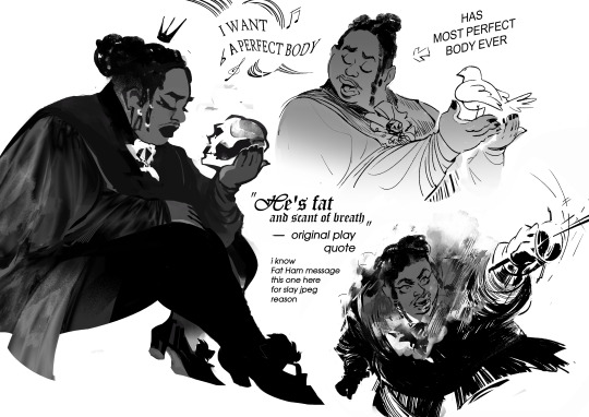
making Hamlet fanart in 2024, slapping Juicy (main hero of Fat Ham, a modern play, Hamlet version, played by black fat queer person) on char design i saw in old b&w film while listening MCR playlist was an experience
highly recommend. also pls watch/read Fat Ham upd: image description added! (in alt text, but also under the cut)
(Image Description: List of sketches with 3 drawings. The textures used here are elegant looks-like photo silk (for clothes), soft shades and gradients. Shapes are sinking in each other depth. No color, black and white
It's fanart depicting Hamlet character being combination of different versions of him from different media: fat black queer masculine person being elegant, wearing mascara and lipstick (took from modern play Fat Ham) wearing vintage royal clothes (took from old classic film). The narrative of sketches also mixed of modern play (Fat Ham) and classic one
There are 3 sketches:
First one. It's the character described above (TC in text further) sitting in side view. His eyes is closed and face has melancholic emotion. TC is holding a scull. There is a simple-shaped silhouette of crown above his head. This image represent classic play melancholic vibes of character fused with modern play appearance
Second sketch. It's TC singing, while holding white pigeon in hands. It had previous classic-modern fusion vibes + a little vibe of disney princess song (because of bird and emotion expression similar to disney musicals). By left side of this sketch is stylized speech babble with music notes symbols and deformed text, visualization of singing. The text saying: "I want a perfect body", quoting singing of TC from modern play. By the right side of sketch there is arrow pointing at character with text "has most perfect body ever".
Sketch Three. It's dynamic sketch of TC in a duel (opponent is out of the frame), waving a thin sword (idk how it in eng, in my first it's шпага, a sword but specific type of it). From the chest of TC it's going steam, like character is heated mechanism pushed to limits. The face of TC is strong and determined, with mouth wide open trying to catch breath. Near this sketch is text: (text starts here) "He is fat and scant of breath" - original play quote. i know Fat Ham message. this one [the sketch with duel] here for slay jpeg reason (text ends here).
End of Image description)
649 notes
·
View notes
Text


Image Descriprions for the flags can be found in the ALT text. The creator of this post apologizes for their size, if it is a bother.
Molotov Queer 【🔥】 A term for a queer individual that is punk, uses many or a few contradictory labels, and is rebellious about it. This may be interpreted as being mean, being extremely firm in your views, being precise with words when you have to, and/or being unruled when exclusionists draw near. This term is against harrassment, but it isn't against self-defense. Label examples are lesboy/turigirl, gaybian/velsbian/gaybiles/velaurian, fagdyke/dykefag, cistrans, and many more.
This term may alternatively be used for < anyone > who is supportively punk for the acceptance and protection of queers with "weirder" or "clashing" labels, without the individual who is being punk using these labels for oneself in specific.
Made with { @floraeth } for THE SIXTH AND FIFTH DAYS (LINK) of THE MOGAI TEAM-UP EVENT (LINK) by { @rwuffles && @vampitsm } — our team is "THE SWARM" (LINK) !!!
FLAG SYMBOL CREDITS HERE (LINK) !!!
Note: i'm fashionably late for this post but its okay because the hosts are very kind people (thank cod cuz id be cooked if they were evil and fucked up HEEHEE)... pls enjoy :3 i tried something a lil diff with this flag, but i hope it still looks okay! enjoy ♡
Anyone may use my terms and flags, however, I will block as I deem fit for my wellbeing (LINK). Please only post this to WIKIs with appropriate crediting towards me (&& others involved with my creation). Do not repost to any other social platforms, ONLY WIKI PAGES. Thank you!
Taglist: @radiomogai, @lovesse, @lunentity, @rwuffles, @kiruliom, @nqvo / @cheruvic, @inknoidd, @h-halos, @puppfie, @gender-mailman, @hypnosiacon, @losergendered, @rabidbatboy, @acronym-chaos, @daybreakthing, @gengernoway, @lawslinger, @local-maneater, @scr-ppup, @sevvys, @puriette-archived, @floraeth, @sylviestial, @idwl. Please, feel free to ask to be removed from/added to the list. (You're also welcome to ignore this!)

{ BANNER IMAGE DESCRIPTION IN ALT TEXT !!! }
#mogai label#mogai flag#mogai coining#mogai flags#mogai gender#mogai genders#mogai identity#mogai post#mogai pride#mogai term#mogai terms#new mogai term#mogai#mogailiom#liom label#liom flags#liom coining#liom flag#liom gender#liom genders#liom identity#liom post#liom pride#liom term#liom terms#new liom term#liom#liomogai#term coining#mogai teamup
143 notes
·
View notes
Text
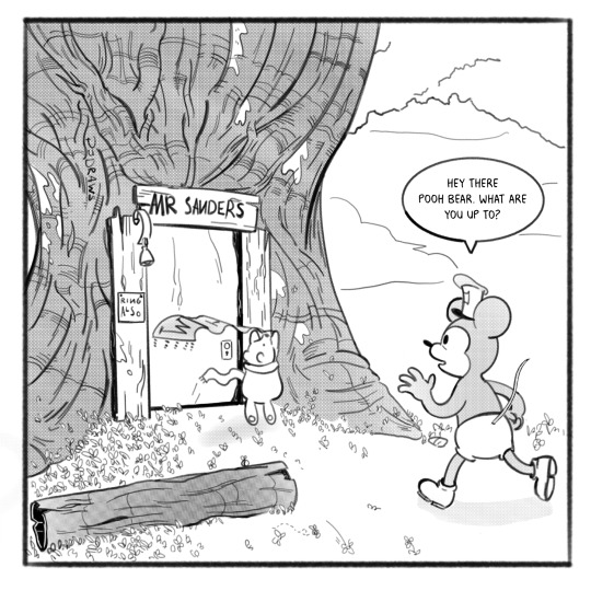
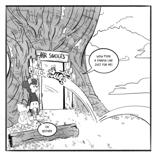
[ID, partly from ALT text: A four panel comic showing Mickey Mouse and Winnie-the-Pooh outside Pooh's. Panel 1: Winnie the Pooh is outside his house, trying to hang a banner. Steamboat Willie approaches, asking "Hey there Pooh bear, what are you up to?" Panel 2: Pooh bear is lifted by Willie to help him hang his banner. "My friend Tigger is visiting today, I haven't seen him in ever so long, so I'm having him a party", says Pooh Panel 3: Willie holds Pooh on eye level and says "I wonder when my friends will make it here I hope they hurry". Panel 4: Tigger bounces into frame right though the banner that says "Welcome Home" that Pooh has been hanging. Tigger says happily, "Wow Pooh, a finnish line just for me!" Pooh responds with an "Oh bother". Mickey watches Tigger jump through the banner with an awed expression. End ID.]


#this is the cutest thing I've ever seen#(I added the regular ID because ALT Text alone is not accessible to everyone who needs an ID#even before we talk about how glitchy tumblr is#so it's safer and more accessible to have it in plain text as well)#my generic tags copy and pasted to save time:#Please copy and paste into the original post for accessability#no credit needed! It should just stay in plain text like it is now#without being put in italics bold or color#and go directly below the image#and above the caption#Image descriptions are for the visually impaired and blind#the way subtitles are for the deaf and hard of hearing#a plain text image description in the body of the post itself#is more accessible than just ALT text.#The image description should not go under a read more as that is inaccessible#and if you change your URL or delete the original post#everything under the read-more will be lost forever
1K notes
·
View notes
Note
Why do you always do a description to your drawings?
It's for people with low/no vision who use screenreaders! Otherwise I'm p sure it just reads out "image" when it reads an image so adding a description makes it so these folks can still understand whatever is in the image, get context, and have fun :3
I keep it in the body of the post rather than alt text as well because I've heard that tumblr's alt text can be finicky with some screenreaders?? And this also makes it accessible for people who might not use screenreaders but still need like. A transcript to read my handwriting for example, or maybe just a horrible internet connection that has em stuck in the Gradient Zone lol.
Basically it's just an accessibility thing that helps people uwu
44 notes
·
View notes
Text
Hey Screen-Reader Users!
Question for my readers who use text-to-audio on tumblr!
When "Alt Text" first became a thing I asked about whether I should move to that for image descriptions, and the feedback I had was that alt-text wasn't really working with the readers yet. Last time I checked in I had the same answer, but that was several years ago and recently I had heard that it was starting to work a lot better.
Which causes an interesting dilemma, because now, if an image has alt text the reader can read, my adding IDs in the post is actually doubling what the person has to listen to, which is not ideal. Less of a dilemma, if I don't have to add IDs in text, I will be able to reblog more image-heavy posts.
So this isn't statistical, more of a community survey of my readership -- I'd like to hear from screen-reader users about whether alt text is now a functional replacement, and from non-users about their thoughts on dropping IDs when the image already has one in alt. I might still do IDs for my own image posts, or I might go to alt text as well, so I'd like thoughts on that too.
Feel free to comment or reblog -- if you'd prefer to privately send an ask that's fine too but unless there's fodder for a more indepth discussion I'll be taking those as notes rather than responding. Thank you everyone!
79 notes
·
View notes
Text
Questions for audio and visual accommodations that bloggers can make on Tumblr:
I have absolutely no idea who to ask, so I’d appreciate people boosting this post. Is there anyone out there who can answer one or more of the following questions about accommodations I can make on posts?
1) If images are fully inaccessible without visual descriptions, what tags do you filter out? I’ve seen ‘undescribed’ and ‘uncaptioned’ used before
2) If you use text to speech and there is a sentence in all capital letters, does that mean the entire post is inaccessible to you? My understanding is that the letters are read one at a time. Is there anything I can do as a reblogger like adding it in plain text in my reblog or does that not work because you don’t know there is plain text below?
3) What tags should I use on a video on if it has no visual description and / or no audio description? Some people need one or the other so I don’t know how to warn people that the post doesn’t have all the information you may need. I don’t want to say ‘uncaptioned’ just to have people who only need visual or only need auditory descriptions left out of the post
4) If a video has the audio transcribed on the screen, how can I best tag that? My assumption is that someone with good vision but no hearing can access the video but someone who needs larger text can’t adjust it because it’s part of the original video. Like is done on TikToks
5) If there is alt text for an image, is that enough or is it better to also put the image description in the body of the post? Why?
Thank you to anyone who helps me learn! I want to make Tumblr more accessible for everyone
#myposts#disability#Deaf#hard of hearing#blind#low vision#deafness#blindness#I really hope it’s okay to tag these communities
41 notes
·
View notes