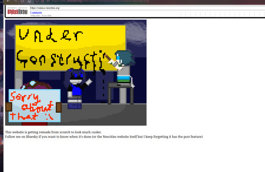
#button in html to link to another page
Explore tagged Tumblr posts
Visit Tumblr Blog
Explore Tumblr blogs with no restrictions, modern design and the best experience.
Last Seen Tumblr Blogs


Fun Fact
The “We are the 99%” Tumblr blog became the slogan for the Occupy Wall Street movement.
Text
========================================================
[tutorial: build your own neocities/nekoweb page]
========================================================
a beginner's guide for making your very own home on the indie web—retro, personal, weird, and 100% yours.
this ain’t an average wix, squarespace, or tiktok aesthetic.
we’re talking full html/css with soul and attitude.
[ prerequisites ]
------------------
> an idea
> basic text editor (vscode, notepad++, or even notepad)
> account on https://neocities.org or https://nekoweb.org
> some gifs or tiles you love (dig deep or make your own)
> optional: image host or gif repo (or self-host everything)
[ feeling overwhelmed? read this. ]
-----------------------------------
you do *not* need to know everything.
html is not a mountain. it's a garden.
you plant one tag. then another. then a style. then a button.
you can build your site piece by piece.
and every piece is a portal to somewhere personal.
you are allowed to make broken pages.
you are allowed to use templates.
you are allowed to start over as many times as you want.
this is *your* world. you control the weird.
[ step 1: create an account ]
-----------------------------
> neocities: https://neocities.org
> nekoweb: https://nekoweb.org
register a name, log in, and enter your file manager.
this is where you upload your files and see your site live.
[ step 2: your first file - index.html ]
----------------------------------------
make a new file: `index.html`
basic starter:
<html>
<head>
<title>my weird little corner</title>
<link rel="stylesheet" href="style.css">
</head>
<body>
<h1>welcome to the void</h1>
<p>this is my page. it’s strange. like me.</p>
<img src="mygif.gif">
</body>
</html>
> upload to the dashboard
> boom. you’re live at
https://yoursite.neocities.org
or https://nekoweb.org/u/yoursite
[ step 3: add a style sheet - style.css ]
-----------------------------------------
create a file called `style.css` and upload it.
here’s some nostalgic magic:
body {
background: url('tile.gif');
color: lime;
font-family: "Courier New", monospace;
text-shadow: 1px 1px 0 black;
}
img {
image-rendering: pixelated;
}
marquee {
font-size: 20px;
color: magenta;
}
link it in your html and the vibes activate.
[ step 4: decorate it like a haunted usb ]
------------------------------------------
> use <marquee> for chaos scrolls
> embed gifs from https://gifcities.org/
> steal buttons from https://cyber.dabamos.de/88x31/
> set up a guestbook at https://www.smartgb.com/
> loop audio with <audio autoplay loop>
> add fake errors, 90s web lore, random link lists
[ step 5: resources, themes, and comfort ]
------------------------------------------
> templates & layouts: https://numbpilled-themes.tumblr.com
> glitchy gifs & buttons: https://glitchcat.neocities.org/resources
> layout builder: https://sadgrl.online/projects/layout-builder/
> free tiled backgrounds: https://backgrounds.neocities.org/
> beginner html intro: https://www.w3schools.com/html/
> pixel fonts & cyber assets: https://fontstruct.com/
remember:
you don't need to know js. you don't need to be a coder.
you just need a mood, a direction, a dream.
the html will follow.
[ bonus concept: shrine pages ]
-------------------------------
> a page just for one character you love
> a room to house digital fragments of your identity
> embed quotes, music, images like altars
> call it shrine.html and link it from your homepage
[ closing mantra ]
------------------
you are not here to be optimized.
you are not a brand.
you are a ghost inside the machine,
carving your initials into the silicon void.
welcome to Your website.
========================================================
#webcore#old web graphics#neocities#web graphics#carrd graphics#carrd resources#rentry decor#rentry graphics#carrd moodboard#carrd inspo#neopets#indie#indie web#early web#webdevelopment#web development#web resources#web design#old internet#old web#oldweb#nekoweb#transparent gif#tiny pixels#pixel gif#moodboard#tutorial#html page#html theme#htmlcoding
433 notes
·
View notes
Text
Needle Lace Resources
This is a very long post, so I'm including a cut.
Tutorial-like Things, Others' Work
An overview of the stages of needle lace (specifically learning from Alençon, I believe. They link to a documentary type of video on Alençon lace): https://www.taixtile.com/needle-lace-first-steps/. This blog has links to other resources (one link is broken, if I recall correctly).
A very approachable first project, I think. From a lace maker who has done very cool illustrations with lace, Maggie Hensel-Brown: https://youtu.be/OLuRpJ96p4Q?si=gqBWqYxa755gFozr
This channel has videos of the stages of needle lace making. They specifically demonstrate Irish lace, I believe. But the stages are very similar to or the same as the stages in Alençon lace. https://youtu.be/dZVagIFCnLc?si=d8lRnPsmz5iTM0Z_
Pierre Fouché has a video about making dense filling stitches and even doing short rows to makes curves (something I tried but did not yet succeed at): https://youtu.be/DK5cMQND3b8?si=qySmT9yaoTcpsUV9 He also does really cool bobbin lace illustrations by constructing patterns in cell-like units.
An embroiderer tries needle lace in two videos. In one of them she tries different styles from different places: https://youtu.be/eTO7dA4oyl4?si=VInx35kql115bIIo https://www.youtube.com/watch?v=A9Wa6-Qf5xw
Example of a different style of needle lace. Unsure what it is exactly. Some sort of cut work or reticella, idk: https://youtube.com/shorts/7DFogWC3tDI?si=uju74sPFbRj3_wrn
Sampler directions: https://youtu.be/oDKBfjDYBnU?si=shQYvaT4kAZD7BgV
Again, a more geometric style of needle lace. I don’t know the particulars of this style (styles?), since I’ve mostly been looking into styles similar to Alençon because I’m aiming for more illustration-like lace. This channel has multiple videos demoing and explaining that process: https://youtu.be/gJd6mkrsUCQ?si=AfVIiwljHvfismrX https://www.youtube.com/watch?v=R6dk721UwW4
Not so much instructions but video of a very skilled lacemaker working on a project: https://youtu.be/01H2GdEXLrs?si=2suFHSG4Kwa6Yl2m
Another lacemaker's work on their blog. I don’t know if they do as much lace making as they do other needle arts https://www.robesdecoeur.com/blog/needlelace-my-work-so-far
A lacemaker's work... the site is older and kind of tricky to navigate. Like. there's no home button, as far as I can tell. Album of their work: https://www.lacemakerslace.oddquine.co.uk/album/index.html Home page, I think: https://www.lacemakerslace.oddquine.co.uk/
Useful/Interesting Things to Know
Alençon lace -- specific French style from the Alençon region, which has a history of point lace and a current institution dedicated to preserving the skills and producing lace. This is the style that I was looking at examples of to try and learn from.
Search terms like different styles of lace that I’m not qualified to talk about but you can look into and do research on: Battenburg, point de gaze (very very fine work, like gauze)… More to be added as I learn about them.
The terms "needle lace" and "point lace" are both used to refer to lace made with a needle. I'm unclear on if there are subtle distinctions between them or if it's simply a matter of location. But having versions of a search query for both terms should help find more results than just using one.
Encyclopedia of Needlework by Therese De Dillmont is an excellent resource to learn how to do different stitches. It seems these stitches mostly come from Irish lace, according to the book. HTML copy of book available on Project Gutenberg here: https://www.gutenberg.org/files/20776/20776-h/20776-h.htm I recommend using ctrl+f to search for "lace stitch" on the page. The end of each chapter in the HTML version seems to have a link to the Table of Contents that is at the end of the entire document. It has chapters for plenty of other needle arts, so it's a good resource all around.
If you want to find examples of needle lace, look on Wikimedia Commons! Using a variety of search terms will help you find more material for inspiration/observation than otherwise
If you want to design your own needle lace depicting objects, it might be worth looking at stained glass to see how larger shapes are broken up into smaller shapes that still feel complete.
You can use multiple colors! Let yourself use multiple colors, like stained glass!
Thoughts from the Learning Process So Far (some terminology used here, look them up so you know what the actual definitions are, but I’ll define what I mean by them)
Tacking vs Couching... I'm unsure about the actual definitions so I may be using them wrong here. In the videos I’ve seen tacking seems to be making a stitch that runs along the way the cordonnet will run. Couching seems to be just when the thread that secures the cordonnet comes up through the backing and goes down through the backing at the same point. With these definitions… Tacking went faster for me than doing couching, but it feels a lot less secure and precise for the form of lace I’m making. Unless I made the tacking stitches perpendicular to the cordonnet's path, the outline cord moved too much due to tension. If it's perpendicular and not a very short stitch, it might get in the way of your filling stitches or binding off stitches. Which might be fine, since you pull them out anyways. But it would also mean more holes in the backing, and at some point the holes are too close together and might tear the backing and pattern. I don't like that. Couching—much, MUCH more tedious for me because I’m not practiced at making the needle come up in exactly the right spot. but it feels more secure to me. The outline seems to be less affected by tension as you work. And I took some shortcuts for couching that helped. I don’t couch the doubled cord, instead I whip stitch back over the already-secured cord. I might make a post to demonstrate what I mean. It kind of messes with the shape/placement of my cordonnet, but for the sake of my impatience I’m willing to sacrifice the precise shape.
Backing material... To use fabric in backing like the instructions usually say, or not? Idk. For me, it’s hard to find the right hole for the couching stitches when I can't see my pattern from the back. It took a lot of trial and error until I got a feel for how to predict where my needle would come up. I don't like the way the poke-and-check method of stitching the cordonnet down tends to rip the pattern up (at least, with my easy-to-access materials. Probably better with better materials and more practice. Using my thumb to find approximately the right spot helped, but not enough). So I just used a sandwich of tape/paper/tape as my backing. If you're willing to fuss around with fabric in your backing, it might make it easier to remove the couching threads after you're done, and when I tried. The directions I've seen usually say to use a backing of doubled-up fabric, clay paper (I'm unsure what this is. might be a thicker paper than cardstock, or it might be paper made to contain clay particles. Probably more like the first option), and contact paper. My last attempt at making a backing used notebook paper (or other type of paper) with packaging tape on both sides to provide a smooth surface and structure. I think it worked fairly well, and I didn't have to figure out where to buy contact paper (or figure out exactly what contact paper was).
#lace making#fiber arts#needle lace#instructions#tutorials#information#resources#my post#i will make this cleaner/easier to read later
125 notes
·
View notes
Text

Advice; Where to Make Rules and About Pages
If you've read my advice post about the difference between about and rules pages and why they're both important, you may not be wondering the best way to make them. The good news is, there are plenty of options!
Tumblr
The simplest choice. In the past, people would make custom pages on their theme. However, since dash view has become popular (and you can't view custom pages via it, nor can you view them on mobile), most people simply post their about/rules page as a normal text post, and link to it in their pinned post. If you have a custom theme, make sure to link the pages in the navigation bar too!
Using a plain Tumblr post increases your page's readability, but reduces the amount of formatting you can do. If you make your pages elsewhere, you will be able to customise them a lot more.
Carrd
A free website maker. You can make a small site with a free account, and the prices are pretty reasonable if you need to make a bigger site. Carrd has a minimalist aesthetic, and it will also adjust what you make to fit a mobile browser (though this may break your formatting if you have designed something complicated).
Carrd is easy to use, but it is best used for simple designs. If you want to do something more complicated than a basic Carrd layout, you're going to spend a lot of time trying to make the formatting work. If you want multiple pages for your site, you're also going to spend a lot of time formatting as you can't clone pages, therefore have to recreate each one every time instead.
It uses markdown for formatting text. If you're familiar with it, this can speed up writing, but it may slow you down if you've never used it before.
One of the benefits of Carrd is that there are lots of free templates available within the rpc! Here are resources I found with a quick Google search, but there are plenty more out there if you look for them: [x] [x] [x]
Weebly
Another free website maker. You can make more for free here than you can on Carrd. Weebly sites should adapt to work on a mobile browser.
I've never seen anybody use Weebly for about/rules pages, but I do recommend it! It's very easy to use, and, unlike Carrd, you can copy and paste entire pages. This makes it ideal if you have lots of muses that you want to make individual about pages for.
It uses a more typical text editor than Carrd. Instead of markdown, it's more like Microsoft Word - where you highlight text and click buttons to add formatting. You also have HTML/CSS options.
Weebly does offer some free templates, but you're likely to want to edit them to suit your needs more. This is okay! It isn't difficult to do!
Google Docs
A popular, completely free option. As with Carrd, there are plenty of templates and resources within the rpc (here are three examples: [x] [x] [x]). These pages will be viewable on a mobile browser, but the theme may not translate well. Keep readability in mind if you use this option.
If you use this option, also make sure the link you share is viewer only and doesn't have editor permissions!
Other Options (WordPress, Self-Hosting, etc)
Don't feel you have to follow the crowd. If you like to use WordPress, use WordPress. You could also use Neocities, or any other website builder!
Personally, I already own a web domain because I have websites for other online activities, so I use about pages that I've coded from scratch and host them myself. For my rules page, I just use a Tumblr text post that's linked in my pinned post. In the past, I've used Carrd and Tumblr pages for about pages.
If you want to write your site using HTML, some free website hosters will allow you to do this (Neocities, for example). If you're interested in coding, I do recommend this! It allows you to have full customisability, and coding can be a really useful skill. However, one downside of this is it can make your pages hard to read on a mobile browser. It's up to you to decide how important this is.
If you're interested in learning HTML (as well as CSS, JavaScript, and other coding languages), this site is a great resource!
41 notes
·
View notes
Note
Previous anon here! I would love to read how you did it. Im suprised you managed to did it in Google Docs. I thought you used a program similar to InDesign or programs that are more suitable for graphic design ANYWAY i am also curious how many chapters you used. Was it seven? Did you stop there because the length was convinient or because a story arc ended there? I am not really good at identifying where an arc begins and stops. okay bcgjkkcj THANK YOU FOR YOUR TIME
YAYYY I LOVE TALKING ABOUT ARTS AND CRAFTS!!
gonna put this in main tags as well this time so:
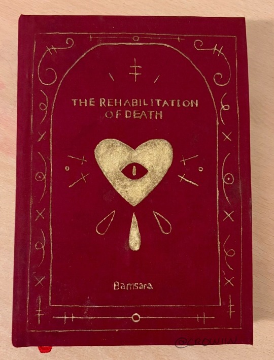
this is my bookbind of trod pt 1 :] by @bamsara which u can and SHOULD read here
ok so this first bit is how I made the pdf and then the next bit is how I turned it into signatures for binding. Then the last bit is splitting up chapters and stuff. If anyone has any advice or tips on what I could do differently (for free or v cheap haha) please let me know!! This is so fun I love learning and discussing and making things
first thing I did was grab a real book so I could take a look at where they put the title page, where they left the pages blank, etc
I then formatted the title and contents and stuff in docs by messing with font and position on the page (etc) until it was to my liking! THEN I realised I wanted an image on the very first page so I went back and put that in. I got to design it it was sooo fun
OH. I ALSO STUCK A SHAMURA QUOTE WHERE THE DEDICATION WOULD BE. HEHE
thennn I went and changed all the heading, title and normal text options for the doc so that they looked nice! I used times new roman size 16 :) but that might be a bit big for most people. I like bigger text
^^ that step was important so that when I started copy-pasting in the text it would all come out the right size automatically. also so that my chapter titles and notes pages looked consistent
next I downloaded trod from ao3 as a html file! I found it works better than pdf bc there aren’t any page breaks
I just copied and pasted trod in one chapter at a time and added in the notes and summary for every chapter where I wanted it and that worked pretty well for me
THEN SPELLCHECK. I didn’t want to do it automatically (docs had some horrible opinions sometimes. Also kept trying to erase bits of the writing style that made perfect sense and sound beautiful???) so I had to confirm every change which took a while but I think was worth it
lastly I added page numbers. They did not want to cooperate with me and I still do not understand the tiny fuckers, but I managed to get them in the middle of the page for book 2 so it looks less weird (hurrah). There’s a button for it
then I saved it as a pdf!
OK NEXT THING : SIGNATURES
this post is my bestest friend (link is to a tumblr post that was really helpful)
and this webpage is how I got a pdf of the signatures (it’s the same one linked in the post)
CHAPTERS:
yeah I split it into chunks of 7 chapters! Book 1 ends on the argument in the field bc a) it was getting wayyy too long and b) I want to lend it to my friends and that’s a delightful emotional cliffhanger. Book 2 (which is actually finished. I’ll try and post photos later today or something) ends after hekets release from purgatory which is I thiiiink another 7 chapters? Book 3 is gonna be a bit longer bc I want to do it up to the most recent chapter, which I was gonna leave out bc of length but then it came out and I went insane haha
OH in book 2 I did drop caps and title decoration which I designed in procreate and then imported into docs and moved around as imported photos. I’ll put a bunch of pictures at the end too
THANK U FOR ASKING!!! If there’s anything else u want to know then let me know!! :]


15 notes
·
View notes
Text
How To Sign Up To This Gift Exchange
This exchange does signups on Ao3, to help with matching! (Last year it took us 8 days to do it by hand and that's just not sustainable).
Once you are on Ao3, there are two sections, one for your requests (stuff you’re telling people (and the machine) would be a good gift for you), and one for your offers (stuff you’re telling the machine that you can make as a gift for other people). Here’s how you fill them out.
Requests
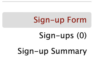
First you go to the collection that you want. The all-ages one is here, and if you are opting into NSFW (and are over 18), you can go to the 18+ collection! In the sidebar on the left-hand side of the page there is a button for sign-up form, you can press to be taken to the sign-up form.
That brings you to the first page, which looks like this.
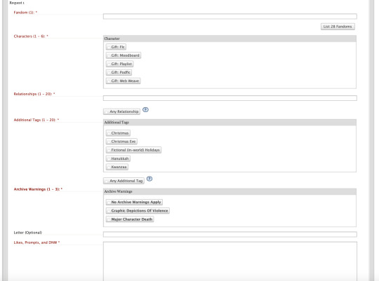
Lots of buttons, but don't worry, it's pretty simple once you get the underlying logic!
Let's say I start with 3rd Life. I know I want to opt into pearl gifts, shadowrot, and platonic desert duo. What will that look like?
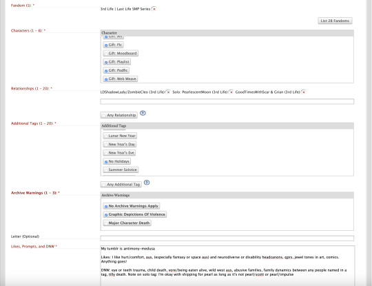
So I selected the fandom I wanted (3rd Life) and what types of gifts that I was open to. And then I selected the relationships that I'd like as a gift! I could match on any one of these, my gifter might have offered only one relationship in this fandom— but we match on one, so they know which relationship to focus on! And each of those tags is formatted a little differently— the desert duo one the names are connected with a & (so that means i'll get something platonic), the shadowrot one the names are connected with / (so that means I'll get something shippy if my gifter chooses to write that relationship), and the pearl tag is Solo, so that means I could get anything as long as pearl is still the focus! So I have to specify later if I'm okay with shipping or not, or any relationships I don't want.
Additional tags is telling people what kind of holidays I'm open to in my gift— not everybody celebrates the same holidays! For this one I don't want any holidays, so I selected no holidays. And then archive warnings is telling people if I'm okay with archive warnings in my gift— because it's 3rd life I'm okay with graphic depictions of violence, or I'm also okay with no archive warnings in my gift at all! Note that if you select archive warnings that just means you're opting into them as an option, not that your recipient HAS to give them to you. And then we get down to the free text box, where I give my gifter a little more idea of how to make a gift that I'd like. We start with my tumblr, because my gifter has to know how to give me my gift on tumblr eventually! And then a list of likes, stuff to give my gifter some ideas. Mods ask that you include at least a couple likes, and/or some prompts, or link a letter in that letter text box.
What's a letter? Ao3 has a text limit of 5 thousand characters in that box, and sometimes people exceed it because they have detailed prompts— especially if they're requesting lots of different ships as options! You also can't do any formatting unless you code it in HTML. So, if you are running out of space on Ao3, you can write the information for your gifter offsite, on Dreamwidth or Google Docs or a tumblr post! Here is an example from another exchange of what a letter can look like.
IMPORTANT NOTE: If you are linking a google doc letter, make sure that you are not using an account that has your real name in it. Make a fandom email for it, or host the letter somewhere like tumblr or dreamwidth, where your real identity will not be connected to your fandom identity. And if you link a tumblr, don't change your blog URL or the letter will disappear for people!
Anyways, I'm not doing a letter cause I'm just doing a quick and dirty signup, so I just did some likes and my DNW! You can also add specific prompts if you want (and it's nice for your gifter if you do) but it's not required!
What is a DNW? DNW stands for Do Not Want, and it's anything (anything) that would ruin a gift for you. You can DNW certain characters, crossovers, types of aus, types of content, specific ways of writing or art, quotes from specific people if you're requesting web weaves, specific music if you're okay with playlists, types of endings, specific sounds if you're requesting podfic— the list goes on. I did a short DNW there to make it all fit within the screen, but my normal one is quite long. There will be a thread in the discord where people can compare DNWs to see if there's anything you want to add to yours.
The rule is that as long as you are polite (nothing like "no kid fic because it's creepy to age down characters") and specific (nothing like "no kinks", because that is too broad and subjective of a category for people to try and navigate) and you don't box your gifter into a specific gift (nothing like "nothing that isn't canon compliant fic specifically about the fairy fort burning") then you're good to go! Because I selected a Solo tag I specifically have to tell my gifter if I'm okay with shipping and which ships, so there's a line there about that. You do need to either put down a DNW or say DNW: no restrictions, so that your recipient knows that everything is on the table.
Please make sure that your DNW and your letter link (if you're using a letter) is included on every fandom box. This is for two reasons. 1) we need to make sure your DNW is in a format that locks once it gets sent to your gifter, not somewhere you could still edit it, like tumblr. 2) There is an option to separate up requests by fandom for people who are looking for extra gifts to give, and that means someone might see only one fandom of your request before giving you something. You need to make sure that anyone who sees just one fandom of your request still has all the information necessary to make a gift.
Note: If you are signing up to the 18+ collections, it's a very good idea to include specific NSFW likes and NSFW DNW because people's tastes can vary wildly, and there's nothing worse than someone carefully making you a gift that's exactly the wrong type of thing for you because are into different things. Give your gifter something to work with and a direction to head in!
And then there's the optional tags box. This is for extra holidays! The additional tags are how you tell someone what holidays you're good to have in your gift, and it only allows you to select 20 at once. But if you wanted to select more holidays than that, you can put them down in the optional tags box! Or you can select any additional tags and just do every holiday at once.
And technically, that's three relationships, so I could call it done there! That's the minimum to request, I'm done. But what if I like other fandoms too? How do I add them? Well. There is a button for that.
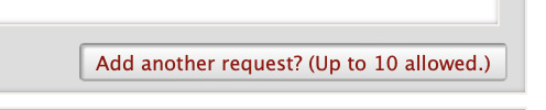
In that case, I can hit this button, and it brings me up another request box, and I can do this all over again with another fandom! You can go up to 10 fandoms, with a maximum of 20 tags for each.
But what if you really really REALLY like rats smp and there are 30 tags in the tag set and you want them all?
Two options. One is that instead of putting in relationship tags one by one, you hit the any relationship button.
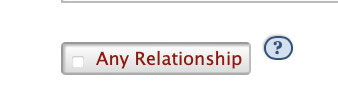
That will match you to any relationship in the tag set. That doesn't mean any tag on Ao3, but it does mean any tag that's been nominated into the tag set, and we keep the tag nominations open so people can get in their last-minute ships. If you select this one, keep an eye on the tag set to make sure that nobody nominates something that's a hard no for you.
Option two is that you hit the button for another request, and then you just do Rats SMP again, with different tags! You can request the same fandom more than once, with different tags— so you can do a request for your shippy tags and one for your platonic ones, or one for your family tags and one for your non-family ones, or one for desert duo and one for convex, or any other way you want to split it up! As long as you go over the minimum of three relationships requested, you've filled out a valid request! Request ten different fandoms or the same one ten times— it'll work.
Offers
And then we scroll down a little bit to the offers page. Let's take a look at it!

So this is telling the machine the type of gift you are open to making, and making sure you're matchable to someone else's request that will look like the one we just did. You've gotta give the machine the information in a way it'll understand so it can whirr away and give you a match to someone who requested the type of stuff you like to make. So how is this done? I did 3rd life again for the fandom, and the type of gift I can make is fic, so I selected fic for the gift type.
I only need a minimum of three relationships for the relationships, but there's more stuff that'll write than I wanted as a gift, so I have a bunch of relationships in there! I could match on any one of them, so I make sure to offer just relationships I'm confident I can write. Like with the requests, / means a romantic (or sexual, if you are in the 18+ collection) relationship, and & means platonic. Solo: means I can bring any relationships I want into the fic as long as the focus is on the person in the tag and my recipient hasn't DNWed those characters.
When it comes to holidays I COULD go down the list and select everything, but it's easier to just select any additional tag, and that'll make sure I'm matchable no matter what holidays someone selects! I figure that I can do my research on different holidays, and maybe ask for a beta reader to help out if I match on a holiday I'm not used to!
On archive warnings I select no archive warnings apply and graphic depictions of violence, and that means I'm matchable to people who selected either one of those.
And Optional tags is for overflow holidays, but I already selected any holidays, so I'm good to go! This is a complete signup! I can submit it now!
But what if I want to offer other fandoms too? There's rats SMP, there's Hermitcraft, I'm still a DSMP fan—
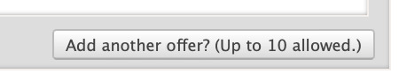
You can add up to ten fandoms, and same as with requests, you can go up to either 20 tags or "any tag (in the tag set)" for each fandom.
And then you scroll down to the bottom and hit submit, and that's it, you're officially signed up!

Editing and etc
You can go back and edit and tweak your signup any time you want until signups close— remove ships, add them, add prompts, edit your DNW— it's all editable until midnight EST on the 17th of November, when signups close and lock for us to run matching on.
The matching requires:
1 match on fandom
1 match on character (gift type)
1 match on relationship
1 match on additional tags (holidays)
1 match on warnings
So you will be assigned to someone where you have at least one tag in common in all of those categories— a fandom you selected, a gift type you can make, a relationship you said you can do, a holiday you opted into, and a level of archive warnings you said you were good with. The system tries to match you with more tags, but sometimes there are edge cases and you only match on one tag. No matter what is on your recipient's signup, you only have to make one gift, and you only have to make a gift with the tags you signed up with— if someone requested major character death and no warnings apply and you offered no warnings apply, you just can focus in on no warnings apply. Your requests are public, so that people can give bonus gifts if they want to and so that we can pinch-hit your requests if necessary (and so your recipient can see what you requested), but your offers are private (only the mods see them). Make sure you only request things which you are okay having public, or speak to the mods about setting up a sock account.
Signing up gives mods access to your Ao3 email (it's how we send you your assignment), so make sure the email attached to your AO3 account is one that a) you check regularly, and b) are comfortable with exchange mods seeing. You can verify your email here: archiveofourown.org/users/[your ao3 name here]/change_email If for some reason we can’t find a way to give you an assignment (say you only offered ships that nobody was requesting), mods will ask you to make more offers until we can give you an assignment. If we can't give you an assignment— there's nobody in the whole exchange you could make a gift for— you will not be able to continue in the exchange. If we can’t assign you to someone (either you are requesting things nobody offered or the matching just didn't work out to cover you), you will be an initial pinch hit, and someone will opt in to take you on as an extra assignment. Initial pinch hits are normal and expected in an exchange of this size, don't panic if you see yourself as one of them. If there is someone in the exchange that you don’t want to match with (for any reason ranging from "we have each other blocked on tumblr" to "we give each other gifts a lot and we want to give gifts to other people this time"), contact the mods through the ticket system and we’ll hand-adjust the matches. We can only do this before matches go out— if you match to someone you can't create for you'll have to drop your assignment and send it to pinch hits, which we would like to avoid happening if at all possible. Please make sure you send us any Do Not Match requests before signups close!
19 notes
·
View notes
Text
Embedding images on AO3: A Guide V2
Hi,
So, I thought I would go back and make an updated version of the A03 embedding image guide I made back in September of 2022.
This choice was mainly due to one of the options being viable.
Discord.
Due to the rise in malware distribution, Discord has set expirations on Discord links. This only applies to links that are used outside of Discord.
This short video explains this well
youtube
So, If we wanted to use the option, we would need to update the link every 24 hrs in your work.
Not great.
I know I also feel the salt.
Well, with that out the way, let's dive in.
A03 doesn’t actually allow for image hosting itself, so that’s why third-party hosting is needed.
In this guide, we will use these as possible choices to host our images
Google Drive
Tumblr
Imgur
https://postimages.org/
Other contenders:
IMGBB https://imgbb.com/
imgbox https://imgbox.com/
IMGBAM https://www.imagebam.com/
Image venue https://www.imagevenue.com/
Paste board https://pasteboard.co/
(Most if not all if these options listed require signup)
But really there are many options to choose from. If you have any recommendations, comment, and I’ll add them in.
Before we upload, you may need to compress your image(s) to shave them down to size, as some of these options upload size caps.
I recommend https://compressjpeg.com/ for this task. Or you may choose whatever your preference is.
Hosting options:
Option 1: Google Drive
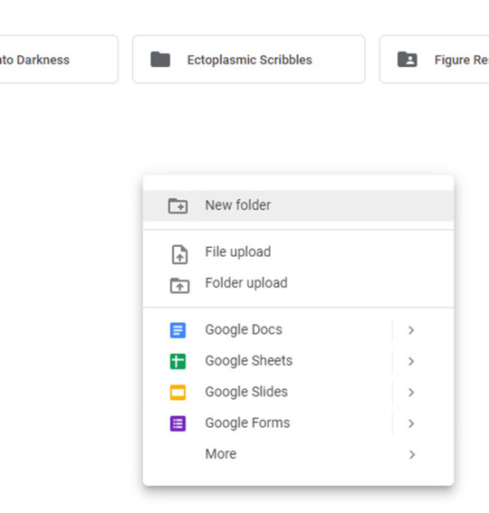
In Google Drive, create a new folder with the image(s) or subfolders for further organization.
Right-click and select New Folder, and name this folder whatever you want.
Now upload your image(s)
Right-click on your image and hit share.
Hit Copy link
The link you have should look something like this
https://drive.google.com/file/d/1Nt17i9jx8LYffyQQew6D2x4HYxXFM0_B/view?usp=sharing
But as is it won't work! We need to modify it first!
Remove the
/view?usp=sharing
at the end of the link to work with AO3
Now, you have a working link from Google Drive that is ready to use.
Your modified link should look like…
https://drive.google.com/file/d/1Nt17i9jx8LYffyQQew6D2x4HYxXFM0_B
This Google Drive portion was from this guide here: https://archiveofourown.org/works/28132845
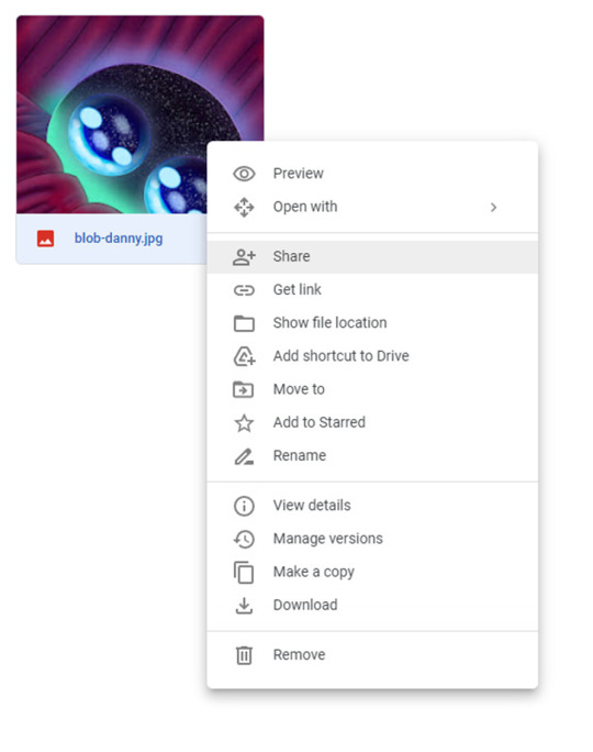
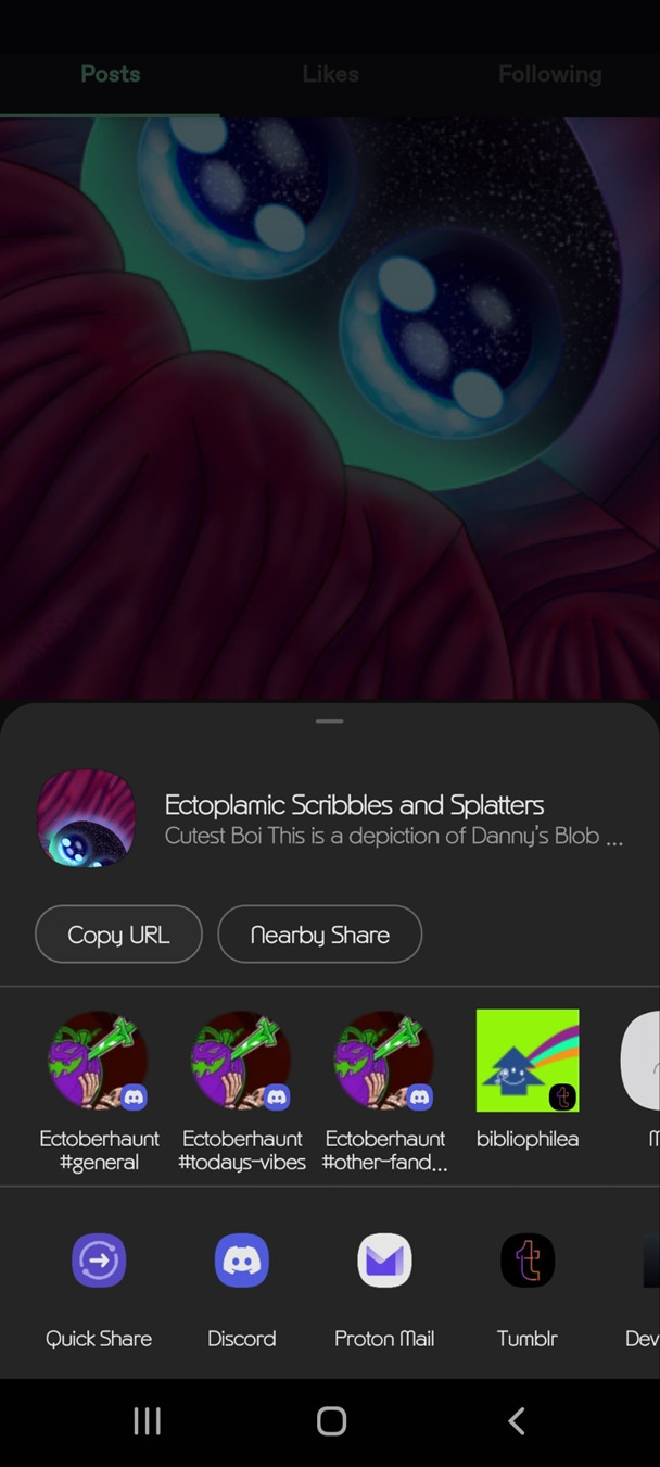
Option 2 Tumblr:
Tumblr is not always the best platform to use, as blogs can get deleted or URLs can change. But I’ll include it here anyway.
On mobile
Long tap the image you wish to use in a post.
You will be presented with this menu.
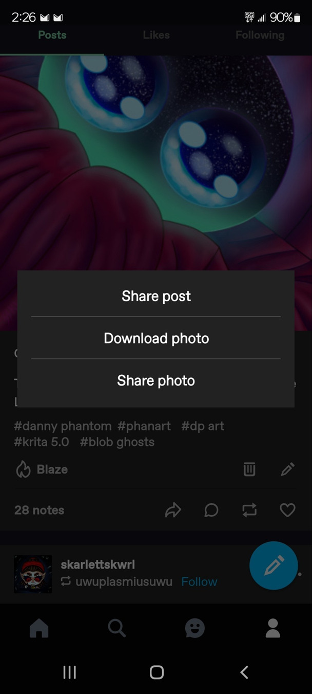
Tap share photo.
Then, you will be presented with another menu.
On the desktop, it will basically be the same.
Right-click on the image and hit copy image address.
Now, you have a working link from Tumblr that is ready to use.
Option 3: Imgur
First sign up for an account. I would recommend this because last year, Imgur began deleting images not tied to a user account. This means that if you upload an image without an account, the image link may eventually expire and the image will be deleted.
Create a new post
Upload your desired photo(s).
Do not hit the Grab Link button
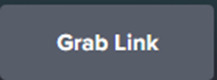
It will not work with AO3
Instead, right, click on the image and hit copy image link or address, depending on your browser.
Now your Imgur Link is ready to use.
Option 4: Using an image hosting service like postimages.org
You can create an account for free with this one. This is pretty straightforward, so I’ll gloss it over.
Once logged in you will be presented with this page.
Upload your image, and you will be taken to this page.
Copy Direct link
Now, you have a working link from postimages ready to use.
Step 2: Inserting and fitting the image
Head over to Ao3.
Go to the new or existing chapter in which you wish to embed image(s).
HTML OPTION:
Make sure in the HTML editor view.

This is located next to the rich text button in the Worktext section, as shown.
Now, find the place in the text where the image should go...
Now, preview your work to confirm the link is correct.
As you can see the image worked but in my case the image was waaaayyy too big.
So, we can add the width and height attributes to scale the image to a more comfortable size.
First, we need to know the exact dimensions of the image.
This can be done by looking at the size in an image app or can be done with an online tool.
Record these values
In this example, the image is 1080x2400
Now divide each by the same factor; this is important to avoid compressing or stretching the image.
In this example, We quartered/ divided them by 4.
Width = 1080/4 = 270px Hieght = 2400/4 = 600px
Record these values
And update the img tag
<p> <img src="" alt="" width="" height=""/> </p>
src is the path to the URL.
alt is the alternative text for the image. This is used for accessibility as well as be a modern web standard.
width is the image width in pixels
height is the image height in pixels
You insert your values in between the double quotes.
ALWAYS TO REMEMBER:
to close your quote _
to close your image tag
to close and include your units
Here it is much better.
RICH TEXT OPTION:
Make sure in the Rich Text editor view.

Set the cursor where you want the image. Click the image icon.

Set the values in this form.
Use the URL we generated in one of the previous 4 options.
Set the Image description
The width and height may be input automatically; if you are unsure, consult the HTML OPTION to find the dimensions and how to rescale an image.
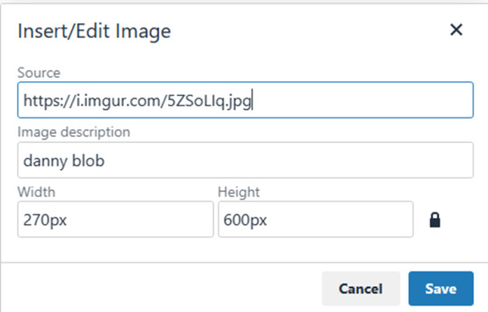
Here’s how it looks after posting
Well, that concludes my simple guide to AO3 image embedding. Thanks for reading to the end.
26 notes
·
View notes
Text
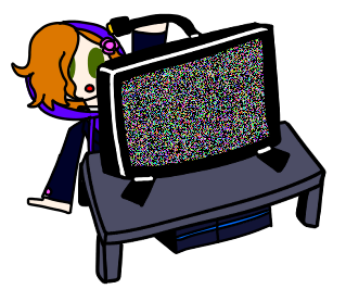
my neocities site used to have a bunch of javascript.
for example, i had a page that existed to load up chapters of various stories so that you could read all of the chapters in one page, sort of like ao3's view full work feature. because it was scripted dynamically, i didn't have to maintain a separate copy of the text, and it was actually more flexible than what ao3 offers, because you could read specific arcs, heck, you could read a specific sequence of chapters (e.g., 2-13 specifically)
another thing i didn't want to maintain by hand was header at the top of the page with navigational links, so i had a script that updates them on page load.
problem is, it kind of just feels bad to load a page, then see a visible delay before the header pops in.
i spent almost a year living like that, but i eventually stopped maintaining my html by hand, and learned the joys of the static site generator.
i didn't need the chapter loader anymore, either - i could code my site generator to concatenate chapters into a full-text page, and since it's static, it'd load much faster than make the user's browser stitch together the html every time they want to open that page.
slowly but surely, everything i might've used js for was getting replaced by simpler, faster, and easier means.
i don't make much use of it, but my site actually has discord-style spoiler text. blocks of text you can click to reveal (and the css is uses currentColor, so it works even on different themes)


i don't even need javascript for this; the way i accomplish it is a bit clever:

it's a checkbox! even if you hide the actual box, you can still click the label to toggle its state
this was something i implemented early, based on this blog post where a similar trick was used for a no-js dark/light mode toggle.
but i took this to a new height this year: i added fancy footnotes

but under the hood, it's the same principle

check box to toggle the state, then some fancy css it position it to float above the text.
but of course, if i'm doing all of this without javascript, what do i need javascript for?
and there was only one feature that stuck around. it's something that i think no one really used, but i'm attached to it.
you see, i'm notorious for writing long chapters. i could split them up, but i have particular stopping points in mind. still, i am merciful, so in my stories with consistently long chapters, i'm gone out of my way to insert break points, "subchapters" seamless into the main text.

those little roman numerals would trigger a script that reformatted the page to hide all the other subchapters, and reconfiguring the next/prev buttons so that clicking them takes you to the next section rather than the next chapter
in theory, you could read Hostile Takeover as if it were a fic with 72 chapters instead of 16.
now, this is a very complex feature. you cant use checkbox tricks to emulate this, unless you want to go crazy writing a dozen css rules for every permutation of checkboxes, or force the user to figure out an arcane system where you need to uncheck one section before loading the next
but it turns out, while i wasn't paying attention, the css committee added a crazy new feature. there are :has selectors, enabling you to style elements based on the properties of elements that come below it in the document.
the whole game has changed now.
couple this with learning about :target selectors courtesy of wonder how a couple of really ambitious ao3 fics do their magic, i had everything i need
all it took to make subchapters happen now a few simple rules

really, you only need that first line. it says "if main has a target element, hide all subchapters that aren't the target"
the other lines are convenience; they had the next/prev chapter buttons if you're in the middle of the chapter. there's a couple other rules (beside the subchap nav i added a button that takes you to the top of the page, which resets the anchor target), but overall, it was quick and painless. really, the actual struggle was teaching my site generator spit out the right html. (i spent five minutes tearing out my hair and rebuilding to no effect because i forgot i had two layers of caching. whoops)
this new approach does sacrifice the ability to make the arrow buttons do double duty, but i don't think it's a big loss when the subchapter buttons are right there, and arguably retaining the single function of each button is a win for usability.
the biggest loss is that there's no real way to style the buttons differently if they've been clicked, so you don't actually know which subchapter you're actually browsing.
(maybe if anyone i actually uses this feature, they can complain to me and i'll whip up a quick bit of js to patch it :v)
but until then, i'll take some satisfaction in delete my site's scripts entirely. in a way, that's the biggest loss, but it's one of i'm proud of
2 notes
·
View notes
Text
webdev log 3
this log is longer since I'm writing it as I work, since I forget a lot once I've put down the keyboard for the night (day? I'm always up until morning)
okay, so...
I've implemented user (me)-only add story, edit story, and add chapter, and edit chapter functions

creating a story. I have some "preset" tags. clicking on them adds them to the input, and it'll get converted into arrays to be placed into the database. they're sort of placed there manually since I'm too lazy to make it so that it sifts through tags and posts them there but I'd rather not since some tags are only used once. for the series presets being manually placed there.. well, I have no excuse. I'm just lazy. I'll just kms when I have to add another, ig.
anyways once a new story is made, there's no chapter added so the link to it doesn't work. I have to go in and add a chapter. I will not update this because I don't care and it doesn't trouble me enough to make it a feature so you can upload it all in one go.
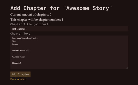
from there I get to see this shitty barebones chapter creator.
START TANGENT feel free to skip
laravel Eloquent stores the text as-is so I won't need to use my shitty markdown -> html converter that I have on my secret utilities site that I always had to use for when posting my stories onto my neocities.
that's what it looked like, lol. I had to make this because of the way I write and I want it to display in a particular way which I'll get into in a sec. the reason why I didn't want to use some shitty markdown -> html converter on some other website is because a single linebreak gets converted to <br> while <p> only gets sandwiched between paragraphs with double line breaks.
I don't like that since I wanted text indents for every <p> but text-indent doesn't apply to the next line within a <p> if you use <br>... they only apply to the start of each <p>. a workaround for this is to use text-indent: {size} each-line; but each-line isn't supported in all browsers, including chrome of all things. So I had to write up a program for my own converter which wraps *every* line into a <p> and applies a <br> if there's another newline after that.
but for my new site, there's a function that detects what browser the user is using and will add the text-indent styling only if using supported browsers. so chrome users will just be indent-less! sorry! (you should switch to firefox anyways)
END TANGENT okay, enough about my neocities..
What it looks like for a user (me)... guests won't be able to see the edit link.
When editing, there's an option to delete the chapter. if it is the first chapter of a story, then it will delete the whole story. it's currently the only way to delete a story, mostly as a safeguard for myself since I don't trust myself. if I have to delete a story with a ton chapters in the future... well.. then fuck me.
over on the side, I also went back and added a delete comment function too. accidentally had it earlier where if I tried to delete a reply it deleted the parent comment too. oops.
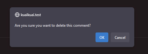
delete buttons (as well as the buttons that accept/reject comments on the user dashboard) had no confirmation so.. phew. now they do! I've accidentally deleted a whole years worth of art before on my computer, so I need this. very badly.
decided to move the warning into a confirmation alert once they hit submit. allows guests to see the warning in a less clunky manner, and also lets them know for sure that their comment is going to get sent! before the page would just refresh without any confirmation.. so this would be less confusing. two in one!
anyways, the next big feature I gotta implement is creating, editing, and deleting art. then I'll be done with all backend related things and I can finally start on the ~fun~ pages like my about. and other things.
unless I decide to make a guestbook. which I probably will end up doing..
I'll probably be keeping my neocities just for memory's sake and also to host my twine games and silly coding projects but I'll probably be removing my dreams page since I kind of don't want people seeing those anymore lest some tiktok-addicted teenager tries to kill me. better huff them all now if you want to peer into my sick twisted mind (jk I'm an angel)
2 notes
·
View notes
Text
STAGHUNTERS NEOCITIES WEEE
Figured I should make a new post at this point because the other one is getting too long to keep reblogging. I've been tinkering away at the site and it is shaping up! Here's a lil page by page tour under the cut
you can view the site here!

Splash screen!
It's a little bumper so the css can load without it scrabling the home page. It looks alright, but to add some more text to the image, I have to make a new one in the death screen generator, which is not ideal.
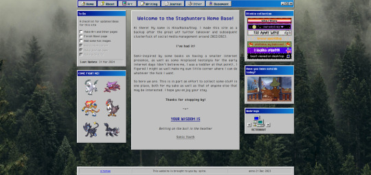
The home page!
I've changed the middle window so it fits in better with the rest. Not very visually exciting there in terms of color, but it is for now the best look imo. Text there is aligned justified, I've condensed it a bit more and added the randomized quote section underneath it instead of it being a seperate window on the side.
To do list needs an update but is still accurate. The team is still there, but on the other side, I have set the blinkies to be a bit larger. The music player has been removed because I couldn't find a way to add songs to it that weren't included on the source site. Snufkin is here now. The webrings will need some more. Retronaut is there, but not functioning as it should. it just forwards you to random sites in the ring instead of where it should be, but I can't find what exactly I'm doing wrong with the code.
Another thing that is not working on neocities itself is the "last updated" part. For some reason it doesn't display there what it does display on my local html. Maybe a bug at neo.
And icons at the top on the nav par! Adds some more flair to the place. The footer has also received a minor update: it now has a sitemap link instead of another back-to-home url.
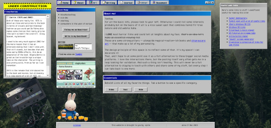
About!
I'm thinking of moving the small window with the short info to the right, but it is here for now. Links that are web-building related are on the right, also for my own referencing. The essentials lists on the left are hidden on load, but can be revealed by tapping the puttons. The lists are in tree-view and the window shouldn't expand over the cassette image once the construction sign is removed. Speaking of, the cassette has a lil playlist.
I might expand on the info a bit more, but that is for me to ponder. I liked including links to tumblr, the guestbook, and a button in case anyone wants to link my site on theirs.

Writing!
Hasn't really changed much. I've been looking at moving the sidebar info to be in the main section upon load, but idk if that would just make things more complicated. Right now it loads to an empty section there, stuff appears once you click a button. PDF support is only available once I'm a supporter of neocities, which i do wanna do but isn't a priority atm just for getting this part running. The links to ao3 will do just fine for now.
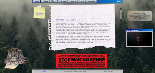
Journal!
The space for my rambling. It can be browsed by entry through the post-it, and all that seems to be functioning alright. Added a kitty and a sticker for decoration. The Stop Making Sense bumper sticker will now load a local video of the performance, but once again I won't be able to add this to the site until I get a supporter thing going. It plays/pauses on click, hehe.

Basement!
Decided to add a page for it. Basic info, schedule, link to the room, my letterboxd, and an overview of past movies. It's a nice spot on the site that is also the most cramped, but I like how it turned out.

BLUE SCREEN OF DEATH
In case any page/url error happens, you can send a movie recommendation to B (their askbox is linked when you open on desktop)


UNDER HEAVY CONSTRUCTION
The art and other pages are very much works in progress. Art can be up and running once I upload art to the site, but I'm not sure if I want to post full pieces here. Maybe I'll make it a space for sketch stuff that I'd otherwise discard.
As for the other page: I might be filing it under the writing page as a section, since the only thing here is WvW atm. It's cool that it has it's own thing, but I'm not sure if something that is basically a fanfic warrants such a space. That, or I keep it and drop all my other-media stuff in here so there's more to look at.
That's it for now! I got some ideas on how to continue, but they're not super-duper set in stone.
#stagcities#it's so much fun ough#takes time out of my other activities but certainly isn't a bore#neocities#web development
9 notes
·
View notes
Text
New website is up!
Finally, after like 2 months: I finished it!
I never want to touch HTML ever again.
Here it is:
I thought I should do a little commentary here as it isn't just some standard linktree/carrd.co thing anyone with a free afternoon can crap out (and also because I'm vain) so here's the commentary:
The problem with my old one was that it was getting too crowded for all the stuff I was chucking at it. I mean, look at this header:

It's a mess!
I wanted to make something that had everything in nice neat categories, and also this was in a time where I was unsatisfied at how flat UI design had become and was starting to long the futiger aero windows XP-7 days. I wanted to make it look detailed and shiny and more personal. I deleted everything off and for 2 months, this was what the website looked like:
(I didn't have a more up to date "under construction" picture so I used the one from Sci-Fi RaiRoboska!?).
I didn't realise it would take 2 months but I didn't want a repeat of last time where I was talking on discord with someone and they were looking at my website as I was designing it as I was doing it live in Neocities and I left the link in my bio.
I used the same layout builder as I still didn't know how containers worked then. It ended up causing some problems later down the line with media querys (FUCK media querys) but it's decent enough to get you started. I did some fiddling with the header so it was the right length (dear god that took a while) and had to do that airbrush thing multiple times just to get it looking right.
I drew this background at around the same time and used my OCs from San_Watsaku as it's my latest game and I don't really have another group of OCs from a game that's released. Annoyingly, I couldn't get the sizing to work on a regular 1080p widescreen display so the top and bottom cuts out. I was trying to go for a similar approach to how Newgrounds does the background arts.
I had a wayback machine page of Newgrounds in 2013 in the early days as reference on how to make things look cool, as well as some pages from this website that has a collection of screenshots of webpages, specifically for UI reference. I was trying to make it look like a website from the late 2000s-early 2010s where everything wasn't flat but also wasn't as shiny as windows 7 (usually).
I put little doodles of myself across the pages because it looks more interesting than a flat button saying "video games". That sidebar is annoying though as it has a habit of cutting off if the main box isn't the right shape by the pixel.

I was very proud of these buttons when I got them working. The design changed a bit as I realised that it needed to be longer to fit properly.


Wasn't sure what to do with tumblr though:

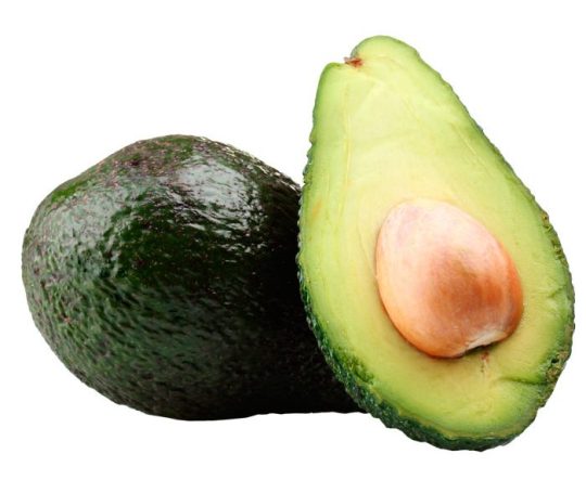
I used a speech bubble drawing for my bio thing to make it look more aesthetic and also to flex that I didn't use AI at all as AI can't replicate my shaky-ass hand. I found this file called "avocadoplaceholder.jpg" which seems to be what I was using to figure out sizing.

For the stuff below the main boxes, I googled for stuff to chuck on a neocities page as it was too boring just having the bluesky embed sitting there. I went on the gif hunt at 11 pm while some AI bro on discord was calling me an idiot for actually coding and drawing the UI. I put some other stuff to pad space, like the pixel art and the links to my older websites. I added some stuff to it over time, like the interests list and the music section once I finally figured out how to get audio players working (literally earlier today lol). I wanted to add music for each page but decided against that. I wanted music on the main page though but couldn't for the life of me get it to work until I was trying to add a preloader (didn't work) and the website I was on was another neocities one that had an audio player but had the "neocities.org" thing in the URL so I knew they weren't a supporter. I went into inspect element and figured out that dropbox works and that's why I now have a dropbox account. Couldn't find a tutorial on how to make it not look basic though, so all I did was make it shorter and blue.
I made unique backgrounds for each of the pages to differentiate them and I made these from scratch as I actually figured out how containers and grids worked.
And of course: matching headers:
For each page: there's a doodle of me doing something vaguely relevant to the topic, little circles as links for the socials I have that apply to that thing (Newgrounds is on all of them and YouTube is on 3/4 of them.) I then used that speech bubble thing to make backgrounds for all the little bios. The music one was originally much longer but I cut it down significantly so it would fit. I used the empty spaces for doodles.


continuing...
2 notes
·
View notes
Text
To new tumblr users:
please turn on custom blog theme in your settings. custom blog theme is something that is actually so wonderful about having a tumblr, and we need to show @staff how important of a feature this is to this site.
Propaganda:
Having a custom blog theme gives you a yourURL dot tumblr dot com site. Having your very own website is cool as fuck.
Having your own site makes it much easier to search and view your blog, and use tags to sort posts.
Another fun thing that you can do is create custom side pages for your blog with useful static information, like an about page or a tags page.
show off your personality and interests with a cool site. organise your posts to find them later, and to give your followers the ability to view all the posts on your blog with a specific tag, like a tag for your writing or your art. This can be done by providing a link to a specific tag that looks like this: yourURL dot tumblr dot com/tagged/myCoolTag
You can have a cool site, even if you don't know how to do web code, I promise. Here's how your turn this feature on:
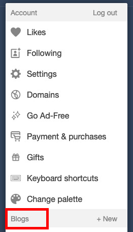
go to the little person icon in your top ribbon (circled in red):

2. in the resulting pop up, scroll down to "blogs" < yourBlog (highlighted in red):
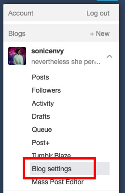
3. click on "blog settings". This will take you to a new page. (highlighted in red)
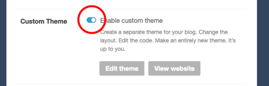
4. on this new page, scroll down to "custom theme" and flip the toggle switch to on. (circled in red)
5. now click that "edit theme" button. This will take you to a new page that will look something like this:
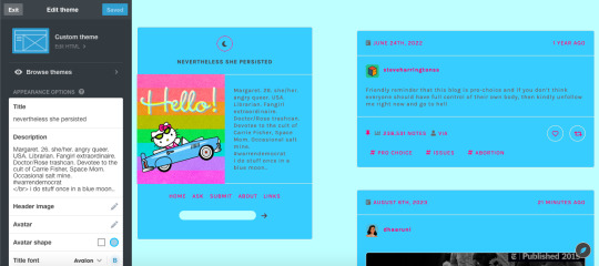
depending on what theme you end up using, the options in the white sidebar will be different. For now, that's not what we're actually interested in though!
6. to get started with your theme, click the edit HTML button.
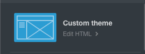
7. This pops open a thing with the code from your blog. This is where you can edit or paste code into to customize your blog. This is where the fun starts!

If you know code, you can write code yourself, but I'm going to just assume that you don't know enough code to write a tumblr theme. Fortunately for you, there are lots of people out here on tumblr dot com that do know how to write code and make tumblr themes and do this AND make these themes publicly available for anyone to use.
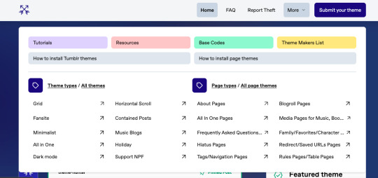
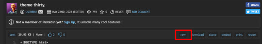
8. Where do I find this, you might ask? Great question! A good place to start is Theme Hunter, which is a blog where they share lots of independent theme creators themes. Typically when you use someone's theme, you should reblog their post about it, as this is often a term of use. Theme hunter is nice because they are really organized so you can find some nice categories to start you theme hunt in their "more" drop down:
you'll notice that they also have pages about how to install tumblr themes. The "page themes" section is for side page themes. We'll get to that in little bit, but for now what you want is the "Tumblr themes" Most themes will have a set of easy to use customization options for stuff like background colors, font sizes, sidebar images, links, accent colors, etc. Most theme posts will have an example or "live preview" of the theme in question so you can play around with it and see if you like all of the features. Remember that you can change all of the colors and the font sizes if you like.
9. Once you find a theme you like, click on the "code" link in the post which typically takes you to a pastebin page with the code of the theme.
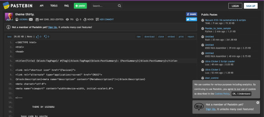
10. click "raw" in the top ribbon, which takes you to a new page that has nothing but the code on it. (highlighted in red)
the new page will look something like this:

11. click anywhere in this page, and hit ctrl + a (on windows) or command + a (on mac) this selects all of the code. Now hit ctrl + c (windows) or command + c (mac). This copies all of the code to your clipboard.
12. Now go back to the theme editing page for you blog and click anywhere in the code box. hit ctrl + a (windows) or command + a (mac) to select all of the text in the code window. hit backspace (windows) or delete (mac) to erase the text.
13. now that your code window is empty, click in it again. Hit ctrl + v (windows) or command + v (mac), which should paste all of that code that you copied before into the code window.
14. Now hit "update preview" (highlighted in red)
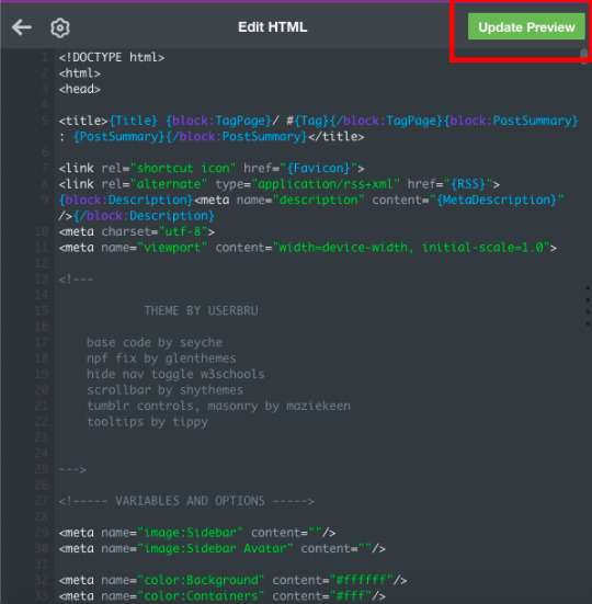
this will update the preview of your blog so that you can now see it with the theme! It may not look quite right yet, but that's because you haven't set up all the customization options yet! Note that until you hit "save" the theme does not become live on your site.
15. hit "save" then hit the back arrow on the code window next to the gear symbol.
16. Now for the fun part! Customizing! Scroll down In the little sidebar to the section called "theme options." This is where you'll get to select stuff like colors, sidebar images and fonts. Sometimes, things still won't look right in the preview, but once you go to your page, you can see what it actually looks like. I recommend having a copy of your blog page open in another tab that you can refresh every time you hit "save" while customizing your theme, to make sure that things look right.
Tadah! you have a new cool website. share the news with your followers.
If you want to get into learning how to make your own themes, check out buildthemes or buildatheme or theme-hunter's tuts page. To learn about web code in general you can sign up for an account through codeacademy or dash general assembly or W3Schools or html dog
#tumblr#tumblr guides#new to tumblr#themes#how to tumblr#resources#ref#long post for ts#learn tumblr#tumblr for newbies series
40 notes
·
View notes
Text
how to remove the live tab (and other annoying marketing ploys) from the desktop tab menu using ublock origin
i'm not good at html, so there's probably an infinitely easier way to do this, but here's what i did if anyone finds it useful!
note: i'm using ublock origin and firefox, so if you're using a different browser or adblock program, your process may look slightly different, but the html stuff should be the same!
step 1: right-click on the tab you want to remove, and select "block element..." from the drop-down menu.
this will open a dialogue box on the lower-right corner of your screen, which looks like this:
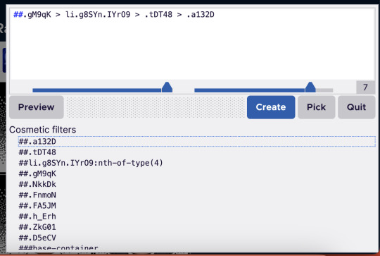
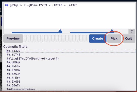
[image id: a dialogue box for ublock origin. the top half of the box contains a white text field with black text, with a menu of buttons underneath: a grey button reading "preview," a blue one reading "create," a grey one reading "pick," and another grey button reading "quit." below this is a light-grey menu labelled "cosmetic filters," which contains several line html line items notated with hashtags. end id]
right now, there will probably be red boxes around both the live tab and other tabs on the side menu, like the home and inbox tabs and other things you probably want to keep.
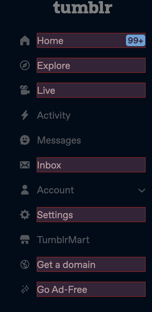
[image id: the tumblr sidebar menu. the menu is dimmed, with a slightly darkened background and text. red borders exist around the home, explore, live, inbox, settings, get a domain, and go ad-free tabs. end id]
if you click "create" on the ublock window right now, this will remove all tabs that have that red box around them, so don't click "create" just yet.
step 2: select the "pick" tool from the ublock window, and click on the live tab.
[image id: the same ublock dialogue box from before. this time, the grey "pick" button has a red circle around it. end id]
step 3: once you've got the live tab selected, in the "cosmetic filters" menu, scroll until you find a line of text that contains the words "nth-of-type" and click that.
it'll be preceded by hashtags and will have a number in parentheses after the "nth-of-type" section. when you hover over this line of code in the menu, the live tab should be the only one with a red box around it. looks like this:
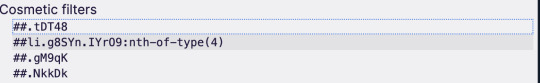
[image id: the "cosmetic filters" section of the ublock box. several items are listed, but one of them is highlighted in a slightly darker shade of grey. this highlighted section contains the words "nth-of-type(4)." end id]
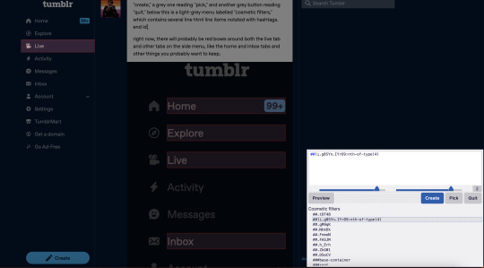
[image id: the tumblr dashboard with the ublock box open. the cosmetic filter containing the "nth-of-type" string is highlighted, and the live tab in the sidebar is contained in a red box. no other tabs have red boxes this time. a draft of this post is visible in the background. end id]
step 4: click "create."
this should remove the live tab from the menu. if you do what i did the first time and click the text and not the actual button, there will still be an empty space where the tab used to be, which will link you to the live landing page. to remove that, follow steps 1-4 again, this time selecting the empty space where the live tab used to be (it'll still highlight like a button would when you're using the pick tool).
here is what selecting the text vs. the button looks like:

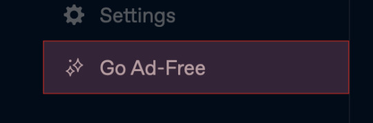
[image id: the "go ad-free" button on the tumblr sidebar menu. the text "go ad-free" is contained in a red box, but the sparkle icon beside it is not. end id]
[image id: the "go ad-free" button again. this time, both the text and the sparkle icon are contained within the red box; there is also a wider margin of space around the text. end id]
i did this for the live, explore, tumblrmart, domain, and ad-free tabs, and now my sidebar looks like this:
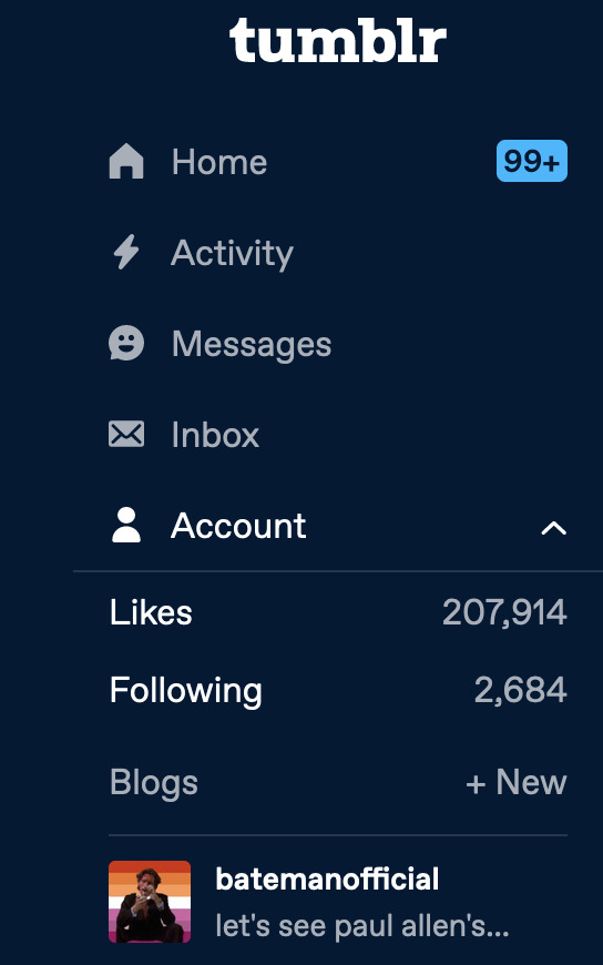
[image id: tumblr user batemanofficial's sidebar menu. the home, activity, messages, inbox, and account tabs are visible. the account drop-down menu is open, and batemanofficial's url and icon are visible at the bottom of the menu. end id]
like i said, there's probably an easier, more efficient way to do this, but this solution (if done with ublock) will stay in place even if you refresh the page.
anyway that's the tutorial, please lmk if anybody has any suggestions for improvement lol!
21 notes
·
View notes
Text

The Comprehensive Guide to Web Development, Data Management, and More
Introduction
Everything today is technology driven in this digital world. There's a lot happening behind the scenes when you use your favorite apps, go to websites, and do other things with all of those zeroes and ones — or binary data. In this blog, I will be explaining what all these terminologies really means and other basics of web development, data management etc. We will be discussing them in the simplest way so that this becomes easy to understand for beginners or people who are even remotely interested about technology. JOIN US
What is Web Development?
Web development refers to the work and process of developing a website or web application that can run in a web browser. From laying out individual web page designs before we ever start coding, to how the layout will be implemented through HTML/CSS. There are two major fields of web development — front-end and back-end.
Front-End Development
Front-end development, also known as client-side development, is the part of web development that deals with what users see and interact with on their screens. It involves using languages like HTML, CSS, and JavaScript to create the visual elements of a website, such as buttons, forms, and images. JOIN US
HTML (HyperText Markup Language):
HTML is the foundation of all website, it helps one to organize their content on web platform. It provides the default style to basic elements such as headings, paragraphs and links.
CSS (Cascading Style Sheets):
styles and formats HTML elements. It makes an attractive and user-friendly look of webpage as it controls the colors, fonts, layout.
JavaScript :
A language for adding interactivity to a website Users interact with items, like clicking a button to send in a form or viewing images within the slideshow. JOIN US
Back-End Development
The difference while front-end development is all about what the user sees, back end involves everything that happens behind. The back-end consists of a server, database and application logic that runs on the web.
Server:
A server is a computer that holds website files and provides them to the user browser when they request it. Server-Side: These are populated by back-end developers who build and maintain servers using languages like Python, PHP or Ruby.
Database:
The place where a website keeps its data, from user details to content and settings The database is maintained with services like MySQL, PostgreSQL, or MongoDB. JOIN US
Application Logic —
the code that links front-end and back-end It takes user input, gets data from the database and returns right informations to front-end area.

Why Proper Data Management is Absolutely Critical
Data management — Besides web development this is the most important a part of our Digital World. What Is Data Management? It includes practices, policies and procedures that are used to collect store secure data in controlled way.
Data Storage –
data after being collected needs to be stored securely such data can be stored in relational databases or cloud storage solutions. The most important aspect here is that the data should never be accessed by an unauthorized source or breached. JOIN US
Data processing:
Right from storing the data, with Big Data you further move on to process it in order to make sense out of hordes of raw information. This includes cleansing the data (removing errors or redundancies), finding patterns among it, and producing ideas that could be useful for decision-making.
Data Security:
Another important part of data management is the security of it. It refers to defending data against unauthorized access, breaches or other potential vulnerabilities. You can do this with some basic security methods, mostly encryption and access controls as well as regular auditing of your systems.
Other Critical Tech Landmarks
There are a lot of disciplines in the tech world that go beyond web development and data management. Here are a few of them:
Cloud Computing
Leading by example, AWS had established cloud computing as the on-demand delivery of IT resources and applications via web services/Internet over a decade considering all layers to make it easy from servers up to top most layer. This will enable organizations to consume technology resources in the form of pay-as-you-go model without having to purchase, own and feed that infrastructure. JOIN US
Cloud Computing Advantages:
Main advantages are cost savings, scalability, flexibility and disaster recovery. Resources can be scaled based on usage, which means companies only pay for what they are using and have the data backed up in case of an emergency.
Examples of Cloud Services:
Few popular cloud services are Amazon Web Services (AWS), Microsoft Azure, and Google Cloud. These provide a plethora of services that helps to Develop and Manage App, Store Data etc.
Cybersecurity
As the world continues to rely more heavily on digital technologies, cybersecurity has never been a bigger issue. Protecting computer systems, networks and data from cyber attacks is called Cyber security.
Phishing attacks, Malware, Ransomware and Data breaches:
This is common cybersecurity threats. These threats can bear substantial ramifications, from financial damages to reputation harm for any corporation.
Cybersecurity Best Practices:
In order to safeguard against cybersecurity threats, it is necessary to follow best-practices including using strong passwords and two-factor authorization, updating software as required, training employees on security risks.
Artificial Intelligence and Machine Learning
Artificial Intelligence (AI) and Machine Learning (ML) represent the fastest-growing fields of creating systems that learn from data, identifying patterns in them. These are applied to several use-cases like self driving cars, personalization in Netflix.
AI vs ML —
AI is the broader concept of machines being able to carry out tasks in a way we would consider “smart���. Machine learning is a type of Artificial Intelligence (AI) that provides computers with the ability to learn without being explicitly programmed. JOIN US
Applications of Artificial Intelligence and Machine Learning: some common applications include Image recognition, Speech to text, Natural language processing, Predictive analytics Robotics.
Web Development meets Data Management etc.
We need so many things like web development, data management and cloud computing plus cybersecurity etc.. but some of them are most important aspects i.e. AI/ML yet more fascinating is where these fields converge or play off each other.
Web Development and Data Management
Web Development and Data Management goes hand in hand. The large number of websites and web-based applications in the world generate enormous amounts of data — from user interactions, to transaction records. Being able to manage this data is key in providing a fantastic user experience and enabling you to make decisions based on the right kind of information.
E.g. E-commerce Website, products data need to be saved on server also customers data should save in a database loosely coupled with orders and payments. This data is necessary for customization of the shopping experience as well as inventory management and fraud prevention.
Cloud Computing and Web Development
The development of the web has been revolutionized by cloud computing which gives developers a way to allocate, deploy and scale applications more or less without service friction. Developers now can host applications and data in cloud services instead of investing for physical servers.
E.g. A start-up company can use cloud services to roll out the web application globally in order for all users worldwide could browse it without waiting due unavailability of geolocation prohibited access.
The Future of Cybersecurity and Data Management
Which makes Cybersecurity a very important part of the Data management. The more data collected and stored by an organization, the greater a target it becomes for cyber threats. It is important to secure this data using robust cybersecurity measures, so that sensitive information remains intact and customer trust does not weaken. JOIN US
Ex: A healthcare provider would have to protect patient data in order to be compliant with regulations such as HIPAA (Health Insurance Portability and Accountability Act) that is also responsible for ensuring a degree of confidentiality between a provider and their patients.
Conclusion
Well, in a nutshell web-developer or Data manager etc are some of the integral parts for digital world.
As a Business Owner, Tech Enthusiast or even if you are just planning to make your Career in tech — it is important that you understand these. With the progress of technology never slowing down, these intersections are perhaps only going to come together more strongly and develop into cornerstones that define how we live in a digital world tomorrow.
With the fundamental knowledge of web development, data management, automation and ML you will manage to catch up with digital movements. Whether you have a site to build, ideas data to manage or simply interested in what’s hot these days, skills and knowledge around the above will stand good for changing tech world. JOIN US
#Technology#Web Development#Front-End Development#Back-End Development#HTML#CSS#JavaScript#Data Management#Data Security#Cloud Computing#AWS (Amazon Web Services)#Cybersecurity#Artificial Intelligence (AI)#Machine Learning (ML)#Digital World#Tech Trends#IT Basics#Beginners Guide#Web Development Basics#Tech Enthusiast#Tech Career#america
4 notes
·
View notes
Note
first of all i just want to thank you for your neocities comment widget, it has legit reinvigorated my desire to work on my website again after leaving it inactive for... a really long time XD
second, agree about the web accessibility - my website is (currently)
... my last ask sent before i was ready, sorry about that! what i was trying to say it that i'm currently fully rebuilding my website from the ground up to be more accessible, are there any particular tools/references you personally use for bluemoonfalls? (i currently use w3schools, i just wasn't sure if there were things out there i didn't know about! ^^)
no worries, i figured that was the case when i saw the first one come through haha. no problem, i'm glad you're getting use out of it...!! i am not feeling amazing this morning but i'm really excited to finally get that little QOL update out to it, so hopefully soon...
i used to recommend w3schools a lot, and it's still nice for its simple language, but if i need documentation on any html/css/js feature i use the much more robust, well written, and up to date mdn web docs (link goes to their HTML directory but they have more stuff on there)
other than that and the typical stack overflow (definitely use this if you aren't already) for questions... honestly, not really, most of BMF and our personal site is cobbled together over a lot of winging it and googling stuff when something goes wrong. i am a very hands-on, learn-by-doing kind of person when it comes to code.
i will say that it's a good idea to run your webpages through the W3C markup validation service to check for basic accessibility and good practices - it's not perfect but it's certainly helpful. if your HTML isn't valid, it could cause issues for people using screenreaders or other alternative viewing methods. after finding out this validator exists, i quickly found out that every button that links to another page on my site needs to be changed... forgot that you shouldn't put button elements in <a> elements... whoops. it'll quickly point out stuff like that to you
oh and you can find a list of basic criteria for meeting web accessibility standards here, it looks daunting but a lot of it probably won't apply to your webpage and even just knocking out a few of these is a good idea
anyway, good luck!!
14 notes
·
View notes
Note
Anon so this doesn't come from my main but it's nsfruitw- I LOVE YOUR BLOG CODING OMG??? THE WORKING BUTTONS AND MOVING WINDOWS ARE SO AWESOME???? I'm so excited for Dee's ask blog!!!
<OOC:>
Ahhhhhh!!! thank you!!! I had three different potential blogs.. but a lot of them didn't really met my wishes/criteria.
Which in case you're interested were:
Windows 98 look
Search bar
Visible tags
One Column
Separate Window for your Profile Info with a picture. (maybe separate icons or a lil menu for links)
No endless scrolling/seperate pages
I will put everything else under the cut since the post became quite long haha
This was one of the first themes I tried out (tbh I kinda jumped between all of them, trying stuff out)
I loveeee the start bar on this one, the icons and that it can be one or two columns. But it has no search bar and I didn't like that the profile section is super small, has no picture and couldn't be swapped to the left instead of the right side. I'm not confident enough in my html/css skills to competently yoink that start bar and transplant it into a different theme
Pros VS Cons: + animated start-bar (with accurate time in the corner) + one column (or two columns) + Windows 98 look + functional corner buttons + icons + custom background picture - no search bar - tiny info profile window, no picture (can't be moved to the left side) - endless scrolling - no visible tags

I prefer this theme for the most part over the previous one.. even if i loveee the functional startbar feature there! Its practically perfect. it can be one or two columns (i prefer one column blog layouts personally) You can add a lil picture in the profile section, its on the left side and you have a search bar!
I also looooveee that the post windows look extremely accurate and that the tags are always visible. (< another thing thats often kinda hidden in themes, so i tend to forget about it) Also the lil corner buttons can actually be used to like or reblog the post! what a highlight<3. my only issue was that i couldnt add a background picture.. and i kinda liked the idea of having separate icons for obvious links like I do now.
Pros VS Cons: + Windows 98 look + functional corner buttons + one column (or two columns + No endless scrolling (page by page) + Left side Info Window with picture and links + Visible tags
- no custom background picture
Another theme that I tried out is this one
They made the same theme I ended up using. It has a built in music player (that wont auto run!) a profile section + picture, customizable icons and background. But the biggest thing for me is that it doesn't have a search bar and I really need/want searchbars in my themes.
It's a really solid theme! It just fell a lil short for what I wanted to have
Pros VS Cons: + Windows 98 look + one column + No endless scrolling (page by page) + Left side Info Window with picture and links + Visible tags + music player (bonus) + custom icons and custom background picture + custom lil link window
- no searchbar (my biggest issue with a lot of themes haha)
Okay so last is the theme I ended up using which is this one:
It's very similar to the previous theme (Nostalgia 98) and was made by the same person. I edited the code a lil to have the tags be visible instead of needing to hover and to add another icon for links. It works but it’s also the only icon that isn’t draggable haha
Pros VS Cons: + Windows 98 look + one column + No endless scrolling (page by page) + Left side Info Window with picture and links + custom icons and custom background picture + custom icons for custom links
- no visible tags (I edited the code a lil so they're permanently visible)
5 notes
·
View notes
Text
I miss the whimsy of the internet, I feel like when we centralized the internet and it became a capitalistic greed-hole we left behind the whimsy. People talk about how the internet isn't the same anymore and I think there's a ton of contributing factors to that sure. However above all else something I notice is the following:
Complaints about ads.
Everything being too samey and void of personality
And boy do I have news for you, you know where things have a ton of personality, and I don't see any ads what so ever? On people's personal websites.
Yea, those still exist; they're mainly tucked away at the corners of the web now where you can't find them unless you know where to look, or they're unappealing because people don't understand how webrings and the like work.
I understand if you've legitimately been brainrotted by notes, numbers, views, clicks, whatever. However I urge you to at least look into getting your own website, go with the free options for now it doesn't matter. If you don't know how to code, or you don't want to learn something like HTML that's entirely fine too, there's plenty of sites out there that let you design websites for free with no need for coding.
I know people have the potential for it because I see how you all set up those carrd things. Honestly, I'd argue that having you own website does a lot for a person when it comes to mental health. I mean sure it eliminates the need for notes and general interaction since that's not how websites typically work; unless you're going for something where people can leave comments, or maybe you prefer forum type websites. But furthermore in light of removing that need/mechanic of social interaction you're allowing yourself the freedom to genuinely post whatever the hell you want.
Who's going to care? Your "followers"? We don't have followers here, unlike twitter or tumblr or whatever; you don't NEED a website to be social media; it doesn't need to have anything to do with others. You may be wondering why you bother posting then and that's because yea people will visit your website, but it's not inherently a social thing outside of the realm you want it to be.
What I mean is that outside of the odd visitor you know who will likely be stopping by your website and that's where webrings come in, they're little enclosed groups who link to one another on their websites. So if I have a website and my friend has a website I'd likely dedicate a page of my site to my "webring" where I'd include a little button that takes you to my friends site. This way when I hop on the computer and log into the internet (we used to do that back in the day) I can quickly access my friend's site and see what they're posting about.
When you don't gauge a post by it's views or notes or interaction it becomes easier to lose the feeling of a "flop post" or whatever. You post what you want, when you want; because you want to.
Having your own website means you get to subject your visitor to your whole ass personality all in one place, you can blast music on their arrival; you can make their mouse cursor a silly little guy; you can do whatever because it's your website. You can have a whole page dedicated to your favorite blorbos from your shows, who cares no one can stop you this is your website!
I still frequent a few personal websites while I work on my own, I keep my personal website to myself because it's just that, a personal website. However I will say that I find no more whimsy and genuine personality online than I do within those personal websites. People who genuinely enjoy the internet for all that it is, and all that it has to offer are just fun people to explore the internet with.
We used to call it "surfing the web" or "sailing the seas" if you knew how to rate some pies, but man they really sterilized the net to be the most boring version of itself.
2 notes
·
View notes