#css background animation examples
Explore tagged Tumblr posts
Visit Tumblr Blog
Explore Tumblr blogs with no restrictions, modern design and the best experience.
Last Seen Tumblr Blogs


Fun Fact
Total funding amounts to $125.3M.
Text

CSS Animated Background
#html css#cool css animation#css background animation examples#divinector#css background animation#css
1 note
·
View note
Text

Animated Background CSS
#animated background css#css animated background#html css#codingflicks#css#css3#html#frontenddevelopment#frontend#learn to code#css animation snippets#css animation examples
2 notes
·
View notes
Text

CSS Blur Background Image on hover
#css blur animation#css blur background#css animation tutorial#html css animation#html css#codenewbies#html5 css3#css animation examples#css blur background image on hover#css#frontenddevelopment#pure css animation
8 notes
·
View notes
Text

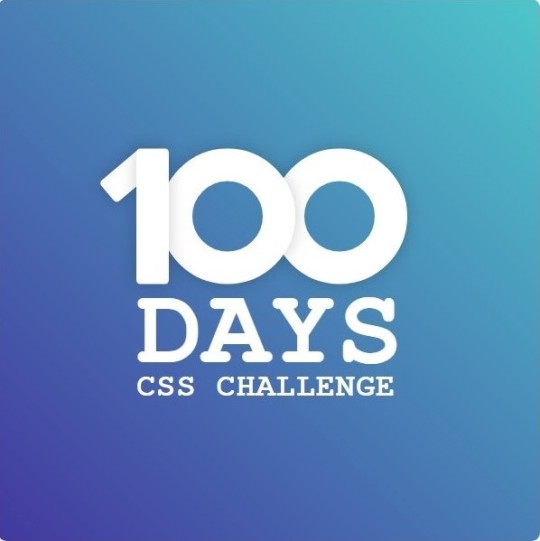
Day 1 - 100 Days CSS Challenge
Welcome to day 1 of the 100 Days CSS Challenge! In this challenge, we'll bring a design to life using only CSS. Our goal is to recreate the image we're provided with on the challenge page using HTML and CSS.
On the challenge page, we see:

A small preview of the design we need to replicate.
A starter HTML template.
A submission form to showcase our work alongside others who have taken on the same challenge.
Let's dive into the process step by step.
Step 1: Screenshot the Image
The first thing I always do is take a screenshot of the target design. Even if the design includes animation, having a static reference helps me focus on the basic structure and colors. Here’s the screenshot of the design we’re aiming for:
Step 2: Extract the Color Palette
Next, I identify the color palette that we'll need. This helps ensure that we maintain consistency with the original design. Here’s the color palette I’ve created:

Step 3: Identify and Create the Image Elements in HTML
Now that we know the colors, I break down the elements in the image:
Background: This is a linear gradient.
The 100 number: This is the main challenge, and it will require some work.
Text: “days css challenge,” which we’ll place to the left of the number.
Here’s the HTML structure for these elements:
<div class="frame"> <div class="center"> <div class="number"> <div class="one-one"></div> <div class="one-two"></div> <div class="zero-one"></div> <div class="zero-two"></div> </div> <p class="sentence1">days</p> <p class="sentence2">css challenge</p> </div> </div>
Now that the elements are in place, CSS will bring them to life.
Step 4: Bringing the Elements to Life with CSS
Linear Gradient
To create the background, we’ll use a linear gradient. Here’s a basic syntax:
background: linear-gradient(to <direction>, <color-stop1>, <color-stop2>, ...);
Parameter 1: Direction/Angle
This defines the starting point of the gradient. You can either specify a direction (e.g., to top, to bottom) or an angle (e.g., 90deg, 180deg).
Direction options:
to top
to bottom
to left
to right
If you want more precision, you can specify angles:
0deg: Gradient starts from the top.
90deg: From the right.
180deg: From the bottom.
270deg: From the left.
You can also combine two directions, specifying both horizontal and vertical movements, like to left top or to right bottom. This means:
The first keyword (left or right) controls the horizontal movement.
The second keyword (top or bottom) controls the vertical movement.
For example:
background: linear-gradient(to left top, red, blue);
This gradient starts at the bottom-right corner and transitions toward the top-left.
Parameter 2: Color Stops
Color stops define how the gradient transitions between colors. Each color stop specifies a point where a color starts or ends. Here's an example:
background: linear-gradient(to right, red 10%, blue 90%);
This means:
The element starts at 0% fully red.
By 10%, the transition from red begins.
Between 10% and 90%, there is a smooth blend from red to blue.
At 90%, the transition to blue is complete, and the remaining part is fully blue.

Once we understand the concept, we can apply the background we need. In our case, the gradient flows from the bottom left to the top right, so the code will look like this:
background: linear-gradient(to right top, #443DA1, #4EC3C9);
Bonus: Stacking Multiple Linear Gradients
You can also apply multiple gradients on top of each other:
background: linear-gradient(180deg, #f00, #0f0), linear-gradient(90deg, #ff0, #f0f);
Step 5: Making the "100" Number
Creating the Zeros
We start with the zeros. These are simply circles created using CSS. To make a full circle, we use border-radius set to 50%.
The white border gives it the appearance of the number zero.
.zero-one, .zero-two { position: absolute; height: 100px; width: 100px; border-radius: 50%; border: 24px solid #fff; box-shadow: 0 0 13px 0 rgba(0,0,0,0.2); }
This gives us a nice circular zero. We adjust their positions using properties like left and top, and manage the z-index to make sure the zeros stack correctly.
.zero-one { z-index: 8; left: 17px; } .zero-two { z-index: 6; left: 100px; }

Now both zeros are positioned, and they overlap in the way we want.
Creating the "1" Number
The number "1" is made of two div elements:
One-One: This part represents the slanted part of the "1".
One-Two: This is the straight vertical part of the "1".
What make the one-one element slightly slanted is
transform: rotate(50deg);)
the one-two is created simply with a little height and width nothing too particular then it is placed directly on top of the slanted part, giving us the full "1". Its z-index tho has to have a higher value than the slanted part of our 1 to ensure it stays above the slanted one.
Step 6: Adding the Text
For the two sentences “days” and “css challenge,” the styling is basic CSS. You can achieve the look with just a few font changes, some padding, and adjustments to font size. It’s as simple as:
.sentence1,.sentence2{ text-transform: uppercase; margin:0; padding:0; } .sentence1{ font-size:82px; font-weight:700; } .sentence2{ font-size:25px; font-weight:700; margin-top:-20px; }
And just like that, we’ve completed day 1 of the 100 Days CSS Challenge! Each part of the design is carefully crafted using CSS, giving us the final result.
Happy coding, and see you tomorrow for Day 2!
#100dayscssChallenge#codeblr#code#css#html#javascript#java development company#python#studyblr#progblr#programming#comp sci#web design#web developers#web development#website design#webdev#website#tech#html css#learn to code
16 notes
·
View notes
Note
hii i tried following that one forum post for a splash screen that you mentioned before in an ask, i didnt really understand it TT could you make a version for dummies? thank you!
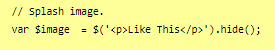
Hi Anon,
Do you mean this ask? about this Forum post? I'll try to make it easier then, cause it mainly is some copy-pasting and some light editing.
The Splash Screen, more explanation
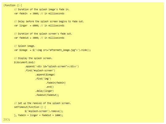
The code from the post will create an element that will cover the whole page, and be triggered every time the game loads (or the tab refreshes).
So first, get on the Forum post, and copy the code in the correct places:
Stylesheet
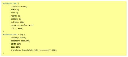
JavaScript
---
Then you will want to edit it to customise it for your project. There is code to change in both block of code:
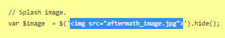
In the JavaScript, you will need to indicate the correct image you want to display on the screen, or any other element (like text).
In the Stylesheet, you will want to edit the colour of the background (and potentially the text colour) to match the vibe.
JavaScript
Here, you will want to edit the correct URL of the image you want to have on the screen.
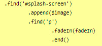
If you want text instead of the image, you can do so by wrapping it with a < p > markup (or other relevant HTML markup):
though, you will need to edit one more thing to make it work, in the .find() line, like below (p for the < p > element, and so on):
StyleSheet
The biggest change you'd need to make for the code in the style sheet will be with the code below:
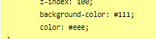
currently, the colours match the basic SugarCube UI colours. So if you've changed the UI palette for your project, you will want to edit those colours (background especially, color is only useful for text)
If you are not using an image, but some text in your splash screen, you will also need to edit this part of the code, to replace the img with the correct HTML markup:
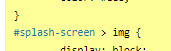
(in the example above, you'd need to change the img with p)
Testing
One important thing afterwards, will be to test the splash screen (for colour, position, or even animation). Note: if you are coding in Twine and used a local image in the splash screen, don't forget to publish to file and open the HTML, rather than test/play through Twine/
If you want to test the Splash Screen, and fiddle with the CSS with the Inspect Tool of your browser, I advise you change the amount of this line in the JavaScript:
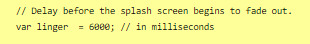
Add a bunch of zeros to increase the time (but don’t forget to remove them before uploading your file anywhere).
---
Hope this helps!
27 notes
·
View notes
Text
Build with the power of code without writing any - Webflow
When you start a business, having a website is primordial. It’s useful to promote your products but also to introduce to your audience new products you made, what are your goals, and why you created this business/brand. But building a website without knowing how to program is quite difficult, even impossible for certain people. It happens to me. It was hard when you don’t know where to start. Then I discovered Webflow, that’s why I want to introduce this website to you.
Webflow allows you to take control of HTML, CSS, and JavaScript in visual canvas, generating clean and semantic code that’s ready to publish or to give to developers. It’s a cloud-based, “software as a service” (SaaS) design tool that runs in a web browser. The principle is easy: you design the website, and they generate the code, for everything from fully custom layouts to complex animations.
Webflow: https://webflow.grsm.io/website_creation
You can design a site from scratch in Webflow, but if you’d rather use a template and make it your own, you can choose from over 2,000 in the Webflow template library. Webflow’s templates are presented in various categories — for example, portfolios, design, blogs, medical, and e-commerce. The templates are of very high quality; they are modern and aesthetically pleasing. They include pre-built elements like data capture forms, background videos, and online store pages — and all of these are fully customizable.
#business#developers & startups#entrepreneur#programming#marketing#website customization#website creation#website
3 notes
·
View notes
Text
Learn to Code
Daily Blogs 356 - Oct 26th, 12.024 Being someone who actually codes and is a software engineer, please learn how to code.
Why?
Before anything else, it is fun, even more if you like puzzles and solve problems, and you could find your future career even.
Nonetheless, coding is an enormous skill to have nowadays with every little job, task, and even hobby, having some sort of technology or another. How many times have you wanted to rename a bunch of files into a more structured form? Or even wanted to have a fast way to see all your tasks for the day? Maybe you are animating in After Effects (unfortunately) and want to make an object pulse following a song beat? Or maybe in your job you have to make spreadsheets in Excel (again, unfortunately) and need something more dynamic? Or maybe, you want to have your own simple website? All of these things can be done, and can be easier, knowing a little bit of coding/scripting.
Coding not only lets you do things in a faster way, it also helps you better understand the technology you use. Did you never think how the little applications that you use are made? Because they are, by humans, like me and you, and that's why they have bugs most of the time. Maybe learning to code, you can even start modding your favorite game! Or even create your own.
But Coding is Hard!
I'm going to be honest, yes, it can be hard. But we aren't talking about doing whole software products or even what could be called engineering, we are talking about scripting/coding, which is just creating files for some utilities, which is far from hard. And instead of trying to explain, let me show you some examples.
Creating a Website Yes, you heard me right, the first example is how to create a website, because you can do it in literally just a file:
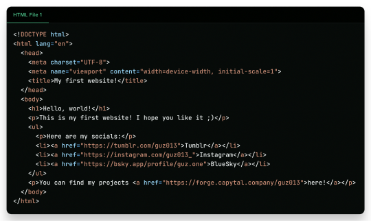
"But it is ugly!", well, just modify a little the first file, and add another file!
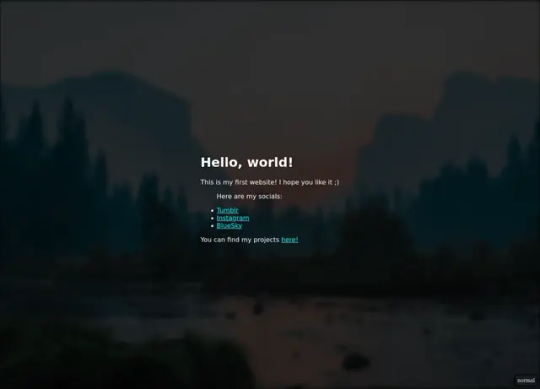
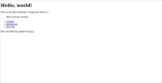
And there it is! Your own website. Now to put it into the internet to everyone to see it is nothing more than uploading these two files to a Web Hosting Service, which most of the simple ones are free! A few examples are GitHub Pages, Vercel, Netlify, all of them you can find easy tutorials to upload your files and have them for the web!
What Are Those Files?
Glad you asked! Let's go step by step.
The first file, the one full of <tags\/>, is what is called an HTML file. HTML (or Hypertext Markup Language) is the language used by all websites you visit, it is designed to structure text in such a way that you can easily put meaning and style into the document, and have you browser read it to show you. These files are marked up using tags, which encapsulate text with an opening tag (like this one <p>) and a closing tag (like this one </p>, see the slash before the letter P), looking like this <p>Hello world</p>. We have multiple types of tags, such as <p> for Paragraphs, <h1> for Heading/titles, <h2> for subheadings/subtitles, <link> for linking one file to another, <ul> for an Unsorted List, which will have <li> for each List Item, <main> for informing what's the main content, <a> for an Anchor/hyperlink for another website, etc. etc. All HTML files will have an <html> encapsulating everything, a <head> tag for information about the page, and a <body> tag for the content of the page. That's pretty much how HTML works, and all you need is to learn what tag does what, and you're pretty much good to go.
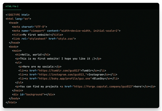
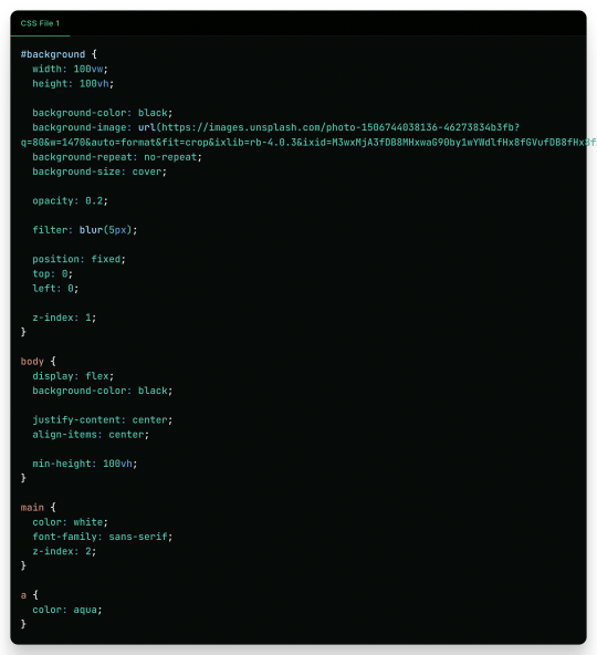
In the second file, we just add some structure to it better, adding a <main> tag and a <div> tag with the ID "background", so the third file, the stylesheet, can make it look pretty! The third file, the one with the {} blocks, is a CSS (or Cascading Style Sheets) file, and it is the one that makes all of our websites beautiful. It is made by these "blocks" of code that applies styles for multiple elements in the page, it is a little bit more hard to explain, but in summary, that file does this:
The "#background" block applies styles to any tag with ID "background". In the example, we make the tag have 100% of the view width (width: 100vw) and 100% of the view height (height: 100vh); make the background be an Unsplash image; decrease the opacity, so the image is not so bright; apply a blur filter; and make its position be absolute in the top left corner, so it doesn't move with the rest of the content;
The "body" block applies styles to the tag and makes it display its content on a flexible layout (display: flex), which we use to make the content be centralized in the page;
We then make the text-color inside the tag white, use a sans font, and make it be in front (z-index: 2) of the tag (see the z-index: 1 in the "#background" block);
And to finish off, we make the color of links an aqua color.
That's pretty much it and pretty much how the fundamentals of how to create a website works. Just 2 files of code, and you can have your own website.
But Where Are the Loops? Where Are the "if"s?
Yes, yes, if you know the concept of coding, you may be asking where are all the loops, "if"s, and variables. Truth be told is that HTML and CSS aren't programming language per-say, they are markup languages to structure and display text, so they can't run anything really. However, they are easy to understand and are considered "code" nonetheless, and personally I find fascinating that websites, the thing we all access every single day, that most people I know think is magic… are based in two simple languages that anyone can learn in an afternoon and have its own website up and running in less than a day.
I Want real code!
Ok ok! Let's so add a little interactivity into our website. What about a little character you can control? Yes, a little game character to control with WASD on your website, with less than 40 lines of code. Let's first update the HTML file so we can add the character:
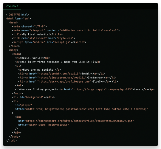
As you can see in the new file, we just added another <div> tag on the website, with the ID "player" and a <img> tag which we can use to add a visual sprite to our character! I'm using this simple sprite/gif I found on OpenGameArt.org. Also, in the new <div> we add some CSS styling directly in the tag, using the style attribute, the reason to this being that here we can manipulate its value with a programming language, in the case of the web, JavaScript. We add the JavaScript file with a <script> tag.
And in the JavaScript file, we can write this simple script:
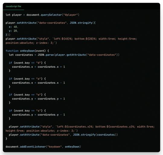
This can be a little overwhelming, but let's go line by line:
First, we get the player element/tag with document.querySelector("#player") (similar on how in CSS we would use #player {} to style the tag). This tag is then saved into a variable player, think of it like a box or alias for document.querySelector("#player"), so when we use something like player.setAttribute it can be thought like document.querySelector("#player").setAttribute;
After that, we use player.setAttribute("data-coordinate", JSON.stringify({ x: 40, y: 20 })). This is just so we can more easily access the coordinates of the player after. An attribute is like that style in the tag, so calling this is like we wrote in the HTML file;
We again call player.setAttribute, but this time to rewrite the value of the style attribute, just to be sure. See how in the text for the style tag (the 2nd argument, aka the left: ${45}%; bottom:${20}%; ...), we use ${}? Well, this is a neat feature that lets us put values inside the text, so it makes the final result be left: 40%; bottom 20% ..., in this line it seems a little redundant, but in later in the lines we will use it more cleverly. Just remember that if we make a variable, a "box", like let x = 10 and use it inside the text like left: ${x}%, it would be in the end left: 10%;
Now the meat of the script, the "onKeyDown" function. A "function" in programming is like a piece of code you can reuse, and pass variables to it to use inside the code, like a box you can put stuff inside to it to do things, a box that uses other boxes, a box inception. Inside the "onKeyDown" function, we take back the value inside that data-coordinates attribute we wrote on the 3rd line, and put it inside the coordinates variable; than, we check if the key pressed is "d", if so, we add 1 to the X coordinate, we are changing the value of coordinate.x; we check for the other keys like "a", "w" and "s", changing the according variable to it; and then, we rewrite both the style attribute and data-coordinates attribute with the new value;
And finally, we use document.addEventListener("keydown", onKeyDown) to tell the browser "hey! Use this function ("onKeyDown") when a key is pressed!".
And that's pretty much it.
As you can see in the top right corner, the values of the style and data-coordinate attribute change when we press a key!
If you want to access this simple website, this is the live version of it hosted on GitHub Pages and the source-code is available under the public domain.
Learning More
Being honest, what I showed here is just a very small toy project, and a lot is simplified because of the gigantic convenience that the browser provides nowadays. But again, this is the type of thing you can do with just a little bit of knowledge on how to code, probably the scripts you will do can be even simpler than this. And just imagine the things you can invent, learning a little bit more!
Besides the toy project, code can be used in a lot of fields:
If you work on data or science in general, coding in Python is a great skill to have on your toolkit, and it is very easy to learn. It works great with creating graphs and can even be used inside Excel for creating more dynamic spreadsheets;
Do you want to make games? Well, learn something like Lua, a very simple language and one of my favorites for scripting, and powerful enough to be chosen by engines like Roblox Studio (which surprisingly is powerful than I thought). But if Roblox is not your taste, well, learn something like GDScript, the language of the Godot game engine, fully free, fully open;
Also, Lua is used for modding on games such as Factorio, and can be very powerful for small scripts for your computer;
If you want to make websites, HTML, CSS and JavaScript, learn them and go nuts (I won't recommend you use any framework as other programmers use, learn the fundamentals first). There are a lot of documentation about the web, and it is one of the fields with the lowest entry;
Are you an 3D Artist? Well then, Python is also the language used for creating add-ons, you can take some time to learn and create your owns to help your workflow!
And if you are a poor soul who is using Adobe products, first: my condolences; second, most Adobe products use ActionScript to create dynamic animations and values such as making an element react to music beats in After Effects.
---
Learn to code, be happy, and maybe you will find a new passion like I did.
Today's artists & creative things Music: Late Night Walk - by Ichika Nito
© 2024 Gustavo "Guz" L. de Mello. Licensed under CC BY-SA 4.0
please learn how to code
like, if you're bored today, and not doing anything,
learn a little bit of coding please
34K notes
·
View notes
Text
CSS 53 💻 transitions
New Post has been published on https://tuts.kandz.me/css-53-%f0%9f%92%bb-transitions/
CSS 53 💻 transitions

youtube
a - transition introduction transitions provide a way to smoothly animate changes to CSS properties over a specified duration. This can add interactivity and visual appeal to your web pages. You can do this by using the transition property transition property is shorthand for four individual transition properties: transition-property, transition-duration, transition-timing-function, and transition-delay use of transition: 1 - select the element you want to apply transition 2 - choose the property (color, height...) 3 - specify the duration of the transition (1s, 2s...) 4 - specify the timing function (linear, ease...) 5 - specify the starting delay b - transition property transition property is a powerful tool for creating smooth animations between different states of an element syntax: transition: [ property || duration || timing-function || delay ] [, ...] you can use: - property and duration only - property, duration and delay property, duration and timing-function - property, duration, timing-function and delay you can also use multiple properties separated by ',' and even all keyword transition: background-color 0.5s ease, transform 0.3s ease; → Transition properties transform: scale(1.2); → end state: Scale the box up by 20% on hover c - transition timing functions CSS provides several timing functions that you can use to control the speed curve of a transition ease: Default value. Starts slow, speeds up, and then slows down again. linear: Constant speed from start to finish. ease-in: Starts slowly and then accelerates. ease-out: Starts quickly and then slows down. ease-in-out: Starts slowly, accelerates in the middle, and then slows down again at the end. You can also define custom timing functions using cubic-bezier values. A common example is cubic-bezier(0, 1, 1, 0)
0 notes
Text
CSS Animated Background Example
#css background animation loop#css background animation#css animated background#html css#divinector#frontenddevelopment#code#css#html#css3#css background animation examples#background animation#css animation tutorial
1 note
·
View note
Text
Solutions for web designers out there
( All animations and movement on a page should be considered for photo-sensitivity including motion sickness and vertigo. )
For animated .GIF image files:
Create a .JPG or .PNG still image version of the animations from their most important or appealing frame. That should be loaded into the HTML first instead of the .GIF.
And before we go into the optimal JavaScript interaction, let’s stick with the HTML a little more...
If you have images that are not already hyperlinked, you can instead make them link to their animated GIF version to open in a new tab (target=“_blank”). Be sure to have appropriate warnings about those links leading to the animated version of that image, right before/above the image itself for those who may be going through the page in order with some accessibility devices. (Thus, they read the warning before they interact with the link.)
Then, from there, we do the script side for this. You can store the different image file paths into your JavaScript and use mouseover/mouseout events to change the file path inside your src=“” attribute. (Here’s how you can dynamically and efficiently do this for many images and give them their own Event Listener: My JSFiddle Example.)
EDIT: I've updated the example to have a 1-second delay for the images to change into animations in case someone accidentally has their mouse over the image after the page loads in. It'll be best to also make hover/active animations optional, which will tie into the JavaScript needed to achieve the hover/active functions to begin with.
Also added a few more in-code comments for extra instruction and clarity.

Another idea with JavaScript is to have a “toggle” sort of <button> on your page that someone can click/confirm whether or not everything on a page should animate/move or not. If you’re nicely familiar with JavaScript, you can make a more in-depth options menu for this sort of thing too!

This is also a great solution since there are web users who look at webpages either in a simplified view or blocking all scripts (like JavaScript) from your website. They could be viewing your website like this due to personal needs, or technological limitations. And so, having a still image in your HTML by default is MUCH preferred!
For CSS @ keyframe animations:
In the raw CSS file, the default value for the animation-play-state property should be paused. We have to keep simplified view users and script-blocking users in mind for moving objects and images on our webpages. So, whatever is loaded in by default must maintain this priority.
Thankfully, sticking with the CSS, we can just as easily changed the animation-play-state to running when the element is hovered (for mouse users) or active (for touch-screen users).
For sprite sheet animations:
If you’ve figured out how to make sprite animations on a web doc, then you’re already involved in the JavaScript for it and familiar with the code. Or, you're doing it the pure CSS way (see here). In which you can refer back to the @ keyframe section above.
So, here’s a general guideline that you can follow in JavaScript!
The sprite sheet element in your CSS should focus on your most important frame that you want to be seen by users on the default page appearance. Set its background-position to that frame inside the CSS.
For users who can load JavaScript on the page, set that element to toggle its animation by mouseover/mouseout or clicking.
For users who cannot load the JavaScript, the next best thing is to build the sprite animation from CSS keyframe steps().
And for most absolute safe case scenario in case of browser or device compatibility issues with any of these properties in the CSS, you could make an animated .GIF file of your sprite sheet. Make sure it's under 1Mb for users in this category who are also likely to be viewing your page from slow download speeds. With that, refer back to the section for handling image files without JavaScript.
Hopefully this is of great help, if not a starting point for accessibility ideas and considerations for your websites!
pleeeeeeeease indie web and scenecore and whatever other subcultures.... have fun and be cringe but PLEASE be careful with your blinkies. if your website has flashing lights that are on by default or that can't be turned off, then it is inaccessible to photosensitive people. if your post has flashing lights, it needs to be tagged. PLEASE. i love indie web stuff but the prevalence of unavoidable flashing lights makes me really anxious!! people have migraines and seizures! please use tags like "flashing lights" and "eye strain," NOT "epilepsy" or "epilepsy warning," and please consider making your site accessible by removing flashing lights or making them avoidable. PLEASE. make the web usable for photosensitive people.
#web design#web development#retro internet#old internet#neocities#accessibility#a11y#wk speaks#wk replies#reference#resources#guides#important#epilepsy support#disability awareness#internet safety#photosensitivity#old web#html#css#javascript
5K notes
·
View notes
Text
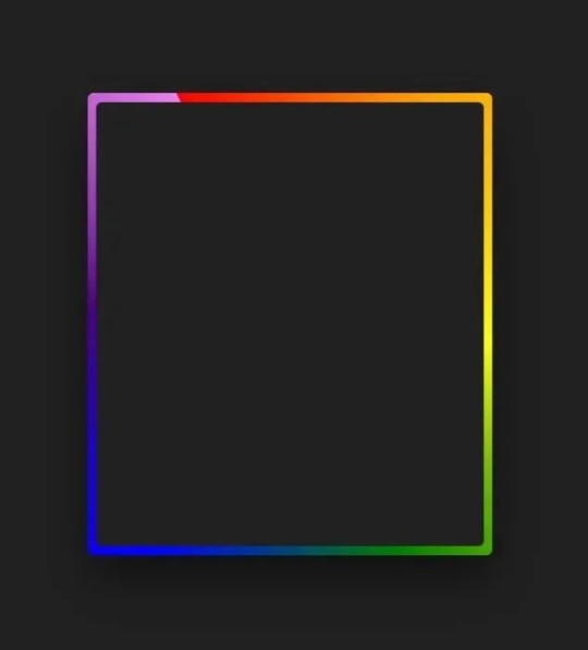
Gradient Border Animation
#css border animation#css gradient background animation#codingflicks#html css#frontend#html#css#frontenddevelopment#css3#webdesign#html css animation#css animation examples#border animation css#neduzone
5 notes
·
View notes
Text

CSS Background Loop Animation
#css background animation#css animation examples#html css#codenewbies#html5 css3#css#pure css animation#css animation tutorial#frontenddevelopment#html css background animation#animated background css#css animated background
3 notes
·
View notes
Text
Future-Proof Your Website: 5 Web Design Strategies That Will Dominate in 2025

Web design is no longer just about making a site look good.
In today’s digital world, your website acts as your brand's voice, your store, your customer service desk, and your sales team. With user behaviors changing fast and technology advancing even faster, your website must be ready to adapt.
That is why future-proofing your website is more important than ever before.
Let’s explore five major design strategies that are reshaping how websites are built and used in 2025. These strategies are not just trends. They are shifts in how we think about digital experiences.
Speed is the New Standard for Online Success
First impressions happen fast. Visitors decide in seconds whether they want to stay on your site or leave. If your page takes too long to load, they are likely to click away before they even see what you offer.
This is why speed is no longer just a bonus. It is a requirement.
In 2025, websites are being built with speed as a core priority. Developers are moving away from heavy frameworks and bloated designs. Instead, they are using lighter code, optimizing images using formats like WebP, and loading only the content that is needed at the moment.
Minimizing unused CSS and JavaScript, reducing the number of third-party scripts, and caching intelligently can all dramatically boost your load time.
Speed matters to users and to search engines. Google now considers page speed when ranking websites. So a faster website does not just improve the user experience. It can improve your visibility in search as well.
Make speed your foundation. It supports everything else you build.
Designing for the Eyes: The Rise of Dark Mode and Visual Comfort
More people are browsing the web at night or in low-light settings. This has made visual comfort an important factor in web design. One of the clearest signs of this shift is the growing popularity of dark mode.
Dark mode gives users an interface that uses darker backgrounds with lighter text. It reduces eye strain and looks more modern to many users. Some devices even switch to dark mode automatically at certain times of the day.
A good website in 2025 respects user comfort. That means giving them options. More and more designers are creating flexible themes where users can toggle between light and dark modes. This not only improves the experience but also gives users a sense of control.
But visual comfort goes beyond color themes. It includes avoiding harsh contrasts, using calm color palettes, and ensuring text is always easy to read. Typography, spacing, and line height all play a role in making sure your content is welcoming and effortless to consume.
A visually comfortable website encourages longer visits, repeat visits, and greater trust.
Micro-Interactions Make the Web Feel Human
We often focus on big elements like headers, layouts, and graphics. But sometimes the smallest touches have the biggest impact.
Micro-interactions are the tiny animations or responses that happen when a user performs an action. Think of a button that changes color when hovered. Or a subtle animation when a form is submitted successfully. These small movements provide feedback. They tell the user something happened.
In 2025, websites that feel alive and responsive are winning attention. Micro-interactions make a site feel more intuitive and engaging. They help users understand how things work without needing instructions.
For example, a progress bar that fills up as someone scrolls down a blog post encourages them to keep reading. A playful animation when a product is added to a shopping cart makes the process feel rewarding.
These touches are not just decoration. They create smoother experiences and help build a sense of flow as users move through your site.
The best micro-interactions are simple, fast, and purposeful. They make the digital feel more human.
Personalization Powered by AI Brings Better Experiences
A one-size-fits-all approach no longer works in web design. Today’s users expect personalized experiences. They want to feel like your website understands their needs.
With AI becoming more accessible, personalization is easier and more powerful than ever.
Websites in 2025 can analyze user behavior and adjust the experience in real time. They can show different headlines based on a visitor’s location. They can recommend products based on past purchases or browsing history. They can greet returning users with content that feels relevant instead of generic.
Smart content blocks, predictive search, and AI chat assistants are some of the ways personalization is being built into websites.
It is not about spying on users. It is about making the experience smoother, faster, and more helpful. When users feel understood, they are more likely to engage, stay longer, and return again.
Always remember to keep personalization subtle and respectful. It should feel helpful, not intrusive.
Accessibility First Means Designing for Everyone
One of the most powerful changes in modern web design is the shift toward inclusivity. Accessibility is no longer a feature. It is a foundation.
An accessible website ensures that everyone can use it, including people with disabilities. This might mean adding alt text to images so screen readers can describe them. It might involve using proper heading structure so the content is easy to follow. Or making sure buttons are large enough to tap and links are keyboard-friendly.
Designing with accessibility in mind helps people with visual, hearing, cognitive, or mobility challenges navigate your site with ease.
But accessibility benefits everyone. Clean, readable design helps all users focus. Keyboard navigation can improve site speed. And accessible sites often rank better in search engines because they are built with better structure and clarity.
More importantly, building accessible websites is the right thing to do. It shows that you care about your entire audience.
When you design for all, your reach and impact grow naturally.
Final Thoughts on Future-Proofing Your Website
Technology moves fast, but user expectations move even faster.
By focusing on speed, visual comfort, micro-interactions, personalization, and accessibility, you are not just chasing trends. You are building a digital experience that will last.
Websites in 2025 need to be fast, responsive, human-centered, and inclusive. That is what it means to be future-proof.
The best time to update your design was yesterday. The second-best time is now.Want more insights on where web design is heading? Explore our full blog: Top 5 Latest Web Design Trends in 2025 and Beyond
0 notes
Text

Day 4 - 100 Days CSS Challenge
CSS ANIMATIONS
Hey everyone!
Today, we’re working with three circles and our goal is to create a smooth animation where the circles scale up and down in a staggered sequence.
Step 1: The Basics
First, let’s talk about the structure. The design is made up of three circles:
Circle 1: The largest circle.
Circle 2: Medium-sized, nested inside Circle 1.
Circle 3: The smallest, nested inside Circle 2.
All three circles are white, and they animate against that reddish background. The animation involves scaling the circles up and down in a staggered sequence.
Step 2: The Animation Struggle
The main challenge here was getting the circles to animate one after the other instead of all at the same time. At first, I thought, "Easy, just add some delays!" But it wasn’t that straightforward. Here’s what I learned:
animation-delay
To create the staggered effect, I used the animation-delay property. This property allows you to delay the start of an animation for a specific amount of time. For example:
Circle 1: No delay (0s).
Circle 2: Delayed by 0.2s.
Circle 3: Delayed by 0.4s.
This way, each circle starts its animation slightly after the previous one, creating that beautiful cascading effect.
Step 3: Understanding animation-fill-mode
One of the biggest "aha!" moments for me was understanding the animation-fill-mode property. This property determines how an element is styled before and after the animation runs.
animation-fill-mode: both: ensures that the element retains the styles defined in the first and last keyframes of the animation. Without this, the circles would snap back to their default state (scale 0) after the animation ends, which would ruin the smooth transition.
What happens if we don’t use it? Without animation-fill-mode: both, the circles would abruptly disappear or reset at the end of the animation, making the whole thing look janky.
Step 4: The Magic of alternate
The alternate value in the animation property is what makes the animation reverse direction after each cycle. Here’s how it works:
Without alternate, the animation would play forward and then jump back to the start.
With alternate, the animation plays forward, then reverses, creating a smooth back-and-forth effect.
This is perfect for our circles because it makes them scale up and then scale down seamlessly, without any awkward jumps.
Step 5: reverse vs. alternate
You might be wondering, "What’s the difference between reverse and alternate?" Great question!
reverse: The animation plays backwards from 100% to 0%. It doesn’t alternate; it just runs in reverse.
alternate: The animation plays forward (0% to 100%) and then backwards (100% to 0%) in a continuous loop.
So alternate is NOT reverse + infinite
For our circles, alternate is the way to go because we want them to scale up and down repeatedly.
What I Learned :
animation-delay is your best friend when you want staggered animations.
animation-fill-mode: both is crucial for smooth transitions.
alternate creates a seamless back-and-forth effect.
cubic-bezier gives you fine control over the animation’s timing.
I’m so excited to keep going with this challenge, and I can’t wait to see what Day 5 has in store.
Keep coding and keep learning.
#100dayscssChallenge#codeblr#code#css#html#javascript#java development company#python#studyblr#progblr#programming#comp sci#web design#web developers#web development#website design#webdev#website#tech#html css#learn to code
1 note
·
View note
Link
Totally amazing, all-in-css animated backgrounds.
0 notes
Text
Micro-Interactions: How Small Details Enhance User Experience
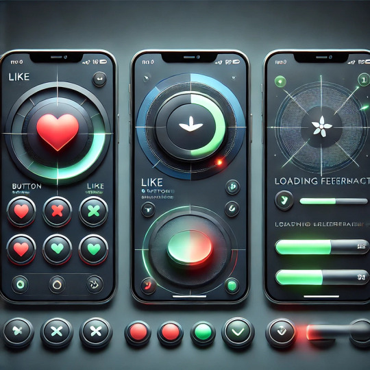
Micro-Interactions: How Small Details Enhance User Experience
Micro-interactions are subtle animations and feedback mechanisms that make digital experiences more engaging, intuitive, and user-friendly. These small details significantly impact usability, engagement, and delight without overwhelming users.
1. What Are Micro-Interactions?
A micro-interaction is a small, functional animation that occurs in response to a user’s action. They guide users, provide feedback, and improve the overall UX.
🔹 Examples: ✅ A “like” button that animates when clicked ❤️ ✅ A password strength meter while typing 🔒 ✅ A loading spinner when fetching data ⏳
💡 Micro-interactions improve UX by making interfaces feel alive, intuitive, and responsive.
2. Key Components of Micro-Interactions
Every micro-interaction consists of four key parts:
1️⃣ Trigger — The user action or system event that initiates the micro-interaction. 2️⃣ Rules — Define what happens once the interaction starts. 3️⃣ Feedback — Provides real-time response (e.g., animation, vibration). 4️⃣ Loop & Mode — Determines if the interaction repeats or adapts based on context.
🔹 Example: Toggle Button Animation
Trigger: User taps the toggle switch.
Rules: The toggle state changes from “Off” to “On.”
Feedback: The switch smoothly slides and changes color.
Loop & Mode: The toggle remains in its new state until changed.
3. Why Micro-Interactions Matter in UX Design
✅ Enhance User Engagement: Makes the UI more interactive and fun. ✅ Provide Instant Feedback: Shows the result of an action in real time. ✅ Improve Usability: Helps guide users intuitively. ✅ Add Personality to a Brand: Creates a more human and relatable experience.
4. Common Micro-Interaction Examples
🔹 Loading Animations
🔄 Prevent frustration by keeping users informed. Instead of a boring “Loading…” message, a creative animation can improve perceived performance.
✅ Example:
Spinning loader (⏳)
Skeleton screens (gradually load content)
Progress bars (indicate completion)
🔹 Button Feedback & Hover Effects
📍 Enhances interactions and confirms user actions.
✅ Example:
Buttons change color or size when hovered.
A ripple effect when clicking a button.
cssCopyEditbutton:active { transform: scale(0.95); }
🔹 Form Validations & Input Feedback
✍️ Makes form-filling easier and error-free.
✅ Example:
Inline validation messages (✅ or ❌).
Password strength indicators.
Shake animation for incorrect input.
javascriptif (password.length < 6) { inputField.classList.add("shake"); }
🔹 Like, Share, & Favorite Animations
❤️ Encourages engagement and interaction.
✅ Example:
Clicking a heart icon makes it pop & change color.
Social media reactions (e.g., Facebook’s Like button).
javascriptheartIcon.addEventListener("click", () => { heartIcon.classList.add("animate-heart"); });
🔹 Toggle Switch & Dark Mode
🌗 Smooth transitions improve experience.
✅ Example:
A toggle switch animates when switching between light and dark modes.
Background and elements smoothly transition between themes.
javascripttoggleButton.addEventListener("click", () => { document.body.classList.toggle("dark-mode"); });
5. Best Practices for Designing Micro-Interactions
🎯 Keep it Simple — Subtle animations work best; avoid overuse. ⚡ Make it Fast — Animations should be quick (0.2–0.5s). 🎨 Match the Brand Personality — Ensure animations align with the app’s tone. 🎯 Provide Feedback — Always let users know what’s happening. 📱 Ensure Accessibility — Avoid relying only on color; support screen readers.
6. Tools to Create Micro-Interactions
🚀 For UI Designers:
Figma, Adobe XD, Sketch — For prototyping animations.
Lottie (Airbnb) — Lightweight animated SVGs & JSON-based animations.
💻 For Developers:
CSS Animations & Transitions — For simple hover and click effects.
JavaScript & GSAP — For dynamic and interactive animations.
Framer Motion (React) — For smooth UI animations.
7. Conclusion
Micro-interactions may seem small, but they greatly enhance user experience by making interfaces more engaging, intuitive, and fun. When used effectively, they improve usability, reduce friction, and add a human touch to digital products.
WEBSITE: https://www.ficusoft.in/web-designing-training-in-chennai/
0 notes