#css border animation
Explore tagged Tumblr posts
Visit Tumblr Blog
Explore Tumblr blogs with no restrictions, modern design and the best experience.
Last Seen Tumblr Blogs


Fun Fact
Tumblr.com is the 103rd most visited website in the world.
Text
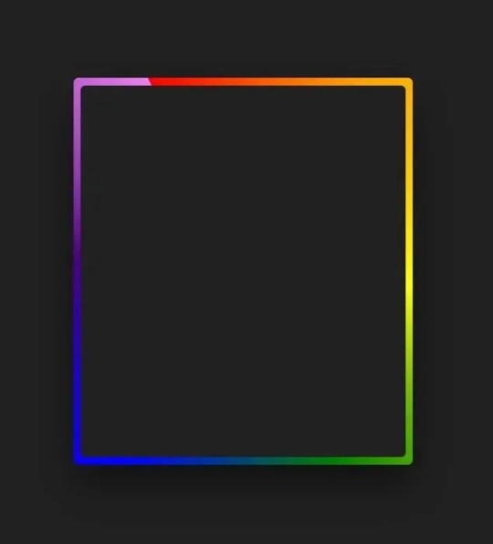
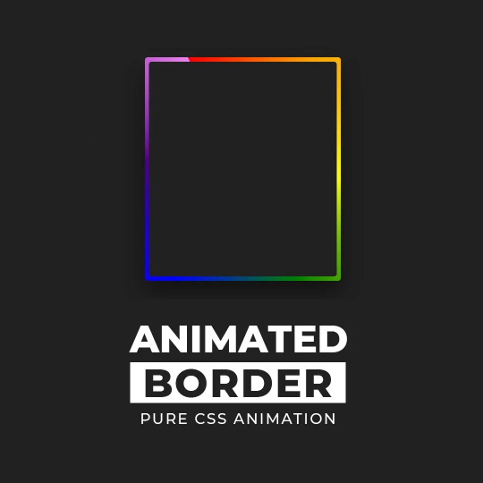
Gradient Border Animation
#css border animation#css gradient background animation#codingflicks#html css#frontend#html#css#frontenddevelopment#css3#webdesign#html css animation#css animation examples#border animation css#neduzone
5 notes
·
View notes
Text
CSS3 Border Animation
#css border animation#html css animation#css animation examples#css animation#css animation tutorial#html5 css3#css#html css#codenewbies#pure css animation#frontenddevelopment#css tricks#css effects#animation
2 notes
·
View notes
Text
CSS Border Animation
#css border animation#html css#frontenddevelopment#css#html#css3#pure css animation#css animation examples#css animation tutorial#divinector#html5#html5 css3#css3 animation
0 notes
Text

Useful websites / links for rentry , bundlrs , gfx & etc for you!
symbol sanatorium - Links to a google document with a ton of symbols , kaomojis & text layouts. I use it for pretty much all of my recent rentrys.
sozaino.site - Website that's been making its rounds on rentry as of late, useful for graphic making. Has dividers, pngs, frames ~ etc if you have the creative touch.
sozai-good - site I found recently that has a lot of pngs you can download, also has frames and borders. In japanese but isn't hard to translate. Everything is also sorted into sections.
lottie lab - Website useful for animating, can be used to move around PNGs for rentry and the like. I don't use it much myself atm, but it's pretty easy to get the hang of.
scripted.neocities - Neocities full of code you can use for bundlrs or carrd. Also useful for stuff like spacehey and other sites that use CSS / HTML
blinkies.cafe - Easily make or find blinkies here! Great for beginners who want to make some simple things.
emojicombos - Search practically anything and you'll find an emoji combo for it. Useful for finding symbol / text combos and kaomojis.
unicode character table - Has pretty much every single symbol you've seen or needed. You can find what you want pretty easily due to its sectioning. Has stuff like arrows , dingbats , brackets , etc etc..
yaytext - Make your text 𝙼𝚘𝚗𝚘𝚜𝚙𝚊𝚌𝚎! or U͟n͟d͟e͟r͟l͟i͟n͟e͟d͟!͟ easily with this website! May possibly break screenreaders in the process though so be warned.
lorem ipsum generator - Too lazy to generate a block of text to make a page look filled out, well look no longer! This site can quickly generate of block of pure gibberish to make it seem like there's actually text there! Good for newspaper / magazine gfx ~
And that's all ( for now )! I use most of all these sites and find them very useful! Hopefully one of them will prove useful to you too dear friend (❁´◡`❁)

#puerileds#text decor#text layouts#websites#sites#pngs#dividers#frames#rentry#bundlrs#carrd#gfx#gfx decor#rentry decor#bundlrs decor#carrd decor#carrd resources#rentry resources#png#divider#gif#rentry stuff#aesthetic#idea#aesthetic bio#bio#discord layout#discord decor#twitter bio#symbols
3K notes
·
View notes
Text
I still find it insane that no one in my life is as excited about webdesign as i am. Like it's a good skill!!! any page you look at looks the way it does because of people who know how to do this!! And still goes so underutilised!! There is so much you could do with it, but the internet is dead set on turning everything into sleek minimalist boxes with rounded edges.
.div{Background:white; border-radius: 25px; border: 2px solid grey;} and you're fucking done you've recreated most major websites.
Nowdays you're LUCKY if you find a social media that allows you to change your background colour, (Such as this one) when with css you could have animated elements! Rainbow text! picture of ground paprika that grows the width of your entire site when hovered over!
Yesterday i showed my mom (wrong person i know, but most people i know check out mentally when i mention it) something i made and she was like "i don't get it. This looks like a gif. How did you know what to write?" Like she was so close to getting that i learned a cool new thing but then she just didn't wanna hear about it anymore.
It's a little bit insane how something half the world runs on can be like, kinda niche as well. Just go on neocities or nekoweb. (I have a few webring neighbours who host on nekoweb) and look what people do on there. Look at that old spacejam website, even.
29 notes
·
View notes
Text

Day 2 - 100 Days CSS Challenge
Welcome to day 2 of 100 days of css challenge, where we will be together getting a given image result into reality by code.
We already know the drill since we did the first challenge, now let's get right into the different steps:
First step : Screenshot the image and get its color palette

No crazy color palette here, we only have two colors
White
This shade of green: #3FAF82
To make things more organized and get used to coding in an organized way, even if not doing it here wouldn't make any difference because we only have two colors, in more complex projects we would have a lot, we will define our colors at the beginning of our CSS code (well, only the green in this case):
:root { --main-green: #3FAF82; }
And this is how we'll use it whenever we want:
color: var(--main-green);
Second step : Identify the image elements
What elements do I have?
Three lines: line1, line 2, and line 3. I'll add them to my HTML starter template, again I'll leave the frame and center there:
<div class="frame"> <div class="center"> <div class="line-1 line"></div> <div class="line-2 line"></div> <div class="line-3 line"></div> </div> </div>
Third step : Bring them to life with CSS
Applying the background color
Only one line should be changed in the CSS code already added to .frame class:
background: var(--main-green);
So this is what we have going on for now :

Creating the lines
Now let's create our lines; if you noticed I gave each one two classes line-number and then line. I'll use the line class to give them all the common properties they have such as the color, height, width, position, border-radius, and shadow. And then I'll use the line-number to move them wherever I want using the left, top, right, bottom properties of an absolutely positioned element in CSS.
Let's start by creating all of them:
.line { left: -45px; position: absolute; height: 9px; width: 100px; background: white; border-radius: 10px; box-shadow: 2px 2px 5px rgba(0, 0, 0, 0.2); }
And just like this you'll see this in the browser:

You only see one line because the three are overlapping each other, and that's why we'll move each one of them exactly where we want using this:
.line-3 { top: 22px; } .line-1 { top: -22px; }
Now our static menu is ready:

Creating and analyzing the animations
As of observing, we can see that:
Line one goes down to line 2
Line three goes up to line 2
THEN line 2 disappears
THEN lines 1 and rotate to create the X
line-one-goes-down animation
This is my line-one code in the static version:
.line-1 { top: -22px; }
What I'm trying to do here is simply a movement translated by changing top from -22px to it becoming 0px:
@keyframes line-one-goes-down { 0% { top: -22px; } 100% { top: 0px; } }
line-three-goes-up animation
Again, I'm trying to go from top being 22px to it being 0px:
@keyframes line-three-goes-up { 0% { top: 22px; } 100% { top: 0px; } }
line-two-disappear animation
Making disappear simply means turning its opacity and width to 0:
@keyframes line-two-disappear { 0% { opacity: 1; width: 100px; } 100% { opacity: 0; width: 0px; } }
I'm gonna apply these animations and see what happens , before I create the rotation animations
.center.active .line-1 { animation: line-one-goes-down 0.5s forwards; } .center.active .line-2 { animation: line-two-disappear 0.5s forwards; } .center.active .line-3 { animation: line-three-goes-up 0.5s forwards; }
forwards means that the element will stay in the final state after the animation and not return to its original state.
This is what applying those three animations looks like:
Last but not least : let's Create the X
We only have to animations left for this: rotate-line-1 and rotate-line-2. Let's create them:
@keyframes rotate-line-1 { 0% { transform: rotate(0deg); } 100% { transform: rotate(45deg); } } @keyframes rotate-line-2 { 0% { transform: rotate(0deg); } 100% { transform: rotate(-45deg); } }
And that is my friends how we finished this challenge!
Happy coding, and see you tomorrow for Day 3!
#100dayscssChallenge#codeblr#code#css#html#javascript#java development company#python#studyblr#progblr#programming#comp sci#web design#web developers#web development#website design#webdev#website#tech#html css#learn to code
18 notes
·
View notes
Note
Hello! I hope I don't bother you again. I have two questions for you (I think there are more). I'm writing a zosan fanfic and I came up with the idea of putting "titles" in what happens in the "chapters" separated by the divider, like the titles of anime episodes (very One Piece with spoilers about what happens in the episode), I would like to know what do you think of this idea? I have images of what these titles would look like if you want them for better visualization. 2- Is there a skin work on ao3 that imitates these "titles", as if they were chapter titles of a book (but without having to have several chapters as I want to make a oneshot)?
hello! yes, I think that sounds like a neat idea. you should go for it!!
I don't watch one piece so I hope I'm visualizing it right. if I got it wrong, feel free to send me a picture.
anyway. are you trying to do something like this?
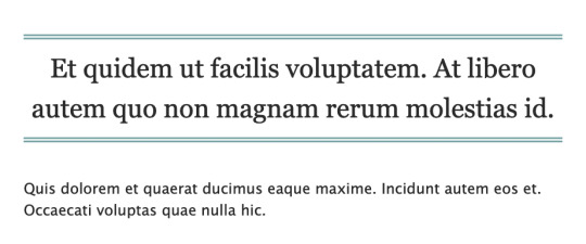
if this is what you're going for, you can try this code out! I also created a pastebin for this one, so you can just copy paste to your own workskin.

so here, we're creating the lined-title css class. you can just add it to your <p> tags in the html when you want to apply them. e.g.
<p class="lined-title">TITLE</p>
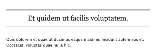
feel free to play around with border-style and the border-color (or any other attribute). you'll want border-style:solid if you just want one single line, for example.
you can also check AO3's FAQ on what colors and fonts you can use. fun fact: border-style:double is the same css they use to add those double lines in the FAQ!
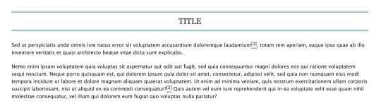
note that this will span the entire width of the page. so if you have a short title, it'll look like this on desktop:
if you don't want it to span the whole page, we could try this instead (also included in the pastebin link):

which will result in this:

however, we can't manipulate the spacing between the text and the lines in this one. on the other hand, it has text-decoration-style:wavy which the first option doesn't have!
for custom scene dividers, you can also check out these guides:
How to Make Customized Page Dividers by La_Temperanza
Dividers & how to style them by skinofthesoul
Rainbow Paragraph Divider by benwvatt
bonus: inspect element
also, are you familiar with inspect element yet? if you are, great! you can just skip this. otherwise, if you're still getting the hang of working with workskins and aren't used to editing css, you can try this:
right click on the text you want to change on AO3, then click "inspect" or "inspect element" (not sure what it's called in browsers these days; on firefox, it's just "inspect"). this will bring up a bunch of developer tools and it kinda looks like this:
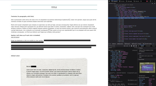
it might look different depending on the browser.
but here on the side, you can see the html on top and css at the bottom. as you can see in the screenshot, we are inspecting the title and we can see the different css rules for the title.
if you want to play around with the css, you can just change them from this panel and it will automatically reflect on the page. these changes are not permanent so it's a good way to test different styles without having to go through the cycle of updating the workskin and refreshing the fic page.
if this is your first time trying this out, it might look overwhelming, but it's very helpful if you get the hang of it. but of course, you don't need to learn how to do this to style your fics. :D
9 notes
·
View notes
Text

CSS Landscape | 2024 #2 Welcome to CSS Landscape digest, where we curate the latest articles, tutorials, and videos to keep you informed and inspired in the world of CSS. In this edition, discover techniques for breaking words effectively, explore innovative CSS button styles, and learn how to handle dark mode with CSS and JavaScript. Dive into advanced tooltip design, captivating border animations, and much more. Stay ahead in CSS trends and techniques with CSS Landscape digest. https://freefrontend.com/css-landscape-2024-03-29/
2 notes
·
View notes
Text
CSS Gradient Border Animation
#gradient border animation#css border animation#css animation examples#css animation tutorial#css animation#cool css animation#css gradient animation#css gradient#learn to code#code#html css#css#html#css3#frontenddevelopment#webdesign#frontend#gradient
7 notes
·
View notes
Text

CSS Button Animation
#css button border animation#css buttons#codenewbies#html css#html5 css3#frontenddevelopment#css#css animation examples#pure css animation#css animation tutorial#code#css tricks#css snippets#html5#frontend
3 notes
·
View notes
Text

CSS Button Border Animation
#css border animation#css buttons#css animation tutorial#css animation examples#pure css animation#learn to code#html css#divinector#css#code#frontenddevelopment#css3#html
0 notes
Text
Getting Creative With HTML Dialog
New Post has been published on https://thedigitalinsider.com/getting-creative-with-html-dialog/
Getting Creative With HTML Dialog
Like ’em or loath ’em, whether you’re showing an alert, a message, or a newsletter signup, dialogue boxes draw attention to a particular piece of content without sending someone to a different page. In the past, dialogues relied on a mix of divisions, ARIA, and JavaScript. But the HTML dialog element has made them more accessible and style-able in countless ways.
So, how can you take dialogue box design beyond the generic look of frameworks and templates? How can you style them to reflect a brand’s visual identity and help to tell its stories? Here’s how I do it in CSS using ::backdrop, backdrop-filter, and animations.
Design by Andy Clarke, Stuff & Nonsense. Mike Worth’s website will launch in June 2025, but you can see examples from this article on CodePen.
I mentioned before that Emmy-award-winning game composer Mike Worth hired me to create a highly graphical design. Mike loves ’90s animation, and he challenged me to find ways to incorporate its retro style without making a pastiche. However, I also needed to achieve that retro feel while maintaining accessibility, performance, responsiveness, and semantics.
A brief overview of dialog and ::backdrop
Let’s run through a quick refresher.
Note: While I mostly refer to “dialogue boxes” throughout, the HTML element is spelt dialog.
dialog is an HTML element designed for implementing modal and non-modal dialogue boxes in products and website interfaces. It comes with built-in functionality, including closing a box using the keyboard Esc key, focus trapping to keep it inside the box, show and hide methods, and a ::backdrop pseudo-element for styling a box’s overlay.
The HTML markup is just what you might expect:
<dialog> <h2>Keep me informed</h2> <!-- ... --> <button>Close</button> </dialog>
This type of dialogue box is hidden by default, but adding the open attribute makes it visible when the page loads:
<dialog open> <h2>Keep me informed</h2> <!-- ... --> <button>Close</button> </dialog>
I can’t imagine too many applications for non-modals which are open by default, so ordinarily I need a button which opens a dialogue box:
<dialog> <!-- ... --> </dialog> <button>Keep me informed</button>
Plus a little bit of JavaScript, which opens the modal:
const dialog = document.querySelector("dialog"); const showButton = document.querySelector("dialog + button"); showButton.addEventListener("click", () => dialog.showModal(); );
Closing a dialogue box also requires JavaScript:
const closeButton = document.querySelector("dialog button"); closeButton.addEventListener("click", () => dialog.close(); );
Unless the box contains a form using method="dialog", which allows it to close automatically on submit without JavaScript:
<dialog> <form method="dialog"> <button>Submit</button> </form> </dialog>
The dialog element was developed to be accessible out of the box. It traps focus, supports the Esc key, and behaves like a proper modal. But to help screen readers announce dialogue boxes properly, you’ll want to add an aria-labelledby attribute. This tells assistive technology where to find the dialogue box’s title so it can be read aloud when the modal opens.
<dialog aria-labelledby="dialog-title"> <h2 id="dialog-title">Keep me informed</h2> <!-- ... --> </dialog>
Most tutorials I’ve seen include very little styling for dialog and ::backdrop, which might explain why so many dialogue boxes have little more than border radii and a box-shadow applied.
Out-of-the-box dialogue designs
I believe that every element in a design — no matter how small or infrequently seen — is an opportunity to present a brand and tell a story about its products or services. I know there are moments during someone’s journey through a design where paying special attention to design can make their experience more memorable.
Dialogue boxes are just one of those moments, and Mike Worth’s design offers plenty of opportunities to reflect his brand or connect directly to someone’s place in Mike’s story. That might be by styling a newsletter sign-up dialogue to match the scrolls in his news section.
Mike Worth concept design, designed by Andy Clarke, Stuff & Nonsense.
Or making the form modal on his error pages look like a comic-book speech balloon.
Mike Worth concept design, designed by Andy Clarke, Stuff & Nonsense.
dialog in action
Mike’s drop-down navigation menu looks like an ancient stone tablet.
Mike Worth, designed by Andy Clarke, Stuff & Nonsense.
I wanted to extend this look to his dialogue boxes with a three-dimensional tablet and a jungle leaf-filled backdrop.
Mike Worth, designed by Andy Clarke, Stuff & Nonsense.
This dialog contains a newsletter sign-up form with an email input and a submit button:
<dialog> <h2>Keep me informed</h2> <form> <label for="email" data-visibility="hidden">Email address</label> <input type="email" id="email" required> <button>Submit</button> </form> <button>x</button> </dialog>
I started by applying dimensions to the dialog and adding the SVG stone tablet background image:
dialog width: 420px; height: 480px; background-color: transparent; background-image: url("dialog.svg"); background-repeat: no-repeat; background-size: contain;
Then, I added the leafy green background image to the dialogue box’s generated backdrop using the ::backdrop pseudo element selector:
dialog::backdrop background-image: url("backdrop.svg"); background-size: cover;
Mike Worth, designed by Andy Clarke, Stuff & Nonsense.
I needed to make it clear to anyone filling in Mike’s form that their email address is in a valid format. So I combined :has and :valid CSS pseudo-class selectors to change the color of the submit button from grey to green:
dialog:has(input:valid) button background-color: #7e8943; color: #fff;
I also wanted this interaction to reflect Mike’s fun personality. So, I also changed the dialog background image and applied a rubberband animation to the box when someone inputs a valid email address:
dialog:has(input:valid) background-image: url("dialog-valid.svg"); animation: rubberBand 0.82s cubic-bezier(0.36, 0.07, 0.19, 0.97) both; @keyframes rubberBand from transform: scale3d(1, 1, 1); 30% transform: scale3d(1.25, 0.75, 1); 40% transform: scale3d(0.75, 1.25, 1); 50% transform: scale3d(1.15, 0.85, 1); 65% transform: scale3d(0.95, 1.05, 1); 75% transform: scale3d(1.05, 0.95, 1); to transform: scale3d(1, 1, 1);
Tip: Daniel Eden’s Animate.css library is a fabulous source of “Just-add-water CSS animations” like the rubberband I used for this dialogue box.
Changing how an element looks when it contains a valid input is a fabulous way to add interactions that are, at the same time, fun and valuable for the user.
Mike Worth, designed by Andy Clarke, Stuff & Nonsense.
That combination of :has and :valid selectors can even be extended to the ::backdrop pseudo-class, to change the backdrop’s background image:
dialog:has(input:valid)::backdrop background-image: url("backdrop-valid.svg");
Try it for yourself:
Conclusion
We often think of dialogue boxes as functional elements, as necessary interruptions, but nothing more. But when you treat them as opportunities for expression, even the smallest parts of a design can help shape a product or website’s personality.
The HTML dialog element, with its built-in behaviours and styling potential, opens up opportunities for branding and creative storytelling. There’s no reason a dialogue box can’t be as distinctive as the rest of your design.
Andy Clarke
Often referred to as one of the pioneers of web design, Andy Clarke has been instrumental in pushing the boundaries of web design and is known for his creative and visually stunning designs. His work has inspired countless designers to explore the full potential of product and website design.
Andy’s written several industry-leading books, including ‘Transcending CSS,’ ‘Hardboiled Web Design,’ and ‘Art Direction for the Web.’ He’s also worked with businesses of all sizes and industries to achieve their goals through design.
Visit Andy’s studio, Stuff & Nonsense, and check out his Contract Killer, the popular web design contract template trusted by thousands of web designers and developers.
#:has#2025#Accessibility#ADD#amp#animation#animations#applications#aria#Art#Article#Articles#Assistive technology#attention#background#background-image#book#Books#border#box#box-shadow#Branding#change#Color#content#CSS#css animations#data#Design#designers
1 note
·
View note
Text
0 notes
Text
IT'S NEW YEARS OVER HERE SO LET ME LAUNCH MY BABIES AT YOU FOR IT!!!!
In case you want their backstories, I just recommend you go over to their Toyhou.ses respectively, as- typing on Tumblr is a pain for my PC. My PC hates Tumblr in particular for some reason, whenever I format text, and I can't LIVE without formatting text as a hobby-author man. xD
LINK TO MARCO'S STORY
LINK TO ZORRO'S STORY
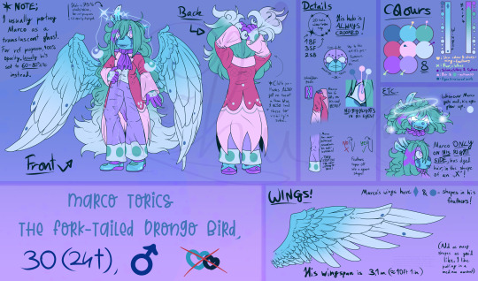
For new users; Marco was made by Heavenly-Hellfire and Hollowed-Hartlocke. I bought him back in 2019! Still love him like it's day 1. My best, most adorable boy <3, he's become my actual role model, I love him sm ;:
In case you never read them before, hopefully you enjoy the reads!!! I hope you can forgive the older grammar on Zorro's. I def plan to rewrite it, once I finish working on my raider-code. (It's been taking so long bc I'm trying to learn to use the CSS mixin z-index class-type. I still can't figure out image borders for the life of me, but I learned rotation class-types LOL.)
I've wanted to redraw both their reference sheet for almost YEARS now. Ever since I've gotten Marco, I continuously evolved how I draw him, over and over, to a point his old ref had become a detriment, due to how differently I draw him nowadays LOL. One thing that desperately needed a redo for him especially, how his hair is supposed to be drawn + his wings. His wings looked like floppy chicken nuggets on the old one LOL. PLUS! I added a section of details, where I see artists I commissioned, struggle with or fail on. Hopefully the detail section is sufficient in fixing that! I'm not sure, if I should also add a mention, of Marco's dot details below the pink pattern, as even the distance between the dots is different. + I LOVE DRAWING EXPRESSIONS. So to also add a small box of extras for Marco's cool glowy eyes was a treat. <3
I plan to redraw his refs for his magic wind attacks perhaps, as for now, I have a shabby drawing, and I got a free animation program lately, so I can FINALLY unleash my years of experience animating, in the appropriate program now LMAO. My own limitations of using SAI to animate, was making my animations look choppy and bad for years unfortunately, so my art always looked very amateur-ish when I actually know how to animate..
Speaking of that, for the attentive...Yes, I plan to possibly try and draw a 360° turnaround of my characters, as the next natural progression of refs next. I am SO close, so so SO close to making my art finally look like it's part of my project I've been working on for years in private. Ever since this year, people have proven, that you CAN start an animated series on the internet, and it will receive an audience. I also wanted to start an animated series when I was a teen, and now that I'm an adult I can make it happen for sure, with the right talents. When the time comes, I might seek out a music producer and perhaps, if I'll have the money, hire animators, so that I'm not the only one who has to work on the series I planned.
For Zorro....He had it coming. Last time I drew his ref, he looked like a 16 yo/ mobian child, it pissed me off for so many years, once I learned how to properly make adult characters look adult lol. THE CEREAL SPITTER NOW ACTUALLY LOOKS ADULT AND LIKE THE BASTARD SELF HE SHOULD BE. I don't have too much to add to him, but I consider him still a WIP in my brain bc- RAIDER PAGE CODE. I WANNA FINISH. GRABBY HANDS. I CAN FEEL THAT IF I LEARN Z-INDEX FINALLY I CAN REALISE THAT CODE. I've wanted to make a code for my raiders 3 years ago already y'all it's painful to be patient w/ myself sdgkldslgdsg
I'm so satisfied, with my ref sheets finally looking, like a professional drew them imho!! If you disagree w/ that notion, feel free to tell me what's missing or where I need to improve on! :D
My 2024 started amazing and with laughter and appreciation for my friends, I'm so happy finally. 3 years in a row, all I did was cry each new year, and be in pain. 2024 feels like it could be my year. Year of the dragon, bless me with your energetic and powerful spirit please,, 🙏
ANYWAY. Forgive me in advance for watermarks, but I kind of? Am paranoid now over my art a bit bc my work is good now? Like I think I'm in the final stages of my artistry. I can feel, that I might find the perfect style soon. I need to experiment just a bit more. Just a bit more...I might consider loosening up my linework in 2024. I honestly still? Hate lineart? Like..My lineart looks good now, don't get me wrong but. I just love sketchy artwork so much more??? Sketching is so fun, creating is so joyful, when it's a sketch..But lineart kind of.....Ruins my art. I think I should loosen up. It's why I might change my approach a millionth time, but my artstyle has potential now. I don't feel, like my art is awful anymore or worth nothing, it now HAS worth, I now HAVE the right to have an ego about it, but some pieces still are missing, to give me the ultimate happiness and relief in my work. Perhaps if I do some more commissions, I might unlock my final potential? We'll see.
My aspirations for 2024;
Pass the prep-exam for my workplace (I LOVE MY WORK. I SINCERELY WISH I'LL PASS. I love work so much omg I don't wanna be fired so badly)
Draw more art of Finn & Marco so they finally pass Chloe in most images on TH (I REALLY DON'T WANT HER TO HAVE THE MOST IMAGES STILL. It should either be my comfort boys or C.I.Ta)
Be more experimental with mixing medias traditionally (I wanna start mixing mini craft-projects + my drawings or mix more pencils + markers and also glass pens + watercolours. I rlly rlly wanna experiment and go loose.)
Animate more and possibly even post said animations. I know animation takes me HELL OF A LOT of time, as I lack so much time to do so, but I'd love to do that
Stop stressing so hard over OTA's and commissions. I know I tell myself each year, "this year will be the year I wanna finish all my owed art!!" But every once and a while, I need to be a realist to myself, my optimism may be good, but it sometimes..Is a little over-eager. But I noticed in 2023, I really heavily strangle myself out. I haven't drawn any private art since 2020, really.....It says a lot about an artist, if they now haven't drawn a personal drawing and finished it, in the same quality of their owed work for 4 years now. I haven't been really honest to myself and my heart, and I'd like to forgive myself slowly, by allowing to both work on owed work, and start creative, passionate art-projects again, again, where I can let loose and just. Experiment. Do something new. Push the boundaries of my art. Combine medias, collages, etc, anything under the sun I wanna try. I limit myself so hard, over chasing a goal, I can't achieve, if I won't acknowledge, I'll cause my own death as an artist, if I continue to chase unattainable goals, I can't achieve, if I won't be gentle to myself.
Finish revamping my commission sheet. It requires, I draw new examples of course. The big thing I need to warn ahead; I will have a fat price-increase, due to work taking all the time I can have now. I can only work around 4hrs a day on art. My art takes around 20 hours to be finished. Every piece is done with love, with time, with effort. I'm not an artist, who adheres to algorithms. I'm an artist who lives with passion, with freedom in mind. I have an endless amount of ideas, I have an infinite amount of space and ways to create it. I am not a machine, I am, what an artist strives to be. To simply...Create. AI can go to hell, and drag NFTs along with it. I to this day get attempts to be hacked, by tech bros, believe it or not. I pissed off BAYC on Twitter once, and some butthurt idiot, is still trying to get to my Insta and Steam to this day. Won't happen anymore with 2FA idiot, lmao. I won't allow a 2nd hack to happen.
Finish giving ALL my characters on TH a floatie icon. I know w/ 100% certainty, that I got this task in the bag. This one is of no problem at all.
With that, thank you for reading my world-salad! Almost as tasty, as mom's olivier-salad. Yumyum. Btw secret lil teaser ig below here lmao. I started Finn's sheet too, and I've got it 1/3rds done, but I don't wanna burn myself out on ref-sheets, so perhaps you'll see Finn also reworked in a few months! ✨
#new years post#new years resolution#artwork#my art#digital art#art#artists on tumblr#character art#original art#semi realistic#sonic fan character#sonic oc#sonic ocs#sonic fan characters#reference sheet#reference sheets#character reference#character ref sheet#ref sheet#oc design#my babies#angel#raider#criminal (fictional)#happy new year#new year#new years eve#happy new year 2024
2 notes
·
View notes
Text

Day 1 - 100 Days CSS Challenge
Welcome to day 1 of the 100 Days CSS Challenge! In this challenge, we'll bring a design to life using only CSS. Our goal is to recreate the image we're provided with on the challenge page using HTML and CSS.
On the challenge page, we see:

A small preview of the design we need to replicate.
A starter HTML template.
A submission form to showcase our work alongside others who have taken on the same challenge.
Let's dive into the process step by step.
Step 1: Screenshot the Image
The first thing I always do is take a screenshot of the target design. Even if the design includes animation, having a static reference helps me focus on the basic structure and colors. Here’s the screenshot of the design we’re aiming for:
Step 2: Extract the Color Palette
Next, I identify the color palette that we'll need. This helps ensure that we maintain consistency with the original design. Here’s the color palette I’ve created:

Step 3: Identify and Create the Image Elements in HTML
Now that we know the colors, I break down the elements in the image:
Background: This is a linear gradient.
The 100 number: This is the main challenge, and it will require some work.
Text: “days css challenge,” which we’ll place to the left of the number.
Here’s the HTML structure for these elements:
<div class="frame"> <div class="center"> <div class="number"> <div class="one-one"></div> <div class="one-two"></div> <div class="zero-one"></div> <div class="zero-two"></div> </div> <p class="sentence1">days</p> <p class="sentence2">css challenge</p> </div> </div>
Now that the elements are in place, CSS will bring them to life.
Step 4: Bringing the Elements to Life with CSS
Linear Gradient
To create the background, we’ll use a linear gradient. Here’s a basic syntax:
background: linear-gradient(to <direction>, <color-stop1>, <color-stop2>, ...);
Parameter 1: Direction/Angle
This defines the starting point of the gradient. You can either specify a direction (e.g., to top, to bottom) or an angle (e.g., 90deg, 180deg).
Direction options:
to top
to bottom
to left
to right
If you want more precision, you can specify angles:
0deg: Gradient starts from the top.
90deg: From the right.
180deg: From the bottom.
270deg: From the left.
You can also combine two directions, specifying both horizontal and vertical movements, like to left top or to right bottom. This means:
The first keyword (left or right) controls the horizontal movement.
The second keyword (top or bottom) controls the vertical movement.
For example:
background: linear-gradient(to left top, red, blue);
This gradient starts at the bottom-right corner and transitions toward the top-left.
Parameter 2: Color Stops
Color stops define how the gradient transitions between colors. Each color stop specifies a point where a color starts or ends. Here's an example:
background: linear-gradient(to right, red 10%, blue 90%);
This means:
The element starts at 0% fully red.
By 10%, the transition from red begins.
Between 10% and 90%, there is a smooth blend from red to blue.
At 90%, the transition to blue is complete, and the remaining part is fully blue.

Once we understand the concept, we can apply the background we need. In our case, the gradient flows from the bottom left to the top right, so the code will look like this:
background: linear-gradient(to right top, #443DA1, #4EC3C9);
Bonus: Stacking Multiple Linear Gradients
You can also apply multiple gradients on top of each other:
background: linear-gradient(180deg, #f00, #0f0), linear-gradient(90deg, #ff0, #f0f);
Step 5: Making the "100" Number
Creating the Zeros
We start with the zeros. These are simply circles created using CSS. To make a full circle, we use border-radius set to 50%.
The white border gives it the appearance of the number zero.
.zero-one, .zero-two { position: absolute; height: 100px; width: 100px; border-radius: 50%; border: 24px solid #fff; box-shadow: 0 0 13px 0 rgba(0,0,0,0.2); }
This gives us a nice circular zero. We adjust their positions using properties like left and top, and manage the z-index to make sure the zeros stack correctly.
.zero-one { z-index: 8; left: 17px; } .zero-two { z-index: 6; left: 100px; }

Now both zeros are positioned, and they overlap in the way we want.
Creating the "1" Number
The number "1" is made of two div elements:
One-One: This part represents the slanted part of the "1".
One-Two: This is the straight vertical part of the "1".
What make the one-one element slightly slanted is
transform: rotate(50deg);)
the one-two is created simply with a little height and width nothing too particular then it is placed directly on top of the slanted part, giving us the full "1". Its z-index tho has to have a higher value than the slanted part of our 1 to ensure it stays above the slanted one.
Step 6: Adding the Text
For the two sentences “days” and “css challenge,” the styling is basic CSS. You can achieve the look with just a few font changes, some padding, and adjustments to font size. It’s as simple as:
.sentence1,.sentence2{ text-transform: uppercase; margin:0; padding:0; } .sentence1{ font-size:82px; font-weight:700; } .sentence2{ font-size:25px; font-weight:700; margin-top:-20px; }
And just like that, we’ve completed day 1 of the 100 Days CSS Challenge! Each part of the design is carefully crafted using CSS, giving us the final result.
Happy coding, and see you tomorrow for Day 2!
#100dayscssChallenge#codeblr#code#css#html#javascript#java development company#python#studyblr#progblr#programming#comp sci#web design#web developers#web development#website design#webdev#website#tech#html css#learn to code
16 notes
·
View notes