#data analytics tutorials
Explore tagged Tumblr posts
Visit Tumblr Blog
Explore Tumblr blogs with no restrictions, modern design and the best experience.
Last Seen Tumblr Blogs


Fun Fact
If you dial 1-866-584-6757, you can leave an audio post for your followers.
Text
SAS Tutorial for Data Visualization: Creating Charts and Graphs That Tell a Story
In today's data-driven world, the ability to visualize data effectively is crucial for analysts and decision-makers. SAS offers robust tools for creating insightful visualizations that can uncover hidden patterns and trends. This SAS tutorial provides a step-by-step guide to crafting compelling charts and graphs using SAS, enabling you to tell a meaningful story with your data.
Understanding the Importance of Data Visualization
Data visualization transforms raw data into graphical representations, making complex information more accessible and understandable. Effective visualizations can highlight key insights, facilitate comparisons, and support data-driven decisions. In SAS, various procedures and tools are available to create a wide range of visualizations, from simple bar charts to complex heat maps.
Getting Started with SAS Visualization Tools
SAS provides several procedures for data visualization:
PROC SGPLOT: Ideal for creating single-cell graphs like bar charts, line plots, and scatter plots.
PROC SGPANEL: Useful for generating multi-cell graphs, allowing comparisons across different categories.
PROC SGSCATTER: Designed for creating scatter plot matrices to explore relationships between multiple variables.
PROC SGPIE: Enables the creation of pie and donut charts.
PROC SGMAP: Facilitates the rendering of maps with overlaid plots, useful for geographical data analysis.
These procedures are part of the ODS (Output Delivery System) Graphics, which provide a flexible and powerful framework for generating high-quality graphics.
Creating Basic Charts with PROC SGPLOT
Let's start with a simple bar chart using PROC SGPLOT. Suppose you have a dataset containing sales figures for different regions:
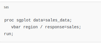
This code generates a vertical bar chart displaying sales by region. The vbar statement specifies the categorical variable (region), and the response option indicates the numerical variable (sales) to be plotted.
Enhancing Visualizations with Customizations
SAS allows extensive customization of charts to improve clarity and aesthetics:
Titles and Labels: Use title and label statements to add descriptive titles and axis labels.
Colors and Styles: Customize colors, line styles, and markers to differentiate data points.
Legends: Add legends to identify different groups or categories within the chart.
Annotations: Incorporate annotations to highlight specific data points or trends.
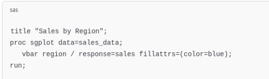
For example, to add a title and customize the color of bars:
Creating Multi-Panel Charts with PROC SGPANEL
When comparing data across multiple categories, PROC SGPANEL is invaluable. It allows the creation of panel charts, where each panel represents a subset of the data:
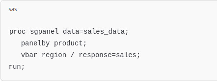
This code generates a series of bar charts, one for each product, facilitating easy comparison across regions.
Visualizing Relationships with PROC SGSCATTER
To explore relationships between numerical variables, scatter plots are effective. PROC SGSCATTER can create scatter plot matrices:
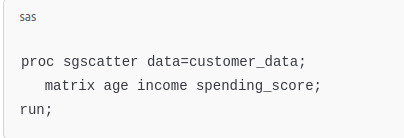
This produces a matrix of scatter plots, allowing you to observe pairwise relationships among age, income, and spending_score.
youtube
Creating Pie Charts with PROC SGPIE
Pie charts are useful for showing proportions. PROC SGPIE simplifies their creation:
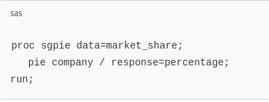
This code generates a pie chart illustrating each company's market share.
Best Practices for Effective Data Visualization
To create impactful visualizations:
Know Your Audience: Tailor the complexity and type of visualization to your audience's needs.
Choose the Right Chart Type: Select chart types that best represent the data and highlight key insights.
Simplify: Avoid clutter by focusing on essential information and removing unnecessary elements.
Use Consistent Scales: Ensure axes are scaled appropriately to allow accurate comparisons.
Highlight Key Data: Use color or annotations to draw attention to significant data points or trends.
Conclusion
Mastering data visualization in SAS empowers you to convey complex data insights clearly and effectively. By leveraging procedures like PROC SGPLOT, PROC SGPANEL, and others, you can create a variety of charts and graphs that not only represent data accurately but also tell a compelling story. As you become more proficient, you'll be able to craft visualizations that drive informed decisions and communicate findings with impact.
#sas tutorial#sas tutorial for beginners#sas programming#data analyst#data analytics#Data Visualization#Youtube
0 notes
Text
What is SAP Datasphere? A Detailed Overview

In our data-driven society companies are always seeking ways to improve their data management as well as improve the process of decision making. SAP Datasphere, an innovative data management software has become the leader in helping businesses reach these objectives. This article will discuss the features of SAP Datasphere, its fundamental capabilities and how it helps companies in analyzing and managing their data.
What is SAP Datasphere?
SAP Datasphere is a cloud-based data platform that lets enterprises manage, connect and analyze data from a variety of sources. The platform offers a seamless environment in which data can be saved, shared and accessed in real-time. SAP Datasphere offers a rich collection of data integration tools management, visualization, and governance that allow businesses to make well-informed decisions based on precise current and accurate information.
Key Features of SAP Datasphere
1. Data Integration
SAP Datasphere allows businesses to connect data from a variety of sources, such as cloud-based systems, in-house databases and third-party apps. With connectors that are pre-built and APIs that are flexible to ensure that data flows seamlessly between different systems, eliminating barriers and giving an improved view of the data in an enterprise.
2. Real-time Analytics
One of the best aspects in SAP Datasphere is its ability to offer real-time analytics. Companies can get their information in real-time which allows them to take quick, data-driven decisions. When it comes to analyzing sales performance or monitoring customer behavior or evaluating financial metrics SAP Datasphere empowers organizations to be more responsive and keep ahead of their competitors.
3. Data Governance
SAP Datasphere provides robust data management features that ensure the data is secure, accurate and compliant with industry standards. With features such as security controls, access lineage and auditing, businesses can be sure the data they store is properly managed and is in compliance with the most stringent standards of security and privacy.
4. Data Virtualization
Data virtualization is a crucial characteristic in SAP Datasphere, allowing users to access and analyze data from different sources without moving physically or duplicating the data. This allows businesses to gain a comprehensive overview of their data regardless of where it's stored.
5. Collaboration and Sharing
SAP Datasphere fosters collaboration by giving teams the ability to share information, insights and reports in an environment that is secure. Users can collaborate easily on data-related projects, which allows for better decision-making as well as improving the overall culture of data within the business.
How SAP Datasphere Benefits Businesses
After we've reviewed the key capabilities in SAP Datasphere, let's dive into the ways businesses can profit from this powerful tool.
1. Improved Decision-Making
With the ability to access real-time data as well as advanced analysis, companies are able to make more informed choices. It doesn't matter if it's optimising marketing strategies, improving client satisfaction or anticipating the future, SAP Datasphere course helps companies make use of data to improve results.
2. Increased Efficiency
Through simplifying data integration and removing manually-driven processes SAP Datasphere helps businesses save time and money. The platform's automation capabilities cut down the necessity of manual entry into data as well as report-writing which allows teams to concentrate on more strategic projects.
3. Enhanced Data Security and Compliance
SAP Datasphere places a strong focus on the security of data and compliance. With features such as encryption of data and user authentication as well as auditing, companies can be sure the data they store is safe and in compliance with laws like GDPR, HIPAA, and others.
4. Scalability and Flexibility
As businesses expand as do their requirements for data. SAP Datasphere is designed to grow with the company and support large amounts of data as well as complex analysis. Cloud-based architecture of the platform ensures that companies can increase their data infrastructure when required without having to worry about hardware limitations.
5. Cost-Effective Solution
By using SAP Datasphere, businesses can cut down on the expense of managing their data by eliminating the requirement for multiple separate systems. It provides a central environment in which data is stored, accessed and analyzed, thus reducing the operational cost and increasing the ROI.
How SAP Datasphere Supports Data Collaboration
In the world of data as the foundation for decision making, collaboration between teams is vital. SAP Datasphere enables organizations to reduce the silos of data by allowing multiple departments to share and collaborate with shared data. Teams can collaborate in real-time, having the capability to analyse and visualize data, and not wait until IT teams to process the data manually. This creates a culture of data-driven decision making and speeds up business innovation.
SAP Datasphere vs. Traditional Data Platforms
While traditional platforms for managing data are focused on centralized processes and storage, SAP Datasphere takes a more contemporary approach by enabling the virtualization of data, integration as well as real-time analysis. Contrary to older systems that typically require complicated ETL (Extract Transform, Extract or load) methods, SAP Datasphere allows businesses to analyze and access data on demand which makes it more agile and adaptable.
Why Choose SAP Datasphere?
SAP Datasphere stands out in the sea of data platforms because of its complete approach to managing data. Here's the reason why companies choose SAP Datasphere:
Unified Data Management: Combines data integration, governance and analytics on a single system.
Cloud-Based Flexibility: There is no requirement for on-premise hardware or intricate infrastructure management.
Real-Time Insights: Accelerates decision-making by utilizing real-time data.
Enterprise-Grade Security: Assures security of your data and compliance with strict regulations.
Easy Collaboration: Facilitates collaboration and sharing of information across departments.
Conclusion
SAP Datasphere is a powerful data management system that allows companies to tap into the full power of data. Through instantaneous analytics as well as seamless integration along with robust data management capabilities, SAP Datasphere helps organizations make better choices, increase efficiency, and provide data security. Whether you're a small-scale business or a major enterprise, SAP Datasphere offers the tools you require to stay ahead of the competition in today's data-driven environment. Additionally, pairing it with ERP Certification Courses can equip your team with the essential skills to maximize the potential of SAP Datasphere, ensuring effective implementation and management for optimal results.
FAQs About SAP Datasphere
Q1. What is the difference between SAP Datasphere and SAP Data Warehouse Cloud?
SAP Datasphere is designed to assist organizations in managing and integrating data from a variety of sources, including on-premise as well as cloud-based systems, with a particular focus on real-time analysis and collaboration. SAP Data Warehouse Cloud, however, is focused more on providing a central solution for data storage for businesses which allows them to analyze huge amounts of data stored on the cloud. These two applications can be utilized in conjunction to provide comprehensive data management and analysis.
Q2. How does SAP Datasphere support data governance?
SAP Datasphere supports data governance by providing features such as data lineage as well as auditing, access control, and compliance with regulations of the industry. These functions ensure that businesses have control over their data, reduce risks and are in compliance with privacy laws.
Q3. Can SAP Datasphere integrate with third-party tools?
Sure, SAP Datasphere offers an array of pre-built connectors as well as APIs that permit it to connect with third-party tools and systems. This allows you to add data from external sources and provide a single overview of the data in an organization.
Q4. Is SAP Datasphere suitable for small businesses?
It is true that SAP Datasphere is scalable and is able to be customized to meet the requirements of businesses regardless of size. While large corporations may benefit from its sophisticated capabilities, small-scale companies can also benefit from SAP Datasphere to improve its data administration and obtain valuable information without requiring a complex infrastructure.
0 notes
Text
youtube
Machine Learning Foundations Course - Python, Deep Learning, Linear Regression, MLOps
Learn the essentials of AI with this 8-hour Machine Learning Foundations course, one of the most comprehensive open resources we've published online. Starting from the basics of Python, this course swiftly advances through deep learning and linear regression models to MLOps, seamlessly integrating theory with real-world application. We cap off your learning experience with two exclusive interviews featuring industry experts who discuss launching a successful career in tech with zero experience and the keys to starting and growing your own startup. This course is your gateway to mastering machine learning and propelling your career forward.
#free education#education#Machine Learning Foundations Course#Machine Learning Foundations#machine learning#technology#educate yourselves#educate yourself#data analytics#big data#data analysis#coding#software development#deep learning#python language#python tutorial#python#development#software#education for all#Youtube
0 notes
Text

Mengolah data survey di ArcGIS PRO 3. Dapatkan di UDEMY via: https://s.id/arcgispro3p
0 notes
Text
Google Analytics क्या है और यह कैसे काम करता है
Google Analytics ��क महत्वपूर्ण और उपयोगी टूल है जो वेबसाइटों के मालिकों और डिजिटल मार्केटर्स को उनकी वेबसाइटों के बारे में गहरी जानकारी प्राप्त करने में मदद करता है। यह एक मुफ्त वेब एनालिटिक्स सेवा है, जो Google द्वारा प्रदान की गई है और इसका उपयोग वेबसाइट पर आने वाले विजिटर्स का डेटा ट्रैक करने, वेबसाइट की परफॉर्मेंस मापने, और डिजिटल मार्केटिंग रणनीतियों को बेहतर बनाने के लिए किया जाता है। आज के…
#Google Analytics audience insights#Google Analytics dashboard#Google Analytics data analysis#Google Analytics features#Google Analytics for beginners#Google Analytics for SEO#Google Analytics metrics explained#Google Analytics reporting#Google Analytics setup guide#Google Analytics tips and tricks#Google Analytics tutorial#how to use Google Analytics#understanding Google Analytics
0 notes
Text
Industry-Leading Visualization with Tableau Data Visualization
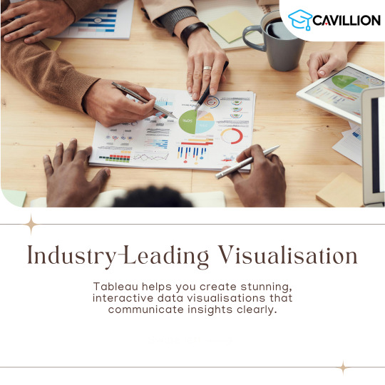
1. User-Friendly Interface: The intuitive design allows anyone to easily start visualizing data.
2. Seamless Integration: Connects easily with various data sources for efficient analysis.
3. Quick Insights: Generate actionable insights within minutes.
4. Integrated Collaboration Tools: Share dashboards and insights with your team effortlessly.
5. Regular Updates: Tableau continuously evolves with new features and improvements.
Want to take your skills to the next level? Join our 1-day Tableau Bootcamp on 2nd November (Online)!
#tableau#tableau software#data visualization#data visualisation#dataviz#software#technology#cavillion#cavillion learning#data analytics#data#tableau online training#tableaudesktop#tableau dashboard#big data#business analytics#data analysis#data science#tableau course#salesforce#Tableau Tutorial#Tableau Visualization#Tableau Training#learn tableau#tableau certification#Tableau Visualisation
1 note
·
View note
Text
A Comprehensive Guide to Understanding and Improving Your Website's Analytics
Are you making the most of your website’s analytics? In today’s world, knowing what your website’s data means is key to making smart choices for your business1. This guide will show you how to use important metrics like pageviews and traffic sources to improve your site. We’ll look at the main metrics you should watch, why website analytics matter, and how to use Google Analytics to boost your…
#Analyzing website trends#Conversion rate optimization#Data analysis for websites#Google Analytics tutorial#Improving site performance#Performance tracking#SEO analytics tools#User engagement metrics#Web traffic insights#Website visitor behaviour
1 note
·
View note
Text
How to use Advanced Data Analysis Plugin in ChatGPT
youtube
Welcome to an in-depth exploration of How to use Advanced Data Analysis Plugin in ChatGPT. The newly introduced data analytics and visualization capabilities. In this video, we walk through the steps of utilizing ChatGPT to visualize data from an Excel sheet, perform data transformations, and even craft dashboards — all using simple natural language! But as ChatGPT's features expand, many wonder about the implications for Business Intelligence (BI) specialists. Will AI ever replace the human touch in BI? We'll delve into the technical, business, creativity, and security aspects of this debate. Whether you're a BI expert, a tech enthusiast, or just curious about the future of AI in business, this video has insights for you. Dive in to unlock the mystery!
------------------------------------------------
🔔 Subscribe now for exciting Business Intelligence & Data science projects!: / @nextgenbiguru
-------------------------------------------------
⏱️ Contents of the episode:
00:00 Introduction
00:31 Activate ChatGPT's Advanced Data Analysis Plugin
02:50 Data visualization with ChatGPT's Advanced Data Analysis Plugin
04:53 Data transformation with ChatGPT's Advanced Data Analysis Plugin
08:31 Full BI dashboard by ChatGPT
14:51 Will ChatGPT replace the need for BI specialists? ——————————————————————
📚 Resources: - How To Develop Sales Trend Report In Power BI - Part 1: • How To Develop Sales Trend Report In ... -
Secrets to Becoming a Business Intelligence GURU | Proven Methodology: • Secrets to Becoming a Business Intell... -
Link to install Python: https://www.python.org/downloads/
------------------------------------------------------------------
Episode Material
- Dashboards scripts
- Python insallation libraries
- Source CSV File
🚨 Available in this link: https://github.com/NextGenBIGuru/BI_D...
#powerbi#python#careerdevelopment#github#chatgpt#analytics#datascience#insights#tutorials#howto#bi#businessintillegence#data#datavisualization#biprojects#powerbiprojects#Youtube
1 note
·
View note
Text
msbi training | ssis course content Excel in Business Intelligence with our MSBI Certification Training online. Specialized in SSIS, SSAS, SSRS. Elevate your skills for success.
msbi certification | msbi course , ssis ssrs ssas certification , msbi tutorial | msbi online training , msbi training | ssis course content , ssrs certification cost | ssrs certification
#msbi certification | msbi course#ssis ssrs ssas certification#msbi tutorial | msbi online training#msbi training | ssis course content#ssrs certification cost | ssrs certification .#data analytics#power bi certification#power bi certification cost#sql#power bi course#power bi#power bi course fees#power bi online training#msbi#education
1 note
·
View note
Text
data analyst course for freshers
launch your career with our specialized data analyst course for freshers. gain practical skills and kick start your journey in data analytics. enroll now!
best data analytics certification courses online , data analyst course for freshers , data analyst certification canada , get data analyst certification , courses for data analyst in canada
#best data analytics certification courses online#data analyst course for freshers#data analyst certification canada#get data analyst certification#courses for data analyst in canada#msbi certification#msbi tutorial#power bi tutorial#power bi certification#sql server certification#sql server tutorial#msbi training
1 note
·
View note
Text
SAS Programming in the Cloud: Leveraging SAS Viya for Scalable Data Analytics
As data continues to grow in size and complexity, more and more companies are shifting their analytics to the cloud. One tool helping them do this effectively is SAS Viya, the cloud-based evolution of traditional SAS software. And if you’re already working with SAS programming, understanding how to use it in a cloud environment could be a game-changer for your work.
What Is SAS Viya?
Think of SAS Viya as SAS for the modern era. It’s a cloud-native platform built for speed, scalability, and collaboration. Whether you're writing code in SAS, Python, or R, SAS Viya offers a single interface where teams can work together on big data, machine learning, and reporting projects.
Why Move to the Cloud?
Traditional SAS is powerful—but it’s often installed on local machines or in closed systems. That makes it harder to share work, scale up analysis, or integrate with modern tools.
SAS Viya solves these problems by being:
Cloud-based: Access your work from anywhere
Collaborative: Work with teams in real time
Scalable: Handle large datasets with ease
Flexible: Integrate with open-source tools like Python and R
This makes it a great choice for companies managing huge volumes of data or running advanced models.
What Can You Do with SAS Viya?
Whether you're a data scientist, analyst, or business user, SAS Viya offers tools customized to your needs. You can:
Build predictive models with machine learning
Create dashboards with visual analytics
Automate processes with ModelOps
Run code in SAS, Python, or SQL
And if you’re familiar with SAS programming, you can continue using your current skills while taking advantage of cloud performance.
Getting Started with Viya
The easiest way to explore SAS Viya is through the SAS Viya trial version or the SAS OnDemand for Academics platform. The interface is intuitive, with support for multiple programming languages and visual workflows.
New to the platform? A good SAS tutorial that focuses on Viya-specific tools can help you understand:
How to upload and manage large datasets
Running models in the cloud
Automating repetitive tasks
Generating reports for team collaboration
Real-World Applications of SAS Viya
SAS Viya is used in industries like:
Banking: Detecting fraud in real time
Retail: Forecasting product demand
Healthcare: Analyzing patient records
Government: Monitoring public programs
Its cloud setup allows teams to act fast, access updated data, and make decisions in near real-time.
SAS Programming in a Viya World
One of the biggest advantages of Viya is that it keeps the core strength of SAS programming intact. So if you’re already writing efficient data steps and mastering PROC procedures, your skills will translate perfectly.
But Viya also opens the door to more. You can now combine your SAS code with open-source libraries, automate with APIs, and deploy models directly into production without needing IT help.
youtube
Final Thoughts
Cloud analytics isn’t just a trend—it’s the future. And SAS Viya makes it easier than ever to scale your SAS programming knowledge into real-world impact. Whether you're working solo or on a team, SAS Viya helps you move faster, handle more data, and collaborate without limits.
So if you're ready to grow your analytics career, now’s the time to explore how the cloud can elevate your SAS game.
#sas programming#sas programming tutorial#sas tutorial for beginners#sas tutorial#sas programming course#sas online training#sas viya#sas programming in cloud#data analytics#Youtube
1 note
·
View note
Text
YouTube Most Watched Videos Finder: Python Code
YouTube Most Watched Videos Finder: Python Code
Description: This article contains a Python script that utilizes the YouTube Data API to find the most watched videos in the past 24 hours for a specific region. The script fetches data from the YouTube API, extracts relevant information such as video title, view count, like count, and creates a list of the most popular videos in the desired region. How it Works: The script is written in…

View On WordPress
#Google API for YouTube#How to fetch popular videos from YouTube#Most watched YouTube videos#Popular YouTube videos in India#Python programming for YouTube API#Python script for YouTube Data API#YouTube API tutorial#YouTube Data API#YouTube video analytics#YouTube video statistics
0 notes
Text
youtube
Statistics for Data Science Full course with Gen AI & ChatGPT 4o (2024)
Ready to learn Statistics for Data Science with Gen AI and ChatGPT 4o. In this video, dive into the essentials of statistics, and its critical role in data science. Further, we will explore key concepts such as Descriptive, Prescriptive, and Predictive statistics. We will learn to measure relationships using correlation and covariance. Also, we will discover how to leverage ChatGPT-4 for advanced statistical analysis. Through this video, you can master statistics in data science. Perfect for beginners or skill enhancement.
Learn Statistics for Data Science that includes key concepts like probability, hypothesis testing, and the importance of normal distribution and sampling in data analytics.
#free education#education#technology#educate yourselves#educate yourself#youtube#Statistics for Data Science#data analytics#datascience#chatgpt tutorial#artificial intelligence#chatgpt 4#Statistics for Data Science Full course#free courses#free classes#Youtube
1 note
·
View note
Text

Dapatkan disini....
0 notes
Text
youtube
Part 1 - SQL MCQ - Q&A | Most asked Interview Questions
1. What does SQL stand for?
2. To use SQL on your computer, you will need:
3. Which organization standardized the SQL language?
4. Which of the following best describes the programming paradigm of SQL?
5. Which of the following is a common use case for SQL?
6. Which of the following best describes the relationship between SQL and RDBMS?
7. Which of the following is a type of SQL database?
8. Which of the following is not a type of SQL database?
9. Which of the following is an example of an open-source SQL database?
10. Does SQL supports Control Flow Statements?
#sqltraining#sql course#sql tutorial#sqlserver#sql#jobs#programming#jobseekers#jobsearch#career#data science#data scientist#data analysis#data analytics#Youtube
1 note
·
View note
Text
youtube
With the new Multiple Actions functionality, when creating templates for the HR processes, you can assign action items for filling in forms (lists) with as many records as required. For example, in the HR process for event planning, you can create an action item for filling in the list of participants.
#lanteria#lanteria hr#strategic management#hr analytics#recruitment data#lanteria hr tutorials#multiple actions on hr tutorial#multiple actions#what are hr processes#creating templates for the hr processes#hr chart#recruiting analytics#hr tech factory#applicant tracking system#hr software#hr activities for employees#hr management software#best hr management software#how do you create hr processes#human resources workflow templates 2023#hr templates#Youtube
0 notes