#data visualization tips
Explore tagged Tumblr posts
Visit Tumblr Blog
Explore Tumblr blogs with no restrictions, modern design and the best experience.
Last Seen Tumblr Blogs


Fun Fact
Tumblr was created by web developers David Karp and Marco Arment.
Text
What are some Tips for Making a Great Data Visualization?
Creating effective data visualizations is crucial for conveying information clearly and engaging your audience. Here are some tips to help you make great data visualizations:
Know Your Audience:
Understand who will be viewing your visualization and tailor it to their level of expertise and interests.
Clarify Your Message:
Clearly define the purpose of your visualization. What do you want your audience to take away from it? Make sure your message is focused and concise.
Choose the Right Chart Type:
Select a chart that best represents your data and effectively communicates your message. Common types include bar charts, line charts, pie charts, and scatter plots.
Simplify and Declutter:
Avoid unnecessary elements that may distract from the main message. Remove chartjunk (unnecessary decorations) and focus on the key information.
Use Color Wisely:
Choose a color scheme that is visually appealing and effectively communicates your message. Use color to highlight important data points, but avoid using too many colors, which can be confusing.
Label Clearly:
Ensure that all axes, data points, and other elements are labeled clearly. Use concise and informative titles, axis labels, and legends to guide the viewer.
Provide Context:
Include relevant context to help your audience understand the significance of the data. This can include historical data, benchmarks, or comparisons.
Use Consistent Design:
Maintain a consistent design throughout your visualization, including font styles, colors, and sizes. Consistency enhances readability and makes the visualization more visually appealing.
Interactive Features:
If appropriate, consider adding interactive features to allow users to explore the data on their own. Interactive visualizations can enhance engagement and understanding.
Tell a Story:
Arrange your data in a logical order to tell a story. Guide your audience through the visualization, highlighting key points and insights.
Check for Accuracy:
Double-check your data for accuracy and ensure that your visualization accurately represents the information you want to convey.
Test and Iterate:
Share your visualization with a small audience for feedback, and be open to making improvements. Iterative testing can help refine your visualization for better understanding.
Consider Accessibility:
Make your visualizations accessible to a wider audience by considering factors such as color contrast, alternative text for images, and compatibility with screen readers.
Stay Mindful of Scale:
Ensure that your scale is appropriate for the data you're representing. Misleading scales can distort the perception of the data.
Remember that the goal of a data visualization is to communicate information effectively and efficiently. Keep the viewer in mind and strive for clarity and simplicity in your designs.
Data Visualization Services
#data visualization#data visualization tips#data visualization services#data visualization consulting
1 note
·
View note
Text

5 Key Techniques to Master Data Visualization in PowerPoint
The world is increasingly becoming data driven. And as data continues to drive decisions, it also means that people are being constantly subjected to big numbers. But trying to make sense of the figures, metrics, etc., can be often overwhelming for the audience. Therefore, data visualization comes into the picture to save the day. Data visualization breaks up those hard-to understand, complex data into visuals that are easily understood at a glance.
However, creating compelling yet informative data visualizations might be a daunting task.
That’s why we are covering 5 key data visualization tips and tricks to ensure you leave your audience well informed and driven to action.
#data visualization tips#data visualization tricks#data visualization technique#data visualization ideas#ppt creation tips#ppt designer#ppt agency
0 notes
Text
How to use COPILOT in Microsoft Word | Tutorial
This page contains a video tutorial by Reza Dorrani on how to use Microsoft 365 Copilot in Microsoft Word. The video covers: Starting a draft with Copilot in Word. Adding content to an existing document using Copilot. Rewriting text with Copilot. Generating summaries with Copilot. Overall, using Copilot as a dynamic writing companion to enhance productivity in Word. Is there something…

View On WordPress
#Advanced Excel#Automation tools#Collaboration#copilot#Data analysis#Data management#Data visualization#Excel#Excel formulas#Excel functions#Excel skills#Excel tips#Excel tutorials#MIcrosoft Copilot#Microsoft Excel#Microsoft Office#Microsoft Word#Office 365#Power BI#productivity#Task automation
1 note
·
View note
Text
** Releasing Your Possible: The Increase of Home Organizations in the Modern Era **
Recently, the concept of a home based business has actually transitioned from a particular niche concept to a mainstream occupation option for many individuals looking for adaptability and self-reliance. With advancements in innovation and the enhancing accessibility of the internet, beginning a service from the convenience of your home has actually never ever been much easier. Whether it's shopping, freelance services, or digital content production, entrepreneurs are using their abilities and interests to create viable revenue streams without the restraints of a typical office environment. The allure of a home organization is not just the benefit of operating in your pyjamas; it likewise supplies the capacity for a much better work-life equilibrium, permitting you to spend even more time with household while seeking your expert goals.However, embarking
on a home company trip is not without its challenges. It calls for a solid service strategy, self-discipline, and efficient time administration to guarantee that your venture thrives. Lots of newcomers grapple with the blurred lines between individual and specialist life, making it vital to establish borders and produce a specialized workspace. Furthermore, advertising and marketing oneself in a crowded online marketplace can be challenging, however with the appropriate techniques and networking, success is achievable. As the landscape of job remains to develop, home based business are set to play a considerable function in the future of entrepreneurship, equipping people to take control of their professions and redefine their paths.
Read more here https://disqus.com/by/sheetnerds/about/
0 notes
Text
5 Effective Social Media Marketing Strategies
Social media is evolving rapidly, presenting numerous opportunities for businesses. To excel in social media marketing, it's essential to understand and Learn ads on various Social Media platforms, content marketing, and more. By implementing these strategies, you can engage with your audience, enhance your brand, and achieve impressive results.
I. Understanding the Evolving Social Media Features
To succeed in social media marketing, it’s important to keep up with changes.
A. Trends Shaping on Social Media
Social media is being shaped by new technologies like augmented reality (AR) and artificial intelligence (AI). Short videos remain popular, and users prefer content that feels authentic and valuable, rather than polished or advertising-driven.
B. The Role of Algorithms
Algorithms determine the visibility of content. To boost your presence, create engaging content that encourages likes, shares, and comments. Utilizing trending hashtags and maintaining a consistent posting schedule can also be beneficial.
C. The Rise of New Platforms
New platforms like Be Real and other smaller networks are becoming popular, especially among younger users. Adding these platforms to your marketing plan can help you reach fresh audiences.
II. Creating Authentic and Engaging Content
High-quality content is essential for effective social media marketing. To master content creation, consider exploring content marketing through Best digital marketing courses in Delhi.
A. Storytelling Techniques
Using storytelling can make your brand more relatable and engaging. Forge an emotional bond with your audience by sharing success stories and behind-the-scenes glimpses of your customers.
B. User-Generated Content
Content from your audience, like photos and reviews, builds trust. Encourage your followers to share their experiences with your brand by hosting contests or using branded hashtags. Feature their posts to show appreciation.
C. Visual Content Strategies
Eye-catching visuals, including photos, videos, and graphics, capture attention effectively. Tools like Canva simplify the process of creating stunning visuals.
III. Building a Strong Community
Creating a loyal community transforms followers into dedicated fans.
A. Engaging with Your Audience
Responding to comments and messages demonstrates that you value your audience. Utilize polls and surveys to gather their opinions and preferences.
B. Collaborations and Partnerships
You can expand your reach by collaborating with influencers or other brands. Seek out partners who share your values and target audience. Participate in campaigns or giveaways to maximize your impact.
C. Hosting Live Events and Webinars
Engage your audience through live events such as Q&A sessions or tutorials. Educate your viewers during these events and interact with them to keep their interest alive.
IV. Utilizing Data and Analytics
Using data helps you improve your strategies. Learning about analytics through Best Digital Marketing courses or resources can provide valuable insights into making data-driven decisions.
A. Importance of Social Media Analytics
Track important numbers like likes, shares, and sales. Tools like Google Analytics can help you see what’s working and what isn’t.
B. A/B Testing for Content Optimization
Two versions of a post are tested for optimal performance in A/B testing. Why is this so? Examine your audience's preferences, including whether they like captions, images, or posting times.
C. Adjusting Strategies Based on Insights
Look at your data regularly and make changes if needed. Brands that adapt quickly often see the best results.
V. Embracing Paid Advertising
You can increase your reach and speed up your business with the help of paid ads.
A. Overview of Social Media Advertising Options
Platforms like Facebook, Instagram, and LinkedIn offer different types of ads. Choose the ones that fit your goals, whether it’s brand awareness or sales.
B. Targeting the Right Audience
Targeting helps you show ads to the right people. Use tools like Facebook Audience Insights to focus on specific groups based on age, interests, or location.
C. Measuring Advertising Success
Track things like clicks, sales, and return on investment (ROI) to see how well your ads are doing. Adjust your campaigns based on the results to improve them.
Conclusion
Social media marketing strategies are all about staying creative, adapting to changes, and using data to guide your decisions. Focus on authentic content, build strong connections with your audience, and don’t be afraid to experiment. With these strategies, you can make your best year yet by Learning about social media marketing with the best digital marketing course in Delhi.
#- Social Media Marketing Strategies#- Digital Marketing Tips#- Content Creation Ideas#- Social Media Trends#- Building Online Communities#- Social Media Analytics#- Paid Advertising Strategies#- Social Media Optimization#- User-Generated Content#- Influencer Collaborations#- Visual Content Marketing#- Data-Driven Marketing#- Social Media Campaigns#- Target Audience Engagement#- Online Branding Tips
0 notes
Text
** Releasing Your Potential: The Increase of Home Based Business in the Modern Period **
Over the last few years, the idea of a home service has transitioned from a niche idea to a mainstream career option for lots of individuals seeking flexibility and freedom. With developments in innovation and the enhancing ease of access of the internet, beginning an organization from the convenience of your home has actually never ever been less complicated. Whether it's ecommerce, freelance solutions, or electronic web content production, business owners are harnessing their abilities and interests to create sensible income streams without the constraints of a traditional workplace setting. The allure of a home organization is not just the comfort of operating in your pyjamas; it also provides the capacity for a better work-life balance, permitting you to spend more time with family members while pursuing your specialist goals.However, embarking
on a home based business trip is not without its challenges. It needs a strong service plan, self-discipline, and reliable time monitoring to ensure that your endeavor prospers. Numerous newcomers come to grips with the blurred lines in between personal and specialist life, making it important to develop limits and create a committed work area. Furthermore, advertising oneself in a congested online industry can be difficult, yet with the ideal methods and networking, success is achievable. As the landscape of work remains to evolve, home based business are established to play a significant role in the future of entrepreneurship, empowering people to take control of their jobs and redefine their courses.
Read more here https://docs.google.com/forms/d/1yHiaYI33IjqyyFg9UGEd-h-Rsl7nV1zt36a85KpKVZA/edit
0 notes
Text
Start Strong: Beginner Data Science Courses to Launch Your Career in Canada
Start a profession with Sai Data Science! Join for beginners Data Science courses in Canada and you'll have access to unlimited chances in the technology sector.
#data science course in canada#learn data science online#data science course in edmonton#data visualization tips and techniques
0 notes
Text


0 notes
Text
How to Keep Your Audience Engaged Using Interactive Content
💥 Want to stand out? Learn how to engage your audience with interactive content! From polls to quizzes, make your content memorable. #InteractiveContent #AudienceEngagement
How to Keep Your Audience Engaged Using Interactive Content Written By: that Hannah Jones Time to Read: 5 minutes In a digital age flooded with content, it’s no longer enough to post static images or blog articles and hope for engagement. The modern consumer craves active involvement, and interactive content can give your brand that edge. According to the Content Marketing Institute,…
#actionable marketing#audience engagement strategies#brand loyalty#brand storytelling#BuzzFeed quizzes#content creation tips#Content Marketing Institute#content strategy tips#customer retention#data-driven content#digital engagement#engagement metrics#Hannah Jones#immersive content#interactive calculators#interactive content marketing#personalized content#Small business marketing#social media polls#Spotify Wrapped#Strategic Hannah#viral quizzes#Visual Content
0 notes
Text
Tech Tip Tuesday: Boost Tableau Performance with Context Filters

Boost the performance of your Tableau dashboards by using Context Filters! ⚡ This trick helps you manage multiple filters more efficiently, making your data visualisations faster and smoother.
#tableau#tableau dashboard#tableau software#data visualization#data analytics#software#big data#dataviz#technology#cavillion#cavillion learning#data#tableaudesktop#tableau online training#tech tip tuesday#tech tips#tableau course#tableau certification#data visualisation#Tuesday Tip#salesforce
1 note
·
View note
Text
Structure Your Dream: The Ultimate Overview to Starting a Successful Home Based Business
""
In today's hectic world, an increasing number of people are transforming to home companies as a means to take control of their professions and pursue their enthusiasms. Whether you're a stay-at-home parent wanting to supplement your family's earnings or a hopeful business owner all set to launch your own venture, beginning a home based business can be a fulfilling and financially rewarding undertaking. With the increase of modern technology and the enhancing demand for versatile work arrangements, there has actually never been a much better time to explore the opportunities of running a company from the comfort of your own home.From crafting a service strategy to establishing up an office, this detailed guide will certainly stroll you with the vital actions of starting and expanding an effective home company. Discover important suggestions on exactly how to determine your particular niche, market your product and services efficiently, and handle your time effectively to accomplish a healthy and balanced work-life balance. With decision, devotion, and a clear vision for your business, you can turn your home-based venture right into a thriving venture that not only satisfies your specialist goals however likewise supplies the liberty and adaptability to live life on your own terms.
Read more here https://x.com/sheetnerds
0 notes
Text
Understand the role of color theory in designing finance dashboards. This guide explains how color choices impact user experience, data comprehension, and decision-making, helping finance teams create more effective visualizations.
#color theory in dashboard design#finance dashboard design tips#financial data visualization#color psychology in finance.
0 notes
Text
[PowerBI] Usando Iconos y código SVG
Una parte fundamental en nuestros tableros de datos es la estética para la experiencia de usuario. Las interpretaciones pueden mejorar de gran manera si nos fortalecemos con imagenes que aporten al mensaje objetivo que tiene el tablero.
Esta demostrado que la experiencia de usuarios es más enriquecedora si nuestras tarjetas tienen un icono al lado o si nuestras tablas tienen formato condicional.
Este artículo nos muestra alternativas para enriquecer de esa forma nuestros reportes desarrollados.
La flexibilidad de Power Bi ha crecido de gran manera. Lo que nos ha permitido jugar con muchas alternativas útiles o divertidas para contar historias con datos. Hoy podemos nutrir de imagenes informes con visualizaciones a través de url, imagenes cargadas por sistema, botones, unichars, formatos condicionales y hasta svgs.
Básicos
Lo primero que se nos presentó y deberíamos conocer es cargar imagenes y controlar formatos condicionales. Las imagenes pueden ser cargadas de dos formas. Por un lado por el botón de la interfaz:
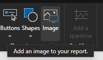
Y por otro como parte de un componente, por ejemplo un botón en blanco. Tanto en propiedades de estilo "Icons" o "Fill" podremos encontrar opciones para cargarlas:

En caso de trabajo de iconos en tablas, el estándar es el formato condicional por iconos que trae unos por defecto.
Usandolos podemos incorporar a nuestras tarjetas, tablas o enfoques de tablero una mejor experiencia.
Otras formas
Esta puede ser útil pero carece de flexibilidad. Cargar un .png por cada guia que queremos mostrar o si nuestra usuario quiere iconos especiales para el formato condicional, estos y otros requerimientos pueden verse limitados. Por ésta razón, vamos a ver tres métodos adicionales para enriquecer nuestras historias.
Emoticones o smiles: tradicionales que encontramos en cualquier chat
Unichars: valores estandarizados de íconos que PowerBi lee por DAX
SVG: es un formato vectorial muy útil para su uso online por su flexibilidad. Permite crear una imagen en una gran URL
Estas tres opciones podemos aplicarlas en visualizaciones individuales como tarjetas, en formas, en visualizaciones que lean imagenes como simple image y también en tablas o matrices.
Emoticones
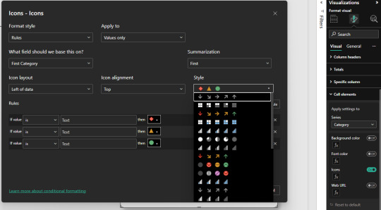
Tal vez la forma más simple de tarjeta que no conocíamos que se renderiza en todo lugar de windows. Con un simple "Windwos + ." en el teclado se nos desplega un menú para incorporar el ícono como texto. Así podríamos facilmente utilizarlo en reglas de dax para determinar un formato. Por ejemplo:

Unichar
No son realmente iconos o imágenes sino que son caracteres especiales llamados unicode. Unicode es un estándar de codificación de caracteres diseñado para facilitar el tratamiento informático. Para usarlo nos nutrimos de la función DAX UNICHAR. La misma, devuelve el carácter Unicode al que hace referencia el valor numérico. ¿Cómo sabremos que número escribir?, podemos asesorarnos de algún sitio web, por ejemplo "https://unichar.app/web/"
En este ejemplo en lugar de seleccionar un solo ícono, pense en puntuar los valores de venta en cinco estrellas. Según las reglas colocara estrellas vacías o llenas
Con tanta libertad de unicodes para usar con unichars, la creatividad será nuestro límte. Asi con estrellas podemos simular puntajes, rankings, etc. Podríamos haber usado algo similar a pulgares también.
Una gran característica de los unichar es que son considerados "texto" en la medida. Lo que significa que podemos pintarlos de cualquier color al igual que el texto.
SVGs
Tal vez el modo que más asusta es el SVG. Pero así también es el más versátil puesto que no se queda en la forma de un objeto sino que da pie a animación. Podemos pensar en el svg como algo similar al código html, puesto que tiene tags y configuraciones de estilo. El modo en el que power bi puede renderizarlo es considerandolo como una "Image URL". Si utilizamos una medida o columna, debemos categorizarla como tal:

Un SVG se compone de la siguiente manera:
data:image/svg+xml;utf8, <svg width='200' height='50' xmlns='http://www.w3.org/2000/svg'>[Código]</svg>
La carcaza siempre es la misma y se modifica normalmente sobre código. Se puede jugar con width y height como tamaños horizontales y verticales límites para el dibujo. Consideren que algunas visualizaciones, como las tablas, tiene configuraciones de formato para esto también:
Dichas propiedades pueden afectar al tamaño del renderizado en la visualización.
Veamos dos ejemplos. Por un lado podríamos poner tags similares a los editores modernos de tablas. Con un código que construya un tag para buenos resultados (success) y malos (failure) junto con una medida que sea un simple IF como windows + dot para elegir podríamos hacer grandes cosas. Veamos ejemplo de success:

Como pueden ver, dentro del tag svg construimos dos tags más. Por un lado el fondo rect que refiere a rectángulo con bordes redondeados y el text que tiene texto por encima.
SVG también nos permite jugar con animaciones. Entonces podríamos usar formas tradicionales como cuadrados o círculos y jugar con animaciones que llamen la atención. En este ejemplo también construimos dos SVG, un cuadrado rojo y un círculo verde. Ambos con movimientos y separados por el mismo IF que hablamos antes para separar valores a modo de ejemplo objetivo. Veamos como:

Por supuesto que el gif da el ejemplo, pero no reproduce tan fluido como el resultado final que es mucho más agradable a la vista. En este caso, incorporamos el tag animate que nos da la flexibilidad de jugar con movimientos.
¿Cómo crear SVG?
Tal vez piensen que no tienen tiempo para aprender esto de código svg. Hay varios caminos, no debemos cancelarlo por ello. Puede que algunas personas más académicas les interese conocer las sentencias de código posible y saber suficiente para controlarlo y entenderlo todo. Quienes no quieran esto hay dos alternativas. Por un lado, buscar otros SVG y posteos de comunidad al respecto. Por otro lado, podemos utilizar IA. Así es, una IA puede ayudarnos con esto. El círculo verde con su movimiento fue construido 100% por IA. Le pedi eso a un chat bastante famoso y me devolvió el código con la animación.
En definitiva podemos validar ideas y pedir códigos escritos. Ya no hay excusa para usar Iconos y SVGs para adornar nuestra UI de informes y brindar aspectos más agradables a los usuarios finales. Recuerden que pueden descargar el archivo de Power Bi Desktop desde mi GitHub.
#power bi#powerbi#power bi argentina#power bi cordoba#power bi jujuy#power bi tutorial#power bi training#power bi tips#power bi desktop#ladataweb#data viz#data visualization
0 notes
Text
10X Your Excel Skills with Copilot
Here’s a brief summary of the key points from the YouTube page “10X Your Excel Skills with Copilot” by Pavan Lalwani: The video, hosted by Pavan Lalwani, aims to significantly enhance Excel skills using Microsoft’s Copilot tool. The video has over 359,000 views and has received numerous positive comments. Viewers appreciate the clear and concise demonstrations provided by Pavan Lalwani,…

View On WordPress
#Advanced Excel#Automation tools#Collaboration#copilot#Data analysis#Data management#Data visualization#Excel#Excel formulas#Excel functions#Excel skills#Excel tips#Excel tutorials#Microsoft Excel#Microsoft Office#Office 365#Power BI#productivity#Task automation
1 note
·
View note
Text
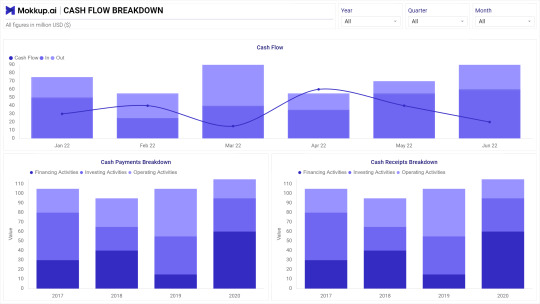
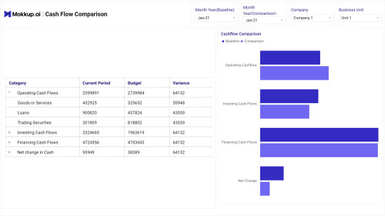
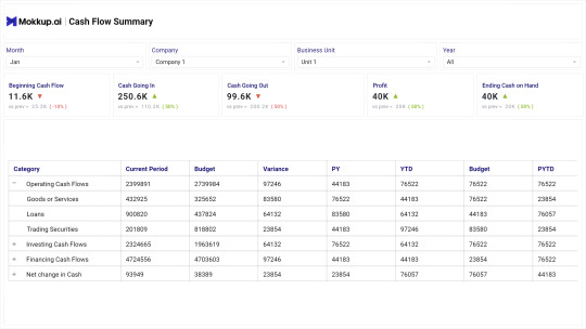


Cashflow - Finance Dashboard Template on Mokkup.ai.
Get free dashboard templates like this and more on FREE dashboard wireframing tool Mokkup.ai
#dashboard#data analytics#tableau#powerbi#dashboards#visualization#data#datascience#dashboard simulator#charts#ideas#tips#creating
0 notes
Video
youtube
How to create creative Infographics with jigsaw puzzle pieces using Canva
#youtube#Canva#Canva design#Canva tutorial#Canva tips#Canva infographics#Canva designerrs#canva designers#infographics#infographics dersing#infographics design#infographics maker#graphic design#learn design#designer#how to use canva#data visualization#tutorial#free infographics#free infographics maker
0 notes