#designgraphics
Explore tagged Tumblr posts
Visit Tumblr Blog
Explore Tumblr blogs with no restrictions, modern design and the best experience.
Last Seen Tumblr Blogs


Fun Fact
70% of Tumblr users say the Dashboard is their favorite place to spend time online.
Text

"Se un pesce è la personificazione, l’essenza stessa del movimento dell’acqua, 🌊 allora il gatto è diagramma e modello della leggerezza dell’aria."🍃
Doris Lessing
È la prima volta che mi sono cimentata nel disegnare un animale.🐱 Sinceramente mi ritengo piuttosto soddisfatta anche se so che Non è perfetto. Come dico sempre io sto ɪᴍᴘᴀʀᴀɴᴅᴏ! ✨ Ci sono punti dove sono più brava, altri dove vacillo di più, e su cui sto lavorando per migliorare. ✍🏻
#tabhitasakamakitaby#clipstudiospaint#clipstudio#artistsontumblr#digitalart#artwork#arteitaliana#artofdrawing#designgraphics#art#artis#artistoftumblr#artoftheday#cats#gatto#gattopersiano#persiancat#whitecat#gattobianco#occhiblu#cesta#hamper#cuscino#pillow#stars#stelle
5 notes
·
View notes
Text


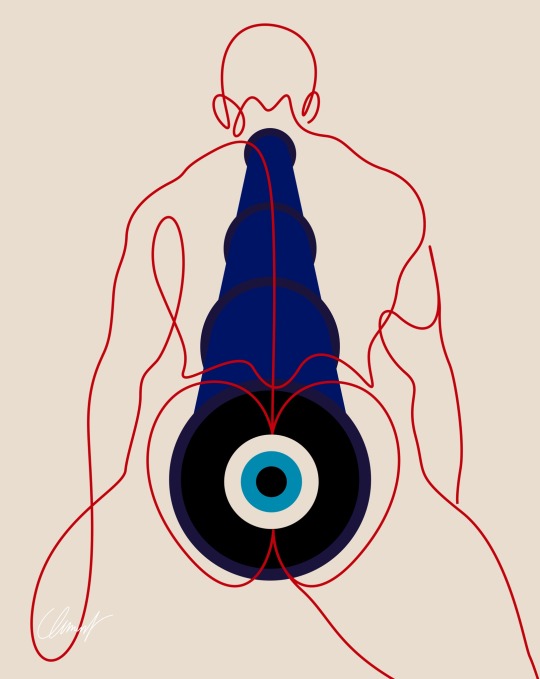


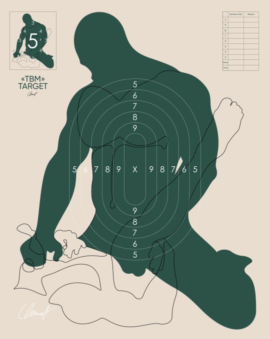
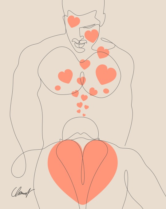
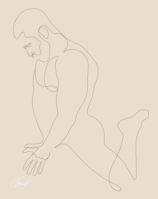

Rétrospective 2023
insta : @clemenlegrand
Plongée dans l’univers de mes créations qui ont suscité l’enthousiasme. Laquelle résonne le plus avec vos émotions? Dites-moi votre coup de cœur! 🖼️💬 (Part 1)
132 notes
·
View notes
Text


Devoirs de typographie où il fallait créer un alphabet entier en inventant une typo sur le logiciel Glyphs et construire une à une chaque lettre. J'ai monté un dossier et appliquer ma typo à une affiche que j'ai entièrement réalisé.
Tous les textes sur l'affiche sont écris dans ma police d'écriture, hormis le mot positionné de côté.
#graphisme#design#designgraphic#da#graphic design#The Weeknd#abel tesfaye#after hours#typographie#typography
5 notes
·
View notes
Text

MEGAN THEE STALLION (2024) @theestallion
#astronautademarmore#megantheestallion#collage#popart#digitalart#colagemdigital#boa#videogame#game#aesthetic#designgraphic#albumcover#artists on tumblr#digital collage#colagem#brazil#art#digital art#brasil
30 notes
·
View notes
Text


"6 gestures/ 6 tricks" #1 : 6 gestures to protect sea turtles
🔹 Illustration as a tool for awareness – "6 gestures/ 6 tricks" 🖌️🌍 Art is a powerful means of communication and awareness. With my new series "6 gestures/ 6 tricks", I want to demonstrate how illustration facilitates the transmission of information on important topics. This first poster highlights 6 simple steps to preserve sea turtles, a species threatened by pollution and poaching. 🌊🐢 🎨
Why illustration as a tool for awareness?
✅ Immediate impact: an image captures attention and remains in memory.
✅ Clarity of message: information accessible to all.
✅ Sharing and engagement: visuals that circulate easily on networks.
🔍 Process & Exploration: Discover the different stages of creation in this project! From the composition to the colors and graphic details, each element is designed to reinforce the message.
🌍 Available in French and English to reach as many people as possible.
📢 I would like your opinion! What topic would you like to see illustrated next?
#artist#artwork#clip studio paint#drawing#illustration#original art#animation#design#2d animation#procreate#Illustration#Awareness#DesignGraphic#ArtEngagé#EducationVisuelle#EcoResponsable#Conservation#ecology#endangered species#wildlife conservation#environment#environmental science
4 notes
·
View notes
Text
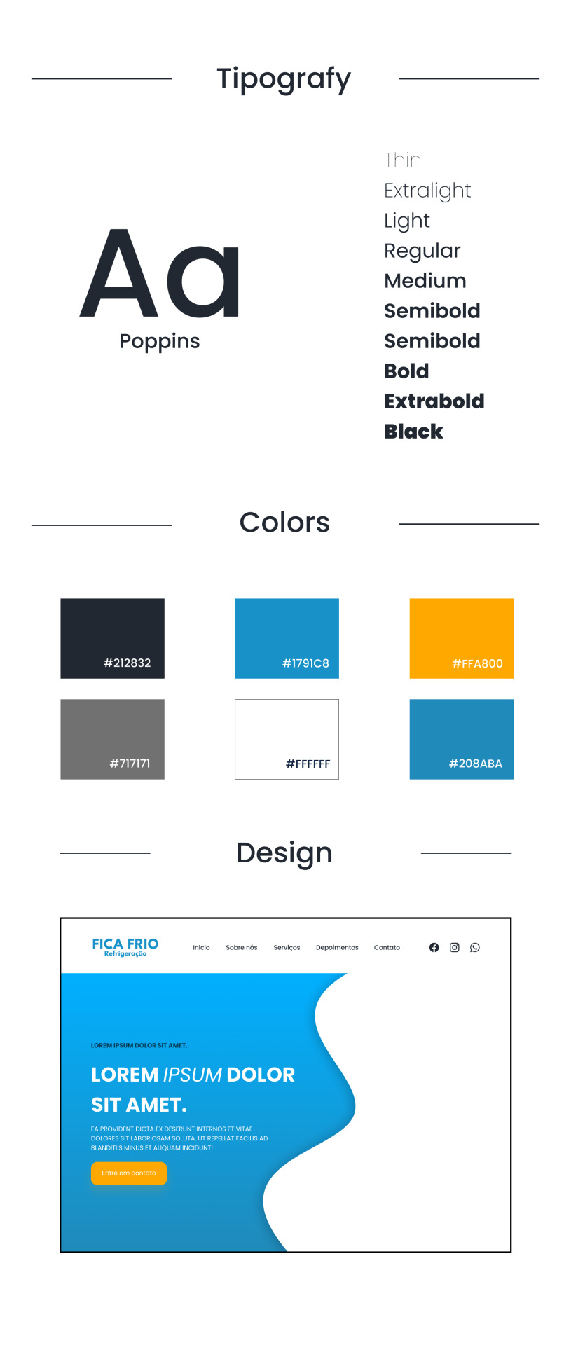
processos zzzz / process zzzz
[ br / eng ]
[um pequeno processo criativo/meu primeiro projeto oficial] lição mágica aprendida hoje: contraste.
˚✧ antiseptic ݁ ੭
BR :
⎯⎯ o processo criativo é a parte mais divertida de um design, as cores, fontes, formas, texturas, tudo é tão bom que me derreto por essa área ♥︎ fico extasiada em como os embasamentos realmente funcionam na prática.
meu PRIMEIRO projeto consistia em fazer um site de refrigeração nas cores azuladas, confesso que odeio não poder encher de símbolos e formas (tirem o figma de mim), mas trabalhar com estilos diferentes me fez refletir como os clientes veem o mundo, então decidi tentar! 𓆩♱𓆪
e o meu primeiro cliente foi meu pai! 🖤

pequenas explicações é apenas a teoria do que pensei, não é necessário ler~
/⠀ ⠀TIPOGRAFIA ⠀⠀ 〜 ♱
𓏲 pesquisei diversas fontes, precisava de algo que não fosse retangular, mas não fosse tão redondo, apesar do aspecto profissional que eu quis passar. a psicologia por trás da forma redonda é bem simples: círculos são associados a suavidade, absoluto, movimento e facilidade, mas não exagere. nenhuma forma deve ser exagerada, isso causa a impressão de mal feito e afastamento, é necessário equilibrar para uma fórmula bem feita. ⛧
/⠀ ⠀CORES ⠀⠀ 〜 ♱
de fato, essa foi a parte mais fácil. a paleta de cores predominante é o azul, o que traz uma sensação de frieza, frio, gelo, tudo o que queremos, certo? (sim.) por se tratar de uma marca de refrigeração, não escolhi o preto como a cor das fontes, mas sim uma cor acinzentada, fugindo do padrão. o laranja foi escolhida por conta do círculo cromático das cores, ou, a velha teoria das cores.

fonte: sla peguei no google / https://blog.adobe.com/br/publish/2022/03/30/como-usar-o-circulo-cromatico-com-o-adobe-color-super-facil
─ é nítido que o azul e o laranja são cores contrárias, então, por que elas parecem tão harmonicas juntas? porque são cores complementares. um pequeno resumo: as cores complementares são aquelas que dão contraste uma a outra, um exemplo interessante é a rapunzel de enrolados, você percebe que a paleta de cor predominante nela é o roxo e o amarelo, pois são cores que se contrastam, ficando assim de forma harmonica.
,⠀cinza e branco: são cores análogas, estão presentes lado a lado no círculo cromático, o resultado é uma cor básica. (imagine aquele seu amigo que fala, aff isso não é roxo, é violeta! entao, é isso...) (eu sou essa chata, ok?) (voce nao pode falar que rosa choque é igual rosa ou eu irei atrás da sua familia) ☆
/⠀ ⠀CONCLUSÃO, uau ⠀⠀ 〜 ♱
é necessário durante a criação pensar no contraste das cores e dos elementos, as formas arrendondadas precisam ser equilibradas com formas retangulares de forma positiva, elementos que normalmente se dão bem juntos são aqueles que se contrastam, é muito interessante pensar em como é necessário dar atenção aos mínimos detalhes. o contraste é uma das ferramentas mais poderosas do design, se utilizada corretamente.
errr, sobre o site? ele continua na fase de programação, mas caso o post tenha uma repercussão boa, eu trarei ele com seu resultado. obrigada a todos que leram até aqui, um comentário e corações me deixariam muito feliz ♡
dúvidas, sugestões ou críticas? me mande um ask, ele está aberto para qualquer tipo de coisa que tenha surgido durante o post. ♥︎
ENG :
[a small creative process/my first official project] magical lesson learned today: contrast.
⎯⎯ creative process is the most enjoyable part of design, the colors, fonts, shapes, textures, everything is so good that I melt for this area ♥︎ i am ecstatic about how the foundations really work in practice.
my FIRST project consisted of creating a cooling website in shades of blue, i confess that i hate not being able to fill it with symbols and shapes (take figma away from me), but working with different styles made me reflect on how clients see the world, so I decided to try! 𓆩♱𓆪
and my first client was my dad! 🖤
small explanations it's just the theory of what I thought, no need to read~
/⠀ ⠀COLORS ⠀⠀ 〜 ♱
indeed, this was the easiest part. the predominant color palette is blue, which brings a sensation of coolness, cold, ice, everything we want, right? (yes.) as it's a cooling brand, I didn't choose black as the font color, but rather a grayish color, deviating from the norm. orange was chosen due to the color wheel theory, or, the old theory of colors.
font: idk, got it from google / https://blog.adobe.com/br/publish/2022/03/30/como-usar-o-circulo-cromatico-com-o-adobe-color-super-facil
─ it's clear that blue and orange are opposite colors, so why do they look so harmonious together? because they are complementary colors. a brief summary: complementary colors are those that contrast with each other, an interesting example is rapunzel from tangled, you notice that the predominant color palette on her is purple and yellow, because they are contrasting colors, thus appearing harmonious.
,⠀gray and white: they are analogous colors, present side by side on the color wheel, resulting in a basic color. (imagine that friend of yours who says, ugh, this isn't purple, it's violet! so, that's it...) (i'm that annoying person, okay?) (you can't say that hot pink is the same as pink or I'll go after your family) ☆
/⠀ ⠀CONCLUSION, wow ⠀⠀ 〜 ♱
it's necessary during creation to think about the contrast of colors and elements, rounded shapes need to be balanced with rectangular shapes positively, elements that usually work well together are those that contrast, it's very interesting to think about how attention to the smallest details is necessary. contrast is one of the most powerful tools in design, if used correctly.
uhh, about the website? it's still in the programming phase, but if the post has a good reception, i'll bring it with its result. thank you to everyone who read this far, a comment and hearts would make me very happy ♡
questions, suggestions, or criticisms? send me an ask, it's open to anything that came up during the post. ♥︎
#designgraphic#design#design ux#design ui#designinspiration#website#web design#art process#colors#theory#disscussion#brasil#english#creative#art#digital art#my art#aesthetic#figma#figmadesign#figma figure
10 notes
·
View notes
Text
Best Graphic Design Service To Elevate your Business
In today’s highly competitive market, businesses are constantly vying for consumer attention. In such a landscape, the importance of visually appealing content cannot be overstated. That’s where top-tier graphic designing services come into play, offering a suite of essential tools to help brands stand out and effectively communicate their message.
Logo design sits at the forefront of brand identity. A well-designed logo encapsulates the essence of a company, serving as a visual representation of its values and mission. With expertise in typography, color theory, and symbolism, skilled designers can create logos that resonate with target audiences, leaving a lasting impression.
Flyer design remains a powerful marketing tool, particularly for events, promotions, and product launches. Crafting visually striking flyers requires a delicate balance of creativity and information hierarchy. Effective flyer design can captivate audiences and drive engagement, ultimately leading to increased brand awareness and sales.
Mockup design is another indispensable service, enabling businesses to visualize their products in real-world contexts. Whether it’s a product packaging or an app interface, realistic mockups help stakeholders better understand design concepts and make informed decisions.
Packaging design goes beyond mere aesthetics; it plays a crucial role in brand differentiation and consumer perception. A well-designed package not only protects the product but also communicates brand identity, values, and product attributes. From structural design to graphics and materials selection, packaging designers ensure that every aspect aligns with the brand’s overarching strategy.
Social media post design is essential for maintaining a cohesive online presence. In an era dominated by social media, eye-catching visuals are key to capturing audience attention and driving engagement. Whether it’s Instagram stories, Facebook ads, or Twitter posts, professional social media design services help brands create visually compelling content that resonates with their followers.
In conclusion, investing in top-notch graphic designing services across logo design, flyer design, mockup design, packaging design, and social media post design is essential for businesses looking to establish a strong visual identity, engage their audience effectively, and ultimately drive success in today’s competitive market.
#adobe photoshop#designer#freelance#design#marketing#graphic design#graphicdesign#bestgraphicdesigingservices#graphicsdesign#graphic#service#graphicdesigner#designgraphic#servicedesign#graphicsdesigner#graphicdesigning#graphicdesigncommunity#designergraphic#designservice#graphicdesignerslife#graphicsdesigning#graphicsdesigners#graphicdesignerclub#freelancegraphicdesign#logodesignservices#designforeveryone
3 notes
·
View notes
Text
Do you want eye-catching tshirt/hoodie design? So you are the right place. I'm professional graphic designer.
More info/order: https://www.fiverr.com/s/LbQWNY https://www.fiverr.com/s/dzjV2z
#design#custom#tshirt#tshirtdesign#hoodie#hallween#urban#newbrand#designapparel#graphictees#streetweargraphics#vintage#retro#newyork#merchandise#designgraphic
2 notes
·
View notes
Text
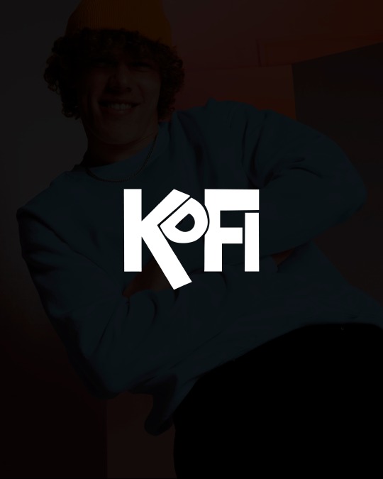

🤩TE PRESENTAMOS LAS ✨TARJETAS DE AGRADECIMIENTO✨ Son un detalle que hace que tus clientes vuelvan a comprarte🛍, dejando tus redes, tu página, dándole un incentivo para que suba una historia y te promocione📢! Estás tarjetas las hicimos para koficlothes que también diseñamos su logo, nos encantó esta propuesta, jugamos con colores vibrantes ya que elegimos el azul en su paleta de colores. Dime qué te pareció en los comentarios y no dudes de pedirme información si necesitas que diseñe para tu emprendimiento/negocio/servicio.
4 notes
·
View notes
Text
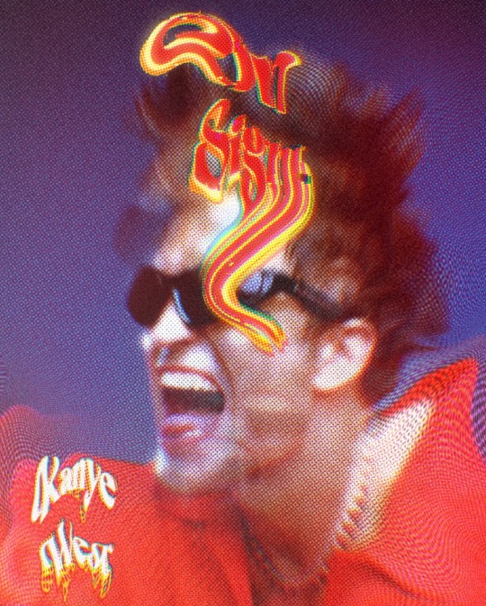
"On Sight" of Kanye West
credit: shooting of Robert Pattinson for the GQ
3 notes
·
View notes
Video
Graphic Designing Mastery: Create Stunning Designs Like a Pro! 🚀🎨
#youtube#Learn Graphic DesignGraphic Design For BeginnersDesign CareerEarn With DesigningFreelance Graphic DesignPassive IncomeDesign TrendsGraphic D
0 notes
Text


Doveva essere una cosa diversa questo disegno ma ha avuto un po' di cambiamenti in corso d'opera lasciando la forma della luna vista qui come strumento fisso nel cielo, chissà forse per rendere canzoni i segreti che ascolta nella notte. Spero che vi piaccia!
Che la fantasia vi guidi!💜
#tabhitasakamakitaby#clipstudiospaint#clipstudio#artistsoninstagram#digitalart#artwork#arteitaliana#artofdrawing#designgraphics#art#artist#artistofinstagram#artoftheday#moon#harpy#Night
1 note
·
View note
Text
How to Build an Eye-Catching Portfolio as a Graphic Designer
Discover how to create a stunning portfolio that captures attention and showcases your skills as a graphic designer. Learn the key elements to include, tips for organizing your work, and creative ideas to make your portfolio stand out. Whether you're a freelancer or looking for your dream job, this guide will help you build a portfolio that leaves a lasting impression.
#dmygraphic#designgraphic#graphicdesignerGuide#designergraphic#portfolio#graphicdesignerportfolio#HowtoBuildPortfolio
0 notes
Text


Page de magazine sur The Weekend, dans le cadre d'un devoirs d'infographie.
3 notes
·
View notes
Text
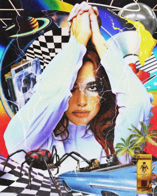
RADICAL OPTIMISM (2024) @dualipa
#RadicalOptimism#astronautademarmore#collage#popart#colagemdigital#dualipa#albumcover#digitalart#pop#surrealism#illusion#colagem#collageart#designgraphic#artists on tumblr#digital collage#digital art
14 notes
·
View notes
Text
🎉 Congratulations, Jatin Sehgal! 🎉
Jatin has secured admission to @sheffhallamuni for the Postgraduate Design Graphic program starting September 2024! 🌟 Your creativity has opened this exciting door. Best of luck in the UK! 🇬🇧
Dreaming of studying abroad? Join Kanan Dehradun for expert guidance.
📍 Visit Us: Above Royal Enfield Showroom, 34 HR Tower, Ballupur Chowk, Dehradun 📞 Call: +91 95577 22747

#KananDehradun#StudyAbroad#SheffieldHallamUniversity#DesignGraphic#StudyInUK#Sep24Intake#Congratulations#GlobalEducation
0 notes