#edited and linked the post with cool color palettes I used
Explore tagged Tumblr posts
Visit Tumblr Blog
Explore Tumblr blogs with no restrictions, modern design and the best experience.
Last Seen Tumblr Blogs


Fun Fact
Average visit duration of Tumblr.com is 10 mins and 25 secs.
Text

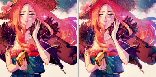
"New" guy! You might have seen him before hehe
This is Iris, or rather how he used to look like in his younger days. In the current story he's an old retired criminal along with his boyfriend Buckthorn (by @furgemancs ) who was just as into heists as Iris.
I'm not quite sure how to talk about this guy's story yet, since we're kind of working out their past through two old coots remembering the days of their youth and puzzling them together as they do. It's very fun!
I'll toss some random stuff about him bellow
-So Iris and Buck are actually "side" characters that appeared with idea of being briefly just there to help two other characters (Astra and Thorn) but we got too attached lol
-The whole cowboy vibe for Iris is due to me watching Undertale Yellow at the time, sort of wanting to pull of a similar feel as Starlo because I didn't intend this guy to become a whole character like this haha!
-He lives with his boyfriend Buck in the middle of nowhere near some woods. They lie that they have riches due to being royalty that escaped to be free and do what ever they want which is why they hide away in the first place.
-The truth is, they used to work as criminals who stole stuff for themselves (and Iris for his abusive gang), mostly from noble or rich bugs, good or not.
-Iris and Buckthorn used to be heated rivals, competing for the prize of their heists. Buck was so cunning Iris hated his guts but over time they started having fun racing for the items they would steal, ended up getting used to each other and eventually close.
-Both had difficult pasts. Iris also worked for the gang akin to mafia while forcibly dating a girl from it so the two eventually had find a way to get away from all of that and not end up hunted down and murdered. It was hard but they eventually succeed, forcing them into hiding not just from getting away from the law but also the gang.
-Luckily, many many years later, they ended up growing old and safe at their humble home in the woods, with enough (stolen) riches to keep them retired for good~
-Iris can go from calm and collected to easily flared and upset depending on the situation. Both Buck and him are perceptive but Iris is not a smooth talker. He can be deceiving and if Buck is around the two are such a good tandem they'll make you buy any lie or truth they say.
-Iris is very very good with ropes and knots. Good at aiming with his crossbow! As young, he was able to fly well too and it helped him reach places and leave scenes faster.
That's all briefly put at least. Have doodles I have so far!


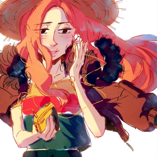
You've seen this one

First and very rough doodle of old Iris. I now have a proportions I'm happy with thanks to the ref above but he is still kind of slim and lanky like this now! His mustache is also fuzzier haha

Rough of Iris' and Buck's earlier encounters XD
EDIT: OH And the palette I used is from HERE (Metal Goat specifically)
#muse: Iris#Buckthorn#Iris Ref#my art#hehehe I drew my own character for once#I DREW A REF OF MY OWN CHARACTER FOR ONCE#this just doesn't happen usually#edited and linked the post with cool color palettes I used
121 notes
·
View notes
Note
Hi!! I saw your blog and it's beautiful! I'd like to ask if you could share some tips about editing posts, specifically changing the font color and doing that cool effect where it has more than one color on the same font ☺ if you're not comfortable teaching that's okay too! Have a good night

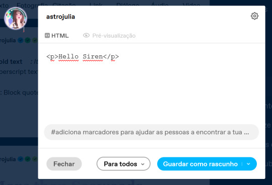
Hello Siren,
Thank you for the compliment. Yes, I can teach you. Just follow a tip from Auntie here: do it because you genuinely like the aesthetic. The time you spend writing the post is sometimes the same as editing it, and in my experience, this won't necessarily translate into more likes or reblogs. So, do it because you think it's beautiful.
As comical as it sounds, I won't be using HTML in this post because using the codes could cause problems. I've seen some tutorials, but I just really learned when I searched on my own.. I also do all my editings on my notebook. So, here's everything I use:

Websites I use for editing:
HTML Code Editor: While you're creating your HTML, you can simultaneously see if it's working
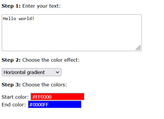
BBcode & HTML Text Colorizer: This is where you'll create the gradient
Browserling: I use this site to make the gradient code compatible for Tumblr
Aesthetic Symbols: this is for that cute symbols
Piliapp: more copy/paste symbols
Fontes e Letras: copy/paste fonts
Canva: This is where I create some of my designs. I also use Photoshop
Deviantart: a lot of material for Photoshop like templates, PSDs and Renders (PNG image with a good resolution), you can see the ones I use the most in my sources
@animatedglittergraphics-n-more: dividers
@saradika: dividers
@engrampixel: cute material
Color Hunt: if you don't have a color pallete in mind, here you can find a lot of options
Adobe Color: if you want to create your own HTML color palette this site can help
DaFont: where I download my fonts, the ones I use the most are: Betterfly, Arcadepix, Starborn, Lemon Milk, Cursive Sans and BubbleGum
EmojiTerra: as I use tumblr on my notebook, this is where I get my emojis
HTML Text Editing
Important:
Go use the HTML Code Editor in this part and your life will be way easier.
Some things I do right here in the tumblr editor, like putting the images and different fonts like Lucille.
All HTML code starts with < > and ends with , that is, when you start a paragraph you will write <p> and when you finish you will write </p> (HTML Code Editor ends your coding automatically)
I'm teaching all this because if you want to make gradients in your entire text and not just in the title, you'll need to know about html
To start your HTML you will need to go to the gear that appears on the right side when you are writing your post, go to the bottom until you find the Text Editor and switch to HTML.

The Codes
<p> start a paragraph </p>
<br> to make a space between text less than a paragraph (good to use in indented text) you don't need to put </br>
<b> make the text bold </b>
<i> leave the text in italics</i>
<strike> leave the text crossed out </strike>
<small> make the text small like this </small>
<h1> make the text large like this </h1>
<h2> make the text large like this </h2>
<ul> Create unordered list (dotted) </ul>
<ol>Create lists with order (numeric) </ol>
*instead of making paragraphs you will create new items in the list using the code <li> </li>
<blockquote class="npf_indented"> make the text indented </blockquote>
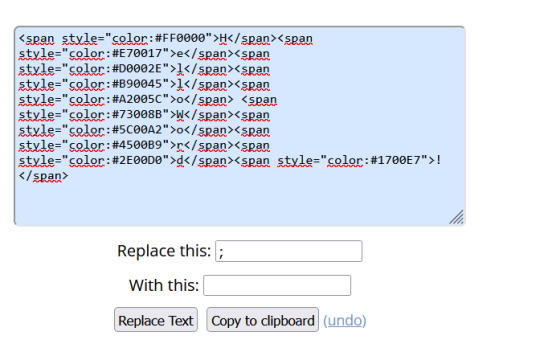
<span style="color: #HTML"> Code to color your texts, pay attention that it uses (") instead of (') and doesn't use (;) </span>
Tutorial on creating invisible spaces, just like I use to do the navigation, if I put it here everything bugs. PT-BR
<a href="URL">Link Text</a>: Creates a hyperlink
Making your Gradient
Go to BBCode and HTML already with your HTML text and colors in hand. Write or copy your text in the box, choose the gradient type (I use middle) and select your colors (from one to three different colors)

Now copy the text in the "HTML code for this text: (To use on your website)" box and go to the Browseling, you will replace the (') to (") and the (;) for nothing
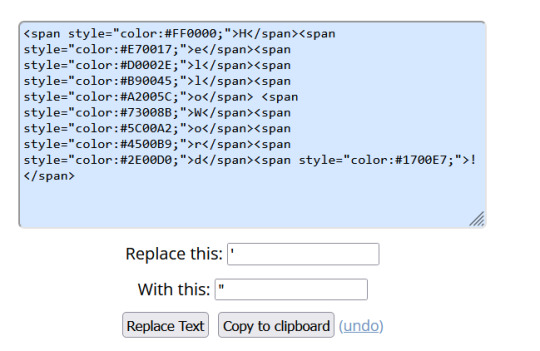
Copy and paste your new code direct in your tumblr post editor or in the HTML Code Editor. Success!!
I think that's all. Kisses from the Sea! 🐚
198 notes
·
View notes
Text
Welcome to The Aureum

Hi! I'm a newer software dev, but with a long history with programming (thanks to this accursed site in 2014 and my desire to join robotics) I also happen to love writing and art, and have a lot of OCs. I always struggled with keeping them organized and finding a software that works for me.
Enter, The Aureum!
What is The Aureum?
The Aureum is a work in progress web based app made with electron that I am working on so that I can organize my characters in a bit of a different way. A lot of elements and planned features take inspiration from the fandom community wiki, mixed with some of my other favorite world building websites that just ended up not being a good fit for me.
I made this blog so I can easily keep track of my development progress on this, and maybe make some cool new friends in the process.
What does it do?
Currently? Very little, other than make characters with information.
However, I'm currently working on a number of features, one of my most ideal features being project organization. This would allow me (and other users ofc) to sort their OCs and locations BY the project. Maybe you're a writer working on a few different series/stories at the same time, and you need some way to seperate them. Maybe your a game dev, visual novel creator, etc and you just want to have some way to store all of your story and character information in one place.
I also have some more fun and 'unique' features that are being worked on, like an automatic reference sheet generator, which prints out some of your characters information like name, age, height, weight, body type, and some of your preselected colors.
Another favorite feature I'm working on are the personality sliders! In the characters page there are sliders that you can edit to have a little more of a 'fun' view of how your characters act. Here are some screenshots of the layout from within Figma!


Currently, I'm setting up the data storage structure so that we can input all of this character information and still be able to create a project after to put the character in. But while I'm still working out the kinks, here's a list of the main planned features that will be implemented before i send it out to friends to alpha test!
Features
Multiple Projects/ Worlds
Entirely locally hosted, no internet connection required
Personality sliders
Character sheet generator
Timeline feature per project/world
Ability to link to sources and citations
Relationship linking between characters (Similar to fandom wiki setups)
The Aurei - The golden ones, your favorite OC's flagged so that you can access them faster, especially if you have favorites from multiple projects.
Random generation features, for things like art prompts and writing prompts.
Ideas for future releases
D20, d6, etc dice roller
Fake social media screenshot generator similar to twinote or photonote
Additional timeline just on a character by character basis
Ability to sort OCs by tag - by gender, species, location, etc.
Dark mode (maybe custom color palettes for later that users can upload/customize via css)
and more!
Okay but when will it be done?
Truthfully, who knows? I'm solo deving this software for fun, while working a full time job on top of my normal small game projects I make. It might be functional in a few months, or it might take a few years. Ultimately, I have no timeline for this project, and I want to be up front right out of the gate. Once i get a stablle build with the main character and project features implemented and organized, I'll send it off to friends to alpha test, and if all goes well for a few weeks, then I'll post the alpha build for others to use.
Why are you doing this?
the short answer is just because i want to. The longer answer is because, while I love using things like notion, obsidian, metos, worldanvil, etc. I find that there's always one or two things missing from each of them that I'd personally like to have. A lot of these softwares/websites are created with specific things in mind, like note taking, etc. But for me, I make games, i do art, i write stories, and I'm a DND Dungeon Master, so not all of those softwares will work for my every project.
I wanted to make something that would work for everyone, for all of their creative needs.
Also a mini note, to anyone who comes back and sees this or is curious, this project *will* be free on release to the public and likely hosted on itch.io. There are currently NO plans for an online sync or any only features, as that is not within my devstack or technical abilities at this time.
#Welcome to the aureum#aureumdev#theaureuem#softwaredev#developer#electronjs#webdev#character development#oc#worldbuilding
6 notes
·
View notes
Photo


SO! I got inspired by my last followers gift when I remembered K8 had also created this interesting furniture set! (1) So, if you want a kitchen in matching colors, you can pick it up here (2). I probably could figure out how to repository some of these recolors together to make them less files... but I didn’t so if someone wants to do that, please send me links when you do! The exciting thing I did learn how to do was recolor the glass, which will definitely come in handy for upcoming recolors. ^^
There are two options for colors. The Oxygen White RCs ONLY recolor the white edges. All the green details in that first picture come as part of the Dark RCs. Like with the Oxygen kitchen set, the edges are intentionally darker than my usual AKOSR3b colors (3), to contrast with the grass/cloth, which is in the normal AKSOR3b colors. I have included the tweaked versions of the meshes that I used for recoloring, but if you want the originals and/or K8′s very cool recolors, please go check out her site for them (1). ^^
As always, I don’t own anything, and to see details about what exactly the AKSOR3b colors are, where they are from, and who exactly were the talented artists that created them, please go here (4). (The color files are individually labeled with their original creator, palette, and name, but like usual I’ve probably mangled them beyond recognition by abbreviating everything.)
The FF versions package all the colors in one file-> less files, but you can’t delete individual colors. The other versions give you all colors individually packaged so you can delete the ones you don’t want. You DO NOT need both.
IF YOU WANT EVERYTHING:
ALL O2 Dark recolors individually packaged: http://simfil.es/2649871/
ALL O2 Dark recolors FF version: http://simfil.es/2649872/
ALL O2 White recolors individually packaged: http://simfil.es/2649883/
ALL O2 White recolors FF version: http://simfil.es/2649884/
IF you would like to just download the O2 Dark recolor pieces you want individually:
Armchair individually packaged: http://simfil.es/2649873/
Armchair recolors FF version: http://simfil.es/2649874/
AL REQ: Bookcase individually packaged: http://simfil.es/2649873/
AL REQ: Bookcase recolors FF version: http://simfil.es/2649876/
Coffee Table individually packaged: http://simfil.es/2649877/
Coffee Table recolors FF version: http://simfil.es/2649878/
End Table individually packaged: http://simfil.es/2649879/
End Table recolors FF version: http://simfil.es/2649880/
Loveseat individually packaged: http://simfil.es/2649881/
Loveseat recolors FF version: http://simfil.es/2649882/
AL REQ: Shelf individually packaged: http://simfil.es/2649885/
AL REQ: Shelf recolors FF version: http://simfil.es/2649886/
Sofa individually packaged: http://simfil.es/2649887/
Sofa recolors FF version: http://simfil.es/2649888/
Table Lamp individually packaged: http://simfil.es/2649889/
Table Lamp recolors FF version: http://simfil.es/2649890/
TV individually packaged: http://simfil.es/2649891/
TV recolors FF version: http://simfil.es/2649892/
Wall Lamp individually packaged: http://simfil.es/2649893/
Wall Lamp recolors FF version: http://simfil.es/2649894/
The preview picture, meshes, swatches, and color info are included with both downloads. I own nothing so you can’t sell it. :)
(1): http://www.parsimonious.org/furniture2/pages/livingroom_k8-Simisysm.html
(2): https://aliksims.tumblr.com/post/660073429520842753/
(3): http://aliksims.tumblr.com/post/189370841371/
(4): https://docs.google.com/document/d/1dZBByQl0wWnq0KzoBNurRROeWshYBZ18ZZ5-t_Sx_4A/edit?usp=sharing/
#object recolors#aksor3b#k8#k8 simisysm#k8 oxygen#furniture set#seating sofa#seating living room#hobby knowledge#lighting wall#lighting table#surface coffee talbe#surface end table#surface shelf#seating#surface#hobby#lighting#electronics#electronics visual#ts2cc#sims2cc#hopefully I didn't miss anything...#al ep req
30 notes
·
View notes
Text
content creator 2021 wrapped tag game
Cut this into what works for you. Want to do only one instead of five? Do it. Tag 2 people? Do it. This game is not your mum or the Apple App store to tell you what to do. But there are a couple of rules:
RULE 1: Review your creations over 2021. Tag some gifmakers/creators, friends and strangers to get them to do the same.
RULE 2: Link to the content, commentary optional.
thank you @usermurdocks and @capinejghafa for tagging me!
5 (or more!) creations from others that made you smash the reblog button hard, closely followed by your ‘insp’ tag or ‘fave tag’. Link to sets that started conversations, outstanding composition, colouring, etc.
oh man there are so many that i’ve love i will probably never be able to list them all but will try my best
ladies of shadow and bone -> color palette / characteristics by @capinejghafa
okay okay this set is just so gorgeous and was such a great gift. and it has like everything you could want, all the sab ladies, gorgeous blending, and beautiful colors!
i also want to mention myra’s kanej + reincarnation au gifset because like it’s gorgeous it’s kanej and it’s purple...like what more could you want!
the witcher › season 2 by @jjmaybanks
there are so many of beck’s gifsets i could mention but like the fact that this edit was made just from the trailer is just amazing! like it’s so gorgeous, the coloring is amazing and has such a cool layout. but like my favorite part is the middle gif, i’ve never seen anyone use do the mix of colors and b&w on a layout and I just thinks it’s so cool!
okay i’m going to mention another one because I can’t help myself but this ciri gifset is ummm just art, it’s stunning and gorgeous and i don’t know what else to say about it other i think you all should just go stare at because it’s gorgeous
darkling by @clarke-griffin
okay the first time i saw this gif i just stared and then i want to both make gifsets as stunning and to never make gifs again because i could never make something as stunning. it’s just amazing and one of coolest uses of overlays and textures i’ve seen in gifs!
yennefer meme: femme fatale by @yenvengerberg
i just...it’s gorgeous and don’t really know what else to say because what is there to say??? I could stare this edit for hour and probably have but it’s just stunning and fits the film noir/femme fatale vibe so well
rebecca + alone by @queencalanthes
i think my jaw literally dropped when i saw this edit. like the way... THE WAY THE TEXT DISAPPEARS IN THE LAST GIF?!?! it’s so good it makes me lose my mind
okay, i’m going to stop now but i could probably keep going forever there are sooooo many talented creators on here
4-5 creations of which you’re proud. These are goals you scored. Nothing to do with notes.
nina zenik
i think this was probably the first edit of mine where i really tried to do something cool with the typography and really liked how it ended up!
kaz brekker
i think this was the first gifset that i felt 100% confident post and just overall felt good about
inej ghafa
this edit took me forever, like i’m pretty sure i had a headache by the end of making it. i think i colored most of the gifs frame by frame but honestly it was worth it. this edit is still one of my favorite edits i’ve ever made and the one i’m most proud
ciri of cintra
i just love the colors in this a whole lot and honestly had a lot of fun making this. i mostly used it as an excuse to try some different coloring and affects that i hadn’t done before
3-4 creations others loved. Include the one that one that got most notes, great comments, or the classic ‘how dare you!’
letterboxd reviews + sebastian
letterboxd reviews + lilo and stitch
inej ghafa
2-3 creations that stretched you as a creator: style, coloring, blending, text, etc. include the one that should have got more notes.
nina zenik
making this edit was an experience...one that might have involved tears
daredevil
this was the second edit i made with a layout and like it tested me man. first the math of trying to figure out the size of the gifs and then just putting everything together was an EXPERIENCE
1 creation of yours that you find most aesthetically pleasing to the eye and self AND 1 creation that broke and (maybe remade you) as a creator – we all have that one.
aesthetically pleasing: yennefer + tissaia
maybe one of my more simple edits but think it’s one of my favorites!
creation that broke me: inej + knives
i was so excited to make this edit and it just...like still can’t think about it. i just could not make it work how i wanted to
0 the creation that never was because nothing was working that day.
i have a good chuck of sab ladies rainbow edit done. i started it for sab ladies application week but just didn’t finish it in time and i just haven’t had the motivation to work on it since but i do plan to finish it at some point. here’s one of the gifs from the set:
Overall comment on your creativity year 2021: i started gif for the first time in like a year and half and have trying out some many new things and just created so much that i’m proud of!
i don’t know who’s already done this so i’m just going to tag some people:
@rreputatiions, @steve-harringtons, @yelenabeluva, @nikolai-llantsov, @kazs-rietvelds, @queencalanthes, @riietveld, @spideyandrews
14 notes
·
View notes
Text
#showyourprocess
From planning to posting, share your process for making creative content!
To continue supporting content makers, this tag game is meant to show the entire process of making creative content: this can be for any creation.
RULES — When your work is tagged, show the process of its creation from planning to posting, then tag up to 5 people with a specific link to one of their creative works you’d like to see the process of. Use the tag #showyourprocess so we can find yours!
sabrina @lanwangiji, my love, tagged me to share my process of making this typography edit! check out her explanation of her the untamed edit and her edit tag.
1. PLANNING
i once opened lyrics edit requests so i can learn and practice typography. this edit was a request as well. i asked them which lyrics they wanted to have and the colors they’d like. since i got several requests and it was hard to keep tabs on them, i made a trello board so i could organize everything. i’m still using the trello board for every edit idea i have, the board makes my life easier.
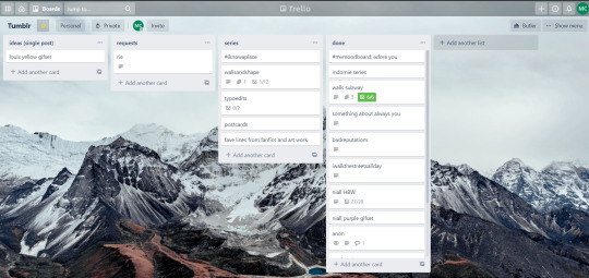

above is what i filled the card in the board with. basically just information of the requests.
1.1 INSPIRATION
once i got the request, my first thought was to find the vibe the song/lyrics exude. “it’s an old curse” screamed witchy vibes to me, so i went to pinterest to find some inspirations. at first i was looking for witchy poster designs and i came across this. i liked how it has smoke-ish graphic and i thought the smoke suited the “old curse” lyrics. and tbh pinterest is a rabbit hole, they gave me suggestions after suggestions, like this and this which became my inspiration for the color palette (i added the gold from those pics) and the sun moon design gave me the idea to incorporate space stuffs too. i somehow landed on this too, and because i wanted to include space theme, i made a simple phases of the moon. ultimately the hero of this edit was the lyrics, i didnt want the graphics took the center stage. i was inspired to make a crystal ball and do this kind of typography but after several trials i couldnt get the the typography right, so i scratched that idea and went with the space theme instead.
1.2 PICKING COLORS
after i was feeling inspired enough, i went looking for the right colors. i usually just type “color name” and “palette” on pinterest. example “dark grey color palette” and i chose the one i liked best. when the request only asked for 1 color, i always searched for either a complimentary or contrasting color to give it a jushz, to add sprinkles. that’s why i added gold on top of the dark grey.
1.3 FINDING FONTS
this is the hardest part. the fonts play important role to the design. they need to convey the vibes of the lyrics, in this case witchy/magic vibe. i needed to find fonts or font just as magical and a bit whimsical. tho i hoard fonts... i like to use new font for every typography edit lmao sue me.
i highly recommend going to creativemarket free goods site, pixelsurplus font freebies and behance to search for fonts. i always use 100% free fonts, that means i can use it personally as well as commercially. creativemarket gives me desktop license for the fonts, which means i can use it for commercial as well. the reason i do this because i want to open an etsy shop someday, and i want to have the right license when i sell my stuffs. i almost never buy fonts bc they are expensive lmao.
the fonts in used are “Vintage” for the main typograpy (i think i was a freebie from creativemarket) and “Morganite” for the title of the lyrics and the name of artist.
2. CREATING
once i have my materials and ideas, i open my illustrator and hope it doesnt crash every 5 min.
for this kind of typography edits, i use 600x700 px. tbh i dont like using 540px, the suggested tumblr size, as the width bc to me it doesn’t look as good in quality, so i up the px. but more on this sizing later. i utilize the artboards function in illustrator, and i use 2 artboards.
i use illustrator (ai) bc i’m working with vectors. when i work with vectors, the graphics/texts or whatever im making in ai wont become blurry or lose its quality when i enlarge or shrink it. in compare to photoshop, i need to make for example the moon graphic very big, so i wont lose the quality when i reduce and enlarge it again. with vector, i can start small and when i expand it, it’s still as good as when it’s tiny.
2.1 GRADIENTS
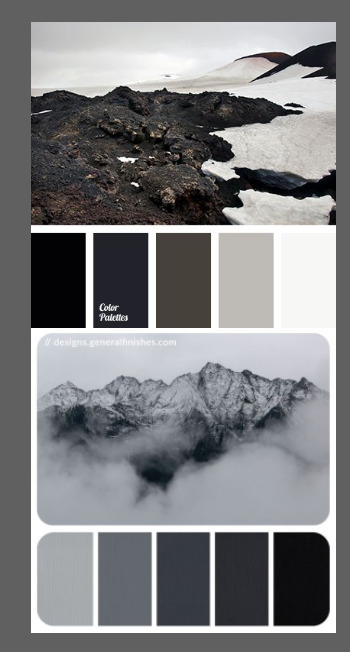
i started with the gradients first. i created a rectangle as big as 600x700px and with the “freeform gradient” tool in ai, i played with the colors. below is the color palettes i used
2.2 LYRICS AND GRAPHICS
once the gradients are done, i worked with the lyrics and graphics right away. when i first doing this edits, i made typos a lot lmaooooooo. so i copy and pasted the lyrics on top of my artboard, so i wouldnt have any typos.
i had 3 layers in my ai. one for the inspo pics and the OG lyrics. the rest for the edits themselves. i broke up “It's an old curse/dreamers diving headfirst” into to parts, hence the 2 more layers
i almost always started with the lyrics first then the graphics. but for this edit, i made the smoke first so i can layout where my text would be.
tbh the process of making the lyrics is a trial and error. i tried bunch of different stuffs and i chose whatever the best. but i worked like methodically, i made sure i finished the first part of the lyrics first then i could move on.
i was lucky with this font “vintage”. the font offers me several glyphs like these
and i chose the one at the bottom. you’re very lucky if you find a font and they have glyphs.
excursion: glyphs vs fonts
glyph is an individual character. It might be a letter, an accented letter, a ligature, a punctuation mark, a dingbat, etc.
A font is a digital file which is used to display a typeface, which contains the entire upper- and lowercase alphabet as well as punctuation, numbers, and other special characters.
after i was finished with all the lyrics i added some graphics to make the edit pretty like small stars or dots. i added the song title and the artist too, sometimes at the bottom sometimes at the top. and i added my watermark put it as small as i could and made it a bit invisible but still can be seen.
2.3 EXPORTING
exporting! this is where i’m going to go deeper with the dimension of my work. in ai, i always choose to save with “export as screens” function. it automatically divides the artboards i have and save them separately. i always save as png, bc the size is smaller than jpg but can maintain the quality.
now the export tab looks like this
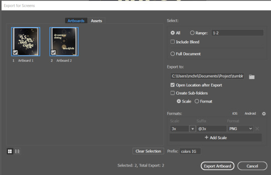
see the formats? i always scale up my edits, 2-3 times the original artboard size. reason is, to maintain the quality. i have tried to save it as original, 600x700 px, but it turned out a bit blurry. bc everything in ai is vector, when i scale up it doesnt lose the quality. BUT once i save it as png, it’s not a vector anymore, and when you zoom in until a certain degree it’ll be pixelated. that’s why i always scale up, to avoid it becoming pixelated when it’s just zoomed 1 or 2 times.
2.4 FINAL TOUCH
i opened my photoshop and also pray it won’t crash. import the png of my edits, add some grains/noise. the reason i use photoshop is, the noise filter is way better than in ai. it’s smoother somehow. and then i export my edits.
(i have a timelapse of how i made one of my edits, it’s not this one, but it’ll give you a better visualization. find it HERE
3. POSTING
now the hardest parts are done, we go to posting!
i uploaded the 2 posters on tumblr as photos then i wrote the captions. for this typography edit, i always chose another lyrics that i like from the same song for the caption. i bolded the lyrics, add link to all of my typography gradient edits.
i always use this link to color my caption. i usually choose 3-4 colors, and i took the colors from my edit. but this was not until recently lmao. before i just took a guess and looked for similar colors that match the edit, but then i thought “why didnt i just use the color in the posters lmao”
ok after i have my html code for the caption, i go to this site to replace the “;” with “ “ so tumblr can read the code.
i’m not one who puts their edits in draft, bc i just cant wait to post it. i have to option here, either i post it immediately when the time is right (i usually post between 4-8) or i schedule it, if im finished before 4.
i put all the necessary tags and click post! i am done finally!
i’m tagging:
@thetriangletattoo for this amazing series
@deludedandlostcause for this impressive gif
@half-lightl for this spectacular edit
@gayndrew for this stunning drawing
@thechampagnelovers for this cool collage
@cloudslou for this incredible edit
@heyangels for this incredible edit
35 notes
·
View notes
Text
comprehensive list of tags
I’ve been using tags since the beginning. I love to pick one and go thru it!
Categories are bolded. Each underlined word is a tag that links directly to the tag page on my blog. Most of the words are literally the tag name. Similar tags are grouped together and separated with a slash. They may be similar, but they are not the same. A description is provided for clarity for some tags, but others are self explanatory and thus do not have a description. This list is not exhaustive nor is it finished.
General
me/this is me/still me/tagged me
me too/same/mood/relatable/r e l a t a b l e/me at work - vibes that I relate to but not exactly
laughter actually - laugh out loud tag
gender of the day
life changing posts
this is so funny/I love this/I still love this/love/looove/fave/fav/best/save/save tag/wholesome/happiness/I love my friends/I love hugs
work of art - “the stars aligned perfectly for this to happen" and many contributed to it
poetic/so poetic/super poetic/nicely phrased/so nicely phrased - “these words sound so nice” in varying degrees
interesting/cool/cool stuff/super cool
childhood/younger self/past self/nostalgia
want/goals
Direct
that sound/those sounds/that face/that voice/looks so smooth/looks so soft/so round/so smooth/so soft/syn/texture/lines - synesthesia tags
dance/martial arts/fitness
film/movies for later/editing/animation
music/audio
photography/old phots
art museum
fashion/looks/outfits/runway fashion/historical fashion
flowers/plants
food
hair
scenery/street scenery
interiors/architecture
y2k - 2000s aesthetic
shop/presents/gift ideas - where you can buy stuff or find shopping inspiration
quotes
maps/infographics
quizzes
video/fid/tiktok
individuals/celebrities
parenting/pda/sap/relationships - advice, etc
dep/axy - mental illness tags
linguistics/languages - each language has its own tag, this tag is for general information
aries/horoscopes
bible stuff
outer space/science/physics
reblog - post booster tag, for donations, exposure, etc
satisfying/so satisfying/satisfaction/process
glow/not green glow - fluorescent pics
amazing/incredible/agreed/truly/good/haha/nice/wow/what/stop/tru/yes/yeah/ok/yo/.../..../??? - various general reactions to anything
so much/so pretty
Art tags/insp
poss a/insp/art insp/design/character design/aesthetic/close/colors/color palette/those colors/portrait/portraits/tattoos/drawing/drawn/art style/art styles/art/prints/webcomics/writing/writing prompts/tropes/stories
Specifics
reference/for later/when bored
hey thats today - posts/events/whatever that happened on this date
airdrop/save pic/save pics/one of those good internet photos - group chat material
tumblr - general cringe. culturally significant
lets go - lists of questions
performance art
misc/musc
reminder
tag viewer
analysis
this is america/dystopia/amreeka/capitalism/police state - “unistatians need a revolution” tag
receipts/history/untold history/the more you know
take on me/take me on/i’ll be gone - posts that go together are labeled by their respective line
black is beautiful/black lives matter/buy black/community - black tags
ser latinx - latino tag
sonora - indigenous tag
ace/lgbt/lgbtq - queer tags
Reminds me of...
Colombia, Germany, Mexico, Europe, the west, Italy, France, Toronto, New York
me
Fandoms
Anime: Cowboy Bebop/Fullmetal Alchemist, the manga, Brotherhood, 03/FLCL/Hunter X Hunter/Jojo’s Bizarre Adventure, manga scans/Mob Pyscho/Naruto/Neon Genesis Evangelion/One Piece/One Punch Man/Puella Magi Madoka Magica/Shingeki no Kyojin/Silver Spoon/Yu-Gi-Oh
Video games: Among Us/Animal Crossing, New Horizons/Assasin’s Creed/Cyberpunk 77/Kingdom Hearts/Earthbound/Kirby/Legend of Zelda, Breath of the Wild/Mass Effect/Metal Gear/Spider-Man: Miles Morales/Minecraft/Nintendo/Overwatch, Overwatch gameplay/Sonic/Street Fighter/Super Smash Bros, Melee, Ultimate
Movies: Studio Ghibli/Spider-Man: Into the Spider-verse/Star Wars
TV shows: Avatar: The Last Airbender, Avatar: The Legend of Korra/Invincible/She-Ra/Spongebob
Musicals: Hamilton/In the Heights
Pokemon: Pokemon Go/Pokemon manga/ribbon cards/not ribbon cards/Mystery Dungeon/RSE/HGSS/kanto/johto/hoenn/sinnoh/unova/fusions/warm
Fire Emblem
Other: Dungeons and Dragons/Kpop/Welcome To Nightvale/crossovers/neodoge
Animals
birds
bunnies
cats
dogs/shiba inu
horses
opossums
raccoons
sharks
snakes
wolves
my dog - posts that remind me of my dog
Years
2010 / 2011 / 2012 / 2013 / 2014 / 2015 / 2016 / 2017 / 2018 / 2019 / 2020 / 2021 / 2022 / 2023
Countries/World
India, Egypt, Haiti, you name it. Search for it in /tagged/
Colors
red / orange / yellow / green / blue / purple / white / black
Holidays
Hanukkah, Halloween, you already know.
Poss
potential icons / potential backgrounds / poss fl / poss cos
People
If you are my friend (or at least have made an impression in my life) you probably have your own tag of posts that remind me of you! Search your name in /tagged/
em / andrea / mack / toby / anoosha
49 notes
·
View notes
Note
Do you have any art tips or a step by step on how you color??
Please its ok if you wont
sure, i can give a tiny bit of insight on how i colour. Under the readmore:
At this point of my personal understanding, i would say colouring is just two things: 1) making sure your colours look good together, and 2) lighting (if u decide to even do lighting/shadows, that is)
The 1st one you can achieve by doing palette studies based on photographs or other ppls art, or by doing trial and error, or apparently by learning colour theory (im too dumb to understand it) and also applying digital tricks like overlay layers and also fiddling with hue/sat/brightness/contrast until it looks good to you. Below is my latest Audrey drawing without the overlay layer (left) and then with the overlay layer (right).
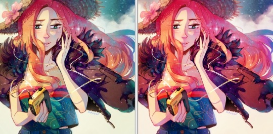
It’s magic, right!? I’m so used to having an overlay layer in every drawing now that these days i just slap one on before i even start colouring lmao. usually 20-50% opacity, usually a saturated orange or pink and then i’ll adjust as i go. mostly i just do trial and error like fitting wooden toy shapes into the right holes - my brain will go “ding!” when the arrow on the hue gauge hits a colour that looks good to my eyes.
The 2nd one, lighting, is more complex. I always say “lighting is everything” because to me it IS...it can control the entire mood of the picture. Where is the light? Is it hard or soft? is there a secondary light? What emotion are u trying to convey? and then how can you execute it? how would light look on THIS object compared to THAT object? A big part of lighting is being able to visualize your drawing in 3D. Once you can do that, you can lay down the light and shadows quite naturally depending on where your light source is. this ties into the way you DRAW things tho (like, u have to already be thinking about 3D while in the drawing stage) so i dont wanna get into it since this post is about colouring.
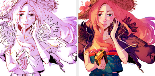
Lately I’ve been p lazy and doing all my major shadows on a single layer, set to “Shade” on sai (it might be something diff on other programs idk), 42% opacity (for this particular piece), and clipped to my folder of colour layers. So that means almost all my actual colour layers are just flat colours! Here’s my main shadow layer all by itself without any base colours (left), and then shadows + base colours (right):
sometimes i’m already thinking about lighting while im still sketching the picture. sometimes i’m already thinking about lighting before i even start to draw. For this particular pic I ended up with 5 different layers for lighting: 1) all shadows (42% opacity Shade layer); 2) some extra shadow under her hat (72% opacity Shade layer), which then allowed me to create the cool hat texture by simply erasing bits of this layer 3) a soft angelic backglow coming from behind her. this layer goes somewhere above the lineart layer to give the illusion of light spilling in front of her and fading out her edges; 4) secondary blue reflective light coming from the....sky im presuming, but mostly because i just felt like the drawing needed some blue lol; 5) a 55% opacity overlay layer containing a trace amount of vignette in 3 of the corners + an extra glob of light just to the right of her cuz i was experimenting with different instagram filters near the end and found one i rly liked and tried replicating it on sai 😂 Here’s the picture with only my main shadow layer (left) vs the picture with all 5 lighting layers (right):
The pic on the right makes her look more like she is Somewhere. I think I could’ve pushed the depth even more but i wasn’t confident enough. And sai doesn’t have blur tool :(
I also always have at least one layer that i name “extra”. The Extra layer goes on top of the colours/shadows/lineart layers, but under the overlay/glow layers. This is for extra details (including extra LIGHTING details) that I wanna add like extra sparkles, extra straw hat strands, hair strands, hair shine, zipper shine, etc all for that “extra” touch of realness. I don’t do all this stuff at the end, though. I have my Extra layer created pretty early on and i go back to it and add to it when I need to. Here’s what it would look like without the Extra layer (left), and with it (right). Try to find all the extra bits i listed:

One last note is i don’t colour one thing at a time. Before I start, I slap on all the base colours and all the shadows super roughly, just to check if my lighting and colour choices look good TOGETHER and make the entire composition look good. no point in spending hours rendering all the lighting and shadows on the character’s hair if in the end u decide there was actually a better lighting design u could’ve gone with. So here’s the rough colouring plan I made for myself before i started rendering for real:
im not sure if this was useful at all but i hope it was interesting at least! if you want to see my actual chronological process for colouring you can watch the gif of wips i compiled here: [link]. You’ll notice that i edit my lines as i colour. I think it’s good to be adaptable, and to be ready to go back and change ur lines to benefit your lighting, colouring, and overall look of the piece.
Also here’s the finished version of the pic: [link]
#Anonymous#miruask#miru art#tutorial#there's a lot more i didnt mention#i didnt mention my texture layers#cuz i felt too ashamed lol im just a sham artist using textures and overlays and texture overlays#textures can absolutely make ur colouring look interesting tho so try some out!#i didnt use a texture for the hat tho i did that all on my own and im proud#i also didnt mention locking ur lineart layer and colouring the lines themselves#but thats such an age old technique that im sure everyone already knows it
32 notes
·
View notes
Text
The Tumblr Beta Version: an objective analysis
I was tempted to just type “it sucks.” And while that is an objective analysis, it’s not exactly helpful. I’ve sent several requests to @staff and @support to restore my account to the old tumblr dashboard format, and received the same automated reply twice now. I’ll copy/paste it here so everyone is on the same page:
(lol, I had to go back and edit this, because apparently the beta version doesn’t display block quotes on the dash. So I’ve also put the block quotes in italics... hopefully it’ll display properly... note after editing: nope, it doesn’t display italics either... how the heck am I supposed to differentiate quoted text? I’ll start each quoted bit with an asterisk, I guess...)
*Thanks for reaching out about the beta dashboard.
*We're currently testing it out, and your account seems to have been selected to take part in the test. Thanks for your patience while we work on it! At this time there is not a way to opt out of testing. You may see your Tumblr experience return to normal as we continue testing.
WE CAN ONLY HOPE.
*In the meantime, check out some of the new features available only in the beta dashboard:
OKAY TUMBLR, IF YOU INSIST, though I would MUCH rather have back all the functionality I personally invested into this website through xkit... you know... making the site ACTUALLY FUNCTIONAL. Let’s see what this beta version has given me instead of functionality:
*Change Palettes: Go to the person icon, then click "Change Palette." You'll find the classic Tumblr blue, dark mode, and a few other color palettes for your dash.
So I tried out all the color palettes. In addition to the ones mentioned here, there’s one that’s trying to look like a green screen terminal that gives me flashbacks to the early 80′s. There’s a reason we stopped using green screen terminals... Another one is “canary yellow.” It’s very yellow. The “classic tumblr” isn’t actually classic tumblr... all the post boxes are dark blue with grey type, not white with black type. And all the other colors are the insanely bright fluorescent of the new Dark Blue standard tumblr scheme. Which means links are practically invisible unless I highlight them. It’s migraine inducing. The one theme with a light colored background is called “Concrete” or “Cement” or something like that and even that only works for about half an hour before the migraine aura really kicks in. I just want my Old Blue via xkit back. You know, what tumblr actually used to look like. I don’t want any of these horrible color palettes. None of them work for me.
*The new "meatballs" menu: This is where you can copy the post link, unfollow the Tumblr who made or reblogged the post, or report a violation to our Community Guidelines.
I could do all of this from the user menus with xkit, too. I don’t regularly report violations or have the urge to block people I have chosen to follow. Why on earth would I want to do any of this? And why would I want these features located directly beside the post link copy feature?
You know what I do miss? I miss the xkit timestamps feature. I didn’t have to hover dangerously close to the KILL IT WITH FIRE meatballs menu in order to see when a post was made, and in this era of disinformation and misinformation spreading around this site faster than Covid-19, being able to see when a post was ORIGINALLY created is a far more useful feature than an easier way to block people. For reference: I currently have three blogs blocked. Two of them are pornbots. One is a nazi. If I don’t want someone’s content on my dash, I don’t follow them. This “feature” is entirely useless to me.
*A quick note: Pagination is not supported in this beta test, but we're collecting feedback to send to our engineers.
THIS IS THE ABSOLUTE WORST. This beta test might actually be tolerable if I wasn’t trapped into endless scrolling. If I could page through my dash, refreshing it every ten posts or so. You know why? Because once I scroll about 30 posts down my dash, tumblr starts overheating my laptop under the load of ALL THOSE POSTS. Things start malfunctioning-- it takes longer and longer to load new posts the farther I scroll. And the keyboard navigation (both page down and hitting J to advance to the next post, and even just using the down arrow to scroll as I read a long post) freeze and stop functioning. One of my laptop fans has actually begun to malfunction.
You know why this wasn’t a problem on the old version? If the data load got to heavy, I could open a post in a new tab, click view on dash with xkit, and voila! Brand new tab! I could close the malfunctioning tab and everything would be refreshed to normal! But without pagination, THAT IS IMPOSSIBLE.
Also, after reblogging a few posts, the beta version of this site breaks, and doesn’t open a post tab to add commentary or even tags. It just... reblogs the untagged post with no warning whatsoever. You know... that’s really really not cool. I tag EVERYTHING. Well, almost everything. The tags are the only way to keep track of the 40k+ posts on my blog. And warn people that I am posting potential spoilers, or other specific content. It’s REALLY inconvenient to have to either immediately go to my blog to edit the post and add tags, or even comments. The alternative is to scroll up to open individual posts I want to reblog in a new tab, and then reblog directly there. Ironically enough, THOSE pages actually open with xkit installed, and everything (surprise!) functions perfectly there.
It’s perfectly reasonable to understand why this specific issue has limited the number of posts I reblog. Reblogging content should not be this much of a hassle. Creators have been complaining for a while that reblogs have drastically slowed down, and I think making it even more annoying and difficult to reblog posts will not help this problem.
Also, with xkit enabled, there’s a function that auto-loads images as you scroll, so the images are always visible BEFORE they appear on screen. I don’t have to look at the colored boxes and wonder if this is a post I’ve already seen or something I should sit and wait for. Don’t even think about watching tumblr videos. Loading priority is given to the ads that you cannot pause or dismiss, so that video loads and plays in choppy two second bursts instead of being given priority. Since that’s the content I am actually here to consume, it kinda makes me want to do the opposite of patronizing anyone who advertises here with graphically intense ads. And then when you scroll away, with xkit, gifs and videos you’ve scrolled past STOP loading and playing, which I think might be contributing to the intensity of the resource hogging that’s literally melting down my laptop.
And for reference, I have a pretty decent little gaming laptop. A blogging platform shouldn’t be driving it to the brink of frying itself. I didn’t realize just how much xkit worked to streamline this and provide basic functionality to this site.
*And lastly, if you're an XKit user, know that the XKit team is working hard to update things on their end to make it compatible with the beta dashboard.
And this doesn’t even begin to scratch the surface of what I’ve lost without xkit. And this is a really REALLY garbage response to user complaints. “Oh, yeah, sorry we made our site suck even worse, but those nice people who do our jobs for free will surely fix our garbage soon!”
Dear wonderful people at @new-xkit-extension, I love you, and I miss you, and while I wish xkit worked with this beta version I’ve been forced into living with, I truly feel for y’all who are trying to deal with this nonsense on behalf of all of us.
And to the folks at Tumblr... maybe try to just... make your site actually more like xkit. You know, actually functional. None of these special new features are useful or functional to me. I respectfully request for a fourth time to be removed from this inane beta test.
Give us OPTIONS. Let us display ALL THE TAGS without having to click a button. Let me have back my Activity+ that actually allowed me to interact with people from my dash! That showed me real-time inline notifications in a way that I could reply to with a single click! Bring me back to my column of open messaging conversation icons so I have easy access to the people I talk with throughout the day instead of closing them all every time I refresh the page. I already feel socially isolated in freaking quarantine, please stop shutting off all my avenues of communication!
Let us have pagination! I mean, maybe it wasn’t the best idea to force heavy users of this site into a beta version that doesn’t allow us to opt out until your engineers had actually figured out how to make it work in a very basic way.
*Let me know if there's anything else I can help you with!
YES. PLEASE REMOVE ME FROM THIS BETA TEST NOW. I have let you know exactly what I want from this site. I just want it to ACTUALLY WORK. For someone who spends 12+ hours a day on this site, this beta test version is NONFUNCTIONAL. PLEASE ALLOW ME TO OPT OUT. I AM LITERALLY BEGGING YOU. I WILL ACTUALLY PAY YOU CASH MONEY TO ALLOW ME TO OPT OUT OF THIS AND GO BACK TO HAVING A FUNCTIONAL BLOG AGAIN. WHAT MORE DO YOU WANT FROM ME?!
PLEASE!
I AM OFFICIALLY AT THE END OF MY PATIENCE FOR ENDURING THIS NIGHTMARE.
(one final quick note... I’ve only been back on my dash long enough to make the parenthetical edits-- i.e. adding italics that don’t display and then adding the asterisks at the beginning of each section of quoted text, and already my laptop is overheating again. For reference, I originally typed this entire post from within my tumblr inbox page-- which still functions normally with xkit-- and spent over an hour on it. My laptop was fine the entire time. Clearly the issue is this beta version of the website. I will never forgive tumblr if y’all fry my literal only portal to the outside world at this time. PUT ME BACK TO NORMAL NOW. THIS IS ABSOLUTELY INFURIATING AND ENTIRELY UNACCEPTABLE. Thanks)
(oops apparently i lied... when the asterisks and the previous final note failed to display, I thought that seemed suspicious, and realized that I literally needed to refresh my entire dash in order to see edited changes. Funny how xkit enabled me to do that in real time, which is just another bit of functionality I’ve lost with this beta program. Please guys, this is really, really not working for me at all, just put it back.)
#tumblr problems#staff#support#xkit#was this good enough for you? because I am totally done with this if that wasn't completely obvious#please end my suffering
130 notes
·
View notes
Photo

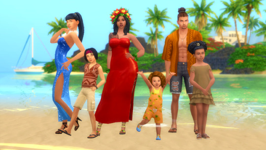

“Plum Under the Sun” An Island-inspired Followers Gift! 🌺
I just wanna say thanks and give to all eight-hundred-and-something of you big, hearty hug! I’m glad you guys enjoy my content as much as I do. This set is a little different from the others–it’s got something for all age groups. And also, the theme this time has kind of a summery, beach-y thing going on.
More info and download links below the cut~
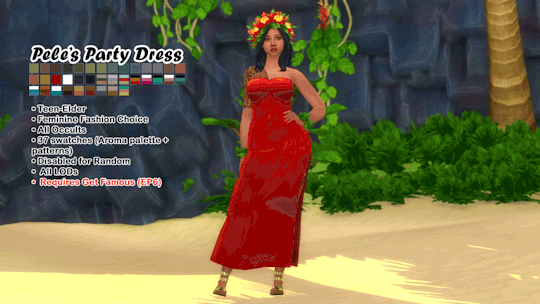
Pele’s Party Dress: A simple, yet elegant dress that doesn’t necessarily have to be worn only at parties. It’s also perfect for a nice stroll down the beach on a cool and breezy morning.
Teen-Elder
Feminine Fashion Choice
All Occults
37 variations ( @smubuh ‘s Aroma palette + patterns)
Disabled for Random
All LODs
❗Requires the Get Famous Expansion Pack (EP6)
I could not, for the life of me, find a single base game mesh that had the same number of cuts and similar UV weights. I’m so sorry!
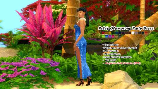
Pele’s Glamorous Party Dress: Now you know it’s gonna be lit when the Goddess herself has come to party! This is the sparkly version of the original dress.
Teen-Elder
Feminine Fashion Choice
All Occults
20 variations
Disabled for Random
All LODs
❗Requires the Get Famous Expansion Pack (EP6)
I could not, for the life of me, find a single base game mesh that had the same number of cuts and similar UV weights. I’m so sorry!
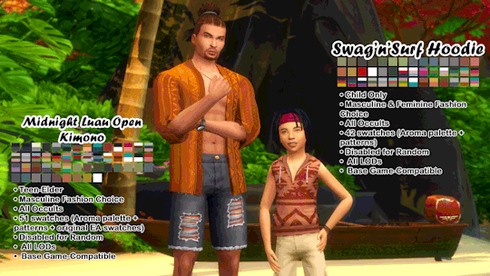
Midnight Luau Open Kimono: Whether it’s hanging out at the seaside bar til’ the wee hours of the morning, or just relaxing and enjoying a mai tai as the sun sets, this lightweight kimono will keep you cool and comfortable.
Teen-Elder
Masculine Fashion Choice
All Occults
51 variations ( @smubuh ‘s Aroma palette + patterns + Original Maxis swatches)
Disabled for Random
All LODs
Base Game-Compatible
Swag’n’Surf Sleeveless Hoodie: This rad hoodie is 100% light cotton through-and-through, allowing you to stay cool and look cool as you do some really awesome surfboard tricks and stuff. Shaka brah? More like shaka–bruh, this hoodie is so comfortable!
Children Only
Masculine and Feminine Fashion Choice
All Occults
42 variations ( @smubuh ‘s Aroma palette + patterns)
Disabled for Random
All LODs
Base Game-Compatible
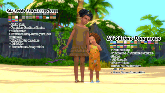
She Sells Seashells Dress: If you even step into the seashell-selling business, you’ve got to make a great first impression! Dress to impress in this cute, ruffly off-shoulder dress! Okay, okay. You don’t have to do that. It’s just that this dress is sooo adorable that we felt the need to advertise it. Oh yeah, and anyone can succeed in the seashell business if they put their mind to it.
Children Only
Feminine Fashion Choice
All Occults
32 variations ( @smubuh ‘s Aroma palette + patterns)
Disabled for Random
All LODs
Base Game-Compatible
Lil’ Shrimp Dungarees: This cute and colorful pair of overalls is perfect for playtime, splash time, or…even nap time, if you wear yourself out enough.
Toddlers Only
Masculine and Feminine Fashion Choice
All Occults
22 variations (including some Maxis swatches)
Disabled for Random
All LODs
Base Game-Compatible
————————————————————————
Feel free to recolor or edit! Yep! You can include the mesh, too! I have a very lax TOU. I don’t even think I should consider it a TOU. But feel free to check it out if you like reading the boring technical stuff.
A list of CC, Mods, Programs, and Resources I use a lot can be found HERE.
Questions, WCIFs, or anything? Feel free to hit that Ask button! I don’t bite. ;o)
And as always, if you encounter any problems with my CC, let me know!
Much thanks and love go to the brilliant minds behind Sims 4 Studio, the wonderfully talented individuals whose CC and mods I use, and of course, Maxis! Otherwise, I don’t think this post would’ve ever existed. XD

————————————————————————
Download Links: Sim File Share | OneDrive
Above links house a folder containing individual packages that you can pick and a zip file containing both packages.
PSDs for Recoloring: Sim File Share
All packages except for the Lil’ Shrimp Dungarees include a solid white swatch you can export and use for recolors as well.
My Dropbox is full right now, that’s why there’s no link for it. However, if you experience any issues accessing the above links, feel free to shoot me a message! <3
I do not use adfly, or anything like that. My links will always take you directly to the download source. :3
#hypergnomeimblr#it's pure sim-sanity#800 follower gift#followers gift#plum under the sun#yfcas#ymcas#toddlercas#childcas#maxis match#ts4cc#custom content#the sims 4#dress#kimono#dungarees#overalls#summer#thank you <3#smubuh
657 notes
·
View notes
Text
Campfire Stories (Vol. 1)
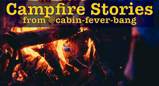
Welcome to the Cabin! We proudly present the first edition of Campfire Stories: your one-stop shop for quality quarantine content.
We’re going to do these regularly, with in-depth reviews of everything that’s been submitted as a prompt fill and additional recommendations from the masterlists of writers who get involved.
If you’d like to be one of those writers, just follow us, comb through our prompts, and be sure to tag us when you post! It’s that easy. We welcome all fandoms and pairings.
This batch of reviews was cooked up by @thoughtslikeaminefield (MJ), @there-must-be-a-lock (Lou), @itmighthavebeenintentional (Val), @fangirlxwritesx67 (Viv), @cracksinthewalls (Bri), and @mskathywriteswords (Kathy), but we encourage you to pass along the random acts of writer-love and reblog with your own additions!
Pull up a seat, toast a marshmallow or two, and settle in for some excellent reading material.
Choices We Make - @becs-bunker - GIF prompt submitted by @dawnie1988
Pairing: Demon Dean x Female Reader
Warnings: angst, brief threat & violence, smut, language, dub con-ish, unprotected sex, orgasm denial
Words: 1374
Everyone loves a Demon!Dean fic, and this is a good one! Lots of action, lots of angst, and some really hot, awful Dean.
Honestly it all felt like some surreal nightmare you couldn’t wake up from. You just wanted Dean back, your Dean.
These lines summarize both the Demon!Dean story arc and the narrator's frame of mind so well, pulling the reader right into the perspective of the story.
“I missed you, y’know?” Dean sighed, and the naive part of you wished he was telling the truth. That somehow, deep down, he still loved you.
This is heartbreaking because it's relatable, because the author does such a good job with the narrator's voice.
Dean licked his lips and there was a familiar hunger in his green eyes that made a whole different sensation rise in your body, and it wasn’t fear.
I'm not going to quote any more lines from the story because the author has written one hell of a twist, but trust me when I said, I gasped out loud reading it. The rest of this story is an absolute roller coaster, well worth the ride.
- Viv
Come For Me - @fangirlxwritesx67 - image prompts created and submitted by @idabbleincrazy
Pairing: Sam Winchester x female reader
Warnings: smut, canon level violence, fingering, first time together
Words: 3100
First, let’s talk about this aesthetic. It’s soft and beautiful, but stark and needy. I love the quotes and photos, the way they flow together. Fantastic visual prompt. "Sam Winchester?” He spoke in a theatrical, mocking tone. “Ooooh, I’m frightened." This line made me chuckle. I love the idea of what’s ahead of us. The bad guy is built up in a hilarious way. Sam is presented through the heart and mind of the narrator, you. But thinking of Sam suffused you with a warm confidence. Not for one moment did you doubt him. This confidence is contagious and warming. Meanwhile, the anxiety over the vampire lurking somewhere else, waiting to taste you… it builds in a beautiful and believable way. There’s a rush of emotions as Sam rescues you, and he’s patient and kind, even while making jokes and being the Sam you know and love. Things progress, and there’s a beautiful and sweet (okay, and hot!) sex scene, with a first time between Sam and you. All in all, a really solid piece, with some story, some tension, some sex, and a whole lot of sweetness.
- Kathy
A New Day - @becs-bunker - image prompt created and submitted by @there-must-be-a-lock
Pairing: Sam Winchester x Reader
Warnings: fluff
I’ve not reviewed an image prompt before, so let’s just jump in. The first word that jumps to my mind is light, but I love how suffused and golden the whole image is. Softer, safer, intimate. There are little pinpoints of light, rays of light, shining light, and the whole thing makes me feel...well...light. Sunrise and candlelight, new day, new beginnings.
The images chosen for Sam, the angles and features we get, are such close, personal angles and shots, giving us this tender atmosphere and setting the tone for this story: personal. Everything you're about to read is intimate, personal, and private, in such a lovely, delicate way.
The curtains in that first shot are so filmy and ethereal, and the whole story feels like it’s set in a kind of golden-hazed forest. And, let’s face it, any sort of vacation for a Winchester is a kind of fairy tale.
I’ve managed to stay pretty much above the brow, so Imma have to dip down for a minute and just drool over Sam’s trapezius muscles. Oh. MY. GAWD.
Golden, glorious, graceful, and just a touch of gooey. Good, good, good.
So, right off the bat, let me tell you that this story is everything I’ve ever wanted for Sam, like everything the show and Chuck and the universe has ever denied him. He’s rested, he’s comforted, he’s bathed in glow (the sun, the reader’s love, all that jazz, you know?).
And then it goes and hits all my camping weaknesses. I was literally just telling someone how I’m missing my camp more than ever now. It’s been eight years since I’ve been, and this story brings back all those feelings of serenity and calm, voluntary isolation with people you more or less chose, because camp was and is my forever real home.
I know that seems a little rambly and off-topic, but the thing is, that’s what this story is for me. They aren’t at the bunker, their “home,” but they’re still home all the same, because (and, yes, you can shoot me for this) home is where your heart is, so this wonderful little cabin in the woods is home, whether they’ve been there together once or a hundred times because Sam.
And then that bit of sugar tossed in at the end...Oh, this story was good for my soul. “Warm mug of coffee on a chill morning, under a blanket” kind of good for my soul.
It’s one of those where I would love to have so much more of these two, of this warmth between them, but I also am perfectly content to know them just in this one perfect moment forever, before the day starts, when everything is still in the “it’s about to happen and it will be great” stages. The beginning of a great new day.
Thank you. I needed this story, now more than ever.
- Val
Crash - @myinconnelly1 - requested by @adoptdontshoppets for @idreamofplaid aesthetic
Pairing: Dean Winchester x reader
Warnings: smut, fluff
Words: 810
The first thing that draws my eye in the aesthetic is the linked fingers. I love pinky links (I’m sure there’s a less cutesy way to say it, but I like it; sue me). They’re sweet, and really personal. You’ve got super tough Dean Winchester who isn’t embarrassed or afraid of intimate, goofy gestures. In fact, I feel like that would one hundred percent be Dean in a relationship: Dean is a giant ball of goofy, intimate gestures.
I love the choices of relaxed, bearded Dean/Jensen paired with the casual, cool color palette immediately set me at ease. This isn’t going to be a terrifying, angsty ordeal. This is going to be calm, soothing, sensual.
And the roses, the sand, the surf, the candlelight, the pokey palm tree fronds...I can hear, smell, feel every bit of these images. The golden-pink wine...ugh. This whole experience is a trip to paradise.
I love how all five senses are emphasized and made equally important. It gives us so much more connection to the moment, makes it that much more intimate. The constant crashing of the waves in the background; the bittersweet chocolate; the cozy, homey image of the baking-wrecked kitchen followed by the much more erotic, candelit bedroom; and then the scent of the oil mixed with the warmth and strength of Dean’s touch.
I also love the level of comfort in the story. We have the cookies, a hard-core comfort staple. We have the warm, lazy beach setting. And the easiness these two have together: that’s the dream, my friend. I love how they have no trouble at all communicating what they want and need, how they are comfortable enough to be messy and cute and flirty and sexy, one right after the other.
And the description is so thorough, I have no trouble at all imagining myself there, in that wonderful, relaxing moment.
This story is relaxing, decadent, soothing, and fun all at once. I am a huge fan of the ending, as well. I was smiling through the whole story, but at the end, I literally laughed aloud. And now I think I’m going to have to excuse myself to go find some chocolate chip cookies. This story gave me a couple of cravings, and as Dean Winchester is in short supply in the real world, cookies are the one I can satisfy right now.
This story is, dare I say it, such a sweet escape.
- Val
No Sugar Added - @myinconnelly1 - requested by @fangirlxwritesx67 - “I’d like to see Steve Rogers from MARVEL sharing Depression-era coping tips. Maybe he vlogs how to make apple-less apple pie.”
No pairing
Warnings: Spoilers for Infinity Wars + Endgame, mention of mental health issues
Words: 446
This was my prompt for the Cabin, and I loved what this author did with the story! A little bit of fluffy cheer.
“Hello, I’m Steve Rogers. As many of you know, I’m also Captain America, and I was alive during another time of hard living conditions.”
Right now, a lot of things in the world seem scary and unsettling. It's one of those times when we turn for comfort to the lessons of the past, to the wisdom of generations, and to heroes. This author does a great job with Captain America, Steve Rogers. His cooking lesson is exactly the sort of inspiring, instructional video I would love to see.
“What is that smell?” Natasha asked as she looked behind her to see Steve walking into the office with the plate.
Because it was never about pie, apple or otherwise. It was always about comfort. Our favorite foods help with that, and so does Captain America, especially written this well.
There are some fun tidbits in this story, including a peek of history and an actual recipe!
- Viv
Communion - @thoughtslikeaminefield - requested by @mskathywriteswords “Fluffy dean or Jensen smoking weed plz, ty”
Pairing: Dean Winchester x unnamed female character
Warnings: marijuana use, high sex, het sex, fluffy smut
Words: 1002
How do I love this? Let me count the motherfucking ways.
First of all, the way this sucks you into the characters’ headspace is beautiful and subtle and masterfully done. It’s in the sentence structure and the flow of the words; there’s no need to describe their inner state, because it’s written into the movement of the sentences and the choice of words. She doesn’t have to say that they’re high, because you can fucking feel it in phrases like “It’s sending me off somewhere…” or “I shiver at the thoughts careening through my mind.”
Second, this is molten hot, but (as with the best smut) it’s not just some rote story of “then he was hard and we banged and it was great.” The sexy bits are unique; this isn’t the same smut you’ve read a thousand times before. It’s got its own personality and tone and voice that very much belong to this particular story.
Also? Filth with feelings! My favorite genre! It’s deeply emotional. I am all for smut that is both dirty and tender. This is like a masterclass on how to walk that line.
It’s such a simple premise that becomes so much more; this has things to say about Dean, about his personality, about this relationship. This takes a very specific moment and uses it as a framework for something big and meaningful. This, for example:
When Dean has to be big, he uses his whole self. His body takes up space and his mere presence -- he can make the darkest of demons shudder with his presence alone.
But Dean’s natural state is this -- nesting, nuzzling, curled up and warm.
Yuuuup.
Also:
His hands -- the same hands I’ve seen thrust a blade into the guts of angels and demons -- are tender, fingertips light but persistent as they slip under my tank top and splay over my belly.
It’s so intimate. This is why we read fanfic, right? To feel like we’re close to these characters that we love so much, to delve into the sides of them that we don’t get to see much in canon… this fic feels like something personal and private that we’ve been lucky enough to be let in on.
- Lou
Deeper Than Deep Conditioner - @fangirlxwritesx67 - requested by @awesomesusiebstuff “The two Sam’s (our Sam and AU Sam) maintaining their hair care routines while quarantined.”
It’s one of those days when I’m feeling too fragile for this world. What’s the best remedy to knock some sunlight into my dark mood? Today, it’s fic -- and one that makes me giggle is a bonus.
This little gem is filled with funny one-liners and side-eye moments to make you laugh out loud:
Dean dreamed of driving away, of bikini beauties on the beaches of Rio. Sam dreamed of scarves and what it would be like to have no bigger worries in the world than his hair.
The look Dean gave him would’ve curdled milk, if there was any, which there wasn’t, because Dean took his coffee black, like a man.
A touch of realism in this bizarro situation got a chuckle, too:
“Sorry, sweethearts,” alt!Dean said, “Flights are all cancelled. A virus or something.”
When Viv named the alternates Deano and Sami, I gave in and embraced the madness. I was delighted with Deano; that’s my own nickname for Dean in my head. But Sami, a most pretentious twist on Sammy? A master stroke. I was tickled.
I was fully on board with enjoying this romp through the bizarro world, but then I was taken by surprise. This little moment, a hint that Sam has been trying to make the best of their circumstances, touched me:
“Is this really how you live?” said Sami, with a dismissive glance at his paper napkin.
“Look,” Sam answered. “I’ve done my best. It’s taken a lot to get us this far.”
I was prepared for that to be the exception to the rule -- a moment of sincerity amongst a sea of lighthearted fun. And there was plenty of fun ahead of me. The jokes come at you hard and fast in this story! But I realized the mood was steadily changing, and suddenly, I was immersed in sincerity and maybe a little sadness:
...somewhere out there, was a universe where he pampered himself...
...maybe there was a place where he could enjoy something as simple as a deep condition...
...something Sam had wanted to watch but never had time for...
...for the first time in a long time, he caught himself laughing...
I thought maybe that was it. A few moments of Sam learning to appreciate what Sami (I was still laughing at that) had to offer, instead of simply mocking his manbun and scarf (I don’t think I could ever stop mocking that, but Sam’s a better person than I am).
But no. It didn’t end there, and I still wasn’t ready. Before I knew it, I was steeped in Sam’s melancholy, his yearning for a life kinder and gentler than what he’d been given. I was truly heartbroken for him in that moment.
I won’t spoil the rest, but by the time I got to the ending, I was grateful for the funny beginning that softened the landing. I expected a comedy, but what I got really was deeper than deep conditioner.
- Bri
Dear Mr. Fantasy - @itmighthavebeenintentional - image prompt submitted @thoughtslikeaminefield
Warnings: SEASON 15 SPOILERS, bit of angst.
Words: 2157
I found the image prompt in my Tumblr feed and immediately started plotting ideas that I cannot write bc I have too many fucking WIPs so imagine my excite when one of my all-time favorite fic writers (and one of my very best friends) filled the prompt as a surprise for me!
Val tells stories with a depth and humor like no one else I’ve ever read. Her natural wit and smarts shine through her fictional words as well, and I love seeing glimpses of her in her work.
In one universe, someone neglected Baby (couldn’t have been Dean, had to’ve been Sam) to the point where she pulls slightly to the left. Dean spends the morning after that dream with a muscle tick in his cheek and a suspicious, side-eyed glare for Sam that he never bothers to explain.
Dear Mr. Fantasy is bittersweet. It is soft and rich and full of color — all the senses are here. It’s a sledgehammer of realism wrapped in velvet. And it’s so very Dean.
At forty-eight years old (none of that years young bullshit, either; he’s old, and he’s goddamn earned it)
In the midst of reading canon Dean dreaming of and admiring and protecting his favorite of his AU-selves and that version’s life, we are treated to what it would be like if he was allowed a normal life. Our devoted, brave, warm, and loving hunter as a common mechanic would be just as brave and loyal, no?
“Pretty sure she’s settled on ya, so just make sure you’re worth it.”
So that’s what Dean did.
But our Dean — the Real Dean as Chuck says — can’t quite let his guard down even in his dreams of another world, even if that other world is safe as houses. He’s still aware of just how unreal this reality is.
Splashes of indigo and orange paint the horizon, framing her approach in a wash of colors blending into shadows that hold no danger.
Then, he lets himself mingle with that dream, if only for a few moments and it’s bliss.
Older Dean and worn-out, monster-plagued Dean sigh together, content down to their bones. This life is it for both of them. She is it. One Dean still can’t believe his amazing luck after all these years, and the other aches at the simple, total happiness he feels honored to witness.
I love you, she whispers, and he allows himself to believe for one moment that she’s talking directly to him.
I’m not going to spoil anything for you, but I will say that you need some tissues. I cried through 90% of this story, from joy and from heartache.
Because that’s what Valerie does, breaks your heart and makes you smile, and it is so fucking good.
- MJ
Synesthesia - @there-must-be-a-lock - request by @wendibird “SPN, Sastiel, due to all the Angelic Grace Sam has been exposed to over time, he starts resonating with Castiel’s. Especially if Cas’ emotions are running high.”
Pairing: Sam Winchester x Castiel
Warnings: none!
Words: 750
First, I love the song that enhanced this idea for Lou. It lends a tenderness and whimsy to the plot that isn’t inherent.
Second, Lou’s words are like poetry and watercolor doing a dance of their own making — GORGEOUS phrasing and rhythm.
Cas whirls around, and Sam is hypnotized by the bright blue in his eyes, wide and concerned in a way that makes Sam feel like he’s being lit up from the inside. There’s a floodlight in his chest.
And, y’all, I don’t even go here, but I swooned SO HARD.
It’s an effort to focus, but when he meets Cas’s eyes, Cas smiles. Sam sees a shower of sparks like the last fizzle of a firework.
Sam hears it as a flutter of spring green like a new leaf.
And Lou’s characterization is always spot on, right? But like Dean isn’t even in the scene, yet here we are.
Don’t let the words fool you; there’s a very angry rainbow happening in his head most of the time.
And did I mention the ARTWORK that is this woman’s WORDS?
There are stars under their feet, entire galaxies spinning out around them, dancing spirals of kaleidoscopic green and gold melting into whorls of brilliant blue.
Anyway, please go read. You’ll be flying high for hours afterward. xox
- MJ
Salvation - @dontshootmespence - image created and submitted by @idabbleincrazy
Pairings: Sam Winchester x reader
Warnings: angst, torture, gore, smut
Words: 1,401
The aesthetics by this artist inspire stories just because they are so well done. This one was a good balance of handsome Sam and some nice suggestive pics along with the phrases that helped shape the action of the story.
This story feels like an episode of the show from earlier seasons, just the right balance of angst and monster fighting with tantalizing peeks of smut and feels. Excellent job!
There are no words that come close to explaining what she means to him. How she saves what soul he has left.
These flashback scenes are both hot and tender. The voice the author gives to Sam is spot on, achingly familiar.
"You're Sam Winchester, the boy with the demon blood."
It's easy to forget, sometimes, all the things that Sam has been and done, how fearsome of a hunter he is. This story reminds us with razor sharp precision.
When he meets her gaze, he finds the peace he's craved for so long.
The contrast between the flashbacks and the action is painfully good.
What’s more frightening, a man like Dean, practiced in his violence out of necessity? Or a man like him, on the verge of losing everything and nothing left to lose?
This is a well drawn distinction between the Winchester brothers, and such a good characterization of Sam!
"You're safe with me, Sam. You never have to hide from me."
Such a beautiful relationship between Sam and this woman! It's no wonder he's fighting so hard to save her.
This story has an imaginative plot, fast paced action, some sweet hotness, and such a good Sam!
- Viv
The Second Hand Unwinds - @mskathywriteswords - image prompt created and submitted by @there-must-be-a-lock
Pairing: Dean Winchester x reader
Warnings: hurt, comfort, angst
I had a vibe in mind when I created this aesthetic but this went so far beyond anything I could’ve imagined. It absolutely nailed that nostalgic, wistful, antique-photo-album feel, and then it managed to knife me in the fucking gut in a few ways, none of which I saw coming.
The JOY in the first part of this is absolutely tangible. It’s so romantic and sweet in a very dreamy way that feels exactly like first love. I love the scattered, disjointed imagery around the flowers in the first part, like flashes of memories coming at you all at once, and then when it settles into the narrative it manages to hold onto that dreamy feeling while still moving neatly through the plot.
This moment was about us, and I wanted to live in it forever. You never gave me reason to cover my body, not that night or ever.
Goddamn right. Ugh, precious and beautiful. And then this:
After so much undiluted time together, I had no idea how to sleep alone. I felt raw waking up by myself, not being able to feel your stubble tickling my skin.
There’s something about that last line that just grabbed my heart and tugged it in a wonderful way. It’s ACCURATE, first of all; this is one of those super-specific feelings that is hard to describe concisely. I haven’t really thought about that feeling in a while, but that little sentence just cut through so many years and brought me right back in a deep and visceral way.
You took pride in doing all the things that were never done for you, you’d told me.
Ouch. It’s little touches like this that make this ring true to character even though it’s a very different Dean than we see in canon.
And then that ENDING.
How do you contain a bomb once it’s been set on fire with grief?
Fuck, dude. Everything about that ending was so painful. I love that she left it raw and messy and not like a simple “welcome back!” kinda moment.
This was just gorgeously done. Can not recommend it enough.
Fort - @there-must-be-a-lock - prompt by @mskathywriteswords “Fluffy dean or Jensen smoking weed plz, ty.”
Pairing: J2 x reader
Warnings: blowjobs and weed.
Words: ~2150
This piece of deliciousness opens with Jensen walking out of the bathroom with a towel on his hips; do I need to say more? I don’t, but I will. After some beautiful description of the blanket fort, we get treated to Jared in nothing but pajama pants. The descriptions in this piece are vivid and full. the way Jared’s hand looks between Jensen’s muscled shoulderblades, thumb stroking back and forth between patches of gold and red light, makes me want to capture the moment and hold onto it. I can see that image in my mind, picture the two of them together, and that’s what makes excellent writing for me. The warnings attached to this piece are fully applicable; the story is very cute and sweet, there’s weed, and there’s Jared and a wicked oral fixation, which in the case of this one-shot means dear Reader, that’s you, get to witness a searing blowjob from one J to another. The way these three interact makes my heart swell, and there’s something about watching the dynamic change between them that really hammers home just how functional they are together. Dive in to this universe, Everything. There are no regrets to be had, maybe only that you waited so long to get wet.
- Kathy
The Gazelle - @thoughtslikeaminefield - requested by Anonymous “I’d really love some more Dean x Benny fanfiction, AU, aligned with canon timeline, whatever. I think they deserved a chance and Benny got killed off before it could even be explored :(”
Pairing: AU Dean Winchester x AU Benny Lafitte x unnamed female character
Warnings: power exchange, mmf threesome implied, Denny apparent, nudity
Words: 1000
Let me start with a caveat: I’m in the bag for pretty much any Dean x Benny fic, pretty much any Dean x Benny x person #3 fic, and absolutely any MJ fic. So you could stop reading this review right now and just go read the fic, if you want; in fact, I sort of recommend it, because it’s better than anything I could have to say about it. But if you want to stick around, I promise to be a little more coherent than ZOMGGGG PERFECT HOT SEXY TIMES DENNY LOVE GORGEOUS MORE PLZ!
Before we even get to the words, we’ve got a gorgeous graphic. Black and white beautiful boys, staring you down with those “I’m gonna fuck you so good” eyes, paired with a sweetly sexy woman tinted with a soft pink; she looks carefree, open to have some fun, and you can imagine her telling them to bring it on. MJ’s graphics are always great, setting the perfect mood for her fics, and this is no exception.
And right from the jump:
Dean and me — we share a lot of things.
We share good music and good drink. Tonight, we’re sharing a good woman.
Oh, this is in Benny’s voice?! Okay okay okay, cool cool cool, I can handle this…
...Dean purrs like a jungle cat as he hovers behind her, hands in her hair, twisting and twirling the silky tresses…
...Dean sets the pace and is the anchor, always. He keeps everything stable and grounded…
And now I’ve realized that I’m going to be seeing Dean through Benny’s eyes -- and no, not cool, can’t handle this -- but I’m definitely not stopping.
I like to mix things up, though, and he lets me.
MJ is a brilliant writer with many talents, but I think her specialty, regardless of what characters she’s writing with, is brilliantly salacious smut that’s steeped in emotion. She can’t help it. Her fucks come with feels, every single time, and I hope it never changes.
This piece is certainly no exception. Dean and Benny are circling their prey, this unnamed woman, utilizing their individual strengths -- Dean’s encouraging, I’m demanding -- and the sexual tension is building with soft touches and lingering kisses. As the scene is progressing, Benny’s inner monologue is sprinkled with thoughts about Dean:
Times we don’t have a subject, Dean’s focus is on me. I don’t argue and I do not complain. Dean knows what to do with every inch of that long, lean body of his. He knows how to cage a person in, make them feel safe, wanted, fucking needed.
She’s handily building emotion and a personal backstory without an exposition dump, without taking focus away from the action for too long:
His hands move slowly, seemingly random, but I know how focused he is on her and the moment. Giving and seeking pleasure are vital things to Dean and he takes the acts to heart.
I’m immersed in the now of this scene but I also understand the depth of their feelings for one another, their history and dedication to each other, and how they work together to bring another partner into their orbit. MJ makes it look easy, when it’s anything but.
And then she gifts us with this perfection and I’ve melted into a puddle of emotionally aroused goo:
“You promise to love, honor, and cherish ‘til the morning light, Dean?”
That is a vow of devotion to a one-night stand. What?! How?! Does her brain come up with this?
From there, the scene continues, the action escalating, supported by a framework of realism and heart. Her Dean feels familiar and in character, even though we’ve never seen him in this particular situation. And Benny, we hardly knew ye, but she brings him to life alongside Dean and I buy their relationship completely. I buy all of this, and now I’m invested.
And then…
“Do it, then,” she says, challenging. “Wreck me.”
My breath catches, my heart starts to race -- yes, here we go! -- a few more sentences, one last connection between Dean and Benny, and then --
Oh, you are evil, MJ. You are so perfectly evil and I wouldn’t have it any other way.
- Bri
#random acts of love#cabin-fever-bang#cabin fever bang#fanfiction#fic rec#rec list#bear hugs#welcome to the cabin#campfire stories#writers supporting writers
50 notes
·
View notes
Note
Did you steal the endophobic flag from the plural community??? They look exactly the same so I checked to see which one was made first. The endophobic flag was made first.
I’m going to put this bad boy under a cut because it has some large images and paragraphs so apologies if it breaks for mobile users and shows you an absolute mess
TL;DR: No, and you can read about the actual flag this flag is based on/a community continuation of on @archivalflags that was posted on August 15th 2016, and about historical color choices and community changes/proposed varients on this blog.
(I believe this is the flag that you’re referring to but if it’s not please send me a direct link to the one you are talking about)

If anything I believe it’s more similar to an MLM flag proposal (pictured below) made by pride-and-pokemon in both color palette and stripe layout seeing as they both have a blue gradient on the top and a green gradient on the bottom (so blue-white-green versus teal/green-white-light blue-deep purple) but I also don’t think that MLM flag proposal was intentionally ripping anyone off

It’s been plainly stated and linked from day one that the flag pictured below is what this proposal used as a starting point and I. It was originally posted in 2016 on August 25th and had green on the top with dark blue on the bottom, you can read about it in-depth and with sources on @archivalflags because the history is a little muddled.

The reason for this was that I saw that people loved the flag and were drawn to it, but had some valid complaints about it (dull colors, no stripe meanings, etc.) so on a whim at my old job I used the medibang paint app and brainstormed things like “yeah the white stripe looks good aesthetically, but how can I make it meaningful?” and “how can I incorporate historical references into this with the colors?” and decided it would be way better as a community input-type project and now we’re here.
I believe I’ve made this point on Twitter before but when it comes to proposing flags, especially within communities like the gay community which has established historical symbols and colors, you’re going to run into a lot of flags that have similar colors and set-ups. I personally don’t think this is a bad thing because it gives people a lot of options and also I am just a sucker for seeing lots of cool flags.
Another thing is that I don’t really believe in just straight-up taking a flag that was made with different intentions for one group and trying to use it for another (this is why, due to set-up similarities in the 7-stripe versions of the flag inspired by the OG proposal, I listen to design input from my Lesbian mutuals to avoid that issue). I think that when making a flag, especially a serious pride flag for a very large group of people, you should put positivity, love, and pride for that group into it from day one. It might be a little bit romantic of me but I do believe that a pride flag should represent.... well pride in who you are and in your life!
I also believe in trying to listen to as much creative input as possible from said group which is why this flag has so many different variants with different stripe counts and color differences suggested and designed by people that aren’t me! (if you haven’t checked those out you can on https://gayflagblog.tumblr.com/flagvarients, I also have some miscellaneous tags for more niche color edits floating around)
(Just cover all of my bases I want to state: I don’t really know what “endo” or “endophobic” fully means in this context [the only endo I’m fully up to date on is my endocrinologist], and I’m not educated or informed enough to speak with nuance or respect so I’m just not going to address any of that. I’m sorry if any language is off here, not my intentions.)
EDIT: I was asked to tag this as “syscourse” at the request of some of my followers.
#sippingmylgbtonig#syscourse cw#syscourse tw#EDIT: I was asked to include the following trigger tags. Please let me know if there are any I missed.
14 notes
·
View notes
Text
#showyourprocess
From planning to posting, share your process for making creative content!
To continue supporting content makers, this tag game is meant to show the entire process of making creative content: this can be for any creation.
RULES - When your work is tagged, show the process of its creation from planning to posting, then tag up to 5 people with a specific link to one of their creative works you’d like to see the process of. Use the tag #showyourprocess so we can find yours.
sabrina @lanwangiji tagged me to show how i made my zayn’s birthday edit! check out her explanation on this mesmerizing zayn’s edit
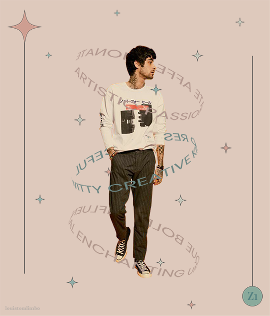
1. PLANNING
It’s Zayn’s birthday, I ought to make something because so far I have made birthday posts for Louis, Niall and Liam. I didn’t participate in his birthday challenge so I had more time to create something for his birthday. I saw this post by @spaceniall and instantly fell in love with it. It's so clean, so neat, an amazing edit. I had that post tagged for inspo and because my Louis’s birthday edit was a bit “grand”, I thought I should make something simple.
I went to look for some photos of Zayn everywhere. Literally e v e r y w h e r e. I saved every photo I found beautiful and there were a LOT. I asked my friends for adjectives that describe Louis best and added them on my Louis’s birthday post, and I followed that approach for this edit. I asked several friends what they think of Zayn and collected the adjectives.
This was a time where I haven’t used trello board, so I put all the adjectives in a google doc. Seriously I swear by trello board, they make my life easier.
After I had all the photos and the adjectives, I went to pinterest to look for the color palette. I forgot how and why I came up with this color scheme, but I believed I wanted something pastel and muted color.
I had this idea to make an evergreen birthday post. I didn’t want to state any “happy birthday zayn” or his age on the graphic. I didn’t want to make all the edits to have his face because I wanted to showcase my graphics and typography style lmao. So I came up with 2 pictures with Zayn’s face and one central picture with his name. And I’m obsessed with space stuffs so this birthday edit is space themed.
2. PROCESSING
This is one of my earliest edits that I made in Illustrator, though I used Photoshop as well.
2.1 REMOVING PICTURES BACKGROUND
Remember I saved a LOT of Zayn’s photos? Yeah? Well I had a hard time choosing the right one. I asked Sabrina to help lmao. After I agreed with myself which photos I would use, I opened Photoshop and prayed it won’t crash after 5 min.
I uploaded the 2 photos and then I used selection on Zayn and then clicked inverse and deleted the background. Recently I found this website who can delete your background in 1 min, tbh that’s a life saver. I recommend using them, if you hate removing backgrounds with Photoshop.
I saved the backgroundless Zayn’s photos as png. And we’re moving on to the next step
2.2 THE TYPOGRAPHY
I only used Photoshop to remove the backgrounds. Now onto Illustrator. Always pray it won’t close by itself every 5 min.
I don’t really remember which dimension I used, but I suspect it’s 600x700 px. I made 3 artboards and loaded the color palette I found from Pinterest. I made 3 rectangles as the backgrounds for each picture and filled them with my desired colors, 2 pink and 1 green. Green being the standalone was put in the middle.
A bit of excursion based on my experience
When you open an artboard in Illustrator, you’ll see a white background. When you save the file you’ve worked on, it’ll actually be transparent. That’s why I always draw a rectangle as a background so it has a solid color.
I focused on ZAYN (middle pic) first because I wanted that to be the main focus. I don’t remember the font I used and I already deleted all files. I followed this tutorial to make the text. Basically you write your text first and choose effect > 3d > extrude and bevel > isometric top. Changed the colors according to my color palette.
I moved on to the first picture, Zayn and the adjectives. I uploaded his photo to the artboard and put it in the middle. I wanted the adjectives to encircle him. I just followed this tutorial on how to make the effect. I made that text effect because that reminded me of the saturn ring lmao.
2.3 THE GRAPHIC DETAILS
Once I got the typography done, I made stars and moon to make the edits merrier and more space themed.
For the stars you can follow this tutorials. For the moon I made 2 circles, one of them was bigger. I put the smaller one in front and click minus front (I think). For the saturn planet, I made a circle with filling and an oval with stroke only, putting the oval infront of the circle and delete the back part of the ring (I hope this makes sense).
I have these lines around Zayn, my intention was to make Zayn pop and kind of crown him or give him a glowy effect sort-of.
All I did was follow this tutorial and delete the lines at the top, because I didn’t want it to be too crowded. Then I put some stars and planets at the top to balance it.
2.4 FINISHING TOUCHES & EXPORTING
I rearranged some things, zoomed out the artboard so I could see everything as one post and picked and deleted some unwanted things. After I was satisfied, I added my watermark and it was my old url, I just typed louistomlinboo. (Now I made a logo-ish and use that as my watermark and the logo is not dependent on my url)
Ok I lied I used Photoshop again… so I had these adjectives in 2.1 that encircled him right but some parts of the texts are above him. I exported my Illustrator file as a psd, uploaded it on Photoshop and used layer mask magic to delete the texts that were above him to create an illusion that the texts went around and under him you know. See the picture below, some texts are beneath him.
For this picture I exported the png file from Photoshop, the rest directly from Illustrator.
This was when I learned I needed to scale up, because on Illustrator they all look good in terms of quality. But when I posted it, the quality was reduced. That time I just exported as big as the dimensions and I was disappointed with the quality when it’s on tumblr.
3. POSTING
I uploaded the 3 pictures I have on tumblr and chose “happy birthday zayn” with star symbols/emojis to keep up with the space theme.
So I always write out what my caption will be with the “rich text” option.

Then I go to this color html website to add the gradient color in the caption and remove the “;” with “ “ in here. Once I have everything, I change rich text to html so I can put the text with color in html mode.
Put some tags related to Zayn. (self promotion time lol. i have compiled tags for 1d creators check them out here)
I finished I think a week earlier before Zayn's birthday so I saved it on draft. I posted around midnight (my timezone is CET), because oh boy it is a competition with birthday post lmao. That’s what I feel like at least. You know, everyone wants to make a birthday post, I feel I have a better chance If I post something first. Whenever I have something done earlier before a certain due date, I either save it on draft or schedule it so it’ll be posted automatically.
Yeah that’s it! It’s not as detailed as before I think because the files are deleted sorry!
i’m tagging:
@spaceniall for this wonderful niall’s birthday edit
@she-fearlesss for this magnificent louis’s birthday gifset
@finewalls for this mesmerizing animation
@louitomlinson (i know you’re not that active but if you want and can!) for this amazing edit
and @tomlinsun for this cool edit
21 notes
·
View notes
Photo


Well hello! It seems like I just hit 200 subscribers on this auspicious Sunday, and that’s obviously a number to be celebrated! Thank you all very much for your support and I hope you all know that I love you each individually and hope you are doing well and somehow keeping encouraged, all things considered.
As for this little gift of my appreciation that I’ve prepared for you: I love Adele’s (1) downloads, particularly her Amelia set since Ja so kindly added so MANY cool add-ons (2). So I recolored the chair and Ja’s counter add-on... and then I decided to recolor the box... anyway, let’s all pretend to be surprised that I ended up recoloring every piece of the original Amelia set for the sake of completeness. ;>.> The texture I ended up using for the table tops etc came from (?)Malle’s recolors (which I can’t locate anymore, but if anyone knows, I’ll add a link), and the table lamp recolors are repositoried to the floor lamp recolors by the wonderful and talented ZeroDark (3).
ANYWAY. Like normal, everything comes in all 111 colors of the AKS Object Rainbow 3b (4). EXCEPT I only added a silver recolor to the lamp bases because I decided enough was enough. I own exactly none of them. To see what exactly all these colors are, where they are from, and who exactly were the talented artists that created them, please go here (5). (The color files are individually labeled with their original creator, palette, and name, but like usual I’ve probably mangled them beyond recognition by abbreviating everything.) Also, I’ve included the recolored meshes in with my recolors, but I HIGHLY recommend you check out the originals linked below to pick up all the extra goodies (if you don’t have them already).
If you would like all 111 recolors of the DECORATIVE BOX individually packaged, you can download them here: http://simfil.es/1881997/
If you would like all 111 recolors of the DECORATIVE BOX in 1 package, you can download them here: http://simfil.es/1881998/
If you would like all 111 recolors of JA’S COUNTER individually packaged, you can download them here: http://simfil.es/1881999/
If you would like all 111 recolors of the JA’S COUNTER in 1 package, you can download them here: http://simfil.es/1882000/
If you would like all 111 recolors of the FLOOR LAMP individually packaged, you can download them here: http://simfil.es/1882001/
If you would like all 111 recolors of the FLOOR LAMP in 1 package, you can download them here: http://simfil.es/1882002/
If you would like all 111 recolors of the MASTER CHAIR (I use the pets version, if you want the base game version check Adele’s linked website) individually packaged, you can download them here: http://simfil.es/1882006/
If you would like all 111 recolors of the MASTER CHAIR (I use the pets version, if you want the base game version check Adele’s linked website) in 1 package, you can download them here: http://simfil.es/1882008/
If you would like all 111 recolors of the PEAR PAINTING individually packaged, you can download them here: http://simfil.es/1882009/
If you would like all 111 recolors of the PEAR PAINTING in 1 package, you can download them here: http://simfil.es/1882014/
Again, the preview picture, swatches, meshes, and color info are included with both downloads. I own nothing so you can’t sell it. :)
(1): https://archive.liquidsims.com/mirror/AdeleSims/adelevk.com/sims/index242c.html?page=objects&set=amelia
(2): https://ja-viera.dreamwidth.org/30771.html
(3): https://gardenofshadows.org.uk/gardenofshadows/index.php?topic=24957.msg611043#msg611043
(4): http://aliksims.tumblr.com/post/189370841371/
(5): https://docs.google.com/document/d/1dZBByQl0wWnq0KzoBNurRROeWshYBZ18ZZ5-t_Sx_4A/edit?usp=sharing/
#object recolors#base game#pets#adele#adele amelia#ja#javiera#zerodark#furniture set#ts2cc#sims2cc#aksor3b#furniture set adele amelia
10 notes
·
View notes
Text

This will be a tutorial on how to install custom themes that are not from the tumblr theme garden- because most of those cost money and the free ones aren’t that cool. You can find custom themes by doing a basic search for ‘themes’ on the tumblr search bar, or you can search theme blogs like @theme-hunter which will break it down by categories to help you find a theme you like based on your needs.
You don’t need any html/css experience to follow along with this tutorial, it is very beginner friendly.
I’ll be using one of my themes as an example for this tutorial (you can find more of my themes here), but the same steps will follow for any theme you use.
Step 1: have two tabs open, one with your blog and one with the theme you want to install.
Step 2: on the tab with your blog open, click on the customize button, it looks like a paint palette.

Step 3: Click on the edit HTML button, right under custom theme

Step 4: ctrl/cmd + A to select all of the text and delete it, yes, all of the text. The html screen should be empty now.

Step 5: Go back to the tab with the theme you want to use, somewhere on their theme post (usually the bottom) there will be a link that says something like “download” or “code” which will be a link to the code (usually pastebin). Click on that link.

Step 6: pastebin will open up with the code to the theme, click on the button that says raw (some theme makers will link their code directly to the raw page so you might be able to skip this step)

Step 7: ctrl/cmd + A to copy all the code on the page

Step 8: Go back to the tab with your customize screen open, click on the empty text field for the html screen, ctrl/cmd + V to paste all the code and click on update! If it all looks good, click on save!

Step 9: Click on the little back button to the left of ‘Edit HTML’ to go back to the customize panel. This is where you can change some options of your theme such as the color, fonts, and links. At this point, it may be helpful to you to have another tab open with your blog. Sometimes things don’t look quite right on the editing screen, but when you hit save you can switch to your other tab and refresh the page to see the changes to make sure everything is correct.


Depending on your theme, you may have tons of options or just a few. I give lots of options in my themes.
1. Images: click on the little pencil icon to choose an image from your computer. If you want to use an image you found online, you’ll need to download it first. If you don’t want to use an image, click on the pencil and then click on ‘remove’.
2. Colors: Click on the colored circle to change the color of that specific thing, the first option says ‘background color’ so this will change the background of the page. You can choose from standard colors tumblr provides, use the rgb slider, or if you know the hex code of the color you want, you can type that in.
3. Toggles: Click on these a few times to trigger them to start working (for some reason these don’t automatically work right away, it’s something wrong with tumblr) Blue means it is on, Gray means it is off. One of my toggles says ‘multicolumn’, if I wanted my blog to have a multicolumn layout, I would click on it a few times to make it work, and then make sure I leave it on blue.
4. Text fields: You type text into these boxes, simple as that! Usually there will be a section for you to write your links in. One will be for the URL and the other will be for the title of the link, these will be specified.
Step 10: You’re done! If you’re happy with how everything looks, click save and enjoy your new theme!
If you want to add a page to your theme follow along with this tutorial! Or if you want to make a combined faq/ask page, follow this one.
I hope this was helpful to anyone who is new to tumblr, or new to installing themes in general :)
Last updated August 20th 2019
187 notes
·
View notes
Text
Contest: 80's, aliens and milkshakes

Create something featuring our beloved chunky human puppy, Alfred with some extraterrestrial undertones, a good amount of junk food and a touch of the 80's feeling! Interpret any subject as you will. Medium is free to choose. Skill level doesn't matter, just have fun. Pairings not necessary but not forbidden.
DRAWING
Go artsy or simple, as you like it. Skill doesn't matter. Digital, traditional, pixel art, gifs, posters, anything's accepted! Just don't trace. A palette go use as a base if you want to: (It's for the bg/details to set the mood. You don't have to color Alfred's skin red gfshd)

Post the art and tag me! Or submit it if you want to.
WRITING
Write a one shot, comic, tumblr text post, dialogue, poem or anything you are good at. Interpret the themes as you feel it, genre doesn't matter. Preferred language is English. Use any characters (even ocs), just make Alfred the protagonist. Some keywords to go by, use them in any tense or form, the more the better (but obviously you can choose not to):
jeans, neon, sticky, red, fried, chequered, laser, billboards, clash, blinding, beeping, bubble(gum), beam, screen
Post it, or send me a link to the ff/ao3/deviantart/... page. Submission is optional. Be sure to tag me.
EDITS
Make a collage, aesthetic image, mood board, wallpaper, etc using any drawing from my blog (I mint be able to give you transparent bg versions just ask me) or official art. Go crazy, use stickers, colors, texts like a 8 yo girl in her diary. Create something really cool and dinamic. Make a bomb a$$ mood board! Be creative.
Post it and tag me, or submit your creation!
Accepting works March 18 - June 1. Every single contestant gets featured.
#hetalia#aph america#alfred f jones#chubby!america#chubfred#ooc#80s aliens and milkshakes#8am contest#old art don't kick me#no strict rules because i want everyone to have fun#be creative#and not limited by skills
166 notes
·
View notes