#even with just for example. reading people's webcomics
Text
SwapOut/Webcomic/Twitch PSA!
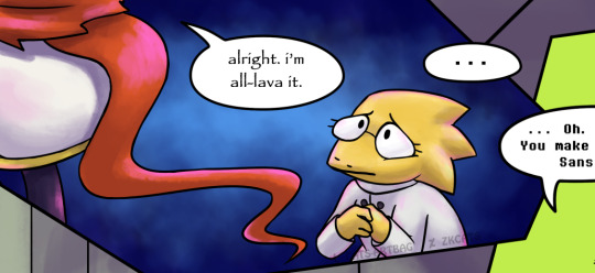
Hi everyone 👋🏻 Zk here >< or Cats, for older followers
So I've been getting back into doing SwapOut again, but I would like to appeal to everyone who reads and loves the comic. Much love to all of you who's still sticking around 🙏🏻💙 But something has also always been bothering me throughout this journey.
As many of us know, we artists do these comics for free (especially fan comics), starting them out of love and taking a LOT of time and energy out of our lives to continue making them.
And it's amazing how many of you come from translations or comic dubs on Youtube, which are also very well-done and take a lot of effort to make, much love to them too. There is a difference, however.
Monetization.
And I'm not asking for pity! I'm appealing for understanding.
Because some comic dubbers on Youtube are able to earn ad revenue from the videos they upload. From the beginning, we artists have given them the permission to dub our works. But we don't receive anything from it, nor do we usually charge them for using our art (against our better judgement).
We let them use our comic pages in their monetized videos for free. And occasionally these videos receive thousands and millions of views, which I imagine gives a decent amount of ad revenue, while the artists themselves don't usually earn anything from their own artwork, nor do we ever want to put it behind a paywall of any kind. (we like reading free comics too so don't worry x|)
... But doing full-colored comic pages for free eventually gets hard to sustain without any income from it, even more so when we need to give our time and energy to other jobs to earn money for a living instead. We legitimately keep going on our comics purely out of love. Truly, we would LOVE to do our own art for a living. There's things like Patreon but it's only feasible if we're also able to produce bonus content or show BTS, and only people willing to spend money for them can help us, and not readers who aren't able to.
And we understand that not everyone can afford to support us monetarily. And that's okay!
But if you love these comics and want to really help us to keep going, there ARE ways you can easily support us for free!
For example, affiliates on Twitch (like myself) are able to earn ad revenue very early on (they must have at least 50 followers, quite a requirement, but still easier to obtain than Youtube's 1000 subscribers).
(my Youtube, btw. not much rn but drop a subscribe?)
But simply put, if the vast majority of readers from the yt numbers visit and stay for ads on the artists' Twitch streams (remember to have adblocker disabled for the site, if any), they'll be making an actual, physical contribution to the artist themselves, at no cost whatsoever. We earn up to 55% from any ads that run on our stream, so the more viewers, the better!
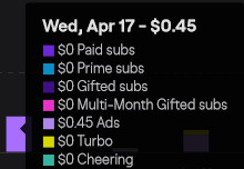
(this is my twitch on average 8 viewers, with a 3 hour stream. again, the more the better!)
(ofc you can also buy subs to watch ad-free and supports me directly, but i'm typing all this to share the free ways people can support their fave creators ✨)
And even if that doesn't work out, I'd be happy enough to see most of you there 🙏🏻💙 I've been treating my streams as work, so I'm striving not to break the streak.
So drop a follow on my Twitch, and catch the streams when you can!
They're great if you need company or background noise, and also great for co-working~
Currently streaming WEEKLY,
Mondays, Wednesdays (SwapOut) and Saturdays, 10.30AM EST
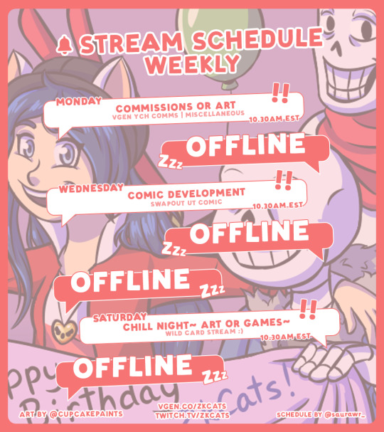
(art by @cupcakepaints)
>> twitch.tv/zkcats <<
Anyway thanks for listening to my Ted talk, please share this around for others as well >< 🙏🏻 Artists, make this a reblog chain or something! Promo your stuff!
And apologies for the essay, I wasn't expecting to type this much sdghsgh this itself is not an ad for Twitch or whatev, I'm just a little frustrated with needing to juggle all this.
I was also considering hosting SwapOut somewhere that could get ad revenue, but I wasn't sure where until I realized I can probably earn that from my Tapas now (i think?? sdfhgh up to 70% ad revenue there but i haven't seen any yet) So maybe I'll post there a day earlier than here or something? We'll see. Go subscribe there! Check it out! Reread it! Help ME help YOU!
... Much appreciated ><
#catschats#undertale#webcomic#swapoutcomicupdate#typed this out mostly for people who aren't aware that ads support streamers etc.#im super tired now wheezee but im living
108 notes
·
View notes
Text
part 2 of effort to compile my art outside of social media: 2023 sketch compilation is up on itch!
It's $5 but I also have free community copies enabled if you can't or don't want to pay that for whatever reason but are still interested in getting a copy <3
#sketchbook#digital sketchbook#not sure what else to tag this#ah well#it'll find it's way or it won't#side note I loooove community copies#I think sharing things for free on the internet is great. makes a wide variety of things accessible for so many people#& I've benefited a lot from that attitude#even with just for example. reading people's webcomics#but I also believe creativity is undervalued and artists need to earn money to live#community copies strike a nice balance between that...
4 notes
·
View notes
Text
"It takes HOW LONG?" Black Hair is an Art (pt.2)
(This is part two of the hair lessons, focusing on writing/narratives. If you want to know how the styles LOOK, refer to part 1 and its addendum)
Now that you know what our hair actually looks like, we’re going to discuss incorporating that into your writing (original fic, fanfic, webcomics, anything with a narrative). You don’t HAVE to give us a dissertation on "how you studied 'The Black People’s Hair'" in your story. That’s not what I’m asking you to do. I’m just asking you to CONSIDER the effort and existence of it. The same way you put effort into discussing nonblack hair textures? Should be the sort of tenderness and care you put into discussing ours. It does not stand to reason that I have read thousands of stories describing "the silky, black/blonde tresses/waves that fell down their pale back as their lover ran their fingers through them", but Black readers have nothing of the sort to compare to without seeking our own authors out. Our hair deserves some loving and adoration too!
This is a very long post describing hairstyles and how they can correspond to your character's design and decisions, so I'll put a read more here. The sections are organized into 'Twist Out', 'Afros', 'Locs', 'Braids', 'Black Men', and 'Straight Hair' if you Ctrl F. PLEASE PLEASE PLEASE take your time to read all of this at some point though, as I put a lot of resources and explanation into this. I'm trusting you!
The History
As I discussed in the last lesson, our hair is incredibly important to us, and part of that includes the vulnerability and trust that comes along with access to it. This is due to a long history of oppression. There’s a racist history of making Black women hide our hair, as if it would ‘tempt white men’ away, regardless of it were due to actual attraction or the (more likely) rape of Black women. There’s a racist history of touching our hair, as though we are animals or zoo exhibits. We aren’t just going to let anyone touch our heads, so DON'T write that, unless you are doing so to show that it is a microaggression towards your character. Even now, cultural appropriation is rampant. If I were to wear cornrows with hoops, it'd be seen as 'ghetto' or 'gang-like'. Meanwhile, it is a fashion statement for white women. When Miles G Morales showed up in Across the Spiderverse, animators specifically chose cornrows for him, but many people mistakenly took it to me that he was 'rougher and tougher' than the original Miles. This was a racist perception! Hearing the Fade get hyped up in the news as the 'Travis Kelce', when Black men and especially NFL players have been wearing it for DECADES to crickets... it hurts lmao. Point is, you can describe and respect Black hair without being racist about it. Okay? Okay.
Vulnerability
YOUR CHARACTERS NEED TO BE CLOSE BEFORE ALLOWING THEM TO TOUCH THEIR HAIR!!!
It needs to be someone they TRUST wholeheartedly. Again, do NOT let a stranger touch their hair unless it’s meant to be an uncomfortable situation!
Consider CONSENT! Consent is ALWAYS beautiful! Have your other characters (Black or not) ASK to touch your Black characters’ hair! And not in the ‘Oh can I touch it?’ way. But if they’re really close friends or dating, have them ask to help do their braids, or wash their hair, or even just to stroke their hair and face! Or if your Black character is injured with a head wound, and they have to tend to them, have them ask! The asking shows a level of care and respect for your Black character and their body! At any point the consent may be revoked, and that needs to be respected! If they let them tend their head wound, but then smack their hand away after, that’s not ‘rude’- they’re allowed to do that, especially to signify that they aren’t at that level of trust yet. That's still angsty!
One great example of love from a Black character is doing their partner’s hair, or allowing their partner to do their hair. The ‘Hair-washing’ fic is a common thing in fanfiction; we all understand how that shows the depth of the trust in the relationship between the characters. How would you write about that trust with a Black character, if you don’t know what goes into taking care of their hair? If you don’t even know what their hair looks or feels like? The lack of awareness will show, and what should be a beautiful, deep moment will fall flat for Black readers. I wrote one once for my character with locs, and it honestly made me tear up because I realized that I’d never seen one, at least not in the majority white spaces that the fandoms I was in were.
Think about it- how often have you read a hair-washing fic with a Black character? Was it accurate? Would you know if it was accurate? Have you spoken to or heard anyone Black in your fandom space talk about it? Do you know anyone Black in your fandom space to ask? It’s things like this that we have to consider!
If you have a character that is nonblack in a relationship with your Black character, that honestly reveals even more trust because there’s a long history (again) behind that NOT happening! In life, we can’t go to the same places. I can’t go to a white hair salon or barbershop. They won’t know what to do! People are allowed to go through hair school without learning how to work with different, thicker textures. It’s not right nor fair, but it’s a part of the casual, systemic racism in our lives.
My feelings on what Lestat symbolizes aside, the scene where he plays with Louis’ curls in AMC's IWTV was an intelligent way to show that closeness, and how a nonblack character would affectionately play with a Black character’s hair! How he works with the curl in his fingers, rather than trying to pet Louis or run his fingers through- it was an intelligent move on Sam and Jacob’s part as actors to understand that THAT’S how that would go down!
If you have a character that wants to show a violation of your Black characters’ space, touching/harming our hair is cruelty on a very personal level that will generate an extreme reaction.
Think About Your Character!
When thinking about your Black character’s hairstyle, you need to think about your character themselves! What do they do every day? What are their hobbies? Are they Type A, Type B personality? Do they have a lot of time? Are they always in a rush? Are they noncommittal? Are they self-conscious? Artsy? Serious? Are they in a time period where the means to care for their hair are limited?
People make jokes and comments about how Black women don’t like getting our hair wet and dismiss our concerns. But it’s not out of ‘silliness’ or vanity. What you consider ‘just hair’ may have taken days of planning in advance and HOURS of our time! We put a lot of thought and effort into our hair, and it will easily shatter the illusion for your Black readers if you describe our hair poorly or create an unlikely scenario with it. It’s not a joke!
Some Terms:
Protective styles- a style that allows our hair to ‘rest’ with minimal manipulation
‘Tender-headed’- some people’s scalps are more sensitive to the tightness of styles, so it’ll hurt a little bit more and require some more gentleness (Regardless it’s still going to hurt for a bit after a fresh style)
Bonnets- a silk/satin cap of varying lengths that we wear at night to protect our hair and keep the moisture in
Loc Sock- same idea, but for locs
Durag- keeps short haircuts protected; can even help create the wave pattern that many Black men enjoy
Scarf- same idea as the bonnets, except scarfs can be used specifically for straight hairstyles to wrap them up to keep it straight and neat
(It'll seem real legit if you include your Black characters wearing their headcoverings at night! I remember laughing while reading Twilight because I knew that if Edward snuck into my room at night, he'd see me in my scarf or bonnet lmao.)
General Hair Care:
While I don’t completely agree with some of the advertising in this first one (it’s the internet. Can’t go nowhere without someone trying to hawk something) it’s cool in general to explain how our hair looks the way it does.
If you have Black children OCs, it’s important to consider that their parents have to do their hair, and how that will be its own experience! (It can be very stressful for Black children to get their hair done, as it takes a long time and can be physically uncomfortable. There are plenty of stories of burnt ears and tugged tangles and not very nice old women. Children are children! Keep in mind how they may behave while getting the style of your choice.
Moisturizing to keep healthy
Twist Outs
Cute twist out styles
Twist outs are a style that takes overnight to hold, or maybe even a few days! The cool thing is that the twists themselves can be the style! So the tighter you want their curls to be, the longer they’ll wear the twists in. If you want to describe your character with tighter curls, there needs to be a section of time where their hair remains in the twists! If your character has an event, and they want twists… this needs to be done in advance. Your character will NOT untwist them the day of, unless they want weak, limp curls (or you want the scene to compose of them having weak curls).
How long they'll last depends on the activity of your character! If all they do is work a desk job, or they don’t sweat very much, the twists can last some time! But if they sweat, or wear hats or caps, it’s not going to last long. Maybe a week.
Pros: Very versatile! If you have a character that loves trying new looks and enjoy being spontaneous, twist outs are for them! Easy! If your Black character is younger, or haven’t done their hair before, this is a great way for them to start working with their hair! Doesn’t take long (to do)! If your character is in a rush, and they do their twists, they can go just about anywhere. If they’re not self-conscious, this will be just fine.
Cons: It cannot get wet again, or the style will puff up back into your natural texture. It does not last long enough to say “oh my character went on a two year long fantasy adventure with this style.” If you want your character to have a twist out the whole time, they’re going to have to take time to do it. It would be cool if you incorporate a scene where they’re working on their hair, maybe in the background while everyone’s discussing plans or something. Just a reminder that their hair isn’t just staying magically twisted (unless they have the magic to do that).
Afros
Afro Style Guide, Style Guide for Men (works for any gender though)
Wash & Gos are just that- wash it (or really, condition it, you don’t have to shampoo it every time) dry with a t-shirt (to prevent breakage), put some oil and a light crème on it, fluff it up and you’re good to go! Maybe an hour at max and can be done while getting dressed in the morning!
Pros: Easy! If they’re doing a full, combed out afro, it’s not as simple, it will take more time. And at night it has to be plaited so that it maintains its length, otherwise it will tangle. But other than that, that’s still not all that hard. They can show off their curls! Black characters can and should have pride in their hair. It’s beautiful. This is the opportunity that you as an author can describe the pure texture of their hair, how it shines in the light, how the coils look, how soft it is! Romanticize Black hair the same way you do anyone else’s!
Cons: None really! Afros are wonderful! Just make sure that your character has a way to keep their hair from getting tangled. Just because it’s easy doesn’t mean there’s no maintenance! A pick, a bonnet, oil and water go a long way!
Locs
Five stages of locs
A person who does locs is a loctician.
Can be palm-rolled or interlocked/crocheted
I cannot emphasize enough that you do not want just anyone doing their locs! They can really mess up someone’s hair if they don’t know what they’re doing. I say that to say, for your character, if they don’t trust the person doing their hair… they should. They should not be walking into anyone’s place to get their hair locked; they’d do research first.
The time it takes locs to ‘bud’ (that is, to actually form the loc) depends on the texture of their hair. But it can take up to 3 months to even a year for them to actually ‘loc up’. So if your character just got locs, they’re not going to look neat. They’re going to be frizzy.
As long as they’re washing their hair, keeping it moisturized, and not using wax products (DO NOT HAVE ANY BLACK CHARACTER USE WAX PRODUCTS IT IS BAD FOR BLACK HAIR) it’ll last forever! Locs are incredibly strong, especially the thicker they get! It is recommended that locs are retwisted every six weeks, but if your character has freeform locs, doesn’t have the money or time right now, or they just aren’t that pressed, they can grow indefinitely.
Something cute to write in your stories: sometimes locs do just… fall out. Not the whole thing! But the same way thin hair gets everywhere… sometimes the ends of thin locs just… fall off! You’ll find little buds on the ground. This happens especially in the budding stage.
Pros: Very low daily maintenance! At most they’ll need a bonnet or loc sock, and oil/water mix to spritz and massage in. Strong style that can hold any look- buns, curls, etc. They can be dyed, though it will take a long time to do so. I say that to say, if you want your character to have bright green locs, go for it!!
Cons: Low daily, but HIGH wash day maintenance! So if your character has a fancy date or something to go on, they should not be getting their hair retwisted the same day, or at least not so close to. It’s going to be shiny, oily, and tight, which can cause discomfort. Give them the day to let the hair settle!
Locs are PERMANENT!! This isn’t a bad thing, as much as it is a ‘KNOW WHAT YOU’RE DOING BEFORE YOU DO IT’ thing. Technically they can be combed out, but that would take a very long time and very precise effort, and most people aren’t going through all that. They’re just going to cut them off and start fresh. If you have a character that would balk at such a choice, locs aren’t for them. If you have a character that’s picky and choosy, that likes versatility, that can’t make up their mind, do NOT give them locs unless they’re making the conscious choice to commit. (Again, this is subjective! Maybe they have locs because their mother died and it reminds them of her! Okay! That works!) If you have a character that’s vain, or at least doesn’t like looking awkward… unless they’re going to style up the awkward stage, they’re not going to want locs. (Awkward stage: the first two stages get considered awkward because the locs look messy. This is because they’re turning from curls to locs!)
Braids
Styles
How long braids can take depend on the style. Box braids can take 10-12 hours to do! Microbraids? You HAVE to have multiple people or you'll be there for damn near a day (and that's assuming you have a masterful braider!)
How long they last depend on your character! If they're like me as a kid, I didn't care how I looked, so my mom got me cheap braids and let me run free for two summer months. So if your Black character is a carefree child! Go for it. But if they're a teen or adult (or are very concerned about how they look) a month to six weeks is about how long braids can stay in before your new growth shows. A character that is usually trimmed and proper having loads of new growth over their braids may symbolize that they don’t have it all together anymore.
Pros: Protective style! Great way to let your character have minimal daily maintenance; oil and water and something to cover it. SOME braided styles allow for high activity and even rain without changing. It depends on the hair that’s been braided in, as well as the style. Incredibly versatile! They can have multi-colored braids, long braids, short braids, beads, trinkets… if your character is creative and bubbly and likes to experiment, the sky is the limit! That can symbolize their artistic expression, just by describing what they look like! So long as they have the time, they can have any look and style they want. No need to commit too long.
If your character is capable of doing their own braids (and locs, btw), they’re amazing. Like… that’s mad respect for them. If you describe your character being able to do their own braids, they’ve got amazing arm strength, patience, and skill. That skilled dexterity can be revealed as a trait of theirs through that alone.
Cons: They take a LONG TIME. Your character is not going anywhere. If they’re getting braids… they’re not going anywhere. If you write your character doing anything fancy the day of, depending on the type of braids, Black readers are not going to believe you. Even if it did get finished, it would be very tight. I currently have a poll going on, and so far, a good majority of the 10+ answers are braids! It cost MONEY. It is NOT CHEAP to get braids done! If your character is poor as a church mouse, they will be doing those braids with their friend in front of youtube. Because it can be in the hundreds of dollars. (Don’t get me started on hair culture right now; BACK IN MY DAY IT COST-)
Hairstyles on Black Men
I want to specifically give space and applause to these hairstyles on Black men, because we REALLY don’t give Black men enough credit for all the creativity they show with their hair! And again, with The Killmonger being the choice style in all these damn vidya games despite almost no Black man I know choosing it as a look… PLEASE LOOK! WE HAVE OPTIONS! Try describing how gorgeous these looks can be on your Black men characters! It would be very nice.
Straight Hair
Well, I was going to explain, but ol ‘Guest Writer’ here pretty much lays it all out! So just go ahead and read this article lol.
Just to re-emphasize, straight hair is NOT something that just grows out of our head that way! It takes effort! So if you have a character that doesn’t feel like maintaining straight hair, they shouldn’t have it! If your character has natural hair and lives in a rainy or humid city, they’re going to be fighting that weather to keep it straight- make sure that’s consistent with their personality!
My best friend used to wash and flatiron her hair every day. Like, laser focused on looking that good, Type A shit (she’s a top money banker now, so I guess it worked out). If you have a character like that, it’s fine! If they’re lazy any other time of the day, they’re not suddenly going to be waking up at 5am to flat iron their hair. It’s not consistent.
Conclusion
That’s pretty much what I have! I’m not the guru on all things Black hair, and I obviously cannot encompass every potential scenario you may have for your characters. Really, my intention here is to get you to think about how our hair reflects our character and personalities, and how when you write and/or draw a Black character, you have that ability! And when you’re able to incorporate that naturally, it makes your Black readers feel seen, like you actually cared about that character enough to give them just as much description as your nonblack characters. You don’t have to be a master at it! Just… occasionally the little things that we can go ‘oh, yeah!’ at would be nice. An equivalent effort would be nice.
Remember, it’s the thought that counts, but the action that delivers!
823 notes
·
View notes
Text
why Aurora's art is genius
It's break for me, and I've been meaning to sit down and read the Aurora webcomic (https://comicaurora.com/, @comicaurora on Tumblr) for quite a bit. So I did that over the last few days.
And… y'know. I can't actually say "I should've read this earlier," because otherwise I would've been up at 2:30-3am when I had responsibilities in the morning and I couldn't have properly enjoyed it, but. Holy shit guys THIS COMIC.
I intended to just do a generalized "hello this is all the things I love about this story," and I wrote a paragraph or two about art style. …and then another. And another. And I realized I needed to actually reference things so I would stop being too vague. I was reading the comic on my tablet or phone, because I wanted to stay curled up in my chair, but I type at a big monitor and so I saw more details… aaaaaand it turned into its own giant-ass post.
SO. Enjoy a few thousand words of me nerding out about this insanely cool art style and how fucking gorgeous this comic is? (There are screenshots, I promise it isn't just a wall of text.) In my defense, I just spent two semesters in graphic design classes focusing on the Adobe Suite, so… I get to be a nerd about pretty things…???
All positive feedback btw! No downers here. <3
---
I cannot emphasize enough how much I love the beautiful, simple stylistic method of drawing characters and figures. It is absolutely stunning and effortless and utterly graceful—it is so hard to capture the sheer beauty and fluidity of the human form in such a fashion. Even a simple outline of a character feels dynamic! It's gorgeous!
Though I do have a love-hate relationship with this, because my artistic side looks at that lovely simplicity, goes "I CAN DO THAT!" and then I sit down and go to the paper and realize that no, in fact, I cannot do that yet, because that simplicity is born of a hell of a lot of practice and understanding of bodies and actually is really hard to do. It's a very developed style that only looks simple because the artist knows what they're doing. The human body is hard to pull off, and this comic does so beautifully and makes it look effortless.
Also: line weight line weight line weight. It's especially important in simplified shapes and figures like this, and hoo boy is it used excellently. It's especially apparent the newer the pages get—I love watching that improvement over time—but with simpler figures and lines, you get nice light lines to emphasize both smaller details, like in the draping of clothing and the curls of hair—which, hello, yes—and thicker lines to emphasize bigger and more important details and silhouettes. It's the sort of thing that's essential to most illustrations, but I wanted to make a note of it because it's so vital to this art style.
THE USE OF LAYER BLENDING MODES OH MY GODS. (...uhhh, apologies to the people who don't know what that means, it's a digital art program thing? This article explains it for beginners.)
Bear with me, I just finished my second Photoshop course, I spent months and months working on projects with this shit so I see the genius use of Screen and/or its siblings (of which there are many—if I say "Screen" here, assume I mean the entire umbrella of Screen blending modes and possibly Overlay) and go nuts, but seriously it's so clever and also fucking gorgeous:
Firstly: the use of screened-on sound effect words over an action? A "CRACK" written over a branch and then put on Screen in glowy green so that it's subtle enough that it doesn't disrupt the visual flow, but still sticks out enough to make itself heard? Little "scritches" that are transparent where they're laid on without outlines to emphasize the sound without disrupting the underlying image? FUCK YES. I haven't seen this done literally anywhere else—granted, I haven't read a massive amount of comics, but I've read enough—and it is so clever and I adore it. Examples:


Secondly: The beautiful lighting effects. The curling leaves, all the magic, the various glowing eyes, the fog, the way it's all so vividly colored but doesn't burn your eyeballs out—a balance that's way harder to achieve than you'd think—and the soft glows around them, eeeee it's so pretty so pretty SO PRETTY. Not sure if some of these are Outer/Inner Glow/Shadow layer effects or if it's entirely hand-drawn, but major kudos either way; I can see the beautiful use of blending modes and I SALUTE YOUR GENIUS.
I keep looking at some of this stuff and go "is that a layer effect or is it done by hand?" Because you can make some similar things with the Satin layer effect in Photoshop (I don't know if other programs have this? I'm gonna have to find out since I won't have access to PS for much longer ;-;) that resembles some of the swirly inner bits on some of the lit effects, but I'm not sure if it is that or not. Or you could mask over textures? There's... many ways to do it.
If done by hand: oh my gods the patience, how. If done with layer effects: really clever work that knows how to stop said effects from looking wonky, because ugh those things get temperamental. If done with a layer of texture that's been masked over: very, very good masking work. No matter the method, pretty shimmers and swirly bits inside the bigger pretty swirls!
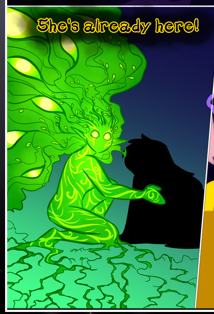
Next: The way color contrast is used! I will never be over the glowy green-on-black Primordial Life vibes when Alinua gets dropped into that… unconscious space?? with Life, for example, and the sharp contrast of vines and crack and branches and leaves against pitch black is just visually stunning. The way the roots sink into the ground and the three-dimensional sensation of it is particularly badass here:

Friggin. How does this imply depth like that. HOW. IT'S SO FREAKING COOL.
A huge point here is also color language and use! Everybody has their own particular shade, generally matching their eyes, magic, and personality, and I adore how this is used to make it clear who's talking or who's doing an action. That was especially apparent to me with Dainix and Falst in the caves—their colors are both fairly warm, but quite distinct, and I love how this clarifies who's doing what in panels with a lot of action from both of them. There is a particular bit that stuck out to me, so I dug up the panels (see this page and the following one https://comicaurora.com/aurora/1-20-30/):

(Gods it looks even prettier now that I put it against a plain background. Also, appreciation to Falst for managing a bridal-carry midair, damn.)
The way that their colors MERGE here! And the immense attention to detail in doing so—Dainix is higher up than Falst is in the first panel, so Dainix's orange fades into Falst's orange at the base. The next panel has gold up top and orange on bottom; we can't really tell in that panel where each of them are, but that's carried over to the next panel—
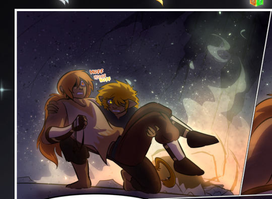
—where we now see that Falst's position is raised above Dainix's due to the way he's carrying him. (Points for continuity!) And, of course, we see the little "huffs" flowing from orange to yellow over their heads (where Dainix's head is higher than Falst's) to merge the sound of their breathing, which is absurdly clever because it emphasizes to the viewer how we hear two sets of huffing overlaying each other, not one. Absolutely brilliant.
(A few other notes of appreciation to that panel: beautiful glows around them, the sparks, the jagged silhouette of the spider legs, the lovely colors that have no right to make the area around a spider corpse that pretty, the excellent texturing on the cave walls plus perspective, the way Falst's movements imply Dainix's hefty weight, the natural posing of the characters, their on-point expressions that convey exactly how fuckin terrifying everything is right now, the slight glows to their eyes, and also they're just handsome boys <3)
Next up: Rain!!!! So well done! It's subtle enough that it never ever disrupts the impact of the focal point, but evident enough you can tell! And more importantly: THE MIST OFF THE CHARACTERS. Rain does this irl, it has that little vapor that comes off you and makes that little misty effect that plays with lighting, it's so cool-looking and here it's used to such pretty effect!
One of the panel captions says something about it blurring out all the injuries on the characters but like THAT AIN'T TOO BIG OF A PROBLEM when it gets across the environmental vibes, and also that'd be how it would look in real life too so like… outside viewer's angle is the same as the characters', mostly? my point is: that's the environment!!! that's the vibes, that's the feel! It gets it across and it does so in the most pretty way possible!
And another thing re: rain, the use of it to establish perspective, particularly in panels like this—

—where we can tell we're looking down at Tynan due to the perspective on the rain and where it's pointing. Excellent. (Also, kudos for looking down and emphasizing how Tynan's losing his advantage—lovely use of visual storytelling.)
Additionally, the misting here:
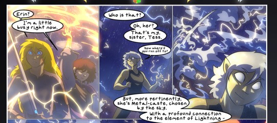
We see it most heavily in the leftmost panel, where it's quite foggy as you would expect in a rainstorm, especially in an environment with a lot of heat, but it's also lightly powdered on in the following two panels and tends to follow light sources, which makes complete sense given how light bounces off particles in the air.
A major point of strength in these too is a thorough understanding of lighting, like rim lighting, the various hues and shades, and an intricate understanding of how light bounces off surfaces even when they're in shadow (we'll see a faint glow in spots where characters are half in shadow, but that's how it would work in real life, because of how light bounces around).
Bringing some of these points together: the fluidity of the lines in magic, and the way simple glowing lines are used to emphasize motion and the magic itself, is deeply clever. I'm basically pulling at random from panels and there's definitely even better examples, but here's one (see this page https://comicaurora.com/aurora/1-16-33/):

First panel, listed in numbers because these build on each other:
The tension of the lines in Tess's magic here. This works on a couple levels: first, the way she's holding her fists, as if she's pulling a rope taut.
The way there's one primary line, emphasizing the rope feeling, accompanied by smaller ones.
The additional lines starbursting around her hands, to indicate the energy crackling in her hands and how she's doing a good bit more than just holding it. (That combined with the fists suggests some tension to the magic, too.) Also the variations in brightness, a feature you'll find in actual lightning. :D Additional kudos for how the lightning sparks and breaks off the metal of the sword.
A handful of miscellaneous notes on the second panel:
The reflection of the flames in Erin's typically dark blue eyes (which bears a remarkable resemblance to Dainix, incidentally—almost a thematic sort of parallel given Erin's using the same magic Dainix specializes in?)
The flowing of fabric in the wind and associated variation in the lineart
The way Erin's tattoos interact with the fire he's pulling to his hand
The way the rain overlays some of the fainter areas of fire (attention! to! detail! hell yeah!)
I could go on. I won't because this is a lot of writing already.
Third panel gets paragraphs, not bullets:
Erin's giant-ass "FWOOM" of fire there, and the way the outline of the word is puffy-edged and gradated to feel almost three-dimensional, plus once again using Screen or a variation on it so that the stars show up in the background. All this against that stunning plume of fire, which ripples and sparks so gorgeously, and the ending "om" of the onomatopoeia is emphasized incredibly brightly against that, adding to the punch of it and making the plume feel even brighter.
Also, once again, rain helping establish perspective, especially in how it's very angular in the left side of the panel and then slowly becomes more like a point to the right to indicate it's falling directly down on the viewer. Add in the bright, beautiful glow effects, fainter but no less important black lines beneath them to emphasize the sky and smoke and the like, and the stunningly beautiful lighting and gradated glows surrounding Erin plus the lightning jagging up at him from below, and you get one hell of an impactful panel right there. (And there is definitely more in there I could break down, this is just a lot already.)
And in general: The colors in this? Incredible. The blues and purples and oranges and golds compliment so well, and it's all so rich.
Like, seriously, just throughout the whole comic, the use of gradients, blending modes, color balance and hues, all the things, all the things, it makes for the most beautiful effects and glows and such a rich environment. There's a very distinct style to this comic in its simplified backgrounds (which I recognize are done partly because it's way easier and also backgrounds are so time-consuming dear gods but lemme say this) and vivid, smoothly drawn characters; the simplicity lets them come to the front and gives room for those beautiful, richly saturated focal points, letting the stylized designs of the magic and characters shine. The use of distinct silhouettes is insanely good. Honestly, complex backgrounds might run the risk of making everything too visually busy in this case. It's just, augh, so GORGEOUS.
Another bit, take a look at this page (https://comicaurora.com/aurora/1-15-28/):
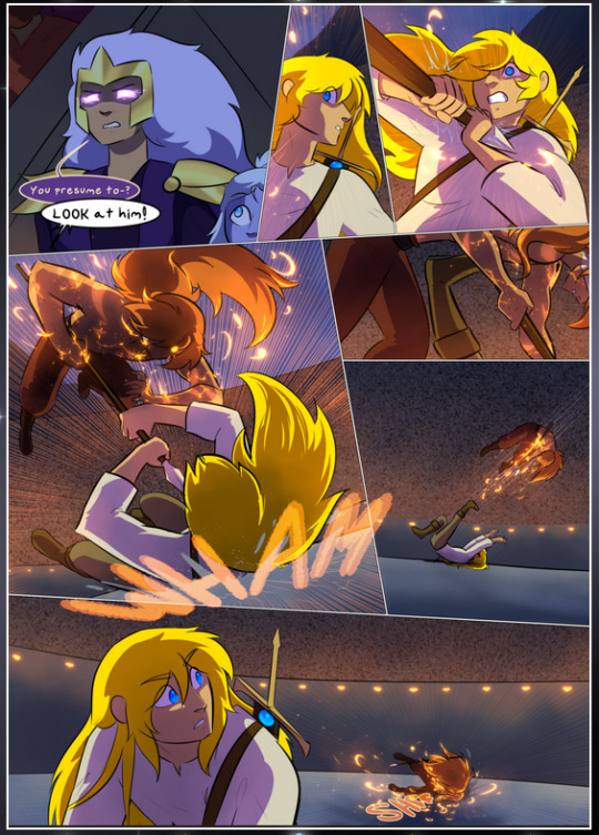
It's not quite as evident here as it is in the next page, but this one does some other fun things so I'm grabbing it. Points:
Once again, using different colors to represent different character actions. The "WHAM" of Kendal hitting the ground is caused by Dainix's force, so it's orange (and kudos for doubling the word over to add a shake effect). But we see blue layered underneath, which could be an environmental choice, but might also be because it's Kendal, whose color is blue.
And speaking off, take a look at the right-most panel on top, where Kendal grabs the spear: his motion is, again, illustrated in bright blue, versus the atmospheric screened-on orange lines that point toward him around the whole panel (I'm sure these have a name, I think they might be more of a manga thing though and the only experience I have in manga is reading a bit of Fullmetal Alchemist). Those lines emphasize the weight of the spear being shoved at him, and their color tells us Dainix is responsible for it.
One of my all-time favorite effects in this comic is the way cracks manifest across Dainix's body to represent when he starts to lose control; it is utterly gorgeous and wonderfully thematic. These are more evident in the page before and after this one, but you get a decent idea here. I love the way they glow softly, the way the fire juuuust flickers through at the start and then becomes more evident over time, and the cracks feel so realistic, like his skin is made of pottery. Additional points for how fire begins to creep into his hair.
A small detail that's generally consistent across the comic, but which I want to make note of here because you can see it pretty well: Kendal's eyes glow about the same as the jewel in his sword, mirroring his connection to said sword and calling back to how the jewel became Vash's eye temporarily and thus was once Kendal's eye. You can always see this connection (though there might be some spots where this also changes in a symbolic manner; I went through it quickly on the first time around, so I'll pay more attention when I inevitably reread this), where Kendal's always got that little shine of blue in his eyes the same as the jewel. It's a beautiful visual parallel that encourages the reader to subconsciously link them together, especially since the lines used to illustrate character movements typically mirror their eye color. It's an extension of Kendal.
Did I mention how ABSOLUTELY BEAUTIFUL the colors in this are?
Also, the mythological/legend-type scenes are illustrated in familiar style often used for that type of story, a simple and heavily symbolic two-dimensional cave-painting-like look. They are absolutely beautiful on many levels, employing simple, lovely gradients, slightly rougher and thicker lineart that is nonetheless smoothly beautiful, and working with clear silhouettes (a major strength of this art style, but also a strength in the comic overall). But in particular, I wanted to call attention to a particular thing (see this page https://comicaurora.com/aurora/1-12-4/):
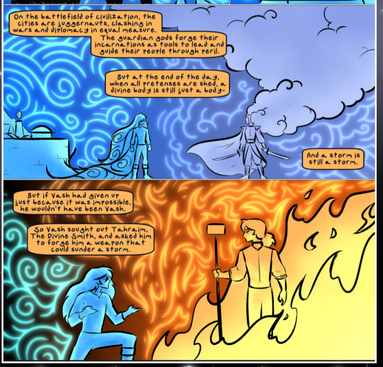
The flowing symbolic lineart surrounding each character. This is actually quite consistent across characters—see also Life's typical lines and how they curl:
What's particularly interesting here is how these symbols are often similar, but not the same. Vash's lines are always smooth, clean curls, often playing off each other and echoing one another like ripples in a pond. You'd think they'd look too similar to Life's—but they don't. Life's curl like vines, and they remain connected; where one curve might echo another but exist entirely detached from each other in Vash's, Life's lines still remain wound together, because vines are continuous and don't float around. :P
Tahraim's are less continuous, often breaking up with significantly smaller bits and pieces floating around like—of course—sparks, and come to sharper points. These are also constants: we see the vines repeated over and over in Alinua's dreams of Life, and the echoing ripples of Vash are consistent wherever we encounter him. Kendal's dream of the ghost citizens of the city of Vash in the last few chapters is filled with these rippling, echoing patterns, to beautiful effect (https://comicaurora.com/aurora/1-20-14/):
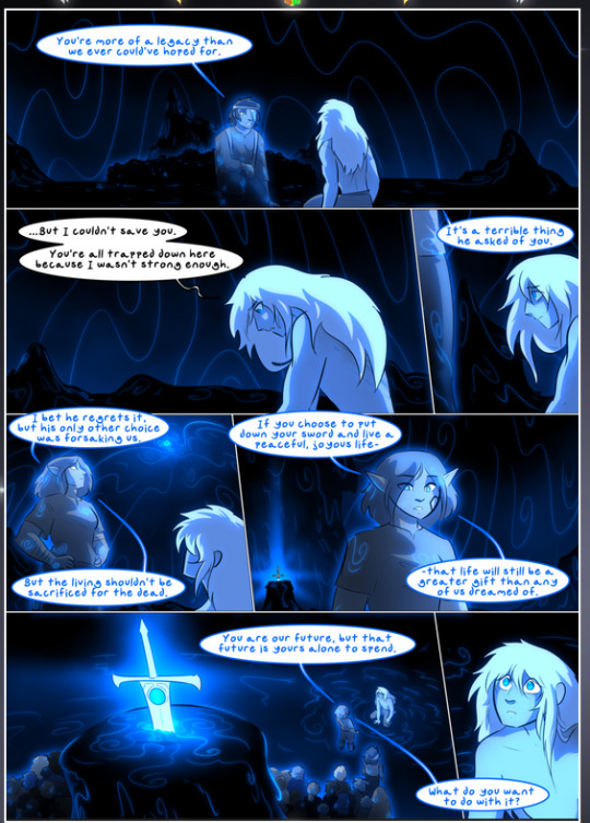
They ripple and spiral, often in long, sinuous curves, with smooth elegance. It reminds me a great deal of images of space and sine waves and the like. This establishes a definite feel to these different characters and their magic. And the thing is, that's not something that had to be done—the colors are good at emphasizing who's who. But it was done, and it adds a whole other dimension to the story. Whenever you're in a deity's domain, you know whose it is no matter the color.
Regarding that shape language, I wanted to make another note, too—Vash is sometimes described as chaotic and doing what he likes, which is interesting to me, because smooth, elegant curves and the color blue aren't generally associated with chaos. So while Vash might behave like that on the surface, I'm guessing he's got a lot more going on underneath; he's probably much more intentional in his actions than you'd think at a glance, and he is certainly quite caring with his city. The other thing is that this suits Kendal perfectly. He's a paragon character; he is kind, virtuous, and self-sacrificing, and often we see him aiming to calm others and keep them safe. Blue is such a good color for him. There is… probably more to this, but I'm not deep enough in yet to say.
And here's the thing: I'm only scratching the surface. There is so much more here I'm not covering (color palettes! outfits! character design! environment! the deities! so much more!) and a lot more I can't cover, because I don't have the experience; this is me as a hobbyist artist who happened to take a couple design classes because I wanted to. The art style to this comic is so clever and creative and beautiful, though, I just had to go off about it. <3
...brownie points for getting all the way down here? Have a cookie.
#aurora comic#aurora webcomic#comicaurora#art analysis#...I hope those are the right tags???#new fandom new tagging practices to learn ig#much thanks for something to read while I try to rest my wrists. carpal tunnel BAD. (ignore that I wrote this I've got braces ok it's fine)#anyway! I HAVE. MANY MORE THOUGHTS. ON THE STORY ITSELF. THIS LOVELY STORY#also a collection of reactions to a chunk of the comic before I hit the point where I was too busy reading to write anything down#idk how to format those tho#...yeet them into one post...???#eh I usually don't go off this much these days but this seems like a smaller tight-knit fandom so... might as well help build it?#and I have a little more time thanks to break so#oh yes also shoutout to my insanely awesome professor for teaching me all the technical stuff from this he is LOVELY#made an incredibly complex program into something comprehensible <3#synapse talks
743 notes
·
View notes
Note
Hi! Hope you're doing well. I was reading a fantasy webcomic with some Deaf characters and was wondering: what adjustments to the language creation processes would a conlanger have to make for creating a sign language? Thanks!
The short answer is relatively few. Sign languages are languages and do all the same things with a different phonology. So long as you understand the phonology of a sign language you can create a sign language.
The long answer is here. That's a thing I wrote up called SLIPA (Sign Language IPA). Due to the fact that the potential for iconicity with gesture is greater than with sound there's a lot more onomatopoeia in a sign language than in a spoken language. To explicate, onomatopoeia in spoken language is a word that imitates the sound of the referent (splash, crash, plunk, boing). In a sign language, it's a sign that imitates the look of the referent (ASL TREE, for example). Since it's possible to be more iconic, sign languages take advantage of that fact. Consequently, you don't find sign languages that DON'T take advantage of it and are purely abstract. There are also things that are hard or impractical in a spoken language that are simple in a sign language simply due to the medium (e.g. full number incorporation in the ASL words for WEEK and MONTH). Finally, there are a lot of "on the fly" verbs that are created that have no obvious analog in a spoken language. It's something like the sentential words of a polysynthetic language combined with imitative sounds in a spoken language to describe a body in motion.
In other words, because there are things you can do in a sign language simply due to the medium that you can't do in a spoken language, sign languages often do those things. It would be strange (i.e. non-human) if they didn't. If you're aiming to create a secret sign language, perhaps you intentionally don't take advantage of those things. It's possible to create a purely abstract sign language, but it would be a fairly obvious construct the way Ithkuil is very obviously not a plausible human language (i.e. it could never have evolved naturally to be the way it is). This might be a fun thing to do for a fictional setting—a totally non-iconic sign language created for secret communication. This is, essentially, what I did with the Atreides sign language in Dune (as opposed to the other sign language I created for the first film that wasn't used). Even that one, though, takes advantage of iconicity in a way that a truly abstract sign language need not. This is because part of the secrecy of the language is the way it's used. Others aren't even supposed to see it—and if they do, they're supposed to dismiss it as hand twitches. You could make an obvious sign language (i.e. it's obvious these characters are signing to each other) but with really, really weird associations—like pointing to your interlocutor means "sky", where eveyrone looking on will think it means "you".
Anyway, just some thoughts. This is an underexplored area of conlanging, but due to the simplicity of video creation and sharing nowadays, it's something that's worth exploring. Back in 2006 when I wrote up SLIPA it wasn't practical to take videos and upload them. It was possible, certainly—we had high speed internet and websites—but we didn't have smartphones, I don't think YouTube existed yet, most frontend UI didn't have video embedding as a feature of its platform, etc. We were lightyears ahead of the internet as we understood it in the 90s, so 2006 would be much more familiar to the people of 2024 than the people of 1994, but smartphones and social media (and its infrastructure) really changed the nature of capturing and sharing video. Conlangers have taken advantage of that in every way EXCEPT creating, documenting, and sharing CSLs (created sign languages).
Like (I don't want to go off on a tangent here) you can have an entire YouTube account that is just a dictionary. ASL already does this. Go on YouTube and type "ASL sign for [whatever]". There are tons of videos that are like 10-15 seconds long that are just demonstrations of a single sign from different angles, all made by Deaf signers. And the videos don't need sound! You don't have to worry about audio quality, microphones, etc. You can actually use YouTube to document an entire sign language. No one's done it yet. Why not?
Anyway, those are my thoughts. Hope this helps.
#conlang#language#ithkuil#sign language#deaf#csl#slipa#youtube#language creation#video#dictionary#deaf sign language
152 notes
·
View notes
Note
with the fallout of bandai namco's idiotic "it's up to interpretation" bs, do you think that it's possible to enjoy queer media made in a corporate environment in addition to independent works? is it even worthwhile to attempt making queer media in a corporate environment? i find it special how well the g-witch production team managed to tell the story they wanted even with the challenges and pressures they faced, but i have to admit that independent works like slarpg are always going to more completely tell queer stories. as someone who has resonated with both slarpg and g-witch, i was curious to know your perspective.
i'm probably less cynical about this than a lot of my peers are - not that i can blame anyone for feeling cynical about queer rep from corporate-owned media. (we've been through so many First Ever Gay Disney Characters at this point, and lord knows blizzard loves to tease that another overwatch character might be gay every year or so as a PR move.) unfortunately it's just extremely hard to get something like a full season of an animated series funded and produced independently, so the artists looking to enter these fields and pour their hearts and souls into meaningful queer stories as a full-time job don't have many options
going indie gives you theoretically endless creative freedom to tell your stories without corporate censorship, but it's also a massive gamble. only an extreme minority of indie creatives in any medium are actually able to make a living. the fact that i came out the other side of slarpg's development with enough money that i can keep being a full-time indie instead of being in massive debt makes me one of the lucky ones. and even with my modest success, i sure as hell don't have the money to hire a whole team, which limits the scope of what i can make. so i can't turn my nose up at the queer people writing disney channel cartoons where they can't say the word "gay" out loud. they have health insurance, i don't. for most people, what i do is simply not an option
with the corporate-produced Queer Stories i enjoy, i'm often able to squint and see what the creatives were trying to do, wishing that they could have done more while understanding that they probably had to fight tooth and nail for what's there
in the realm of children's animation in particular, i'm thankful that the people working at these studios ARE fighting for more, because it means that kids today have so many more positive queer stories to relate with. i didn't have a single gay character i felt i could relate to until i read scott pilgrim at age 16 and saw wallace wells. before that, i felt so alone in the world. i denied who i was for years because it felt like there would be no place for me. i didn't know anyone openly gay in real life, growing up in the south, and in fiction gay people either existed as the butt of a joke or not at all. the fact that queer kids are now able to see people like themselves in so many shows means something, even if we still have a long way to go and the big studios continue to be a major obstacle
on the subject of g-witch, i'm honestly unfazed by the statement from bandai-namco. i guess i wish they could've let suletta and miorine kiss, but like... the text of the show is extremely blunt about them being a couple by the end. it's not up for debate. and it's not like a gundam series having a meaningful story in spite of the wishes of the toy-producing overlords is anything new, this is just our latest example
all that being said, i do think people should branch out more and explore more weird indie shit if they want more wholeheartedly, openly queer stories. people gotta suck it up and embrace more outsider art instead of only valuing things with studio-level production values. start looking at ren'py visual novels, rpg maker games, obscure webcomics, zines drawn in sharpie, artists on bandcamp who aren't signed to a label, all that jazz. maybe part of the reason why i'm not more fazed by the state of affairs with corporate-funded fiction is that i'm constantly surrounded by furry artists who are telling their own little gay stories
282 notes
·
View notes
Text
In honour of 4/13x15 I'm posting (a very slightly edited version of) the paper I wrote on the Unofficial Homestuck Collection for one of my classes last term. The language/tone is a bit more academic than what I would usually put up on here, but it's exam season so...
Don’t Turn Your Back on the Body:
The Resurrection of Homestuck After the Death of Flash
Digital media is, broadly speaking, very difficult to preserve. The rapid pace of technological development means that obsolescence and decay present a consistent threat to the availability of natively digital works. Most computers produced in 2023 no longer have built in CD drives, and I feel fairly confident in asserting that none are being produced with floppy disk readers outside of hobbyist spaces. Issues with the accessibility of physically stored digital media can be mitigated (at least for now) by the use of external readers, but the preservation of fully digital media, born and hosted in its entirety on the Internet, is a different beast entirely.
This is, in part, an issue of pure volume; no one organization could ever hope to archive the vast amounts of stuff that the Internet is constantly producing, let alone organize it into a resource that could be used effectively. Like Borges’ cartographers who created “a Map of the Empire whose size was that of the Empire,” to fully archive the Internet would be to replicate it in its entirety. Thus scope becomes a central question of fully digital archiving.
The Internet Archive, which also operates the Wayback Machine, answers that question with a resounding and all-encompassing ‘yes’ — their stated goal is to “provide Universal Access to All Knowledge,” but even this comes with caveats. The organization freely permits members of the public to upload files to the archive and save pages on the Wayback Machine, but the work carried out by its official volunteers is more curated, and prioritizes webpages which have been identified as particularly important.
The Internet Archive is very effective within its own space, yes, but it has its limits. When the piece of work you are trying to archive is composed of not just static text and images, but longform animations and complex browser-based games, where do you put it? What do you do when the software necessary to access these elements of the work has been taken offline? And what happens if the people who were supposed to safeguard it fail to do so?
These were the issues that the fans of Homestuck faced in 2020 as the impending deactivation of Flash loomed on the horizon.
But first, before I properly explain what the Unofficial Homestuck Collection really is and why it is so effective as a digital archive, let me tell you about Homestuck.
Frustrated with the poorly implemented official preservation of the comic, and with a lot of free time on his hands, one fan began the Unofficial Homestuck Collection as a personal project during lockdown, during the “depths of 2020.” As the project changed hands and more fans became involved over the following years, its true scope came into focus: the Collection would preserve not only Homestuck itself, in its entirety and with its Flash-dependent pages intact, but also as much of its contextual material as possible, thus making it a prime example of the effectiveness of fan-driven digital archiving and preservation. Because the people who created the Collection are long standing fans of Homestuck, they know which pieces of peripheral material will provide the context the comic demands. The Collection preserves Homestuck as a text in a way that would be impossible in an analogue format, creating an archive both of the work and of the experience of reading it in a serialized format.
Andrew Hussie began* Homestuck on April 13th of 2009, and published it serially on mspaintadventures.com, his personal website at the time, until its conclusion on April 13th, 2016. Prior to beginning Homestuck, Hussie had been publishing short webcomics and pieces of fiction for several years on his older website, Team Special Olympics, since 2004, which had gained him a small but very loyal following. This following was centered mostly around the forum attached to the TSO website, which hosted the first of Hussie’s ‘MS Paint Adventures,’ Jailbreak, in September of 2006. Jailbreak was a short comic which Hussie produced as a collaborative writing game on these forums, in the style of early text adventures.
Beginning with the prompt, “You wake up locked in a deserted jail cell, completely alone. There is nothing at all in your cell, useful or otherwise,” Hussie then wrote the rest of the comic according to the first comment posted after every page. This, perhaps predictably, resulted in a barely coherent mess of a story.
Following the conclusion of Jailbreak after a short 134 pages, Hussie would produce two more comics prior to beginning Homestuck: the unfinished Bard Quest (June-July 2007) and Problem Sleuth (March 2008-April 2009), which was his longest work so far at the time of its conclusion. Problem Sleuth in particular represented a substantial increase in production quality and general coherency over Jailbreak, as Hussie gained experience using the MSPA forums as tools for collaborative storytelling, reigning in the meandering narrative by allowing himself to be more selective about which forum responses he followed.
Hussie would continue this more controlled style of forum collaboration throughout the first three Acts of Homestuck, which followed a much more focused story than any of his prior work, thanks to his decision to use reader input only in specific parts of the comic. In the introduction to the print edition of the first Act, Hussie described his own role during the production of these first Acts as “dungeon master, a game engine responding to input, and an improv comic all in one.” During the process of writing Act 4, Hussie stopped taking prompts from readers entirely, and would construct the rest of the comic ostensibly as its sole author.
‘Okay,’ you might now be thinking, ‘you’ve given me the context, but what the hell is Homestuck? And what’s it about?’ Well, to wildly oversimplify a very complex piece of media, Homestuck is a webcomic about four young online friends who play a video game that causes the end of their universe and grants them the power to create a new one as they see fit. It is a story about growing up and realizing you’ve been forever changed by your experiences, a story about leaving behind the life you knew and constructing a new one. It is also a story about time travel and paradoxes, genetics and cloning, a large number of aliens, a possibly larger number of puppets (at least one of which is sentient), and an unfortunate amount of clowns.
This story slowly unfolds over the course of 8126 pages, 817,929 words, and 166 animated panels, 95 of which contained some degree of interactivity and all of which total over four hours in length. Most of the comic’s pages consist of a main image, usually a short looping gif, accompanied by a text description or dialogue, which is almost always written in the format and style of online chat-logs between characters. As mentioned previously, however, these simpler gif-and-description pages are interspersed with longer videos, animated in Flash and soundtracked by one of Hussie’s several collaborators.
The first of these animated panels was uploaded a few weeks into Homestuck’s publication — an animated opening title-card for the comic, scored ominously with sounds of howling wind and windchimes. This first Flash panel was relatively simple, but the next would introduce a bespoke soundtrack (“Harlequin” by Mark Hadley), and the third would include simple interactivity. These soundtracked animations and interactive segments increased in scope and complexity over the course of the comic’s run; the final animated page in the comic, “[S] Collide,” comes in at nearly twenty minutes in length, and some of the larger interactive segments can take upwards of two hours to fully explore.
While some of the later interactive pages were developed in an engine based on HTML5, most of Homestuck would be built using Adobe Flash, and would depend on the program for basic functionality. This would prove disastrous for the comic’s long term preservation. Flash was very popular, and had become ubiquitous by the early 2010s, but it had security issues which were easy to exploit, its range was fairly limited in terms of what kinds of animations it could produce, and, as its most fatal flaw, it couldn’t run on mobile. Thus with the expanding use of smartphones and tablets, Flash became less and less practical as a tool for web developers, and Adobe began slowly preparing to kill it. On December 31st, 2020, Adobe sent Flash off to the farm where it could frolic and play in the digital sunshine, leaving many online communities facing a crisis. How do you preserve a text when its foundations have crumbled?
With Homestuck using Flash in such an integral way, the issue of preservation was an important one. After the finale, Hussie would post some short post-credits stories to Snapchat from October 2016 to August 2017, as well as a longer epilogue in April 2019, before stepping away from any formal involvement with the comic in 2020. In 2018, Hussie had given the distribution rights for Homestuck to VIZ Media, which primarily handled the English-language publication of several manga series, and had left the rights to the IP and the freedom to produce new work to former collaborators. Thus it was VIZ who took on the task of officially preserving Homestuck against the death of Flash.
To say their efforts were unsatisfactory would, I think, be paying them too great a compliment. The complex and highly detailed Flash animations were replaced with embedded YouTube links to low-quality screen-captures of the originals. The hours-long walkaround games were not translated at all, replaced with ‘choose your own adventure’ style pages of text and links. The official version of Homestuck as it currently exists fails to capture a lot of what made the comic work, because it removes a lot of the gamified elements of the comic that are so integral to its storytelling.
There are many snapshots of the website from before the walkaround games were taken down on the Wayback Machine, but the Flash emulator that archive.org uses is very inconsistent, frequently becoming stuck on looping loading screens or failing to process assets correctly. While the dubious preservation of the long Flash animations is a real issue on its own, the lack of any attempt to replicate the format of these longform games represents the loss of something essential to the comic. Homestuck is, throughout the whole of its story, intertwined with the visual and cultural language of video games. The loss of the complex interactivity of these panels fundamentally changes how the reader is permitted to engage with them and, by extension, with Homestuck’s narrative as a whole. The official version of Homestuck that exists online is no longer complete.
This incredibly poor preservation was the impetus behind the creation of the Unofficial Homestuck Collection. In its most basic form, the Collection is simply a preserved and restored version of Homestuck, intact and in high quality, accessible through a downloadable client, rather than online — reducing the Collection down to this basic description does it a disservice. The Unofficial Homestuck Collection includes not just Homestuck, but all of Hussie’s prior work: Jailbreak, Bard Quest, and Problem Sleuth are in there, but so are the full contents of his first website, Team Special Olympics, alongside archived versions of his now-deleted accounts on various social media platforms, and copies of threads from the MSPA forums that he would later reference in the main comic. The Collection also includes material that Hussie released alongside Homestuck, like the in-fiction blog of one of the main characters, various short comics written by guest authors, and a full episode of an in-universe childrens’ cartoon.
These peripheral materials are interesting and provide context for some of the more obscure references throughout Homestuck, but many of them were not produced until well into the comic’s run, and assume an audience that is caught up with the most recent update, making them dangerously full of spoilers for the unaware new reader. This issue is solved by the appropriately named ‘new reader mode.’ One of a variety of useful accessibility tools included in the Collection, the new reader mode tracks which page a user has reached, and implements a universal spoiler cloak over the whole program, hiding all materials that were released after their most recent page’s publication. This tool is what transforms the Unofficial Homestuck Collection from an archive of a text, into an archive of an experience.
De Kosnik argues that fan-driven archiving serves as a way for fans to mediate their own temporal experience of a text, describing websites hosting fanworks as mechanisms which “maintain the possibility of individuals joining fandoms… long after a media text has ceased to air.” While De Kosnik’s focus is on archives of fanworks and their function in ongoing fan spaces, I would argue that this framework, which centers the impact of serialization on the dynamics of fan communities, fits extremely well when applied to the Unofficial Homestuck Collection. Homestuck was published serially over the course of seven years, accompanied by blog posts, side comics, music, and other pieces of peripheral media that were released in tandem with the comic itself.
Updates were highly anticipated events, and fan communities were structured around them — one user on Tumblr found an unlisted part of the MSPA forums where Hussie posted new pages before they were published, and this “MSPA Prophet” became a fixture of the fandom for their ability to predict when the next update would come. The event that was an update (or upd8, after the typing style of a popular character) was a central aspect of the experience of reading Homestuck during its publication, and it is one that is very difficult to recover now that the comic exists as a static, completed work. The Unofficial Homestuck Collection, through its new reader mode, functions as a solution to that absence. It does more than safeguard the reader against unwanted spoilers: it temporarily transforms Homestuck back into an incomplete text.
Homestuck makes use of the assumed preexisting knowledge of the reader, and their “intuitive familiarity” with various types of digital media and culture, especially ones which are inherently participatory. The story’s use of narrative motifs and referential easter-eggs allows Homestuck to function, in Hussie’s own words, as “both a story and a puzzle,” but that “There [are] a range of ways to interface with it[…] Failing to grasp everything shouldn’t preclude basic enjoyment, nor is it a symptom of failure by either the reader or the story.” In the most frequent example of repeated symbology in Homestuck, Hussie peppers the text with references to the number ‘413,’ simplified from April 13th, the day the comic began.
The story follows four friends who are all thirteen years old, many of the songs on the comic’s soundtrack are exactly four minutes and thirteen seconds long, and the timestamps on chat-logs show that characters frequently begin important conversations at precisely 4:13, to name just a few of the number’s appearances. The combination of puzzle and story in Homestuck extends beyond these kinds of motifs, however, and into the way Hussie employs referential humour.
Some of these references are fairly easy to catch; in Act 4, one of the main characters is gifted the Warhammer of Zillyhoo — a brightly coloured weapon which originally appeared in Problem Sleuth. Others, however, are much more obscure. The older brother of another main character runs a business creating bizarre, semi-ironic puppet pornography. Most of the audience read this as an absurdist joke about the internet’s love for offputting porn; the subset of fans who had been following Hussie for several years, or those who looked into Hussie’s early activity on the MSPA forums, however, would find themselves with new understanding of a long-running joke. This element of the experience of reading Homestuck is something that the Unofficial Homestuck Collection not only preserves, but makes readily accessible to the comic’s readers in a way that would not have been possible during the comic’s publication.
On a purely theoretical basis, I would argue that the Unofficial Homestuck Collection is valuable not just in the context of contemporary fan activity, but as a potentially valuable resource for future research. Homestuck is a foundational piece of the current cultural landscape, its influences permeating both digital and analog media in subtle (and sometimes not so subtle) ways.
Undertale, titan of online culture that it is, was created by Toby Fox, who was the composer behind a large amount of the music in Homestuck and was, during the game’s production, living in Andrew Hussie’s basement. Tamsyn Muir, author of the Locked Tomb tetralogy, began her writing career as a prominent figure in the Homestuck fandom on Tumblr and Archive of Our Own. Although the reach of her original work has thoroughly outgrown her fandom roots, Muir includes sly references to Homestuck in several places in her books. Hell, one of the animators working on Bluey, a cartoon aimed at very young children, included references to Homestuck in the backgrounds of episodes they worked on, as easter-eggs for the benefit of parents in the know. All of this is to say that Homestuck has its hooks deep within the culture of the Internet, and its impacts will, I think, be felt for a long time yet.
The Unofficial Homestuck Collection is certainly not immune to digital decay or link rot, but it is resistant to them, since it is hosted on a large and well established website (GitHub), and, once downloaded, can be accessed without an internet connection, and shared freely. For the hypothetical future researcher, the Collection contains resources to mitigate the frustration of trying to hunt down pieces of contextual or peripheral material by packaging them with the text itself — it functions like a sourcebook.
Bibliography
Bamboshu, and GiovanH. The Unofficial Homestuck Collection. 2020. https://bambosh.dev/unofficial-homestuck-collection/
De Kosnik, Abigail. Rogue Archives: Digital Cultural Memory and Media Fandom. Cambridge, Massachusetts: The MIT Press, 2016. https://doi.org/10.7551/mitpress/10248.001.0001.
Glaser, Tim. “Homestuck as a Game: A Webcomic between Playful Participation, Digital Technostalgia, and Irritating Inventory Systems.” In Comics and Videogames. Edited by Andreas Rauscher, Daniel Stein, and Jan-Noel Thon. 96–112. Routledge, 2021. https://doi.org/10.4324/9781003035466-8.
Hussie, Andrew. Homestuck. MS Paint Adventures, 2009-2016. https://homestuck.com.
Nakhaie, FS. “Reproduce and Adapt: Homestuck in Print and Digital (Re)Incarnations.” Convergence, 2022. https://doi.org/10.1177/13548565221141961.
Read MS Paint Adventures. “Statistics.” Last modified April 7, 2018. http://readmspa.org/stats/.
Veale, Kevin. “‘Friendship Isn’t an Emotion Fucknuts’: Manipulating Affective Materiality to Shape the Experience of Homestuck’s Story.” Convergence 25, no. 5-6 (2019): 1027–43. https://doi.org/10.1177/1354856517714954.
#ray speaks#homestuck#413#the unofficial homestuck collection#andrew hussie#uhhhh#homestuck studies#i fucking guess#if you notice any errors in this don't hesitate to let me know! i always try to keep living versions of all my old essays#so that if something new comes along i can add it for future reference or easier editing if i ever want to get it published#also this is Fucking Long and i will not apologize
65 notes
·
View notes
Text
I'm really late but rereading the recent webcomic chapters reminded me how badly Genos's psyche is deteriorating
Like, Genos has stated THIS is how he thinks of himself SO MANY TIMES. That he’s ‘thrown away his human side’, is ‘a being whose only purpose in life is to fight' among other things really shows just how much he's beating himself up -- and he has been for a while, it's just recently it's probably been triggered by Dr. Kuseno's death.
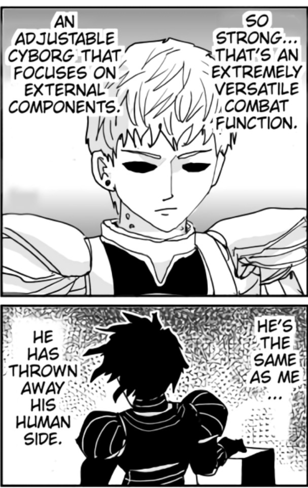
And this panel is even more disturbing. He sees Boros and says he's a 'pathetic being whose only purpose in life is to fight.... just like me', and that boros (and therefore himself) is just a living being deprived of his will and operated as a weapon.
But the most disturbing thing is that he then he proceeds to try and PUT BOROS OUT OF HIS MISERY. Like, that's basically implying that Genos would put himself out of his misery as well if he could, and that he very well might -- after all, he's got a history of drastically trying to self-destruct or taking actions that may very well lead to self-destruction. He's a hero, yes, but sometimes he comes off as a little too eager to throw away his life in order to save lives, or just defeat a monster. But a large part of why he's still alive is because Saitama stops him.

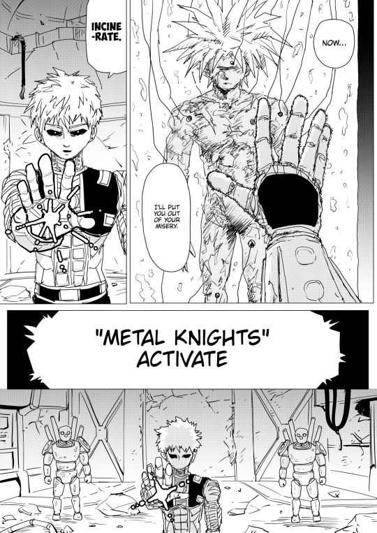
Which brings me to the other thing that's deteriorating -- Genos and Saitama's relationship (though that could be seen coming from a mile away, honestly. All the little cracks in their relationship have been played off for laughs and gags up till now, but knowing ONE, a gag is always the surface of something more serious.)

Even Dr. Kuseno acknowledged directly that Saitama had a huge part in keeping Genos human, in control, and feeling like a normal teenager, and not self-destructing.

Saitama used to be the thing tethering him TO his humanity, but now that he's not even there for Genos, and Genos is mad at him, and Dr. Kuseno, the only person with sufficient emotional maturity to comfort Genos, is gone, what's left to keep him from absolutely losing it?
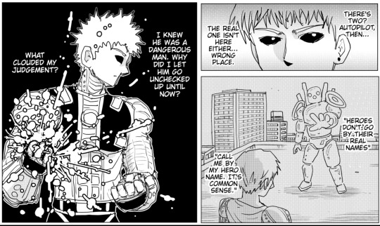

When I saw these two pages, I could at first see it being construed as: Genos's belief in the humanity and goodness in people allowed him to let Metal Knight to go unchecked, and then he also believed in Saitama's ability to stop him and save everyone if anything were to go awry, and that's what 'clouded his judgement'. But obviously that isn't how it's supposed to be construed. He's definitely mad at Saitama (my shipper heart went through the five stages of grief reading it)
Saitama can't save everyone, not even Dr. Kuseno. This is another example of the consequences of a gag rearing its ugly head now... his unconcerned nature was funny at first, but Genos now feels Saitama is to blame for the whole situation.
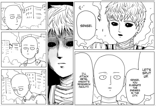
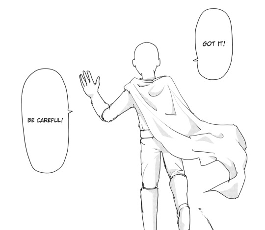
Even at this particular panel, which is pretty early on, it's like Saitama knows that Genos is mad at him and that his self-control may be slipping away, and either doesn't really know what to do or decides to give Genos space.
This is the second time across 2 different mediums that Saitama's tardiness and nonchalance caused someone important to him/the people around him to get killed (for the manga, Genos himself, and for the webcomic, Dr. Kuseno.)

Yet he STILL blames himself and goes back to thinking he's worthless and powerless and a shitty hero.
But there's no denying it, he's super mad. Saitama is no longer the perfect idol he looked up to. It used to be such a gag that Genos was willing to do anything for Saitama, and admired him to the point it was borderline obsessive, but the consequences are really showing now.
Buuuut, maybe this is all for the best. A question I avoided confronting was when Genos would finally blow up. For a relationship to be healthy, I think it definitely requires for the people in it to have arguments, disagreements, and work through them together. That's what constitutes a strong relationship with proper understanding and communication.
Aaand if it's one thing these two are bad at, it's communicating their needs and listening to each other imo. (Even Genos misunderstanding everything Saitama says for something suiting his own 'vision' of him is played off as a gag as well.)
It's just that the consequences of these issues are exaggerated by like x1000 and the fate of many people relies on the health of this relationship, and on Genos's psyche staying intact, so... uh, I hope it's all for the best?
If they both don't come out the other end holding hands and slowly mending then RIP Saigenos :(
(sorry for this long ass post it probably could've been summarised in 20 words about 3 months earlier)
51 notes
·
View notes
Text
OOPS! ALL ANONS
THESE ARE 15$ USD EACH!
TOS and Purchase Links Under cut! I will not be updating these to reflect their sold status, you’ll just have to check the link. They’ll show as sold out if they’re sold out.
REMINDER. FOR THE FIRST 24 HOURS, YOU MAY NOT PURCHASE MORE THAN 2 DESIGNS TOTAL. That includes for yourself AND others. Other people may not buy you designs to gift to you if you're buying for yourself either!! Time posting: [April 21st, 2024 at 12pm EDT]. You can come back for more if you want tomorrow!
TOS
By purchasing you will be agreeing to follow these terms as follows. PLEASE make sure you read them in full to understand them.
In the interest of fairness, given how fast these go sometimes: FOR THE FIRST 24 HOURS, YOU MAY NOT PURCHASE MORE THAN 2 DESIGNS TOTAL. That includes for yourself AND others. Other people may not buy you designs to gift to you if you're buying for yourself either!! Time posting: [4/21/24 at 12pm edt]. You can come back for more if you want tomorrow!
You MAY change the design/species of any design i've made after youve bought it, but you must leave credit with INDIG0TEA for the design, and the design itself must be recognizable.
Gender/sex/etc is ultimately up to the buyer.
You may NOT resell the design for more than you paid for it, unless it comes with extra art either made by you (listed for your current or historical commission rates), or commissioned by you. Gift art/free art does not count towards the value of any design I make, ever. Additionally: You may not ever ask for, recieve, or offer full resale plus non-currency add ons (such as, but not limited to: art, characters, merchandise, games, game currency, etc.). Yes, even if the offer as couched as "free art/commission/character". Partial resale may be negotiated only for designs whose original buying price was 30 or more dollars USD, and split dollar amount may be for no less than 2/3 of the list price to prevent people trying to workaround this TOS to encourage other people to accept their offers. (For example: Partial resale on a 30$ design may be a maximum of 20$ partial + non-currency add on.) This is to prevent overoffering/artificially inflating resale value. I am willing to make exceptions to this clause, but you will have to speak to me directly to ensure my TOS is being respected.
If the design is gifted/traded at any point, all financial value up to that point is lost and it may not be resold until further art is made/commissioned for it.
You may not include my designs in resale bundles. Period.
You may not EVER feed ANY of my art into an AI interface of ANY kind.
If you resell, trade, or gift this design, please inform me that it has been traded/resold/gifted so that I may update the TOS to reflect that and so future buyers cannot be scammed.
You may not resell, gift, or trade this design (or any of my designs) to anyone on my blacklist, which is linked below for your convenience. Doing so will result in immediate blacklisting/blocking of your accounts.
You may not ever edit the original artwork(s).
You may not repost the original artwork to deviantart, instagram, or other social media/portfolio sites.
You may not use this design for the creation of license-able media such as (but is not limited to): books, animated shorts/shows, Vtuber/twitch streamer sonas, comics/webcomics, and video games (free or otherwise). If you would like to use this design in anything like this, we can negotiate a one time licensing fee which covers use in all of the above. This can be anywhere form an additional 150-500$ depending on your intended use.
You MAY use your design for any other purpose, so long as you are not profiting financially off of my work nor passing it off as your own.
You are allowed to store it in your deviantart sta.sh, post it to tumblr profiles, or upload it to websites like toyhou.se with proper credit.
However, you may not reupload to toyhou.se, to keep the ownership log intact, and to keep the original tos consistent.
For my personal comfort, you may not delete original listings from toyhou.seand resell it separately. This is again to keep the ownership log intact, and to keep the original tos consistent. If the person you wish to resell it to does not have a toyhou.se, I have plenty of invite codes I can give out as necessary.
Please credit to INDIG0TEA the first time you post art of them to websites other than toyhou.se
Violation of many of these terms will result in permanent blacklisting/banning from buying or owning designs by me in the future.
BLACKLIST
[N1 LINK]
[N2 LINK]
[N3 LINK]
[N4 LINK]
[N5 LINK]
[D1 LINK]
[D2 LINK]
[D3 LINK]
[D4 LINK]
[D5 LINK]
[R1 LINK]
[R2 LINK]
[R3 LINK]
[R4 LINK]
[R5 LINK]
[W1 LINK]
[W2 LINK]
[W3 LINK]
[W4 LINK]
[W5 LINK]
[A1 LINK]
[A2 LINK]
[A3 LINK]
[A4 LINK]
[A5 LINK]
24 notes
·
View notes
Text
I made a Patreon lol.
Here's the free sample post:
THE CREATION MYTH OF KILL 6 BILLION DEMONS
INTRODUCTION
I love fantasy religions. I love it when fictional humans try to understand worlds like Brandon Sanderson’s Cosmere and Tolkein’s Middle Earth through a religious lens—especially because in those books and in many others, the fantasy religions are somewhat true, and somewhat false. It’s really fun to look at a fictional universe through the eyes of a character who might not see things objectively. Religion usually plays a role in that. But, if I’m being honest, a lot of fantasy religions are just Christianity wearing a fun hat. Don’t get me wrong, I am fascinated by Chrisitianity, and I really enjoy a lot of fantasy versions of Christianity. But it’s a great special treat when a fantasy story goes the extra mile and portrays another concept of the divine. That’s one of many reasons that I love the webcomic Kill 6 Billion Demons. The webcomic’s fictional religion Atru has parallels to Taoism, Gnosticism, Advaita Vedanta, theothanatology, Biblical divine nomenclature, the list goes on. I just threw a lot of big scary words at you, but I promise, this is a beginner level essay. I’ll break everything down into bite-sized pieces. I just wanted to list out some of K6BD’s religious influences to show that they are complicated, and diverse.
This is specifically a essay about the creation narratives. K6BD is an amazing comic—later on, it tackles questions about time, free will, and optimistic nihilism, but I won’t dig into that stuff here. Those things would require their own essays. Here, I’m going to try to explain how the seven-part world came to be. More specifically, I’ll examine the stories that White Chain, Cio, Michael, and the old devil’s tale tell us; then I’ll look at fictional holy texts found in the Concordance.
I’ll also compare and contrast with a lot of real world religion and philosophy. I want to be clear that the creator Abaddon and I have never spoken. I don’t know where he got most of his inspiration. I’m not revealing any information that wasn’t already available, I’m just compiling it and offering my own thoughts. Unless I specifically quote Abaddon, assume that I’m not even talking about his inspirations. I’m drawing parallels because it’s fun, even though it probably won’t give us new insight into how the text was created.
I promise I’m not trying to convert you! I genuinely don’t want to make other people believe the religion that I believe—or any religion at all. I’m just trying to show you how understanding some real world religious and philosophical concepts can deepen your appreciation of K6BD. Obviously, there will be tons of spoilers, so go read the webcomic if you haven’t already. It’s absolutely genius.
Lastly, I want to say I will discuss suicide and murder.
Ok, let’s get started.
PART ONE: THE FIRST AND GREATEST DIVISION
Let There Be No Genesis
White Chain begins the history of the universe with the words, “Let there be no Genesis,” closely echoing the in-universe fictional Psalm I. “For indeed, there was [no Genesis]. God has always existed and has never existed.” As White Chain tells her story, we are shown the god YISUN. This figure is sometimes described with it/its or she/her pronouns, but for the sake of simplicity, I’m going to follow the example of the fictional Psalm I, and use he/him. I might call him “YISUN” or “God” with a capital G depending on the context.
YISUN was eternal, and the “undisputed master of the entire omniverse.” He predates everything else, and without him, nothing would exist.
YISUN has at least twelve bodies, probably more. Some are smiling, some look mad; some resemble insects or animals; most hold weapons; and all are different colors. The central white body has four arms. Abaddon has said that YISUN’s appearance is directly inspired by the Hindu god Vishvarupa. Hindu gods are frequently depicted with multiple body parts, an artistic tradition that Doris Srinivasan calls “the multiplicity convention.” She explains some of the religious and artistic reasons that many Indian gods have multiple body parts in her book “Many Heads, Arms, and Eyes: Origin, Meaning, and Form of Multiplicity in Indian Art.” The tradition of Hinduism is long, and diverse, so the multiple limbs in one text can mean something very different from the multiple limbs elsewhere. Srinivasan closely examines a vast expanse of Indian history, and I don’t have time to present all her ideas. I would like to specifically focus on the interpretation that multiple limbs represent the manifestations of a singular godhead.
Srinivasan writes that “Multiple versions of a myth are facilitated by the idea that there exists multiple aspects or manifestations of a godhead.” Think of the difference between Greek and Hindu goddesses. Bruno Snell suggests “that these four women signalize the four aspects of all womanhood,” but Srinivasan qualifies his interpretation. The Olympian women “are not multiple forms of [one] Divine Woman, as is the case in Hinduism.” Artemis and Athena are different people who are both women, plural. Parvati, Sati, and Uma together are Woman, singular. Zeus, Demeter, and Poseidon are gods, plural. Shiva, Vishnu, and Krishna are God, singular. That’s not how all Hindus see things, but it is one Hindu perspective that I find especially comparable to K6BD.
Similarly, the multiple bodies are only manifestations of a single God: YISUN. All of his bodies are a single person. In Hinduism, the plurality of the divine can be seen as empowering and liberating. Multiple body parts signify that the god is a well-rounded entity. But Abaddon makes it look like a curse. He turns the artistic convention around. Using the same symbolism and metaphysics, he tells a radically different story. As White Chain says, “Being was only circular.” “YISUN had no equal… It was a wretched life, without meaning or perception. Imagine infinite stories to tell… and nobody to tell them to.” Perfection is lonely. At this point, YISUN is the only thing that exists, and that can’t be fun. All those arms and heads cannot satisfy YISUN’s need for companionship. It’s fascinating to me that when White Chain says YISUN had no one to whom it could tell its stories, Abaddon chose to illustrate multiple heads right next to each other. Even if those heads told each other stories, the speaker and the listener would still be the same person. Dissatisfaction with isolation is why YISUN created the world.
Although not all Hindus follow the school of Advaita Vedanta, in this case, I think it will be helpful to compare and contrast with Advaita. As Ram Shanker Misra writes in “The Integral Advaitism of Sri Aurobindo,” “Brahman [ is] perfect, absolute, infinite, need[s] nothing, [and] desir[es] nothing…” Brahman is full of all perfections. And to say that Brahman has some purpose in creating the world will mean that [Brahman] wants to attain through the process of creation something which it has not. And that is impossible.”
But that’s exactly why YISUN created this world. He wants to gain something that he does not have: companionship.The universe is God’s escape from himself. There was no Genesis, but there was “the first and greatest division: division of self”: “God committed holy suicide.”
2. The Divine Suicide
White Chain’s story is similar to Friedrich Nietzsche’s famous claim that “God is dead,” but Nietzsche did not mean God was a real entity that had literally died. He meant that intellectually, it was impossible to continue believing in God, and that all intellectual achievements founded on belief in Him had to be abandoned. Nietzsche’s claim is a famous example of a philosophical school of thought called death of God theology, also called “theothanatology,” which means “the study of God’s death” in Greek.
“Death” can mean a lot of different things in this context. Sometimes it’s metaphorical, sometimes it’s literal, and usually, it’s a very confusing mixture of both.
Nietzsche proposed the death of God as a social claim about humans. He’s talking about what we can believe, what we should do, and what we need to accept. God never really existed, but as religion loses followers and influence, even the idea of God has begun to “die” because it no longer has power over the real world.
“Death” can also mean God exists, but in a way radically different from what people usually mean when they say “God.” The Rabbi and philosopher Richard L. Rubenstein thought God exists as a “ground of being,” but not as a supernatural entity that made a covenant with Abraham. Rubenstein proposed the death of God as an intellectual change in what humans think the word “God” means.
And, finally, “death” can just literally mean “death.” The Protestant theologian Thomas J.J. Altizer wrote “we shall understand the death of God as an historical event: God has died in our time, in
our history, in our existence.” This isn’t a social claim about humans—it’s a metaphysical claim about God.
Death of God theologians usually mean more than one thing when they say God is dead. Nietzsche wasn’t just trying to convince Christians to become atheists; he was also trying to convince many atheists that they disbelieved in God in the wrong way. Altizer had radical thoughts about what human beings are able to believe.
White Chain means that God is dead in the literal sense. She is proposing a metaphysical belief that God, as a historical figure, chose to actually kill himself. White Chain is not rejecting or critiquing religion—she’s asserting that her religion, in which God has died, is fact.
You can see slight parallels to Nietzsche, Rubenstein, Altizer, Hegel, Zizek, and Blake in White Chain’s version of the fictional religion Atru. But there is no better comparison than the king of sad philosophers Philipp Mainlander.
Mainlander was an atheist—but not in the sense that people usually mean when they say “atheist.” Mainlander believed that there was a God at some time, but that time is now over. There isn’t a God anymore. Mainlander is pretty unique among death of God theologians because he explicitly describes God’s death as a suicide. Whittaker explains that Mainlander thought “[a]ll things have their origin in what may be called… the ‘will’ of the absolute being… to annihilate itself.” Essentially, the cause of the universe is God’s suicidal desires.
God was a “real unity,” but his death caused a “collective unity”—that’s the universe where we live now. God had been a total and undivided One, but now the universe is made of distinct parts. God cut himself apart into the pieces of the universe. God created the world by becoming it, and he became the world by dying.
Mainlander said “the knowledge that life is worthless is the flower of all human knowledge.” He thought suicide was desirable, and ultimately, he put his money where his mouth was. The biggest difference between Mainlander and White Chain is that she doesn’t seem to think ordinary people such as herself should follow God’s suicidal example. Even beyond the views of a specific character, the story of Kill 6 Billion Demons reads as an affirmation of life’s beauty and value.
But the webcomic clearly argues that making a better world is a bloody project. So it should come as no surprise that making the world itself involved bloodshed. First and foremost, the blood of God. What’s so interesting to me is that both White Chain and Mainlander equate God’s suicide to the creation of the world. Our life comes from God’s death. Creation and destruction aren’t opposites—they’re different ways of looking at the same process. At the end of Book 2, Allison destroys Mottom’s evil tree and a lot of her palace—but this destruction is also part of the creation of a more just and free world.
So, what did God’s destruction create? What came after YISUN?
3. The Duality of Un and Yis
The destruction of the total unity creates duality. I know that’s a little confusing because YISUN had many faces, but remember that behind all of those faces was one God, and only one. Not anymore. “From division was birthed duality. White Un, Lord of empty and still places, master of all that is not. Black Yis, infinite mother of the rampant flame. Master of all that is''
I cannot avoid comparing the White and Black gods to the Yin and Yang—a spinning black and white symbol usually associated with the religion Taoism. Yin and Yang represent a cosmic duality. Yin is associated with femininity, darkness, passivity, and even numbers, among other things. Yang is associated with masculinity, light, activity, and odd numbers, among other things. Mainstream Taoist philosophy asserts that the universe can be understood through duality. So, why are these pairs important? And why do things get paired together in the first place?
As is written in the foundational Taoist text the Tao Te Ching, “Being and non-being create each other. Difficult and easy support each other. Long and short define each other. High and low depend on each other. Before and after follow each other.” What’s so interesting about the pairs is they “create,” “support,” “define,” and “depend on” each other. Black can’t exist without white, and white cannot exist without black.
As the Encyclopedia of Philosophy puts it, “...yinyang is emblematic of valuational equality rooted in the unified, dynamic, and harmonized structure of the cosmos. As such, it has served as a heuristic mechanism for formulating a coherent view of the world…” Essentially, neither of these opposites are “dominant” or “truer.” Choosing one side won’t help you understand the universe because the universe is their partnership. Their equality gives “structure to the cosmos.” That structure is order, not chaos, but it is differentiated. There are two different things: Yin and Yang. They contradict each other, but at the same time, they make the universe. Yin and Yang are a productive paradox.
I’d like to return to the notion that “being and non-being create each other.” At this stage of creation in K6BD, UN and YIS could not exist without each other. Their very existence is the fact that they are not a unity. If there was only one of them, then there wouldn’t have been a division—and they are nothing more than the product of division. Just like how being and non-being create each other, the Master of All That Is and the Master of All That Is Not create each other. YISUN was characterized by his totality—he was the total sum of the omniverse, there was nothing else. After the division, Un and Yis experience otherness. The first otherness in the omniverse. It’s difficult for them to find balance—in fact, they immediately went to war for seven years. At the end of their seven-year war, Un and Yis made love for seven days.
I want to be very clear that this is not a depiction of actual Taoism. Yin and Yang are not gods with faces and minds. Notably, the Tao Te Ching asserts that yin and yang are “older than God.” so make of that what you will. But I think Taoism is thematically relevant to this era. Two opposites have to come into balance with each other. The whole universe is a duality of interconnected forces.
K6BD repeatedly emphasizes the need for community. As Allison says at the end of King of Swords, “I couldn’t have done this without any of you… We make mistakes. We learn from each other. We all still have so much to learn. Once I saw that as a weakness, now I’m certain it’s not. Someone who lives still thinking like that… struggling to do everything themselves… I can’t help but think how alone they must be.”
YISUN had to do everything all by himself, and we saw that Allison was right—isolation was a struggle, even for God. But the struggle is over, and in its place is duality. Partnership. The first community.
These are the first four parts of a fourteen-part critical essay. You can read the rest here.
Bibliography is on the free Patreon post.
30 notes
·
View notes
Text
Lettering Tips for Comics Artists!
Lettering is an easy to overlook aspect of comics creation, partially because good lettering is designed to be invisible, but bad lettering can ruin an otherwise well crafted project.
Now, I'm not a letterer by trade, I'm a colorist who thinks too much about comics craft, but I've picked up on a few common mistakes I've seen new webcomic artists making, and I thought I'd share my tricks.
#1: Get a Dialog font
Sorry, despite Comic Sans having the word comic in the name, it's not actually good for lettering comics. Comic book letterers usually use specially designed fonts when they're lettering comics, and they often have websites where you can get these typefaces for a reasonable fee (or sometimes even free!)
What makes dialog typefaces special?
The barred-I! (and other contextual options)
This one is subtle, but generally, you want to only use the barred-I for the personal pronoun "I" or for roman numerals. It helps clarify that what you're looking at is an I and not an L, but it takes up more space in the word, and we're trying to reserve as much space as possible for the art on the page.
Specially made comic book fonts will also be custom designed to be legible at a distance, have multiple bold/italics options, and might even include special versions of individual letters for when you type multiple of the same character in a row! It'll give your lettering a personal touch that you won't get from typefaces designed for other things.

Blambot is a great resource for all your lettering needs. Here I'm using Backissues and Nightmark
#2: Dialog Stacking
Dialog should always be stacked such that your longest line of text is in the middle. The block of text itself should have a sort of diamond shape <>. Sometimes this is difficult to do, especially if you have any long words at the beginning or end of a sentence. You can't always get it to work (and if you're unwilling to rewrite your dialog so it fits), so sometimes it might not be perfect, but if your text block is more hourglass shaped >< that's a good indication that you should try putting your line breaks somewhere else. Basically try to make your text as round as possible if it's in a balloon.
#3: Balloon Shape
One of the more common mistakes I see webcomic artists making is using perfectly elliptical balloons. It's actually kind of difficult to fit text into balloons that are perfectly elliptical; there ends up being a lot of uneven space around the text, and it looks kind of cheap. Making your balloons slightly more rectangular is going to give you more bang for you buck, they'll fit the text block a little better. I like a hand drawn balloon, I tend to think they add variety.
One thing you definitely shouldn't do is this:
This might be a personal preference thing more than any kind of hard and fast rule, but these lettering styles give me the impression that the text is pasted on top of the art, and that no real thought was put into arranging it thoughtfully with the art. These are probably more appropriate for captions, not so much for dialog
Lettering is a part of the medium we're working with, the dialog should be approached as a part of the artwork, and treated as such.
#4: Balloon Placement
The number one, most important rule of lettering, is that the placement of your balloons should never confuse your reader. The goal of balloon placement is to guide your reader around the page, each one should naturally lead your reader towards the next thing they should read. Here's an example of something I see a lot:
While yes, it is true that on a comics page, people read left-to-right top-to-bottom, if two balloons are connected with a line, I am going to read them one after another. Readers are not going to intuitively assume they should jump to the other side of the page just because the #2 balloon is slightly above #3. In this situation the balloons should be interwoven.

It should not be possible to look from one balloon to another and skip over intermediate dialog. If your reader misses a part of the conversation and has to double back to figure out what they missed, you've broken the flow and immersion of the page.
Like I said, lettering is all about guiding your reader around the page, it should be a part of your composition from the beginning, don't forget to incorporate lettering into your work when you're first laying out your page. Put yourself in the place of your reader and see how your eyes track across the page.

Hope these help! Like I said, I'm no expert; it took me a while to learn a lot of this. I would have found these tips super useful when I was first starting out. If you're interested in the technical side of lettering, I highly recommend The Essential Guide to Comic Book Lettering by Nate Piekos. It's one of the most useful reference books I own, and I learned most of this from that book.
#undertale and deltarune webcomics get a free pass on using comic sans#webcomics#tutorial#comics#ferrouscomicscraft#when I say I think too much about comics craft this is what I'm talking about#I could go on and on about how cool auto-ligatures are#lettering
80 notes
·
View notes
Note
curious question because ive been thinking about it: has the new (ish) format of the comic pages affect the way you guys pace things? as far as you've noticed anyways, and by pace i mean the story's pacing
how is the comic in this new page by page format- rather than scrolling format. like what are changes you noticed, etc
im just curious to hear any miscellaneous thoughts actually, because im thinking about comic formatting a lot and id be interested to hear!! thats all
It's actually curious you would ask this because this chapter and the next chapter were intended to be all read together and we were not intending to switch to a page-by-page format until probably after this arc was concluded.
However, we needed much more breathing room to plan and put together the next chapters and we couldn't go a year or so without updating because that's not fair on our readers. Thus, we decided to go ahead and release the completed two chapters we had page-by-page.
So, the fact that nobody so far has really raised any complaints about how we've formatted the page-by-page storytelling is really interesting. I wouldn't even blame people for doing so since yep, page-by-page updates that just drag and have hardly made any progress in a year or so is a bit of a pet peeve of mine when reading comics.
Off-White as a comic had this issue for me, for example. Absolutely stunning comic but I remember the whole scene concerning Seven, Raigho and Gebo took forever to play out. I think I remember reading it and then going back a few years later and it was still ongoing. And it wasn't due to any sort of hiatus or w/e (that's different, folks can't help not being able to work on free webcomics) but because of the way the pages were structured.
The whole comic itself had this issue and I even remember it being a bit of an ongoing joke that if we ever reach the year 3000, Off-White will still be the best ongoing wolf comic out there. lol
Anyway, I'm rambling but yeah, there isn't anything to really divulge because we just didn't plan for these chapters to be page-by-page. We just did it because Cat is just really that good at formatting.
Though I suspect something is gonna click with folks about our own pacing issues now that I've admitted all of this. Which is cool, but it'll still be funny. lol - RJ
31 notes
·
View notes
Note
I liked sparklecare until the author did this odd thing where villainous or morally questionable characters are always strictly cishet and even said it was their hard-line rule? Like LGBT characters can never be antagonists or abusive which just felt weird to me, maybe they relaxed on that though I dunno? I am def never offended if a villain shares my gender in a series where good guys can be like me anyway I mean
TLDR: Yeah, there's some weird gender bias with the characters sometimes. Anyways, *starts talking about Awful Hospital again*
Also, spoilers for both Sparklecare Hospital and Awful Hospital. (up to page 41 of SH and various plot point/character reveals for Awful Hospital)
I haven't read too far into the comic myself to confirm, and the genders of the characters were kind of vague anyways thanks to Nurse Mood's shitty notetaking (EDIT: I learned about the existence of the 'Cast' page, my bad), but yeah I've definitely seen a pattern where the LGBT characters are all 'good', regardless of whether they're a patient or employed by the hospital.
For example, Mood and Ms. Dies are in a lesbian relationship. They're also both employed by the hospital, and despite this are portrayed sympathetically, in opposition to Dr. Cuddles' being genuinely malicious and cruel, as seen below:
...Even though it's also shown that Mood doesn't give half a shit about the patients, either.
Now, if you want some equal, well-handled representation, look no further than seriously one of the worst best webcomics of all time...

Awful Hospital, despite the majority of its cast not even being remotely human, has some great LGBTQ representation in both it's heroes and its villains! Well, 'villains'. The only real villain is the Big Bad(s) of the series, everyone else is just doing what they gotta do in order to survive.
Speaking of which, this is E.M. Balmer. He's a villain of a whole arc, and has a sort of "kid's cartoon villain" vibe. Goofy, incredibly self-absorbed, and affably evil. He's also implied to have some sort of interest in another male character, Dr. Phage.
Also, just tell me this beefcake isn't some sort of a Gay. Just look at him.
...AAAANYWAYS, in terms of heroic queer characters, you've got your choice between the Lesbians and the Trans.
Celia and Staph are this really sweet fungal/bacterial couple who have like a trillion kids and are also besties with the person who's corpse they live in.
Miss is cleverly implied to be trans with this line here:
Which, personally, I think is really cool!!!!
ALSO I JUST REMEMBERED, THERE ARE ALSO SCISSORS WHO ARE LESBIANS! AND ALSO THESE STAIN MOMS
Also, I realize I didn't really talk much about how cool and epic Awful Hospital's LGBTQ+ characters are very much, buuuut that's because I'm tired and need to sleep so whatever
Anyways, goodnight tumblr people, and...
Read Awful Hospital for fuck's sake!!!
#gengarghast#awful hospital#bogleech#sparklecare#sparklecarp#EM balmer#miss awful hospital#celia awful hospital#staph awful hospital#there sure are a lot of lesbian couples#nurse mood
48 notes
·
View notes
Note
I feel this is a good time to disclose that I don’t know what homestuck is so that you can induct me and also talk about it at length so that others may be similarly inducted.
Thank you in advance/you’re welcome xox
hahaha i actually do this a lot, i should probably find one of my “how to read/understand Homestuck” posts and bring it back to reblog every time somebody asks about it
Homestuck is an interactive webcomic & experimental hypertext, told mostly through epistolary chatlogs. In short, this means that Homestuck is told mostly through images and text (like most comics) but that sometimes — even often — the panels are have sound effects, music, playable sequences etc. facilitated through Shockwave Flash (the same now-retired software that used to let you play browser games during class if you’re the same generation as me :P). Also, as mentioned, most of the dialogue is delivered through chat logs between internet friends, and they’re incredibly faithfully written — Homestuck is the comic for internet friends to read together.
I just spent a long time talking about what Homestuck IS but not what it’s about — this is because as a whopping 8,000-page epic told using over a million words Homestuck is actually about a lot of things and its genre, setting, and even main characters shift quite drastically throughout the comic. Also, because Homestuck is a meta-narrative, its story is often about itself, which gets a little tricky to understand & explain; one of the big conflicts of Homestuck is the concept of retaining fictional relevancy (some characters even know when they are and aren’t the main character, and it vexes them, for example).
Overall, the first “main plot” you’re going to contend with is the adventure of four teenaged internet friends playing a special videogame together and discovering their destinies to embark on a quest to save all of reality.
TIPS:
1. Don’t let the 8,000 pages, 1 million words thing get to you. It breezes by a lot faster than you’d think when you get into it. Plus, single-panel-pages & long playwright style dialogs inflate how big it looks a lot; a lot those one million words are probably the narrative stating a character’s name to show they’re talking.
2. Read the Unofficial Homestuck Collection. There is an official Homestuck website; as of February 2024 it’s still considered pretty broken & the Unofficial Collection is considered unbeatable. It’s even author approved.
3. A lot of people give up because they don’t “get it” and they think they’re missing something. They aren’t, it’s just a little obtuse and doesn’t explain everything in a clear way intentionally sometimes. The comic will trick you, lie to you, tell you things intentionally out of order, make up meta bullshit a joke, intentionally draw stuff badly, etc etc. It’s a trial through fire. You can overcome it, and if you do, Homestuck is for you & it has a bounty of creative spoils for you.
4. People also give up assuming it isn’t queer because characters don’t immediately say “oh wow im gay” in the first thirty seconds. Well, these characters are realistically portrayed teenagers. You’re gonna have to wait, and that’s what makes it so good.
Good luck. You’re gonna need it.
18 notes
·
View notes
Note
Hey, I've worked a bit in animation and just wanted to point out that shows very often get pitched and bought out, and can sit in the back burner for a really long time depending on the market! Seems like with all the strikes and post covid lag, and a market thats already saturated with greek mythology atm (think percy jackson live action coming soon, youtube series, other webcomics, etc.), lore olympus is probably floating in the air atm until the time is right. These kinds of things can take years to happen, even 10+ years! Some of the most popular animated shows were pitched years before they were picked up and sent into production. Hoping in the time its on hold, they get some really good writers to clean up the story. I don't mean to disregard your post, but just a lil bit of info on how that nature works in animation. I love lore rekindled too, keep it up!
Oh hey thanks for your input! So I do actually have a diploma in animation (though I never ended up working in the larger industry) so I know a bit about how things like that can happen. Nimona's a great recent example, it was bought in 2015 by 20th Century Fox but never made it through development because of Disney purchasing them and bringing the project to a crawl due to it being LGBTQ+, then they shut down Blue Sky and that kept the project in limbo until it got picked up by a new studio and brought to Netflix. So it took well over 10 years for that one to finally hit the screen.
That said, most of that post is addressing the fact that if LO is going to get a TV show (I'm really strongly believing it isn't at this point, esp not with JHC but that's me) then stalling it out for 10 years or however long probably won't be the best move. Especially not with how things are going with animation at large.
While LO is the biggest on the WT platform, the platform itself still isn't as prestigious here in the west as say, DC or Marvel. Its platform and its comics just don't have that sort of longevity out here. LO is also undoubtedly nearing the end of its run and it's struggling to stay relevant as it is - so to make a show years down the road when it's long gone out of everyone's minds (which it will be as soon as it ends and WT starts shilling the next big thing) just sounds like a missed opportunity. It could rejuvenate interest, sure, but it could just as easily flop due to its fanbase having moved on/lost interest/etc. LO is pretty much reliant on WT's advertising at this point, it's not a good sign that WT has to keep putting notifications to read LO everywhere on the app. WT loooves the "strike while the iron is hot" methodology and now with the show they just drag it out? It feels less like striking the iron while it's hot and more like trying to get a fire going, period.
Like, when Nimona got its movie, it was like "omg Nimona's finally getting a movie!!!" but I can't help get the sense that if LO goes through that same treatment, the response is gonna be, "that gross comic with the underage girl and old man billionaire is still getting a TV show??" Maybe that's a mean assumption to make but if LO is struggling to stay relevant and in a positive light now, god knows what that's going to be like years from now if and when they do release a show.
Especially when it comes to comics like LO which generate so much criticism, I feel like it's going to go through the same thing Twilight did, where people adored it during the peak of its run but as soon as the series was over and the hype left everyone's brains it gave people room to actually reflect on it and realize how icky it was LOL (and if it goes the full way of Twilight, people will read it as a joke over how bad it is).
There are also theories in the community that a lot of what WT is doing with LO rn (paying for Rachel to be in the top billing spot at NYCC, getting her a second Eisner, etc.) could very well be them trying to "shop it around" for investors or a new network, by putting Rachel in the spotlight and going "see! look at how successful this comic is! buy it!" That's just a theory of course, but it really isn't a good look when LO wins awards and people ask why. It feels like WT's is trying to throw money at a problem without realizing what's causing the problem in the first place. It winning an Eisner or being hinted at a TV show or getting a top billing spot at NYCC won't give it legitimacy because the comic they're advertising is still garbage, they're trying to convince people it has merit when it doesn't. If anything, it'll make LO and WT lose even more credibility because it makes people wonder why the fuck a comic like LO is winning those awards and why it's being given more attention and opportunities over other comics on the platform that are far more deserving.
Anyways, this post is kinda all over the place, but that's my two cents, my point really is that if there is a show happening, it's definitely not happening soon (in spite of Rachel saying "yeah it's happening!") because there's no clear timeline or progress that's been made or even team in charge of it at this point - and if it happens down the road, its only chance of doing well will be if it gets a major overhaul in its writing IMO because the comic is way too much of a mess rn for television LOL
That said, I'd love to genuinely believe that the show will happen someday, but I feel like the best time for it to happen has passed, especially with the comic losing the quality and prestige it was sold to JHC for since then. That's just me though.
#ama#ask me anything#anon ask me anything#anon ama#lore olympus critical#lo critical#antiloreolympus#anti lore olympus
58 notes
·
View notes
Note
Hi! So it says in your bio that you're both a filmmaker and novelist, so I'd like to ask you something. First, are you involved with the script part of filmmaking specifically, or fo you work mostly with other elements of filmmaking? Second, if you are, what are the major differences you've noticed between script writing and prose writing?
For context, I want to make comics, and I'd like to have a script to work from, but I've only occasionally dabbled in script writing. I know I could just use thumbnails and that's definitely something I want to be part of the process, but one of the reasons I want a script is so that I can have something to hopefully make my comic accessible to blind readers. I don't have the money to pay for an audiobook version to be made, so my thought process was if I make a text version of the comic, like a script, I can then make sure that at least a version of that copy is screenreader friendly.
So, do you have any advice for me?
--
I'm a film editor, or was, which definitely involves a lot of understanding of narrative, but that's different from being a screenwriter, and being a screenwriter and/or novelist is different again from writing scripts for comics.
That said, I have written scripts. The biggest difference is that if your script is intended for someone else to direct, you are asked to leave out a lot of commentary and stage direction that director-written scripts tend to have and that novels would have.
--
Dialogue is a fairly minor aspect of both novels and films—at least most good ones.
In a novel, much of the actual characterization is done in the actions characters take or in the way things are described in the narration.
In a director-written script, the writer will often include a lot of stuff that isn't put into actors' mouths to remind themselves of what the point of a given scene is. What would be narration in a novel becomes cinematography and editing choices.
As a rando writing scripts, you're not supposed to shove in that stuff because you're telling the director and other creatives how to do their job. You're just the writer: you don't get to decide those things. The script is less a finished blueprint and more a main melody line that someone else will improvise on top of.
Unfortunately, most of the ~great scripts~ people are told to look at for inspiration are by someone with more creative control (director, showrunner, creative producer) and do have a lot of interpretation already baked in. That makes them more fun for a layperson to read, but it doesn't always make them great examples of how to write commercially.
--
My impression is that a comics script is a specific thing in the pro industry, and it's not a thing that would necessarily be ready for blind readers. If you want to make an accessibility aid, I think you're looking at descriptive commentary along with any dialogue. Depending on the nature of the comic, it might be useful, or it might be pointless.
I would indeed storyboard your comic, not for future readers but to help you plan layout. The visual storytelling is a key part of any visual medium, and a good comic does more than just put the key actions on page. Where are people standing relative to each other and relative to the edge of the frame and how does this create a balanced composition or an awkward tension? Do you need the equivalent of a film insert shot and why? How is the eye being directed around the page, and does this make it easy to follow or chaotic?
What kind of comics format you're doing will matter a lot, obviously, but even in a basic 3-panel webcomic, you can control things like how close to the edge of the frame characters stand.
If you want some 101 on visual storytelling from a film perspective, one of the best regarded books is The Visual Story by Bruce Block. I personally also greatly enjoyed The Eye Is Quicker by Richard D. Pepperman. I remember the latter having more on film editing but nice storyboards and the former having a lot more visual arts-adjacent commentary on cinematography: line, color theory, negative space, etc.
--
People focus way too much on words as a crutch because they don't understand the far more important grammar of visual storytelling.
If your visual story—comic, film—cannot do 90% of its work without the words, it probably sucks.
That's my biggest piece of advice.
29 notes
·
View notes