#github course
Text
I've learnt how to input in python I will be unstoppable now
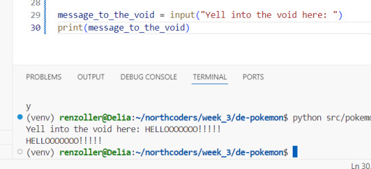
#I've also meanwhile figured out how to make a new line within one text string (it's \n)#and that the input() method does take enter alone as a valid input#which means all the text-based games my heart desires may start appearing on my github (once I have time for literally anything other than#bootcamp and current ongoing projects that is of course)#maybe I'll even be able to finally implement that cyberpunk dating sim I was trying to make with c++ back when I was learning that ToT#oh ye I have a github if any of y'all have one and wanna follow me on there (it's only forked I'm guessing private repos on there atm tho#bc I've only been using it for bootcamp) my username is dkettchen same as everywhere else#we've been coding a 'pokemon battler' the last two days for sprint#and I just got to the exercise that's like 'and now make it into a game you can play in command line' this afternoon#and started having way too much fun just writing half-assed pokemon fanfic as an intro bit#to actually get to the coding bit to use the various classes and methods I've been coding the last two days x'D
9 notes
·
View notes
Note
Hi Alex my boyfriend is shy and he was wondering what story you’d recommend to start off with when reading up on Ryuseitai specifically, given that he’s someone who hasn’t finished a single one, and he’s scared to just pick one because he’s weird. And asked me to ask you because you are ryuseitai. Thank you ♡
WAH THIS IS SO SWEET!! hello perce and also theo though he is shy. im so incredibly honored to be asked this.. but hmm let me think... personally the first ryuseitai story i read fully myself was meteor impact Actually that was the first enstar story i read fully at all. Ever. but i dont think id specifically recommend that to start. sweet halloween is another of the first i read + one of my favorites in general and is more casual and silly https://310mc.github.io/sweet_halloween/ ALSO climax is soso good esp for getting to know the dynamic in the unit itself and is very important in their overall plot and setting up their entire arc throughout !! era https://310mc.github.io/climax/ but it also makes me ugly cry beware. But its good so good..!!!
#there really isnt a super specific one that id say to start with but.! id recommend reading their basic era events before going thru the#music ones#which ofc id just read in order they came out..#if he decides to continue reading about them. which of course i recommend in general (Unbiased)#practically every single ryuseitai story tl ive read is from 310mcs github which both those up there are on#so u can find a lot there#I hope he enjoys. My beautiful ryuseitai. All ryuseitai stories are good so theres really no wrong way to go#also sorry for the delay on this i started answering a while ago now but then i started eating in the middle#I THOUGHT THE LINKS WOULD BE CLICKABLE AUTOMATICALLY sorry idk how to tumblr. should work now#mail
9 notes
·
View notes
Text
as someone whose only tech qualifications are being a bit autistic about linux and submitting small PRs to random github projects it is interesting to read about the inner workings and politics of the tech industry. idk have been considering going to school for cs mostly bc the government pays you to study if it's ur first degree and it'll be nicer than retail 😭 i do hate the tech industry though if i cant find like a nonprofit or whatever who wants me as a tech worker i'd probably just not use the degree professionally lmao
#ik you dont need a cs degree to work in tech most of my mates w tech jobs dont have any formal qualifications#but then i'd have to actually write and share mildly impressive projects on my github/codeberg/whatever to put on my cv#i dont really like sharing my projects cause i feel like they're not very good so maybe if i just share the stuff i worked on during a#course it'll be easier. idk#anyway fast forward a few years and i may have joined the league of anti-civ tech workers i guess lol
11 notes
·
View notes
Text
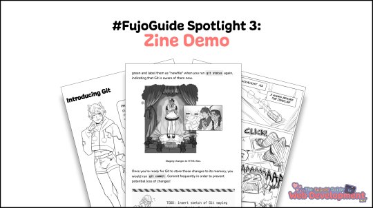
📔FujoGuide Spotlight #3: Zine Demo📔
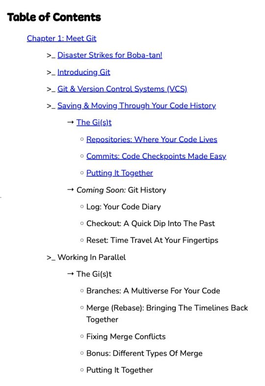
With the cast spotlights out of the way (find the links at the end of the thread), today we want to focus on the actual product we'll be putting in everyone's hands: our Version Control zine.
If you're just joining us, you can get this zine in your eager fujin hands (and help us reach our stretch goals) by backing us on Kickstarter.
If you want to follow along with the demo, you can find it here as a PDF.
Before we go into the nitty-gritty details, we chose Version Control as our first topic because, while working with both beginner and experienced coders, they reported it as the most life-changing (but intimidating) skill they gained. It also helps them join open-source projects!
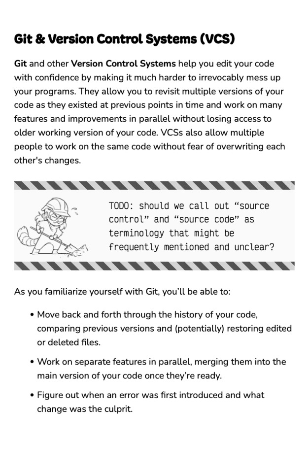
Keep reading for lots more!
Remember: all you see here is a work in progress, and things may and will change in the zine. Our campaign is a love-letter to Japanese productions like otome games and "cast full of hot boys" anime. Similarly, our zine calls back to Japanese fan productions, a.k.a. doujinshi.

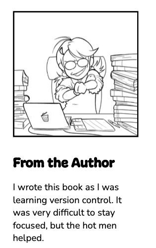
As you likely noticed, we pride ourselves on committing to the bit. This zine is no different. For example, Boba-tan, pitched as the revolutionary brain behind our educational devices, is both its fictional author and protagonist. After all, who doesn't love a good self-insert?
After this, the zine follows a simple pattern: a comic explains the current plight of our protagonist, a new character/technology is introduced, and then we dive deeper into concrete examples of how the technology is used in a practical workflow. We keep it light but useful!
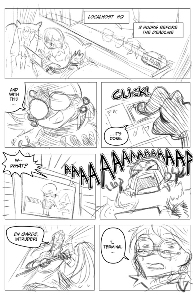
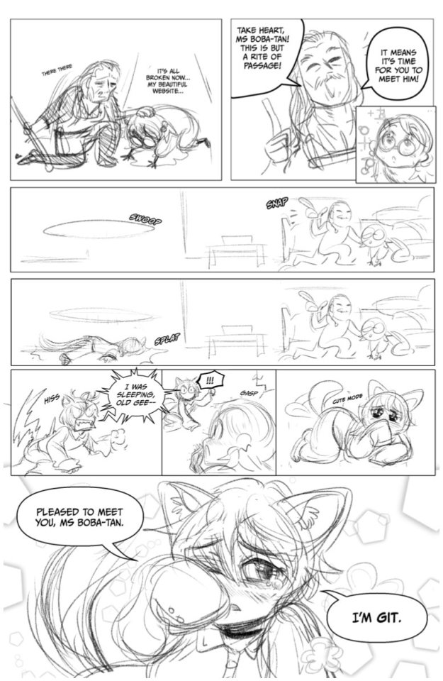
Let's show, not tell! Behold, our first comic by @tempural (🎨) and @essential-randomness (🖋)! Boba-tan, deadline quickly approaching, manages to wreck her website! #relatable
Fear not! Terminal has a simple solution, which we fully endorse: Boba-tan, meet Git! (bonus HTML cameo 👀)
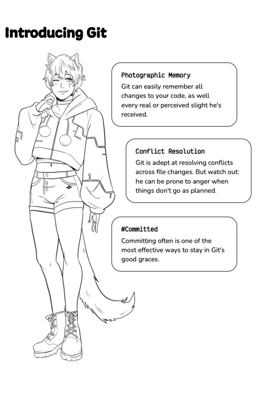
Next is Git’s character introduction featuring @brokemycrown's amazing art. This page serves a double purpose: it adds depth to the character (and some laughs), but most importantly it's a memorable way to help the core concept immediately stick in the reader's brain.
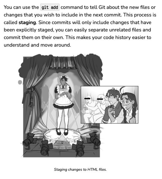
And now we finally reach the core of our offering, that is our actual educational material. The current version (remember, a work in progress) was planned by @essential-randomness, written by @enigmalea, and reviewed by our technical writing consultant wiredferret.
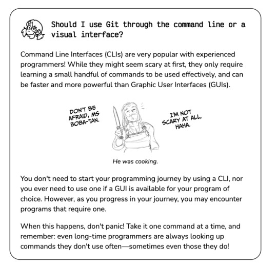
After the campaign, we plan to work closely with backers to deliver material that truly works. But while the content is in flux, you can see the landmarks of our experience: simple explanations that don't shy away from the technical details, with hot men sprinkled all around!

Fun fact: we also used Git & GitHub to collaborate on the zine itself! Thanks to Vivliostyle's powerful tools for typesetting with code, @essential-randomness and @enigmalea were able to use the techniques we're teaching to iterate together without stepping on each other's toes!
And that is all for today! We hope you're now even more excited for this guide to soon be reality. Although we hit our initial goal (🎉🎉🎉) we still have many stretch goals to go. Help us smash through them in this final week by backing us at our Kickstarter page.
If you missed the previous spotlights and wish to learn more about our characters in the Localhost HQ and Browserland spotlights.
#fujoguide#codeblr#kickstarter#gijinka#web development#webdev#vivliostyle#css#git#terminal#github#html#aria#and of course boba-tan!#zines#original zine#contributor spotlight#spotlight
44 notes
·
View notes
Text
Patreon question
I'm focusing hard on budgeting, and one of the things I want to do more of in the coming year is support independent creators/small groups on Patreon and Substack, even if I can only do a little bit at a time. I have a few creators I already support on Patreon, and two on Substack, but I'd love to support more.
I know you've got creators that you love to support on these platforms! Tell me who you support and why you started supporting them if you have creators that are especially unique or near and dear to you. Anything and everything, across the board, I love supporting small business and I love finding new people and niches I never heard about before. There're no wrong answers here!
#I support a few freelance artists and writers and a couple of content creators like Crash Course and Jo Beckwith#I want to hear anything and anyone you've cared enough about to donate to/support!#ALSO FOR THE LOVE OF GOD. IF WE ARE MUTUALS OR FRIENDS AND YOU HAVE A KO FI OR A PATREON LET ME KNOW#THAT IS NOT A REQUEST THAT IS AN ORDER (unless you really truly don't want to. but if you just feel like it's too prideful or not a#'big enough' thing/deal or you don't want to 'bother me'. DO IT. I WANT TO HAVE YOU ON MY LIST TO SUPPORT IF I CAN#I often rotate small amounts of money to different creators every few months in a cycle so I can spread it around still even though#I can't help much. it feels so good to do and makes me feel like I do when I shop a true small or local business. direct action babyyy etc#especially if the creator is going through a health crisis like Physics Girl#2024#to do#reply here or send me a dm or drop an ask in my inbox or make a post and tag me#whatever#i want to hear why you love what you love#i want to hear what you care about so much you already do or want to in the future financially support it#the world is full of so much amazing work and inspiring creativity and massive efforts#i love learning about them so i get to acknowledge and witness and support them too#i love GitHub for the same reason lol
8 notes
·
View notes
Text
i just got told if i want to keep my job, i've got to fish for compliments 🙃
#ooc#we just went through the team objectives for the year#and of course ai tools like github copilot came up#ehhhh 🥴
4 notes
·
View notes
Text
the thing about my inability to choose a tumblr username is that I do have two default online handles, and I think both of them are free on here. However, associating all my accounts since I was, like, fourteen (I think that’s when I got that nickname) - or, much worse, my Official Job Username - with my tumblr feels like a very bad idea.
#what were you doing at the devil’s sacrament of course#but I do not want people to be able to go from my tumblr to my github#or worse. vice versa#nor do I want some people from the forums I hang out on to be able to find me on tumblr#not that they would want to I think#but this is still terrifying
2 notes
·
View notes
Photo

⭐ CAREER CHANGE TIPS ———————————————————————— 📌 How to become a self-taught developer? ⚡ Useful links and roadmaps in my bio! ———————————————————————— 📌 Follow: @rehman_coding 💼 Portfolio: https://a-rehman.com/ ⚙️ GitHub: https://github.com/MuhRehman 💎 LinkedIn: https://www.linkedin.com/in/abdul-rehman-%E2%9C%94-8611505b/✅If you find this content useful, tap the ❤️ Icon, share and consider giving me a follow Thanks. . #html #css #git #github #frontend #reactjs #javascript #coding #programming #khattakdev #crash #course #development #web #technologies #typescript #chrome #developerpodcast https://www.instagram.com/p/ClJ9w_mDp5p/?igshid=NGJjMDIxMWI=
#html#css#git#github#frontend#reactjs#javascript#coding#programming#khattakdev#crash#course#development#web#technologies#typescript#chrome#developerpodcast
4 notes
·
View notes
Text
How to Make a “Scroll to Select” Form Control
New Post has been published on https://thedigitalinsider.com/how-to-make-a-scroll-to-select-form-control/
How to Make a “Scroll to Select” Form Control
The <select> element is a fairly straightforward concept: focus on it to reveal a set of <option>s that can be selected as the input’s value. That’s a great pattern and I’m not suggesting we change it. That said, I do enjoy poking at things and found an interesting way to turn a <select> into a dial of sorts — where options are selected by scrolling them into position, not totally unlike a combination lock or iOS date pickers. Anyone who’s expanded a <select> for selecting a country knows how painfully long lists can be and this could be one way to prevent that.
Here’s what I’m talking about:
It’s fairly common knowledge that styling <select> in CSS is not the easiest thing in the world. But here’s the trick: we’re not working with <select> at all. No, we’re not going to do anything like building our own <select> by jamming a bunch of JavaScript into a <div>. We’re still working with semantic form controls, only it’s radio buttons.
<section class=scroll-container> <label for="madrid" class="scroll-item"> Madrid <abbr>MAD</abbr> <input id="madrid" type="radio" name="items"> </label> <label for="malta" class="scroll-item"> Malta <abbr>MLA</abbr> <input id="malta" type="radio" name="items"> </label> <!-- etc. --> </section>
What we need is to style the list of selectable controls where we are capable of managing their sizes and spacing in CSS. I’ve gone with a group of labels with nested radio boxes as far as the markup goes. The exact styling is totally up to you, of course, but you can use these base styles I wrote up if you want a starting point.
.scroll-container /* SIZING & LAYOUT */ --itemHeight: 60px; --itemGap: 10px; --containerHeight: calc((var(--itemHeight) * 7) + (var(--itemGap) * 6)); width: 400px; height: var(--containerHeight); align-items: center; row-gap: var(--itemGap); border-radius: 4px; /* PAINT */ --topBit: calc((var(--containerHeight) - var(--itemHeight))/2); --footBit: calc((var(--containerHeight) + var(--itemHeight))/2); background: linear-gradient( rgb(254 251 240), rgb(254 251 240) var(--topBit), rgb(229 50 34 / .5) var(--topBit), rgb(229 50 34 / .5) var(--footBit), rgb(254 251 240) var(--footBit)); box-shadow: 0 0 10px #eee;
A couple of details on this:
--itemHeight is the height of each item in the list.
--itemGap is meant to be the space between two items.
The --containerHeight variable is the .scroll-container’s height. It’s the sum of the item sizes and the gaps between them, ensuring that we display, at maximum, seven items at once. (An odd number of items gives us a nice balance where the selected item is directly in the vertical center of the list).
The background is a striped gradient that highlights the middle area, i.e., the location of the currently selected item.
The --topBit and –-footBit variables are color stops that visually paint in the middle area (which is orange in the demo) to represent the currently selected item.
I’ll arrange the controls in a vertical column with flexbox declared on the .scroll-container:
.scroll-container display: flex; flex-direction: column; /* rest of styles */
With layout work done, we can focus on the scrolling part of this. If you haven’t worked with CSS Scroll Snapping before, it’s a convenient way to direct a container’s scrolling behavior. For example, we can tell the .scroll-container that we want to enable scrolling in the vertical direction. That way, it’s possible to scroll to the rest of the items that are not in view.
.scroll-container overflow-y: scroll; /* rest of styles */
Next, we reach for the scroll-snap-style property that can be used to tell the .scroll-container that we want scrolling to stop on an item — not near an item, but directly on it.
.scroll-container overflow-y: scroll; scroll-snap-type: y mandatory; /* rest of styles */
Now items “snap” onto an item instead of allowing a scroll to end wherever it wants. One more little detail I like to include is overscroll-behavior, specifically along the y-axis as far as this demo goes:
.scroll-container overflow-y: scroll; scroll-snap-type: y mandatory; overscroll-behavior-y: none; /* rest of styles */
overscroll-behavior-y: none isn’t required to make this work, but when someone scrolls through the .scroll-container (along the y-axis), scrolling stops once the boundary is reached, and any further continued scrolling action will not trigger scrolling in any nearby scroll containers. Just a form of defensive CSS.
Time to move to the items inside the scroll container. But before we go there, here are some base styles for the items themselves that you can use as a starting point:
.scroll-item /* SIZING & LAYOUT */ width: 90%; box-sizing: border-box; padding-inline: 20px; border-radius: inherit; /* PAINT & FONT */ background: linear-gradient(to right, rgb(242 194 66), rgb(235 122 51)); box-shadow: 0 0 4px rgb(235 122 51); font: 16pt/var(--itemHeight) system-ui; color: #fff; input appearance: none; abbr float: right; /* The airport code */
As I mentioned earlier, the --itemHeight variable is setting as the size of each item and we’re declaring it on the flex property — flex: 0 0 var(--itemHeight). Margin is added before and after the first and last items, respectively, so that every item can reach the middle of the container through scrolling.
The scroll-snap-align property is there to give the .scroll-container a snap point for the items. A center alignment, for instance, snaps an item’s center (vertical center, in this case) with the .scroll-container‘s center (vertical center as well). Since the items are meant to be selected through scrolling alone pointer-events: none is added to prevent selection from clicks.
One last little styling detail is to set a new background on an item when it is in a :checked state:
.scroll-item /* Same styles as before */ /* If input="radio" is :checked */ &:has(:checked) background: rgb(229 50 34);
But wait! You’re probably wondering how in the world an item can be :checked when we’re removing pointer-events. Good question! We’re all finished with styling, so let’s move on to figuring some way to “select” an item purely through scrolling. In other words, whatever item scrolls into view and “snaps” into the container’s vertical center needs to behave like a typical form control selection. Yes, we’ll need JavaScript for that.
let observer = new IntersectionObserver(entries => entries.forEach(entry => with(entry) if(isIntersecting) target.children[1].checked = true; ); , root: document.querySelector(`.scroll-container`), rootMargin: `-51% 0px -49% 0px` ); document.querySelectorAll(`.scroll-item`).forEach(item => observer.observe(item));
The IntersectionObserver object is used to monitor (or “observe”) if and when an element (called a target) crosses through (or “intersects”) another element. That other element could be the viewport itself, but in this case, we’re observing the .scroll-container for when a .scroll-item intersects it. We’ve established the observed boundary with rootMargin:"-51% 0px -49% 0px".
A callback function is executed when that happens, and we can use that to apply changes to the target element, which is the currently selected .scroll-item. In our case, we want to select a .scroll-item that is at the halfway mark in the .scroll-container: target.children[1].checked = true.
That completes the code. Now, as we scroll through the items, whichever one snaps into the center position is the selected item. Here’s a look at the final demo again:
Let’s say that, instead of selecting an item that snaps into the .scroll-container‘s vertical center, the selection point we need to watch is the top of the container. No worries! All we do is update the scroll-snap-align property value from center to start in the CSS and remove the :first-of-type‘s top margin. From there, it’s only a matter of updating the scroll container’s background gradient so that the color stops highlight the top instead of the center. Like this:
And if one of the items has to be pre-selected when the page loads, we can get its position in JavaScript (getBoundingClientRect()) and use the scrollTo() method to scroll the container to where that specific item’s position is at the point of selection (which we’ll say is the center in keeping with our original demo). We’ll append a .selected class on that .scroll-item.
<section class="scroll-container"> <!-- more items --> <label class="scroll-items selected"> 2024 <input type=radio name=items /> </label> <!-- more items --> </section>
Let’s select the .selected class, get its dimensions, and automatically scroll to it on page load:
let selected_item = (document.querySelector(".selected")).getBoundingClientRect(); let scroll_container = document.querySelector(".scroll-container"); scroll_container.scrollTo(0, selected_item.top - scroll_container.offsetHeight - selected_item.height);
It’s a little tough to demo this in a typical CodePen embed, so here’s a live demo in a GitHub Page (source code). I’ll drop a video in as well:
That’s it! You can build up this control or use it as a starting point to experiment with different layouts, styles, animations, and such. It’s important the UX clearly conveys to the users how the selection is done and which item is currently selected. And if I was doing this in a production environment, I’d want to make sure there’s a good fallback experience for when JavaScript might be unavailable and that my markup performs well on a screen reader.
References and further reading
#2024#Airport#amp#animations#Articles#background#Behavior#box#box-shadow#Building#buttons#change#Children#code#Color#container#Containers#course#CSS#details#dimensions#direction#display#Environment#Events#focus#form#Forms#gap#github
0 notes
Text
0 notes
Text
Microsoft's Comprehensive Suite of Free Artificial Intelligence Courses: A Gateway to Mastering AI
"Exciting news! Microsoft offers free AI courses covering everything from basics to advanced topics. Perfect for all skill levels. Enhance your AI knowledge with expert-led training. Don't miss this opportunity - start learning today! #Microsoft #AICourse
In an era where Artificial Intelligence (AI) is reshaping industries and daily lives, Microsoft has taken a significant step forward by offering a series of free courses designed to empower professionals, enthusiasts, and students alike. These courses, available through various online platforms, provide an invaluable opportunity for individuals to enhance their understanding and skills in AI,…

View On WordPress
#AI Education#AI for Beginners#AI-powered Apps#Artificial Intelligence#Azure AI Services#Azure OpenAI Service#Computer Vision#Ethical AI#Free Courses#Generative AI#GitHub Copilot#Machine Learning#Microsoft#Microsoft Copilot Studio#Natural Language Processing#Neural Networks#Power Virtual Agents#Professional Development#Responsible AI#Visual Studio
0 notes
Text
youtube
Dockge: A New Way To Manage Your Docker Containers
Dockge is a self-hosted Docker stack manager, designed to offer a simple and clean interface for managing multiple Docker compose files. It has been developed by the same individual responsible for creating Uptime Kuma, a popular software for monitoring uptime
Dockge is described as an easy-to-use, and reactive self-hosted manager that is focused on Docker compose.yaml stack orientation. It features an interactive editor for compose.yaml, an interactive web terminal, and a reactive UI where everything is responsive, including real-time progress and terminal output.
It allows for the management of compose.yaml files, including creating, editing, starting, stopping, restarting, and deleting, as well as updating Docker images. The user interface is designed to be easy to use and visually appealing, especially for those who appreciate the UI/UX of Uptime Kuma.
Additionally, Dockge can convert docker run … commands into compose.yaml and maintains a file-based structure, meaning that compose files are stored on the user's drive as usual and can be interacted with using normal docker compose commands.
The motivation behind Dockge's development includes dissatisfaction with existing solutions like Portainer, especially regarding stack management. Challenges with Portainer included issues like indefinite loading times when deploying stacks and unclear error messages. The developer initially planned to use Deno or Bun.js for Dockge's development but ultimately decided on Node.js due to lack of support for arm64 in the former technologies.
In summary, Dockge is a versatile and user-friendly tool for managing Docker stacks, offering a responsive and interactive environment for Docker compose file management. Its development was driven by a desire to improve upon existing tools in terms of usability and clarity.
Resource links:
Github:
https://github.com/louislam/dockge
FAQ:
https://github.com/louislam/dockge#faq
#youtube#education#free education#windows10#Docker Containers#docker course#docker tutorials#docker apps#Docker#github
0 notes
Text
I love when I open the guidelines for next week's assignments and it literally makes no sense. I don't mind this
#i know we haven't covered this material yet but also what does it MEAN. what does it all mean#and my netlify blog is broken ✨ and i don't know why ✨ the debug console tried to tell me but i couldn't understand what it was saying ✨#when i tell you i haven't changed ANY of the deploy settings or info. i haven't changed the njk files. i haven't done ANYTHING#i suspect either netlify or github has updated and broken my blog themselves#or maybe just Maybe i accidentally did something but.... no. i don't think it's anything that i personally did#because i'd see it in the version history in my repository and there's nothing. i don't see anything#i love this. i love that i didn't even break it and it's STILL on me to fix it. that's great actually. i don't mind this#i am so heavily thinking about quitting this course but i'm literally 2 weeks from the end so that'd be stupid. right? ...right?#i'm not going to do it. unless.....#no honestly the time to quit was like a month after starting lol. i have been confused and annoyed this whole time#yes i've learned stuff but most of the time i just get so frustrated i end up cutting corners and doing the absolute bare minimum to get my#assignments done because i honestly do not care anymore. i don't want to work in tech after this. i am so blatantly not cut out for it#i'm going to defect back to education but in a support role this time and just hope for the best#which is also what makes me think i might as well quit the course? idk. i should've quit weeks ago because now sunk cost fallacy#is kicking in. i told my friend and she was like 'i had no idea it was this bad :( you can't quit' 1) yes it is 2) yes i can#maybe i'll just ask for an extension. i have had a really bad couple of months#y'know what; yeah. if they can't give me an extension (to give me enough time to fucking figure this shit out) i'll just quit#either give me a long ass time to do the assignments or i'm not doing them#personal
0 notes
Text
.
#i fucking hate my university course so much i hate my programming unit#they don’t teach us fucking anything they just give us the tasks and say good luck what the fuck am i meant to do???????#i would love to learn a new programming language that’s why i’m taking the fucking unit but they don’t teach us anything#how am i supposed to just figure it out????#last trimester there were actual videos walking you through how to plan out a program and implement everything#idk maybe i’m just stupid but god i’m so sick of this unit#like i’m reading through other peoples work on github and it’s got all these random methods in there like#how the fuck am i supposed to know i need read integer and read line methods??? it’s not in the task sheet or the workbook#i think maybe im just dumb but god i want to kill myself over this shit#im doing fine in my other units it’s just the only one that relates to the career i might want to go into#how the hell am i going to be employed if i can’t complete first year uni tasks by myself#he speaks
0 notes
Text
Dashboard Unfucker v3.3.0!
As I first discovered today from the massive surge of people reblogging my previous update posts, the shitty new layout is now universal despite widespread protest, since us existing users are now apparently backseat to a Tumblr's hypothetical endless stream of high-revenue new users who are allergic to using social media sites that don't look like every other site. Well, thankfully at least for the time being, reverting the update via userscript is still as easy as ever!
Version 3.3.0 even fixes the new server-side bug where avatars next to posts disappear, because apparently I spend more time reviewing my commits than a multimillion dollar social media platform.
Installation Guide:
A userscript extension is required to run the script. Currently, the only tested extensions are Tampermonkey and Violentmonkey, but you might have still have luck with a different extension if you already use it.
Once you have the userscript extension installed, simply click this link to open the install page. This also works for updating, but make sure the version listed near the top is up to date, since it only fetches the script from GitHub every so often.
And of course, it's all open-source! Contributions, bug reports, and general insights are all appreciated.
Common troubleshooting info under cut:
Script not working
I can't offer specific help without knowing exact details, but two common issues are caching (try clearing your browser cache) and conflicts with New XKit (the script works fine with XKit Rewritten, which I would recommend anyways). If neither of those solve it, you can open an issue on the repository with more details.
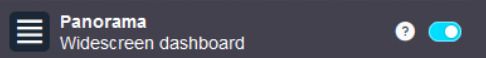
Content takes up the full width of the page
This is an XKit feature, Panorama.
6K notes
·
View notes
Last Seen Blogs

moxiebility
mew mew vampire


fantasyphantom
are you made of stardust too

flynncavalier
Elevation Station

skooncatlitter-blog
Darrell Jones