#gradient loading animation
Explore tagged Tumblr posts
Visit Tumblr Blog
Explore Tumblr blogs with no restrictions, modern design and the best experience.
Last Seen Tumblr Blogs


Fun Fact
Tumblr.com is the 103rd most visited website in the world.
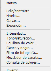
Text

💜 GRADIENT LOADING SCREEN 💙
7 versions with of animated white plumbob
━━━━ ✨ Download free ✨ ━━━━
⠀
🔮 Creators · Darriseyn - time-lapse drawings of plumbob · Tiasha - layout, screen creation · Slooo - idea, refs gradients ⠀ ⠀ Pleasant minimalism for your game 💫
#simblr#ts4#симблер#симблог#симс 4#mod#mods#ts4 mods#симс 4 мод#tiasha_ls#sims 4 loading screen#ts4 loading screen#loading screen#gradient#plumbob
1K notes
·
View notes
Note
could you please do a tutorial of your game of thrones 'so much for stardust' gifs where it has the ripped paper textures? it's so pretty, and i'd like to learn how to do one with just the texture in the middle and two gifs on either side, like half and half and just having a rip in the middle. it's so cool how you did a gif in the middle though so i wanted to ask as well! all of them are so cool looking. you are extremely talented. if you don't want to though i understand :) thank you
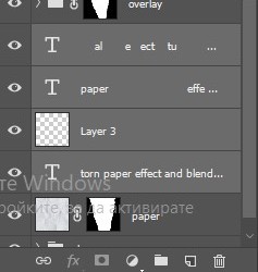
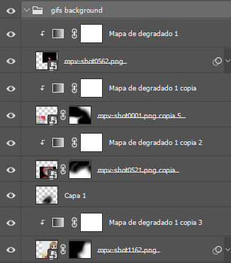
TORN PAPER EFFECT + BLENDING TUTORIAL
thank you so much for your sweet words, dearest anon and i'm sorry it took so long to answer but it's here now so i'll try my best to explain <3 disclamer: this is the first tutorial i ever made, it's very screenshot heavy and it assumes the basic knowledge of ps and gifmaking. if there's something you don't understand, don't hesitate to ask <3 so, let's get to it!
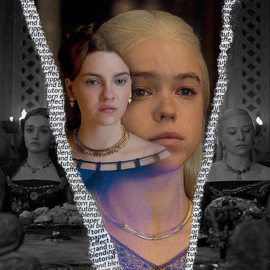
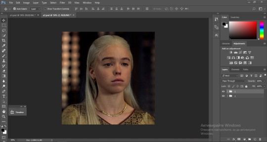
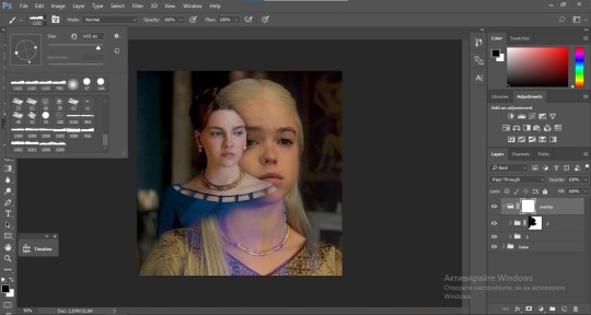
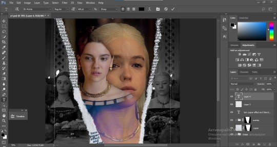
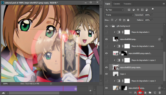
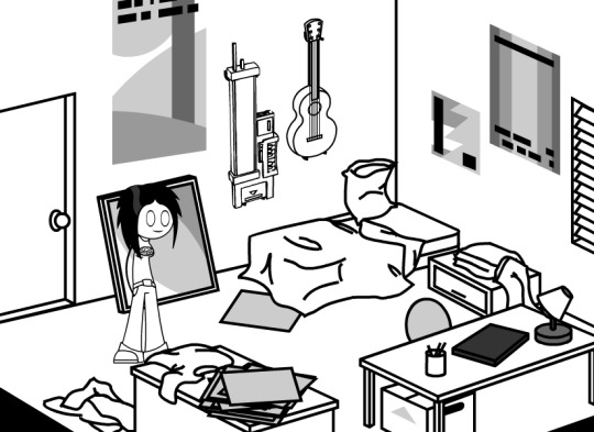
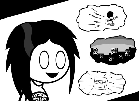
1. PREPARING THE BASE As you can see in this shot there's a lot of space between Rhaenyra and Alicent and that makes it perfect for the ripped paper overlay without hiding much of the base gif. So the first thing i did was to crop it like this:
Also you want to make sure that the highlighted box (delete cropped pixels) is unchecked! After taking the usual steps for the animation (creating frames from layers, reversing the frames, setting frame delay) you continue with the video timeline and convert your frames into a smart object. psa: if you don't have the motivation or the time to play around with coloring here are some psds i recommend: 1, 2; as for the sharpening i think this one is the best.
now that you have your smart object sharpened and colored what you want to do next is drag it to the end of the canvas and duplicate it. after that you move the copy on the other end like the original and make sure it's under the coloring layers, like this:
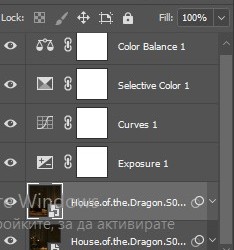
After that you have to create layer masks (the highlighted icon above) for both smart object and the copy and change the blending option of the copy to screen or lighten (whatever looks best!). So this is how it looks now:
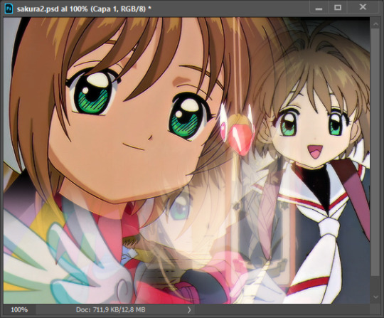
pls ignore that there are no layer masks on the smart objects i just added them after changing the blending rip </3 Now, as you see both gifs are like fighting eachother for their rightful place on the canvas. (fgfgfdf) To fix that you have to use a soft round brush to delete the parts you don't want. (feel free to play around with the brush however you want to get the result you want!) Here's my result:
2. THE OVERLAY
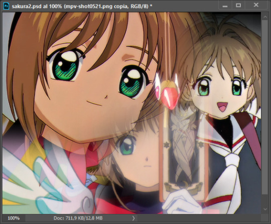
Now for the both gifs you want to use for the ripped paper effect you pretty much apply the same steps as the ones you did with the gifs for the base. Here are the two gifs i chose:
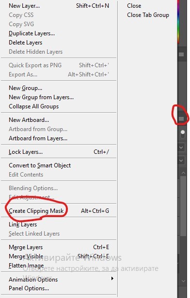
Before blending both gifs however you want to create a clipping mask for each of the smart objects coloring layers, like this:
And now you're ready to blend both gifs together! You choose the group with one of the gifs and change the blending again to screen or lighten and place the said group on top of the other. So this is how it looks now:
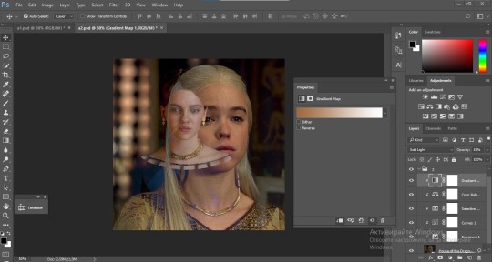
optional: if you feel like the base gif doesn't pop out enough you can always add a gradient map on one of both gifs and play around with the opacity and the color you think fits best.
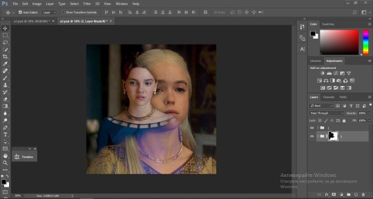
Then you add a layer mask on the overlay gif group and again play around with the brush to delete what you don't want. So this is the final result:
ps - don't repeat my mistake by placing the group with the layer mask under the other group. it should be on top and the blending option should be lighten or screen.
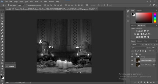
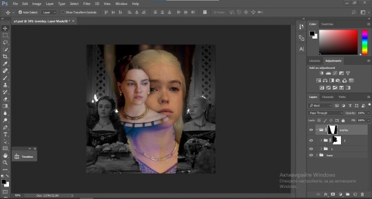
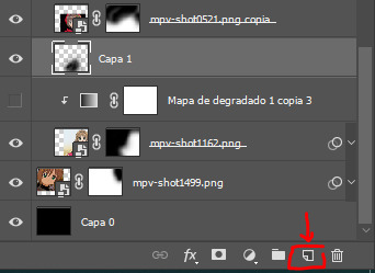
After blending both gifs together, you're ready to place them on the base. So first thing you want to do first is place both groups of each gif in one single group together. Then you duplicate the said group in the psd of the base gif and create a layer mask. This is how it should looks:
Now, in order to create the ripped paper effect, you'll have to download a ripped paper brush pack. This is the one i use. After loading the brushes in ps (if you don't know how here is explained) you're ready to begin! Change the size and angle however you'd like to make it look how you want. And if you want you can move the overlay gif by choosing both groups in case you aren't happy with the adjustment. This is how it looks like so far:
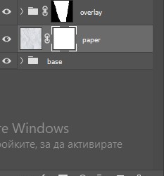
We're almost done! Now you have to find a paper texture, (i got mine from google) place it between both groups of your gifs and create a layer mask, like so:
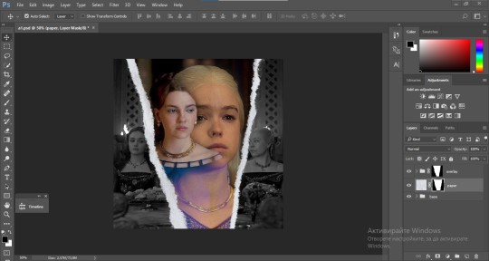
What you have to do here is pretty much the same thing you did with the overlay gifs. Still, make sure there's enough space for the text you want to write in. However, if you think that the space isn't enough you can just delete a bit more of the overlay gifs. Here's mine:
3. THE TEXT
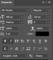
You're finally ready to type out the text you want! If you're having troubles with choosing the right font and size, here are my text settings:
You can always play around with the angle and if your text is too small, zoom in so you can place it just how you like it. And since i'm a bit lazy to deal with it later, i choose to add the highlight color while it's still zoomed. You just have to add an layer above the text and use a soft round brush with opacity from 70-75% and flow from 15-18%.
For the repeated text you want to make sure you create a big space for writing so it can contain the whole space of the torn paper. Also, write where the text will be seen only and use the tab button to skip the space where the gif is. This is how it looks:
Once you're done with writing the repeated text, you want to select all the character layers and the highlight layer and move them under the overlay gif and on top of the paper, like this:
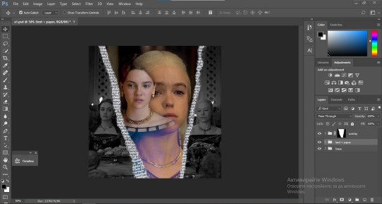
With the layers still selected and in order to contain the text within the paper the last thing you want to do is create a clipping mask. And that's It. You're done! This is the final result:
#allresources#dailyresources#usergif#chaoticresources#gifmakerresource#hisources#onlyresources#alielook#usermaguire#userrobin#usernik#userpat#userbells#gif tutorial#ps help
177 notes
·
View notes
Text

🧡 Tuesday Tips #3 🧡
Your website is more than just a collection of pages—it’s your digital home. It should reflect you, your interests, and your personality. But with so many sites out there, how do you make yours stand out?
Here are 25 ways to make your website feel more personal, unique, and personalized to you!
........................................................................................................
🎨 Design & Aesthetics
1. Custom Color Palette – Pick colors that resonate with your personality and aesthetic.
2. Unique Typography Choices – Use a mix of fonts that match your vibe.
3. Handwritten or Doodle Elements – Add personal sketches or notes.
4. Custom Cursor – Let visitors use a fun, themed cursor on your site.
5. Personalized Favicon – A tiny but powerful detail that makes your site feel complete.
6. Themed Layouts for Different Pages – Make each page visually distinct but cohesive.
7. Custom Backgrounds – Textures, gradients, or even a personal photograph.
8. Retro or Experimental CSS Styles – Go wild with unique styles that make your site stand out.
9. Create a Custom Hand-Drawn Logo – Instead of a standard logo, try sketching one yourself for a unique touch.
10. Add Subtle Animations – Small hover effects, background animations, or cursor trails can bring your site to life.
11. Play With Layering Elements – Overlap images, text, and shapes for a more dynamic look.
12. Design a Personalized Loading Screen – A custom loading animation or message adds a fun detail visitors will remember.
13. Add Your Own Handwriting as a Font – Convert your handwriting into a web font for a truly personal touch.
14. Design a Seasonal Theme Switcher – Let visitors toggle between different seasonal or mood-based color palettes.
........................................................................................................
📜 Content & Personality
15. Create a Behind-the-Scenes Page – Show how your website was built, share your thought process, or include fun bloopers.
16. Add a "The Making Of" Section – Share drafts, sketches, or early concepts behind your creative works.
17. Include a Personal Dictionary of Words You Love – A list of favorite words, phrases, or slang you frequently use.
18. Design a "Things That Make Me Happy" Page – A simple, uplifting page filled with personal joys.
19. Show Your Progress on a Learning Goal – Track and share your journey in learning a new skill, language, or hobby.
........................................................................................................
💾 Interactivity & Engagement
20. Add a Clickable Mood Indicator – Let visitors see your current mood with an emoji or phrase that changes over time.
21. Create a Dynamic Banner That Updates Automatically – Display different messages depending on the time of day or special occasions.
22. Add a "What I'm Listening To" Widget – A live-updating display of your current favorite song or playlist.
23. Embed a Poll or Voting Feature – Let visitors vote on fun topics or help you make creative decisions.
24. Introduce a Mini Personality Quiz – Something quirky like “Which of my favorite books/movies are you?”
25. Make an "Ask Me Anything" Page – An interactive page where visitors can submit questions for you to answer.
Closing: Make It Yours!
Your website should be you in digital form—fun, unique, and engaging. Whether you add just one or all 25 ideas, the most important thing is to have fun and make it your own.
If you try any of these ideas, let me know—I’d love to see what you create!
-----------------------------------------------------------------
Want to help the Small Web movement grow?
Join us on other platforms. ♥
FB Page & Group:
facebook.com/thesmallweb
facebook.com/groups/thesmallweb
Twitter/X:
x.com/smallweblove
Tumblr Community:
tumblr.com/communities/thesmallweb
Mastodon:
indieweb.social/@thesmallweb
#small web#indie web#web revival#old web#blog#neocities#2000s web#decentralized social media#decentralizedfuture#old internet#decentralization
16 notes
·
View notes
Note
Hello, this is not a request it's question because I really want to learn how to make graphics with gifs and idk how to do it 😭😭😭
Like your agar agar cookie layouts, I really like your work and would like to learn how you make it
Thank you for reading this, if you don't want reply it's okay, have a very nice day

Haiii!! It's no problem!! Unfortunately, I'm VERY bad at explaining stuff LOL, so here's the best I can do!! (Also, have a sneak-peak to another post :3)
How to make a gif edit.
How I decorate my edits.
How I make my PSDs.
VERY LONG POST BELOW. MASU LOVES TO HEAR HIMSELF TALK.
Okay so step one is to use photopea. I used to be an avid ibispaintx user until I realized that photopea can make gif edits and suddenly I'm photopea's #1 fan (and hater). Photopea is a website, BTW, here's the link!
First, open up a project. Good job! We're 1/4 of the way there! You can import a PSD if you want (Here's a different tutorial for that), but let's just say you DON'T have a PSD, for the simplicity of this tutorial.

Next, find the animation you want! For this example, we'll be using the Wind Archer sprite below (I took this from the CRK wiki). It can be anything - but preferably nothing too big, because Tumblr for SOME REASON HATES high quality gifs. Siiiigh...

From here, you want to go to FILE > OPEN & PLACE. It'll show a window of all your downloaded items. Click on the animation we just downloaded.


Wam-bam! We're almost there!! Okay, if your image is a WEBP file, it will not animate if you export as a GIF. But! That's okay! Because with trial and error, I found out how to fix this!
On the downloaded layer, double click on the layer. After this, go to SMART OBJECT > CONVERT TO LAYERS...

Now, if your photopea tries to explode and pretend it don't know nobody, that's okay! Just let it load a bit. The file is very. very big. It should turn into a folder! You have nothing else to do from this.

After this, you can do, well, whatever ya need!! Slap a stroke on, put a gradient map on this bad boy, anything else! Once you're finished, go to FILE > EXPORT AS... > GIF. Your photopea might try to explode again, for like, a few minutes. Just give it some time. It's a lot of trial and error!! Don't feel bad if you didn't get it the first time!!
Now, before I talk about my edits, I want to make it clear that you should FIND YOUR OWN STYLE! Don't try to copy off of someone else, or try to replicate another style. Every editor is different!! While I overuse overlays and gradient maps like I won't see tomorrow, you may like a more simple style, or something less over and out there ~ ! That's alright! Don't be afraid to branch out.
Now, as we said - we love to use overlays + gradient maps. I am an artist, so a LOT of what I do correlates to that as well (having an interesting silhouette, making a focal point, color theory, color contrast, composition). It'll be WAY, WAY too much to explain in one single post, so I'd just say to go with the flow! If something looks off, try something else! There's no shame in scrapping an entire project - especially if you're unsatisfied with the result. Do what you need to do!! It's your edits.
For making PSDs, our process is actually pretty simple. We just use a gradient map and adjusts it till it works LOL. We add a few others things too - but that's mostly what I do. If you want to learn how to make your own, my word of advice is to dissect from others. Take inspiration!! If you don't feel like doing that, there's no harm in just using a F2U PSD floating out there. Feel free to look at our Squid Ink post and use that as an example of our PSDs! (If you don't feel like going to go get it, yeah I understand, here it is right here.)
All in all, my biggest tip (besides to have fun), is to edit until you like it. Don't try to compare yourself to big editors - they've had TONS, AND TONS, of experience and editing. Experiment with your style, put yourself out there, edit some new media you've never edited before, find resources to help you out, find tutorials, ETC. It takes time to learn, so make sure to take that time!! You got this, don't feel discouraged by other people's work!!!
That's all from us folks!! Peace out!! ^_^


#໒꒰ྀི ․ ․⸝⸝⸝ ꒱აㅤ﹑﹫ㅤtalks.#໒꒰ྀི 𖦹 ˕ × ꒱ྀིაㅤ﹑﹫ㅤasks.#editblr#edit tutorial#editing#edit blog#psds#photopea tutorial#tutorial
17 notes
·
View notes
Text
HOW TO: change the background color of a gif with a lot of movement ⭐
for if you are lazy as fawkkk like me and don't feel like figuring out how to use keyframes, or if your gif has too much movement to make it work teehee. it is labor intensive, but this gif originally looked like this so it is definitely worth the effort!
METHOD 1: adjustment layers
this works well with movement, however results are best if the background is very distinct! i would not advise against attempting this with a red or yellow background because it is going to mess with the skintones. i'd aim for blues, cyans, pinks, purples and very saturated greens (because some shades of green will be picked up as yellow and not adjust well)
for tutorial purposes, i'm going to go with a gif with a background that's cyan/blue. you can go ahead and get your gif loaded in, sharpened, etc. you can color it first, however i'm not going to be doing so.
the first thing you're going to do is make a hue/sat adjustment layer. you are going to bring the overall saturation up first (so leave it how it is and increase saturation). this is very much a matter of personal taste so just do as much or as little as you'd like. i'm also going to do a levels layer. use the eyedropper to pinpoint the darkest black and whitest white on the image. this leaves us with this, the goal here being to accentuate the background a bit.
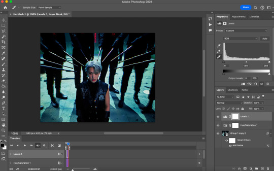
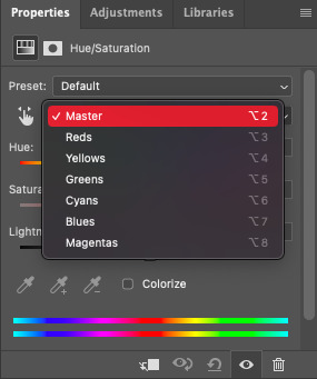
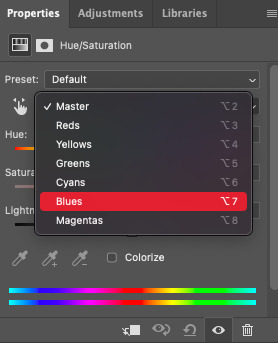
now, create another hue/saturation adjustment layer. instead of leaving it as is, change 'master' to the most prominent color in your background. i'm going to go with blue. if you are working with a blueish background, you will likely need to follow this step with blue and cyan for everything to be picked up!
drag the 'hue' slider over in either direction until you achieve the color you're looking for. some shades will be easier than other: going from a blue to a purple or pink will be easier than reaching a yellow shade. however with enough tweaking anything is possible :3 this is what it looks like now.
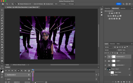
i'm going to do some coloring over this now, and some underneath as well. color to your liking! if the skin tones are off when coloring over this layer, move your coloring layers beneath it. you can also just color it first as i mentioned earlier :) either works fine. export it and this is what we're left with!
METHOD 2: frame by frame
this method is a little more time intensive, but it works well when your background is a neutral color, multiple colors, or too close to a skintone to be manipulated.
a few notes here: this works best in my experience if the person in the gif has dark hair. it can totally work otherwise but dark is more forgiving lol. it also helps it blend better because you can change the highlights without throwing the rest of the hair off!
you are going to want to do all of your sharpening, coloring and any other edits first. otherwise, your background may be messed up when coloring over it. once your coloring is done, convert your gif back to a frame animation. you can find a quick tutorial on how to do this as well as an action here.
with your gif converted back, create a gradient map with the color(s) you want your background to be. start with the very first frame in the gif and put the gradient map one layer above this frame. change the blend mode to whatever you happen to think looks best: i'm using color here.
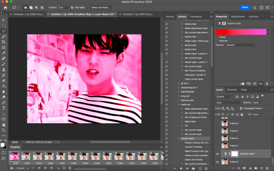
now, you're going to click that first frame and select your magic wand tool. on your top toolbar you'll see an option to 'select subject'. click the drop down menu, select 'cloud select'. then click 'select subject' and it'll select the person in your gif.

then, go back to your gradient map and select your layer mask. make sure your foreground color is white and background color is black. then, go to edit -> cut. this will mask the layer so the gradient map is only applied to the background. make any adjustments using a white brush tool on the layer mask. here, there's still some small orange pieces left over so i'm going to fix that.
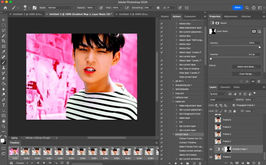
afterward, you will merge your frame with your gradient map (i recommend copying the gradient map first so you don't have to create it over and over again lmfao).
the highlights in his hair start to become more visible a few frames in, so when i'm adjusting the layer mask i'm going to account for this by brushing over his hair so the highlights go from their original white to pink. again, this is optional! the white just stands out too much for my linking.
now... you are going to repeat this step until you reach the end of your gif :) gradient map above the frame you're working with, layer mask, merge, repeat. it's time consuming but worth it!
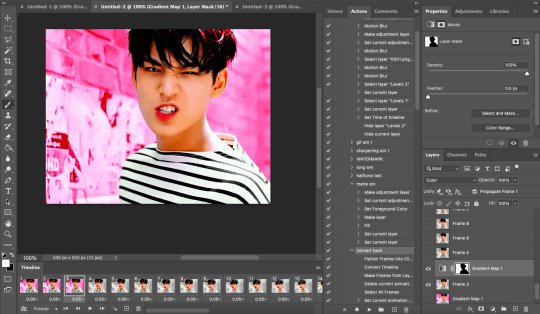
once you're finished and your sanity is depleted, delete the frames from the timeline. the animation is going to be thrown off by all the editing we've done so it's best to just remake it.
to remake it, click the three lines, then 'make frames from layers'

then, select all your frames and set the frame delay to 0.07 (you can do 0.05 too but that's just my preference). you can either export it like this or convert it to a smart object for further editing. this is how it turns out!
40 notes
·
View notes
Note
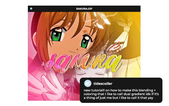
Hello, this gifset for pscentral event 37 is really pretty ✨
https://www.tumblr.com/tidescaller/779330612766081024/pscentral-event-37-trios-the-girl-the-boy-and?source=share
would you please consider posting a tutorial on how you made the blending multi gifs and colouring in the first gif?
Hi anon, so glad you liked it! I'll try my best to explain as detailed as I can. Just a small note that I'm not an expert, I'm still pretty new to blending edits in general so I'm learning as well as everyone ૮(˶˃ᆺ˂˶)
But before that real quick, and if my tutorial isn't enough, I'll leave you a list of amazing tutorials/guides that help me a lot when it comes to everything gifmaking related, so shoutout to them!
basic blending tutorial
coloring tutorial
blend gifs tips
blending, coloring and text effects guide (video)
another one similar to the previous one
gradient text
text outline
HOW TO: Blend multi - gifs / Dual Gradient coloring
You will need any version of Photoshop (I use CC 2019) and basic knowledge on making gifs.
STEP 1: THE BASE
1.1 - Make sure your canvas is 540px width. Mine is 540x450. Choosing which gifs to blend is kinda tricky and no one can tell you what's perfect. Everything depends of the scenary your show, movie, anime whatever you're working on has; but a tip is to use scenes that have dark areas, since it's easier to blend then. 1.2 - Make your individual gifs: crop, color, sharpen, all that, and make sure all of them are the same amount of frames. 1.3 - Before duplicating your gifs into your empty canvas, convert them all into smart objetcs. This will help to simplify stuff, have a much more organized work space and help you load your preview faster.

STEP 2: BRING YOUR GIFS
Now all you have to do is right click on every gif you made, go Duplicate layer… and sent it on your empty document. I would suggest doing one by one, so you can work better. Duplicating them all at once can be a little bit intimidating and might have you confuse how to combine your gifs. Try imagining what you want your gif to look like and where you want each element to be. As an example, I wanted the key scene when it kinda drops to be falling from the top of my gif and also as a separation of the one in color and the one Sakura is roller-skating.
STEP 3: BLENDING
3.1 - Okay, now that you more or less know what you want your gif to look like you can start by changing the blend mode of your gifs. Photoshop has mutiple options on this and it applies to all types of layers. For blending, one of the two (or more) gifs you are working is going to be on top, that's the one you're gonna have to change its blend mode in order to start this process. Generally, Screen is the one to go to.
3.2 - Some people group (selecting your layers > ctrl/cmd+g or right click > group) all the gifs so they can then change the group's blend mode into Screen but I personally like to do separately cause if I need a gif to fill some of the background I would keep it as Normal.
STEP 4: LAYER MASK
The key gif works perfect with Screen blend as it has a black background, but of course this won't be the case for most gifs you want to put in the main one. For those unwanted pixels we don't need, we use a Layer Mask. 4.1 - In order to do that, select your gif by clicking on them and next click on the layer mask button.
4.2 - Now you'll see a white square next to your gif layer. This will help by reducing the opacity of those things we don't need of your gif. What is white is 100% opacity and what is black 0%. So all you have to do is click on the layer mask, pick the brush tool and paint over what you want to "delete". Pay attention to use a soft brush, and the size of it should be around 200 and 300px. 4.3 - Repeat the process with all the gifs that need it
STEP 5: EXTRA LAYER
Sometimes a gif will look too bright/transparent/softened over the other ones. In order to fix this, you can create a new layer (the button right next to the trash can)
and paint with a black soft brush over the part you need to bring back. I don't know exactly how to explain it properly but I'll try with these before and after images. I'm adjusting the one with Sakura and her card:
STEP 6: COLORING
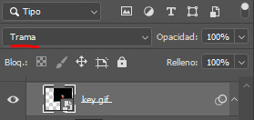
6.1 - OKAY, now that we have all that sort out and the gif has a proper structure is time to add some color. As I'm going to do a dual gradient after and leave only one of these 5 gifs with color, I'll use a black and white gradient map and add it to every individual one as a clipping mask (right click on the gradient map > create a clipping mask). Like this:
6.2 - Now that we have this I can add my own psd. I started making my own psds for every edit I make and I'm not ready in any way to explain that, but I learn how to do this with this tutorial. With that, my gif now look like this:
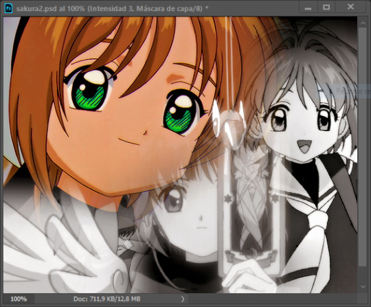
STEP 7: DUAL GRADIENT
Finally for this part I recommend making another group (the folder button next to new layer) and add a new layer for the different colors you add. This is all about painting and playing with the blending modes for these layers. There's no right way to do this, you just have to play around and see what works best for you and the scenes you have. You will end up with something like this:
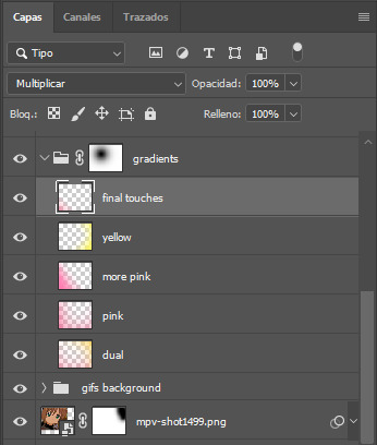
Tips for this step are: 7.1 - Use a soft brush, size it up to 1000px, zoom your gif out and start painting out of the canvas. This will help create that gradient effect we are looking for. 7.2 - Change the layer's opacity/blend mode. This is (again) about playing around with colors. I changed these settings for all my layers that are part of the gradients' group. In order: dual is Screen + 90% opacity, pink Vivid Light + 70%, more pink Lighten + 90%, yellow Hard Light + 70% and final touches Multiply at 100%. I also mixed up the colors, not only staying with certain yellow or pink. 7.3 - The gradient tool works the same way as the brush tool! Just make sure the gradient is any color you're working with + transparent. 7.4 - I also added a layer mask to my gradient's group to erase some of the extra color in Sakura's face. All this will result on this:
And that's pretty much it! For the text part, I was going to add it but the tutorials I linked at the beginning explain it perfectly so shoutout to them. As always, if you have any other doubt, send me an ask and I will answer it as fast as I can! Always happy to help ⸜(。˃ ᵕ ˂ )⸝♡
#answered#anonymous#*tutorial#photoshop help#gif tutorial#blending tutorial#photoshop tutorial#coloring tutorial
13 notes
·
View notes
Text
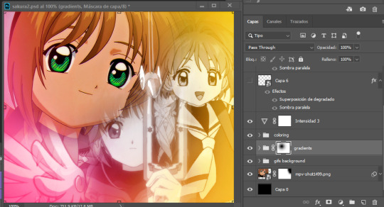
Quick-N'-Easy Icon Editing Set-up with Krita!
I'm sure there are already a few tutorials like this one out there, but hey, what can one more hurt?
What's this do?: Krita has features you can use so you can make quick edits to your icons all at once, and save them all out individually with the press of a button. It's a great time-saver, and gives you a lot of flexibility in your edits!
What you'll need:
Krita, a free and open-source painting / image editing program!
Icons!
Part 1: How to export your icons all at once.
( warning: long and image-heavy! Written with beginners in mind. )
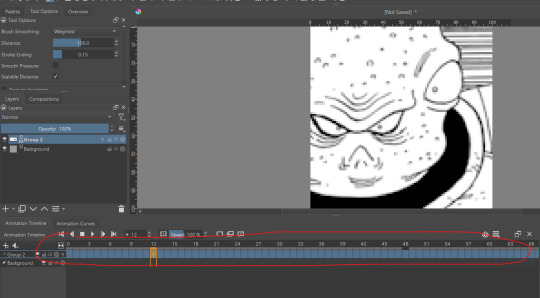
Once you open Krita, you'll want to go to Window > Workspace > Animation on the uppermost bar to change the layout for what we'll need, here.
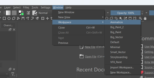
We're going to be using Krita's animation features to make iconing / icon-editing a little easier.

( as an extra note, hitting '1' on your keyboard will set Krita's zoom to the image's actual size, while '2' will have it fill the available space. Helpful for seeing how your icons will appear on the dash. )
Okay, let's get started! Make a new image ( File > New or press Ctrl + N ), set it to whatever dimensions you want ( I default to 100x100px ). Make a new layer ( Click the plus icon in the layers tab, or press ins ), and then put that layer in a group ( Right-click the layer and click group > quick group, or press Ctrl+G while its selected. )
With that grouped layer selected, Grab your icons, and click & drag them into Krita, onto the canvas ( the big empty grey space in the center ). When Krita prompts you, select 'insert many layers.' This will load in each image as its own layer. If you don't have the grouped layer selected, you'll have to select them all and put them back in the group. ( No big deal, just shift + click the first and last layers, and drag them where you need them. )
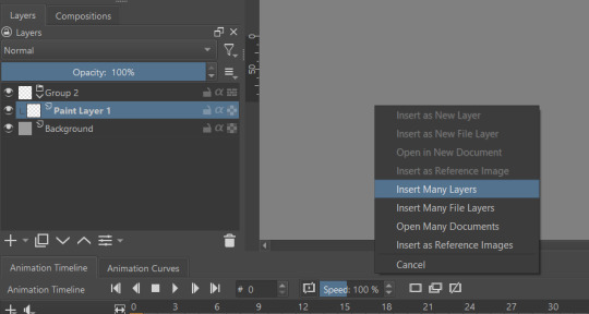
You can now delete your initial paint layer in the group, if you want. Otherwise it will make an 'empty' icon when we export.
Select that group, then go to Layer > Convert > Convert Group to Animated Layer on the top bar. ( This is only accessible through the top bar, not the menu that appears when you right-click on a group. I don't know why. )
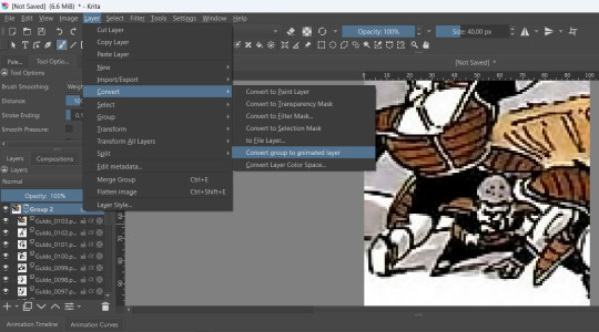
Congrats! Now all your icons are frames in an animation. Each cell on the timeline is a single icon. If you have a scroll wheel, you can scroll to quickly look through them all.
If you can't see all of your icons on the timeline, click the three bars here and set 'clip end' to whatever number of icons you have ( or a little more, for extra wiggle room. )
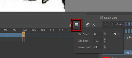
Find the last filled cell, right-click it and select 'set end time.'
When you're ready, hit File > Render animation.
You'll want to make sure you set it to export as an image sequence, and select where you want your icons to go on your computer. Give them a naming scheme. Make sure you save before you export your icons, as I've had Krita crash while exporting a large number of icons all at once. ( If it does this to you, just try again. Worst comes to worst, you can export by setting the first frames and last frames to smaller chunks instead of all at once. )
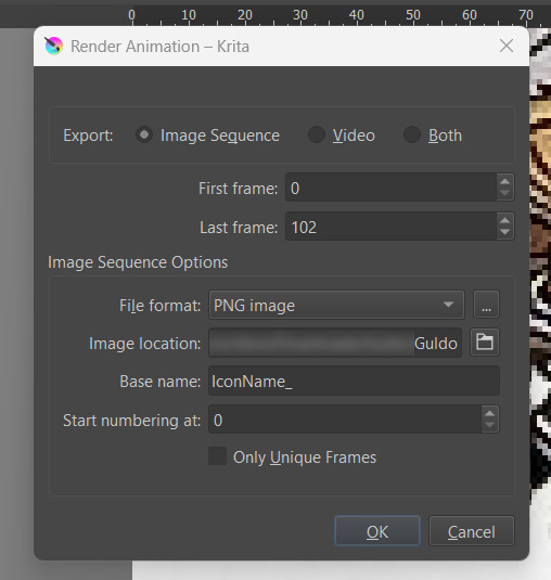
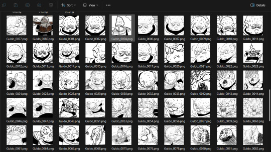
Hit OK and voila! No more saving icons out one-by-one!
Of course, we haven't done any editing yet, so this is all redundant unless you're saving out your own freshly-cropped icons. Let's move onto the fun part:
Part 2: Editing
Right-click your new group layer and hit add > filter mask. Choose any you want- for demonstration purposes, I'll be using my favorite: gradient map.
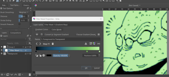
This will put that filter over all frames in that animation layer, meaning you won't have to repeat your edits per icon.
If you want to edit your filter mask after you click off, just right-click it in the layer tab and select 'properties.' It will bring the initial prompt up again for you to adjust.
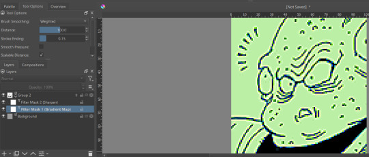
You can add as many filter masks as you want! The order the layers are in does matter, though, so keep that in mind.
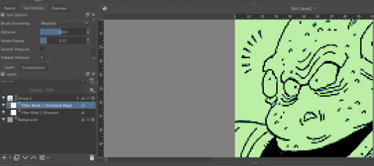
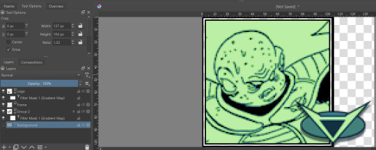
If you want to add frames, banners, name tags, symbols etc, you can do that on layers over or under that animation layer! They'll stay consistent across the 'animation' unless you add new frames to them on the timeline.
If you want to edit your icons again, just do so, and re-export! If the naming scheme and numbers are the same, Krita will automatically overwrite the old files. But watch out; if you're trying to save new icons, make sure you start numbering at a higher number than your last icon, or change the base name.
Happy iconing!
#rp icons#rp icon tutorial#rp resource#rp tutorial#icon editing#icon edits#not icons#no clue what to tag this as...
51 notes
·
View notes
Text
✨Gracie's Rimworld Modlist✨
(For the Mechanitor's Message run)
Here are all my current mods in order. Once again it’s all hand-typed because I am a bit rubbish at computer stuff and don’t know how to export modlists. Enjoy!! xoxo
Prepatcher (required for one or more of the other mods to work)
Harmony (I think this is just for performance)
Vanilla Backgrounds Expanded (this is just cool for loading screens etc.)
[CAT] Show Hair With Hats or Hide All Hats (so my colonists can show off their beautiful hair)
HugsLib (I think this is just for performance)
Camera + (better for taking screenshots)
Character Editor (so I can start with customised colonists)
Vanilla Expanded Framework (so all the Vanilla Expanded mods work)
Vanilla Furniture Expanded - Props and Decor (adds fancy props and decor)
Geological Landforms (for fun map generation)
Pathfinding Framework (a framework for pathfinding)
ANDH - Animal Nuzzling Detects Horrors (animals can detect metalhorrors when they nuzzle your colonists)
[GMT] Trading Spot (those darn traders always track dirt on my floors)
[KV] Impassable Map Maker (in case I feel like settling on an impassable tile)
[NL] Facial Animation - WIP (they look so cute with their lil’ faces!!)
[SBV] Recreational Drum Use (drum go bang boom, brain get happy)
[T] Moor Floors 1.4 (more floors)
[XND] Proper Shotguns (Continued) (makes shotguns work better so Security Chief Ratchet and Deputy Rocket the militors can be extra kickass)
Llama's Proper Shotgun Patches (some patches for the previous mod)
Adjustable Archonexus Quest Continued (no way Mechi is losing all his research!)
A Dog Said… Animal Prosthetics (animal bionics wooo)
Dubs Bad Hygiene (bathrooms cool)
Allow Tool (makes life so much easier)
[ATW] House Decor (more decorations for the house)
Biomes! Core (framework for Biomes! mods)
Biomes! Fossils (dinosaur museum go brrrr)
Biomes! Islands (tropical paradise, here we come!)
Allies are Helpful (so that our friends, few as they may be, will actually be useful)
Alpha Biomes (adds cool new biomes)
Alpha Memes (new ideology memes)
Alpha Mythology (adds cool new mythological animals)
Alpha Prefabs (cool prefabricated buildings)
Alpha Props - Parks and Gardens (adds props for parks and gardens)
Anima Animals Combined (Continued) (cool anima animals)
Animal Controls (animals can have food restrictions, etc.)
Better Mods Mismatch Window (to see which of my mods is fucked up THIS time 🙄)
Ebbbs (cute black blobby creatures)
Horse Breeds - Skin Variations (in case we feel the need to become cowboys with a varied herd of horses)
Biome Transitions (so your biomes transition)
Childhood Backstories (so your children can have backstories)
Clocks (every house needs a grandfather clock)
Colors (personally I prefer “colours”, but we can’t all be right)
Det’s Xenotypes - Avaloi (colourful drunk coral-people!!)
Det’s Xenotypes - Bogleg (alien mafia)
Doors Expanded (expands on the doors)
Dormitories (Not Barracks) (they shouldn’t be that upset about sharing a room)
Dress Patients (Continued) (put clothes on the patients)
Enhanced Beliefs (expands on the ideology system a bit)
Erin’s Baldur’s Gate 3 Hairs (need more hair)
Erin’s Cottage Collection (cutesy furniture)
Erin’s Decorations (cute decorations)
Erin’s Hairstyles - Redux (mmmmmore hair!!)
Extra Alerts (handy-dandy extra popups)
Floordrawings (those kids are so artistic)
GloomyFurniture (cutsey furniture)
Gloomy Furniture Fix (fixes something idk)
Gradient Hair (gradient hair)
Hard Times: Hair and Beards (more hair and beard styles)
Haul to Stack (you think they could figure that out themselves, but no. They need a mod)
Hospitality (warcrime-themed hotel chain let’s goooo)
Human Butchery 2.0 (just in case)
Human Leather Floor (👀)
Interaction Bubbles (to see what dey sayin’)
Kinky Bodystrap (I will not elaborate)
Lights Out (conserve electricity, save the planet)
Megafauna (biiiig pets)
Minify Everything (if I wanna carry a whole wall I damn well will)
More Descriptive Words and Names (exactly what it says on the tin)
More Faction Interaction (Continued) (more faction interaction)
More Persona Traits (to make Persona Weapons more interesting)
More Religious Origins (adds some more religious origins for ideology)
More Thrumbos (Continued) (mmmmore thrumbos)
More Thrumbos (Retextured) (just makes them look a bit better)
More Vanilla Biomes (more vanilla biomes)
negative traits (they can’t all be good)
Non-Binary Gender (adds a non-binary option)
Offworlders - The Biliog (swamp people)
Optimization: Meats - C# Edition (all meat is raw meat)
Pawn Name Variety (variety in pawn names)
Pick Up and Haul (pick it up and haul it)
Prisoners Don’t Have Keys (why would they??)
Random Research (it looked amusing)
Reel’s Facial Animation Textures (face stuff)
Replace Stuff (to build walls on top of other walls etc.)
RimPy Mod Manager Database (just for insurance)
Rimsenal - Hair pack (hair)
Rimsenal Hair Retextured (more hair stuff)
RimTraits - General Traits (more traits)
River’s Tribal Shoes (tribal shoes)
Romance on the Rim (awww, so romantic <3)
Roo’s HD Dreadlock Hairstyles (dreads)
Roo’s HD Glasses Hairstyles (glasses)
Roo’s HD Hairstyles (hairy)
Roo’s HD Royalty Hairstyles (fancy hair)
RPG Style Inventory Revamped (inventory is easier to use)
RT Fuse (I don’t like zzzt events)
Sand Castles (for funsies)
Simple sidearms (always be prepared!)
Smutty Fanfiction (👀)
Snap Out! (for mental breaks)
Standalone Hot Spring (why have geothermal power when you can have a nice hot bath instead?)
Stylized Slave Collars and Headgear (to fit the theme)
The Vanity Project - Beards (more beards)
The Vanity Project - Female Hair (for the gals)
The Vanity Project - Male Hair (for the guys)
Trait and Backstory Icons (icons for traits and backstories)
Toddlers (smol bean people)
Upscaled - Won hair_men (hair)
Upscaled - Won hair_women (hair)
Vanilla Achievements Expanded (makes me feel successful)
Vanilla Animals Expanded (adds fun new animals)
Vanilla Animals Expanded - Endangered (adds endangered animals)
Vanilla Animals Expanded - Royal Animals (adds fancy animals)
Vanilla Animals Expanded - Waste Animals (edgy dystopian animals)
Vanilla Apparel Expanded (new clothes)
Vanilla Apparel Expanded - Accessories (new accessories)
Vanilla Armour Expanded (more armour)
Vanilla Backstories Expanded (more backstories)
Vanilla Brewing Expanded (alcohol woooo)
Vanilla Base Generation Expanded (generates cool bases)
Vanilla Brewing Expanded - Coffee and Tea (to feed our caffeine addiction)
Vanilla Cooking Expanded (fun food)
Vanilla Cooking Expanded - Stews (everybody loves a good stew)
Vanilla Fishing Expanded (such a relaxing pastime)
Vanilla Fishing Expanded - Fishing Treasures AddOn (you can fish up cool stuff, like wood)
Vanilla Cooking Expanded - Sushi (we have to do something with all those fish)
Vanilla Events Expanded (can never have too many events)
Vanilla Factions Expanded - Ancients (scary ancient people)
Vanilla Factions Expanded - Empire (makes the empire more interesting)
Vanilla Factions Expanded - Mechanoids (we couldn’t have a mechanitor run without them)
Vanilla Factions Expanded - Settlers (yeehaw)
Vanilla Factions Expanded - Tribal (I like having tribal friends)
Vanilla Furniture Expanded (more furniture)
Vanilla Furniture Expanded - Architect Module (new structure stuff)
Vanilla Furniture Expanded - Art Module (fancy art and decorations to make)
Vanilla Furniture Expanded - Farming (we love growing food)
Vanilla Furniture Expanded - Medical Module (to make the most kickass hospital)
Vanilla Furniture Expanded - Power (mechanitor has to power their mechs somehow)
Vanilla Furniture Expanded - Production (cool manufacturing stuff)
Vanilla Furniture Expanded - Security (you can never be too careful)
Vanilla Furniture Expanded - Spacer Module (a mechanitor’s dream)
Vanilla Hair Expanded (always need more hair)
Vanilla Hair Retextured (make it look snazzy)
Vanilla Ideology Expanded - Dryads (for sprucing up gauranlen tree stuff)
Vanilla Ideology Expanded - Hats and Rags (to dress properly)
Vanilla Ideology Expanded - Icons and Symbols (to customise ideologies as much as possible)
Vanilla Ideology Expanded - Relics and Artifacts (cube…?)
Vanilla Ideology Expanded - Sophian Style (fancy~)
Vanilla Ideology Expanded - Splits and Schisms (reminds me of Wookshys)
Vanilla Nutrient Paste Expanded (hell yeah nutrient paste)
Vanilla Outposts Expanded (we can form outposts if we like)
Vanilla Races Expanded - Android (it would be cool to have androids hanging out with our mechanitor…)
ReGrowth: Core (I like the retextures)
ReGrowth: Tropical (more fun stuff)
ReGrowth: Aspen (new biomes)
ReGrowth: Boiling (new biomes again)
Vanilla Plants Expanded (yummy foodstuffs)
Tilled Soil (heehoo farm)
Vanilla Persona Weapons Expanded (make the persona weapons more personable)
Vanilla Plants Expanded - More Plants (even MORE farm)
Vanilla Plants Expanded - Mushrooms (I should do a dirtmole colony someday)
Vanilla Plants Expanded - Succulents (they’re cute)
Vanilla Psycasts Expanded (I love ‘em)
Alpha Animals (one of my favourite mods)
Vanilla Genetics Expanded (genetics stuff)
Vanilla Genetics Expanded - More Lab Stuff (more lab stuff)
Vanilla Ideology Expanded - Memes and Structures (more customisation)
Alpha Genes (Makes for fun people to draw)
Alpha Mechs (Mechs for the Mechanitor!! Skulls for the- oh, wait, no)
Vanilla Races Expanded - Archon (basically githyanki)
Vanilla Races Expanded - Custom Icons (to make your own xenotypes that much more distinct)
Vanilla Races Expanded - Fungoid (zombies go brrrr)
Vanilla Races Expanded - Genie (how many wishes do I get?)
Vanilla Races Expanded - Highmate (the perfect partner!)
Vanilla Races Expanded - Hussar (nobody will ever be as good as Henry…)
Vanilla Races Expanded - Lycanthrope (do we need a werewolf boyfriend?🍍)
Vanilla Races Expanded - Phytokin (tree people my beloved)
Vanilla Races Expanded - Pigskin (is there a teacup pig variant?)
Vanilla Races Expanded - Sanguophage (vampires go brrrr)
Vanilla Races Expanded - Saurid (lizard people to control the government)
Vanilla Factions Expanded - Waster (pollution people)
Facial Animations Xenotype Compatibility (to help smooth out the face stuff)
Vanilla Skills Expanded (makes learning more interesting)
Vanilla Skin Tone Genes (inheritable skin tones)
Vanilla Social Interactions Expanded (more interactions to draw)
Vanilla Textures Expanded (expands the vanilla textures)
Vanilla Textures Expanded - [NL] Facial Animation (makes the facial animation more vanilla and less anime)
Vanilla Textures Expanded - Variations (so things don’t look too same-y)
Vanilla Ideology Expanded - Anima Theme (for funsies)
Vanilla Trading Expanded (expands the trading)
Vanilla Traits Expanded (more traits!)
[DN] Bundle of Traits (one of my favourite trait mods <3)
Vehicle Framework (a framework for vehicles)
Vanilla Vehicles Expanded (more vehicles)
Vanilla Vehicles Expanded - Tier 3 (even MORE vehicles)
Vanilla Weapons Expanded (to spice up the combat)
Vanilla Weapons Expanded - Coilguns (adds coilguns)
Vanilla Weapons Expanded - Grenades (expands on grenades)
Vanilla Weapons Expanded - Heavy Weapons (more heavy weapons)
Vanilla Weapons Expanded - Laser (laser weapons)
Vanilla Weapons Expanded - Makeshift (for when you gotta make do)
Vanilla Weapons Expanded - Non-Lethal (for interrogations and organ harvesting)
Vanilla Weapons Expanded - Quickdraw (to draw quickly)
Vanilla Weapons Expanded - Frontier (yeehaw)
Vanilla Weapons Expanded - Tribal (they deserve some variety too)
Vanilla Factions Expanded - Pirates (arrr me hearties!)
VPG Garden Resources (if I wanna grow uranium I will)
Vanilla Psycasts Expanded - Puppeteer (mind control, oooh!)
VVE - Deconstructable Vehicle Junk (so we can make old cars new!)
War Crimes Expanded 2 Core (Updated) (just in case)
What's That Mod (so I know what the mod is)
While You’re Up (PUAH) (more hauling revamps)
Won Hair Men Retextured (hairy hairy)
Won Hair Women Retextured (more hairy hairy)
Xeva’s Rimhair (hair)
Xeva’s Rimhair Retextured (hair)
Yet Another Hair Mod (I don't have too many, shhhh!)
ATH ‘s Retexture Female Apparel (looks like fun to draw!)
ATH’s Style Female Dresses (fun to draw)
HousekeeperAssistanceCat (the best mod)
Facial Animations Xenotype Compatibility (to make the cute faces more compatible with different xenotypes)
[FSF] Complex Jobs (Legacy Version) (makes job prioritizing easier)
Nice Short Female Hairs (okay maybe I have a problem with hair mods 😅)
Pointless Surgeries (it looked funny)
Rational Romance 2 (Continued) (I don't think Mechi is the romantic type but just in case)
Rim of Madness - Bones (it seems to fit the void-studying aspect)
ReGrowth: Retextures (fixes ReGrowth textures or something idk)
Urn Retexture and Variation (we needed different urns in case)
[LYN] HD Corporate and Hedonist Apparel (makes some of the Vanilla Expanded clothes HD)
Alpha Vehicles - Early Cars (Mechi should have cool vintage cars)
Det's Xenotypes - Venators (if I can't have T'au I'll have a different ranged xenotype)
Det's Xenotypes - Stoneborn (dwarf go brrrrr)
ReGrowth: Wastelands (biomes~)
ReGrowth: Tundra (bioomes~)
ReGrowth: Swamp (biooomes~)
ReGrowth: Temperate (bioooomes~)
ReGrowth: Boreal (biooooomes~)
Do Recreation When Idle (makes pawns do recreational activities when they're not doing anything else)
Ponpeco Furnitures : Kids' Room (cute furniture in case we, I don't know, acquire a little girl along the way)
Roo's HD Accessory Hairstyles (I JUST NEED MORE HAIR TO DRAW)
Roo's Minotaur Xenotype (we have pig people and dog people and lizard people and I WANT COW PEOPLE DAMMIT)
Roo's Minotaur Xenotype Expanded (just a lil' extra somethin'-somethin' for flavour)
Roo's Birthmarks and Blemishes (fun 👏 to 👏 draw 👏)
Roo's Faun Xenotype (I can live out my Narnia dreams...)
Roo's Satyr Xenotype (need more xenotypes)
Roo's Satyr and Faun Xenotypes Expanded (just a lil' extra somethin'-somethin' for flavour)
Roo's Tattoos - Starter Pack (mmmmmore tattoos!!!)
Use Resurrector Mech Serum On Rotten or Skeleton People (on the off chance we have a sibling who's been buried for too long to be resurrected with a serum otherwise 👀)
Share Rooms [LWM] (on the off chance we have royal twins who don't want to share a room, but I want them to share a room. A mod explicitly written for this run, and I could not be more delighted ❤️❤️❤️)
#rimworld#gracie plays#rim#rimworld mods#gracie's#gracie's rimworld modlist#A Mechanitor's Message#Feel free to ask any questions!!#I'm always happy to tell you what mod stuff is from <3#have an awesome day!!
44 notes
·
View notes
Note
Hello!
Your creative coding artwork is intriguing! If it’s okay, can you explain the process of how you create them?
Hellos, yeah sure. They're matrices, or grids if you will, each cell of the grid has a color value, or a texture a pixelated image, you have your instances of the grid, you're going to want to control how these instances appear, if you have just solid colors like red, gren and blue, then you have three instances being use in your grid, you will need to create some variables and rules to control how they are layout out, if you utilize a circular gradient for example, your going to map your instances to the color values of this gradient its the simples rule I can think of right now, so if you have three instance they are going to appear based on the numeric values of the gradient 0 being black 1 being white and every value between, so in other words you will make a gradient of your instances, you will also want a black solid instance to represent the literal black parts of the gradient, I always use animated noises, theres lots of formulas for the noises out there, if you prefer you can also load in a video file instead of creating the noise in the code itself. the rest is just stylistic choices and extra movement, I load a lot of teture and some animated texture too, so I animate some pixelated texture in photoshop and I clone them in the grid, its like making a mosaic, after that there are a few animation things for the glitchness of it, like blinking instances, changing their rotation values rapidly, some dithering. its a little cumbersome to make it in Processing but you can use Touchdesigner there's more tutorials on creating matrix grids and cloning stuff into them, its also a little easier to create noises in too, and touchdesigner has a free version with a single limitation of only exporting artwork in 1080x1080, touchdesigner is simpler coding with blueprints instead of typing. you can use a 3D package as well since the logic is pretty much the same, creating a grid of clones -> control the instances layout with something, and some 3D packages have access to python in it so you can create your specific system or effectors and such.
7 notes
·
View notes
Text
Hard-light Heartline
(2024-02-20) MSPFA | Eagle Time
(Check below the break for some important information!)
you are a RIGHTEOUS ROOMIE. you're chillin. in your ROOM. things are pretty good! no problems here.
This week's been great! You spent it eating takeout and messing with your GUITARS. It's what you do every week, but that's never bothered you before. It's been a good night. What day of the week is it again? Oh right, it's the day where you're expecting a PACKAGE! That's definitely something that's happening now that wasn't happening last week.
---------------------
Well, hello there! It's Waterworks' 14th anniversary, and I was thinking it might finally be time to try something just a little bit different.
Eagle-Time came back (as https://eagle-time.org, so update your bookmarks if you haven't deleted them yet); I'll be watching for suggestions both there, here, on MSPFA, and generally wherever my eyes happen to be. Additionally, I will need to update the information on all three sites and ensure they link together properly. I'm not going to post full updates here on tumblr, but I will post a link to MSPFA and Eagle Time just like before. I also need to take the time to design a logo/thumbnail, and figure out an issue with my webhost that's preventing images from loading 100% of the time. I suppose some cobwebs have built up.
With all that out of the way, there are a few key points.
This isn't Waterworks. I don't intend for this adventure to be comparable in size or scope to Waterworks. I've been yearning to just sit back and tell a story, so that's what I'm going to do.
There will be no Flash animations and gif output will be limited. As much as I love Flash, fighting with the pressure to turn every cool idea into an epic animation has taken its toll on me. I'm going to nip this in the bud and say that there will be no Flash animations at all. There will be gifs, but they will be toned down to keep stress at a manageable level - The adventure will run locked at 18fps, and I will not use any colour gradients. There's some cool stuff you can still do at 18fps. If you're disheartened about the lack of full animations with sound, I'd like to direct you to a musician named Nstryder. I'm a fan of his music and have listened to a lot of it while scoping out the adventure. His music has been an excellent inspiration and I'll try to call some of it out when I hit relevant points in the adventure.
Regular updates will be attempted, but not guaranteed. The adventure itself will also have a set lifetime, whether or not it ends up finished. This one's hard for me. Life has happened. As much as I would like to update every day, it simply isn't possible. But I'm still going to try. I've set a weekly quota for myself to meet (but I'm keeping it to myself for now). If I can't make a day, I will communicate the delay on tumblr as soon as I am able. Additionally - I don't want this adventure to stretch out way past its prime. I've got a tentative end-date in mind for when to shut things off (regardless of the adventure's status), but I'm not willing to commit to it just yet. I'm gonna see how these next few weeks go and build some confidence before settling on a particular date.
I think that's it for now. I've gotta go fix that network error. I'll try to shape up everything else as the week progresses.
Welcome back.
46 notes
·
View notes
Text
A stream has started, but it's not in a virtual space. It's in a semi-empty warehouse. In frame are a set of large screens, a variety of tech setup, speakers, and some boxes/containers marked with the Genius Built logo.
The screens activate, a loading animation plays before going to a rainbow gradient background and the base models for all Four turtles walk across with one stopping every few feet in order of Raph, Donnie, Leo and Mikey.
Donnie: Hello members of the Bale, we're testing some new toys I got together for future events!
Leo: Gotta admit this looks pretty cool Dee.
Mikey: We're still going to figure out costumes for going in person right? It would be boring to just use screens.
Raphs model sits down and just smiles at his brothers. He's decided to just watch them have fun with this. He also doesn't have a mic on him for this stream.
Donnie: Of course, or else they would go to waste.
Leo and Mikey look confused, until in the warehouse Shelldon zooms past, and River follows after. They come back into frame a second later. Raph looks amazed.
Shelldon: Hey Dudes! Hope to see you IRL soon!
River: I got an upgrade!! And can't wait to join in on events!
Leo & Mikey: Awesome!
Leo: Wait, when did you last sleep?
Donnie: I got a solid 5 hours.
Mikey: At once or over the course of the last few days?
Donnie looks nervous, but composes himself.
Donnie: We'll worry about my sleep schedule later, I want to show off some of the overlays I had Mikey make for this setup!
Raph looks exasperated, and about ready to drag Donnie to bed, but he's decided this is a Leo's in charge moment.
They mess around with the screens, lights, and other stuff, including Shelldon and River being able to somewhat manipulate what's on the screen, like pushing over one of the turtle models, or objects that are spawned in.
Chat isn't so much ignored as much as the prompter was apparently not able to handle the spam of chat, messages, and notifications.
Masterpost
#VTurtles!#vtuber au#vturtles!#rottmnt donatello#rottmnt donnie#rottmnt leonardo#rottmnt leo#rottmnt michelangelo#rottmnt mikey#rottmnt raphael#rottmnt raph#rottmnt au#rise donatello#rise leonardo#rise michelangelo#rise raphael#rise donnie#rise leo#rise mikey#rise raph#rottmnt#rise of the teenage mutant ninja turtles#rise of the tmnt#rise tmnt#tmnt rise#tmnt 2018#teenage mutant ninja turtles#tmnt#tmnt fanfiction
35 notes
·
View notes
Note
*sitting cross legged on your floor and hands you a cup of tea*
The ghouls working in agriculture/farm and ranch supply
Mountain is your seed agronomist/soil sciences expert. He's gonna tell you exactly what type of grass mix you want and when to plant it. You want to plant orchard grass in a fast draining sandy soil? No ma'am you need something hardier than that.
Dew and Swiss are in the back working the loading bay and the forklifts. Dew got teased and shit on for being so small and not being strong enough until he loaded an entire trailer bed with alfalfa bales by hand.
Rain is your irrigation expert. He can definitely tell you if you need center pivot irrigation or if you can get away with wheel lines. For the love of God, don't talk to him about over watering your lawn. Conserve water dammit!
Phantom is the new associate they put in charge of the rabbits, ducks and chicks during Chick Days. He's so sweet with them but he's had to be told multiple times that no, the kids cannot reach in to hold the animals.
Aether is in charge of the animal husbandry/veterinary supply section. He also helps with the quarterly spay/neuter pop up clinics that they host in the store.
Cumulus and Sunshine are in charge of the clothing section. They can tell you for sure what brands are more affordable but still just has sturdy as Carhartt. And no, that cut of boot cut jeans does not work for your body shape but we will find you something that makes you feel great and your ass look fabulous.
Aurora is in charge of the nursery section. Her plants are the healthiest and come with a life guarantee. She and Mountain work...very close together.
Cirrus is the store manager. She's fair, she runs a tight ship, but you better be respectful to her employees or she will ban your ass.
*takes the tea and slides you a plate of pastries*
Dew getting teased/people not thinking he's strong enough to do his job is highkey relatable, but also him hauling ass and getting shit done is very satisfying. (I have The Ballad of Smokin' Joe Rudeboy by Tom Cardy stuck in my head, and you just have to imagine Dew flipping Swiss off on the truck.)
He's probably also had to answer the question, "Is this first cut or second cut hay?" but no one has told him, and, hell, it could be third cut his late in the season-
His intuits it, and he's always right.
Also the image of Aether helping with the pop up clinics; How many times has he looked at the other guys passing by and joked, "That one's not up on his rabies shot, so look out!" and it's Mountain, who's busy carrying flowerpots, so he nudges Aurora to flip him off for him.
I feel like they all wind up dirty somehow, it just happens, but it's a gradient of filth.
On that note, today's one of my long day at the barn; It's seed restock day.
#lamp rambles#shitghosting#nameless ghouls#ghost band#the band ghost#ghost bc#ghost band headcanons#nameless ghoul headcanons#ask thingie#mac mac mac
38 notes
·
View notes
Text
one of these things is not like the other 👀💦
[ID: emote showcase for myself, synniestar on Twitch. in order, the emotes shown are: Bleh, Cranky, Cry, Feisty, Sip, Hi, Hype, Lewd, Smug, Love, Cozy, Never Sus, Loading, and Thonk. the Loading emote has a little loading icon over its head. the background is a lavender to pink gradient with twinkling white stars at each corner. at the top of the image is white pixel text that reads "ttv/synniestar" with my website, "synniestar.carrd.co" underneath.]
finally finished revamping my emotes, wheeyyyy! i think they're very cute :> if you have suggestions for more to add, let me know! i have quite a few animated slots to fill 😅
#twitch emotes#emote artist#commissions open#artists on tumblr#artists on twitch#*#image description in caption
4 notes
·
View notes
Text
4chan was where I learned that the internet could be bad. I first encountered the site during high school, not long after its founding, in 2003, by an American teen-ager named Christopher Poole (better known by his username, moot). Poole copied the format of a Japanese message board nicknamed 2channel; users on 4chan could anonymously post an unfiltered mix of text, images, and animated GIFs. Illicit material was never hard to find on the internet, but 4chan served as an early hub—or “dumping ground” might be more apt. The site was inundated with pornography, pirated files, and uncensored screeds about dating or politics. Its background, a pale yellow gradient, still gives me a slight frisson, like a Playboy issue hidden under the bed. I would often test the censorship settings on a library or school computer’s LAN internet connection by trying to load 4chan. Usually, it wouldn’t work, which hinted at the site’s infamy: even the grown-ups knew at least its name, and that it warranted a place on ban lists.
On 4chan, usernames were most often just “Anonymous” or a string of numbers. I never posted, but I understood the appeal of hiding behind a mask and becoming one of a crowd. The site formed a collective id that could be called up in a web browser, years before the digital gang wars of Twitter began. Learning the forum’s slang was the key to understanding its jokes: lulz, fren, TFW, troll. Posts were deleted when they stopped getting new engagement, which typically happened quickly, especially if the messages failed to provoke. At a time when the internet was still sparsely populated, 4chan guaranteed constant energy, no matter the time of day or night. But as the social-media landscape grew up around it, during the twenty-tens, and other sites competed as spaces for “shitposting,” that digital term of art, 4chan faded in relevance. In 2015, Poole sold it to the owner of 2channel, the Japanese site that had inspired it. It survived as a basement of the internet—dingy, subterranean, and in a state of arrested development—which is why it wasn’t exactly surprising when, on April 14th, 4chan suddenly disappeared. A spinoff forum called Soyjak.party (even harsher and more political than its predecessor) took credit for hacking the site and shutting it down.
After a week and a half, 4chan limped back online over the weekend, but an air of embarrassment hung over its return. The hackers had leaked 4chan’s source code, along with the accounts of its anonymous volunteer moderators. “It’s pretty archaic internet infrastructure,” Jared Holt, a researcher at the Institute for Strategic Dialogue focussing on domestic extremist movements on the web, told me. Rather than an act of total destruction, the hack appeared to be a troll, a dig at 4chan’s secondary status two decades into the forum’s existence. Once a digital home to political incorrectness, and a staging ground for incel culture, white-power groups, mass-shooting manifestos, and more, 4chan is now one among many platforms just as conducive to hate speech. President Donald Trump’s own Truth Social is another, as is Parler, the right-wing video site offering “True Freedom.” There’s Patriots Win, a kind of Trump-focussed Reddit clone; Kiwi Farm, a hub known for coördinated online harassment; and X, which under the ownership of Elon Musk has loosened content-moderation policies and allowed the kind of conspiracy theories and graphic imagery that once thrived on 4chan. As Holt put it, “4chan had essentially been outflanked to the right.”
What’s undeniable is that 4chan helped form the content ecosystem as we know it. The kind of real-time one-upmanship that happens on X, TikTok, and video podcasts; the culture of “owns,” clapbacks, and online putdowns—all of it crystallized on 4chan. The site demonstrated, before many people realized it, that the internet existed fundamentally in a Hobbesian state of nature, hosting a war of all against all. Cole Stryker, an editorial consultant in Los Angeles and the author of “Epic Win for Anonymous: How 4chan’s Army Conquered the Web,” from 2011, summed up the forum’s influential attitude as “nonstop playful misanthropy.” 4chan played a role in the acceleration of digital culture, the onslaught of discourse in the form of a million multimedia particles. On 4chan, “it was just as easy to share an image as it was to share words,” Stryker told me, adding, “Now everyone kind of has that capability to speak in that language.” Today, a fluency in memes extends to the highest levels of authority. “Even our President and our Vice-President are posters,” Stryker said. The official White House account on X, in particular, has taken on a trolling aspect; one A.I.-generated image it posted in March, of the arrest of an alleged drug dealer in the anime style of Studio Ghibli, resembled nothing more than a 4chan post in its nihilistic combination of implicit violence and absurdist humor. 4chan thrived when such edgelord content wasn’t acceptable on more mainstream social-media channels; now it can be found most anywhere.
When 4chan came back online, a post on a company blog explained that the site had been suffering from a lack of resources that had prevented the team from upgrading its servers. The damage from the hack “was catastrophic,” the post said, but during the downtime the team had finally moved onto new, secured infrastructure. Though the functionality that allows users to upload new posts and images has remained down, and some features have not yet been restored, the blog post proclaimed, “4chan is back. No other website can replace it, or this community.” Even if 4chan could reclaim its position as a nucleus of online radicalization, the reality is that more and more extremism is happening in private digital niches. School shootings have been planned and broadcast on the decentralized chat platform Discord. The brain poisoning of the internet is now perpetuated through closed groups on Telegram or Signal, which offer some encryption and automated erasure of messages. In Semafor, the journalist Ben Smith recently broke the news of a collection of influential group chats involving Silicon Valley investors, media executives, politicians, and writers, including the MAGA-friendly venture capitalist Marc Andreessen, the right-wing entrepreneur-turned-politician Vivek Ramaswamy, and the anti-woke author Thomas Chatterton Williams. The chats had jokey names such as “Last Men, apparently” and hosted sniping conversations about workplace identity politics and the rise of China which provided test runs for those figures’ publicly stated opinions. “Every group chat ends up being about memes and humor, and the goal of the group chat is to get as close to the line of being actually objectionable without tripping it,” Andreessen told the podcaster Lex Fridman in February. 4chan could just as easily disappear again, but its sensibility endures in a grungy corner of our brains, a shitposting thread that can never be erased.
5 notes
·
View notes
Text

🚀 Premium Shopify Video Section – Ultimate Conversion Booster
This premium solution solves the #1 frustration with Shopify videos—autoplay that actually works on all devices while complying with browser policies.
✅ Smart Autoplay Engine
Browser-compliant autoplay (muted by default with optional sound toggle)
Loop & background playback for seamless viewing
Mobile-optimized with fail-safe fallback images
🎨 4 Designer Button Styles
Minimal Underline – Clean hover animation
Pill Button – Modern glass-morphism effect
Arrow Reveal – Dynamic hover interaction
Thin Outline – Ultra-minimalist luxury style
🎚️ Advanced Customization
9 content positions (drag-and-drop placement)
Dynamic overlay controls (gradients + opacity sliders)
Independent mobile/desktop settings
⚡ Performance Optimized
Lazy loading built-in
30% faster than standard video sections
SEO-friendly structured data
youtube
#video#add video#add video on shopify#shopify#fastest shopify theme#youtube#shopify store#woocommerce#web development#shopify ecommerce development#business#seo#advertising#ecommerce#shopify development company#shopify tips#Youtube
2 notes
·
View notes
Text
Artist Process Post

Some process pics and behind the scenes for my Sam and Dean Costume artwork 😄:
My usual style for digital artwork is free-hand painting. I usually either build a reference scene in a 3D modeller or I draw a messy concept sketch from reference photos to get my basic shapes. Next I do a neater sketch on a new layer in Procreate and turn off my old concept sketch layer. After that I draw block colours on a layer underneath my sketch layer, before finally painting the shading and detailed features on a new layer over the top of it all. I use this process because I am a self-taught digital artist coming from a traditional art background. Plus I just really like painting 😄 - laying down colour in freehand brush strokes to build up my picture - it lets me adjust and change my ideas as I go (pre-planning is not my forte! 😅). However a lot of digital art originated in animation and anime styles, so it uses line art and colour fills in closed shapes to produce a much cleaner style. I thought I’d change up my regular process and give that style a go here and I’m really proud of my novice achievements 😄
I still started with a sketch of the boys. I drew the poses and body shapes in blue, using classic superhero poses and musculature. Then on a new layer I added the costume details in red. (I had loads of fun with this stage, it took me back to teenage me who used to draw comic book heroes instead of doing my homework 😂)

Next I lowered the opacity of my sketch and did some line work on a new layer. The trick here is to try and draw clean smooth lines in a single stroke and to make sure that the lines meet so that shapes are closed. (Later on you select individual closed shapes and fill them with colour, but if you have left gaps in your lines the colour floods out into other areas or fills up the whole page.) My lines aren’t the smoothest (I messy sketch for a reason! I have very shaky hands!!😂) and they also don’t have much nuance to them (lines should vary in thickness to add emphasis and flow to the design) but I was just pleased my work was neat-ish and still looking like my concept! 😄
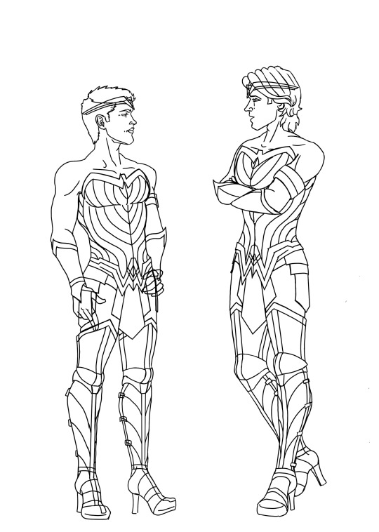
The next stage is flat colour. This is a straightforward stage if you have taken time on the line work. I selected the areas that I wanted and used the fill tool to add my chosen colours inside the lines. (I also painted a freehand background to add atmosphere before I started on my shading.)
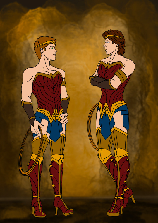
The final stages I did were shading and lighting. I drifted back towards my traditional painting style with the shading. Anime styles often use single colour shadows in block shapes, or gradient overlays to add depth, but instead I clipped my shading layer over the top of my flat colour (clipping a layer prevents you from accidentally going outside the edges of the layer below) and hand painted shadows, tone variations and highlights with freehand strokes and a blender brush. The final layer on top of that I used the hard light setting to paint on glows and shine.
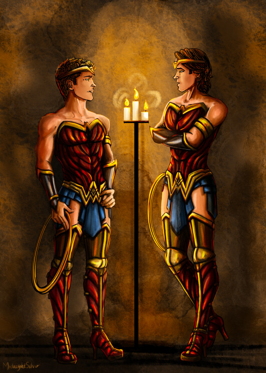
And that’s everything. 😄 All in all this took me about 8 hours but that’s because I’m incredibly slow at line work 😭 (I spent soooo much time erasing and undoing crappy lines) and because freehand painting my shading layer is much slower than using block shape shadows - but I would need a lot more practice at that to make it look good, freehand painting is slower but it let’s me cover more of my errors as I go 😁. So while this art style for this pic is still not as clean or as efficient as typical anime/animation style digital artwork, I’m really pleased with the look of it compared to my usual loose style.
P.s. if you hadn’t noticed, I’m not an expert! This is not a tutorial, this is just an explanation of how I did this this time - and I’m learning more every day. If you wanna learn more about digital drawing from people who know what they are doing you can check out amazing artists like @kirathehyrulian and many others. 🤗
Stay awesome and happy Arting my friends
- Midnight
Art post on its own without the behind the scenes 😄
#supernatural#spn fanart#MidnightSilver#my artwork#artists process#digital drawing#sam winchester#dean winchester#wonder woman#superheroes
12 notes
·
View notes