#i don't use any multiply or overlay layers
Photo

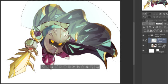
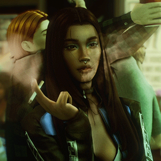
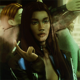
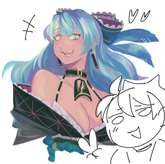
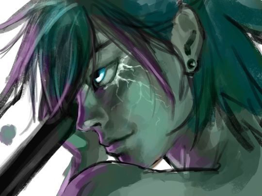
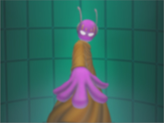
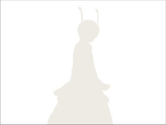
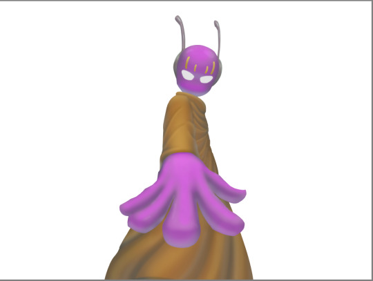
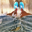
drew my octoling in the template made by meruz :D
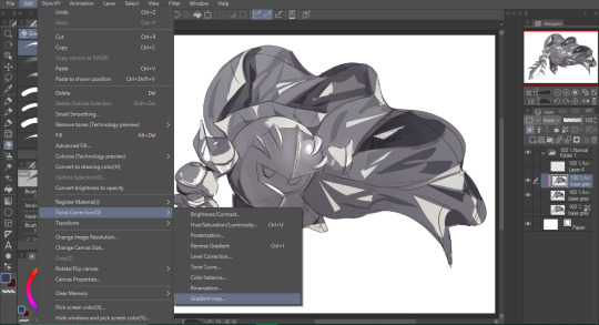
#splatoon 3#splat3#splat3n#splatoon#i based the bg off of hagglefish market#i struggled so much with drawing the flingza orz#even now it's still not correct i think but i gave up#also i tried to make the white spaces transparent#with the csp thing like brightness to opacity but it didn't work#so I just drew over the white boxes#kind of embarrassing ngl#i actually think the drawing I did for this came out good#I haven't drawn a bg in a long time#plus coloring was kind of hard#i don't use any multiply or overlay layers#so it was hard trying to get all the colors to be warmed tones#my art#other people's work
9 notes
·
View notes
Note
your rendering is so good how do you do it
Thanks, I love your rendering too!! Gonna try and make a tutorial ^^
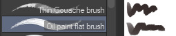
To start off, I'm on Clip Studio Paint and these are the brushes I use! First two for rendering characters (round brushes) and the other two for mostly backgrounds (square brushes)

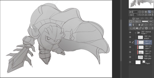
I used to do lineart, but it takes too long >:( now I just make a sketch and sorta clean it up!

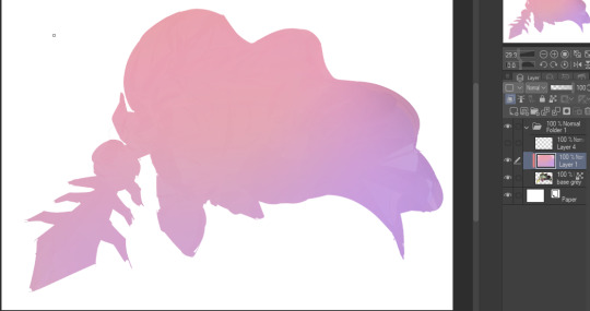
Next I fill it in with a gray color. For simpler pieces I just put in the flat colors, but for more paint-y pieces I do grayscale -> color! I'll be doing that here :)
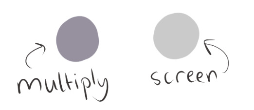
Also, I make 3 clipped layers on top of the gray - two are multiply, and the top one is screen. On the first multiply, I do a soft gradient using an airbrush
On the next multiply layer, I fill everything in with either a cool-ish or warm-ish gray, depending on the mood ^^
I also determine a light source, and use the lasso tool on the screen layer to block out where (I think) the light hits! Tbh I just do wherever feels right lmao, but I recommend having a reference! I like doing it in triangle patterns
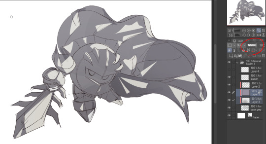
Then adjust the opacity of each layer to whatever feels right, and merge everything (I don't merge the sketch/lineart yet, I do it before adding colors in!)
Now... rendering. Some tips I have are color pick (greys) off of the canvas and use them to paint! Clean up the sketch more, erase edges, but I save details (like Galaxia's red gem, his eyes, etc.) for the end, or during coloring.
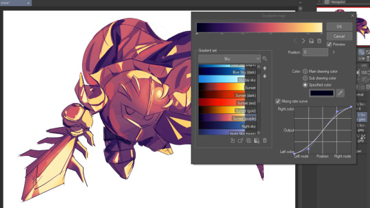
After I'm sorta happy with it, I merge the sketch layer, then duplicate it, and add a gradient map! I did this sunset-y one but changed the hue to yellow-ish, then lowered the layer's opacity ^^
Play around with the hue-saturation-luminosity setting!

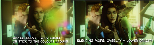
Now go crazy with blending modes! Multiply, overlay, color, glow/color dodge, etc. Feel free to layer them up on top of each other too, and this is to add the character/piece's actual colors in. For example, I used a white-blueish overlay layer for his mask and glove, blue for his cape, blah blah
Now I clean the sketch up/refine it more. Also, to "harmonize" the color palette, you can add a colored gradient on top. Then set it to multiply, and add overlay/glow dodge layers with any colors you see fit! I like using teal and light/warm orange!
Here is an example of a colored gradient:
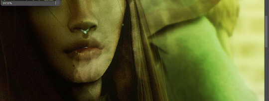
Another tip is to add saturated colors on the edges of both lighting and darker shadows, before blending it:

Also I usually add in a light blue/grey in shadowy areas, and lower the opacity for reflective light:

Also! You can lasso + use an airbush with a light blue to block out parts of the background (his cape here, for example). It helps with more depth!
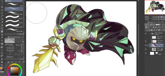
Finally, I like adding sparkles on low opacity :3 And gaussian blur to certain areas! I'm using radial blur on this piece though ^^

For the background, I like doing blocky shapes!! I use my square brush on 90% ish opacity, to color pick different hues from the piece. For lighting I use a glow dodge layer, here's a mini timelapse as well as the finished art!
At the very end, play around with the hue/saturation and contrast tools to change the colors :)
#iiii hope this helped??#first time making a tutorial sorry!!#art tutorial#kirby meta knight#meta knight fanart#meta knight#nintendo kirby#kirby nintendo#kirby fanart#kirby series
512 notes
·
View notes
Note
hi lovely!! do you have any tips on making cool fun and sexy typography?
hey joanna!! this made me giggle haha, i'm not quiiiite sure how to answer that, but here are some tips i keep in my when i do typography, and some examples:
FONTS
don't be afraid to "shop" for fonts and try funky fonts you've never used/seen. i often try so many before settling. i almost always use at least 2 different font for gifsets, even 3 sometimes. i think a good font pairing can do a lot for a gif. it's usually something like:
serif + cursive/funky fonts (example)
sans serif + cursive/funky fonts (example)
serif + sans serif fonts (example)
two different cursive/funky fonts (example)
or even simply the same font but all caps + all lowercase (example)
in case you're unsure where too start or want inspiration, here's a great resource: usergif's font pairing guide and its fonts page
BLEND MODES & LAYER STYLES
i think playing around with different blend modes and layer styles will always elevate your typography game, in my opinion. it's usually a bit more dynamic than just an opaque color. tho this minimalist typography can also be really good.
when you double click on a text layer, you get all the layer style options, as well as the blend modes. a very popular layer style is setting the layer's blending option to difference, paired with a color and/or gradient overlay (often set to multiply/color dodge). a drop shadow is also important so the text is more easily readable. we often see a black soft drop shadow, but don't hesitate to be creative with it, for example a thick, hard line, colorful drop shadow.
i feel like this step often takes the most time for me because the possibilities are endless. definitely play around with layer styles, especially drop shadow, color overlay, gradient overlay, stroke. and also try different blending modes for these settings.
as for the layer's blend mode, also definitely play around with them. and keep in mind that the text's color will also give a different result, it doesn't have to be white + blend mode set to difference, even tho this is a classic that works well.
TEXT WRAPING & POSITION
a great feature on photoshop is definitely the text warping tool. to access it, right click on a text layer and go "warp text". from there you'll get a few different styles and setting sliders. my favorites are flag and wave (example). you can always go back to edit these settings once they're done by right clicking again. and you can even keyframe/animate these settings!
typography doesn't always have to be centered and straight, i often prefer it on a side and rotated a little. you can easily rotate typography by selecting the layer(s) and hitting ctrl + T. you can also play with the skew and pespective after hitting ctrl + T by right clicking the canvas and clicking on either. these will give different ways to move your text.
SIZING
i love playing around with different font sizes, it makes the typography more interesting in my opinion, and it's a way to emphasize some words.
so for that reason i usually put each word on a different layer so i can edit each word separately. sometimes i will also put each letter on a different layer, because it can be interesting to offset/rotate some letters sometimes (example) (another example).
i often pair a quite small serif or sans serif font with a much bigger funky font (example). and often that bigger font will also have different sized words (example). i play around a lot with this!
ADDED EFFECTS
there are some things than can be done to enhance typography:
adding a colorful rectangle block behind the text (example)
using text symbols such as quotation marks or backets (example)
using lines around the text (example) (another example)
these can definitely bring typography to a different level
MORE RESOURCES
great font website
usergif's typography tag
my fonts tag
this is all i can think of right now, i hope it helps :D if you have any question on a specific text effect let me know, i can definitely make a tutorial!
#alie replies#silversmists#typography#photoshop#*ps help#resource#completeresources#allresources#resourcemarket#usercats#userabs#userpjo
172 notes
·
View notes
Text
Updated: How I edit my sims 4 screenshots (night-time edition)
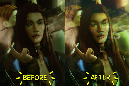
A more detailed editing tut so you can understand my process as it may help you, i edited this relatively quickly and usually spend about 1-2hrs editing something...so let's goo.....
Before taking screenshots:
Help yourself as much as you can in-game, I always make sure there is some sort of light source in my pictures or something interesting that I can add to enhance something already there
Understand good/bad composition and add variety by using different angles
I take LOTS of photos just to end up with 1 or 2 good ones

I'll just be using photoshop for this, but i also like to use the procreate app as i'm more confident w it.
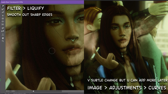
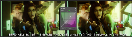
step1: I check if there are any major glitches or hard areas e.g, fingers elbows etc.. that have sharp points and pull them in liquify so they are smooth. Then use curves to change the contrast.
step2: *duplicates image* using the dodge and burn tools (keyboard shortcut: o ) i'll add emphasis to highlights and shadows (be careful with these as the dodge tool can ruin the image if used in excess) *merges image* (i duplicate and merge as i go, utilise using lots of layers so you can go back if you mess up/ want to change the opacity of an effect.)
step3: making light sources POP. *new layer* change blending mode to overlay or soft light and choose a colour you like.
step4: *new layer* draw hair strands. i just use a basic round brush in photoshop and change the hardness or i'll use a sharp caligraphy type brush depending on my sims hair type. (i try not to overdo it as i like maxis hair and don't want it to look too realistic)
step5: i would then add a new layer and set the blending mode to multiply to add more shadows, but i don't feel like i need to at this point.
step6: *duplicates image* go to filter > camera raw filter, i change the "light" and "curve" panels, i like green tints in my screenshots especially the night ones. (this is where all the magic happens really so just adjust all the channels to your liking, lightroom is also really good to use)
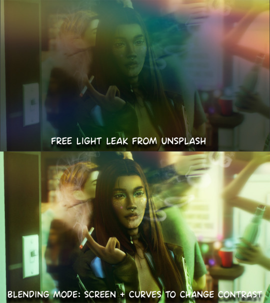
step7: *create new layer* blending mode: screen or linear dodge (add) / makeup and finishing touches! - for this look i'll get stars and glitter pngs off google or unsplash same for the smoke, though if i'm using procreate they have free brushes for that :')

step8: add light leaks as they add some fun dynamic lighting and textures to your screenshots. (i also flip my image horizantally [image > image rotation > flip canvas horizontally] whilst editing as it's like a "fresh pair of eyes" when you've been editing for a while so you can see what looks off)
final step: merge all the layers (though i do merge along the way once i'm happy with something) go to filter > sharpen > smart sharpen. I leave it as the default setting.
extra step if u want: for party pics i might add chromic abberation here is a 60 second tutorial on youtube it makes the pic look cool and trippy.
And you're done!! congrats on surviving. if you have any questions please send them in my ask box so others can see and get help too.
131 notes
·
View notes
Note
hello! i'm not sure if you remember me, a while ago i asked about digital art and if it's possible to do on an ipad or something similar. i was really grateful for your response and i got an ipad over christmas! i didn't realize how expensive the pencils were though and was only able to get one recently. now that i have all of that, i download the first art program i saw (ibispaint x, i don't know how good that is) and feel super overwhelmed by everything, all the tools and brushes and i have no idea where to begin. i know this is a super broad topic, but i don't know if you have any advice for a beginner hoping to become a digital artist? or know of any resources? thank you so much in advance and no worries if this topic is too broad to really get into properly!
Oh hey!! Congrats on getting an iPad! And yeah, shopping for the pens is a big pain in the butt, but I'm glad you finally got it all setup!
So most of the advice I'm gonna give you is very basic, starter advice that can apply to virtually any digital art software, as the vast majority of them are built with the exact same base tools, they just vary in their intended purposes which means they may differ in more advanced settings and what they offer beyond the basics (ex. Photoshop has more colors than Clip Studio because it's built for editing high quality photos whereas Clip Studio is meant to emulate comic art, but Clip Studio offers more in the way of comic-creating tools such as specialized rulers, 3D material support, built-in screentoning, etc. and all of the software available will tend to have different brush engines, meaning it doesn't always 'feel' the same to draw in one software as it does in another).
Your bestest friends:
Layers! This is the biggest pro to going digital, because now you can work with layers! So anything you draw on each layer is preserved and can't touch or affect whatever's on the other ones :3 You can find the layers tab in Ibis Paint X in the bottom right, don't be afraid to make a bunch of them and mess around with what you can do. Play around with the different blending mode settings (in Ibis Paint it's the menu that's labelled 'Normal' in the layers popup) especially Multiply, Color Dodge, and Overlay, as those three are the most commonly used to make coloring more efficient and give your art some extra pop.
Lasso/marquee/magic wand tools! These are basic selection tools that allow you to select an area within the layer you're working on, so that whatever you paint won't travel outside of that area. The Lasso is a free draw tool, the marquee tool is typically 4 sides by default (so squares/rectangles) and the magic wand detects and selects a closed area with one click! (just note that by default it's only on the layer you're on, so if you use it on a layer that has nothing, it will typically select the entire canvas).
Alpha locking! This is a simple button setting you can click to 'lock' the layer you're working on, which basically means that whatever you've drawn on that layer, anything you add can't travel outside of that drawing. So if you want to quickly shade something without going outside the lines, alpha locking is your solution!
Clipping groups/layers! This is a bit more advanced but is basically an even better version of alpha locking that you can use in conjunction with it. Clipping layers are basically additional layers that , when you click the 'clipping group' button, 'attaches' that new layer to the layer that's below it. It performs the same function as the alpha lock by preventing whatever you draw on that layer from travelling outside of it, HOWEVER it comes with the added benefit that it's on an entirely different layer, meaning you can erase and mess with whatever's on that new layer as much as you like and it won't hurt the base layer. It kinda follows the same logic as animation cels !
Masking! Y'know when you're doing a traditional painting, and you put down tape to cover the area so you can paint over it and later remove the tape and everything underneath is untouched? That's basically what masking is! Once you put down a layer mask, using the erase tool on it will 'erase' whatever the mask is applied to, and using the brush will make it magically return! This may sound silly at first, but I find masking is especially helpful if you want to erase something on the layer you're working on without it disappearing forever! It's also really helpful for comic work because you can mask whatever's outside of the panels and voila, nothing you draw will travel outside of those panels!
Stabilization! I don't know how extensive Ibis Paint X is with offering stabilization tools, but many digital art software comes with it and it's a LIFE SAVER for new digital artists adjusting to the feel of digital art. It essentially 'slows down' the output of the ink on the canvas which helps a lot with getting cleaner lines in fewer tries. It's not quite as big of a deal when drawing on iPads because obviously you have more control by default by drawing directly on the screen, but it can still be really helpful when you need to pace your hand ahead of the actual drawing tool to pull cleaner lines!
That's pretty much all I can think of for now! But here are some other commonly asked questions:
1.) There are so many brushes to choose from, which one do I use?
The round brush is small but mighty. Virtually anything can be painted with it, it's simple, but malleable, especially when you start messing around with the hardness and opacity settings. Don't get too lost in the sauce with the brushes that are available to you, it can be very easy to get overwhelmed by all the options and variety. Some artists still work purely with just round brushes, some artists have custom brushes they like to use to speed up their drawing process or achieve certain textures. Play around with them, but don't get too stressed about which one you use because there's no wrong answer, the right brush to use is the one that gets the job done ! <3
2.) What canvas size should I use?
It depends on a variety of factors such as whether or not you're planning to print, where you're going to be posting it, etc. By default I like to work on 8.5 x 11 inch canvases (standard printer paper size) at 350 dpi, which if you want to make that canvas in Ibis Paint X, means you just have to make a canvas with a pixel ratio of 2975 x 3850 pixels! Just note that the lower you go in either pixel count or dpi, the lower the resolution, so it's typically encouraged you work at a minimum of 300 dpi (but you usually don't have to go any higher than 600) to ensure you don't wind up with any blurry low res JPG's/PNG's.
3.) Should I export my final drawing as JPG or PNG?
This is usually just up to personal preference, but like the canvas size, it depends on what you're using the image for. You can always export as both, the biggest difference between them is that PNG is lossless meaning you won't experience image compression like you will with JPG, BUT you're also going to have much larger image sizes. JPG is often fine for any standard posting, PNG is typically recommended if you want to have a drawing with a transparent background for printing (as JPG can't do transparent backgrounds) or if you just want to have a really high res image file for sharing outside of social media sites (as social media sites like FB/IG/etc. will typically compress the hell out of your images anyways)
Here are some other super helpful resources as well if you need some visual and/or audio guides:
Sinix Design - How to Learn Digital Painting (Beginners)
Marc Brunet - The Beginner's Guide to Digital Art
Skynix Art - 50 Digital Art Tips in 5 Minutes
One thing I also like to do is watch speedpaints of digital artists as it can really help pull back the curtain on what they're doing (or at least, it can help you see what they start with which can help you better picture the process of turning a blank canvas into a finished work of art!) And though I don't do it as often, if there's an artist whose work I REALLY like, I'll try and find their actual work files (many bigger artists sell them on their crowdfunding sites/Gumroad/etc.) so that I can actually break the drawings apart layer by layer for the purpose of analysis. Of course, all that is something that you'll grasp better over time as you learn the tools and learn to recognize what artists are doing in their own workflow, so don't worry if you don't glean a whole lot of info from the "big guys" right away, you should always be referencing artists who are higher along the skill ceiling from you but not too high that they're using techniques and tools that are outside of your realm of understanding.
Other than that, just try to have fun, don't stress too much about it, and save often!!! Part of creating art is learning to be at peace with the process, so don't stress too much if it takes you a while to get adjusted to the layouts and tools - at the end of the day, digital art is another medium entirely, so it's not uncommon at all for traditional artists to need a lot of practice to 'switch' to digital, because they both utilize different tools and techniques. Be patient with yourself, always be on the hunt for new resources and guides and references, and don't be afraid to experiment and make mistakes (the best part about digital art? Mistakes don't cost you any paint or materials!)
Good luck!! And congrats again! 🥰
57 notes
·
View notes
Text
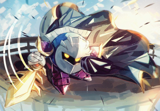
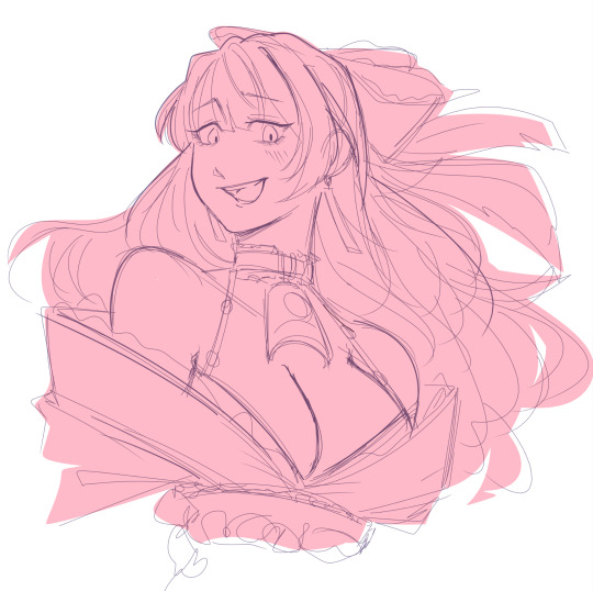
bestie asked how I rendered so yeah, kind of a tutorial? it's more like a step by step but alas
tutorial under read more
sketch/line art ► I don't do line art out of sheer laziness + I'm not very good at getting clean looking lines. My lines are always coloured and set to a multiply layer.

colour block + base colours ► the block is 90% of the time the characters skin colour, but if I'm feeling fancy I might go with other colours like I'm doing with this one, a light reddish pink
I do this because I colour everything in one layer
I use a mixing brush to sloppily throw in the characters actual palette
yeah it's very messy, but has a fun unpredictable variation in the colours you typically wouldn't get if you just threw in base colours like a normal person

shading ► continuing the trend of being absurdly sloppy with my process...
I like shading with multiply or burn layers, and highlights are usually done with overlay or add (mostly add) could obviously be done with any colour except full on black or white
after this I merge all my layers together for clean up

clean up ► the fun yassification part wooo!! essentially all I'm doing is just carving out the various shapes I want with a basic round hard mix + soft mix brush, further refining everything and making it not look sloppy
I always start with the face and then move out to other parts like hairs and clothes
Marco Bucci on YouTube has fantastic videos on painting shapes and he explains everything better than I ever could

Optional filters + edits ► boring part simply adding a paper texture over the piece using overlay, just makes everything look less flat and digital

profit ► yeah!! uhh thats really it honestly, I don't really do anything special lmfao
#art tutorial#art reference#nori art#i hate rendering but... this is for the bestie#AND SORRY IF THIS MAKES LIKE NO SENSE#I AM TOO MESSY FOR MY OWN GOOD
446 notes
·
View notes
Note
The way you paint textures is mesmerizing! Its always nice to zoom in and see the little details. Also How do you achieve them?
Hello, thank You! I'm really glad You like them! :D
I use a brush that does a lot of my texture work for me, because depending on how i use it it can deliver both quite smooth strokes and a pretty heavy texture:

Where this one is not enough i hop onto Splatter Tool from Kyle Webster's brush set and paint over Multiply or Overlay layers set on lower opacity:
And these too can give quite a good range to work with:
I don't use photo textures nor any other brushes, so the rest is looking at a lot of references and thinking how to apply that on things I'm painting, and then rendering. Or just slapping them all over till I feel it looks ok lol.
539 notes
·
View notes
Note
uh hi can you give some shading tips? pls?
Sure! :DD
I think the easier way to give some tips is by showing my own process.
(I won't explain here the basics of shading, but if you want I linked a tutorial down at the end of this.)
First off, the program I use is Krita (but any program is ok 👍✨)
And here's the brushes I use:

I'd say use at least two brushes. A soft one and a harder one.
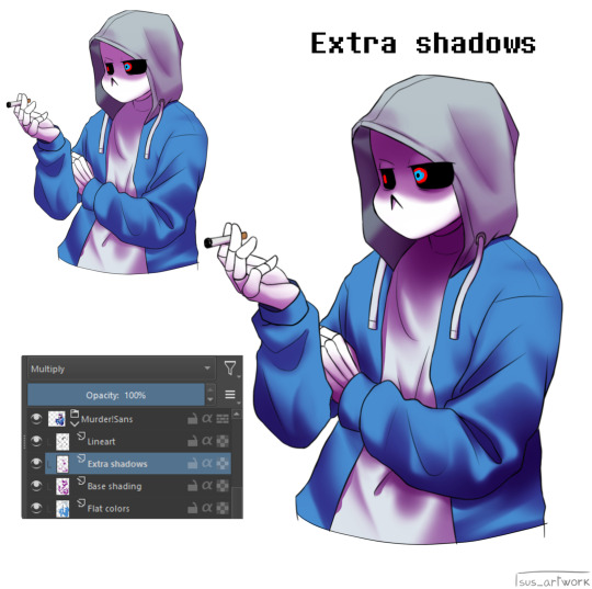
To show you I'll use this doodle I did of Murder!Sans (by @/ask-dusttale)
First, flat colors.
Then start shading on a new layer and put it in Multiply mode, then change the opacity at your liking.
Don't use black for the shadows! Use a dark color.
I usually use a purple or a brown.

Now with the same color, go on a new layer (Multiply mode), and add extra shadows where light has trouble reaching.
This gives more depth to the drawing.
(To make this process easier I use the Select Opaque option, by right clicking on the Base Shading layer, down in the menu, and then paint on the new layer)
Now fill the canvas with the light's color (or do like me and duplicate the Flat Colors layer, and recolor it if you want the light to be only on the subject).
I'm using yellow since it makes a nice contrast with the purple.
Put it in Pin Light mode and change the opacity at your liking.

Aaaand
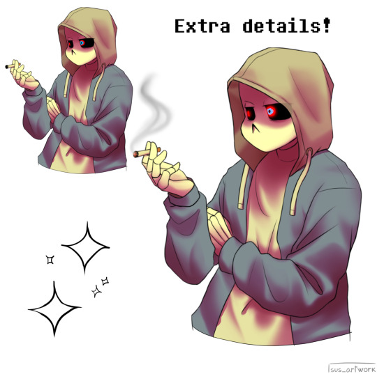
You could say finished!
We could stop here, but if you want some extras, go under the cut:
-EXTRA-
Now I-
I can't explain what "Bouncing Lights" and "Sub-Surface Scattering" are, so... go see on internet :''D
Basically slap some red and blue over the shadows layer in Overlay mode and voilà
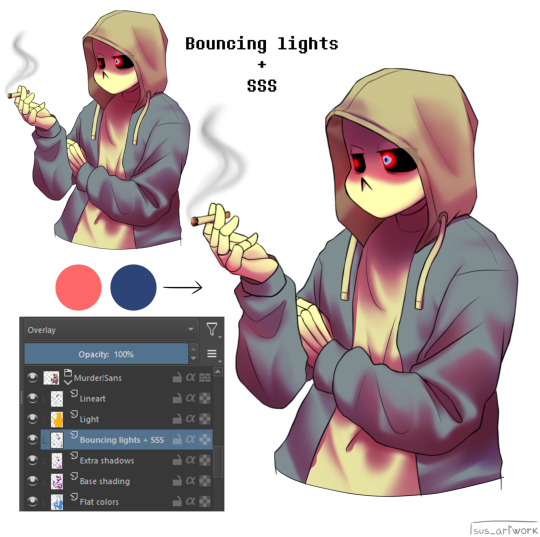
It'd be more noticeable with less light but trust me, it's good
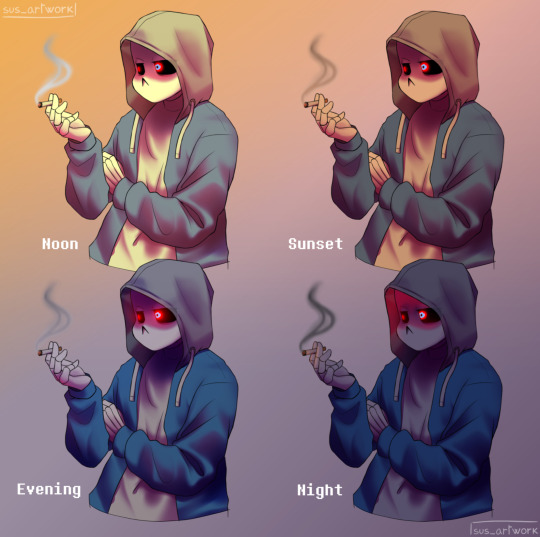
Now let's talk about ambience.
We can create many different scenes just by playing with the light and shadow layers!
Change their colors, change the blending mode, play with 'em and see what you get:

Also I suggest studying how color schemes work (I'll link you a video down below).
I uhh actually kinda suck at color schemes XD but having at least a basic understanding of them it's useful.
And, here's some tutorials that personally helped me a lot:
Shadows and lights tutorial/tips <- great for learning the basics of shading
Time saving shading solutions
This great rendering tutorial by @/licollisa
Different color schemes
For any questions don't hesitate to ask me (^w^)
#ask answered#miramoonli#undertale#undertale au#dusttale#sans#murder!sans#dust!sans#art tutorial#drawing tutorial#art tips#drawing tips#shading tutorial#coloring tutorial#rendering tutorial#This was oddly fun to do :D#maybe cause I LOVE shading. It's my fav part of drawing#Also Murder is fun to draw-#You know whose fault it is XD#This doodle was to practice drawing hoods tbh.
119 notes
·
View notes
Note
Do you have any art advice for people who just started? Layers, tracing, social media etc?
hi anon! i've answered some asks before about general art tips (x x x x ) so if I miss anything here these are more detailed and might help as well!
don't worry too much about creating a style right now! in fact, from my personal experience, i'd say don't worry about creating a specific style at all. the style of a piece is supposed to be a tool to help you give form to a feeling. instead take a look at art that makes you feel good and think about why and use that analysis as a guide for your choices during the process
assuming you're a digital artist, layers are Great. they're Beautiful. I use separate layers for things that I think I might need to move around later, e.g., the colour of the skin, the colour of the hair, etc. most programs have features such as clipped layers (to keep everything on the layer above within what you have drawn on the layer below), blend modes (to change the way the colours on the layer above interact with the layer below), and a naming function, so you can label what is on each layer if you need. definitely have a fiddle around and see what works for you! a general thing that people tend to do with blend modes is multiply for shadows and overlay/screen for lighter parts. have fun with it and see what feels good!
honestly. honestly. the biggest mistake I made was getting too deep into posting on social media before I started enjoying art as a hobby in itself. your skill is not determined by how fast you can draw, or whether your art looks like the most popular pieces you see circulated on social media, or whether one of your pieces breaks 1k notes. social media traction follows your confidence and enjoyment in your work, it's not the condition that precedes that. focus on building a good relationship with your art and your feelings about yourself as an artist and all the good stuff will come without you even realising, I promise <3
30 notes
·
View notes
Note
I’m not sure if you’ve answered this before, but how do you do you pages? Do you use one program or several? I wanna use the format but I’m baffled XD
It’s so good! Also Pinemorant FTW!!🏳️🌈
I've briefly discussed my process in making issues, but I can go through the whole thing for anyone who is interested in making a comic like this. It's not complicated at all - I only use one program (technically two, if you count Google Docs), Medibang Paint Pro. It's free to download and I've used it for years, it's a medium-level digital art program.
I'll take a page from the last issue, 26, to demonstrate. So if you haven't read it yet, do that before reading this.
My first step, which is already completed for every issue, is to write a basic summary of the things I want to happen. If I have a specific dialogue I want to use I'll include, but normally it's just descriptions.
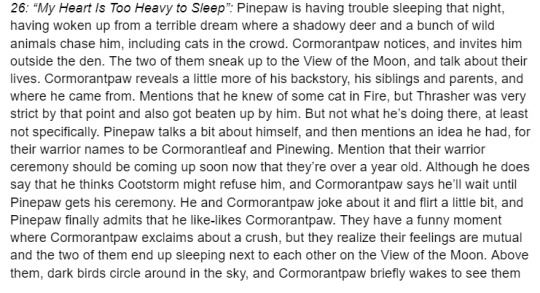
I don't always use everything from my summary, or I'll add things in the final written draft. You may notice a line about "he knew of some cat in Fire", which was about Cormorantpaw knowing of Rainhaze but not actually who he was. I took it out because I couldn't seamlessly work it into the conversation.
2. The stories themselves are written in Google Docs, in the format of any short fiction. My process is pretty short - I'll write out a rough draft, leave it alone for a day, then come back and clean it up. Here's the section from the page I'm showing.
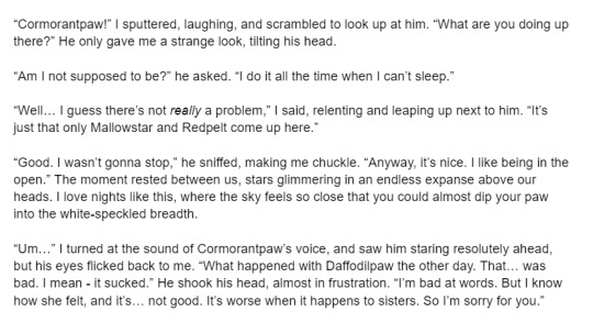
If I use speech bubbles on a page, like this one, sometimes there will be descriptive language in the story that's not in the page, like "I said, relenting and leaping up next to him."
3. My first compositing step is to lay down the text and sketches, so I know where everything goes and ensures the page flows nicely. Medibang has a feature called the "Text Tool", which is what I use to lay down text. I can't say my fonts exactly since they're mostly Korean characters, but they're part of the default Medibang font set.
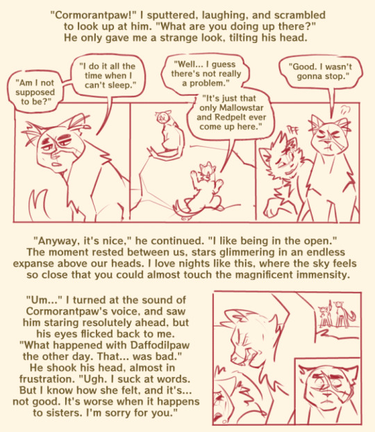
4. After this, I add lines and colors. It's pretty simple.
I have a specific color scheme for borderlines; black is normal, present drawings, reddish-pink is flashback, blue is fantasy/imagination.
5. After color, I draw the backgrounds. All of my backgrounds are painted using the Pen brush and the Watercolor (Wet) brush, sometimes with Acrylic or Chalk for texture.

6. My final step is to add a gradient multiply and overlay layer, since I don't cell shade or paint shade the characters. It saves a lot of time! I also add final cleanup like sound effects, whiskers, and speech bubbles, if they're needed.
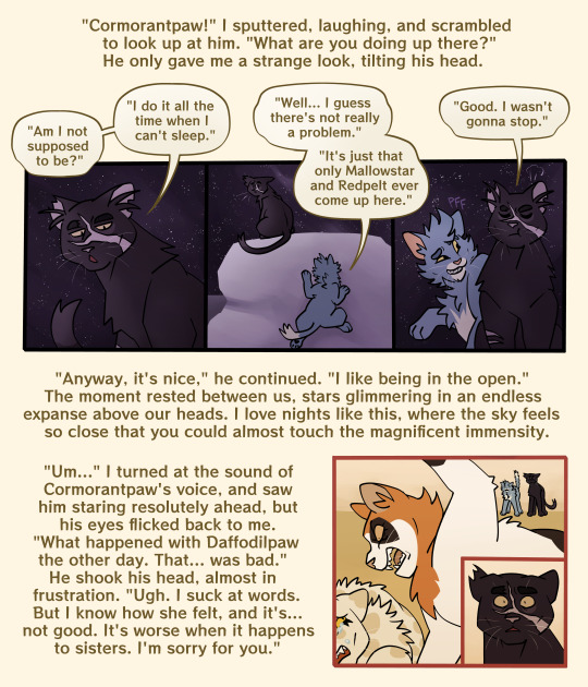
And that's a page done!
116 notes
·
View notes
Note
i am so tired of being nice i just want to go apeshit PLEASE FOR THE LOVE OF GOD VTUBER ARTISTS WHO HAVE NEVER RIGGED BEFORE: ASK A RIGGER FOR ADVICE ABOUT SEPARATION AND LISTEN TO IT!!!! as a rigger and artist i am so fucking tired of having to spend 8+ hours re-separating and fixing all of the bullshit with your artwork that makes rigging a nightmare. AS A BASIC RULE PLEASE...
1: NEVER USE A SPACE IN LAYER NAMES!!! if you use a space in the name of any layers ( i.e. "leg l" "part 1") the name will be switched in live2D to "artmesh" and your rigger will have to RENAME EVERYTHING. if you do this for every layer THIS IS A NIGHTMARE. it's not easy to fix PLEASE use underscores instead of spaces.
2: have ANY KIND of naming system. it literally doesnt matter, as long as it exists and is consistent the rigger will figure it out. don't name one thing "left_arm_1" and another thing "Bang>SidePart" and expect me to be able to easily work with your file.
3: KEEP. LAYERS. ORGANIZED. please please PLEASE understand basic rigging hierarchy and stick to it. If the left eye folder is ten thousand layers below the right eye folder this will be extremely confusing. also make sure the limbs are ordered properly. if the shoulder is in the layer for the jacket and the hand is somewhere floating in the ether i now have to spend time to reorganize the psd.
4: LIVE 2D DOES NOT WORK LIKE A DRAWING PROGRAM. it only allows for multiply, add, and normal layers. no overlay, no screen light, just add and multiply. if I have to clip a layer to more than five other layers the program WILL lag for both you and the person who ends up using the model. Do not just leave a massive multiply layer over the entire model it doesn't work that way.
5: oh my fucking god PLEASE draw EVERYTHING even if it isnt in view. if you have a separate layer for the bang's shading, for example, in normal illustration you just draw what's visible and call it a day. I'M TURNING THE HEAD, MEANING IT WILL JUST CUT OFF. if i have to fix this for every single instance of shading i am taking time away from my work, my whole process takes longer. as a rule of thumb, always draw more than what you think you need.
6: separate more than you need, but not everything. sometimes I work with models that have not enough things separated, and its a pain to work with. sometimes i work with models that feel like the artist just sent me their work file with every tiny brushstroke on a different layer and then I have to spend a day merging and checking everything. use your head while you are drawing, think to yourself "is the thing I'm drawing something that will need to move independently?" try to imagine the model in 3D space as your working, and if you can't do that perhaps study an object in real life and see how turning it in space interacts with the lighting or whatever idk. also: if there are too many separations the model will come out looking blurrier. live2D doesn't just read the photoshop file, it creates a new texture file. imagine the model like a paper doll, it takes every piece of paper and spreads each piece down flat. this takes up much more space and many more pixels then the photoshop document, and the bigger i have to make the texture file, the laggier things become. if i don't want it to lag, everything has to be shrinked down to fit, and thus everything becomes blurry. if I don't want it all blurry, I basically have to spend hours upon hours manually placing every "piece of paper" on another piece of paper essentially playing the worlds most annoying jigsaw puzzle.
I feel like I'm working on a group project and doing half of your work. please, stop making my job much harder than it needs to be.
.
28 notes
·
View notes
Note
Do you have any tips for someone who is trying a more realistic aproach for their art style? your painting and lighting are so good that I had to ask 🤠
Thank you!
So this question is actually pretty hard to answer, mostly because I still consider myself a beginner/hobbyist, and I'm pretty sure a lot of my technique comes from the ~5 years of classical art training I received in middle school and high school, and that's so fuzzy I can't tell what's intuition or muscle memory! I can go over some of my workflow/thoughts though and hopefully some of it is useful!
The first thing is that for realism, You. Need. References. It is impossible to replicate the level of detail in a realistic painting without a reference. I usually pick a reference, try to draw that reference exactly, and once I have the proportions correct, I'll change it to match the character/scene I'm drawing (move an arm, tilt the head, add a hand, make the eyes bigger, add anime hair etc. haha). Over time you'll get more comfortable moving away from a specific reference and piecing together a bunch of references into something more unique.
Here is an example of a recent post that was fairly simple. I take the reference image (link to reference here) and try to match it, and then I change it to match the character details, in this case, Kashimo.

As for the lighting, when I first started, my colors were a mess! I already know basic color theory which helps, but it didn't help enough haha. What I think helped me learn the quickest was color picking - in krita you can select a color directly from an imported reference figure. So I'd find a reference that I really liked the lighting on, and color picked from it while paying attention to the actual color I was grabbing (how warm it was, gray it was, what the typical skin tones were, etc).
Later on as I started to learn what types of color palettes I really liked working with, I'd open the reference photo in Krita and tweak the image's contrast and sometimes completely change the lighting and colors. However, at some point I started using it as a crutch and my skills stagnated, so you need to be careful! However, now I've progressed to the point of doing a painting in black and white and adding the colors later (with no color picking!), sometimes even without a reference for the color. This was a slow and painful process, so don't expect things to make sense overnight!
Also, don't forget that you don't have to make the colors perfect in one shot. Usually I'll color things using a color layer with minimal detail and basic color tone (Itadori's hair is soft pink, his hoodie is bright red, etc), and then create shadows and lighting with multiply and overlay layers (blues and purples for night, etc.). Eventually I'll build up the color and merge all the layers together, and then add details in full color. I can color pick from other parts of the painting to maintain consistency. Then to finish things off, I almost always tweak the colors and contrast using filter layers.
Here is an example from that same Kashimo painting, going from black and white to full colors using color, multiply, and overlay layers, and then ending with full color details.

As a side note, starting out in black and white can make things so much easier. When you're only worried about values, you can really focus on shadow depth and the shapes of things. It's so much easier to explore rendering when you're not trying to do color on top of everything! Don't try to do everything at once.
The rendering style I use is based heavily on trying to replicate the feeling of actual oil painting. I use the (free!) art program Krita, and my favorite, most used brush is from a free pack I downloaded from deviant art (here). I use the brush called R T Masked4 (shown below) for basically 90% of any painting I do. I use about 4 brushes total on a typical painting (R T Masked4, that same brush but tweaked to be narrower for hair details, a smudge brush that I discovered maybe 10 days ago that I'm now obsessed with, and sometimes a scratchy brush for additional texture).

One last thing - don't be afraid to use tracing! Block in a reference photo to get the head and shoulders in the right place!! Trace a few hands to see how it feels!!! Obviously don't trace somebody's art and present it as your own, and it should only be rough approximations of shapes so you learn how to break down the body into parts. Otherwise, it won't be helpful at all. I only use photographs for tracing, including pictures I've taken of myself. One of the more helpful things I'll do is free hand my drawing and try to make it match the reference as closely as possible. Then, on a separate layer, I'll trace the reference photo (again, no details, just general positioning/shapes), and compare it to my original drawing. I can immediately see the issues, and I'll use the liquify tool to get things in the right place. I've learned that my horizontal spacing is usually pretty good, but I struggle with vertical spacing, especially on faces. So now I triple check my work for those specific things!
This kinda turned into a book, I'm sorry! I hope some of this is helpful and doesn't sound like the 10:30pm ramblings of someone who didn't get enough sleep haha.
77 notes
·
View notes
Note
hi alie, please could you tell me how you made the lens flare and film grain effect on your recent rwrb fonts gifset? it looks so beautiful! i'm working on my very first gifset with blending and overlays and things, and i'd like to try my hand at learning some more new stuff 💛
hiiii! thank you!! <3
i've found these overlays on youtube over the years, i don't remember exactly which videos they were, but if you look up "film strip overlay", "kodak overlay", "film grain overlay", etc for the film one, you should find something that you like. same goes for the light streak one: if you search for something like "light streak overlay", you'll get a bunch of nice one. then i download them via a website (i often use y2mate) and make a gif with screencaps from the dowloaded video(s) like i would any other gif.
once you have your overlay(s) ready to go as a smart object, duplicate it onto your gif, on top of everything (or under the typography layers), but definitely on top of coloring and blending, etc. put the overlay layer in a group, and if you have more than one overlay, put each overlay in its own group.
if the overlay is mostly black with some white specs/other colors, set that group's blending mode to screen (or lighten if it looks better). this will make everything that is black in the overlay transparent. and if the overlay is mostly white with some black, you can use the multiply (or darken) blending mode (it will make everything that is white transparent).
the reason why i prefer putting the overlay in a group and change the group's blending mode, instead of the overlay itself, is because it's easier to change its color that way if you wish. to change its color, i use a gradient map layer. the colors should be black to whatever color you want, and this layer should go into the overlay group, and n top of the overlay layer.
for my gifs in this rwrb set, there was also actually an animated grainy overlay below these two overlays. i've uploaded it here as a psd if you want, since it's pretty light. i put that layer in its own group and changed the blending mode to hard light and the opacity to 10%. i only used a gradient map to change the color on the color steak one to make it more of a pastel orange color, the two other overlays are as is without any color correcting layers.
i hope that was clear enough :)
#alie replies#skatingthinandice#*ps help#photoshop#resource#tutorial#completeresources#resourcemarket#allresources
86 notes
·
View notes
Text
here's some tips to copy my cross hatching style on procreate, sorry no pics bc I don't know how to screenshot on an ipad
1. get a really textured brush: the chalk brush is what I use, but I also bought chromagraph brush sets from True grit texture supply, and they can mimic traditional brushes super well.
2. this style really works well with linearted stuff, so. fill in your lines with the base color a shade lighter than your intended color. Don't use a textured brush for the base. use a really smooth one, or even the fill tool.
3. when you're done with the base, make a new layer on top, and set it to multiply, but make the opacity low. Mine is usually set to like 30%, but adjust as needed- Start coloring in with the textured brush.
4. layer in your colors like youre actually working on traditional art. lightest to darkest, this will really work well if you avoid using any blur tools. When you're done with the first layer of colors with the textured pencil, merge it down, start a new layer, set it to low multiply, and add the next layer of colors, just like how you would color pencils irl.
5. if you can comfortably eyeball the colors, try to add in more colors to the piece *without* using the layer tools like multiply or overlay, and just try to guess which color harmony would work. Don't be afraid to use more grays rather than the really vivid colors.
6. once you're done with the drawing, you can use the sharpen option to make the textures more prominent!!
7. try to add just One filter above it, just to make the drawing feel more natural !
183 notes
·
View notes
Note
Less about OCs, but I'm interested to know what your process is like when creating a piece as detailed as that one you posted for Valentine's Day. How do you go about it? And do you happen to do time-lapse videos?
hmm can't say I can give an explanation that's terribly interesting or satisfying lol... I'm almost entirely self-taught, so "process" is a very loose and nebulous concept for me, and it changes from piece to piece. the one common thread among my works is that they all involve obscene amounts of trial and error. I don't have any recent time-lapses because I never think to record them, but if I did you would definitely see how often I feel the need to adjust and redo every little thing.
for the Valentine's Day piece, because it was a "remake" I had the benefit of a much more solid foundation than usual to start out with. however you can still see where I ended up deviating from the sketch phase - most obvious being her pose, the design of her hair, and the details of her sandals. (there were also meant to be candles on the dresser, but I forgot and didn't feel like adding them back in later and so I decided a vague suggestion of candlelight was enough lmao)
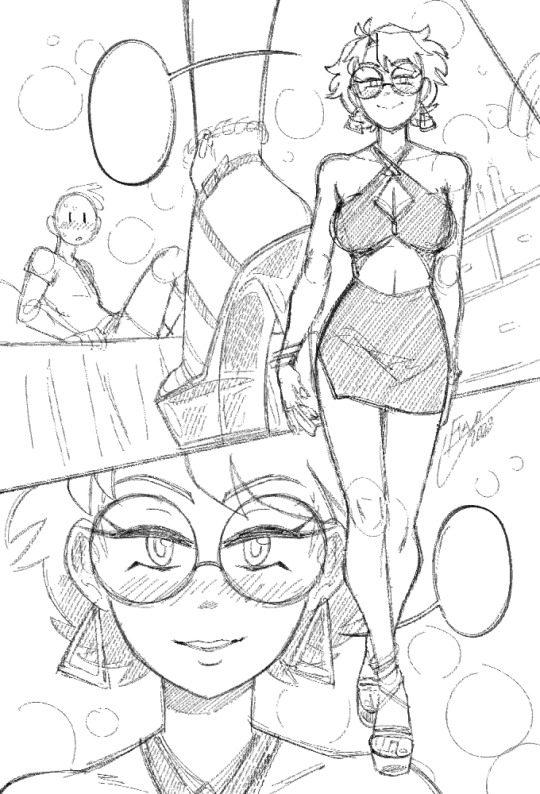
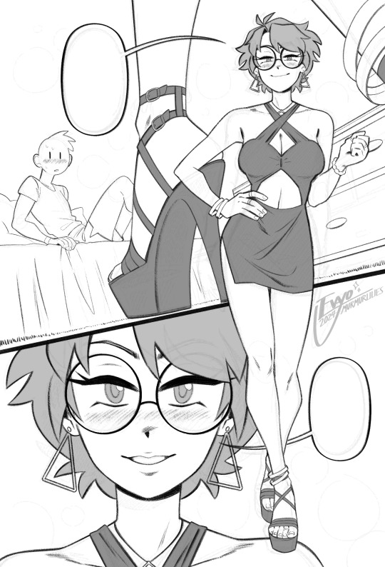
anyways, compared to everything else, sketching and linework are fairly straightforward and come most easily to me. there really isn't much to say, just scribble some messy lines and then whittle away at and draw over them till they magically become less messy!
when it comes to coloring and shading, things get a lot weirder and more complicated. this is where my process tends to vary the most, because it really depends on the mood of the piece. for this one I wanted something dark and seductive, so I covered the whole image in a layer of burgundy red, then painted the "lighting" on top across several Overlay layers. additional shadow details were brushed in on Multiply layers using deep purple instead of straight black, but ultimately I didn't want them to be too dark, as that initial layer of red was meant to serve as the primary "shadow" of the piece.
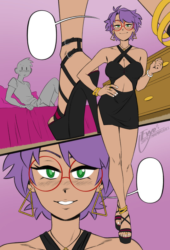
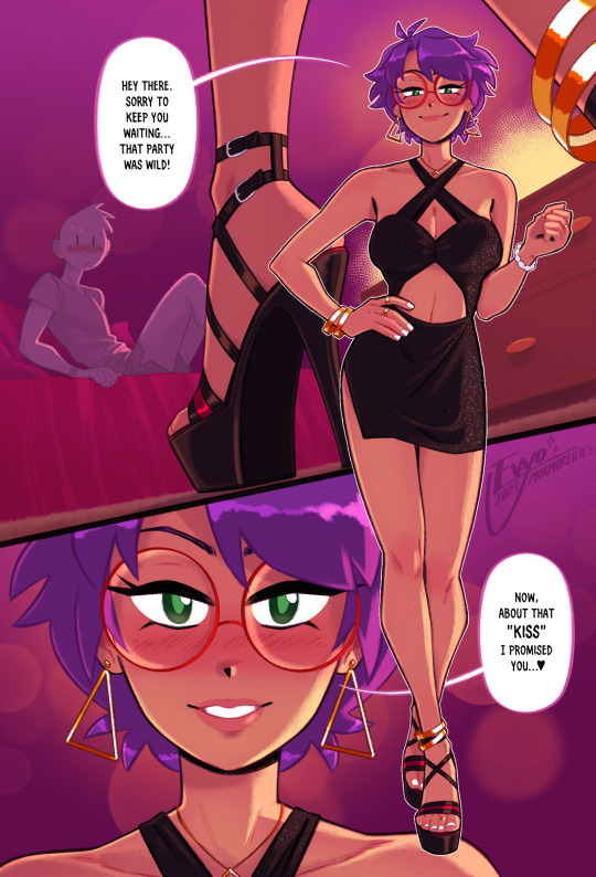
this is also usually where I decide which lines I want to "color" with clipping masks, which can either make certain elements pop or feel softer. it sorta brings the whole image together, giving it a much more painterly look overall. from there all that's left is to keep making adjustments and adding little details - the glittery effect on her dress was one of the last things I added, I thought it looked really nice!
...ok now take everything I just said and throw it all in a blender. because even though it might sound fairly orderly, the truth is I'm constantly making changes to all stages of my works, even the earliest ones, all the way to the end. I'll still be making adjustments to the linework and such after I've already put so much effort into the lights and shading! it's not the most efficient way of doing things... but again, trial and error. my perfectionism gets the better of me...
anyways I apologize if NONE of this made any sense, like I said I never had any formal training in art, so I'm not very good at teaching or explaining it!! at the end of the day my process is less about what makes logical sense and more about finding what feels right in a given moment. at the very least I hope it was a fun read lmao 🥳
#evayo asks#evayo art#glassborn#ocs#fun fact: i had no idea what to put in those dialogue bubbles till like an hour before upload LMAO... she could've been saying anything 🙊
37 notes
·
View notes
Note
I just found this blog and I noticed that a lot of your stuff seems, well, oddly 3D. I don't mean like in a bad way but it feels like rendered but untextured 3D models? I kinda want to ask what your art process is (sorry for mini-rant)
thanks for checking out my blog! and no need to apologize for anything.
hmm, my art process. honestly i have no idea what to say, i dont know how people normally answer this question so i cant base it off anything either. i'm still kinda new to this whole art thing but i'll try and answer, super sorry if i get this completely wrong and this was all a waste of time.
i guess i'll just talk about how i draw things step by step? for the high effort pieces at least.
ok, so for starters like step 0. when it's a high effort piece, i can already see the image in my mind. i see the pose, i see the general lighting, the layout of stuff, but it's a bit blurry. if i cant see this mental image, the drawing usually comes out extremely poorly.
this is kind of an example of what i see in my head? this might be all useless info idk, but this is i guess where i start.
well step 1 is just the sketch and line. i start with just sketching the general shapes, then slowly refining it until it fits close enough to the image in my head. then in the line layer i'll fix any mistakes the sketch had and add more details to it. oh and for brush, it's just a round brush, like default. i dont know how much of a difference using a drawing tablet does, but i dont use one so... yeah.
i should've put more effort into the sketch for this drawing, but i did not.
next i do flat colors. pretty simple, i just select the smart select the outside of the line layer, invert the selection and now i can't paint outside the lines. i dont really think about what colors i use, i just use whatever the characters normal colors are.
next i do the shading, but first. i duplicate flat layer and recolor it to like a cream color
like so. for high effort pieces, i was told online to shade in pretty much black and white. now actually onto shading. there's 2 kinda shading i do, 1 from the proper light source, and 1 that's kinda just a shadow because things are close together (like corners and stuff). and i'll shade them on separate layers so i can adjust them individually however i want. oh right, i'll either use a very dark color, pretty much black and the the layer blending mode set to multiply. or i'll use a light kind of gray, tinted slightly yellow or something and set the layer blend mode to difference. then i just use a soft air brush and shade in the ways i described above. shading from regular light source, and the corner stuff thing.
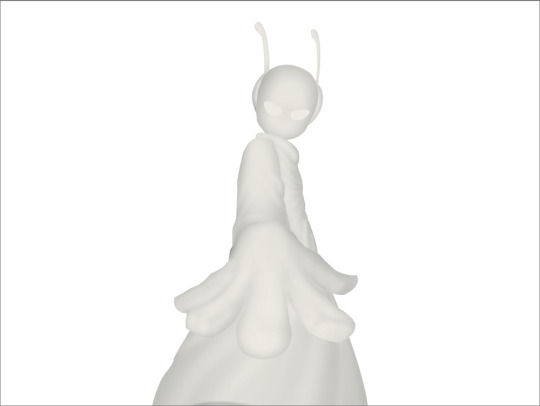
normal lightsource - - - - - corner thing
then toggle both layers on and mess with the opacity of each layer until you get what you want.
then you can toggle the normal flats layer, the one that has color and it should apply the shading decently. you can mess with the opacity again on the shadows.
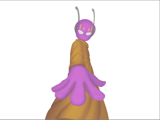
next i do lighting. i just grab a very light color, usually pretty close to white and set the layer blend mode to overlay. then i use a soft airbrush and "light" it? idk i just do like the opposite of the normal shadows, lighter the closer it is to the light source
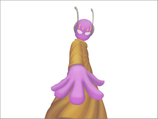
mess around with the opacity as usual. then i do pretty much the same thing if there's another light source. in this case there was a blue light kinda coming from underneath, so i did that.
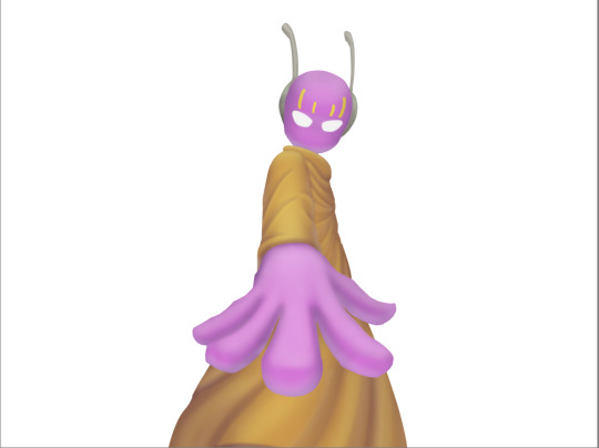
now from here i would go back to the flats layer, make a copy, and mess around with different layer styles and properties and settings. sometimes just messing around is useful. in this case, i felt it was too bright and colorful, so i decreased the brightness and saturation of it.

i think it helped a little bit but who knows.
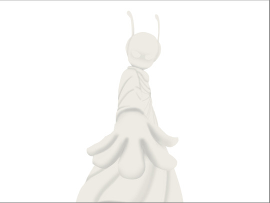
now i do some kinda highlights and details. i grabbed the colors that were in the background and used those. it was a weird pale blue. i had 2 layers for this, 1 of them was specifically for his antenna things at the top, and one was just for his "skin". anyway, the antenna layer was normal, just kinda gave it an outline with the random reflective circles you see normally in pictures, no thoughts behind them. the skin tho had the layer blend mode set to soft light, i thought it looked best this way. it was just more random things to imply it was slightly reflective.
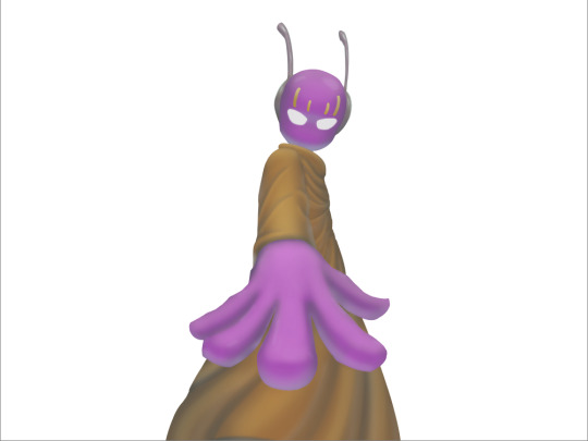
together the layers looked like this. i think it makes him look glossier which is what i was aiming for.
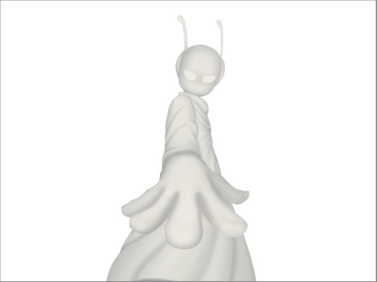
next, and it pretty much the end for pebbles, i got someone to look at it and let me know if they think anything was missing. they said it looked a little unsaturated. which it does. so i made a new layer, set the blend mode to saturation, grabbed the airbrush and made it pretty inline with the lighting layer.
that's kinda it. the background i didnt really care about, just drew and colored it. blurred it a bunch and added a bunch of shadows. i did add some like, "overshadows" is what i call it, i just draw some big shadows down the screen as the top layer.

but yeah thats literally everything i did to draw this. i would like to apologize if this was not at all what you wanted to know, i'm certain i've screwed this up bigtime. super sorry for wasting your time. if there's anything i can do to help, please ask. i owe you a proper answer to your question, i'm just really dumb. sorry for rambling. sorry. and sorry if the drawing i used for example didnt showcase what you wanted to know.
also, i really like your art! please keep up the great work!
#i think i did this all wrong#i'm so sorry#i feel incredibly stupid#:I#rambling :I#now everyone get's to see how little i know about drawing
25 notes
·
View notes
Last Seen Blogs
storyofmybooklife
Story of My [Book] Life
ayazmsy
javadoff
moviegifsdaily
Movie Gifs Daily
nausoulecau
come with me
xatirelerimtlumbr-blog
xatirelerimtumblr