#i hope this helps tho
Note
Hello!
I just noticed that you reblogged a post i added an image to with a description of your own as well. I haven't seen a whole lot of discussion about this, but do you have any idea if plain text descriptions that are visibly seen in the post generally viewed as better than the embedded descriptions in the alt text?
Hi!
As far as I can gather, ALT text embeds the description within the HTML code of an image, which makes it great for screen readers. However, plain text is preferred because it's more accessible for everyone. So long as it's not in small text, coloured text, italics, bold. It helps those who don't use screen readers, those whose screen readers can't/don't read ALT text, slow WiFiers, those who exclusively use the app,
I'm someone who uses the app, I don't realise things have an ALT description unless it's mentioned, in which case, I will paste it in plain text with credit. The few times I am in browser, the box is so faint that I don't even notice it's there.
Here's a post we described a while ago that has ALT text.

[Image description: a screenshot of a reblog by StarTrekDescribed, in the screenshot is the image of a screenshot of the ikea monkey headline altered to say "stylish but illegal FREAK found roaming Dominion ikea". in the image, the tiny monkey in the puffy jacket has been drawn over to look like weyoun. In the bottom left corner very faintly is a small faded square that says ALT /end image description]
The box telling me it's ALT is so faint, I wouldn't notice at all. I can imagine that's true for other people as well. If I'd known you had written your own, I would have used it, sorry about that.
So, yes, plain text is preferred as it's much more accessible.
#Sorry‚ this got very long winded. I've got a terrible tendency to ramble#I hope this helps tho#Feel free to ask me anything else if you wish#sorry for taking a while to respond#It's half term so my free time is very small
8 notes
·
View notes
Text
Today my therapist introduced me to a concept surrounding disability that she called "hLep".
Which is when you - in this case, you are a disabled person - ask someone for help ("I can't drink almond milk so can you get me some whole milk?", or "Please call Donna and ask her to pick up the car for me."), and they say yes, and then they do something that is not what you asked for but is what they think you should have asked for ("I know you said you wanted whole, but I got you skim milk because it's better for you!", "I didn't want to ruin Donna's day by asking her that, so I spent your money on an expensive towing service!") And then if you get annoyed at them for ignoring what you actually asked for - and often it has already happened repeatedly - they get angry because they "were just helping you! You should be grateful!!"
And my therapist pointed out that this is not "help", it's "hLep".
Sure, it looks like help; it kind of sounds like help too; and if it was adjusted just a little bit, it could be help. But it's not help. It's hLep.
At its best, it is patronizing and makes a person feel unvalued and un-listened-to. Always, it reinforces the false idea that disabled people can't be trusted with our own care. And at its worst, it results in disabled people losing our freedom and control over our lives, and also being unable to actually access what we need to survive.
So please, when a disabled person asks you for help on something, don't be a hLeper, be a helper! In other words: they know better than you what they need, and the best way you can honor the trust they've put in you is to believe that!
Also, I want to be very clear that the "getting angry at a disabled person's attempts to point out harmful behavior" part of this makes the whole thing WAY worse. Like it'd be one thing if my roommate bought me some passive-aggressive skim milk, but then they heard what I had to say, and they apologized and did better in the future - our relationship could bounce back from that. But it is very much another thing to have a crying shouting match with someone who is furious at you for saying something they did was ableist. Like, Christ, Jessica, remind me to never ask for your support ever again! You make me feel like if I asked you to call 911, you'd order a pizza because you know I'll feel better once I eat something!!
Edit: crediting my therapist by name with her permission - this term was coined by Nahime Aguirre Mtanous!
Edit again: I made an optional follow-up to this post after seeing the responses. Might help somebody. CW for me frankly talking about how dangerous hLep really is.
#hlep#original#mental health#my sympathies and empathies to anyone who has to rely on this kind of hlep to get what they need.#the people in my life who most need to see this post are my family but even if they did I sincerely doubt they would internalize it#i've tried to break thru to them so many times it makes my head hurt. so i am focusing on boundaries and on finding other forms of support#and this thing i learned today helps me validate those boundaries. the example with the milk was from my therapist.#the example with the towing company was a real thing that happened with my parents a few months ago while I was age 28. 28!#a full adult age! it is so infantilizing as a disabled adult to seek assistance and support from ableist parents.#they were real mad i was mad tho. and the spoons i spent trying to explain it were only the latest in a long line of#huge family-related spoon expenditures. distance and the ability to enforce boundaries helps. haven't talked to sisters for literally the#longest period of my whole life. people really believe that if they love you and try to help you they can do no wrong.#and those people are NOT great allies to the chronically sick folks in their lives.#you can adore someone and still fuck up and hurt them so bad. will your pride refuse to accept what you've done and lash out instead?#or will you have courage and be kind? will you learn and grow? all of us have prejudices and practices we are not yet aware of.#no one is pure. but will you be kind? will you be a good friend? will you grow? i hope i grow. i hope i always make the choice to grow.#i hope with every year i age i get better and better at making people feel the opposite of how my family's ableism has made me feel#i will see them seen and hear them heard and smile at their smiles. make them feel smart and held and strong.#just like i do now but even better! i am always learning better ways to be kind so i don't see why i would stop
17K notes
·
View notes
Text

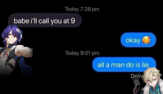


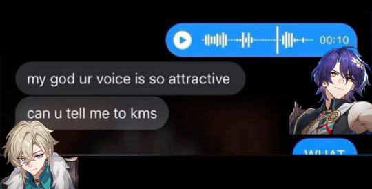
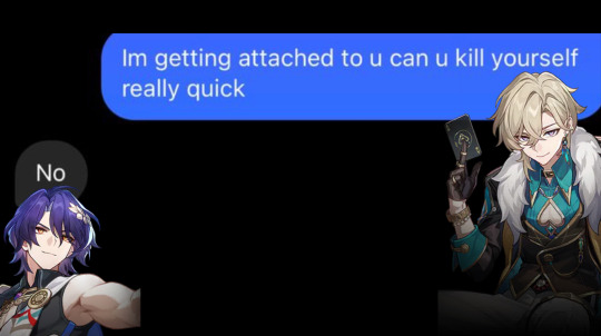
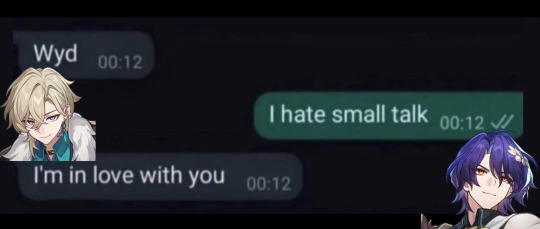


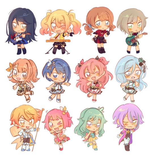
Making Incorrect H:SR Quotes Until I Run Out of (hopefully) Original Ideas - Pt. 1 - Ratiorine Messages Edition
[Pt. 2] [Pt. 3] [Pt. 4] [Pt. 5] [Pt. 6]
#aventurine#dr ratio#ratiorine#aventio#honkai star rail#hsr#hsr incorrect quotes#hsr memes#hsr meme#honkai star rail memes#honkai star rail meme#hsr aventurine#hsr ratio#dr. ratio#veritas ratio#this blog is about to be about 80% Star Rail for an indefinite period of time. and i’m not sorry abt it y’all have been warned#can't get these guys outta my head so here's my first attempt at contributing to this fandom please laugh#no but fr tho i can't tell if any of these are Actually funny slash accurate or if they just are to me#still. the idea's been nagging me for a couple days so i'm getting it outta my system#i also hope none of these have already been made. i always fear that i'm gonna unknowingly copy someone aaa#also also i've no clue if my attempt at adding alt text was actually helpful or done right so if it isn't feel free to correct me
1K notes
·
View notes
Text
and i got eyes on the back of my head, i got eyes everywhere so i know where you go
#yrdnzz art#blue lock#blue lock fanart#isagi yoichi#isagi#bllk#artists on tumblr#hey#been a minute.... sorry fazgang#I FEEL LIKE IM ALWAYS APOLOGIZING IN THE TAGS my fault#ill do better mb yall i just graduated this month and ive been just chilling doing fuck all bc ive been artblocked AYE EFF#big thank u to jamie for talking me thru this piece even tho its sooo simple#just having someone to talk to about how i feel abt my art was very helpful bc i was definitely stuck on how to start drawing again#what graduating with a bs in comp sci does to a mf i guess#anyways hope yall like this one LOVE U ALL MWAH
1K notes
·
View notes
Text
bugs when you lift up a rock
#GYAAAAAH oh god the tags. help me#project sekai#pjsk#prsk#emu otori#proseka#tsukasa tenma#nene kusanagi#rui kamishiro#mmj#leoneed#wxs#more more jump#wonderlands x showtime#HAPPY BRITHDYA SAKI I FAKWKNG LOVE YOUUU#ichika hoshino#saki tenma#honami mochizuki#shiho hinomori#minori hanasato#haruka kiritani#airi momoi#shizuku hinomori#Time for my secret tags. IF YOU'LL BE AT ANIME NORTH THIS SATURDAY AND SUNDAY I WILL BE HANDING SOME OF THESE OUT ..#and i will FINISH VBS AND NIIGO GOD WILLING 🤞#um itll just be paper i dont know i dont have sticker paper. im making some into magnets for friends w what i have left of magnet paper#THERES A 30 TAG LIMIT? ok well im makign cosplayer for the next 2 weeks and im so scared ALSO MIKUEXPO TORONTO GYAAAAAH!!!!!#if youll be at mikuexpo toronto i hope to being some with me to give no promises tho. i'll be .. cosplaying tsukasa .... on public transit.#AGAIN. to get there. anyways i need to lock in goodnight love you sorry to asks i havent answered im sleepy#yhis ones dedicated to the person who said my art tastes like hard candy. little candy bobbleheads for you
1K notes
·
View notes
Text

What do you mean I’m a bit late for Janus’ big day? Of course not, how could you say such a thing! I definitely didn’t forget all about it in my absence and only get reminded in the incorrect quotes video live chat; that’s not like me at all ;]
Anyways I decided to dress our sassy snake in some different outfits I think he’d like. He seems like the type to get all dolled up on his birthday and it goes with Thomas posting pics in outfits inspired by the sides on their appreciation days!
@thatsthat24
#sanders sides#janus sanders#ts janus#thomas sanders#sanders sides fanart#my hoard#I’ve returned!#the newest asides came out and I remembered how much I love it#so I’m hyperfixated again and I’ve not now peace since#it is nice to actually finish something again tho#I’ve been pretty busy working lately and now I’m starting to pack to move into my first apartment!#so not much time to really sit down and draw#and when I do have time I can’t get the motivation to actually draw anything#I want to get better about posting stuff on here#(even though it feels like I’m just dreaming into the void a lot)#even just silly little things or rough sketches I’ll never finish#I hope it’ll help me continue to draw and make things again#I forgot how nice it is#anyways if you’ve read this far thanks#have a cookie :] 🍪
1K notes
·
View notes
Text
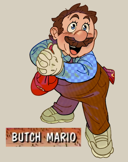
to be fair he’s butch 24/7 but i just needed to get this out of my system
#smb#mario#no id#giddly’s art#to be perfectly clear: i hc him as an amab he/him who likes women. him and peach are lesbians. hope that helps 👍#mario and pauling was also hella lesbian btw. what can i say he loves his femmes#i need to drawr him in fruity stuff more often. the handkerchief in his back pocket is a detail i’m particularly proud of#idk if there’s a dyke code handkerchief specifically tho so erm…. red!
863 notes
·
View notes
Text

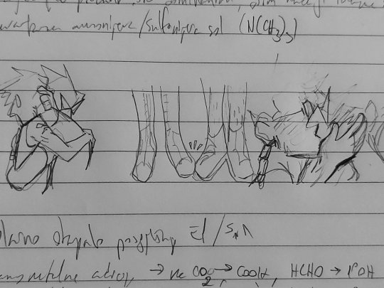


jakey + dirkjake sandwiched between my organic chem notes. a poem in there somewhere
#homestuck#hom3stuck#home24uck#home2t4ck#jake english#dirk strider#erisolsprite#brobot#dirkjake#admin draws#fanart#ok so the latter two are. a bit old and drawn in a rush because as usual i had thoughts about dirkjake and hair BUT ALSO#while reading the post-timeskip chatlogs i was like hm jake's hair looks kinda long here. i might be crazy tho#and then i continued thinking. because Ive had jakes haircut and t has to be trimmed often and i dont trust his ass to competently do that#so i think brobot helped out there and post entry it fell on dirk to trim it#and i think as their relationship worsened the first thing to properly go was the haircuts. because jake couldnt be assed to sit in dirk's#company for the duration of a haircut. direct line of strider word vomit while ur held captive basically (massive overdramatization)#so. its a good thing he got interrupted after trying to cover the tattoo up. because i guarantee you he wouldve been waking up on that#quest bed with breakup bangs.#finally formatted this one in drafts to post so im not leaving yall too high and dry again#i see my askbox and i appreciate it btw! its terraria night but i hope to be drawing tomorrow :]
723 notes
·
View notes
Text

Espeon, Dusk Lycanroc, and Sylveon ko-fi doodle for Kaitlyn!
I'm accepting pokemon ko-fi doodle requests here! ✨
#artists on tumblr#pokemon#espeon#dusk lycanroc#sylveon#gotchibam arts#ko-fi doodle#thank you sm for the request!! <3#i'm sorry this took so long ;_;#been having an art block for the past week so I couldn't finish any doodle#I think i'm getting back to it now tho esp. since the weather here is cooler now#w/c helps a lot (the past days has been terribly hot so yeah)#anyways i'll get back to ppl's msgs soon!!#also need to update stuff for my kofi members >_<#i'm getting behind a lot of stuff but I hope u guys can be patient w/ me ;o;
2K notes
·
View notes
Text
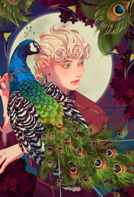
bird :)
#giorno giovanna#jjba#jojo's bizarre adventure#golden wind#vento aureo#deliart#yayyyy i finished ittt#a very busy image with lots of eye strain to it#banger!#i had my bestie help me choose between colors but in return i had to give that peafowl a necklace#so i did. hope he is happy#ngl its alittle cute tho
2K notes
·
View notes
Text
half of these tiktok relationship/break up/whatever pranks would not work on most of the jjk boys, but nanami is esp funny because he just becomes immune to it. you tell him you two should break up and he just sighs and nods, continues making dinner even as you flutter around him and try to start a fake argument. “kento, hello? i’m saying we’re finished!” and he just hums, and chops the vegetables, “that’s nice, dear. did you want red or yellow peppers this time?”
#he is not listening to a damn thing youre saying LMFAO#this also applies to levi ackerman bc 9/10 things i say about nanami also apply to levi they are lost cousins#honestly most of them do not care LMFAO. they all normally lose the idgaf wars terribly but in these instances they are gold medallists#the grandest reaction you could pull is out of megumi but even then#you say you want to break up and he’s like “i didn’t ask you tho? so moving on.”#you keep pestering megumi and eventually he is going to sigh and grab u by the scruff and drag u to eat or something#like that's the end all be all solution to everything i HATE HIM!#not even yuuji bc u mention anything like that and yuuji is like um... no! hope that helps! xoxo#yuuji is dense but it's also willfully ignorant LMFAO. u could even say u wanna hang out w somebody else instead of him today#and hes like yeah... no! i'm outside ur house 😁😁 where u go i go 😁😁#nanami x reader#💌
504 notes
·
View notes
Text
why Aurora's art is genius
It's break for me, and I've been meaning to sit down and read the Aurora webcomic (https://comicaurora.com/, @comicaurora on Tumblr) for quite a bit. So I did that over the last few days.
And… y'know. I can't actually say "I should've read this earlier," because otherwise I would've been up at 2:30-3am when I had responsibilities in the morning and I couldn't have properly enjoyed it, but. Holy shit guys THIS COMIC.
I intended to just do a generalized "hello this is all the things I love about this story," and I wrote a paragraph or two about art style. …and then another. And another. And I realized I needed to actually reference things so I would stop being too vague. I was reading the comic on my tablet or phone, because I wanted to stay curled up in my chair, but I type at a big monitor and so I saw more details… aaaaaand it turned into its own giant-ass post.
SO. Enjoy a few thousand words of me nerding out about this insanely cool art style and how fucking gorgeous this comic is? (There are screenshots, I promise it isn't just a wall of text.) In my defense, I just spent two semesters in graphic design classes focusing on the Adobe Suite, so… I get to be a nerd about pretty things…???
All positive feedback btw! No downers here. <3
---
I cannot emphasize enough how much I love the beautiful, simple stylistic method of drawing characters and figures. It is absolutely stunning and effortless and utterly graceful—it is so hard to capture the sheer beauty and fluidity of the human form in such a fashion. Even a simple outline of a character feels dynamic! It's gorgeous!
Though I do have a love-hate relationship with this, because my artistic side looks at that lovely simplicity, goes "I CAN DO THAT!" and then I sit down and go to the paper and realize that no, in fact, I cannot do that yet, because that simplicity is born of a hell of a lot of practice and understanding of bodies and actually is really hard to do. It's a very developed style that only looks simple because the artist knows what they're doing. The human body is hard to pull off, and this comic does so beautifully and makes it look effortless.
Also: line weight line weight line weight. It's especially important in simplified shapes and figures like this, and hoo boy is it used excellently. It's especially apparent the newer the pages get—I love watching that improvement over time—but with simpler figures and lines, you get nice light lines to emphasize both smaller details, like in the draping of clothing and the curls of hair—which, hello, yes—and thicker lines to emphasize bigger and more important details and silhouettes. It's the sort of thing that's essential to most illustrations, but I wanted to make a note of it because it's so vital to this art style.
THE USE OF LAYER BLENDING MODES OH MY GODS. (...uhhh, apologies to the people who don't know what that means, it's a digital art program thing? This article explains it for beginners.)
Bear with me, I just finished my second Photoshop course, I spent months and months working on projects with this shit so I see the genius use of Screen and/or its siblings (of which there are many—if I say "Screen" here, assume I mean the entire umbrella of Screen blending modes and possibly Overlay) and go nuts, but seriously it's so clever and also fucking gorgeous:
Firstly: the use of screened-on sound effect words over an action? A "CRACK" written over a branch and then put on Screen in glowy green so that it's subtle enough that it doesn't disrupt the visual flow, but still sticks out enough to make itself heard? Little "scritches" that are transparent where they're laid on without outlines to emphasize the sound without disrupting the underlying image? FUCK YES. I haven't seen this done literally anywhere else—granted, I haven't read a massive amount of comics, but I've read enough—and it is so clever and I adore it. Examples:


Secondly: The beautiful lighting effects. The curling leaves, all the magic, the various glowing eyes, the fog, the way it's all so vividly colored but doesn't burn your eyeballs out—a balance that's way harder to achieve than you'd think—and the soft glows around them, eeeee it's so pretty so pretty SO PRETTY. Not sure if some of these are Outer/Inner Glow/Shadow layer effects or if it's entirely hand-drawn, but major kudos either way; I can see the beautiful use of blending modes and I SALUTE YOUR GENIUS.
I keep looking at some of this stuff and go "is that a layer effect or is it done by hand?" Because you can make some similar things with the Satin layer effect in Photoshop (I don't know if other programs have this? I'm gonna have to find out since I won't have access to PS for much longer ;-;) that resembles some of the swirly inner bits on some of the lit effects, but I'm not sure if it is that or not. Or you could mask over textures? There's... many ways to do it.
If done by hand: oh my gods the patience, how. If done with layer effects: really clever work that knows how to stop said effects from looking wonky, because ugh those things get temperamental. If done with a layer of texture that's been masked over: very, very good masking work. No matter the method, pretty shimmers and swirly bits inside the bigger pretty swirls!
Next: The way color contrast is used! I will never be over the glowy green-on-black Primordial Life vibes when Alinua gets dropped into that… unconscious space?? with Life, for example, and the sharp contrast of vines and crack and branches and leaves against pitch black is just visually stunning. The way the roots sink into the ground and the three-dimensional sensation of it is particularly badass here:

Friggin. How does this imply depth like that. HOW. IT'S SO FREAKING COOL.
A huge point here is also color language and use! Everybody has their own particular shade, generally matching their eyes, magic, and personality, and I adore how this is used to make it clear who's talking or who's doing an action. That was especially apparent to me with Dainix and Falst in the caves—their colors are both fairly warm, but quite distinct, and I love how this clarifies who's doing what in panels with a lot of action from both of them. There is a particular bit that stuck out to me, so I dug up the panels (see this page and the following one https://comicaurora.com/aurora/1-20-30/):

(Gods it looks even prettier now that I put it against a plain background. Also, appreciation to Falst for managing a bridal-carry midair, damn.)
The way that their colors MERGE here! And the immense attention to detail in doing so—Dainix is higher up than Falst is in the first panel, so Dainix's orange fades into Falst's orange at the base. The next panel has gold up top and orange on bottom; we can't really tell in that panel where each of them are, but that's carried over to the next panel—

—where we now see that Falst's position is raised above Dainix's due to the way he's carrying him. (Points for continuity!) And, of course, we see the little "huffs" flowing from orange to yellow over their heads (where Dainix's head is higher than Falst's) to merge the sound of their breathing, which is absurdly clever because it emphasizes to the viewer how we hear two sets of huffing overlaying each other, not one. Absolutely brilliant.
(A few other notes of appreciation to that panel: beautiful glows around them, the sparks, the jagged silhouette of the spider legs, the lovely colors that have no right to make the area around a spider corpse that pretty, the excellent texturing on the cave walls plus perspective, the way Falst's movements imply Dainix's hefty weight, the natural posing of the characters, their on-point expressions that convey exactly how fuckin terrifying everything is right now, the slight glows to their eyes, and also they're just handsome boys <3)
Next up: Rain!!!! So well done! It's subtle enough that it never ever disrupts the impact of the focal point, but evident enough you can tell! And more importantly: THE MIST OFF THE CHARACTERS. Rain does this irl, it has that little vapor that comes off you and makes that little misty effect that plays with lighting, it's so cool-looking and here it's used to such pretty effect!
One of the panel captions says something about it blurring out all the injuries on the characters but like THAT AIN'T TOO BIG OF A PROBLEM when it gets across the environmental vibes, and also that'd be how it would look in real life too so like… outside viewer's angle is the same as the characters', mostly? my point is: that's the environment!!! that's the vibes, that's the feel! It gets it across and it does so in the most pretty way possible!
And another thing re: rain, the use of it to establish perspective, particularly in panels like this—

—where we can tell we're looking down at Tynan due to the perspective on the rain and where it's pointing. Excellent. (Also, kudos for looking down and emphasizing how Tynan's losing his advantage—lovely use of visual storytelling.)
Additionally, the misting here:

We see it most heavily in the leftmost panel, where it's quite foggy as you would expect in a rainstorm, especially in an environment with a lot of heat, but it's also lightly powdered on in the following two panels and tends to follow light sources, which makes complete sense given how light bounces off particles in the air.
A major point of strength in these too is a thorough understanding of lighting, like rim lighting, the various hues and shades, and an intricate understanding of how light bounces off surfaces even when they're in shadow (we'll see a faint glow in spots where characters are half in shadow, but that's how it would work in real life, because of how light bounces around).
Bringing some of these points together: the fluidity of the lines in magic, and the way simple glowing lines are used to emphasize motion and the magic itself, is deeply clever. I'm basically pulling at random from panels and there's definitely even better examples, but here's one (see this page https://comicaurora.com/aurora/1-16-33/):

First panel, listed in numbers because these build on each other:
The tension of the lines in Tess's magic here. This works on a couple levels: first, the way she's holding her fists, as if she's pulling a rope taut.
The way there's one primary line, emphasizing the rope feeling, accompanied by smaller ones.
The additional lines starbursting around her hands, to indicate the energy crackling in her hands and how she's doing a good bit more than just holding it. (That combined with the fists suggests some tension to the magic, too.) Also the variations in brightness, a feature you'll find in actual lightning. :D Additional kudos for how the lightning sparks and breaks off the metal of the sword.
A handful of miscellaneous notes on the second panel:
The reflection of the flames in Erin's typically dark blue eyes (which bears a remarkable resemblance to Dainix, incidentally—almost a thematic sort of parallel given Erin's using the same magic Dainix specializes in?)
The flowing of fabric in the wind and associated variation in the lineart
The way Erin's tattoos interact with the fire he's pulling to his hand
The way the rain overlays some of the fainter areas of fire (attention! to! detail! hell yeah!)
I could go on. I won't because this is a lot of writing already.
Third panel gets paragraphs, not bullets:
Erin's giant-ass "FWOOM" of fire there, and the way the outline of the word is puffy-edged and gradated to feel almost three-dimensional, plus once again using Screen or a variation on it so that the stars show up in the background. All this against that stunning plume of fire, which ripples and sparks so gorgeously, and the ending "om" of the onomatopoeia is emphasized incredibly brightly against that, adding to the punch of it and making the plume feel even brighter.
Also, once again, rain helping establish perspective, especially in how it's very angular in the left side of the panel and then slowly becomes more like a point to the right to indicate it's falling directly down on the viewer. Add in the bright, beautiful glow effects, fainter but no less important black lines beneath them to emphasize the sky and smoke and the like, and the stunningly beautiful lighting and gradated glows surrounding Erin plus the lightning jagging up at him from below, and you get one hell of an impactful panel right there. (And there is definitely more in there I could break down, this is just a lot already.)
And in general: The colors in this? Incredible. The blues and purples and oranges and golds compliment so well, and it's all so rich.
Like, seriously, just throughout the whole comic, the use of gradients, blending modes, color balance and hues, all the things, all the things, it makes for the most beautiful effects and glows and such a rich environment. There's a very distinct style to this comic in its simplified backgrounds (which I recognize are done partly because it's way easier and also backgrounds are so time-consuming dear gods but lemme say this) and vivid, smoothly drawn characters; the simplicity lets them come to the front and gives room for those beautiful, richly saturated focal points, letting the stylized designs of the magic and characters shine. The use of distinct silhouettes is insanely good. Honestly, complex backgrounds might run the risk of making everything too visually busy in this case. It's just, augh, so GORGEOUS.
Another bit, take a look at this page (https://comicaurora.com/aurora/1-15-28/):

It's not quite as evident here as it is in the next page, but this one does some other fun things so I'm grabbing it. Points:
Once again, using different colors to represent different character actions. The "WHAM" of Kendal hitting the ground is caused by Dainix's force, so it's orange (and kudos for doubling the word over to add a shake effect). But we see blue layered underneath, which could be an environmental choice, but might also be because it's Kendal, whose color is blue.
And speaking off, take a look at the right-most panel on top, where Kendal grabs the spear: his motion is, again, illustrated in bright blue, versus the atmospheric screened-on orange lines that point toward him around the whole panel (I'm sure these have a name, I think they might be more of a manga thing though and the only experience I have in manga is reading a bit of Fullmetal Alchemist). Those lines emphasize the weight of the spear being shoved at him, and their color tells us Dainix is responsible for it.
One of my all-time favorite effects in this comic is the way cracks manifest across Dainix's body to represent when he starts to lose control; it is utterly gorgeous and wonderfully thematic. These are more evident in the page before and after this one, but you get a decent idea here. I love the way they glow softly, the way the fire juuuust flickers through at the start and then becomes more evident over time, and the cracks feel so realistic, like his skin is made of pottery. Additional points for how fire begins to creep into his hair.
A small detail that's generally consistent across the comic, but which I want to make note of here because you can see it pretty well: Kendal's eyes glow about the same as the jewel in his sword, mirroring his connection to said sword and calling back to how the jewel became Vash's eye temporarily and thus was once Kendal's eye. You can always see this connection (though there might be some spots where this also changes in a symbolic manner; I went through it quickly on the first time around, so I'll pay more attention when I inevitably reread this), where Kendal's always got that little shine of blue in his eyes the same as the jewel. It's a beautiful visual parallel that encourages the reader to subconsciously link them together, especially since the lines used to illustrate character movements typically mirror their eye color. It's an extension of Kendal.
Did I mention how ABSOLUTELY BEAUTIFUL the colors in this are?
Also, the mythological/legend-type scenes are illustrated in familiar style often used for that type of story, a simple and heavily symbolic two-dimensional cave-painting-like look. They are absolutely beautiful on many levels, employing simple, lovely gradients, slightly rougher and thicker lineart that is nonetheless smoothly beautiful, and working with clear silhouettes (a major strength of this art style, but also a strength in the comic overall). But in particular, I wanted to call attention to a particular thing (see this page https://comicaurora.com/aurora/1-12-4/):

The flowing symbolic lineart surrounding each character. This is actually quite consistent across characters—see also Life's typical lines and how they curl:

What's particularly interesting here is how these symbols are often similar, but not the same. Vash's lines are always smooth, clean curls, often playing off each other and echoing one another like ripples in a pond. You'd think they'd look too similar to Life's—but they don't. Life's curl like vines, and they remain connected; where one curve might echo another but exist entirely detached from each other in Vash's, Life's lines still remain wound together, because vines are continuous and don't float around. :P
Tahraim's are less continuous, often breaking up with significantly smaller bits and pieces floating around like—of course—sparks, and come to sharper points. These are also constants: we see the vines repeated over and over in Alinua's dreams of Life, and the echoing ripples of Vash are consistent wherever we encounter him. Kendal's dream of the ghost citizens of the city of Vash in the last few chapters is filled with these rippling, echoing patterns, to beautiful effect (https://comicaurora.com/aurora/1-20-14/):

They ripple and spiral, often in long, sinuous curves, with smooth elegance. It reminds me a great deal of images of space and sine waves and the like. This establishes a definite feel to these different characters and their magic. And the thing is, that's not something that had to be done—the colors are good at emphasizing who's who. But it was done, and it adds a whole other dimension to the story. Whenever you're in a deity's domain, you know whose it is no matter the color.
Regarding that shape language, I wanted to make another note, too—Vash is sometimes described as chaotic and doing what he likes, which is interesting to me, because smooth, elegant curves and the color blue aren't generally associated with chaos. So while Vash might behave like that on the surface, I'm guessing he's got a lot more going on underneath; he's probably much more intentional in his actions than you'd think at a glance, and he is certainly quite caring with his city. The other thing is that this suits Kendal perfectly. He's a paragon character; he is kind, virtuous, and self-sacrificing, and often we see him aiming to calm others and keep them safe. Blue is such a good color for him. There is… probably more to this, but I'm not deep enough in yet to say.
And here's the thing: I'm only scratching the surface. There is so much more here I'm not covering (color palettes! outfits! character design! environment! the deities! so much more!) and a lot more I can't cover, because I don't have the experience; this is me as a hobbyist artist who happened to take a couple design classes because I wanted to. The art style to this comic is so clever and creative and beautiful, though, I just had to go off about it. <3
...brownie points for getting all the way down here? Have a cookie.
#aurora comic#aurora webcomic#comicaurora#art analysis#...I hope those are the right tags???#new fandom new tagging practices to learn ig#much thanks for something to read while I try to rest my wrists. carpal tunnel BAD. (ignore that I wrote this I've got braces ok it's fine)#anyway! I HAVE. MANY MORE THOUGHTS. ON THE STORY ITSELF. THIS LOVELY STORY#also a collection of reactions to a chunk of the comic before I hit the point where I was too busy reading to write anything down#idk how to format those tho#...yeet them into one post...???#eh I usually don't go off this much these days but this seems like a smaller tight-knit fandom so... might as well help build it?#and I have a little more time thanks to break so#oh yes also shoutout to my insanely awesome professor for teaching me all the technical stuff from this he is LOVELY#made an incredibly complex program into something comprehensible <3#synapse talks
761 notes
·
View notes
Text


He does tho :P
lyrics from "You look like you love me" by Ella Langley and Riley Green!
#iwaoi#oiiwa#my art#haikyuu!!#iwaizumi hajime#oikawa tooru#oh and makki who's done with their gayness#my art is crappy#the song was stuck in my head#and thought of IwaOi (like always)#Oiks stare means two things hehe#if u squint enough you'll see “it”#no ones gonna know...#i hope no ones gonna know...#HELP i hope its not that obvious LOL#rip me#anyway i should rlly stop yapping in tags#tried doing something new with my art tho :D#ill rework this#was just too lazy to fully render it rn
215 notes
·
View notes
Text
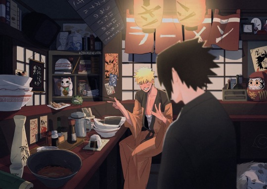
A lil date 🍅🍥
#sasunaru#narusasu#naruto#sasuke#this is my first time like#drawing an interior and actually put effort#i hope u guys like it#i spent SO MUCH time on this#like more than any of my other stuff and i think u can see#spent like 4 hours a day for a week#hot damn#tho this was exhausting i rly rly hope that#this can help me make more of these kinds of illustrations#bc i rly like pretty cluttered scenes#tho it is a pain to make holy heeeeck#round fox baby#naruto’s boyfriend#my art#background
3K notes
·
View notes
Text
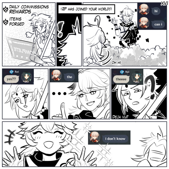

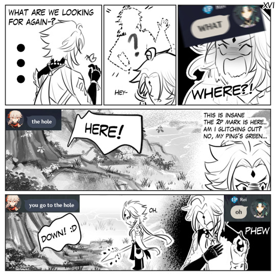
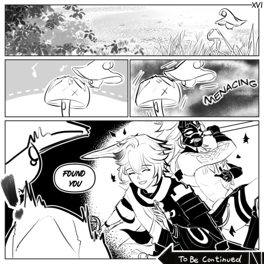
I honestly wasn't expecting the Kazuha to rejoin my world even after being added in the friend list, 'cause you know, sometimes they're just there- in the list.
But boy am I surprised- in a good way! 'Cause omg I genuinely feel giddy PAHAHHADHSAJDH
The Kazuha wanted fungal spores this time :'))
Also yes, there's "TBC" because I did not include all of the shenanigans here, so there's going to be one more part!
(a very cute close-up of two adventuring anemo men utc)

#moonlitartem#genshin comic#kazuha#xiao#genshin fanart#seriously i cant help but love our interaction#heres to hoping they arent annoyed by my over use of capslock lmao i cant help it 😭#also this 2p is very kazuha... i swear its uncanny#bcs 2p has a tendency to just vanish in thin air and i cant find them at ALL like seriously-#re-enacting his fugitive arc?? /LH#the next part is even funnier 😭#im so flattered they rejoined my world tho lIKE FR MY HEART! ITS SOFT.
7K notes
·
View notes
Text

help me hold onto you | T | 7/12
f1driver!max and streamer!charles
The man—Charles, Max assumes—sounds French. He loves that. He should be used to a French accent, he was forced to converse with Pierre often enough, but it sounds different coming from Charles. More melodic. Almost similar to someone he used to know once.
“And that made me think,” Charles says, voice bellowing from Max’s speakers. “That it was stupid that we didn't have carrots before. Like, come on, it's a farming game.”
Max has no fucking idea what the hell he is on about.
or: Max is lonely and finds Charles streaming on Twitch.
based on this prompt sent to @f1prompts
#eeeee I'm rlly excited about this!!!#the prompt lived rent free in my head since the moment i saw it so i Had To#hope i can do it justice just a little :)#also for context: the songs i would add to a playlist for this fic are the archer by taylor n satellite by harry#like i said in the authors note: currently anticipating 10 chapters and one every week or so. maybe be sooner may be longer#I'm excited to get it written and posted tho so we'll see!! hence the no beta too lmao my gf said she would but i wanna post it Now#alims writes#f1 rpf#f1 rpf fic#f1 fanfiction#f1 fic#formula 1 rpf#formula 1 fanfiction#lestappen#lestappen fic#lestappen fanfic#lestappen rpf#1633#3316#fic: help me hold onto you
348 notes
·
View notes
Last Seen Blogs
explorersofdeath
the world without a hero

fhotogenic
Untitled
olicityqueenx
It Was RED

ilmostrodalcuoretenero-blog
Ilmostrodalcuoretenero

uncannyoceanz
Omnious