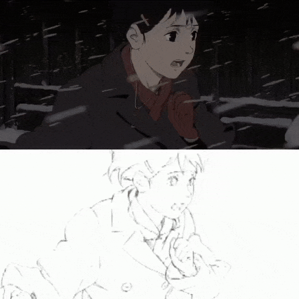
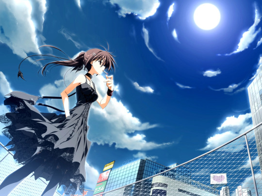
#it has cool lineart imo
Photo
I like this song
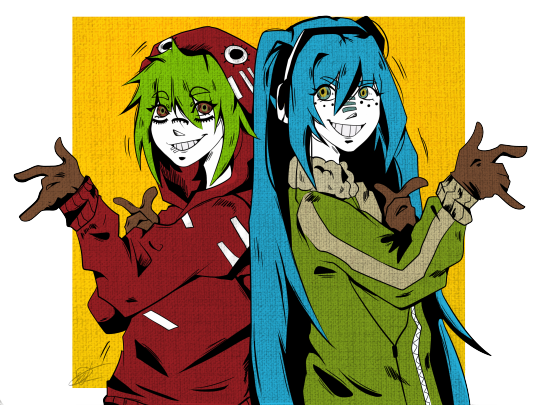
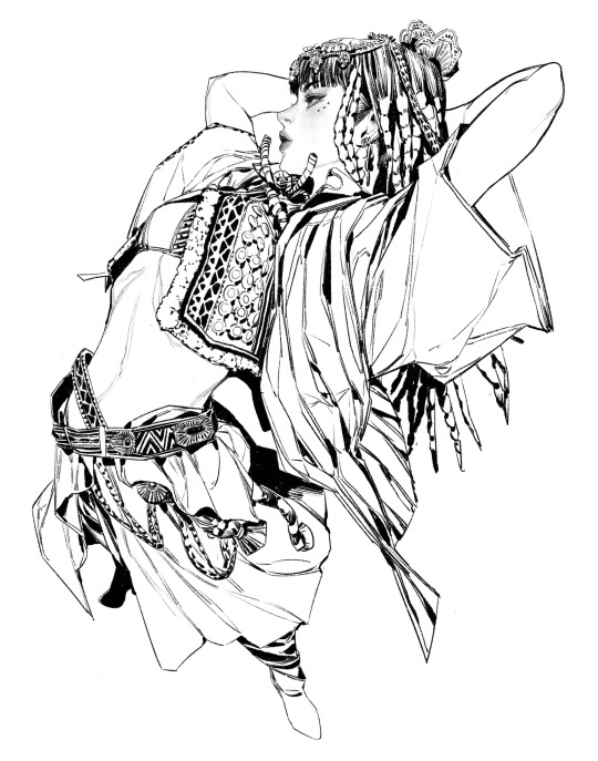
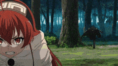
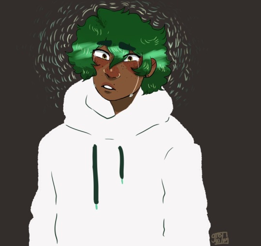
#matryoshka#vocaloid#vocaloid fanart#hatsune miku#hatstune miku fanart#miku#gumi#gumi megpoid fanart#hatsune miku fanart#fanart#art#digital art#i hate lineart#its the only reason i always render#this was an exception tho#it has cool lineart imo
249 notes
·
View notes
Text
Those that think flat coloring is the most fun step of the art process I want to talk I just have some questions just a quick chat
#pink thinks#it is by far the most tedious and maybe i just do it wrong but coloring every single thing in a background is just mentally mind numbing#and yet exhausting at the same time#lineart is the best one imo#oh and like everything has to fit into the color palette too like you cant make things too cool or too warm and it just is like brrrbrbrbrrr
2 notes
·
View notes
Note
What are your art inspirations?
Disclaimer: A LOT of RAMBLING
Honestly hard to answer, nowadays I don't really look at a lot of art anymore but mostly just movies.
Biggest inspiration over the years (from 2020 to 2022) would have to be Kan Liu. His painting style with mostly just the round brush and hard edges really spoke to me, especially when it came to lineart I was a massive fucking copycat lmao.
Around 2022 I also began falling in love with Sungmoo Heo. The perspectives and overall style just fucks so hard.
The most obvious inspo would have to be Seonhyeok Jeon though, who I still rip off blatantly.
In general I began taking art seriously around 2020, when I found Kan Liu, because I began training to compete in bodybuilding, which I did the next year. I began getting super interested in how the body and muscles work so I just drew those a fuck ton, and those anatomy studies ended up really helping my art skills in general.
Anyway! For animation... Hiroto Nagata and Q Kawa are big inspos.
This shit is so fucking RAW and HOLY SHIT when I look at how the perspective gets just in your face I always just think "what am I even doing man I have to PRACTICE". It's like watching a Zyzz or Ronny Coleman clip before doing a lift at the gym but for art, shit's motivational.
This cut in Ghost In the Shell as well is WOW, I think what speaks a lot to me is when an animation doesn't conform to what's standard in the medium and tries to push boundaries/be unique. Be it in this case through insane details, in the case of Mushoku Tensei through bg animation mixed with extreme foreshortening or just a crazy perspective and punchy movements in the Madoka clip.
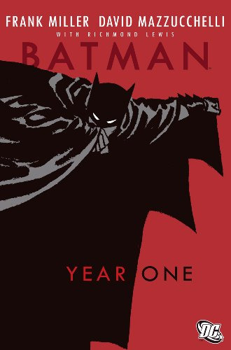
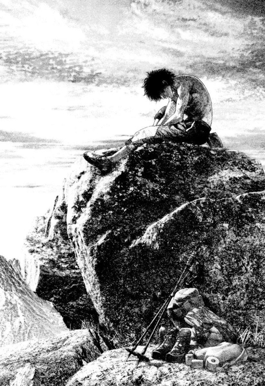
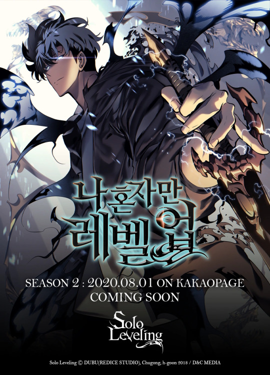
Overall it's hard to say what else my inspirations are though. When it comes to manga and comics I can think of Batman Year One, The Climber by Shin-ichi Sakamoto, Ultra Heaven by Keichi Koike, Solo Leveling (big inspo in 2021) and Homunculus.
Also, even though everyone assumes it, I haven't played Cyberpunk 2077 or am that big a fan of the Blame! manga, I guess I just have a fairly similar artistic vision to both of those.
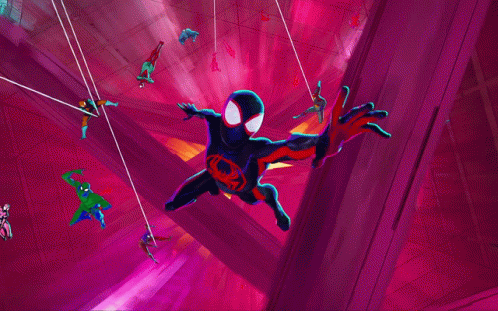
For animated fiction it'd be Spiderverse recently, Millennium Actress, Silent Voice and a million other anime I've forgotten the name of. Naoko Yamada's directing for Silent Voice or other anime like Hibike Euphonium and the Liz movie has always been amazing to me because she is able to express characters personalities through their body language, like they way they walk or stand, in a way I have never seen done before. Extremely recognizable and iconic style imo. A long time ago I used to be really into watching anime, but I don't care much for it anymore.
Other inspo would be this guy on twitter, his stuff is insanely cool https://twitter.com/be_myvu/status/1725069515107533178?s=46
It's like that Ralph Waldo Emerson quote - “I cannot remember the books I've read any more than the meals I have eaten; even so, they have made me.” I think throughout the years I've been so obsessed with all kinds of artists that I've taken in inspiration from everywhere. I cannot recall them all anymore, but they have made me the artist I am today.
Currently, like I said, I would consider movies to be my biggest inspiration because I find it interesting how cinematographers are able to stylize real life, which I'm trying to get closer to. If I could direct a movie, I would probably stop making art right then and there, but I'm not really working towards that goal anyway lmao. One day, being able to make a short film in animation would be something I would like to do though.
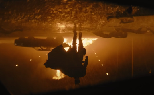
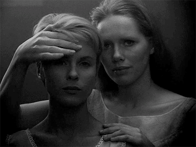
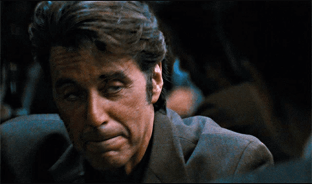
I'm not deep enough into the movie scene to get the street cred of being called an expert but I love them a lot. Fallen Angels made me fall in love with fisheye back then for example. Fight Club and The Batman have a grit to them visually that I find inspiring, and movies like Persona and Heat also come to mind when I think of movies I just love. I could look up my letterboxd for a more thorough answer but I feel I've already been writing way too long.
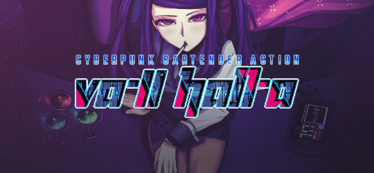
For video games, I guess you can imagine that I would say Signalis lmao. Besides that I can think of Subahibi (vn), Muramasa (vn), and Va-11 Hall-a for inspirations
Lastly, I guess huge inspirations are also a fuck ton of music. I mostly listen to either metal or hard techno, but I think I'll refrain from any more yapping.
I feel that this isn't really a great answer to the question, but it's the one I consider the most correct, because it's never as simple as just mentioning one artist. With a lot of these you wouldn't see a visual resemblence to my art, but in all of these I recognize a feeling that I also find in my own art.
Thank you for the question!
59 notes
·
View notes
Text
Reviewing Horse Picrews - Part 1
Check out: Part 2 here, Part 3 here
A brief review of every horse Picrew dollmaker I could find! (The small exception being any generic MLP G4 pony makers.)
I'll be trying to create an either sunbleached black / seal brown / liver chestnut horse in each one (my favourite coats), as well as one or two more exciting horse designs, showcasing the options.
(These Picrews are created by people in their free time without getting paid, so let's remember that and respect the artists!)
------------------------------------------------------------


⬆️ Horse Designer by shadowscar00
Rating: 🥕🥕🥕⚫⚫ 3/5 carrots + tasty apples 🍎🍏
A neat little horse maker! Decent variety to create different realistic coats, and some fantasy colour options too. Enjoyable and cute.


⬆️ 🐴horsesona maker🐴 by thereisteainmyshoes
Rating: 🥕🥕🥕🥕🥕 5/5 carrots + gold star ⭐
This one has amazing variety. Horse expressions, colours and styles, accessories and details, backgrounds and bonus effects. Really great for both cute regular horsies and humanoid ones. My only minor criticism is that the brown nose and brown mane colours don't have a match... other than that I love it.


⬆️ Equine Creator Vol. 1 by The.LastValkyrie
Rating: 🥕🥕🥕🥕⚫ 4/5 carrots + epic flames 🔥🔥🔥
There's a ton of options here, both realistic and fantasy! The reason it's not a full 5/5 is because the experience is a bit confusing, it doesn't use the built-in colour option system and the thumbnails can be hard to understand. But if you fiddle with it for a bit you can make very cool horses.


⬆️ Horse Maker by TTMVStaff
Rating: 🥕🥕🥕⚫⚫ 3/5 carrots + shiny sparkle ✨
This is apparently a maker for an RP called Through The Misty Valley. There's a decent amount of realistic options, definitely enough to make a pretty horse! This one is also a little confusing with thumbnails and not using the built-in colour system. The backgrounds look suspiciously like AI imo.


⬆️ Foal maker by TTMVStaff
Rating: 🥕🥕🥕⚫⚫ 3/5 carrots + baby bonus 🍼💘
Pretty much same as above but foal version. The backgrounds again look suspiciously like AI. But, the foals are pretty cute and there are decent customisation options for realistic coats! (The "free lineart" credit in these makes me think the lineart artist may not have had anything to do with the Picrews, as a note.)


⬆️ Handheld Horse Production Farm by 木兎
Rating: 🥕🥕🥕🥕⚫ 4/5 carrots + sweet pudding 🍮
Make a little horse that you could hold in your hand! There aren't a ton of options here, but the horses are very cute and huggable. This one also doesn't use the built-in colour system, but the thumbnails are easy enough to grasp quickly, so it wasn't a problem.


⬆️ Horse OC maker by BeelYourself (Picrew user PorcelainBee)
Rating: 🥕🥕🥕⚫⚫ 3/5 carrots + fun lollipop 🍭
Many realistic options for coat colour and details. There's only one option for mane and tail style, and no accessories or backgrounds, and it was a bit confusing that thumbnails use words instead of images (as a visual person - and it makes it less accessible for different languages). But, the horses look cool!


⬆️ 46-style Favourite Horse Maker by n046
Rating: 🥕🥕🥕🥕⚫ 4/5 carrots + teddybear 🧸
This one is adorable, another one where the design makes up for the slight lack of options for coat details and such. It doesn't use the built-in colour system, but was easy enough to use. I want to hug them.


⬆️ Stick Ponies by Sodateru
Rating: 🥕🥕⚫⚫⚫ 2/5 carrots + pens and crayons ✏️🖍️
The creator's note says that it's mostly a Twilight Sparkle clone maker right now, which is pretty true based on there only being one mane and tail style. But there are lots of colours to choose from and different hair colour effects, so you can still make a cute little stick pony.


⬆️ Race Horse Maker by Ninjinfactory
Rating: 🥕🥕⚫⚫⚫ 2/5 carrots + a nice flower 🌼
It's a pretty simple one, not that many options to choose from, but the expressions are charming so it's still a cute horse. It also doesn't make use of the built-in colour system and the thumbnails could be hard to see, but since there weren't that many options, it was still easy to use.


⬆️ Wasteland Pony Dress Up Game by uhohkiya
Rating: 🥕🥕⚫⚫⚫ 2/5 carrots + crispy bacon 🥓
I'm not sure if this is for a fandom or the creator's original setting, but you get to pick a few options for dressing up 3 different horses, like the simpler kind of old character dressup games. The horses are cute, but there isn't much to customise.


⬆️ Anthro Pony Maker by BabyBunnyBab
Rating: 🥕🥕🥕⚫⚫ 3/5 carrots + waffles 🧇
It's hard to make a regular-looking horse in this one, but if you want to make a colourful anthro horse with fangs, you're in the right place! It partially doesn't and partially does use the built-in colour system, but the thumbnails were easy to understand. There are some minor artefacts around the edge of the feathering. But, overall it's a cute anthro with a decent amount of options.


⬆️ Supported Horse Icon Maker☆ by Riu
(in the sense, the horse you're supporting in races / being a fan of)
Rating: 🥕🥕🥕🥕⚫ 4/5 carrots + a little treat 🍬
There aren't that many options, but the design is really cute. For the purpose of representing the race horse you're backing, it has what you need. It's always interesting seeing how much of Japanese horse culture has to do with racing rather than other equestrianism.


⬆️ Horsemaker by Hajen14 (@hajen14 on Tumblr!)
Rating: 🥕🥕🥕🥕🥕 5/5 carrots + strawberry cake 🍰
This is the first one where I really felt I was making a seal brown horse. There aren't any accessories or extras, but the extensive coat patterns and colours, and mane and tail options, is more than enough to stand on its own. If you want to design a realistic horse coat with a lot of detail options, this one is for you!
#horses#horseblr#horse fandom#horsegirl#horse girl#picrew#dollmaker#dressup doll#horse maker#horse creator#doll maker#horse#pony#equestrian#horsesona#ponysona#horse art
15 notes
·
View notes
Text
I've been drawing a whole lot more in the past few days, and it's been completely involuntary, just like it used to be when I was a kid. I'll just zone out and zone back in, and I'll have the pencil in my hand and a ton of little critters all over a page. It feels nice. I even ended up drawing a specific made up character more than once, and actually refining their design.
Art is second nature to me when I stop thinking of it as a means to an end. Ever since I saw this one casual reddit post about not monetizing your hobbies and just doing them to enjoy them, it felt like just having my eyes pass over those words broke some kind of magic seal and let my creativity back out.
I'm going to have to keep relearning this lesson over and over again. It's just because I've been on the internet for a long time, and it's damaged my relationship with something I enjoy doing. I do best when I'm not forcing myself to draw or "improve". I do best when I just mess around and make whatever the heck I want, whenever I feel like it.
And no, this isn't social media's fault. The rhetoric around art that damaged me has been around since the old deviantart and forum days. "You should never be happy with where you are!" "You should always be looking to improve!" "You need to refine and stabilize your style!" "Always add backgrounds!" "Nobody's going to look at your work if you don't color it!"
Cool. I drew a shitty slug fella and I love him. He's uncolored and the lineart has a million "errors". Gaze upon him and despair.
One of my favorite artists over on twitter goes through a lot of heartache over her art and how she doesn't feel like she's improving, even though everything she makes looks legitimately amazing and masterful. Sometimes I wonder if this constant search for "improvement" is doing more harm than good, and that the online art space has become this unsustainable arms race where even people who regularly draw and paint Mona Lisas feel inadequate because of this weird idea that one can "always do better". That has to be exhausting.
And that's even before throwing in the metrics hell that social media introduced. If something doesn't do numbers, then that somehow means it's bad, even though that's not a good indicator because people generally think art is cool, but they don't interact with posts for whatever reason they have (which is fine, IMO).
Unlinking my enjoyment of drawing from a need for approval and a flawed idea that I should be drawing to improve to the point where I can make money off of it has completely freed me from the paralysis of being afraid to draw at all. And I've even been hearing this one phrase echoed everywhere this past week, and it's uncanny because it's the first time I've ever heard it:
Perfect is the enemy of good.
#estoy thinkin#vent#I'm also training myself to only post some of my stuff when I truly feel like it#The little start buttons and stuff were things I truly felt like posting#And I still feel good about them
3 notes
·
View notes
Note
12 14 and 16 for the fandom asks
tysm for the ask! apologies for taking a while to get to it!
12: compliment someone else in your fandom
GODDD THERE ARE SO MANY COOL PPL IN THE DS9 FANDOM IT'S HARD TO CHOOSE........ for now im gonna pick @/garaks-padded-bra, his art and animation is so awesome and he is a wonderful and hilarious person :-) we in the star trek fandom are very privileged to have him around! also @/man-toy bc i NEED to express my appreciation for their art and posts, the civil defivil ytp lives in my mind forever and their art is SO GORGEOUS it is beautiful the lineart and colours are so yummy 😋........
in general the star trek fandom is full of loads of awesome talented ppl though it's so cool
(not tagging anyone directly bc i don't wanna be annoying lol)
14 - the ship that always makes you smile
idk if they have a ship name but captain sisko x kasidy yates!!!!! my god they're so cute every scene with them has me compulsively beaming ear to ear........ we as a fandom need to appreciate them more, they're both such likeable characters and their relationship is so well written imo.......... honestly the main thing is that i wish we'd gotten to see more of them lol
16 - a tiny detail in canon that you want more people to appreciate
garak and odo's friendship!!!! it happens in such odd circumstances but they're oddly compatible and similar in ways i didn't expect. their friendship is simultaneously kind of a lifeline for each other but also it's sorta Silly. they're both so lonely and separated from their own people and yet also are well aware that their own people Kinda Suck. i think they have a mutual understanding of each other which barely any of the other characters have with them and i NEED everyone to appreciate it more
1 note
·
View note
Text
Isekai Ojisan ep.1 thoughts
The initial image and premise for this kind of set off some alarm bells for me, the weird facial expression for the uncle and the pretty isekai ladies gave me some weird expectations for what this show would be like. So, I initially decided to pass on this, but then I watched the pv for it and it actually seemed like it could be fun, so I added it back in
I’m happy to say that my idea for this show was completely off, seems like I judged Ojisan too harshly on his appearance... (which, funnily enough, is a plotpoint in the show)
I actually thought they’d go to the other world, but having this guy needing to re-asses to normal life after living in a fantasy world for so long is much more fun. I love how they mix all this high fantasy stuff with everyday life, and how they have this modern vs old tech thing going on. The fact that they use his cool fantasy powers to do lame everyday stuff (getting yt famous, not paying for shipping) is such a hilarious way to go, I love it
It’s very dry in its presentation (which works well for a parody) and the uncanny over the top expressions are a funny addition to it all
I lost my shit when I realized Ojisan was voiced by Koyasu Takehito (best known for Dio) and Takafumi being voiced by Fukuyama Jun (best known for... a lot) is also a treat, esp since he gets to play the reactionary role in this (something he’s very good at, imo)
The first thing I actually noticed was the thicker and sketchier lineart, and as the episode continued it became clear that we’re dealing with a well animated show (not spectacular, but def good) one thing abt the style I love is how their glasses do the fog thing 90% of the time (not just because it looks funny but also because I think their eyes look a bit uncanny...)
The op is fun, both in terms of song and animation, the different styles reminiscent of old games are very charming (side note; I love the dancing part lmao), the 1st ep doesnt show an ed so I’ll see if it has one in a later ep I guess
Mal score; 7.88
My score; 8
0 notes
Note
Excuse me can I just say, I was just gone a a year and OMG YOUR ART really improved, the mod who drew naruto. The uh black hair girl white eye color lol. Do you use anything fancy like a cintiq? I personally just have an ipad 10.5 😭 but I haven’t been drawing as much, and practicing. Can you share your drawing tips? You use clip studio right? What brushes did you use to color or lineart? My art friends all say, to look up refs, trace, study the anatomy. Cause dear god, listen if you ever have commissions open please please. I would absolutely throw money at you. Sorry if this ended up being long lol. If you have a personal blog I’d be cool messaging you over there instead. Don’t wanna clog up the askbox -art anon

ANON WHAT THE HECK?? WHAT THE HECK????? THAT'S SO SWEET I'M GONNA CRY HHH??H??HHHHHHH??H?
sdkfjhdsfj okay lemme gather uhmm:
- This is my personal blog so you're in the right place :D asks are only at asksds
- I've been using a Wacom Intuos Pro M for years and I'm very happy with it!! I do actually have a Cintiq at work, and it's very handy for what I'm doing there, but for my private art I prefer the Intuos because with the Cintiq I always feel like my hand is in my way haha. That's just me and my preference though! My best friend uses her iPad, after she has worked with a regular drawing tablet and screen tablet, and she's super super happy with it, so it depends on the person.
- I do use Clip Studio, I even upgraded to EX in the last sale because I love it so! Currently my favourite brush for sketches is this one, and I occasionally use it to line as well (like with these Hinata-doodles), but generally I use the basic G-Pen in Clip for lineart, like here. For asks in asksds I use a brush I got from the asset store once called Bird's Lineart Brush, but I think it was deleted ;; it's very similar to the G-Pen though, the only difference is that the stroke-tips are a little more blunt.
- As for tips (this got a bit long so I'm putting it under a Readmore):
1) be lazy. I don't have as much time for drawing anymore since I got a fulltime job (hence why I don't upload a lot), so when I do I just take shortcuts, which is why I love Clip so much. I have downloaded countless brushes in the asset store so I don't have to draw a full plate of macarons 3 times and can just use a brush for it (btw. I counted and I have 67 lace brushes...wow.), and make a lot of use of the 3D-Models, especially for perspective. The bigger comic-updates in sds exist only because I use 3D-Models and rulers and whatnot, and I love them. Fuck the mindset of that being cheating (which I did have myself, I used to be like "But I should just KNOW how to do perspective!"). It gets the job done and you have more time for other art or other things. Win-Win!
2) Using refs, tracing and studying anatomy are all true tips which I also support, but just saying it like that is frustrating and too nebulous as a concept (it always felt that way to me at last), so lemme try to explain why. An excellent tip I read once is that art is like a language - you can't just craft something from yourself, but you need to learn the vocabulary first to get there. Likewise, you need to do those things so you train your hands and muscle memory. If you trace a thigh 100 times, your hand starts to just kinda know how the line is supposed to flow. tbh you could compare it to rhythm games, the longer you play, the more your fingers just kinda take over, and actively thinking about it makes you play worse.
That's not to say that it's some magical fix or you "know" art then! It's just that you don't have to actively think about everything you do anymore since your hands do part of the work, because you trained them for it and they remember.
Using refs and studying anatomy imo are intertwined. What I felt has worked the most for me (and keep in mind that I don't study a lot and I really really should do it a lot more so don't be like me) is actually trying to grasp the basics of skeletal structure and muscle build. There's a really good book called "Anatomy for sculptures", which is WILDLY useful for explaining and grasping muscle structure (you can find it online if you know where to look wink wink), and an app called C.Anatomy, which has a paywall for the full content, but the free version has a really nice 3D-Model of a skeleton which you can rotate and look at. I also really recommend MangaMaterials, she's a pretty big inspiration to me and explains the concepts of studying anatomy extremely well on her Youtube-channel.
Basically, if you know at least the base structure of the body, you start to kind of understand the random bumps and connections on the human body which makes it easier to reproduce them I feel. And again, I don't do this NEARLY enough myself and I make a lot of mistakes still, but even just doing it for a bit helps a lot imo.
HOPE THIS HELPS!! This ask made me so happy skdfhjkj I hope you have a fantastic weekend Art Anon!!
8 notes
·
View notes
Note
OOOH i'm gonna try not to ask too many questions but my biggest one as someone who prefers pencil/paper to digital art rn is - how do you get your paintings to look so nice and finished? i always struggle with so many wispy lines. i know that it should just be a matter of doing a good, clean lineart layer, but i struggle with the patience. any tips/tricks once you've finished the sketch layer? (also one last question - what program do you use?) anyways i love how clean and polished (almost statue-esque?? but in a serene not static or anything way) ur art looks 🥺🥺🥺
@ladythespera 🥺🥺🥺 WOW first off tysm for the lovely compliment. i love that description it's so cool!!
ok so i use clip studio paint for everything and i adore it :) i totally get what you mean about sketch vs. line art, i only very recently started getting more comfy with lines. to be honest, the #1 thing that helped me get here was finding a lineart brush i really really like!! i struggle with super smooth 'pen' brushes all the time, but the one i use right now is actually a 'pencil' brush and that's honestly what makes me comfortable with it!
i feel like with a lot of brushes that are supposed to represent ink, their line consistency is fighting against me a lot of the time. the joy of this 'pencil' brush is that it still has some variation in texture and that helps me really keep the spirit of my sketches imo!! here's what it looks like:

as you can see it has some 'grain' to it unless you're pressing quite hard - and even then, the edges have texture too. something about this brush makes me not as afraid to do lineart and i'm really glad :) so just remember, if it's more comfortable to use the same brush/tool for sketch AND lines, go for it!! for traditional, i can also recommend using a harder pencil for your initial sketch so the sketch lines are lighter and then you can go over with a darker one when you're doing tighter lines. when i do traditional, i do not use pen for lines LMFAO i just use a darker pencil!
i hope this helps but let me know if i was confusing or you want more info :)
2 notes
·
View notes
Note
give me your scout ships.. give me
scout ships! thank you for this i will now be waxing poetic about the scout pairings i love.
- the pairing i care most about is scout and sniper of course, i like that they're similar in the ways that they're extremely conscious of how they come across and like.. posturing and stuff. i'd argue that they both deal with different expressions of toxic masculinity but that's literally just my reading. i also like that they just hang out!! it's good! you could go enemies to lovers or friends to lovers with these two and it always works very well imo. i like how their differences and quirks play off each others, and they can make each other better... or worse! 😈
- i have a soft spot for headcanoning pairings as exes (which.. i guess counts as shipping...? idk) and im attached to the idea of scout and miss pauling as amicable exes, or even just scout got over his crush and discovered that actually he'd much rather be friends with miss pauling. i know a lot of people read miss pauling as a lesbian and i agree! i was chatting with a friend about how her relationship (or lack thereof!) with scout would have been transformative for both of them, and cemented her feelings that yeah she's not attracted to men, while scout literally learned to be less... selfish? in his pursuit of romantic interests? that's wot i think anyway
other ships i think look/are cool but i havent thought about enough to have a real Take on:
- i can totes imagine scout having a big ol crush on medic because he has a type and the type is "older than him, dark haired and wears glasses". i kinda like the idea of this being one-sided? idk.
- an underrated (?) scout ship is probs scout and demoman. so much potential for sheer comedy and, for a lack of a better word, "bromance" lol. bromance but make it actually gay.
feels like most other ships i see as platonic/brotherly (pyro, heavy) or father/son (engie, and obviously spy). soldier is somewhere between the two i think. im not fully dismissing these pairings (aside from spyscout which im explicitly not interested in) because im sure someone would be able to come up with a good reading on them, i guess? mostly i dont really think about them.
by the way i love your art! the way you capture everyone's (and especially scout's) facial expressions, and you just have really solid lineart. it rocks.
3 notes
·
View notes
Text
Love Yourself Challenge
Tagged by awesome @marvilus73, thank you so much for thinking about me and my stuffs!
Rules: Time to show yourself some love! Link or post 5 of your favorite works (art, writing, edits…whatever!) from the last year below. Then share the love and tag some of your favorite creators.
I’ll tag my these awesome people: @guidethisonekalahira, @iawv, @shaiandra, @forevervobla, @maxrev, @lavellanlove, @greyias. Please share whatever you’ve created and proud of, no limits. If I didn’t mention people, and you’d still like to do it, please do, and tag me as well)
I have a bad case of OCD, and don’t draw nearly as much as I’d like to, but here are some of my favorites. Oldest to newest.
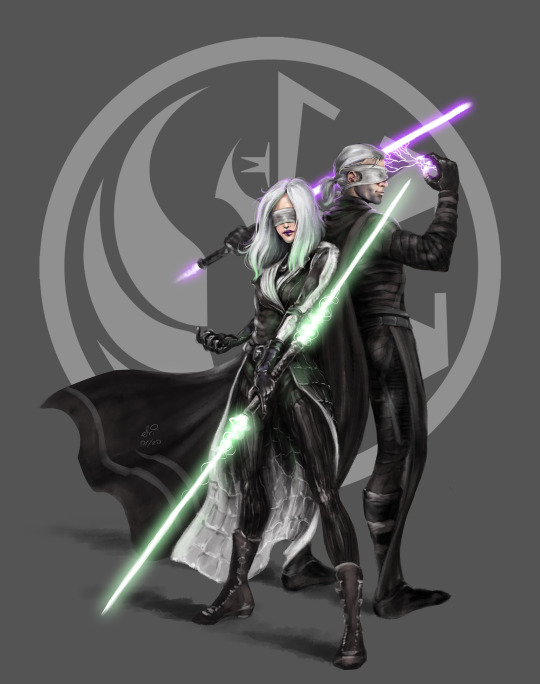
1. Another Baldur’s Gate piece - Ari Throne of Bhaal portrait. There are couple of things I am proud of in this: 1. getting her to look exactly how I wanted - face, armor, hair, badassery. I am also using it in the game and it fits imo. 2. Trying a slightly different painting method and adding back light, shading front, making it slightly more... solid. 3. I’ve used a brush that I’ve created myself based on one of my favorite comic artists, and I really like the results. Come to think of it I need to recreate it as I’ve lost it when switching PS versions.
2. Miraluka twins painting for SWTOR. My two twins that I love and that got me to complete two of my least favorite stories. Couple of things of pride: 1. Same brush as above that I really enjoy the style of. 2. Completing full characters for the first time. Technically my Sith Warriors were first, but this style/painting is one of the two styles I strive for. 3. I think they just look really cool. 4. Lightsabers!! :3
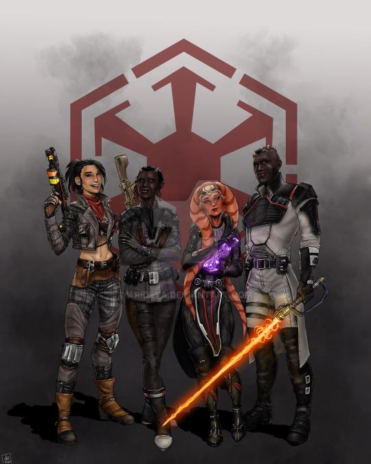
3. My first SWTOR commission. I am not too fond of the comic-style with lineart, but I am happy with the amount of time and detail I’ve put in it - I’ve basically first sketched all the details, then drew line art, then colored with flat colors, and THEN added the highlights, shadows, and other colors. Tumblr kills the resolution but I’ve spent a looong time on this painting and it paid off. Currently the person who commissioned it has it on their lockscreen. <3
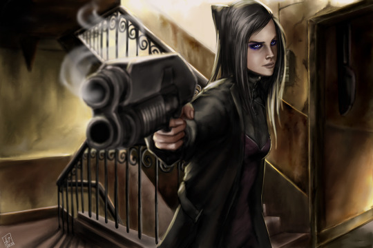
4. This was done just yesterday actually - An Ergo Proxy screencap repaint.
Things I am proud of: 1. My first even screencap repaint. 2. I’ve done a full-scale background. 3. One of the two styles I am trying to get better at. 4. One of my favorite anime of all time and I am happy I was finally able to give it due love, now its only up from here :3. 5. Took me about 5-6 hours instead of days that these things normally take me. 6. I eyeball everything from colors to composition and I think it turned out fairly close.
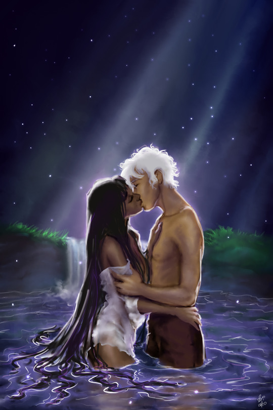
5. Some of my Arcana fan art. This is unfinished and I am planning to add/fine tune a lot of things, but I am proud of it being an original piece, no repaint, and also a full background. Also its been a while since I’ve drawn any kind of romantic couple so its been liberating. :3
35 notes
·
View notes
Text
line harmony
my thoughts on lineart that I’ve seen from various artists of various styles and why they work,
this isnt a style guide nor a tutorial but characteristics and mindsets ive seen from artists that are very successful at lineart. everything you put in your art takes up space, every line, dot etc takes up space on ur canvas and interacts with the rest of it,
lineart isnt just to lay the grounds or to make the viewer understand what they are seeing, lineart isnt just a descriptor , it is an active part of a piece, to see lineart as just as a descriptor downplays its value as space that is taken up and presented to the viewer.
things that line harmony DOES NOT INHERENTLY IMPLY ( but can have ):
flowy nice lines
controlled lines
detailed or complex lines
dynamic lines
smooth and polished lines
decorative lines
anatomically correct or extremely accurate observational lines
line width and diversity
“originality”
having these things doesnt mean you have line harmony, you can have all of these or none of these and it doesnt make your lines any more harmonious, it is HOW you use these , their presence in it of itself is meaningless
also having a unique creative style is great ! however having cool gimmicks , trademarks on ur lineart is once again surface level. it must have intent ! dont have blind loyalty to what you think looks cool! experiment.....
many seem to think (atleast imo) as long as your lineart is decorative, pretty or stylized (in whatever trends) your job is finished. it completed its job to look “pretty” or it has completed its job to make the viewer understand what u are drawing. JUST BECAUSE YOUR LINEART LOOKS COOL DOESNT MEAN ITS SUCCESSFUL!
to make a viewer understand what you are drawing many people can do , it is not too hard with enough practice. however to have line HARMONY is lineart becoming a part of the composition.
this means that lineart has intent and purpose, lineart becomes its own character in the piece
lineart can:
lead the eye or disorientate the eye (whatever your intent is)
show personality
convey emotion beyond what is being depicted (any line can convey a sad face, but can the lines themselves take upon sadness?)
show rhythm, direction ( any line can draw a downward arrow, but can those lines themselves take up the traits of downwardness?)
show depth or not show depth (once again intention is everything)
things that line harmony TAKES INTO CONSIDERATION :
intent +purpose
strong fundamentals
self-awareness (you are conscious of yourself and your decisions)
to have control over your lines you must have strong fundamentals this means perspective, composition, weight,understanding of value, good observational skills. studying previous masters (beyond contemporary popular cartoonists ) is also important.
signs of line harmony (having all these things doesnt mean you have harmony per say however many artists that have line harmony have these things):
every line they draw has a purpose (whether it be smooth, shaky, crude, etc),
having purpose and intent with every curve, straight line ,
balance of symmetry + asymmetry (or being able to justify either of those things)
consciousness of shape
unless one has developed muscle memory, nothing is done thoughtlessly
another good sign is being able to explain and justify your lineart decisions, you have the ability to point at every single line that takes up space on a canvas and explain why you placed it there and why you made it the way it is.
you are able to justify:
why you made a line straight instead of curved
why you made a number of short lines instead of one long one.
why you made this line thick and this one thin
why this line breaks perspective and this one doesnt
so on and so forth
signs you dont have line harmony :
your lines are distracting ( and you didnt intend to do that)
the eye doesnt go where you want it to (wherever that may be)
you cannot achieve simplicity or complexity when you want to
you feel your lineart traps or limits your expression
how to improve line harmony (just tips):
pay attention to the rhythms of what u are drawing (observational , from a picture, or just ur head)
plan it out
study from all sorts of artists (prehistoric, medieval, not european or american, sculpture, not cartoonists, not just one style)
please note throughout this all i did not denote a singular stylistic guideline, it doesnt matter what ur style is, these standards are universal,
this is me going through MANY styles and picking out traits from them that can universalized for ALL styles!
and lastly artists i personally like and have studied from:
modigliani
al hirschfeld
ronald searle
greek and roman vases
1920s vogue covers
anatola howard
michael hampton figure drawing book
those disney character designers from all decades and the like
errr if i remember any more ill add it onto here
56 notes
·
View notes
Note
Sorry I’m still new to the Bnha anime . So have they taken a break or something? Do explain please?
Sorry, I’m not actually sure what this question means! But if you’re asking why there’s no anime airing right now, then that’s because season three ended and season four still hasn’t started!
Anon said:hey there! i love your linearts so much and i really enjoy coloring lineart/manga panels and i was wondering if you'd be okay with me coloring some of your lineart? i wouldn't repost it, i'd either just keep it to myself or i'd add it as a reblog onto the original post of yours. if the answer is yes, thank you so much! if it's no, that's okay, have a great rest of your day, and keep being talented & awesome :D
I don’t like the idea of you posting them anywhere, but if it’s just for yourself then I don’t mind at all! Thank you for liking my stuff!!!
Anon said:Have you considered… Honenuki x Kuroiro?
I guess I have now :O but I still prefer Tokoyami for Kuroiro, after all haha
Anon said:When I saw you drew something with hawks I almost passed out I love the way you draw him sksksksksksk
Thank you so much!!! He’s a lot of fun to draw!!
Anon said:That sero and Kiri with the long hair 😱😍
Glad you like them!! I’m especially fond of Sero, ngl!!
Anon said:yooo i know you don't care for the villains but i gotta say i love the way you draw dabi! i just love your style in general but i really like how you draw his scars and hair, i feel like it looks more angular than how other artists draw him if that makes sense.
Why thank you so much!!!!! I like Dabi’s design a lot so it’s cool to know I can do him justice!!
Anon said:I have a phone and no laptap and i cant see your faq,what drawing tablet and drawing program do you use?
Easy Paint Tool SAI and a very old very basic Wacom Intuos! The FAQ should be accessible by mobile too tho!!
Anon said:Can you draw more of the kiribaku kids? Please
Yes I can!! Thank you for liking them!!!!
Anon said:i am so in love w your art 🖤
Ah heck thank you so much!!
Anon said: Heeey! Your vigilantes AU is soooo cute. Are there any fic or maybe more art about it? I really love it! And your art too!! Thank you for the great art! (◠‿◠✿) || Oooo ooo and I love the way you made the relationship and interactions between Bakugou and Jirou! It's really cute. (vigilantes au anon)
A lot of people have mentioned wanting to write for it but as far as I know no one has gone through it yet! It’s a very impegnative AU isn’t it!! I should know, I’m the first who has pages full of ideas and not a comic to show yet! Maybe one day haha thank you for liking it tho!!
Anon said:Hi. You deserve the world imo. You helped me cheer up when I was feeling down. Every post of yours made my day better when I scrolled through tumblr. Thank you for everything. Bye bye 💖
TT^TT I’m so happy to hear this!! Thank you so much!!!
Anon said:Your art makes me feel warm inside, I love it!! So much!!!!
THANK YOU!!
Anon said:tumblr shows up to the 20th tag on search. just fyi.
That’s cool to know! Tho I might argue right now tumblr’s search doesn’t show jackshit! By the way using this very nice ask to let yall know that the search function on my blog isn’t currently working how it should, so if you can’t find something in the tags that’s why !!
Anon said:wow... i love your family au so much... you said you didn't like the palate you chose for mako but i couldn't disagree more!! i think she fits into the family beautifully! but anyways it's so wholesome and the best kiribaku art out there
AW THANK YOU SO MUCH!!!! I’m happy to know you like them TT^TT
Anon said:you were like the only artist that drew kiribaku like two years ago and for that you have my undying loyalty... thank you..... you gave me content for them before I became an artist.. also thank you for getting me into art :) I love your art style so much!
Was I!! :O it’s been so long I honestly can’t remember, but I’m happy yo hear you’ve been around since back then! Thank you so much!!!
Anon said:Your idea for the time swap with fantasy bakugou is so great!!! I'd love if you drew more of it
AH thank you so much!!! I’d love to draw more for it too, but I can’t promise it’ll happen sadly !
Anon said:oh my God your art is super cute!! you're one of my inspirations!
That’s so sweet and wonderful to know!!! Thank you so much!!!! ;O;
Anon said:please don’t die
This is a super omnious ask, and I got it twice too 👀👀 anon what do you know that I don’t
Anon said:hi wow i just wanted to let u know that you’re art is fucking amazing and i absolutely love your blog!! just wow you’re so talented and amazing and i love you’re style and just love all your comics and just keep up the amazing work broski!!
THANK YOU SO MUUUUCCHHHHH!!!!!!! TTOTT
Anon said:Have you considered KamiMomoJirou?
Hell yeah I have!
Anon said:Bakugou and Kirishima as mermen are so beautiful. I wonder what Todoroki and Midoriya look like as mermen...
Overly complicated and requiring more time and motivation than I currently have, for sure haha but maybe one day I’ll try my hand at it! Thank you so much for liking the krbk!!!!
#fran answers#lots of !!!!!#it's because im freezing#i can't feel my hands#im trying to use excitement to warm myself up#it's not working#h e l p#anonymous
145 notes
·
View notes
Text
get madder :^)
hey yall remember that post where i gave a 1-or-2 sentence comment about each fanart that got featured in the community update? many people promptly took their panties and corkscrewed them directly up their very touchy buttholes, so i thought it'd be fun to do a follow-up :^)
>everyone who just said "lol bad post u suck ur opinion SUX"
it's my opinion lol deal w it
>it’s kinda cute how you think we would care about this / nobody cares
clearly u do bc ur mad fam!!! hahaha rekd got u!!1!
>perhaps… perhaps art is subjective and they wanted to make some community members happy by featuring them?
they couldve picked a little better was my only point
>"It’s people like this who give new artists anxiety for posting stuff online" / everything about how mean i am bc it will make newb artists feel nerbous :'(
hey guess what! it's the internet where literally everyone can see and say whatever they want. that's the risk ya fuckin take when u post online :^) waahhh
>"It’s called a personal art style"
its common knowledge by now but "its muh style" is not an excuse and yeah its subjective but also sometimes aspects of a pic are just bad
>"how does desnik only get a 5/10 lmao. Amazing shading, a super unique and difficult perspective that brings life to the whole piece? Ye nah that’s shit, apparently."
i said the shading (painting) was pretty good, and they lose points bc "bringing it to life" with a weird pose only works if the anatomy and perspective (which i specified) isnt so off that it takes away from the entire piece pretty significantly, which imo it does. also that pose isnt unique i can find u 10 pics of furries in that exact pose on like the front page of furaffinity or wherever. also i didnt say it was shit LOL
>"“this is anime uwu garbage” is not criticism OP"
fuck yeah it is, you ever been to the front page of deviantart? i assumed the implied "stop using super stylized shitty anime pics as a reference bc ur overall "style" is severely and obviously suffering for it" was kinda evident but i guess not
>"why the fuck do people get so butthurt when someone says their art is bad"
dude THANK you i mean i was expecting pretty severe backlash but i was as least expecting more creativity than literally just "bad post op" 20 times. tho i DID see enough to make this post i guess? this blog is fun but like in a painful way
> “not to be rude to the featured artists, good on them” pick a tone and stick with it
sorry man i really just do have a rude-sounding speaking (,,typing) voice and i dont mean any bad feelings towards these artists, my literal only point is that that one pic has some problems and maybe staff had some better pics to spotlight instead (and i don't even mean that for all of them. top, middle, and bottom left were all good choices and so was desnik's tbh. but i figured id ""review"" them too cuz they were there) i usually even pointed out something i liked about it? but i gotta move fast here cmon 100 character limit
>"dude… do you even know what a sketch is? because that’s in no way a sketch"
what do YOU define as a sketch? i guess the snapper one could also be lineart but its in 2 midtones (which people do when theyre "sketching" out values) and they used a messy brush so my mind went to sketch. and the coatl one looks like they did it really fast and slapped some flat colors on it. actually my point was literally that it looks like they did it fast, like a sketch rather than a lineart
>"at least put in some effort in writing a couple of sentences on each drawing on what, why, and how to improve the drawings. Seeing that some of the art is clearly from amateur artists, some words of advice would at least be helpful here."
yeah u right they definitely deserve better. but i was going fast cuz i just have an affinity for short snappy reviews i guess. like i tried to do cliffnotes, just "this part is good but this part is bad" and then a meaningless number score cuz i aint even addressing this to them, i posted it to a drama blog to complain about staff basically
>the nocturne guy who wrote a lot
alright cool. you totally have gotten a lot better. i never meant to discourage you for drawing in the first place. incidentally i said u had potential bc u were obviously a new artist, but like u were OBVIOUSLY a new artist with a loose understanding of depth and shading and stuff, and again this is a front page spotlight yadda yadda. ill fuckin hit u with a review right now:
you clearly understand shading and anatomy way better, and that coatl actually looks pretty fuckin good. the lineart is more consistent, it's framed way better, the proportions are WAY better, and it's really clean and stylized. the shading is infinitely more convincingly shiny and reflective. from here, imo you could benefit from going further with shading (darker, more dynamic, leaving little to no flat spaces like the crest fluff and tongue), and maybe polishing the lineart a little more too, like coloring/highlighting it and really pushing/polishing the linewidth (there are tutorials for that). overall that coatl is v cute, keep on pushing poses & shading
>"i bet OPs art sucks ass"
fIT e ME IrL
anyway thanks 4 reading my fucking essay and i'm super high. if you read al lof this then shame on you
55 notes
·
View notes
Text
Anonymous said to greyvolpe: Ahhh do u have a tutorial on how u choose your colors??? Your skin / hair / cloth tones always look so good together and I need to know how....
soooo this got pretty long. i’m putting it under read more but i hope i made sense!!!
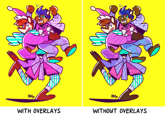
okay!! i’m going to be using my latest drawing as a ref for this whole thing so first off lets remove my overlays

SKIN- so i’d like to start off saying that for the most part i use a reference for my skin tones. some times i’ll tweak them a bit but all in all i’ll either use the same skin tone for a character ive drawn before from my files (though that all came from this next bit) or!! i’ll pull out a reference sheet with skin tones.
once my skin is selected though this is where the rest comes into play since i want to make sure all my colors look nice together. that being said lets continue with the skin but go into the blush..

when selecting a blush i always like to take my base skin tone, drag the little thing down and to the right and then bring it into a more red area. this way you end up with a darker redish color that still kind of looks similar to your base. from there i’ll adjust it as i like, multiply and change the opacity. freckles and lips follow this same general rule. for freckles i DONT make the tone more red and i pull the color from the blush instead of the base skin tone.
EYES- for eyes and teeth i NEVER use WHITE white. i always pull an off white color. it really just depends on what you’re going for. for this piece i went for a redish off white since deku is clearly crying. for other things like lance i’ll pull a blueish off white and so on.
HAIR- so this was also pulled from the ref i used from a friend BUT mind you i’m not going to pull certain colors. so unless my goal is to make it very.. well stand out then i’m going to go for darker tones and nothing extreme with colors. while deku, yes, has GREEN hair i’m going to pull a darker green that’ll look okay with everything else. really this can take some trial and error and i even added a gradient overlay to the final product on the hair.
CLOTHES- so there’s not much shown in this drawing but i’ll still explain. generally i like to pick colors that go with the feel. i wanted a dark background so i went with a white hoodie (though it IS off white) and i wanted a LOT of contrast so i made it as close to pure white as i could. with regular outfits i generally just like pastels. i’ll also pull greys. not typically PURE grey’s (just like i dont do pure whites) but some sort of tinted grey (red tinted greys are my fave)
MISC- so another rule of thumb is that i NEVER use pure black. i’ll do it for my line art but even that i change. it’s just.. it contrasts TOO much. if you WANT that contrast than use it!!! but i like my colors like.. blending i guess ??? anyway i always use a very dark grey that is tinted.
- for lineart i like to use a clipping layer and generally after i’ve shaded i’ll pull the darkest color, make it a bit darker (pulling the color down and to the right again) and then recolor the lines like that.
- for shading it depends. sometimes i shade w one color.. lately i havent. i used to just use this dark blue/purple, multiply the layer and then adjust the opacity.. now i use a like dark blue or a dark red depending on if the stuff im shading is cool or warm in its coloring. if it’s cool i use the dark red.. warm i use the dark blue.
OVERLAYS- okay overlays imo is what REALLY brings the whole piece together. it tints the colors and ties everything into one another. soo really your overlay depends on what you’re going for. just mess around with colors and so on. use gradients use multiple layers. go wild!!! i do though try to keep from making the overlay lighten the skin tone too much. this way you prevent any accidental white washing of your darker skin tones.

ref of the colors used. as you can see the background isnt BLACK and the hoodie and eyes/teeth arent even 100% white
unless you’re going for this try to avoid doing this. (lines are black, i pulled a random red for the blush and lips, the eyes and teeth are WHITE and the hair is a brighter green) things just dont look as good and together.
16 notes
·
View notes
Note
Hi! I love the way you use colors on your drawings! Do you have any tips for choosing colors? I always seem to mess them up ;( (Pd: love your comic! ♡)
Hellooo! Aaaa thanks so much!!! Oh gosh! I’m known to be TRULY wild with my color choice so I’m unsure if I’m qualified..! But, regardless, I’d love to help!
To start, there’s no harm in using references for colors, similarly with how you’d use reference for drawing poses, backgrounds, clothing, etc. Here are some sites:
colourlovers - this is my favorite one! Sometimes I’ll search a random word (like “happy,” “friends,” “sunshine,” “sadness”) and pick what I think would fit the mood of my piece. A lot of times I’ll end up editing the colors to fit more what I want, adding a color that complements the rest, or adjusting the values of the colors so my piece will be more balanced. But overall it gives you great ideas and can be a fun exercise to limit yourself with their palettes 💖
colrd
shutterstock labs / palette / spectrum
pictaculous - upload a photo/pic you like and get a limited color scheme for it!
(anyone please feel free to link other resources in the comments!)
If you’re struggling more with technicalities, I have some tips, too 😁:
1) Don’t rely on local color
This is sort of funny but I didn’t even know what the term “local color” meant until, like, my 3rd year of college? LOL anyway, there’s no reason to use real colors ever! Instead of making your color scheme work around your subject, try stylizing your color choice! Settle on a color scheme and substitute the local color with one that might be similar (or just go wild). For example:
red sand might remind you of brown sand
purple sidewalk might remind you of grey sidewalks (or maybe just sidewalks with a nighttime feeling?)
Landon’s hair is pink instead of red + a pink cactus because I’m Wild
2) Limit your color scheme
It may or may not be obvious that I love to use as few colors as possible… LOL. Doing this is super exciting IMO, because you literally only choose the colors you like!!! DOWN WITH BROWN! I don’t ike brown………… except to eat chocolate
1st img, I used the same red for hair + shirt, the same orange in the jacket details + shoes, and for the jacket + pants I used the same grey but used the color slider and made the pants lighter
2nd img, I used a formula where there’s pink hair/shirt/shorts/shoes (note: that kid is a brunette but I made him have pink hair) + grey hair/shirt/pants/shoes + purple accessories…………….. do you see it, like a zig-zag? Fun, right? 😁
3rd img is where I most obviously used limited colors. I’m sure not every furniture in a house will be blue/purple/green but those are the colors I chose when I started so I just used them! You can do the same with clothing. Nothing has to be real 🎉 WE’RE WILD AND FREE 🎉
3A) Try not to use black or grey
I mean, if it’s part of your color scheme, go for it! But black and 100% grey are pretty heavy and don’t always add to color schemes, especially if you’re trying to be more stylized with them.
in the first 2 examples, the outfits (including the cat bag) are supposed to be all black–but I used shades of purple instead.
3rd img, rather than using just straight up grey, I gave it a more purple-leaning (RGB color code R: 188, G: 169, B: 188)
3B) DON’T LIMIT YOURSELF WITH BLACK LINEART!
Changing the lineart color makes suuuuch a huge difference. I very rarely use black lines in my colored pieces! I go back-and-forth using a lineart color that:
contrasts most of the colors of the piece ➡️ like using a blue line when most of the colors are oranges/yellows or
complements them ➡️ like using a dark purple line in a piece that’s many shades of purples/blues
4) Experiment with overlays
Yeah……… LOLOL.
Add a layer on top of your colors/lines ➡️ fill a color (purple? pink? blue?) ➡️ set the layer style to overlay, screen, color burn, soft light, whatever, anything you like! ➡️ lower the opacity (so it’s not super wild, if you want)! Sometimes this will balance the piece by having the colors all lean towards the one color you filled the layer with.
Don’t be afraid to use fill/adjustment layers in Photoshop and play around with the color balance!
5) Think about and plan your colors
Maybe try thinking about what colors mean? Very basically, as an example:
warm colors, yellows, oranges = feels happier
cool colors, blues, purples = sadder, more somber
like, if your goth kid is sad, maybe you’d use cooler and darker tones
maybe your character is super angry so you’ll use a violent, loud shade of red
I say this but all my works are rainbow, so…… LOLOL 😂
Anyway, those are my ideas! I’m not very fancy… //// in fact, I don’t even like to color LOLOL but those are the sorts of things I go with! If you have more questions, feel free to ask. 😚 Most of all, HAVE FUN! Best wishes!!! 💖💖💖
987 notes
·
View notes
Last Seen Blogs

magnatayeezy
KING KHALIFA خَلِيفَة
desiretouch
* / KISSES !
desiretouch
* / KISSES !

lquoteb
جواهر الكلام
time2andspace
I don't know shit dude