#paintings and mostly 2d art
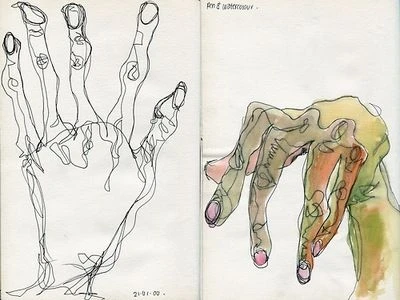
Photo
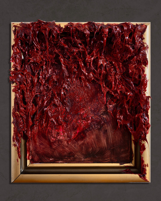
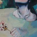
Kim Jakobsson, Harbinger
Oil painting
Many thanks to @amourduloup to sending me this artist!
https://kimjakobssonart.com/
#hannibal#nbc hannibal#art that reminds me of hannibal#kim jakobsson#paintings and mostly 2d art#contemporary art#blood#viscera#could be part of some murder art#gore
2K notes
·
View notes
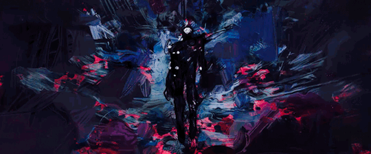
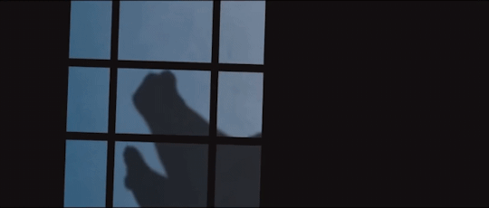
Text
⚠️ Not suitable for human consumption ⚠️
#no sounds cos i cant be bothered#no sounds#video#animation#2d animation#artists on tumblr#digital art#procreate#procreate dreams#mostly drawn in procreate and then comped in procreate dreams#painting study to animation study to uhhhh this. you can find the og video reference in pexels! its not that faithful but yeah use refs#this is just in case but#blood tw#jitterbugbear art
86 notes
·
View notes
Text


minor assignment dump but this was a hit w my professor so posting 3d model assignment finally + prop sketches 4 it
+ less rendered screenshots but better view of gory details


#dork art#blood tw#mild gore tw#mostly under cut just an eye n parts of aome guts#cant see then too well in the final#first time ever actually making a 3d model generally thought i was gonna fail this bc i couldn't figure it out even w help#n then everything clicked n now im v happy w the results :>#professor gave me the go ahead to be as gory as i wanted after i showed him the initial 2d sketch thus the differences#n bc painting in substance is reslly fun when the uvs work#the final rendering was all done in substance also the model was made in maya n the bg was a preloaded environment#two assignments left n im free for the semester <3
47 notes
·
View notes
Text
Can't wait till next week is over so I can show the progress I've made for my senior thesis
#I wanna fix one thing up before I release it#Ill be a senior next year#this project is like a practice round / prep before actually doing it#I've mainly been working on the functionality than the looks#senior year will be working on the aesthetics (a bit of summer too)#setting up the foundations of the house before I start paint or furnish or whatever#I'll try my best to liveblog progress#also queue up some classwork#I've been making a lot of art just none of it is fanart and it's not like beautiful illustrations or funny comics#its all mostly 3d stuff#and if its 2d they're sketches or ideation#so i feel like its not worthy to post ig#i am also a perpetual forgetter#It's just kind of awkward being like ''oh let me upload my homework onto the internet lol'#I just need to force myself to post more often lol
1 note
·
View note
Text
Lancer Tactics devlog
I'm gonna try out posting my ~monthly devlog roundup here as well. These suckers are glorified changelogs with anecdotes and gifs galore. Let me know if this is something you like seeing show up on your dash?
Map Editor
Got units able to be placed/deleted/moved in the mission editor
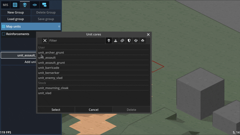
Can paint/remove command zones in the editor
Can paint minecraft-like terrain blocks in the editor

Can paint/rotate multi-tile props in the editor
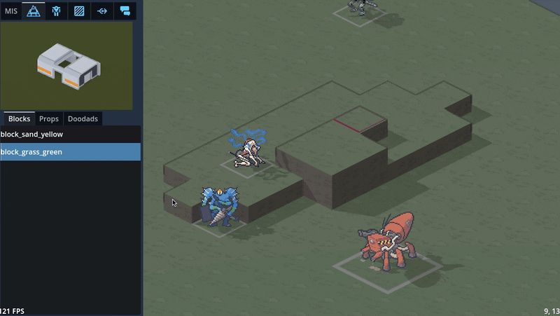
Can edit unit character sheets and portrait via the editor

3D maps
Did a bunch of art tests with 3D mech models, provided by GeneralChaos, which we ended up deciding not to go with to keep things simple.

To avoid the can of worms that is animation, we'd have to lean into a static "tabletop minatures" aesthetic which we decided is not a style we want to be stuck with. By sticking with 2D sprites, we avoid falling into a sort of uncanny valley; it's easier to get away with not animating a 2D sprite than it is for a 3D model.
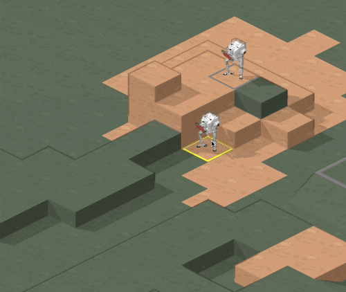
We also experimented with 3D terrain. We decided to make a rule that the visual style for a piece of terrain should match its mechanical effect: obstructing terrain that you can't move through, such as rocks or buildings, will be in 3D, while non-obstructing terrain like trees will stick with 2D sprites.

Hooking up the 3D camera to follow events like movement and attacks did a LOT for making it starting to feel like it's cohering into an Actual Game™
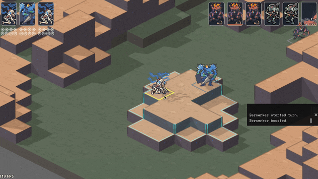
Implemented cover! And an attack preview! Cover works by aiming a ray from the target to the originator (technically to and from each voxel of each, respectively, to handle size 2s shooting above size 1 cover) and tracking all the terrain blocks it hits (how we'll handle non-terrain hard cover TBD). I think I have it working according to Perijove's cover rules manual, but I'm sure there'll be edge cases to work out. This is a case where things are significantly simplified by working in squares instead of hexes; hexes have a lot more possible weird angles you have to deal with.

Re-added what I'm stubbornly calling Combat Popcorn; little bits of text that pop out when you use abilities and attacks.
UI & game screens
Added ability for the engine to show UI that's anchored to the game world via a little word bubble line but also stay on screen as the camera moves around.

Got word bubbles working; you can now write dialogue in the mission editor, hit playtest, and see it work in a mission! (it does actually translate correctly now; this gif is just from a bug I thought was funny)

Got ability effects mostly behaving appropriately again, including muzzle flashes. The easiest way to handle them ended up being NOT billboarding them so they always face the camera (like all other 2D sprites in the game); instead, I put them on a plane parallel with the ground and just spin them around the unit to point at wherever their target is.

Did some work ironing out our tooltip system. The standard in CRPGs these days is this kind of nested labyrinth of tooltops that you see in Baldur's Gate 3:
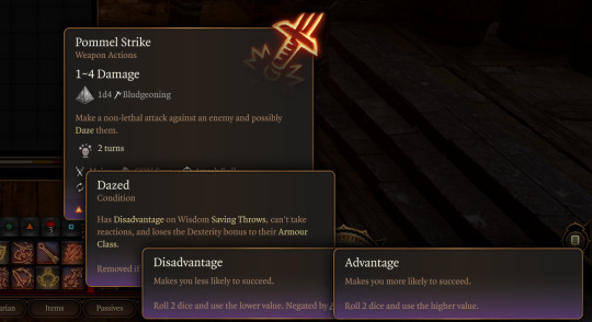
I Did Not Want to try and figure out how to wrangle that much UI, so we're instead opting to cap the nested tooltips at the second layer. You can lock a general tooltip for e.g. an action and then mouseover various items within that tooltip to get glossary definitions...

...and then instead of having those glossary tips be lockable/mouse-overable themselves, I collect all related terms to that glossary definition and let you tab through them.
Added skin overlay functionality to the portrait maker, enabling textures like scars, tattoos, stubble, and vitiligo to be applied to just the skin and not extend off into space.
Midway through writing this update, Carpenter sent me this gif of the randomization button working! There's a still a bunch of skintones/assets missing and a few are a bit janky, but it was exciting to start seeing the range of these lil freaks (affectionate) that this editor can create.

Mourning cloak license!
This is the one I'm probably most excited about: I did a bit of a content dive and implemented a basic character sheet + all Mourning Cloak traits and equipment. They don't have fancy graphics yet, but the weapons and systems can be added via the character sheet and used in-game.

It took a little under a day, including adding soon-to-be common mechanisms like bonus damage. This is great news in that it means the engine we've been building for so long in the abstract seems to do a great job in handling comprehensive actual game content, and that it looks like we've set ourselves up for success when it comes time to buckle down on churning that out.
I'm sure other licenses will come with unique difficulties (I fear the day it comes time to do the Mule Harness // Goblin CP) but I'm feeling good about it!
Vertical slice?
Taking a step back, the pressing question on my mind has been "when will we have a playable early access build?"
I was originally hoping for Feb/March, but what we've internally been referring to as the "3D cataclysm" has pushed everything back by at least three months, so the target for the first alpha build is now in May. So, ah, thanks for your patience! Seeing things come together, I've become more and more convinced that moving to 3D was the right call.
#lancer tactics#made with godot#godot 4#indie game dev#game dev#lancer rpg#tactics rpg#indie dev#godot engine
277 notes
·
View notes
Note
Hello, hope this finds you well!
As a film enjoyer and small artist I was absolutely mesmerised by the animation work in ATSV all around but The Spot in particular stood out to me! I was curious how the process of animating his scenes went especially with all the portals, which I assume many of which were painted in afterwards? Was the way the team thought out his scenes different from other chatacters?
Apologies if I'm asking about something you didn't work on but I thought asking was worth a shot! Anywho thats it, may you have a lovely day!
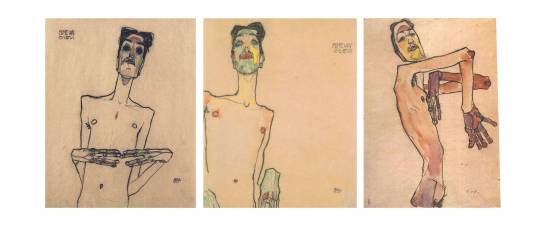
good question, and thank you! i haven't seen much talk about spot but a lot of development went into his look
for posing, we took a lot of inspiration from the artist egon schiele, an idea from humberto rosa. we wanted spot to look awkward by making him feel like a loose yet controlled sketch, exaggerating his weird long and lanky proportions into very squared off and angular shapes
for the portals, they had to be created in anim first and then fx did a pass on them to add all the little extra swirly bits, and then comp did another pass on them to integrate them into the scene. every element that you see in a shot had to be created in 3D in order to move properly down the pipeline so that the other departments knew what to do with the scene, because they don't always look at the animation playblasts, what matters is what's published in the scene file. we can draw over our shots to try things out quickly but eventually had to put in the work of making them real 3D assets. every portal that you see on spot's body and floating off of him was placed by an animator
near the beginning of production, a lot of tests were done to make spot's face portal more expressive, mimicking mouth and eye shapes as a part of his acting. it was decided that simpler was better in this case, so it was mostly just kept as an oval instead

in order to make a shot like this work in 3D, we used two spot rigs here and a portal tool that let us flatten the geo of the second spot down to 1 pixel so that only his hand can be seen while animating in and out of the portal. nothing is painted over here, this is pretty much 1:1 to what's in the maya scene
in order to progress spot's power throughout the movie, we needed to add more body spots in the india sequence, similar to the second to last pose here (art by aymeric kevin):

our anim tech lead emmanuel gatera worked with rigging to update spot with the ability to turn sections of his body black with the use of a boolean, since it was impossible to add enough spots to totally cover his hands and midsection. he did still need a lot of spots along with the booleans though, i think it was somewhere around 80 (we had library poses for them, didn't need to bring them all in and manually place them in every shot haha)
and finally forget what i said about having to create everything in 3D because the final stage of spot's power was the exception to that rule since he was only in a small handful of shots. nideep varghese animated this shot with the regular spot rig and drew over it entirely in 2D, which the fx department recreated with about a bazillion layers of hand-drawn fx by arthur muller, srdjan milosevic and filippo maccari. lighting/comp by craig feifarek
362 notes
·
View notes
Note
Kinda weird question, but can you teach me drawing backgrounds? 👉👈🥺
I’m not the best person to ask when it comes to drawing backgrounds…
BUUUUUT!
I can give some tips and tricks I’ve learned over the years.
so when drawing backgrounds, what you need to know is what they’re used for. Not just for a place for characters to move around, but what feeling they give.


take for example of arcane, the city the show takes place gives a sense of wealth, prosperity, and upper class.

While in the depths of the under city, feelings of safety and security leaves as the colors mute and dull in color. Showing how the lower class is seen and acts.
which also goes along with describing some world building, like how they live, what’s the streets like, etc. give the feeling you want for the story and world.

Decorating the layout can even show what to know of your character, are they ambitious and an artist: their home might look like a mess or organized.
Speaking about layouts, you should also keep in mind where the focus should be depending on the scene.
Here is a better explanation on how to do it. Guide your audience’s eyes towards where you want them. Not need necessarily, want is what you’re looking for.

Items or lighting and color can help you in what you want your audience to look at. Especially for animation related backgrounds.
which now ties to what’s important to note, perspective and space.
Take a look at how storyboards work with backgrounds, they follow perspective and spacing. This is a little tricky to understand, but what helps me is just make it rough enough to not overwhelm you, but accurate to where the guideline is. Don’t worry on the details, focus on the guide lines, simple and easy to follow.
also not that you shouldn’t always follow perspective if it will mess with the scene.
Don’t make things flat, 2d isn’t real in real life, there are hills and low slopes.
Mess with where the camera is placed and follow its view point.
Another thing to note is to not make the background become the takeaway. They’re just a place for your characters to walk and talk in. Unless they live in a empty vacuum.

Mike Mignola is a great example for simple, yet effective, background art. His perspective can be off, or they can fade out, or they can be simple that a three year old can easily trace. But it works because it doesn’t drive away the focus which is the character.
comics like BONE by Jeff smith, can be simple yet atmospheric at the same time. You can be detailed if the scene needs it for cinematic effect, but mostly you will have a blank back space with the details becoming more complex the closer it gets.


if you want detailed backgrounds, then save it for illustration or painting. If it’s comics or animation, simplicity with that flare of personality is needed. Don’t overwhelm yourself.
but don’t listen to my advice, if you want real professionals: watch Bam animation on backgrounds.
youtube
glad I can at least help. Stay strong compadre.
#Animation#background#art tips#art advice#storyboard#gravity falls#arcane#101 dalmatians#Bone Jeff smith#Hellboy#hoo boy am I tired
137 notes
·
View notes
Text
OK, but hear me out
Say Ride the Cyclone were to be adapted into a film; imagine how much fun it would be to see it animated.
Because for the main plot, like the intro song and the mostly dialogue scenes in limbo, you could easily do a stylistic, but still grounded in realism style that a lot of modern animated projects are doing right now (think Arcane or Into the Spider Verse). But once each of the kids go into their respective songs/fantasies for what their life could have been? What if those were done in completely different styles?? Imagine the additional, visual storytelling that would tell about who they are as characters?
Like say, for Ocean's number, WTWN, everything became more simplified, and the characters (especially Ocean herself) turned into a more rounded, chibi-like style to enhance just how cutesy and likeable she's trying to portray herself throughout that number.
Or for Noel's Lament, everything goes black and white, and the characters become even more 2D stylized, and the film scales down to a smaller millimeter frame, more reminiscent of cartoons from the early 20's, when animation was just starting out, to enhance his idealization of "the olden days" (as Ocean puts it).
Mischa's song, This Song is Awesome could be animated with a more choppy frame rate, and the character designs turn a little more jagged around the edges, kind of like animated music videos (I'm thinking a Gorillaz band vibe). But as he transitions into singing about Talia, the colors start to bleed out over their lineart, and become more paint-like and Talia herself moves like a rotoscoped character (think Loving, Vincent that came out a few years ago) to enhance the sense that she's somewhere between a real person and a fantasy Mischa's built in his mind.
Ricky's song would, of course, be stylized after those sci-fi cartoons from the 90's, like X-Men or Captain Planet.
For the Ballad of Jane Doe, I would love to see something like what Wolfwalkers did back in 2020, where most of the characters (in this case, the other kids) are for the most part, animated like traditional, 2D characters with very clean lines and neat movements, whereas Jane herself stands out for having messier, sketchy line art, and looks more and more unfinished in her animation as the song goes on, because she can feel more and more of her own identity being lost.
Constance's Sugar Cloud I could see done in the classic 2D Disney style (i.e., the Renaissance era of Disney, like the Lion King or Little Mermaid days) because not only is it really smooth and colorful and just all around nice to look at, but it reminds the average moviegoer of their childhood growing up with those movies (among others, obviously), which ties in nicely with Constance's preceding monologue about remembering her own life, and the good that came with the bad.
I'm even tempted to envision the first half of the finale song in a different style, when the stage production would show a quick projection of Jane/Penny's life after she returned to the world of the living. Imagine watching this animated film, and for that segment alone, it becomes that really hyper-realistic, almost uncanny valley CGI animation style, to show that she really has joined the world of the living, i.e. our world, among us, the living breathing movie goers watching this, and watching the other kids still in limbo fade back to that main art style for the final number.
I don't know; it just feels like something that would be so engaging to see from an already compelling storyline and characters. Especially with more experimental animation projects on the rise right now
#random rambling#Ride the Cyclone#Ocean O'Connell Rosenberg#Noel Gruber#Mischa Bachinski#Ricky Potts#Jane Doe#Penny Lamb#Constance Blackwood#idk I just really love animation you guys#so naturally I have to bring my latest hyperfixation into that world#might even sketch these different styles#for a better visual idea#but I haven't done any sketches in a hot minute#so who knows
986 notes
·
View notes
Text
Some movies that stylized their animation before Spider-Verse in 2018.
Fantasia 2000 by Disney in 1999. It takes CGI and 2D animation and mix them together.
The Peanuts Movie 2016 by Blue Sky's. It was mostly 3D, but the expressions and motions had 2D in them. Which is beyond creative because they only had dots for eyes and a line for a mouth. Which limits expressions, but the 2D lines they had, like when they fall or jump, really add expressions to the charaters. The background looked very flat as if the characters were standing in front of a painted scenery and were performing on stage. Super cute.

Captain Underpants 2017. By Dreamworks. Same as Peanuts' Movie. Made to look like they were in a book, and the movements were very Loony Toon style.
Trolls franchise 2016 by Dreamworks. I can go on for hours on how creative this franchise got with their animation. They used scrapbook materials to build their world. The water is fabric, the waterfall are streamers, the waves are marbles, the sand is glitter, the forest is fuzzy, the ground looks like a carpet, the fire looks like troll hair, the Funk Trolls kingdom are mirror's and reflective material, the Rock Trolls kingdom is leather, the Classical Trolls kingdom are cotton balls, it's endless creativity. They even hired a professional to sculpt a forest with fabrics and glitter so they could get an idea of how they were gonna make this world. AND they created a whole new program just to animate glitter. The same way Spider-Verse had to create one to animate Hobbie. Yeah, Spider-Verse was not the first film to do that. It was Trolls 2016. And then the franchise adds in live action and 2D animation here and there, and that makes it more unique and gives an 80s style to the film.
And then we have other films that also made their world building look unique. Book of Life made their characters look like traditional puppets in Mexico. Lego Movie made it look like toys were moving around. Like if a kid were actually playing with them. Is their any smearing in the Lego Movie? I swear every frame is clear with no stretching or smearing.
Finally, the one that I feel like deserves a lot of credit because it was the one that was experimenting with 2D and 3D animation waaaaaaaay before Spider-Verse.


This is just the intro to the 3rd film.
Kung Fu Panda franchise 2008 by Dreamworks. The 1st film has a small dash of 2D in Shifus flash back. I think. But the 2nd film in 2011 100% has that mix of 2D and 3D. Epically during the training montage for Po and Shen. The lighting looked 2D on 3D modles. And there were times in the 3rd film where it was meant to look like Chinese art. And you see this combination throughout the entire film. The animated shorts are meant to look like traditional Chinese art as well. And they look great!
I have no problem with Spider-Verse being the one who finally broke the mold and inspired other animated films to do the same. But can we acknowledge that Kung Fu Panda was the one that was experimenting with it the most? Unless there's one that I'm over looking way before 2008. But the Dreamworks Kung Fu Panda franchise was the one that walked so Spider-Verse could run!
#spider man#across the spiderverse#spider verse#into the spider verse#peanuts#peanuts movie#captian underpants#dreamworks trolls#trolls dreamworks#trolls#book of life#lego movie#kung fu panda#kung fu panda 2#kung fu panda 3#2d animation#animation#3d animation#i really feel like people over looked Kung Fu Panda big time
211 notes
·
View notes
Text
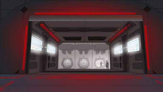
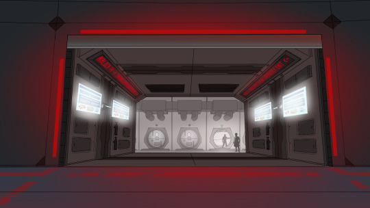
SPOTLIGHT ON: Murderbot Fanimation Project Backgrounds!
(Part 3 of 3) (Jump to part [1] [2])
They may be the literal background of the finished product, but the backgrounds done for the Murderbot Diaries Fanimation Project deserve their time in the spotlight!
Part of what makes the Fanimation stand out as much as it does is the love, care, and attention to detail that the artists poured into the backgrounds. The team stuck closely to the source texts when designing the spaces, producing some beautiful pieces of art that deserve appreciation on their own.
You can watch the Murderbot Diaries Fanimation Project here.
In this final part, we look at some of the backgrounds that we animated to give them that extra wow factor. Some of the shots in the Murderbot Fanimation have backgrounds completely made in 3D - the opening shot and the post-credits scene, for example. But the shots in this post are mostly 2D imagery, with some 3D components and clever editing that bring them to life.
Deltfall Habitat - Background art and motion editing by @broken-risk-assessment-module , habitat model created by TechnicalToad and rendered by @theash0
"I climbed the ladder up to the roof hatch and popped it. The armor’s boots have magnetized climbing clamps, and I used them to cross over the curving roofs to the third habitat and then around to the second."

Milu Storm - 3D model of the corridor by TechnicalToad, storm effect created by @theash0 using, among many other elements, an effect created by @chimaerakitten
"Swirling, towering clouds, filled with electrical discharges, obscured any view of the surface. [...] It was immense, and wrong, and terrible and beautiful all at the same time. I stood there for what I later clocked as twenty-two seconds, just staring."

Docking Bay Door - Background, foreground, and door textures illustrated by Vanessa. 3D door composited and animated by @theash0
"Gurathin knelt beside an open maintenance floor panel next to the gate, tools scattered around, and Ratthi held a light for him. The panel was painted with an emergency feed marker label that in a selection of different languages read 'Manual Release.'"
Docking Bay Corridor - Illustrated by @nirelaz , motion editing by @theash0
"Our shuttle slot was six locks down, glowing emergency lighting showing me Mensah standing beside it holding a small energy weapon."
Bonus higher-quality stills of those last two to appreciate the detail:
(Docking Bay Door by Vanessa)
(Docking Bay Corridor by @nirelaz - you can find more of the backgrounds Nirelaz did for this project here)
#murderbot#the murderbot diaries#mbfanimationproject#behind the scenes#murderbot fanart#all systems red#rogue protocol#exit strategy#background art
79 notes
·
View notes
Note
What exactly do ppl understand under rendering?
im not entirely sure what this is asking so apologies if I misunderstood but rendering as a term for (2d) art is pretty broad. It mostly just means "refining/taking the art to its final state" which means vastly different things to different artists depending on their process
for me personally i do a lot of painting and not a lot of lineart so anything past the thumbnail->cleaner sketch-> flat colors stage is rendering in my process. everything from cleaning up my sketch lines to adding texture, shading, & detail get lumped into that because of how loose my work flow tends to be.

i assume this message is cuz i mentioned in a previous ask that i love drawing hair but not so much rendering. in that case its because while you can imply hair texture and flow through a relatively small amount of lines while drawing, there's much more effort that goes into painting and making any hair texture believable because of how hair specifically layers and builds upon itself to create form


this process is fun for me as well! it just can get tedious at times and im extremely impatient with my own art dshjf
#lizard inbox#art help#? unsure if this is actually helpful but i put allprocess stuff in that tag#sorry if this wasnt what you were asking btw! i focused more on my own process trying to answer#but the reality is im not familiar with how other people tend to work so i cant make sweeping statements on What people count as rendering
234 notes
·
View notes
Photo

Fábio Magalhães, Untitled (Intimate Portraits Series), 2013
Oil on canvas
https://paulodaregaleria.com.br/en/artistas/fabio-magalhaes/
#hannibal#nbc hannibal#art that reminds me of hannibal#Fábio Magalhães#meat#gore#paintings and mostly 2d art#people are meat#as seen in the murder basement#posts I created#contemporary art#queue
1K notes
·
View notes
Text
Some Drawing Resources
I saw @freesia-writes asks for some drawing resources and I thought I would share some that help me along the way. List is below.
Some drawing programs (prices may vary):
Autodesk sketchbook (free)
Krita (Free)
Adobe Photoshop ($11 USD A month)
Clip Studio Paint (80 USD a year)
Procrate ($10 USD) For tablet
3D Programs:
Blender (free) - great for learning anatomy and 3D space of a figure.
Maya ($300 USD for 100 days) - used to be a lot cheaper but not anymore.
Books:
1. *** Human Anatomy for Artist: The Elements of Form - by Eliot Goldfinger *** (Must have)
2. Anatomy for Sculptors: Understanding Human Figure - by Uldis Zarins (fan fave)
3. Figure Drawing: Design and Invention - by Michael Hampton
4. Classic Human Anatomy: The Artist's Guide to form, function and movement - by Valerie L. Winslow
5. Classic Human Anatomy in motion: The Artist's Guide to the Dynamics of Figure Drawing - by Valerie L. Winslow
6. Dynamic Human Anatomy: An artist's Guide to Structure, Gesture, and the Figure in Motion - by Roberto Osti
7. Anatomy: A complete Guide for Artists - by Joseph Sheppard.
Online Art Pose References (where to find):
Artstation Marketplace (not free)
Deviantart (mostly free)
Pose Space (pricey)
Gumaroad (not free)
Background:
I actually have a degree in 3D and 2D animation from on the the top art schools in the USA. However, I really didn't learn much about drawing in school. I learn more about 3D/2D programs and how the 3D animation industry works. I learned how to draw/paint mostly on my own.
I started out as a digital artist and still am a digital artist. It not so much the medium in which one draws on but what one is learning how to draw. Much like music - doesn't matter which instrument one is learning how to play, one needs to learn their scales. In art those "scales" are learning anatomy (which nobody learns), color theory (which is my pride and joy), perspective (super hard), gesture and form (super fun once you get it).
Remember, everyone learns differently and at their own speed. Find what makes you want to learn and a fun way to learn for you. Hope this helps! Best of luck on your art journey.
#drawing#digital art#art#art tips#art resources#art research#illustration#art education#artbook#artwork#tutorial#painting
50 notes
·
View notes
Text
My thoughts on Disney's Wish (Spoilers)
Let me preface this by saying that I haven't heard all of the negative things that have been circling around the movie, but I've heard more than a few things that painted a pretty grim picture of the movie before I went to see it. I was going in expecting something akin to Strange World going in, which I really didn't like (and that's coming from someone who likes unique worldbuilding.)
After I left the theater yesterday, my thoughts were just, "This is the worst Disney movie of 2023?" I really didn't have any issues with it at all, and even if I usually tend to have a more positive outlook on movies I watch in comparison to others, I just have to say that this was NOT a terrible movie. Disney has had a LOT of blunders in 2023, but I can't say that this was one of them. I know that a lot of people out there might disagree with me or even hate me, but Wish made me feel something that I don't feel very often: magic.
It's hard for me to know what specifically to talk about since I don't know about all the criticisms the movie's gotten, though I do know about a few. The first one that sticks out to me is the movie's art style, and how some people have called it ugly and even unfinished looking. But... I honestly don't get it. Nothing strikes me as unfinished, and I never found the art style to be irritating. It was something new, and I thought it was fine. It uses shading and colors that are a bit flatter than some of their previous works, but I saw that as it being a sort of in-between of the 2D look of the classics and the 3D look of the newer movies. There was probably only one time where I noticed something was slightly off, and that was where Asha is waving around some flags at the beginning and having no motion blur or smear frames on it looked a little awkward. I can also understand how some of the shots can feel a bit flat, but once again that's something that makes it feel similar to the 2D classics.
Up next, I heard some things about some of the characters being trash. The main two I heard about were Asha and King Magnifico. Some of the main things I heard concerning Asha was that she's dorky and silly to a fault, and what I have to say to that is that although she's pretty silly at the beginning of the movie and sometimes it can be a bit embarrassing to watch, that's just Asha being Asha before the adventure kicks off. As the story progressed, I thought that she learned to be more serious over time as she learned the truth about the wishes and Magnifico and what she really wanted to do, and most of her antics after that point are mostly concerning the actions of other characters. I never felt like she was silly in places where it was inappropriate, and I actually ended up liking her a lot. As for Magnifico, I haven't heard anything specific about him other than the fact that he's supposedly the worst Disney villain of all time. But... I just don't see it. His motivations are believable (according to my standards), he's shown to be a narcissist who doesn't truly listen to other people's criticisms, and him turning from a king who wants to maintain order while very rarely giving people what they want into a power hungry madman who wants nothing more than for his subjects to bend to his will and lick his boots feels in character for him and it had the right setup. I thought that the supporting characters were all good as well, but my least favorite was probably Valentino. He was alright and he did his job, but he really felt like more of a gimmick than anything else.
The next thing I want to talk about is the music. I don't know if anybody's had a lot of bad things to say about it, but I thought the songs were great. After Encanto I was wondering what they'd have in store for this movie, because although Encanto had some banger songs there were one or two that I didn't really like. Not so for Wish though, because I liked every last song that was in the movie. I'm... not really sure what else to say here.
I heard about there being a few cameos in the movie as well, and I picked up on a lot of them as I watched it. But the references feel tasteful, not overblown and obvious, and something you'll really only notice if you're looking for it (except for the Peter Pan reference maybe, but that's just one.)
One last thing I want to talk about is how I've seen some people calling the film's main source of conflict something that makes Asha a bad person. Basically, they say that her mission goes against Magnifico's warnings of what could happen if everybody is allowed to keep their wishes and that there could be some serious consequences that she's too headstrong to consider. But... they address all these points in the movie. Even if someone's wish turns out to be a rotten one, you can always try to step in and make sure it doesn't get too out of hand.
And I think those are all the things I had to say concerning Wish. I personally feel like it paid some good tribute to the animated classics with its story and familiar themes, and it was a good way to celebrate 100 years of the Walt Disney company, though I'm well aware that there are plenty who disagree. If there are some things that I didn't cover or consider please let me know, and I'd like to hear what you all have to say about the movie as well.
28 notes
·
View notes
Note
I don’t know if this is a silly question or not, but I saw you mention how the creator of “there are no demons” uses a 3D sculpts to make their comic. Do you use a 3D software? I have never even considered it before now, but now I’m wondering if it would help me keep consistency with different characters body types
I actually do, not so much software (I'm not a 3D modeller at all lol) but 3D assets! There are a few sprinkled throughout Rekindled, mostly involving background props and set designs (though in a lot of cases my assistant @banshriek will often just use them as references to paint over rather than use them directly if they feel it looks better, much of the backgrounds in the comic since Ep 23 can be attributed to them <3).
I don't use 3D models for my character art, not so much because I'm against it, just because I've used them in the past and while I found they helped with certain things I often struggle with like perspective and proportions, they've also started to hinder my creativity because of how stiff they can be (and tbh it made the drawing process really boring for me because I was literally spending more time adjusting poses than I was actually drawing!) I'm finding I'm perfectly capable of drawing anatomy on my own now, using 3D models for a while helped me get there but now they're more limiting than they are helpful due to my outgrowing them (kind of like training wheels on a bike, like yeah they're helpful so you can learn how to ride a bike, but you won't get to go as fast or have as much freedom of movement as you would if you learned how to ride a two wheeler). I think they're great for referencing or if I'm REALLY stuck on a pose or how a character exists in a space, but I don't like being constrained by them by using them constantly and that was what it was starting to feel like while I was using them for Time Gate so I've moved away from 3D character models and stuck exclusively to using 3D assets for backgrounds and things that aren't going to affect the overall quality of my work or how I make it.
I think the fact that a lot of people straight up don't notice that I use 3D assets in Rekindled is a testament to that LMAO Although you can tell in some of the earlier episodes when it was just me working on it and I had to balance quality with turnaround time. I've always hated drawing backgrounds and so Banshriek has been a huge help with relieving that stress and adding that extra touch to Rekindled that I just can't feasibly bring on my own :' )
If you're interested in trying out 3D models for yourself, then by all means do it! You won't know what works for you until you try it. Most of my advice stems from experience, I'm not someone who wants to spend all day messing around with 3D dolls, so using them to aid in my drawing just wound up being redundant, time-consuming, and boring. But there are folks out there who love messing around with 3D models, there are even comics out there that are fully 3D with zero drawing, using models that are handmade. Webcomics are a medium, you can do whatever you want :' )
The only advice I have to give from experience is to be aware that like with any tool, they aren't necessarily a "replacement" for the learning process, they should supplement your learning alongside other resources and references. You should still make an effort to learn foundational things like composition, lighting, color theory, dynamic gestures, etc. regardless of whether you're working in 2D, 3D, or a fusion of the two. "There Are No Demons" has a look to it that's uncanny and that's clearly the point so the 3D models help a LOT with that, but there are just as many webtoons that use 3D models poorly and wind up with an uncanny look they weren't intending to have (ex. Let's Play).
#lore rekindled#lore rekindled comic#lore rekindled ama#ask me anything#anon ask me anything#anon ama#ama
34 notes
·
View notes
Last Seen Blogs