#photopea adventures
Text

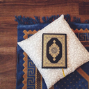
Lake Mungo (2008, dir. Joel Anderson)
112 notes
·
View notes
Text
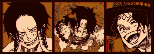
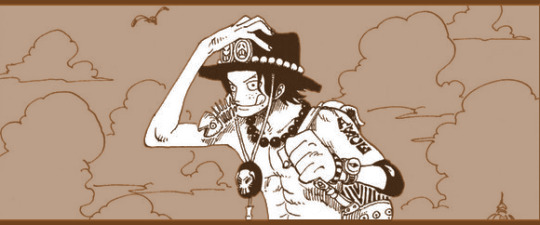
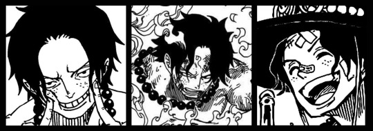
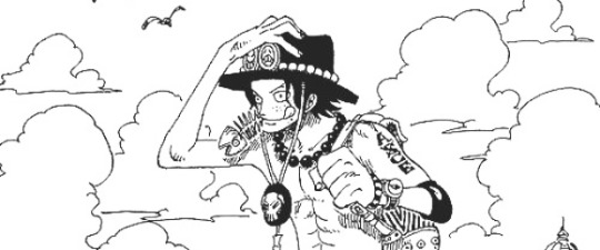
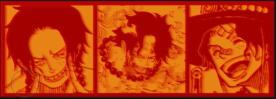
↬ OC Verse Trading Cards
Here it is! The reason (well, one of the reasons) for why I've been so inactive lately. I saw this super cool trading card template by @squea and @buttertrait and thought it was super fun, so I wanted to make something similar for my mutuals and myself. And, as you can see, I rediscovered my love for art deco on the way, so it's very art deco lol
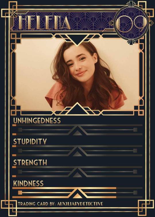
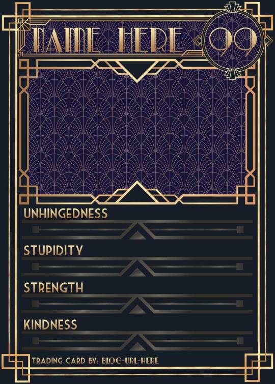
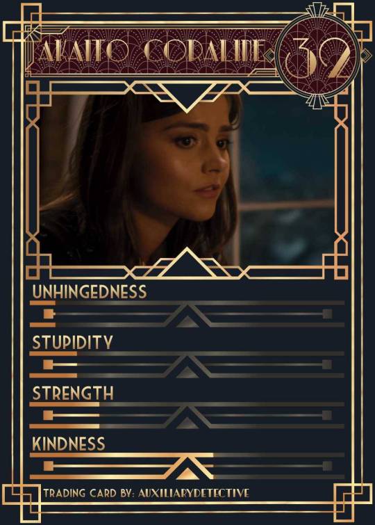
You can find the template to make your own cards here - and I explicitly encourage you to make your own, because I was kinda hoping I would get to see cards of you guys' OCs and we could collect them all in a binder like this one. It would be really fun! (The number next to the name is the power level btw - I wanted to imitate a set of Star Wars trading cards I used to collect as a kid) Make sure to @ me when you do and tag your post with #ocversetradingcards!
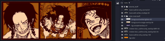
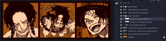
I tried to make the template as accessible as possible so that even beginners should be able to use it without any issues. So, I color-coded the layers!
The red layers are ones you shouldn't touch. They make up the main frame of the card. The orange layers are ones where you can play around with the colors, but that's for advanced photoshop/photopea users. The green ones are the ones where you put in text! Edit those freely. Blue ones are ones you have to select and move as a batch - if you don't know how to do that, check below the cut ^^
You'll need to download these fonts:
Park Lane (name & power level)
Market Deco (main text font)
Artisual Deco Black Italic (blog url)
Below the cut, you'll find a tutorial for the template and a list of the image resources I used - Quick info for everyone, including the more experienced Photopea users: Save your image at 50% quality. The template is a big file and the exported image will also be pretty big if you don’t save it at a lower quality. 50% is what you can see above and I think it's a nice size-quality ratio.
Tutorial Time
Opening the File
Step one: Get either Photoshop or Photopea. Photoshop costs money, Photopea is free and runs in your browser. Take three guesses which one I use. Yeah, it's Photopea. As such, this tutorial will be Photopea-centric, and I also have no clue what the Photoshop interface looks like, so I can't really help you if you work on Photoshop. But I'm told they're essentially the same, so...
Step two: Download the fonts listed above from the links in this post.
Step three: Click on the link above to go download the template. It's a bit of a big file, so I put it into a zip file for you. Don't worry, you don't need a special program to open it. Photopea will do that for you.
Step four: Open Photopea. Click on "File" -> "Open..." and select the "TradingCardTemplate" zip file.
Step five: Click "File" -> "Open..." again and select the zip files for the fonts. This will import them to Photopea. There are also preview images included in at least one of the zip files for the fonts, so just close the windows for those projects when they pop up by clicking on the little "x" next to their file name. You only need the "TradingCardTemplate.psd" tab to be open in your Photopea window.
Great! Now you're all set to edit!
Editing the name, power level and blog url
I decided to group these together because they function essentially the same way
Step one: Select the typing tool. It's the little "T" symbol in the toolbar on the left side of your screen.
Step two: Select the layer of the text you want to edit. The blog url one is in plain view. For the name and power ones, you need to open the corresponding folders first. They're the green layers in the folders!
Step three: Click on the text you want to edit. It's easiest to aim for the middle, that way you have the least chances of missing. The typing tool is a bit finicky with that sometimes, especially if the text is small.
Great! Now you can use your keyboard to delete the placeholder text and replace it with your own! The power level will only fit two digits and picking "00" will look bad. Your OC should have at least some power. They need it to breathe.
Changing the size of the name text
As you might be able to tell, the basic text size only works for fairly short names. So, you might have to make it smaller for your OC's name to fit
Step one: Enter your OC's name as described above.
Step two: Select the text as you would anywhere else in your browser.
Step three: Above the little tag where it says "TradingCardTemplate.psd", there's an options bar. You'll find a box there labelled "Size" with a box that says "150px" and a down arrow next to it. Click on the down arrow and a slider will pop up. Play around with that slider until your text has a good size. Then click on the checkmark.
Step four: Switch to the transformation tool. It's the cursor with the directional cross next to it, at the top of your left-hand tool bar. Move your text so that it aligns well with the left side of the frame but make sure it's below the middle.
Step five: You now have to select two layers at once. The text layer and the frame for the name tag. Do do that, either press and hold your control key on your keyboard while selecting the other layer or toggle the control key using the on-screen keyboard at the bottom left of the toolbar. If you use the toggle, don't forget to untoggle it after.
Step six: On your horizontal toolbar above your project window, click on the icon that's a horizontal line with two boxes centered on it.
Congrats, your text should now be centered!
Adding in your OC picture
Step one: Open the "Picture" folder and select the layer beneath "Add picture here". This will make sure your picture will be in the right spot. Also make sure to click on the eye next to the "Pattern" layer tag to make it go invisible.
Step two: Select "File" -> "Open & Place..." and pick a nice image.
Step three: Once the image has been imported, make sure you change the zoom percentage to 100%, that way the image doesn't look pixely or weird. Click on the checkmark.
Step four: Resize your image so your OC fits nicely into the frame. The image should fill the entire space inside the frame and can stick out as much as you want.
Step five: Right-click (or press and hold, if you're on mobile) your image' layer and select "Clipping Mask".
Perfect! Now your image should no longer stick out of the frame. Feel free to adjust your image's coloration, brightness etc. by selecting "Image" -> "Adjustments" and your preferred action.
Changing your stats bars
This works the same for each bar and I tried to make it as simple as possible.
Step one: Open the corresponding folder.
Step two: Select the set of three blue layers together. You can do this by selecting one layer normally, then selecting the other two while holding your control key or while having it toggled using the built-in on-screen mini keyboard at the bottom left of your screen. If you use the toggle, don't forget to untoggle it after.
Step three: Switch to the transformation tool (the one at the top of your left-hand toolbar, it's a cursor with a directional cross) and move your layers. By moving them to the right, you'll reveal more of the gold underneath the overlay. More gold = higher level of the corresponding stat.
Great job! Now adjust the bars to your liking.
Saving your project + card image
To save the project: Click on "File" -> "Save as PSD". This will download the current project under the same name as the file that you downloaded it as. So, it will be called "TradingCardTemplate (1)" or something similar. Make sure you change the name in your files so you know which is which. Alternatively, you can also change the name of the project by double-clicking the little square that currently says "TradingCardTemplate" and type in your new name. If you save again now, it will show the new project name! Make sure to save your project if you want to be able to recover it and/or work on it later!
To save the card image: Click on "File" -> "Export as >" and pick your preferred image file type. I suggest JPG for best results. Make sure to turn the quality slider to 50%, then hit the save button. This will download an image file of your chosen type, under the same name as the project name. To change that name, refer to the bullet point above or go to your files :)
Advanced: Changing the BG color of the pattern
Step one: Select the pattern background of either the name tag, power score or picture and turn it to 100% opacity.
Step two: Color-pick the current background color of the pattern.
Step three: Click "Image" -> "Adjustments" -> "Replace Color..." and click on the colored rectangle in the new pop-up. Replace the default color with your color-picked color. Now use the Hue, Saturation and Lightness sliders to get a new color that you like. Note down your slider values for later so you have them for the other elements.
Step four: Color-pick your new color and select the corresponding solid background layer. For those layers, click "Edit" -> "Fill..." and make sure you have "Foreground" and "Normal" selected, your Opacity is 100% and you have "Preserve Transparency" checked.
Step five: Don't forget to turn the opacity of your pattern layers back down to 60%.
Congrats! You have your colors changed! Repeat this process for the other two patterned elements.
Extra advanced: Changing the card's background color
NOTE: I DON'T recommend this. You can do it, but it's a lot of work.
Step one: Select the background layer and change its color to the new color you want. You can do it with the "Hue/Saturation..." adjustment, with the "Fill" edit as described above, or whichever way you want. Color-pick your new color.
Step two: Open the smart object PSDs for the frames for the frames for the picture, the name tag, and the power counter by double-clicking on the preview image of the layer.
Step three: Select the lowest colored layer of each and change its color to the same as your new card background color. Click on "File" -> "Save (Smart Object)". Close the project windows.
Step four: Open the folders for the various stat bars and select the "Color Overlay" layers. Change their colors the same way you did for the other layers. Warm colors and high-saturation colors will most likely not look good here and you might need to find a different way of making the stat bars look good. Playing around with the "Brightness/Contrast" adjustment layers above might help, but I can't promise anything. This is the main reason why I don't recommend changing the card background color. The stats bars are adjusted to the background color.
There we are! Either your card looks very pretty now or you understand why I don't recommend this. Either way: Good job!
Resources from Freepik:
Corners by tartila
Power counter frame
Picture frame by pch.vector
Stats bar by tartila
Pattern

Taglist (we're bringing out all fandoms today): @starcrossedjedis @oneirataxia-girl @daughter-of-melpomene @bravelittleflower @box-of-bats @fluffle-system @wheresmybloodynauglamir @nanukanal @supermarine-silvally @cody-helix02
#ocversetradingcards#artsy#photopea adventures#oc: akaito coraline#oc: helena#holy freaking shit i finally did it#look everyone!!!
18 notes
·
View notes
Text

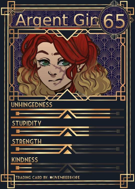
I did the OC trading cards for the two missing characters, now that they finally have names.
The other four can be found here
Still unsure about the power levels but Ellaria has a high power level due to her useful power rather than fighting skills, although I might have her get some training in the future. Ginny, on the other hand, is quick to battle and ready to throw her fists at anyone but at this point, she still needs a lot more training, so I've decided to rank her between Niara and Neri in terms of power. (Neri is actually quite powerful in the water so if only that would count, she would have top power levels!) Niara's will raise in time too, but for now they're all still learning.
Anyway, this is fun!
Check out the original post by @auxiliarydetective here and make your own oc trading cards. (I gave up on photoshop and used photopea). Check the original post for an amazing editorial on how to make these trading cards!
Now that they all have faceclaims I should probably have used those... but I already had four done and I wanted these to match, so I ended up using picscrew again.
#ocversetradingcards#artsy#photopea adventures#oc#original character#one piece ocs#opla ocs#one piece original characters#oc: argent gin#oc: argent ginny#argent gin#argent ginny#oc: ellaria#ellaria#my ocs#oc creator#my one piece ocs#trading cards#photopea#ocedits#artwork#my artwork#picscrew#fyeahonepieceocs
8 notes
·
View notes
Text
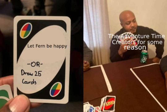
We haven't watched an episode with Fern as himself yet but this feels accurate nonetheless
#adventure time#the system edits#ant's screaming into the void#fern the human#by 'as himself' I mean like. as a grass boy#we've seen a few episodes with Finn sword. and with Fern pre-Finn sword as well#ignore my jank-ass editing. Photopea sucks#(we're not buying Photoshop. I don't do this often enough to care)#alright should I tag this as adventure time spoilers or not.#fuck it I'm tagging it as adventure time spoilers#adventure time spoilers
31 notes
·
View notes
Photo


"Now you will carry on his legacy."
"The way you lived was not my choice."
#ghost of tsushima#gotsedit#gamingedit#dailygaming#ghost of tsushima spoilers#iki island spoilers#oh my god photopea really DOES have video frames to gif capabilities now!! YAY!!!#it's not perfect but i'm sure it's gonna get there in the end!!#would be even better tho if i could make things completely from my tab 🥺#also when the hell did the br html tag not work on tumblr??? what???#seaofolives original#edit: not me editing this post just to say that i can make gifs from my tab now i just need to make the video res 720p max#but LOOK it has been an adventure this is very important to me!!!!
33 notes
·
View notes
Text
recently one of my favourite head canons has been aroace!Jason so i made some pfps for pride month!


Bonus!
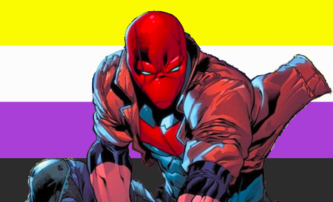
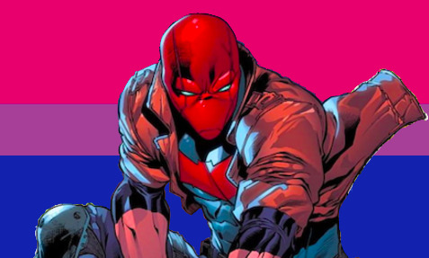

+ og image by Robert Atkins

#uhhh my first time doing this stuff so its shitty but. yeah.#made on photopea btw#jason todd#red hood#adventures in photoshop#aroace jason :)#aromantic asexual jason todd#aromantic#asexual#bisexual#pansexual#batman#robin#nonbinary#batfamily#my post
92 notes
·
View notes
Text

inktober day 11: wander
#art#artbyrewcana#artists on tumblr#my art#oc#tumblr art#original art#photopea#cat#cats#wander#wanderer#inktober day 11#inktober#inktober challenge#inktober2023#cat art#cat adventurer#adventure#cat person#kitty cat#dungeons and dragons#d&d#DND
6 notes
·
View notes
Photo

orion’s halloween party, 2022.
kiara santucci as... lemonade-era beyonce.
#waltstyle#photoshop still isn't working but at least we have photopea#❝ she's an adventure with messy hair and a wild laugh ❞ | wardrobe#❝ now that i'm free to be myself; who am i? ❞ | about
8 notes
·
View notes
Text

Messing Around with icon border styles. I kind of like this one.
#ooc#out of character#ash's adventures in iconning#just messing around in photopea#nothing is set in stone yet icon wise because i'm indecisive
0 notes
Text
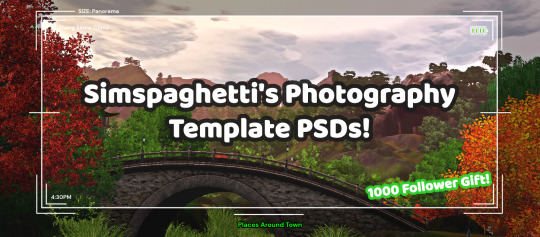
First of all, I want to say thank you so much for 1000 followers - that is truly a bonkers number I never thought I'd reach, thank you to everyone who interacts with my posts or follows along with my legacies or just occasionally sees my posts on your dash - I love this community so much, and I've felt so welcomed here since I joined simblr!! Mwah ily!
I come bringing gifts!! It's another PSD template, based off of the photography UI for Sims 3
I got the idea for this template way back when I was taking these screenshots in Gen 1 of my Blossom Random Legacy, and I figured they could really come in handy for people who are doing world adventures style gameplay :)
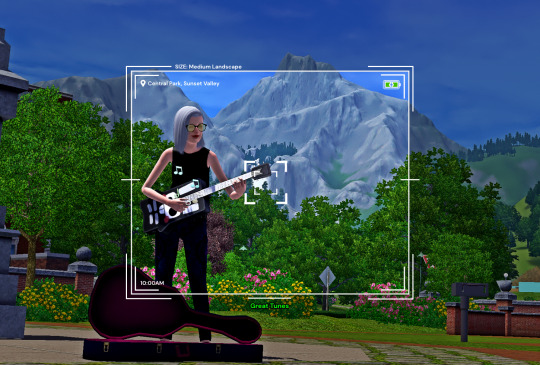
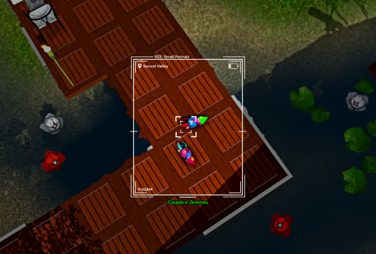
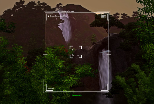
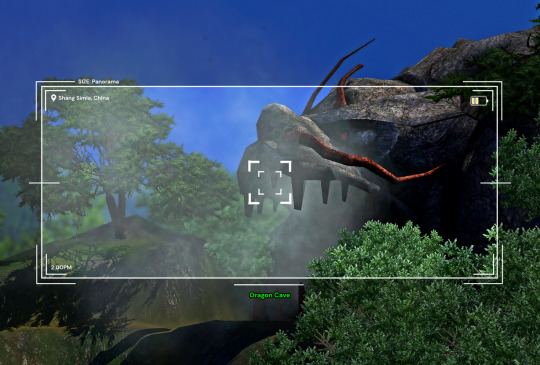
There are 4 sizes to choose from, each one is loosely based on a photo size in the game:
Medium Landscape
Medium Portrait
Panorama
Small Portrait
They're all on a 1450x980 canvas, but you can of course crop them however you want!
It's also pretty easy to create your own custom size if you want to, as long as you have a basic knowledge of photoshop tools - every layer is completely adjustable and customizable!
Terms of Use:
Please don’t claim as your own or reupload without my permission, and credits on posts aren’t necessary, but I’d love to see you use them in your game if you do tag me!
Alter and customize the templates literally however you want, but if you're gonna reupload a downloadable variation of them I'd appreciate a link back to my blog :)
The only font used in all the templates is DM Sans (bold) it can be found here
➡️ DOWNLOAD (Simfileshare, .psd files)
Instructions: These are .psd files, so you can open them in photoshop, photopea (my personal choice of editor), gimp or another similar photo-editing software
Then just place your image at the bottom of all the layers
You can alter the text in the boxes to whatever your needs are, I recommend referring to this page on Carl's guide to see all the photography collections which inspire the green text! :)
52 notes
·
View notes
Text

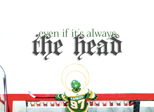
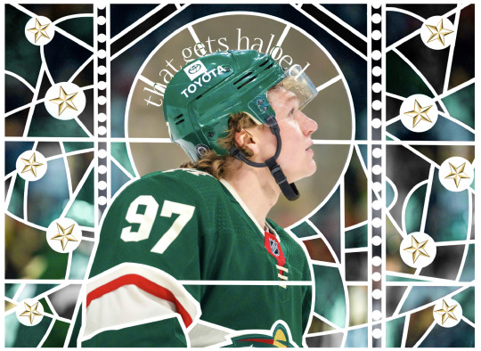
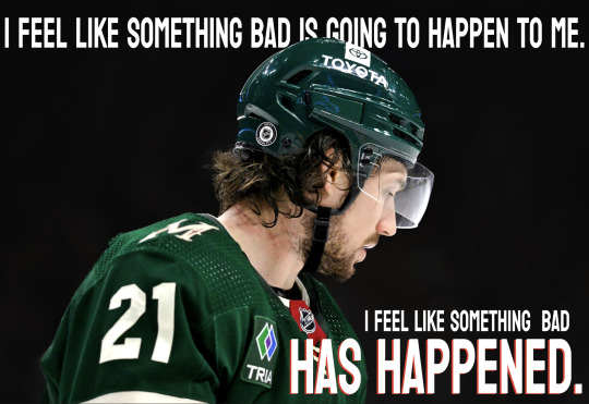
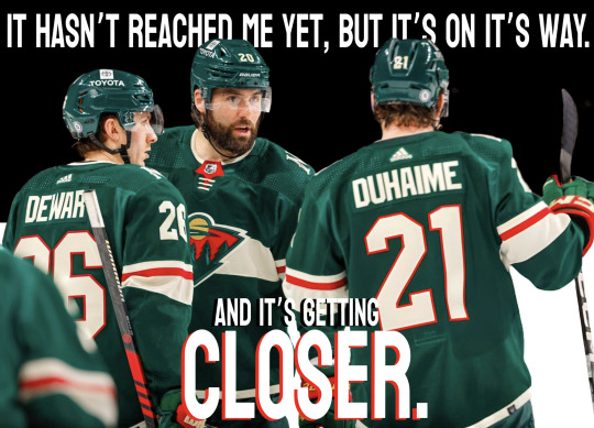
God makes more sense this way.
C.T. Salazar, "Self-Portrait as Headless John the Baptist Hitchhiking"
#joy gjør ting hun ikke kan :)#minnesota wild#hockey poetry posts#kirill kaprizov#photopea adventures
128 notes
·
View notes
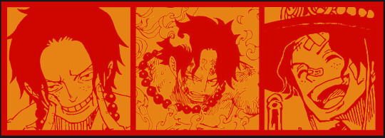
Text
The Fledgling Hawk Falcon

@supermarine-silvally allowed me to make a trading card of her amazing OC, Bravada Yara! Also, huge thanks to @oneirataxia-girl for providing the image edit!
Taglist: @starcrossedjedis @oneirataxia-girl @daughter-of-melpomene @bravelittleflower @box-of-bats @supermarine-silvally - let me know if you’d like to be added or removed!
17 notes
·
View notes
Text

made with this template
#oc#original character#my ocs#my art#my artwork#oc creator#oc art#oc artwork#photopea adventures#oc: ellaria#ellaria#one piece oc#opla oc#one piece original character#one piece revolutionary army#revolutionary army oc#one piece oc art#fyeahonepieceocs#ocappreciation#i know it's all simple but i'm just figuring this out at the moment#i used to do real overloaded edits back in the day with tons of text nobody could read lol#those were they days lol#anyway simple and clean suits my vision girl well i think
2 notes
·
View notes
Text

hai everypony! ^_^ may i ask for a promo? i am a new editor (not new to tumblr) practicing my editing skills! >.< i use photopea && (sometimes) ezgif :3c i am willing to do rentry graphics && layouts! i currently have no blacklist or whitelist as of now but i will freely decline any requests as i please n_n my requests are currently open but ONLY for one piece, jojo's bizzare adventure, overwatch, jujustu kaisen && project moon games. :3c
ask to be removed ~ @iv-ry @kiochisato @daintykill @cherryshh @lavendergalactic @atlascasino @strawberrymedicine @stellaimuse @p1nk-sugar @vashwoodyuri @yaoitistic @metalbody @i43furi @necroangelz & anyone else who wishes to! it is much appreciated :3c
psd credits
33 notes
·
View notes
Note
Heyy, I’ve been reading your wonderful one piece works for a while — and I couldn’t stop wondering how are you actually doing those magnificent headers?
Like… hello? The great quality, with additional 3D-alike details I could catch by my eyes? I got only Ibis Paint X on mobile, since I’m only a young man that literally two months ago went on a life-time ‘adventure’ of living alone in a small apartment.
In short — I got no money to pay for additional graphics/drawing programs, not yet at least
Hello!
Thank you! I'm glad you enjoy my writing - I'm curious to know what's your favorite piece / part? Also I'm so happy you like my headers? Makes it feel worth it to spend time on them! :D
I have excellent news for you, I used a mix of Canva and Photopea. They're both FREE!
I'll be explaining the process for making these two kinda? The full tutorial is below the cut, to be courteous to the other folks, hope you don't mind?
Though I am hearing that Canva has given people some grief. But Photopea is just *chefs kiss*
If you've ever used photoshop, Photopea is essentially a free photoshop, and it even has the automation tools! An absolute lifesaver when you have multiple layers you want to export (but that's for larger projects not this)
I'm going to assume you have basic knowledge of layers in digital drawing programs for this. If anything isn't clear: ask me, I'll clarify!
//-------------------------------------------------
My General Process is:
Search for official art / images
bring it into canva / photopea
crop / arrange images to match the dimensions
select a thematic color that is associated with the character
separate the foreground from the background
mess around and test things until they work
//--------------------------------------------------
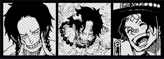
Given "Louder than Words" is the latest one I've made, I'll start with the process for it.
Dimensions: 3000 x 1055 px
dpi: 96
//-------------------------------------------
Let's Get Crackin'
Alright let's grab some official art so we're not using any fanart without the artist's permission
I try to pick images that feel relevant enough to what I'm trying to make.
For example: the image for the Matching banner shows the ASCE tattoo which is super important in that fic
2. Let's arrange them onto a banner where each individual image has the same/similar dimensions to the rest
That's probably part of why you like these. To a certain extent they have similar dimensions, so they have a uniformity that's pleasing to the eye! (It's not perfect because I threw perfectionism to the wind because this is tumblr not my portfolio)
Tip: if you have 3 images and only 2 that have similar dimensions, and the 3rd one can't be cropped logically: but the one that's a different aspect ratio in the middle!
3. lets arrange them in such a way that the borders all feel like they're the same/equal width/thickness
you might find that you have to shrink some images for this, that's fine.
ALTERNATIVELY: if you're going with one image crop it so it's just the relevant info and it matches the dimensions (3000 x 1055 px)
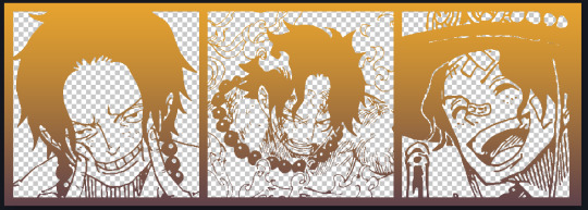
We have our base! Now let's add some color, and direct the viewer's eye together!
4. pick out a color that you think matches your character / vibe - that color is going to be your background
Given I'm making an Ace banner: orange is the color I'm going with
I went and named my layers for this lol. The numbers represent the opacity, and they aren't important. I just kept changing the opacity until I liked the way things looks. But here's the secret to the 3D feel:
Motionblur (+ moving it about)
Separating the foreground and background and dulling out the background.
I'm going to show you my process so you can see the effects, but first let's give you some quick skills:
//------------------------------------
SKILLS / THINGS I THINK ARE HELPFUL
//------- Select Similar
magic wand -> select something -> right-click -> select similar
This works best when you have high contrast images (like manga panels that are black and white). You can select the black or the white areas. Depending on what works better for you.
TIP!
Invert selections with ctrl + i
Say you know that you want to select everything but Ace's face in the second panel. Select his face with the magic wand then ctrl + i, and that's the only thing NOT selected


TIP!!!!!!!!!!!!!!!
Please, please, please, duplicate your original image and work on the duplicate layer. This helps you SO much. !!!!!!!!!!!!!!!!!
TIP!
Check your selection tolerance! This could be why too little, or too much is being selected.

//------- The Move Tool
Shortcut key: v
While the move tool is active, you can nudge the stuff on whatever layer with your arrow keys
Shift + arrow key = 10 px move (generally)
//------- Layer Locking
1- Layer Blending Mode (see Overlay vs Multiply vs Normal) for how this can affect results)
2- Opacity: how see through it is / isn't
3- Lock Transparency (it's the little checker board)
4- Lock Layer (looks like a lock)
5- Lock icon that appears when anything on the layer has been locked
More on 3 Lock Transparency: You can only paint on / modify what's on that layer. You CANNOT add anything to any area that is already transparent
Here's a demo of what you can do with this power:
Here's the original Image - notice how it's just the lineart with a transparent background.
It's powerful: abuse it
//------- Overlay vs Multiply vs Normal
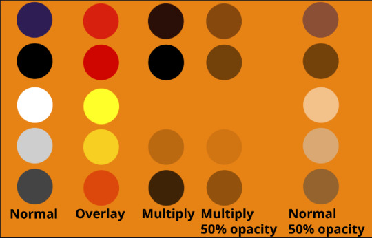
I think seeing this is the best way to visualize how different modes can affect the color.
//--------------------------------
Back to the Tutorial
!!I IMPORTANT NOTE !!
Please play around with the opacity slider to figure out what opacity works best for you on the multiple different layers we're about to make / work with. It's up to your own style to figure this out.
Next: please feel free to not follow all of it. Add more layers, add less layers, take the base principles and go wild! :D
5. Separate the lineart from the background and save it as a new layer
6. Duplicate it and set it to overlay, or set it to overlay immediately
7. Duplicate that lineart layer twice and set the blending mode to overlay
8. lock transparency on the top one and change it to be a dark grey
9. Apply motion blur to both:
Main menu bar -> Filter -> Motion Blur
I made it so that the grey layer was blurrier than the black layer
10. More them around a little to give it a "3D effect" as you called it.
It creates shadows under the lines - I was aiming for an effect similar to chromatic aberration (chromatic aberration is a valid way to add punch to your stuff too!)
So this is what things look like now - painful, but let's keep going
11. Duplicate the ORIGINAL / BASE lineart layer, that you DID not apply motion blur to -> set the blend mode to multiply (reduce opacity for it to actually take effect)
okay that's less painful
here's what the layers look like right now:
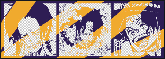
let's bring more focus to Ace's face, and push the background farther away:
12. Use the magic wand tool to quickly select large areas of the faces / focal area / foreground and the lasso tool to refine things
TIP!
Hold shift + click -> add to selection
Hold Alt + click -> subtract from selection
13. On a new layer with blending mode -> lighten, fill that selection to be white
If you look at it, you'll notice that it is ALREADY starting to draw our attention to his face, but the background is kinda aggressive, so let's dim that down
TIP!
Right-click on the gradient tool to find the paint-bucket tool

TIP!
Sample All Layers:
Turning this option off makes it so that you only work with the content on THAT specific layer. Turning it on makes it so that it is working while taking all other layers into consideration.
14. ctrl + click on the "white foreground" layer to select the contents of that specific layer (pink thing is your mouse)
15. ctrl + i to invert selection and ON A NEW LAYER (layer mode -> multiply) fill that with a complementary color
16. I did one last thing where I took the original base (before we separated the lineart) and added it to the very top and played with the opacity to get something less in your face (layer blend mode was set to NORMAL)
And that's it!
More considerations that I take:
I want the banner to be "thin" or not square, so it doesn't take up too much screen real estate on people's devices
I don't want readers having to scroll too much to get to my writing (which is the whole point of the post, let's not waste their time making them look for things)
I want the banner content to be relevant enough?
ie: with Matching: I wanted the ASCE tattoo to be visible. With matching I wanted Ace to not look too happy in some of them.
I'm also trying to avoid spoilers, I hated getting things spoiled, so I'm trying to be careful that the images I pick don't spoil anything really.
Congrats on starting life on your own! I did that whole living by myself thing too! Tip: keep the pantry stocked with lentils, beans, pastas, baking essentials, rice. They really come in a clutch when you're hungry.
#photopea resources#photopea psd#tutorial#tutorials#tumblr banner#photoshop#photoshop tutorial#digital art#fuck adobe#adobe photoshop
9 notes
·
View notes
Note
do you have a guide to making your animated comic edits?
i don't, actually! in part because i'm relatively new to these parts and no one has asked for one, and in part because every gif i do is kind of a unique little adventure into teaching myself a new skill, so there isn't just one approach. but! i'm delighted that you want to know! so i'll try and walk you through a couple of them.
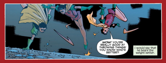
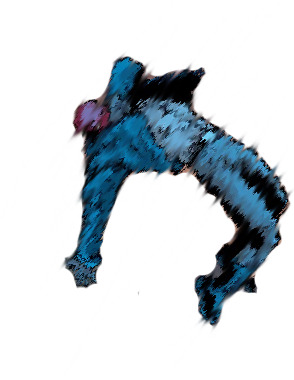
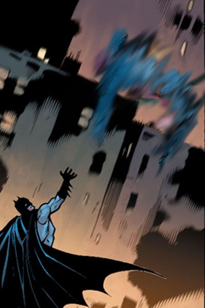
we'll start with this guy, because he's a favorite of mine and showcases a lot of the steps that i usually have to do:

tools you'll need: photoshop CS6; digital versions of the comics you'd like to edit.
(i assume you can use any version of photoshop or any editor capable of creating gifs, but CS6 is my preference. photopea is a fantastic free alternative, but figuring out timing and transitions is a lot harder there and requires more effort.)
step one: find your panels and elements
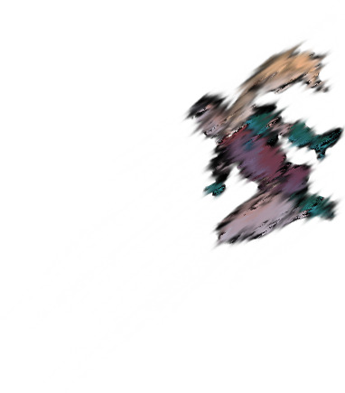
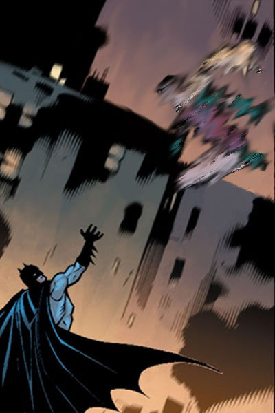
it's worth noting here that i cannot - and i mean this - cannot draw. at all. a lot of my life would be easier if i could, but here we stand. as such, nearly every element of these gifs is pulled from the comics themselves.
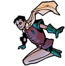
for this particular gif, which is admittedly on the simpler side, i needed two things: the initial panel, of jason leaping into the air, and a still image of jason as robin. preferably from the same run with the same artist, because that way, the art matches. i found these:

and that's all i needed for this one. sometimes i need to pull several panels for the vibe i want, or for specific things -- leaves to drift through the frame, magical elements, text and sound effects, speech bubbles, etc -- but adding those in follows pretty much the same processes either way.
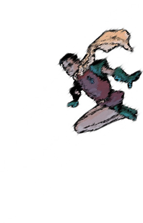
step two: prep them!
easier said than done, really. what i needed to do here was make myself a blank canvas around the elements that i would be messing with. this varies from project to project, but for this one, it goes as follows: remove the narration box and jason from the first panel; create an isolated version of jason that can be pasted back in; create an isolated version of robin that can be pasted in the same place at a similar angle.
this is a lengthy process, because i work off my laptop and have a touchpad and no artistic skills. here, it requires drawing in a lot of building and making a successfully blurry, ombre sky. and, because robin!jason's toes are cut off, i have to draw those in and try to match the shading.
(there's also some work here with color balance and photo filters to match coloration; i had to add some highlighting and change the colors on robin!jason a bit to match the background lighting of the overall image, but not by much. sometimes, this step is more involved.)
after some fiddling, i usually end up with things i'm happy with. for this gif, those are as follows:


(this is done through the blur tool, the magic wand selection tool, refining the edges of a selection, or -- in many cases, because comic lineart is my enemy - erasing every pixel of the background or character by hand. yes, there are easier ways to do this, but i like my time-consuming methodologies. they're soothing to me.)
and now we're ready for the fun parts.
part three: assembly!
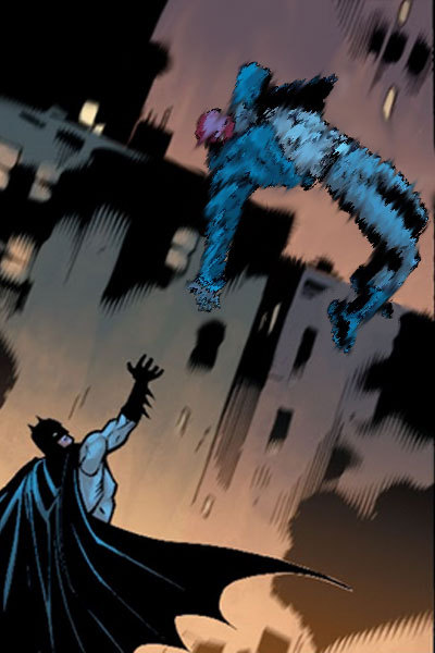
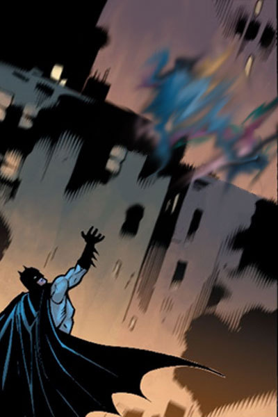
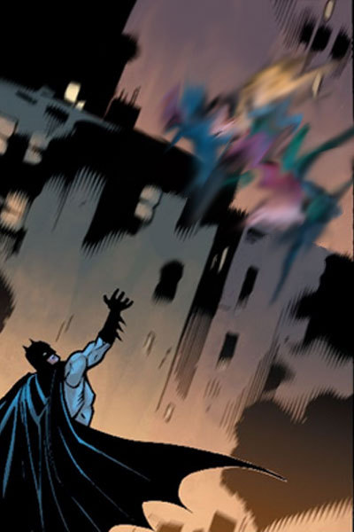
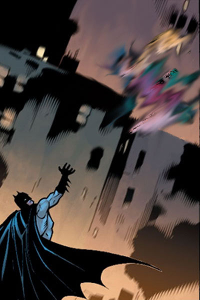
so we take that background we just made and we paste hood!jason back on it on a new layer. silly that we have to, but yknow. it's fine. he's in there. and now the goal is to find a way to successfully transition from hood!jason to robin!jason in a way that's satisfactory.
i follow a lot of standard gifmaking practices, i feel like? but i'm also self-taught, so i actually don't know how true that is. i create a timeline in photoshop and set it to have a delay of about 0.2 seconds to start with, just to see how the transitions go. i usually start with 10 frames, and then add or remove depending on what seems right.
(the variations here can be broad, by the way. i have a green arrow gif with 140 frames with no delay and a wonder woman gif with six frames on a one-second delay, for example, but those are for another time. starting with 0.2 seconds' delay across 10 frames is just a comfortable starting place for me, is my point.)
this is what the timeline looks like for this project:
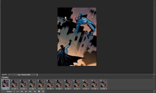
(it's that bar at the bottom. you can see the settings and all that as they appear in the final product: 0.1 second delay over 12 frames, so not too far off from my default. nice.)
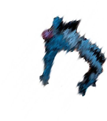
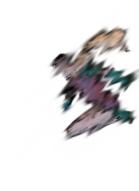
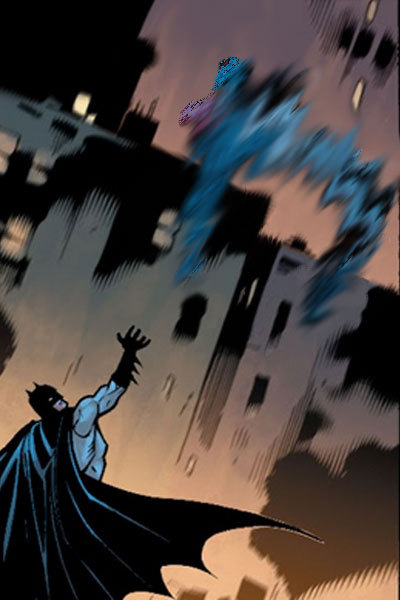
operating within that 10-12 frame range, i mess around with photo filters and the blur tool to both make hood!jason disappear and make robin!jason appear. this involved a heavy use of the "accented strokes" setting in the filter gallery and smudging and blurring until they looked how i wanted them to, which is to say, rather silly.
here's red hood vanishing:


and here's robin appearing:

there are a few additional versions of these, but i think you get the idea. these are all the bits and bobs, and i just have to lay them out in the timeline in order to get the transition as i'd like it to be.
so i start with jason as hood, and then i move through the timeline and click and unclick the little eye to view them. this is also a heavy process; this gif has about twenty layers, and i'm revealing/hiding each one individually. that is actually not as bad as it could be; one of the poison ivy gifs i've published has about 600 layers that i did that with, and i have a green arrow gif with about 800 layers and 70 frames that i didn't even end up publishing because i wasn't happy with it. c'est la vie.
the end product should look something like this:


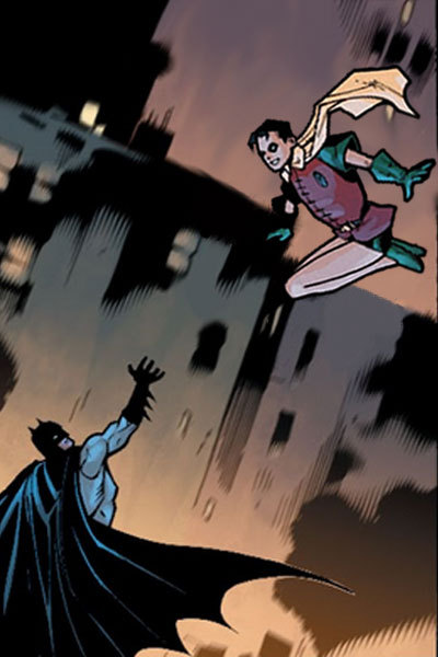
which, when played at 0.1 second delay and looped, looks like this:
part four: in conclusion...
i recognize this "guide" is messy and skips over quite a bit, but that's because every gif really is its own beast. i am very familiar with trial and error, and with trashing things that don't end up working out. each gifset takes me about 10-12 hours, depending on complexity, without even counting the time to track down panels or read the comics themselves.
if you want to start with something simple, i suggest animating text bubbles. all you have to do for those is erase them from the background and then drop them back in over the top for about 0.5 or 01 seconds apiece for readability. this gif of mia, for example, was just isolating her from her background, creating a new background from a different panel, and then flipping the text on and off. it's got five frames on a 0.5-second delay.
basically... fuck around and find out. a lot. once you know how the gif timeline works and how to hide/reveal layers, the world is your oyster, because that's all this is.
again, i know this is messy and all over the place, but i hope it helps! have a little fun with it, and don't be afraid to mess up. it's fun either way. <3
#tbanimations#how to#ask.tb#elioherondale#i am always down to talk about how these got made so if there's a more specific one you had in mind...#feel free to ask about it#i am an open book i like discussing the things i make
9 notes
·
View notes
Last Seen Blogs
foodieshubs
Tasty Indians Foods
hamsatpic
هَمسات
starofsound
Starburnt's Art Crater
morbidpublic
Morbid Public
zioandsons
ZIO AND SONS