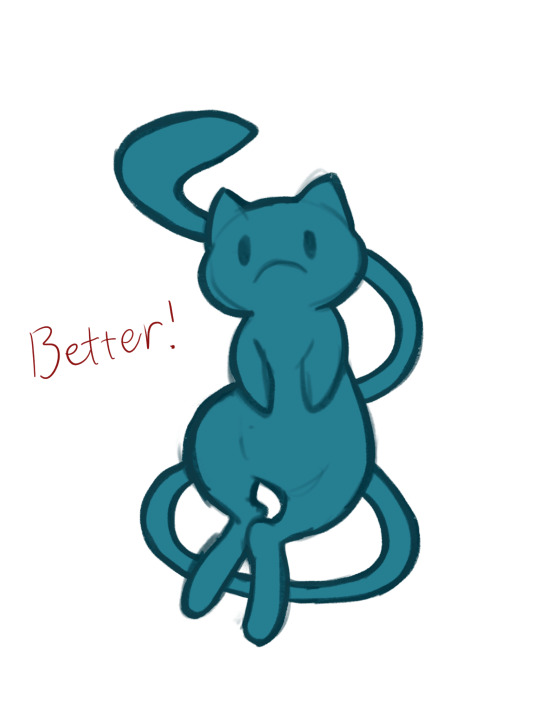
#procreate's handy like that <3
Text
(flashing video!)
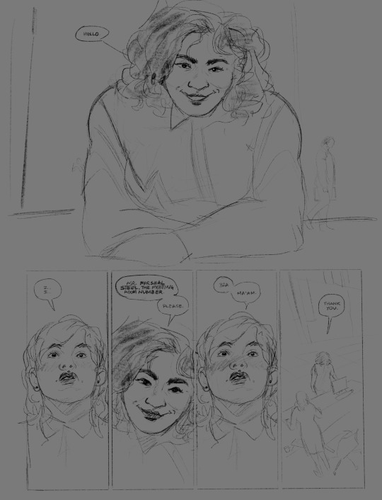
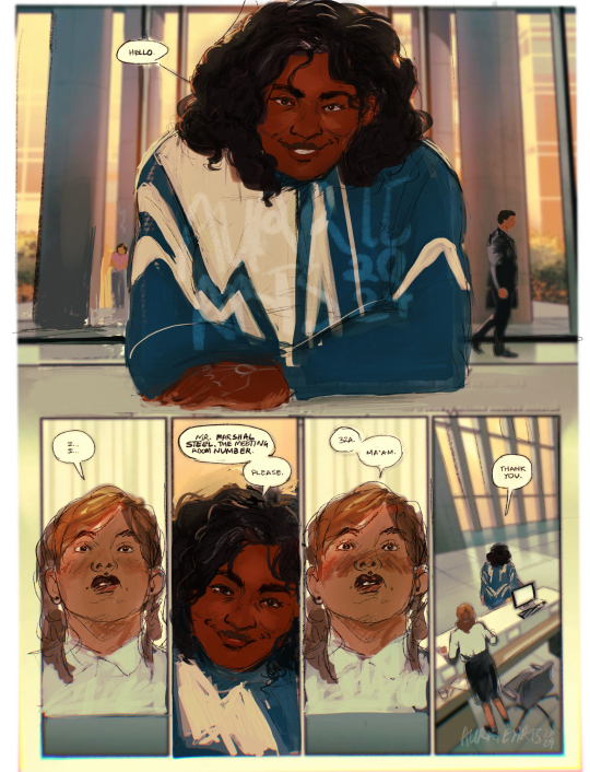
i did a timelapse of the julia comic redraw so you guys can see my process
#my art#fallen hero#fhr#julia ortega#charge fhr#art process#procreate's handy like that <3#flashing video#undescribed#aurrie's art
49 notes
·
View notes
Text
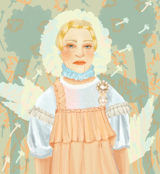
#more late nite bullshit feat my intense desire for the entirety of simone rocha ss23#and a ruffle collar#and a mound of pearls#and a silly little dye job#I really hc that fashion tm is just how wizards (gender neutral) dress#like when dracos dad went to wizards (gender neutral) jail (take 2) draco raided his whole closet and that shirt was in there#one of the ruffles started to detach and so Draco asked Harry to please sew it back bc he knows how to do stuff like that#v handy#gets way too into like#home repair w Grimmauld place and grows up to be that friend that gifts every one a fully stocked tool box as a housewarming gift#and then ends up using them himself bc he’s also the friend who will rent scaffolding to help you reside your house or w/e#I think I’ll draw toolbox Harry next 3 am#I digress#anyways he gave back the shirt and love you was stitched on the front#<3 and now it’s dracos favorite#draco malfoy#harry potter#drarry#hp fanart#i am working my way slowly thru all the procreate brushes :>#also the outfit isn’t 1 to 1 from the collection I chopped and screwed it aka made it significantly worse#this rly feels like what my old hs art journals looked like#lots of almost straight on portraits w haloish additions and half assed backgrounds#I feel like I should b writing the date and time on the back of a th page#instead I’m writing a whole journal entry in the tags#stop me
44 notes
·
View notes
Text
I am deeply touched that so many people enjoyed my little animation of Technoblade. I genuinely didn’t think that my post would get spread much, if at all, so thank you from the bottom of my heart for reblogging it and giving me such kind words.
While Procreate does include a playback feature, unfortunately the playback for how I animated this is 45 minutes long and well beyond the capacities of tumblr’s compression and limits. And since I don’t yet have a YouTube channel to host such a lengthy video, the best I can to is provide this quick and dirty breakdown of my process.
I animate the roughs in procreate and you can see that I am VERY loose with my initial pass. I often forget if I’m drawing him with 4 or 5 fingers, I changed his outfit halfway through the animation from a draping cape to a coat, and proportions fly all around. The most important aspect of this initial pass is just to get the timing and movement right.
I then do a second cleanup pass. It is not shown here, but this is what the lineart will eventually be based on. This pass is to refine the art and solidify it. Fix anatomy issues, those finger and clothing issues, and just generally work on sticking closer to the model I had chosen for my reference.
Then I do the lineart pass. I did this in Procreate Dreams by importing the animation as a video, lowering the opacity to 50%, and using it as a guide for the lineart. Here I refine the animation further and clean up any lingering problems.
Finally once the inking is done I color the animation. In Dreams I realized that groups are a godsend for this process. Every color was its own separate layer. But once I finished a layer I could group it together and Dreams treats it like it’s own singular track on the timeline. Then once I finished another color I would group those together with the group I already finished. And then again and again and so on until eventually I only had one layer for all the lineart and color. But if I ever needed to fix anything I could expand those groups and go directly to the frame in question. It’s a really handy feature!
Because he looks out the window at one point I wanted to have the light cast shadows on him. So I colored all the frames before and after the window in a darkened pallet, and the frames where he is at the window in the actual colors. Then I animated a shadow layer that I placed over those frames where he’s at the window at 30%.
For the background I drew an extra wide scene in Procreate and imported it into Dreams. I included an outside, and inside, and three curtains. Two closed, one open. With all of this in Dreams I then added the camera move, and a warp effect on the open curtain to make it seem like it was pulled open quickly. It was surprisingly easy to do!
As a final touch I added a reddish tint to the end when he goes full crazy.
If anyone has any questions about the animation process, or about Dreams or anything, please feel free to ask and I’ll do my best to answer as I can.
Again, thank you for enjoying this animation. I’m deeply touched by the response.
As an added bonus, here’s my 3 favorite smear frames!

#procreate dreams#procreate#animation#2d animation#procreate animation#hand drawn animation#dreams#technoblade never dies#technoblade#Minecraft#mcyt
188 notes
·
View notes
Text
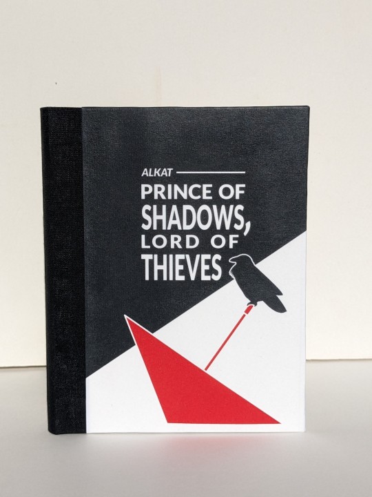
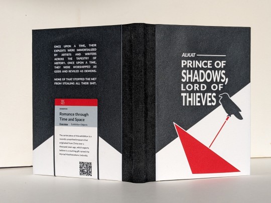
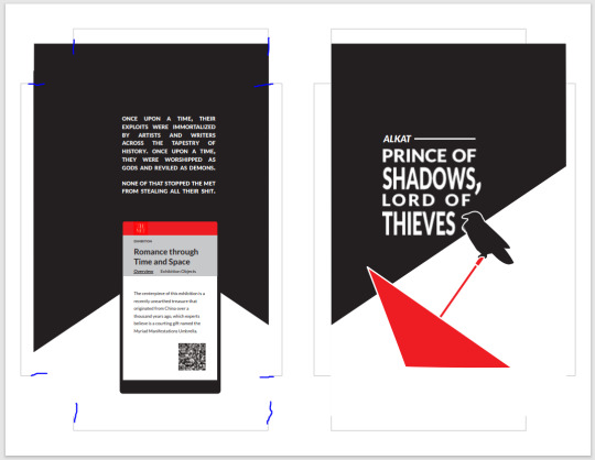
Prince of Shadows, Lord of Thieves by alkat
Fandom: The King's Avatar | 全职高手
Rating: Teen And Up Audiences
Category: Gen
Words: 1 929
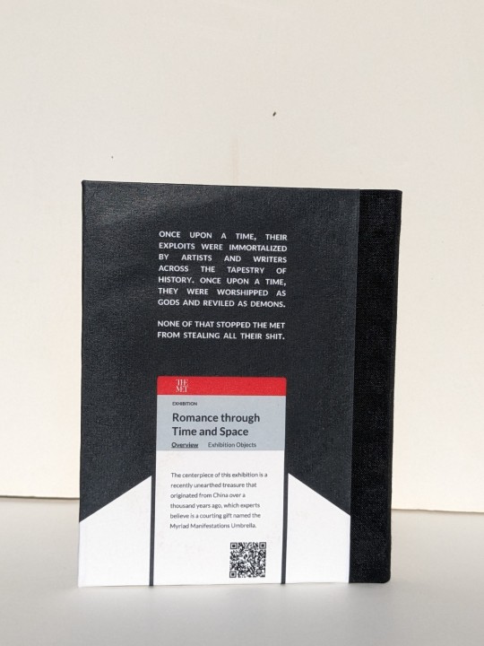
Once upon a time, their exploits were immortalized by artists and writers across the tapestry of history. Once upon a time, they were worshipped as gods and reviled as demons. None of that stopped the Met from stealing all their shit.
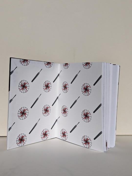
About the Book
FONTS: Alegreya [Google Fonts], Lato [Google Fonts]
IMAGES: all art made by myself @greenhorn-art for this fic
MATERIALS: regular ol' printer paper (8.5"x11", 20lb, 96 bright); ~2-2.5mm binder's board; Neenah cardstock (8.5"x11", 65lb, bright white); Cialux bookcloth (black); waxed linen thread (30/3 size, white); wheat paste (1:4 flour:water); paste wax (from a friend, unknown ingredients&quantities, some kind of wax and turpentine/mineral spirits)
PROGRAMS USED: Affinity Publisher 2; Affinity Designer 2; Bookbinder JS | Renegade's Community Imposer (settings: Quarto, snug against binding edge, custom signatures of 2, 1, 2 sheets).
Text & QR codes printed with colour laser printer (duplex, flip long edge), images printed with inkjet printer. QR codes generated with LibreOffice Writer, snipped, saved, and inserted where needed.
BINDING: quarto (quarter-letter) size, sewn board binding with french link stitch and breakaway spine.
.
So this one all started because the visual of HST's outfit was so fun that I was possessed by a visceral need to draw it. Inspiration slapped me across my mind's eye, and much like a medieval knight being slapped in the face by a glove (which didn't actually happen, that's a myth that sprung from the throwing down of a gauntlet. but that's beside the point), I felt bound to take up the challenge. Which lead me to draw a few more, and then I ended up binding the whole thing.
(Also, I find it really amusing that the famous Terracotta Warriors were just storage for YXs stuff. And the gang going 'shopping' at various exhibits for gifts for friends/family,, like that sure is SOME window shopping! I can hear it now: 'Oooh I'll take one one those SMASH, and that SHATTER, and throw in some of those CRASH, they're going to love these! 😇'. All in all, it was a fun little read, and fun little project! :D)
About the Art
Because this was initially a one-off drawing I tried a new art style (and struggled to at least not stray too far for the rest). It was fun and helped me think more about shape and visual focus, instead of being caught up in the details.
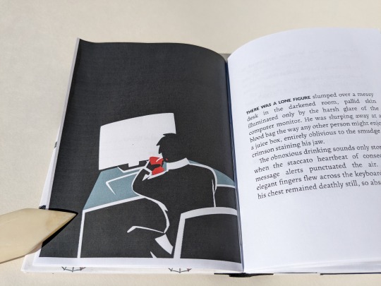
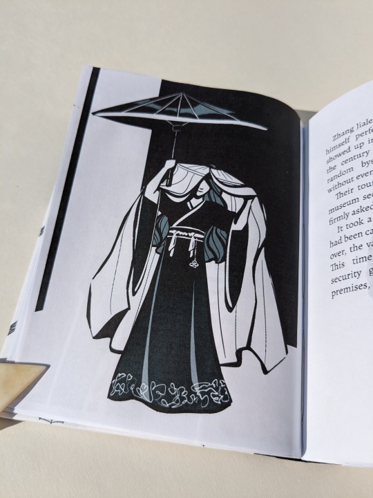
The crow (based off of image ID: 4039963 from Rawpixel) and the red umbrella on the front cover were filled curves made with the pen tool. The illustrations' poses were based off of a combination of images found on Google and photos taken by myself.
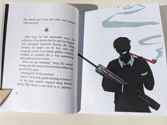
Pinterest is awful for sources, but it would have been handy to pin the references I'd googled. Only remembered to save the one of a man sitting at a desk. (I deliberately searched for someone sitting with bad posture because YX is described as being "slumped" over the desk. I figure that since "the laws of physics held no meaning to ["cursed souls eschewed by the natural order"]", they'd also be immune to mundane things like discomfort from sitting hunched over for too long. Back pain images were a gold mine! All I had to do was choose one with lighting that would give me a silhouette.)
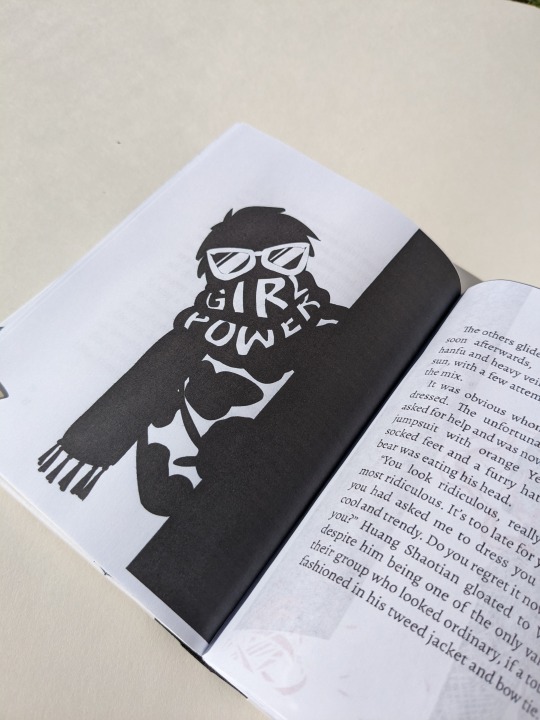
The Myriad Manifestations Umbrellas and illustrations were drawn in Procreate.
I opted for a more plain umbrella design because it's not (presumably) a fantastical weapon in this story. Though the initial version did have YX cradling the donghua!MMU.
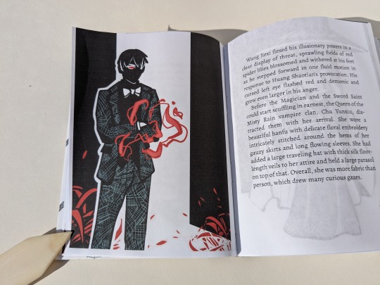
For the scene breaks I inserted the images, pinned them inline as character, and adjusted height and baseline in the pinning menu to fit.
The author wrote one scene break differently than the others, using multiple empty paragraphs instead of just one. Following suit, I used a different image for that particular break. I wanted to reference vampires somewhere, so for that break I made two bloody spots resembling bite marks. The blood spots were made with a group of shapes in Designer.
On cover design:
Because the MMU is what sparks the whole heist, I wanted it on the front cover.
Earlier iterations involved a full cover spread with a man's shadow standing before a shattered glass case, with a plaque mounted on the wall to the left providing information. The plaque was formatted like a museum label and had the author, date published, title, event collection, and story description. I'd also added a QR code to it. Ultimately, I abandoned the concept because it was difficult to decipher what is was when only looking a one cover at a time.
My second idea for the cover would have been a bookcloth-only cover with a cut-out of the MMU on the front, acting like a window showing off an image of the MMU on paper below it. (Inspired by the work of a number of folks over on Renegade's Discord. Here's a few examples gleaned from a quick search: szynkaaa's lung cutouts, some of EHyde's books, and the front cover of Spock's massive all-in-one TGCF). As fun as that would have been to try out, I felt it didn't quite suit the style of the art so I nixed that too.
Eventually I landed on the back cover design with the Met exhibition webpage. At last, I felt that the back & white and simple-shapes-background went with the artwork. The webpage viewed on the phone is based off of the Met's actual website. I took a snip/screenshot of the Met's logo from the banner at the top, then looked at their exhibitions' pages and eyeballed it to create my own. (Threw in the QR because I wanted the easy access to the fic online on the back cover). I chose to use a phone screen rather than I computer monitor because it worked better composition-wise. And besides, while YX may be allergic to owning a phone, SMC is not. I imagine that she saw the news while on her phone then messaged him.
The front cover came together after that. An umbrella for the MMU, and a pop of red. One of YX's messenger crows. A black shape in the background similar to the back cover's, sort of creating a spotlight over the umbrella and placing the rest of the cover in shadow.
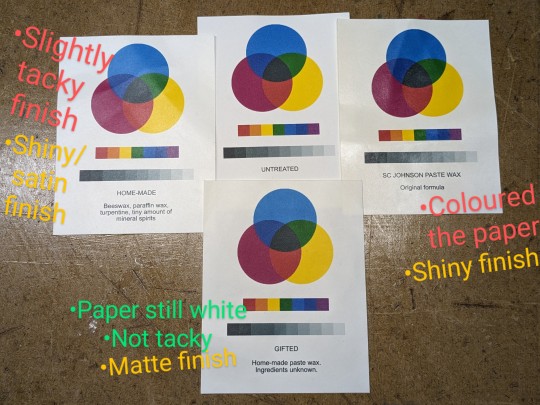
Trying New Things: Applying a protective finish to printed covers
Over on the Renegade Bindery Discord, folks have spoken about using a beeswax & turpentine/mineral spirits 50-50 mix to seal printed covers (thank you Kate). According to my dad that's just a paste wax, so he threw 3 different ones at me and said 'have at it'.
I tested them out using the same paper and inkjet I'll use for the cover. I was looking at 1) whether the paste wax affected the paper colour or print quality, and 2) the finish. After applying one coat each and buffing them out I had my winner. Then I applied & buffed two more coats to it and tested 3) water resistance by dripping tea on it. The liquid beaded up and wiped away without staining -- good, three coats will work nicely.
(Test results: Mystery paste wax from a friend wins.
The commercial SC Johnson Paste Wax Original formula (intended for woodworking) has a nice dry shiny finish, but coloured the paper slightly brown -> disqualified
My dad's homemade stuff has a nice shiny/satin finish and didn't change paper's colour, but it felt slightly tacky even after buffing it -- maybe I didn't buff it enough?
The gifted paste wax has a matte finish, didn't change paper's colour (in the image below this one has 3 coats. The paper is now slightly off-white, but still acceptable), and while not as dry-to-touch as the Johnson it was not as tacky as the other homemade stuff.)
When I print out my quarto covers, I print front and back covers side-by-side on the same page*, with some guides to ensure I'm cutting and gluing in the correct place. (The guides mark the boundaries of the covers and start of the turn-ins, and stop at the edge of where I cut. Before cutting I flip it over to mark the guides [see marks indicated in image below] on the wrong side and connect them so I can see where to glue/place book. Then flip it back over to cut, right side up.)
*I'm being economical here at the cost of possible warping damage. This layout means that I'm only using one sheet of paper, but the grain is running in the wrong direction (across the book instead of preferred head-to-tail/top-bottom). This could cause warping issues, but I'm OK with that. I'm hoping that by just gluing at the edges, instead of pasting down the whole thing, warping will be minimized. (I use wrong-grain endpapers most of the time with larger books anyways).
I applied the paste wax before cutting out the covers, working carefully to avoid accidentally creasing/bending the paper (which happened twice, but it was minimal and I hardly notice it). Doing so before cutting ensured that the cover material was completely covered. Even the turn-ins -- something I later came to regret. After all, wax is used specifically so that things don't stick to it. It made it rather difficult to drum on the endpapers because I was trying to glue something down onto a waxy surface. It all worked out in the end -- perhaps due to the fact that there were multiple layers of wheat paste which could adhere to each other, followed by being squashed in a press.
92 notes
·
View notes
Text
We Don't Gatekeep Art Resources | A Comprehensive List
Here's a list of some of the tools/sites I currently use or have used previously for works/studies. I'll separate it into Software/Utility, Reference, and 'Other' which will be just general things that could help you map out things for your experience with art.
**[Free highlighted in pink, paid highlighted in green. Blue is variable/both. Prices Listed in USD]**
Software/Utility:
2D
Krita Painting app (PC) (my main digital art software on PC for 5+ yrs)
Clip Studio Paint [PC] [CSP 2.0+ allows for 3d modelling within the painting app and a lot of other cool features] [apparently allows up to 6 months free trial]
Procreate (12.99) [iPad/iPad Pro] (the GOAT)
Artstudio Pro [iPad/iPad Pro] (An alternative to Procreate if you enjoy the more traditional art app layout) -- I find this app handy when Procreate is lacking a feature I need, or vice versa. (you can easily transfer files between the two, but keep in mind Procreate's layer limit)
2D "Collaborative Painting/Drawing apps"
Magma Studio
Drawpile
Discord Whiteboard
Gartic Phone (Pretty decent for 2d animation practice, but has a hard limit on frames)
3D
Blender [3D Modelling, Sculpting + Layout] (PC)
Sculptris [PC] (it's an old unsupported version of Zbrush, but can help to get ideas out, and functions better than browser sculpting apps
Nomad Sculpt [iPad/iPad Pro] ($20) Works pretty well if you prefer a mobile setup, but it is a bit intense on the battery life and takes some getting used to
References + Study
Magic Poser [ PC and Mobile ] Has both free and paid versions, I've made do with just the lite version before
Artpose ($9.99) [Iphone + Steam]
Head Model Studio [IPhone] A 3D head, with both a basic blockout version for angles, and a paid version with more detail
Cubebrush [simply search "[keyword] pose reference pack"], they usually have good results + they frequently have sales!
Line of Action [Good for Gesture practice + daily sketching], also has other resources built in.
Quickposes Similar to Line of action, more geared toward anatomy
Drawabox | Perspective Fundamentals Improvement modules (Suggested by @taffingspy )
Sketchfab, this skull in particular is useful, but there is other models that can help you study anatomy as well.
Pinterest can be good, you just have to be careful, usually you're better off just finding reference pack if you have the money, sometimes certain creators have freebies as well
Artstation Marketplace can be decent [make sure to turn on the Aye-Eye filter so it doesn't feed you trash], a colleague of mine recommended this head model for practicing facial blocking, there is also this free version without lighting.
Local Art Museums [Unironically good for studying old "master work" if you're into that, or even just getting some inspiration]
Brushes + Other Useful software:
I personally have used both of these brush packs before making my own
(I actually don't know how to share my daily brush set because I frequently switch between Krita, Procreate, and ASP, but once I figure that out I'll be sure to do that lol)
Marc Brunet's Starter brush pack [Technically free but supporting him for this if you like it is ideal, there's some good brushes]
Dave Greco Brush Pack [$3]
Gumroad in general is a good place to find brushes and art resources. *Note; for Krita specifically, brush packs are a bit weird, so it may require you to find different packs, or import them in a particular way
PureRef [PC] - Reference Compiler/Moodboarding
VizRef ($3.99) [iPad] - Moodboarding/Reference Compiler
Artist Youtubers/Creators that helped me improve/guide me along as a self-taught artist from when I first started digital art to where I am today:
Proko
Marco Bucci
Sinix Design
Sycra
Hardy Fowler
Lighting Mentor
Winged Canvas
Moderndayjames
Swatches
Chommang_drawing
Marc Brunet (YTartschool)
+ Observing a lot of speedpaint art by people whose work I enjoy on social media/youtube, trying to dissect their processes
If you've gotten this far, first of all, congrats, you can read a lot, and second of all, thank you for reading and I hope this helps! I'll continue to come back and update this if I find any new resources in the future, or if my processes change :)
Much Love,
-Remedy (aka "grommy_art")
#art#artwork#digital painting#painting#artists on tumblr#drawing#anime art#sketch#digital illustration#transfem#art tools#art resources#useful websites#small artist#illustration#digital art#artist on tumblr#procreate#my process#my art#krita#art tag#sharing is caring#learning#knowledge#useful stuff#links#reference
30 notes
·
View notes
Note
That last piece aaaaaaaah beautiful and sweet, really captures how Lav feels about Randy :D
Also I love how you colour and shade everything, how do you do it? Do you think you could record a speed paint or something? What brushes do you use? Canvas size? How do you painstakingly colour within the lines? What device do you use?
Sorry for so many questions in one ask, I’m really curious lol. Hope you can answer these! No rush :3
First off, thank you so much!
I use Procreate on iPad, which has a handy-dandy little feature where it automatically records everything you do on a canvas, and you can create a time lapse of it. So, yes, I can give a speed paint. :3
(Yes I painted this specifically for this ask.)
For comics (and this painting sample), I use a canvas that's 1813X2263.
For doodle dumps and other less dedicated projects, I use a 1955X2357 canvas, rotating as I want or need to.
If I have a bigger project I want to do, I start with Procreates "Square" canvas default (2048X2048) and crop as I need to as I work.
I've been sticking to this Jingsketch brush set for a while now, though I've modified some to make them more comfortable. As of now the set is free to download. (There appears to be a larger Jingsketch set that costs about $15--I may get that someday lol)
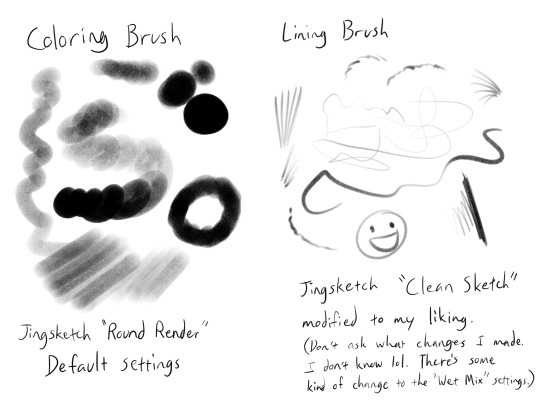
For smudging of shadows and markings, I use the Jingsketch "Jittery Smudge".
Alright, prepare for a thorough rundown of the time lapse. X3
As for how I color, the video shows my two most used methods. I do the Momo method when I want it to look a little neater or smoother, and the Midas method for when I don't care how unpolished it looks and just want to show a colored image.
For flats (the solid red seen in the video) I do it on a layer under the lines. I usually put all the flats on one layer, but this time I did their flats on separate layers for demonstration purposes, and merged them once they were both filled.
For Momo, I colored by drawing just inside the lines, erasing what went outside. Then used a Freehand (or equivalent) selection tool to fill in the inside. This is the more time consuming but smooth of the two methods, in my opinion.
For Midas, I specifically drew the outer lines thicker so that I could use the "automatic" (I guess that's "wand" in other programs? I'm not sure) selection to do a quick fill. This method will usually leave the colors with a hard, semi-unappealing edge. (Feathering the selection a little or smudging the flats can probably help with that, but I don't do that very often.)

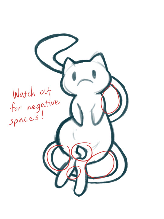
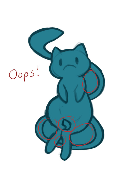
What I do is select the OUTSIDE of the lines, expand the "Selection Threshold" so that it barely selects JUST outside the lines, then invert the selection so that it filles everything INSIDE the lines. With this method you need to be careful to get all the negative zones as well--I didn't think about demonstrating that in this painting, so here a mini-tut on that.


For the actual colors, I usually do each color on a separate layer set as a "Clipping Mask" to the flats layer. Eyes usually get a layer of their own--The iris colors and pupil (if present) get the Clipping Mask treatment until I'm satisfied with them and merge them into one eye layer.
For shading, I'll fill an entire layer, still Clipped to the flats, with my color of choice, usually set it to the Multiply blend mode, and adjust the opacity as I want. I usually shade the main body separately from the eyes, but try to match the blend mode and opacity settings.
For more high-effort projects, I'll fill a layer with a solid color under the shadow layer but above all the other colors so that I have a better idea of the shapes. Colors like on Midas here can really badly mess with the perception of the shapes and shadow locations. I may also add more Multiply layers if necessary.
And that's my lengthy and extensive look into how I paint~ Keep in mind this is MY process, and I admit I work in a rather quick, dirty, and even somewhat lazy way. So take what you will from this, and go arting as YOU please! ^w^
94 notes
·
View notes
Text
@dandenbo asked me for the art asks:
🎠What is a typical 'workflow' for a piece from idea to finished?
It turns out to be a long answer so here's its own post, under the cut to save your dash!
How I go from screenshot to painting:
(This is not intended to be a 'this is how you do it!' kind of guide. I absolutely don't do an optimal route, this is just how I go about painting and what works for me! I've done a workflow for a screenshot to painting as I do a few different things but this is one I could explain somewhat coherently. My comics tend to be created pretty chaotically lol)
1) I take an ungodly amount of screenshots while playing. Also pester friends for their screenshots or stalk the group discord for interesting shots.
2) Go through all those screenshots cursing why I took so many, looking for those great moments that I want to paint. I’m particularly looking for nice poses/captivating moments, dynamic lighting or interesting expressions, and they don’t need to have all 3 as we can fix some of that in the next step.
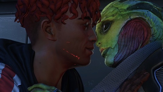
Here’s the screenshot I chose for my Keahi x Thane piece:
It was a cute, soft moment between them and I liked the highlight at the edge of their profiles.
3) Refine the screenshot.
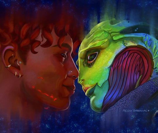
I don’t use anything fancy for this. I game on windows PC, so I open up the screenshot with windows photo editor. I crop the image, play around with saturation, exposure, contrast, just basic editing until it looks tastier. For this piece I wanted it to be hyper colourful and vibrant, leaning towards warmer tones.
4) Decide what I will change, then gather references for those changes.
In this case I was fortunate that not a lot needed changing. I knew I wanted to move Thane’s eye position to looking at Keahi rather than the way he is slightly off focus, do a more realistic ear with earrings for Keahi, make Thane a little more smiley and lower his eyelid and give Keahi nicer eyelashes. I keep a whole bunch of art guides and tutorials on my PC so I grabbed the necessary ones and sent them to my ipad ready to have on hand for the sketch stage. I have Thane’s character model in XNApose, so I can check things like his eyelid specifically in that (this is actually for a different project but shows you what I mean)
If I was going to change up the lighting/shading I would also gather references for that. For example sometimes i’ll take screenshots of lighting schemes I love from films/tv shows (think the strong teal and orange scheme in Mad Max or the neons of Blade Runner). Or for precise shadows, I can again use XNApose. I also have a little 3d printed Thane head I can shine a torch at and take photos of to get shadow ideas. For humans there’s lots of reference to be found with online searches, I find pinterest more useful than google for this. For specific expressions or body parts, i’ll just take photos of myself (hand poses, smiling from the right angle etc.) My camera roll is an interesting place. I have drawn drell frills on my neck and on my chest before to see how the lines would fold at certain angles.
5) Setting up a canvas
I work in procreate. For a piece like this I try to go pretty big, say 5000 x 4000 pixels, then i’ll crop down later as needed. 300 DPI.
As I work, I’ll make duplicates and continue on the copy each fresh session. When i’m finished I make a backup save of the PNG and .procreate files on an SSD.
I immediately turn the background colour down to a more muted colour to not burn my retinas. If i’m using a textured background like an oil board i’ll insert it, and any overlays like canvas effects. Set up my layers from the start basically for easy toggling throughout. I try to be good and label things to make life easier, it doesn’t always happen though.
I don't wear a digital glove or use paper effect screens but I do have a bottle of screen cleaner and a microfibre cloth handy at all times.
6) Sketch.
I’m still very much learning to draw. I tried for a long time to do the classic ‘ball for a head, draw the planes/lines etc. It was a constant struggle and never clicked for me, the ball especially always made things much worse, turning a circle into a 3d image in my head just does not happen. I find it better to just start drawing and work things out as I go (I use procreates reference window to see my screenshot).
So I’ll have my sketch in one canvas, and i’ll also have a second canvas with the photo ref on it at the same size, and if I feel like something is really wonky and off i’ll test my lines over the photo to see what’s gone wrong, then go back to the sketch and correct the areas that revealed. Sometimes I’ll use the grid feature if i’m getting stuck.
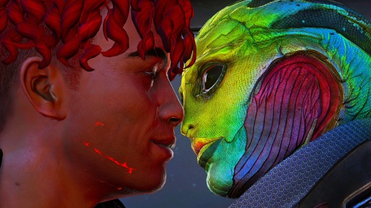
Here's a few of the sketch stages:


Here I tried out the lines on the photo and noticed that Thane’s frills were a little too far to the left, and Keahi’s eyebrow needed to arch down towards the nose.In the next pass I correct these:

Also, and I know i’m gonna get side eye from some people for this but I really could not care less to be honest. On some pieces i’ll just trace the screenshot. Sometime I just want to get to painting, am not in the mood or mindspace for a learning experience, and this is a hobby. It’s my screenshot, no one is getting ripped off. My latest Javik piece was done this way 🤷♂️
6) Painting.
I’ll start by blocking in the background and the portrait flats, usually on separate layers. I try to have an idea of the background colour from the start as this can effect the whole piece overall, but sometimes you just gotta change it as you go so having it on a different layer makes this much easier.
The painting itself I’ll lay down wider areas of colours, then start going in and refining bit by bit, I tend to work on one area at a time, and sometimes I’ll get pretty well rendered on a small area before moving on, other times work on a wider area. It really depends on my mood and what i’m vibing with that day. Like you can see here I’ve done some general messy colouring all over Keahi, but done a lot of refinement on the eyeball:
7) Finshing the piece, uploading and testing:
When I’m sick of rendering the painting and don’t think I can add anything more to it without gnawing my own wrist off, it is time to finish up! I make sure I toggle all the layers I want on, add a top signature layer (lol I lie I forget this all the damn time). Then i’ll upload the piece to my google drive and open it up on my big 4k monitor on my PC, and on my phone, and see how it looks (my ipad is a 9.7inch air). I find that once off my ipad, it often looks a little less saturated and contrasting as it does in procreate. So I might go back and change the levels if it’s too big a difference until it looks decent across devices (it’ll never look perfect on them all though, just gotta find that happy medium).
8) Posting online
I really don’t have any strict steps for this. I know some people go for optimal posting times, and will make multiple copies of their pieces in different sizes to fit better on different sites (damn you instagram and your need for everything to be square). I… do not do any of this lol. I post when I’m done whatever time or day that is. I do tend to reblog/retweet etc before I go to bed, as I live in the UK and that will at least be getting into evening time in US. I reblog my own stuff a fair bit.
15 notes
·
View notes
Note
hello! i don't know anything about digital art or tablets but it's something i'd like to try out. i was wondering if you know of any affordable tablets that you don't have to hook up to a computer?
So the fortunate thing is that tablets have gotten a LOT cheaper especially with other companies like Huion and XP-Pen stepping up to offer competitive prices compared to Wacom, which is notoriously expensive.
That said, the unfortunate thing is that the cheapest tablets on the market are the ones that you have to hook up to a PC (these are typically desk tablets, i.e. the ones that you basically use as a computer mouse because there are no screens built in to them).
There are PC tablets where they're all in one PC's that offer tablet screens (I used to use a Cintiq Companion 2 which was exactly that) but they're INCREDIBLY expensive and honestly, not much better than just getting an entry level PC and screen tablet / monitor + desk tablet. It's definitely not something you'd want to get if you haven't tried out digital art before either, because there's a risk in that in and of itself - you haven't done it before, so you're not guaranteed to stick with it. And I say that because digital art in and of itself is a medium, there's a learning curve to it even if you already have foundational knowledge in traditional art (though that foundational knowledge will help a lot) and it's not as easy or simple as just pressing some buttons and making art appear. So the last thing you're gonna want to do is spend a whole bunch of money on a drawing tablet / digital art software if you wind up not liking it in the long run.
So I would say your best option for trying out digital art without losing out on a whole lot of money if you wind up not enjoying it (and if you want something that doesn't require hooking up to a PC) would be a Samsung tablet or iPad - and I say that because if you DON'T end up creating digital art in the long term, you'll still have a handy portable PC that you can use for other things. You can get iPads and Samsung tablets at used prices through pawn shops, local marketplaces, etc. or if you have strong rep with your phone company, you might be able to snag a deal next time you renew your phone plan (I would recommend checking around back-to-school season or Christmas/Black Friday/etc. as that's when phone companies offer crazy deals where you can get tablets and accessories basically for free LMAO)
Just make sure you do your research on what tablets offer what in terms of pen and software compatibility, some tablets don't work with pens, others only work with specific kinds of pens, etc. For iPads, you'll typically want something that will ideally work with the Apple Pencil 2, as that's the newest model of the Apple Pencil (and it has that fun way of charging where you can just stick the pen to the side of the tablet and it magnetizes/charges from your iPad's battery).
I can't really give advice on the Samsung tablets as I've never used them, so do your research for that one, there are loads of videos online that talk about all the different models and benefits. Just note that if you want to use Procreate specifically, you'll need an iPad as it's an iOS-only app. Clip Studio and Adobe products , on the other hand, are offered on virtually all mobile devices and software!
I hope that helps! Good luck!! <3
24 notes
·
View notes
Note
Hello, great artwork.
If you don't mind, how do you draw comic art like This[https://www.tumblr.com/wynsvre/731663598459502592/hellooooooooo-heres-clerics-radio-au-part-24]. Like is it digital art or handrawn if digital could you kindly share your workflow.
Keep up the good work.
hi!! thanks so much!! i'll do my best to explain...
first off, cleric's is entirely digital! i work in procreate, which i would highly recommend. i'm being so serious when i say it's the most worthwhile $10 i've ever spent. ever. in my LIFE.
first, i draft out the overall story of cleric's in a notes app. each installment is its own little checked box. they're super vague, but i make sure each installment has a purpose to the larger story, and i fill in the dialogue and everything when i go to sketch.
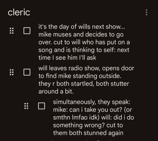
second step: sketching! this is always a messy stage; i try my best to keep things loose so i can tweak/erase panels if i need without losing too much time. usually, i nail down the dialogue at this stage, but that was obvs not the case with our latest installment. i make sure to research and fact-check anything that i'm uncertain about, content-wise. i also try out a lot of different panel compositions—certain framing can help the emotion(s) of a scene come across better, and variety is always good.

next i go to line! procreate has a handy "drawing guide" feature that helps me get the lines looking neat. i keep the boxes, dialogue, and scene lining all on different layers to make things easier! i also use reference!! reference is so, so important and can be super helpful to artists at ALL stages. USE IT!!!!

last step is usually adding text and checking to see if i've missed any other details! for mike and will specifically i try to make sure i've added moles, freckles, etc. :)
et voila!
i hope this was helpful! if you want to know about my coloring process, or anything i talked about here, feel free to comment/message me/shoot me another ask!! <3
27 notes
·
View notes
Text
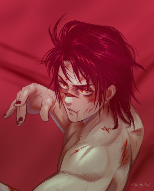
Ch. 3 of ‘Pretty Boy Down’
[I wasn’t joking when I said I put him through the wringer :(]
tw// references to/implied sexual assault, swearing, mentions of violence/pain, angst
—————————————
Giyuu almost wished the demons would get this whole spiel over with and just kill him. This shit was humiliating.
He was using this spare moment to gather his strength, enduring the horrendous, grasping clutches of the demon tearing at his uniform, mouth-breathing with his jagged teeth right in front of Giyuu’s face. Only a few more moments.
The demons serving under the Upper Rank had gone out of their way to not only inflict a fair amount of non-lethal injuries to him, but also to harass him, to make his every conscious moment perversely uncomfortable. Giyuu’s sole victory at this point in time had been his steadfast refusal to show any facial reaction to their efforts.
He couldn’t stifle every flinch or grimace, but his eyes, even when bloodshot, were still as stone, his lips, even torn, stayed a thin line, his true reactions tightly masked by clenched jaw and unmoving eyebrows. He tried channeling the expressions of Himejima and Tokito, blank and unbothered.
Thus far, it seemed somewhat effective. Any demon who had come close enough to bother him had pummeled their distaste into him for as long as they felt like it, then usually grew bored of him, and tossed him aside. Giyuu suspected that they were probably hoping for more lively prey.
At last, the perception of himself as a ‘stone-cold bitch’, according to Shinazugawa, came in handy. If he made it out of this mess alive, Giyuu swore he would make sure that asshole knew it was his bitchiness that got him through it. Fuckin’ prick.
If this were some incredible story, it would be pretty nifty that the captured hero had a good defense against pain, due to his willpower and intense training. But Giyuu had never heard any fairytales where the villains couldn’t keep their hands off the hero.
Well, there was Obanai, he supposed. Now there was someone who would never let him live it down if he died in the same circumstances Obanai had bested as a child. Then again, he didn’t think Obanai was petty enough to chew out a dead man. Or even waste his time visiting Tomioka’s grave to do so. Hell, the Snake Hashira would probably throw a party to commemorate Giyuu’s pathetic demise.
Giyuu broke his train of thought, sensing the slightest opening thread in his situation. Deep breath in. Knowing it would hurt, knowing it wouldn’t even do very much, Giyuu twisted at the hips and swung his bound arms like a club into the head of the demon with his claws inside his uniform.
Sure, demons couldn’t procreate, but that didn’t stop them from having their fun. Even so, they seemed to want a reaction from their victims, and nothing they had done so far had cracked Giyuu’s line of defense. Surely, though, it was only a matter of time before they settled for, at bare minimum, a weak, restrained body.
Ideally, there wouldn’t have been so many situations in his young life where kind others had voluntarily given their lives to the hands of monsters to save him, but then again, Giyuu supposed that, ideally, demons wouldn’t even exist in the first place.
He wasn’t entirely sure how long he’d been enclosed in this dark, filth-ridden space, as at some point he had been rendered unconscious, and thus delivered into this sunless cavern. Well, underground building, perhaps. There was a door and a man-made wall at one end of the darkness, he knew that much.
In fact, the not-knowing this information was starting to piss Giyuu off something fierce. Unfortunately, it wasn’t a solvable issue at the moment. He would have to just be mad.
The demon launched, swiping across his defenseless chest and drawing a near-mist of blood from Giyuu, so quick and sharp he almost didn’t feel it. He rolled back, trying to find an angle, but the next swipe caught the hem of his haori, pinning it to the dirt. Giyuu scrambled to his knees, and was rewarded by demonic talons slashing across the diagonal of his scalp, a stinging rain upon his head. He saw spots, toppled over, landed on his side, tried to force air back into his lungs. Why couldn’t he breathe?
Perhaps the demon’s rancorous breath was part of its blood demon art. Perhaps it was sucking the oxygen molecules from the air with every inhale. Perhaps it held a tranquilizer or paralytic element. Giyuu couldn’t even focus enough to hold a thought for more than a moment.
As the demon contemplated what to do to him, Giyuu’s subconscious came to his aide, slipping him into a dream, a pleasant memory, maybe the last one he would ever make.
The snow was vicious that last night, the wind an awful force to reckon with. Tanjiro had childishly complained that they were going to die before they even reached their destination, probably saying so for the sole purpose of making Senjuro frown.
The youngest Rengoku had firmly replied that the temperature wasn’t as dangerous compared to the wind, and that surely Tanjiro had endured worse, having grown up on a mountain. Like his brother, Senjuro didn’t always catch when someone was being hyperbolic or sarcastic, although Tanjiro usually ended up giving himself away by responding with more and more dramatic answers, delivered in a flat, solemn voice.
“No, no,” Tanjiro deadpanned, holding his palms up to the fireplace he sat before, staring into the flames. “I’ve decided. This is the end of Kamado Tanjiro and Tomioka Giyuu. We will surely be remembered, albeit fondly, as fools.”
Kyojuro, who picked up on the joke quicker than usual, guffawed from the table, where he was gathering up all the dishes and utensils to wash. “Brave fools, though!”
Senjuro’s perplexed expression deepened at the crease of his brows. “You can’t be serious.”
“Sen...take care of Nezuko for me,” Tanjiro drolled, unfolding from his sitting position and laying supine to stretch. “And watch after poor brother Kyojuro, who, in his old age, surely will not be far behind us.” Senjuro finally detected the bullshit in Tanjiro’s tone, and reached over to smack the older boy on his stomach, which did finally make Tanjiro giggle and stop with his theatrics.
Kyojuro scoffed, raising a single finger in defiance. “I’ll have you know, your precious Tomioka-San is a whole year and three months older than I am!”
“Yeah, but I’ve already determined that the cold will take him first. He’s no match for winter...in her wrath!” Tanjiro rolled over and dug his fingers into Senjuro’s side for emphasis, back into his strange persona. Senjuro burst into laughter at that, which only made Tanjiro laugh harder in victory, even if it was less at the words and more at the deeply weird and nigh-unsettling voice Tanjiro was putting on.
“Yeah, you might have to do all the fighting, Tanjiro. Wait, wait—“ Senjuro stood, gestured to Nezuko’s box, which sat upright near the doorway. “Could he—?”
Tanjiro howled at that, and now Kyojuro was starting to catch their contagious humor. Drying a bowl carefully, he stifled his laugh into the side of his arm, so as not to miss any other quips. Tanjiro had his stomach in his hands, nearly out of breath, and Senjuro was now leaning on the box for balance, much in the same state. Tanjiro gasped. “No, because—“ He gestured with his hands, indicating a very small stature for a person. “Because imagine Giyuu-San the same size as Nezuko, how itty bitty—“ his words dissolved into wheezes.
It was then that Giyuu had appeared in the entrance from the hall, hair loose and tangled from sleep, a still slumbering Nezuko held on his hip, her head slumped against his shoulder and hair neatly braided. Giyuu blinked in the firelight. “What’s so funny?” He yawned, and jolted when a fresh round of cackling ensued between the two boys.
Kyojuro, having not heard Giyuu’s approach, nor his low, sleep-soft voice, turned at the sound of the new laughter, and his eyes lit up. “Giyuu,” he gushed, quickly drying his hands and crossing the room. He drew his arm around his lover’s waist, gently pulling him close so he could be speak more quietly, but still be heard over the hysterics of the boys. “You’re up!”
Giyuu hummed, leaning in to routinely kiss Kyojuro on his cheek. His voice was a weak rumble. “Against my will.”
Kyojuro smirked affectionately, patting his hand against Giyuu’s hip. “You poor old man.”
Dark eyes narrowed, but Giyuu wasn’t fully awake enough for a sufficient reply. His words were smothered by another yawn. “You...shhhh. Or else.”
Kyojuro just smiled fondly at him. “Oh, don’t worry, I saved you some tempura. Here, I can take her.”
Giyuu beleagueredly transfered a snoring Nezuko to his lover, the girl in such a deep sleep she didn’t stir. Although she was nearly recovered, Nezuko had been exhibiting symptoms akin to a head cold, and had spent much of the past week either asleep or close to it while Shinobu attempted to diagnose her.
As near as could be determined, it wasn’t anything to worry about, but they’d all fretted anyway, unsure of how a demon, with supernatural youth and strength, had caught a human illness. It was possibly a sign that the demonic blood within was becoming less resistant to contagions, which could mean Nezuko was on the long road back to her humanity, but there was no clear answer yet.
Giyuu remembered pondering the strange situation as he ate dinner. He remembered Tanjiro asking him if they were leaving that night or the next morning, to which he had answered the latter. He remembered Senjuro and Tanjiro still in some deep conversation as they retired to their rooms for the night, Senjuro wishing everyone sweet dreams, Tanjiro imitating him in a high pitched impersonation, and Kyojuro gently scolding him to settle down and get some rest.
Giyuu remembered washing his own bowl before joining Kyojuro in the (frankly, messy and ridiculous) pile of pillows, blankets, and misshapen futons that he and Kyojuro buried themselves in at night. Nezuko had opened her eyes, but seemed close to falling back asleep as Kyojuro made up a story to tell her.
Once she was out, Giyuu remembered carrying her to her room and folding her carefully into her futon, snug, but not too snug. He remembered shambling down the hallway back to the room he shared with his lover, blowing out the candlelight and getting comfortable in bed.
Giyuu remembered waking a few hours later and struggling to untangle Kyojuro’s limbs from his own and poking him until he quit snoring. He remembered the early, secret morning of the next day, the smile lines carved into fawn-colored skin, the calloused, gentle hands stroking his cheek.
He didn’t remember leaving for the mission.
When Giyuu awoke later, head full of cotton, his empty stomach clenching, and in unimaginable pain, alone in the humid, pressing darkness, he wept.
25 notes
·
View notes
Note
How do you make your mlp screenshot edits? They always look so good!
Hi Scribbly :3
This is gonna be really long so I'm putting it under a readmore 😭😭 Apologies in advanced, I hope it doesn't sound convoluted skhjdg
I use Procreate and my own brushes, but you can use whatever program and brushes you feel fit :3 I used to use Ibis Paint for my screenshot edits before I concocted my perfect edit brushes on Procreate khdjg
SO! I start by picking a screenshot that I like that has two ponies in the shot. One of which is my FO of choice, and a mare-shaped pony beside him (I like using a mare-shape for my sonas as opposed to a stallion shape 😭 Anyone can pick whatever body shape they'd like, though, you can always take pony shapes that you like out of other screenshots and edit them to your liking to trace over, too! @/cosmiccherri has a uniquely shaped ponysona so they use screenshots taken from other episodes for theirs and they always look so good!!)
If I can, I find a couple more screenshots that show more background! So I can cut the background out and paste it to cover the other pony. It's okay if it doesn't completely cover, though, I go over it with brush lines and additional textures so it's as seamless as I can get it. I'm kind of a stickler for having my edits and art be perfect, so I always look for ways to use brushes to my advantage especially with trickier backgrounds.
Personally I erase as much of the other pony as I can, so I can reuse the piece bc I know I never stick with one ponysona for longer than a month 😭 /lh It's just handy for me if I ever wanna see each ponysona I go through with my FOs :3
After I get the pony erased as much as I can, I lower the opacity on the background layer so the previous pony is showing a little bit so I can trace over their body, sketch in my mane + tail style, and tweak his expression to one that I like. I also make my ponysona chubbier than the standard mare shape bc I'm not a Skinny Minnie 😭 Once I've got my sketch out, I turn the opacity back up on my background layer and lower the opacity on my sketch layer. I trace a line on the FO pony to check my line thickness, edit it to my liking, and then start lining my sketch with black. You can use whatever color you'd like, I just use black bc it's the easiest for me to see my lines- I like to separate parts on different layers, especially the eyes and hair. MLP eyes are always lined in black! Once the pony is lined, I go through and start erasing lines that end in open spaces, like the chin, shoulders and flank, ear, mouth, etc. so they end in tapers. I also erase a little bit on overlapping lines in the mane and tail, I think it makes them look sharper and more streamlined :3
Once my lineart is completely finished, I color in the pony however I'd like. MLP:FIM always has at least one leg shaded, if not two, and they're always the legs furthest from the viewer. That's one of my favorite parts to shade, and I always use a grey-ish purple

Around this area, but you can use whatever you feel is good :3! I turn the shading layer into a multiply layer, and the opacity is also turned down to 25%
After coloring in my ponysona, I color in the lineart! MLP's colored lineart is one of my favorite things in the show, and I LOVE picking the colors to use. They're always slightly darker than your pony's coat colors, and manes tend to use one or two colors for lineart despite some manes having lots of colors. Rainbow Dash's mane even uses the blue in her colors as the lineart color! It's super interesting tbh, I love the colored lineart- Don't forget to shade the lining on the shaded parts, too! Same grey-purple shading color you used on the legs, turned down to 25% on a multiply layer
That should be everything! I like to make a copy of the original screenshot, merge the background layer onto the copy, copy that so I can merge my ponysona onto it, and at the very end there should be three images left, as well as the sketch layer :3 You don't have to copy everything I do to a T, that's all just my process of editing screenshots 😭
#asking ! 💌#talking ! 💫#SORRY THAT IT'S SO LONG WINDED DKJDG#This is the most I've ever typed on a tumblr post omg#Long post#VERY long post
8 notes
·
View notes
Note
Hello! I was wondering if you could a small tutorial on how you render your pieces?? They’re all super pretty btw!! I love your art :D!!
Ahh thank you sm!! <3 0: i’m not very good at explaining my process, and it changes depending on what I’m drawing as well, but I’ll try my best to explain it!
imma use the choso panel redraw since it’s a pretty simple portrait (done in Procreate, but most of this can be applied to CSP too)
once i’ve got a decently refined sketch, i fill in a basic starting skin colour for the character. i start some shading once i have a basic idea of where i want lighting. colour-wise, i usually go a bit darker & warmer for the first pass. (i use a brush that’s a basic airbrush settings but i replace the shape source with a reuleaux triangle) besides where shadows will fall, ill also focus on making the colour more dense on the ears, fingers, around the eyes, and sometimes the blush area. (also let it be known i use Liquify a lot, and constantly flip my canvas. as you render you’ll often start noticing lil adjustments that need to be done)
ill build up passes of colour, going darker & more saturated as i do. as the colours darken, they’ll be in the more receded/hidden areas of the face (like under brows, under chin, inner ear, unless the lighting calls for otherwise) in this case though, he’s also kinda beat up, so i added more colour under the eyes/on the cheekbones to add to the bruise vibes
for the nose/brow/shoulder highlights, i made a new layer & set it to Add. it’s a handy way to get a highlight colour and brighten your hot spots for lighting. this is usually when ill mess with the sketch/linework, sometimes i switch the layer mode to Multiply if i know i want to fully paint over it. in this case i think i just Alpha Locked the layer and painted in the hair/eyeliner since i wanted them darker. once the linework is thoroughly fukt with, i make a new layer and start painting over. usually involves a lot of colour picking & making some adjustments, playing around with levels of colour. I also swap between the reuleaux and a funky dense rectangle thing for rendering, sometimes little sketch pens for smaller details too.
(technically the blue-tinge reflective lighting wasn’t very accurate for the bg/scene colour i chose, but i got carried away and didn’t wanna change it lol)
hair rendering is fun sometimesssss. i make a new layer, choose a slightly brighter colour, and messily block in where i want the highlights. idk how else to explain it besides like, think about using H-adjacent shapes when you’re erasing/refining the highlights. for the last step, i make a new layer, set it to Add, and paint inside the highlights for the sharper look.
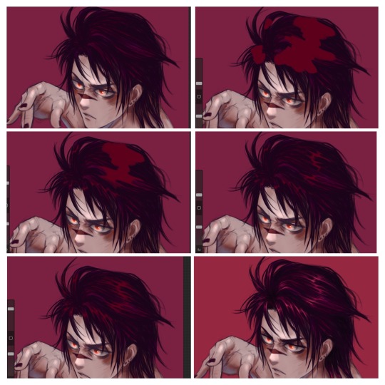
When it’s getting to a place i kinda like, (added some blood/cuts on this one before moving on) ill usually start messing with some overlay effects. this usually involves picking a random colour, filling in a new layer, and seeing how it lays over the piece. depending on the vibe im going for it can change a lot, but i find myself usually liking Exclusion & Subtract a lot. (sometimes ill throw a Noise + Overlay layer on top as well, but didn’t for this piece)
i hope that makes some sense??😭 im sorry if anything isn’t clear, i can try my best to answer specifics if needed.
it’s not my most thoroughly rendered portrait but it’s one i got a decent amount of wip screenshots for.. my style in general is still a wip, and i change it up a bit every time. i encourage experimentation always!!! it’s helped me a lot. i’ll see about making a more thorough tutorial for a properly rendered piece soon too!
50 notes
·
View notes
Note
Hi clam!! i really love your art, the colours and lines are amazing. Your art and doodles always have such an incredible quality and finish to them, really brings your characters to life. I hope you dont mind me asking, but what device and program do you use or would you recommend for digital art? thxs have a good one<3
Ah ty! I currently use an iPad + procreate for most of my art—it’s very handy since I can draw on the go. My university gives free adobe subscriptions to students so I use photoshop and a cintique for most of my school work and more complicated stuff. But if ur starting out, I’d get a small pen tablet like a Wacom or Huion that connects to ur computer. I first used manga studio (predecessor to clip studio paint) which was a one time payment and a small Wacom bamboo tablet, and that combo pretty much lasted all throughout middleschool and highschool for me :) there’s also a bunch of free programs like krita and firealpaca too!
9 notes
·
View notes
Note
Hi! Studying motion graphics sounds so cool! I found your art through the lovely rain on hydrangeas pic and was very surprised to see you did it on Procreate. I have only tried animating on it once and it was so hard for me to get the timing right! Especially if you're doing several offset animations in one picture.
I'd love to hear about your process if you'd like to share! Looking forward to seeing more of your art :D
Oh yea it's Procreate entirely! Procreate is kind of tricky when you want to animate multiple things, but since I usually work with very limited amount of frames (6-24 max) it can be done with folders. Any more complex animation and I just export all the frames separately and bring them back into the program for another round. Oh and the foreground and background layers/folders are also very handy, but it can take some getting used to.
If I'm feeling very spicy I'll just export everything to Clip Studio Paint, the animation system is easier to handle & you can clip effects layers directly to folders which is verrrrry helpful!
Thank you thank youuuu hoping to make something neat soon<3 hopefully loll i'm having a bit of an art block moment currently
2 notes
·
View notes
Text
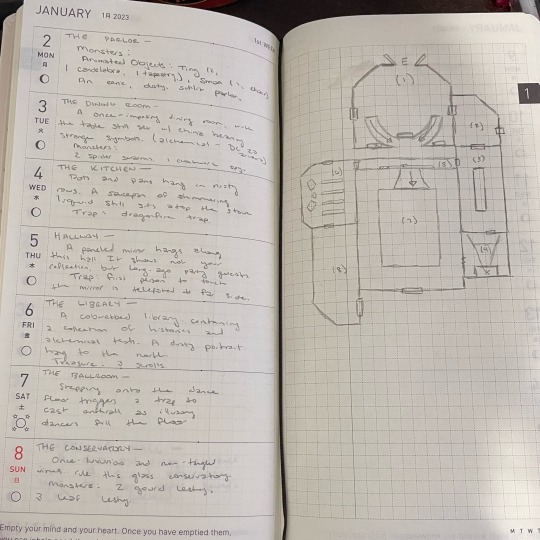
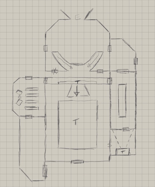
Week 1 of Dungeon 23 is complete! We’ve got (almost all of) a first level of the Abandoned Manor, the first section of our megadungeon mapped out. I’m drawing them in my handy-dandy notebook and then transferring them into Procreate, so I’ll have a map that’s useable for Roll20 (and in a format that will let me combine together sections, once I get to parts of the dungeon that aren’t specifically stacked long and narrow manor floors). Room descriptions and details are below the cut.
First off, some descriptions and motifs! I’m using a little bit of Hexed Press’s Dungeon23 Helper to organize things. This area is meant to be an intro from the overworld into the dungeon; its function is to conceal the way forward. The Locked Door in the entrance hall leads down into the dungeon proper, so this is like a Death House intro area where traversing back into the city to get supplies or rest is very easy. I have some motifs for the area picked out: alchemical symbols = secrets, portraits = treasure, and enchanted mirrors = traps. A lot of the rest didn’t apply for this section, since it’s very deserted.
The flavor text I have written out to intro the quest and area is: Once a fine manor in Korvosa, this house has long since fallen into disrepair. Strange sounds come from within and citizens fear what else might find its way out…
Day 1: Entrance Hall: A dim and dusty entrance hall. A grand staircase leads to an upper level. (X) is locked.
Day 2: The Parlor: An eerie, dusty, sunlit parlor, Monsters: Animated Objects: Tiny (2, 1 Candelabra, 1 tapestry) Small (1, chair)
Day 3: The Dining Room: A once-imposing dining room, with the table still set with china bearing strange symbols (DC 20 arcana to ID them as alchemical symbols), Monsters: 2 spider swarms, 1 clockwork spy
Day 4: The Kitchen: Pots and pans hang in rusty rows. A saucepan of shimmering liquid still sits atop the stove, Traps: Dragonfire Trap (trigger: touching the saucepan), Treasure: the saucepan contains a potion
Day 5: Hallway: A paneled mirror hangs along this hall. It shows not your reflection, but long-ago party guests, Traps: First person to touch the mirror is teleported to the far side
Day 6: The Library: A cobwebbed library containing a collection of histories and alchemical texts. A dusty portrait hangs to the north. Treasure: 3 scrolls can be found behind the portrait.
Day 7: The Ballroom: Stepping onto the dance floor triggers a trap to cast enthrall as illusory dancers fill the floor.
Day 8: The Conservatory: Once-luxurious and now-tangled vines rule this glass conservatory, Monsters: 2 gourd leshy, 3 leaf leshy
I’m not sold on the teleport + enthrall mechanic, as it’s a bit wonky, but I didn’t want to put anything explicitly dangerous in the ballroom if people can get separated (especially with a combat potentially separating the party from the vanished player). They do have a chance to just end up… stuck standing on the dance floor, though, given that enthrall has a really long duration.
The scrolls and potions are meant to be generic and can be used to fill in gaps in the party comp, or otherwise randomly generated. The missing room on the top left is going to be a trophy room; the other doors all go outside, to another floor, or to storage space (I think there’s a closet on the map somewhere that isn’t currently filled in, LOL).
#Dungeon23#pathfinder#pathfinder 1e#my working title for this dungeon is Descent of Hours but that’s because I haven’t had time to workshop the pun#anyway if y’all don’t want to see my dungeon posting I’m gonna tag it all as Dungeon23 so that’s the tag to blacklist
1 note
·
View note
Note
I recently found your account and just thought I should say how utterly beautiful your art is! :3
Do you have any tips for drawing digitally?
That's kind of an ambiguous question but here's some general advice I can think of:
⚫ If your PC allows it, work on a big canvas (at least 2000x2000 pixels or higher) for better definition. If you're planning to print them later on, I strongly suggest researching what DPIs are.
⚫ Keyboard shortcuts are extremely handy to improve your workflow. Not just the good ol' Ctrl+Z, keep shortcuts for your most used brushes, to zoom in/out, flip the canvas and anything else you need.
⚫ When in doubt, look up tutorials in youtube or google.
⚫ Please please PLEASE always remember to take breaks away from the screen to stretch. There's even some recommended exercises for digital artists to try. Do not end like us fools dealing with back hernias or carpal tunnel.
⚫ Make it a habit to save constantly (keyboard shortcut ;D ), you never know when tragedy could strike and all your effort will be lost forever. Unless you're using Procreate. Bless Procreate.
⚫ Shortcuts like using layer modes, filters, brushes, gradients and so on are 100% valid and don't let any art purist out there tell you otherwise. If they can save you time and you can make them work in your favor, don't shy away from using them.
There's a lot to digital art that depends heavily on your goals as an artist. This is the best I can think of for now, hope it's of some help to you~
(Oh, and the videos from Ctrl+Paint do a wonderful job at explaining the basics in all aspects of drawing, digital or not. Highly recommended)
81 notes
·
View notes
Last Seen Blogs
bara-izu
Rated PG for Pretty Gay.
uiiyru
nico the seal

andy347
20/20 Unlimited - Ways to Make Money?
nemuus
its a bat-beetle world out there

justimaginenaildesign
Nail Artist