#r-typography
Explore tagged Tumblr posts
Visit Tumblr Blog
Explore Tumblr blogs with no restrictions, modern design and the best experience.
Last Seen Tumblr Blogs


Fun Fact
There were a total of 171.5 billion posts on Tumblr in 2019.
Text

A. R. Ammons, from a poem titled "Shot Glass," featured in The New Yorker
6K notes
·
View notes
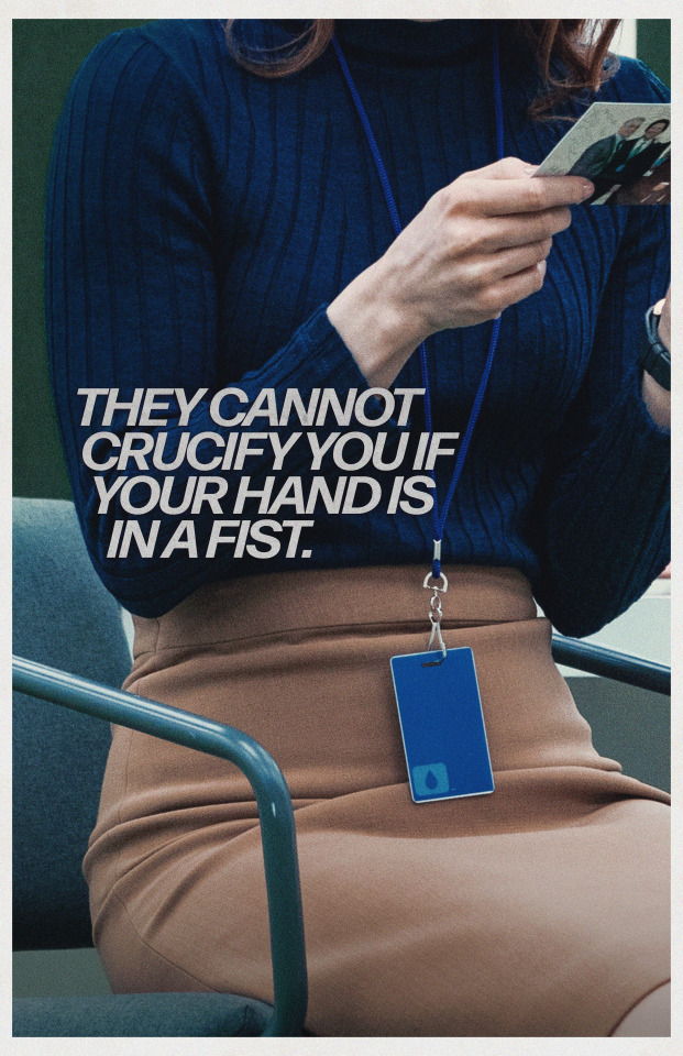
Text

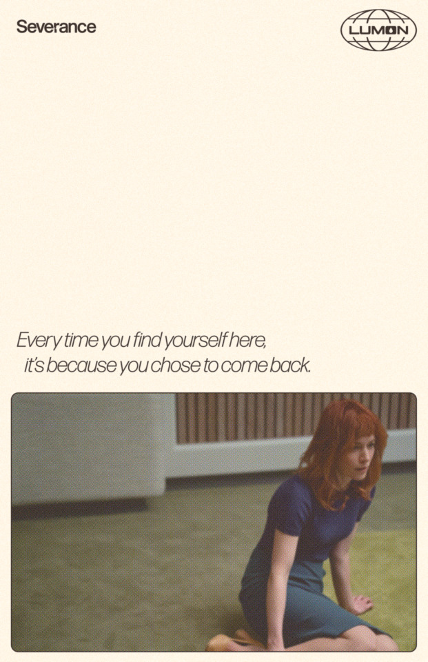
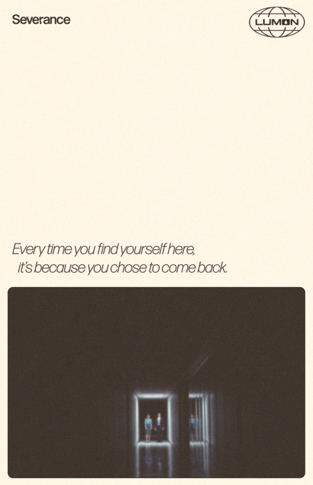
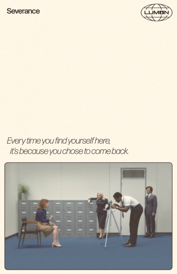
Adam Scott on Mark making a choice between Gemma and Helly - Behind the Scenes of Severance Season 2, Episode 10: Cold Harbor
1K notes
·
View notes
Text

Idk

#sab posting#bsd#bungou stray dogs#bsd chuuya#chuuya nakahara#im sorry it looks like a french flag#i realized only after finishing it#but tbh french ppl r the main problem in Chuuya's life so eh#anyway#i hate typography
1K notes
·
View notes
Text
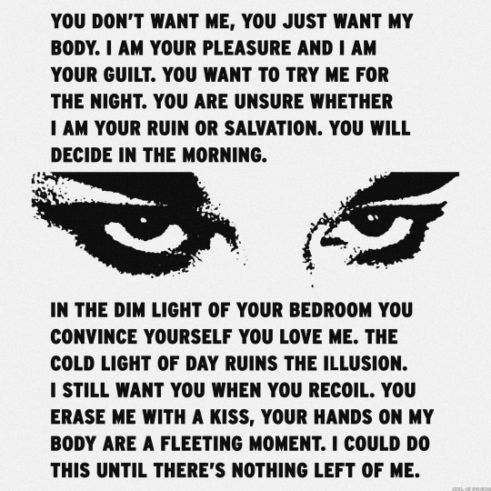
RUIN OR SALVATION
430 notes
·
View notes
Text
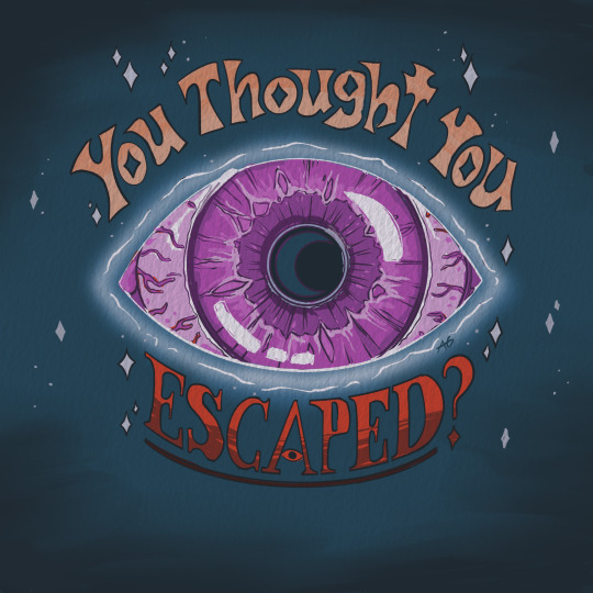
Ty Philza for that hell of a concept
#tw eye#tw moon#the realm smp#realm smp#Philza#r!philza#you thought you escaped?#typography#kinda#so about that moon….#messy doodle#griff art
434 notes
·
View notes
Text
Very simple design from a while ago, but I'm so excited to make new posters as these new episodes come out... please stay tuned...
286 notes
·
View notes
Text
967 notes
·
View notes
Photo
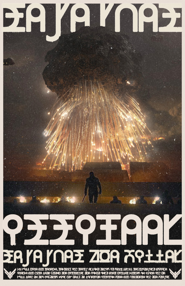
"Remember Arrakeen, Remember the fallen." Galach Translated
Atreides Fictional Propaganda Poster by u/DesignMan01 via r/dune
#dune#atreides#propaganda poster#art#graphic design#fanart#house atreides#arrakeen#arrakis#designman01#u/designman01#r/dune#reddit#artists on reddit#scifi#gothic#caladan futura#typography#font#frank herbert#denis villeneuve
70 notes
·
View notes
Text

Loan Exhibition, Museum of Non-Objective Painting, New York, NY, June 15 – October 15, 1943 [The Guggenheim Museums and Foundation, New York, NY]
Feat.: Harry Bertoia, E. V. Biel, Florence Brillinger, Werner Drewes, Emmett Edwards, Manuel Essman, Perle Fine, Dwinell Grant, Marguerita Hohenberg, Charles Johnson, Lucille Autorino, Ellen Kern, Maude I. Kerns, Fernando Martinez, Alice L. Mattern, Ladislaus [László] Moholy-Nagy, Hilla Rebay, Attilio Salemme, Rolph Scarlett, John Sennhauser, Charles Smith, Edna Tacon, Jean Xceron
#graphic design#typography#art#brochure#cover#museum of non objective painting#solomon r. guggenheim museum#solomon r. guggenheim foundation#1940s
26 notes
·
View notes
Text

Dhalgren by Samuel R. Delany
#dhalgren#quote#typography#samuel r. delany#literature#dark academia#scifi#disorder#dark things#EB garamond#aesthetic#academia aesthetic#academia#chaotic academia#queer literature
25 notes
·
View notes
Text


Severance, 2.10: Cold Harbor // Excerpt from the Cold Harbor Script
#severance#severanceedit#mark s#helly r#markhelly#my edit#typography#this excerpt is an absolute gut-punch
168 notes
·
View notes
Text


Typography Tuesday
SCHWABACHER
Not all Gothic typefaces are the same, and there were several distinctive designs that were used in the early years of printing. While similar to the rounded Rotunda Gothic, Schwabacher is more angular and has certain distinctive letter designs, such as in the capitals A and H. It was perhaps the most common typeface in Germany until Fraktur supplanted it by the mid-16th century.
The name comes from the German town of Schwabach, just south of Nuremburg, where it is believed the font was designed. The earliest extant appearance of the typeface is from an Augsburg printing of 1472 (Augsburg is about 80 miles (129 km) south of Schwabach). It was famously used by Anton Koberger for both his Latin and German editions of the lavishly-illustrated Nuremberg Chronicle of 1493, a comprehensive history of the world from the creation to the date of publication compiled by Nuremberg scholar and doctor, Hartmann Schedel. Those editions proved to be so popular that the Augsburg printer Johann Schönsperger (ca. 1455-1521) plagiarized the editions to produce his own small folio German edition, with 2100 new woodcuts, in 1476, followed by a Latin edition in 1497, and then another German reprint in 1500, all using Schwabacher type.
The original leaf shown here is from the p signature of Schönsperger's 1497 Latin edition which is included in the leaf book . . . the highest form of flattery . . . by the American book designers, letterpress printers, and specialists in the Nuremberg Chronicle Adrian (1923-1988) and Joyce L. Wilson (1914-1996), printed under the direction of George R. Kane (1913-2009) at the Cowell Press of UC Santa Cruz by Felicia Rice (b. 1954) and Nick Zachreson in an edition of 90 copies in 1982. Ours is one of 60 copies bound in half leather. For the record, UWM Special Collections does not condone the breaking of books for sale or for inclusion in leaf books. Our copy was part of the donation from our late friend Jerry Buff (1931-2025).
View other posts on Gothic type.
View our other Typography Tuesday posts.
#Typography Tuesday#typetuesday#Gothic type#Schwabacher type#Schwabacher#Johann Schönsperger#Augsburg Chronicle#Nuremberg Chronicle#the highest form of flattery#Adrian Wilson#Joyce L. Wilson#Cowell Press#George R. Kane#Felicia Rice#plagiarism#incunabula#leaf books#Jerry Buff#15th century type
46 notes
·
View notes
Text

#prose#typography#dark academia#poem#rainer maria rilke#rilke#r. m. rilke#writing#words#quote#keanu reeves#the book of elsewhere#china mieville#poetry#poem quotes
39 notes
·
View notes
Text

If I do anything, I hope I can convince anyone else to watch Severance. Designs by me! Hoping to make more 😈
1K notes
·
View notes
Text
why does everyone hate on papyrus and comic sans and impact so much times new roman is way worse
#its so ugly#and it doesn't even have that old timey flair that it's trying to give off#typography#fonts#196#r/196#r196#196archive#apartmentofawesome#rule#literally 19684#196 rule#/r/196
183 notes
·
View notes
Text
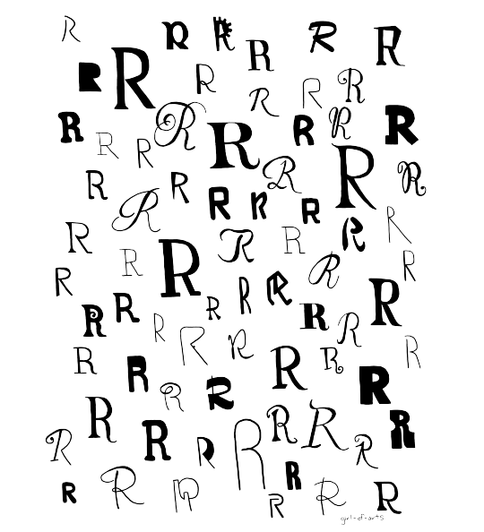
R, 2023
I've always really loved fonts and typography, so when I came across 1000 Fonts: An Illustrated Guide to Finding the Right Typeface I felt like I had hit the jackpot and knew that I had to make an art piece using it. I definitely want to do other letters as well, R just seemed like the most interesting letter to start with.
threadless
teepublic
#typography#fonts#art#R#girl-of-arts#if anyone wants a different letter just let me know#i want to do more of these when i have time#i just don't know what letters to start with
41 notes
·
View notes