#rendering shapes and drawing objects
Explore tagged Tumblr posts
Visit Tumblr Blog
Explore Tumblr blogs with no restrictions, modern design and the best experience.
Last Seen Tumblr Blogs


Fun Fact
Tumblr Inc. has $15.1M in annual revenue.
Note
How do you go about your backgrounds? Particularly interiors where believable looking perspective makes or breaks the scene.. Do you use vanishing points or is it something you just intuitively build around the character?
I will often just freehand it, starting with the character and then building a scene around them, but for more complex or rendered pieces I do make use of perspective tools. If you use Clip Studio, I highly recommend downloading the TOPGYN(The Only Perspective Grid You Need) assets, I've been using it a lot recently and it's very useful.
I'll use this recent commission as an example to show my process. I usually start with just freehanding perspective when I'm sketching. I don't like worrying too much about being 100% accurate with the perspective at the start, I just wanna be able to feel out the image I have in my head, then I can worry about accuracy later.
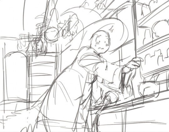
Depending on how rough I am with the initial sketch, the perspective probably gonna be at least a little off in terms of accuracy or "believability". So I'll set up TOPGYN and focus on setting up the background as close to the initial sketch's perspective as possible

And once I have all of the rough shapes blocked out, I just use this as a guide to draw everything else back into the scene.
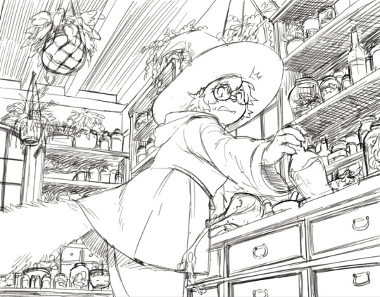
I don't really use the perspective tools for any of the details at this point, it's just too much hassle to block out the perspective for ever little object in a scene so I just do my best to eyeball it from there. And from that point I just paint it, that's basically my whole process for setting up backgrounds and perspective! I don't know how novel any of this info about my workflow is but I hope it's at least somewhat useful ^_^;;
975 notes
·
View notes
Text
i think one of the most upsetting things i see from artists, particularly digital artists, is the lamentation that their artwork isn't "good" because it doesn't fall into that narrow category of ultra-rendered riot splash art, or god forbid that it doesn't compete with generative ai renders.
what sort of art are you hanging on your walls? what sort of patterns are on the clothing you buy? how many items have you purchased because the packaging was cute? what are the things with which you ornament your daily life? it's probably closer to what most would call "folk art". vivid patterns, charming little animals, geometric shapes. graphic florals. calligraphy. stained glass. little ceramic objects.
wanting to explore technical rendering improvement is fine, but please do not fall into the trap of thinking that improvement and progress exists on a scale of "stick figure to photorealism". art of every kind is needed in the world, now more than ever as fascism rises and tries to tell us what is and is not "good art".
i think getting to see the keith haring "art is for everyone" exhibit last year was probably one of the most impactful art experiences of my life, and i think the reason it was is because it came at a time where i badly needed a reminder that art is allowed to be secret, abandoned, and intimate. you don't see people react to your doodle on the subway wall, you just leave it and allow people to make of it what they want privately. is it cute? is it vandalism? does it matter? you have already left. it's why i started drawing more on restaurant receipts, and on the boxes i ship out from the warehouse at my job. art being for everyone goes in both directions, and if we allow a narrow market to dictate our aspirations, the world will slowly drain of its color.
820 notes
·
View notes
Text
very invested in how lumon is explicitly described as a company that has a foothold in the medical field, initially established as a manufacturer of medicines right around the time the concept of the modern pharmaceutical industry started taking shape in the 19th century, and its products/services are floated as the sale of medical equipment and health & wellness to its customers. they facilitated the development of the surgical procedure for severance and use psychological tactics to keep their workers in line. after helly r attempts suicide, her orientation into her new situation on the severed floor is framed as a patient’s admission into a psychiatric facility - objects that can be used to inflict bodily harm on herself are locked away, which offers continued commentary on her consistent lack of access to self determination and bodily autonomy. mark s commits to the procedure anticipating that it’ll allow him to better deal with his grief.
this goes hand in hand with their forays into research - the services that macrodata refinement render are directly in service of keir’s vision of automating the human condition (re: keir’s theory that unique ratios of the tempers - dread, malice, frolic, woe - make up different people). the concepts of natural selection preceded, and eugenics was developed, within keir’s lifetime during the 19th century. also thinking about how emotional regulation goes hand in hand with shaping the perfect worker - health and wellness are once again emphasised when it attempts to corral its wayward workers; but these concepts are relative, and constructed in the corporate’s interest. they’ve also constructed company towns for their workers where, for all intents and purposes, they hold a significant amount of power over the bodies housed at their expense. where do you draw a line on the work-life balance issue when the corporate world has entered your home and your body?
#just a couple of facts that I think about a lot. this post isn’t meant to say anything.#rewatching s1. and after that I’m probably going to rewatch it again.#I need to get around to reading paradise lost and inferno because so much of the media I’m invested in references them at least in passing#but I don’t know where to beginnn.#text#also. dolly the lamb. really on my mind a lot lately.#severance
197 notes
·
View notes
Text
Whipped!
Tags: Whipped cream, edging, teasing, overstimulating, precum, morning sex, fem reader, squirting, tied up, nipple sucking, orgasms.
7:38 A.M. The sun was barely rising from the midnight silky cloak, waves of azure mixed with hues of gold and maroon blended into the sky, the sight of a sunrise so beautiful it woke someone up with a smile.
You woke up early, flipping over to stare at Bruce while he was sleeping, the man was knocked out cold. His soft snores, the ruffled hair, wearing a pair of grey sweatpants without a shirt made everyday worth it.
You looked under the blanket, realizing he had morning wood. It couldn’t just be left alone, right?.. A small giggle left your mouth, shuffling out of bed heading down into the kitchen. The refrigerator welcomed you with a chill, the cold air making you shiver. A can of whip cream laid on the side, full of delicious sweetness that could make things a million times better. You grabbed the can, silently closing the fridge door, tiptoeing back upstairs. Bruce had laid on his back, hands clutching underneath the pillows he was laying on. The small rug helped muffle the thuds of your footsteps, climbing onto the silk sheets of your shared bed.
You straddled his waist, gently placing your thighs around his waist, quietly grabbing his hands. On the night side table, you reached into the second drawer, fishing out a pair of baby pink fuzzy handcuffs, specially bought by you. These were never used, well, not until right now.. The headpost was the right size for you to cuff his hands on the side, rendering him somewhat helpless. He stirred, letting out a sigh that eventually turned back into soft snoring. The whip cream can was shaken for a good spray, twisting the cap off for some fun. You held the nozzle down, drawing lines of sweet fresh cream on his torso and abs, shapes, objects, letters, you name it. His nipples were covered in two piles of cream, the coldness making him open his eyes.
“Hi sleepyhead.. Did I wake you up? ‘M sorry Brucey..” You bent down, licking the cream off his nipples, sucking on the perky buds that hardened into little pebbles. “S-shit!.. Oh my god- I, baby can’t… Sensitive..!” He let out a groan, vibrations running through his body straight to his dick. You licked the cream off his torso, relishing in the sweetness of the cream, his body making it extra sweet. “Mmm… So sweet and creamy. Oh handsome, you just make everything better, don't you?” You gave him a smirk, rising to sit on his lap. He tried to move his arms to grab you, but the cuffs did their job, restricting him the freedom of movement.
Of course, Bruce could break out of these cuffs no problem, but he wanted to go along with your plan. “Mercy? I’ll be good for you darling..” He gave you big brown eyes, silently pleading for mercy. The will to give in was strong, but first you wanted to go through with what you wanted first. “Not yet, soon baby..” Bruce's pants were pulled down just enough to let his dick free, the morning wood clearly shown. Prominent veins of tinted blue and purple ran down his entire length, his shaft pulsing with need. There were clear signs of pre lubing his shaft, the milky droplets making his tip pop, the cherry red color slowly blending into blush pink. He grunted, the cold chill of the morning air making him hiss from the sudden movement.
The can of whip cream was in your hand and you shook it, placing it directly above his tip. Nozzles suddenly had the best use because it was sooo easy to decorate his cock with the cream. You swirled it on the top, the coldness making his body wrack with chills. He was quivering from the temperature. “Hah- Ngh~ Cold..” Bruce mumbled under his breath. Your very own lollipop decorated with fresh cream, and extra pre to top it off. Your hand wrapped around his base, sucking on the tip, licking up all the whipped cream. He moaned, bucking his hips to fuck your throat.
Bruce tasted so good in your mouth, like a delicious cream pie made for you. Your head moved down, taking in all 9 inches of his cock, the tip twitching in the back of your throat. You moved a hand down towards your pussy, playing with the cute bud of yours, using your slick to lube your folds. “Mmmm.. Y’ tas s’ gud!” You moaned around his tip, the vibrations from your voice sending pleasure through his veins. “Fuck fuck fuck f- D-don’t do that.. Can’t- ‘M gonna cum!”
Bruce threw his head back as a powerful orgasm drove his body to ecstasy, the thin ropes of cream blessing your tastebuds. You sucked on the tip, making his tip extra sensitive as you overstimulated him, his body quivering. His cock was released with a pop as you sat on his lap. You rubbed circles on your pretty little clit, mouth forming into an ‘o’ shape as you moaned his name over and over. “Bruceyyyy!! Nghhhh-” You squirted on his lap, the juices coating his abs and dick, the sunlight highlighting it.
A loud noise jolted you from your post orgasm, Bruce had uncuffed himself from the headboard. He grabbed your plush hips, rubbing his thumbs over your skin. “Are you ready you fucking minx?.. I’ll make you cum so much you’ll be thinking of me over and over again..”
#batman smut#batman x reader#bruce wayne smut#bruce wayne x reader#bruce wayne#i love batman#smut#batman#whipped cream#hornyyy#fem reader#early morning#dc comics#dcu#dc universe#dc smut#batman comics#ashywashy#⋆ ˚。⋆୨୧˚𝕒𝕤𝕙𝕝𝕠𝕧𝕖𝕤𝕗𝕠𝕠𝕕˚୨୧⋆。˚ ⋆
319 notes
·
View notes
Text

Basking in the light of flowers
I started this piece because I was thinking about the Piripu Isekai Plot again. The thing I fret about is getting the pages drawn in a timely manner, since I do want the comic in full color.
Some changes in approach I took in this drawing, with the aim of getting things rendered quicker:
Using a different brush to shade. I usually use a more blendy brush, but here I used a brush that behaves more like a normal brush (that is, one that lays down solid colors). Doing this, I hoped to fuss with defining the shapes in the light less.
Actual clean line art. In some regards I've learned to both care about the line art more and learned to care about it less. I didn't really bother with trying to make the line art look super good by itself. What mattered most to me is that all the lines were more or less connected and kinda clean, that way I could use the bucket tool with minimal pain
Some objects, like the flowers, took extra effort to render, but hopefully more demanding objects won't be seen as often during the PIP. The time it takes to complete multiple pages may also not be as drastic as completing one page by itself.
So for example, if it took me 4 hours to completely finish this piece, I could potentially see myself completing 2-3 other pieces like it within 6 hours if I did things right. So like, completing the sketch for each piece, then the line art, then the coloring and so on, instead of completely finishing one piece at a time.
I dunno, only cold hard experience will yield the real answers. Until then, the only limiting factor is for me to write the damn PIP.
(Pictured: Mufo eating a flower.)
#sky children of the light#sky cotl#that sky game#thatskygame#skyblr#mufo draws#the titular mufotsuki#not a photo from the album
72 notes
·
View notes
Note
HOW THE HOW DO YOU COLOR PLS I NEED THE SECRET UR ART IS SO ETHEREAL
I am so happy to share some art tips!! I think what makes the drawing look ethereal is the softness and airness I guess? I think impressionism paintings could be a really good references for beginners. (I usually took reference from movie scenes tho)
Usually, I tended to use mainly muted colours of blue, pink, purple & turquoise in my drawings. I think the key is to avoid using too many hues or values for beginners, because if they are applied wrongly the colours would look messy, so I guess the first step is to separate the light and shadow (very important to create the airness) by using grey scale, then choose a colour u like as the underpaint/ base colour, and finally apply colours according to the grey scale.

Usually, the base colour I used is muted & low-saturated, then I would apply more saturated colours on it layer by layer to add the volume and shading. If u like more vibrant colours, I think its key is to use a limited colour palette, or else the colouring will turn out dirty.
During colouring rendering, I guess it is important to notice the soft and hard edges of the outlines of shadows and shapes.
The tones of background could also provide a sense of softness & emptiness, you can applied a soft lighting by using lighting around the character/ object on the background to add the depth of the scene.
I hope I made it easier to understand :3
65 notes
·
View notes
Text

🪭🧪 Human Fantube designs because I can’t post one half of the Core Lights and not the other :] !!
Catching up on posting art !! I loved rendering this omga. Sooo fun to add all the halftones and colors…
Juuuust like last time I’m gonna add some design commentary. I am a happy yapper!
🪭 Fan: I made his hair spiky to represent the folds of the paper fan, and it's dyed reddish (although it's been fading for a while). Gave him some yellow-rimmed glasses, and even though they look like gold they most definitely are not haha. His red jacket is zipped up in a way that alludes to his shape as an object, and he has some flannel underneath to represent his patterning + he would totally wear flannels lol !! He has a tote bag for his laptop, and I didn't draw the pins that he has attached to it, but I'll do that at some other time. He has an II logo buckle attached to his baggy pants (with loads of pockets). And overall he's just a nerd doing nerd things. I love him :) I love his design, I feel like it uses the shapes of the object form pretty well :3
🧪 Test Tube: She has a translucent lab coat that is SO FUN TO RENDER oh my golly...I know it's highly unrealistic, but jeepers is it fun to draw! She has a green sweater and green eyeshadow to match, along with a headband to represent the lip of the test tube. She has some scars on her face from some of her more dangerous experiments and circular glasses. And she has a butterfly hair clip to represent Bot !! Although her design is more simple than Fan's, I incorporated a lot of long, rounded shapes pretty effectively !! Plus, I just love drawing her lab coat. I intend to give all of them alternate outfits at some point, but I CANNOT LIVE without her super cool coat. It's just so fun...
I love these designs just as much as my Lightbrush ones !! I will have to draw all of them together at some point :)
Anyways, thanks for listening to me yap! Have a nice day and make sure to get enough sleep 💝
#inanimate insanity#ii#osc#object show community#ii fanart#ii fan#ii test tube#ii fantube#fantube#osc fanart#yippeee i love them sososoos much GWAAAH#they are so me#at the same time#LOOOOL#starla art
69 notes
·
View notes
Text

Commission Info!
This post is going to go over my commission information. Mostly for character illustrations, but there will be other kinds of commissions included. I'll be breaking up the information and prices into chunks based on: - Art Style - Pose - Additional Elements (i.e. backgrounds, props, additional characters...) - Experimental Commissions (i.e. comics, animations, etc...) - Terms of Service. There will be example images provided and a short paragraph explaining the information. Should be a long post so it will all be under the read-more.
Art Style
The style decides the base price of your commission. Sketch: $15
The sketch style means I only do a sketch of the character. I generally will keep it clean but they will often have a rough feeling to them still. I am generally okay with the inclusion of one, somewhat sparse color in a sketch commission used for occasional detailing. Colored Doodle: $20
With a colored doodle, you get a rough and sketchy drawing but with some simple coloring. The amount of detail and complexity depends on additional commission add-ons. However, I get a lot more say in how the end result looks with these, meaning the general "roughness," presence/amount of shading, etc are all at my own discretion. Flat Colors: $30

This style means I keep it to flat colors only. The line art will be cleaner than the sketch or colored doodle. However, there will be no shading whatsoever. Rendered: $50

A fully rendered commission includes full color and shading. I will often use textured brushes in these, but if you want something smoother then you can ask for that. I include Disco Elysium styled portraits here and not in "style imitation" (further down) generally because I feel better attempting that style as I've had attempts with it in the past.
Pose
From here on, prices are considered "add-ons" meaning they are added on to the base price from the selected commission style. Bust: +$0 A bust commission includes the head, shoulders, and sometimes chest of a character. Half Body: +$10 Half body commissions can include hips and above on a character. If you want a bust commission but also wanted to include a character's hands in the pose, it is considered a half body commission. Full Body: +$20 Generally includes anything beyond the hips. If you can see the whole body, it feels self explanatory that a full body commission is what you are looking for.
Additional Elements
Backgrounds Transparent/Single Color: +$0 If nothing is specified for the background, the commission will simply have whatever color my default "paper" layer current is set to as the background. If you want something different feel free to ask, you can even send a specific hex code if you'd like. A transparent background is available to all commission levels, just ask me to also send a version without a background. Simple Design: +$5 This generally includes things like simple shapes or more complex multiple color backgrounds. Complex Background: +$20 A simple background can include a few objects/background elements. Generally if you want you character sitting in a chair, at a table, under a tree, leaning against a wall, etc, you'd be asking for a simple background. Scene: +$50 If you would like a whole scene, covering the entire background with many complex and sometimes intricate elements then would like a Scene background. This would also include whatever props your character would have, so if you get a Scene commission, you can ignore the next "Props" section. Props (Price covers one to three props) Simple Prop: +$5 A simple prop often just includes something the character is perhaps holding or a larger prop with a simple design. Complex Prop: +$10 If the design for the prop is more intricate then the price is increased. Additional Characters: +$15 Any additional character is another $15.
Experimental Commissions
Experimental commissions are commissions I would like to start doing, but don't have much experience doing for other people. As such, they generally include a few additional caveats when compared to a normal commission.
Style Imitation: +$20

I can attempt to imitate a style, the "Style" base price is dependent on the style I will be imitating. This is just something I'd like more practice with to be honest. I also really only would consider imitating the styles from famous cartoonists or the styles of certain games, comics, or animated shows. I won't imitate another random online illustrator's style. Simply because it feels a little rude lol. Examples provided include: Peanuts and The Far Side (both showing scenes from the Maia Kobabe memoir, Gender Queer), Deathloop, Darkest Dungeon II, and Sweet Bro and Hella Jeff. Comics: $20

The styles are limited to Sketch, Colored Doodle, and Flat colors for the time being. They are also intended to be more like a comedic webcomic, and not something like a comic book or graphic novel. I may include stuff like that in the future though, priced per page. For now, the base $20 includes up to 4 panels and another $10 per additional panel. Animations: $35 per ten frames I am still somewhat new to animating, so the style for these are limited to only the Sketch style. Since this is a skill I am learning you should keep the request somewhat simple. (For now there are no example to show because my only animations are NSFW in nature. When I have more SFW examples to show off here, I will add them. For now, you will just have to look for the animations I have already done in my #animation tag) PNGtubers:

The price for these can vary. The style is limited to Flat Colors and the poses are limited to Bust or Half Body. Those decide the base price. Additional expressions (blinking, open mouth, etc) are +$5 because these are often simple and easily made changes just on the face. Additional poses (hands up, additional props, etc) are +$10 The backgrounds are of course Transparent.
Terms of Service
I am fine drawing most anything (so NSFW is allowed), just ask to be sure.
I can refuse a commission for any reason
Please have references for me. - If you are having me design a character with no official design be sure to bring reference of examples of what you want your character to look like (like hair and facial features).
Delivery time - Commissions will be done in the order they were received. - For especially complex commissions, expect a few months for completion simply because of my schedule. I do these in my free time. - Simpler commissions can take a few days or maybe weeks. - Please be aware, just because I upload a personal drawing does not mean I am not working on commission.
Revisions - I will check in with you on occasion to ask for input or desired changes. - Please keep bigger changes towards the early parts of the process. As the commission progresses I will be less willing to do larger changes to the commission.
Payment - I only accept payment via Paypal Invoice (you don't need a Paypal account, it will be sent to you via email and you can pay in the link sent) and Ko-fi. - Also, if you are especially happy with you commission, you can even leave a tip on Ko-fi ;3
#honkful art#commission info#making a whole post dedicated to this as opposed to just an image or series of images is far better i think#now if i ever need to update the information i can just edit this post as opposed to having to make new little graphics
76 notes
·
View notes
Text
BACKGROUNDS IN WEBCOMICS
I want to talk about sustainability in your work process, featuring our fave: Backgrounds. How to simplify, convey, and deliver in comics! (examples include Phantomarine, Wychwood, Shaderunners and Ghost Junk Sickness) The usual suspect to burnout is often the workload involved. Many ppl who FULL HAM on pages that def need a detail cut for many reasons Main one being: You don’t need excessive detail to tell whats happening in a small panel, in fact, less is better. When you observe a page in its entirety, where does the eye travel? Where does the eye stop? Having a fully rendered BG in multiple panels can actually be a huge distraction, on top of the time it takes to get there. So how do you balance?
In Phantomarine, the most detailed panel is the establishing one, it holds our characters and allows readers to understand the positions they're all in/standing at. Its one panel that provides a specific telling detail: the railings behind Phae indicate we're on the boat.
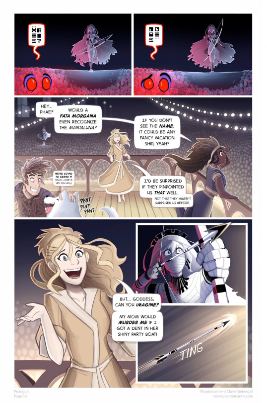
In the bottom left panel,the artist uses the railings again, but doesnt have to render the lights, floor boards, or sea to show where we were, then uses the colours of said BG and mood to paint the rest of the page. This is where colours/gradients and small objects save the day! The same example is here, just flipped. The establishing shot shares DETAILS that you need to show the readers where we are, then the BG of Pavel eating food isnt over whelmed with background characters or other details that get in the way of the ACTION that is to be conveyed
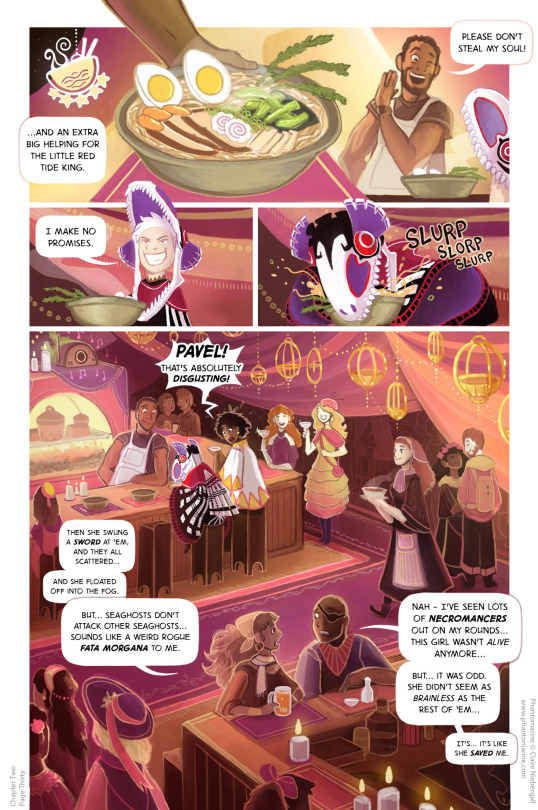
it would be rather distracting if we were to see Pavel eat that bowl, with sooo many more details involved in the panel- instead, the drapes, hues of light, and clever sound effects tell us what is happening. Wychwood does the very same with establishing shots, then KEY DETAILS to provide the reader with where the character is standing, without sacrificing the facial expressions and details of the CHARACTERS that we need to get across
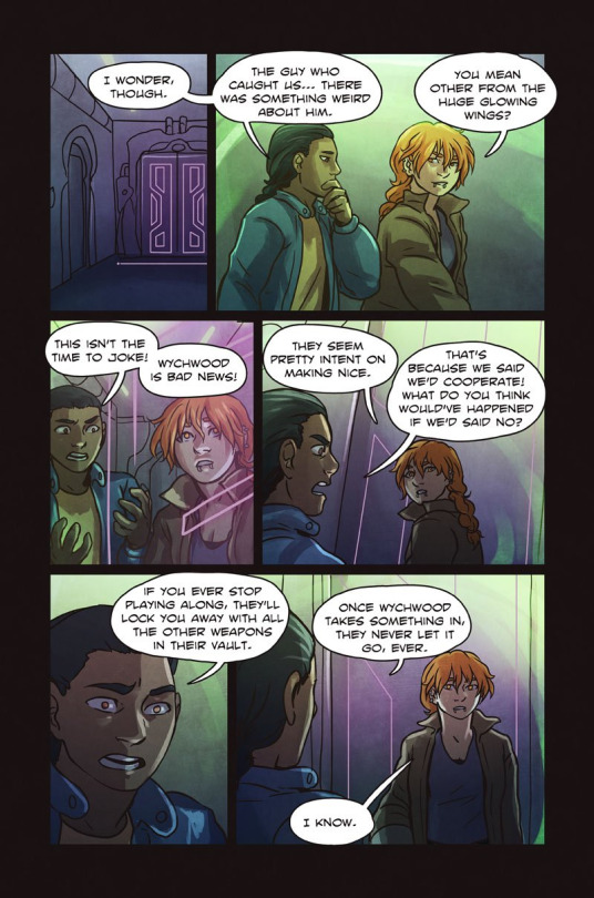
Most detail is in the top panel, the BAR that Julian holds onto is a KEY PIECE to show where they are in the BG already established. Perfect use of BG! Get used to thinking of those key details when changing scenes and establishing shots!
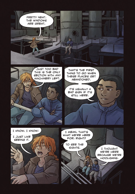
Pick those key details to tell the reader where they are and draw that. If you have a library scene, please just draw that BG once! Take a specific bookcase or key feature, use blocked shapes and colours, and make it less detailed than the provided establishing shot. I also wanna talk about : Action Scenes Focusing on the ACTION of the scenes is SO important when you have them, and often details get lost when a creator focuses on details that can distract a reader! My advice? Most action scenes are best without/need little backgrounds. A few shots from Ghost Junk Sickness demonstrate this. We're paying attention to the action- we've been established where we are before, so let's play in the sandbox now.
Have a panel or two peppered in there, with the same principal as above to ground where your character is, but do not add a BG in every panel. It instantly takes away from the action when it's not integrated as well, and it takes SO MUCH MORE TIME to draw that sequence!
Read More amazing tips: Here are some GREAT examples by the creators of ShadeRunners, HERE who break down how they do backgrounds ( AND CROWD SHOTS!!!!)
TL;DR: Comics are a MULTITUDE of skills and needs. It takes a lot of time and work to pull it off, so working with methods that make it easiest for you as the creator is what will help you maintain that momentum and stability you need! Good luck and get comicking!
405 notes
·
View notes
Note
I know you're not focused on cat art now, but do you have any tips for drawing cats?
Depends what you want specifically advice on.
For realistic anatomy, trace basic shapes from photographs to get a good base and to nail the proportions. Eventually you won't need to do that anymore, but it's an effective way to start out imo. I still do this sometimes because getting proportions correct takes me the longest. With a good base drawing, everything falls into place.

Line weight is important. There's a delicate balance of how much fur should be rendered in the line art vs coloring. This would depend on your art style. I usually draw some fur in the line art, usually around joints or bends. (Take a look around the ears or neck in the drawing above). I also choose to color part of my line art after I finish coloring a piece.
For coloring, I start big, filling in each object with a flat color. Using a large textured brush with a soft edge, I'll add in some additional colors. The second cat on the left has a darker tail and lighter face than the middle of the body. I filled him in with the mid orange color then added the dark color for the tail and lighter face on top.
Then, I do a lot of individual brush marks for the fur and hatch lines. I use the same brush as I use for the line art. It's easy to overdo these lines. Less is more! Some of these little brushstrokes for fur are on a layer above the line art.
And don't forget whiskers! I often forget to add the whiskers because it's my very last step.
I hope this is at least a little bit helpful?
205 notes
·
View notes
Note
how did you learn to render realistic light/volumes so well? your work looks real to my eyes in a way i cannot wrap my head around
I mention having studied as a sculptor for 4 yrs a lot when I get asked about my process but I really do think it was extremely helpful to my 2D art progression (more than anything else, really - I kinda sucked at sculpting).
It hardwired my brain to think of everything I make in 3D terms. Even when we were doing figure studies on paper, it was emphasised that we imagine the figure in three dimensional volumes, and pay attention to how the light and shadows wrapped 'round each individual form. Now, when I paint, I think of "sculpting" the painting out with my brush - when I add shadow to a cheekbone, I imagine I am smoothing the form away with my thumb in order to make the plane of the cheek curve more towards the darkness, and I imagine the different values within that shadow area as well. When I carve out a piece of the nose to form its shape, I think of how this new shape affects the shadows it is casting on the cheeks or mouth. Knowing exactly where your light source is from the start is very important for this.
And I know "think of everything in 3D and imagine the light/shadows wrapping around an object" is super common advice, but I don't think a lot of people mention that it's not just a mindset you can slip into immediately, it's something you have to train up just like any of your other art skills. You kinda have to brute force yourself to ignore that you're working on a flat canvas, and let go of all shorthands (instead of only visualising the nose as a flat image, as it exists in profile in the image you're referencing, imagine how it might look if suddenly the model turned their head towards you. Think of how the planes of the nose are curving away from you to create that rounded shape of the tip, think of what you can't see but you know exists on the other side, etc.)
But of course, it's hard to do this if you've never studied what a nose looks like at different angles. You need to build your mental library so you can enter that space easier. So 3D reference in general is still very important to me; I work better when I can spin something around and see how the light changes or curves because it helps me understand it, rather than just copying what I see in flat 2D ref. I rarely guess at anything I'm not sure of - whenever I need them, I either take references of myself or someone I know, and sometimes I use a simple head sculpt I made in blender ages ago when I'm lazy/need to figure out a more complicated lighting situation. I treat every drawing as a learning experience and try to solidify more of my existing knowledge through it. I even had a small head I'd sculpted in real clay for a while. When I'm in the mood for doing studies I'll sometimes set up a bunch of different lighting scenarios with the 3D head or a 3D-printed skull I have and do quick micropaintings, to refresh my memory. One of the other things I do, for example, is take a flat reference imagine whose lighting I like, re-create that lighting in 3D, then turn the 3D head around to see how it would look under that light source at different angles.
I'm also constantly observing things in the real world. Whenever I'm watching movies my eyes and brain are immediately drawn to the lighting and colors, how the shadows change whenever someone retreats from dark into light etc. I make notes of these or screenshot to do studies later. Whenever I'm hanging out with people and I notice an interesting lighting situation happening I ask them to let me take a picture so I can study it later, or add it to the reference vault. I love to people watch, I look at nature, I'm probably the spaciest person to hang out with but it's helped with the art lmao. Again, this is also something that you can consciously train yourself to do, it didn't come innately to me.
And uhh, honestly sometimes I think it helps that I use a lot of dramatic lighting in most of my portraits. It's easier to sort of "cheese" three dimensionality when you have such a defined separation between dark and light. The first thing I do is paint in the darkest shadow on any painting, then work outward from that. You can use things like the shadow's penumbra, the terminator shadow and ambient occlusion to push the three dimensionality further.
Anyway in relation to this I think of painting more in terms of value rather than color. I don't paint in b&w but over time I've come to learn the values of colors instinctively, though I sometimes apply a black and white filter on top and toggle it on whenever I wanna check if I'm on the right track. Then on top of that, apply colour theory such as different coloured bounce light and sub surface scattering, the colors in different zones of the face, etc.
To summarise, it mostly comes down to studying a lot, training yourself to visualise everything in a 3D space, being observant, making every drawing a learning experience, and training yourself to discard what you 'think' an eye or mouth looks like so you don't fall back on those shorthands whenever you're drawing something more realistic. Grab some clay and make a ball, do some studies of it.
Hopefully this helped shed light on my thinking process in some way; explaining things is usually when I remember english is my second language, I never know if I'm making any sense haha.
#text#as much as training myself to think like this has been helpful I also feel like it's been a bit detrimental#because I have a harder time making cartoonier more stylised art even when i want to.#also of course I am hugely inspired by artists who do a lot of realistic portraiture and I stare at their paintings a lot & save them#pinterest hates 2 see me coming
29 notes
·
View notes
Text

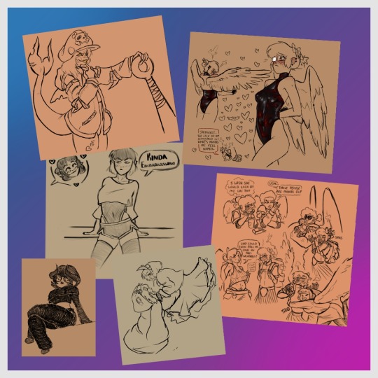
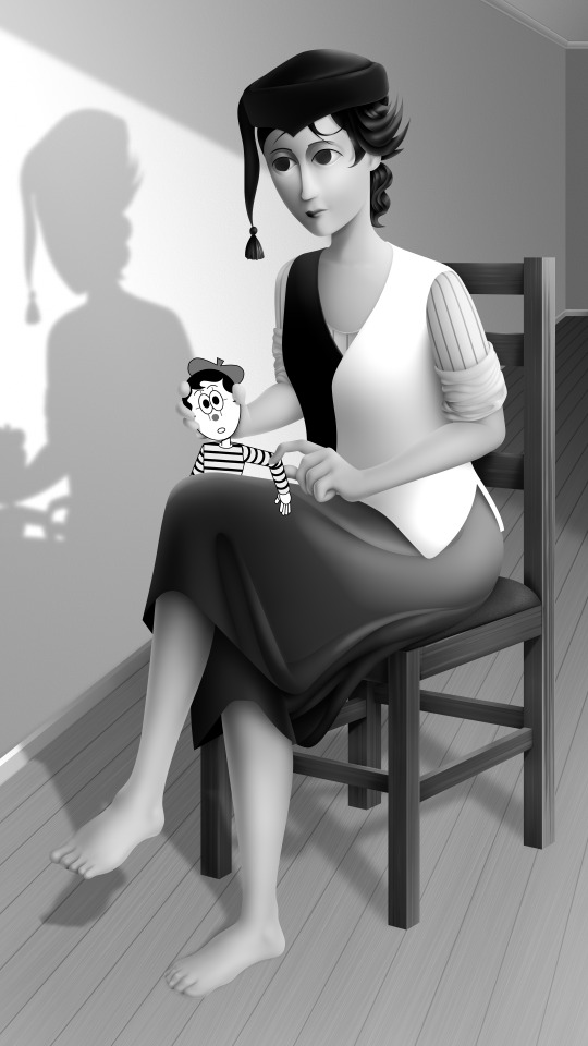
The question arrives, who will claim the Soul Jam? The Jester? Or the King?
[ID Below!]
[ID: Full rendered drawing of two characters, one right-side up on the bottom, the other upside down at the top. They're both reaching for a sky blue club-like gemstone in the middle which is glowing brightly. The figure in at the bottom looks like; Short, pale blonde hair split in the middle, tan skin with closed eyes that have white eyelashes and a star like mark in the middle of his forehead, big pale yellow hat that has a waffle cone pattern with the brim being a darker yellow and more pointed. Holding together his cape is a cross-shaped metal object with a light blue club-like gemstone in the middle and underneath flows two long tassels. His robe is white and loose with a bit of brown dripping down the middle like chocolate ice cream. He holds a staff with a flower at the top. The flower has a half opened eye and is staring at the middle shape. The figure up top looks like; Long black hair with blue eyes near the ends and white and blue bangs near his face, light blue skin with a teal [left] and deep blue [right] colored eyes. He wears puffy sleeves, one white one black, with blue teardrop shaped patterns in it. He wears a white ruffled collar with a steel colored diamond shaped object that has a upside down club-like gemstone that has a line through it to look like an eye. He wears a tight black leotard with teal diamonds on his chest and knees. He holds a staff that seems to hold a light-to-deep blue orb with a bright teal iris. Under the orb is something that looks like a milk splash holding it in place. He grows more transparent the further down he goes. The background is a deep-to-light blue with a dark-to-light squares-to-diamonds pattern. End ID]
#cookie run fanart#cookie run kingdom#cookie run#pure vanilla crk#pure vanilla cookie#shadow milk crk#shadow milk cookie#pure vanilla fanart#shadow milk fanart#rorothedrago art#crk 2024 fanart contest#crk fanart#cookie run kingdom fanart contest 2024
57 notes
·
View notes
Note
What art program do you use? sorry if you already answered something like this but im so mesmerized by the techniques you use in your art.
Thank you. No need to apologise; I don't mind answering this question because it's an excuse to walk through my latest image!
The concept for this piece is based on being perceived online through interpretations of posts and artwork, yet how artificial this can be. The relationship the viewer forms is more with the narrative of the work, and any insight into the artist through this feels highly awkward to me, which is precisely what I want to explore with this piece.
In this example, I wanted an attractive sitter to look like someone out of a new romantics music video or like an Enya video, because this genre and era of media is very aesthetically pleasing and nostalgic for me. I hold it as an unobtainable ideal— a hauntology. So, as wonderful as it is, it equally feels shameful and perverse because it's an aesthetic object of desire that I am contriving.
The sitter is holding one of my cartoon characters, Lauren Ipson, the protagonist of my Ersatz world project. A trope in writing is when a character acts as a self-insert of the author, and I'm conscious to try and avoid that with Lauren. I try to write Lauren as dry and sardonic yet also fun, dramatic, and friendly. I don't think of these as personal qualities of my own, but I imagine personal qualities bleeding into fictional characters is inevitable.
Yet Lauren Ipson feels much more alive a character to me compared to any attempt at self-portraiture or self-expression that I've done, which is very little because I'm not interested in constructing a perceivable identity. (I'm aware this text itself can be interpreted as self-expression; however, to me this is just another construct.)
So Is the sitter meant to be me, controlling Lauren? I'm definitely baiting the viewer to think this, and you can interpret it that way if you want, but really I don't think of the sitter as me at all. My intention is to show how it's all a facarde. The sitter is basically just as much a doll, a puppet, a mannequin as Lauren Ipson is, if anything more so.
There's a deliberate irony between Lauren's cartoon rendering and the sitter, who I wanted to render with more detail and evoke a modernist style. I'm inspired by Hans Bellmer and Dorothea Tanning with their work with dolls. However, despite that implied visual hierarchy, the more detailed sitter shares a similar, stilted vector construct to Lauren. They're both born from vector drawing after all. And it's further undermined with the way Lauren the doll looks directly at the viewer, as if she's alive, while the sitter looks to the side with a blank, almost dead-in-the-eyes expression.
Anyway, with that in mind, almost all of my work starts as a thumbnail sketch. Although I often draft digitally and am fine with doing that, I feel more confident doing it freehand on paper. Digital rendering feels more like a refinement process to me. Funnily enough, although I often prefer to sketch with physical materials, I'm anxious of refining or rendering with them.
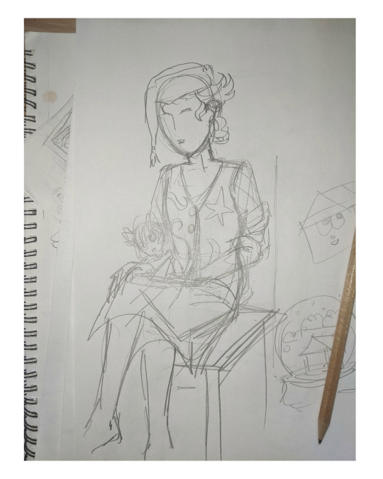
I like my designs to be very direct and conceivable, so a solid silhouette, pose, negative space etc. I often create a quick digital sketch with this in mind, either by tracing or referencing the thumbnail, although sometimes I skip this step and go straight to the rendered drawing. The aim is to establish a visual guide, dividing the drawing into various shapes for digital airbrush rendering later on.

With this composition, I made a second draft with more attention to details such as the face, hands and feet. Sometimes I'll use photo references if I'm struggling with posing or anatomy. These drafts are often blue because it's easier to render the black linework over a transparent blue sketch.

The chair took some time but was relatively simple to render. It uses the line tool set to magnetic anchor point, following two-point perspective vanishing points. I like two-point perspective because it feels sort of digitally native to me to have these impossibly perfect vertical lines. I also know the horizon line should be at eye level or something, but I just like the idea of the top of the chair to be perfectly horizontal.

Here I'm drawing the final rendered form. I use the stroke tool with it set as smooth as possible. Often I'll redraw lines over and over if it means getting certain curves to look right. Once the lines are drawn, I'll fill them in and remove the stroke, leaving just the solid vector shape. The shade of grey I use is done to simply denote the shape. It does not represent any kind of shading or anything; in fact, when I bring it into Photoshop, all these shapes are set to the same shade, but if I had that here in Animate as I'm drawing, it would be impossible to see what I'm doing. The red background is just for clarity.
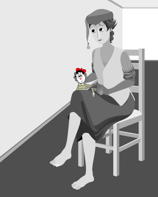
Once it's all drawn, I'll make sure every shape is clean, overlapping nicely, and divided into its own layer. A composition can often be comprised of hundreds of separate shapes.
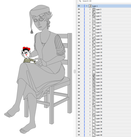
Each shape will be its own layer in Photoshop, which will operate as a clipping mask. The clipping masks act like masking tape or shielded off areas for soft brush opacity rendering, similar to the soft atomised rendering from an airbrush, just done digitally.
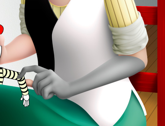
I follow very rudimentary painting techniques of simple shading, lighting, and bounce-back highlights. I follow a simplified Grisaille technique, focusing on strong values in greyscale before adding a wash of colour with a color gradient map set to layer style color. Sometimes my values can be a little off, but as long as the values are all consistently acting together, I can correct them with transparent washes or color curves. If the greyscale looks harmonious with all the forms clear, colour will likely work.


Proper digital painters will say this is an amateur process, with results that look mechanical and stiff, as colours in the real world all bounce together off different surfaces, resulting in colour harmonies. However, I don't mind the inharmonious nature of the colours, as I find the values give the composition enough harmony. I'm working digitally, so why go to all the effort to make it not look digital? It's interesting to me to have the red chair look blindingly red, the green skirt look blindingly green.
Colours can look boring without some form of harmony though, so I will add in blue-greens with the darker areas, more turquoise greens towards the highlights.
Skin tones are far more complex, however, as it's something that's more informed by realism. This is why kigurumi dolls with their plastic flesh look so artificial to the eye, because we're familiar with how light passes through flesh and skin and all the subtleties of colour that it picks up. This piece is the first time I've explored flesh tones, as typically I avoid all this by rendering skin as grey porcelain.
I needed to really up the contrast, with shaded areas becoming purples and highlights verging on washed out. Areas with more blood, like feet and cheeks, appear more orange and red. Areas closer to bone and cartilage, like the bridge of the nose, can look almost blue and green. Exploring these colour values and tints in the aim of natural tones was fun to do, and ironic given how blank the face is.

Although in the moment I feel very much like I'm rendering a realistic reality, when I step back, I'm reminded how stylised and unrealistic the painting actually is. It looks kind of insane, like everything is so uniform and overtly saturated. It doesn't feel present in a real space, despite the shadow and form implies one. But I'm not consciously thinking of these things, of style, as I'm working. To me, it's a process of world-building and problem-solving.
129 notes
·
View notes
Note
Hi! As an LGBTQ+ Christian, I'm genuinely really curious how you reconcile non-celibate homosexuality with Bible verses like Leviticus 18:22 and Romans 1:26-28? While I know alternative interpretations/translations are offered, taking into account context, I really struggle with why God would allow the more commonly accepted interpretations to be so widespread if they were wrong, so I'm super interested in your view on this (if you're okay to share?). <3
Of course! First of all let me start by acknowledging I am not a biblical scholar and am only human, so I encourage you to do your own research. Also, if any of my dating or analysis is factually wrong (like my manuscript analysis), I will be happy to address that if pointed out.
Allow me to take this step by step. This post ended up being super long so I’m going to break it up into three separate posts. Part I is Leviticus 18:22, part II will be on Romans 1:26-28 and part III will be on why I believe the widely held interpretations are so widespread if they are wrong, and why widespread theology and belief doesn’t necessarily mean correctness or truth. I’ll @ you and cross link these posts for access as I go.
Edit: Part II is now up
Part I: Leviticus 18:22
First off, external context:
The following text is from The New Catholic Bible: St Joseph Compact Size Edition (2019)
Modern critics agree that during the Babylonian Exile some priests (of the tribe of Levi) collected and made part of their final text the liturgical books that had taken shape in the course of time: a ritual for sacrifices, another for the investiture of priests, a set of norms for distinguishing clean from unclean; at some later point, they added the "Law of Holiness" (chs. 17-26). It is this body of material that makes up the Book of Leviticus. The various components are not all from the same period: some prescriptions date from the time of Moses and even earlier; in other instances the editors adapt ancient rites to their own present religious concerns. The Law of Holiness, which probably dates from the last years of the monarchy (end of the seventh century) reflects the viewpoints of the Jerusalem priesthood and stands in contrast to the viewpoints found in Deuteronomy, which was published during the same period.
All the laws systematized in Leviticus are regarded as expressing God's will. They impose on the chosen people a common religious behavior by which this people will show themselves to be the people of the Sinai covenant. The Lord has delivered his own from the land of Egypt and he now expects them to acknowledge his presence and render him the worship due to him.
Sacrifice, which takes numerous forms, is the essential act of worship. It signifies that the children of Israel hand over themselves and their possessions to him who is their supreme protector. It unites them to their God and, by winning his forgiveness, restores this union when sin has broken it. In short, through sacrifice God saves and sanctifies his people. Israel is a priestly people; the priests in their actions symbolize the worship of an entire people.
In addition to moral and liturgical precepts, Leviticus lists various, sometimes quite detailed regulations meant to decide which objects and things hinder a person from drawing near to what is sacred, even though no moral fault might be involved; it was thought that these objects had a baleful power. Like the neighboring peoples, the children of Israel had their prohibitions, but even through these taboos, which were standard in this ancient civilization, they came to know the holiness of God, which is so strongly asserted throughout this book and which came to pervade their entire existence.
Let’s do some close reading here. First of all, Leviticus as we have it was compiled and written during the Babylonian Exile, likely combining oral tradition, Jewish practice and written documents. This means that the text carries with it a long history of existing laws and reflection on customs and law/the priesthood. This isn’t to say that the text isn’t divinely inspired (a doctrine I personally affirm though you don’t have to), but because it was written through mortal men we can assume the limitations of humanity apply such as bias, cultural understanding (such as the way an American’s understanding of the date 9/11 is coded by the 2001 plane attacks as a modern day citizen), and imperfect dialectic and rhetoric skills. Once again, this doesn’t denigrate the text as much as just humbly acknowledge that as humans we are limited, and we must approach Scripture with that knowledge lest our arrogance overtake us into the sin of pride (which is similar to the issue a lot of Catholics take with Protestants defending strict sola scriptura). This means that we must approach the text with the understanding that Leviticus 18:22 was written after the law was given, traveling in the desert, the establishment of Israel as a kingdom and the Babylonian captivity and exile. That’s…a lot of time for potential interference between the law given by God and the text in our hands. It’s like playing a really long game of telephone: we’re probably really close, but there can be gaps and we should acknowledge that potential. So I can acknowledge that the verse was written by fallible men, with human limitations, quite some time and distance culturally and geographically from the original handing of the law at Sinai. Once again, this doesn’t denigrate Scripture and its worthiness, but is a necessary acknowledgement for humility and understanding within the text’s proper context.
Second of all, the above quote tells us that the laws are there to show that the Sinai people are different and set apart (more on this later). This gives us the motivation and intention of the text and the laws within them. Now, while we may certainly argue that the truths expressed in the law have worthiness in being continued (one of my favorite parts of Leviticus is the house code of Leviticus 14 which tells the priesthood how to deal with mold infections in a house and when it’s salvageable and when it needs to be destroyed/how to avoid getting sick from it with the means available to them in the desert and later on when they could actually build houses) it’s important to recognize that the law was given to the Jewish people in order to keep them alive in the desert and to separate them from Egypt and the Canaanites (Leviticus 18:3). Thus everything contained in the law is for one or both purposes, and should be evaluated in this way. The question becomes: what was the behavior being addressed in 18:22, and how did that keep them alive in the desert and/or separate them from the people around them? I’ll come back to this question later.
Notably, the point of being separated from people around them was twofold: the purpose was either to avoid being judged and looked down upon by other nations (by doing something they’d see as shameful or dishonorable) OR it was to set apart Jewish religion from other religious practices around (remember Leviticus is primarily aimed at priests and framed within a religious law (rather than secular) context). So 18:22 must be referring to behavior either condemned by other nations OR religious behavior normalized within other nations (a good comparison is the prohibitions of scarification and tattoos, as these were regularly performed by surrounding religious groups for ritual purposes. Notably, we no longer uphold such prohibitions as we are not Ancient Israel.)
As a quick side note the detail on describing houses of stone also emphasizes my above point about the text being written post Sinai and the desert exile (when they were more nomadic and largely in tent encampments).
Another aspect of note is when the quote above talks about “the various components are not all from the same period: some prescriptions date from the time of Moses and even earlier; in other instances the editors adapt ancient rites to their own present religious concerns.” This also affects our approach to the applicability of the text in our lives, and we must acknowledge that we don’t have the law dictated by God at Sinai (dated roughly 1313 BC), we have an inspired account by men written during the exile (dated roughly 425 BC to 328 BC). That’s a thousand year separation. Remember that game of telephone? So we have God’s dictated law, filtered through God’s inspired scripture a thousand years later by a divinely inspired yet still fallible and limited human being. And that’s just the original copy. The earliest manuscript of Leviticus we have, 4QExod-Lev of 4Q17, is a Dead Sea scroll that dates to 250 BC (so at least 78 years since the original), and that manuscript doesn’t even have 18:22. For that verse we have to go to 4Q23 which is dated sometime between 140 and 37 BC. So now we have our divinely dictated word of law being written by divinely inspired humans, then (since we only assert that the originals are divinely inspired, not copies or translations) being copied and translated into a not divinely inspired manuscript written approximately 1,173-1,276 years after the original law was dictated at Sinai, all by fallible humans. That’s a lot going on in our game of telephone before we even touch the question of translation, preservation, and the biblical canon.
That’s made even more complicated by the fact that 18:22 is part of the Law of Holiness, which “probably dates from the last years of the monarchy (end of the seventh century) [and] reflects the viewpoints of the Jerusalem priesthood [of the time] and stands in contrast to the viewpoints found in Deuteronomy, which was published during the same period.” Telephone game and human limitations.
Finally, for external context, we have the following part of the quote: “Leviticus lists various, sometimes quite detailed regulations meant to decide which objects and things hinder a person from drawing near to what is sacred, even though no moral fault might be involved; it was thought that these objects had a baleful power. Like the neighboring peoples, the children of Israel had their prohibitions, but even through these taboos, which were standard in this ancient civilization, they came to know the holiness of God” I want you to keep this in mind as we move into the next part of our verse analysis
Internal context:
Leviticus 18 is part of the Law of Holiness (or Holiness Code), which is unique for regarding all of Israel as holy (not just the priests or sacrifices) and mainly is the bit where God says that the Canaanites were doing certain practices and Israel needs to not do them. So we know 18:22 refers to something the Canaanites were doing, which satisfies the earlier question about the verse needing to help Israel survive in the desert and/or set them apart from other peoples. 18:3 specifies this by saying “you shall not do what is done in the land of Egypt where you lived, nor are you to do what is done in the land of Canaan where I am bringing you; you shall not walk in their statutes.”
Remember the earlier definition of “set apart”? Let’s come back to that. Option 1 is to avoid shame. Option 2 is to avoid religious practices to set Judaism apart. The word used in 18:22 is the infamous to’evah. Abomination. What does to’evah mean in its original context? Let’s look at other verses. In Genesis 43:32, it’s used to describe the way Egyptians believed it was a to’evah to eat bread with the Hebrews. In Genesis 46:34, it’s used to describe how Egyptians saw shepherds as to’evah. In Exodus 8:26, it talks about how the Egyptians saw certain Hebrew sacrifices as to’evah and that’s why Moses asked pharaoh to let them go out of Egypt to make sacrifices. In all these cases, option 1 (behavior detested by other nations) seems to be the best case. It’s notable that none of these things are morally bad in of themselves (the Bible itself discusses how shepherds, Egyptians and jews eating bread together, Jewish sacrifices are all fine) but instead are cultural taboos.
So let’s look at behaviors that were prohibited by surrounding nations:
First off the Hittites had laws against a father having intercourse with his son (I don’t know for sure if this means consensual or not because the term I came across is “violates” which could mean rape or it could mean defilement). It is accompanied by other anti incest laws similar to the rest of Leviticus 18. The scholar Harry Hoffner Jr notes that the Hittite law was because the partner was the man’s son, not because they were of the same sex. The following quote is by scholar Brian Gerig:
Table A, paragraph 20 deals with a physical act done, not just a rumor: “If a seignior [an Assyrian man] lay with his neighbor [another citizen], when they have prosecuted him (and) convicted him [the first citizen], they shall lie with him (and) turn him into a eunuch.”14 This describes a situation where a man has forced sex upon a local resident or business partner, who then has the option of bringing a charge against him. Noticeably, the perpetrator is punished while the victim is not; so the crime here is rape. Homosexuality itself is not condemned, nor looked upon as immoral or disordered. Anyone could visit a prostitute or lay with another male, as long as false rumors or forced sex were not involved with another Assyrian male. Still, both of these laws suggest that for a male to take the submissive woman’s role in same-sex intercourse was looked down upon as shameful and despised.
I’ll come back to the idea of a man in a submissive woman’s roles being looked down upon later. But for now, Brian Gerig continues on:
Pictorial and literary references in ancient Mesopotamia show acceptance of some forms of homosexuality, but wariness toward others. Anal intercourse was freely pictured in figurative art in the ancient cities of Uruk, Assur, Babylon, and Susa from the 3rd millennium B.C. on – and images show that it was practiced as part of religious ritual. Both Zimri-lin (king of Mari) and Hammurabi (king of Babylon) had male lovers, which the queen of Zimri-lin mentions matter-of-factly in a letter. The Almanac of Incantations contained prayers favoring on an equal basis the love of a man for a woman, of a woman for a man, and of a man for man.16 (Lesbian love is not mentioned, probably because of the low status of women in ancient times, when women were basically considered property, and adultery was considered a trespass against the husband’s property. A husband was free to fornicate, but a wife could be put to death for the same thing.17) The Summa alu, a manual used to predict the future, sought to do this in some cases on the basis of sexual acts, five of which are homosexual:
“If a man copulates with his equal from the rear, he becomes the leader among his peers and brothers.
If a man yearns to express his manhood while in prison and thus, like a male cult-prostitute, mating with men becomes his desire, he will experience evil.
If a man copulates with an assinnu [a male cult-prostitute], trouble will leave him
If a man copulates with a gerseqqu [a male courtier, or royal attendant], worry will possess him for a whole year but will then leave him.
If a man copulates with a house-born slave, a hard destiny will befall him.”18
The fact that different kinds of homoerotic pairing will occur is taken for granted. What mattered was the role and the status of a partner, especially the passive partner – and the anticipated ramifications in each case. To penetrate a male who was of equal status or a cult prostitute was thought to bring good fortune; but copulation with a royal attendant, a fellow prisoner, or a household slave was thought to probably spell trouble.19
Needless to say, none of these are about being queer as we understand that now. The closest one is the act of anal sex between men, used as a power and social dynamic: they are equals until anal penetration occurs, after which the penetrator is superior and a leader, and the nature of each case of homosexuality comes down to power dynamics and social class between men. This isn’t an act of a romantic and sexual relationship such as the gays have now. Notably, 18:22 reinforces this distinction by the addition “as one lies with a woman.” The prohibition isn’t against lying with another man, but against lying with him in a specific way. This separates 18:22 from the other verses in ch 18, in which incest is just flat out prohibited in all forms such as 18:7 (you shall not uncover the nakedness of your father or mother), onto 18:20. Similarly, 18:23 (beastiality) is a flat out prohibition rather than a specific font of an action. Only 18:22 stands out with the qualifier “as with a woman.” I would argue this is because of the above power and social dynamics of anal sex in the Ancient Near East. The woman was submissive and penetrated, for a man to receive anal penetration was for him to become a woman and thus degrade himself and be judged for it. That’s why Sodom and Gomorrah ought to be read as gang rape in an attempt to humiliate a foreigner (which is the interpretation that better aligns with Ezekiel 49-50: “Behold, this was the guilt of your sister Sodom: she and her daughters had arrogance, abundant food and careless ease, but she did not help the poor and needy. Thus they were haughty and committed abominations before Me. Therefore I removed them when I saw it.” [Emphasis added]).
This is further emphasized by the fact that Ancient Greece and Ancient Rome both had similar views of anal sex, in which the bottom participant was seen as holding the role of a woman and/or an inferior (and thus denigrated) while the top was accepted (and in some cases seen as asserting his manliness and power in having anal intercourse as the penetrator). More on Rome’s views later.
So to summarize: to’evah suggests practices that are cultural taboos rather than inherently immoral acts. This lends itself to an interpretation of “being set apart from Canaanites” as avoiding behavior that would shame Israel in the eyes of the nations around it. Historical evidence does not suggest that queer relationships were an issue. Instead, the judged behavior was either actions that aren’t queer relationships OR an act based around power dynamics and social class hierarchy and humiliation that led to the social shame of one of the participants as “less of a man” and as an inferior. Obviously, that last one is not the case for modern queer relationships, which are not about power and social class dynamics in that way AND our society does not look down upon men who practice anal sex the same way the Ancient Near East did because we no longer have the same views of men and women and their sexual and social roles (excluding of course modern homophobia which is fueled by verse interpretations and thus out of the question here).
But let’s say I lost you with my interpretation of to’evah as social taboo. Maybe 18:22 was a matter of Israel avoiding behavior that surrounding nations allowed or celebrated religiously or socially (option 2 of being set apart). Let’s examine it again from that lens then:
Brian Gerig and many other Near East religious and cultural scholars highlight laws and cultural norms around homosexuality as taking two main forms outside of the ones already addressed above: pedastry and temple prostitution/religious erotic practices.
Pedastry is, of course, pedophilia. I think we can all agree that pedophilia is evil and also NOT WHAT QUEER RELATIONSHIPS BETWEEN TWO CONSENTING ADULTS IS.
As for temple prostitution (of which Canaanite cultures did have quite a few instances of men and women who engaged in sex with worshipers as an act of religious devotion) and religious erotic practices (in which priests and priestesses engaged in erotic and sexual activities as offerings or devotion to their gods and spirits), this aligns more with the idea of “being set apart” = “not doing religious practices of surrounding nations” (remember the scarification example?). Once again, this is situationally limited (we as Christians no longer prohibit tattoos because we don’t do them religiously and are not Jewish so as to be set apart like Ancient Israel) and more importantly IS ALSO NOT WHAT MODERN QUEER RELATIONSHIPS AND SEX ARE ABOUT. A gay couple isn’t having sex as an offering to an ancient Mesopotamian deity or as a temple act with worshipers and parishioners for religious reasons (most of the time at least, idk what everyone does with their time but we’re not talking about that here).
I have one final nail in the coffin for Leviticus 18:22, and that’s about exegesis and application:
Supersessionism is bad and antisemetic. We’re not replacing Jewish people in the covenant and in being set apart from other nations by YHWH. Thus, we are not under the same category of having to be set apart from Egypt and Canaan like the Ancient Israelites were. You could argue the Holiness Code does not apply to modern day people as a result.
Part 2: Romans 1:26-28 and Part 3: Why the commonly held interpretations are widely spread if they are wrong to come shortly.
#clobber passages#leviticus#romans#folk catholicism#catholicism#queer catholic#queer christian#catholic#folk practitioner#jesus christ#catholic saints#queer#lgbt#progressive christianity#progressive catholic#catholic lesbian#side a#side b#side y#side x
39 notes
·
View notes
Note
You got any tips for rendering metal? I’m fighting for my life rn
I think the best advice to keep in mind when rendering anything is to keep it as simple as possible. Keeping things clear and simple makes it readable and very nice to look at, dont hyperfocus on small details that overtake the image. Obviously look at a lot of references and keep practicing until it becomes less taxing on your mind to think of which colors go where. For metals, i usually start with a faded/muddy base color, then draw in the major shadows with a more saturated and much darker version of that base (this shadow follows the shape of the metal object). Then i put in the major highlight, which is usually a very bright and more saturated version of the base color, sometimes i shift the color wheel a bit too so it’s not the exact same shade (this highlight follows the shape as well, be mindful of your light source. It’s usually directly next to the shadow). Then i do reflections, which i get the color for by taking the shadow color, shifting the color wheel a bit, and upping the saturation a lil. (This is the light reflection from the light around your object, it’s usually sandwiched inside the dark shadows). Lastly you do rim lights, which are very bright and can honestly be any color you want as long as it defines the edges. This is a crude description of my process, but i try to do more illustrated examples of such things on my patreon if you’re interested
33 notes
·
View notes
Text
#Caturday 🐱:
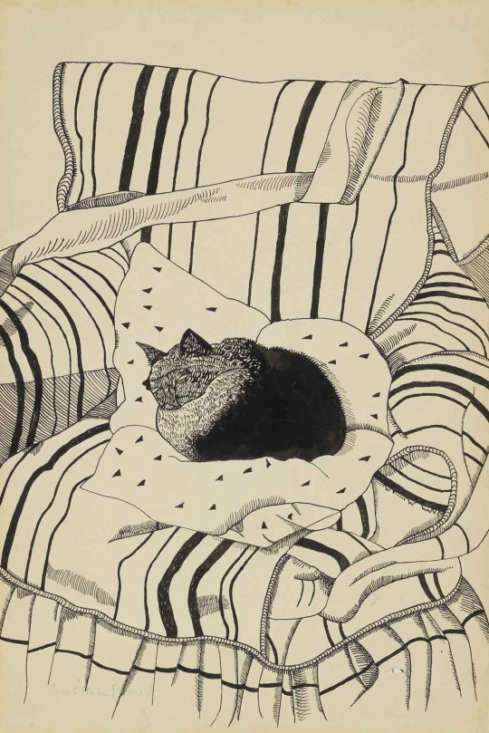
Lucian Freud (German-British, 1922-2011)
The Sleeping Cat, c.1944
ink & pencil on paper laid down on card, 10¾ x 7in. (27.2 x 17.8cm.)
https://www.christies.com/lot/lot-5459621
“Curled up within the soft upholstery of its comforting armchair, Lucian Freud's The Sleeping Cat is a drawing abundant with life. The small black mass of the cat's body appears warm with breath and heavy with sleep, the fur on its back rendered almost tactile through the careful strokes of Freud's pen. The blanketed armchair fills the remaining paper; its striped patterning articulated in black ink, undulating over the surfaces of the furniture. In this drawing, Freud demonstrates his remarkable and early aptitude for draughtsmanship, hatching and cross-hatching form, volume and surface with the deft nib and stroke of his pen. In The Sleeping Cat, Freud depicts for the first and only time in his oeuvre, the figure of a cat. While he himself has never had a particular affinity or affection for cats, his mother and father were especially fond. It is perhaps in this context, as a loving tribute that we should understand The Sleeping Cat. Freud's mother Lucie in particular had always been an avid proponent of her son's work, indulging his ability and treasuring each work he gave her. Their bond was to continue throughout the artist's life.
Freud was only in his early twenties when he realised The Sleeping Cat, and was barely concerned with style. His central focus was on the importance of shape and texture, taking extreme care to express the bristling fur of an animal, the silken barb of a feather, the fold of a hand, the crease of an elbow or the shape of an eye. This devotion to detail is particularly apparent in The Sleeping Cat. As Robert Hughes has suggested, 'everything is equally there, and must be equally described. This objectivity, this evenness of attention mingled with a barely veiled otherness of all objects - rooms, faces, plants, furniture - lies at the core of Freud's early work' (R. Hughes, Lucian Freud Paintings, London 1987, p. 13). KA”
#animals in art#20th century art#european art#drawing#monochrome#black and white#cat#Caturday#pet portrait#modern art#1940s#Lucian Freud#Christie’s#British art
22 notes
·
View notes