#responsive css menu
Explore tagged Tumblr posts
Visit Tumblr Blog
Explore Tumblr blogs with no restrictions, modern design and the best experience.
Last Seen Tumblr Blogs


Fun Fact
When “GIF” was named word of the year in 2012, Oxford Dictionaries U.S.A. credited Tumblr for pushing the word.
Text

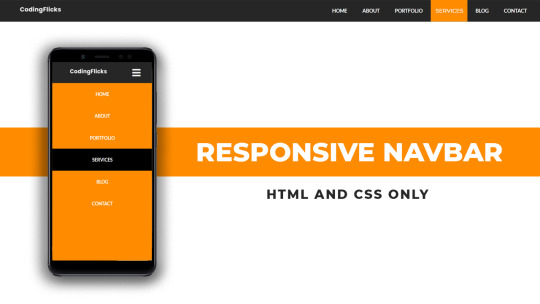
Responsive Navigation Menu
#codingflicks#html css#responsive navigation menu#css menu#css#html#css3#frontend#frontenddevelopment#webdesign#navbar#learn to code#responsive web design#menu html css
5 notes
·
View notes
Text

Responsive navbar
#responsive navbar#html css#divinector#css#webdesign#frontenddevelopment#css3#html#responsive web design#html css menu#css menu
4 notes
·
View notes
Text

Responsive Mega Menu
#Responsive Mega Menu#flexbox mega menu#css navbar#css menu#html css menu#css megamenu#responsive menu#codenewbies#html css#css#html5 css3#code#responsive web design
3 notes
·
View notes
Text

Leonora is a UI template for use with the Sugarcube story format in Twine.
Inspired by an imaginary cathedral by the sea and the distorted, sacred devotions of a woman who was once a girl there.


Did this template need three stories for its demo? No, but here they are anyway: there's flash fiction, a petite novelette, and a branching interactive adventure to show off everything Leonora can do. All lovingly written, coded, and styled by hand.
Features:
Mannerism-inspired design
3 built-in themes (dark, light, sepia)
Customisable title screen
Matching settings & save menus
Optional built-in Character Profile
Annotated passage guide, CSS stylesheet, and Story Javascript for easy customisation
Responsive design for desktop, tablets, and mobile devices
Includes both portrait and landscape styling for small screens
Download + play the demo on itch:
#twine template#twine games#interactive fiction#indie game dev#writers on tumblr#writeblr#game assets#original fiction#short fiction#ok that's all my tag soup! i am very proud of these stories n the template i will not lie. all 32k words of em (only cried a little over js#i had a lot of fun making them and i learned a lot of cool new things >:3#project oblation#name reveal i suppose#jinx.exe#leonora template
363 notes
·
View notes
Text


Over two years ago, I was inspired by @transhitman's personal Disco Elysium Skill project to make my own Disco Elysium Skills. Today, I am proud to present my own take on the idea, the Internal Family Skills, having finally gotten my brain in gear enough to finish it in a showable capacity. This isn't the final form of the project, but I'd need to learn CSS to make a full fake menu on my Neocities, and a new tablet to make the Skills as painterly as the game's art style (which I might not do, since this style is basically what the inside of my brain looks like).
We're starting off with the Manager (MGR) Attribute: Your capacity to present sufficient normalcy and interact with the people around you. Its six Skills are:
Bureaucracy
Disguise
Distress Tolerance
Hiya
Pakikiramdam
White-Passing
[ Firefighter | Exile | Self ]
Bureaucracy
Understand process and procedure. Pull on the levers available to the public.
COOL FOR: Pencil-Pushers, Concerned Citizens, The Maliciously Compliant
Bureaucracy is what humans use for detailed communication in place of emotional honesty. This is not, in fact, an imposition -- rather, it allows for smooth cooperation and organization at large scale without the superior's scorn or the inferior's resentment getting in the way. Your Bureaucracy skill familiarizes you with paperwork and precedent, assures that the powerful view you as properly compliant, extracts assistance from systems that don't care about you as a person, and teaches you how to work to rule.
At high levels, Bureaucracy lets you navigate hierarchies, provide and access information easily, and fill in gaps in existing procedure where there is none. It'll also make you a fussy, obstinate smartass who refuses to participate with anyone emotionally or act without structure. At low levels, however, you'll be adrift in a paper sea designed to silence, exhaust, and oppress you.
Disguise
Manipulate with masks. Fit yourself into palatable forms.
COOL FOR: Changeling Children, Sociopathic Butterflies, Emotional Laborers
Disguise wants you to know that if you can't be yourself, it's always okay to be someone else. As your handy-dandy superficial charm, Disguise feeds you the lines necessary for a given situation: Need to act mindful and demure at work when you're imagining gutting your manager like a fish? Disguise is already on it. Want to seem like a problem-solving super-genius when you're actually in the middle of cybersex? Disguise is running the social buffer. Trying to avoid telling the truth to your parents or scaring the hoes at the local queer scene? Got. You. Covered.
At high levels, Disguise makes you terrified of failing to live up to your image, to the extent that you'll partition off your life into different personas. You won't be tempted to become any of the masks, but by God will you not take any of them off. At low levels, though, you'll have to take all the lumps that come with never telling anybody what they want to hear.
Distress Tolerance
Endure immediate pain for long-term gain. Stay in the trap to remove the one who set it.
COOL FOR: Forward-thinkers, Sensitive Souls, Cluster Bs
Distress Tolerance is your lexicon of adaptive coping mechanisms. It snaps into action when the world is painful and unfair, identifying pain relief and things you can control. Distress Tolerance reminds you to go for a walk instead of lying in bed, to spend time with people you love instead of fighting online, and to box breathe instead of hiding in a cabinet and sobbing. It also helps you keep your goals in mind: the point of enduring the pain is to avoid hurting people and to have a better life in the future.
At high levels, Distress Tolerance makes you hyper-sane, and thus hypernormal. You'll fall victim to the seductions of personal responsibility, assuming that it's simply your duty to put up with the world's iniquities. Without it, though, you'll be a panicking woman-child ignorant of her own agency, unable to do anything about those iniquities but lash out at the people who love you.
Hiya
Feel shame yourself. Anticipate shame in others.
COOL FOR: Overton Glaziers, Panopticon Inhabitants, Human Dignity Enjoyers
Hiya isn't the cop inside your head, it's the patriarch -- instead of trying to shoot you when you've deviated from the accepted standards of behavior for a given community, it just makes you feel fundamentally unlikable and helpless. This isn't entirely a bad thing, since the accepted standards of behavior frequently involve putting others first so you don't make them feel fundamentally unlikable and helpless. That said, while Hiya teaches you that standards of behavior can change, the only tool it gives you to accomplish that is the cattle prod called "shame".
At high levels, Hiya makes you socially invulnerable -- because you don't do anything objectionable in the first place. Not only will you be self-sacrificingly afraid of being deemed deviant, you'll cringe and withdraw when others embarrass themselves regardless -- and you'll enforce shame yourself to make the cringing stop. Without it, though, you'll literally be walang hiya: a shameless, self-gratifying boob incapable of thinking about others' feelings.
Pakikiramdam
Understand that others’ needs are different. Find out what they are.
COOL FOR: Relationship-Builders, Active Listeners, Safety Tool Users
Pakikiramdam feels out everything that isn't explicitly said. It's a Skill of social moderation formed through trial and error -- knowing what will tickle someone's funny bone, whether acquiescence is hiding upset, and whether they see a given action as common courtesy or a true effort. Pakikiramdam creates models of others' internal states to better foster and maintain kapwa; to this end, it reminds you to check in, slow down, and look at the conversation from outside so you're on the same page about what's going on.
At high levels, Pakikiramdam will make you truly empathetic and understanding -- as long as people can stomach you being a busybody who demands adult communication and introspection about their wants at the drop of a hat. Too low, however, and you'll simply barge through situations assuming you already know what everyone wants, giving you no chance to build empathy in the first place.
White-Passing
Defend yourself and get away with it. Recognize and use what authority you have.
COOL FOR: Egotists, Dissatisfied Customers, Fifth Columnists
You are the phenotypical expression of a multigenerational effort to make you and your desires untouchable in any social situation. White-Passing measures your ability to live up to that standard: Can you talk over people in a meeting to make your point heard? Can you talk to a cop like he's a brave and dignified defender of your security? Can you justify the entire extractive supply chain in order to demand a better customer service experience?
At high levels, White-Passing will get you what you want, and getting what you want will reinforce the rightness of your power. Not only will this make you an entitled little martinet claiming power you lack, it'll chain you to the structures that have given you what power you have. But without it, you won't even be able to get past the cop in your own head, let alone the ones outside it, and you'll make a cult of your own disenfranchisement.
Notes:
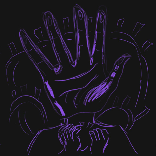
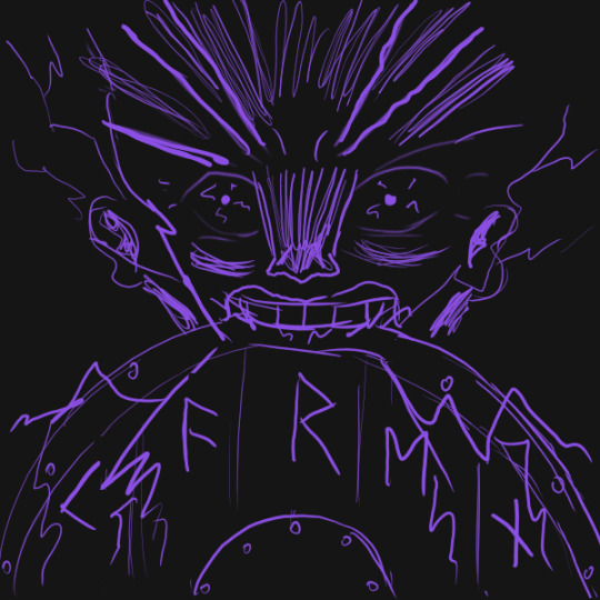
Bureaucracy's ear-thingies are a reference to Intergalactic Advocate Bob from Jupiter Ascending.
The mask Disguise is wearing is based on Caves of Qud's gentling mask.
Thanks is due to Jeremiah Reyes' 2015 article "Loób and Kapwa: An Introduction to a Filipino Virtue Ethics", which was instrumental in me figuring out how exactly my lolo's ethics filtered through my dad to me, for good and for ill.
21 notes
·
View notes
Text
I'm alive (theoretically)! I'm almost ready to start putting things up on the armor gallery <- view in a desktop browser for best results pls
the consensus from this post seems to be to keep the sky portion which is fine with me, but last call if you want to make your opinion known! next question:


ok it's not super obvious when the pics are tumblr-sized, but any thoughts on if should I have the shield overlay not visible (left) or visible (right) on the shield-weaver? or both since there will be two images? no overlay with no headgear/visible with headgear maybe?
also I'd still love to find someone knowledgeable in current CSS/javascript/tumblr theme making (my CSS is many years out of date, I don't know js, and while I'm sure I could make a theme I simply don't have the spare brainpower to do it right now). the dropdown menus work on desktop but are iffy at best on mobile, and while I tried to make the theme* responsive to screen size changes, I'm sure it could be done better.
From what I understand of javascript (admittedly very little), a js dropdown menu would work much better on touchscreens - but if there's some sophisticated CSS that would also do the job I'd love to hear about it!
so if anyone wants to help me out in this area, I (and probably anyone who uses the armor gallery) would greatly appreciate it 🙏
*the theme I modified is like... ancient... and doesn't support NPF. which is not exactly a problem because before the old post editor went the way of the dinosaurs, I created *checks blog* 316 drafts in the old format. lol. lmao, even. I may not be good at planning but I AM good at hoarding! still, a theme that's up to current tumblr (and HTML/CSS) standards would be nice.
#horizon-armor#if you notice the background looks a bit different: you know how i said i'd cry if i missed one?#... ... ...#...yeahhhhhhhh#i had a list and everything. physical list on paper right in front of my face. checked things off as i went. and still#(banuk ice hunter master i'm not talking to you ever again)#ANYWAY they're all there now. really. for sure this time. (god i hope)#also GIMP 3.0 coming out just a bit ago was both great and slightly not great#great bc non-destructive editing now whoooooooo! and you can select multiple layers at once! FINALLY!#not great bc some things changed and i had to adjust my muscle memory#but the layer effects are a huge boon! they make everything so much faster!#including my laptop's fans if i've got a lot of them! lol#also i know the theme for *this* blog has issues with npf posts and weird overlapping of pics/text sometimes -_-#i'll have to figure it out or get a new theme... but i don't wanna...
18 notes
·
View notes
Text
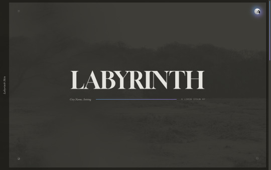
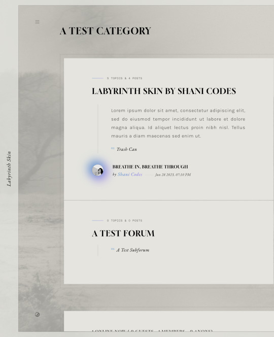

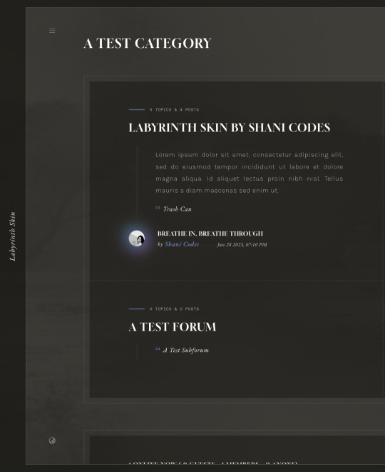
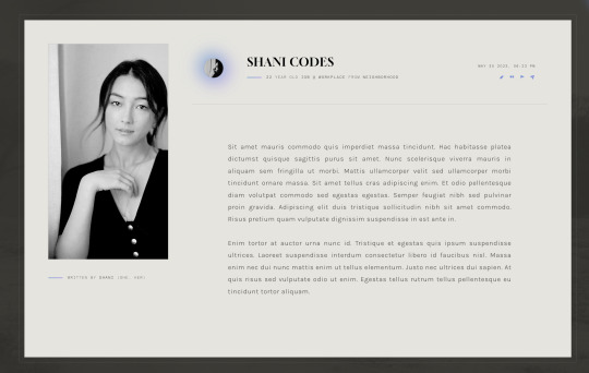
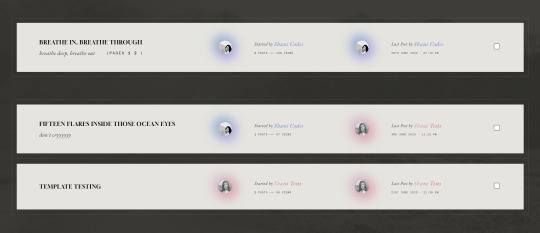
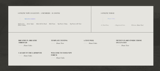
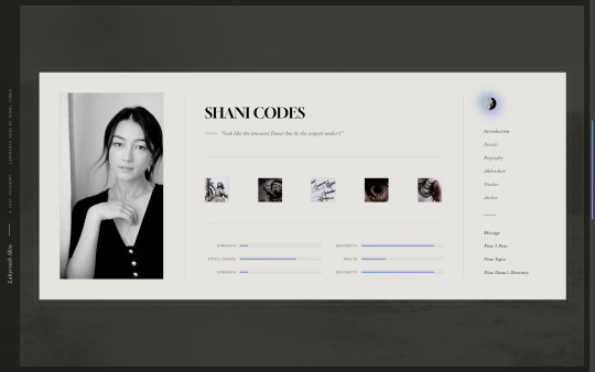
Labyrinth Skin ($65, Unlimited) by Shani Codes
LABYRINTH is a responsive skin for JCINK forums and is optimized for Google Chrome. If you have questions about the skin, or seeing a full preview, feel free to join my support discord: discord[DOT]gg/G9zb4sQxdp
SKIN INCLUDES:
Two pop-ups for Navigation menu and for User Links,
A color mode toggle with three themes: light, medium, and dark modes
Full responsiveness for various screen resolutions, supporting both mobile and smaller screens,
Easy to edit member group variables,
CSS variables for fonts, colors, images, sizes, etc. for easy customization,
Post row with a sticky, hover mini profile,
A tabbed, pop-out main profile ft. attribute sliders, aesthetic images, sections for freestyle and shipper, and automatic thread tracker,
A filterable, searchable, and sortable isotope member list with counts,
And an included installation guide PDF with comprehensive instructions.
NOTES:
A low-contrast, bright background image is recommended to match all three color modes.
Accents can easily be switched from gradients to solid colors.
PURCHASE LINK: ko-fi[DOT]com/s/b164fd2264
#jcink skin#jcink skins#jcink skins for sale#jcink codes#jcink code#really excited about this one! it's my most customizable skin yet!!!#for sale
100 notes
·
View notes
Note
hi so i was playing around with my codes and the link color does not work ? the hover , active , and visited does but the actual link itself will not change the color or text decoration. also wayfarer works pretty well on mobile nested nicely on screen. what code did you use because the code i am using makes it all squished thanks !
The CSS for the hover is separate from the CSS for the link.
Here's the CSS from the default Sugarcube UI. The element a (anchor, which creates links) controls your link styling. a:hover controls the styling for when the cursor hovers over it. a[disabled] controls a disabled/visited link. You can see how they have different colours and text decorations.
a { cursor: pointer; color: #68d; text-decoration: none; transition-duration: 200ms; } a:hover { color: #8af; text-decoration: underline; }
a[disabled], span.link-disabled { color: #aaa; cursor: not-allowed !important; text-decoration: none; }
Making your game responsive isn't a one-size fits all scenario. It depends on the dimensions of your UI and a number of other unique factors. You can use media queries to change what your game looks like on different viewport sizes.
If you open your game in a browser, right click and hit Inspect, you can test what it looks like with different resolutions. Switch it to mobile mode and there will be a dropdown menu with the dimensions for different common phones and tablets.

You can switch through them to see how your media queries are working with each size; usually you will have to fiddle with things to get it to fit right.
10 notes
·
View notes
Text

CSS Landscape #20 (2024)
- New features in Safari 197 & Firefox 127 - Shadow DOM, Popover API, rem units & more - Build responsive menus, text reveals & cut-out shapes
Tutorials, videos & podcasts included! → https://freefrontend.com/css-landscape-2024-07-18/
10 notes
·
View notes
Text

Comment faire un site internet de qualité ?
janvier 14, 2025
by engama237
with no comment
Uncategorized
Edit
Avoir un site internet de qualité est aujourd’hui essentiel pour toute entreprise, organisation ou professionnel souhaitant se développer sur le web. Un site bien conçu renforce votre crédibilité, améliore l’expérience utilisateur et augmente vos chances de convertir vos visiteurs en clients. Mais comment créer un site internet qui soit à la fois esthétique, fonctionnel et performant ? Voici un guide complet pour vous aider à réussir.
1. Définir vos objectifs et vos besoins
Avant de commencer la création de votre site, il est crucial de définir précisément vos objectifs :
Souhaitez-vous vendre des produits en ligne ?
Présenter vos services ?
Informer vos clients ou générer des contacts ?
Un site internet de qualité doit répondre à des besoins précis et avoir un but clair. Rédigez un cahier des charges qui détaille vos attentes en termes de fonctionnalités, de design et de contenus.
2. Choisir le bon CMS ou plateforme
Le choix de la technologie joue un rôle majeur dans la création d’un site web. Plusieurs solutions existent selon votre niveau de compétence technique et votre budget :
WordPress : Idéal pour les blogs et sites vitrines. Il est personnalisable grâce à ses nombreux thèmes et plugins.
Shopify ou WooCommerce : Parfait pour créer une boutique en ligne.
Wix ou Squarespace : Pour des sites simples et rapides à mettre en place.
L’objectif est de choisir un outil qui permet de créer un site internet de qualité sans compromis sur la personnalisation et les performances.
3. Prévoir un design adapté et professionnel
L’apparence visuelle d’un site est primordiale pour capter l’attention des visiteurs. Voici quelques principes de base pour un design réussi :
Simplicité et clarté : Évitez les designs trop chargés.
Harmonie des couleurs : Utilisez une palette de couleurs cohérente avec votre identité de marque.
Navigation intuitive : Facilitez la navigation avec un menu clair et structurant.
Responsive design : Un site internet de qualité doit être adapté aux mobiles et tablettes.
N’oubliez pas que le design doit servir l’expérience utilisateur et non l’alourdir.
4. Optimiser les contenus de votre site
Un contenu pertinent et optimisé est la clé pour attirer et retenir vos visiteurs tout en améliorant votre référencement. Voici quelques conseils :
Rédigez du contenu clair et concis : Utilisez un langage simple pour expliquer vos services ou produits.
Travaillez vos mots-clés : Le terme site internet de qualité doit apparaître naturellement dans vos titres, paragraphes et méta-descriptions.
Ajoutez des visuels : Images, vidéos et infographies rendent votre site plus attractif.
Valorisez vos appels à l’action (CTA) : Invitez vos visiteurs à passer à l’action (contact, devis, achat).
L’optimisation des contenus est une étape essentielle pour répondre aux besoins de vos visiteurs et aux exigences des moteurs de recherche.
5. Améliorer les performances techniques
Un site lent ou qui présente des erreurs techniques nuit à l’expérience utilisateur et au référencement. Pour assurer un site internet de qualité, voici ce à quoi il faut veiller :
Temps de chargement : Optimisez la taille des images et utilisez un service d’hébergement performant.
Code propre et optimisé : Réduisez les fichiers CSS, JS et HTML.
Sécurité : Installez un certificat SSL et assurez-vous que votre site est protégé contre les attaques.
Compatibilité : Testez votre site sur différents navigateurs (Chrome, Firefox, Safari).
Les outils comme Google PageSpeed Insights ou GTMetrix vous permettent d’analyser et d’améliorer les performances techniques de votre site.
6. Optimiser le référencement naturel (SEO)
Un site internet de qualité doit être facilement trouvable sur les moteurs de recherche. Voici les bonnes pratiques SEO :
Structuration des titres : Utilisez les balises H1, H2, H3 pour organiser vos contenus.
Meta-descriptions optimisées : Rédigez des descriptions attractives intégrant le mot-clé site internet de qualité.
Optimisation des URL : Préférez des URL courtes et descriptives.
Backlinks : Obtenez des liens entrants de qualité depuis d’autres sites.
Un bon référencement améliore votre visibilité en ligne et attire plus de visiteurs qualifiés.
7. Proposer une expérience utilisateur (UX) optimale
Un site internet performe quand il offre une expérience utilisateur exceptionnelle. Voici les éléments à optimiser :
Accessibilité : Votre site doit être accessible à tous, y compris aux personnes handicapées.
Structure logique : Facilitez l’accès à l’information grâce à une hiérarchie claire.
Interactivité : Intégrez des formulaires, boutons CTA et outils de communication (chat en ligne).
Une bonne UX contribue à retenir vos visiteurs et à augmenter vos taux de conversion.
8. Analyser et améliorer constamment
La création d’un site internet de qualité ne s’arrête pas une fois le site mis en ligne. Il est essentiel d’analyser les performances et d’apporter des améliorations constantes :
Utilisez des outils comme Google Analytics pour suivre les comportements de vos visiteurs.
Analysez vos taux de conversion et identifiez les pages les plus performantes.
Répondez aux commentaires et feedbacks de vos utilisateurs.
Un site internet évolue avec votre activité et les besoins de vos clients.
Conclusion
Faire un site internet de qualité repose sur une combinaison de facteurs : une stratégie claire, un design professionnel, des contenus optimisés et une expérience utilisateur fluide. En respectant ces étapes clés, vous pouvez créer un site performant qui répond aux attentes de vos visiteurs et qui améliore votre présence en ligne.
Pour découvrir plus d’astuces, consultez notre page blog Abonnez-vous à notre page Facebook
2 notes
·
View notes
Text
Responsive Navigation Menu
#responsive navbar#responsive web design#css#frontend#html css#neduzone#html#css3#frontenddevelopment#learn to code#webdesign#responsive navbar html css#html css menu#menu css#css menu
1 note
·
View note
Text

Responsive Navbar HTML CSS JS
#responsive navbar#responsive menu#responsive navigation menu#responsive navigation menu bar#responsive web design#html#css#javascript#navigation menu#divinector#html css#learn to code#css3#code
4 notes
·
View notes
Text

Responsive Navigation Menu
#responsive navbar#responsive menu html css#codenewbies#html css#frontenddevelopment#html5 css3#navbar html css#responsive web design#css#html css tutorial#pure css tutorial#html css menu#css menu
1 note
·
View note
Text
Common Web Design Mistakes and How to Avoid Them
Designing a website is a critical step in establishing a strong online presence. However, even the most well-intentioned efforts can result in mistakes that impact usability, performance, and SEO. In this article, we’ll highlight common web design mistakes and provide actionable solutions to avoid them. By addressing these pitfalls, you can ensure your website achieves its full potential and stands out in a competitive digital landscape.
1. Ignoring Mobile Responsiveness
The Mistake: Many websites still lack proper mobile optimization, leading to poor user experience on smartphones and tablets.
How to Avoid It: Prioritize responsive web design services to ensure your website adapts seamlessly to all devices. Partnering with a leading website development company in Jaipur can help you create a mobile-friendly website.
2. Overloading with Visual Elements
The Mistake: Using excessive images, animations, or design elements can slow down your site and confuse users.
How to Avoid It: Focus on simplicity and functionality. Balance visuals with clean layouts that enhance user navigation without sacrificing speed.
3. Poor Navigation Structure
The Mistake: Complicated menus or lack of a clear navigation path frustrates users and increases bounce rates.
How to Avoid It: Use intuitive navigation menus and ensure every page is easily accessible. Collaborate with web design experts who specialize in creating user-friendly interfaces.
4. Neglecting SEO Basics
The Mistake: Forgetting to optimize meta tags, headers, and images for search engines can harm your website’s visibility.
How to Avoid It: Work with SEO-savvy web developers who ensure your website is optimized for keywords like “best website development company in Jaipur” and “web design services.”
5. Slow Loading Speeds
The Mistake: Websites that take too long to load risk losing visitors before they even see the content.
How to Avoid It: Use tools to compress images, minimize CSS/JavaScript, and optimize your hosting. Regular performance checks by professional developers are essential.
6. Inconsistent Design Elements
The Mistake: Mismatched fonts, colors, and layouts create a lack of brand identity and professionalism.
How to Avoid It: Maintain a consistent design theme throughout your website. Utilize brand colors and typography to enhance recognition and trust.
7. Failing to Include a Call-to-Action (CTA)
The Mistake: A lack of clear CTAs results in missed opportunities to convert visitors into customers.
How to Avoid It: Add compelling CTAs on every key page, guiding users toward desired actions like signing up or making a purchase.
8. Ignoring Accessibility
The Mistake: Not designing for accessibility excludes a significant portion of users with disabilities.
How to Avoid It: Implement features like alt text for images, keyboard navigation, and proper contrast ratios.
Reach Out to the Best Website Development Company in Jaipur — Webpino Software
Webpino Software is a leading web development and digital marketing company in India. Our expert team specializes in creating cutting-edge websites, intuitive mobile apps, tailored SEO strategies, and responsive web design services to meet your unique business needs. With over a decade of experience and a proven track record of successfully delivering innovative solutions, we are dedicated to helping your business thrive online.
If you’re ready to bring your digital vision to life, let the best website development company in Jaipur, Webpino Software, transform your ideas into reality. Contact us today to explore how we can elevate your online presence!
#website development#web design#wordpress development#website design#web developers#digital marketing#seo#website#seo friendlly website#business website solutions#custom website design#website optimization#web hosting#wordpress#website design in jaipur#best website development company in jaipur
2 notes
·
View notes
Text
How to Create Mobile-Friendly Websites with Responsive Design
In today’s digital era, where mobile devices dominate web traffic, creating mobile-friendly websites has become more important than ever. As users increasingly access the internet through smartphones and tablets, businesses must ensure their websites are optimized for a seamless mobile experience. This is where responsive design comes into play. At Nividaweb, a leading responsive web design agency in Vadodara, we specialize in crafting websites that look and perform flawlessly on any device.

Here is a comprehensive guide on how to create mobile-friendly websites with responsive design:
What is Responsive Design?
Responsive web design is a design approach that ensures a website's layout and content adapt dynamically to different screen sizes and resolutions. Whether your users are browsing on a desktop, tablet, or smartphone, a responsive website delivers a consistent and user-friendly experience. This adaptability is essential for improving user engagement, reducing bounce rates, and enhancing overall website performance.
Why Responsive Design Matters?
Before diving into the how-to, let us understand why responsive design is crucial:
Improved User Experience: A responsive website ensures that users can navigate and interact with your site effortlessly, regardless of their device.
Higher Search Engine Rankings: Search engines like Google prioritize mobile-friendly websites in their rankings, making responsive design a key factor in SEO.
Increased Conversion Rates: With a user-friendly interface, responsive websites encourage visitors to stay longer and take action, boosting conversions.
Cost-Effective Maintenance: Instead of maintaining separate websites for desktop and mobile users, a responsive design simplifies updates and reduces costs.
Steps to Create a Mobile-Friendly Website with Responsive Design
1. Start with a Mobile-First Approach
The mobile-first approach involves designing the website for smaller screens first and then scaling up for larger devices. This method ensures that the core elements are optimized for mobile users. A responsive web design company in Vadodara like Nividaweb emphasizes this approach to ensure a seamless user experience on all devices.
2. Use a Flexible Grid Layout
A flexible grid layout is the foundation of responsive design. It allows website elements to adjust proportionally based on the screen size. Instead of fixed-width layouts, use percentages and relative units like ems or rems to define dimensions. This ensures that your website adapts smoothly to different screen resolutions.
3. Optimize Images and Media
Large images and media files can slow down your website, especially on mobile devices. To enhance performance:
Use responsive images that scale according to screen size.
Implement modern image formats like WebP for better compression.
Use CSS media queries to serve appropriate image sizes based on the user’s device.
At Nividaweb, a trusted responsive website design company in Gujarat, we leverage advanced tools to optimize images and improve loading times.
4. Implement CSS Media Queries
CSS media queries are essential for responsive design. They enable you to apply specific styles based on the device’s characteristics, such as screen width, height, or resolution.
5. Prioritize Touch-Friendly Navigation
Mobile users interact with websites using touch gestures, so it is essential to design navigation that is easy to use. Key considerations include:
Larger buttons and clickable areas.
Simplified menus with collapsible options for smaller screens.
Avoiding hover-dependent features, as they do not work well on touch devices.
6. Test on Multiple Devices and Browsers
Testing is a critical step in creating a mobile-friendly website. Use tools like Google’s Mobile-Friendly Test and browser developer tools to simulate various devices and screen sizes. Additionally, test your website on physical devices to identify and resolve any usability issues.
7. Ensure Fast Loading Times
Mobile users expect websites to load quickly. A slow-loading site can lead to higher bounce rates and lost opportunities. To optimize loading times:
Minimize HTTP requests by combining CSS and JavaScript files.
Enable browser caching and compression.
Use a Content Delivery Network (CDN) to deliver content faster.
As a responsive web design company in Vadodara, Nividaweb employs performance optimization techniques to ensure your website loads swiftly across all devices.
8. Leverage Responsive Typography
Typography plays a crucial role in readability and user experience. Use scalable fonts that adapt to screen sizes and maintain legibility on smaller devices. Tools like CSS’s viewport units (e.g., vw, vh) can help create fluid typography that adjusts dynamically.
9. Incorporate Mobile-Friendly Features
Enhance your website's usability by integrating features tailored for mobile users:
Click-to-call buttons for quick communication.
Location-based services like maps.
Fast and secure payment options for e-commerce websites.
10. Work with Experts in Responsive Design
Creating a truly responsive and mobile-friendly website requires expertise and experience. Partnering with a reputable responsive web design agency in Vadodara, like Nividaweb, ensures that your website meets the highest standards of design and functionality.
Why Choose Nividaweb for Responsive Website Design
Nividaweb is a leading responsive website design company in Gujarat, dedicated to transforming your online presence. Here is why businesses trust us:
Tailored Solutions: We understand that every business is unique. Our team works closely with clients to deliver customized designs that align with their brand identity and goals.
Cutting-Edge Technologies: We stay ahead of industry trends and utilize the latest tools and techniques to create responsive websites.
Experienced Team: Our skilled designers and developers have extensive experience in crafting mobile-friendly websites across diverse industries.
End-to-End Services: From design and development to testing and optimization, we provide comprehensive solutions for all your web design needs.
The Future of Mobile-Friendly Websites
As technology evolves, so do user expectations. Emerging trends like voice search, augmented reality, and progressive web apps are reshaping the way users interact with websites. At Nividaweb, we are committed to staying at the forefront of these developments, ensuring our clients remain ahead of the curve.
Conclusion
Creating a mobile-friendly website with responsive design is no longer optional; it is a necessity. By following the steps outlined in this guide and partnering with a reliable responsive web design agency in Vadodara, you can create a website that delivers exceptional user experiences, drives engagement, and boosts conversions.
Ready to take your website to the next level? Contact Nividaweb, the trusted responsive website design company in Gujarat, and let us help you create a website that stands out in today’s competitive digital landscape.
#Responsive web design agency in Vadodara#Responsive web design company in Vadodara#Gujarat#Responsive website design company in Gujarat#Vadodara#Website design and development company in Gujarat#India#Web design and development agency in Gujarat#Website design and development company in Vadodara#eCommerce web design in Vadodara#eCommerce website developer in Gujarat#eCommerce website developer in Vadodara#Best web design agencies in Vadodara#Web design company in Vadodara#Best website design company in Vadodara
5 notes
·
View notes