#selection tool and rgb sliders >>>
Explore tagged Tumblr posts
Visit Tumblr Blog
Explore Tumblr blogs with no restrictions, modern design and the best experience.
Last Seen Tumblr Blogs


Fun Fact
The total number of visits Tumblr.com received during January 2021 is 327 million.
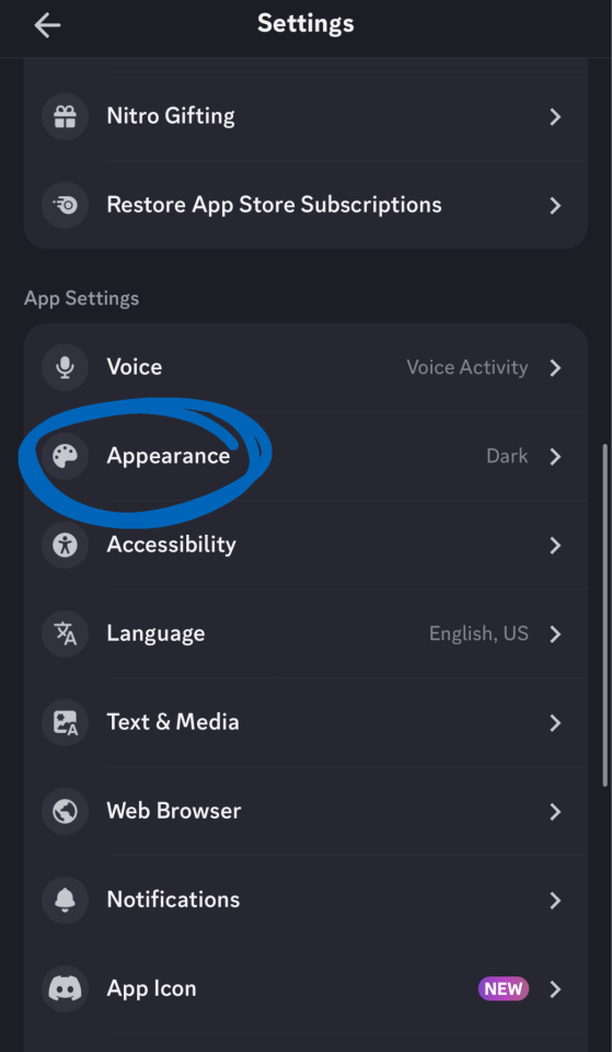
Text
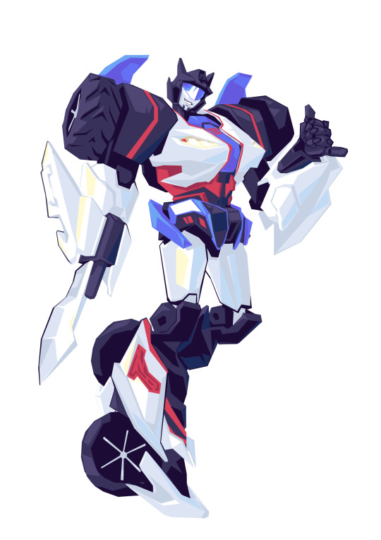
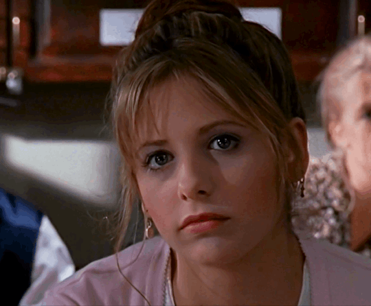
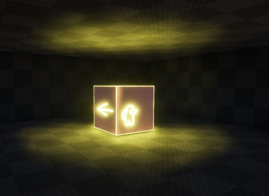
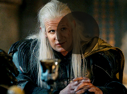
Jazz and Prowl
Vaguely tfp once again… or just. Lack of a nose and frustratingly confusing armour shapes
2K notes
·
View notes
Text
a very foking detailed GIF tutorial you asked for and how I color my gifs
However, I color them individually, so there will be explanation of tools I choose instead of showing what settings I used for this specific gif in this tutorial.
I will go through entire process of how I create gifs, the process of gifmaking can be different for others and there is no obligation of how to create a gif. Basically, do it however you like and enjoy the process.
this is part I, part II is here\in reblogs.
First, you will need to prepare everything, you choose the moment you want to gif and make screencaps. I use mpv player to create them, here is a great tutorial on how to install it. So I won't go over it, just follow it and or use another player which allows to make screencaps, such as kmplayer.
Once you make screencaps go to photoshop - file - scripts - load files into stack - browse - select screencaps and upload them.
At this point I will also add that I use keyboard shortcuts a lot, you can set them up to your preference, that is much easier for me and might be for you too, and I am so used to them that I forget where are some settings. You can do it from edit - keyboard shortcuts, you may set up anything there.
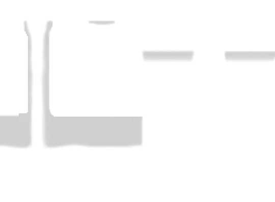
You will have all screencaps uploaded into one file. Once I have it I change canvas/image size, I also remove 10 pixels from each side, because I hate that some files have that weird black line which looks awful on gifs. But that's up to you. Use proper dimensions for tumblr, that is important since your gifs will look 'not good' when you upload them. I will go with 540x500px this time. (correct dimensions for tumblr are 540px for big gifs, 268px for two gifs along each other and 177-178-177px for the three gifs together)
Go to images - image size (crtl+alt+i) and change the size.
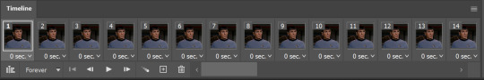
After that I make animation, because without it we would not be able to convert all the screencaps into smart filters. Go to windows - timeline
you will have something like this by default

click on create frame animation - then on 4 horizontal lines which will open menu - make frames from layers
click on convert to video timeline (that 3 horizontal lines and 1 vertical line or whatever it is, right under the first layer) you will get something like this.
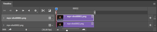
now, this will be animated. If you choose convert to video timeline right away it will not be animated.
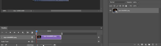
Now, select all the layers - filters - convert to smart filters
You will have something like this, and if you play it - it will be animated anyway. That way you can edit ALL the screencaps at once.
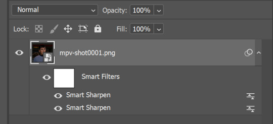
I usually start with sharpening, settings may change according to the files I have, for some you will need more sharpening, for some less. I go with filters - sharpen - smart sharpen and usually that's enough
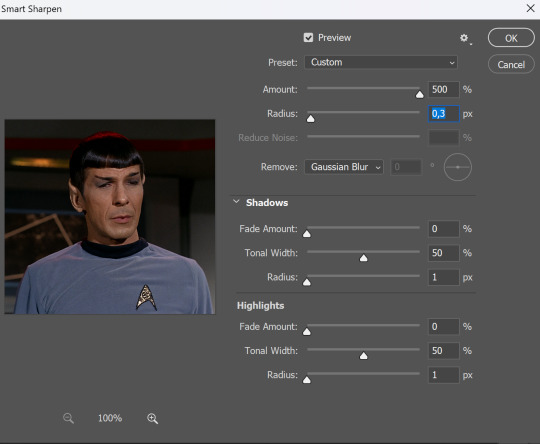
but I sometimes add more sharpening, just change radius to 0,2. So, repeat the action.
You will have it like this
and at any point of making gif you will be able to change settings for it, if after coloring it will look not as good as you wanted to.
I will not go into a lot of details about coloring for this gif, because does not matter how good the coloring on this gif will be, it won't work as good on another gif.
There is no right way to start coloring, you may start with curves, levels or selective colors depending on the screencaps you want to edit.
Well, this time I did start with layer - new adjustment layer - curves. (yeah, i guess by the end of the day we all do lmao) (Always use 'layer - new adjustment layer'. That's the only thing I suggest to remember when you color. ) Just to brighten gif a little bit, but you also can change colors with it.
those are not settings I used for this gif!
Curves have option to edit colors, just press RGB and you will see options for RED, GREEN, BLUE. Upper slider adds the said color, the slider at the bottom removes it. That's a great tool if you have a very red\yellow\blue\green scene, with those settings and moving sliders here and there you will be able to add the color you want, for red scene I suggest to use more green and blue, as well as for yellows but with less green. Just move them to see what fits your gif better.


there are also eyedrop tools which will help you to edit picture, with the first one you need to find the darkest part of your gif and click, it will adjust your picture according to it. If there's too much red, it will make it bluer, etc. The middle one is the one I use the most out of them, cos it changes the midtones, it's great if you have very yellow picture, just press the yellow part and it will make it bluer\greenish, depends on the picture, and then you can adjust it to make it look better. And the last one you can use to lighten picture as well, just find the brightest part of the picture and press it. It will adjust other colors accordingly.
I like to play with settings, I could add more darkness to the gif by levels, by selective colors making dark colors even darker, but sometimes I just use layer - new adjustment layer - black & white. Putting it on soft light blending mode and changing opacity. Idk, I like the effect :D Also, by using these, you will be able to darken part or lighten specific colors
so yeah, play around and figure out what is the best way for you.
after that I used layer - new adjustment layer - selective colors. I think this is one of my favorite tools out there, I love it, I usually end up with 30 selective color layers if I make a super complex gif :D
You can change colors with it, make them more vibrant, or less.

for each color you will have 'cyan, magenta, yellow and black' and by dragging sliders you can change colors, make them darker or lighter for the lovers of those paster gifs :D

But don't worry, that's not where I will go with the gif, so it will look better, i promise.
You know how much I love making blue even more blue. So I go with more selective color layers to enhance it.
You do not have to use just one, and you won't be able to make it with just one sometimes. So add as many as you like to get the result you want.
next is one of my favorites - layers - adjustment layers - levels
with it you can darken colors or lighten them, there's also auto, as well as on curves, which will find the most suitable settings for your picture.
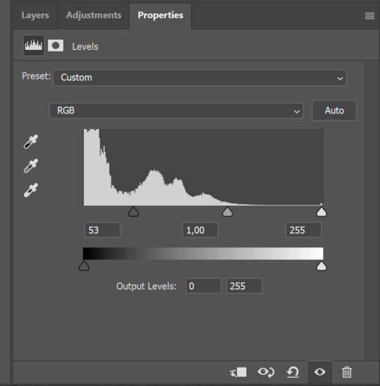

I hardly ever change the middle slider, cos
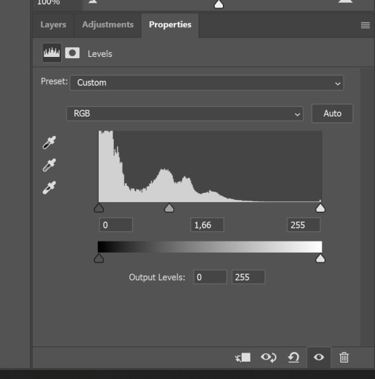
nope.
so, we are at this part of the gif by dragging sliders.
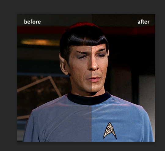
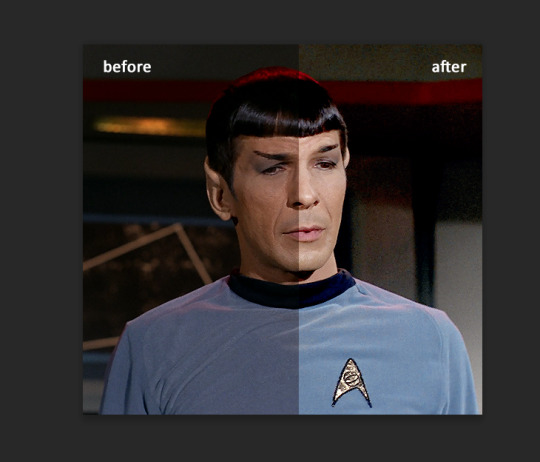
next one I used is layers - adjustment layers - color balance. right now I will stop adding directory, this tutorial is already long enough, so most of the things are there in layers - adjustment layers.
Absolutely love it, most of settings do the same things but a little differently, this one changes colors but also entire picture, not just part of it. You have shadows, midtones and highlights
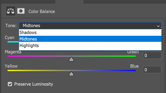
Each of them is really great when you have a yellow\red\blue\green picture to edit. And each of them has 3 sliders cyan\magenta\yellow.
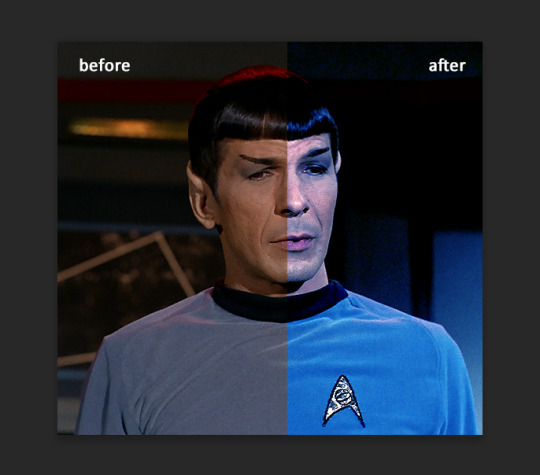
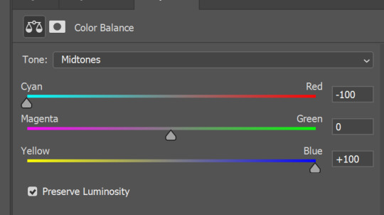
You see, if you drags sliders the other way it will make picture more yellow.
END OF PART I
since tumblr
132 notes
·
View notes
Note
How to make a gif???? For dummies???? Anytime I go to look up how I get scared
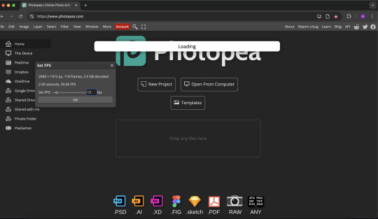
I use the built-in screen recorder on my computer to clip videos and photopea (free in-browser photoshop alternative) to edit, which limits what I can do with my gifs, but works fine for a basic and free gifmaking process and is probably good for someone just getting started! However, if you do have access to photoshop, you might consider following this tutorial or this tutorial.
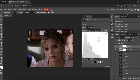
I start by recording a whole scene or series of scenes that I want to gif, then I trim a clip of each gif I want to make. I usually aim for each gif to be between 1.5 to 2 seconds. Then I load the clip into photopea and set the frame rate to 13fps (feel free to play around with this to figure out what works best for you).
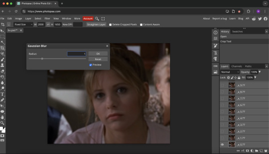
Once the clip is loaded, I crop it (this one is 2000x1650). Then I select all the layers and apply a gaussian blur (filter > blur > gaussian blur) with a radius of 1. Sometimes I also apply add noise (filter > noise > add noise) with a radius of 2, but I don't think this gif needs it.
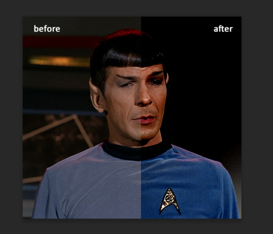
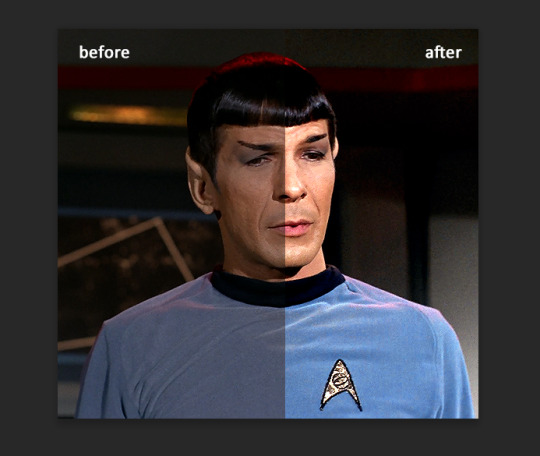
Next, I add a levels layer (layer > new adjustment layer > levels). I use the sample from image buttons to select a spot on the image that I want to be black, and a spot that I want to be white.

Then I use the dropdown menu where it says RGB to go into the red, green, and blue levels settings and adjust the slider to make the gif more or less of each colour until I get an effect I like.

Next, I add a curves layer (layer > new adjustment layer > curves) to increase the contrast. I usually slide the bottom left corner in and raise a spot near the top right corner to brighten the gif while keeping the blacks deep.
Then I add a vibrance layer (layer > new adjustment layer > vibrance) and increase the vibrance and saturation.
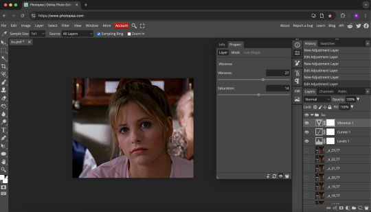
Once the saturation is increased, I readjust the colours using a colour balance layer (layer > new adjustment layer > color balance) and shift the sliders around until I feel happy with the effect.
There are several other helpful tools you can use to adjust colour like the hue/saturation (to adjust the hue, saturation, and lightness of a specific area of the colour spectrum), channel mixer (to adjust the rgb of a specific colour, e.g. make all the blues in the image more or less red), and the selective colour (adjust the level of cyan, magenta, yellow, and black in a specific colour). I don't use these ones as often but there are tutorials for using these specific layers on tumblr or you can play around with them yourself.

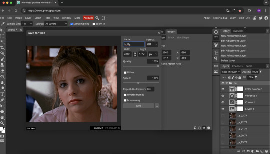
When I'm done editing, I export as gif (file > export as > gif). Photopea will usually prompt you to scale your gif down by half, but I always say no to this so I can scale the gif to different sizes myself.

Once I've hit cancel, there's a preview of the gif and options to scale it, rename it, and adjust the quality and speed. I check the size (below the bottom right corner of the image) to see how it compares to tumblr's file size limit (under 9.5mb). This one is 26.8mb, so I need to either delete some layers, crop it further, or scale it down.
I usually scale my gifs down to be a width of about 1000, which typically gets them to an appropriate file size for tumblr. This one is now 8.6mb, which means I can save it and post it.
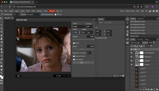
Finally, I hit save and I have my gif!
This is a pretty basic overview of what I usually do, but feel free to do more or less editing and find a process that works for you! Here's a colouring-specific tutorial that might interest you (and I would encourage you to search tumblr for gifmaking tutorials, which is part of how I learned!) Of course, if you want to just make gifs with no editing or recolouring, that's also cool – it's awesome to have more people making gifs at whatever level is comfortable for you!
Thanks for the ask and I hope this was helpful :)
1 note
·
View note
Text
How to Fix Color Changes in Photoshop: Easy Step-by-Step Guide
Color inconsistencies in Photoshop can be frustrating, especially when working on professional projects that require precise color accuracy. Whether you're dealing with unexpected color shifts, dull tones, or incorrect hues, there are several techniques to fix these issues. This guide will walk you through effective solutions to correct color changes in Photoshop using various image editing techniques.
1. Check the Color Profile Settings
One of the most common reasons for color changes in Photoshop is an incorrect color profile. If your image appears different from what you expected, follow these steps to check and adjust the color settings:
Open your image in Photoshop.
Go to Edit > Color Settings.
Ensure that the working space is set to sRGB or Adobe RGB (1998) (depending on your project requirements).
If the colors still look off, try Assign Profile under Edit and select the correct profile.
Using the right color profile is essential when providing color correction services or ensuring consistency across different devices.
2. Use the Color Correction Tools
Photoshop offers powerful tools to adjust and fix color changes. If your image looks too warm, too cool, or washed out, try these methods:
A. Levels Adjustment
Go to Image > Adjustments > Levels (or use Ctrl + L).
Adjust the sliders to balance the shadows, midtones, and highlights.
This technique is useful for enhancing images in clipping path services and shadow creation services.
B. Curves Adjustment
Navigate to Image > Adjustments > Curves (Ctrl + M).
Adjust the curve to correct brightness and contrast while maintaining color accuracy.
C. Hue/Saturation
Go to Image > Adjustments > Hue/Saturation (Ctrl + U).
Adjust the Hue, Saturation, and Lightness sliders to fix color distortions.
Ideal for image manipulation services and creative edits.
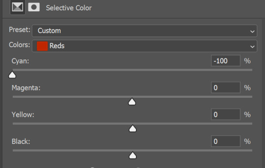
3. Fix Color Issues with Selective Color
If certain colors appear unnatural, you can correct them using the Selective Color tool:
Go to Image > Adjustments > Selective Color.
Choose the color that needs fixing (Reds, Blues, Yellows, etc.).
Adjust the sliders to fine-tune the color balance.
This method is commonly used in color change services when clients need specific colors adjusted in a photo.
4. Convert Raster to Vector for Accurate Colors
If you're working with logos or graphics that need precise color reproduction, consider using a vector conversion service. Raster images can sometimes cause color inconsistencies when scaled. Converting them to vector format using Adobe Illustrator ensures better color stability.
5. Apply Image Masking for Isolated Color Changes
For more detailed color adjustments, image masking services allow you to work on specific areas without affecting the rest of the image:
Use the Quick Mask Mode (press Q).
Paint over the area you want to modify.
Exit Quick Mask Mode and apply color corrections only to the selected area.
This is useful for product photography and fashion retouching where certain parts of an image need color adjustments.
6. Use Soft Shadows to Enhance Colors
If your image looks dull after fixing colors, try adding shadows for a more natural look. The shadow creation service helps enhance depth and contrast:
Duplicate the image layer.
Go to Layer > Layer Style > Drop Shadow.
Adjust the opacity, distance, and blur settings for a realistic effect.
This technique is commonly used in eCommerce product photography to give objects a more defined appearance.
Conclusion
Fixing color changes in Photoshop requires a combination of correct color profiles, adjustment tools, and professional editing techniques. Whether you’re working on color change services, vector conversion services, image manipulation services, or clipping path services, understanding how to adjust colors effectively will improve the quality of your projects.
By mastering these techniques, you can ensure that your images always have the perfect colors, whether for digital marketing, product photography, or graphic design.
Company Information:
Website: https://clippingace.com/
Facebook: https://www.facebook.com/clippingace
Contact : https://clippingace.com/contact/
Resources: https://clippingace.com/clipping-ace-blog/
Youtube: https://www.youtube.com/channel/UCoRU-n9L3Rt1zZYtR6Unozw
Twitter: https://twitter.com/Clippingace
Quote: https://clippingace.com/request-a-quote/
Pinterest: https://www.pinterest.com/clippingace/
Instagram: https://www.instagram.com/clippingace.graphics/
Linkedin: https://www.linkedin.com/showcase/clippingace/
Office Address
Canada
(Client Support)
80 Barbados Blvd
Scarborough on M1J1K9
Toronto Canada
14374342120
14374342125
Bangladesh
(Head Office)
183 Green Rd
Dhaka 1205
Bangladesh
8801730087159
8801793463556
0 notes
Text
Day Four (Part One)
Doing stuff with UV Mapping today.
Note: while making this blog post, my internet was acting up, so if there are some missing parts or theres a place where it randomly jumps from one point to another, that is why, but I'll do my best to avoid that from happening.
We can access this in Maya by going to the very top toolbar, and selecting the 'UV' option.

That should open up a new window to then allow you to view the UV map.
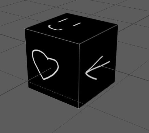
For now, I'm just practicing on a cube. You wanna make sure the cube is selected before clicking the little camera icon on the end of the left hand side of the second toolbar. This will give you a lot of export options and how you want to export it and where to export it to, so set those to your liking and then do so.
Then you can go into photoshop and mess with it how you want. If there's any parts over hanging out of the borders, it's fine, those parts just won't be included.

Once you've modified the UV map to your liking, you want to export it as JPG. Then go back to Maya and hold right-click on your cube (not the UV map, the actual cube) and go all the way down until you get to 'Assign New Material' and let go of right-click, selecting it.
Choose the third option down of 'Lambert'.
Now we want to select the cube again, and on the tool bar going down the right hand side of the screen, make sure that it is on 'Attribute Editor'. Then, select 'lambert2' from the options it gives you.
Now, click the checkered box next to the color slider. It should have given you another popup, in which you want to select the fourth option down on the right hand side, named 'file'.
Now that you have that, you should see that the original right hand side section has changed quite a bit. Select the folder icon, and then find and choose the jpg that you exported.
You'll see that it hasn't changed, but it is there, trust me. The final thing you have to do is with the toolbar right above the viewport, three boxes away from the already highlighted blue box titled 'Smooth Shade All', you have a checkered circle called 'Texturing'. Select that, and you should see that the image is now there.
You want to export this cube now to be able to use it unreal so, go to File, then Export All but click the button to the side of Export All. Open the File type drop down, and scroll until you see 'FBX export' and select that. Then click Export All, and save it/name it whatever you want
Now, we open up Unreal Engine and go into our map.
You'll want to open the Content Drawer and import the FBX you just recently saved.
Put the mesh into your world to make sure it imported properly. It will probably be tiny so you'll want to scale it up by about 100 times.
Anyways, we open up the material now and we should be greeted by this.
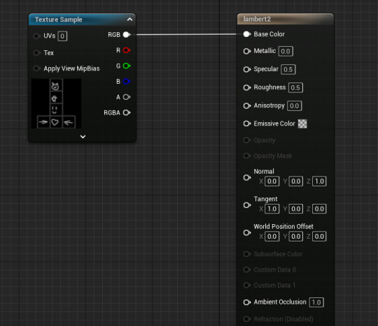
Hold ALT and click on the RGB on the Texture Sample node, to disconnect it from the material name (It should be something like lambert2 unless you renamed it). We want to have two colours because we're going to be masking the two colours that our texture has. We're going to be using some shortcuts so, hold down '3' on the keyboard and click on the Material Graph twice to get two Nodes that should both be called 0,0,0. Then we hold down L and click to get a Lerp node.
Though it is hard to see, both of the 0,0,0 nodes have black squares in them that are actually colour pickers. Double click on it and select the colour you want, do the same for both but make sure they're different colours. You want to put the white node connector of one of the colours into A on the Lerp, and the other white node connector of the other colour into B on the Lerp, with the RGB of the original Texture Sample node going into the Alpha of the Lerp. Then finally connect the Lerp to the Base Colour node connector of the long 'lambert2' node.
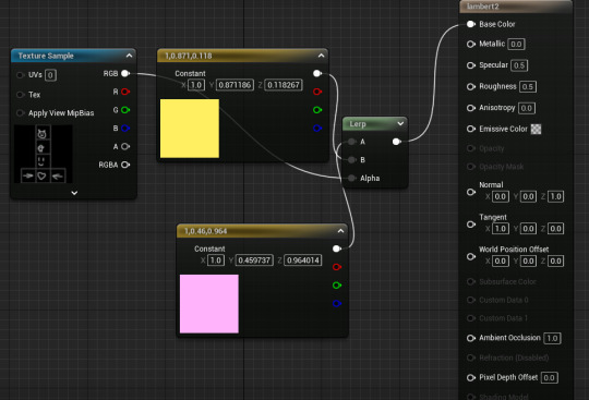
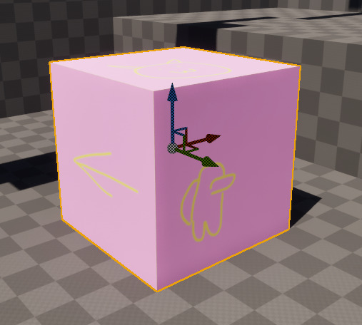
Once that's all done, you can click Apply in the top left, and then go back to your map, and the cube should be the colours you want. Of course, if it's swapped around from the way you want it, then just flip which one goes into A and which goes into B on the 'Lerp' node.
We can mess around with this more, such as if we want it to glow.
We go back into the material, and delete the lerp. Now, we connect one of the colours directly into the base colour (I chose my yellow). With the other colour and Texture Sample node, we do something a bit different. On the Material Graph, hold 'M' and click to easily create a Multiply node. Put the white node connector on the colour into A and the Texture Sample RGB node connector into B. Then off of this Multiply we want another Multiply node so that we can choose how bright the cube glows. Put the original Multiply into A, and then change the value next to B to be whatever you want (I chose 1000). Then connect this new Multiply node to the Emissive Colour node connector on the 'lambert2' node.

Very glowy, very pink.
And here I swapped the colours around, not sure what I expected. It's just glowy with yellow now.
Now we're making a compass.
Get a cylinder from the Poly Modeling tab.
Then we want to scale down the Y axis. I set it to 0.1 but you can do whatever you wish. Now we want to select all of the faces on the top. Hold right click and release once your cursor is over 'Face'. A shortcut to select all of the faces at the top is to hold tab and just hold down left click and drag the cursor over the faces, selecting them all. Then we want to go to our Modeling Toolkit and click extrude.
Now we want the little bit that goes at the top of the compass.
Hold right click and go back to face mode. Now go to one of the edge faces that is directly above a thick black line.
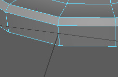
Select it, and then the one next to it while holding shift.
We want to extrude it slightly, and then add a bevel to smoothen out the top even more. What we want to do now is add the little dial bit that goes at the top of a compass. Spawn another cylinder but shrink it down a lot. Then you place it at the extrusion we made a few minutes ago. Now use the multicut tool, while holding shift and control to make a cut about 80% up the side of the cylinder. After this, you want to go back to face mode, then select all of the new faces and go to extrude mode, and extrude them out by about 0.05 or so.
Then we make a cube, and flatten it into a very thin horizontal rectangle. Now you want to use the multicut tool and make a cut at 50% along the rectangle both horizontally and vertically and then another one at 30% and 70% along the rectangle vertically. Go into edge mode and choose the middle verticle edge on both sides of the rectangle, go into scale mode and pull them out to make a point.
1 note
·
View note
Text
How Does Converting Images to Black and White Enhance Visual Impact?
Images' visual impact can be greatly increased by convert pictures to black and white, which highpoints composition, texture, and contrast. A deeper emotional connection is made possible by the absence of color distractions, which allow viewers to concentrate on the photograph's key components. More prominent light-shadow interaction draws attention to features that could otherwise be missed in color photos. Photography in black and white works well for expressing stories since it frequently arouses feelings of nostalgia and everlasting appeal. By removing color, photographers may tell a stronger story and present their subjects' intricacy and beauty in a visually arresting and captivating manner.
The Influence of Photography in Black and White Black and white conversion is an artistic method that can significantly change a photograph's visual story. This change removes the distractions that color can provide, allowing the photographer to concentrate on important components like composition, texture, and light. When color is removed, the image frequently acquires a timeless character that enables viewers to connect with the subject on a more profound emotional level.

Easy Processes for Converting JPG to Black and White One can use a variety of tools and applications, containing online converters or Adobe Photoshop and GIMP, to convert JPG to black and white. Opening the desired JPG image in the selected program is usually the first step in the procedure. Look for settings that permit desaturation or grayscale conversion after the image has loaded. You can efficiently enhance the image's details by adjusting the brightness and contrast using the sliders that many programs provide. Once the required changes have been made, save the updated black-and-white version to utilize in your projects.
Making Images Black and White for Impact When convert color image to black and white, think about the feelings you wish to portray. This method frequently highlights stark contrasts and shadows, which improves the picture's overall mood. This treatment is especially useful for subjects like landscapes, architecture, and portraits since it highlights the natural textures and patterns of these subjects by removing color. Because black-and-white photography enables artistic expression through light and shadow, it is a preferred option for artists seeking to convey particular emotions or stories.

JPEG conversion to black and whiteGiven how interchangeable JPEG and JPG photos are, the procedure for convert jpeg to black and white is still the same. Once your JPEG image has been uploaded to the editing program, make use of the available grayscale conversion tools or filters. It is essential to adjust brightness and contrast because these parameters will determine the final image's texture and depth. The objective is to produce a striking black-and-white image that draws in the audience and effectively conveys the required message.
RGB to Greyscale: A Technical ViewpointGaining a deeper appreciation for black-and-white photography can also come from knowing how RGB to greyscale conversion works. Red, green, and blue—the three fundamental colors utilized in digital imaging—are referred to as RGB. These colors are converted to different shades of gray according to their intensity when they are converted to greyscale. Therefore, the image highlights the key fundamentals of the subject by displaying the entire spectrum of light without the effect of color.
0 notes
Text
Esplora Arduino game controller

The ESPLORA Arduino game controller Board is an Arduino-compatible microcontroller board based on the Arduino Leonardo. Unlike previous models, it comes equipped with a variety of built-in sensors for immediate use in interactions.
This guide is perfect for individuals interested in using Arduino, but who don’t want to dive into electronics right away. To learn how to use the ESPLORA Arduino game controller Board in a simple and clear manner, be sure to read the Getting Started with Esplora guide.
The ESPLORA Arduino game controller Board boasts onboard sound and light outputs, as well as multiple input sensors such as a joystick, slider, temperature sensor, accelerometer, microphone, and light sensor. Additionally, it offers the option to enhance its functions through two Tinker-kit input and output connectors and a socket for a color TFT LCD screen.
Similar to the Leonardo board, the ESPLORA Arduino game controller Board also utilizes an Atmega32U4 AVR microcontroller with a 16 MHz crystal oscillator. It features a micro USB connection that can function as a USB client device, such as a mouse or keyboard. Additionally, there is a reset push button located in the upper left corner of the board for restarting purposes.
There exist four indicators, each displaying a different status.
The green indicator shows if the board is currently being powered.
The L [yellow] connects directly to pin 13 on the micro-controller for easy accessibility.
The [yellow] LED indicates data being transmitted or received through the USB connection.
Within the board lies all the necessary components to support the microcontroller. To begin, just connect it to a computer using a USB cable. The ESPLORA Arduino game controller Board is also equipped with built-in USB communication, allowing it to function as a mouse or keyboard when connected to a computer. It also offers a virtual serial/COM port (CDC). This alters the behavior of the board, which is further explained on our getting started page. On this page, you can find all the instructions for configuring your board and utilizing the Arduino Software (IDE) for coding and electronics experimentation.
The transfer of data, both in and out.
The ESPLORA Arduino game controller Board features a classic gamepad design, including an analog joystick on the left and four push buttons on the right. It also comes equipped with several onboard inputs and outputs:
The analog joystick features a center push-button and two axes, designated as X and Y. There is also a central pushbutton for added functionality.
Arranged in a diamond formation are 4 push-buttons.
The slider for the linear potentiometer is located towards the bottom of the board.
A tool to capture the volume (amplitude) of the surrounding environment.
A sensor that detects light to measure brightness.
The temperature sensor measures the surrounding temperature.
A three-axis accelerometer detects the orientation of the board with respect to gravity, along the X, Y, and Z axes.
The buzzer has the ability to generate square-wave tones.
The RGB LED features Red, Green, and Blue elements that allow for color mixing and a bright display.
The TinkerKit Inputs allow for easy connection between the sensor modules and 3-pin connectors.
The TinkerKit Outputs allow for easy connection of the TinkerKit actuator modules via the 3-pin connectors.
The TFT display connector can be used for a color LCD screen, SD card, or any other devices utilizing the SPI protocol.
To fully utilize all available sensors, the board employs an analog multiplexer. This way, multiple input channels (excluding the 3-axis accelerometer) can share a single analog input of the microcontroller. Selecting which channel to read is done through four additional pins on the microcontroller.
Communication is essential in any relationship, whether it be personal or professional. It plays a crucial role in maintaining strong connections and fostering understanding between individuals. Effective communication allows for open and honest dialogue, facilitating problem-solving and building trust. Without good communication, misunderstandings can occur, leading to conflicts and strained relationships. Therefore, it is important to prioritize effective communication in every aspect of our lives.
The ESPLORA Arduino game controller Board for the Leonardo offers various features for connecting with a computer, another Arduino, or different micro-controllers. The ATmega32U4 enables serial (CDC) communication through USB and is recognized as a virtual com port on the computer. It also functions as a full speed USB 2.0 device and can be used with standard USB COM drivers. A .inf file is needed for Windows.
The Arduino software comes equipped with a serial monitor for easy transmission of text data to and from the board. Whenever data is being sent via the USB connection to the computer, the RX and TX LEDs will light up on the board. Additionally, the ATmega32U4 has SPI capability accessible through the SPI library. In addition, the Esplora can act as a standard keyboard and mouse, allowing you to use programming to manage these input devices via the Keyboard and Mouse libraries.
The act of creating computer software, also known as programming, involves writing code using various languages and tools. This process requires a combination of problem-solving skills, critical thinking and creativity. Programmers must constantly learn new techniques and adapt to ever-changing technology in order to produce high-quality programs.
To start using the Esplora with your Arduino software (download), simply choose “Esplora” from the Tools > Board menu. For more information, refer to the getting started page. The ATmega32U4 on the Esplora comes pre-loaded with a boot-loader, enabling you to upload new code without an external hardware programmer.
The AVR109 protocol is the chosen method of communication. To avoid using the bootloader, you can program the microcontroller through the ICSP header. Additional instructions are available for reference.
A dedicated library for the Esplora simplifies writing sketches, with methods available for reading sensors and controlling onboard outputs. These high-level methods also perform pre-processing of data, such as converting temperature readings to degrees Fahrenheit or Celsius. Additionally, the library allows easy access to outputs like the RGB LED. For further information and examples, please refer to the Esplora library reference page.
The automatic reset and bootloader activation are key components in the software’s functioning.
Rather than relying on the physical reset button, the Esplora utilizes a software-based reset triggered by opening and then closing the virtual serial/COM port (CDC) at 1200 baud. This initiates a processor reset, temporarily cutting off the USB connection to the computer and causing the virtual port to disappear. The boot-loader remains active for approximately 8 seconds before it can also be activated by pressing the reset button on the Esplora.
Please be aware that upon initial power up, the board will launch the user sketch instead of the boot-loader, if available. Due to the specific reset process of the Esplora, it is most effective to allow the Arduino software to attempt a reset before uploading, especially if you typically press the reset button before uploading on other boards. However, in the event that the software is unable to reset the board, you can manually initiate the boot-loader by pressing the reset button on the board.
The USB port is equipped with overcurrent protection to prevent any potential damage.
The ESPLORA Arduino game controller Board comes equipped with a re-settable poly-fuse to safeguard your computer’s USB ports against shorts and over-current. While most computers have built-in protection, the fuse adds an additional level of security. In the case of a short or overload exceeding 500 mA, the fuse will disconnect the connection until the issue is resolved.
Regarding the appearance of this object, its external features will be discussed.
The ESPLORA Arduino game controller Board PCB has a maximum size of 6.5 inches in length and 2.4 inches in width. The USB and TinkerKit connectors extend beyond the width dimension. Additionally, there are four screw holes that allow for attachment to a surface or case.
1 note
·
View note
Text
I personally like the UI, and find it usable. I have low vision and albinism, so high contrast and larger text sizes are very important to me. I consider the new UI to be a net improvement over the old one, so I suppose in my case it's more accessible.
Herein lies the problem, people are going to have different needs, and they often contradict. The solution, however, is rather simple - and I presume a competent programmer could make it work very easily.
I use the Bookshare service to acquire e-books in an accessible format, and a core part of that is my ability to use a client app to connect to it from an iPad. The client I use, Dolphin Reader, solves this in a manner that is pretty much foolproof. Instead of a light and dark appearance toggle, the color of the text, background, and highlight tool are selectable separately with a wide variety of colors.
What colors do I use...?
Yellow and green.
If a feature that allowed us to do that existed in every app, our problem would be mutually solved. The reason why it doesn't is likely because the developers never thought of it, they didn't say no to it, the thought just never crossed their minds. If a new standard was created around being able to pick a set of colors for app appearances (perhaps even with a full RGB slider), every app would become significantly more accessible for the visually disabled.
As for everyone else... customizing colors is fun.
My message on Discord's new UI
"I have visual snow syndrome, a symptom of visual snow syndrome is that white text on a very dark background can cause afterimages. You know screen burn? Imagine screen burn in your eyes, where whatever you were looking at is stuck there for up to an hour. Light mode is physically painful and dark mode is disabling. Your new changes are an accessibility nightmare and have made the app fully unusable for me. And that's not even mentioning the fact that a lot of the changes you made to the app are absolutely awful, convoluted and just plain stupid for ease of use. I know companies love to pull the "well we know every single tester has hated it, but we spent a lot of money redesigning it so we're doing it anyway!" card. But this isn't the logo, this isn't the blue, this isn't minor changes you'll stop noticing after a while. This is a huge overhaul that is again AN ACCESSIBILITY NIGHTMARE! Cut your losses and listen to your audience because I'm seeing a lot of people posting API alternatives to Discord in other servers and Reddit. People will not be using your app. Do better. Discord mobile is fully unusable to me until you make changes, I physically cannot look at the text anymore. Please fix it and do the smart thing."
I downloaded the last APK file for Discord before the change, but this is genuinely disheartening. Discord is actively refusing to even read genuine complaints, telling people 'Well this is how it is now'. Much like Tumblr.
Please send feedback on the Discord app as well as on the store pages! Please let them know this isn't the same as just changing the icon or the colour of their blue. This is an actual accessibility issue!
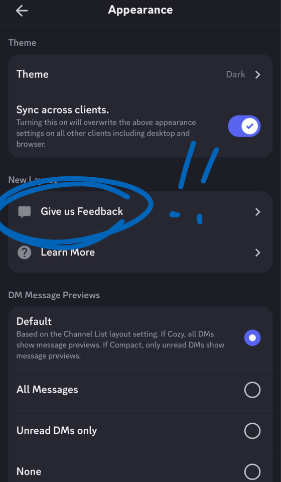
I will admit though, the ONE good thing about the change is the new Media feature while searching chats, but it's completely overshadowed by everything else and the lack of pages (only infinite scroll) makes it difficult to find things.
#Accessibility#discord update#New UI#low vision#albinism#albino#app development#app design#Actually Disabled#software#technology
400 notes
·
View notes
Note
could you make a detailed tutorial on how you do your big gifs, specifically the hotd ones? i struggle a lot with coloring cause everything is so grainy and dark. i have every episode in 1080p but the quality just doesn't seem to be that good once it's giffed
hi anon!
i have a comprehensive tutorial of sorts in the works, but i have, uh, absolutely no idea when it will be done. that said, i do have some tips/example psds i'm happy to share right now ✨
basic tips
to start off: my giffing process is the same no matter the size of the gifs. i use the process outlined in tay's incredible tutorial, so just follow that if you want to do exactly what i'm doing
always gif from 1080p or higher (i’m using 1080p here)
use the "load files into stack" method (see tutorial above) instead of "import video frames to layers"; this will give you much clearer, crisper gifs
crop once and do not attempt to resize once you have cropped; resizing/recropping will introduce a lot of fuzz
coloring tips
some caveats! coloring is hard, yo, and there are a million different way to go about it. the best (and least immediately helpful) advice i can give you is honestly to just screw around and figure out exactly what each adjustment option does—curves, exposure, levels, channel mixer, etc.—and start piecing together your own style
when it comes to "grainy" gifs, there are gifs with film grain and gifs that are noisy/fuzzy. hq footage will have film grain, and lightening aggressively tends to highlight that. if you're worried about noisy or fuzzy gifs, "files into stack" and cropping only once should help minimize those issues
also, hbo hates gifmakers. got and hotd are both straight up nightmares to color, so if you feel like you're struggling, just know that everyone is struggling :/
lighten first: i usually try one or two curves layers first to see if i like what the rgb "auto" option gives me. if i don't, i move on to exposure and adjust using that tool
darken the blacks: it sounds counterintuitive, but as you lighten the scene, you need to make sure you're not washing it out as well. darken blacks using selective color or increase contrast using levels (or both)
adjust colors: hotd is hideously yellow a lot of the time, so channel mixer is your friend here. i typically increase the green slider in the blue output channel and then fine tune by decreasing yellows in selective color. if i'm still struggling, i'll go to hue/saturation and adjust the yellows there
smooth artifacts: artifacts are blocky sections that don't match the coloring on the rest of the gif. do your best to correct them by adjusting in selective color or by cheating and applying a black and white gradient map over the gif— set the blend mode to color and reduce the opacity to around 10-20% to smooth out some of the artifacts
duplicate + blur: if you're really struggling with excessive fuzziness/artifacts, you can duplicate your base gif directly on top of the original, add gaussian blur at 3.5, and set the opacity to somewhere between 10-25% to smooth out the mess. be aware that this will increase your overall file size
adjust export settings: i use "diffusion" exclusively, but that's a personal preference. some people think "pattern" looks cleaner, and sometimes it can help reduce noise
and finally, here's a selection of psds i've used for hotd scenes:
psd #1
psd #2
psd #3
psd #4
there you go! these psds should give you a pretty good look at how i color, but feel free to send me another ask if you any more questions or want tips on coloring a particular scene!
good luck!
88 notes
·
View notes
Text
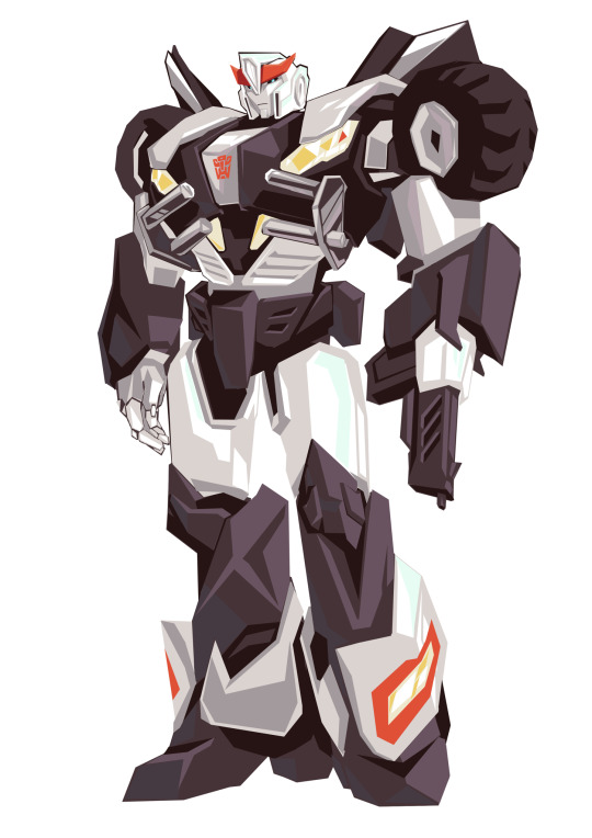
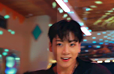
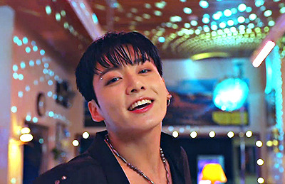
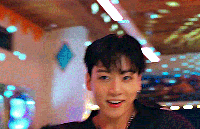
Tfp style Prowl… vaguely used smokescreen as a reference…

Pop that hip girl

I got to trade iPads so the one I’m using now isn’t crashing procreate so often…
Apparently the newer model has an Apple Pencil proximity sensor or something so the selection tool is more like the polyline selection tool on pc programs and it’s very fun 👍
Also been trying out colour selection with rgb sliders… interesting experience
67 notes
·
View notes
Note
Hi, I really love your andor gifset from September 28 2022 (idk if I can post a link so... but it's from the first episode) and I was wondering if you could maybe give me some tips on how to make it so clear and vibrant even when the picture is big? I have just started gif-making a few days ago and I definitely want to aspire to make such great gifs.
Hi there!!!! Firstly tysmmm 🥺 i really had a fun time making those big gif andor episode sets i think they all turned out great!
I did make a tutorial a while back mostly focusing on how I sharpen my gifs. My steps mostly the same as they were here except I now export gifs using "adaptive & diffusion"
The Andor gifsets you called out I did use 4K SDR videos. But I don't always think 4K is necessary (especially where r we gunna get them now rip rarbg), 1080p is always preferred and if you're d*wnl*ding / t*rr*nting i would recommend trying to pick the larger file size, for example choosing a movie thats 5GB over 1.5GB.
In my last tutorial I didn't really go into how I colour my gifs but that's where the biggest changes come into place. I don't use a set preset/psd, I colour each gifset uniquely but I do have the same order of steps generally. My order of adjustment layers tends to be: Levels, Curves, Selective Colour, Vibrancy. I also frequently use Channel Mixer and Hue/Saturation when needed. Below the cut I'll share my "starting" settings for some of the adjustments layers but these often change as the gif needs.
I hope this is somewhat helpful!! I think with practice and more gifing you'll find your own style and process. I look back at gifs I made a year ago and think oooof haha what was I doing back then. constant improvements & always finding new tricks♥️ I would also recommend following some gif resources blogs like @usergif or @pscentral they often post really helpful tutorials & tricks to help make your gifmaking the best it can be!
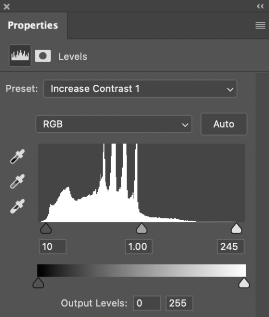
Levels - I tend to start with the default "Increase Contrast 1" or "Increase Contrast 2" depending on how dark the intial scene is. When making aditional adjustments I focus on the end sliders - the dark & light, and barely ever touch the midtones adjustment, if i do use it I go very subtly so 1.05 or 0.95. Our goal in the end is to make the darkest parts of the gif black & the lightest parts almost white.
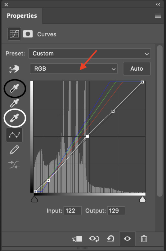
Curves - imo curves makes the biggest adjustment for the gif colouring. shes my best friend! So again I focus on the dark/light eye droppers. I start with the white eyedropper and select something white or the lightest part of the gif, then go to the black eye dropper selecting a very dark portion of the gif. Then in the middle section I adjust the curves line (white line) to meet the needs of the gif for proper contrast / brightness. If needed Ill open the RGB drop down (red arrow) and adjust specific colours. I use the Blue the most as i often see alot of yellow tint in movies (which i hate lol) so ill bring the top end of the blue line closer to the centre of the grid to reduce the yellowness. Sometimes ill make a second curves layer, set the preset to "linear contrast" then adjust the sliders as needed, this often gives additional contrast & brightness.
Selective Colour - my second best friend! this is where you can make little adjustments to the hues of the gif, then fine tweak the darkness/brightness in the gif. So below i have my "starting points" in the white, natural & black colours. Often the white ends up being a much lower number (-40 or less) and in the neutrals area i can fine tune the overall hue of the gif - reduce the yellows or increase the reds etc. This tool is alot of playing around with and just seeing what looks good!
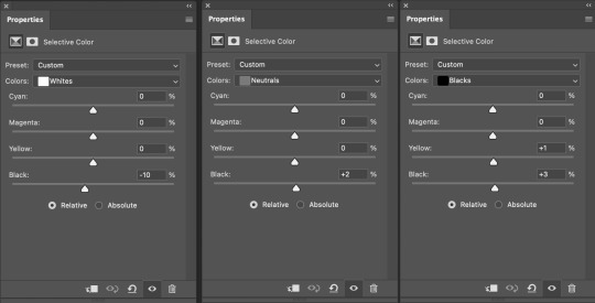
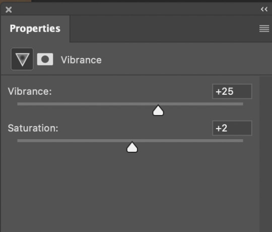
Vibrance - this is normally the last layer ill add. I barely change the settings I tend to go with 20-30 Vibrance and then 2-5 on Saturation. Just gives add extra vibrancy and colour pop. Saturation stays a bit on the lower side as often bringing it makes peoples skin tone too orange/red/yellow etc. But if I want over saturation increase on particular colours I'll make those adjustments with a Hue/Saturation layer.
11 notes
·
View notes
Text
Channel Mixer for Recolouring Gifs
Channel mixer is probably one of the more complex and least used layers in making gifs, so here is a tutorial on how to use channel mixer on photoshop or photopea to adjust colours! Channel mixer allows you to change colours within existing colours using the principles of red/green/blue light rather than the colour wheel, which lets you add colours that don’t exist to a gif, or change the distribution of colours.
Although not strictly necessary to understanding this tutorial and how channel mixer works, you will understand more about how best to use this tool for recolouring if you have a basic knowledge of how to use most other colouring layers such as hue/saturation, colour balance, curves and selective colour. Channel mixer is pretty fiddly and you can often achieve what you want with other layers, so I’d recommend learning how to use those layers first before turning to channel mixer.
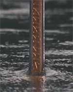
I’m going to turn this:
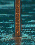
Into this:
I can’t use hue/saturation because the lake has no existing colours to pick up on, and even the sword barely has any. Selective colour kind of works but the hand and the lake are both fairly neutral, and anyway, this is just to show how channel mixer works. Let’s get going beneath the cut. It’s long, sorry, because it’s a slightly complicated concept and depends on a good understanding of colours and light.
#1 Back to school with light and colour theory
Light is made of three primary colours: red, green and blue (RGB). Because gifs are on a screen and projected using light, they use RGB instead of the colour wheel or art primary colours of red, blue and yellow. RGB combines to make white, and black is an absence of these colours. This means that where you have white or grey in a gif, you have red, green and blue all present in equal amounts, but the darker the grey is, the less of these colours it has.
Most colours in an image will contain at least a little of each of the three primary colours. You can check how much red, green and blue is present in different areas by going into the channels tab (next to your layers) and turning off RGB. It’s not necessary, but can be useful to understand where your colours are. Obviously a green tree will have a lot of green, but it’s surprising sometimes to see what colours are present in different areas which you may not have thought would be there.
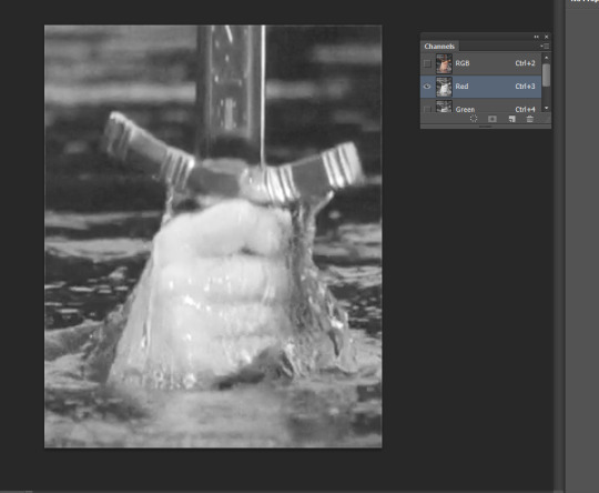
The whiter an area is, the more of that colour it has, and the darker it is, the less it has. In this case we’re in the red channel and the hand is quite bright, which means there is lots of red in the hand. Let’s look at the blue channel to compare.
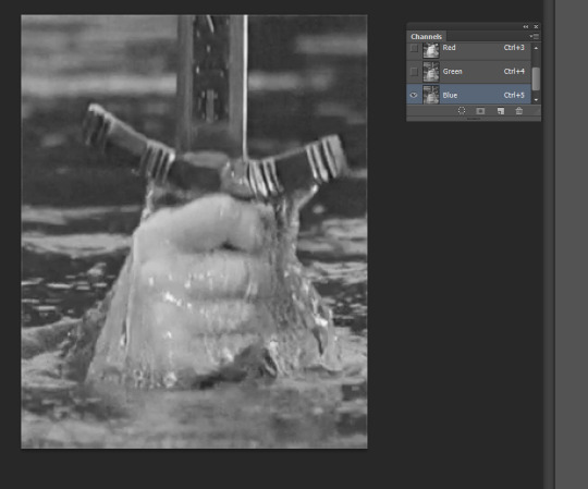
The hand and sword are much darker, which means there is less blue than there was red. There is still a little blue in the sword and hand, otherwise it would be completely black instead of dark grey. There is also colour in the lake for both the red and blue channels because white and grey equally comprise all three primary colours.
Red, green and blue also have opposites: cyan, magenta and yellow (CMYK), respectively.
#2 What does this have to do with channel mixer anyway
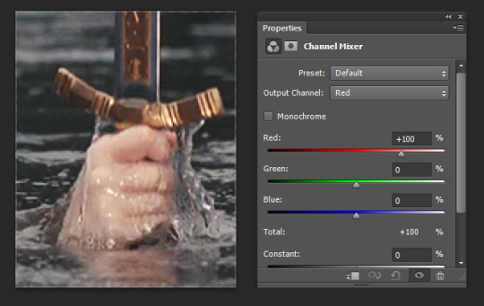
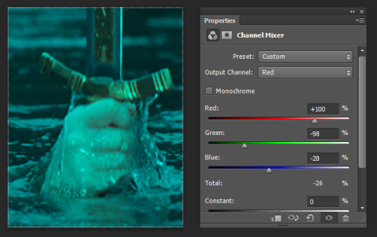
Channel mixer has three channels: red, green and blue. Your output channel will always be the colour that you are adding or removing. So if you want to change the amount of green, use the green output channel. If you want to change the amount of blue, use the blue output channel. I’m in the red output channel which means I’m changing the amount of red.
Channel mixer will change colours within another colour. While I am in the red output channel, changing the red slider will change the amount of red within the existing red light. Changing the green slider will change the amount of red within the existing green light.
Green and blue are automatically set to 0% in the red output channel because there is no red inside the existing green and blue light, and red is 100% because (I don’t know a good way to say this) the red light is already full of red. Channel mixer lets me add even more red to the red light, or add reds to the green or blue light (or I can decrease red instead).
If I increase the blue slider in the red output channel, it will increase the amount of red within the existing blue light.
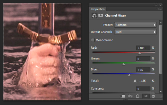
Looks red all over, I know. That’s because blue light (as well as green and red) is present in all whites and greys, and there are a lot of neutral colours. That means blue light is present pretty much everywhere in the gif, so it does have the appearance of just adding a red tint. But if you look closely the sword handle hasn’t changed colour as much as the rest of the gif because the sword has less blue light to add any red to. The darker greys have also barely changed colour because the darker something is, the less light it has, and therefore the grey has very little blue light to add any red to. You can’t ever add colour to black using channel mixer, because there is no existing light within black for you to add colours to.
We can and will rebalance colours so it doesn’t look like we’ve just slapped a tint on it in my example; this is just to understand what channel mixer does. Before we go on, this is a handy time to remember the opposite colours:
red-cyan
green-magenta
blue-yellow
So for example if I want to decrease the amount of green in an image (for which I need to be in the green output channel), that will increase the amount of magenta.
#3 Hurry up and get to the tutorial please
I want to turn the lake cyan. Red and cyan are opposite, so if I decrease the amount of red that means I’m increasing the amount of cyan.
The lake is neutral and contains all three colours of light in equal amounts, so I could decrease the amount of reds in any three channels of red, green and blue to make it cyan. However, I’m going to remove red from the green and blue light because I don’t want to make the red light in the hand and sword less red.
This has admittedly turned the hand and the sword blue as well, because they contain some green and blue light. (Also, it didn’t really make a difference if I moved green as opposed to blue for this step - they’re both moderately equal in this gif and I wanted to add a LOT of cyan, so I just slid them back randomly). I’m going to make the existing red light in the hand and sword even redder to compensate for making the greens and blue light in the hand cyan.
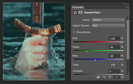
Much better. I kept increasing the reds until the blue tint from the hand was almost gone. As you can see, although the lake is less blue than before, the hand has been much more affected because it has more red light for me to add colour to than the lake does. The lake’s probably less blue than I’d like but that’s fine; I’ll fix it at the end. I just want the balance of colours correct for now, which is what channel mixer is all about.
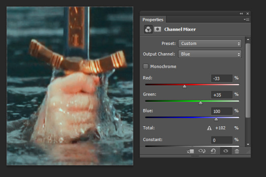
The sword is a bit coppery and the hand looks very red-blue and cold, which is because I’ve only been operating with red/cyan and have added a lot of red and cyan to the hand that wasn’t there before. I’m going to add some yellow (aka decrease the amount of blue) to bring some natural warmth to the skin and make the sword more golden.
Because I want to change the amount of yellow, I’m going to the blue output channel. I want to affect the hand most, and since it has more red light than than any other colour, so I’m going to increase the amount of yellow within the red light. And remember, increasing yellow actually means decreasing blues.

Again, this has the effect of giving the entire gif a yellow tint because I’m adding yellow to the red light in the lake. To make the lake less yellow while still leaving the hand yellow, I can increase the amount of blue within either the green or blue light to balance it out.
I’m going to modify the blue light because the hand has more green light than blue, which I checked this using the RGB channels from earlier in the tutorial. That means that I’ll add more blue to the hand if I modify the green light, simply because there is more green present. I want to keep as much yellow in the hand as possible while removing it from the rest of the gif. Since there’s less blue light in the hand, I won’t affect the hand as much by changing the colour of the blue light in the gif.
Comparison below of adding blue to the green light vs adding blue to the blue light.
Adding blue to the green light, a bit better than before but still slightly copper and red. If I only turn the green slider to 30%, the lake looks too yellow.

Adding blue to the blue light instead :) It hasn’t added much blue to the hand because it doesn’t have much existing blue light, but has affected the lake because the lake has more blue light to add colour to. I’m happy with the colour distribution, but I’m going to add a hue/saturation adjustment layer to bump up the cyan.
All done! I could probably have used selective colour to similar effect though, so when is channel mixer actually useful? It’s often difficult to use as a stand-in for selective colour like I’ve just done, which only worked this well because the colours in this gif are so simple. I just used it because all the neutrals were useful for explaining the light theory. Since channel mixer affects light rather than hues, it’s really hard to pick and grab specific colours without changing the hue of other areas of the gif, as you’ve seen in this tutorial where the changes I made to try and affect one area tinted the entire gif, particularly sections with lots of light.
In practice, channel mixer is more like an advanced colour balance or curves tool. I often use it when recolouring day-for-night scenes or any other scene with a tint or colour grading that looks slightly off and needs a more delicate tool than colour balance or curves, which add colour to regions of light rather than to specific colours. And while hue/saturation and selective colour affect specific colours, they don’t affect regions of light. Rather than changing the hue of colours or light, it lets you change the hue of colours of light. It’s a bit of a hybrid whose use becomes more understandable with experimentation, so have fun!
185 notes
·
View notes
Text
How I think CC Clothing Creators should do to shadow map
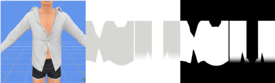
1. What is shadow map?
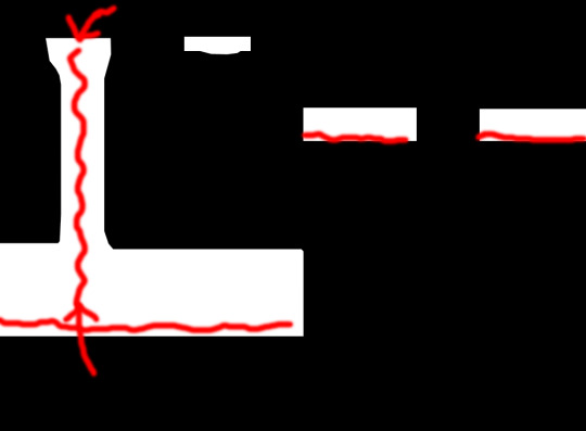
Take this shirt from Island Living for example and export shadow map in DDS format.
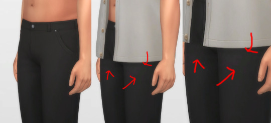
In game, shadow gives clothing layers, 3D-ness or enhance the 3D-ness that texture or normal map already gave. Shadow like this is easy to achieve without the need of MXAO from ReShade.
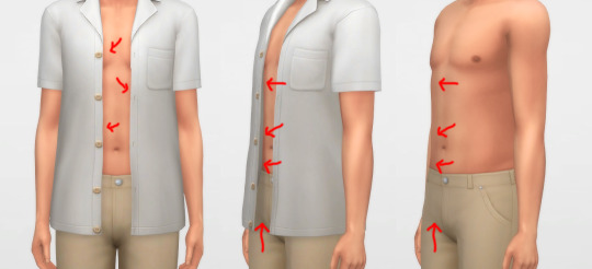
What is the problem here? Look, when I have an accessory undershirt in black on without the EA shirt, it’s looking normal, but when it is on there are some pixels breaking up, even for pants

I’m a perfectionist, I don’t want my cc pant or cc undershirt to look like that when pair with other shirts. And if you don’t see it as a problem, that is fine, you can stop reading right now and go on with your days, I’m not offended by it ^^, it is your own stylistic choice at the end of the day.
2. How shadow map behaves?
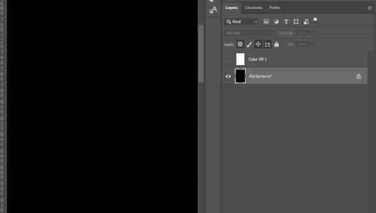
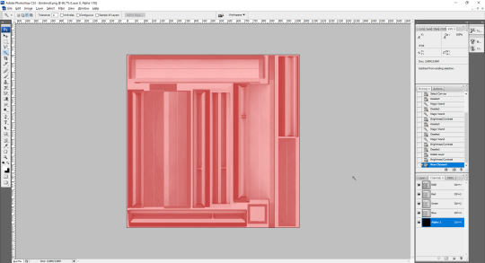
Open that shadow map we exported in DDS format into Photoshop, take a look.

The image show the grey which is the shadow where it should be on the body, the white area is NOT TRANSPARENT, it is white color where shadow does not belong.
Now, click on Channels, click on Alpha 1 layer, the Alpha 1 image is the key
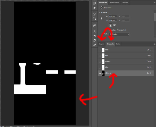
The Alpha layer is in black and white and sometimes in grey colors. Black is to hide everything of that area on RGB layer, white is to show everything of that area on RGB layer, Grey is like a slider, lighter grey will show more of that area while darker will show less.
And now if I put a male template on original rgb shadow map with 40% opacity, there are area of the chest, below shirt, below arms are white on Alpha layer which I highlighted red. That means that the white on RGB layer of shadow map still visible as white!
How is that the problem you ask? Here I have a image filled deepest true black (#000000) and add noise to it with Filter -> Noise -> Add Noise..., amount is 1% with monochromatic unchecked. This represents the black undershirt above with textures (grainy). Now if I paste a white layer (#FFFFFF) on top of black layer and set the blending mode to Soft Light.

There are a lot of breaking pixels with strange colors appear, like black undershirt and white shirt above ingame!
Because of how the shadow map still keep that area between chest remaining white, how Sims4 works, in my belief is they softlight or overlay the white onto whatever underneath, skins, black undershirt, that then will happen. Remember, this effect will visible when underneath is dark and muted colors, bright and light colors are hard to see.
This is how EA do shadow map on their clothings, by blocking the shadow, the arms, the chest, and bottoms of the shirt.
3. How to solve this problem?
Now here is my opinion, we should not blocking the shadow the way EA did, but by framing it around, close to the shadow.
Here is one of my shirt, its shadow map and how I do the alpha layer.
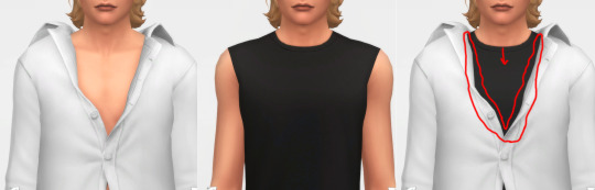
When I frame the shadow, there will still breaking up pixels AROUND that FRAME, but in between the chest doesn’t have white so it doesn’t breaking up any pixels! That is the best I can think of and do to reduce the issue, let me know if you have better way.
4. How to do it?
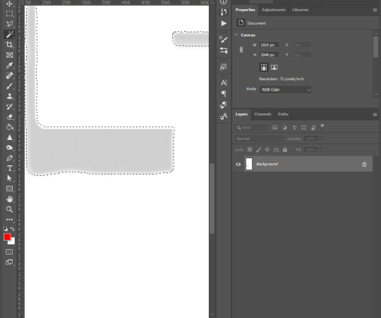
Step 1: For new blank shadow map starter, follow other shadow tutorials on how to paint grey color on image where your clothing projects shadow on the body. Merge everything so RGB image have grey shadow area and white area.
Step 2: Right-click on this icon on the left collumn, choose Magic Wand Tool
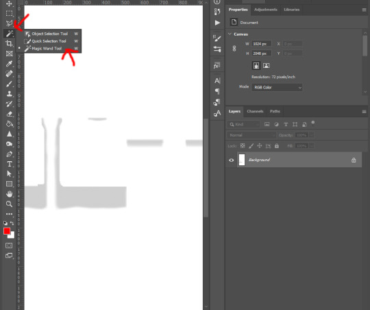
Step 3: Left-click on any white area, there will be marching ants around the grey shadow.
Step 4: Right-click on the same place and choose Select Inverse from list
Step 5: Go to the top tool bar of Photoshop, Select -> Modify -> Expand..., and enter from 5 to 8 pixels depend on your grey shadow blur or your desire. Hit OK
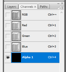
Step 6: Go to Channels tab next to Layers, click on Alpha 1, if you don’t see Alpha 1, click the icon on bottom right corner (blue arrow point to) to create Alpha layer
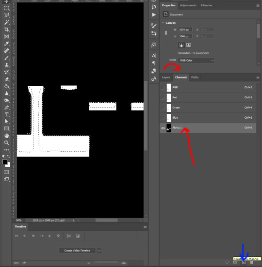
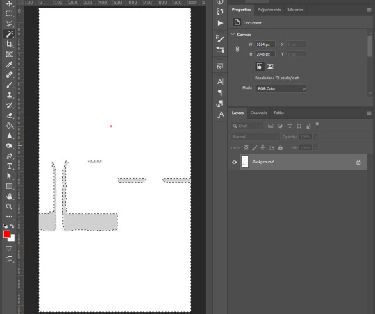
Step 7: Hold Shift + F5 or go to Edit -> Fill... on top tool bar of Photoshop. Then Contents -> White, hit OK

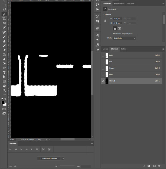
Step 8: Right click on the black area of the image, choose Select Inverse. Repeat step 7 : Hold Shift + F5 or go to Edit -> Fill... on top tool bar of Photoshop. Then Contents -> Black, hit OK
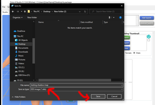
Step 9: Click on RGB layer, then Layers tab, Ctrl + D to deselect the marching ants, and save the work as DDS file
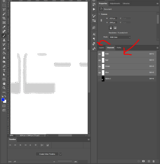
and yeah you’re done ^^.
You want to do this with every piece of cc, hairs, accessories, necklaces, bracelets, tops, bottoms, gloves, shoes, because of how sort layer work for items in CAS, lower sort layer items will get affected by higher sort layer items if shadow map was what it was.
Credit to one of Grimcookies’ old post about how shadow map should be done in Alpha Layer
#syaovu#sims#ts4#ts4 tutorial#s4 tutorial#shadow map tutorial#tutorial#resources#how cc clothing creators should do to shadow map#long post#gif
505 notes
·
View notes
Note
hey ♡ you know, all your colourings are beautiful and perfect and this is no secret. but the way you coloured ptd jeongguk solo scene is M A G I C 😭 so i came here to ask if you think about someday doing a tutorial on how to fix scenes that have a weird filters. please 😭 you're so talented!
hi! i'm sorry for answering this late, but i wanted to give a thorough response to this. i’m always so flattered by your praise and this means a lot coming from you in addition to everyone else who complimented my coloring in the tags on my PTD gifset. thank you! :’)
a few of those gifs only had a couple adjustment layers on them while other ones took a few extra minutes to work on. luckily, i had the good sense to save the coloring on the jungkook gif specifically as a psd just in case anyone wanted to see the before and after because it was the one that needed the most attention.
so i’m gonna put some tips and tricks under the cut that are helpful for me when it comes to working with footage in low light or working around the original color grading. i’m not the best at explaining things, so i recommend checking out this detailed tutorial as well. hope it helps!
first, here’s a gif where you can see the before and after.
the original shot is pretty dark and orangey, so in order to brighten it and work around that (but still maintain integrity of the scene and his skin tone) your best friends here are gonna be the curves and selective coloring tools.
all my gifs start with a curves layer to fix the white balance of the scene if need be. you do this simply by using the black and/or white eyedropper tools, like the tutorial i linked says, depending on how dark the scene is. this takes a lot of practice and trial and error before you get it right. usually, i just use the white dropper tool first and pick a white point in the scene, then i do the same with the black dropper, but it’s not always necessary.
in this case, neither the black or white dropper tools in RGB mode where giving me any decent results. that’s when desperation kicks in and you test it out in the red, green, or blue options in the drop down menu in your curves layer. since this scene is so red, i chose red. then i used the white eyedropper tool and clicked on his teeth. boom, i got something.
here’s what my gif suddenly looked like with only the curves layer at 100%.
i could have left it alone, but i turned the opacity of the layer down to 70% so i was left with this.

then i went on to add a levels adjustment. the the far right slider is my favorite because just moving it the slightest bit to the left always makes a gif look like someone turned the lights on lol. i then did some minor selective coloring like bumping up the blacks and adjusting the reds to warm it back up the tiiiiniest bit and now i have this.

from there i added my hue/saturation and vibrance layers. then i added a deep blue photo filter at 10% density and a gradient map at 20%, which are just some of my own personal touches.
here’s the finished gif!
43 notes
·
View notes
Text
Step-by-Step Guide: Convert Images to Grayscale Online
Converting images to grayscale can greatly enhance their beauty by decreasing contrast of light. Your grayscale image might take on a vintage or nostalgic aesthetic by eliminating unnecessary distractions. Now it is easy and quick to convert jpg to black and white. All it requires are some tools - and in this article we will outline some free options available to quickly transform photos to grayscale.
Are You Ready? Let's Get Going!
Convert Images to Grayscale
Now it is possible to give your photographs an old-world charm with free grayscale image converter tools available online, directly in your browser without installing additional software.
Here we have provided you with some grayscale picture converter tools. Take a look!
Tool 1: PhotoPad Photo Editing Software
The PhotoPad photo editor is a quick and enjoyable free tool that quickly edits images to grayscale. It is reliable, user-friendly, and supports all image formats - making this an essential image editing program!
Now, let's use it to convert photos to grayscale.
Steps for taking grayscale photos using this tool
Step 1: Download PhotoPad Photo Editor
To get started editing on your PC, download and install PhotoPad Photo Editor in the first step. When complete, launch it to begin the editing process.
Step 2: Add JPG images to PhotoPad
To open the file finder window, simply click on the Open button in the main toolbar and locate and select your JPG image from your computer before clicking "Open" to import it into PhotoPad for Grayscale conversion. Alternatively, simply drag-and-drop your file directly onto PhotoPad!
Step 3: Convert JPG to Grayscale
To convert a JPG image automatically, navigate to the Color tab on your main toolbar. Under Filters icon, choose Grayscale in drop-down menu for filters. Alternatively, there is also an assortment of grayscale filters located under Effects & Layers column on right. Using Strength slider, you can also alter grayscale filter amplification level.
Step 4: To Save Grayscale Photos
SAVE In order to save convert image to grayscale, click "Save" in the main toolbar. Grayscale pictures can be saved as JPG/JPEG, GIF, ICO, PNG PSD TIF/TIFF files - alternatively you could upload them directly onto Flickr Dropbox and Twitter!
Install PhotoPad JPG Grayscale Editor instantly to convert JPEGs to Grayscale!
Tool 2: FilmConverto
Another grayscale a photoconverter tool you can use to give your photos a vintage aesthetic is FilmConverto, a free browser-based service which requires no software installation whatsoever and makes use simple; simply upload an image file and click "Submit now"!
Tool 3: Pixelied
Pixelied is a free online grayscale image converter. With it, you can quickly produce beautiful retro images to delight online audiences forever! Easily adjust the exposure of each picture with the grayscale tone slider for optimal results; plus create graphics quickly and share them online - perfect for sharing on social media sites!
Tool 4: RAW.PICS.IO
With Raw.pics.io, it is simple and fast to create grayscale photos. Only a few clicks are needed to eliminate all colors from digital shots taken through your browser - completely free. Additionally, since Raw.pics.io operates browser-basedly and doesn't need installing on desktop PCs or other devices separately - every device can benefit from its use!
Tool 5: Fotor
With Fotor's rgb to greyscale image converter, quickly transform any photo to grayscale. Just drag and drop an image to be grayscaled before applying a grayscale filter; reduce colors as desired to adjust grey tone intensity as required.
0 notes
Note
Hi! I was wondering when converting s4 to s3 how do you make the multiplier and specular? Thank you for your time!
Hmm, okay, how to explain it without taking too much time...
THE MULTIPLIER
All right. While many people prefer to re-bake a multiplier on Blender (and you can find bake tutorials VERY EASILY), I actually REALLY LIKE the painted-on wooden texture of many EAxis objects, so I extract a diffuse from my object of choice:
(as I told in a previous post, I actually extract two, a high contrast one for the mask, a low contrast one for the multiplier, and I make the mask FIRST.)
PNG is fine; I only had to extract a diffuse in DDS once, because EAxis screwed with the alpha.
I make my mask (it’s basically selecting different colored parts and filling it with color channels, that’s for another time), then I add it as a new layer over my multiplier diffuse:
See the bottom right corner? Two layers!
But before playing with the magic wand, I go to Layer 0 / Background Layer / whatever it works on your image editor, and I desaturate the multiplier. In Photoshop, it’s Image > Adjustments > Desaturate.
My multiplier layer looks like this now.
While it LOOKS like it’s finished, now I need to check if the average color of a certain part of the texture is middle grey, or RGB 128, 128, 128 (some people go for 133-133-133 to avoid flat blacks, assuming the risk of getting overblown pure white recolors, but that’s a matter of TASTE).
For that, I’ll reactivate my mask layer and use the magic wand to select the red channel, THEN I hide my mask layer again. Do not forget to set tolerance as 0, no anti-aliasing, not contiguous.
If you do it right, your selection will look like this

Now it’s just a matter of using the eyedropper tool to click on a not very bright, not very dark part of the selection and see if it’s 128-128-128 or very close to it (126 to 130 is an okay margin).
In this case, it’s a little too dark, so I go to Image > Adjustments > Brightness/Contrast and I fiddle only with the Brightness slider until getting close to my result (you CAN use the eyedropper without applying the changes, just look at the upper right corner to check the new value. For this selection, I used Brightness +38.
(Some textures, especially when too light, need to be darkened by Adjustment > Curves, but that’s more of an outright Photoshop tutorial than just fiddling with stuff. Practice, practice, pratice...)
All right, it looks like this now, with only the part of the multiplier that will be affected by the red channel brightened:
If your item has only one channel, then save your multiplier, it’s finished (and you really didn’t need to paste the mask as a new layer to help with the selections, since a one-channel mask is fully red, but it’s good to get into the habit)
For every other channel, press Ctrl + D to deselect everything, reactivate your mask layer, select the new channel, repeat everything. But IMPORTANT: different channels WILL require different Brightness values UNLESS you got a monochromatic diffuse, and not every item comes with a plain swatch.

In this case, my second channel needed an adjustment of Brightness +28, just to prove what I just said about different channels, different values :)
Since my example only came with two colors, I save it as PNG for now. I only convert to DDS when it’s over 1024x1024 or I’m pretty sure that the DDS compression won’t fill my texture with artifacts. Even multipliers with transparent or translucent parts work with PNG just fine.
THE SPECULAR
You’ll NEED a finished multiplier first. Yes, really.
The fastest way is to select everything, go to Image > Adjustments > Brightness/Contrast, and hike the Brightness to +100 or +110 and up the Contrast a little.

LIIIGHT.
Than you go to the Channels tab of your Layers window and add a new Alpha Channel by clicking this button:
You’ll have a brand-new Alpha 1 channel that’s fully black. That’s fine, keep it that way.
Select the RGB channel, you’ll see that your specular will have a faint red tint - no worries, that’s just to show that your Alpha is also active.
Now, you’ll have to save it as a DDS, no ifs or buts:

ALWAYS keep the Alpha Channels option ON, or else you’ll have an item that’s always shiny because no alpha means a fully white alpha, which means the game will force the brightness of the original, hyper-brightened texture ALL THE TIME. Black alpha, and it means things only get shiny if you add a shiny pattern in CASt.

In the next window, choose DXT5 compression.
And that’s... the basics. Checking if it gets noisy, if it needs more adjusts after you import it to TSRW, etc, are matters of practice, getting familiar with your image editor, and developing a good eye for subtle color changes. But the necessary parts are those that I explained, and they’ll work great in 95% of the cases!
(the other 5% are for when you need a translucent part in Phong Alpha shader to not be recolorable because Phong Alpha overlays SUCK, when TSRW messes with your textures no matter if it’s PNG or DDS and you’ll need to save a texture as 8.8.8.8 uncompressed DDS and replace it with S3PE, and all sorts of... annoying issues)
Also credits for @enable--llamas for finally showing me a way to make speculars that WORK.
This is a tad slapdash, but hope it helps!
62 notes
·
View notes