#thanks for breaking the fandom
Text
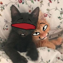
oh yeah happy one year since this bastard first debuted on the owl show
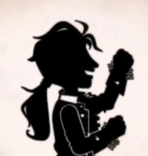
thanks for completely shattering the fandom homeboy
#the owl house#toh#emperor belos#philip wittebane#toh belos#belos#toh philip#through the looking glass ruins#ALSO HAPPY BIRTHDAY FIRST LUMITY KISS!!!!#a year ago today I was actually in transit to Disney lol#was in the car and found a bootleg of the episode and just freaked#heard philips voice and immediately went ‘OH THATS BELOS FOR SURE.’#and then freaked even MORE ABOUT THE LUMITY KISS#anyways#happy birthday philip wittebitch I guess 🙄🙄#thanks for breaking the fandom#I remember logging onto tungle and seeing the fandom split between ‘OH MY GOD LUMITY KISS’ and ‘OH MY GOD HES DEFINITELY BELOS’
2K notes
·
View notes
Text


I am both King and Queen best of both things!
But Dad works fine.
#toh#toh spoilers#the owl house#toh finale#watching and dreaming#little break from your regularly schedule hedgehogs because: that finale huh#also This Guy has been living in my head rent free since I saw him#im in love with his design#peak Dad#edit: thank you to the person that provided an Image description!!#I've updated the post to include it#misc fandoms
4K notes
·
View notes
Text
why Aurora's art is genius
It's break for me, and I've been meaning to sit down and read the Aurora webcomic (https://comicaurora.com/, @comicaurora on Tumblr) for quite a bit. So I did that over the last few days.
And… y'know. I can't actually say "I should've read this earlier," because otherwise I would've been up at 2:30-3am when I had responsibilities in the morning and I couldn't have properly enjoyed it, but. Holy shit guys THIS COMIC.
I intended to just do a generalized "hello this is all the things I love about this story," and I wrote a paragraph or two about art style. …and then another. And another. And I realized I needed to actually reference things so I would stop being too vague. I was reading the comic on my tablet or phone, because I wanted to stay curled up in my chair, but I type at a big monitor and so I saw more details… aaaaaand it turned into its own giant-ass post.
SO. Enjoy a few thousand words of me nerding out about this insanely cool art style and how fucking gorgeous this comic is? (There are screenshots, I promise it isn't just a wall of text.) In my defense, I just spent two semesters in graphic design classes focusing on the Adobe Suite, so… I get to be a nerd about pretty things…???
All positive feedback btw! No downers here. <3
---
I cannot emphasize enough how much I love the beautiful, simple stylistic method of drawing characters and figures. It is absolutely stunning and effortless and utterly graceful—it is so hard to capture the sheer beauty and fluidity of the human form in such a fashion. Even a simple outline of a character feels dynamic! It's gorgeous!
Though I do have a love-hate relationship with this, because my artistic side looks at that lovely simplicity, goes "I CAN DO THAT!" and then I sit down and go to the paper and realize that no, in fact, I cannot do that yet, because that simplicity is born of a hell of a lot of practice and understanding of bodies and actually is really hard to do. It's a very developed style that only looks simple because the artist knows what they're doing. The human body is hard to pull off, and this comic does so beautifully and makes it look effortless.
Also: line weight line weight line weight. It's especially important in simplified shapes and figures like this, and hoo boy is it used excellently. It's especially apparent the newer the pages get—I love watching that improvement over time—but with simpler figures and lines, you get nice light lines to emphasize both smaller details, like in the draping of clothing and the curls of hair—which, hello, yes—and thicker lines to emphasize bigger and more important details and silhouettes. It's the sort of thing that's essential to most illustrations, but I wanted to make a note of it because it's so vital to this art style.
THE USE OF LAYER BLENDING MODES OH MY GODS. (...uhhh, apologies to the people who don't know what that means, it's a digital art program thing? This article explains it for beginners.)
Bear with me, I just finished my second Photoshop course, I spent months and months working on projects with this shit so I see the genius use of Screen and/or its siblings (of which there are many—if I say "Screen" here, assume I mean the entire umbrella of Screen blending modes and possibly Overlay) and go nuts, but seriously it's so clever and also fucking gorgeous:
Firstly: the use of screened-on sound effect words over an action? A "CRACK" written over a branch and then put on Screen in glowy green so that it's subtle enough that it doesn't disrupt the visual flow, but still sticks out enough to make itself heard? Little "scritches" that are transparent where they're laid on without outlines to emphasize the sound without disrupting the underlying image? FUCK YES. I haven't seen this done literally anywhere else—granted, I haven't read a massive amount of comics, but I've read enough—and it is so clever and I adore it. Examples:


Secondly: The beautiful lighting effects. The curling leaves, all the magic, the various glowing eyes, the fog, the way it's all so vividly colored but doesn't burn your eyeballs out—a balance that's way harder to achieve than you'd think—and the soft glows around them, eeeee it's so pretty so pretty SO PRETTY. Not sure if some of these are Outer/Inner Glow/Shadow layer effects or if it's entirely hand-drawn, but major kudos either way; I can see the beautiful use of blending modes and I SALUTE YOUR GENIUS.
I keep looking at some of this stuff and go "is that a layer effect or is it done by hand?" Because you can make some similar things with the Satin layer effect in Photoshop (I don't know if other programs have this? I'm gonna have to find out since I won't have access to PS for much longer ;-;) that resembles some of the swirly inner bits on some of the lit effects, but I'm not sure if it is that or not. Or you could mask over textures? There's... many ways to do it.
If done by hand: oh my gods the patience, how. If done with layer effects: really clever work that knows how to stop said effects from looking wonky, because ugh those things get temperamental. If done with a layer of texture that's been masked over: very, very good masking work. No matter the method, pretty shimmers and swirly bits inside the bigger pretty swirls!
Next: The way color contrast is used! I will never be over the glowy green-on-black Primordial Life vibes when Alinua gets dropped into that… unconscious space?? with Life, for example, and the sharp contrast of vines and crack and branches and leaves against pitch black is just visually stunning. The way the roots sink into the ground and the three-dimensional sensation of it is particularly badass here:

Friggin. How does this imply depth like that. HOW. IT'S SO FREAKING COOL.
A huge point here is also color language and use! Everybody has their own particular shade, generally matching their eyes, magic, and personality, and I adore how this is used to make it clear who's talking or who's doing an action. That was especially apparent to me with Dainix and Falst in the caves—their colors are both fairly warm, but quite distinct, and I love how this clarifies who's doing what in panels with a lot of action from both of them. There is a particular bit that stuck out to me, so I dug up the panels (see this page and the following one https://comicaurora.com/aurora/1-20-30/):

(Gods it looks even prettier now that I put it against a plain background. Also, appreciation to Falst for managing a bridal-carry midair, damn.)
The way that their colors MERGE here! And the immense attention to detail in doing so—Dainix is higher up than Falst is in the first panel, so Dainix's orange fades into Falst's orange at the base. The next panel has gold up top and orange on bottom; we can't really tell in that panel where each of them are, but that's carried over to the next panel—

—where we now see that Falst's position is raised above Dainix's due to the way he's carrying him. (Points for continuity!) And, of course, we see the little "huffs" flowing from orange to yellow over their heads (where Dainix's head is higher than Falst's) to merge the sound of their breathing, which is absurdly clever because it emphasizes to the viewer how we hear two sets of huffing overlaying each other, not one. Absolutely brilliant.
(A few other notes of appreciation to that panel: beautiful glows around them, the sparks, the jagged silhouette of the spider legs, the lovely colors that have no right to make the area around a spider corpse that pretty, the excellent texturing on the cave walls plus perspective, the way Falst's movements imply Dainix's hefty weight, the natural posing of the characters, their on-point expressions that convey exactly how fuckin terrifying everything is right now, the slight glows to their eyes, and also they're just handsome boys <3)
Next up: Rain!!!! So well done! It's subtle enough that it never ever disrupts the impact of the focal point, but evident enough you can tell! And more importantly: THE MIST OFF THE CHARACTERS. Rain does this irl, it has that little vapor that comes off you and makes that little misty effect that plays with lighting, it's so cool-looking and here it's used to such pretty effect!
One of the panel captions says something about it blurring out all the injuries on the characters but like THAT AIN'T TOO BIG OF A PROBLEM when it gets across the environmental vibes, and also that'd be how it would look in real life too so like… outside viewer's angle is the same as the characters', mostly? my point is: that's the environment!!! that's the vibes, that's the feel! It gets it across and it does so in the most pretty way possible!
And another thing re: rain, the use of it to establish perspective, particularly in panels like this—

—where we can tell we're looking down at Tynan due to the perspective on the rain and where it's pointing. Excellent. (Also, kudos for looking down and emphasizing how Tynan's losing his advantage—lovely use of visual storytelling.)
Additionally, the misting here:

We see it most heavily in the leftmost panel, where it's quite foggy as you would expect in a rainstorm, especially in an environment with a lot of heat, but it's also lightly powdered on in the following two panels and tends to follow light sources, which makes complete sense given how light bounces off particles in the air.
A major point of strength in these too is a thorough understanding of lighting, like rim lighting, the various hues and shades, and an intricate understanding of how light bounces off surfaces even when they're in shadow (we'll see a faint glow in spots where characters are half in shadow, but that's how it would work in real life, because of how light bounces around).
Bringing some of these points together: the fluidity of the lines in magic, and the way simple glowing lines are used to emphasize motion and the magic itself, is deeply clever. I'm basically pulling at random from panels and there's definitely even better examples, but here's one (see this page https://comicaurora.com/aurora/1-16-33/):

First panel, listed in numbers because these build on each other:
The tension of the lines in Tess's magic here. This works on a couple levels: first, the way she's holding her fists, as if she's pulling a rope taut.
The way there's one primary line, emphasizing the rope feeling, accompanied by smaller ones.
The additional lines starbursting around her hands, to indicate the energy crackling in her hands and how she's doing a good bit more than just holding it. (That combined with the fists suggests some tension to the magic, too.) Also the variations in brightness, a feature you'll find in actual lightning. :D Additional kudos for how the lightning sparks and breaks off the metal of the sword.
A handful of miscellaneous notes on the second panel:
The reflection of the flames in Erin's typically dark blue eyes (which bears a remarkable resemblance to Dainix, incidentally—almost a thematic sort of parallel given Erin's using the same magic Dainix specializes in?)
The flowing of fabric in the wind and associated variation in the lineart
The way Erin's tattoos interact with the fire he's pulling to his hand
The way the rain overlays some of the fainter areas of fire (attention! to! detail! hell yeah!)
I could go on. I won't because this is a lot of writing already.
Third panel gets paragraphs, not bullets:
Erin's giant-ass "FWOOM" of fire there, and the way the outline of the word is puffy-edged and gradated to feel almost three-dimensional, plus once again using Screen or a variation on it so that the stars show up in the background. All this against that stunning plume of fire, which ripples and sparks so gorgeously, and the ending "om" of the onomatopoeia is emphasized incredibly brightly against that, adding to the punch of it and making the plume feel even brighter.
Also, once again, rain helping establish perspective, especially in how it's very angular in the left side of the panel and then slowly becomes more like a point to the right to indicate it's falling directly down on the viewer. Add in the bright, beautiful glow effects, fainter but no less important black lines beneath them to emphasize the sky and smoke and the like, and the stunningly beautiful lighting and gradated glows surrounding Erin plus the lightning jagging up at him from below, and you get one hell of an impactful panel right there. (And there is definitely more in there I could break down, this is just a lot already.)
And in general: The colors in this? Incredible. The blues and purples and oranges and golds compliment so well, and it's all so rich.
Like, seriously, just throughout the whole comic, the use of gradients, blending modes, color balance and hues, all the things, all the things, it makes for the most beautiful effects and glows and such a rich environment. There's a very distinct style to this comic in its simplified backgrounds (which I recognize are done partly because it's way easier and also backgrounds are so time-consuming dear gods but lemme say this) and vivid, smoothly drawn characters; the simplicity lets them come to the front and gives room for those beautiful, richly saturated focal points, letting the stylized designs of the magic and characters shine. The use of distinct silhouettes is insanely good. Honestly, complex backgrounds might run the risk of making everything too visually busy in this case. It's just, augh, so GORGEOUS.
Another bit, take a look at this page (https://comicaurora.com/aurora/1-15-28/):

It's not quite as evident here as it is in the next page, but this one does some other fun things so I'm grabbing it. Points:
Once again, using different colors to represent different character actions. The "WHAM" of Kendal hitting the ground is caused by Dainix's force, so it's orange (and kudos for doubling the word over to add a shake effect). But we see blue layered underneath, which could be an environmental choice, but might also be because it's Kendal, whose color is blue.
And speaking off, take a look at the right-most panel on top, where Kendal grabs the spear: his motion is, again, illustrated in bright blue, versus the atmospheric screened-on orange lines that point toward him around the whole panel (I'm sure these have a name, I think they might be more of a manga thing though and the only experience I have in manga is reading a bit of Fullmetal Alchemist). Those lines emphasize the weight of the spear being shoved at him, and their color tells us Dainix is responsible for it.
One of my all-time favorite effects in this comic is the way cracks manifest across Dainix's body to represent when he starts to lose control; it is utterly gorgeous and wonderfully thematic. These are more evident in the page before and after this one, but you get a decent idea here. I love the way they glow softly, the way the fire juuuust flickers through at the start and then becomes more evident over time, and the cracks feel so realistic, like his skin is made of pottery. Additional points for how fire begins to creep into his hair.
A small detail that's generally consistent across the comic, but which I want to make note of here because you can see it pretty well: Kendal's eyes glow about the same as the jewel in his sword, mirroring his connection to said sword and calling back to how the jewel became Vash's eye temporarily and thus was once Kendal's eye. You can always see this connection (though there might be some spots where this also changes in a symbolic manner; I went through it quickly on the first time around, so I'll pay more attention when I inevitably reread this), where Kendal's always got that little shine of blue in his eyes the same as the jewel. It's a beautiful visual parallel that encourages the reader to subconsciously link them together, especially since the lines used to illustrate character movements typically mirror their eye color. It's an extension of Kendal.
Did I mention how ABSOLUTELY BEAUTIFUL the colors in this are?
Also, the mythological/legend-type scenes are illustrated in familiar style often used for that type of story, a simple and heavily symbolic two-dimensional cave-painting-like look. They are absolutely beautiful on many levels, employing simple, lovely gradients, slightly rougher and thicker lineart that is nonetheless smoothly beautiful, and working with clear silhouettes (a major strength of this art style, but also a strength in the comic overall). But in particular, I wanted to call attention to a particular thing (see this page https://comicaurora.com/aurora/1-12-4/):

The flowing symbolic lineart surrounding each character. This is actually quite consistent across characters—see also Life's typical lines and how they curl:

What's particularly interesting here is how these symbols are often similar, but not the same. Vash's lines are always smooth, clean curls, often playing off each other and echoing one another like ripples in a pond. You'd think they'd look too similar to Life's—but they don't. Life's curl like vines, and they remain connected; where one curve might echo another but exist entirely detached from each other in Vash's, Life's lines still remain wound together, because vines are continuous and don't float around. :P
Tahraim's are less continuous, often breaking up with significantly smaller bits and pieces floating around like—of course—sparks, and come to sharper points. These are also constants: we see the vines repeated over and over in Alinua's dreams of Life, and the echoing ripples of Vash are consistent wherever we encounter him. Kendal's dream of the ghost citizens of the city of Vash in the last few chapters is filled with these rippling, echoing patterns, to beautiful effect (https://comicaurora.com/aurora/1-20-14/):

They ripple and spiral, often in long, sinuous curves, with smooth elegance. It reminds me a great deal of images of space and sine waves and the like. This establishes a definite feel to these different characters and their magic. And the thing is, that's not something that had to be done—the colors are good at emphasizing who's who. But it was done, and it adds a whole other dimension to the story. Whenever you're in a deity's domain, you know whose it is no matter the color.
Regarding that shape language, I wanted to make another note, too—Vash is sometimes described as chaotic and doing what he likes, which is interesting to me, because smooth, elegant curves and the color blue aren't generally associated with chaos. So while Vash might behave like that on the surface, I'm guessing he's got a lot more going on underneath; he's probably much more intentional in his actions than you'd think at a glance, and he is certainly quite caring with his city. The other thing is that this suits Kendal perfectly. He's a paragon character; he is kind, virtuous, and self-sacrificing, and often we see him aiming to calm others and keep them safe. Blue is such a good color for him. There is… probably more to this, but I'm not deep enough in yet to say.
And here's the thing: I'm only scratching the surface. There is so much more here I'm not covering (color palettes! outfits! character design! environment! the deities! so much more!) and a lot more I can't cover, because I don't have the experience; this is me as a hobbyist artist who happened to take a couple design classes because I wanted to. The art style to this comic is so clever and creative and beautiful, though, I just had to go off about it. <3
...brownie points for getting all the way down here? Have a cookie.
#aurora comic#aurora webcomic#comicaurora#art analysis#...I hope those are the right tags???#new fandom new tagging practices to learn ig#much thanks for something to read while I try to rest my wrists. carpal tunnel BAD. (ignore that I wrote this I've got braces ok it's fine)#anyway! I HAVE. MANY MORE THOUGHTS. ON THE STORY ITSELF. THIS LOVELY STORY#also a collection of reactions to a chunk of the comic before I hit the point where I was too busy reading to write anything down#idk how to format those tho#...yeet them into one post...???#eh I usually don't go off this much these days but this seems like a smaller tight-knit fandom so... might as well help build it?#and I have a little more time thanks to break so#oh yes also shoutout to my insanely awesome professor for teaching me all the technical stuff from this he is LOVELY#made an incredibly complex program into something comprehensible <3#synapse talks
746 notes
·
View notes
Text
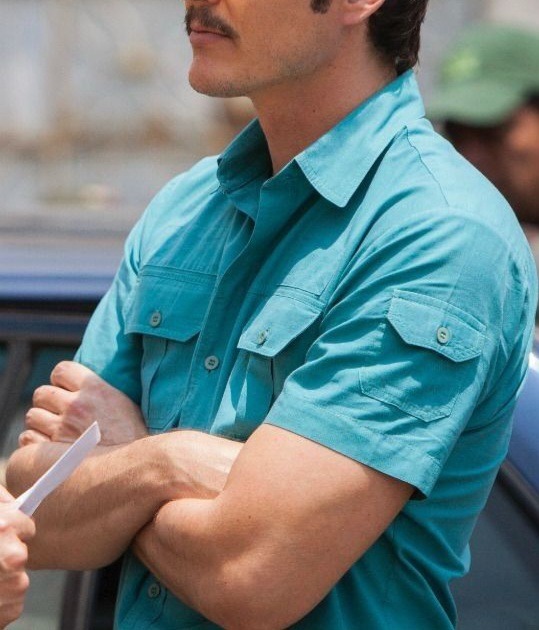
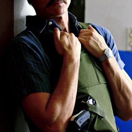

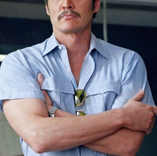
Javier's arms make me feel so feral, I mean, they look strong enough to break me in half 🥺🔥
#jose pedro balmaceda pascal#pedro pascal fandom#pedro pascal#pedropascal#ppascaledit#pedropascaledit#pedro pascal characters#javier peña#javier pena#javier peña narcos#javier narcos#aaaaa yes#arms arms arms#i dream with those arms#they could break me in half#and ill be like#oh yes#thank u very much sir#i never in my life#thought i would be so thirsty for someone's arms#like geez#what am i doing with my life#softiedingo
798 notes
·
View notes
Text
hi it's the good omens mascot here's some shit about me that might be relevant
I appear to have accidentally caused chaos so I figured you might as well know about me since I'm responsible for it. And also so that you know who you broke, thanks ineffable fandom.
I have been called the prophet by some of you all. This is not entirely untrue, but I would like to add as I did in one post, that Apollo also gave me the curses of art, (very emotional) music, (sometimes good mostly dreadful) poetry, (same parentheses apply, except that the dreadful is on purpose) writing and (used to be good now dreadful) medical knowledge, and so yes, you did accidently adopt a messenger of an ancient Greek god.
Yes, this entire entry into your cult happened from start to now happened in 48 hours.
This will seem less bizarre when I give you context about me and fandoms. I changed career paths (after three years of intense study that cost me my sanity) from science to the arts because I was inspired by drarry fanfiction of them leaving their ministry jobs and following their dreams. Yes I tossed three years and my loss of sanity away in one week of decisions. I'm now a designer. Thanks Draco.
I read so much drarry fanfiction that my mum had to take me to the hospital for injured wrists. I wore wrist and elbow supports and was in constant pain for a few months. I was only later introduced to autoscroll. Yes, I am a fool. Yes, I am unaware of how to human.
I'm broke and cheap enough that I feel guilty buying bottled water, but for Christmas I spent the equivalent of around 150 bottles of water getting a Bakewell tart custom made (they don't sell them where I live). Why? Because in one single fanfiction, it is Draco's favourite food. I would never spend that kind of money on a dessert for any real human being.
That is to say, you all are not ready for when I REALLY fall for Crowley. I don't saunter vaguely downwards for people. I bypass earth and crash into hell, leaving a smoking pit in its infernal ground.
I swear I'm not as dumb as I seem, I just have ZERO general knowledge, and am terrible with faces. I can tell you what the graffiti on the walls of Pompeii from before 70 AD said but I don't know who my previous president was, and personally I think that's very classy of me.
Some of you seem concerned about my sleep schedule. Worry not, I sleep in four installments, night, morning nap, afternoon nap, evening nap. I sleep more than you all, that I can promise. I sleep more than my doggy sister.
About the streams and the timezones, I have no idea how to make it so people can watch, because I frequently mix up east and west and last morning I mixed up the Pacific and Atlantic ocean. I don't know at what point the Eastern hemisphere becomes the Western or how any of it works. I also thought Wakanda was a real place.
But hey fun fact, in 2020 diclofenac sales were dropping in Iceland. I know this because I wanted to make sure to use the correct painkiller in one sentence of a story I was writing. It was completely irrelevant. But hey any of you writers here probably feel my pain. I don't write fanfiction, but I am an author and I write original stories. And honestly what is more useful, Icelandic diclofenac sales from three years ago or timezones?
A career test once told me to be a standup comedian.
Yes that's me Asmi, just your regular dumbass lad who is slightly unhinged, serving himbo twink energy, hello hi nice to meet you all. PS: the poll results are out and Doctor Who won, so tremble, DW fandom.
#good omens fandom#good omens mascot#asmi#weirdly-specific-but-ok#this is me y'all#good omens brainrot#thanks for breaking me i figured you should know about me#crowley#just crowley i'm going to shatter soon#drarry#draco malfoy#fandom culture#fandom things#doctor who#dw fandom#more inaccurate summaries coming up#good omens#fanfiction#and how it ruined and saved me
378 notes
·
View notes
Text
The Power of DPxDC
There has been a lot of anti-DPxDC sentiment going around lately; if you haven't heard about it, then don't worry about it. This isn't a post about the negativity, this is a post celebrating how much we've done as a crossover fandom!
Just as a bit of perspective, I've been reading fics from DPxDC since 2020. Now that might not seem like a long time ago, but back then we didn't even have 100 fics for the crossover as a whole, and look at us now! This is a screenshot from Ao3 just today:
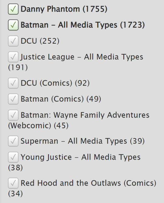
Incredible, isn't it? Look how much we've grown and contributed and shared! And that's not even mentioning all the wonderful Tumblr prompts and posts and incredible fanart. DPxDC has us in a chokehold and it isn't about to let go any time soon.
I know it can be a little disheartening to see all the people trying to drag us down. I know I've been left disappointed in some cases, but I also know that my love for the crossover hasn't abated at all, and I hope it stays that way with you all too!
There is so much engagement in this crossover, I cannot tell you enough how much you all have spoiled me with comments and kudos and fanart. A lot of my fandom friends like to tease me for writing so much, but I don't think I could have written half of those fics had it not been for people like you loving them as much as you do.
Passion is the lifeblood of this fandom, of every fandom! And I don't see that going away any time soon for DPxDC.
I know I want to comment and kudos more. I read a lot of fics, but I don't sign in often so that you can see me leaving that kudos, and it's been more and more apparent to me how many people don't realize how much I adore their writing. I'm hoping to fix that!
Some might say that we don't tag our work appropriately, and while that might be true in some cases, I cannot stress enough just how good of a job we're doing. @tourettesdog made a wonderful post not too long ago about tagging, and we do clean work! Not even a full 3% of all the tags they'd seen included a "main" tag, which has been the frustration for most. 3%? That's incredible!
You all deserve some appreciation for the hard work y'all do, and this is it! I hope you all know how well you've fed creators, readers, and fans like me! Don't let up, because we do amazing work. And that deserves to be celebrated.
#dpxdc#i'm gonna be real with you all#dpxdc got me through a TOUGH fandom break#had it not been for this crossover#i might have quit writing altogether#but you're the reason i kept going#and i can't stress enough how much#that means to me now#so thank you too
497 notes
·
View notes
Note
Ooh I see your requests are open! Maybe a Mumbo Jumbo? :)

This is how I see the pair
thank u for asking ! its always nice to see u in my ask box hehe
Requests are OPEN!!!
#mcyt#mumbo jumbo#hermitcraft#grian hermitcraft#grian#hermitcraft smp#smp#mumbo jumbo hermitcraft#i never got super attached to him cuz i only got to enjoy his content for a few months before he went on his break#but i love how vampire esque his design his#ah i shouldbe made a monacle ;;;;#or maybe a looong diamond earing ;;;#but oh well#i need a nap#alos i#think i have specific pen for each fandom hehe just cant draw mcyt without a certain pen and lmk without the other#curious#my art#I've never really drawn him before but boy is he skrunkly ! heheh thank u so much for asking u might have taken me out of my mcyt crunch ha#how can i not sneak in a grian into this#it feels wrong not to have him here !#this was very much not a doodle#but incredibly therapeutic haha
526 notes
·
View notes
Photo
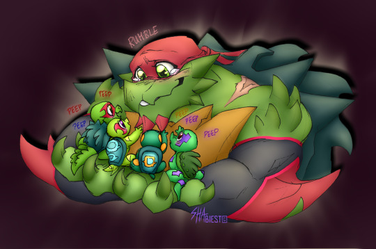
Okay but I need yall to know that I couldn’t physically stop myself from coloring this absolutely adorable sketch by @sha-biest of her Golden Future Raph with his hands full of the tiny turtle tots once i got permission of course
just look!!! how cute!! i love!!!
ik im new to the whole fandom, but if by chance you see this and you havent seen sha’s art, i highly encourage you to go give her love and support!!
#rottmnt#rise of the tmnt#rottmnt raph#rottmnt tots#turtle tots#heck how does one tag for this fandom dskjfkdslf#this was so much fun tho#still trying to figure out how to draw the bois myself#but taking a break from that to just do some coloring#aka my fave part#was a very nice change of pace#thank u for letting me color this sha~ <3
634 notes
·
View notes
Text

Oh, empty my heart
I've got to make room
For this feeling
It's so much bigger than me ~
So this idea smacked me over the head when I was going to the post office yesterday and I've been consumed ever since. 4 pages turned to 6 and here we are...
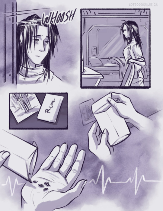
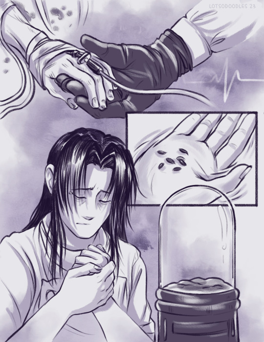
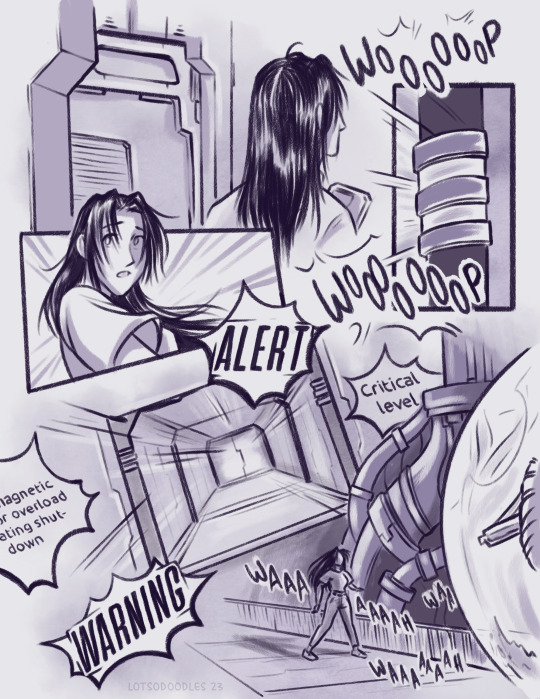
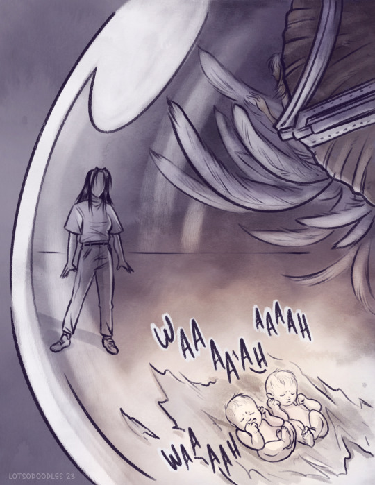
I've been thinking a lot about Rem and her grief over Tesla and the way that would affect her when the twins came into her life. I took some liberties with canon with this comic but I hope it isn't too bad.
#artist ramblings under the cut#trigun#trimax#trigun manga#vague spoilers#vash the stampede#millions knives#rem saverem#fanart#comic#thanks Stampede for making me think about Tesla again#and breaking my fucking heart#general content warning for feelings?#I'm sorry for the harm I might be inflicting upon the fandom
551 notes
·
View notes
Text
Me when people talk about growing old as if you suddenly become a completely different Old Person
Paul McCartney in conversation with Stanley Tucci, 29th June 2023
#my prev tags:#I love the way kids think you just flick some kind of switch when you become an Old#hate to break it to you youngsters but your brain will mostly stay the same#you’ll just be stuck in an older body like some kind of skeleton key horror#thank god for fandom to take you out of that horror#I’m not even that old but I know I’ll feel the same now as I do when I’m paul’s age#because I’m still essentially the same as when I was 20#paul mccartney#old farts of tumblr
154 notes
·
View notes
Text

thanks @hellofromthehallowoods :)
#finch here & i'm very excited about this. already shared pics in the discord but they belong here too tbh#the jaw moves on the wolf !!! what!!!!!#thanks mx. wellman; hope you've had a restful + productive break!#hello from the hallowoods#hfth fandom#hfth#Moderator Finch
82 notes
·
View notes
Text
Welcome to my little meta analysis essay called
Why do we misremember Flower Husbands as being “nicer” than it was?
Disclaimer: I’m not here to talk about whether or not FH is “toxic” or anything like that. It’s just a fact that many old fans rewatching FH POV and new fans who are watching it for the first time after seeing fan content tend to be surprised at how they actually behaved in the series compared to how everyone remembered them being back in the day. This will NOT go over whether or not I think FH is unhealthy or whatever and instead just discuss why I believe this phenomenon has happened.
So, if I try to make this a fancy well written essay, I’ll be here all day, so I’ll just get to the point. 3rd Life came out during the DSMP era of mcyt. MCRP has been around for ages, but the DSMP style of RP (which I’ll be calling “smp rp”) was pretty much popularized by DSMP, mostly towards the end of 2020. For reference, 3rd Life started early 2021, so there’s about a half a year between these two events, and DSMP kept going for years so 3rd Life was absolutely happening during the golden era of DSMP.
But what does DSMP have to do with this? Well, it sort of created this idea of “lore” and only specific things being “canon”. You can make fun of me for the way I worded that, but you know what I mean, DSMP was weird about that stuff. I don’t really blame them as it was kind of a new style of RP they accidentally spawned, but still, it was a confusing time for SMPs.
3rd Life was actually less like DSMP and more like the modern SMP RPs, where there’s no (known, lol) scripted events and the fandom itself deciphers what is or isn’t “canon” rather than it being told to them, with mostly everything being considered canon. HOWEVER, I do believe that DSMP’s style did still affect the fandom, specifically with the topic of this essay, Flower Husbands.
But why would it only really affect Flower Husbands? Now we get into a rough topic: shipping discourse. Back in those days, shipping in the mcyt fandom was heavily frowned upon. Moreso than it is today (I know it’s still around, but it was a lot worse the earlier we go lol). I’ve even seen old relics of ppl saying flower husbands should only be portrayed as platonic cuz it’s wrong to ship them, despite their team name literally being husbands. But more importantly, for A LOT of people, flower husbands was the One Ship people felt “allowed” to ship, BECAUSE it was canon. So they would allow FH and shun every other ship.
My point isn’t actually that, with it being the only “acceptable” ship everyone tried to make it more wholesome, though I suppose that could be a contributor. But my ACTUAL point is where all the things I laid out finally close in on each other:
Ships were a Dangerous territory in mcyt fandom, and ships being “canon” was something a lot of people weren’t prepared to deal with. People don’t want to get too close to RPF territory, but back in the day their ideas of c! vs cc! wasn’t as great, so they default to the DSMP Rule of “if it’s stated to be roleplay, then it’s canon to the characters, if not, it’s noncanon and just the CCs hanging out”.
You see where I’m going with this? When trying to follow this rule for a character relationship where they don’t explicitly state what is or isn’t RP, they hear “we’re married” and instantly mark that as canon to the characters since it clearly isn’t true to the CCs, and tend to block out anything else, otherwise you’re risking it not actually being true to the characters. Especially when it’s things like Scott saying something mean about Jimmy; that directly contradicts the “these characters are in love” thing, so it must not be canon, right?
But wouldn’t people still remember that these things happened, or did they actually straight up not process any of it? My answer to that is: of course everyone was paying attention, but with the context that it’s the CCs playing a video game, all of the teasing and other behavior seems WAY less serious. It just looks like average friends playing a hunger games smp together. And as I explained earlier, the fandom was ONLY processing this as a CC thing, so Scott’s treatment of Jimmy never stood out because that’s just how it is playing games.
Back to DSMP, I’m not active in that fandom anymore but I’ll see snippets sometimes, and I’ve seen the claim that beeduo was actually boring in canon and the fandom was the one that made it interesting. I feel like this is exactly what happened with FH. Nobody was actually expecting anyone to go hard into romantic roleplay, so the fans just take whichever pair says they’re getting married and fill in the blanks themselves. And that was normal back then, it wasn’t fans making stuff up for no reason, it was kind of expected of us.
So yeah, I personally believe that this whole confusion about FH is a result of its time. Whether you want to finally look at the actual substance of the relationship rather than following weird rules about what is or isn’t “canon”, or you believe that since FH was from a time where romantic RP was confusing and weird it would make the most sense to take into account the time period it came from and ignore the less appealing bits in favor of the fanon, I don’t really care honestly. But man isn’t this an interesting situation.
#trafficblr#life series#flower husbands#again this is NOT about whether or not FH is healthy. it’s only about the meta.#if you want to ask me my honest opinions on if FH is toxic you can ask but not on this post lol.#I do stand by my last paragraph that I honestly couldn’t care less if some fans choose to ignore canon due to the time period#tho I personally lean more towards ‘maybe now we should ACTUALLY look at what happened’#I still think ppl have a right to focus more on the fanon. cuz that’s just how weird FH was. but I wanna focus on the canon personally.#this all sort of just comes back around to that ‘what is or isn’t canon is entirely different depending on who you ask’#it’s usually pretty decently consistent what ppl consider canon or noncanon but FH was stuck in a weird situation so it’s the exception#like I said in an old post that still gets notes. regardless of ur opinion on FH it had to break thru so many walls for us and we should#thank it. the fandom would’ve PROBABLY made it to this point EVENTUALLY but without FH it would’ve been harder. thank u FH ur so weird.
32 notes
·
View notes
Text
i miss saltburn??
i feel myself slowly drifting back into the IT fandom again and im sad
#i love saltburn#so so so so much#but we're such a small community and we barely get any new content#i read and re-read so many fics#i try to create my own content and keep it going cause i love it here SO SO SO SO MUCH#even if my memes are shit#even if my prompts and writings are mediocre at best#i want to give back to the fandom that gave me so much#but lately it's been so quiet#it breaks my heart that i cant use the discord server more often cause.i want to but it just doesn't work#the discord group is so fun#every time i get in i laugh and learn so much#and i expand my gallery (thank you minty)#i don't even know where I'm going with this#im just a little sad#is a feeling like#i miss saltburn#but its right there#but not really#personal
24 notes
·
View notes
Text
Repostober Day 29 | 29 Years
Detective Conan began its serialization in Shonen Sunday 29 years ago, and it's still going strong!
I think this is the first Cone I ever drew, in December 2012. At the time, I had no idea that several years in the future, this series would become so dear to me—and would introduce me to so many wonderful people!
#repostober#goop draws#detective conan#i had been getting a lot of anon hate and then there was the pandemic and so i kinda took a break from tumblr for about a year#i came back in 2021 with detco posts and was met with *so* much encouragement and support#all the time i wonder what i did to deserve folks being so kind to me 🥺#thank you detco fandom <333#also i could not have imagined my current detco collection in 2012 lol!#just got my sixth detektiv conan blu-ray box today and that means i now own several eps *three* times ^^;#(part 7 of the japanese vhs tapes and... well i have part 5-5 to part 24-10 of the japanese dvds...)#(so normal about detco ^^; was planning on going to nyc for the eng dub premiere of m24 but looks like it might not happen. again...)#(but hey at least i'll be in nyc!)
61 notes
·
View notes
Note
it’s been a long while but im here to share my pure love for drdt like other fans
it’s a phenomenal project that im constantly thinking abt everyday, I don’t know if tumblr would even let me copy and paste all the positive compliments in the english dictionary here!
but recently drama has happened and im really concerned. I love drdt, I don’t want it to end nor do I want the fandom to break.
^
#hey anon if you want any form of consolation#the reason I made this blog in the first place was because of bad events that happened in the fandom#(the whole incident with the now deleted confession account if you remember that)#but even after that the fandom still thrived with passion and positivity#so though I'm not entirely educated on the current happenings of what's going on#I doubt it'll be enough to break the fandom or anything :D#danganronpa despair time#drdt#fangan#fanganronpa#drdtappreciation#thanks for the submission!
21 notes
·
View notes
Text
.... I'm sorry. I'm so sorry.
THIS FANDOM. HAS LITERALLY. NO DRIP.
THE PERSON WHO POSTED THIS IS GODDAMN FUCKING 31 YEARS OLD.
LIKE I NEVER THOUGHT I'D FUCKING SAY THIS BUT GO WATCH KILL BILL OR SOMETHING!
And don't get me started on the Chalastor discourse that I hear is happening right now as if I wasn't deep into the Daddy Kink Fanfic long before the show started as if the new episode combined with what Al said about Charlie in episode one doesn't fuel it for me.
But you know what? I'm glad that Medrano is having fun gaslighting the straighty straight puritans trying to turn this ship into the second coming of Starco because y'all deserve to be psychology messed with like that after what the fuck you did to this poor woman on her birthday.
Shame on you.
#Hazbin Hotel#hazbin hypocritical#chalastor#huskerdust#I was so excited to finally see some Q/Femmes breaking down hazbin and vivzie and the controversies and doing a deep dive like that cause#you know I wasn't about to let some content farming crusty gamer bro in the fandom do that and then try to bring that over to my Queer Femm#Adult friends who don't watch the show but then imagine how let down I was when all these nice Femme Queers talked about was shipping ...#Because they had to I guess ...#And oh I don't blame THEM for that I blame YOU! So thanks for that Starco 2.0 truthers .... Thanks a lot.#undescribed
40 notes
·
View notes
Last Seen Blogs

toddhank
Untitled
fand0ms-galore
lets see what this week’s obsession is

twstowo
☆Enese At Your Disposal☆
jayadwal
Jayadwal
saucy-gremlin
Ongoing Crisis