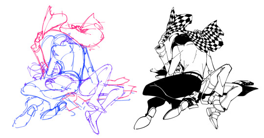
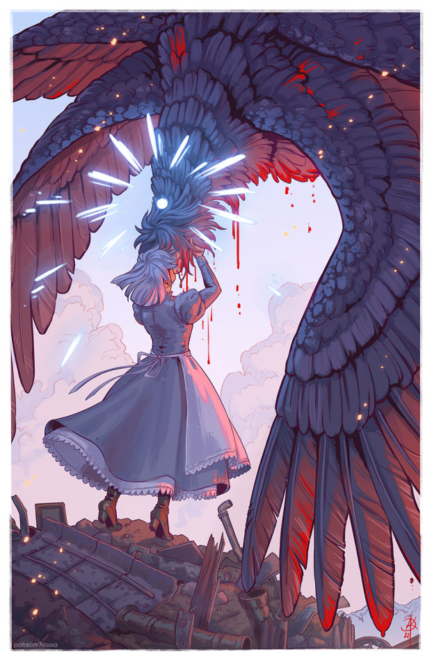
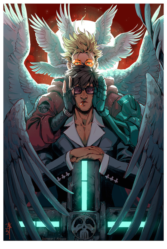
#the lineart is too thick <\3
Text
She is mocking Nick
10 notes
·
View notes
Text

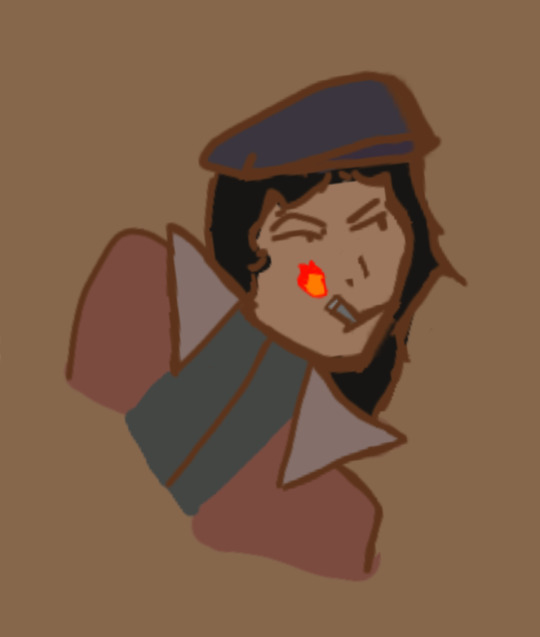
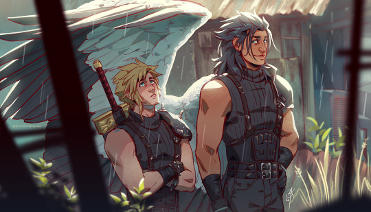
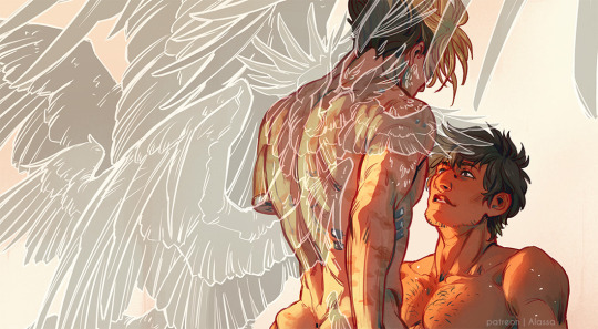
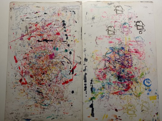
an unfinished vincentgaz piece, but i thought shy looked cute 💗
#GUYS I'VE SOLVED THE PROBLEM#I'M USING TOO THIN OF A LINEART. IT'S TOO HARD#returning to my pencil and thick lineart immediately <3#I AM SO SORRY MY THICK BRUSH LOVES. I'M SORRY FOR CHEATING ON YOU WITH THE THIN BRUSHES#art#wip#unfinished art#art wip#VincentGaz#cod#artists on tumblr#illustration#oc x canon#canon x oc#cod oc#call of duty oc#COD OC: Vincent 'Shy-Guy' Barclay#my oc#gaz#kyle gaz garrick#call of duty#mw#call of duty art#ship art#doodle#artwork#my art#drawing#lu's canvas#wrylu
19 notes
·
View notes
Text
being an artist means you can draw literally whatever you want but it also means experiencing The Horrors from time to time
#the horrors can be many things ranging from absolutely fucking hating your art with every fiber of your being#or just. hand cramps#...for me its hand cramps KLASKLJLKJG#because what happens is like. lets say i draw a LOT in a short span of time like. i draw every day for like a week. maybe 2 weeks#and then i go through a period where i dont draw for like a MONTH and so when i get that burts of energy and want to draw#even just draing something small mkakes my hand just crmap up and its jjust like . ow :(#i am experiencing . thr horrors!!!!!!!!!!!!!!!!!!!!!!!!!#but also i rly do enjoy how my art looks rn i think#i drew some good art yesterday (that i. cannot show here. bc um. its 😳) and like. idk! i just think it looks good#i finally kinda figured out like. a good lineart size. size 4 (or 5)#bc a lot of the time i would just use whatever size brush i used to sketch so usually like a 6 or 7 or even like. 10#but then i kinda realized the lineart was too thick so i started skethcing bigger and drawing with smaller lines so . yeah <3
13 notes
·
View notes
Note
can i ask what brush you use for sketches :3
inking too but mainly sketches, idk if you use procreate or what but ur art is super pretty and your style is super unique an i just look up to you a lot as an artist
I sketch and ink everything on paper! I use mechanical pencils a lot, for sketches as well as some rougher linearts. 0.7 mm is my preferred lead thickness.
For proper inked linearts I use Staedtler pigment liners, Pilot drawing pens, Copic multiliners and Pigma microns.

1K notes
·
View notes
Text

How to make modern era Kaneko rendering
I use user-made CSP tools listed here :
- Lineart -> https://assets.clip-studio.com/en-us/detail?id=2060489 (Can use the brush used for coloring too. As long it's a textured pencil with high sensitivity. It'll works)
- Coloring -> https://assets.clip-studio.com/en-us/detail?id=1761353 - Blend -> https://assets.clip-studio.com/en-us/detail?id=1391024
- Scan Dot Effect -> https://assets.clip-studio.com/en-us/detail?id=1687175
- Color Filter -> https://assets.clip-studio.com/en-us/detail?id=1732272 (Set at clip layer > Difference)
Rendering tutorial below :
1. Prepare line art with rough textured pen. I used a pencil tool
2. Color in base. Idk I think Kaneko often starts from dark->light, but I too used with light->dark coloring.
3.) If you're coloring it light->dark like me. Slowly go from base color, to secondary, and put the darkest color on last. I use the pencil tool on my previous post
4.) blend the shading with watercolor tool. Be careful to not overblend it'll look glossy. Pull and push the color
5.) at this point, you might want to process the line art a bit.
Idk what tool Kaneko used for the lineart in this era, but it's super textured and "fades" when you put low pressure, like a real pencil.
Interestingly enough, his modern art style would ditch the textured pen(?)

6.) For the eye highlights, I used a white layer with "add" layer effect.


7.) Optional, but if you want the classic scan effect and color for parody/april fools project. You can use this filter from the user-made CSP filter list I posted above, set the folder to clipping layer -> difference + 50% opacity for the folder.
If you want to even add more, you can add the dot filter processing. For this pic I used 60 size dot because it's a small sized close up of an eye. For a gigantic pic you can use 10 or 15... Whatever you want
---
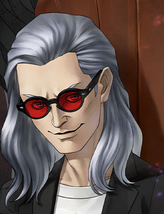
The result will look something like this. I think my lineart's too thick and I over-rendered too much on its clothes. If you learn from my failure, I think you can reproduce a parody of Kaneko's artwork, either for april fools purpose or maybe you wanna reverse engineer it into your own art style

If you're wondering why Kaneko's art style had a distinct porcelain doll look, you might want to refer to this post of Kaneko and possible inspiration from 80s animator Tomonori Kogawa
270 notes
·
View notes
Note
i really love your lineart!!!!!!
sometimes in the inking stage i kind of mess up about the thickness about the lines and such. and in general it looks stiff in comparison to the sketch. any advice for a novice?
thanks!! wow it's been two years since someone asked me about lineart :') in addition to the stuff i wrote in that post, some ways my process has changed since then:
using a pen at lowered opacity w/ velocity variation:
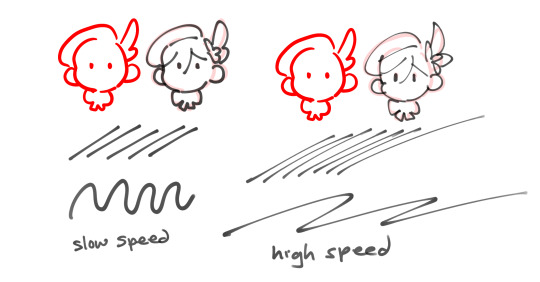
(example used is ciro pen!) if you draw a fast stroke it thins out, but consistent speed/pressure gives you a uniform width. it took me awhile to get used to bc developing speed + control just takes practice, but i like how pens with velocity make it quick to vary line width easily. (it might be a placebo effect but i also feel like drawing with these types of pens forces you to have more line confidence, bc it's very visually apparent when you go slow or unsteady...haha)
2. sketch vague, draw detail in later
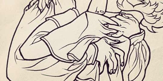
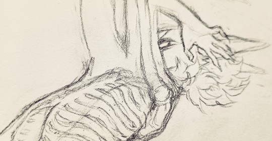
for pictures that i draw separate lineart for, i usually do rough bodies/shapes and then draw in details while inking. if there's too much detail in the sketch, i think it's easy to focus too much on following the sketch perfectly with your lines, so it gets really stiff and loses the motion in the original sketch. example sketch -> lineart
3. the "this is fine" or "eh fix it later"
try not to overwork it! its fine if there are holes... and the lines dont connect... and the width is weird... it is okay.... employ the time honored techniques of "it's fine" it or "ill just fix it later" lol i tweak or add details as part of coloring to correct places where the lineart got weird. you can probably see it better in this process vid i posted before, but i also drew an example today ft. my boy gaming
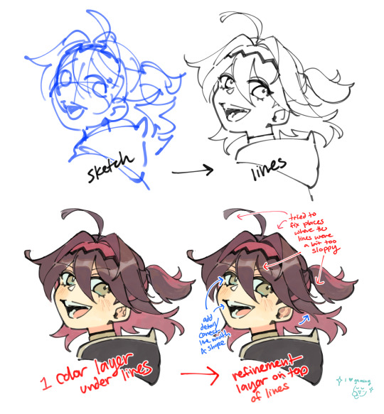
like any other skill, i think developing skill + speed with lines follows with time and practice, but i totally empathize with the struggle against it looking too stiff... getting past the mental block of trying Too Hard and losing the charm is tough. you can do it!! i hope this helps!
#ASK EVER#i love u gaming genshin impact... ur joie de vivre and kindness are so charming....#fun fact the first character in gamings name is the same as in mine. a rare irl ever fact
297 notes
·
View notes
Text
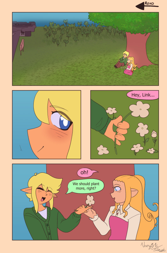


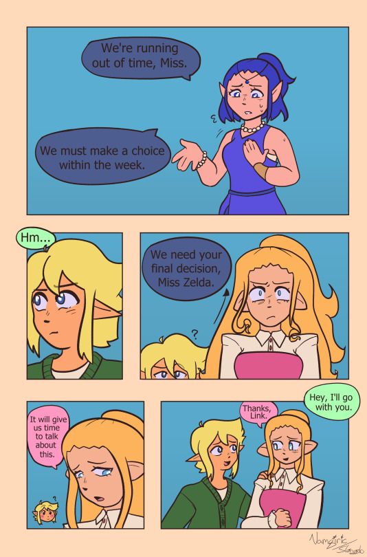
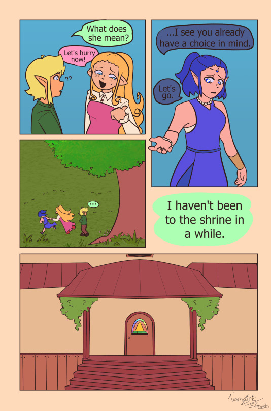


HOLY SHIT HERE WE GO !!!! somewhat world building dump as the prologue.
Chapter one will be longer and in parts, and will involve exploring Link's current life, more world building, and also !! HIS DAD !!
more rambling below;
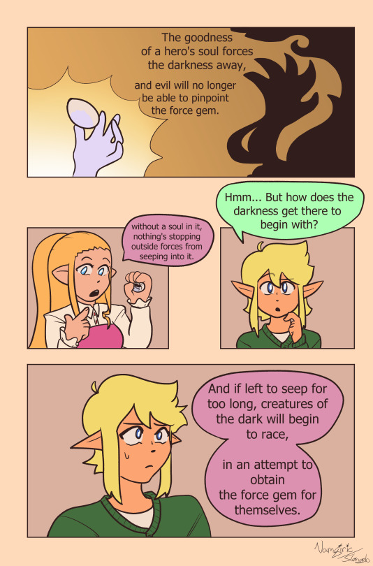
So in case it wasn't obvious the whole "you'll die if the gem is broken" isn't TECHNICALLY true. no one's ever actually had the gem break while bound to it, so the thought that you'll die is just an assumption based on like... well. YOUR SOUL IS IN THAT. and it's been passed down as fact rather than theory.
the gem will get broken at the end of chapter one, leading to Link's soul being torn into four pieces. This technically kills Link which is why I do want to spend time going over his current place in life in chapter 1 before the DeathTM :3
also worth noting; they're young adults ! Link has no plans to go to college and is kind of a mess right now, Zelda rather than being any kind of princess is from a family with spiritual importance- ofc being taking care of the force gem. it's been a while since a hero had to be chosen !!
also, all the maidens are being given actual names, chosen after gemstones instead of colours because like,,, I mean, blue maiden is the most important one here, I can't really call her Blue lol.
I DUNNO HOW FAST UPDATES WILL BE, I wanna be careful to not burn myself out, so we'll see how it goes :3 I might post 3 or so pages at once per update instead of 9 each time aha;;
I hope this is interesting !! I'm really excited to tell the story I wrote for this AU and I hope you guys will enjoy the ride <3
consider this some exposition combined with experimenting with the comic process because this is the first time I've actually finished a comic that's longer than 1 page and it probably shows. I'll be forced to make it more interesting once I get to the action stuff don't worry XD I'll try to get better at making the talking stuff look interesting over time .. AND YOU CAN SEE HOW INCONSISTENT MY ART IS WAAH.
I ended up changing line thickness after 3 pages bc I realised I was going too thin and I was never going to finish it if I kept w/ it because I haaate doing thin lineart...
#four swords#fsa#four swords manga#link four swords#zelda four swords#maiden linarite#force gem of four au#my art
50 notes
·
View notes
Note
Really love your art ❤️ the wings you draw looks amazing 👏 how does one draw them? 👀 do you use any references?
Oh my god, this ask is making the circle full fr. ;; Thank you SO MUCH, Anon!! I've had an enormous wing kink most of my life, but scared of drawing and avoiding them for uh.......... most of my life lol. So reading this means A LOT.
TLDR - yes, use refs of all sorts of birds! use gradients! don't overdoit with brushstrokes! wings are paperthin!
In 2021 I said fck it and-- asked my partner, @lesoldatmort, who's a wing-master to teach me how to wings. And the answer was simple - use refs. I did! And it looked better than before. But. Uh.
Most of my wings looked like-- pillow sheets? Or. Pillows. Blankets. Puffy and thick. (Rafe from December, 2020)
So the biggest trouble for me personally (and for my partner, who was trying to knock it in my thick skull), was to get the wings as thin as possible. And use refs. And draw a lot of wings.
The biggest and best advice I got from my man, was to think of wings as of paper. Flat and thin. And use gradients for the sections instead of too many brushstrokes for each feather. Actually, save on the brushstrokes where you can.
January 2022 this was the best I could do. And that's after a LOT of interference from my partner, who kept nagging me to get rid of brushstrokes and add. more. gradients.
In June I decided I'm cracking the case. Gave up on trying to paint too much, because I prefer lineart 95% of the time anyway and drew the Howl piece. Still too many brushstrokes, but I used vulture photos as a reference for this one. Adoration is from this time as well. Used a pinned down bald eagle as a ref for Zack's wing.
In summer, I did some more random studies, kept looking at wings very closely. Looked at other artists drawing them. In September I was lucky enough to get cmed to draw safer Sephiroth. And that was probably the final moment I gave up on too many details and brushes and started stylizing the hell out of it. And using gradients. And lasso tool. As my partner's been telling me for almost two years at that point. Thin. Finally.
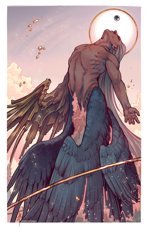
And then I just kept going. Simplifying the hell out of them............
And here we are. I have a problem. It's called a wink kink. And I'm loving it. <3
A few months ago, due to a gender crisis, lol, I even started using the name "Alas" along with Alassa. Which supposedly means "wing" in latin.
So... Thank you for coming to my ted talk and personal vent and rant. Sorry this got so long! However, seeing somebody asking me specifically about wings in my art... feels like reaching a finish line after years of whining. Thank you so much! ;; <3
165 notes
·
View notes
Text
Tutorial for @mimssides
How I draw with alcohol markers. Beginner edition
First off all I want to specify: this is based on my experience only, so take it with caution. This is also my first tutorial ever.
1) Have an underpaper.
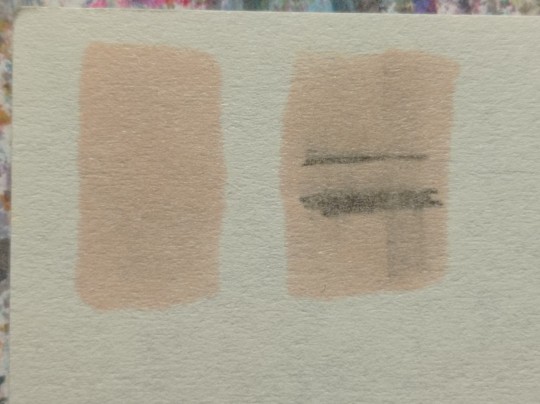
Unless you use some really thick paper, markers will bleed on your next page or table ( depending if you're drawing in a sketchbook or not). I recommend to have one list of some decent paper under the page you're drawing on. Decent means thicker than office paper, can be watercolor paper, it usually perfect for it. It's reusable and over the years mine two look like this:
( you can see there's a lot of stuff going on there)
2) Always, and I mean ALWAYS erase your sketch.
If you're doing a quick try out of color combinations you can skip this step, because you don't need the aesthetic or anything. I'm not sure how useful this tip is for colored pencils ( cuz I never sketch with those), but with regular graphite pencil it's very much important. Graphite smudges your markers, and not only that. It also gets trapped if you go over it with a marker, meaning you wouldn't be able to erase it and it's going to leave you with gray smudges all over. Truly awful.
3) Have your pallets on the same paper you draw on. Or simply - have pallets!
Colors can show differently on different paper, that's why it's important to do color swatches once you buy your markers. They are designed for specific paper, and on your paper they can look a lot darker or really pale. I recommend testing colors before you buy them, it's usually an option in the most craft stores. If you're buying a set just take 30 minutes to do all the swatches and naming them. It also helps visually to see what colors you have.
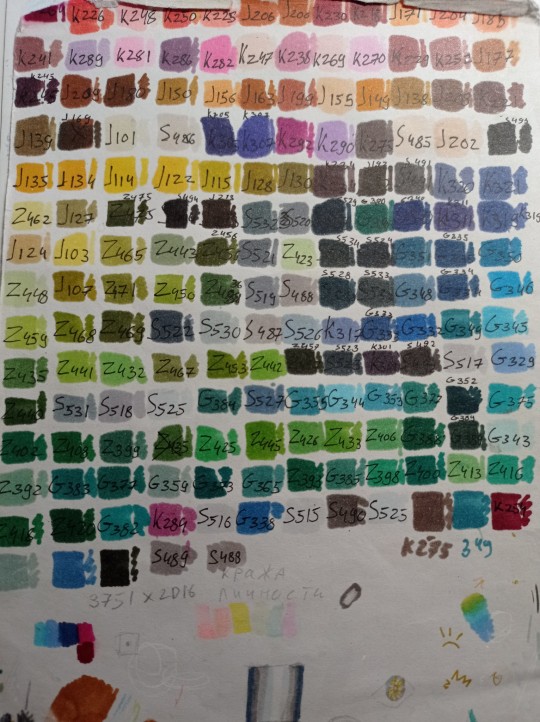
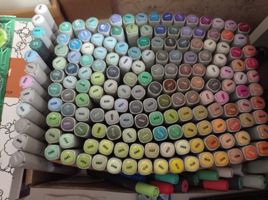
(I have a lot, but you don't need as much, there's like 60 colors I use usually and the rest are on rare occasions. Build a set you're comfortable with)
4) Make sure your materials all work together.
We already talked about graphite swatches, not the worst thing that can happen to you. Mainly you need to make sure how your materials work together, how they lay on top of each other. Make sure your lineart won't react to your markers, there's special waterproof liners and those are the best for markers ( mine are Pigma Micron from Sakura). See how your pens and liners act before and after you apply markers.
Decide which is better to use before and which after markers
5) No black.
I don't use black in any of my drawings. All you see is different shades of gray. It looks much more pleasant with the rest of the colors and it allows for my lineart to be visible underneath. Sometimes even those grays are too dark and I need to add more shades or white lineart to fix it

6) How to shade.
This is a very subjective thing to talk about. You can shade how you want. I will talk about two ways I shade.
1. Same marker. Markers dry. And when they do you can go over them another time. Usually that makes a darker shade of the same color and it's a pretty safe way to do the shading if you don't know which colors can go together. It doesn't work as well on the light colors and difference can be barely noticeable. It's a nice way to get soft shading
2. The pure chaos. Just kidding... Different color marker. It's hard to explain, and yo always need to test what works for you. If you want sharper shade you need to grab a different color, can be from the same hue ( for yellow - orange, for red - burgundy) or something a little more spicy. You can add different hues to your colors with different shades ( your black with red shades is suddenly looks burgundy, or purple, or blue). Experiment! Fail! Find out which combinations work and which don't!
If color seems a little darker than you expect you can go over it with original color, which might lighten it up. This tip doesn't always work

7) How to do gradients.
1. Choose your colors beforehand, see how well they work together. It's easy to do a gradient from red to pink, but not so much from orange to blue. You might need to choose lighter colors, because if you want smooth transition from one color to another you will need to go over them a couple of times and that will darken them.
2. Add a middle color. Not every gradient needs a middle color, but with it you can make your gradient much smoother, it will be more noticeable the bigger aria you cover. The more middle colors you have the more harder gradients you can do

( without and with a middle color)
3. Act quickly. Markers dry relatively quickly so you need to add colors one after the other, you can't go away before you're done.
4. Blend with the lighter color. You can also start with this color as a base but that doesn't work for all color combinations. Lighter color will go in top a darker and flow into it making it lighter and transition smoother. ( example: you go from red to purple to cyan, you will need to start with red, then purple going over red to soften it, and finally the lightest cyan going over purple and maybe even a little red). You always put darkest first and go over it.
There's other methods of doing the gradients. They are very similar actually, but for second one you will need a blender. For the first one grab two markers you want to use ( more if you're feeling risky) turn one of the markers upside down and touch their tips. Now use your understanding of gravity. Color from the top marker will go into the bottom one. The longer you wait the longer the gradient will be. Usually I don't need to wait longer than 3 seconds.
And you can do the same with a blender
8) How to use a blender.
Blender is a marker with no color. Usually it's named B000 (I recommend buying a blender with brush tip). There are many ways to use it.
Gradients: you can use two markers technique with a blender making gradient fade on one end, or you can mix colors inside the blender.
Fixing mistakes: blender will make a white show through your color, you can use it to get rid of the wrong color. But it doesn't work without some problems. Of course darker colors will likely stay, even if much lighter, and your previous color will try to flee ( likely to other sides, if you're lucky it will go on your underpaper)
That's all I have for you today. Experiment and learn something new. Hope that helps
111 notes
·
View notes
Note
OK I NEED TO KNOW WHAT YOUR ART PROCESS IS
HOW DID YOU GET SO GOOD?!
I love your art sm it’s the best thing I’ve ever seen!!!
awww thank you!! i’m too lazy to figure out how to make a timelapse so im doing a step by step thingy
step 1 : open pinterest and find a reference
this one gave me sayori and natsuki vibes so i chose it
step 2 : make a rough guide line sketch using the reference
i don’t usually worry about the first sketch being 100% accurate because the clothes will mostly hide the imperfections anyway, especially in this case where the clothes are so thick

step 3 : make the main sketch
the reference isn’t in the picture but i still use it if i can tell something is wrong, like a eye is too left ect

step 4 : colour
i usually skip the lineart because i don’t have the patience for it lmao, but honestly letting my art be more messy has helped me a lot since i don’t focus on every single detail and instead just have fun
step 5 : colour the “lineart”
i just like how it looks :)
now all that’s left is the background which i just kind of wing it and tadaaa

#ddlc#ddlc natsuki#ddlc sayori#asks#art process#this isn’t a tutorial by any means just how i personally go about it#thanks again for the compliments :D#art stuff
50 notes
·
View notes
Text
✿ Depiction of Hana & Ren (from Damian's Manga) ✿


-
✤ Style of Damian Wayne ✤
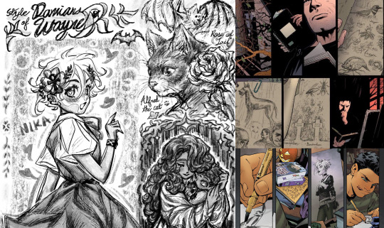
Great understanding of fundamentals and a good visual memory.
Has used up a lot of sketchbooks, sketching nature and surrounding with pencils in his free time.
Have different purposes use of his sketchbooks, but have a main one for daily practice. Using the sketchbook page by page, marked the date for his art section was made on the top page corner, like a diary.
Love to draw animals but still draw some people too. Family, friends, and pets are prominent themes.
Smooth line and soft, delicate shading. Neat observation and attention to detail.
Do well-planning drafts and thoughtful studying. Practice and draw more subjects for the ideal drawings he has in mind.
Lately, Damian had a heavy interest in learning the shojo manga art style. ( Try to reference/inmates Tezuka Osamu Sansei's works )
.
❤︎ Style of Nika ❤︎

Use markers & ball-point pens more than pencils.
Doing great on a single page of the paper, but using the sketchbook poorly. Often failing to fill the whole book. Has neat little drawings throughout the sketchbook instead, reflecting her inconsistent drawing habits.
The drawings are not in the right order in Nika's sketchbook, she opened a random page and found a blank space to draw. Marked the date for the finished art on the corner of it, if she still remembered.
Likes to draw objects, design symbols, and stylish cartoony characters. Death themes and classic weaponaryies are prominent.
Thick angular lines and light shading with pencil.
Nika rarely did the full details sketch before the lineart, and even if she did, the final lineart on top is still a different variation from the original sketch ( it bothered Nika sometimes, but Damian found her subconscious method quite interesting ). She would draft the little thumbnail art instead, this way is more helpful for her to visualize the planned drawings.
Still trying to find her style of drawing people, had tried a lot of approaches. Recently, Nika has learned a lot from Damian and soaked up his advice and tips like a sponge.
-
❀ Hana & Ren ❀
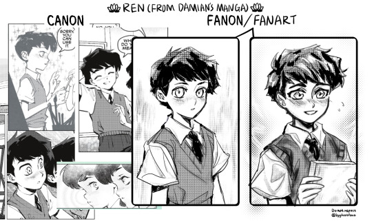
(with the canon looks in Robin 2021)
.
❥ 1 . 2 . 3 . 4
❥ head canons: 1.2 (dates and activities).3 (taking care of each other, sleep habits, gifts) .pet names.art styles.asking game
#damian wayne#flatline#nika#flamian#daminika#gravebird#robin 2021#nika dc#damian al ghul#damiline#dc comics#damian x nika#damian x flatline#robin x flatline#hana & ren#damian headcanon#nika headcanon#dc headcanon#fanart#my art#long post
213 notes
·
View notes
Note
hihi, not a request!, i really love your artstyle! its soso fuzzy and the lineart looks like carpet.. i like how thick it is too, especially since i see thin lineart a lot and personally use it. it's just really pretty and soft. Just some excellent art
Tysm <3 seeing messages like this brightens up my day
37 notes
·
View notes
Text

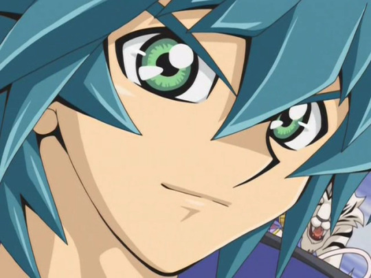

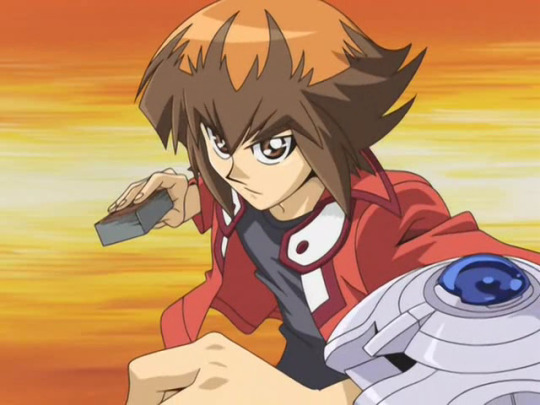
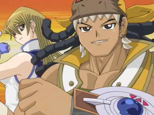


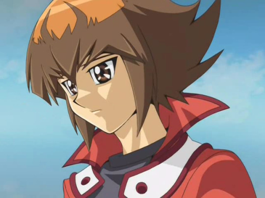
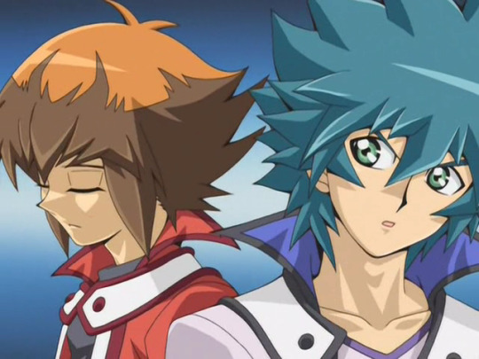


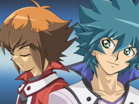
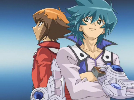
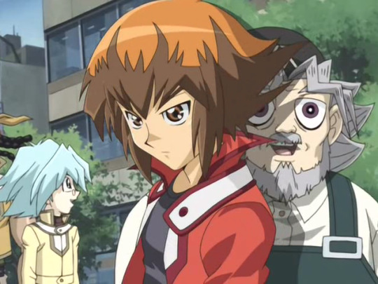
Appreciation post for some of the quick, pretty (or quality [affectionate]) in-between frames in Teardrop V1, courtesy of Kenichi Hara and the other OP/END Creators: Junpei Ogawa, Futoshi Higashide, Sono Kato, Aoi Kisaragi, Takayuki Noguchi, and Masayuki Hiraoka. your work on all that cake is much appreciated
There are a bunch of nice shots in the scene as they're setting up to duel, but I love that closeup on Manjoume that lasts for 2-3 frames, and that one transition shot between Kenzan and Shou where Kenzan is confidently passing the baton to Shou (still enjoy how their friendship arc went in Season 2). Neos's cake aside, that other shot is just funny to me--"Neos offers you [your least-favorite thing], do you accept?" And then with a down Judai in this version, there are these frames with some melancholy to his face, ending with him seeming to force a smile and "act tough," as the lyrics describe. The lineart and use of thick lines here/there really helps too, and the song is just always fantastic. 10/10, someone hug Judai
Bonus: the V2 equivalents of those last six frames, as Judai finds his feet yet still steels himself for what's to come (as this version started being used as the duel with Professor Satou and the question of what he duels for come up):


BONUS Bonus: rejoice, the dub ate some cake too:
#GX#yugioh#yugioh gx#ygo gx#ygo#yu-gi-oh gx#Judai Yuki#Johan Andersen#Jun Manjoume#Asuka Tenjoin#Tyranno Kenzan#Shou Marufuji#Elemental Hero Neos#i'm glad i was able to revamp my V1 textless edit bc that judai/johan scene might be my fave#[i'll post it with finalized-subs!105 on NAC when done]#GX with more episodes styled like this would've been gorgeous [and we do get scenes that come close with Gil-bo Noh's work] but these help#[i'll rb when i hit 132 in my sub-finalizing project to add the V3 differences]#[i'm surprised dub!Neos wasn't edited haha]
41 notes
·
View notes
Note
For the artist's asks:
5. how would you describe your art style? and/or
17. what is something youre confident about in your art?
Heyyy, thank you for the ask <3
5. How would you describe your art style?
My art is quite cartoonish, more like anime/manga, and while I'm still re-learning anatomy, I don't intend to go realistic any more than that. People who want to see the exact photocopy of Temuera Morrison in my clone art probably have a bad time in my gallery.
It's rather inconsistent, but I think I'm starting to have a recognizable style. You will always catch me using colorcodes: repcomm art usually red, coruscant guard usually red, tbb is a mix of reds, oranges and yellows (though I don't have too much tbb art), 501st art is always blue, thick lineart, and usually monochrome.


And here are these ones in comparison when the characters are not clones. My pretty sword boys~ <3


Strangely my requested arts don't reflect this, they are always ending up so different from my default style, but when my recent MayCross got attention, I was really happy. ^^
17. what is something you're confident about in your art?
I think I draw expressions well. ^^ And characters reflecting their personality is really important for me. Drawing clones is a challenge because they have to have a consistent appearance while making them always a slightly different based on their personality.
#ordomaze#maycross#cloneship#cloneshipping#ordo skirata#alpha 26 maze#commander mayday#tbb crosshair#original clone character: blaze#original clone character: lily#commander fox#tbb tech#arc trooper fives#clone trooper tup#clone trooper dogma#clone trooper warthog#souza samonji#kasen kanesada#hachisuka kotetsu#nikkari aoe
18 notes
·
View notes
Text
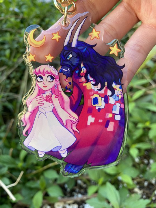
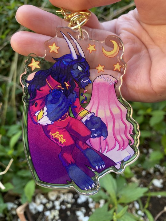
Heyoo! I finally got the charm I had design and it came out okay lol. I believe I made the Beast too blue and dark, but I can fix that. I'm gonna talk abit more below.
I think it came out well, but I'm more disappointed on the quality of the charm and print? I ordered 3 and on one of them, there is an apparent white layer that wasn't cleaned off well. Idk about acrylic charm making, but I don't like that white layer being so visible like that.
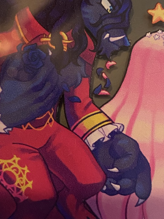
And I also don't like how visible Belle's face is on the Beast's side. Behind her hair, you can see her face which makes me a lil upset. It can also be like that with the Beast's eyes where you see his other pupil on his side. Idk if the print wasn't thick enough or if the lineart is dark enough to see thru, but I have double sided design charms myself and they don't have that problem of seeing the design from the back/front side. Unless pink is a very transparent color or something? I want to know why her face is haunting me on the other side of the charm :/
I was hoping I could sell these if people were interested, but I don't think it's good and I don't want to give out this quality of a charm.
I got these from Vograce and I don't know the general quality of their charms from other people, but I would like to know if someone had similar experiences. I could have gotten a bad batch or I did something wrong on my end.
Overall, these are okay and I'm disappointed XD. Thank you for reading this small rant lol.
#myart#lerons rambles#Belle#Ryuu#Belle 2021#Idk maybe I'm fussing over nothing#But I've seen ppls charm design from Vograce and they looked good#And I'm upset that mine didn't come out that way#Idk what I did wrong :/#Maybe I had high expectations#Idk if I'll look for a different manufacturer#If yall are still interested in this charm regardless of my complaints#Then let me know Ig?#It'd be nice to know if there is interests#I'm all bitter now XD#lerons charms chaos
35 notes
·
View notes
Text
ask dump #3!
rch
Yes and no! Holetta Baby is a character song for a story I wrote in high school with some friends I've since fallen out of touch with --- because of that (esp. since some of the characters were based on ourselves), and because it's frankly bizarre, I don't know if I'll ever share too much about it.
All you really need to know is that it's from the perspective of a man whose wife flew away as he gradually realizes that she's never coming back. IIRC she was just fleeing for a while because their love was forbidden, hence "Loving you's so good I fear it's wrong." In reality, she got trapped on an island somewhere and he was too heartbroken to consider the possibility that she might need rescuing.
Thank you!!! I really can't overstate how happy I am that Townsend resonates with other people who have intrusive thoughts. It's something I still have trouble talking about but she's been a good outlet for that. Also quite happy that the angst is hitting right ehehe
art
Honestly no, I have so much trouble with that too OTL. Occasionally I use the warp tool on a sketch to help put an interesting line of action before I actually do lineart? I recently started experimenting with drawing in fisheye perspective too, and that definitely shakes things up.
Thank you so much!!
I almost always draw in Procreate (with an iPad + apple pen). I have 2 sets of favorite brushes on there - these are what I usually use:
6B Pencil (found in the "sketching" category). I use this for EVERYTHING from lines to rendering.
Studio Pen ("inking")
Medium Hard Airbrush aka the most generic brush on earth
Inka ("inking")
Spectra ("painting") - annoying because it can alter colors by pressure though
Then I have this set I call 'ink kit' which I use when I want to change things up without actually switching mediums lol
Blackburn ("drawing") - Really thick brush that makes me think a little harder about lines. I also have a duplicate modified to make it a little smoother and smaller & I switch between those two when doing lineart on these pieces
Gesinski Ink ("inking") - one of those pens that's flat so it's really thin or wide depending on the angle
Oil Paint ("painting")
Watercolor ("painting") -- just for coloring stuff in when it doesn't have to be precise
Also these niche uses:
Driven Snow ("elements") for freckles
Nikko Rull ("painting") for skin texture
adamandi
It was just a fairly thick curling iron (curled upwards all over my head) and then a lot of hairspray. If I remember correctly, the first night it was done by our costume designer Hahnji Jang (@/hahnjij on insta!) and then I did it myself the rest of the nights. It was definitely their idea at least - my hair is naturally pretty flat and up til then I assumed Vincent's would be too, lol.
No idea where the bag (or really any of it) is from, sorry. I really liked walking around in his swooshy jacket, and I ended up buying it afterwards. As far as normal people clothes I would actually wear, I really really liked his pants, which I was unfortunately not able to keep.
There actually exists in my mind a completely different "biblically accurate Vincent," which is the Vincent I had been picturing all the way up until the actual performances. I always pictured him with long black hair and freckles, and I considered drawing on freckles for the show because of that.
11 notes
·
View notes
Last Seen Blogs

transcends-into-pleasure
Sweet Ignorant Bliss
endlesslogo
Never_ending_logo

firmhanddaddy507pt2
Firm Hand Daddy✋

melllzfargooo
mellzfarg00

sorryneedtostudy
just wanna make nice things + get enough sleep