#tis my default art style
Text
why does art have to be so art
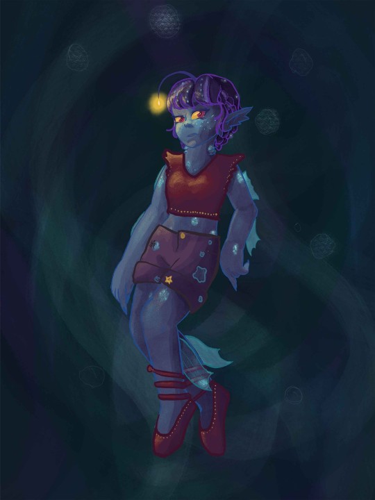
#I really wanna draw Octopath fanart but something about the official art's style short-circuits my brain#like I sit down and start sketching and cannot figure out how to translate the style to my style#it's simultaneously more sketchy and more polished than my art style#so using it as a ref is Very Hard for me for whatever reason#this goes back to the first game where I wanted to draw all sorts of cool art and managed one (1) Ophilia#I keep telling myself if I get all the characters sketched in my style then I can just ref my own sketches instead of the official art#but hmm even something about how all the designs are is just. Tricky to get right#I dunno if it's just that I've spent years drawing FE fanart (and at one point did a fair amount of AA/DGS art)#that my brain wants to default to having that style be my base of reference but 'tis an interesting conundrum#I've drawn some TriStrat fanart too and had the same issue--the designs are just complex in a different way than FE complex to be difficult#actually I just went and checked and yeah I've drawn almost nothing but FE fanart for the past couple of years#I mean I've drawn plenty of original stuff too but that's significantly easier for me bc it's 100% me from start to finish; no translating#maybe I should make an effort to make fanart for other games....expand my range of base references#expand the art styles I am spending a fair amount of time looking at Very Closely#I was able to sketch some busts of some of the Octo2 characters and got Partitio to look how I wanted him to look#so that's a start at least#hopefully I can keep at it#oracle of lore
1 note
·
View note
Note
The art style for the pokemon anime and manga has shifted and changed quite a lot over the years. Is there a specific series or era style that you particularly prefer or that you think your art style is inspired/affected by when drawing the characters?
Ugh amazing question I have 3 answers (for the anime since im an anipoke girlie)
I'm a big fan of the OS anime style. The colors, the sharper style and the grainy look. I also really love the proportions from that era. Everything just felt so solid and blocky in a nice way. I also really love the expressions. There was a lot more subtlety at that time and it was really effective.
Next one and maybe the bigger influence on my own style is the SM anime. I LOVED the design change. Incredibly simple, bouncy, round fun to draw, less tied down, etc. It's just so fun! I feel like my default style has always been a bit of a mix of anime and modern western cartoons and this is the pokemon series is the closest to that vibe. Also those EXPRESSIONS. I have so many random screenshots saved from this series just because of how bonkers the expressions would get.
My #1 influence without doubt is not a specific series style or era but rather a specific artist! His name is Akihiro Tamagawa and he was one of the animation directors on pokemon from OS to I beliiiiive XY? He also did a lot of the movies! Everything about his style is just so appealing to me. The proportions, the posing, the composition, the expressions, EVERYTHING. I've definitely taken inspiration from how he draws eyes and mouths. I draw a lot of low mouths and big smiles because of this guy. I feel like once you see it you won't be able to unsee it in my work hahaha. I made a post about it before!
And here's a guide of all the episodes he directed on!
475 notes
·
View notes
Note
Is there anything in particular that inspired you to make Link and Zelda's body types look like they do? (Asking only because I'm obsessed with the dynamic duo vibes they give off)
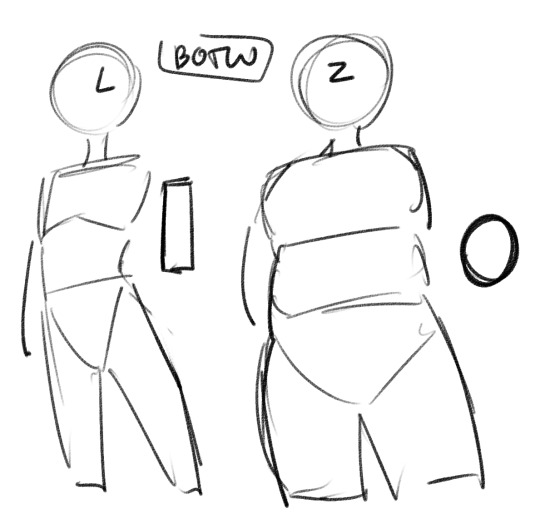
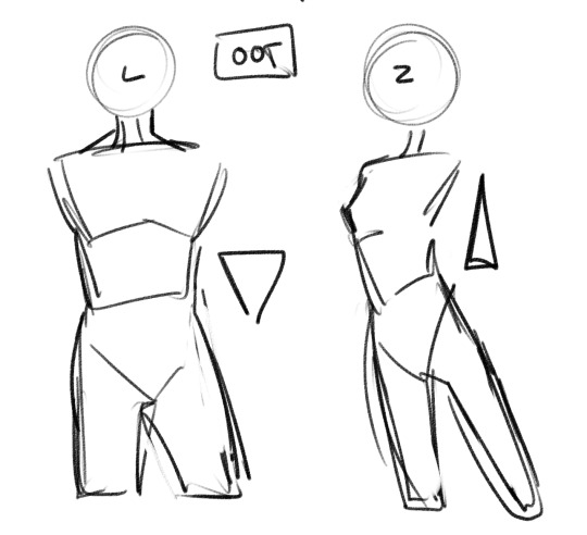
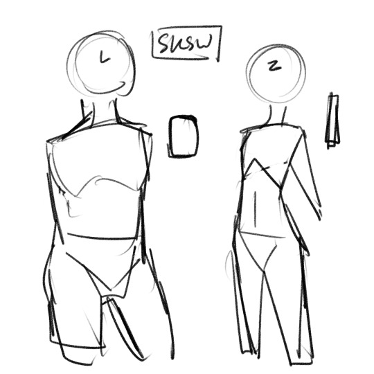
shape language babey! im a big fan of when character designs complement each other visually, and i think that so much of that is tied up in the shape language, and, as a result, the body shape of your characters. My art style is also very shape-heavy and i default to shapes when constructing figures so it's easy to do for me! It's probably most evident in my botw link and zelda because my changes are the most obviously different from their source material there, but I do this with most of the zel/link pairs i draw regularly! I like to have pairs that are complementary but not same-y. with botw i like to play up the difference between link's thin, angular body type (i think of him as a skinny rectangle) and zelda's softer, rounder body (I think of her as an oval) but the same goes for other pairs--I see oot zel&link as 2 triangles of varying sizes; they're both angular, but in this case i play up the difference between link's muscular build and zelda's skinnier dancer-like body. With sksw, i usually go for a chubbier, kind of boxy build for link to contrast zelda's really thin, stick-straight build. in general tho i just like to find combinations of character designs that both work well together and fit the vibe of the source material!
181 notes
·
View notes
Text
Striking the Balance
Considerations for designing vanilla-adjacent block models
or “A Case Study in Bivalves”
I’ve spent a number of years working on Minecraft textures and models for various projects, from small retextures to hand-crafted mobs. Lately, I’ve found particular interest in the design philosophy of vanilla Minecraft, specifically, how complex ideas are illustrated in simple models. In coming to understand this design philosophy, I have been able to learn how to better design “vanilla-like” models and additionally discovered where I am able to push these boundaries of design without creating a disjointed experience. As I have worked through retexturing and remodeling the Prehistoric Nature mod for my personal resource pack, Vanilladendron, I have had to make many design considerations along these lines, and I hope my thoughts are useful to those considering creating vanilla style resource packs or mods in the future.
The design history of Minecraft is long and messy. With the earliest developers being programmers but not artists, a purposeful design philosophy took time to develop and left numerous exceptions, from the inconsistent pixel sizes between entities of different scales to greatly varying levels of detail in blocks. Despite this, with time, two general thoughts would prevail. First of these is that Minecraft is not a voxel game, and second, that objects should be represented by the simplest possible model that can accurately communicate their identity. Failure to align with either of these two thoughts is the primary way that modded aesthetics clash with vanilla Minecraft. This is not necessarily a problem, and may in fact be a purposeful design choice, but anyone wishing to create an experience congruous with the core of Minecraft must keep them in mind.
Thought one: Minecraft is not a voxel game.
In understanding what Minecraft is, it is important to understand what it is not. So, what are voxels, anyway? In an artistic sense (no, we’re not gonna talk about the coding or rendering of voxels), voxels are essentially 3D pixels. Rather than just representing points on a flat grid, voxels have volume - they fill three dimensional space. So, knowing this, in what sense is Minecraft not composed of voxels? While Minecraft uses pixel art and 3D environments, pixels never represent stand-alone 3D voxels. Instead, textures are applied to flat surfaces on larger polygonally-defined objects. If, instead, Minecraft were a voxel-based game, you could expect to see objects such as flowers represented by 3D structures, with each pixel converted to a voxel, as has been done by many resource packs, such as the fittingly named “Default 3D”. For examples of voxel-based games, consider Cube World or Teardown. Both games show how voxels can be effectively used to create an aesthetic very unique from Minecraft, with varying degrees of blockiness. Note how objects and character designs from each game would be greatly incongruous with vanilla Minecraft, which does not use a voxel art style. In designing models for Minecraft, it is often tempting to stray towards a voxel aesthetic, as this can allow for clear shaping and detailing in 3D space, but if a vanilla-adjacent look is the goal, this should be thoroughly avoided.
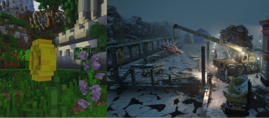
Default 3D resource pack displaying voxel-like models
Teardown, a game with a voxel-based art style
Thought two: Objects should be represented by the simplest possible model that can accurately communicate their identity
This thought ties closely to the prior, and discusses how objects are represented without being detailed 3D voxel structures. The vast majority of objects in Minecraft are blocks - cubes with six 16 x 16 faces. While this works well for many things, particularly pieces of terrain, there are many cases in which objects could not be communicated well by a meter cubed. In these cases, the simplest solutions are used. For example, rather than representing vines as a series of twisting voxels, they are a 16 x 16 texture on a single flat plane. Flowers and saplings - too complex for a single plane, are formed from only two faces, crossed. Of course, objects get more complex than that. Take for instance cauldrons, anvils, or hoppers. In these cases, the shape of the object is important in communicating the purpose of said object, and despite being more complex than most blocks, they are still relatively simple and do not stray into the territory of being mistaken for voxel art. It can be difficult to know how detailed to make a model. Even Mojang struggles with it. Sometimes they undershoot, creating a model that lacks necessary details, such as early versions of the campfire or archaeology pots. I am of the opinion that the redesigned campfires represent the most detailed block currently in Minecraft that still fits the vanilla aesthetic perfectly. Sometimes Mojang overshoots, such as with the dragon egg, which borders on voxel art, and which provides repeated frustration to the current Minecraft dev team. With this in mind, I view the dragon egg as the furthest extent of detail which can be accepted within “vanilla-like” models, and mods should truly go no further. You must figure out how to strike a balance between simplicity and complexity. If you are unsure how detailed to make your model, start with the least detail you can conceive and work up from there until you are happy with the aesthetic you have created.
The original, under-detailed campfire block
The dragon egg, an overly detailed block
Opinions by the developers on the dragon egg
Philosophy in practice
Let’s apply these thoughts to a model from the Prehistoric Nature mod, specifically the “upright bivalve.” This is a model which has, to my mind, overshot the vanilla look in terms of detail. Specifically, it looks as though it is composed of voxels rather than larger, textured faces. Thus, it stands out greatly against vanilla blocks and other underwater decorations such as seagrass.
While I know where I would start in terms of reworking it, I would like this to act as a full guide, and so I will walk through my entire design process (which I usually do in my head) in the form of fully-fledged models, starting as discussed before with the simplest possible model, and then increasing complexity until we reach a design which I believe fits the vanilla feel of Minecraft and which I find personally pleasing.
Our first option is a flat plane, something similar to vines or glow lichen. It should be quickly obvious that this is not the correct choice. It’s hard to tell that these are even supposed to be shells, and certainly not “upright” ones at that.
The next level of complexity would be that of a cross model, like saplings. I personally feel this one has some potential, and with a bit of texture tweaking, it could work. I suspect that if Mojang were to add this block, it would look something similar to this. However, I don’t feel it fits the aesthetic goals of myself or the original artist of the mod, so let’s continue to tweak it.
Perhaps we could mimic the shape of the original design, but use flat textures. While I feel this does better represent the shape I want than the previous option, it still appears too flat to be the oyster-like shells that I’m going for.

So we finally land at the version I like (in fact, the one I originally designed, the others being merely representations of my thought process). It is very similar to the design from the mod, just with the voxel shapes being simplified down into clear faces. This design is likely a bit more complicated than would be added to vanilla Minecraft these days, but doesn’t clash horribly with what is already in the game.
There we have it! A vanilla-inspired remodel that fits both the default appearance of the game while generally following the ideas introduced by the mod. Here it is featured alongside a variety of other remodels that I have done for my resource pack.

Thanks so much for reading! I hope this guide is useful to up-and-coming resource pack and mod makers!
199 notes
·
View notes
Note
I’d like to hear the reasons why you don’t want to post art ever again. I’m just curious, and I respect your decision not to.
im still kinda asleep so im gonna try to make this legible and also not too personal although it is tied to my art so i guess by default it is
tl;dr im embarassed and i think everyone looks at me weird so i kinda want to disappear some times
i cant avoid feeling like everyone thinks of me as weird because i make so much art of this one guy and 50% of that is because i can make art really fast so i can do a lot of it but then i also probably look crazy because i really do so much art but i can only pull off the "well i have autism" card so many times before it loses all meaning and also its not something i actually want to talk about
i try not too think about this too much cuz if it were true then i probably wouldnt have the amount of numbers i have in social media and i wouldnt have people sending me requests/ideas or people making art for me and i feel like im ungrateful that despite all of these things i still feel like im an outsider or that everyone secretly hates me but i kinda cant avoid it because im someone that inherently feels like a weirdo half of the time and then ill just say it again my first weeks in the vs community kinda sucked ass n all of my close people have always reassured me that these people were overreacting but
and then when i make personal art its like this cringefest gore nudity shit and thats been my thing for like 6 years now but i feel like it doesnt make me look any better even though i dont mix the two things
i really do all of the art i do out of appreciation, i know my way of showing it isnt drawing in a cute style that makes everything look beautiful or super happy but thats just not how i work and it kinda makes me feel like i dont belong or that im just looked at weirdly and its kinda hard not to say "i dont want to post ever again" because its the only thing ive been drawing
like i made a zine of all my art and posted it and so many ppl liked it but i was this close to ultimately not posting it because looking at it from afar i kept thinking "oh wow i look insane and i think everyone is going to think so too" so yeah im just constantly feeling paranoid over something at the end of the day i guess i cant control or whatever
i try not to fall into whatever concept people currently have of parasocialism cuz like i said some days i dont care about my art being acknowledged by the guy and most of it i do as fanart of him as a singer which is why it ends up looking kinda edgy but again how do others perceive meeeee lol lmao
alternatively you might not even be a vs fan so this means nothing to you in that case sorry anon if you actually read through all of this
#long post#no one gaf i should have written how i felt last night because now everything feels cloudy#im gonna post this before i keep adding onto it and if i need to ill just make a whole new post sorry
14 notes
·
View notes
Text
Kagura Bachi Chapter 1: Mission

At this point, I'm sure everybody's seen all the memes and jokes about Kagura Bachi. #1 New-Gen Shonen manga that's better than God himself, or whatever. A funny joke at times, but a little overdone.
Kagura Bachi would never live up to that hype, but it's also not a series that's going down the gutter right this second. It struggles, as a first time mangaka will, but at the very least has the potential to turn things around. So, let's take a look at this first chapter then and see what it can do.
The art. All the teaser images you've seen around make it look surprisingly good, and in some places it is. But the default? It's not really that good. It's not awful, but it's far from something you'll routinely comment on.
Simple designs, simple faces, and not a lot that changes about them. Honestly, I'd put it on the same level as the Fantasy Bishoujo manga that I talked about earlier, but even then I think the average quality of the art in Kagura Bachi can struggle to keep pace. Anyways, it certainly doesn't hold a candle to other recent SJ additions. Not awful to be at the bottom of the pack, but the art itself certainly isn't an immediate selling point for readers.
Diving further into the art and style, same-face is a real struggle with the shape and designs of characters. Eyebrows and pupil/iris shapes are some of the main ways the mangaka forces distinction between their characters. Truthfully, it's not something that's a deal breaker by any means, but just points to the struggles of an early on artist (though it's not like I can really say anything when I can't draw to save my life).
A more important issue however is the action. It's got solid layouts and ideas, but the choreography can feel.. plain. Not a bad thing, but you need art that can fill those gaps, that can provide pace and movement within. Kagura Bachi does not have the benefit of art that can help with that. And so, because of that, the action ends up stuff, and even lackluster.

Well, I suppose that's enough about the art, let's talk story.
... it's essentially on the same page as the art. Some good, some bad, lotta mediocre. Bog standard revenge plot meets unique but highly underutilized power system.
Chihiro is the son of a famous blacksmith, at some point his father dies and Chihiro is out for revenge against an organization of sorcerers that, we as readers assume, are the ones that killed his father. But Chihiro's just a boy, how could he go up against sorcerers? Well, he's got some special katanas from his departed father.
Very typical, no? Which I think is a shame, because the chapter deeply limits itself. It starts with the story stating that "only" Chihiro has magically imbued Katanas, but anyone with half a brain knows that as the series goes on, villains will wield similar katanas as well. To clarify, we know that Chihiro's father has made more than just the katanas that Chihiro has. The core of the gripe is that only Chihiro's father was able to create them, and that there's no information about how many there are or who might wield them (spoiler, it's gonna be all the bad guys).
The second, and more problematic issue is how the power system is approached. It separates sorcery from the katanas themselves, which is a painful mistake. The magic should be tied to the swords, it would make for a way better power system to explore. Swords vs magic has been done a thousand times over, so I'm just not thrilled to see its opportunity squandered.
That's not where it ends though. Despite being a magic sword, and despite readers knowing, thanks to earlier exposition, that it has the ability to "ward off evil", the manifestation of that ability is... to turn the sword black and slash people really hard.
I really can't get more disappointed than this. You lead with this super cool visual of the goldfish that the katana is imbued with, and you follow with a single slash. Not even a fancy one. Just a big, fat, shonen manga slash.

So, at the end of it all. There'll be an audience for this type of story, there always is. Violent revenge plot centered around black haired swordsman fighting non-sword wielding enemies. About as generic as you could make it, really. I just hope that the mangaka sees the potential that they wield and changes it up. Different schools centered around various imbued properties. Allowing Chihiro the use of sorcery to attempt to create his own blades. Distancing itself from the revenge plot. The art will undoubtedly grow and improve if the series is allowed to live, but in these early chapters.... well it's now or never for shifting the focus of the story. It has the ability to go the distance, but by the hand of the mangaka, the story is going down a path that will destroy its potential.
#kagura bachi#kagurabachi#shonen jump#shounen jump#weekly shounen jump#weekly shonen jump#weekly shonen magazine#カグラバチ#manga review#manga reccs#manga recommendation#anime and manga#manga
20 notes
·
View notes
Text
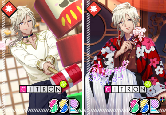
A3! Citron - Translation [SSR] Curtain Among Cherry Blossoms (1/3)
*Please read disclaimer on blog; default name set as Izumi
---
Tangerine: Wow, I’ve never seen any of these tools before!
Taichi: These are items used in traditional Japanese games!
These are just some examples though.
Kumon: This one’s called a top and you play it by spinning it!
This one’s a kendama. You either set the ball on a cup or stab it.

Tangerine: What is this one?
It looks like simply a rope tied in a loop.
Kumon: You use that in a game called cat’s cradle.
You wrap the string around your wrist or fingers and make various shapes.
Tangerine: Cat’s cradle… that sounds fun!
Kumon: Are you interested?
Alright, I’ll show you how it’s done!
Taichi: Kyu-chan’s a pro at cat’s cradle~.
Kumon: Lemme see. Loop this string on my thumb and remove this other string…
Look, I made a tower!
Tangerine: Amazing. A simple piece of string became an art piece!
You’re a genius, Kumon!
Kumon: Hehe, thanks!
You know, Sakyo-san is awesome at cat’s cradle too.
Tangerine: I can’t imagine someone making beautiful art with that look.
People are not always what they seem~!
Taichi: That’s surprisingly harsh!
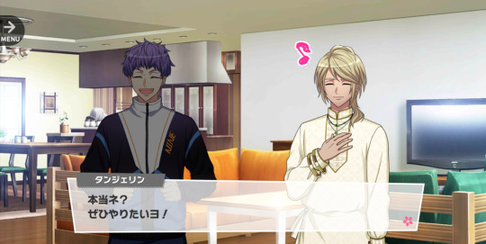
Kumon: Would you like to give it a try, Prince Tangerine?
I know a trick that’s a little easier.
Tangerine: Really?
I would certainly love to.
Kumon: Okay! First, wrap the string on your thumb and little finger. Then twist it and take it with your middle finger…
Tangerine: Middle finger… like this?
Um, I think my fingers are going to get caught.
Izumi: …It looks like Tangerine-kun is enjoying the traditional Japanese games.
Tsuzuru: His teachers Taichi and Kumon look like they’re having fun too.
Citron: I’m full of great attitude that everyone is getting along well with Tangerine~.
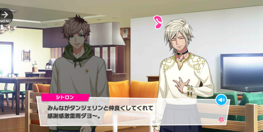
Tsuzuru: It’s gratitude, not great attitude.
Kumon: There, the broom is complete!
Tangerine: Wow. I can do it too!
Taichi: You made it perfectly the first time!
You have a knack for this, Prince Tangerine~.
Tangerine: I am full of graptitude.
Taichi: It’s gratitude!
Kumon: Hey, let’s play another game!
Which one do you like, Prince Tangerine?
Tangerine: Hm… I am curious about this round block.
Is this a Japanese-style building block?
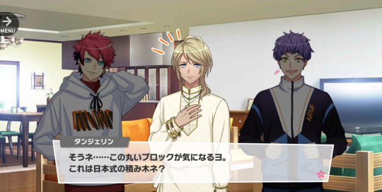
Kumon: Oh, the daruma otoshi!
Nice choice!
Taichi: This is a game where you hit and slide the block on the bottom of the stack out while being careful not to make the top blocks fall.
If you hit it sideways quickly with this little hammer, the blocks on top of it will fall straight down.
Tangerine: I see!
I do not fully understand, but it sounds fun!
Kumon: It’s faster to actually do it than explain it, so let’s give it a shot!
Here, take this mallet~.
Taichi: Give the block on the bottom a big ol’ smack to the side!
Tangerine: I got it. I will try.
…Here I go!
---
| next
#a3!#a3! translation#a3! citron#act! addict! actors!#this was requested forever ago sdkfhsdk#SORRY BUT HERE WE GO <33
29 notes
·
View notes
Text
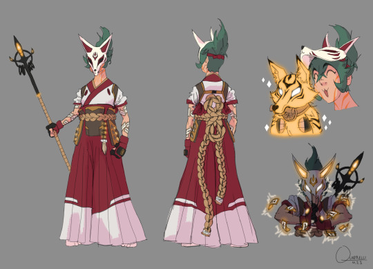
Quick and dirty Kiriko redesign
Main issues I tried to address:
The shilouette is pretty meh. It's not dire but at a glance/distance there is potential for confusion. So I tried to exaggerate notable features (hair, mask ears, hakama) and added a spear, like she has in some of the concept art. For one thing it looks cool and for another, it's been established through the Shimadas that these animal spirits are tied to a weapon and a spear fits in very neatly with a sword and bow.
The design is bland. (Which at least makes her fit in with the other OW2 default skins lmao). The first time I saw her I literally thought it was a D.Va skin. The idea, I would guess, was to merge traditional japanese clothing with modern day hip street fashion vibes and it just doesn't come together at all. Instead of enhancing them, all the aspects that should have visual impact are watered down. From her leggings to her face, there is no flavor; except in that trash garbage mask-visor nonsense. So I leaned into the traditional clothing, since leaning into the "hip young person" would just make her even less distinguishable from similar characters. I also tried to add some bits and bobs for flair (like the seals on her arms), just can't be bothered to really go into texture and detail atm.
Generic personality. This is more of a vibe thing than a character design thing but I want her to, at least at first glance, come across as a bit more cool and confident, maybe a little mysterious and just more interesting than the knock off Tracer/D.Va she turned out as. She can still be a bit of a goofball behind the mask but I feel her protector role demands that she can be at least a tiny bit intimidating.
That trash garbage mask-visor nonsense. My least favorite part by a goddamn mile. It just looks so fucking dumb and there's no way to make it cool; with its teeny kitten ears, dumbass white eyebrow triangles and perfectly flat bottom cut off. Again it's like mixing two things (naruto style ninja headband and kitsune mask) and ending up with the worst of both worlds. And you just know the reason she doesn't have a full or even half mask is because god forbid you can't see a female characters cute, utterly indistinguishable from the other cute 20-somethings, face. Fuck you, she gets a whole mask and it's badass.
Color. Her color palette has powerful "I'm 14 and this is my OC" energy. Actually, everything about her kinda has that, but the color palette especially. Now, I'm the first to admit that color isn't my strong suit either but even I can see some very obvious improvements. Like, why are her normal healing and her ult different colors? To me that's unnecessarily confused and looks bad, simply put. On top of that, they're yellow and cyan respectively, aka the most overused colors for glowy things ever. So I picked a yellowy orange bc it matches the fox motif and sets a nice contrast with the Shimadas' blue and green, just like the red in her outfit does. I incorporated some of that orange into her clothes as well, you know, for cohesion, and kept the green hair as a nice complementary to all the warm colors.
Feel free to make suggestions for improvements, might do a V2 eventually
#idk to me that already works much better and with some more finessing could be pretty awesome#kiriko is the first (and so far only) OW character I looked at and went “wow that's pretty fucking weak”#even the second worst design (Echo) is merely boring#my stuff#overwatch#ow2#kiriko
45 notes
·
View notes
Text
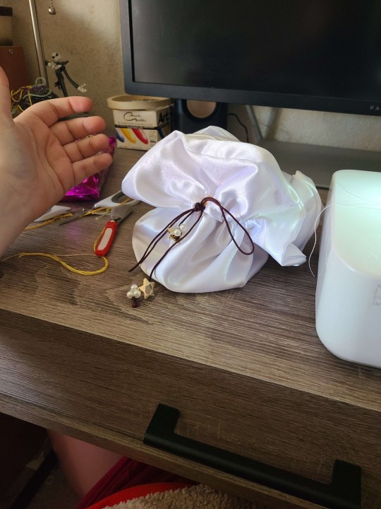
Im opening up commissions and general purchase stuff. Both for my sewing and for 2d art.
I'll get info sheets made and stuff, but for now I have a list of what everything is, and have tried to provide photos for most stuff.
Here is my portfolio website as well.
http://sleepydesigns.co/
Dm me if you're interested, and we can discuss. I'll remake this post when i get better assets made. I'll take payment on paypal or cashapp. I also have venmo.
Here's a list of some of the stuff i make
Sewing
I make custom dice bags, those are 12-16 depending on the fabric and any add-ons. (Example: mine is embroidered, another has pearls and buttons on it) embroidery can be done but will cost more.
Scrunchies/hair ties. Most of them are cotton, but i make velvet and silk ones. Cotton is 3, velvet and silk are 4. You get a dollar off if you buy 2.
Customizable stuffed animals. You can pick the color, pattern, whatever. on these dolls, and they are made to order. The animals i have are a large dinosaur, large dragon, turtle, rabbit, dragon, and elephant. ( i think thats everything.) These all come with the date it was completed on its paw, so you know how old your new friend is.
Bumblebees!! These are little 7$ plushies that can sit on your desk or sleep with you, each one has a unique patten on its wing. It also comes with the date it was completed, so you know how old your new friend is.
Custom humanoid dolls. This can be from a photo of you or a loved one. Or you can send me art of your character. These are incredibly complex, detailed dolls, and i will work closely with you to make the doll. It's a long process that takes me several hours. As a result, these are at least $200. I only take one or two commissions for these a month at the moment.
I can take other commissions but we will have to discuss that.


Stickers
Potions. Each potion is completely unique. Each painted by me using India Inks. These paper stickers are in 3 different sizes. Small is 3, medium is 4, and large is 5. You can tell me what color you want, and if its not available in the size you want, i can likely make it.
Holographic spider's hat shop. This is a large vinyl Holographic sticker of a jumping spider wearing a water droplet hat, selling other tiny things for others to wear as hats. This sticker is $4. If i have any in may, there's mini paper ones for $2
Milkshake pride stickers. These are paper stickers meant to be semi-subtle pride flags. I have the following flags, and can add more. Lesbian, omni, bi, ace and aro, demisexual, demiromantic, pan, rainbow, nonbinary, trans, and intersex. These are $2 each. I also have a tiny sticker set of all of them for the same price.
Fairy. This fairy sticker is a paper sticker of a fairy holding a mushroom as an umbrella. It is $2
Frog with a tophat. This is a paper sticker of a cute little frog with a tophat. He's rather dapper. $2
Fox leaping. This is a paper sticker of a red fox. It is also $2
Red mushroom this paper sticker will not be remade, i have a few left. It's a cartoony red mushroom in some grass. It's $1.50
? Block i dont think i can really say what brand this is based on. It's a paper sticker. $1.50

Art commissions
It is probably worth mentioning that i have a BFA, so that does affect my pricing slightly (on my illustrative work)
I am flexible in style, and can do a fair number of stylized things. No realism.
$20 for a base sketch
$30 for basic shading
$45 for full shading/the works
Each character after that will be half the price.
A background will be $5-10 depending on how detailed it is. By default you get a plain background


#forest talks#my art#commission#art commisions#commission info#commission is open#my work#forests art
41 notes
·
View notes
Text
Ok so I'm still here. Apparently. Floating around in all your art and metas and fanfic. And it's wonderful and angst-inducing at the same time.
Some thoughts I'm mostly writing down and sharing to try to help them escape the confines of my tired, tired head. Maybe then I can have some peace? Probably not but still.
1. I dont like assigning blame or taking sides between our ineffable idiots. Love isnt a competition. People are what they are and sometimes choice doesnt come into it. Sometimes everyone loses. Sometimes people can be absolutely made for each other - absolutely 100% destined and perfect, and just what the other needs. But their pasts and their presents and their emotional needs and external ties are just too far away from each other in a moment in time. It doesnt - cant - happen. Incompatible operating systems. Sometimes things work out later. Sometimes never. That's a real life outcome people have to live with sometimes, folks.
2. Those guys are dorks. Look them both. Look at their hair style choices. Look at the angel's magic show and tartan compulsion. Crowley's ridiculous snake belt and fondness for ducks. I love them so much. I bet almost all of us can see a bit of both of them in ourselves. I'm an Aziraphale operating system with Crowley software.
3. I'm in team they both consciously know they're in love with each other at least as far back as 1967. Probably in 1941 (I really hope there's a part 3 to the London Bliz meeting in s3). Maybe Crowley knew by the time he was asking for holy water. Maybe much earlier. In some ways I think the exact moment of realisation matters less than the fact that by S1 they def know and are both already used to repressing it. Pretending has become so second nature as to be everything. Part of their lived "us". And where do you even start unpicking something that's part of "us"?
4. Whether they both have the same concept of what it is to be "in love" is an interesting question. My own concept of love has changed so much over time just during my couple of decades of adult life that I imagine 6000 years could take you to a lot of places, especially layering in the complexities and realities of queer love through history.
5. I am certain they're both living in a state of absolute terror at the implications and risks that such love creates - but in different ways. Crowley's experience of losing God's love, and the reality of the physical and mental torture that came with that and what that's done to him as an individual will hit much differently than the angel's maybe more abstract, but perhaps more encompassing fear for himself and for Crowley. Aziraphale has lost less and so has more still to lose. But the demon understands, anticipates the reality of loss much better. Perhaps it's not surprising that Crowley's default is to run away and defend what he has while Aziraphale's is to reach desperately for the outcome that maximises what he can keep (i.e. please can I keep heaven/God/Earth and Crowley?!)
6. I'm looking forward to seeing how S3 gets them through all this and to their happy ending. Because I dont believe Terry and Neil would leave those two with anything else in the end.
Kudos to anyone who managed to read to the end of this nonsense!
#they really need to put an addiction warning on this show#repeatedly taking pyschic damage#good omens#ineffable husbands#go2#aziracrow#aziraphale#crowley#good omens s2
10 notes
·
View notes
Note
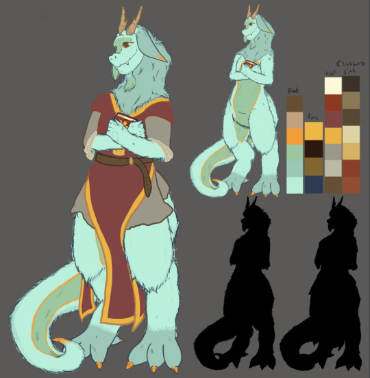
OC Design questions for Paola and Dalia: glance, stature, day, arms, bling and hair
(if you want to answer for Maya and Luca too, I'd love to see it)
Glance: answered here <3
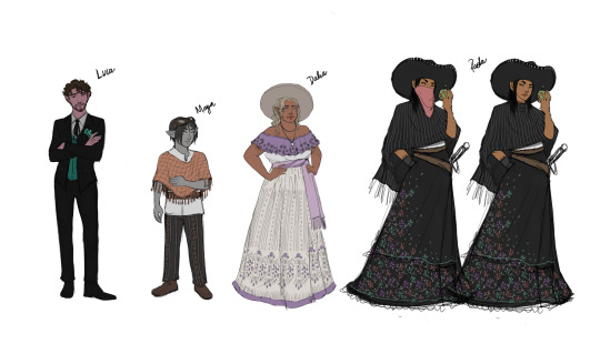
stature: What's your OC's body type? How tall are they? Do they wear clothing to accentuate their look or do they try to mask it?
I created concept art so I could answer this ask visually, yay! Luca definitely accentuates his height with well-tailored suits, and Dalia accentuates her curves and cleavage with well-chosen dresses. Maya prefers not to wear anything flashy, and Paola often wears long skirts that accentuate her height as well (not on purpose).
day: What does your OC wear on a normal day? Why do they default to those clothes? Do they wear similar things, or do they change it up?
Paola wears black on the regular, and a black sombrero as well. She defaults to those clothes because she damn well pleases. Black is her thing, man, what can I tell you? Hehe. I mean, there might be more reasons, but I'll keep some secrets. She does not carry a wardrobe around and is constantly on the move, so she tends to wear the same clothes for a while.
Dalia enjoys wearing bright-colored dresses with pretty patterns or flower embroidery. She has a variety of dresses to choose from, not because she's wealthy but because she takes excellent care of her clothes. Her mother is a seamstress and Dalia learned quite a bit growing up.
Maya wears working clothes. Pants, a shirt, a poncho, goggles. On their time off, they probably wouldn't wear anything too different either, but they'd favor comfort over style. They have some decent clothes and they can match colors, but other than that they don't really care about fashion.
Luca wears suits nearly every day, on account of being a.... lawyer. Yes. One of my main characters is a lawyer. He is also rich, so his suits are tailor-made with fine fabric imported from Tevet (in the old continent). His elegant, leather shoes are also imported from the Cinco Islands in Laus. On the weekend, he'd wear more relaxed clothes -- a silk shirt, comfortable pants, smth like that.
bling: What jewelry does your OC wear? Does it have any meaning?
Paola and Maya wear very little jewelry. I didn't give Luca any in the artwork, but I actually think he'd look great with a necklace and some dangly golden chains, and a few fancy rings.
I also didn't give Dalia any earrings or bracelets, but I think she would wear them. She also wears her amulet, a family heirloom, at all times.
hair: How does your OC wear their hair? Does it have some kind of meaning?
Boringly, everyone wears it down, lol. Dalia would switch it up, though, and sometimes wear it tied or in a braid or styled for a play or for a night out.
And the one you just asked me to add :
canvas: Does your OC have any scars, piercings, tattoos, or other markings? Do they display or cover them up at all?
Paola definitely has scars from several squirmishes, though I have to figure them out.
Maya might have tattoos. I think they are definitely the type, but I hadn't thought about it so I'll have to rotate it.
Luca has scars >3 But I'll keep them secret.
Dalia, I'm inclined to say neither, but perhaps I have yet to learn some things about her.
#oc asks#oc development#raywrites#placeholder name: order among rebels#original novel project#speculative fiction#novel ocs#oar ocs#adalia sorrijo#maya guerreri#luca flores#paola arain#thanks for the ask!
2 notes
·
View notes
Text
15 Questions: Character Edition
Tagged by @words-after-midnight! Using this for OCs as well as writers is a fun idea.
Going with everyone's favorite repentant bloodborn and fish dad, Renato (who just got some lovely new art):
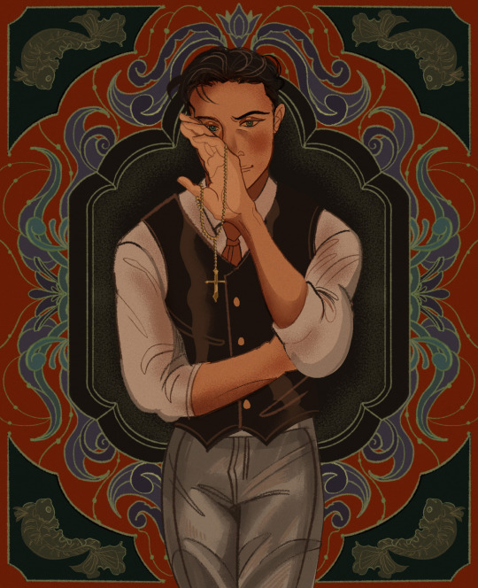
(Thank you again to @/littlestpersimmon for taking the commission! I love the background and fish details especially. Go check out more of Caleb's beautiful art and his comics if you're not familiar with them already!)
1. Are you named after anyone? My given name came from my Portuguese great grandmother on the Dimas side of the family, my father's side. I chose "Renato" as a teenager because the meaning (reborn) applied to both my transition and future as a bloodborn. Anyway, it shares the first letter and same number of syllables with the old one, so I also just liked how it sounded.
2. When was the last time you cried? I...honestly can't remember. Really. I'm not trying to sound tough or cool or anything. I must've cried when I was still a child of course, before the break. I can recall afterwards, though, watching the harbor get farther and farther away as my family fled the destruction on a ship. My eyes were completely dry. I still felt...still feel despair, anger, sadness. But after the world changed, I did too. Crying just seemed like a waste of water. It wouldn't get me anything, so my body just...didn't bother with tears.
*shifts, visibly nervous* But I think...I think I'd like to cry again someday? Is that a strange thing to say? Nevermind--forget it. Next question.
3. Do you have kids? No, but I have the next best thing. *opens wallet with photos* The goldfish is Tesoro--Tes, for short. They can roll a tiny football into a mini net. Ah, they're so talented! Then there's Beija, the pleco. She's nocturnal like me, but rather shy. And of course I can't forget the Venerable Order of Lady Guppies: Sisters Dolores, Joan, Hildegard, Leonella, Mary Celeste, Teresa, and Abbess Malfada. They're named after nuns since there aren't any male guppies in the tank and, well, you get the idea.
4. Do you use sarcasm? Occasionally, to make a point maybe. I prefer saying something outrageous with a serious face, though. I've gotten quite good at it over the years.
5. What's the first thing you notice about people? It's going to sound terrible...it is terrible, but true. I try to see if they have a weapon, and assess their vulnerable points, gauge which would be best to strike first. You know...to incapacitate. Or kill, if need be. It's ingrained into you as part of becoming an Aquila. But I'm sure you don't want to listen to such a dark subject.
6. What's your eye color? *sighs* They're blue-green, or aquamarine, or sea-green, or whatever you want to call them. I honestly don't find them that special. The way dark brown or black eyes shine is much more appealing, in my opinion.
7. Scary movies or happy endings? Hm. I'm just as likely to be annoying and complain about either one being unrealistic. I think the execution and style is what matters to me, not the category.
8. Any special talents? Winning people's trust. Being deserving of it... that's another matter. I've been told I pick up languages rather quickly, at least as far as basic conversation goes. Of course I grew up being a strong swimmer and diver.
9. Where were you born? On the Pacific, in a ship's medical bay, while my mother was accompanying my father to the States. That meant I was a default Brazilian citizen, although both my parents had dual citizenship.
10. What are your hobbies? Looking after my fish, making a nuisance of myself, finding what little pleasures I can take. I'm starting to realize just how much of my identity was tied to being an Aquila, honestly. Without that...well, I suppose I'll just have to test things out and see what sticks.
11. Have you any pets? Oh, do you want to watch all my videos of Tes and the others? [A/N: I advise you to decline. There are a lot of fish videos.]
12. What sports do you/have you played? I practice various styles of fighting and marksmanship, but that's survival rather than friendly competition. I never had a real opportunity to play any, given the world descended into chaos when I was ten. I mean, Ollie and I used to play a game where we'd dare each other to touch sharks while scavenging. Does that count?
13. How tall are you? 5'5". Many of the deadliest predators are smaller than their prey.
14. Favorite subject in school? I only attended about five years of Catholic school. My parents found me tutors for various subjects after the Break happened. I did fine with math, reading, science, all of that, but I preferred learning and honing skills. Spear fishing, sailing, foraging, those sorts of things I could use in a practical sense.
15. Dream job? *grins* Indolent concubine of a lofty noble or conquering warlord (gender neutral). Perhaps if things work out with these supposed merfolk they'll have some openings available.
Dysthanasia Taglist: @thecyrulik @thatndginger @space-writes @sunset-a-story @scoundrelwithboba
26 notes
·
View notes
Text
Reviewing past projects - Airships 'N' Aliens
Airships 'N' Aliens was the 3rd project I worked on and I'm super happy with how it turned out. It was created to be an arcade game so I had the challenge of making the game work with a limited controller. Notably, the controller only had 1 joystick. This posed quite the challenge later down the line once I decided to make the jump from 2D to 3D, though I'm getting ahead of myself so let's start from the beginning.
Originally, Airships 'N Aliens was planned to be a top-down 2D game in which the player would control a little pirate guy on a flying pirate ship, and would have to run between cannons to shoot UFOs. Each cannon would have a different type of ammunition that was effective against a different type of UFO each. There would be 3 waves increasing in difficulty each time, and then a final boss wave afterwards with some kind of giant ship that you had to utilise each cannon for (perhaps weak points would appear associated with a certain cannon?) I didn't end up developing the idea for the boss very much though, it was more of an afterthought.
Work started off pretty slow, I'd made a single untextured platform the player spawned on, and I set the camera into a fixed top-down position. I had also created a couple basic sprites for the pirate the player would control, and had created a second sprite as I decided I wanted to try to incorporate a 2-player mode (this didn't end uo happening).
After creating these sprites, I struggled to decide whether to animate them at the time, or to first create a sprite for the ship itself. I decided on the ship and started looking at reference images but then multiple thoughts entered my mind;
"I shouldn't be creating assets this early."
"Do I even know what style I want to go with?"
"Is top-down even a good idea?"
"I should really develop some basic gameplay first."
"I really don't like 2D stuff in UE5, should I switch to 3D?"
Eventually, after that last question I considered my options and decided yes, I should go 3D. Working with 2D in UE5 isn't impossible (after all, my first game was a 2D platformer made in UE5), however it is pretty tedious as UE5 is a 3D engine at heart and you have to take extra things into account if you want to make it pretend to be 2D. I wasn't willing to do all that and decided to instead go from a top-down 2D game to a first-person 3D game.
I really embraced the Voxel-art style for Airships 'N Aliens after going to 3D. I created everything out of Voxels except for the sky itself which is just the default UE5 sky with some modified attributes (moved the clouds lower down & made them larger). I also moved from MagicaVoxel over to Blockbench as one of my friends suggested. Blockbench is often viewed as being designed for Minecraft, and to an extent that is true, however whilst Minecraft support is heavily advertised and used as some of the default templates, Blockbench is also capable of just being a really solid voxel modelling program without having to care about Minecraft stuff. So that's what I used going forwards and what I still use now for any voxel stuff.
The first big obstacle from the switch to 3D was the controls, specifically movement and camera. As I mentioned earlier, these arcade machines only have a single joystick, so how could I possibly make it so the player can look around AND walk around? Perhaps I could make a button toggle between moving and looking? Or maybe I could have it so you move with the joystick and can turn 90 degrees with a button? None of those felt very natural though. Then I turned to somewhere rather unexpected, DOOM. Yes, that DOOM, the big bloody demonic game in hell with the cool music. You see, old DOOM games worked very similarly to what I was doing here, in that movement and turning are kind of tied together. This led me to replicating this style and having it so the player cannot look up or down (thankfully, there's no need to... is there?) and instead up/down would move the player forwards/backwards, and right/left would rotate the player clockwise or anticlockwise respectively.
The cannons... oh boy the cannons. These damn things took up the vast majority of development time on this project. It took so many attempts to get them to work as intended and that's not to mention that I very much did in fact need to let the player loop up and down in order to aim the cannons properly. Thankfully this was actually one of the simpler issues to sort out, I ended up making it so when the player uses a cannon, they actually "possess" it, which then means the player's controls change to match whatever controls the cannon itself has. So I basically just made it so the cannon has different rules to the player, in simple terms, the cannon could turn but not move.
If I were to explain every single issue i had with the cannons this post would be longer than the damn bible, so i'll just say there were plenty of them, and if you want to see some of the more prevelent ones and see how it progressed, it's all availiable on my blog for Airships 'N' Aliens here:
Alright time to evaluate some of the strengths and weaknesses from this project.
Strengths:
- Developed skills in UE5
- Voxel Models
- Kept ideas realistic
- Problem solving skills
- Knew how to deal with a drastic change in direction
- Learned some of UE5's Niagara System
- Created a finished game I was happy with
- Worked around controller limitations well
- Gained lots of feedback to work on
- Learned how to play videos on UI Widgets
- Used prior skills in Davinci Resolve to edit a video for the main menu
Weaknesses:
- Slow start
- Cut a few corners
- Didn't get round to adding a high-score that saves
- Didn't get round to adding 2-player mode
- Moving around & having multiple cannons ended up being pointless as a result of not getting round to adding multiplayer & different ammunition types
youtube
#gamedev#video games#unreal engine#devlog#3d game#game design#game development#voxel#reflection#videogame#Youtube
5 notes
·
View notes
Text
Learned Mortality | Night 1 (Part 2) | Art Thread + Behind the Scenes
Hey everyone! Another Learned Mortality session has come and gone, and with that I have a whole slew of artworks to share with you all! This episode was a wild ride, so let's get right to it.
As always, spoilers below for the episode ^-^

In case you haven't seen the episode yet, and want to check it out, watch it here on YouTube or follow @breaksequence
youtube
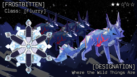
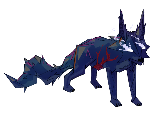
First off, the convoy that was seen travelling north in King's Pass. Not much is known about this frostbitten yet, so I will save that for when it's revealed ^-^
Where the WIld Things Are got dropped this session! I love these wolves, they have a very fun "Science Factoid" about them, the calls they make are the same sounds that reverberate through ice cores and on lakes when ice impacts ice. They use their mallet-like tongues to communicate battle strategies to each other and empower their own attacks.
They've also learned to create projectile-like ice shards by dipping their tails in water and using the collected mass like a bow.
These are the first frostbitten artworks I finished for this game and defined the style I would use going forward!

So now I'd like to get into the map assets I've created for this game. As the scenarios I want to create get more and more complicated, the limitations of Roll20's default map assets become greater. I've created an array of parts that are used to create The Lucky One's network of flesh which act as its ears and feelers throughout the Titanic dungeon.


Ice is also hard to come by. These ice assets were made by me.
The Lucky One!
The main "antagonist" of this episode, aside from our boi murph. The Lucky One was originally going to be Murphy's stand, with the idea that Murph would be a "Frostbitten Sympathizer". This idea was scrapped as I felt it would be more horrific for Murphy to be aware he's being controlled, but have completely given up fighting it because of his shit luck making it impossible to fight back against this Frostbitten's luck-negation ability.
The purpose of this frostbitten is unknown, but in the documentation notes it is referred to as "The Alchemist".
It was able to see through Murphy's infected eye, feel through its feelers, and "hear" through its ear extensions that are laid out throughout the titanic. Its hearing is very bad, as it relies on vibrations and its sense of touch more than something like a human's hearing.
Fun Fact: the party was able to discern that there was something weird in the air at the start of the dungeon, but I wanted to make it very difficult to tell that there was actually anything infecting them. The spores would have begun to take hold if the party had decided to spend the night in the Titanic before continuing on, for example.
Edit: Some additional thoughts I remembered to add; Its head is shaped like a Four Leaf Clover ( four hand clover lmao ). It has a heart on its stomach exposed externally, and it has a cape billowing in the wind to mock the classic "My Heart Will Go On" Titanic scene / song. Its one leg has a walky-talky wrapped around it to imply that Murphy can "talk" to it, before Murph even reveals that. Its feet are tied and there are ice shards jutting into them. The clawing hands coming out of the shards represent the deaths of all of those on the Titanic who couldn't do anything to escape their fate... just like Murphy.


My boi murph. Just ain't his lucky day...
Based on the concept of "Murphy's Law", and designed off of the Police Officers in the music video for Tooboe's "Shinzo".

Annnd the additional eyecatches that dropped this ep:
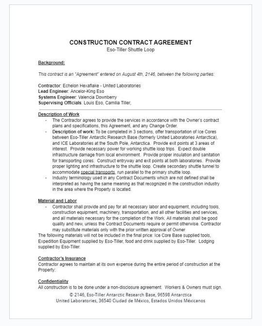
Lastly, while not exactly "art", the construction documents I wrote for the Eso-Tiller Shuttle Loop contain some really fun details ^-^ Have fun combing for secrets~
-Tali
#Youtube#dnd#dnd art#dnd campaign#ttrpg podcast#ttrpg art#ttrpg campaign#ttrpg dev#ttrpg oc#ttrpg character#ttrpg#ttrpg stuff#jojo ttrpg#jojottrpg#sequence break#learned mortality#lesbian art#lesbian#Shinzo Murphy#tooboe#the lucky one#my art#my art style#antarctica#indie ttrpg#ttrpg design#dnd5e#tabletop#dungeons and dragons#stand
10 notes
·
View notes
Note
For the art ask game 8 ! 2 3 6 !!!!
hi cubey!! :D i wasnt sure if the 8 was on purpose but i answered it anyways!
art ask game!
8 | what's the most fun and the least fun parts about your process
i love doing line art (which may be surprising, considering how little i do it nowadays LOL). i think its really fun to finally watch everything come together and to refine the sketch!! i barely enjoy it more than sketching though, they're pretty tied to me.
least favorite part... probably shading. ive never been very good at understanding what parts of the body will be hit by light, no matter how many observation and life drawing classes ive taken lol. i love shading a still life! but when it comes to the human form, not so much 😭 i cannot explain how many drawings ive done, like, three layers of shading, took a step back, then deleted every layer and posted it as flat colors instead because i hated it LMAO
2 | what's your favorite thing about your style
ohhh thats hard. i really like my art in general, honestly? i dont think im a fantastic artist, but i do think its clear that i like. went. to school for it bhbjfdghjbdfjh im proud of my art!! i really like drawing noses i guess and i think my style works well for good variation there? i still need to practice more types of noses, but i think im already doing well, so ill say that! the noses.
3 | what's your least favorite thing about your style
very small thing but EARS. I HATE HOW I DRAW EARS but i also dont know how to draw them BETTER ? i used to just never draw them. then i used to do them more detailed, but it always just looked... odd. i think it looks better without the extra details because i always did it weird, but it still looks goofy. its such a small thing though that i dont know that anyone else would ever even notice LMAO also! jawlines. my style very much favors a round soft jawline, which is obviously my default (stares at my art and tries not to think about same face syndrome), but then i try and do a sharper jawline and feel like im dying LOL im trying to get better at that though, because i want more facial diversity in my art. scary and veronica marlowe i just know you have sharp fuckin faces and im trying to get better at showing this aspect of you every day
6 | warm colors or cold colors
WARM COLORS!!! orange is my favorite color! i love warm colors! i tend to use a mix of both in my art though, i like the way warm tones and cool tones balance each other out :]
6 notes
·
View notes
Text
comfort movie tag game! tagged by @ajaystillblue (thanks for tagging me in the game!) list 7 comfort movies and tag 7 ppl
Spirited Away: my first Ghibli film. Just really good Ghibli film of calm moments, Chihiro trying her best while being a kid in an underpaid job, and good action moments. Daveigh Chase in the English dub ties it to Lilo and Stitch in nostalgia for me, so while I could also list Princess Mononoke and Naussica: Valley of the Wind, Spirited Away is the Ghibli default for me.
Moonrise Kingdom: the first Wes Anderson film I saw, which I note to say that the unfamilar style of the movie stood out to me, and rewatching made it a comfort film. But also the plot is very good, and "Cuckoo" is a comfort song.
To Dust: I really like the somewhat absurd plot mixing with genuine grief in a weird buddy-comedy setup of community college biology professor and Hasidic cantor try to figure out how bodies decompose. It's that really good mix of 'this is ridiculous' combining with the calm of Shmuel finding a peace by the end.
Only Lovers Left Alive: So in high school, my bonus mom would take me to indie art films with her friend, which is how I saw To Dust, The Lobster, and Only Lovers-- three films that I really hold fondly though The Lobster is more a film for a rewatch once every four years to preserve the uneasy tone. Only Lovers has a butt naked Tom Hiddleston and Tilda Swinton; it has a character admitting to being Shakespeare's ghost writer before dying. It also has two vampires reflecting on what eternal love and survival looks like, which includes making experimental music on the internet, complaining the humans like your experimental music, and then making more experimental music with your 200 year old guitar before getting high on blood. It's great.
Arrival: I think the combination of linguistics as a major plot and the mixture of love and grief in parenthood got me. It's just a warm quilt kind of movie to me with a good sci-fi plot.
Watchmen: Director's Cut (2009): I'm sorry. Rorschach has undergone so much fan analysis that he is a wet cat in the rain to me now. I've listened to a two hour long podcast by two trans masc people breaking down how Rorschach is trans coded and gay. I have read the comic; I've read possibly too much AO3 smut during the pandemic. I've written fanfiction in a parking lot during my lunch hour. I was obnoxious with excitement during the HBO series sequel. The director's cut just adds more comic material and a character's death on scene.
Everything Everywhere All At Once: Also a warm quilt kind of movie for me about love and grief in a parent-child relationship amongst the absurdity. Also very very well done visually.
Tagging: @whotaughtyougrammar, @taakomg, @isadora-greenhall, @nick-close, @west-tokyo-incidents, @cryptic-creepies, anyone who wants to do it essentially. You can say I tagged you, and no pressure to the people I did tag. I'm just curious about your comfort movies.
5 notes
·
View notes
Last Seen Blogs

evvvvat
Untitled
evvvvat
Untitled

inconnect
Untitled

dysphorictendencies
janhavi

whet-ones-write
One of Kirishima's hoes