#trying to add more characters to the comics but its hard
Text
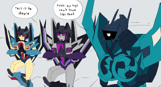
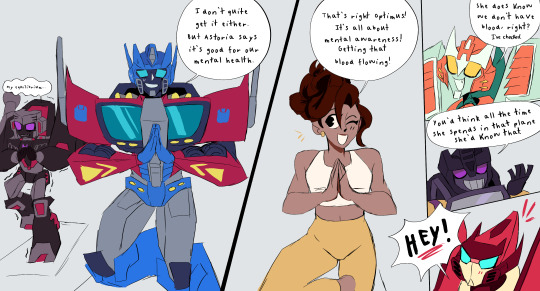
If you didn't expect me to draw robots doing yoga then idk what to tell you
#deadlock being into meditation and yoga who would have expected#trying to add more characters to the comics but its hard#tf zenith au#transformers zenith#maccadam#transformers#artists on tumblr#my art#ratchet#mtmte#transformers deadlock#powerglide#optimus prime#megatron#pharma#skywarp#thundercracker#whirl#swindle
2K notes
·
View notes
Text
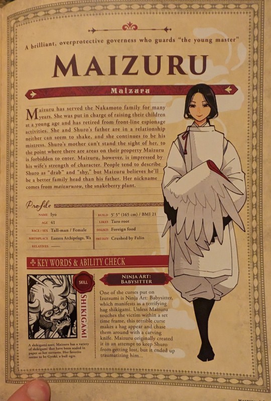
oh hey for anime onlys/ppl who havent read the adventurers bible, a bit of trivia for yall. this isnt super spoilers bc it doesnt really. come up at all? it doesnt appear in the main series At All (that i remember) but does inform a lot of the way they interact: Maizuru (the lady with the cool wing-sleeves who was cooking shuros meal/doting on him) is his governess, and also his dad's mistress. it was apparently an open secret in the household.
because of this, shuro kinda resents her, tho its pretty subtle in the series (kinda hard to tell from him just being world weary and upset at being babied)
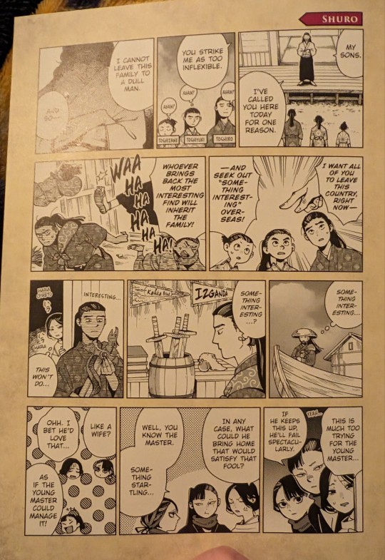


so uh. yeah no its not just "ugh im an adult stop treating me like a kid", theres also. this. I would really reccomend reading the adventurers bible if you can, its got so many little things that add depth to the characters, even ones we barely get to see in the series. with this, im pretty sure it doesnt come up at all otherwise! warning tho that the bible DOES contain spoilers for some pretty late series stuff (like, literally up to 10 chapters before the end or some shit) so if youre anime only thus far, i would rec either reading the manga or WAITING for the bible.
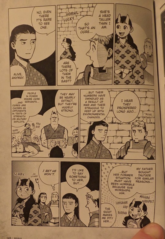
also, gonna throw this in too: this part is SLIGHT spoilers just for izutsumi's backstory, but yep, the family literally bought her. and didnt treat her amazingly for that matter (mostly in terms of being super controlling and trying to "discipline" her). ill also include this bit on inutade bc it sheds a bit more light on the dynamics among the group (inutade also having been bought)

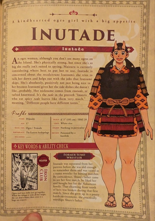
and, heres another comic from the section on ogres later that goes into her inutade a bit more
#dungeon meshi#delicious in dungeon#izutsumi#shuro#shuro dungeon meshi#maizuru dungeon meshi#toshiro nakamoto#inutade#inutade dungeon meshi#sorry for no alt text this is. a lot.
4K notes
·
View notes
Text
I for one enjoy creating things i feel proud of and dont want to have to go back and work on again 3738393873 years in the future
#i for one dont like regretting creating something lazily when i wanted it to look a certain way with more effort#i for one think trying and challenging yourself and your ability to achieve your goals is good#if me 'going back to fix things' happens like. about 3 years after ive posted it- then that means i wasnt satisfied w it when i posted it#in the first place. i plan to do that w my comic kinda but thats more or less with coloring and after like 2-3 years of not coloring#everything in i think id probably just leave it black and white#but i wouldnt say that its necssarily unfinished. i finished it and maybe ill add on to it.#as far as im concerned. unless i clarify something is a wip everything i post online is finished as it is.#but im not about to post it until i think its actually finished#and not just 'sufficient'#but das just me#idk hard to have an opinion here bc i like all of my art both when i make something w a lot of effort and even when i dont try at all#ig i just dont feel the urge to post the pics i dont feel like *other* people think is good enough to see#like on here i feel like i have to have an *aesthetic*. my art blog has to all flow together#but when i used to be on deviantart i had scraps or other places i could put pics that the more pretentious artists wouldnt like#so even if my ~pretty~ art was what ppl saw first i was still posting everything else. i had it all in one place#but unless i wanna fill my art blog w a bunch of black and white images n shit and totally fuck up the *currated aesthetic* then idk#idk if i want to do that. i want to post about my characters and such but a. no one gives a fuck about anything on here esp not original-#content.#and b. i do kinda like the aesthetic ive made on my art blog. idk. ill do whatever when i feel like it#im very either or in that way yknw#at least i can say theres stuff im really proud of bc i actually tried.
0 notes
Text
STWG daily prompt 9/12/23
prompt: barbie
pairing/character(s): steddie, stobin
transfemme!stevie has my heart ngl
-
Stevie's been out to Eddie for a few months when her birthday comes around. And she's anticipating a... Depressing day, if she's honest.
The only people that know are Eddie and Robin. To everyone else, she's still a guy. So she anticipates all the masculine gifts; cologne, clothes she won't wear, gag gifts from the kids about her being their dad.
And that part of her birthday is depressing. She sits through a lunch-time barbecue with the party and Eddie holds her hand out of view of everyone else so she can squeeze it every time something is said that makes her want to bawl her eyes out. Like how Mike keeps making jokes about how her hair's starting to be too long to look good, and Dustin keeps asking why she's wearing so many layers in July, and everyone keeps calling her the birthday boy, and son, and Steve-
She's happy to go home, is the point. Expects to spend the rest of the night curled up on the couch with Eddie who will no doubt spend the rest of his night feeding her words of affirmation about how she's his girl and other ooey gooey feminine phrases he knows quell the knot in her stomach some.
What she doesn't expect is for Robin to be sat on the couch she wants to curl up on, a comically huge blanket in her hands and an equally comically large pile of gifts towered in front of the couch.
"Rob, what-" Stevie starts, eyebrows raising involuntarily. She looks to Eddie, who has a small, proud smile on his face.
"Happy birthday, dingus!" Robin cheers. A party popper seems to have materialised in her hand out of nowhere, and Stevie can't help the laugh that's shocked out of her when it pops loudly.
"Go get changed into something more Stevie, okay, my love? It's time for your real birthday." Eddie says into her ear.
A sudden well of emotion builds up inside her at the words, at how lovely her boyfriend and best friend are, at the thought of how much they must have spent to buy her these gifts. She sniffs harshly to keep tears from falling, nods, and goes to her and Eddie's room without a word.
She considers getting straight into sweats in case she falls asleep in the living room, but knows she needs to feel feminine right now. Needs to see who she is reflected on the outside as well as the inside so she doesn't feel so... Wrong for the rest of the night. She slips into a comfortable pink day dress with a wrap front (an incredibly willing donation from Robin's closet) and doesn't give herself any time to scrutinise her figure in the mirror. Just brushes her hair out of its more masculine style of being pushed back, and into something softer that frames her face.
When she reenters the living room, Robin is still sat on the couch with the blanket, and Eddie is crouched down by the pile of gifts, murmuring to himself as he picks through them. Robin's laughing at him, and Stevie's chest feels warm in their presence.
"Hey! There's the birthday girl." Eddie grins when he sees her, and then looks back down at the gift pile to select a box-shaped one that's wrapped in purple polka-dot paper.
Stevie sits next to Robin, and tilts her head to rest on her shoulder as she watches her boyfriend make a sound of celebration when he holds up the gift.
"I was gonna save this gift for last, but after that shitshow I just- here, babygirl." He holds it out to Stevie with a softer smile on his face (Robin calls it his Stevie Smile), and Stevie takes it with gentle hands.
"It's from him and me, by the way. Don't let dingus 2 take all the credit." Robin adds on. Eddie just rolls his eyes and nods, and then starts to talk as Stevie carefully tears the wrapping paper. She's trying to preserve it as much as she can. Wants to keep as much evidence of her first birthday as herself as she can.
"I hope we got the right one. It was kinda hard to find, but I went to a bunch of flea markets and I remember you talking about how when you were younger you wanted it but your mom wouldn't let you and-"
Eddie cuts himself off when Stevie finally tears enough wrapping paper away to see the beginnings of the Barbie logo and gasps. Tears are already brewing in her eyes, and maybe one or two drip onto the precious wrapping paper as she manages to slide it off to reveal-
"Ballerina Barbie." She whispers, staring down at the doll. Her hands are shaking a little, and she feels so incredibly wobbly and warm.
She can't believe Eddie remembers what she said about the moment she knew she wasn't a boy the way she was supposed to be. How her mom had snatched the toy out of her hands in the toystore and replaced it with a car set.
"Is it the right one?" Eddie asks after a moment, and Stevie lifts her head to see him chewing nervously on his lip.
Instead of speaking, she wordlessly gestures for him to join her and Robin on the couch and promptly throws an arm around each of them for a much needed cuddle.
"It's perfect." She says to both of them, and gets twin squeezes to each side. A couple more tears slip out as she looks at the pile of gifts she still has to go through, "I can't believe you guys did all this for me."
"We love you, Stevie-bee." Robin says simply. Like that explains everything. Like it makes perfect sense.
"Yeah, we gotta treat our girl the way she deserves." Eddie adds on.
And Stevie thinks that maybe it does make perfect sense. After all, she'd go the same length for either of them.
#steddie#stobin#stevie harrington#trans steve harrington#steddie ficlet#steddie drabble#the party aren't transphobes to be clear they just literally do not know#stwgdailyprompt#dailydrabble#mywriting#steve harrington#eddie munson
537 notes
·
View notes
Text
just finished the bear season 3 and there is such a collective cognitive dissonance from everywhere from the writing of the show all the way to the social media marketing.
i know i’m biased because i particularly like syd and carmy together, but this season was strange but in different ways than the last season was strange.
not only does carmy take a backseat as a protagonist about halfway through, he and syd have hardly any scenes together, but i think the show almost suffers for it. this season was certainly funnier than the last, but the neil and ted fak got old and old fast. it certainly doesn’t help that even though carmy has a new arc every season, but he doesn’t take the lessons he should’ve learned into how he should act going forward. it’s stunting his growth and now that we have three seasons to compare to one another, it’s only more apparent.
we’ve already talked about how funny characters are stronger than comic relief characters and that’s essentially what the faks are. i really liked neil’s more vulnerable moments where he got to be taken seriously but it’s hard to take him seriously when all of his screen time is him doing stupid shit. also the hauntings thing? it really was not that funny.
also the show is making such an active attempt to rewrite its own history and i don’t understand why. so many little details that connect moments from the past and present to make up who the characters are and yet it’s kind of being thrown out the window.
claire being described as carmy’s peace threw me for a loop because he felt out of place in his own relationship. i think we all know the clip of carmy’s late s2 panic attack where thinking of claire and him together makes it worse but now we are given so many more scenes of when he was happy? what narrative are they trying to spin here? was carmy genuinely in love with claire or mostly disinterested, because it can’t be both.
even claire doesn’t seem interested in being with carmy at this point, and who can blame her?
her presence was just kind of weird to me, because she didn’t really interact with the rest of the cast until the 9th episode. i think her brief hospital scenes were to flesh her out more, but it’s really just creating vulnerabilities and revealing the seams. and because she’s never really been developed as much as everyone else in the series, we’re left with more questions. who was that in her bed? why was she never fired for insane medical malpractice? what is any of this for?
also a lot of the lighting this season has changed. i saw one user (can’t remember who but their post was super interesting) mention how much warmer and inviting the scenes with syd are as opposed to the coolness and almost detachment the scenes with claire were. except we see carmy in cool lighting a lot more this season.
i also wanted to add where carmy gets overwhelmed in the finale, thoughts of claire coming in with a violin sting like a horror movie doesn’t add to the narrative that they keep telling us. that’s another thing i noticed. they tell us how great claire was even though their time together hindered him being involved with his passions and his coworkers, but they retcon things and add scenes of them happy and have carmy tell us how amazing she is but they barely cared to show us.
a huge theme in this show is family and responsibility. and the scene where neil fak said claire could be the one to take care of carmy and vice versa really rubbed me the wrong way. first of all, i think it kind of supports the idea of codependency which isn’t great but i could be reaching. second, carmy isn’t really equipped to take care of anyone and i think the way he interacts with his coworkers when he’s frustrated is proof of that.
don’t get me wrong, i thought this season was amazing television, christopher storer is a brilliant writer and director, joanna calo really should helm more episodes bc ice chips was actually a perfect episode, and ayo getting the opportunity to direct tina’s episode was so amazing and i really hope i see her name in more directorial projects in the near future. but i think we’re getting a little lost in the plot here and losing sight of what the heart of the show is. the literal restaurant. and logically some of the decisions made don’t exactly hold up and i would hate to see this show fumble.
it can’t be a coincidence that so much of the show’s marketing is tied to carmy and syd and i think efforts to trick the audience are actually making the show suffer. or the increasingly less subtle decisions in the editing in the few scenes of them together? are you really gonna gaslight a whole audience for the sake of a misdirect?
181 notes
·
View notes
Text
2009 era Damian reading
As I've been doing my 2009 era Damian reading, I'm trying to condense the good stuff and bad stuff, and things I believe are relevant for his character. These are in addition to what I assume is obvious (Batman and Robin 2009, the comic where he has a starring role).
Battle for the Cowl: this has how Damian becomes Robin. It's not necessarily good. Daniels really does not understand Damian, especially this early in his writing, but it does have some important context for things going down b/c Damian helps Squire save Tim's life, and we can see Dick viewing training Damian as something he is responsible for.
Secret Origins (2014) #4: This is a much more in character Damian becoming Robin, though fit for a condensed new 52 timeline that leaves some stuff out (like Damian's rocky intro with Bruce).
Batman #688 (Long Shadows part 1): Winick seems one of the early writers who does a Damian as he lines up with later characterization (views himself more as a professional assassin), so I think this one's good.
Batman: streets of Gotham #1-6: damian makes some minor appearances here.
Batgirl #5-7: Always take Damian's guest-starring stuff with a grain of salt, as often times writers just go with "how would an obnoxious 10 year old boy act here" without understanding he's a specific kind of obnoxious 10 year old boy... that said I do like some of his interactions with Steph, and I think it's incredibly important that we see Damian defends his competence based on his training, not on his blood.
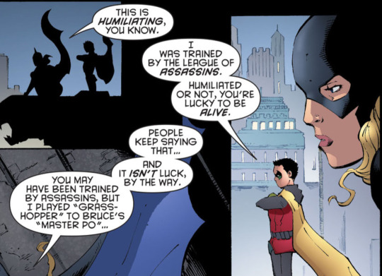
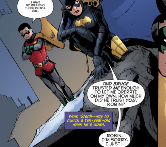
Like he'll sometimes justify why he belongs based on his blood (which like... no one acts like they want him around), but he isn't going around saying "I'm better than you b/c I'm batman's son". he was trained intensely since birth (and that's why he should say he's better than you :P)
Batman #692-697: not a ton of Damian in this, and it is Daniel's writing, but he's a little better than he was in Battle for the Cowl. We see Dick training Damian some.
Batman: Streets of Gotham #7, #10-#11: love this plotline for him. Good show of competence and characterization.
Blackest night: batman: More focused on Tim and Dick, and Tomasi sucks at writing Babs, but at there is some Damian content that I remember enjoying.
Red Robin #11-15: as long as you read this one with your brain turned on, it's good for explaining some Tim and Damian stuff. Sadly some fans are like "woooo arrogant 10 year old gets beat up". Nicieza makes some missteps (frames Tim's thinking around Damian as coldly logical, when it is anything but and he is reacting from a place of emotion), but one can ignore those.
Batman #703: shows Damian's character pretty well in a default Batman and Robin adventure, and his relationship (or lackthereof) with Bruce and his dynamic with Dick and Alfred
Teen Titans #88-92 (including Red Robin #20 in a crossover plot): surprised by how well I liked this one. I think it portrays Damian pretty fairly, and we can see that he is trying hard, but hasn't been given a lot of support up until now (or even now, Dick kind of just drops him off with a bunch of older kids who all also have issues and are predisposed to disliking him XD). His dynamic with rose is fun and I think it is notable how quickly he does acquiesce to following Cassie's orders when she's like (at first) the only Teen Titan who is OK with him being there and assures him its not personal when she makes a comment he doesn't like.
Bruce Wayne: The Road Home: Batman and Robin: Has some nice Dick and Damian banter, showcases how they've worked together well
Batgirl #17: more damian and steph interactions.
I will probably add more (either editing this post or in a reblog) as I keep reading.
199 notes
·
View notes
Note
Hey what were you trying to say in your “it gets good at page 1001” post
Was it more of a comment directed at yourself ( self degradation), is it satire about perfectionism,
Is it supposed to be inspirational for Beginners webcomic creators, or we’re you just in a bad mood?
More of a warning against self-sabotage, because I see it so much. Sometimes it's tied to perfectionism, sometimes it's the opposite - people surrendering to imperfection when they don't really have to.
Creator chat incoming. I'll put it under the deelybob for anyone who wants to read it 👇
I've been in the webcomic sphere for several years now and I've seen so many people introduce their comic with 'I know it's very long and not easy to read, and I won't be going back and changing anything about what I've already made - but please critique it so I can make the rest of the pages better and attract a bigger audience from now on.'
And that's a hard thing to respond to. If a reader can't get through all those existing pages without being confused or bored, then how can they get to the good stuff that lies past them?
So much of gaining an audience is about actively making it easy to 'fall into' a work. Without that easy entry point, it's always going to be an uphill battle to build an audience, no matter how good the later chapters get. There are outliers, but most webcomics won't be those outliers, especially with thousands of them available nowadays. Some people love the grind, but most people will jump to a new tab and try to find something less frustrating.
And webcomic creation is particularly cursed by its very nature. Creators are hesitant to go back and edit pages, even once they've figured out more details about their craft or story structure. It's mostly because of the seeming permanence of it all - the art takes ages and the words feel unchangeable if even one other person has read them. To go back and edit is to publicly admit your failings, right? That's how it feels. What do you MEAN you didn't get it right the first time? You were supposed to do it live, and do it PERFECTLY!
But ideally it shouldn't be any different than prose writing, which is ALL ABOUT finding the story in those edits. And because your story is digital, you can go back and change things whenever you feel like it. A webcomic is fluid.
And if you're thinking 'I should just redraw my whole first chapter' - NO! Hell no, old art can be a part of the appeal! It's far more about finding little tricks to convey your story/characters more clearly. I have read some first chapters with janky art that made me fall completely in love with the story and cast. It's not about the art - as with all things comic-related, it's about conveyance.
Examples I've seen and some I've used myself: A single extra page with a meaningful interaction can solidify the theme of a character's arc. One additional 5-to-10-page scene can help add visual context for an offscreen event where there was none before. Adding a map can tell people where the characters currently are. Changing a character design can help if they get often confused with another character. Redoing your lettering to make it more legible is a huge one too.
In the end, I just don't want people to be afraid of small edits. When I got feedback about the bad clarity of my own work, I knew it would take some time to fix those problems. It wasn't fun to think about or to do, but I'm glad I did it in the end - because it would have limited my audience tremendously. With just a bit of extra effort, I opened a door that wasn't there before, and it now leads more people even more easily to 'the good stuff.'
tl;dr You started your webcomic for a reason, and you're learning more things about its characters, story, and craft every day. Don't be afraid to go back to old pages and inject some of that wisdom through editing. Even a little can go a long way.
***Caveat: If your goal is to just create chaotically, with no goal of gaining an audience, you are a wild and free little thing, and I am in awe of you. This whole rant doesn't apply to you, and you are stronger than me.
105 notes
·
View notes
Note
With Moxxies origin, wouldn’t it have made more sense if Moxxie just lied about his home ring? This would explain why he didn’t fit in with the wrath imps in harvest moon and wasn’t used to the culture. It would also have more impact to find out he lied to Millie of all people, because it makes you wonder, “why would he do that? He trusts Millie.” And while Millie is upset and questions it, Blitzø understands. A turn around of the usual dynamic.
Moxxie: Oh no, no, I hate this place. I grew up right over there.
Blitzø: I thought wrath was your old stomping grounds Mox?
Moxxie: Shit, busted. Okay. I haven’t been honest. This may be hard to believe, but I didn’t grow up on a ranch in the wrath fields.
Blitzø: Thats actually not hard to believe. I get it. I’m a greed imp too. Not the prettiest place.
Moxxie: I didn’t know that.
(After meeting Crimson)
Millie: Mox, why did you lie to me about where you’re from, and how come I haven’t met your Pa before?
Moxxie: I just don’t like to talk about this part of my life. I’m ashamed of the things that happened here. I’ll explain everything later Millie.
(Maybe you could add Blitzø telling Millie that some people aren’t proud of their families or where they grew up. This is something Millie struggles to understand, since she’s so proud of her own.)
I feel like there are ways to make new ideas fit with your story, and if they have an obvious inconsistency at first, you can adapt that into characters voicing the same confusion and questions the audience may have. Then just provide an in-universe answer. Book no more explanatory Twitter threads needed for your show.
Don’t just throw shit at the wall and hope it sticks. Or less graphically, don’t paint a wall green then later touch up the paint with blue and call it the same colour. Paint it turquoise.
It makes sense that Moxxie would lie about his home ring since he changed his own name just to hide from it. And that twist even makes the story and conflict better. At the dinner table Millie might even bring this lie up, having Crimson use it to try and drive a wedge between them. Because what else is he lying about? Same with Blitzø going to wrath after leaving Verosika, but in the next episode say to stolas that hes never been there. Both cant be true.
This episode just missed so many marks. On paper, Crimson and Chaz are a good dynamic duo of villains, one serious and dangerous, the other the less scary comic relief. You could have kept Crimsons scene very dark and serious, then after it ends and he goes upstairs to bed, Chaz does the dumb dick jokes. You keep Crimson as a threat, and keep the silliness you wanted, just keep that part focussed on Chaz. That’s what a comic relief is.
I just feel like the show needs consideration of its audience. There are ways to resolve plot holes by adapting the story slightly, even use them to create new reveals and new conflict.
There are absolutely ways to resolve plot holes by adapting the story slightly and ways to paint a green wall turquoise and all of this other extremely good and actionable writing advice. Unfortunately, Viv's solution to writing dilemmas is a mixture of "Do whatever and let the fandom harass anyone who points it out" and "add more rape."
71 notes
·
View notes
Text
so from what ive been seeing in the show so far it seems they’re gonna pair off paul with debbie and here’s why I don’t rly like it
btw in case anyone is wondering yes this happened in the comic and here’s comic paul vs show paul for comparasion

(At least they wont have debbie fucking a hospice patient in this)
while im normally all for “yes girl get that dick” in terms of Debbie’s character it just seems ,, cheapening to chain her to another man to show she’s “whole” now. Debbie as a character/person has little to nothing to gain out of this relationship realistically. Women can live without “needing”a relationship to make them complete. Especially after what she’s gone through, like thats a 20 year relationship its gonna leave emotional scars.
Also the show seems to have this AVERSION to giving debbie actual female friends for longer than 1 scene at a time. Like im happy she has Art as a friend but she needs a woman in her life. Like I loved the scene with Olga at the start of s2 and the interaction w Carol of the SOS group but! Olga went back to Moscow and debbie can’t return to the group of bc of alana’s ugly ass ex husband. Like if they MUST pair her off with Paul just like the comic at least idk show that her past trauma is affecting her? Show her being messy and making mistakes or even Paul pointing out like “hey I don’t think you’re in the headspace for this” and breaking it off
Maybe then have debbie realize she’s better off single and begins to focus more on herself now! She could get a good friend group (or at least one female bestie pls) and in that stability of being single and with more immediate support in new friends! Show her taking up new hobbies to occupy her time outside of her job and enjoying life without ‘needing’ a partner, no characters growth should be dependent on a romantic partner!
It will make whenever nolan drags his sorry ass back to earth to see her that much more hard hitting because she doesn’t need him, he needs her. it’ll add so much more depth and struggle to him just trying to regain her trust and then if the show does do them getting back together it’ll actually feel more earned instead of happening off screen which I hated.
Also bc in the comic debbie breaks it off with paul bc after she sees nolan again she says “it didnt feel right being with paul anymore” like,, its so bs. Comic debbie has no self respect.
Ok thats all bye bye
#I just love debbie a lot as a character and I think she deserves the world#even if I don’t obviously like paul x debbie I also don’t think paul should just be some disposable love interest#also maybe can we see some of Debbie’s other coworkers? please?#let debbie have female friends for more than once scene 2024!#invincible#debbie grayson#nolan grayson#debbie x paul#invincible show#long post#cris rant#invincible comic#text post#omniman
143 notes
·
View notes
Text
everyone and their mom, mainly people smarter than me, have talked endlessly about fallout and especially about both new vegas and 4, but fuck it, i'll add my two cents
i think my problem with bethesda's take on fallout as opposed to black isle's/obsidian's is that they're just too caught up on the Aesthetic™ of it. they try going so hard on the "50's retro futurism meets mad max" visual that they forget why that's the case in 1, 2, and new vegas.
the kitschy, 50's visuals are there not just to contrast the modern, post-apocalyptic landscape, it's there to contrast to how pre-war america operated. before the nukes fell, america was a totalitarian, military dictatorship that routinely engaged in human rights violations that wore the facade of idealized 50's suburbia. and 200 years later, it's the only thing that remains of its corpse. in new vegas, this part of the setting is acknowledged, but it's more concerned on the current culture of the mojave and a major theme of the game (if not the series) is how to build a new society that won't destroy itself like the one that came before (it's no coincidence some of the characters that cling harder to the past are more prone to have evil karma)
but to bethesda, there's no underlying point. the aesthetic is the point. here's a bunch of things related to nuka-cola, here's a quest where you play as a silver age-esque comic book character, here's group of people that treat power armour like 50's hot rods (and i have to admit, i actually think that's pretty cool), here's a door to door salesman but he's a ghoul, etc, etc. there's all this imagery and aesthetic choices but none of it seems to tie to any theme or actually try saying anything.
#luna talks#fallout#fallout new vegas#fallout 4#anyways please don't take this post super seriously#i'm no writer or critic or whatever and i talk mostly out of my ass#i just wanted to put this Somewhere because otherwise i'd go crazy#treat it more like a vent post i guess
141 notes
·
View notes
Note
How do you decide how to stylize the characters you draw? If it's okay to ask.
totally okay to ask! but kind of a hard question because I have so many designs BAHBGFHDJKS!! I'll use my zack design as an example since I draw him the most... and I want an excuse to talk about my process BAHABGFH
the first thing is obviously to get references haha. with Zack thats really easy cos he has 500 designs, I did some studies to figure out how to draw him, what aspects I liked and what things I didn't like! I don't have the studies anymore cos i lost them (bubby lost media) so heres my recreation vvvv

the thing I liked the most were the sharper, bigger eyes of the cutscene zack, the harder jaw of the remake older zack, and the bigger eyebrows of the younger remake zack >:3 so I slap them all together into my design !!
some other stuff misc stuff I took from some design are the darker skin from the og crisis core, and the big ol mane he's depicted with in his first designs!

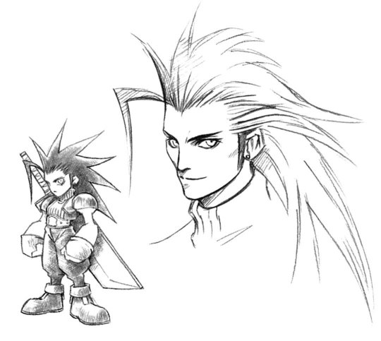
BOOM first pass design

once I have my first design, I just slowly decide what parts I want to emphasis and exaggerate :) for zack, I like to really push his hair and his eyes. I like to make his visuals very expressive because I see him as a character who isn't very good at verbalizing his emotion, having him physically readable makes writing comics with him easier despite this.
(In canon he actually has a tendency to completely turn around or hide his face when he cries! You can see this when Angeal dies, he hides his face behind the sword, later faces away from aerith in the church when he cries, and then at the end during the final meal he turns away from them again. Just a little zack fact.)
I also like to push triangular shapes in his design to give him a sort of super hero vibe. Triangle eyes, triangle body type, triangle hair, that sorta thing. Triangles are the strongest shape, so they give him a sort of immovable vibe, however triangles in character designs are also often used for villains because they convey a sharpness and unpredictability. That's why I use them in my sephiroth design a lot too LOL, parallels.
I also tend to push the wolf/dog theme a lot with him, with the sharp teeth, big fur hair, and puppy dog ear bangs in his younger design. Mostly because. yea duh Zack The Puppy BAHBVGFHD but also to mirror Sephiroths own theme of dehumanization. Zack is a person second and an attack dog first to ShinRa. Sephiroth the hero and Zack the puppy..... ive got a lot of thoughts but idk how to say them i just hope it comes out in my drawings at all thats what its all about LMAO


Some other things I try to add are visual parallels I give him to my sephiroth design, with a low nose, sharper jaw, big shoulder pauldrons and a triangle body type. It's more obvious from how I draw their side profiles tho hehe


And that's how I got to my current Zack design!! sorry for the ramble, thanks for giving me an excuse to talk about my art FWWHWH character design is a big passion of mine yippee!!
#bubby talks#ffvii#zack fair#long post#zack fair ff7#zack fair ffvii#sephiroth#sephiroth ff7#sorry this is long
87 notes
·
View notes
Note
Ferdinand (2017)

Its okayyyyy but also not really anything. Despite being based on an extremely short picture book I do there there probably was some way you could have made a decent feature length movie from the rough skeleton of it. I wish it was a gentler or even a little more “serious” movie and trying way less hard to be so wacky and zany. I wish they did more with the human side of things rather then felt the need to add like a dozen annoying comic relief animal side characters.
The movie is similar to Rio in some regards for me since both are too safe and people pleasing to say anything interesting with its topics. Not that I would expect them to tackle conservation or uh..blood sports in depth. The stuff with the slaughter house was the most engaging thing in the movie moreso then the bullfighting. Besides that there really isnt much remarkable about this movie.

The hedgehogs in the movie are the most Blue Sky(TM) character designs ive ever seen.
58 notes
·
View notes
Text
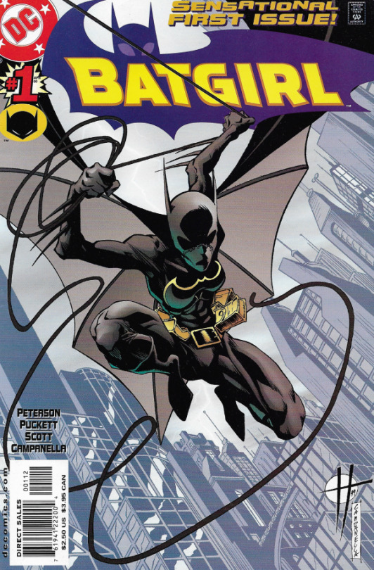
Batgirl (2000)
Perhaps my single favourite piece of writing in the comic book medium. This was my introduction to Cassandra Cain, and is the perfect place to get into her. Everyone should read Batgirl #19, and bask in the way it lays out the core of Cass' character with surgical precision. Puckett's Cass is fascinating: a fine balance of absolute confidence in her ability, crushing guilt about her past, a desperation for redemption and to see others redeem themselves, and a fundamental belief in the preservation of life.
1st batgirl on going, very good overall run, do it for Cass everyone
its quite literally required reading for cass, babs, and steph. the way kelley puckett is able to explore cass’s character through her relationships with the other bats and the parallels between her and bruce is actually insane. theres so many little details in the visual story telling as well that just make the experience that much better. the fluidity and expressiveness of the art also adds on to the overall experience. it is literally DCs magnum opus
Life changing series.
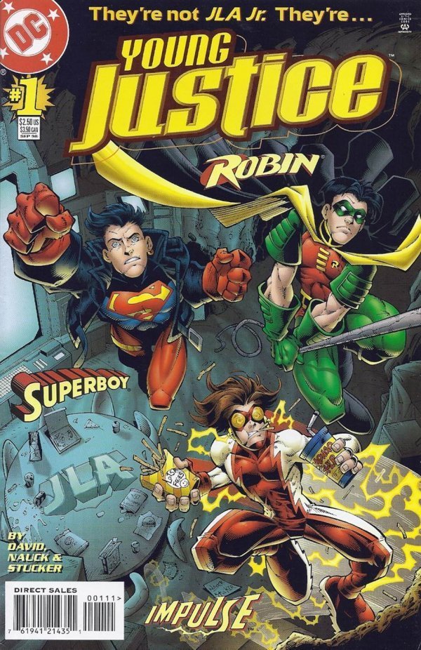
Young Justice (1998)
It's 6-8 fifteen year olds living in a cave, and their only adult supervision is a robot wind machine one of them graffiti-ed all over within the first five minutes of meeting him. The only two with anything even RESEMBLING normal childhoods are the demigod and the son of two billionaires (literally just some guy). They have an alien motorbike and at one point they save the world from aliens by playing baseball. Everyone in it is just so stupid all the time and I love that for them (god bless 🙏)
Never has a comic quite that batshit and quite that sincere graced my presence
I just love it and I enjoyed reading it
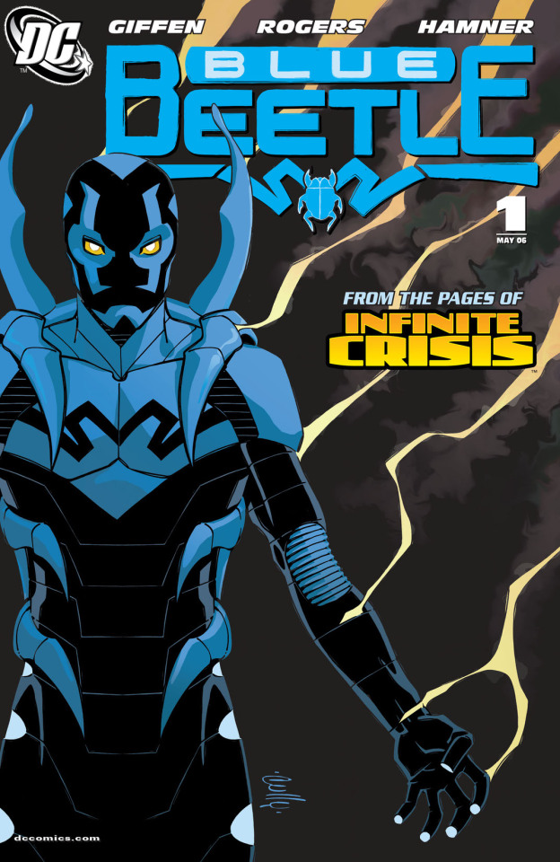
Blue Beetle (2006)
Just a good introduction to a character with a satisfying conclusion. I love you, Jaime, a guy who's just trying to do his best for his loved ones and his local community. I love you Khaji Da, scrungly lil dude speaking in glyphs. I love you, Brenda, and your complicated relationship with your aunt who adores you, but is also a crime lord. I love you Paco, a genuinely good friend. I love Jaime's family and the way they all adjust to Jaime being a superhero. I love the effort made to portray Jaime as a person with community and connections.
i looove jaime sososo much he's such a fun protagonist and the developement of his character + his relationship w khaji da is sooo interesting and well written. i love seeing him bond with his little alien bug parasite !! all of the side characters are also so great like brenda and paco are so fun and la dama is suuuch an interesting character. jaime's family is also so lovely they clearly care abt jaime so much and its nice to see a kid superhero with parents who respect and also deeply care abt their kid. the art is also very fun overall its just a really stellar run
Quite honestly one of the best written comic runs I've ever read, DC or otherwise. It flips so many standard comic book tropes on their heads and does it well. The main character is the epitome of just some guy and he is my favorite of all time.
AMAZING characters. Fresh perspectives on comics tropes that are so overused it's hard to imagine comics without them. Everyone is worthy of respect and treated with dignity, even the villains. Khaji Da's character arc is amazing. And the adults make me laugh so much. Guy and Peacemaker as mentors who IMMEDIATELY recognize this kid is FAR more emotionally mature then they are, so they're not going to bother with that side of mentoring!
#dc comics#poll#best of dc poll#batgirl#young justice#blue beetle#cassandra cain#robin#tim drake#superboy#conner kent#impulse#bart allen#jaime reyes
133 notes
·
View notes
Text
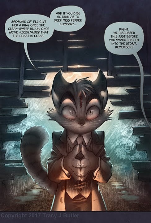
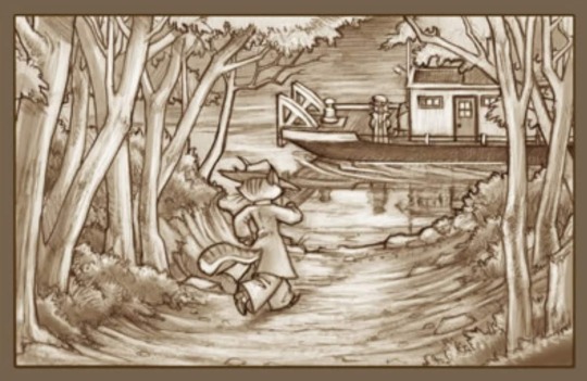
rocky and his water motif
ive seen a few people analyze rocky and his symbolism with water, and i thought id jump on the train and contribute what ive found. i looked through every piece of art in the gallery and messed around with the dead drop to find everything here! with that being said…
obvious spoiler warnings! and warning for a lot of speculation and over analyzing! a lot of things i mention are really big stretches but i added them anyways incase anyone else wants to look into it more
starting where the pilot starts and near the start of the comic (the page “lackadaisy dithyramb”), right off the bat we have an entire poem from rocky dedicated to the mississippi river. this iconic poem is literally just about the river, and he recites it in both scenes from on the bridge over the river.
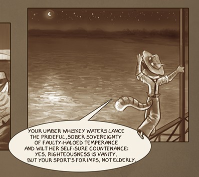
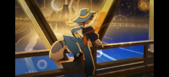
note that in both cases there is also a crescent moon featuring in the background
more poetry! this one is from the comic on the page “lackadaisy doggerel”. this is actually one of my favourite pages in the comic, its very cool! we have this poem that, again, is entirely about water. it talks about water in a metaphorical way, comparing it to memory and the passage of time. maybe ill try to analyze this poem sometime but idk im not very good at that stuff. seems to talk about rockys past but im not sure
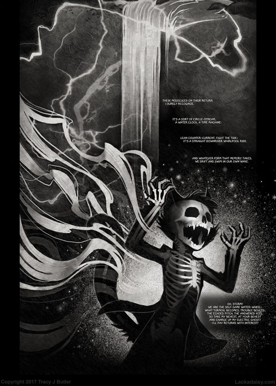
i didnt want to just put this entire page here but i will note that the page has a raging storm, an ocean, a water mill, another storm cloud and a waterfall all picured above rocky, who, in this case is ahem under water, in a way.
last bit of poetry im talking about is probably the most relevant. rockys feauture in the “lacrimosa” poem/halloween artwork shows him seemingly drowning outside a window.
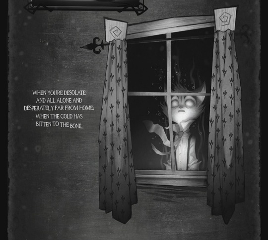
the significance of it being outside a window is somewhat unclear to me, as every other character appears in something reminiscent of a picture frame. my only idea is that its meant to show him outside of what could be a home, in reference to him getting the “unceremonious boot”. the text emphasizes this idea, saying hes away from home
this next one is more obscure and much more of a stretch! after digging around in sketchbook pages, i found this tiny little sketch on a page simply labeled “lackadaisy preview 0018”. the sketch page features sketches that were used for the page “lackadaisy palaver” in the comic, and a few bonus doodles. this was one of the bonus doodles, and i cant seem to find a comic pannel that matches it anywhere.
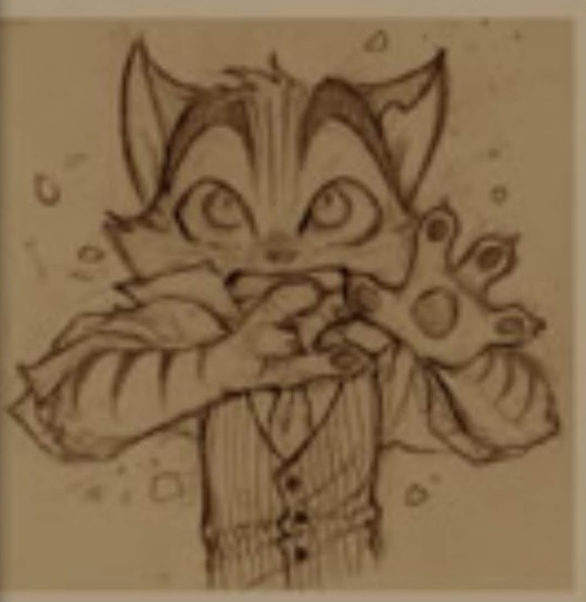
this sketch could be a lot of things, its a bit hard to tell. most likely, its an unsused pannel of rocky that was going to be used on the comic page. maybe him on whe windshield, or something like that. that being said, the first thing i thought of was the lacrimosa art. its a stretch but i thought id add it, just in case! who knows really
next up is rockys character artwork, which features him standing on a barrel floating in a river.
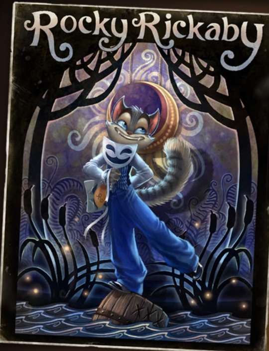
be careful rocky, you might fall! one little detail about this art that i like is that hes quite literally hiding his sadness behind his back. and again, the crescent moon motif features in the background. the cattails in this image also remind me of this scene in the pilot

…but i mean cattails do grow near water so i dont think that means anything
speaking of the pilot, this scene has rocky accidentally blowing up a water tower and flooding the area, and getting a whole bunch of water dumped on him

be careful rocky, you might get hurt! ...i dont think he cares
one last note from the pilot (for now) is a line from mitzi after rocky comes back with alcohol for them. it could mean nothing, could be foreshadowing, who knows


note in the second image: “rest” as in the rest of the alcohol they were meant to bring back
the music video for liquid gold ends with rocky dropping a bottle and the golden liquid flooding the room
i wasnt even looking for water symbolism when i found this, i was just rewatching the music video for fun! i just about had a heart attack when it ended like that D: rocky please dont drown
back to the comics! sorry this is a bit all over the place. forgive me for just uploading an entire comic page, but the page “lackadaisy thunderhead” features rocky standing over a river. at the bottom of the pannel on the right there are daisys, a symbol that features in a lot of rockys artwork and is generally associated with the lackadaisy speakeasy. the daisys could just be for aesthetics or to frame the pannel better, but its also notable that they appear where the water is.
the name “thunderhead” is interesting given some other pannels
not sure what it means though
the very first scene in the comic aside from the introduction shows rocky at the river.
in the page “lackadaisy trouble boys” from the early concept art mitzi makes a comment about rockys aim, and makes an… interesting metaphor
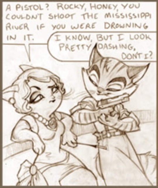
side note: im gonna cry is that actually how rocky gets the little hole in his ear lmao

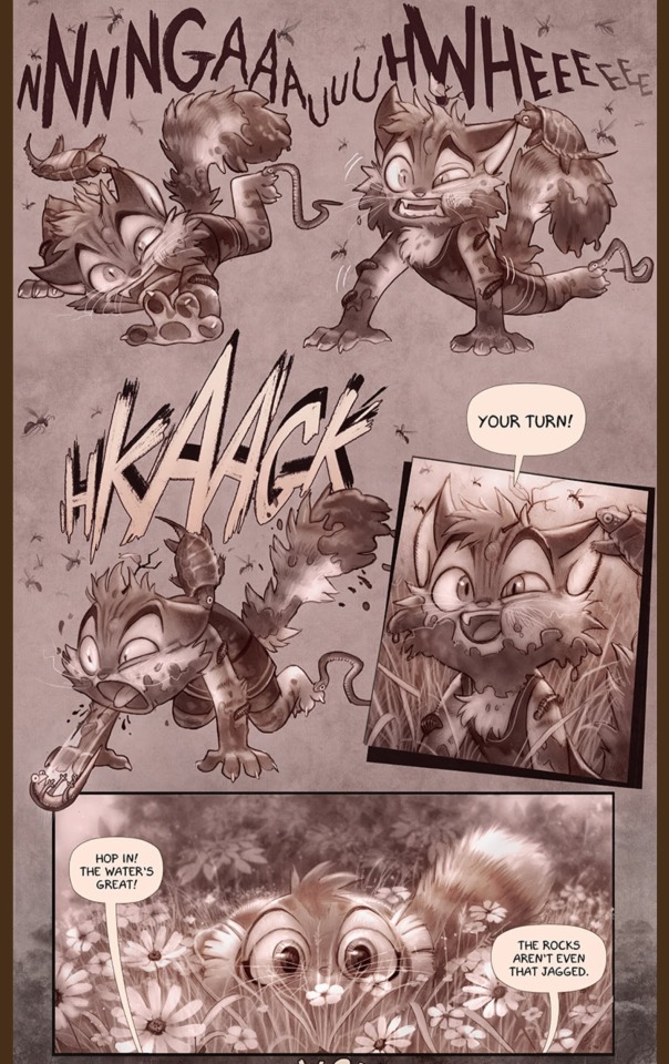
the mini comic “wilderness” has rocky climbing out of a small muddy pool of water claiming “the waters great”, despite looking absolutely horrible. isnt shown here, but he says he cant feel his legs and calls for freckle to come back.
knock knock! its time for the playing cards! rockys card depicts him as the 8 of spades, although hes also been shown as the ace of clubs multiple times.
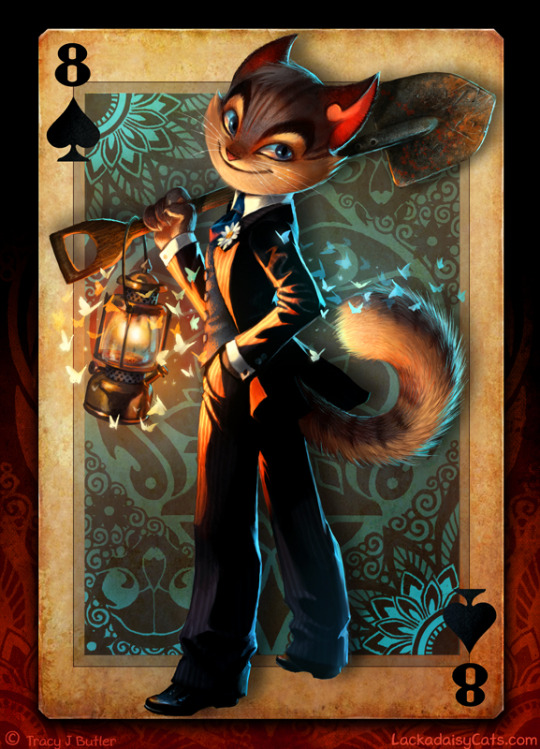
first up, 8 of spades! i really like this art but i have a lot of questions. for one, why is rocky holding a shovel and whats with the lantern? theres nothing wrong with it, just caught my attention since i think freckle is drawn with shovels a lot more than rocky (might be wrong on that though) second, this is the only picture i can find where you can CLEARLY see rockys head injury healed. cool! third, the outfit hes wearing is… atypical for rocky, you could say. for obvious reasons. he always wears blue, why suddenly the change to black? and obviously, the choice of making him the 8 of spades. some quick google searches and this is what i found: from various websites (the first things that popped on on google), apparently spades symbolizes the winter season and the water element. it seems to represent old age, change, wisdom and acceptance. the number 8 supposedly represents victory, prosperity and overcoming. i was going to put images, but i could only have 30 and i ran out of space lmao im so sorry this is SO LONG djfjsjnrfj
make of it what you will. as for the ace of clubs:
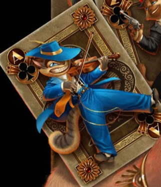
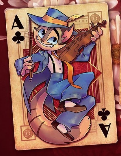
my google searches were much less interesting so ill just put my own thoughts. the clubs is likely just for the association with the lackadaisy speakeasy, as in both of these cases he is shown alongside other characters from the lackadaisy and everyone has clubs. as for him being the ace, the main notable thing about the ace is that its generally the highest card.
the main idea i personally took from these cards is the idea rocky will possibly not be a part of the lackadaisy in the furure. we see him in his classic outfit, no head injury as the ace of clubs, with clubs being associated with the lackadaisy. but we also see him with a healed head injury (so clearly in the future) with a new outfit and no more clubs suit.
not sure if this is even notable but this entire (very iconic) scene in the comic takes place in the rain
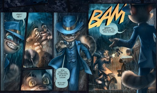
be careful rocky, you might get shot!
and now, even more crescent moon motifs
so why have i been pointing this out? well its undeniable that rocky also has motif with this crescent moon. i have no idea what it means but heres my very quick five minute thoughts on it: one: the moon controls the tide. obviously a river doesnt really have a tide, but still! theres some association with water there, so its notablea. two: this might be a stretch but in the pilot theres this very memorable frame where it shows the reflection of the moon (which initially looks like a cat) ahem in the water. obviously water reflects stuff so its not abnormal for the moon to reflect in the water but i just thought it was cool!


aaaand last but not least

this analysis was brought to you while listening to hatsune miku, i probably made a lot of typos so yell at me and ill fix them but not my grammar its terrible and im not fixing that, lmk your thought and if i missed anything, thank you for reading have a nice day sorry it was so long <3
82 notes
·
View notes
Text
Analysis of how KaySD draws Sergey Razumovsky
Or: trying to justify a thirstpost about the world's most terrible man
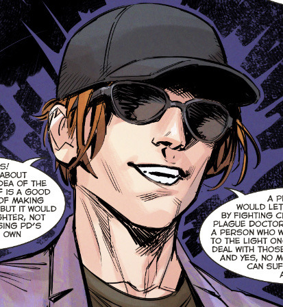
Sergey's gone through a number of artists through the years, and I gotta say, KaySD's rendition has captured my heart. In fact, it was a screenshot of Kay's Sergey that first got me into Major Grom. While Phob's is the official art style that we associate with the comics, Kay's style, I believe, better serves Sergey's character in the current PD run.
Genre-wise, PD returns to being a big-action, ensemble comic, which--compared to The Game's tight conflict and human drama focus--deliberately implements Kay's more traditionally comic-book style to this effect. The first arc (nine volumes in total) of PD are all Kay; though the current issues are being outsourced to a number of different artists now, Kay's style--with its roots in distinctly American superhero comics, such as DC--was what they wanted to prime audience's expectations with. After Time of the Raven, there was a big push for Bubble to adhere their stories to big names like Marvel, and with that came the desire to usher in things like a multiverse, space and supernatural elements, and franchise crossovers. Plague Doctor was one of their latest installments of that new "culture," and they had to match their aesthetics appropriately.
Okay, but that brings me back to the brainrot part of this post, which is HOT DAMN KAY'S SERGEY LOOKS SICK???
The whole idea of Plague Doctor is that, for like seven years or something, Sergey has been declared dead or missing or otherwise MIA. Nobody, both in-universe and irl, knows where he is or what the fuck he's up to. You crack open issue 1, encounter a guy in sunglasses and a hat who is painfully obviously Sergey, but you get to the last page and

(I will say this is probably the most unflattering frame of him. His chin makes him look like such a chad derogatory)
BAM. HOMEBOY IS ROCKING A NEW HAIRCUT, HE'S WEARING ANOTHER STUPID PURPLE SUIT, HE'S RIPPED, AND HE HAS BLUE EYES.
This isn't the soft, sort of angelically beautiful Sergey we're used to seeing from Phobs. It's radically different, an entirely different character almost, which was the intent.
His new look is more practical, both tactically and socially. His hair is cut, so people won't recognize him as easily. It won't get in his face or get grabbed during fights, and combined with his more muscled build, this is a Sergey who's taking things more seriously this time around. Gone is the flamboyant cape and swishing fiery locks; the plague doctor campaign is no longer a passion, but a duty. And he's ready to enter the thunderdome and get his hands dirty and god damn it, he will die trying.
Kay does take care to preserve the core elements of Phob's Sergey, while making a hard left into traditional masc territory. He's still unrealistically attractive, in that distinctly soft and youthful way. He's more noticeably fit but still maintains a slim, smooth appearance.
But on top of that, he adds this charm and charisma to him that is distinctly boyish (as in, young and mischievous, a pretty face that's up to no good). It makes his persona as a young, leftist radical more believable; he looks like a student revolutionaire, angry and passionate about all issues topical and trending.

He does look more obviously aged. Guy is now in his mid(?) thirties, and the past five years probably amounted to like three lifetimes of stress, so it certainly makes sense. Compared to how Kay drew The Game Sergey, his face is more defined with sharper lines, muscularity, and wrinkles. The short hair also ages him somewhat, making him look less angelic and more like... a regular dude.

And of course, there's the overnight peach fuzz.

The more mature, aged look helps him actually look like a person who's lived a life as loaded and fucked up as Sergey's. He's a guy whose parents died, grew up in foster care, became a CEO that rocketed to stardom in five years, committed the most elaborate fucked up terrorist campaign ever, and then immediately fell from fame to the deepest coldest cell in St Petersburg (and this is all just the OG Major Grom run). He's not Phob's Sergey (or Rag, whoever it was in The Game)--a blameless childish pretty boy who's detached from his crimes. Kay does a good job in making Sergey have this subtle undertone of... unsettled, unhinged, what have you. I don't know how much of this is hindsight bias, but he looks like a guy with a fucked up secret. You wouldn't think twice if you were seeing him in a grocery store or something but I can imagine later recognizing his mugshot on the news and thinking wow now that i think about it, he really does look like a serial killer.
And let's talk about his fashion. For all the features of Sergey's flamboyant costumes in Phob's renditions, Kay dresses him quite casually, and it works, ironically, to make him look deceptively plain in the way all extremely rich people dress (think of the $10k white t-shirts and sunglasses get-up all rich men wear). He dresses like his current social stature: a new-money sod who has gotten used to his wealth enough that he doesn't have to show off with his clothes anymore. Of course, this could also be turned on its head and instead, be an indication of Sergey's original, cheap clothes that he habited from his childhood. Certainly, the ironic rightwing graphic tees Kay puts him in edge towards that point of view, only now they're colored by Sergey's sense of political humor. I doubt a "god guns government" shirt is selling for $500 at some luxury tailor shop.

This is what I love about Kay's Sergey. In making him look more human, we get to orient him more organically into our own world. He looks like a thirty year old loser who studied CS in college and now commits cyber terrorism and doesn't know how to cook. He looks like a young adult leftist who is terminally online and has 500+ open tabs on Marxist theory. He looks like a guy who became too rich too young, who was the world's angle and then its devil in the span of like two years, and is now disillusioned with it all, who wears $5 graphic tees and stays up all night looking behind his back and tries desperately to find something that actually matters.
Once Sergey looks more believable, he becomes more understandable. And the more we understand him, the more the story has the potential to make him intrigue and surprise and reach us in multiple, unexpected ways.
#not as expansive as I wanted but I wanted to get The Thoughts out#major grom#plague doctor#sergey razumovsky#bubble comics
162 notes
·
View notes
Text
@endlesscolddreams and @liemurienn dropped some really good replies on my USUK vs. FrUK post and it’s made me think about the differences between both pairings and why they might attract their respective fans the way they do.
Let’s begin with USUK, which nearly from series start has more canon on its side. Or rather it has more “serious” moments. Hetalia is a gag show at heart and its non-jokey parts are few and far between, ship tease included. The first gut punch most fans will encounter is Alfred and Arthur’s battle during the American War for Independence. That will definitely stick with a lot of people if for no other reason than it’s so unexpected. The funny, silly anime about pasta and gag war abruptly pivots to a main character sobbing his heart out in the rain while another looks on, stony faced, with no joke at all. This can’t not leave an impression. Even fans who loathe Alfred never try to pretend his effect on Arthur isn’t huge. Then the series carries on teasing the things left unsaid between them in both serious and silly shapshots. With all this is mind, it’s not hard to see why USUK became the big, swinging dick of Hetalia’s ships. Aside from the borderline canon Gerita, nothing else really has the weight behind it I think.
This definitely makes it what I would call an “easy” ship to get into. That sounds bad because fandoms can be very judgey about pairings they find to be basic. Just like everything else in the arts, there’s a perception among some people that if something is popular then it must be dumber/less deep/worse. Pure elitism basically. And it’s bollocks. Just because something is popular with the masses doesn’t make it worse. It just means it’s popular. Plenty of people hate USUK for the perfecly legitimate reason that it just doesn’t gel with them. But there’s always been a minority undercurrent of “I hate this just because it’s the fandom’s most visible ship!” Seen this happen a million times with other communities over the years.
USUK also has the almost universally beloved tropes of Happy, Gregarious, Extroverted one loves Moody, Gloomy, Introverted one. Who loves him back but can’t say it because tsundere. FrUK on the other hand is more subtle. It has Slowburn, Rivals/Enemies to Lovers as its bread and butter. These tropes are well loved but there’s no big, attention grabbing dramatic moment early on that makes use of and cements the FrUK interpretation of them in the minds of fans. Francis and Arthur share a lot of screentime but it’s all jokey and fun. Even the ship tease is all gags relating to Francis being comically pervy and Arthur being comically stuffy and flustered. Francis gets some heart rending moments later (Joan of Arc, the wish for a mortal life) but Arthur isn’t included. Even though he could have been because of what happened to Joan. It’s left up to the fans to add him. In another universe the Closet Cleaning arc was replaced by a Bitter Hundred Years War arc, and FrUK subsequently took the top spot in the fandom’s ship rankings as a result.
Leaving plain, old personal taste aside, I think all this divided the fandom between shippers who wanted something they could leap into and get early gratification (USUK) vs shippers who wanted to expend a little more energy on interpretation (FrUK). Because there’s plenty of drama to be had with Francis and Arthur thanks to the French/English historical rivalry (see above). But it’s not offered up on a plate in canon like with Arthur and Alfred. A USUK shipper gets drama given to them while a FrUK shipper has to dig deeper and make their own fun. Different strokes.
This kind of thing is very interesting to me. Please feel free to add on your own interpretations if you like ☺️
#hetalia#fruk#usuk#hws england#hws america#hws france#aph america#aph england#aph france#my posts#i love both pairings so don’t worry 🥰#fruk is number 1 otp#but usuk is beloved too
29 notes
·
View notes
Last Seen Blogs

traitimdoithay
live phi action
zealctry
❝ I go off like a GUN / a loaded WEAPON. ❞

gregsalvatorinyc
GregSalvatori.com
jennifercheck
jennifer's evil..

pxrkxrsth
parker