#tumblr is the new twitter
Text
It happened.
Tumblr Twitterized itself.
And I..... To be honest, I don't hate it. Sure, for many Tumblr users it's a travesty, and I totally recognize and understand the problems with such a drastic change, but to me personally it feels more comfortable, as I came from Twitter, and I've never been too much of a Tumblr user.
I think this fixes a problem Tumblr had - a lack of comfort. Tumblr forced itself to be different, which was nice and made it seem more unique, but on the other hand, I never understood why they kept it for so long.
A centered feed is better for widescreen
The left and the top of the screen are the best places for navigation, they feel so comfortable and they're immediately accessible without any submenus, though I would add an option to switch it to a left-handed mode for the, well, left-handed
Images are now a bit smaller, you see more of the post at a time, scrolling feels more intuitive.
If I were Tumblr, I would've added an option to switch to the previous design and an easy way to switch themes. "Settings -> Dashboard" is not where I'd expect to see the theming/color palette options.
There isn't really a whole lot of bad things to say about the new design because Tumblr is already not what it used to be - there's currently a clear emphasis on sharing rather than on blogging and it's only logical for it to evolve into something more Twitter-esque. Maybe this new layout will make me use it more.
2 notes
·
View notes
Text
zhang yong you're so real

3 notes
·
View notes
Text

#funny meme#lol memes#tumblr memes#memes#funny memes#best memes#dank memes#dankest memes#fresh memes#meme humor#meme template#memedaddy#memes image#nerdy memes#new memes#relatable memes#twitter memes#meme#lol#funny#funny content#funny pics#funny post#funny shit#funny stuff#funnyshit#hilarious#humor#humour#dark humor
30K notes
·
View notes
Text
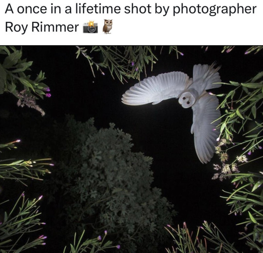
#funny#lol#haha#humor#meme#memes#tweet#twitter#funny memes#goth#gothic#spooky#pale#grunge#alternative#soft grunge#dank memes#dark humor#news#animals#birds#birdblr#photography#photographers on tumblr#cute animals#baby animals#owls
13K notes
·
View notes
Text


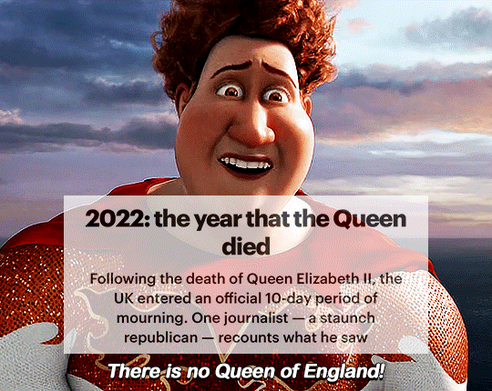
#joe biden#news#tumblr#2024 presidential election#president biden#2024#2024 elections#twitter#posts#kane52630
6K notes
·
View notes
Text
#bye tumblr 2022 it’s been fun
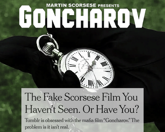
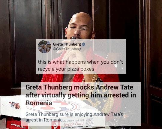
#happy new year#new year#tumblr#2022#2023#twitter#andrew tate#greta thunberg#supernatural#spn#new years eve#elon musk#memes#meme#funny#lol#tumblr meme#destiel#goncharov#*myedits
81K notes
·
View notes
Text


Happy lego monkie kid week, or whatever.
#these are the two drawings that ppl somehow end up finding on Twitter whenever a new season releases#so I thought I'd post it here#though im not sure how big the lmk sphere is on tumblr#lmk swk#lego monkie kid swk#lmk macaque#six eared macaque#shadowpeach#lmk fanart#lego monkie kid
5K notes
·
View notes
Text
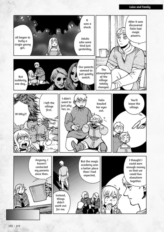
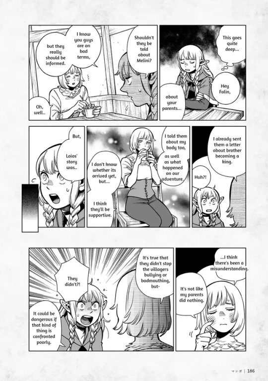
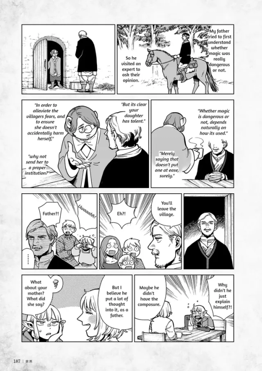
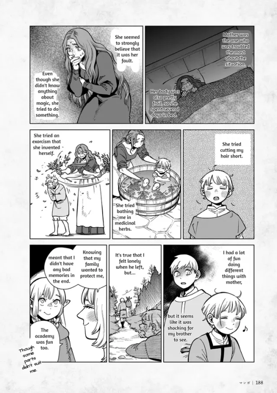
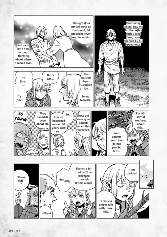
hadn't seen anyone post the full comic about laios + falin's family on tumblr yet so. here you go
source is from the reddit
#in general i haven't seen as many translations of the new content get posted here which is like fine#but it was annoying me that the pages shared here and on twitter were missing sections. lore is serious business#the less lore the average tumblr user knows about the more nonsensical takes i'm forced to read. so im taking direct action#this is the last time im posting manga pages here i don't want to become a manga pages blog#beepbeep.txt#dungeon meshi#dungeon meshi spoilers
5K notes
·
View notes
Text

· · ͟͟͞͞꒰ 𝓝ew symbols ◌
ıllı. ➜ ░ 𓏲ּ .ᐟ. 𓇼 ִֶָ 𓂃⊹ ִֶָ 𖥸
𖤛 𔒌 ╰╮ ᨒ. ᘝ 𖠋 ⚘( ၴႅၴ واو
𓇢𓆸 𝜗𝜚 .☘︎ ݁˖ 𓍢ִ໋🀦 ١٥٧٤ ♡ ̆̈ ๋࣭ ⭑⚝
#messy locs#instagram bios#bios messy#long bios#messy aesthetic#messy long bios#random bios#cute bios#soft bios#twitter bios#bios instagram#girls icons#instagram packs#instagram story#bio rp#tumblr bios#short bios#messy bios#mini bios#mini locs#moodboard#messy#new symbol#random symbols#cute symbols#cute symbol#text symbols#symbols#shorts bios#bios short
5K notes
·
View notes
Text
cubito cellbo 🔎
#myart#qcellbit#qsmp#qsmp cellbit#illustration#artists on tumblr#cellbit fanart#q!cellbit#cellbit qsmp#qsmp fanart#drawing#cellbit#digital art#digital illustration#fanart#guapoduo#qsmp roier#roier#spiderbit#here is my new home S2#I'm without twitter :(
1K notes
·
View notes
Text
Who loves reading old fanfics and WIPs instead of writing?
This mf bye

#Fanfiction#Fanfic#procrastinating#Writing#I'm a guilty mf#Perdoname madre por mi vida loca#Using Tumblr instead of Twitter#tumblr is the new twitter#sorry i don't make the rules#demon slayer#kimetsu no yaiba#kny#JJK#jujutsu kaisen#Jujutsu#Fanfictions#Fics
0 notes
Text
#twitter memes#relatable memes#new memes#nerdy memes#memes image#funny memes#fresh memes#dankest memes#true memes#history memes#tumblr memes#best memes#dank memes#lol memes#memes
26K notes
·
View notes
Text
I’d love to get @photomatt’s thoughts on the latest Breaking News, but I have no idea if he’s a Dropout subscriber.
0 notes
Text
5K notes
·
View notes
Text
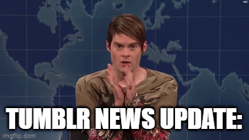


i'm back on my bullshit hope it's okay
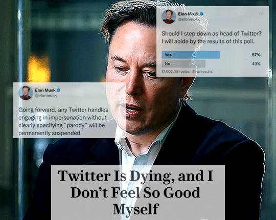
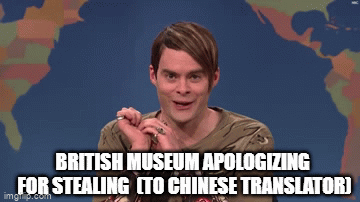
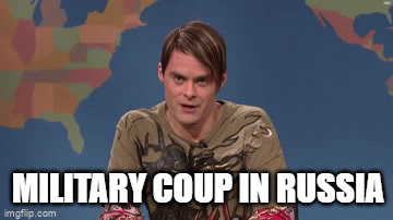
#tumblr news update#russia#putin#joe biden#kesha#helluva boss#elon musk#mark zuckerberg#british museum#yellowstone river#marvel#secret invasion#reddit#twitter#stock market#titanic#titan submersible#oceangate
9K notes
·
View notes
Last Seen Blogs
a-book-wonderland
City of Books

-undertaker
FUCK YEAH, SHINIGAMI DESU!

kirupile
Voci Nel Silenzio

incorrect-jellicle-quotes
The Cat’s Meow

indn241project2morga-blog
INDN 241 Project 2