#viewport width
Explore tagged Tumblr posts
Visit Tumblr Blog
Explore Tumblr blogs with no restrictions, modern design and the best experience.
Last Seen Tumblr Blogs


Fun Fact
Hackers stole 65M passwords from Tumblr in 2013.
Text
absolutely wild that in 2025 there still isn't a way to set a font size by width rather than height with css
#i know there are javascript workarounds shhh#also viewport width doesn't count#i'm talking pure pixels#or even % of parent element rather than viewport
0 notes
Text
Introduction To HTML
[Note: You need a text editor to do this. You can use Notepad or Text Edit. But it's so much better to download VS Code / Visual Studio Code. Save it with an extension of .html]
HTML stands for Hyper Text Markup Language
It is used to create webpages/websites.
It has a bunch of tags within angular brackets <....>
There are opening and closing tags for every element.
Opening tags look like this <......>
Closing tags look like this
The HTML code is within HTML tags. ( // code)
Here's the basic HTML code:
<!DOCTYPE html> <html> <head> <title> My First Webpage </title> </head> <body> <h1> Hello World </h1> <p> Sometimes even I have no idea <br> what in the world I am doing </p> </body> </html>
Line By Line Explanation :
<!DOCTYPE html> : Tells the browser it's an HTML document.
<html> </html> : All code resides inside these brackets.
<head> </head> : The tags within these don't appear on the webpage. It provides the information about the webpage.
<title> </title> : The title of webpage (It's not seen on the webpage. It will be seen on the address bar)
<body> </body> : Everything that appears on the webpage lies within these tags.
<h1> </h1> : It's basically a heading tag. It's the biggest heading.
Heading Tags are from <h1> to <h6>. H1 are the biggest. H6 are the smallest.
<p> </p> : This is the paragraph tag and everything that you want to write goes between this.
<br> : This is used for line breaks. There is no closing tag for this.
-------
Now, we'll cover some <Meta> tags.
Meta tags = Notes to the browser and search engines.
They don’t appear on the page.
They reside within the head tag
<head> <meta charset="UTF-8"> <meta name="viewport" content="width=device-width, initial-scale=1.0"> <meta name="description" content="Website Description"> <meta name="Author" content="Your Name"> <meta name="keywords" content="Websites Keywords"> </head>
Line By Line Explanation:
<meta charset="UTF-8"> : Makes sure all letters, symbols, and emojis show correctly.
<meta name="viewport" content="width=device-width, initial-scale=1.0"> : Makes your site look good on phones and tablets.
<meta name="description" content="Website Description"> : Describes your page to Google and helps people find it.
<meta name="author" content="Your Name"> : Says who created the page.
<meta name="keywords" content="Website's Keywords"> : Adds a few words to help search engines understand your topic.
_____
This is my first post in this topic. I'll be focusing on the practical side more than the actual theory, really. You will just have some short bullet points for most of these posts. The first 10 posts would be fully HTML. I'll continue with CSS later. And by 20th post, we'll build the first website. So, I hope it will be helpful :)
If I keep a coding post spree for like 2 weeks, would anyone be interested? o-o
#code#codeblr#css#html#javascript#python#studyblr#progblr#programming#comp sci#web design#web developers#web development#website design#webdev#website#tech#html css#learn to code#school#study motivation#study aesthetic#study blog#student#high school#studying#study tips#studyspo#website development#coding
100 notes
·
View notes
Text
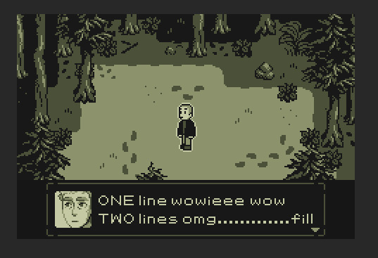
The Spell statblock is FINALLY done after WEEKS of work.
Thank you Bootstrap ourgh
And it works on any viewport width, so phone people will not explode !
39 notes
·
View notes
Text
Shit writing Saturday <3
Haven’t done one of these in a while! To be fair… haven’t written smth I was excited to share in a while. Here’s this!! Lmk what you think 🥰🥰
Cody continues to stare, unseeing, out the viewport.
“I don’t know these stars,” he murmurs finally.
Kenobi says nothing. Cody knows he’s listening all the same.
“When I… grew up, on Kamino. There were rare cloudless nights. The seas would still for maybe only a few hours at a time, and the clouds would part around these brilliant points of light in a pitch black sky.”
He closes his eyes. He can just about see it; the rain-slicked platform, the cadets all hushing each other as they hurried outside, hoping no longnecks would catch them, no trainers would see them. Hoping that Fett himself was asleep, that his own cadet had been enough of a handful that day that Fett wouldn’t catch them either, all of them breaking rules.
“We would find our way around the biggest stars, first. The brightest. The ones that were always there. Those were our trainers. The guiding stars to direct us to where we needed to look. And then… we started naming the other stars. And we named them after ourselves. After each other. Our batchers, our squaddies, anyone. There were so many stars in the sky… but there were so many of us, too, what felt like enough to give each of those stars a name. The command formation has me, Bly, Fox, Wolffe, and Ponds, about two fingers’ width up from the star that was Alpha-17.
“Each of those names on that report—” Strato. Pusher. Scald. Cinder. Fuck, he knew where each of their stars was.
His eyes snap open again. Unfamiliar stars fall past him. It’s a cold sort of comfort, to distance himself from the urge to scream that rises in his throat.
“Cody,” Kenobi whispers, near silent.
He drops his forehead to his knees. “A swath of the sky has gone dark,” he replies. “And there’s nothing I can do.”
#dani writes#codywan#star wars#commander cody#obi wan kenobi#shit writing Saturday#wip weekend#this fic makes me insane actually#this shit came to me one night and then BOOM it was on the document idk about anything in between
146 notes
·
View notes
Text

question: dialogue panel full viewport width or no?
18 notes
·
View notes
Text
I learnt the 'vw' unit in CSS~!
% and rem/em units weren't working properly for the responsiveness so I search online for other units I could use and I came across vw and now I'm satisfied! Scales semi-smoothly~! 😏
Using vw means the font size is directly proportional to the width of the viewport.
You don't need to worry as much about setting breakpoints for different screen sizes. The font size adjusts automatically based on the viewport.
Hope this helps other people learning CSS and working on making their site responsive! I used the vw unit on the font-size, padding height and width of the elements! Might need to add it to the box-shadow property too? 🤔💭
#codeblr#coding#progblr#programming#studyblr#studying#computer science#tech#css#css tips#comp sci#programmer
86 notes
·
View notes
Text


seamless fruitiger metro inspired site background !
» i had absolute HELL finding site backgrounds when i first started out (╥﹏╥) i usually just use solid colors now ... but i decided to make it a little easier for someone else to make their own site! as long as the width of the background image is set to the viewport, this image should seamlessly transition to itself when it repeats.
» reblog or send a couple bucks to $ anonymousangelboy to use :)
» colorless ver + seamlessness test under the cut


!! recolors still need to abide by the usage terms !! tag me if you post a recolor, id love to see!
seamlessness test:
#neocities#rentry#rentry resources#edit blog#editblr#my edit#rentry decor#rentry graphics#codeblr#site background#calne's creations
10 notes
·
View notes
Text
100 days of code - day 22
Hello again 😊
Today I studied a few topics, they were: SVG, Tables, and CSS units.
SVG is an image format based in vectors and geometrical shapes, instead of pixel, it means that svg can scale to any size without losing resolution. SVGs are widely used on the web to create icons, logos, and this graphic stuff.
Tables are tables, I learned how to create one, how to style it, and the best practices using it.
Also, I learned about CSS units, until now I was using almost only px that is a absolute unit, It doesn't scale, different from other relative units like em, rem, vh and vw that scale relative to something and are ideal for responsive websites.
With vw I can make the font size always be x% of the viewport width, like so:
That's it 😴

#day 22#100 days of code#100daysofcode#codeblr#programming#progblr#studyblr#computer science#1000 hours#code#100 days of productivity#100 days of studying#software development#100 days challenge#tech#javascript#html css#coding
40 notes
·
View notes
Text
Minetest shrine is now mobile friendly. Mostly I added a set of plain links to the top of the page when the viewport is below a certain size.
The animated links panel still doesn't play well with resizing much. On desktops you are supposed to view it in full screen. I probably won't bother changing that.
Bottom line; it now works for mobile. The screenshots are a bit small, but you can zoom in fine. Or open the images in a new tab if you want them full size.
The shrine is made for desktop, but it doesn't look to bad on mobile. I consider that a win.
More importantly, for some reason I am having trouble getting images in my blog to resize to mobile layouts when I am not specifically targeting them by class or explicitly defining them in the html. This is obviously not great when you just want to make a blog post with an image. I played around with the css for a while, and am currently stumped.
This is also an issue, since the links is supposed to be fixed to a certain position of the screen relative to the device width, and right now, if I have an image in my blog post, that will resize the screen to fit the image. Meaning the links are way far off to the right, off screen unless you zoom way out.
Ill keep working on it, but right now, I feel like I am banging my head against a rock. Inspecting the element shows that it should be working; but when I actually load it up on mobile, it doesn't resize the image at all. Ive tried limiting it by vw, by %, and by straight up px. Nothing is working.
2 notes
·
View notes
Text
Spacing and Sizing in Web Design 📐✨
Understanding spacing and sizing is crucial for creating an intuitive and visually appealing web design. Let’s break it down!
1. What is Spacing?
Margin: The space outside an element. It controls how far apart elements are from each other.
Padding: The space inside an element. It affects the space between the content and the element’s border.
2. Why is Spacing Important?
Readability: Adequate spacing improves text readability and overall user experience.
Hierarchy: Proper spacing can help establish a visual hierarchy, guiding users’ attention to important elements.
Aesthetics: Well-spaced designs look cleaner and more professional.
3. Sizing Elements
Fixed Sizes: Set dimensions that won’t change regardless of the viewport (e.g., width: 200px;).
Fluid Sizes: Use percentages or viewport units (e.g., width: 50%;) for a responsive design that adapts to different screen sizes.
Responsive Design: Combine fixed and fluid sizing with media queries to ensure elements resize appropriately on various devices.
4. The Role of Interior Spacing
Example: Buttons: The size of a button is influenced by both its width/height and its padding. A button with too little padding may look cramped, while excessive padding can make it appear too large.
5. Best Practices for Spacing and Sizing
Consistent Units: Use consistent units (like rem or em) to maintain scalability across your design.
Grid Systems: Implement a grid layout for balanced spacing and sizing, making the design more predictable and user-friendly.
Whitespace: Don’t underestimate the power of whitespace; it enhances focus and reduces clutter.
6. Testing and Iteration
Regularly test your designs on various devices to ensure spacing and sizing work well in all contexts.
Gather feedback from users to identify areas needing adjustments.
Quick Tips:
Aim for a harmonious balance between spacing and sizing.
Use design tools or frameworks that offer predefined spacing/sizing options.
Be mindful of touch targets; ensure buttons and links are large enough for easy interaction.
Mastering spacing and sizing will elevate your web design, making it more functional and visually appealing! 🌟
----------
What marketing strategies are you excited to try this year? Let’s share ideas and inspire each other! Visit Our Web Design Blog!
5 notes
·
View notes
Text
HTML (HyperText Markup Language), web sayfalarının yapısını ve içeriğini tanımlamak için kullanılan bir işaretleme dilidir. İnternet tarayıcıları tarafından okunarak görsel olarak kullanıcıya sunulan web sayfalarının iskeletini oluşturur. HTML, metin, resim, bağlantılar, tablolar ve diğer multimedya öğelerini düzenlemek için çeşitli etiketler kullanır.
HTML, aşağıdaki gibi ana unsurlardan oluşur:
Etiketler (Tags): İçeriği tanımlayan yapısal bileşenlerdir. Örneğin, <h1> etiketi bir başlığı belirtir, <p> etiketi bir paragrafı tanımlar. Çift taraflı etikette açılış (<etiket>) ve kapanış (</etiket>) bulunur.
Öznitelikler (Attributes): Etiketlere ek bilgi sağlar. Örneğin, <a href="https://example.com"> etiketi, bağlantının gideceği adresi belirtir.
Elementler: Etiketler ve onların arasındaki içerikten oluşur. Örneğin, <p> Bu bir paragraftır. </p> bir elementtir.
HTML Yapısı: HTML dosyası, genellikle bir <!DOCTYPE html> bildirimi, <html>, <head>, ve <body> gibi ana bölümlerden oluşur.
Örneğin, temel bir HTML yapısı şu şekildedir:
———————————————————
<!DOCTYPE html>
<html lang="tr">
<head>
<meta charset="UTF-8">
<meta name="viewport" content="width=device-width, initial-scale=1.0">
<title>Örnek Sayfa</title>
</head>
<body>
<h1>Merhaba Dünya!</h1>
<p>Bu, bir HTML örneğidir.</p>
</body>
</html>
———————————————————
HTML'nin ana amacı, web içeriklerini organize etmek ve yapılandırmaktır. Tarayıcılar, HTML kodlarını okuyarak kullanıcıların görsel olarak etkileşim kurabilecekleri bir web sayfası oluşturur.
———————————————————
Telif Hakkı Uyarısı!
Bu içerik bana aittir ve izinsiz kullanımı, kopyalanması veya paylaşılması yasaktır. Lütfen kaynak belirtmeden veya izin almadan paylaşımda bulunmayınız. Tüm hakları saklıdır.
———————————————————
#batman#captain curly#dan and phil#formula 1#free palestine#jujutsu kaisen#agatha harkness#anya mouthwashing#bucktommy#cats of tumblr
4 notes
·
View notes
Text
Made progress on the extended adventure plate page. No idea why the tab buttons on the glamour section don't change like they do in Character window, I've tried to fix it so many times
It takes a while to load due to all the image assets, so I intend to resize a bunch of the non-interchangable ones and maybe make add a loading screen.
Also started making a trust-inspired page for displaying info on multiple characters.

They're both semi-responsive, they both will break on mobile because frankly why would you view these on a tiny phone, but the adventurer plate page scales with your screen using vh, while the second scales using @ media viewport widths!
5 notes
·
View notes
Text
..."What I keep seeing is the conflation of not being comfortable with being unsafe, and I think it’s kind of a cop-out for the university to say this is about antisemitism."
..."I made the decision to skip my family’s Passover and go to the Passover Seder in the encampment because I kept seeing stupid-ass people online talking about how this movement was antisemitic. To me, it embodied the spirit of Passover, which is the liberation of oppressed people."
.."I was telling them[NYPD], “This is our campus, and you’re not keeping us safe; you’re endangering us.” And one officer had the nerve to say, “We’re here to keep you safe.” Moments later, they threw our friends down the stairs. I have images of our friends bleeding. I’ve talked to friends who couldn’t breathe, who were body slammed, people who were unconscious. That’s keeping us safe?
..."The violence student protesters experienced at the hands of the police is connected to the violence Israel is carrying out. We know that police are sent from the United States to be trained in Israel by IDF soldiers, and we know that they share military tactics and weapons and technologies."
#student protests#student journalism#student activism#palestine#free palestine#isreal#gaza#apartheid#genocide#colonization#american imperialism#us politics#police state
3 notes
·
View notes
Text
CSS One-Liners to Improve (Almost) Every Project
CSS One-Liners to Improve (Almost) Every Project
#css#webdev#listicle
Most of these one-liners will be one declaration inside the CSS rule. In some cases, the selector will be more than just a simple element; in others, I will add extra declarations as recommendations for a better experience, thus making them more than a one-liner —my apologies in advance for those cases.
Some of these one-liners are more of a personal choice and won't apply to all websites (not everyone uses tables or forms). I will briefly describe each of them, what they do (with sample images), and why I like using them. Notice that the sample images may build on top of previous examples.
Here's a summary of what the one-liners do:
Limit the content width within the viewport
Increase the body text size
Increase the line between rows of text
Limit the width of images
Limit the width of text within the content
Wrap headings in a more balanced way
Form control colors to match page styles
Easy-to-follow table rows
Spacing in table cells and headings
Reduce animations and movement
Limit the content width in the viewport
body { max-width: clamp(320px, 90%, 1000px); /* additional recommendation */ margin: auto; }
Adding this one-liner will reduce the content size to occupy 90% of the viewport, limiting its width between 320 and 1000 pixels (feel free to update the minimum and maximum values).
This change will automatically make your content look much nicer. It will no longer be a vast text block but something that looks more structured and organized. And if you also add margin: auto; to the body, the content will be centered on the page. Two lines of code make the content look so much better.
Aligned and contained text looks better than a giant wall of text
Increase the text size
body { font-size: 1.25rem; }
Let's face reality: browsers' default 16px font size is small. Although that may be a personal opinion based on me getting old 😅
One quick solution is to increase the font size in the body. Thanks to the cascade and em units browsers use, all the text on a web page will automatically increase.
Larger text size makes things easier to read.
Increase the space among lines
body { line-height: 1.5; }
Another preference for improving readability and breaking the dreaded wall of text is increasing the space between lines in paragraphs and content. We can easily do it with the line-height property.
Spaces between lines break the wall of text and the rivers of white.
This choice (with the previous two) will considerably increase our page's vertical size, but I assure you the text will be more readable and friendlier for all users.
Limit the size of images
img { max-width: 100%; }
Images should be approximately the size of the space they will occupy, but sometimes, we end up with really long pictures that cause the content to shift and create horizontal scrolling.
One way to avoid this is by setting a maximum width of 100%. While this is not a fool-proof solution (margins and paddings may impact the width), it will work in most cases.
Prevent horizontal scrolling and make images flow better with the text
Limit the width of text within the content
p { max-width: 65ch; }
Another tactic to avoid the dreaded wall of text and rivers of space is to apply this style even in conjunction with the max width in the body. It may look unnecessary and sometimes weird, as paragraphs will be narrower than other elements. But I like the contrast and the shorter lines.
A value of 60ch or 65ch has worked for me in the past, but you can use a different value and adjust the max width to match your needs. Play and explore how it looks on your web page.
Break the bigger chunks of text into smaller blocks for readability
Wrap headings in a more balanced way
h1, h2, h3, h4, h5, h6 { text-wrap: balance; }
Headings are an essential part of the web structure, but due to their larger size and short(-er) content, they may look weird. Especially when they occupy more than one line. A solution that will help is balancing the headings with text-wrap.
Although balance seems to be the most popular value for text-wrap, it is not the only one. We could also use pretty, which moves an extra word to the last row if needed instead of balancing all the content. Unfortunately, pretty has yet to count on broad support.
Balanced wrapping can improve visibility and readability
Form control colors to match page styles
body { accent-color: #080; /* use your favorite color */ }
Another small change that does not have a significant impact but that makes things look better. Until recently, we could not style native form controls with CSS and were stuck with the browser display. But things have changed.
Developing a whole component can be a pain, but setting a color that is more similar to the rest of the site and the design system is possible and straightforward with this one-liner.
It's the small details (and colors) that bring the page together
Easy-to-follow table rows
:is(tbody, table) > tr:nth-child(odd) { background: #0001; /* or #fff1 for dark themes */ }
We must use tables to display data, not for layout. But tables are ugly by default, and we don't want data to look ugly. In particular, one thing that helps organize the data and make it more readable is having a zebra table with alternating dark/light rows.
The one-liner displayed above makes achieving that style easy. It can be simplified to be only tr without considering the tbody or table parent, but it would also apply to the table header, which we may not want. It's a matter of taste.
Easier to follow the data horizontally (by row)
Spacing in table cells and headings
td, th { padding: 0.5em; /* or 0.5em 1em... or any value different from 0 */ }
One last change to make tables more accessible and easier to read is to space the content slightly by adding padding to the table cells and headers. By default, most browsers don't have any padding, and the text of different cells touches, making it confusing to differentiate where one begins and the other ends.
We can change the padding value to adjust it to our favorite size. However, avoid overdoing it to avoid unnecessary scrolling or too much blank space.
Easier to follow data horizontally and vertically
Reduce animations and movement
@media (prefers-reduced-motion) { *, *::before, *::after { animation-duration: 0s !important; /* additional recommendation */ transition: none !important; scroll-behavior: auto !important; } }
Okay, okay. This code is way more than a one-liner. It has a one-liner version (removing animations by setting their duration to zero seconds), but other things on a web page make elements move.
By setting these declarations inside the prefers-reduced-motion media query, we will respect the person's choice to have less movement. This approach is somewhat radical because it removes all movement, which may not necessarily be the user's intent -it is "reduced motion" and not "no motion." We can still preserve movement on a case-by-case basis if appropriate.
No animations? No problem!
2 notes
·
View notes
Text

<!doctype html><html lang="en-US"> <head> <meta data-rh="" charSet="utf-8"/><meta data-rh="" content="width=device-width, initial-scale=1" name="viewport"/><meta data-rh="" content="#001936" name="msapplication-TileColor"/><meta data-rh="" content="https://assets.tumblr.com/pop/manifest/mstile-150x150-b040e390.png" name="msapplication-TileImage"/><link data-rh="" href="https://assets.tumblr.com/pop/manifest/favicon-0e3d244a.ico" rel="shortcut icon" type="image/x-icon"/><link data-op/js/fallback/1254-d1e96a0c.js" defer crossorigin="anonymous" nonce="NTMxMTMzMWI3MGZiMWM5MzIzOWFjZjlkYmU3NTlkYzg="></scr' + 'ipt>'+' <script src="https://assets.tumblr.com/pop/js/fallback/2121-76375b2d.js" defer crossorigin="anonymous" nonce="NTMxMTMzMWI3MGZiMWM5MzIzOWFjZjlkYmU3NTlkYzg="></scr' + 'ipt>'+' <script 53, 1); --content-blue: rgba(0, 110, 153, 1); --content-purple: rgba(74, 55, 153, 1); --content-pink: rgba(153, 58, 124, 1); --content-
1 note
·
View note
Text

Responsive Web Design: Best Practices for Optimal User Experience and SEO
In today’s digital age, where the majority of internet users access websites through various devices, responsive web design has become paramount. It’s not just about making a website look good; it’s about ensuring seamless functionality and accessibility across all screen sizes and devices. Responsive web design (RWD) is a critical approach that allows websites to adapt to different devices and screen sizes, providing an optimal viewing and interaction experience.
Importance of Responsive Web Design:
Responsive web design is essential for several reasons. Firstly, it improves user experience by ensuring that visitors can easily navigate and interact with the website regardless of the device they’re using. This leads to higher engagement, lower bounce rates, and increased conversion rates. Secondly, with the proliferation of mobile devices, responsive design is crucial for reaching a wider audience. Google also prioritizes mobile-friendly websites in its search results, making responsive design a key factor for SEO success.
Key Principles to Follow:
Fluid Grids: Instead of fixed-width layouts, use fluid grids that can adapt to different screen sizes.
Flexible Images and Media: Ensure that images and media elements can resize proportionally to fit various devices.
Media Queries: Utilize CSS media queries to apply different styles based on screen characteristics such as width, height, and resolution.
Mobile-First Approach: Start designing for mobile devices first, then progressively enhance the layout for larger screens.
Performance Optimization: Optimize website performance by minimizing HTTP requests, reducing file sizes, and leveraging caching techniques.
Tips for Optimization:
Prioritize Content: Display essential content prominently and prioritize functionality for mobile users.
Optimize Touch Targets: Make buttons and links large enough to be easily tapped on touchscreen devices.
Viewport Meta Tag: Use the viewport meta tag to control how the webpage is displayed on different devices.
Testing Across Devices: Regularly test the website across various devices and browsers to ensure consistent performance and appearance.
Progressive Enhancement: Implement features in layers, starting with basic functionality and progressively enhancing it for more capable devices.
Impact on User Experience:
Responsive web design directly impacts user experience by providing a seamless and consistent experience across devices. Users no longer have to pinch and zoom or struggle with tiny buttons on their smartphones. Instead, they can effortlessly navigate through the website, leading to higher satisfaction and engagement. A positive user experience ultimately translates into increased conversions and customer loyalty.
SEO and Responsive Design:
Responsive web design plays a significant role in SEO. Google, the leading search engine, recommends responsive design as the best practice for mobile optimization. Responsive websites have a single URL and HTML code, making it easier for search engines to crawl, index, and rank content. Additionally, responsive design eliminates the need for separate mobile websites, preventing issues such as duplicate content and diluted link equity.
Real-Life Examples:
Apple: Apple’s website seamlessly adapts to different screen sizes, providing an optimal browsing experience on both desktops and mobile devices.
Amazon: Amazon’s responsive design ensures that users can easily shop and navigate through its vast catalog on any device, contributing to its success as a leading e-commerce platform.
HubSpot: HubSpot’s website is a prime example of a responsive design that prioritizes content and functionality, catering to users across various devices.
Conclusion:
In conclusion, responsive web design is not just a trend; it’s a necessity in today’s digital landscape. By adhering to best practices and optimizing for user experience, websites can effectively reach and engage audiences across desktops, smartphones, and tablets. As Google continues to prioritize mobile-friendly websites, investing in responsive design is crucial for maintaining visibility and driving organic traffic. Embrace responsive design to stay ahead in the competitive online ecosystem.
Web Development Services:
Blockverse Infotech Solutions has been a pioneer in providing exceptional web development and design services for the past five years. With a dedicated team of professionals, Blockverse ensures cutting-edge solutions tailored to meet clients’ specific needs. Whether you’re looking to create a responsive website from scratch or revamp your existing platform, Blockverse Infotech Solutions delivers innovative designs and seamless functionality to elevate your online presence. Trust Blockverse for all your web development and design requirements and witness your digital vision come to life.
3 notes
·
View notes