#web user interface design
Explore tagged Tumblr posts
Visit Tumblr Blog
Explore Tumblr blogs with no restrictions, modern design and the best experience.
Last Seen Tumblr Blogs


Fun Fact
Average visit duration of Tumblr.com is 10 mins and 25 secs.
Text
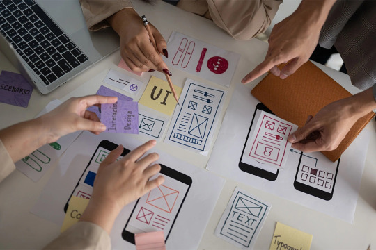
What are the best UI/UX design companies in India?

By this answer you will find top best UI/UX design company in India. For more visit: https://www.quora.com/What-are-the-best-UI-UX-design-companies-in-India/answer/Techtheta-IT-Solution
#user interface and user experience design#user experience ux design#user experience design#web user interface design#ux design website#user experience designers#ui interface design#UI Design#UX Design#top best UI/UX design company in India#best UI/UX design company in India
2 notes
·
View notes
Text
Honestly, the thing that really burns my ass about mobile web design these days isn't even the bloated ads – it's the pages where there's nowhere that's safe to touch to scroll because every single pixel is a clickable hotspot that whisks you away to somewhere else, including the text. I truly believe the owners of websites that do this should die.
#life#computers#technology#internet#web design#user interface#user experience#ux#ui#grumping#death mention#swearing
5K notes
·
View notes
Text
The Fundamentals of UI and UX Design: A Comprehensive Guide
Great looks meet great usability! UI and UX design are the secret sauce behind successful digital products. This guide dives into their world, exploring the basics, processes, and tools you need to know.
UI vs UX: Partners in Design
UI (User Interface): Focuses on the product's look and feel (colours, typography, and layout). Think of it as the furniture in a room.
UX (User Experience): Looks at the entire user journey, ensuring smooth interaction and achieving goals. Imagine the room's flow and functionality.
Fundamental Principles
Simplicity: Keep it clear and easy to use.
Accessibility: Make it usable for everyone.
Responsiveness: Adapt to different devices (desktops, tablets, phones).
Consistency: Maintain a predictable user experience across platforms.
User-Cantered Design: Design around user needs and feedback.
The UX Design Process
User Research: Understand your target audience through personas.
Information Architecture: Organize content for easy navigation.
Usability Testing: Evaluate how users interact with the product.
Wire framing & Prototyping: Develop solutions and test them.
Best Practices
Conduct user research to understand your audience.
Prioritize content for easy information access.
Use clear navigation for smooth user interactions.
Test prototypes to identify and fix user problems.
Top UI/UX Tools
Sketch
Adobe XD
Figma
Invision
#UI and UX design#Product development process#UX design services#user experience audits#web user interface design
0 notes
Text
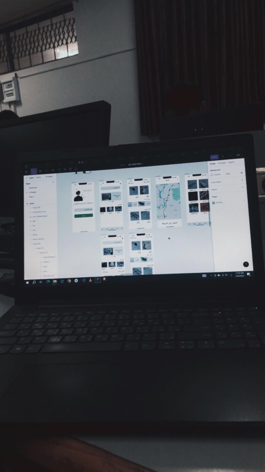
“I Need Your Support to Continue My Studies and Build My Future from Gaza🍉🍉
My name is Mahmoud Naeem Abu Hatab, from Gaza.
I am a university student majoring in Software and Databases at Al-Azhar University. Since the beginning of my academic journey, I have been passionate about User Experience (UX) and User Interface (UI) design, as well as website development. These fields inspire me, and I dream of advancing my skills and building a professional career in them.
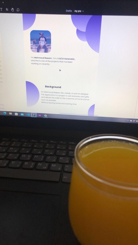
Unfortunately, during the recent war, I lost my laptop, which was essential for both my studies and work. I was forced to flee my home and relocate to southern Gaza due to the difficult circumstances. Despite my efforts to replace my laptop, the financial situation has made it impossible to afford a new one.

Without a laptop, continuing my studies or seeking job opportunities in programming and design has become extremely challenging. This directly affects my academic progress and future career.
Today, I am reaching out to ask for your support to help me purchase a new laptop. Having a laptop would allow me to resume my studies and work on programming and design projects that are crucial for improving my skills. It is a vital step towards completing my education and pursuing my dream of becoming a professional in programming and UX/UI design.
I know that the situation in Gaza is difficult, but I believe education is the only path to building a better future for myself and my family. If you are able to contribute any amount to help me get a new laptop, it would be a real opportunity for me to get back on track academically and professionally.
I am determined to keep learning and working despite the challenges, but I need your support to achieve this goal. Every donation or act of help, no matter how small, will make a significant difference in my life.
If you’d like to support me, you can donate through:
GoFundMe
OR
USDT
If you can assist in any way, please don’t hesitate to reach out to me.
Thank you for your support and kindness! 🌿
@gaza-evacuation-funds @appsa @nabulsi27 @palestinegenocide @orblesbian @palebluebutler @pallasisme @fallahifag-deactivated20240722 @vakarians-babe @sayruq @ @plomegranate @riding-with-the-wild-hunt @queerstudiesnatural @tamamita @apollos-boyfriend @riding-with-the-wild-hunt @queerstudiesnatural @palestinegenocide @sar-soor @akajustmerry @annoyingloudmicrowavecultist @feluka @marnosc @flower-tea-fairies @flower-tea-fairies @tsaricides @tsaricides @belleandsaintsebastian @ear-motif @brutaliakent @raelyn-dreams @troythecatfish @4ft10tvlandfangirl @90-ghost @paper-mario-wiki @nabulsi @prisonhannibal @beepiesheepie @walcutt @schoolhater98 @commissions4aid-international @sar-soor @zigcarnivorous@tododeku-or-bust@turtletoria @brutaliakhoa @flower-tea-fairies @schoolhater @baby-girl-aaron-dessner @sayruq @omiteo777 @malcriada @neptunerings @bat-luun @kaneverse @nightowlssleep @staretes @friendshapedplant @soon-palestine @aria-ashryver @heritageposts @magnus-rhymes-with-swagness-blog @khangerinedreams @kordeliiius @mazzikah @feluka @dlxxv-vetted-donations @girlinafairytale @a-shade-of-blue @vakarians-babe @babygoatsandfriends @self-hating-zionist @mangocheesecakes @dlxxv-vetted-donations @gazaboovintage @gazavetters @wellwaterhysteria @sar-soor @applebunch @irhabiya @sayruq @xxx-sparkydemon-xxx @junglejim4322 @reptilianspecies @dr-lapdance @tamamita @cantsayidont @fairweathermyth @dear-indies @eruthiawenluin @katealot @lenasai @stalinistqueens @ayeshjourney @gaza-evacuation-funda @el-shab-hussein @irhabiya @nabulsi @ibtisams @dlxxv-vetted-donations @tododeku @a-shade-of-blue @gaza-relief-fund @catnapdreams @northgazaupdates @buttercuparry @stuckinapril
#voic of gaza#gaza#free palestine#palestine#free gaza#save gaza#save palestine#help gaza#help palestine#programming#studying#uxdesign#ui ux design#uidesign#ui#ux#user interface#user experience#figma#xd#web design#web development#web developers#mobile design#html#css#js#javascript#java#front end development
296 notes
·
View notes
Text

Instagram: cheri.png
#good morning friends#this morning I was looking for inspo for web designs hehe#cybercore#y2k#cyber y2k#old internet#old web#00s#2000s#tech#moodboard#cyber core#cyberpunk#y2k nostalgia#y2k aesthetic#y2kcore#nostalgiacore#nostalgia#web archive#webcore#early web#user interface#windows#old microsoft#tech aesthetics#tech blog
94 notes
·
View notes
Text
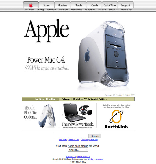
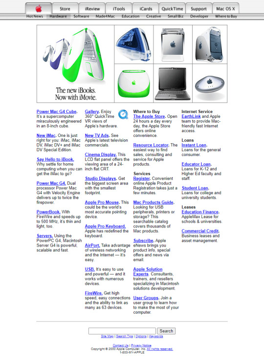
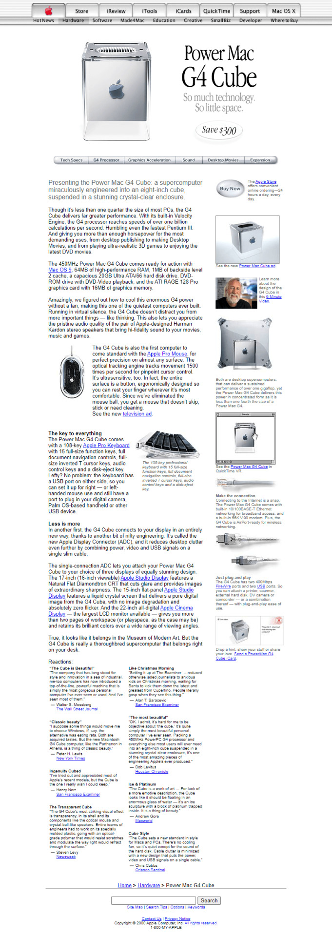
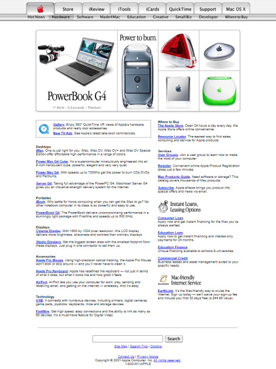
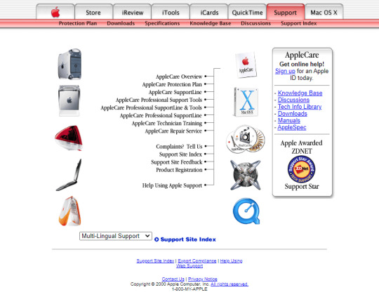
Apple in 2000
#2000#2000s#00#00s#apple#computer#cybercore#cyber y2k#design#graphic design#kaybug#laptop#long post#old web#photos#screenshots#technology#techcore#tech#user interface#y2kcore#y2kore#y2k aesthetic#y2k core#y2k cyber#y2k design#y2k futurism#y2k graphics#y2k
239 notes
·
View notes
Text
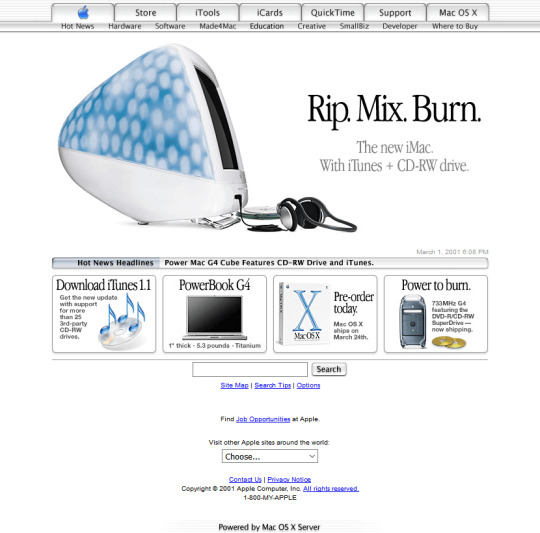
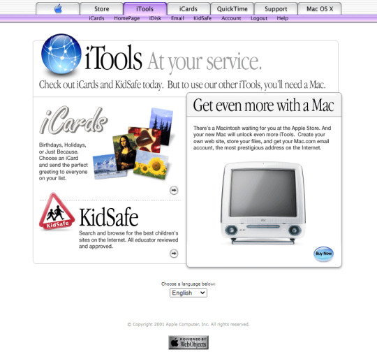
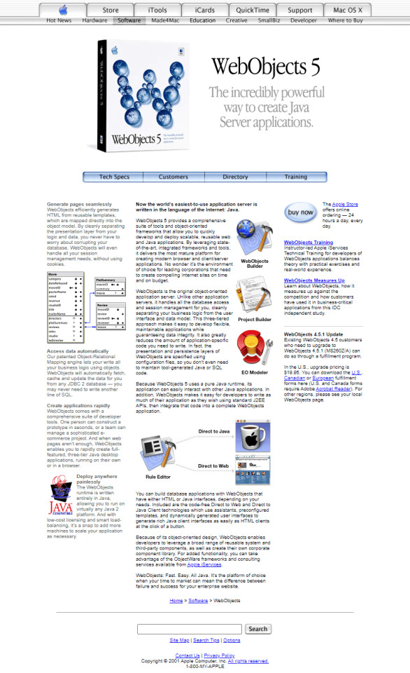
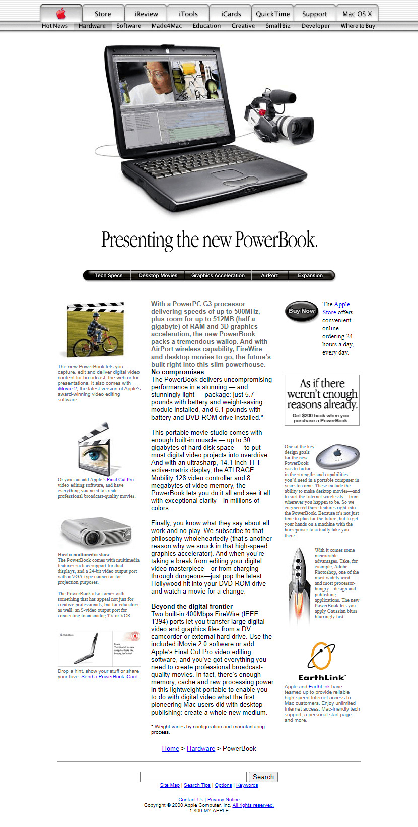
Apple in 2001
#2001#2000s#01#00s#apple#art#cgi#design#frutiger aero#graphic design#graphics#icons#illustration#old web#screenshots#skeuomorphic#skeuomorphism#technology#user interface#vector#website
114 notes
·
View notes
Text
I love how every website and software maker are doing circle and sqircles to try and feel "natural" or whatever B.S. excuse they're trying to justify cheap, assimilative design with.
And then there's Pinterest who's just like, "Fuck it. We're doing squares again." And tbh? It's a good look for them. If only Pinterest hadn't devolved into A.I. Slop central, it would actually be a pretty nice place to use.
2 notes
·
View notes
Text


Bionix - Bold Inktrap Font
https://www.behance.net/gallery/193146761/Bionix-Bold-Font
Bionix is a sans display font made with a bold and modern impression, equipped with inktrap which adds personality to this font. This font is suitable for designs that require a strong and clear impression when used in media but is still modern and fun. Bionix is suitable for headlines, posters, banners, logos, etc
#strong font#Fat font#headline font#typography#font#sans serif font#display fonts#futuristic font#poster font#bold font#Free font#display font#Graphic Design#Design Inspiration#Typography#Font Design#Logo Design#Creative Design#Visual Design#Graphic Art#Web Design#Poster Design#Minimal Design#Modern Design#Illustration#User Interface Design#User Experience Design#Digital Art#Branding Design#Magazine Design
9 notes
·
View notes
Text
meu primeiro redesign!
[ br / eng ]
[meu primeiro redesign e como isso é mto confuso/my first redesign and how this is so confusing] lição mágica aprendida hoje: paciência.
˚✧ antiseptic ݁ ੭
BR :
’ㅤㅤㅤok é estranho postar depois de algum tempo MAS EU JURO QUE TENHO FEITO COISAS!
primeiramente, percebi que eu não ia conseguir aplicar meus estudos se eu não colocasse em prática (obviamente?), então do q adiantaria estudar se eu não faria nada com isso?
eu estava navegando na minha maravilhosa shein com esse pensamento, quando eu parei pra analisar: POR QUE EU NÃO FAÇO UM REDESIGN DA SHEIN?
sim. eu fiz.
Este site é propriedade da Shein e é destinado exclusivamente para fins de estudo. Todos os direitos sobre os materiais, informações e elementos gráficos apresentados neste site pertencem à Shein e estão protegidos pelas leis de direitos autorais.
ok pra começar: eu não fazia ideia do que fazer. não pensei em nenhuma teoria ou nada, eu só simplesmente fiz???
acredito que esse post vai ser o mais curto do perfil, mas irei tentar explicar meus processos pra não ficar tão sem conteudo. ao final do post, terá o link do resultado caso queira pular!
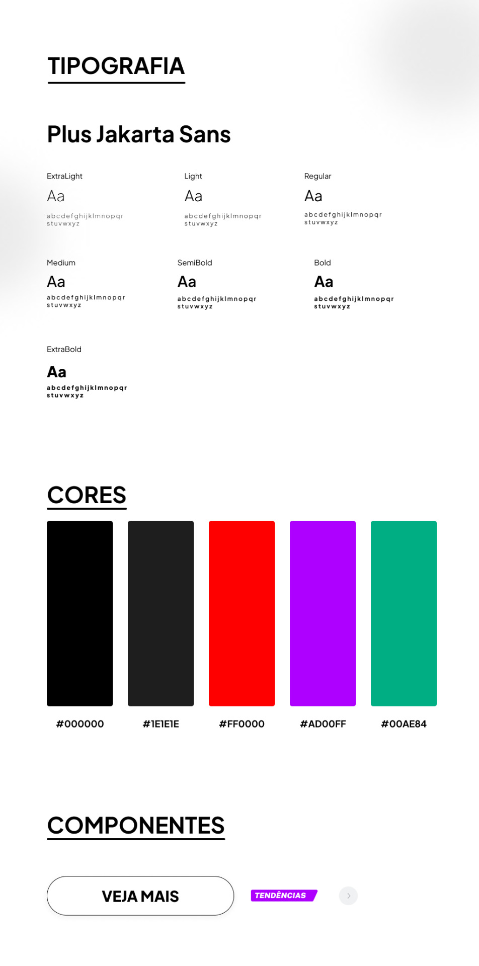
TIPOGRAFIA:
a escolha da fonte foi uma abordagem que precisava ser elegante e moderna, sabia que essa fonte foi criada sob encomenda do 6616 studio para um projeto do governo provincial de jacarta chamado ‘+Jakarta City of Collaboration’, lançado em 2020. ela se inspira em fontes como Neuzeit Grotesk, Futura e outras sans-serifs grotescas dos anos 1930, apresentando um contraste quase monolinear e curvas agudas.
a plus jakarta sans é caracterizada por suas formas modernas e limpas. ela tem uma altura-x ligeiramente maior, o que proporciona um espaço claro entre as letras maiúsculas e a altura-x. além disso, a fonte é equipada com contadores abertos e espaços equilibrados, garantindo uma boa legibilidade em uma ampla gama de tamanhos.
agora que te dei um contexto histórico dessa fonte, vou te explicar algumas razões que me fez escolher ela (não, não foi aleatorio ok). a fonte reflete uma estetica moderna e contemporânea, proporcionando espaços claros e legibilidade em vários tamanhos, tornando uma escolha versátil para diferentes elementos, desde títulos até textos menores.
CORES:
confesso que nessa parte não tenho muito a dizer, o preto é uma cor elegante e básica, tornando a comum. em termos técnicos, o preto é a ausência de luz ou cor. no espectro de luz visível, a cor preta absorve todas as cores e não reflete nenhuma delas para os olhos. legal, ne?
sobre o vermelho, é obvio que eu precisava de algo chamativo; o verde normalmente simboliza elementos da natureza, mas em alguns contextos ele também representa renovação, então, imaginei que essa era a melhor cor pra representar sobre avisos de roupas ou quaisquer coisas novas.
agora o roxo, não sei dizer o que me levou a escolher essa cor, confesso que entrei no site da SHEIN e dei uma boa olhada no motivo de ela estar ali e tudo o que me faz pensar, sinceramente, é porque ela é chamativa, o que faz o usuario ficar ansioso e pensar nossa meu deus TENDENCIA eu preciso comprar!!
CONCLUSÃO
esse foi meu primeiro trabalho concluído, de fato. tanto como webdesign como redesign, eu realmente gostei muito de ter feito e me diverti ao longo do processo, mas eu ficava ansiosa pra terminar e percebi que eu tentava atropelar algumas etapas, isso deve ser mais comum do que eu imagino e eu preciso treinar isso, mas tirando isso.... consegui trabalhar bem olhando as referencias do proprio site da SHEIN e acredito que fiz um retrabalho bom!
POR FAVOR SHEIN ME CONTRATA
dúvidas, sugestões ou críticas? me mande um ask, ele está aberto para qualquer tipo de coisa que tenha surgido durante o post. ♥︎
ah, e sobre o resultado final, claro....... eu postei no dribbble! provavelmente vai ser a plataforma que utilizarei em todos os meus posts para mostrar o design final, ent caso vc n queira ver meu monologo, basta pular direto pro final!
https://dribbble.com/shots/24251593-SHEIN-Redesign?added_first_shot=true
[meu primeiro redesign e como isso é mto confuso/my first redesign and how this is so confusing] magic lesson learned today: patience.
˚✧ antiseptic ݁ ੭
ENG :
’ㅤㅤㅤok it’s weird to post after some time BUT I SWEAR I HAVE BEEN DOING THINGS!
firstly, I realized that I wouldn’t be able to apply my studies if I didn’t put them into practice (obviously?), so what would be the point of studying if I wasn’t going to do anything with it?
I was browsing my wonderful shein with this thought, when I stopped to analyze: WHY DON’T I DO A REDESIGN OF SHEIN?
yes. I did.
This site is owned by Shein and is intended exclusively for study purposes. All rights to the materials, information and graphic elements presented on this site belong to Shein and are protected by copyright laws.
ok to start: I had no idea what to do. I didn’t think of any theory or anything, I just simply did???
I believe this post will be the shortest on the profile, but I will try to explain my processes so as not to be so without content. at the end of the post, there will be the link to the result in case you want to skip!

TYPOGRAPHY:
the choice of font was an approach that needed to be elegant and modern, I knew that this font was custom made by 6616 studio for a project of the provincial government of Jakarta called ‘+Jakarta City of Collaboration’, launched in 2020. it is inspired by fonts like Neuzeit Grotesk, Futura and other grotesque sans-serifs from the 1930s, featuring an almost monolinear contrast and sharp curves.
the plus jakarta sans is characterized by its modern and clean shapes. it has a slightly larger x-height, which provides a clear space between the uppercase letters and the x-height. in addition, the font is equipped with open counters and balanced spaces, ensuring good readability in a wide range of sizes.
now that I’ve given you a historical context of this font, I’ll explain some reasons that made me choose it (no, it wasn’t random ok). the font reflects a modern and contemporary aesthetic, providing clear spaces and readability in various sizes, making it a versatile choice for different elements, from titles to smaller texts.
COLORS:
I confess that in this part I don’t have much to say, black is an elegant and basic color, making it common. in technical terms, black is the absence of light or color. in the visible light spectrum, the color black absorbs all colors and does not reflect any of them to the eyes. cool, right?
about red, it’s obvious that I needed something eye-catching; green usually symbolizes elements of nature, but in some contexts it also represents renewal, so, I imagined that this was the best color to represent about clothes warnings or any new things.
now the purple, I can’t say what led me to choose this color, I confess that I entered the SHEIN website and took a good look at why it was there and all it makes me think, honestly, is because it is eye-catching, which makes the user get anxious and think oh my god TREND I need to buy!!
CONCLUSION
this was my first completed work, in fact. both as webdesign and redesign, I really enjoyed doing it and had fun throughout the process, but I was anxious to finish and I realized that I tried to rush some stages, this must be more common than I imagine and I need to train this, but apart from that… I managed to work well looking at the references from the SHEIN website itself and I believe I did a good rework!
PLEASE SHEIN HIRE ME
questions, suggestions or criticisms? send me an ask, it is open for any kind of thing that may have arisen during the post. ♥︎
ah, and about the final result, of course… I posted it on dribbble! it will probably be the platform that I will use in all my posts to show the final design, so if you don’t want to see my monologue, just skip straight to the end!
https://dribbble.com/shots/24251593-SHEIN-Redesign?added_first_shot=true
#design#aesthetic#art#english#designinspiration#brasil#design ux#ui ux design#uidesign#ui ux company#ui#ux#redesign#shein#sheinstyle#design ui#web design#website#user interface#prototype#digital art#figmadesign#figma#creative#dribbble#dribble
8 notes
·
View notes
Text

The 2nd Web Design I made in my previous company. This had a theme of clouds and galaxy, for a childcare.
#artists on tumblr#my art#web design#web development#website#site#web series#old web#ui#ui ux design#uidesign#ux#design#user interface#accessibility#blue#space#outer space#little space#astronomy#galaxy#stars#childcare#template#cute
2 notes
·
View notes
Text


Want to add a cool light beam to your designs in Figma? It's easier than you think!
Just design a few shapes, blur them, and blend them together for a glowing effect.
Follow these steps to make your designs really shine!
4 notes
·
View notes
Text
Explore the World of Food and Drink Icons for Your Projects

->Icons are now an essential component of site design in the digital age, making navigating simpler and more aesthetically pleasing. We at IconAdda provide a large selection of food and drink icons to suit all kinds of projects, including mobile apps, food delivery systems , and restaurant websites. Our selection of premium icons includes everything for every need, whether you're creating a menu, an e-commerce website, or simply want to improve the project's appearance.
Modification at Your Fingertips: What separates our icons is the flexibility to adapt them to your website's branding. Our icon editor allows you to: ->Change the colors to match your palate.
->Rotate or flip the icons to fit your design arrangement.
->Adjust the size for different positions.
->Modify forms or add distinctive components to make them genuinely yours.
Why Do You Choose Our Food and Drink Icons?
->Variety:We provide icons in a variety of styles, from flat design to intricate images.
->Quality: We create all of our icons with precision and clarity, so they appear excellent on any device.
->Ease of Use: Our icons are ready to download and integrate into any project, which saves you time and work.
->Customization: With basic editing tools, you may easily modify the icons to your specific needs.
When choosing food and drink icons for your project, there are various factors to consider to guarantee that you get the best one for your needs. First and foremost, consider the typeface used in each icon; ensure that it is consistent with your overall design aesthetic and seems nice on screen. Consider the color pallet; choose colors that complement each other while still providing enough contrast to prevent them from blending too much. Finally, consider size; often larger is better when utilizing food and drink icons because it allows them to stand out more clearly against other items on screen.
How to Use Our Food and Drink Icons: Including food and drink icons in your project is straightforward. Simply visit IconAdda, choose the icons you want, then utilize our editor to make any necessary changes. Once satisfied, you can download the icons in a variety of formats, including PNG, SVG, and others, making them appropriate for a wide range of digital contexts.

Conclusion: Whether you're creating a new food-related website, releasing a mobile app, or developing a marketing campaign, our food and drink symbols will help enhance your project.
Begin exploring our collection today and elevate your designs to the next level!
here to go ~ IconAdda .
#ui#ui ux design#uidesign#user interface#ux#programming#coding#computing#creative#icons#logo#design#web design#graphic design#photoshop#home design
2 notes
·
View notes
Text

Secrets of UI and UX design! This guide explores the fundamentals, processes, best practices, and tools to craft user-friendly and visually appealing digital products.
0 notes
Text
Why do websites only use a limited width for the important part of their content?
Facebook, Tumblr, Twitter, etc all have sidebars on both sides with the content in the center. I get that it's a popular way to do things, but when I'm trying to take screenshots or read without scrolling every few seconds, it's wildly inconvenient.
Is there a way to change the code on my blog so that it fills the screen/adapts to the screen size?
Every single site has so much wasted blank space; and when the window is made smaller than full screen, like when I have windows next to each other, the formatting is still fukt and often the actual content is the part that is sacrificed rather than the damn sidebars.
I know I can't fix other sites like facebook and twitter, but how can I get my personal tumblr blog to have an adaptable width?
#help#ask tumblr#blog help#html#css#web desin#blog layout#blog design#code help#codeblr#web design#user interface#ui help#thank you#i love you goodnight
8 notes
·
View notes