#webcomic tutorial
Text
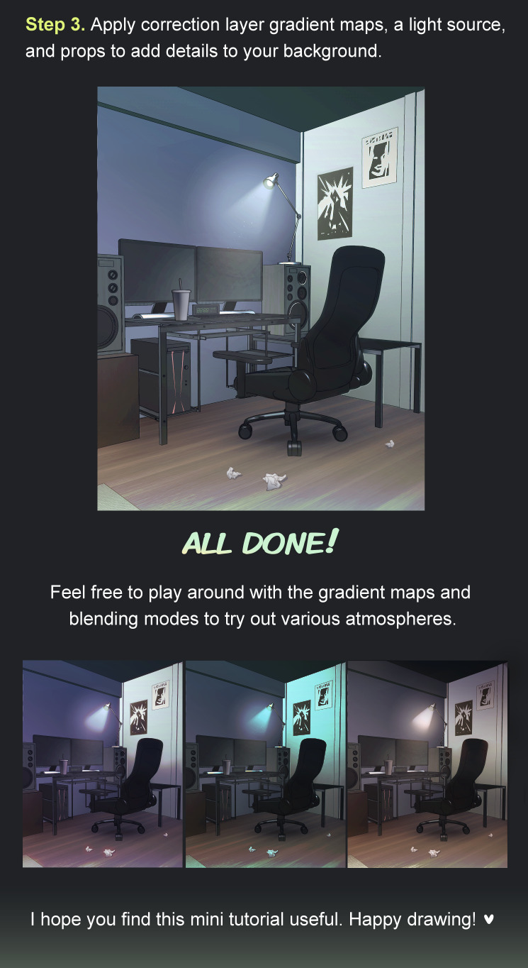
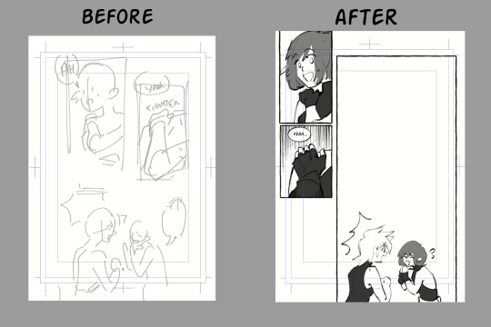
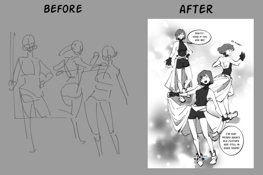
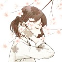
Back to making these tutorials! This one is a bit short but that’s because I split it into 2 parts so keep an eye out for the other half 👀
34 notes
·
View notes
Text
How to Webcomic!
A solid book that I’ve been enjoying

Some sample pages:
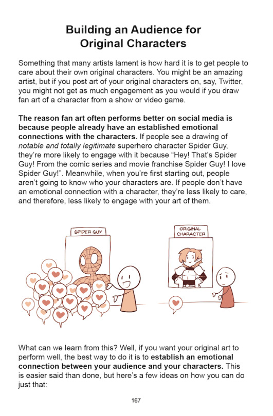


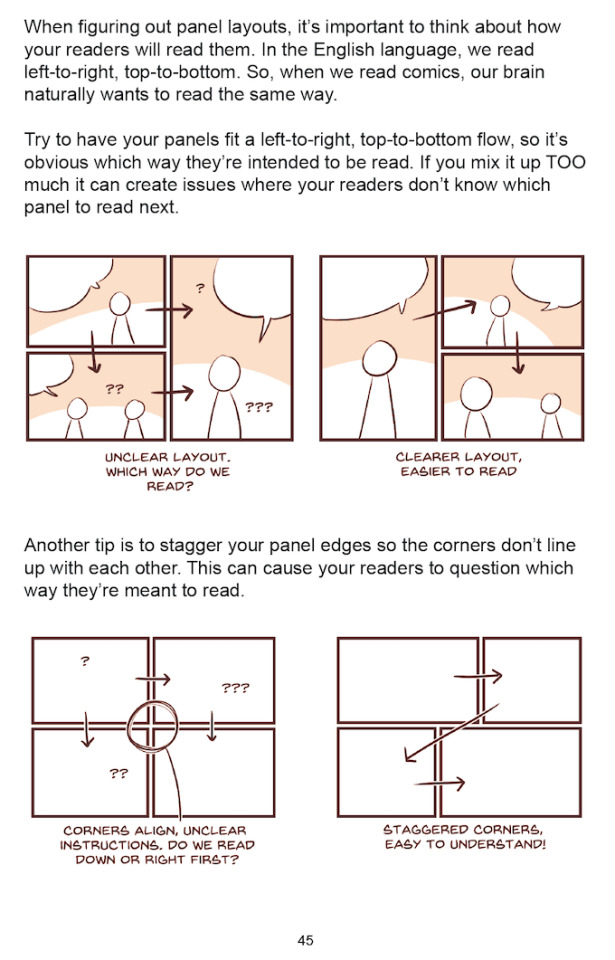
45 notes
·
View notes
Text
Webcomic websites
I've seen people wondering where they can post their webcomics and all, here's a small list of websites for different types of comics, feel free to reblog/dm me with the ones you know too and I will update the list!
For Webtoon style/ infinite scrolling comics (the ones that are one long page that you scroll through):
Webtoons
Tapas
Lezhin
Clip Studio Share*
For traditional webcomics (Page by page reading):
Global Comix
ComicFury
Arkhaven
Comicgenesis
The Duck Webcomics
Hiveworks
Clip Studio Share*
For uploading your comics as a downloadable PDF people pay for:
Itch.io (comic section)
Global Comix
*Clip studio share is cool because it's also a host for your comic and you can embed it into your own website if you have one!
11 notes
·
View notes
Photo
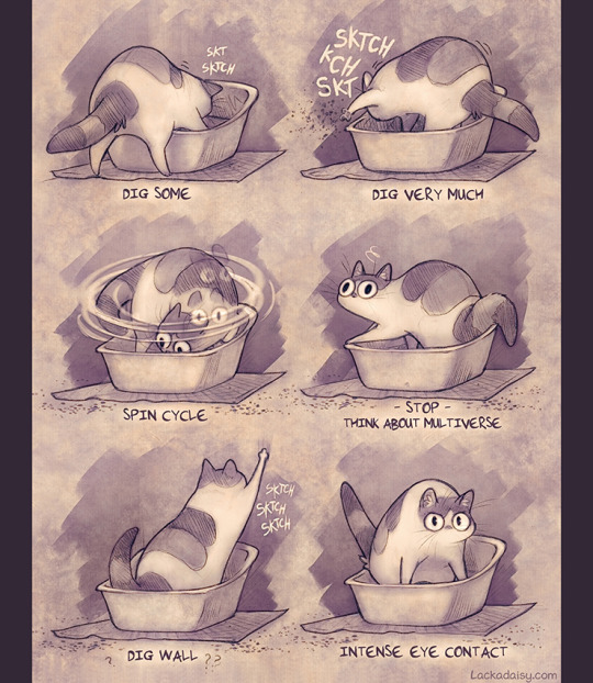
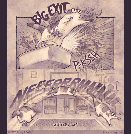
Tutorial - my cat wanted to share with you some tips and tricks.
-----------------------------------------------
Originally from my Patreon, where there’s a little more to this.
(Patrons get extra stuff and early releases)
31K notes
·
View notes
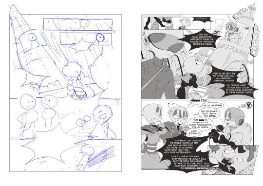
Text
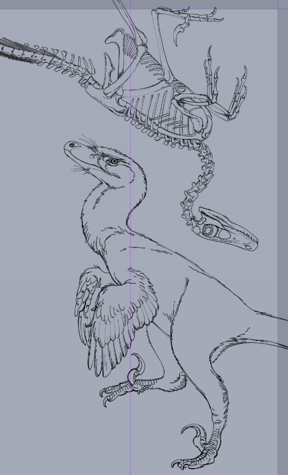
really happy with how this (unspesified) (heavily velociraptor inspired) raptor lineart is turning out, this is from a comic project i'm working on so stay tuned if you like historical fiction settings with victorians, domesticated dinosaurs and time travel shenanigans !!
#comic art#comic#paleobr#paleoart#paleontology#graphic novel#antikythera comic#original comic#webcomic#webtoon#art tutorial#paleoillustration#paleomedia#paleo art#theropod#velociraptor#its basically a velociraptor but some kind of very close unspesific species dont look into it too much dfghdfgh
502 notes
·
View notes
Note
(this question is for mun) I've been wondering for a long time, how do you make your backgrounds? they look so realistic?? do you use some kind of 3d/rendering program? or photos? I too use clip studio paint, but I would have no idea how to make the backgrounds look as perfect and realistic as yours😳

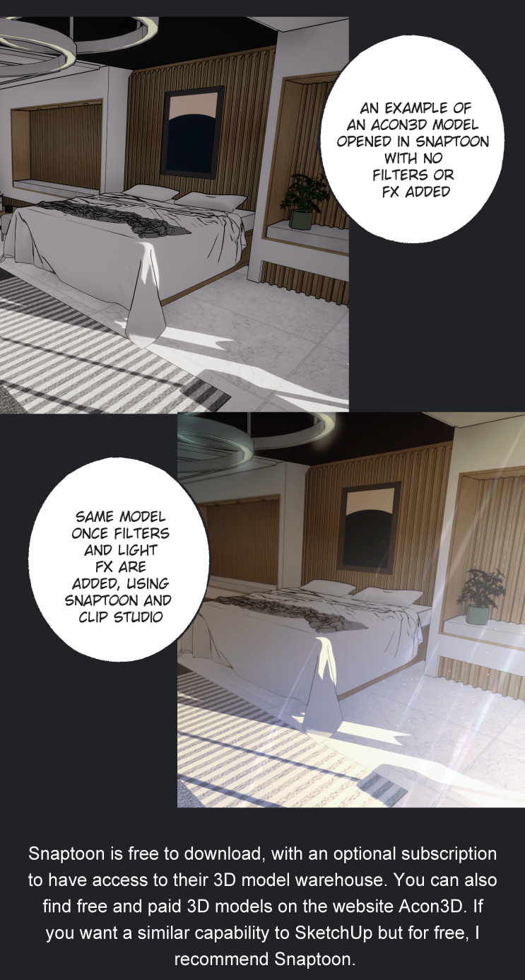
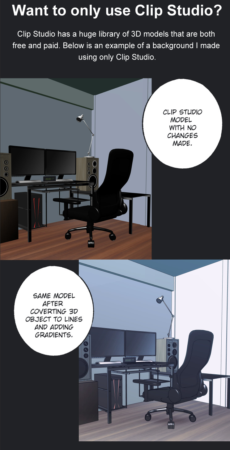

Snaptoon:
https://www.acon3d.com/en/toon/product/1000007186
https://snaptoonwarehouse.com/snaptoon/snaptoon_en.php
Acon3D:
https://www.acon3d.com/en/toon
Clip Studio Assets:
https://assets.clip-studio.com/en-us/
Mentioned auto actions:
https://assets.clip-studio.com/en-us/detail?id=1901436
https://assets.clip-studio.com/en-us/detail?id=1989728
https://assets.clip-studio.com/en-us/detail?id=1990089
https://assets.clip-studio.com/en-us/detail?id=1936799
https://assets.clip-studio.com/en-us/detail?id=1989165
365 notes
·
View notes
Text
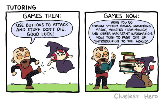
#459 Tutoring
Back in my day, you only needed two buttons
Facebook | Instagram | Shop
#Clueless Hero#webcomic#gaming#video games#tutorials#old school gaming#retro games#modern games#introduction#explanation
74 notes
·
View notes
Text
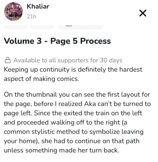
👽Have you checked out my Ko-fi yet?👽
I‘m halfway through sharing my process on Volume 3, for any amount of your choice donated you get to see me rant about the mistakes I almost made & what I learned from them💅🏼✨
#invader zim#iz#artists on tumblr#comic#indie comic#webcomic#webtoon#comic tutorial#original content artist#art tutorial#comic panels#comic making
31 notes
·
View notes
Text
Lettering Tips for Comics Artists!
Lettering is an easy to overlook aspect of comics creation, partially because good lettering is designed to be invisible, but bad lettering can ruin an otherwise well crafted project.
Now, I'm not a letterer by trade, I'm a colorist who thinks too much about comics craft, but I've picked up on a few common mistakes I've seen new webcomic artists making, and I thought I'd share my tricks.
#1: Get a Dialog font
Sorry, despite Comic Sans having the word comic in the name, it's not actually good for lettering comics. Comic book letterers usually use specially designed fonts when they're lettering comics, and they often have websites where you can get these typefaces for a reasonable fee (or sometimes even free!)
What makes dialog typefaces special?
The barred-I! (and other contextual options)
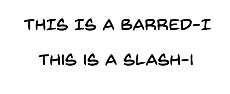
This one is subtle, but generally, you want to only use the barred-I for the personal pronoun "I" or for roman numerals. It helps clarify that what you're looking at is an I and not an L, but it takes up more space in the word, and we're trying to reserve as much space as possible for the art on the page.
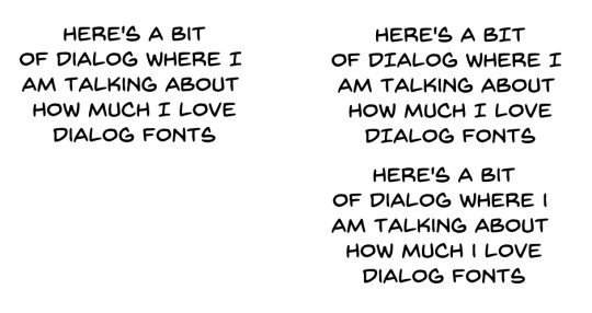
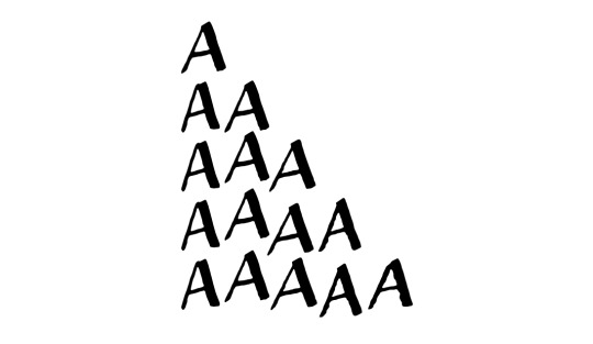
Specially made comic book fonts will also be custom designed to be legible at a distance, have multiple bold/italics options, and might even include special versions of individual letters for when you type multiple of the same character in a row! It'll give your lettering a personal touch that you won't get from typefaces designed for other things.

Blambot is a great resource for all your lettering needs. Here I'm using Backissues and Nightmark
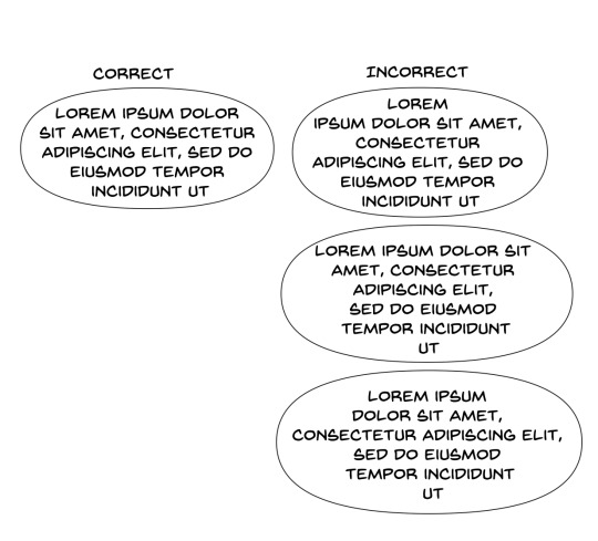
#2: Dialog Stacking
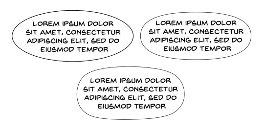
Dialog should always be stacked such that your longest line of text is in the middle. The block of text itself should have a sort of diamond shape <>. Sometimes this is difficult to do, especially if you have any long words at the beginning or end of a sentence. You can't always get it to work (and if you're unwilling to rewrite your dialog so it fits), so sometimes it might not be perfect, but if your text block is more hourglass shaped >< that's a good indication that you should try putting your line breaks somewhere else. Basically try to make your text as round as possible if it's in a balloon.
#3: Balloon Shape
One of the more common mistakes I see webcomic artists making is using perfectly elliptical balloons. It's actually kind of difficult to fit text into balloons that are perfectly elliptical; there ends up being a lot of uneven space around the text, and it looks kind of cheap. Making your balloons slightly more rectangular is going to give you more bang for you buck, they'll fit the text block a little better. I like a hand drawn balloon, I tend to think they add variety.
One thing you definitely shouldn't do is this:
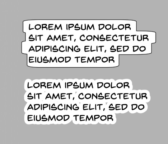
This might be a personal preference thing more than any kind of hard and fast rule, but these lettering styles give me the impression that the text is pasted on top of the art, and that no real thought was put into arranging it thoughtfully with the art. These are probably more appropriate for captions, not so much for dialog
Lettering is a part of the medium we're working with, the dialog should be approached as a part of the artwork, and treated as such.
#4: Balloon Placement
The number one, most important rule of lettering, is that the placement of your balloons should never confuse your reader. The goal of balloon placement is to guide your reader around the page, each one should naturally lead your reader towards the next thing they should read. Here's an example of something I see a lot:
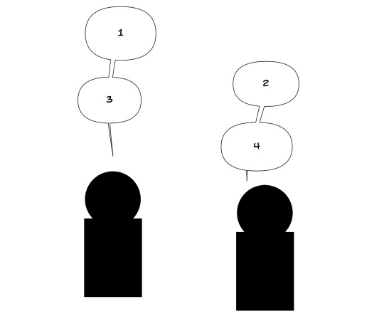
While yes, it is true that on a comics page, people read left-to-right top-to-bottom, if two balloons are connected with a line, I am going to read them one after another. Readers are not going to intuitively assume they should jump to the other side of the page just because the #2 balloon is slightly above #3. In this situation the balloons should be interwoven.

It should not be possible to look from one balloon to another and skip over intermediate dialog. If your reader misses a part of the conversation and has to double back to figure out what they missed, you've broken the flow and immersion of the page.
Like I said, lettering is all about guiding your reader around the page, it should be a part of your composition from the beginning, don't forget to incorporate lettering into your work when you're first laying out your page. Put yourself in the place of your reader and see how your eyes track across the page.

Hope these help! Like I said, I'm no expert; it took me a while to learn a lot of this. I would have found these tips super useful when I was first starting out. If you're interested in the technical side of lettering, I highly recommend The Essential Guide to Comic Book Lettering by Nate Piekos. It's one of the most useful reference books I own, and I learned most of this from that book.
#undertale and deltarune webcomics get a free pass on using comic sans#webcomics#tutorial#comics#ferrouscomicscraft#when I say I think too much about comics craft this is what I'm talking about#I could go on and on about how cool auto-ligatures are#lettering
80 notes
·
View notes
Text
Note to Self - Word Balloons: A Study
(No spoilers, don't worry)
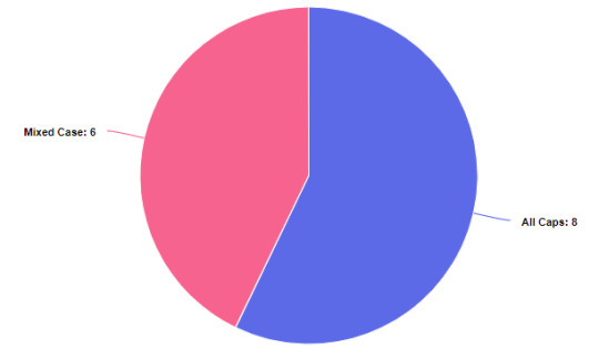
14 total comics to compare against, across genres with half as traditionally printed comics and half from webcomics. While not an exhaustive list, should be enough to start to give some idea about preferences.
Text Type: Either fully capitalized (EXAMPLE) or with mixed case (Example)
All Caps versus Mixed Case

Mixed Case vs. ALL CAPS for all comics
Mixed Case vs. ALL CAPS for Traditional Printed Comics AND for all webcomics (same results)
A slight preference for the traditional method of writing out word balloons with text in all caps
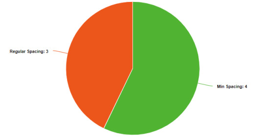
Spacing Between Text and Outer Balloons
Min Spacing versus Regular Spacing versus Max Spacing


Spacing between text and outer balloon for all comics
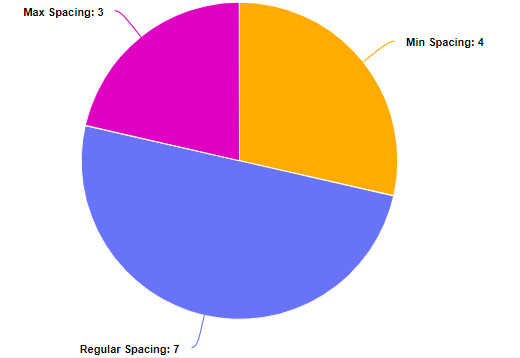
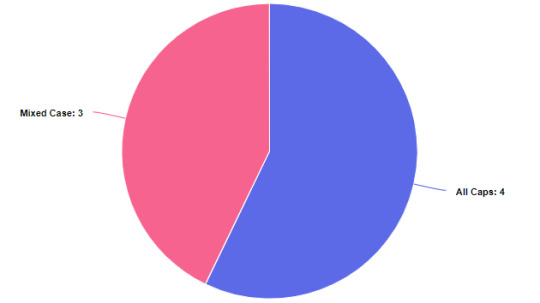
Traditional comics are basically evenly split between a normal spacing (about the width of a letter) and min spacing (which leaves essentially no room between the text and the balloon)
Traditional comics slightly tend toward a minimizing the spacing between the text and the balloon
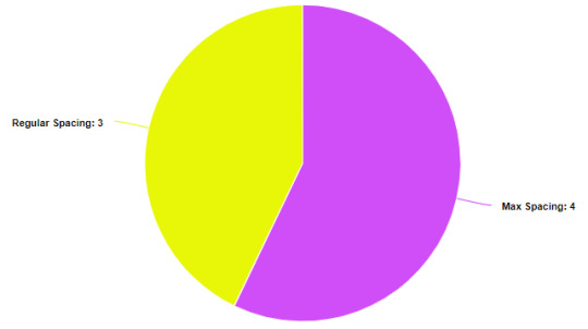
Spacing between text and outer balloons for webcomics
Webcomics are split between between a normal spacing (about the width of a letter) and extra spacing (which can sometimes double or triple the distance between the text and the balloon). Webcomics slightly tend towards adding additional space between the text and the word balloon
Word Balloons Within or Outside the Panels
Within Panel versus Outside Panel

Whether word balloon (typically) lie entirely within or can exist outside the strict space of the panel
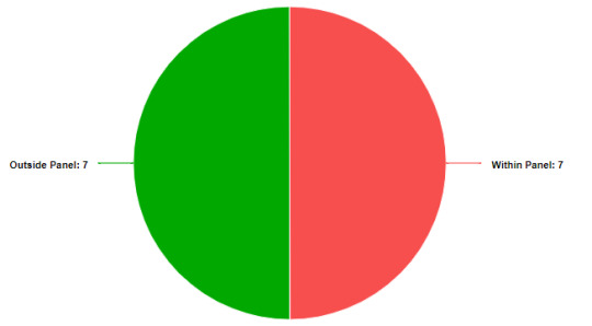
This is perhaps the most obvious difference between webcomics and traditional comics. All traditional comics in this set only have word balloons that lie within the panel, while all the webcomics typically have there word balloons lie outside their panels
Conclusion
As reductive as it sounds, the overall conclusion is that any combination of word balloon choices are well represented in both traditional and webcomics. The only noticeable difference is that webcomics tend to take greater advantage of the negative space between panels by moving their word ballons out of the panel borders
Resources (and Comic Recommendations)
Format: Print (Traditional)
Fables by by Bill Willingham, Lan Medina, Steve Leialoha, Craig Hamilton, Sherilyn van Valkenburgh
Nimona by ND Stevenson

Bone by Jeff Smith
Ghostopolis by Doug TenNapel

Saga by Brian K. Vaughan, Fiona Staples

Tintin by Hergé
Superman: Red Son by Mark Millar, Dave Johnson
Format: Online (Webcomic via Webtoon)
Marionetta by Míriam Bonastre Tur
Suitor Armor by Purpah

Castle Swimmer by Wendy Lian Martin

Cursed Princess Club by LambCat

Lore Olympus by Rachel Smythe

Space Boy by Stephen McCranie

The Dragon Tutor by Mar_Mai

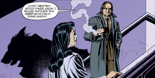
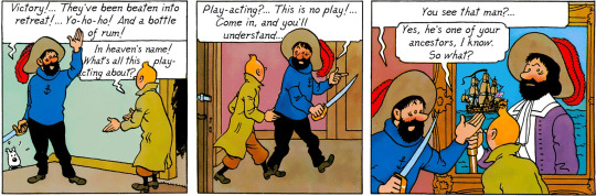
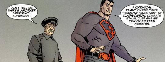
#word balloons#comics#comic tutorial#art tutorial#education#fables comics#nimona#bone comic#Ghostopolis#saga comic#tintin#the adventures of tintin#superman#superman: red son#superman red son#marionetta#webtoon#web comic#webcomic#suitor armor#castle swimmer#cursed princess club#lore olympus#space boy webtoon#space boy#dragon tutor#the dragon tutor#note to self#comic recommendations#comic recs
272 notes
·
View notes
Text
TIPS on drawing BIPOC ocs!
Soooo I recently did a collab with another webcomic creator, if you have seem my last post you know what one : ))
as soon as I saw the wonderful artwork I received I noticed something that felt off to me, it's lin's skintone.
This is my Oc Lin Peckett (main character of my comic I Love you Lin peckett)

I never specified her ethnicity (which is my fault on my part) I thought people might know by her looks that she's a POC. specifically she is black/Mexican mixed (I believe blaxican is the term used sometimes)
here are some examples of people I based her off of aesthetically
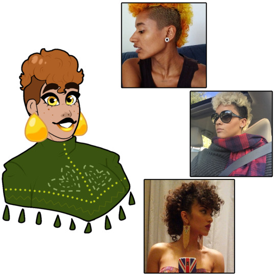
they are all people of color, share similar skin tone and hair as her. these images are good inspiration to use!
these women in these pictures are all women who are black/Mexican
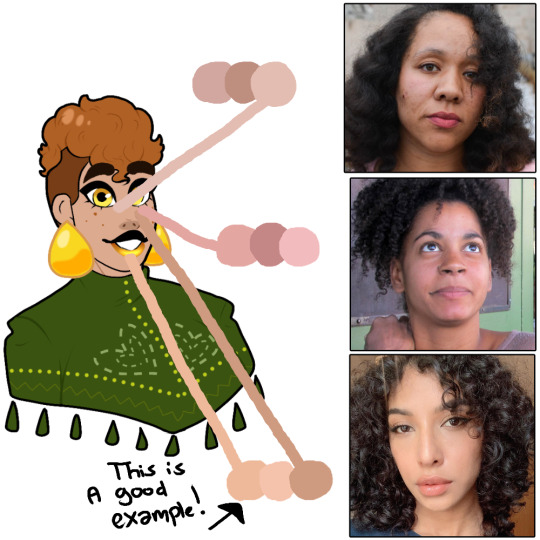
I used the eye dropper tool to pick 3 different shades of color for comparison, notice how multiple shades are similar to her skintone
lin has tan skin thats more on the lighter side, sometimes her skin tone changed depending on the lighting but her main color is tan. she has lots of warmer tones compared to cooler tones, so keep it more on the yellow side than red/pink compared to other skintones. you can see a difference between the top and middle one than to the bottom one.
here are some white women to compare lin's skintone to
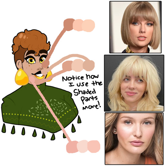
notice how some are similar to her skin, you might think ok so she's white NOPE, look a second time and notice how the color that matched best with her are the parts of these women's faces that are shaded or shadowed. using these women are not good references and if you notice most of them have more pinker tones, lin has warm toned skin.
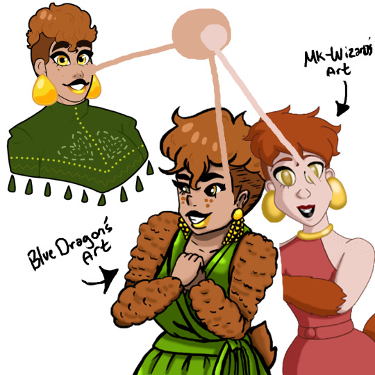
heres two pieces of artwork I received recently of my oc lin, (both by wonderfully talented creators I'm grateful to get art from) but notice how bluedragon's artwork is the same as lin's. that's because she used an art programs best friend
the eye dropper tool!
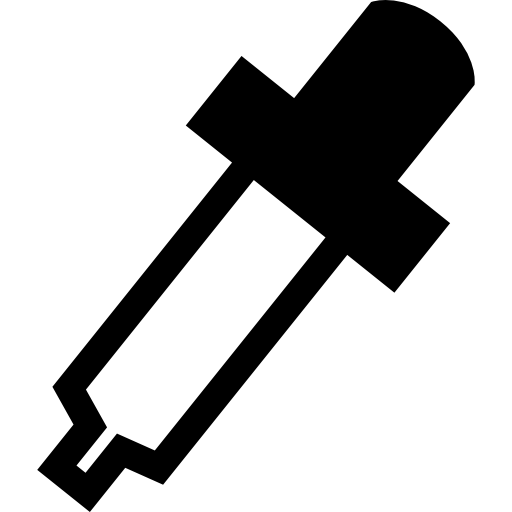
this thingy?
it's literally in every single art program ever created, yes even mspaint
use it if you're not sure what skintone to use on a character!
but back to that drawing, you can see a big difference between the two pieces the one on the left by bluedragon is accurate. and the one on the right is by mk-wizard which has lin is very light skin. which is just not correct lol

so let's use are little friend again (the eye dropper tool) to recolor lin with the skintone used in mk-wizard's artwork. as you can tell it's a BIG difference! lin would be a unseasoned piece of chicken if I colored her like this lol (get it …chicken.. HA)
so my final notes to this long post is, please study the character you are drawing a bit more, ask questions. I know this artist isn't whitewashing lin purposely it's an honest mistake that could be anything from different computer monitors showing up different tones? or them being inexperienced drawing POC? which you have all the time in the world to keep studying while drawing! it's okay to make mistakes and learn from them : )))
also this isn't a "callout post" or anything negative towards the artist, this is simply some advice not just for them but for every artist.
I hope this helped in any way possible? and if I missed anything or made any mistakes pls educate me more on drawing BIPOC! I love to hear advice <3 anyways have a good day and drink some water bye~

#i love you lin peckett#iloveyoulinpeckett#webcomic#web comic#lin peckett#oc#indie comic#art advice#drawing bipoc#drawing tips#art tips#art help#art tutorial
76 notes
·
View notes
Text
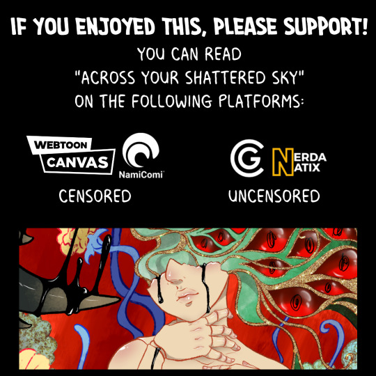
Webcomic Tips ~ How I approach dream/nightmare sequences
Wanted to share a breakdown of how I approach nightmares & dreams with a friend and figured I might as well share it with everyone! So please enjoy this simplified process of how I form my dream scenes for my Psychological Thriller "Across Your Shattered Sky"
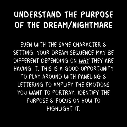
Understanding your character is key. You can personalize sequences to fit their themes, fears & personalities


Don't get distracted or intimidated just because it's not the same setting you are used to! If you know WHAT the reasoning for the scene is, you can focus on how to convey it

Try something new! Experiment and take inspiration from weird places even if it's totally different than your norm!

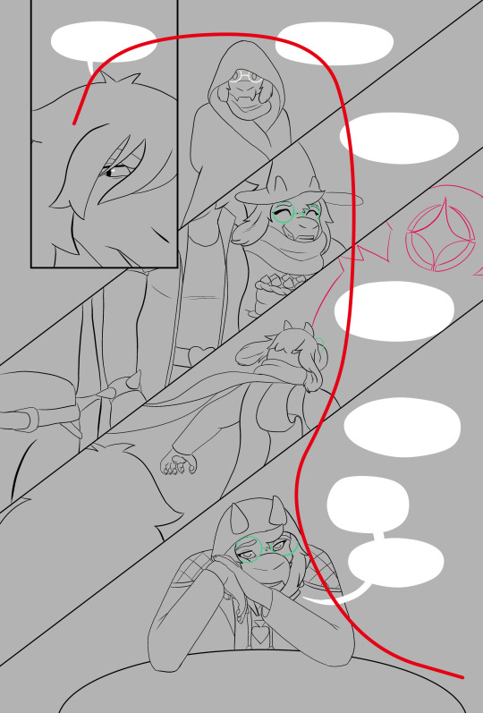
And not just with the art, try something different with your paneling, lettering & affects you use. I would say go wild honestly~ I prefer to not use any traditional panels with edges/boxes & just work seamlessly in these sequences

It'll look & feel different at first, but that's okay! It's not the same space as the rest of the comic and there's no real "rules" like real spaces have! If you do it enough eventually you'll find your own dreamscape style too~

Shameless plug, if this was helpful or you just like the art, consider giving a follow and reading on any of these platforms~ (though please be aware the NamiComi upload is now uncensored as well!)
#webcomic#original comic#indie comics#oc#original character#digital art#clip studio art#tutorial#tips#creative writing#thriller#romance
20 notes
·
View notes
Text
Digital Comic Software (that aren’t 2D art programs)
Here are a list of programs I use frequently to make my digital comic making experience easier!
Bulk Rename Utility [Free] https://www.bulkrenameutility.co.uk/
I deal with tons of files on the regular and this program lets me rename and relabel them very easily.
Lazy Nezumi [$30] https://lazynezumi.com/
A line smoothing program that works with nearly every piece of decent art software. It also has built in rulers, fractals, and scripts. If you are a professional illustrator of any kind, this is a must.
One Note [Free] https://www.microsoft.com/en-us/microsoft-365/onenote/digital-note-taking-app
I use this in a lot of my writing and research. It’s just a good baseline program that lets you drop in images, quotes, and text.
DesignDoll [Free] https://terawell.net/index.php?anchor=download
3D humanoid rigs that are great for poses. It has a fairly comprehensive catalog of body types but you’ll still want to depend on your own design sheets and artistic prowess to keep your characters on model.
SketchUp [Free] https://www.sketchup.com/
A 3D modeling software that is good for sets, buildings, props, and other inorganic shapes. I use it for reference and scene set up all the time.
Sculptris aka ZBrushCoreMini [Free] https://www.maxon.net/en/zbrushcoremini
This is the 3D modeling software I use to sculpt organic parts like horns, faces, wings, claws etc.
* Note: This is not a sponsered post, just a list of software I use.
365 notes
·
View notes
Photo
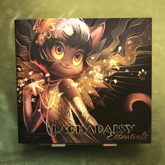

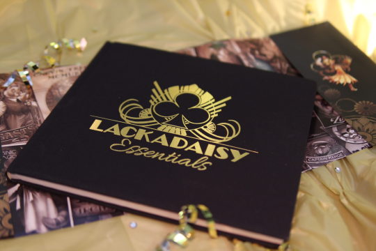
Lackadaisy Essentials art books...
...are finally in the warehouse! Kickstarter backers, you should begin receiving your books this month.
Meanwhile, Iron Circus is selling a very limited number of extra books. These will come with a signed bookplate, and will ship immediately after the Kickstarter backer books are fulfilled. (Likely in July.)
Find them in the Iron Circus Shop here!
I believe we’re at about 100 left as I type this.
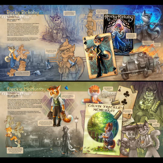
The Essentials is a large hardcover book, clothbound with a gold foil title and dust jacket. It contains ~140 pages of character art spreads and bios, mini-comics, tutorials and full color illustrations!
-----------------------------------------
**Note: This is the best chance to get the book as a solo item. If you’re wanting to get all of the new Lackadaisy hardcover books (Volume 1, Volume 2 and Essentials), I suggest waiting for the BackerKit campaign in July. They’ll be available as a set.
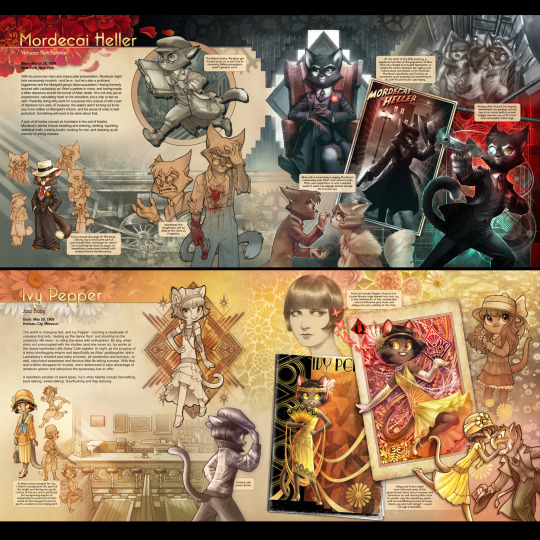
#lackadaisy#lackadaisycats#lackadaisy essentials#art book#books#comics#tutorials#character art#webcomic#illustration#cats#1920s
2K notes
·
View notes
Text
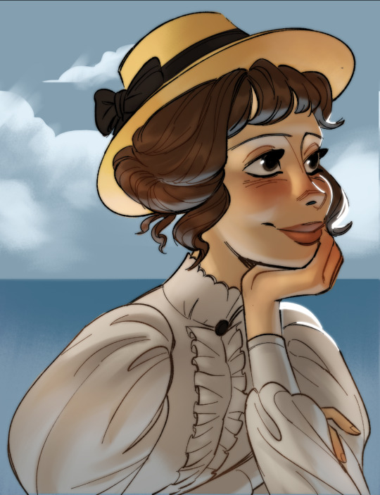
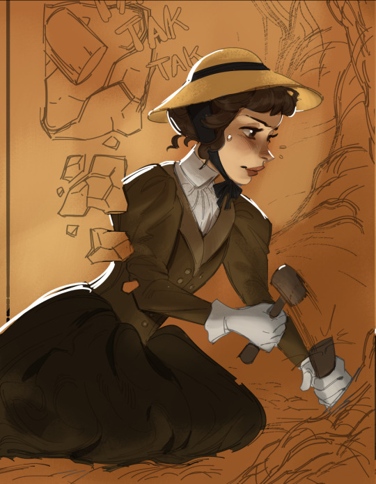
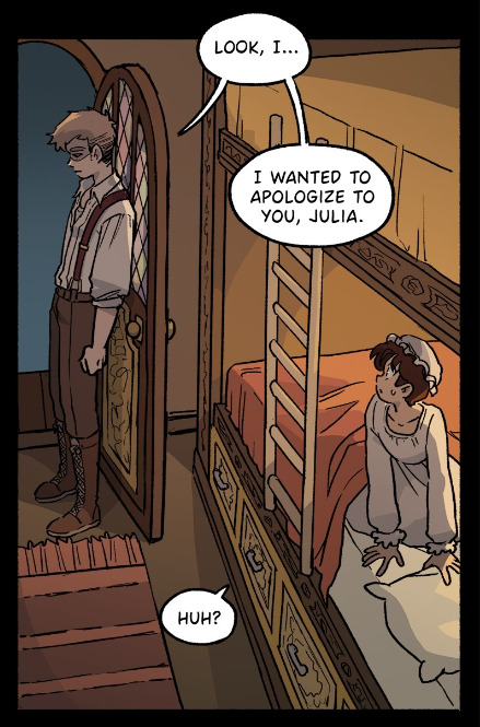
Comic pages are slowly being drawn, i've been experimenting with different coloring styles! Featurin our protagonist Lana, a late 19th century archeologist... I wonder what she's digging up there... !!
I was struggling with what style i should go with that wouldn't kill me with the amount of work, but this simple soft shading is pretty simple for me to just shlap on !
To get that ''glow'' in the first image I just Ctrl+Shift+C the whole image > paste > gaussian blur > set layer mode to Darken > lower opacity to about 50%
I also duplicate then blur the rim light to give it that glow effect too!
#comic art#original comic#victorian oc#victorian era#antikythera comic#graphic novel#webcomic#webtoon#comic#art tutorial#comic tutorial
34 notes
·
View notes
Text
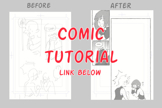
@15krixa15 requested a comic tutorial so I made some time to make one! I don't like the Tumblr formatting so I slapped it on a google doc! Feel free to ask any questions in my inbox, curiouscat, or dms. Thank you!
TUTORIAL LINK
Some Previews
49 notes
·
View notes
Last Seen Blogs
elisalami
Eli's Blog and Arts

aliittlepieceoftom
Love Like You
jt-anime24
jt_anime
miramichisupreme
Mira Michi