#wings of fire a dark secret
Text

I just think she’s a little neat a little silly hmm
#Man. Battlewinner more like BATTLELOSER!#I love her concept though I do wish she got a little bit more depth rather then showing up and just dying though her death was really cool#Wish she was a bit more melty/goopy#shes literally sitting in lava man#don’t know what else to say about that#HOWEVER AGAIN SHES JUST WOW#Would like to also know how frostbreath works#(in canon I have so many headcanons about how it works)#frostbreath SO cool but SO underused 💔💔💔💔💔💔💔#Same with every aspect of wof#but yknow that’s how the series is#wof#wings of fire#wings of fire book 4#wings of fire a dark secret#nightwing#night wing#nightwing royal family#queen battlewinner#queen battlewinner wof#ice gore#?#gore#frozen#frozen over#my art
10 notes
·
View notes
Text

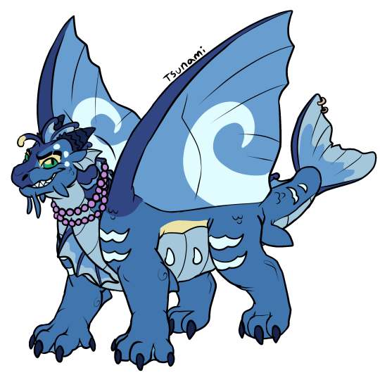
Tsunami the Seawing (Revisited)
Been over a year since I started this blog and there are some designs I want to freshen up a little bit so here's a bit of a new design for Tsunami!
[Image Description: A digital drawing depicting Tsunami from Wings of Fire. She is a blue slightly muscular seawing dragon with a light sky blue underbelly and a deep blue neck, nose bridge and forehead. She has swept back curled lighter blue webby fin that goes from her forehead to her tail, they resemble slightly like tidal waves. She has similar webby fins on her chest, a tail fin, and ears that are similar to fish fins. Her offwhite bioluminescent scales are shaped like wave markings and teardrops and they're notably on her shoulders knees tummy, tail and brow. She also has swirl bioluminescent markings on her fin like wings to signify she is of seawing royalty. On her chin, she has two long barbels similar to her father's and then two more barbels that are similar to a shark's pectoral fin. She also have shark like fins on her elbows and on the bottom part of her tail. She has a little bit of yellow on the side of her belly, on her upper eyelids and on her esca. Her horns are a deep dark blue that resemble the tip of a conch shell. Her left eyebrow has a scar that runs vertically through it and her eyes are green. She is standing giving a toothy smile. In the second image she's shown to be wearing a purple pearl necklace, and two fin rings on her tail fin. /.End ID]
#wings of fire#wof#dragon#wof arc 1#wof arc 2#wof art#seawing#the dragonet prophecy#the lost heir#the hidden kingdom#the dark secret#the brightest night#moon rising#escaping peril#talons of power#darkness of dragons#the hive queen#the poison jungle#the dangerous gift#the flames of hope#wof arc 3#my faves#dragonslayer#agttdw#dragons#jade mountain academy#dragonets of destiny#royalty#protagonist#tsunami wof
208 notes
·
View notes
Text

THE ENEMY IS POVERTY
AND THE WALL KEEPS OUT THE ENEMY
AND WE BUILD THE WALL TO KEEP US FREE
THAT’S WHY WE BUILD THE WALL
#wings of fire#wof#wof art#wof fanart#wof morrowseer#princess greatness#greatness wof#mastermind#wof mastermind#starflight#the dark secret#I LOVE YOU BOOK 4#adamz art
87 notes
·
View notes
Text

Yeah that's fucking RIGHT you PUNK BITCH-
63 notes
·
View notes
Text

Actually proud of this. Neat
#its that one scene where Darkstalker offers magic to Qibli btw#Don’t ask what the plant is it a secret#art#wof art#darkstalker#dragon#wof darkstalker#darkness of dragons#darkstalker wof#wings of fire#wof#sombra arts (me)#qibli wof#qibli wings of fire#wof qibli#my art#digital art#small artist#artists on tumblr#digital artist
53 notes
·
View notes
Text


#wings of fire#book series#the hidden kingdom#the lost heir#the drsgonet prophecy#the dark secret#the brightest night#moon rising#escaping peril#winter turning#wings of fire legends#darkstalker
28 notes
·
View notes
Text
wings of fire.
starflight is my favorite he’s so SILLY
SILLY NERD
#wof#wings of fire#starflight wof#starflight wings of fire#no SPOILERS btw I’m like halfwayish through the dark secret 😭
25 notes
·
View notes
Text
Wings of fire but when queen battlewinner rises from the lava dark souls boss music starts playing
11 notes
·
View notes
Text

Very rushed and ugly panel redraw of Greatness


Og panel + her og colors
26 notes
·
View notes
Text

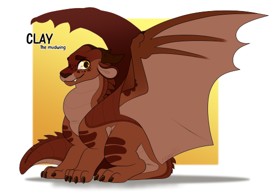
Clay the Mudwing.
#Clay#Mudwing#Dragonet of Destiny#Clay wings of fire#Wings of Fire#The Dragonet Prophecy#The Lost Heir#The Hidden Kingdom#The Dark Secret#The Brightest Night#Moon Rising#Escaping Peril#Talons of Power#Darkness of Dragons#Dragonslayer#Wings of Fire Design#I don't think I did him much justice but I am proud of this nonetheless!
34 notes
·
View notes
Text
wings of fire has some really good but also really bad alternate covers that released in different countries but I think the best of them ( other than the German ones ) is the ukranian ones


everyone's a little off model and weird but idk i like them
#wof#wings of fire#wof the lost heir#wof the hidden kingdom#wof the dragonet propechy#wof the dark secret
9 notes
·
View notes
Text
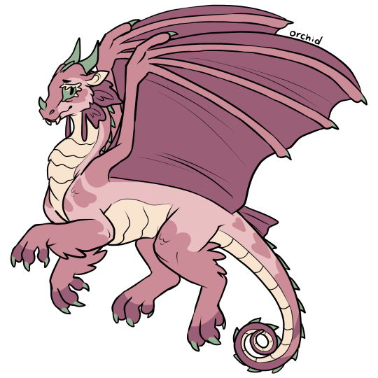
Orchid the Rainwing
[Image Description: A digital drawing of a light pink rainwing dragon named Orchid from wings of fire. She's modeled off an orchid mantis. She has a small snout, big green eyes with long cream colored eyelashes. Her legs have spikey scales, reminiscent of a mantis' scythe-like arms. She has a darker pink on her legs, tail, shoulders, head and cheeks, shaped like hearts and flower petals. Her underbelly is an off-white cream yellow. She has minty green horns, spikes and talons. Her rainwing frills are big and petal shaped, segmented like she has two petals and then a long dangling petal. It's dark pink along with her wings, toes and the end of her tail. /.End ID]
235 notes
·
View notes
Note
I'm curious now, what are you doing with Starflight in your rewrite?
howdy, ty for asking!
starflight's arc in my rewrite is all about confronting his desire to be important/special. he's taken by the nightwings sometime between the lost heir and the hidden kingom after appearing on a battlefield to stop blister from killing king gill (will make sense after I share my tlh notes haha). prior to this, he was raised on lots of stories about the nightwings being very special, and he's always wanted to embody that.
on the nightwing island he meets his family (father and half-sister) and is placed at the head of the false dragonets of destiny. this is a very alluring thing to him, becoming the leader - he could start over as the powerful mythical dragon he's always wanted to be. of course, this façade gradually falls apart, and he eventually rejects the nightwings' plan in favor of choosing the prophecy and bringing it to fruition with his chosen family (the dragonets of destiny).
there's some other stuff going on in the dark secret as well, which i'll list here:
starflight replaces fatespeaker in the fake dod lineup. fatespeaker acts like she's totally okay with this, but it actually tears her up a lot, as she feels like she got thrown out the second a "better choice" showed up. starflight actually bonds with her quite a bit in tds, he helps her find meaning beyond the prophecy and in the process discovers things about himself & the nightwings.
starflight learns about stonemover while on the island! stonemover is spoken about in hushed tones, as a traitor who the queen wants dead. he comes up again in the brightest night, but plays a different role than in canon.
starflight gets into a fistfight with fierceteeth and some other nightwing teens. he loses.
a song I heavily associate with him is helplessness blues by fleet foxes.
#tysm for asking! I love talking about this :]#keeb wof#keeb roars#ask#starflight#wings of fire#the lost heir#the dark secret#keeb!starflight#keeb!the lost heir#keeb!the dark secret
24 notes
·
View notes
Text
Moments in Wings of Fire that changed my brain chemistry (potential spoilers).
Glory becoming queen and essentially giving a big fat middle finger to the concept of destiny
Viper's death being brushed over
Flame crying
The moment in The Brightest Night just as the dragonets land near Burn's Stronghold with all the dragons of all the tribes gathered around waiting for them
Clay's fakeout death
The prologue to Moon Rising
Glory's fakeout death (why are there so many fakeout deaths?)
Anemone repeatedly beating Moon with a broom and her subsequent meltdown (and my subsequent realization that she was a scary fucking character)
Darkstalker Legends from beginning to end
The epilogue to Darkness of Dragons confirming Anemone's crush on Tamarin
Sundew being confirmed as the biggest lesbian this side of the ocean
Jerboa's backstory
Snowfall's last vision in The Dangerous Gift (Pretty much all of that book honestly)
Jambu having a boyfriend, and said boyfriend being instrumental in saving the world
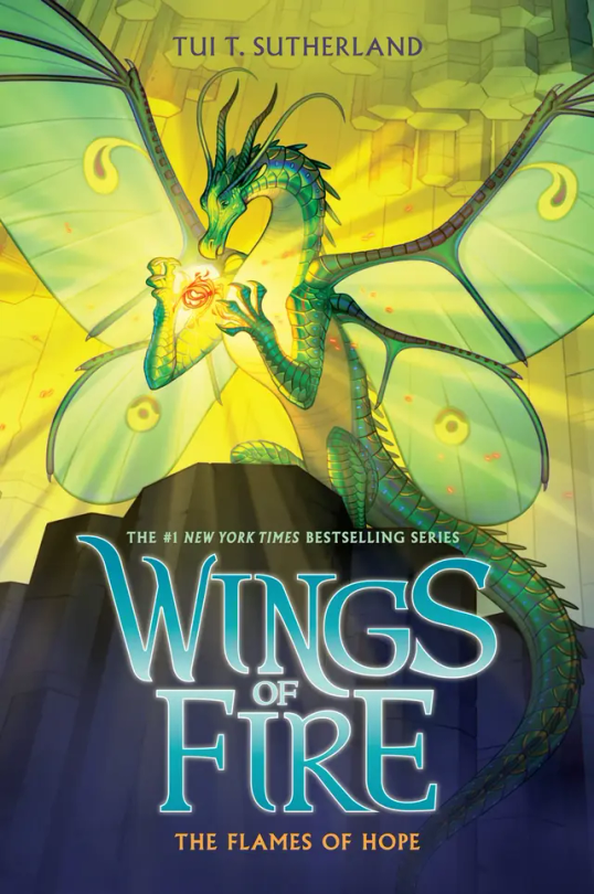
Finishing the Flames of Hope epilogue and realizing that all the main characters survived to the end.
#wof#wings of fire#wof spoilers#wings of fire spoilers#the hidden kingdom#the dark secret#the brightest night#moon rising#escaping peril#talons of power#darkness of dragons#the poison jungle#the dangerous gift#the flames of hope#wof glory#wof viper#wof flame#wof clay#wof moonwatcher#wof anemone#wof darkstalker#wof tamarin#wof sundew#wof willow#wof jerboa#wof snowfall#wof glacier#wof jambu#wof pineapple#darkstalker legends
30 notes
·
View notes
Text
Ranking all Wof Cover (except winglets and graphic novels) because I’m bored :p (Some spoilers!)
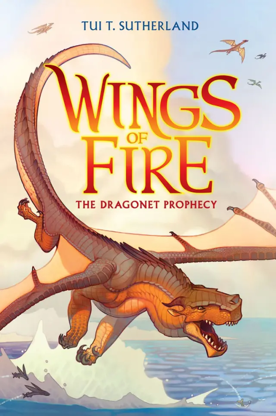
#1: The Dragonet Prophecy. Personally, I think it’s cool, although I think it could have a little more action on it. In the drafts, it was gonna have Queen Scarlet’s arena, which I think would’ve been a cool edition to the cover, but sadly they removed it. 7/10
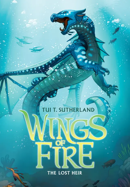
#2: The Lost Heir. Ok this one is awesome. It really shows Tsunami’s personality in her pose and it has so much action yet not to much. But they did forget to put the royal markings on her wings, which kinda makes her seem a little less important if you’re just looking at the cover. Originally it was gonna be called “The Last Heir” which sounds epic, but then again Anemone is in the book, so it wouldn’t make sense. 9.5/10
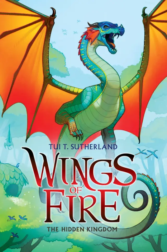
#3: The Hidden Kingdom. One of the coolest covers, I’m a sucker for the wings contrasting with the background (which is a reason I love The Dangerous Gift) but to be honest, Glory just kinda doesn’t stand out. Even with Tsunami being blue on blue, she stands out while Glory just… doesn’t. I think it would be cool if we saw her using venom, and if you say “But she doesn’t use venom in the Rainforest in the book!” Boy are you gonna do a flip when you see The Lost Continent. 5/10.
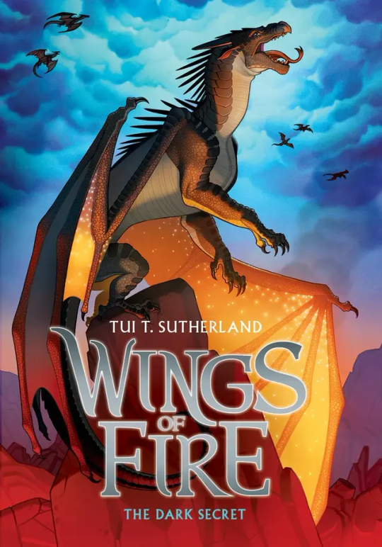
#4: The Dark Secret: Honestly… just kinda… meh. I mean sure Starflight’s pose is cool, as it shows how the Nightwings are supposedly these evil mind reading future seeing beings that are going to rule the world, but it’s not really as cool as Tsunami’s or Clay’s. If anything I think the background makes up for it. The blue cloudy sky contrasting with the dimly red lit stone just catches my eyes immediately. 5/10.
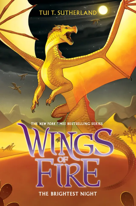
#5: The Brightest Night: I love this cover. Mainly because I love the way Sunny is portrayed on it as she is a hybrid but also I love the three moons in the background and the Sand Kingdom. Sunny’s golden yellow on the black night in the back is just perfection to my eyes. 10/10.
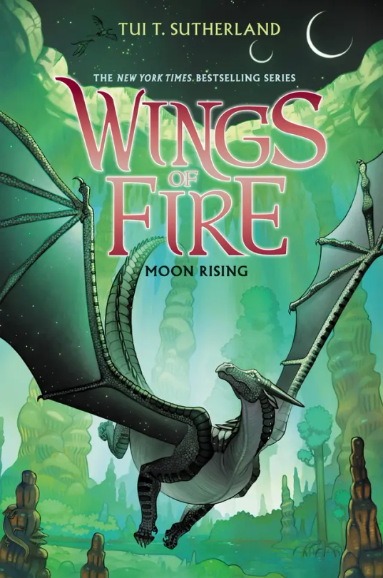
#6: Moon Rising: I adore this cover. And not because Turtle is on the back but that’s a reason I love it as well. Moon having that green fade on her wings is just really cool imo, and this is one of the covers that actually takes place in the book. I think it would be a little bit better if MoonWATCHER was look in the direction of the MOONS, but other than that I love this cover. 9/10.
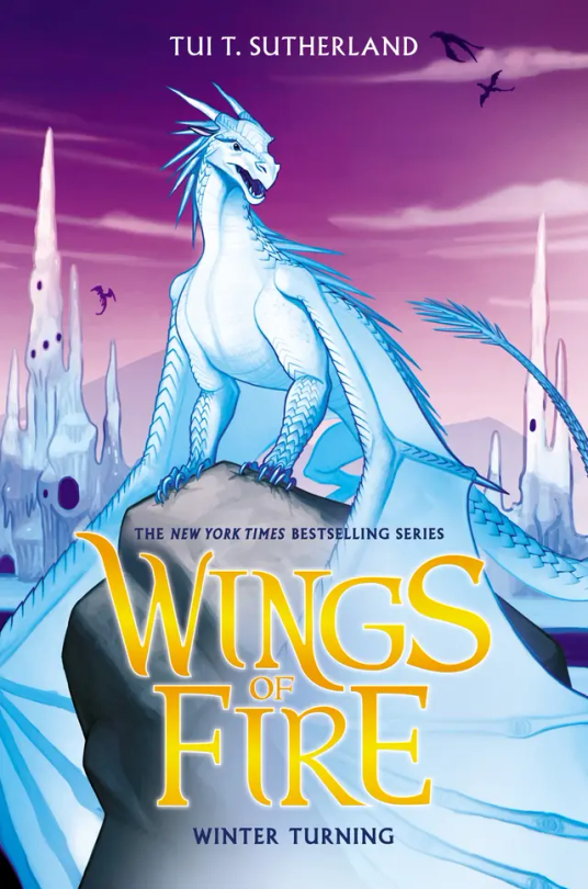
#7: Winter Turning: The draft for this wasn’t going to have purple on it, and to be honest, I’m glad they added that. The purple really brings out Winter and the Ice Kingdom, and it really makes everything pop. 10/10.
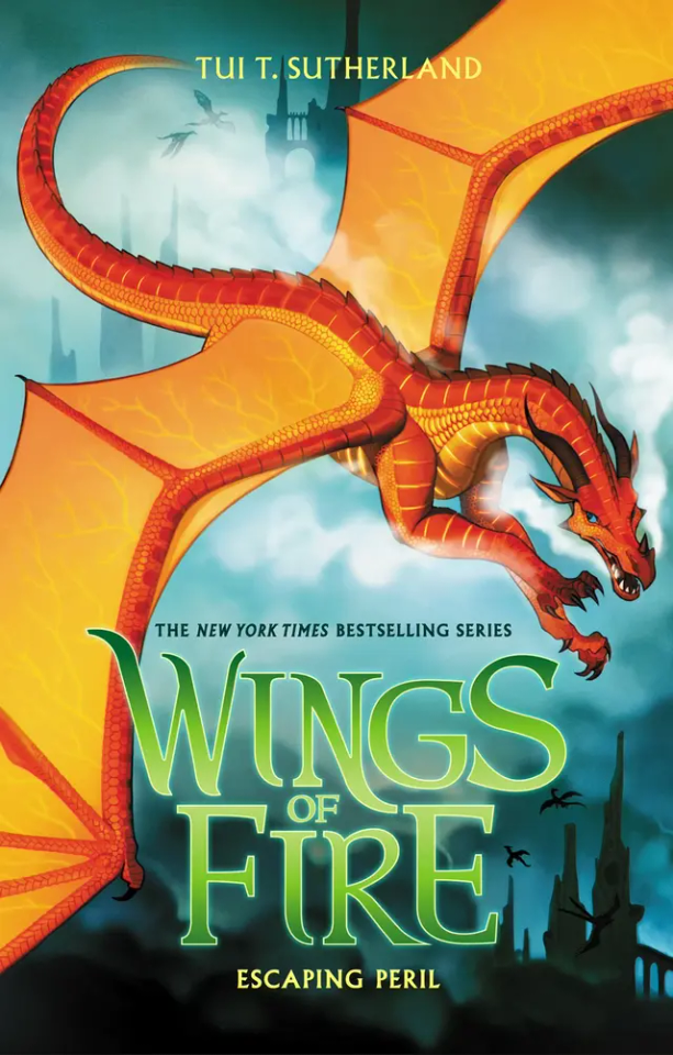
#8: Escaping Peril: Ok so maybe I’m a sucker for red on blue but Peril’s cover is just, wow. Her being chased by Scarlet is awesome, but I’m a little sad it didn’t happen in the book. (I think? Haven’t read this in like a year) My only complaint is that it doesn’t look like the Sky Kingdom in the back. Like if I first saw this cover and didn’t read WOF, I would think they’re flying over human city’s. 7/10.
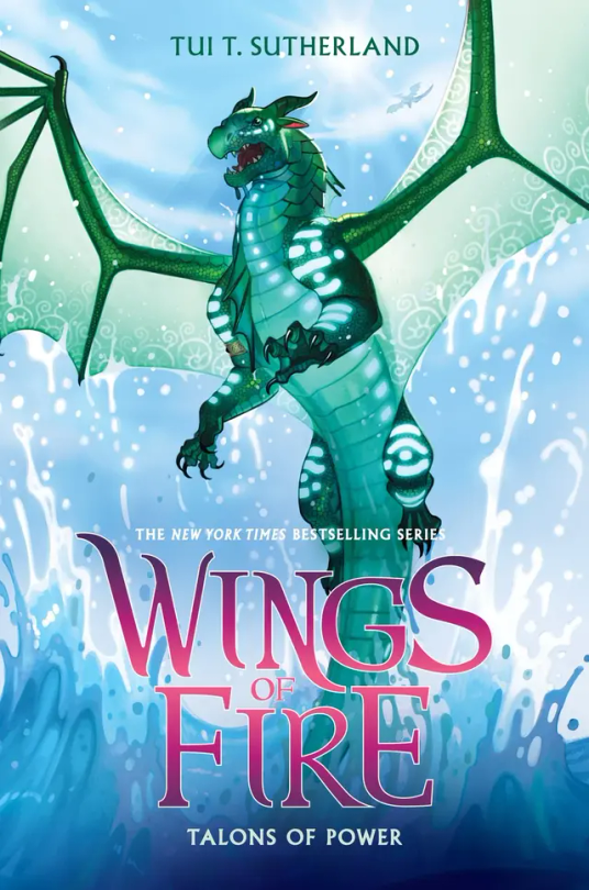
#9: Talons of Powers: Don’t be bias about this one because Turtle's in it, Don’t be bias about this one because Turtle’s in it, can you tell that this is my favorite cover? Other than the fact that Turtle’s on it, I love the fight between Turtle and Anemone on the cover, giving away a key point, but not too much spoilers. I also love all the action on the cover, with Turtle soaring out the water. But they did forget Anemone’s royal patterns, so it’s not perfect. 9.9/10
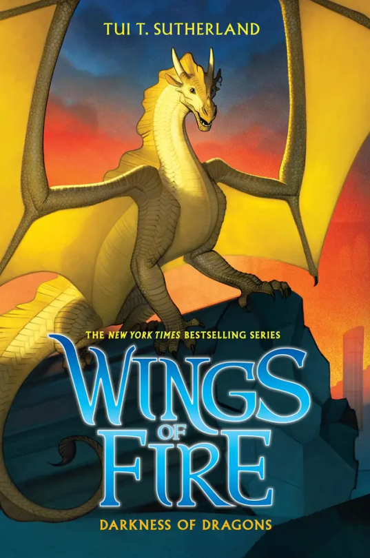
#10: Darkness of Dragons: Qibli’s yellow on the sunset background is just perfect, alongside the dark pieces of stone from the ancient Nightwing city. His pose really shows how Qibli is brave and daring, but they did forget his snout scar, which is like the one thing that makes Qibli, Qibli. 8/10.
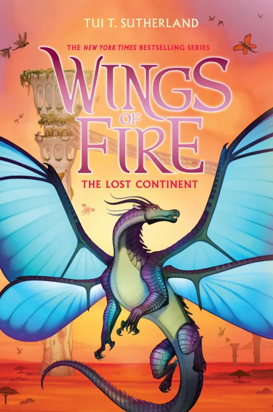
#11: The Lost Continent: Blue’s, well blue is the perfect contrast to the orange Pantalan savanna and the tan hives. Now, most people don’t like this cover because, “Blue doesn’t get his wings in the book!” or, “Cricket described him as blue, but on the cover he’s purple and green!” And my response to these are, 1: Tui actually was going to make Blue have no wings on the cover, but she thought he looked more pretty with wings than without. And 2: I personally love purple and green blue, It makes him look more related to Admiral and it makes him less of an eyesore imo. (If you seen the book description version of him on the wiki, you know what I mean). 10/10.
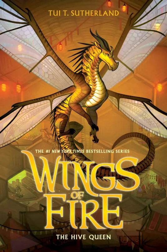
#12: The Hive Queen: Again, even though it’s yellow on yellow, Cricket still manages to stand out. I think it’s because Cricket’s more yellow, while the hive is more orange. I think the lights and the.. hole dens? Really just make the background so visible but not the main focus. 10/10
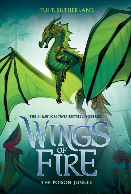
#13: The Poison Jungle: How does Joy Ang manage to put the same colored character on the same colored background and still make them stand out? Magic. Anyways, Sundews pose and the Poison Jungle in the back just really shows how fierce she is. Her small gold scales make her pop from the background, and I think the light behind her is the key to not have her blend it. 10/10
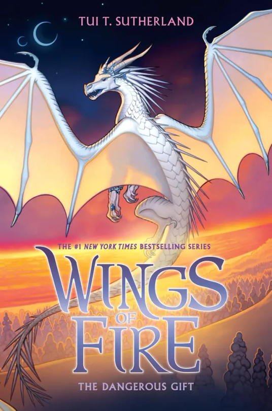
#14: The Dangerous Gift: Like I said in THK, I love wings that stand out from the background, so this is one of my favorite covers. Snowfall flying with Lynx by the coast where the Silkwings would fly in gives away so much yet so little. Also I love Snowfalls pose, no reason why it just looks cool :). 10/10
#15: The Flames of Hope. Honestly…. This cover is the worst in the Lost Continent Arc. Honestly Lunas pose is cool, and I think it would look really awesome if it wasn’t for the lighting of the flamesilk. That kind of blends her into the background at makes it a little boring to look at. But I do have to say I love Sky with Wren on the back and even thought Sky is described as pale, I love a red Sky. 6/10.
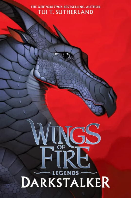
#16: Darkstalker: Darkstalker in on his mewing streak on this cover 🤫🧏♂️👌. I love his black on red background, but it’s boring. There’s nothing going on in the back, and he’s just standing there doing nothing. 6/10.
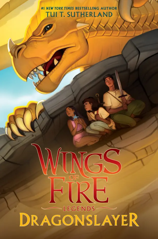
#16: Dragonslayer: I don’t have much to say about this cover. It has so much action but so little at the same time. It catches my eye but at the same time it doesn’t. I’m honestly very meh about this cover. 5/10.
#wings of fire#wof#the dragonet prophecy#the lost heir#the hidden kingdom#the dark secret#the brightest night#moon rising#winter turning#escaping peril#talons of power#darkness of dragons#the lost continent#the hive queen#the poison jungle#the dangerous gift#the flames of hope#Clay wof#tsunami wof#glory wof#starflight wof#sunny wof#moon wof#winter wof#peril wof#wof turtle#qibli wof#blue wof#cricket wof#sundew wof
25 notes
·
View notes
Last Seen Blogs