
Don't wanna be here? Send us removal request.
Statistics
We looked inside some of the posts by michellange10 and here's what we found interesting.
Average Info
Notes Per Post
44
Likes Per Post
39
Reblog Per Post
4
Reply Per Post
1
Time Between Posts
6 days
Number of Posts By Type
Text
16
Last Seen Tumblr Blogs


Fun Fact
Tumblr was named as a finalist in Lead411’s New York City Hot 125 in Aug 2010.
Text
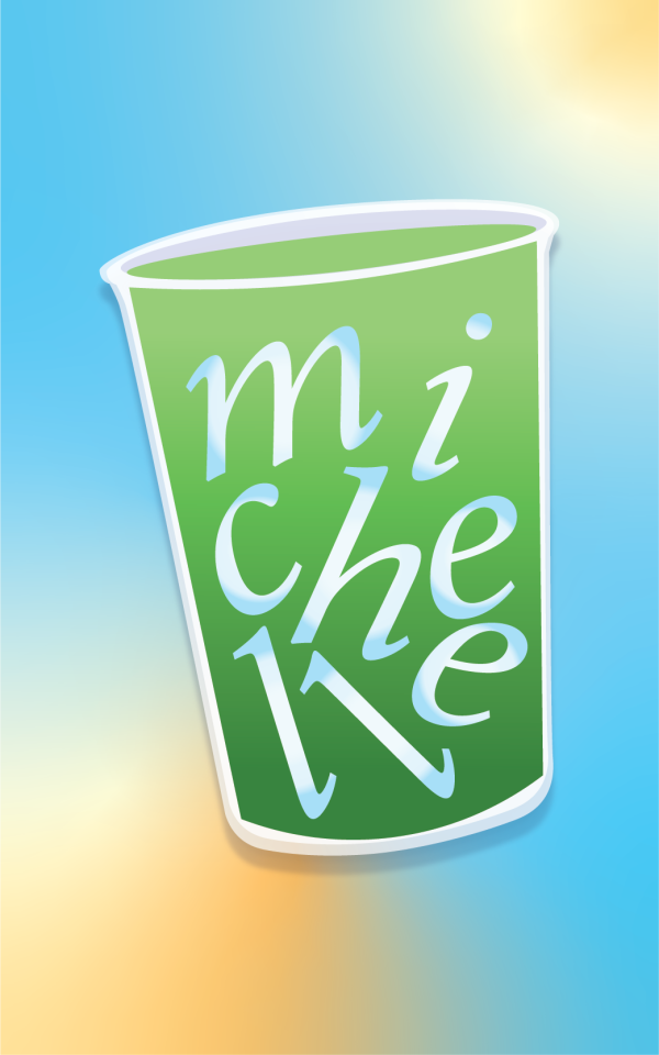
WEEK10 HW #9 - Webflow Site
Link to site: Michelle's Matcha Site
My website showcases my current collection of matcha, my reviews for each tin, and instructions on how to make your own matcha latte.
I personally do not like Webflow at this current time. I don't think it's the most intuitive web application for non-coders to build websites, but maybe I'm just a hater because I haven't caught onto the slight learning curve yet. Figma lover, what can I say?
I think the font I chose worked the best for my website. I was going for a casual feel, so I used pastel colors and a simple layout to display my information.
0 notes
Text
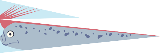
WEEK09 HW #8 - Oarfish Flag
My flag:
Inspo:
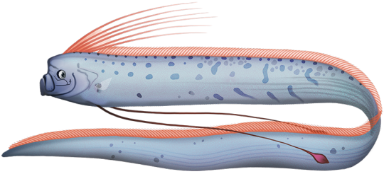
I decided to re-tackle the flag assignment. Instead of following the strict rules of flag design, I chose to play with the shapes of the flag to make it look as much as an oarfish as possible! while still keeping the design simple so it's recognizable from afar and waving in the air.
11 notes
·
View notes
Text
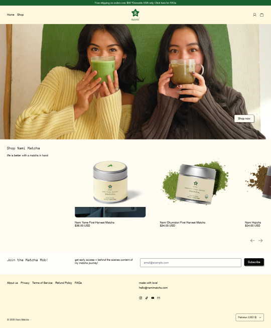
WEEK08 HW #7 - Nami Matcha (Extended)
Before:


After:


⭐ View prototype!
Think about the homework you did last week. Either make a new version building on what you learned last time, or pick a new app/website/program. Use Figma in the same way — Give yourself a directive: I am going to make this app/site/*** funny/silly/angry/usable/terrifying/legible/incomprehensible/……….. Then, think about what qualities you can use to create a version that embodies that adjective. Your changes might be subtle or loud – try out a few things before you settle on your final direction. If you don’t know what to do, talk to me.
About Us:
Directive: I am going to make this page less empty and more personal.
My changes:
Introduced more colors to brighten up the page!
Incorporated more photos that are not already in use on the site.
Added the reoccurring arch in home and product display page for a more welcoming feel.
Product display & info (Yame):
Directive: I am going to make this page emphasize the flavor and customer experience of Nami's Yame Matcha.
My changes:
Push matcha description up, making it the first thing a user reads instead of the payment option.
Add more fun and inviting shapes from the home page to display Yame matcha images.
Slight edits to the matcha description to make the text visually less condensed (asterisk, line skip)
Rotating thank you message was too light. Changed it to Nami green and butter yellow!
Customer reviews are visually more condensed because original design require customer eyes to drag across the screen. I hate it lol
2 notes
·
View notes
Text
WEEK07 HW #6 - Nami Matcha

Nami Matcha Home Page
Note: Left is original, right is my mockup
Directive: I am going to make Nami's home page more inviting and create more space for their current matcha collection.
My experience:
Compared to Cha Cha Matcha's mockup, I think I had an easier time redesigning Nami's home page. I am a longtime fan of Ashley Alexander, Youtuber and creator of Nami Matcha, so I was already familiar with her down-to-earth branding. I added more warmth to the page by changing the pale yellow of the original design to a warmer butter yellow, which aligns with Nami's branding. It also adds more contrast to the off-white background used for the product display. Another big change in the mockup is introducing the arch. It's a round shape that adds softness and coziness to the website design.
3 notes
·
View notes
Text
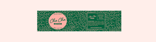
WEEK07 HW #6 - Cha Cha Matcha
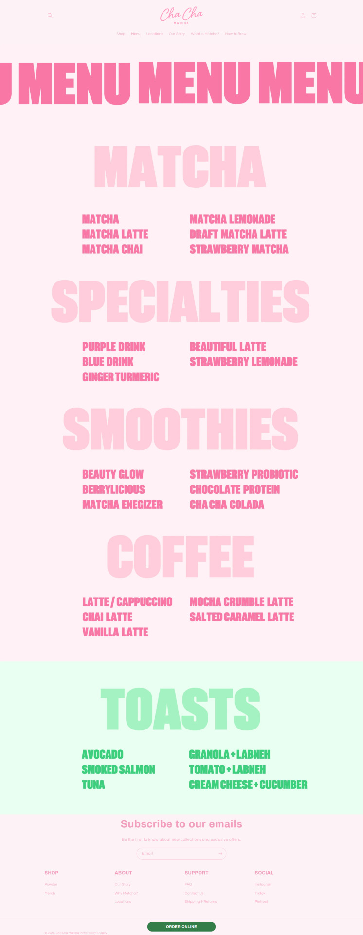
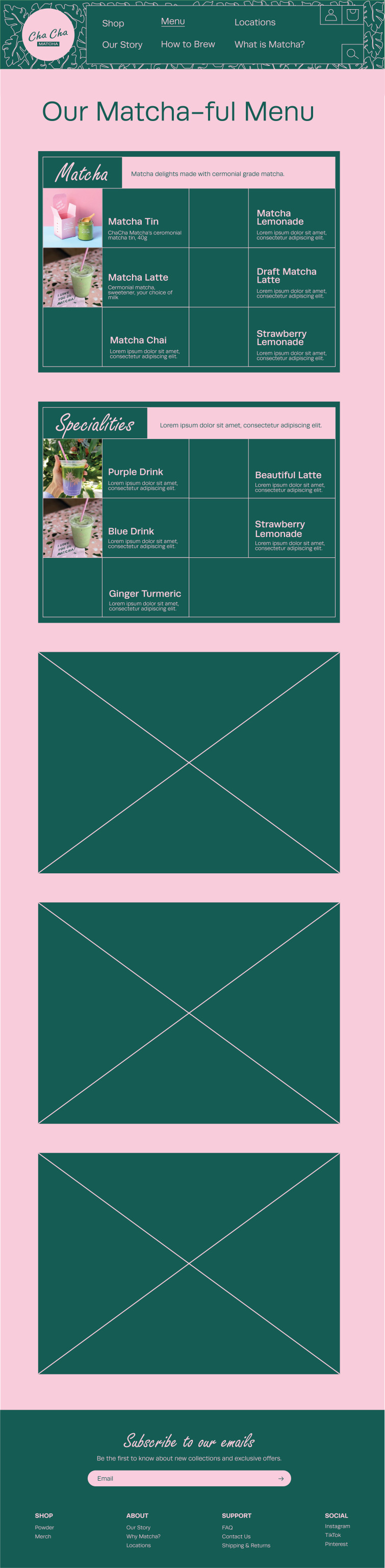
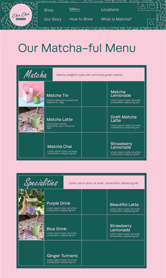

Cha Cha Matcha Menu
Note: First image is original, second image is my mockup, third and fourth images are close ups.
Directive: I am going to make Cha Cha's menu page more enticing for customers by adding images, descriptions, and deeper colors.
My experience:
Redesigning Cha Cha's menu page was tedious as there were several new components being added to the mockup. However, the Manufactur's official rebranding was extremely helpful when it came to new colors, different shapes, and understanding Cha Cha's NYC x tropical branding. I swapped out the pale pink and green with deeper shades and a cooler tone.
I also incorporated the script font from the logo throughout the menu page because it's type logo is just as memorable as Cha Cha's pink and green branding. Boxes were also a big competent in the redesign. It added more structure to the menu page, making it easier to neatly display images and additional text, which the original design was lacking.
2 notes
·
View notes
Text
WEEK06 HW #5 - Type Logos
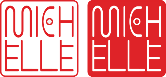

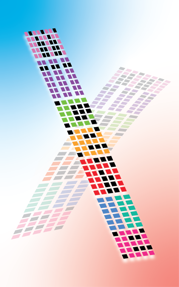
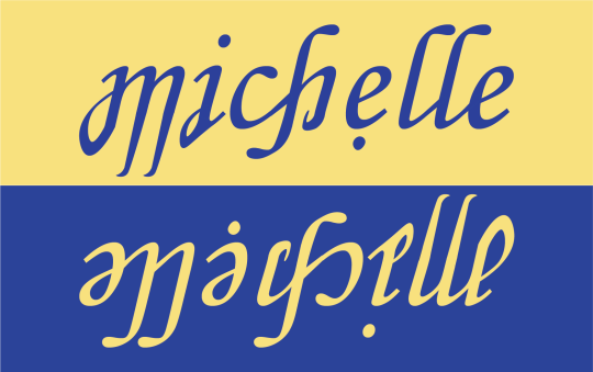
a little artist's note:
I really liked being able to separate each letter of my name and adding a unique twist to its design.
However, I did have trouble with the cohesion of the redesigned letters when I try to piece them together for the overall design. The progress I'd make didn't always reflect my sketches.
1 note
·
View note
Text
Week05 HW #4 - Movie Poster

Trailers I watched:
Thunderbolts*
Mission: Impossible – The Final Reckoning
The Woman in the Yard
Design inspiration: this Guardians in the Galaxy poster

#medp250#homework#week05#movie poster#movies#poster#bucky barnes#marvel#mission impossible#the woman in the yard
9 notes
·
View notes
Text
Week05 - Visual Journal #4
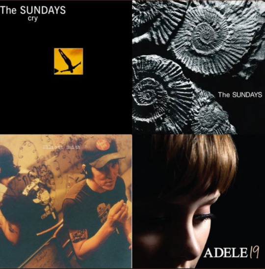
Growing up with the rise of Spotify being people's primary music streaming platform, I've seen playlists be the center of one's personalized compilation of emotions and vibes. It ranges from situationships, getting through a breakup, being in love, summer vibes, the list goes on!
I am relatively new to Spotify (premium... I was using Soundcloud before) so here is the cover of my first ever Spotify playlist. These specific songs make me feel like I'm in a red brick apartment in NYC. It's near sundown during the Fall/Winter months, and I'm in my living room watching the sunset as I smoke a cigarette with a Bud Light.
I don't smoke or drink. This is just what came to mind!
I really like the cohesion of colors across the 4 different album covers. 3/4 of the album covers have shades of yellow and brown, that sort of makes a film of orange. And of course, there is a darker color element that exists in all the covers. Some of them being darker brown and some are just pitch black.
3 notes
·
View notes
Text
Week04 HW #3 - 2 Flags


As someone with a growing collection of matcha tins, it would be ridiculous of me to not make a MATCHA FLAG.
On the left side is a design following flag rules. We have three colors: off-white, a shade of matcha green, and a darker shade of green. In the center of the flag is the handle and center of a matcha whisk. Surrounding these two whisk components are matcha leaves. The handle of the whisk also has a circle to represent matcha's Japanese origin. Finally for the background of the flag, we have a wave of green to represent matcha when it's whisked with water.
On the right side is a design breaking two flag rules: only using 2-3 colors and no lettering or seals. To represent the Japanese origin of matcha, I added Japan's signature red dot/sun into the background. And just in case someone is not familiar to matcha, I added the Japanese characters/translation for matcha in the upper left corner of the flag.
1 note
·
View note
Text
Week04 - Visual Journal #3

Personal Friend Zine
I don't have a specific design in mind this week, but I did make a lot of progress on a friendship zine this past weekend. Being new to the zine making world, I truly didn't know where to start or how to tackle this personal art project.
But after browsing through Pinterest, I was inspired by the collage aspect of certain designs. Instead of a clean cut, digitally designed zine- I was gravitating towards designs that reminded me junk journaling and crafting.
Layering of different papers. Pens. Markers. Pencils. Writing over images. Magazines. Paper bags. The list goes on!
4 notes
·
View notes
Text
Week03 - Visual Journal #2

What I love about this painting is the dominant use of yellow throughout the entire piece. As we learned in class this week, colors evoke different emotions and feelings.
Although this piece doesn't have a written statement, we can still conclude that it comes from a place of love and happiness due to the intimate position of the human figures. The color yellow evokes similar positive emotions: happiness, excitement, enthusiasm, confidence, etc.
I also enjoy the use of complimentary colors for the different shades of yellow throughout the painting. Purple and yellow, blue and orange, purple and green. They bounce off of each other quite well!
1 note
·
View note
Text
Week03 HW #2 - Remixed Emojis


Remoji_01: Junji Ito inspired cat skull
Remoji_02: Cch-chick pea...? gross... /_\
Remoji_03: Don't f_ck with me.
What went well? - I like the overall composition of my remixed emojis. The little details from the added shadows to the outlined shapes bring out the unique personalities of each emoji.
What was challenging? - Nothing was too hard, but I would like to practice with more colors and layers in the future. I was able to change the colors of selected objects, but I am not sure if I used the most efficient method!
1 note
·
View note
Text
Week03 - Color wheel
ccoollooorssss :D
1 note
·
View note
Text
Week02 HW - 2 Original Emojis
01. chickpea

this is a chickpea emoji. apple already has a falafel emoji, so why not try and create a chickpea emoji? fun fact: falafel is made with chickpeas. this idea was suggested by my vegan friend, shoutout to nico.
I was inspired by the realism of Apple emojis, specifically their food emojis. Using the pen tool, I traced the shape of a chickpea I found online. Then with the brush tool, I layered on colors to add value to the chickpea, in addition to shadows and highlights.
02. unhinged bite

this is an unhinged bite emoji. this idea was also suggested by nico. he wanted an emoji that evoked the message of: "i'm about to bite you."
I traced over a sketch I made in my journal and used layers to separate the different components of the design.
2 notes
·
View notes
Text
Week 2 - Visual Journal Entry #1
02.05.2025

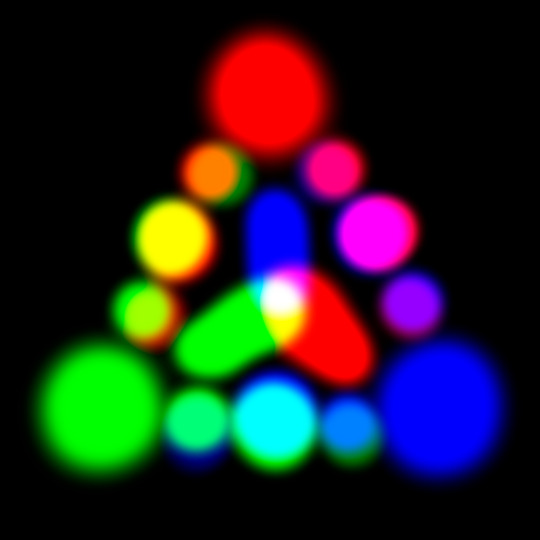
Image 1. INSPIRATION
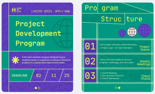
Image 2. THE CREATION
As a graphic designer for the Computer Science Club at Hunter, I am responsible for creating promotional materials like posters and Instagram graphics for our club events and initiatives.
Image 1 is the inspiration for Image 2, the Project Development Program graphic I created for Instagram.
What I like about Image 1 is the mixture of simple shapes (rectangles, circles) and organic forms. The restricted color palette and the smooth lines also adds to the simplicity of the design, meanwhile being almost maximalist with the different design components in the image.
1 note
·
View note
Text
Michelle(angelo) Lee

Hi! My name is Michelle and I go by she/her.
I'm a CS x Media Studies double major and one of my 2025 goals is to do more art. I love music, design, matcha lattes, and cooking!
It's nice to meet you :4)
2 notes
·
View notes